There Is No Alabama Miracle (But There Is a Lesson)

Header: There Is No Alabama Miracle. But there is a lesson about effort, adequacy and where the money goes. Trend lines of 8th grade NAEP math with Alabama highlighted.

Another southern miracle

Every so often someone discovers a miracle in a southern state. Back in February it was Mississippi. Now it’s Alabama, whose 4th graders gained 6.3 points in NAEP math from 2022 to 2024, against 2.4 points nationally. That gain is being held up as proof that “red state” reform (accountability, science of reading, numeracy coaches, and lately, school choice) is the model for everyone else.

So let’s look. I compare Alabama and Mississippi to Arizona and Florida, the two states that have gone furthest in dispersing public money to charters and private school vouchers, and benchmark all four against Massachusetts and New Jersey. My two points:

  1. There is no miracle in Alabama. In 8th grade, the better gauge of what a school system adds up to, Alabama is last among these six states in both math and reading, and still sliding.
  2. To the extent Alabama (and Mississippi) aren’t collapsing like Arizona and Florida, it’s less about what they did than what they didn’t do. They didn’t drive fiscal effort to the floor, didn’t build a parallel charter sector, and, until this year, didn’t send public money to private schools at scale. They kept investing in their public schools. Steadily, if not adequately.

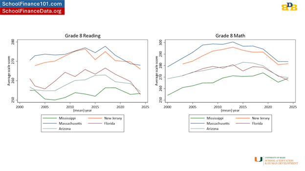
No miracle in 8th grade

Alabama’s 8th graders scored 261.8 in NAEP math in 2024. That is essentially the score Alabama posted in 2003 (261.9). In reading, at 249.6, they’re below where they were in 2003 (253.2). Among these six states, Alabama is now last in both subjects.

As I said about Mississippi, 8th grade is a better indicator of the cumulative effect of a school system than 4th grade. A 4th grade bump can come from one well-targeted early-grades push. An 8th grade gain means the system is building on it.
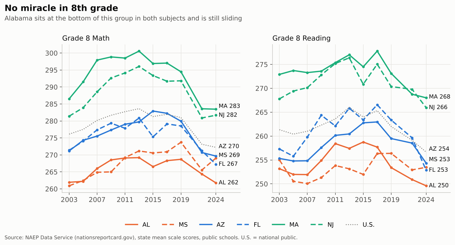
Line charts of grade 8 NAEP math and reading, 2003-2024, for Alabama, Mississippi, Arizona, Florida, Massachusetts and New Jersey.

The “miracle” lives entirely in 4th grade math. Alabama gained 6.3 points there from 2022 to 2024. Over the same two years, Alabama’s 8th graders lost 2.6 points in math. Since 2019, it’s +6.7 in 4th grade and −6.9 in 8th. If there’s a story here, it’s an early-numeracy push that hasn’t (yet) carried into the middle grades.
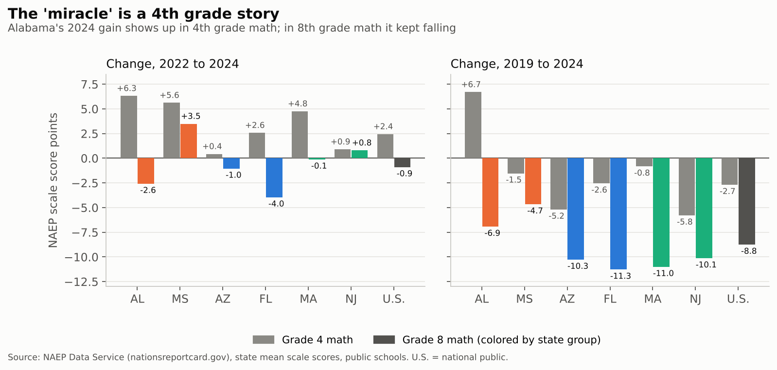
Bar charts of NAEP math changes in grade 4 and grade 8.

If anyone in this group has a claim to a rebound, it’s Mississippi, the only one of the six whose 8th grade math score rose meaningfully from 2022 to 2024 (+3.5). Even so, Mississippi doesn’t catch Massachusetts or New Jersey. Not even close. Both still sit 13 to 14 points above Mississippi in 8th grade math and 13 to 15 points above it in reading.

What Alabama and Mississippi didn’t do

Arizona and Florida have spent two decades building a second school system alongside the first. By 2024, 36 percent of Arizona’s public school students were in charter schools, and 14 percent of Florida’s. Alabama and Mississippi? Under 1 percent each. Even Massachusetts and New Jersey, hardly charter-averse, sit at 5 to 6 percent.
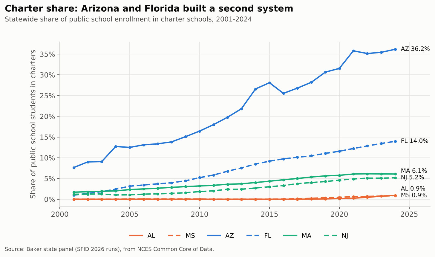
Charter share of public enrollment, 2001-2024.

Then there are vouchers, which in their current form are mostly education savings accounts (ESAs). Here the gap is even starker:

StateProgram(s)Students (est.)Public dollars (est.)
FloridaFES-EO, FES-UA, Tax Credit Scholarship~515,000 (2025-26)~$3.8 billion
ArizonaEmpowerment Scholarship Accounts (universal since 2022)100,000+ (early 2026)~$1 billion a year
AlabamaCHOOSE Act ESA (new in 2025-26)~23,600 approved in 2025-26; 34,000+ for 2026-27~$124 million; $174 million for 2026-27
MississippiSpecial-needs ESA, dyslexia and speech-language scholarships~600 (2024-25)small
Massachusettsnone00
New Jerseynone00

Florida figure: 432,581 FES scholarship FTEs estimated by the state for 2025-26 (EDR) plus 81,947 Tax Credit Scholarship students (EdChoice); dollars from the Florida Policy Institute via WUSF. Arizona: AZPBS. Alabama: Yellowhammer News and Decatur Daily. Mississippi: Empower Mississippi.

The point isn’t that every charter or voucher dollar is wasted. It’s that Arizona and Florida have been spreading roughly the same (shrinking, as we’ll see) public effort across more and more systems, with less and less accountability for where it lands. During the period over which Alabama’s and Mississippi’s 4th grade gains were built, neither state was doing that.

Effort: Arizona and Florida walked away

Fiscal effort, K-12 spending as a share of gross state product, tells you how much of its economic capacity a state chooses to put into its schools. Alabama spent 3.3 percent of GSP on K-12 in 2024, the same as in 2013 and a bit above the U.S. state average (3.1 percent). Arizona fell from 2.5 to 2.0 percent over those years, and Florida from 2.6 to 2.2 percent. Both now put in less than half of New Jersey’s effort (4.8 percent).
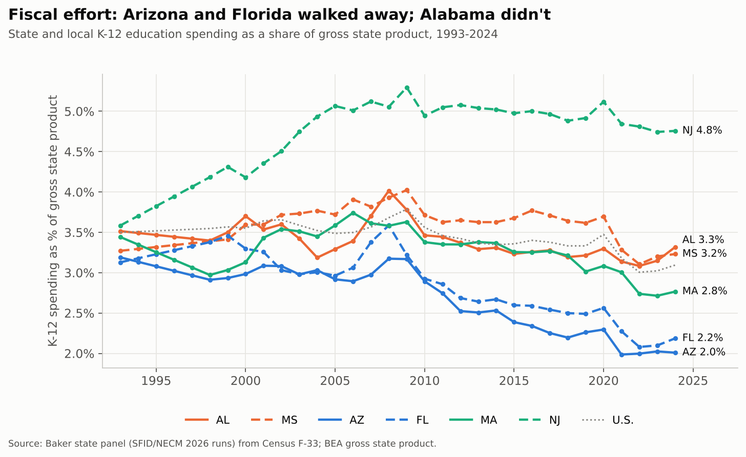
K-12 spending as a share of gross state product, 1993-2024.

Alabama isn’t a hero here. Its effort peaked at 4.0 percent in 2008 and took a big hit after the recession. Mississippi dropped from 3.7 to 3.1 percent between 2020 and 2022 (partly fast post-pandemic GSP growth, not only budget choices). But neither has ridden effort to the floor the way Arizona and Florida have.

Spending: the order flipped

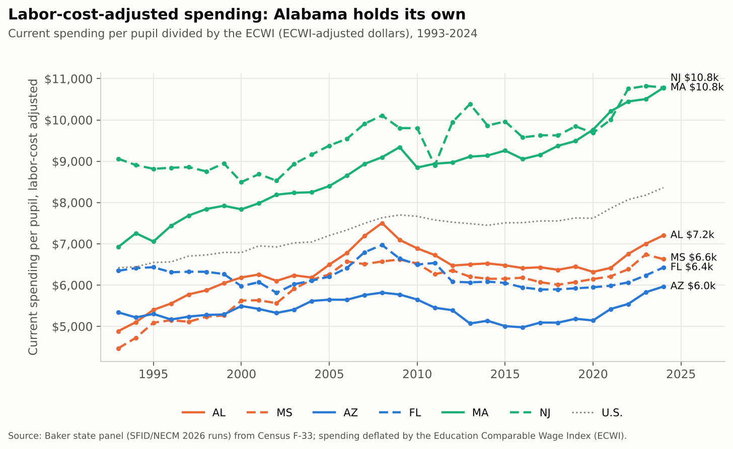
The result shows up in what schools actually have to spend. Adjusting for regional differences in labor costs (using the Education Comparable Wage Index), Alabama and Florida have traded places since the early 1990s. In 1993, Florida spent about $6,350 per pupil in labor-cost-adjusted dollars and Arizona about $5,340, both well ahead of Alabama ($4,890) and Mississippi ($4,470). By 2024:

  • Alabama: $7,204, up 47 percent since 1993
  • Mississippi: $6,627, up 48 percent
  • Florida: $6,425, up 1 percent, and still 8 percent below its 2008 level
  • Arizona: $5,965, up 12 percent
Labor-cost-adjusted spending per pupil, 1993-2024.

Massachusetts (up 56 percent, to $10,779) shows what sustained investment looks like at a higher level. Alabama and Mississippi are nowhere near that. But they’ve kept climbing while Arizona and Florida stalled.

Adequacy: steady isn’t the same as enough

Here’s where the “steady investment” story needs a caveat. Spending more than Arizona isn’t the same as spending enough. Our National Education Cost Model (NECM) estimates what each district would need to spend to reach national average outcomes, given its poverty, labor costs and size. Because Alabama’s children are poorer, its required spending is higher. So even though Alabama outspends Arizona and Florida, it’s further from adequate.

In 2024, Alabama districts spent 64 percent of what the NECM says they need, statewide. That’s third lowest among the 47 states we estimate, ahead of only Mississippi (51 percent) and Texas (59 percent). Arizona sits at 72 percent and Florida at 70. Massachusetts and New Jersey are well above adequate (132 and 136 percent). In Alabama’s highest-poverty districts, the figure is 44 percent.
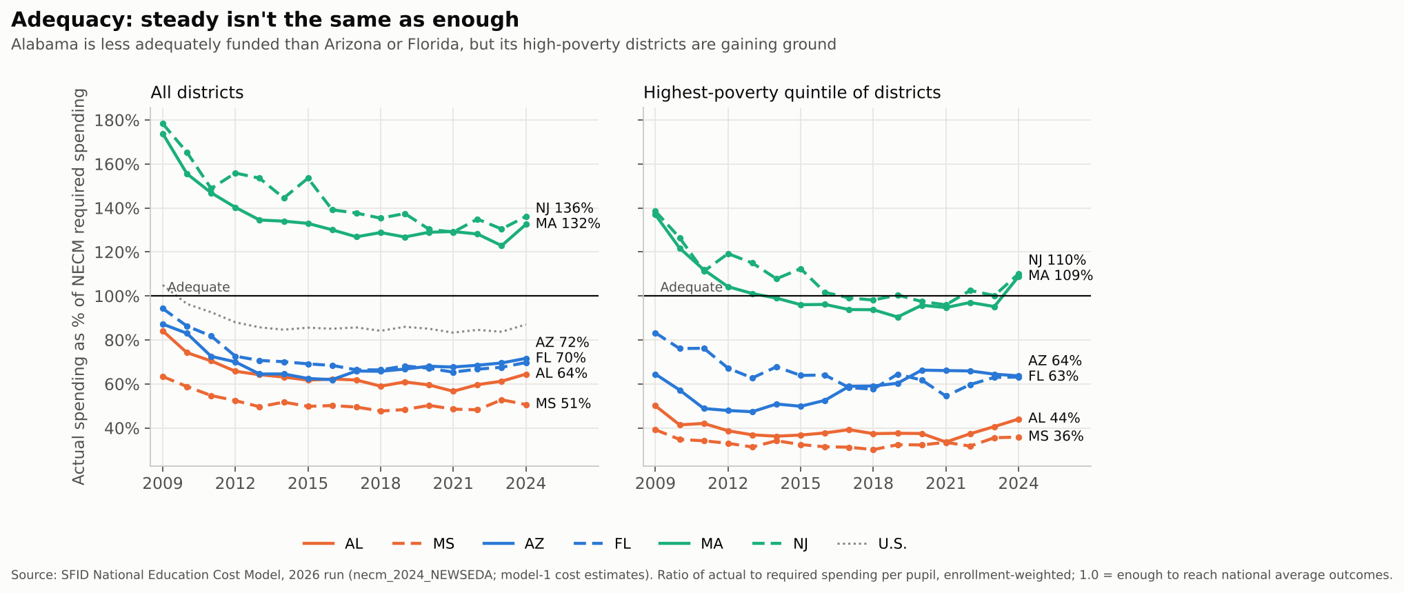
NECM adequacy ratios, all districts and highest-poverty districts, 2009-2024.

The encouraging part: Alabama’s high-poverty districts are gaining ground, from 34 percent of adequate in 2021 to 44 percent in 2024, and statewide from 57 to 64 percent. That’s the kind of sustained, if modest, investment that might eventually show up in 8th grade. It isn’t there yet.

Nearly every Alabama child (96 percent) attends a district funded below adequate levels, and about two thirds attend districts in the bottom fifth nationally. A state can hold effort steady and still leave its schools short. Alabama has.

Caveats, and how much they matter

A few things look, at first glance, like they cut against this story. Mostly they don’t.

First, NAEP gains and losses depend on where you start. Low-scoring states have more room to gain, and high-scoring states more room to fall. Across all 50 states, the correlation between a state’s starting score and its change is strongly negative over the long run: about −0.4 to −0.65 for 2013 to 2024, depending on grade and subject. It’s also negative for 4th grade math from 2022 to 2024 (−0.52). So part of Alabama’s 4th grade jump is what you’d expect from a low starting point. Adjusting for that, Alabama still beat expectations by about 3 points, fifth best in the country. Good, not miraculous.

The 2019 to 2024 drop in 8th grade is different. It hit high- and low-scoring states about equally (correlation near zero in math, −0.15 in reading). Here’s how each state did relative to what its 2019 level predicts:

StateGrade 8 math, actual changevs. expected (rank of 50)Grade 8 reading, actual changevs. expected (rank of 50)
Mississippi−4.7+4.0 (3rd)−2.9+2.2 (8th)
Alabama−6.9+1.8 (14th)−3.8+1.1 (20th)
Arizona−10.3−1.8 (35th)−5.1+0.2 (26th)
New Jersey−10.1−1.9 (37th)−4.4+1.8 (12th)
Florida−11.3−2.7 (41st)−10.5−4.9 (48th)
Massachusetts−11.0−2.8 (42nd)−5.1+1.3 (16th)

So, relative to where they started, Alabama and Mississippi held up better than most states, and Florida held up worse than almost anyone. That’s the “not collapsing” point, and it survives the adjustment.

Second, Massachusetts and New Jersey fell further than Alabama in 8th grade math since 2019. In raw points, yes. How much of that is about where they started depends on how you fit it. A straight line says both fell 2 to 3 points more than expected. Let the relationship bend (a lowess fit), and both land about where their starting level predicts (−0.4 each, 29th and 30th of 50). The ten highest-scoring states in 2019 fell 9.0 points on average; the ten lowest fell 8.0. Either way, these gaps are a point or two, about the size of NAEP’s margin of error for a single state. What holds under every specification: Florida near the bottom (41st to 43rd in math, 48th in reading) and Mississippi near the top (3rd or 4th in math).

Third, Alabama is still sliding in 8th grade math in the latest round, down 2.6 points from 2022 to 2024 while Arizona dipped 1.0. That’s one two-year interval, and Alabama’s longer-run, level-adjusted record is average (22nd of 50 for 2013 to 2024). Average is the point: there’s no miracle.

Finally, Alabama just started down Arizona’s road. The CHOOSE Act ESA launched in 2025-26 with about 23,600 approved students, roughly three quarters of them already in private school or homeschooling. For 2026-27, 34,000+ students are approved at $174 million, with $250 million appropriated. Mississippi’s House passed a universal ESA bill this year, 61-59, before the Senate Education Committee killed it.

Expected change in the table comes from a linear regression of each state’s change on its starting score across all 50 states (NAEP state means, public schools). Quadratic and cubic terms add little (R² rises by about one point; the squared term is not significant), but a lowess fit moves Massachusetts and New Jersey to about average.

So what’s the lesson?

There’s no miracle in Alabama. Its 8th graders score where they did two decades ago, it’s last of these six states in both subjects, and its schools remain among the least adequately funded in the country.

But there may be a lesson in the comparison. Over the past decade, Alabama held its fiscal effort and Mississippi kept its above the national average. Both have raised labor-cost-adjusted spending by roughly half since the early 1990s, and both kept their public dollars in their public schools. Arizona and Florida cut effort to among the lowest levels in the nation, stalled their spending, and spread what was left across district schools, charters and private school accounts. Florida in particular is now in free fall.

That’s not a causal analysis, but it’s more rigorous than most of the “miracle” talk I’ve seen. If the folks touting Alabama want to learn something from it, the lesson isn’t the CHOOSE Act. It’s the boring stuff Alabama did before the CHOOSE Act: keep funding your public schools, and keep funding them better, especially where kids are poorest. Now Alabama is about to find out what happens when it stops.

Data notes and sources

  • NAEP: state mean scale scores, public schools, from the NAEP Data Service, 2003-2024. “U.S.” is national public.
  • Fiscal effort, labor-cost-adjusted spending, charter share: my state panel built from the 2026 SFID runs (Census F-33, BEA gross state product, NCES Common Core of Data). Spending is current spending per pupil divided by the Education Comparable Wage Index. Public version: SFID State Indicators Database, 2026 release.
  • Adequacy: SFID National Education Cost Model, 2026 run with updated SEDA outcomes, extended through 2024 (model-1 cost estimates; districts under 100 students and outliers excluded; Alaska, Hawaii and Vermont not estimated). Ratios are enrollment-weighted actual over required spending; “bottom fifth” = the 20 percent of districts nationally furthest below adequate.
  • Vouchers/ESAs: see the links under the table above. Counts mix awards, participants and FTEs, so treat them as orders of magnitude.
  • Earlier post: On Miracles in Mississippi.
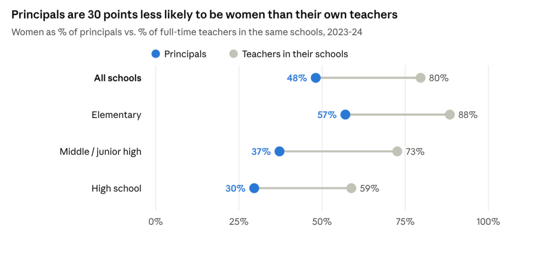
The Gender Pay Gap in New Jersey Schools Lives in the Principal’s Office

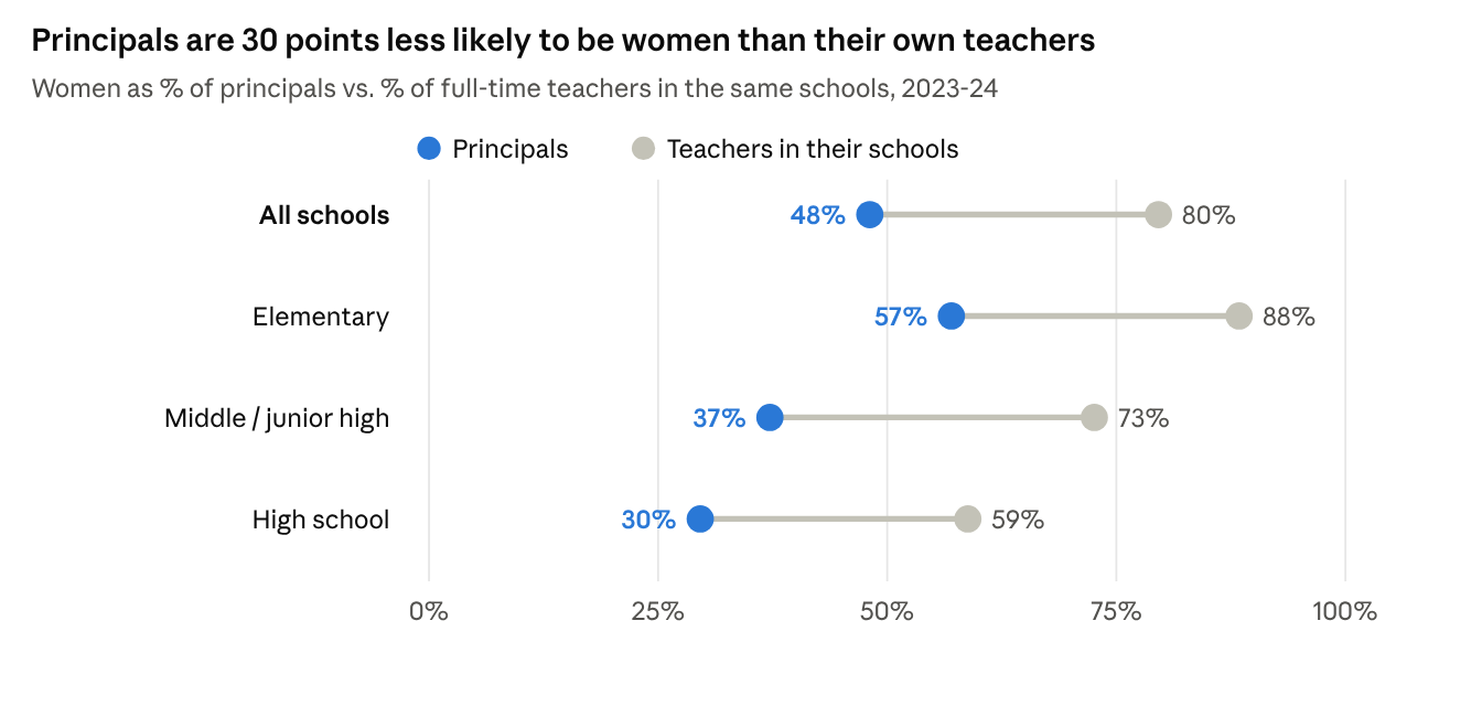
Dot chart: women are 48% of principals vs 80% of their teachers overall; elementary 57% vs 88%; middle 37% vs 73%; high school 30% vs 59%, 2023-24.

Teaching is a predominantly female profession. Nationally, 77% of public school teachers are women (NCES); in New Jersey, women hold 76% of full-time teaching jobs.

It is also an underpaid one. The Economic Policy Institute finds that teachers earned 25.2% less in weekly wages than comparable college-educated workers in 2025, up from 6.1% in 1996. Counting teachers’ better benefits, the penalty is still 14.5% (EPI). New Jersey does better than most states but not well: EPI puts its penalty at about 14%. School Finance Indicators Database estimates found New Jersey teachers earning 15.9% less than similarly educated non-teachers of the same age (SFID via NJPP; Shanker Institute). A mostly female profession paid well below its peers is already a gender pay story.

Within teaching, though, it would at least seem that there should be no gender pay gap. Public school salaries are set by negotiated guides: a step for each year of experience, a column for each degree, the same scale for everyone in the district. A woman and a man with the same degree and years should earn the same.

The data tell a few different stories. I looked at every full-time certificated employee in New Jersey from 2017-18 through 2023-24, more than 800,000 person-years of salary records.

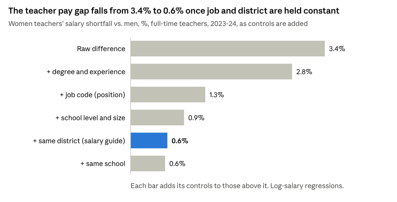
  1. The pay gap does exist. In 2023-24 the typical woman teacher earned $79,069 and the typical man $83,510, about 95 cents on the dollar. Even among teachers in the same district with the same degree, experience and assignment, women earn about 0.6% less.
  2. It is bigger for principals. The typical woman principal earned $145,500, against $155,567 for men. Within the same district, at the same school level and size, women principals earn 3.3% less, about five times the teacher gap. Among high school principals the median gap is $20,496.
  3. Women tend to be in the lower-paying jobs and settings, even within K-12 schooling. Elementary-only districts are 86% women and pay about 6% below average for the same credentials. Principals are 30 points less likely to be women than the teachers in their own schools, and men principals are twice as likely to lead a high school.

The common thread: where pay follows a published rule, the gap nearly disappears. It persists where pay is negotiated person by person, and where women and men end up in different districts and different jobs.

Teachers: the salary guide does its job

Most of the teacher gap comes from who teaches what, and where. Men are concentrated in high schools, in larger schools, and in fields such as science, industrial arts, vocational education and social studies, and those settings pay more. Hold job code, school level and size, and district constant, and the gap all but disappears.

Bar chart: women teachers' pay shortfall falls from 3.4% raw to 2.8% with degree and experience, 1.3% with job code, 0.9% with school level and size, 0.6% within district and 0.6% within school, 2023-24.
Source: NJDOE certificated staff file, 2023-24; 93,263 full-time teachers with name-classified gender.

Within the same district, a woman teacher with the same degree, experience and assignment as a man earns about 0.6% less, roughly $520 a year. In elementary and middle schools it is 0.2–0.3%, and for teachers with 25 or more years’ experience it is essentially zero.

What is left is mostly money outside the guide. In 2022-23 and 2023-24, men teachers’ supplements, such as coaching and club stipends, averaged $1,460 against $814 for women. Measured on base salary alone, the within-district gap shrinks from 0.71% to 0.39%.

Principals: the gap the guide doesn’t reach

Principals are a different story. In 2023-24, women principals earned 3.3% less than men in the same district, at the same school level and size, with the same degree and experience. That is roughly $4,800 a year, about five times the teacher gap. Assistant principals show about 2%. Superintendents show about 2% after accounting for district enrollment.

The gap does not depend on what kind of school a principal leads: it is 2.6% in elementary schools, 2.3% in middle schools and 3.0% in high schools. It does grow with seniority, from 2.0% for principals with under 15 years of experience to 3.2% for those with 25 or more. That is what we would expect if pay is negotiated contract by contract and differences compound over a career.

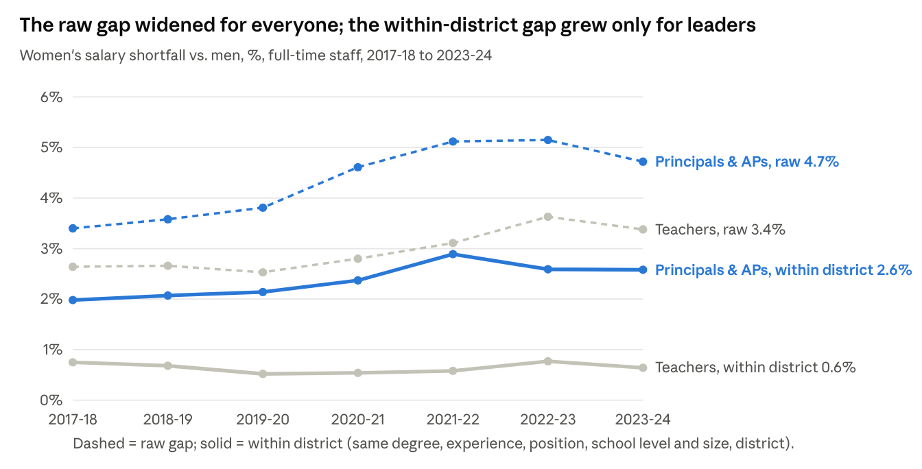
Line chart, 2017-18 to 2023-24: raw gap for principals and APs rose from 3.4% to 4.7%, within-district from 2.0% to 2.6%; teachers raw from 2.6% to 3.4%, within-district flat at 0.5-0.8%.
Source: NJDOE certificated staff files, 2017-18 to 2023-24; log-salary regressions by year.

The trend makes the contrast plain. Raw gaps widened for teachers and leaders alike between 2018 and 2024. For teachers, the gap within the same district held at 0.5–0.8% every year. For principals and assistant principals it grew, from 2.0% to 2.6%.

Representation compounds the problem. Women are 76% of New Jersey’s teachers but 48% of its principals, 37% of its superintendents and 31% of its high school principals, the best-paid principal jobs.

Who works where

Much of the raw gap comes from structure rather than from different pay for the same post. Three patterns stand out.

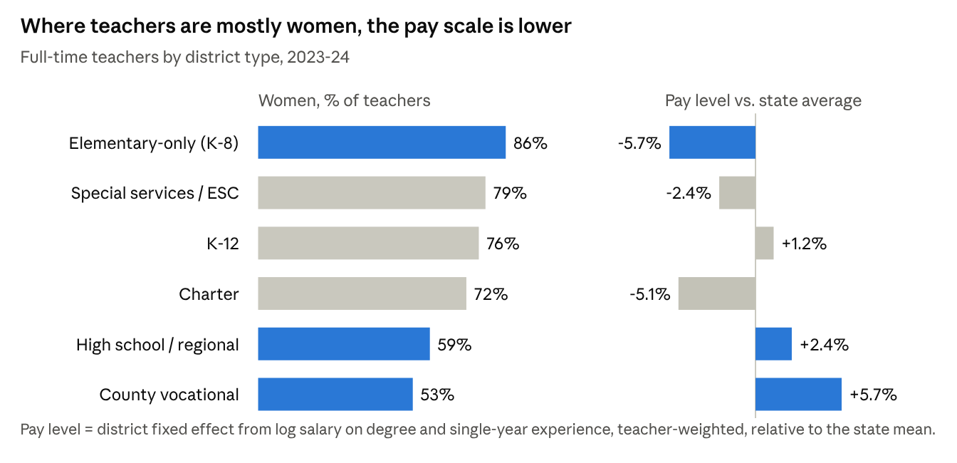
Different districts, different staffs, different guides. New Jersey still runs hundreds of elementary-only (K-8) districts alongside regional high school and county vocational districts. The elementary districts are 86% women and pay about 6% below the state average for the same degree and experience. Regional high school districts (59% women) and county vocational districts (53% women) pay 2–6% above it.

Chart by district type: elementary-only 86% women, pay 5.7% below state average; special services 79%, -2.4%; K-12 76%, +1.2%; charter 72%, -5.1%; high school/regional 59%, +2.4%; county vocational 53%, +5.7%.
Source: NJDOE certificated staff and enrollment files, 2023-24. Pay level = district effect on log salary net of degree and experience.

Men teachers are more likely to work under those higher guides. 8.0% of men teachers work in regional high school districts, against 3.6% of women, and 4.9% of men work in county vocational districts, against 1.7% of women. Nearly one in five women teachers (18.5%) works in an elementary-only district, against one in ten men.

This is not just a difference in job mix. Comparing teachers in the same job code, elementary-only districts still pay 5.1% below average, while regional high school districts pay 0.7% above and vocational districts 2.2% above. District by district the pattern holds: each 10 points more women on a teaching staff goes with a pay scale about 3.5% lower. Which district a teacher works in accounts for about 23% of the raw teacher gap.

Principals don’t look like their staffs. In 2023-24, 48% of principals were women, compared with 80% of the teachers in their own schools. The shortfall is about 30 points at every level: elementary principals are 57% women against 88% of their teachers, and high school principals 30% against 59%. Even in schools where 90% or more of the teachers are women, only 56% of principals were women between 2018 and 2024. If principals mirrored their own schools’ teachers, roughly 620 more women would have been principals in 2023-24. Assistant principals come closer, at 50% women against 70% of their teachers.

Dot chart: women are 48% of principals vs 80% of their teachers overall; elementary 57% vs 88%; middle 37% vs 73%; high school 30% vs 59%, 2023-24.
Source: NJDOE certificated staff files, 2023-24; 1,967 principals matched to schools with 10+ classified full-time teachers.

Men lead the high schools. A quarter of men principals lead high schools, against an eighth of women; 71% of women principals lead elementary schools, against half of men. In regional high school districts, 7 of 50 high school principals are women.

Principals, 2023-24MenWomen
Share leading high schools25%12%
Median salary, elementary$152,230$145,481
Median salary, high school$169,096$148,600

The high school premium goes mostly to men. Men high school principals earn $16,867 more at the median than men elementary principals; for women the difference is $3,120. Women who lead high schools tend to run smaller ones (median enrollment 735 vs. 1,022), and more often in charters and lower-paying districts. Inside the same district, women high school principals earn about 3% less than men, about the same as at other levels.

Putting it together: for teachers, school level, job, school size and district explain about 60% of the raw gap. Experience explains most of the rest, and about a fifth is left unexplained. For principals, school level explains about a fifth and district and school size about a third. Half the principal gap remains unexplained, among people in the same district, at the same level, leading schools of the same size.

The full policy brief, with data and methods, detailed tables, robustness checks and policy recommendations, is available as a PDF:

The Education States that will Lead the Way

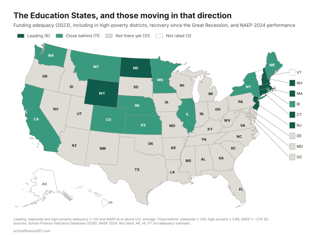
U.S. map classifying states as Leading, Close behind, or Not there yet on school funding adequacy and NAEP performance

In my last post I described the Dependent States of America: the states, mostly red, whose schools lean most heavily on federal aid, in many cases because they have chosen to underinvest in their own children. This post looks at the other end of the spectrum. These are the states that fund their schools adequately, including the schools serving the poorest children, and that perform well. And they include the states that, after letting their school funding collapse in the Great Recession, eventually chose to reinvest.

In an earlier working paper, I called these the Education States. They are states where courts have been willing to uphold and enforce education rights, where legislators and governors have funded those rights whether a court ordered them to or not, and which are now positioned to protect their own students while the federal government retreats. I noted then that the Education States are not exclusively blue or northern. The data bear that out, though not by much.

Measuring an Education State

I use three measures. The first two come from the School Finance Indicators Database (SFID), 2026 release, which covers school years through 2023. Funding adequacy compares what districts actually spend per pupil with what our National Education Cost Model estimates they would need to spend to reach national average test scores, given their students’ needs and regional costs. A ratio of 1.00 means spending is exactly adequate; 0.75 means districts spend three-quarters of what they need. I look at adequacy statewide and in each state’s highest-poverty fifth of districts, because a state can be well funded on average while its poorest districts are left behind. The third measure is performance: each state’s 2024 NAEP scores in grade 4 and grade 8 reading and math, expressed as standard deviations above or below the national public school average.

From these, I sort states into three groups:

  • Leading: adequate funding statewide and in high-poverty districts (both ratios at or above 1.00), with NAEP performance at or above the national average.
  • Close behind: adequate statewide, high-poverty districts at 85% of adequate or better, and NAEP at or above, or within 0.10 standard deviation of, the national average.
  • Not there yet: everyone else.
U.S. map classifying states as Leading, Close behind, or Not there yet on school funding adequacy and NAEP performance

Six states lead: Massachusetts, New Jersey, Connecticut, New Hampshire, Wyoming and North Dakota. Eleven more are close behind, including New York, Maine, Rhode Island, Minnesota, Washington, Colorado, California and Illinois, along with Kansas, Nebraska and Montana. The remaining 31, including nearly the entire South, are not there yet, though several of them are moving in the right direction. (Alaska, Hawaii and Vermont aren’t rated, because the cost model can’t produce reliable estimates for them.)

Funding and performance go together, though not perfectly. Across states, the correlation between statewide adequacy and NAEP performance is about 0.45. Every leading state performs above the national average, with Massachusetts (+0.27 SD) and New Jersey (+0.18) at the top.

The Great Divergence

The Great Recession hit every state’s school budget. What separates the Education States from the rest is what happened next.

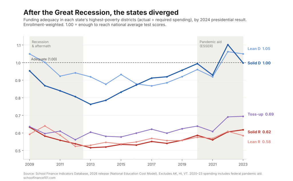
Line chart of funding adequacy in high-poverty districts, 2009 to 2023, by 2024 presidential result: Democratic-leaning states recovered to about 1.0 while Republican-leaning states stayed near 0.6

Nationally, adequacy in high-poverty districts fell from 0.79 in 2009 to 0.66 by 2013. Those districts spent, on average, about two-thirds of what they needed. In the states Harris carried by 10 points or more, high-poverty adequacy dropped from 0.95 to 0.76 at its 2013 low. Then those states climbed back steadily, reaching 0.96 by 2019, before any federal pandemic aid arrived, and about 1.00 by 2023. In the states Trump carried by 10 or more, high-poverty adequacy fell from an already low 0.63 to 0.52, crept back only to 0.56 by 2019, and stood at 0.62 in 2023, still below where it was in 2009.

In other words, the gap between blue and red states’ highest-poverty districts was wide before the recession (about 0.32) and wider after the recovery (about 0.40 in 2019). Both groups cut their effort. In 48 of the 50 states with data, state and local school revenue is a smaller share of personal income today than in 2008; only Illinois and Hawaii are exceptions. But the median solidly Democratic state’s effort fell from 4.3% to 3.8%, while the median Lean R state’s fell from 3.8% to 2.4%, a decline of more than a third.

2024 resultStatesStatewide adequacy, 2023High-poverty adequacy, 2009Post-recession lowHigh-poverty adequacy, 2023Effort, 2008 → 2023NAEP 2024Leading / Close behind
Solid R (R+10 or more)240.820.630.520.624.3% → 3.5%0.002 / 3
Lean R (R+2 to 10)40.770.590.520.583.8% → 2.4%−0.050 / 0
Toss-up (margin under 2)31.130.640.560.694.8% → 4.1%+0.030 / 0
Lean D (D+2 to 10)61.311.050.881.054.5% → 3.6%+0.012 / 2
Solid D (D+10 or more)141.240.950.761.004.3% → 3.8%0.002 / 6
United States511.010.790.660.834.3% → 3.6%0.006 / 11
Adequacy = actual current spending per pupil ÷ spending required to reach national average test scores (SFID National Education Cost Model); 1.00 = exactly adequate. Group values are enrollment-weighted (pooled); high-poverty = each state’s highest-poverty fifth of districts. Post-recession low is the lowest value between 2010 and 2016. Effort = state and local school revenue as a share of personal income, median state. NAEP 2024 = average of grade 4 and 8 reading and math, in national standard deviations from the national public average, simple mean across states. Leading / Close behind = number of states in each group. Adequacy not estimated for Alaska, Hawaii or Vermont. Sources: School Finance Indicators Database (2026 release); NAEP; FEC 2024 certified results.

The pattern by political leaning is stark. In states Harris carried, by any margin, high-poverty districts are funded at or near adequate levels on average. In states Trump carried by any margin, they are funded at about 60% of adequate, and that hasn’t changed in fifteen years. The three toss-up states, Michigan, Pennsylvania and Wisconsin, look like their politics: adequately funded on average but with their poorest districts well short, at 0.69.

Average NAEP performance by group is close to the national average across the board. That is partly because group averages blend high and low performers, and partly because performance depends on much more than funding, including child poverty, which is higher in many red states. It’s not that funding doesn’t matter. The leading states all outperform. But money is a necessary condition, not a sufficient one.

The Education States, by name

StateStatewide adequacyHigh-poverty adequacy: 2009 → low → 2023EffortNAEPRein­vested2024 margin
Leading
Wyoming1.802.10 → 1.78 → 1.933.71%+0.15R+45.8
New Hampshire2.071.45 → 1.31 → 1.543.34%+0.16YesD+2.8
New Jersey1.691.38 → 1.10 → 1.265.16%+0.18D+5.9
Massachusetts1.541.36 → 0.99 → 1.153.23%+0.27D+25.2
North Dakota1.330.90 → 0.71 → 1.123.51%+0.09YesR+36.5
Connecticut1.571.36 → 1.13 → 1.074.07%+0.11D+14.5
Close behind
New York1.461.22 → 1.00 → 1.095.02%−0.03D+12.6
Maine1.561.11 → 0.93 → 1.093.73%−0.07D+6.9
Washington1.350.74 → 0.66 → 0.963.38%+0.04YesD+18.2
Rhode Island1.321.04 → 0.82 → 0.943.82%0.00D+13.8
Colorado1.160.73 → 0.56 → 0.923.04%+0.14YesD+11.0
Minnesota1.180.78 → 0.74 → 0.923.47%+0.10D+4.2
Kansas1.140.99 → 0.76 → 0.914.16%0.00R+16.1
Montana1.070.75 → 0.71 → 0.912.76%+0.09YesR+19.9
Nebraska1.130.92 → 0.87 → 0.893.69%+0.03R+20.5
California1.090.59 → 0.46 → 0.894.03%−0.08YesD+20.1
Illinois1.140.69 → 0.66 → 0.874.68%+0.05YesD+10.9
Adequacy and effort are for 2023; NAEP is 2024, in standard deviations from the national public average. Leading: statewide and high-poverty adequacy both at or above 1.00, and NAEP at or above the national average. Close behind: statewide adequacy at or above 1.00, high-poverty adequacy at least 0.85, and NAEP within 0.10 SD of the national average or above it. Reinvested: high-poverty adequacy gained at least 0.15 from its 2010–2016 low, had already gained at least 0.08 by 2019 (before pandemic aid), and by 2023 exceeded its 2009 level. Row shading shows 2024 presidential leaning: solid red/blue = margin of 10+ points; pale red/blue = 2 to 10 points. Sources: School Finance Indicators Database (2026 release); NAEP 2024; FEC 2024 certified results.
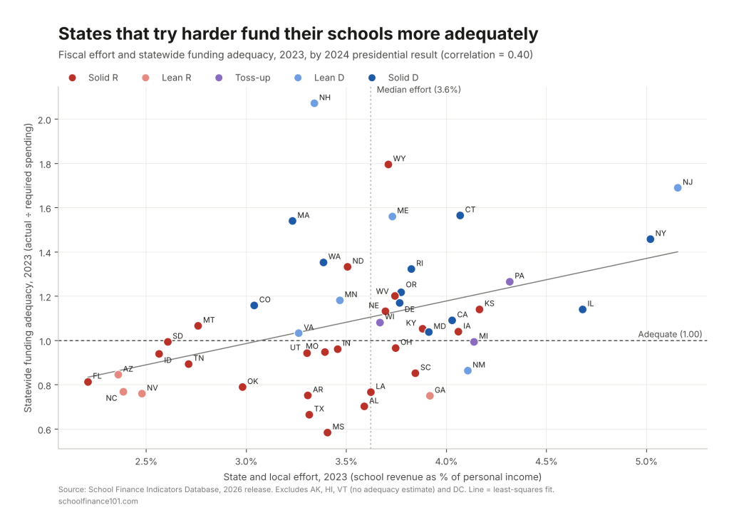
Scatterplot of state and local school funding effort against statewide funding adequacy in 2023, with states colored by 2024 presidential result; low-effort, low-adequacy states are mostly Republican-leaning

Effort explains a good share of the difference. Across the 47 states with estimates (excluding DC), state and local effort and statewide adequacy are correlated at about 0.40. Of the 23 states putting in less than the median effort (3.6% of personal income), 17 voted for Trump, and only 8 fund their schools adequately statewide. Of the 24 at or above the median, 18 do. Twenty-one states fall below adequacy statewide, and 19 of them voted for Trump. The exceptions run in both directions. New Hampshire, Massachusetts, Washington and Colorado reach adequacy with below-median effort because they are wealthy. Georgia, South Carolina and New Mexico put in above-median effort and still fall short, because their capacity is lower and their needs are higher. But the lower-left corner of the chart, low effort and inadequate funding, belongs almost entirely to Republican-leaning states: Florida, Arizona, North Carolina, Nevada, Idaho, Tennessee and Oklahoma.

Of the 17 leading and close-behind states, 12 voted for Harris and five for Trump. The red Education States fall into two types. Wyoming and North Dakota are small, energy-rich states that can fund adequate schools without exceptional effort. Wyoming’s effort has actually fallen from 5.8% of personal income in 2008 to 3.7%, but its funding is built on decades of court-enforced adequacy under the Campbell County decisions. Kansas, Nebraska and Montana are more traditional Plains states with long-standing commitments to their public schools. Kansas, in particular, was pulled back by its courts. After deep cuts under Governor Brownback, the Gannon litigation forced a multi-year reinvestment that the Kansas Supreme Court finally approved in 2019. Its high-poverty adequacy, stuck at 0.75 as late as 2019, reached 0.91 by 2023.

Nor is being blue enough. Maryland (high-poverty adequacy 0.71), Virginia (0.68), New Mexico (0.67) and Delaware (0.98, but with NAEP well below average) are all “not there yet.” And several of the leading states have slipped. Connecticut’s high-poverty districts went from 1.36 in 2009 to 1.07, and New Jersey’s from 1.38 to 1.26. Both are still adequate, but the margin is narrower than it was.

The states that eventually reinvested

The most hopeful part of the story is the states that hit bottom after the recession and then chose to rebuild, mostly through new funding formulas, often prompted by litigation, and mostly well before federal pandemic aid arrived.

  • California adopted the Local Control Funding Formula in 2013, directing additional funding to low-income students and English learners. High-poverty adequacy rose from 0.46 in 2012 to 0.74 by 2019 and 0.89 by 2023, the largest gain of any state.
  • Washington, under the state supreme court’s 2012 McCleary decision, overhauled its funding in 2017 and 2018. High-poverty adequacy rose from 0.66 to 0.96.
  • Illinois replaced one of the nation’s most regressive systems with its Evidence-Based Funding formula in 2017, and is one of only two states whose effort is higher now than in 2008. High-poverty adequacy rose from 0.66 to 0.87.
  • Oregon passed the Student Success Act in 2019. High-poverty adequacy rose from 0.63 to 0.99 by 2019 and stood at 0.94 in 2023.
  • Colorado rose from 0.56 to 0.92 even before eliminating its “budget stabilization factor” in 2024. That change isn’t yet in these data.
  • Massachusetts and New Jersey, both already adequate, recommitted through the Student Opportunity Act (2019) and New Jersey’s 2018 school funding reform (S2), respectively, reversing post-recession erosion.

A second wave of reinvestment is too recent to show fully in data that end in 2023. Kansas is one example. Maryland’s Blueprint for Maryland’s Future, enacted in 2021, has moved high-poverty adequacy from 0.53 in 2019 to 0.71. New Mexico, responding to the 2018 Yazzie/Martinez ruling, has moved from 0.48 to 0.67. Michigan’s 2023 budgets began to fund its new Opportunity Index. Pennsylvania’s Commonwealth Court declared the state’s system unconstitutional in 2023, and the legislature has begun adding adequacy funding. Whether these states become Education States depends on whether they sustain the effort.

Not every state that recovered deserves the credit. Arizona, Tennessee, South Dakota and Missouri also improved high-poverty adequacy from their post-recession lows, but their effort kept falling. Arizona’s dropped from 3.7% of personal income in 2008 to 2.4%, and Tennessee’s from 3.4% to 2.7%. Their gains came from economic growth, not renewed commitment, and several are now expanding universal vouchers that will pull money away from the public districts these figures describe. Utah is the more convincing case: its high-poverty districts are now at 0.94 of adequate and its students outperform the national average by 0.15 SD.

Then there are the states that never came back. Florida’s high-poverty adequacy is lower now (0.70) than in 2009 (0.76), and its effort has fallen from 3.8% to 2.2%, the lowest in the country. North Carolina (0.61 to 0.55; effort 3.6% to 2.4%) and Texas (0.56 to 0.52) followed the same path. Iowa, whose high-poverty districts were adequately funded in 2009 (1.01), has slid to 0.82.

Leading the way

The Great Recession was a natural experiment in political will. Every state took a hit. Some states rebuilt, usually because courts insisted or because legislatures and governors decided their poorest children deserved better. Others took the opportunity to cut taxes and never looked back. Fifteen years later, the result is two countries: one where children in high-poverty districts attend schools funded at roughly the level needed to reach national average outcomes, and one where they attend schools funded at about 60% of that level.

The Education States now carry a double burden. In the short term, they must protect their own students from a federal administration that is withholding funds, dismantling the Department of Education and targeting equity itself. That means backfilling lost federal aid, building their own data capacity as NCES and IES are hollowed out, setting aside reserves (as I’ve proposed, through federally tax-exempt education endowments), and closing the door to publicly funded religious and discriminatory schooling by tightening charter oversight before the courts force it open.

In the longer term, they are the model for Project 2029. The states that reinvested after the recession show that the decline is a choice and can be reversed. They also show what reversing it takes: a cost-based formula, a commitment of state revenue, and in most cases a court willing to hold the state to its constitution. A federal foundation aid formula of the kind we’ve proposed would ask every state to do what California, Washington, Illinois and Kansas did, with federal help for states whose capacity genuinely falls short. The Education States have already shown the rest of the country the way. The question is whether the rest of the country will follow.


Data notes

  • Adequacy, effort and spending figures are from the School Finance Indicators Database, State Indicators Database, 2026 release (school years through 2023). Adequacy is actual current spending per pupil divided by required spending per pupil, estimated by the SFID National Education Cost Model to reach national average test scores. The model doesn’t produce estimates for Alaska, Hawaii, or Vermont after 2016, and SFID advises caution in interpreting New York’s estimates.
  • 2020 to 2023 spending includes some federal pandemic relief (ESSER) funds, which raise adequacy in absolute terms in those years. For that reason, the reinvestment test requires that recovery was already under way by 2019. Effort is a strictly state and local measure and is unaffected.
  • Group adequacy figures are enrollment-weighted, pooling all states in each group. Effort and NAEP group figures are median and simple mean across states, respectively. Effort is state and local school revenue as a share of aggregate personal income.
  • NAEP performance is the average of 2024 grade 4 and grade 8 reading and math scale scores, each expressed as the difference from the national public school average divided by the national standard deviation (NAEP Data Service).
  • Political leaning is based on the statewide popular-vote margin in the 2024 presidential election (FEC certified results). Solid = 10 points or more; Lean = 2 to 10 points; Toss-up = under 2 points.
  • Baker, B. D., Di Carlo, M., & Weber, M. (2026). The Adequacy and Fairness of State School Finance Systems (8th ed.). Albert Shanker Institute, University of Miami and Rutgers Graduate School of Education.

Abbott Elementary Is Entertaining. The Damage Is Real.

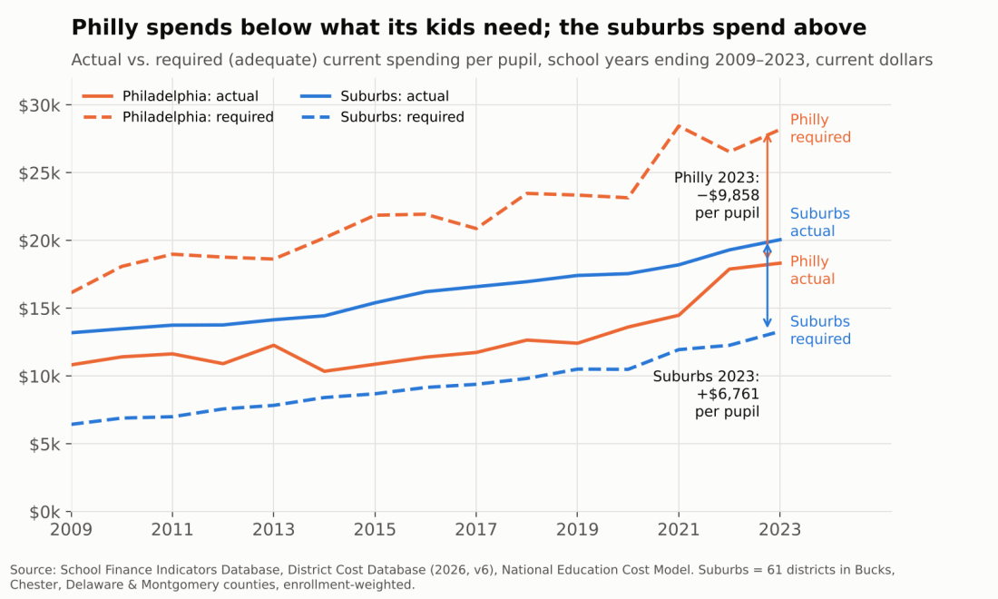
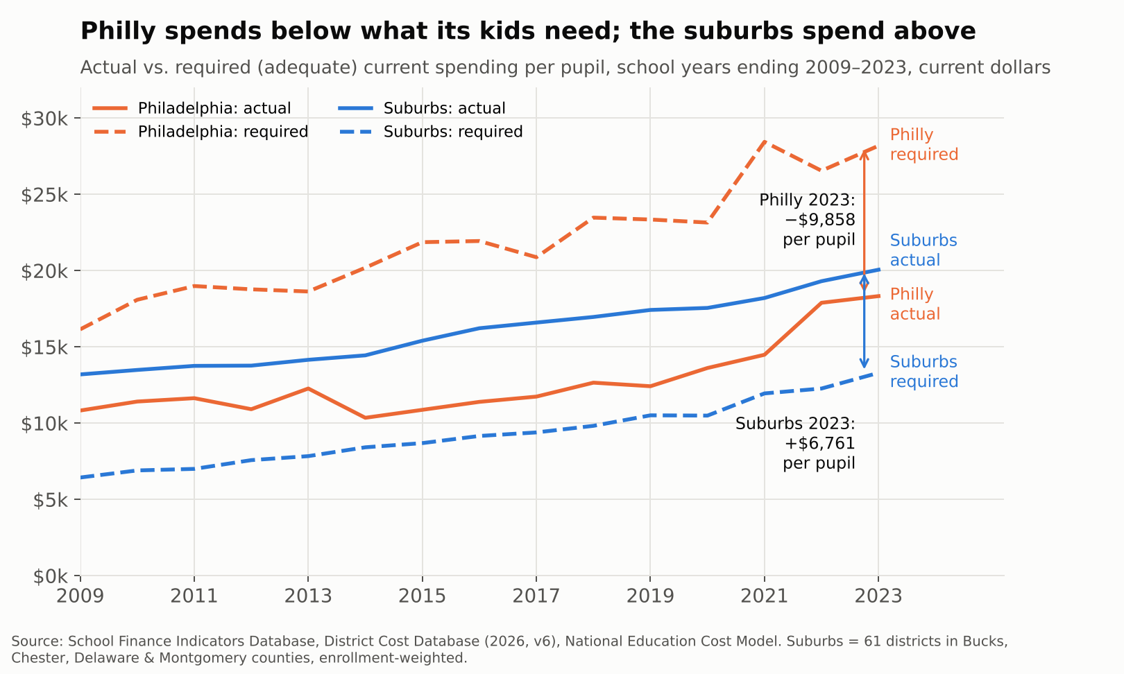
Actual vs. required spending per pupil, Philadelphia and suburbs, 2009–2023

Abbott Elementary plays it for laughs. Janine Teagues hunts for a working rug, a functioning copier, a single extra aide. Barbara Howard has seen every reform come and go. Gregory Eddie inherits a classroom with no curriculum. Melissa Schemmenti knows a guy who can get the supplies the district can’t.

The show is entertaining. The damage is real. Behind every running gag is a funding gap that has been measurable, year after year, for at least fifteen years, and that has landed on real children in real Philadelphia classrooms.

Philadelphia’s district schools have spent between a third and a half less than what it would cost to get their students to national-average outcomes in every year from 2009 to 2023. Over the same years, the 61 suburban districts in Bucks, Chester, Delaware and Montgomery counties spent between half again and twice what their own students needed. We laugh at the broken boilers, missing counselors and teachers buying their own supplies. The kids living it don’t get a laugh track.

What follows walks from the money to the classroom: first the adequacy gap, then the simple “screwed city” picture, then teachers per child, teacher pay, and finally who is actually standing in front of the kids.

Fifteen years below the line

In 2022-23, the School District of Philadelphia spent $18,329 per pupil. Our National Education Cost Model estimates it would have needed $28,187 to give its students a shot at national-average test scores. That is a gap of $9,858 per child, or roughly $1.2 billion across 118,000 students, in a single year.

The suburbs face the mirror image. Their enrollment-weighted average spending was $20,059 against a required $13,298, a surplus of $6,761 per child. Same metro, same labor market, same state constitution.

Actual vs. required spending per pupil, Philadelphia and suburbs, 2009–2023

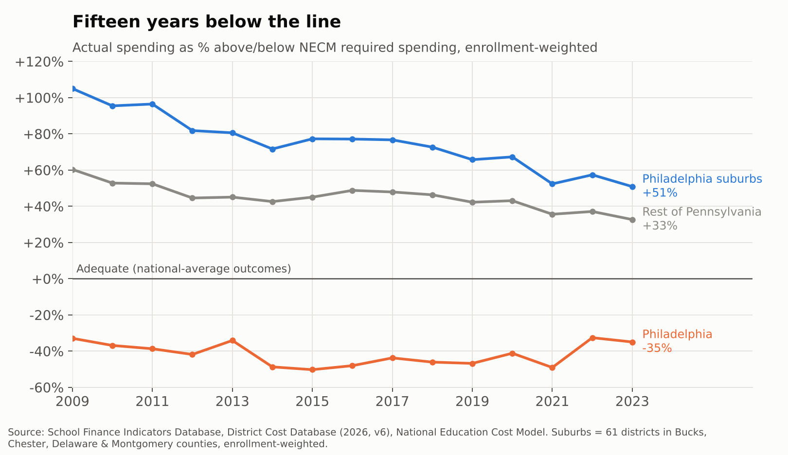
This is not a recent dip. Philadelphia sat 33% below its adequacy target in 2009, sank to 50% below in 2015 in the wake of the “doomsday” budgets, and was still 35% short in 2023, even with federal pandemic aid in the mix. The suburbs started out spending more than double their target and have drifted down to about 51% above it. The rest of Pennsylvania sits in between, about a third above.

Percent above or below adequacy, Philadelphia, suburbs, and rest of Pennsylvania

The outcome side tells the same story. Philadelphia’s students scored roughly 0.8 standard deviations below the national average in 2022-23, while suburban students scored about 0.2 above. Abbott’s students are not falling short because nobody cares. They are falling short where the money falls short.

The simple version: a “screwed city”

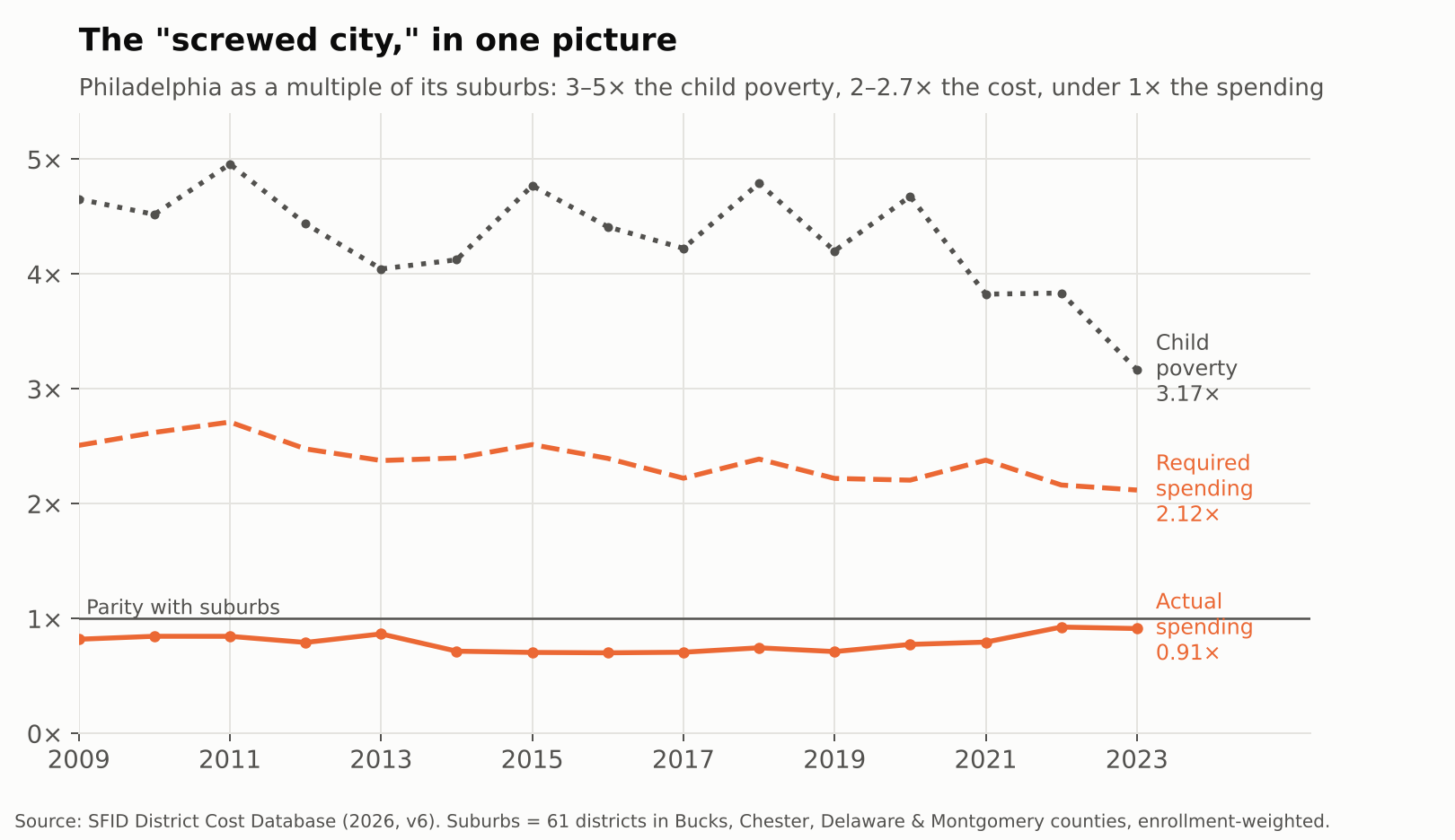
You don’t need a cost model to see the problem. Divide Philadelphia by its suburbs. In 2022-23, the city had 3.2 times the suburban child poverty rate. Under the NECM, that translates into 2.1 times the cost of reaching national-average outcomes. And the city spent 0.91 times what the suburbs spent.

Philadelphia as a multiple of its suburbs: poverty, required spending, actual spending

That pattern has held every year since 2009. Philly’s poverty rate has run 3 to 5 times the suburban rate, its costs 2 to 2.7 times, and its spending has never once caught up to the suburbs, let alone exceeded them.

That is what it means to be a screwed city. Not just underfunded relative to need, but outspent outright by the comfortable districts a short SEPTA ride away.

Even in Pennsylvania, Philadelphia is not alone

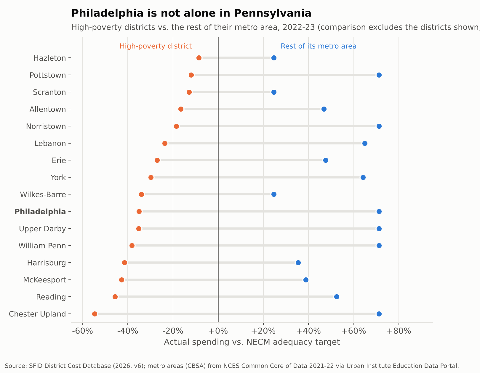
Philadelphia is the biggest case, not the only one. Reading spent 46% below its adequacy target in 2022-23, while the rest of the Reading metro spent 53% above. Allentown was 17% short while its Lehigh Valley neighbors were 47% over. Harrisburg, York, Lebanon, Erie, Wilkes-Barre and Chester Upland tell the same story.

High-poverty Pennsylvania districts vs. the rest of their metro areas, percent above or below adequacy

The pattern reaches into Philly’s own suburbs. Chester Upland, Upper Darby, William Penn, Norristown and Pottstown are all below adequacy, surrounded by districts in the same four counties that spend about 71% above theirs.

Across the state, 56 of 497 districts spent below their adequacy targets in 2022-23. They enroll 23% of Pennsylvania’s students, but 67% of its Black students and 49% of its Hispanic students, compared to 8% of its white students. Philadelphia accounts for about a third of the students in those districts. Fixing Philly alone would not fix Pennsylvania.

This is the system the Commonwealth Court found unconstitutional in William Penn School District v. Pennsylvania Department of Education in February 2023. The state has since begun phasing in adequacy aid, including $565 million statewide in the 2025-26 budget (WHYY). The gaps above are what that aid is chasing.

From dollars to classrooms: fewer adults per child

School money is mostly people. When a district is short a third of what it needs, the shortfall shows up as fewer teachers, larger classes and missing specialists.

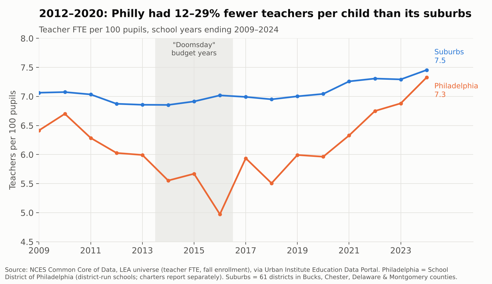
Philadelphia reported 11,103 teachers in 2009-10. By 2013-14 it had 7,645, a 31% cut, while enrollment fell only 17%. From 2012 through 2020, the district ran between 12% and 29% fewer teachers per 100 pupils than its suburbs. That is Gregory Eddie’s world: a full roster of kids, and not enough colleagues to share them with.

Teachers per 100 pupils, Philadelphia vs. suburbs, 2009–2024

The gap has nearly closed since 2021, to 7.3 teachers per 100 pupils in Philadelphia vs. 7.5 in the suburbs in 2023-24, helped by federal pandemic aid and new state money. But parity is not adequacy. A district whose students cost twice as much to serve, by the NECM’s estimate, does not get there with the same staffing ratio as Lower Merion.

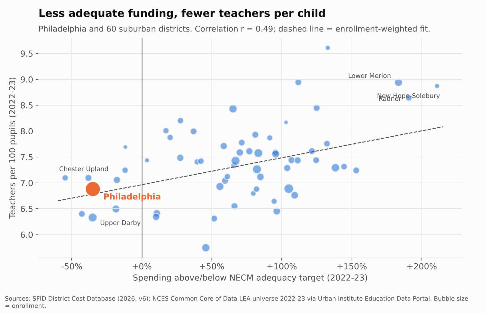
Across Philadelphia and its suburbs, adequacy and staffing move together. Districts further above their adequacy targets employ more teachers per child (r = 0.49 in 2022-23). The fitted line implies that if Philadelphia were funded like the average suburb, it would have roughly 0.45 more teachers per 100 pupils, or about 500 more teachers, before accounting for its higher needs at all.

Adequacy vs. teachers per 100 pupils, Philadelphia and suburban districts, 2022-23

Teacher pay: same labor market, different paychecks

Philadelphia and its suburbs hire from the same pool of teachers, often the same graduating classes. So pay comparisons here need no regional cost adjustment. They are apples to apples.

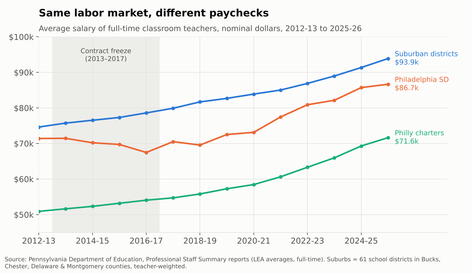
In 2012-13, the average full-time Philadelphia district teacher earned $71,407, about 96% of the suburban average. Then came four years without a contract. By 2016-17, Philly’s average had actually fallen to $67,479 while the suburbs rose to $78,598, a gap of more than $11,000. The district has climbed back since, to $86,664 in 2025-26, but that is still about $7,200 behind the suburbs. Teachers in the city’s charter schools averaged $71,644, roughly three quarters of the suburban figure.

Average teacher salary, Philadelphia SD, Philadelphia charters, and suburbs, 2012-13 to 2025-26

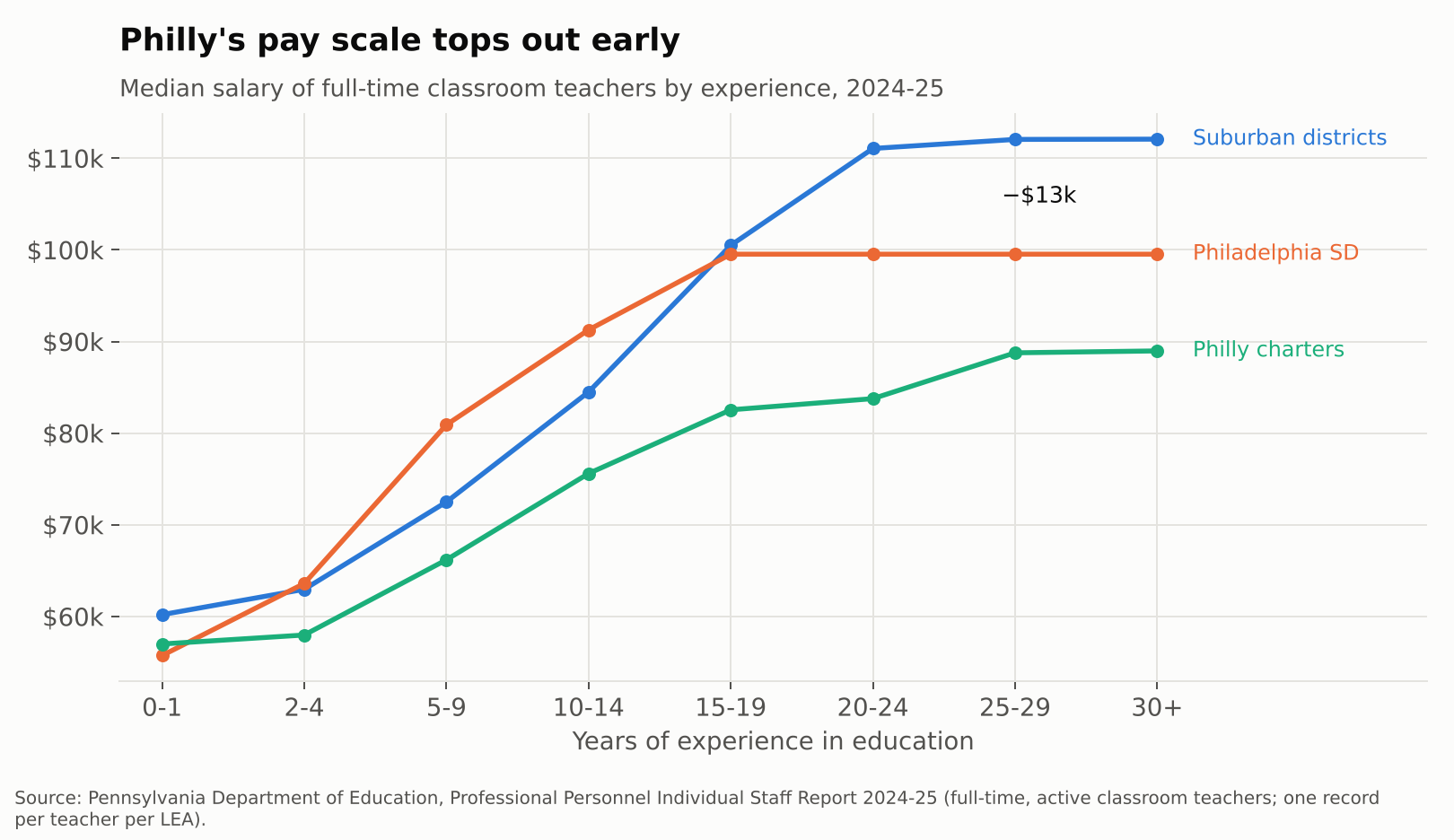
The averages hide where the gap bites. Philadelphia’s current salary scale is competitive in the middle years. Teachers with 5 to 14 years of experience actually earn more than their suburban peers. But the scale flattens at $99,534 after about 15 years. Suburban veterans keep climbing, to a median of about $112,000. A 25-year Philly veteran makes roughly $12,500 less than one in the suburbs.

Median teacher salary by years of experience, 2024-25

That matters for who stays. Philadelphia district teachers average 13.7 years of experience, vs. 15.6 in the suburbs. Charter teachers average 8.9. Every school needs its Barbara Howards. An underfunded system has the hardest time keeping them.

Inside the building: who is actually in front of the kids

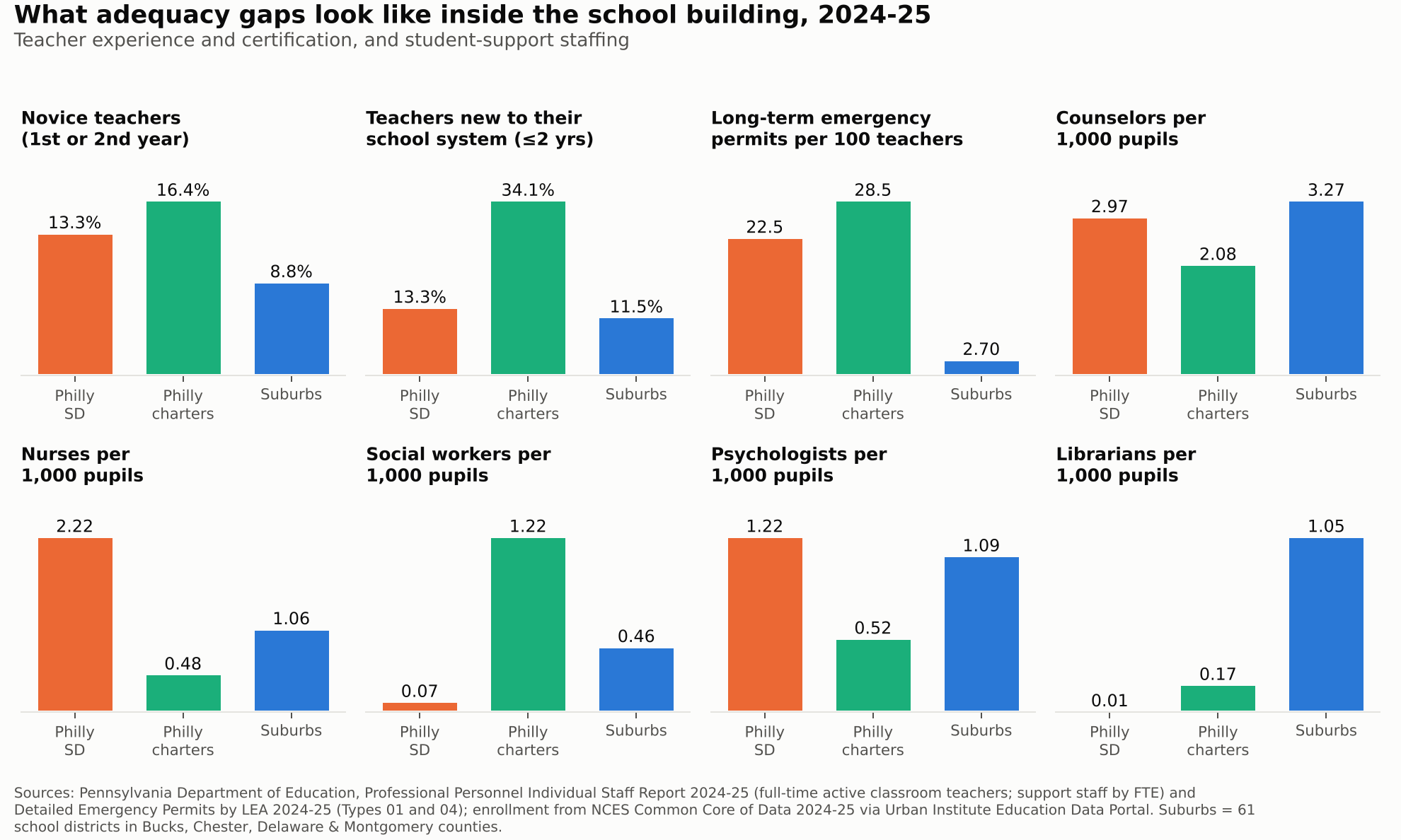
Pennsylvania’s own staff records let us look at who is actually in the classroom, through 2024-25. Janine is not the exception at Abbott. In 2024-25, 13.3% of district teachers were in their first or second year in education, vs. 8.8% in the suburbs. In the city’s charters it was 16.4%, and more than a third of charter teachers had been with their school system for two years or less.

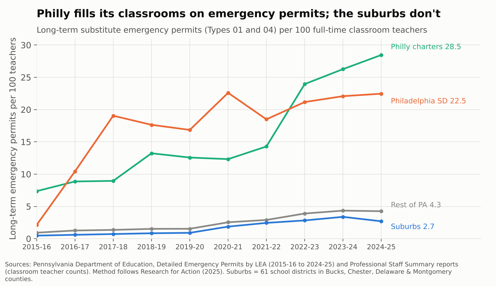
The starkest gap is certification. Pennsylvania lets districts fill vacancies with long-term substitutes on emergency permits when they can’t hire a certified teacher. In 2024-25 the School District of Philadelphia held 22.5 of those permits for every 100 classroom teachers. Philly charters held 28.5. The suburbs held 2.7, and the rest of the state 4.3. Philadelphia’s rate jumped from about 2 to 19 per 100 between 2015-16 and 2017-18, during and right after the contract freeze, and has never come back down.

Long-term emergency permits per 100 classroom teachers, 2015-16 to 2024-25

Support staff tell a more complicated story. After the 2013 layoffs left many schools without counselors or nurses, the district rebuilt. In 2024-25 it reported more nurses and psychologists per 1,000 pupils than the suburbs, and nearly as many counselors (3.0 vs. 3.3). That is what recent money bought. But it is rough parity for students with three times the poverty, and some positions never came back. The district reported 9 social worker FTE and 1 librarian for about 120,000 students. The suburbs had about 148 social workers and 342 librarians for 325,000.

Novice teachers, emergency permits, and support staffing, 2024-25: Philadelphia district, Philadelphia charters, suburbs

Teachers are also absent more. In the most recent federal data with that measure, 2017-18, 46% of district teachers missed 10 or more days, vs. 38% in the suburbs.

The show is entertaining. The damage is real.

Abbott Elementary works because its teachers are heroic and funny and stubborn. Real Philadelphia teachers are too. But heroism is not a funding formula. Year after year, the data show the same chain: Pennsylvania’s system leaves Philadelphia, Reading, Allentown, Harrisburg and their peers far below what their students need. That shortfall becomes fewer teachers per child, a pay scale that stops rewarding veterans, more novices and uncertified teachers, and libraries with no librarians.

The Commonwealth Court said in 2023 that this system violates the state constitution. The new adequacy aid is a start, and the recent staffing gains show money does show up in classrooms when it arrives. But a district still roughly $10,000 per child short of adequacy in 2022-23 will not close that gap with a few hundred million dollars spread across the state.

Janine shouldn’t have to fix the copier herself. And the kids in her class shouldn’t have to be in a sitcom for anyone to notice.

Data notes and sources

  • Adequacy: School Finance Indicators Database, District Cost Database 2026 (v6), National Education Cost Model estimates of required spending to reach national-average outcomes. Spending is current spending per pupil, direct to elementary and secondary education, in current dollars. Years are school years (2023 = 2022-23).
  • Suburbs: the 61 regular school districts in Bucks, Chester, Delaware and Montgomery counties, enrollment-weighted unless noted. Metro comparisons for other Pennsylvania cities use Census CBSAs from the NCES Common Core of Data.
  • Staffing: teachers per pupil from the NCES Common Core of Data LEA universe; teacher absences from the Civil Rights Data Collection; both via the Urban Institute Education Data Portal. Philadelphia SD figures cover district-run schools; charters report separately.
  • Classroom staffing and certification: Pennsylvania Department of Education Professional Personnel Individual Staff Report 2024-25 (teacher experience; counselors, psychologists, nurses, social workers and librarians by FTE) and Detailed Emergency Permits by LEA, 2015-16 to 2024-25. Permit-rate method from Research for Action (2025).
  • Teacher pay: Pennsylvania Department of Education, Professional Staff Summary and Professional Personnel Individual Staff reports, full-time classroom teachers.
  • Caveats: NECM estimates are model-based and benchmarked to grade 3–8 math and reading outcomes. Emergency permit rates count long-term substitute permits (Types 01 and 04) per full-time classroom teacher, following Research for Action (2025); a permit is not an FTE, so read them as rates of reliance, not exact shares of classrooms. Teacher absences come from the 2017-18 Civil Rights Data Collection, the latest year with that item.
  • Related: Rachel Wessler’s earlier Shanker Institute reflection on the show, Heartwarming or Heartbreaking; state budget coverage from WHYY.

Transcript of Video Critiquing Edunomics Graphs

“Make it stop! Please!” — Video debunking of Edunomics intentionally deceitful school funding/outcome graphs

Source: School Finance 101 (Bruce Baker), published June 16, 2026

schoolfinance101.com — Make it stop! Please!

Transcribed from the post’s auto-generated captions (video runtime ≈ 20 minutes) and lightly cleaned up for readability; screenshots below are frames pulled from the same video at the points the graphs are shown on screen. A few short passages were unintelligible in the source captions and are marked accordingly.

Greetings, folks. Let’s talk. I need to vent a little bit, because after all these years, the same BS continues to roll out, continues to emerge in the school finance conversation — something I’ve been writing and talking about for years.

I put this report out last year, this new version of Does Money Matter in Education? — summarizing a whole bunch of rigorous, peer-reviewed studies applying different approaches and using different data that show us how and why money matters for improving student outcomes.

I talked about this years ago — for a decade, really. This is actually a little less than a decade old, in this book and in other sources on my blog going back more than a decade: basically the dumbest, most facile, simple-minded, intentionally deceitful versions of arguments that try to say, well, money doesn’t really matter. You can do great — you can be awesome with very little money — and you can suck with lots of money. Money’s gone up and test scores have gone down. There are really about four or five different versions of this argument that have been thrown out over the years, but there are two common ones — pretending to be empirical analyses — that are repeatedly used, and that I’ve repeatedly debunked, that just continue to find their way back.

At this point, anyone who’s putting these kinds of graphs out there is doing so knowingly and intentionally to deceive policymakers, courts, judges — whatever. Most of this stuff doesn’t make its way these days into judicial debates over school funding, but I had to face this again over a year ago, and then I’ve seen these graphs re-emerging for every state continuously over the past year — and even again recently on Twitter/Bluesky, where one of my colleagues, thankfully, also took a shot at just how stupid and intentionally deceitful these graphs are.

So let’s jump into it. If you’re a policymaker in a state — or if you know one, or if you’re on a commission in a state and people have been invited in and are putting this stuff in front of you — stop it right there. Kick them out of the room. This is not credible. It shouldn’t be part of the discussion. Just look at the graph.

Graph #1: The “long-term trend” graph

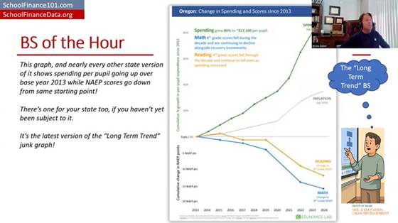
Here’s one of the graphs — this is the new version of what I call the long-term trend graph. The Edunomics Lab at Georgetown University — I’ll call them out by name — and Marguerite Roza have put out data visualization tools that let you make this graph for every state, and then the next graph I’ll talk about.

Let’s take a look at this. First of all — and I’ll explain why this is part of the intentional deceit — they picked 2013 as the starting year. Second, you get two totally different kinds of measures put on a common y-axis, a common vertical axis, with different units for the test scores than for the spending, and both of them stretched out to make it look like these trends are wildly diverging.

Edunomics-style “long-term trend” graph for Oregon: spending, NAEP math/reading, and inflation all plotted on a common stretched axis since 2013 (“BS of the Hour” slide).

And even the construction of the measures is a problem. We’ve got per-pupil spending, not even adjusted for inflation, and then a separate line for some inflation adjustment — maybe a Consumer Price Index — which isn’t even the right adjustment to use for per-pupil spending. I’ll show you what it looks like adjusted correctly in a few minutes.

They’ve got per-pupil spending skyrocketing. I’m using Oregon here because it’s the last place I was faced with having to waste an exorbitant amount of time debunking this garbage. So we’ve got per-pupil spending — not adjusted for inflation, just nominal per-pupil spending — seemingly skyrocketing, which you can do by stretching out the y-axis. And we’ve got NAEP (National Assessment of Educational Progress) test scores taking a dive from 2013 forward to 2024. Then there’s a separate, gratuitous inflation measure thrown in on yet another scale. My head explodes just looking at this. And most people who’ve encountered this graph and have any knowledge of how to do actual research and empirical analysis, and how to measure a school dollar — their heads have exploded too.

Why 2013 is the tell

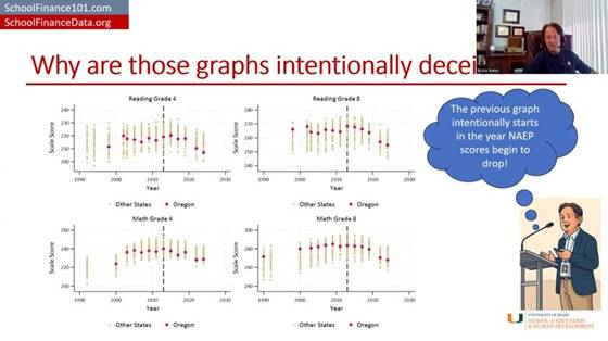
Let’s talk about 2013 for a second. First, 2013 is well understood to be the point at which NAEP scores level off and/or start to decline. They go up for all the years before that, and then they hit a plateau and start to decline. So picking 2013 is intentionally picking the point at which, in almost any state, you can show test scores leveling off or going down while money is going up or staying the same — which, of course, looks bad. It implies money couldn’t possibly relate to test scores. Better research says otherwise, even for this period.

NAEP Grade 4 Reading and Grade 8 Math scores over time for all states, with Oregon highlighted — scores plateau/decline for nearly every state starting around 2013.

Here’s NAEP scores over time for all states, with Oregon highlighted — and, like the others, it just drifts downward from that point, more or less within the pattern of other states (a bit more so for the fourth-grade scores). But picking 2013 was intentionally picking the year at which NAEP scores level off or turn downward.

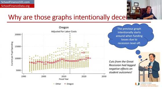
On the spending side: per-pupil spending for public school districts took a real hit starting around 2008–09. 2008 was about the best year for public school expenditures. From about 2008–09 to about 2011–12 is when spending really took a hit. It had drifted upward through 2008, then dips, and hits its bottom — leveling off and maybe starting to creep back upward a little around 2013.

Oregon per-pupil spending by fiscal year, adjusted for labor costs, compared to other states — spending bottoms out around 2013 after the Great Recession before drifting back up.

So if you pick 2013 as your starting point, what you’re actually picking is the year when the cuts to funding had hit bottom and test scores had hit their peak. Track it forward from there for almost any state, and you’ll get this apparent divergence — especially once you consider that spending should really be adjusted for the cost of recruiting and retaining a comparable-quality teacher workforce, given that private-sector and other wages have been rising faster than wages for teachers and public school employees. Adjusted that way, spending clearly does not skyrocket the way it does in their graph. Again, 2013 is right where spending per pupil bottoms out and levels off (maybe starts to climb a little) — stretch the axis and don’t adjust for anything, and you can make it look like it’s climbing a lot.

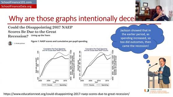
Interesting side note: there’s a really good empirical study by Jackson and coauthors (published via EducationNext) that shows the detrimental effects of recessionary cuts on student outcomes during that exact same period.

“Could the Disappointing 2017 NAEP Scores Be Due to the Great Recession?” (EducationNext) — Figure 1: NAEP scores and cumulative per-pupil spending, zoomed in on 2000–2015.

Zooming in on just the 2000–2015 period the way this study does, test scores actually rose when spending rose, leveled off when spending leveled off, and dipped when spending dipped — the opposite pattern from what’s implied by stretching the axes the way Edunomics does. That study’s authors go on to run solid, causal empirical analyses of this relationship — including, later, a study with more than 30 causal estimates of the returns to a $1,000 increase in public school expenditure, which I summarize along with a ton of other studies in my report.

And yet the graph still persists. It’s still thrown at us in the most absurd ways.

A properly adjusted version

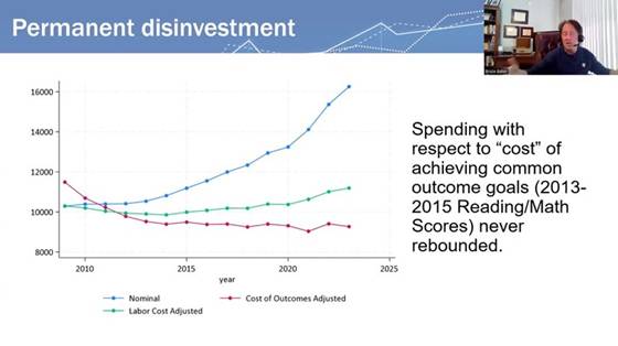
Here’s another version of the graph — the blue line is roughly their version of per-pupil expenditures, though not as exaggerated as showing it as a percent change since 2013 on a stretched y-axis. Just unadjusted per-pupil spending: it went up. Adjusted for changes in labor costs, per-pupil spending is only ever so slightly higher in 2024 than it was in 2009 — that’s adjusting for what it costs to recruit and retain teachers of comparable qualifications.

Now, if we adjust for all of the other cost changes — the student populations to be served, and everything else that goes into achieving a common set of outcomes, using our National Education Cost Model at schoolfinancedata.org — spending actually declined precipitously during and in the years immediately following the fiscal-austerity period after the Great Recession, then levels off, and may even continue drifting down slightly relative to what the dollar was worth toward achieving 2009-level outcomes.

“Permanent disinvestment” — spending with respect to the cost of achieving common outcome goals (nominal vs. labor-cost-adjusted vs. fully cost-of-outcomes-adjusted); the cost-adjusted line never rebounds after the Great Recession.

That’s what fully cost-adjusted spending looks like over time, in many if not most states.

Graph #2: The cross-sectional “spending vs. proficiency” scatterplot

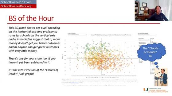
Now for graph number two — another mind-bogglingly, intentionally deceitful graph. The idea: take a whole bunch of schools across a state, regardless of differences in cost from one place to another or the students being served — schools of different grade levels and everything — and plot their per-pupil spending on the horizontal axis and their percent proficiency on state tests on the vertical axis.

The “Clouds of Doubt” graph: Oregon FY22–23 per-pupil expenditure vs. SY23–24 all-grades combined proficiency, with no cost adjustment — no visible relationship between spending and outcomes.

That lets you show that some schools do awesome with very little money, and some schools do crappy with a whole lot of money — so clearly, money doesn’t matter. That low-spending, high-scoring school just needs everyone else to learn from its awesomeness, and everyone can be awesome with whatever they have. Inequity doesn’t matter, adequacy is irrelevant — just get the better outcome, and if you don’t, it’s because you suck.

The layers of problems with this graph are mind-boggling. The main issue is the complete failure to adjust for the value of the school dollar toward achieving these outcomes from one place to the next — to look at the dollar adjusted for its value, or for whether it’s sufficient to achieve a given target given those outcomes.

What it looks like adjusted for cost

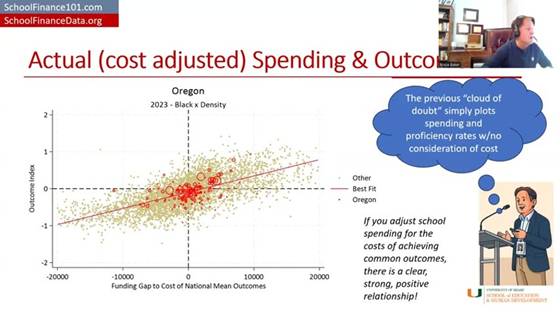
I can give a couple of examples of what happens when you do that adjustment. First, I put Oregon in the context of the nation for 2023. If you look at that unadjusted, the overall pattern looks downward — the more money you have, the worse you do, as if you just don’t know how to use it well, and need to be squeezed harder to perform like the districts in the upper-left corner.

But if instead you responsibly use methods that have been in the peer-reviewed literature going back to about 1971 — and extensively since about 1998–99, in the “modern era” starting with a piece by Downes and Pogue in the early 1990s — and look at each district’s spending relative to what it would cost that district to achieve national-average outcomes, and then look at their actual outcomes relative to the national average, districts that spend more (relative to their cost of achieving average outcomes) achieve more, on average.

“Actual (cost adjusted) Spending & Outcomes” — Oregon districts (red) against the national distribution (gray): funding gap to the cost of national mean outcomes vs. outcome index. A clear, strong, positive relationship.

Districts on the right-hand side of this picture are ones spending more than they’d need to achieve national-average outcomes, and the districts in the upper-right quadrant are mostly achieving above-average outcomes. Districts in the lower left have less funding than needed to achieve national-average outcomes — and guess what, they’re achieving below-average outcomes.

There’s still variation around that trend line — more adequate funding (controlling for costs) generally means better outcomes, but there’s variation worth exploring further, which my colleagues and I have done in individual states. For example, a report on Colorado compares districts and schools that get better outcomes than would be expected given their spending. Sometimes what we find is that there was simply something our model didn’t fully capture about that school or district; sometimes we get real insight into what they’re doing differently. That’s what real efficiency analysis looks like — not making a judgment with no consideration at all for the value of the school dollar.

This other stuff — the raw scatterplot — is garbage. Just say it bluntly: it’s garbage. It’s intentionally deceitful. It has no place in a real policy conversation about how to help schools improve, or how to equitably and adequately fund schools. It shouldn’t be part of the conversation, and neither should the long-term trend graph. It’s utterly ridiculous.

A side-by-side, nationwide comparison

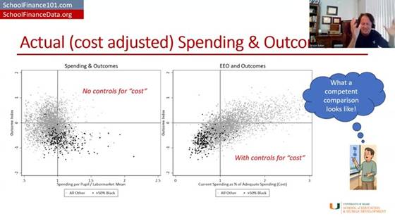
Here’s a side-by-side comparison. If I take districts across the whole country and just look at their per-pupil spending relative to the average for their labor market (i.e., adjusted for regional cost differences in the labor market — from Kansas City to El Paso to New York) — districts spending more than their labor-market average versus less — and plot that against an outcome index combining reading and math scores for grades three through eight, it looks a lot like the Edunomics-style graph: overall, the higher-spending districts don’t appear to be doing any better.

“What a competent comparison looks like” — left: spending/labor-market mean vs. outcomes with no cost control; right: current spending as % of adequate spending (cost) vs. outcomes, with cost control. The relationship only emerges once cost is controlled for.

But if you instead adjust properly for the full cost of achieving a given outcome goal and then plot it, districts with more adequate spending relative to that cost have higher outcomes, and districts with less adequate spending have lower outcomes. Then you can start to explore what explains the variation among districts at similar levels of spending and outcomes — but you can’t make any judgment at all from the unadjusted version. Putting that unadjusted version in front of policymakers or any audience — or, for that matter, using it to teach and train people in a school finance certificate program — is reckless, irresponsible, and needs to stop.

Oregon, school level

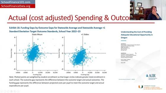
Here’s what it looks like in Oregon with school-level data, based on a report I produced with colleagues at the American Institutes for Research.

AIR’s “Understanding the Cost of Providing Adequate Educational Opportunity in Oregon” (Feb. 2025) — Exhibit 18: funding gaps by outcome gaps for statewide-average and +1 SD target outcome standards, school year 2022–23.

It’s a messy graph, but it generally trends upward, and the statistical analyses in the report show that schools with more adequate funding tend to have higher outcomes, and schools with less adequate funding tend to have lower outcomes. And when you set a higher outcome goal, it costs more to reach it. That’s the punchline.

Closing

This isn’t new, and it shouldn’t come as a surprise to anyone. I called graphs like the second one “clouds of doubt” in my 2018 book — clouds of doubt and the long-term trend were two of the most deceitful ways people tried to argue that schools just need to do better with what they’ve got, that more money doesn’t matter, that we should stop “throwing money” at schools because outcomes are declining anyway. All of that is garbage, and it’s well understood to be garbage. These particular empirical representations of it are an absolute joke.

Stop it now. Shut the door on it. Kick it out of the room. It has no place here, period.

Thank you, and have a wonderful day — I’ve enjoyed this pleasant time chatting with you.

Referenced reports

Baker, Bruce D. (2025). Does Money Matter in Education? (Third Edition). Albert Shanker Institute. shankerinstitute.org/resource/does-money-matter-in-education — PDF: moneymatters3rdedition_final.pdf

Baker, Bruce D., & Losen, Daniel J. (2026). Unpacking Racial Disparities in School Spending: Why “progressiveness” and “comparability” are not enough. EdWorkingPaper ai26-1558, Annenberg Institute at Brown University. edworkingpapers.com/ai26-1558

Brooks, Christopher D., Levin, Jesse, Salvato, Brad, & Baker, Bruce D. (2025). Understanding the Cost of Providing Adequate Educational Opportunity in Oregon. American Institutes for Research, prepared for the Oregon Legislative Policy and Research Office. air.org PDF

Florida School Finance Update: Here’s your manageable standard, now fund it!

I’ve had the pleasure of running some new models with updated data in the past few days. I recently produced a lengthy report on school funding in Florida.

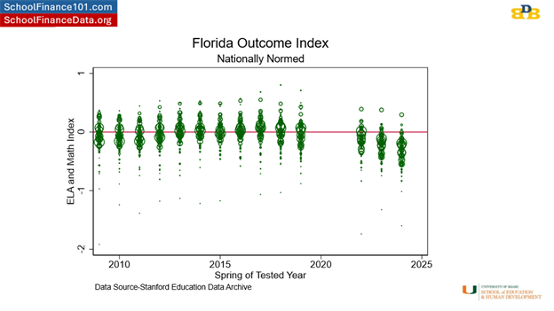
I’ve pointed out on several occasions recently that Florida schools have continued their rapid decline in 8th grade outcomes in reading and math. Florida is one of the reasons why Mississippi’s overall rank improves on national assessments. Yay for Florida.

The thing about Florida is that the state, over the past decade and more, has uniformly crushed the public schooling system and the outcomes it produces. Here’s the distribution of district average performance on reading and math for all FL districts compared to national average outcomes (0- horizontal red line). The vast majority of Florida kids are now below – well below that line.

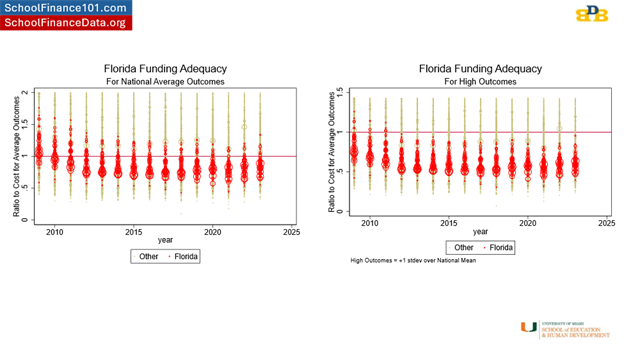
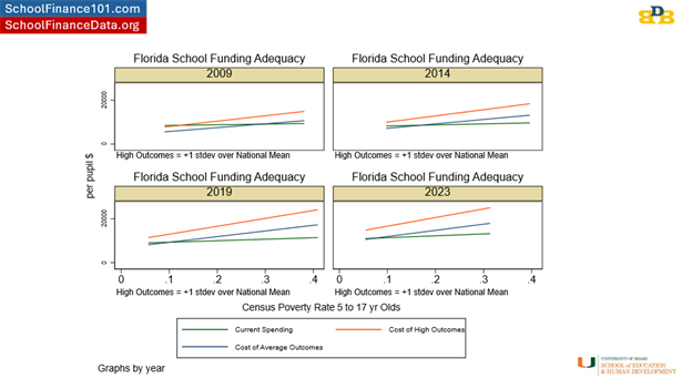
Not shockingly, relating back to my report linked above, there’s a connection between these performance declines and the inadequacy of funding provided to Florida public schools over the past decade. As I explained in my report – and in several other reports and peer reviewed articles – I have a model based on data for every school district in the U.S. which generates predictions of the spending needed in each school district to achieve different levels of student outcomes (standardized reading/math outcomes).

Here’s where Florida districts stand when comparing their current spending as a ratio to the estimated need for achieving a) national average and b) 1 standard deviation above national average outcomes in reading and math. I actually had to cut off the top part of these graphs to focus in on the bottom and show the spread of Florida districts which are now almost entirely packed into the bottom half.

Now, in my report, I explained how the Florida Supreme Court said there’s really no way to set a manageable standard for what’s adequate anyway, so the legislature should just do whatever it wants. Well, those red horizontal lines aren’t just manageable standards, they are reasonable empirical predictions that could be directly used in guiding the state school finance formula. But, silly me, with my data and models (courts in other states have relied heavily on such evidence for setting such standards).

Florida’s constitution (education article), ratified/revised by Florida’s citizens in 1998 and 2002, requires provision of a high quality system of public schools. We can quibble over whether national averages in reading and math are “high quality,” or merely average. I’d say the latter. What’s clear is that Florida’s school finance system, for MOST OF FLORIDA’S CHILDREN falls short of providing sufficient financing for even that goal – and as a result – most Florida children no longer meet even that modest goal?

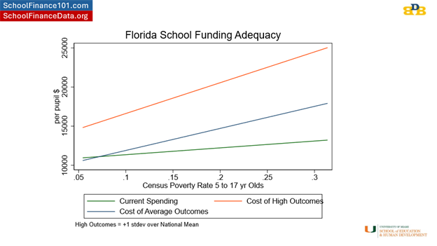
This figure shows the distribution of a) current spending with respect to differences in child poverty rate and b) cost estimates for the low (national average) and high (+1 standard deviation) outcome goals. Florida specifically falls well short of providing sufficient funding for children in higher poverty communities to achieve even the modest outcome goal – national average.

Over time, the reality of Florida school funding – actual spending – has slid further and further below these targets – things weren’t actually so bad in 2009 (kinda “meh” but not like they are now).

Here’s another view of the problem. A self-inflicted – excuse me – legislatively inflicted problem. After all, the adequacy of school funding in every state is a responsibility of state elected officials. When it’s good, that’s their accomplishment. When it’s not so good? That’s on them too!

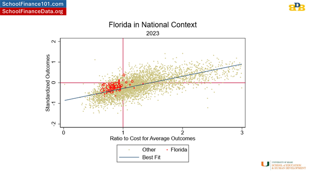
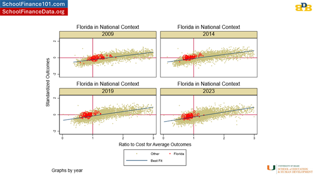
Here, we see the overall relationship, across the US, in 2023, between the relative adequacy of funding to achieve national average outcomes (current spending / spending needed), and, their actual outcomes! Shockingly, or perhaps not, districts (each dot is a district – beige are all districts nationally) with more adequate funding have higher outcomes in reading and math. Districts to the right of the vertical red line spend more than their cost estimate (to achieve national average outcomes). Districts to the left of the vertical red line spend less than their need estimate. Districts above the horizontal red line perform above national average outcomes and districts below the horizontal red line perform below national average outcomes. The worst place to be is in the lower left quadrant – not enough money and poor outcomes. And that’s exactly where most Florida school districts presently sit – with better funded districts performing better and worse funded districts performing, well, worse.

One upside for Florida districts is that they generally sit on or above the diagonal line which might be interpreted as representing average efficiency in producing outcomes. Florida school districts are efficiently producing the outcomes they produce – getting better than expected outcomes. By the way, that’s what actual efficiency analysis looks like – not the DOGEY BS we keep hearing about. It’s about rigorously evaluating the quality of output of a business or government entity, given the inputs, and NOT about creating faux outrage over some anecdotal line item on an expense sheet.

Florida school districts just don’t have the resources to do much better, and as a result, aren’t doing better. The solution one can derive from this image is to push Florida districts up that slide – that diagonal – from lower left to upper right! That is – to provide more adequate funding, and particularly to those furthest in the lower left – which tend to be districts serving higher poverty student populations.

But, rather than push districts from the lower left to the upper right, the state has instead, let districts slide from the middle/upper right to the lower left. This is a problem that can be fixed. And the solution is rather transparent – Adequate funding. And funding progressively distributed to schools and districts serving higher need student populations.

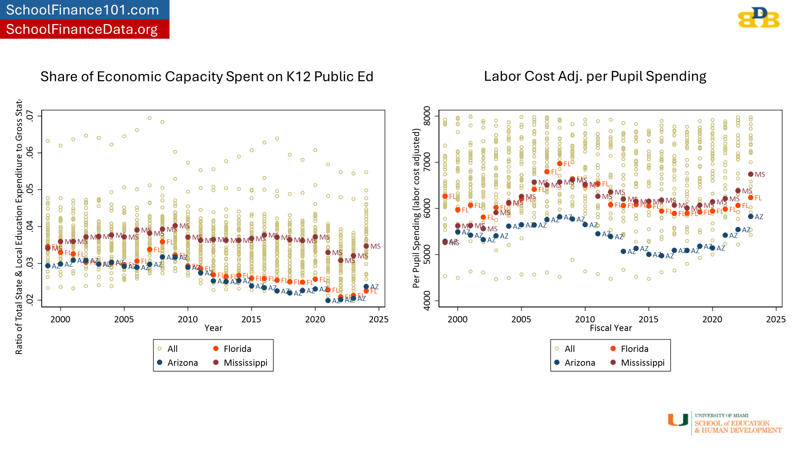
The solution is adequate funding. At least for Florida – here and now. And yes, Florida can afford that solution. Florida is near last in the country on the share of its economic capacity spent on K12 schooling. As a result, Florida school districts actually spend less, in adjusted dollars, per pupil than they did in 1993 and now spend less than Mississippi. Woohooo. Yay for Florida again. As I point out in my report linked above, even if Florida merely spent the same share of state GDP on public ed now as in the mid 2000s, the state would spend nearly 30% more than it does now. That would close a significant portion of the funding gap toward moving the state back to average outcomes. Still not high. But not falling off the cliff they have been for the past several years.
Time to start having the right conversation about school finance in Florida to ensure that all children in Florida have access to “a uniform, efficient, safe, secure, and high quality system of free public schools that allows students to obtain a high quality education…”