“Make it stop! Please!” — Video debunking of Edunomics intentionally deceitful school funding/outcome graphs
Source: School Finance 101 (Bruce Baker), published June 16, 2026
schoolfinance101.com — Make it stop! Please!
Transcribed from the post’s auto-generated captions (video runtime ≈ 20 minutes) and lightly cleaned up for readability; screenshots below are frames pulled from the same video at the points the graphs are shown on screen. A few short passages were unintelligible in the source captions and are marked accordingly.
Greetings, folks. Let’s talk. I need to vent a little bit, because after all these years, the same BS continues to roll out, continues to emerge in the school finance conversation — something I’ve been writing and talking about for years.
I put this report out last year, this new version of Does Money Matter in Education? — summarizing a whole bunch of rigorous, peer-reviewed studies applying different approaches and using different data that show us how and why money matters for improving student outcomes.
I talked about this years ago — for a decade, really. This is actually a little less than a decade old, in this book and in other sources on my blog going back more than a decade: basically the dumbest, most facile, simple-minded, intentionally deceitful versions of arguments that try to say, well, money doesn’t really matter. You can do great — you can be awesome with very little money — and you can suck with lots of money. Money’s gone up and test scores have gone down. There are really about four or five different versions of this argument that have been thrown out over the years, but there are two common ones — pretending to be empirical analyses — that are repeatedly used, and that I’ve repeatedly debunked, that just continue to find their way back.
At this point, anyone who’s putting these kinds of graphs out there is doing so knowingly and intentionally to deceive policymakers, courts, judges — whatever. Most of this stuff doesn’t make its way these days into judicial debates over school funding, but I had to face this again over a year ago, and then I’ve seen these graphs re-emerging for every state continuously over the past year — and even again recently on Twitter/Bluesky, where one of my colleagues, thankfully, also took a shot at just how stupid and intentionally deceitful these graphs are.
So let’s jump into it. If you’re a policymaker in a state — or if you know one, or if you’re on a commission in a state and people have been invited in and are putting this stuff in front of you — stop it right there. Kick them out of the room. This is not credible. It shouldn’t be part of the discussion. Just look at the graph.
Graph #1: The “long-term trend” graph
Here’s one of the graphs — this is the new version of what I call the long-term trend graph. The Edunomics Lab at Georgetown University — I’ll call them out by name — and Marguerite Roza have put out data visualization tools that let you make this graph for every state, and then the next graph I’ll talk about.
Let’s take a look at this. First of all — and I’ll explain why this is part of the intentional deceit — they picked 2013 as the starting year. Second, you get two totally different kinds of measures put on a common y-axis, a common vertical axis, with different units for the test scores than for the spending, and both of them stretched out to make it look like these trends are wildly diverging.
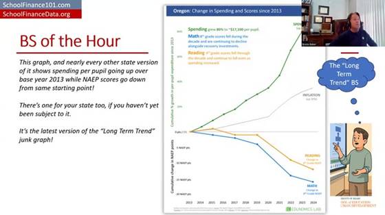
Edunomics-style “long-term trend” graph for Oregon: spending, NAEP math/reading, and inflation all plotted on a common stretched axis since 2013 (“BS of the Hour” slide).
And even the construction of the measures is a problem. We’ve got per-pupil spending, not even adjusted for inflation, and then a separate line for some inflation adjustment — maybe a Consumer Price Index — which isn’t even the right adjustment to use for per-pupil spending. I’ll show you what it looks like adjusted correctly in a few minutes.
They’ve got per-pupil spending skyrocketing. I’m using Oregon here because it’s the last place I was faced with having to waste an exorbitant amount of time debunking this garbage. So we’ve got per-pupil spending — not adjusted for inflation, just nominal per-pupil spending — seemingly skyrocketing, which you can do by stretching out the y-axis. And we’ve got NAEP (National Assessment of Educational Progress) test scores taking a dive from 2013 forward to 2024. Then there’s a separate, gratuitous inflation measure thrown in on yet another scale. My head explodes just looking at this. And most people who’ve encountered this graph and have any knowledge of how to do actual research and empirical analysis, and how to measure a school dollar — their heads have exploded too.
Why 2013 is the tell
Let’s talk about 2013 for a second. First, 2013 is well understood to be the point at which NAEP scores level off and/or start to decline. They go up for all the years before that, and then they hit a plateau and start to decline. So picking 2013 is intentionally picking the point at which, in almost any state, you can show test scores leveling off or going down while money is going up or staying the same — which, of course, looks bad. It implies money couldn’t possibly relate to test scores. Better research says otherwise, even for this period.
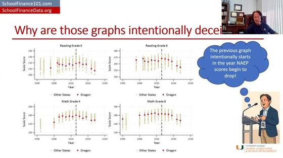
NAEP Grade 4 Reading and Grade 8 Math scores over time for all states, with Oregon highlighted — scores plateau/decline for nearly every state starting around 2013.
Here’s NAEP scores over time for all states, with Oregon highlighted — and, like the others, it just drifts downward from that point, more or less within the pattern of other states (a bit more so for the fourth-grade scores). But picking 2013 was intentionally picking the year at which NAEP scores level off or turn downward.
On the spending side: per-pupil spending for public school districts took a real hit starting around 2008–09. 2008 was about the best year for public school expenditures. From about 2008–09 to about 2011–12 is when spending really took a hit. It had drifted upward through 2008, then dips, and hits its bottom — leveling off and maybe starting to creep back upward a little around 2013.
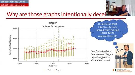
Oregon per-pupil spending by fiscal year, adjusted for labor costs, compared to other states — spending bottoms out around 2013 after the Great Recession before drifting back up.
So if you pick 2013 as your starting point, what you’re actually picking is the year when the cuts to funding had hit bottom and test scores had hit their peak. Track it forward from there for almost any state, and you’ll get this apparent divergence — especially once you consider that spending should really be adjusted for the cost of recruiting and retaining a comparable-quality teacher workforce, given that private-sector and other wages have been rising faster than wages for teachers and public school employees. Adjusted that way, spending clearly does not skyrocket the way it does in their graph. Again, 2013 is right where spending per pupil bottoms out and levels off (maybe starts to climb a little) — stretch the axis and don’t adjust for anything, and you can make it look like it’s climbing a lot.
Interesting side note: there’s a really good empirical study by Jackson and coauthors (published via EducationNext) that shows the detrimental effects of recessionary cuts on student outcomes during that exact same period.
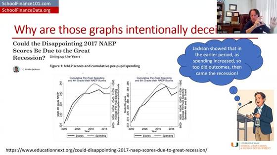
“Could the Disappointing 2017 NAEP Scores Be Due to the Great Recession?” (EducationNext) — Figure 1: NAEP scores and cumulative per-pupil spending, zoomed in on 2000–2015.
Zooming in on just the 2000–2015 period the way this study does, test scores actually rose when spending rose, leveled off when spending leveled off, and dipped when spending dipped — the opposite pattern from what’s implied by stretching the axes the way Edunomics does. That study’s authors go on to run solid, causal empirical analyses of this relationship — including, later, a study with more than 30 causal estimates of the returns to a $1,000 increase in public school expenditure, which I summarize along with a ton of other studies in my report.
And yet the graph still persists. It’s still thrown at us in the most absurd ways.
A properly adjusted version
Here’s another version of the graph — the blue line is roughly their version of per-pupil expenditures, though not as exaggerated as showing it as a percent change since 2013 on a stretched y-axis. Just unadjusted per-pupil spending: it went up. Adjusted for changes in labor costs, per-pupil spending is only ever so slightly higher in 2024 than it was in 2009 — that’s adjusting for what it costs to recruit and retain teachers of comparable qualifications.
Now, if we adjust for all of the other cost changes — the student populations to be served, and everything else that goes into achieving a common set of outcomes, using our National Education Cost Model at schoolfinancedata.org — spending actually declined precipitously during and in the years immediately following the fiscal-austerity period after the Great Recession, then levels off, and may even continue drifting down slightly relative to what the dollar was worth toward achieving 2009-level outcomes.
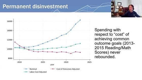
“Permanent disinvestment” — spending with respect to the cost of achieving common outcome goals (nominal vs. labor-cost-adjusted vs. fully cost-of-outcomes-adjusted); the cost-adjusted line never rebounds after the Great Recession.
That’s what fully cost-adjusted spending looks like over time, in many if not most states.
Graph #2: The cross-sectional “spending vs. proficiency” scatterplot
Now for graph number two — another mind-bogglingly, intentionally deceitful graph. The idea: take a whole bunch of schools across a state, regardless of differences in cost from one place to another or the students being served — schools of different grade levels and everything — and plot their per-pupil spending on the horizontal axis and their percent proficiency on state tests on the vertical axis.
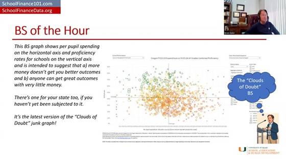
The “Clouds of Doubt” graph: Oregon FY22–23 per-pupil expenditure vs. SY23–24 all-grades combined proficiency, with no cost adjustment — no visible relationship between spending and outcomes.
That lets you show that some schools do awesome with very little money, and some schools do crappy with a whole lot of money — so clearly, money doesn’t matter. That low-spending, high-scoring school just needs everyone else to learn from its awesomeness, and everyone can be awesome with whatever they have. Inequity doesn’t matter, adequacy is irrelevant — just get the better outcome, and if you don’t, it’s because you suck.
The layers of problems with this graph are mind-boggling. The main issue is the complete failure to adjust for the value of the school dollar toward achieving these outcomes from one place to the next — to look at the dollar adjusted for its value, or for whether it’s sufficient to achieve a given target given those outcomes.
What it looks like adjusted for cost
I can give a couple of examples of what happens when you do that adjustment. First, I put Oregon in the context of the nation for 2023. If you look at that unadjusted, the overall pattern looks downward — the more money you have, the worse you do, as if you just don’t know how to use it well, and need to be squeezed harder to perform like the districts in the upper-left corner.
But if instead you responsibly use methods that have been in the peer-reviewed literature going back to about 1971 — and extensively since about 1998–99, in the “modern era” starting with a piece by Downes and Pogue in the early 1990s — and look at each district’s spending relative to what it would cost that district to achieve national-average outcomes, and then look at their actual outcomes relative to the national average, districts that spend more (relative to their cost of achieving average outcomes) achieve more, on average.
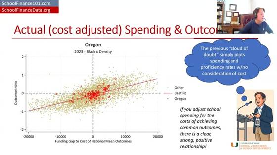
“Actual (cost adjusted) Spending & Outcomes” — Oregon districts (red) against the national distribution (gray): funding gap to the cost of national mean outcomes vs. outcome index. A clear, strong, positive relationship.
Districts on the right-hand side of this picture are ones spending more than they’d need to achieve national-average outcomes, and the districts in the upper-right quadrant are mostly achieving above-average outcomes. Districts in the lower left have less funding than needed to achieve national-average outcomes — and guess what, they’re achieving below-average outcomes.
There’s still variation around that trend line — more adequate funding (controlling for costs) generally means better outcomes, but there’s variation worth exploring further, which my colleagues and I have done in individual states. For example, a report on Colorado compares districts and schools that get better outcomes than would be expected given their spending. Sometimes what we find is that there was simply something our model didn’t fully capture about that school or district; sometimes we get real insight into what they’re doing differently. That’s what real efficiency analysis looks like — not making a judgment with no consideration at all for the value of the school dollar.
This other stuff — the raw scatterplot — is garbage. Just say it bluntly: it’s garbage. It’s intentionally deceitful. It has no place in a real policy conversation about how to help schools improve, or how to equitably and adequately fund schools. It shouldn’t be part of the conversation, and neither should the long-term trend graph. It’s utterly ridiculous.
A side-by-side, nationwide comparison
Here’s a side-by-side comparison. If I take districts across the whole country and just look at their per-pupil spending relative to the average for their labor market (i.e., adjusted for regional cost differences in the labor market — from Kansas City to El Paso to New York) — districts spending more than their labor-market average versus less — and plot that against an outcome index combining reading and math scores for grades three through eight, it looks a lot like the Edunomics-style graph: overall, the higher-spending districts don’t appear to be doing any better.
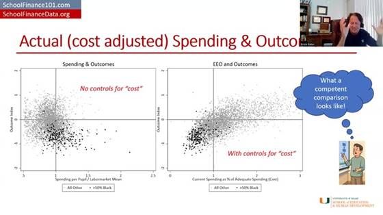
“What a competent comparison looks like” — left: spending/labor-market mean vs. outcomes with no cost control; right: current spending as % of adequate spending (cost) vs. outcomes, with cost control. The relationship only emerges once cost is controlled for.
But if you instead adjust properly for the full cost of achieving a given outcome goal and then plot it, districts with more adequate spending relative to that cost have higher outcomes, and districts with less adequate spending have lower outcomes. Then you can start to explore what explains the variation among districts at similar levels of spending and outcomes — but you can’t make any judgment at all from the unadjusted version. Putting that unadjusted version in front of policymakers or any audience — or, for that matter, using it to teach and train people in a school finance certificate program — is reckless, irresponsible, and needs to stop.
Oregon, school level
Here’s what it looks like in Oregon with school-level data, based on a report I produced with colleagues at the American Institutes for Research.
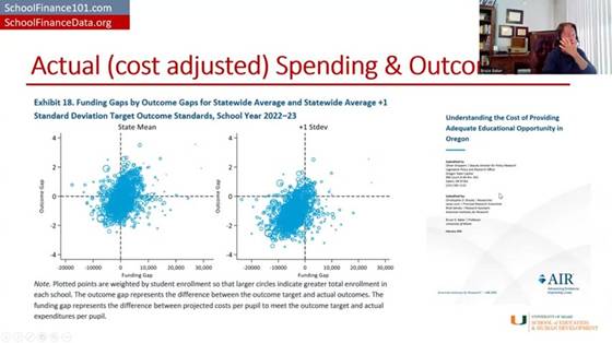
AIR’s “Understanding the Cost of Providing Adequate Educational Opportunity in Oregon” (Feb. 2025) — Exhibit 18: funding gaps by outcome gaps for statewide-average and +1 SD target outcome standards, school year 2022–23.
It’s a messy graph, but it generally trends upward, and the statistical analyses in the report show that schools with more adequate funding tend to have higher outcomes, and schools with less adequate funding tend to have lower outcomes. And when you set a higher outcome goal, it costs more to reach it. That’s the punchline.
Closing
This isn’t new, and it shouldn’t come as a surprise to anyone. I called graphs like the second one “clouds of doubt” in my 2018 book — clouds of doubt and the long-term trend were two of the most deceitful ways people tried to argue that schools just need to do better with what they’ve got, that more money doesn’t matter, that we should stop “throwing money” at schools because outcomes are declining anyway. All of that is garbage, and it’s well understood to be garbage. These particular empirical representations of it are an absolute joke.
Stop it now. Shut the door on it. Kick it out of the room. It has no place here, period.
Thank you, and have a wonderful day — I’ve enjoyed this pleasant time chatting with you.
Referenced reports
Baker, Bruce D. (2025). Does Money Matter in Education? (Third Edition). Albert Shanker Institute. shankerinstitute.org/resource/does-money-matter-in-education — PDF: moneymatters3rdedition_final.pdf
Baker, Bruce D., & Losen, Daniel J. (2026). Unpacking Racial Disparities in School Spending: Why “progressiveness” and “comparability” are not enough. EdWorkingPaper ai26-1558, Annenberg Institute at Brown University. edworkingpapers.com/ai26-1558
Brooks, Christopher D., Levin, Jesse, Salvato, Brad, & Baker, Bruce D. (2025). Understanding the Cost of Providing Adequate Educational Opportunity in Oregon. American Institutes for Research, prepared for the Oregon Legislative Policy and Research Office. air.org PDF


