The Charter School Company Store, Revisited

A decade ago on this blog I wrote about charter operators who require the people paid with public money to spend a share of it back at a store the operator itself owns. The mechanism hasn’t gone anywhere. Here it is again, in five cases across four states, with the receipts — and, this time, a schematic for each one.

In 1947, Tennessee Ernie Ford hadn’t yet recorded “Sixteen Tons,” but every coal miner in Appalachia already knew the joke wasn’t really a joke: paid in company scrip, redeemable only at the company store, “I owe my soul to the company store.” Nobody pays a teacher in scrip anymore. But in 2009, new teachers walking into Uncommon Schools’ North Star Academy in Newark discovered a tidier version of the same arrangement: as a condition of taking the job, they had to enroll in a master’s program at Relay Graduate School of Education — an institution chaired by the same person who chaired Uncommon’s own board, housed in the same Newark building as the school employing them, and priced at roughly $17,500 a year, with the new teacher’s own paycheck covering close to half of it.

I wrote about this back in December 2016 under the headline “The Charter School Company Store.” I’ve spent the years since researching a much bigger version of this book chapter, and the honest news is that the mechanism hasn’t needed updating so much as re-cataloging. It shows up in real estate, in curriculum contracts, in management fees, and — this is the detail I keep coming back to — in the credential a new teacher is required to buy from their own employer’s affiliate before they’re allowed to start the job. Below are five fully documented cases, one from the archive and four from the last twelve months, each with a schematic showing exactly where the money enters, where it’s required to leave, and where it lands back in the same hands it started in.

Newark: the credential you’re required to buy

Start with North Star Academy, because it’s the cleanest specimen. Relay Graduate School of Education was co-founded in 2011 by, among others, Norman Atkins, who also chaired Uncommon Schools’ board. Jamey Verrilli held Relay’s Newark deanship and a board seat at North Star Academy at the same time. Both organizations’ IRS filings list the same street address — 10 Washington Place, Newark, the same building housing North Star Academy itself. None of that is illegal. What it means, in practice, is that the decision to require a credential and the decision about who gets paid for supplying it sat with the same small group of people. (Source: my own 2016 reporting, drawing on Uncommon’s and Relay’s IRS Form 990 filings.)
Running New Jersey’s own staffing data against Relay’s published tuition figure, I get a rough cumulative estimate on the order of $6 million flowing from Uncommon’s own new hires toward Relay by 2015 — money that started as a teacher’s salary, and ended up, in significant part, back inside the same corporate family that had just hired her. New Jersey Department of Education staffing reports for North Star Academy alone counted 103, then 134, then 153 “novice” teachers across three consecutive years between 2009 and 2015 — each one, under Uncommon’s own hiring policy, a plausible Relay enrollee. That’s the arithmetic behind the $6 million; it’s my own back-of-envelope calculation from public staffing data and a published tuition figure, not a number either organization has itself disclosed. A related fundraising affiliate, Uncommon Knowledge & Achievement, separately reported $500,000 to Relay and $100,000 to Zearn, a curriculum company sharing board leadership with Uncommon, in a single tax year. Individually, every one of those looks like a grant. Read together against the shared address and the shared board seats, they look like an organization funding itself in triplicate.

Diagram showing Uncommon Schools requires new teachers to pay roughly $17,500 a year in tuition to Relay Graduate School of Education, which shares a board chair and Newark address with Uncommon, plus additional grants from Uncommon's fundraising affiliate to Relay and Zearn.
Figure 1. The Relay loop: a required credential, a shared board chair, a shared Newark address, and roughly $6 million flowing back to the same corporate family by 2015, on the author’s own estimate.

Miami: two invoices, one family

Academica, the charter management company Fernando Zulueta built starting in 1999, runs the same idea at regional scale — and shows something the Newark case doesn’t: a company store with two separate registers. By 2011, StateImpact Florida’s reporting (drawing on the Miami Herald’s own investigation) found Zulueta family interests controlling more than two dozen companies doing business with the schools Academica managed. Academica itself collected roughly $9 million a year in management fees. A separate set of Zulueta-controlled real estate entities collected another $19 million a year in rent from the same network, on a portfolio of more than $115 million in South Florida properties that, because they house public schools, pay no property tax at all — nine schools were paying more than a fifth of their total revenue in rent alone.

A 2014 federal audit found Fernando Zulueta sitting on the board of Mater Academy, one of his own network’s schools, while that school signed leases with his family’s development companies, and turned up a vendor relationship with an architecture firm that employed his brother-in-law — Erik Fresen, a sitting state representative who sat on the House’s PreK-12 Appropriations Committee, the panel with jurisdiction over the same charter-facilities funding stream his brother-in-law’s schools drew on, while sponsoring legislation requiring public school districts to share construction-tax revenue with charter schools. Academica disputed the inspector general’s characterization of these findings when the report was released; I note the dispute because a company’s denial belongs next to a federal auditor’s finding, not in place of it.

Two contracts, two boards could in theory negotiate independently — a school could push back on the management fee without touching the lease, or vice versa. In practice, $9 million and $19 million a year both terminated in the same family’s accounts, and no single filing was ever built to add the two together.

Diagram showing two revenue tiers converging on one family: about $9 million a year in management fees paid to Academica Corp, and about $19 million a year in facilities rent paid to Zulueta-controlled real estate entities, combining to roughly $28 million a year.
Figure 2. Two revenue tiers, one controlling family. A management fee and a facilities lease are ordinarily separate business decisions. Held by the same family, they function as a single extraction with two invoices.

Chester, Pennsylvania: the books it took a lawsuit to open

Then there’s the case that shows what happens when nobody can see the invoice at all. Chester Community Charter School, Pennsylvania’s largest brick-and-mortar charter, enrolling roughly 3,000 K–8 students, has been run since the 1990s by CSMI, a for-profit company controlled by Vahan Gureghian — a developer, lawyer, and, per Inquirer reporting, the largest individual donor to Governor Tom Corbett. In January 2009, The Philadelphia Inquirer filed a Right-to-Know request for CSMI’s salaries, payments to Gureghian, and profit figures. CSMI’s lawyer refused, arguing the records belonged to “a private management company, not a public charter school.” Pennsylvania’s Office of Open Records disagreed, ruling on May 8, 2009 that CSMI, in running the school’s day-to-day operations, was performing “what is otherwise a governmental function,” and ordered the books opened. What came out: $60.6 million in public subsidies to CSMI since 1999, for a school then enrolling roughly 2,150 kids.

Seven years later, a federal inspector general reviewing charter management organizations found that Gureghian had the authority to write checks to himself from the school’s accounts without board approval, and had done so to the tune of roughly $11 million in the 2008–09 school year alone (CCCS’s attorney disputes the “without approval” characterization, telling investigators each payment had in fact received board sign-off). By 2014–15, CSMI was collecting nearly $17 million in a single year, for a school then enrolling roughly 2,900 students — and CSMI’s profit margin on the arrangement has never been publicly disclosed, then or since. And in 2010, Gureghian sold the school’s own buildings — which he owned personally — to a newly created nonprofit, Friends of Chester Community Charter School, for $50.7 million, financed by Delaware County industrial development authority bonds, then leased them back. Pennsylvania’s auditor general, Eugene DePasquale, flagged the whole arrangement as improper, since the school, through its own affiliate, still effectively owned the building it was collecting lease reimbursement to rent — the “we bought it twice” mechanism this project documents elsewhere, run one more time through a services company instead of a REIT.

Diagram showing two lanes converging on Vahan Gureghian: a management-fee lane where Chester Community Charter School pays CSMI $60.6 million since 1999, and a real-estate lane where Gureghian sold buildings he personally owned to Friends of CCCS for $50.7 million, then leased them back to the school.
Figure 3. Two lanes, one owner. A management fee and a sale-leaseback run through structurally separate contracts, both converging on the same controlling individual.

Arizona, 2024–25: three cases in one school year

None of this ended when the last decade did. ABC15 Arizona documented three related-party arrangements running in the 2024–25 school year, in a state where roughly 97 percent of charter schools are exempt from competitive bidding even as related-party transactions are required to surface, after the fact, in an annual audit. At Crown Charter School in Litchfield Park, co-founders James Shade and T.C. Crownover — a married couple, Shade as chief executive and Crownover as board chair — directed $111,200 to Five Star Educational Research, a California-based nonprofit curriculum provider where Shade serves as CEO and Crownover as chairman. At Burke Basic School in Mesa, the Gaddie family, which founded the school, leases its building from a for-profit entity the family manages, collecting $542,000 at a rate the family itself put at $10 per square foot annually. And at Calibre Academy and its affiliated Thrivepoint Alternative High Schools, serving roughly 2,100 students combined, a for-profit called Learning Matters Educational Group supplied curriculum, technology, and management services under contracts totaling $5.3 million in a single year. (Source: ABC15 Arizona.)

None of these arrangements, on the reporting available, has been found unlawful; all were disclosed, as Arizona law requires, in the schools’ own audited financial statements. What they share with Newark in 2009, Miami in 2011, and Chester in 2009 is simpler than a legal violation: in each case, the person deciding what the school would buy and the person collecting payment for the sale were, functionally, the same person, and the disclosure requirement’s only real function was to make that fact locatable, not to change it.

Bar chart comparing three Arizona related-party charter contracts in 2024-25: Crown Charter to Five Star Educational Research at $111,200 per year, Burke Basic to the Gaddie family at $542,000 per year, and Calibre Academy to Learning Matters Educational Group at $5.3 million per year.
Figure 4. The same mechanism, current inventory. Three Arizona cases from the 2024–25 school year, ranging from a six-figure curriculum contract to a $5.3 million combined services deal — all disclosed, none found unlawful.

New Jersey, 2026: when the vendor also runs the board

A parallel January 2026 finding by New Jersey’s Office of the State Comptroller extends the pattern from curriculum and real estate into something closer to full operational control. Reviewing College Achieve Public Schools, Inc. (CAPS, Inc.) — the for-profit manager of three New Jersey charter schools, including College Achieve Greater Asbury Park — investigators found the schools’ own board had, in the Comptroller’s word, ceded “sweeping authority” to the vendor: hiring and evaluating the schools’ own executive directors, running core administrative operations across all three campuses, and controlling the fee structure governing its own compensation. Across its eleven-campus network, CAPS, Inc. had received $57 million in public funds between 2016 and 2023; in the single year 2022–23, the company forgave $385,568 in debt the school owed it, without disclosed board approval, and separately paid more than $100,000 to a business owned by the brother-in-law of the network’s own executive director. A vendor empowered to hire its own overseer, forgive its own debts, and route six figures to its chief executive’s in-laws is not managing a school’s company store so much as it has become the only store left standing — the board that was supposed to shop elsewhere no longer meaningfully can.

Diagram: the school board nominally oversees CAPS Inc., but CAPS actually hires and evaluates the schools' own executive directors, runs core administration, forgave $385,568 of its own debt without disclosed board approval, and set its own fee structure.
Figure 5. When the vendor also runs the board. The oversight line runs from the board down to CAPS; every functional line of control runs the other way. New Jersey Office of the State Comptroller, January 2026.

The scale, side by side

Here’s the scale, side by side, with the caveat that these cover different time periods and shouldn’t be read as directly comparable — they’re listed to show that the mechanism spans small dollar amounts and very large ones, not to rank the cases:

CaseAmountPeriod
CSMI / Chester Community (PA)$60.6 millioncumulative since 1999
CAPS Inc. (NJ)$57 millioncumulative, 2016–2023
Academica (Miami)$28 millionper year (mgmt. fee + rent)
Relay GSE tuition from Uncommon’s new hires~$6 millioncumulative, by 2015
Learning Matters / Calibre Academy (AZ)$5.3 millionper year (curriculum + tech + mgmt.)
Burke Basic / Gaddie family (AZ)$542,000per year (real estate)
Crown Charter / Five Star Educational Research (AZ)$111,200per year (curriculum)

The one thing every case shares

Every one of these arrangements was, at the time it was examined, either fully legal or defensible under existing disclosure rules. That’s the finding that matters more than any single dollar figure. A related-party disclosure requirement that surfaces the relationship only in an audited financial statement’s footnote, months after a board has already signed the contract, isn’t stopping anything — it’s documenting it. Every case above cleared the bar its state actually set. None of them was stopped by it.

I go into all five of these in more depth — with the full sourcing, the underlying filings, and a field guide for anyone who wants to trace their own local charter operator’s related-party contracts — in a chapter of the same name in the book I’m currently drafting, The Grift Model. If you want to run the same check on a school in your own community, start with three documents: the school’s Form 990 (Schedule L for related-party transactions, Schedule R for related organizations), your state’s charter-authorizer annual audit, and your state’s corporate registry for whoever’s name is on the vendor’s paperwork. None of it requires a subpoena. It just requires running the same name through more than one place and seeing whether it comes back twice.

Sources


Related reading: The Charter School Company Store (2016) and the Edu-Grift hub for the rest of this series.

Buy Low, Rent High: The Charter School Real Estate Playbook

Charter schools generally can’t issue the kind of low-interest, taxpayer-backed general obligation bonds that districts use to buy land and build schools. That basic financing gap has, over time, produced two distinct and well-documented problems in how charter operators end up housed. They’re often talked about as one blurry story about “charter real estate deals,” but they’re actually separate mechanisms, with separate fixes, and it’s worth treating them that way.

Neither problem requires resolving the larger, separate argument about whether chartering itself is good policy. Both are fixable with fairly ordinary transparency and pricing rules — the kind already applied to public companies and, in places, to districts themselves.

Problem 1: districts selling public buildings to charters for far less than they’re worth

A handful of states require or strongly encourage school districts to sell closed public school buildings to charter operators at a mandated discount, skipping any real appraisal or competitive process. The public built and maintained these buildings; the transfer price reflects almost none of that investment.

Indiana’s so-called “$1 law,” on the books since 2011, requires school districts to sell or lease closed buildings to charter schools for a dollar. Indianapolis Public Schools has made exactly two such sales: the former School 11 building went to KIPP Indy for $1 in 2012, and the former School 98 building went to the Tindley charter network for $1 in 2017 — buildings IPS taxpayers had financed construction and decades of upkeep on. The charters note they then had to sink hundreds of thousands to millions of dollars into renovations, and neither made a taxable profit on eventual resale — but the initial transfer price, for a facility the public built and maintained, was a dollar (Chalkbeat Indiana, February 2024).

California law requires districts to offer surplus school property to charter schools before anyone else, at a sale price that can legally be set as low as 25 percent of the property’s current market value (California Legislative Analyst’s Office).

And in 2025, Ohio’s state budget process included a provision that would let the state force closure of public school buildings and then force the district to sell those buildings to charter or private schools below market value — over the objections of the state’s largest districts. The superintendent of Canton City Schools called it “a bad deal for taxpayers” in a district that had just approved bond levies to build new neighborhood schools (WYSO / Statehouse News Bureau, May 2025).

The fix here is simple: require an independent appraisal, and price the sale at or near market value, or at minimum require the district to be compensated for its documented capital investment. A state can still prioritize charter access to vacant buildings without simply giving those buildings away.

Problem 2: charter operators paying inflated rent to a landlord tied to their own leadership

Four-step diagram showing public financing typically builds a school; a private buyer, often a related party, instead buys or develops a facility and leases it to a charter operator, sometimes at a markup; public per-pupil dollars pay that rent indefinitely; the private owner keeps the asset.
Figure 1. No single step here requires an illegal act. The risk is concentrated in one place: when the landlord and the charter’s own leadership are the same people, nothing keeps the rent at a market rate.

Because most charters lease rather than own, someone else typically holds title to the building and collects rent from the school’s public per-pupil funding. That’s ordinary and not inherently a problem — landlords take on real financing risk purchasing or building facilities whose only realistic tenant is a five-year-renewable charter school. The problem is a specific, recurring variant: when the landlord and the charter’s own leadership turn out to be the same people, and the rent is priced well above what an arm’s-length market rate would produce.

Cornerstone Charter Schools, a five-school Detroit network, is a clean illustration. Cornerstone’s founder, Clark Durant, also leads the New Common School Foundation, which owns and leases the buildings his schools occupy — and Cornerstone Education Group, the management company that collects 10 to 13.5 percent of the schools’ per-pupil funding on top of the rent. One Cornerstone elementary school alone paid more than $500,000 a year to rent its own building, under a triple-net lease that also stuck the school with taxes, insurance, and maintenance (WXYZ Detroit). “A really big, disconcerting piece of this puzzle,” I told a Detroit reporter, “is that these are a number of entities drawing on the public dollars and then sending that money back and forth between themselves.” That arrangement escalated past a policy question in November 2020, when the estate of the network’s largest historical donor filed a complaint with Michigan’s attorney general accusing Durant of running the foundation “as a for-profit entity with the primary purpose of financially benefiting Mr. Durant” himself — pointing to a compensation package that rose 61 percent in a single year and a pair of interest-bearing loans running in both directions between Durant and the foundation he leads (WXYZ Detroit; Crain’s Detroit Business).

Most of this architecture never sees a courtroom, which is part of why it persists. Hellenic Classical Charter Schools, in Queens, is a rare exception. Hellenic’s lease on its building — originally about $660,000 a year, held by a Greek Orthodox parish — was transferred to “Friends of Hellenic Classical Charter Schools,” a nonprofit that shares a chairperson with the school itself, which then subleased the same building back to Hellenic at more than $2 million a year. New York City, on the hook to reimburse charter rent under state law, balked; the state education commissioner sided with the school anyway. In March 2025, an Albany judge overturned that decision, citing “multiple red flags” — the related-party sublease and the rent’s exponential jump chief among them — and ruled the city need only reimburse a school’s “actual rental cost,” not whatever a related party decides to charge it (Chalkbeat New York).

New Jersey supplied its own entry in January 2026: a state comptroller’s investigation into CAPS Asbury found the charter’s management company, CAPS Inc., holding the master leases on all three of the school’s buildings, subleasing them back to the school it manages, and collecting 14 to 15 percent of the school’s revenue in management fees on top — the same landlord-and-manager combination, filed under a different agency’s letterhead (NJ Office of the State Comptroller).

Bar chart comparing interest rates: a district general obligation bond at about 4.5 percent, a charter nonprofit revenue bond at 5 to 6 percent, and related-party or sale-leaseback debt at about 8.5 percent.
Figure 2. Financing costs alone run higher outside the district lane, per Baker & Miron (2015) — before any related-party markup is added on top. On a $10 million building financed over 25 years, the spread between the first bar and the third is worth roughly $7.5 million in additional interest, money that buys no classroom, teacher, or textbook.

The aggregate pattern shows up in the data, too. Ohio’s state auditor found charter schools leasing from a management company paid an average of $2,325 per pupil in rent, against $848 at comparable charter schools with no related-party lease — nearly three times as much, for materially identical buildings (Ideastream Public Media).

The fix here is also simple, and it’s the one a court already improvised in Hellenic’s case: require any related-party facilities lease to be benchmarked against a market comparison before an authorizer approves it, or before public reimbursement is owed, and require the same related-party disclosure a public company already owes its own shareholders — applied to a nonprofit spending public money instead of investor money.

What ties the two together

Both problems have the same shape: a transaction involving public money and a public asset, priced without the scrutiny a genuine market transaction would face. In Problem 1, the state itself mandates the discount by statute. In Problem 2, the discount runs the other direction — a related party charges above market — but the missing ingredient is identical: nobody with the authority to say no is required to ask whether the price is fair.

Neither fix requires banning charter schools or deciding the broader argument about chartering. It requires only what every case above was missing until, in Hellenic’s case, a judge finally supplied it: someone with the authority to ask whether the person filing the paperwork was also the person collecting the money — and the power to say no when the answer was yes.

Sources

The Charter Money Trail

Following public dollars through a traditional school district is, by comparison, straightforward. District budgets are public record. Board meetings are open. Every dollar of state and local revenue flows into a single governmental entity that files public financial statements, undergoes independent audits, and answers to elected or appointed boards bound by open-meetings and public-records law. You can follow the money because the law requires the money to be followable.

Charter school finance doesn’t work that way — not because it’s illegal, but because it’s structured differently from the ground up. A single public funding stream can pass through a nonprofit school corporation, a for-profit management company, a related real-estate entity, and a tax-exempt bond issuance — and at almost every hop, the entity receiving the money is under no obligation to disclose anything to the public. Some links in that chain file a Form 990. Some don’t file anything at all. The paper trail doesn’t disappear, but it moves from one regulatory regime to another — nonprofit tax filings, corporate registries, county property records, municipal bond disclosures — each with its own rules, its own audience, and its own blind spots. Tracing it means knowing which of several unrelated public filing systems to check at each step, and accepting that at some steps, no public filing exists at all.

The walkthrough below maps that structure stage by stage: what becomes public, what doesn’t, where to look when it is, and where the trail goes cold when it isn’t.


Field method — public-records tracing. How one dollar of per-pupil funding can travel from a school budget line, through a management company, into a related real-estate entity, and out the far end as a municipal bond — and which public filing catches it at each hop.

  • Three hops: management fee → related-party transfer → bond-financed real estate
  • Filings used: IRS Form 990 · Schedules L & R · EMMA bond disclosures
  • Audience: reporters, auditors, curious taxpayers

How to read the boxes

  • Public money / public agency — district, state aid, or a bond authority
  • Nonprofit entity — solid border, files a Form 990
  • For-profit entity — dashed border, no 990 ever filed
  • Where to find it — the specific public filing to pull
  • Disclosure gap — the point the paper trail usually goes cold

1. Budget line to management fee

Public per-pupil funding lands in the nonprofit charter school’s checking account, then a slice of it leaves the same year as a fee to whoever runs the school day-to-day. Most large CMOs — Charter Schools USA, Academica, National Heritage Academies — are for-profit LLCs or corporations, not nonprofits, so the fee (often 8–15% of revenue, or a flat per-pupil rate) typically leaves the nonprofit school’s books and lands somewhere that files no Form 990 of its own.

Diagram: public per-pupil funding flows to the nonprofit charter school, then a management fee flows to the education management organization, which is for-profit and files no Form 990
Stage 1: budget line to management fee

Where to pull it

Form 990, Part IX (Statement of Functional Expenses) on the school’s own return — look for a “management fees” line, or a lump “other expenses” figure explained in Schedule O. Search both entities by name or EIN on ProPublica’s Nonprofit Explorer, which hosts the full 990 as filed, including Schedules L, O, and R. The school’s state charter authorizer annual financial report and independent audit, filed with the state education agency, almost always break out the management fee separately and by percent of revenue.

If the management company is itself a nonprofit, the fee shows up as revenue on its own Form 990, Part VIII — compare it against the school’s expense line, and check the CMO’s Schedule R, Part II, where the school should be listed as a related tax-exempt organization. If the management company is for-profit (the common case), no 990 exists for the recipient at all; the only federal trail is the school’s own return, Schedule L, Part IV (Business Transactions Involving Interested Persons), and only if an officer, founder, or family member holds an interest in the CMO above IRS thresholds. Otherwise, the fee is visible only in the school’s audited financial statements (related-party footnote) and its state authorizer filing.

2. Management company to related-party real estate

A second, related entity — often created and controlled by the same people who run the CMO — now receives money for land or a building, typically a development fee, a capital contribution, or a building bought low and resold high. This is the hop courts and auditors call “self-dealing” when it’s priced above market. In reporting on Charter Schools USA, the network’s founder is also tied to Red Apple Development, the firm that buys and builds the network’s school buildings.

Diagram: the management company sends a development fee, capital contribution, or a building bought low and resold high to a related real-estate entity commonly owned by the CMO's founder or executives
Stage 2: management company to related-party real estate

Documented pattern

Reporters tracing county property records found a Charter Schools USA building bought for $2.2M in March 2011 and resold six months later, to the network’s own real-estate arm, for $9.3M — a markup the school then paid off through rent. A second building followed the same path, $3.75M to $9.7M. Truthout, 2014, citing county deed records

Adjudicated example

A federal court found Imagine Schools breached its fiduciary duty by routing a charter board into an above-market lease with SchoolHouse Finance — Imagine’s own wholly owned real-estate subsidiary — and ordered $935,400 in damages, calling the arrangement “self-dealing.” — Renaissance Academy for Math & Science of Missouri v. Imagine Schools, Inc., W.D. Mo. 2014; see also St. Louis Post-Dispatch coverage of the ruling

Where to pull it

Run the real-estate entity’s name through your state’s Secretary of State / corporate-registry search (e.g., Florida’s Sunbiz, Delaware’s Division of Corporations) — registered agent and officer names are what tie it back to the CMO’s leadership. If the entity is a nonprofit “Friends of” corporation rather than an LLC, it files its own Form 990 — check Schedule L for the lease or purchase transaction and Schedule R for the ownership link. Pull the county property appraiser and recorder of deeds records for the parcel: purchase price, resale price, and date — this is how property flips like the one above are actually caught. The school’s audited financial statements (related-party transactions note, usually near the end) should disclose the lease and the related party, even when the 990 doesn’t.

3. The building gets bond-financed

Rather than pay cash, the real-estate entity typically borrows the purchase or construction price through tax-exempt bonds, applying for conduit financing through an Industrial Development Authority or state finance authority. The authority lends its tax-exempt bonding power but takes on no repayment risk itself; the bonds are underwritten and sold to bondholders and municipal-bond investors, who buy the debt on the strength of the lease revenue described in the offering document — not on the authority’s credit. The bonds are issued in the name of a public authority, but repaid entirely by the charter school’s lease payments.

Diagram: the real-estate entity applies for conduit financing through an Industrial Development Authority or state finance authority, which issues bonds underwritten and sold to bondholders and municipal-bond investors
Stage 3: the building gets bond-financed

Adjudicated example

The SEC charged UNO Charter School Network with failing to disclose, to buyers of a $37.5 million bond offering, that a construction contract had gone to a company owned by a senior officer’s brother. SEC v. UNO Charter School Network, settled June 2014

Where to pull it

Search emma.msrb.org — the SEC-designated municipal-disclosure archive — by issuer name, borrower/”obligated person” name, or CUSIP to find the Official Statement (OS). Inside the OS: the “Security and Sources of Payment” section names the lease or loan agreement that backs repayment; the maturity schedule gives the par amount and interest rate for every maturity; the cover page names the underwriter, bond counsel, and trustee. EMMA also holds every continuing-disclosure filing made after closing — the charter school’s annual audited financials and enrollment figures, filed for as long as the bonds are outstanding. That’s the ongoing monitoring trail, not just a one-time snapshot.

The loop closes here. The charter school’s per-pupil funding — the same dollars that started at Stage 1 — now also makes the lease payment that services this debt. One public revenue stream is paying, in the same fiscal year, a management fee, a related-party real-estate return, and municipal bond debt service.


Reporter’s toolkit

Six free lookups, in the order you’ll actually use them, to run any charter network through the three stages above.

ProPublica Nonprofit Explorer
Full-text 990s, including Schedule L and Schedule R, searchable by organization name or EIN.
IRS Tax Exempt Organization Search
Confirms exempt status and pulls the raw filed return when ProPublica hasn’t indexed it yet.
EMMA (MSRB)
Every municipal bond Official Statement and continuing-disclosure filing, searchable by issuer, borrower, or CUSIP.
State Secretary of State registry
Corporate filings for the LLC or Inc. behind a management or real-estate entity — officers, registered agent, formation date.
County property appraiser / recorder of deeds
Purchase price, resale price, and date for any parcel — the record that exposes a flip.
State charter authorizer portal
Annual financial reports and independent audits, which usually break out the management fee by name and percent of revenue.

On the examples above: the Winthrop/Woodmont property-flip figures are as reported by Truthout (2014) from county deed records; the SEC and Renaissance Academy/Imagine Schools matters are settled federal enforcement and adjudicated court findings, cited to the SEC’s June 2014 press release and the W.D. Missouri court’s December 2014 ruling respectively. Charter Schools USA and Red Apple Development are named here only as the illustrative structure that reporting has already documented — not every CMO/real-estate pairing follows this pattern, and not every instance of it is unlawful. This piece describes a documented mechanism and where its paper trail lives; it is not an allegation about any specific school’s current finances.


Related reading

Transcript of Video Critiquing Edunomics Graphs

“Make it stop! Please!” — Video debunking of Edunomics intentionally deceitful school funding/outcome graphs

Source: School Finance 101 (Bruce Baker), published June 16, 2026

schoolfinance101.com — Make it stop! Please!

Transcribed from the post’s auto-generated captions (video runtime ≈ 20 minutes) and lightly cleaned up for readability; screenshots below are frames pulled from the same video at the points the graphs are shown on screen. A few short passages were unintelligible in the source captions and are marked accordingly.

Greetings, folks. Let’s talk. I need to vent a little bit, because after all these years, the same BS continues to roll out, continues to emerge in the school finance conversation — something I’ve been writing and talking about for years.

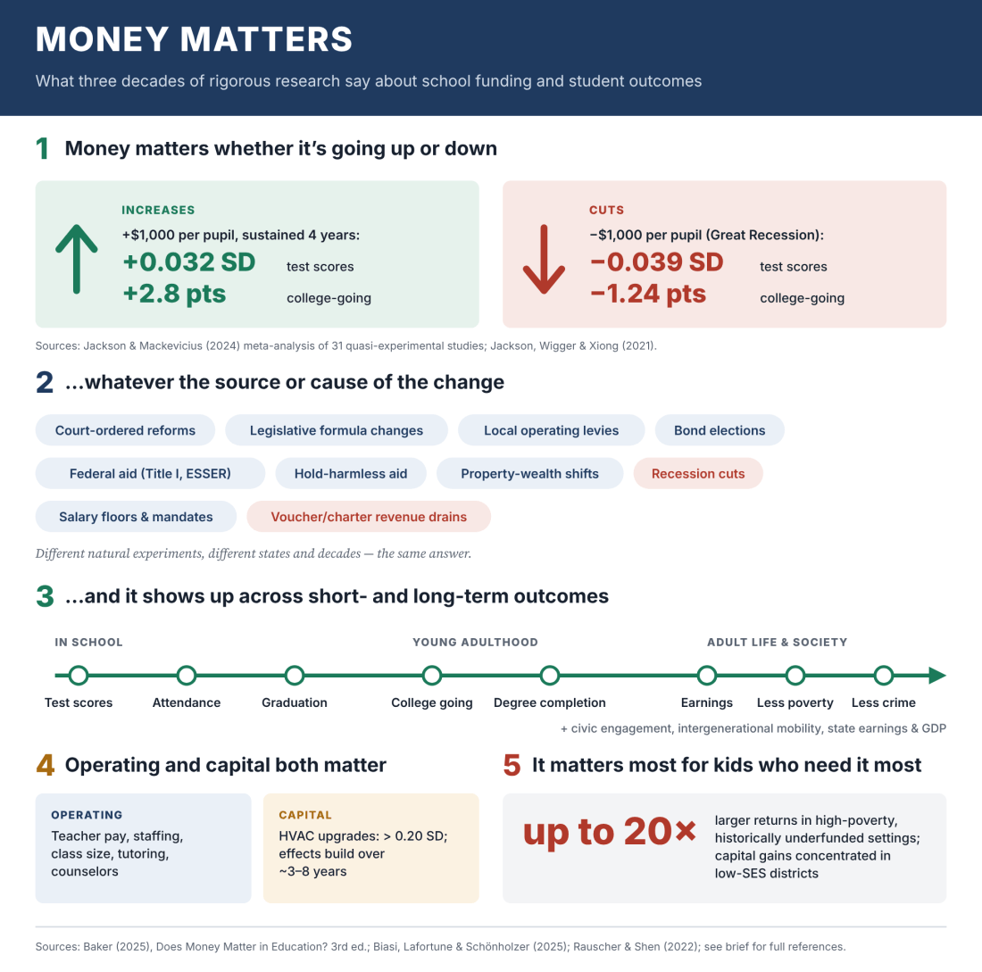
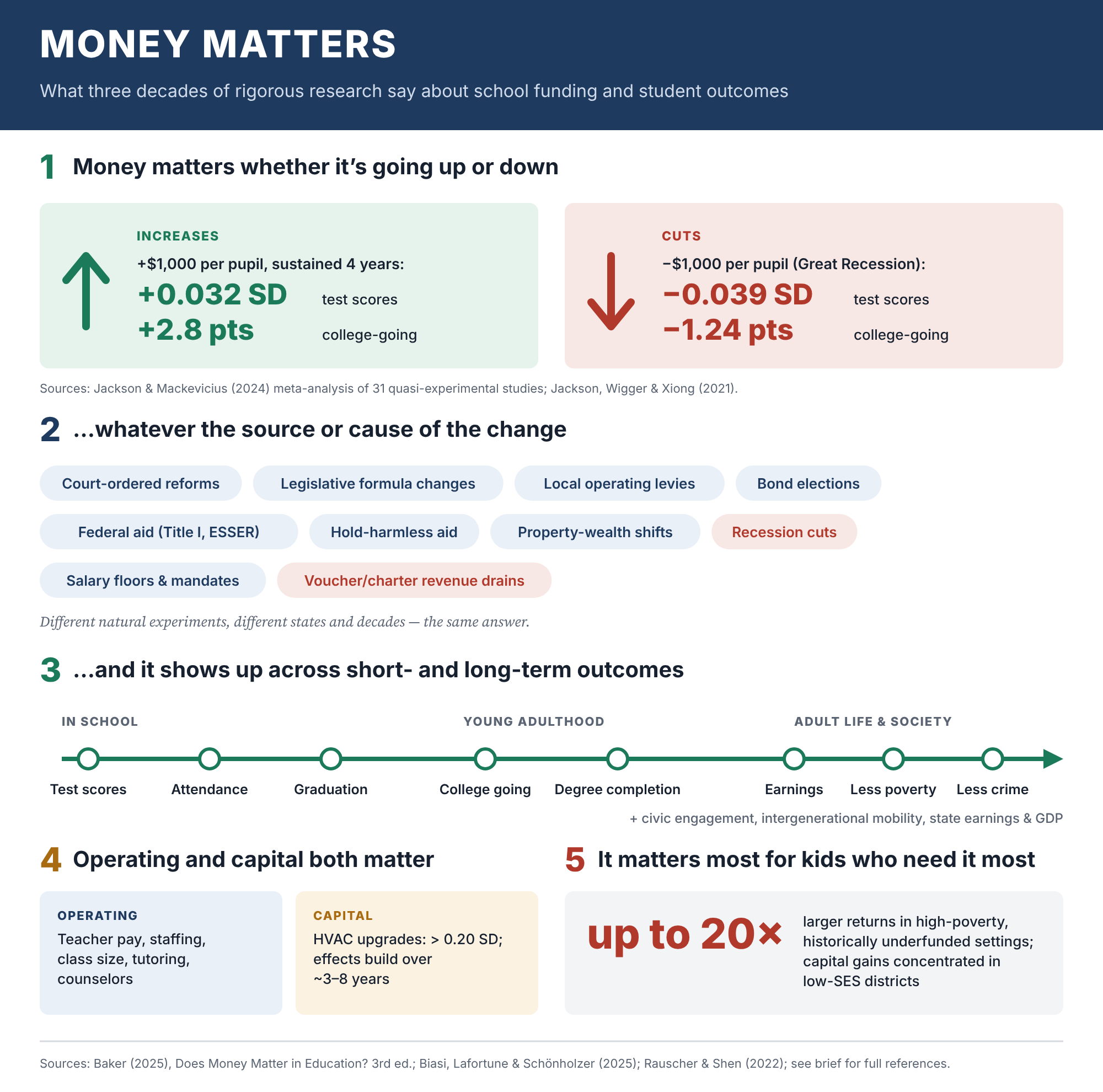
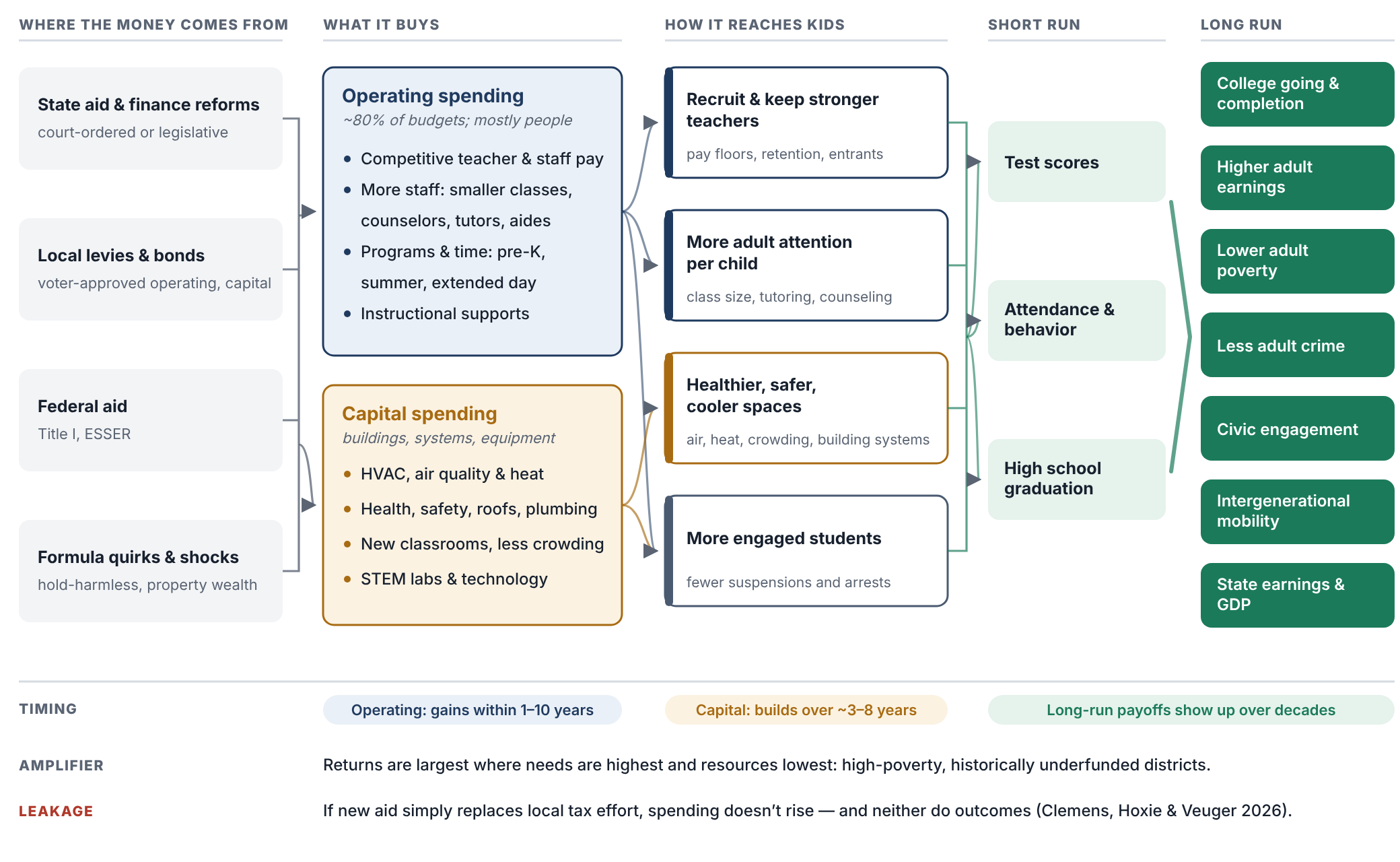
I put this report out last year, this new version of Does Money Matter in Education? — summarizing a whole bunch of rigorous, peer-reviewed studies applying different approaches and using different data that show us how and why money matters for improving student outcomes.

I talked about this years ago — for a decade, really. This is actually a little less than a decade old, in this book and in other sources on my blog going back more than a decade: basically the dumbest, most facile, simple-minded, intentionally deceitful versions of arguments that try to say, well, money doesn’t really matter. You can do great — you can be awesome with very little money — and you can suck with lots of money. Money’s gone up and test scores have gone down. There are really about four or five different versions of this argument that have been thrown out over the years, but there are two common ones — pretending to be empirical analyses — that are repeatedly used, and that I’ve repeatedly debunked, that just continue to find their way back.

At this point, anyone who’s putting these kinds of graphs out there is doing so knowingly and intentionally to deceive policymakers, courts, judges — whatever. Most of this stuff doesn’t make its way these days into judicial debates over school funding, but I had to face this again over a year ago, and then I’ve seen these graphs re-emerging for every state continuously over the past year — and even again recently on Twitter/Bluesky, where one of my colleagues, thankfully, also took a shot at just how stupid and intentionally deceitful these graphs are.

So let’s jump into it. If you’re a policymaker in a state — or if you know one, or if you’re on a commission in a state and people have been invited in and are putting this stuff in front of you — stop it right there. Kick them out of the room. This is not credible. It shouldn’t be part of the discussion. Just look at the graph.

Graph #1: The “long-term trend” graph

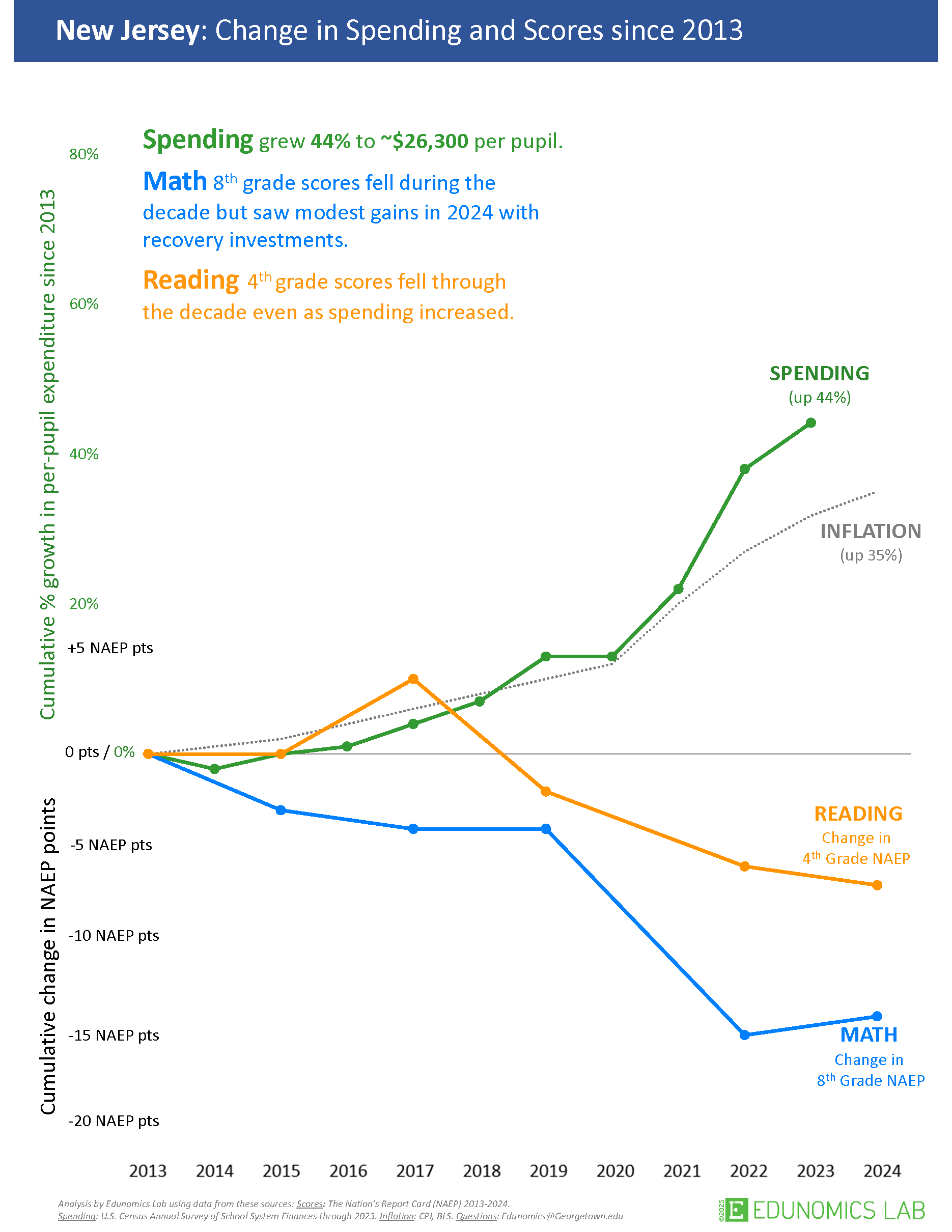
Here’s one of the graphs — this is the new version of what I call the long-term trend graph. The Edunomics Lab at Georgetown University — I’ll call them out by name — and Marguerite Roza have put out data visualization tools that let you make this graph for every state, and then the next graph I’ll talk about.

Let’s take a look at this. First of all — and I’ll explain why this is part of the intentional deceit — they picked 2013 as the starting year. Second, you get two totally different kinds of measures put on a common y-axis, a common vertical axis, with different units for the test scores than for the spending, and both of them stretched out to make it look like these trends are wildly diverging.

Edunomics-style “long-term trend” graph for Oregon: spending, NAEP math/reading, and inflation all plotted on a common stretched axis since 2013 (“BS of the Hour” slide).

And even the construction of the measures is a problem. We’ve got per-pupil spending, not even adjusted for inflation, and then a separate line for some inflation adjustment — maybe a Consumer Price Index — which isn’t even the right adjustment to use for per-pupil spending. I’ll show you what it looks like adjusted correctly in a few minutes.

They’ve got per-pupil spending skyrocketing. I’m using Oregon here because it’s the last place I was faced with having to waste an exorbitant amount of time debunking this garbage. So we’ve got per-pupil spending — not adjusted for inflation, just nominal per-pupil spending — seemingly skyrocketing, which you can do by stretching out the y-axis. And we’ve got NAEP (National Assessment of Educational Progress) test scores taking a dive from 2013 forward to 2024. Then there’s a separate, gratuitous inflation measure thrown in on yet another scale. My head explodes just looking at this. And most people who’ve encountered this graph and have any knowledge of how to do actual research and empirical analysis, and how to measure a school dollar — their heads have exploded too.

Why 2013 is the tell

Let’s talk about 2013 for a second. First, 2013 is well understood to be the point at which NAEP scores level off and/or start to decline. They go up for all the years before that, and then they hit a plateau and start to decline. So picking 2013 is intentionally picking the point at which, in almost any state, you can show test scores leveling off or going down while money is going up or staying the same — which, of course, looks bad. It implies money couldn’t possibly relate to test scores. Better research says otherwise, even for this period.

NAEP Grade 4 Reading and Grade 8 Math scores over time for all states, with Oregon highlighted — scores plateau/decline for nearly every state starting around 2013.

Here’s NAEP scores over time for all states, with Oregon highlighted — and, like the others, it just drifts downward from that point, more or less within the pattern of other states (a bit more so for the fourth-grade scores). But picking 2013 was intentionally picking the year at which NAEP scores level off or turn downward.

On the spending side: per-pupil spending for public school districts took a real hit starting around 2008–09. 2008 was about the best year for public school expenditures. From about 2008–09 to about 2011–12 is when spending really took a hit. It had drifted upward through 2008, then dips, and hits its bottom — leveling off and maybe starting to creep back upward a little around 2013.

Oregon per-pupil spending by fiscal year, adjusted for labor costs, compared to other states — spending bottoms out around 2013 after the Great Recession before drifting back up.

So if you pick 2013 as your starting point, what you’re actually picking is the year when the cuts to funding had hit bottom and test scores had hit their peak. Track it forward from there for almost any state, and you’ll get this apparent divergence — especially once you consider that spending should really be adjusted for the cost of recruiting and retaining a comparable-quality teacher workforce, given that private-sector and other wages have been rising faster than wages for teachers and public school employees. Adjusted that way, spending clearly does not skyrocket the way it does in their graph. Again, 2013 is right where spending per pupil bottoms out and levels off (maybe starts to climb a little) — stretch the axis and don’t adjust for anything, and you can make it look like it’s climbing a lot.

Interesting side note: there’s a really good empirical study by Jackson and coauthors (published via EducationNext) that shows the detrimental effects of recessionary cuts on student outcomes during that exact same period.

“Could the Disappointing 2017 NAEP Scores Be Due to the Great Recession?” (EducationNext) — Figure 1: NAEP scores and cumulative per-pupil spending, zoomed in on 2000–2015.

Zooming in on just the 2000–2015 period the way this study does, test scores actually rose when spending rose, leveled off when spending leveled off, and dipped when spending dipped — the opposite pattern from what’s implied by stretching the axes the way Edunomics does. That study’s authors go on to run solid, causal empirical analyses of this relationship — including, later, a study with more than 30 causal estimates of the returns to a $1,000 increase in public school expenditure, which I summarize along with a ton of other studies in my report.

And yet the graph still persists. It’s still thrown at us in the most absurd ways.

A properly adjusted version

Here’s another version of the graph — the blue line is roughly their version of per-pupil expenditures, though not as exaggerated as showing it as a percent change since 2013 on a stretched y-axis. Just unadjusted per-pupil spending: it went up. Adjusted for changes in labor costs, per-pupil spending is only ever so slightly higher in 2024 than it was in 2009 — that’s adjusting for what it costs to recruit and retain teachers of comparable qualifications.

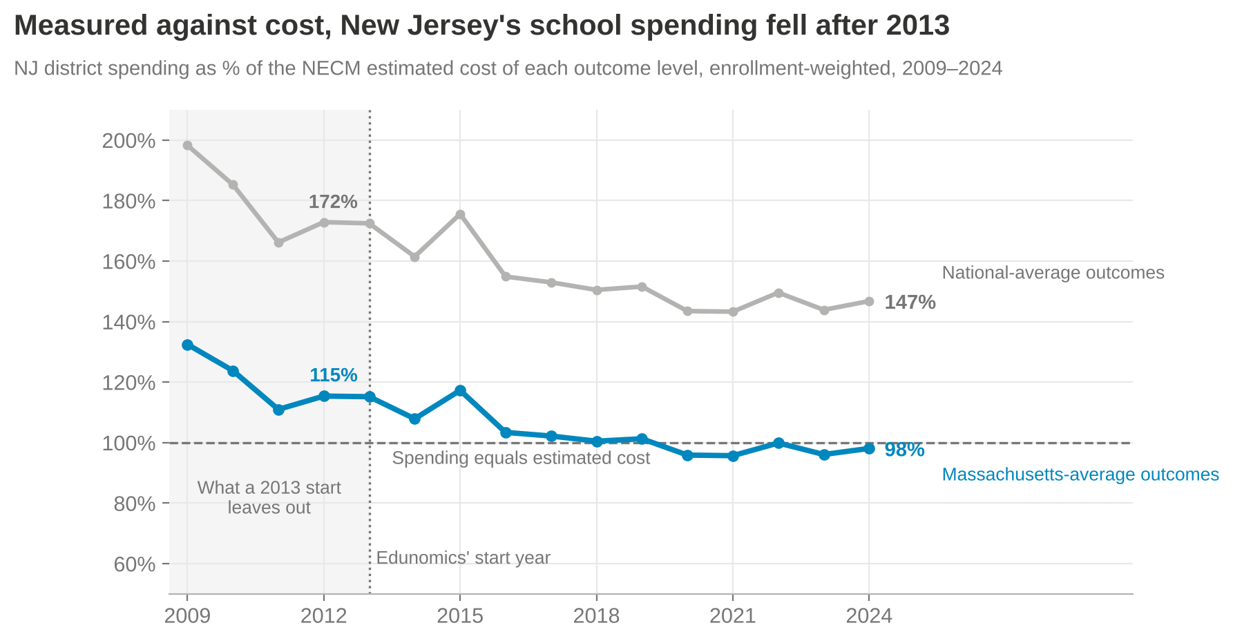
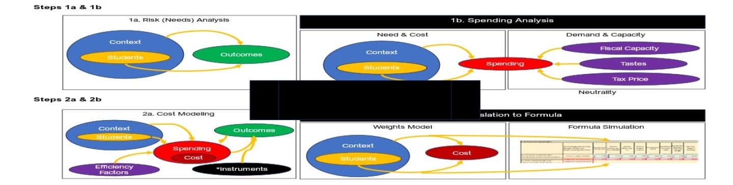
Now, if we adjust for all of the other cost changes — the student populations to be served, and everything else that goes into achieving a common set of outcomes, using our National Education Cost Model at schoolfinancedata.org — spending actually declined precipitously during and in the years immediately following the fiscal-austerity period after the Great Recession, then levels off, and may even continue drifting down slightly relative to what the dollar was worth toward achieving 2009-level outcomes.

“Permanent disinvestment” — spending with respect to the cost of achieving common outcome goals (nominal vs. labor-cost-adjusted vs. fully cost-of-outcomes-adjusted); the cost-adjusted line never rebounds after the Great Recession.

That’s what fully cost-adjusted spending looks like over time, in many if not most states.

Graph #2: The cross-sectional “spending vs. proficiency” scatterplot

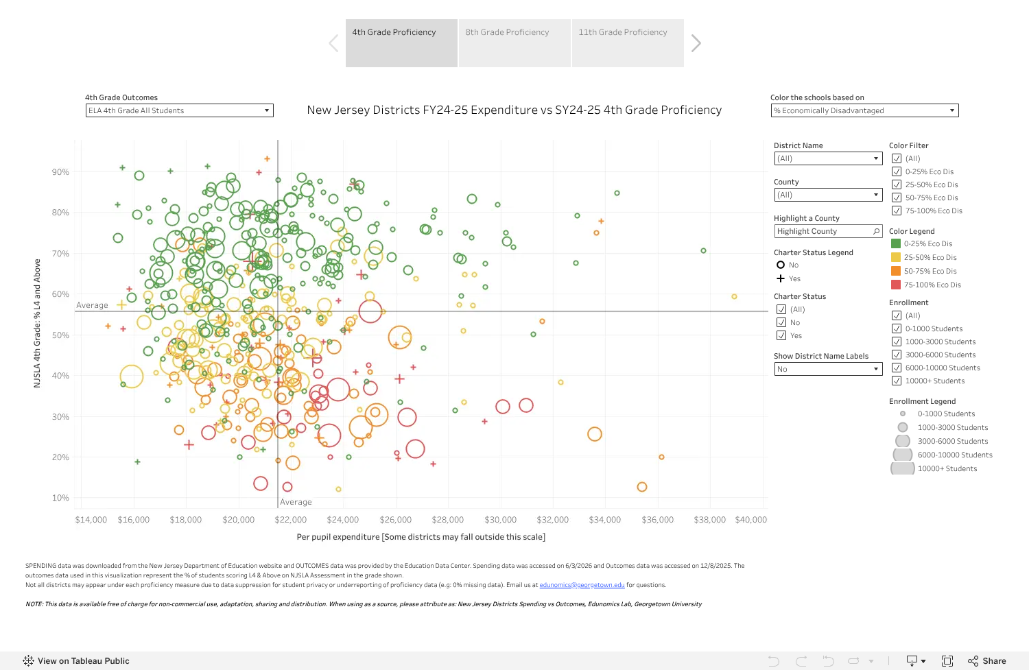
Now for graph number two — another mind-bogglingly, intentionally deceitful graph. The idea: take a whole bunch of schools across a state, regardless of differences in cost from one place to another or the students being served — schools of different grade levels and everything — and plot their per-pupil spending on the horizontal axis and their percent proficiency on state tests on the vertical axis.

The “Clouds of Doubt” graph: Oregon FY22–23 per-pupil expenditure vs. SY23–24 all-grades combined proficiency, with no cost adjustment — no visible relationship between spending and outcomes.

That lets you show that some schools do awesome with very little money, and some schools do crappy with a whole lot of money — so clearly, money doesn’t matter. That low-spending, high-scoring school just needs everyone else to learn from its awesomeness, and everyone can be awesome with whatever they have. Inequity doesn’t matter, adequacy is irrelevant — just get the better outcome, and if you don’t, it’s because you suck.

The layers of problems with this graph are mind-boggling. The main issue is the complete failure to adjust for the value of the school dollar toward achieving these outcomes from one place to the next — to look at the dollar adjusted for its value, or for whether it’s sufficient to achieve a given target given those outcomes.

What it looks like adjusted for cost

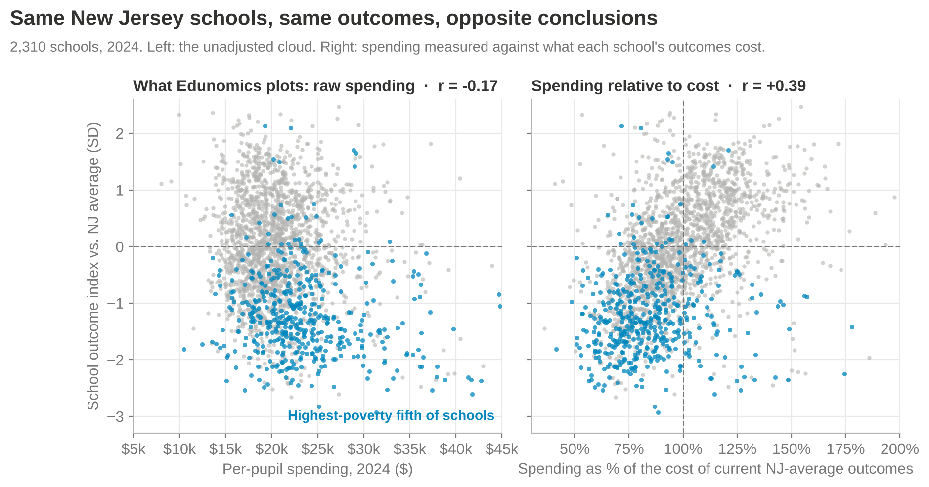
I can give a couple of examples of what happens when you do that adjustment. First, I put Oregon in the context of the nation for 2023. If you look at that unadjusted, the overall pattern looks downward — the more money you have, the worse you do, as if you just don’t know how to use it well, and need to be squeezed harder to perform like the districts in the upper-left corner.

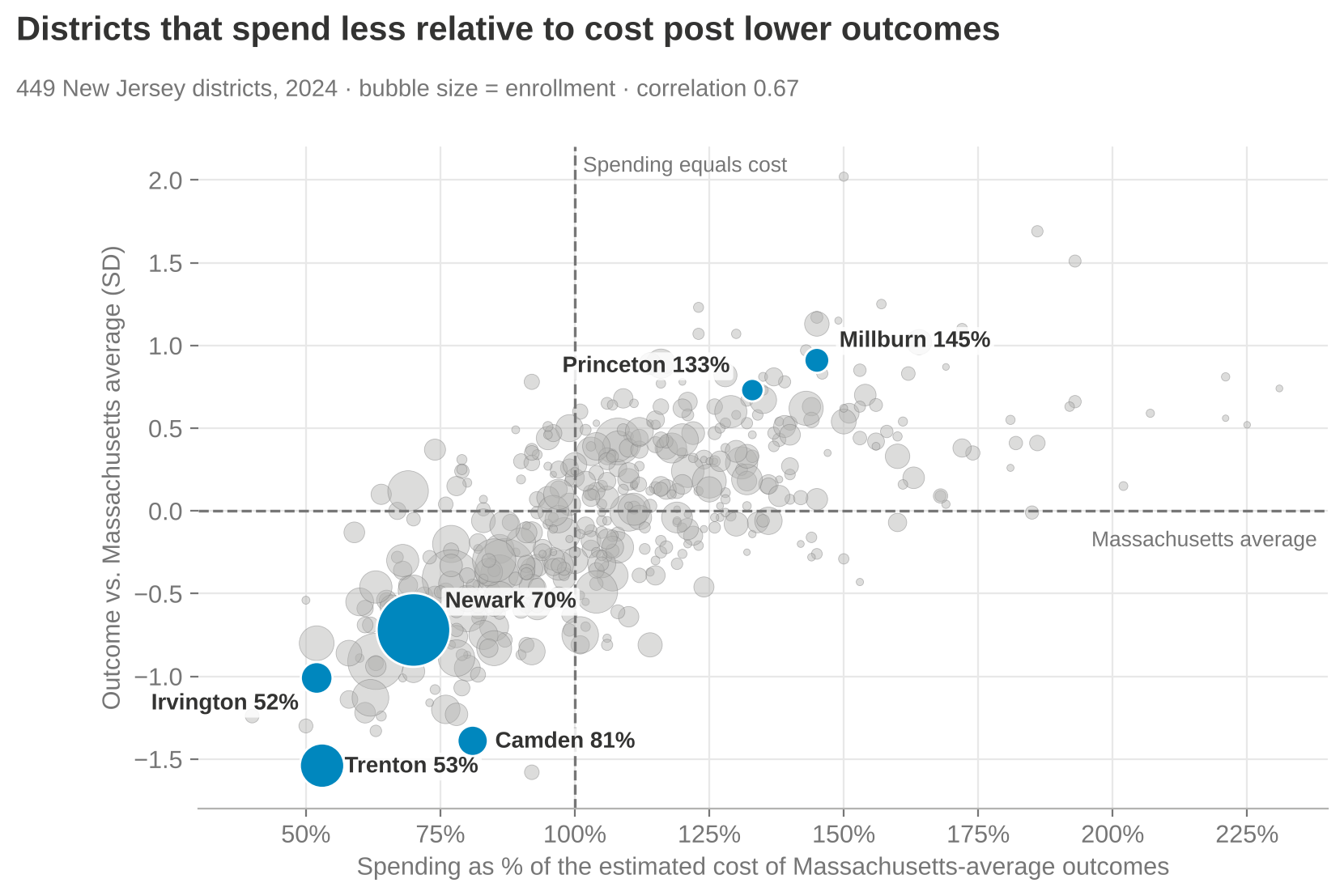
But if instead you responsibly use methods that have been in the peer-reviewed literature going back to about 1971 — and extensively since about 1998–99, in the “modern era” starting with a piece by Downes and Pogue in the early 1990s — and look at each district’s spending relative to what it would cost that district to achieve national-average outcomes, and then look at their actual outcomes relative to the national average, districts that spend more (relative to their cost of achieving average outcomes) achieve more, on average.

“Actual (cost adjusted) Spending & Outcomes” — Oregon districts (red) against the national distribution (gray): funding gap to the cost of national mean outcomes vs. outcome index. A clear, strong, positive relationship.

Districts on the right-hand side of this picture are ones spending more than they’d need to achieve national-average outcomes, and the districts in the upper-right quadrant are mostly achieving above-average outcomes. Districts in the lower left have less funding than needed to achieve national-average outcomes — and guess what, they’re achieving below-average outcomes.

There’s still variation around that trend line — more adequate funding (controlling for costs) generally means better outcomes, but there’s variation worth exploring further, which my colleagues and I have done in individual states. For example, a report on Colorado compares districts and schools that get better outcomes than would be expected given their spending. Sometimes what we find is that there was simply something our model didn’t fully capture about that school or district; sometimes we get real insight into what they’re doing differently. That’s what real efficiency analysis looks like — not making a judgment with no consideration at all for the value of the school dollar.

This other stuff — the raw scatterplot — is garbage. Just say it bluntly: it’s garbage. It’s intentionally deceitful. It has no place in a real policy conversation about how to help schools improve, or how to equitably and adequately fund schools. It shouldn’t be part of the conversation, and neither should the long-term trend graph. It’s utterly ridiculous.

A side-by-side, nationwide comparison

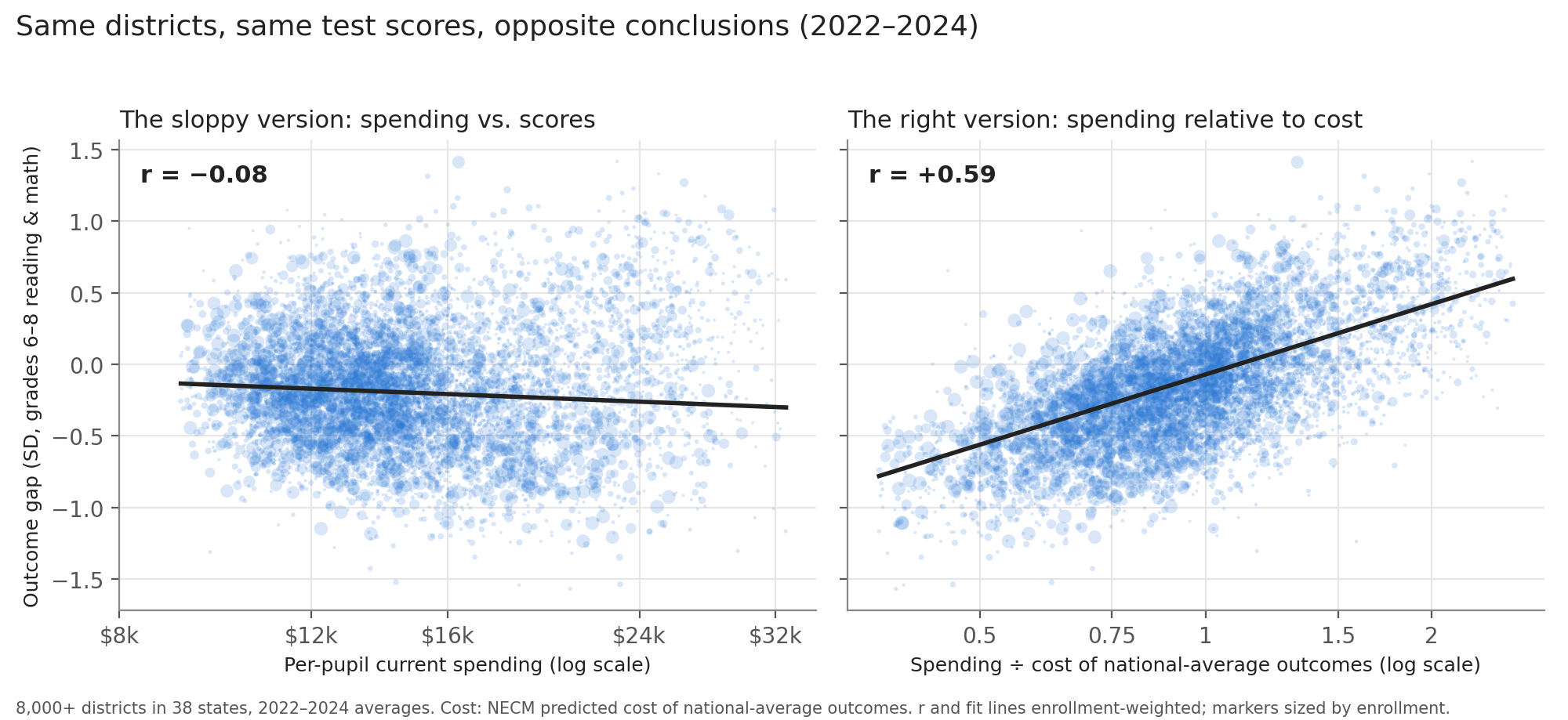
Here’s a side-by-side comparison. If I take districts across the whole country and just look at their per-pupil spending relative to the average for their labor market (i.e., adjusted for regional cost differences in the labor market — from Kansas City to El Paso to New York) — districts spending more than their labor-market average versus less — and plot that against an outcome index combining reading and math scores for grades three through eight, it looks a lot like the Edunomics-style graph: overall, the higher-spending districts don’t appear to be doing any better.

“What a competent comparison looks like” — left: spending/labor-market mean vs. outcomes with no cost control; right: current spending as % of adequate spending (cost) vs. outcomes, with cost control. The relationship only emerges once cost is controlled for.

But if you instead adjust properly for the full cost of achieving a given outcome goal and then plot it, districts with more adequate spending relative to that cost have higher outcomes, and districts with less adequate spending have lower outcomes. Then you can start to explore what explains the variation among districts at similar levels of spending and outcomes — but you can’t make any judgment at all from the unadjusted version. Putting that unadjusted version in front of policymakers or any audience — or, for that matter, using it to teach and train people in a school finance certificate program — is reckless, irresponsible, and needs to stop.

Oregon, school level

Here’s what it looks like in Oregon with school-level data, based on a report I produced with colleagues at the American Institutes for Research.

AIR’s “Understanding the Cost of Providing Adequate Educational Opportunity in Oregon” (Feb. 2025) — Exhibit 18: funding gaps by outcome gaps for statewide-average and +1 SD target outcome standards, school year 2022–23.

It’s a messy graph, but it generally trends upward, and the statistical analyses in the report show that schools with more adequate funding tend to have higher outcomes, and schools with less adequate funding tend to have lower outcomes. And when you set a higher outcome goal, it costs more to reach it. That’s the punchline.

Closing

This isn’t new, and it shouldn’t come as a surprise to anyone. I called graphs like the second one “clouds of doubt” in my 2018 book — clouds of doubt and the long-term trend were two of the most deceitful ways people tried to argue that schools just need to do better with what they’ve got, that more money doesn’t matter, that we should stop “throwing money” at schools because outcomes are declining anyway. All of that is garbage, and it’s well understood to be garbage. These particular empirical representations of it are an absolute joke.

Stop it now. Shut the door on it. Kick it out of the room. It has no place here, period.

Thank you, and have a wonderful day — I’ve enjoyed this pleasant time chatting with you.

Referenced reports

Baker, Bruce D. (2025). Does Money Matter in Education? (Third Edition). Albert Shanker Institute. shankerinstitute.org/resource/does-money-matter-in-education — PDF: moneymatters3rdedition_final.pdf

Baker, Bruce D., & Losen, Daniel J. (2026). Unpacking Racial Disparities in School Spending: Why “progressiveness” and “comparability” are not enough. EdWorkingPaper ai26-1558, Annenberg Institute at Brown University. edworkingpapers.com/ai26-1558

Brooks, Christopher D., Levin, Jesse, Salvato, Brad, & Baker, Bruce D. (2025). Understanding the Cost of Providing Adequate Educational Opportunity in Oregon. American Institutes for Research, prepared for the Oregon Legislative Policy and Research Office. air.org PDF

Illustrations: Why “Cost” Matters in School Finance Research

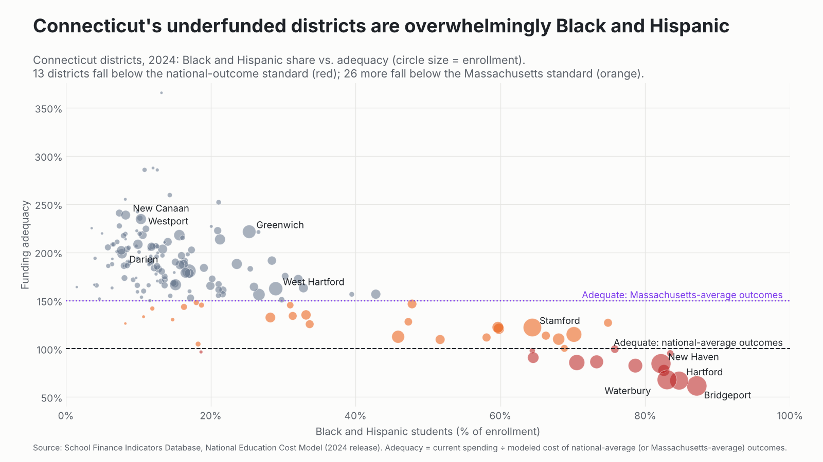
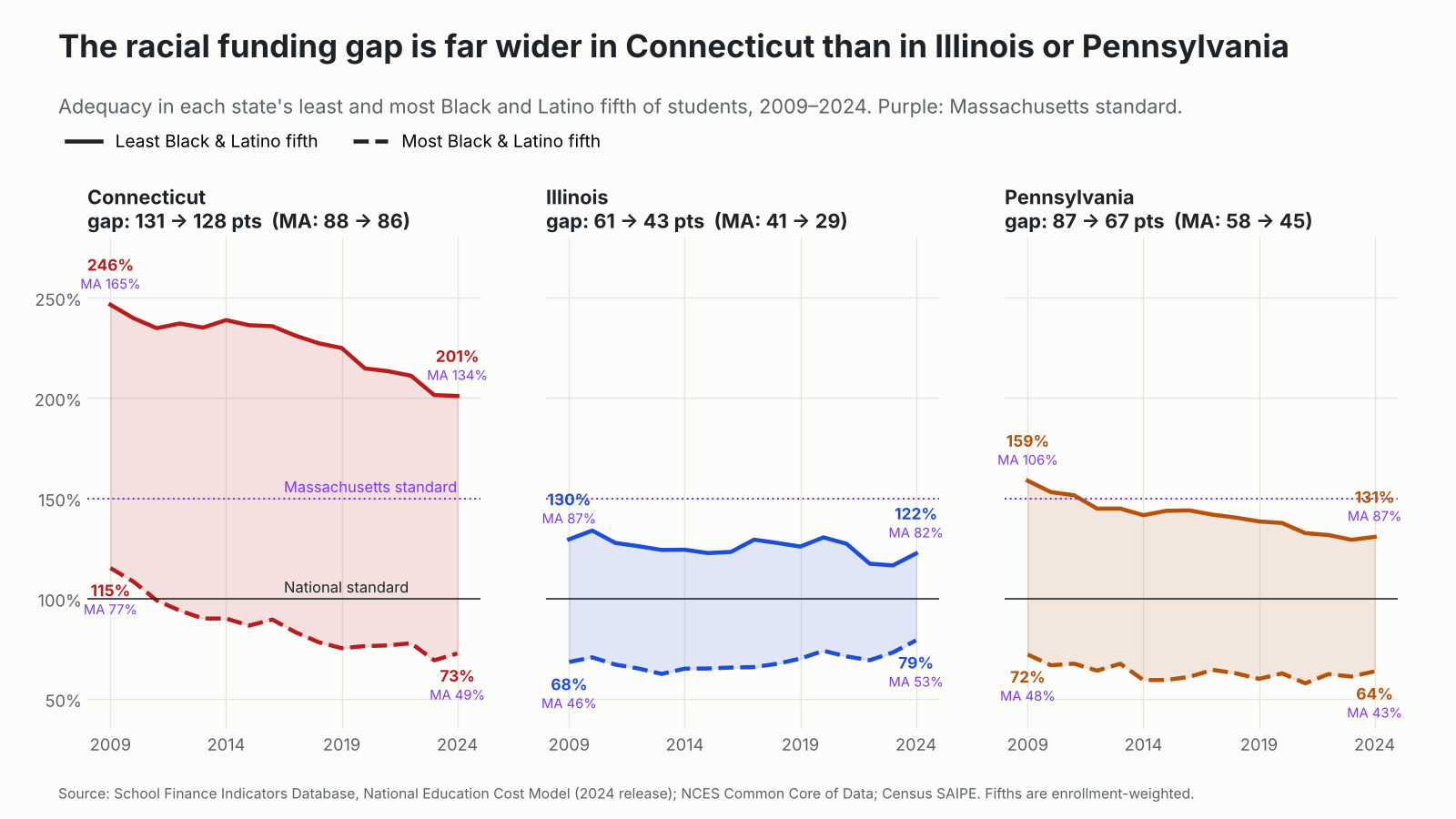
Figure 1 – left panel – compares nominal per pupil spending by U.S. Census Poverty rates for all school districts nationally. Per pupil spending is measured as a ratio of each school district’s spending to the average spending for all other districts in the same labor market (metropolitan or micropolitan core based statistical area or rural area outside of CBSA, within each state). A district with a spending ratio of 1.0 would be spending at the average of those districts around it. This approach compares districts subject to similar input prices. What we see here is that on average, districts with higher rates of child poverty tend to have higher per pupil spending. In fact, moving from 0% to 100% child poverty would be associated with .62 increase in per pupil spending (from average to 62% above average). More realistically, within the actual range of data, the highest poverty district would be expected to have about 31% higher relative spending than the lowest poverty district, in 2023, weighted for district enrollment. That sounds rather progressive. But, is it progressive enough? To provide equal opportunity? Similarly, as we can see in Figure 2 – left panel – districts that serve majority black student enrollments tend to be above the “average” line, while also being generally high in child poverty rate. Measured this way, a district that is 100% black would be expected to have about 25% higher relative spending. Again, progressive.

Figure 1 – right panel – shows what happens when we measure current spending with respect to the cost of achieving national average outcomes in reading and math. Despite the uphill (progressive) slope in the left panel, we see a regressive slope with respect to poverty in the right panel. If the slope in left panel was steep enough – progressive enough – the right panel would have all districts falling along the horizontal line. The right panel captures both adequacy and equal opportunity. Adequacy – measured as a low bar of national average outcomes in reading and math, is captured in the dashed horizontal line. Many low poverty (left) districts spend well above what would be needed to achieve merely “adequate” outcomes measured by this low bar. Meanwhile, most high poverty districts and nearly all majority black districts fall below spending needed to achieve “adequate” outcomes. The distance of each district to the horizontal line, or ratio to it, measures equal educational opportunity.

Figure 1

Figure 2 shows why this reframing is so important. It is important that we understand the outcome implications of inadequate funding. That the goal of a well-designed funding formula is to ensure that all children have resources adequate to achieve a common set of educational outcomes. State school accountability systems are premised on as much – that all children are expected to achieve “X.” And that school and district officials shall be subject to penalties if or when they do not. That is, even if the state has not calibrated the school funding formula to provide equal opportunity to do so.

Figure 2 – left panel – shows that if we look just a relative spending and student outcomes, higher spending districts have lower outcomes, with majority black districts having relatively higher spending but particularly low outcomes (combined, normed index of reading and math achievement). The opposite is true (right panel) when comparing the adequacy of spending to outcomes – more adequate spending leads to higher outcomes, consistent with the research on how and why money matters. Additionally, the adequacy of district spending explains nearly 40% of outcome variation, whereas relative spending alone explains about 5%, but in the “wrong” direction.  Spending adequacy is simply the better, more correct (more valid[1]) measure for comparing access to fiscal resources across children and setting. These are the same data used above, also for 2023. Collectively what Figures 2 and 3 tell us is that while spending on average is “progressive” it is far from “progressive enough,” leaving large gaps in equal educational opportunity, including significant racial gaps.

Figure 2


[1] Valid in the sense that the measure has predictive validity – can predict the outcome measures of interest (with the correct sign, sufficient magnitude and variance explained) – which, in this case are measured student outcomes in reading and math. See also: Baker, B. D. (2006). Evaluating the reliability, validity, and usefulness of education cost studies. Journal of Education Finance, 32(2), 170-201.

Oh, the Thinks You Can Think About School Funds! (Seussical thoughts on “money follows the child”)

More serious posts on this topic: https://schoolfinance101.com/?s=public+goods

In the town of Ka-Boodle by Lake Sneetchy Creek,
The folks all paid taxes each month and each week.
For schools and for sidewalks and fire trucks so red,
And libraries full of good books to be read.

But then came the Chortlers from Voucher Von Vee,
Who shouted, “That money belongs to each wee
Little child with a backpack! It follows them round!
Just stuff it in pockets and spread it around!”

“The money’s the CHILD’S!” cried the Bellowing Band.
“It does not belong to the schools or the land!
Just hand every parent a sack full of cash,
And schools can all scramble and boomity-crash!”

Now the Grickle-eyed Mayor scratched hard at his chin.
“That’s not how public goods work, my dear kin.

When taxpayers gather their dollars in pools,
They build mighty systems — like hospitals, schools.
The money’s not owned by one youngster named Ned
Who doodles green Yoppets and sleeps in his bed.

It pays for the buses! The pipes! The big roofs!
The science lab beakers! The gymnasium hoops!
The playgrounds! The band room! The boilers downstairs!
The nurses and counselors helping with cares!

And some of these things were bought long years ago
With debts that will linger through sunshine and snow.
So taxpayers all — even old Uncle Zed,
Whose children are forty and mostly bald-headed —
Still pay for the schools because everyone gains
From communities filled with smart citizens’ brains!”

“But what about choice?” cried the Chortlers once more.
“Shouldn’t each family shop school like a store?”

“Ah yes,” said the Mayor, “but schools are not socks.
They’re not jars of pickles or purple mail-box locks.
A public good works when folks plan it together,
Through rainstorms and hard times and wild Wumbus weather.

If every last dollar just fled with each child,
Whole systems would wobble and grow rather wild.
You still must heat buildings and run every route
Even when one little Who-zit skips out.”

The Chortlers grew quieter. Some scratched their knees.
One murmured, “Public goods aren’t private fees…”

And down by Lake Sneetchy, beneath truffula skies,
The townsfolk grew slightly more thoughtful and wise.

For schools are not gadgets to auction or trade.
They’re promises communities carefully made.
And taxes, though grumbly, when pooled with some care,
Can build things no single small person could bear.

If Dr. Seuss Opined on Equal Educational Opportunity (a productive use of LLMs)

Alas – I’ve found a use for OpenAI – Converting my deepest theoretical musings on school finance into Seussical prose:

Oh, the Funds You Will Flum!
(A Zany Zoodle on Equity, Adequacy, and Opportunity Gum)

In a flibber-flap land of the Schollaroo Schools,
With Sneetchy-like districts and Yoppity rules,
There lived some young learners (some tall, some quite small),
Some had lots of Zoom-Zooks… some nothing at all.

Now the Board of Big Thinkers (in hats three feet wide)
Said, “Fairness! We’ll fix it!” and puffed up with pride.
“We’ll give EVERY school just the same little stack—
Same dollars! Same books! Same chalk in each pack!”

But the Glumguzzle Kids from the Far Fizzle Vale
Said, “That sameness you’re selling is starting to fail!
For we’ve got more needs than the Zazzberry crew—
Same stuff doesn’t make us equal to you!”

“Oh fiddle-dee-FOOF!” said a Number McNerd,
Adjusting his graphs (which were wildly absurd).
“If fairness is sameness, then sameness we’ll do!”
But the data went BLORP! and the theory fell through.

Then a Wise Whiffling Wonk (with a long curly tie)
Said, “You’re asking the wrong kind of ‘what’ and of ‘why.’
Don’t stare at the STUFF—don’t just measure the pile—
Ask what kids can do at the end of the mile!”

“Set goals!” cried the Wonk. “Let outcomes be king!
A common big target for every small thing!
If all kids must reach the same Zibble-Zoo height,
Then fund them so EACH one can climb it just right!”

“But WAIT!” cried the Snargle from Budget Bay Bog,
“You’re forgetting the Blibbers! The Froons! And the Fog!
Some start way behind on the Great Learning Track—
You can’t just say ‘equal!’ and pat your own back!”

So they huddled and muddled and scribbled in ink,
With equations that wobbled and charts that would clink.
Till they stumbled—KERSPLOOSH!—on a curious rule:
“To be truly fair, you fund not by the school…

But by NEED!” they all shouted. “Yes, NEED is the key!
More Zorks for the Borks! More help for the Wee!
Unequal inputs (now isn’t that neat?)
Are how equal outcomes can finally meet!”

Then in strutted Adequacy (round as a bun),
Saying, “I’ve got a shortcut! A quick way! A fun!
Just set a low bar—call it ‘good enough done’—
And declare every system a marvelous one!”

“Oh NO!” cried the Wonk, with a wobble and squeak,
“That ‘good enough’ thinking is terribly weak!
If some kids zoom high on a rocket of flair,
While others just hover… that still isn’t fair!”

“For school’s not a puddle—it’s more like a race,
Or a ladder, or jungle, or zig-zaggy place!
Where where you land matters (oh yes, it is true),
For jobs and for futures and who gets what who!”

“So adequacy?” asked a small nervous Nerp.
“Is it useful at all, or just policy burp?”

“Why yes!” said the Wonk. “But don’t let it shrink—
When budgets go BLINK! and revenues BLINK!
That floor must stay sturdy, not sink in the goo,
Or opportunity slips right away from your view.”

Then they built a GRAND GIZMO (with levers and springs),
That balanced these tricky, conflicting things:

One lever for NEED (pull it higher for some),
One lever for GOALS (so all kids can become),
One lever for BASES (tax gaps big and wide),
So poor little districts don’t lag far behind.

The machine whirred and clanked—CLACK-CLUNKETY-CLACK!—
Spitting fairness (at last!) from the back of the stack.

And the children? The children went ZOOMITY-ZEE!
Climbing their ladders as far as could be!
Not all in the same way, not all at the same pace,
But each with a real, fighting, fair-starting place.

So remember, dear reader (with eyebrows or none),
This tale of the Funds You Will Flum when begun:

Don’t trust simple sameness—it’s often a trick.
Don’t settle for “adequate”—that’s far too quick.
Set bold common goals, but fund smartly indeed—
And tilt all the dollars in favor of NEED.

For a system that’s fair (in this wibbly world stew)
Must be stretchy and thoughtful and slightly askew—
A bit Seussian strange, but precisely on track…

Or the whole thing goes SPLOOP!
…and we’re right back to whack.

Florida School Finance Update: Here’s your manageable standard, now fund it!

I’ve had the pleasure of running some new models with updated data in the past few days. I recently produced a lengthy report on school funding in Florida.

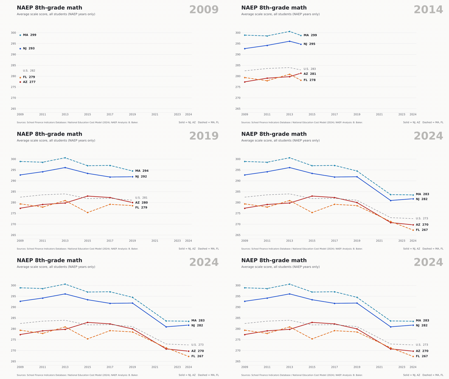
I’ve pointed out on several occasions recently that Florida schools have continued their rapid decline in 8th grade outcomes in reading and math. Florida is one of the reasons why Mississippi’s overall rank improves on national assessments. Yay for Florida.

The thing about Florida is that the state, over the past decade and more, has uniformly crushed the public schooling system and the outcomes it produces. Here’s the distribution of district average performance on reading and math for all FL districts compared to national average outcomes (0- horizontal red line). The vast majority of Florida kids are now below – well below that line.

Not shockingly, relating back to my report linked above, there’s a connection between these performance declines and the inadequacy of funding provided to Florida public schools over the past decade. As I explained in my report – and in several other reports and peer reviewed articles – I have a model based on data for every school district in the U.S. which generates predictions of the spending needed in each school district to achieve different levels of student outcomes (standardized reading/math outcomes).

Here’s where Florida districts stand when comparing their current spending as a ratio to the estimated need for achieving a) national average and b) 1 standard deviation above national average outcomes in reading and math. I actually had to cut off the top part of these graphs to focus in on the bottom and show the spread of Florida districts which are now almost entirely packed into the bottom half.

Now, in my report, I explained how the Florida Supreme Court said there’s really no way to set a manageable standard for what’s adequate anyway, so the legislature should just do whatever it wants. Well, those red horizontal lines aren’t just manageable standards, they are reasonable empirical predictions that could be directly used in guiding the state school finance formula. But, silly me, with my data and models (courts in other states have relied heavily on such evidence for setting such standards).

Florida’s constitution (education article), ratified/revised by Florida’s citizens in 1998 and 2002, requires provision of a high quality system of public schools. We can quibble over whether national averages in reading and math are “high quality,” or merely average. I’d say the latter. What’s clear is that Florida’s school finance system, for MOST OF FLORIDA’S CHILDREN falls short of providing sufficient financing for even that goal – and as a result – most Florida children no longer meet even that modest goal?

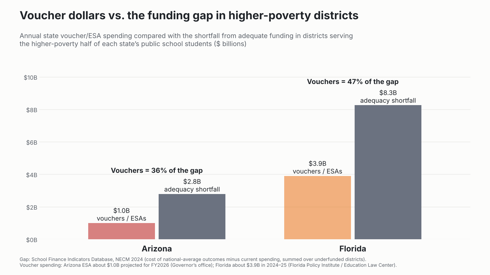
This figure shows the distribution of a) current spending with respect to differences in child poverty rate and b) cost estimates for the low (national average) and high (+1 standard deviation) outcome goals. Florida specifically falls well short of providing sufficient funding for children in higher poverty communities to achieve even the modest outcome goal – national average.

Over time, the reality of Florida school funding – actual spending – has slid further and further below these targets – things weren’t actually so bad in 2009 (kinda “meh” but not like they are now).

Here’s another view of the problem. A self-inflicted – excuse me – legislatively inflicted problem. After all, the adequacy of school funding in every state is a responsibility of state elected officials. When it’s good, that’s their accomplishment. When it’s not so good? That’s on them too!

Here, we see the overall relationship, across the US, in 2023, between the relative adequacy of funding to achieve national average outcomes (current spending / spending needed), and, their actual outcomes! Shockingly, or perhaps not, districts (each dot is a district – beige are all districts nationally) with more adequate funding have higher outcomes in reading and math. Districts to the right of the vertical red line spend more than their cost estimate (to achieve national average outcomes). Districts to the left of the vertical red line spend less than their need estimate. Districts above the horizontal red line perform above national average outcomes and districts below the horizontal red line perform below national average outcomes. The worst place to be is in the lower left quadrant – not enough money and poor outcomes. And that’s exactly where most Florida school districts presently sit – with better funded districts performing better and worse funded districts performing, well, worse.

One upside for Florida districts is that they generally sit on or above the diagonal line which might be interpreted as representing average efficiency in producing outcomes. Florida school districts are efficiently producing the outcomes they produce – getting better than expected outcomes. By the way, that’s what actual efficiency analysis looks like – not the DOGEY BS we keep hearing about. It’s about rigorously evaluating the quality of output of a business or government entity, given the inputs, and NOT about creating faux outrage over some anecdotal line item on an expense sheet.

Florida school districts just don’t have the resources to do much better, and as a result, aren’t doing better. The solution one can derive from this image is to push Florida districts up that slide – that diagonal – from lower left to upper right! That is – to provide more adequate funding, and particularly to those furthest in the lower left – which tend to be districts serving higher poverty student populations.

But, rather than push districts from the lower left to the upper right, the state has instead, let districts slide from the middle/upper right to the lower left. This is a problem that can be fixed. And the solution is rather transparent – Adequate funding. And funding progressively distributed to schools and districts serving higher need student populations.

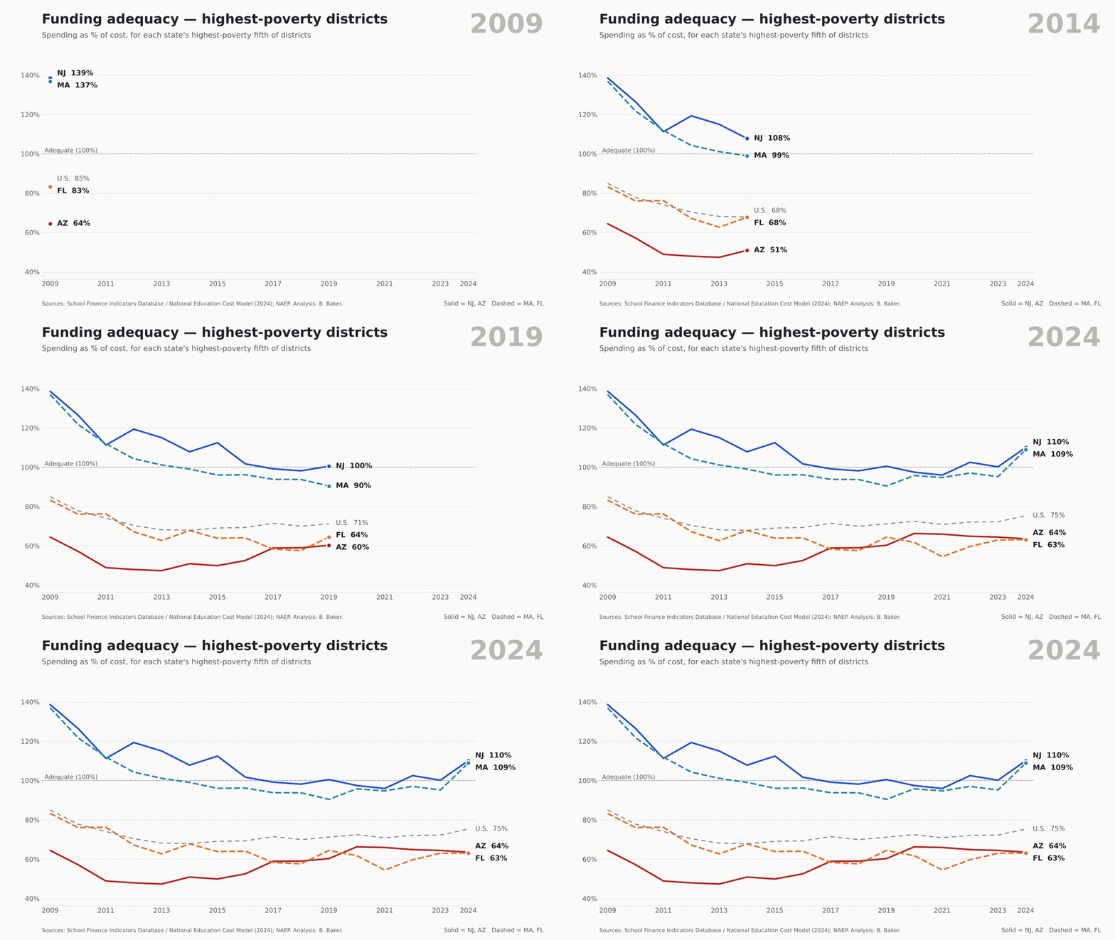
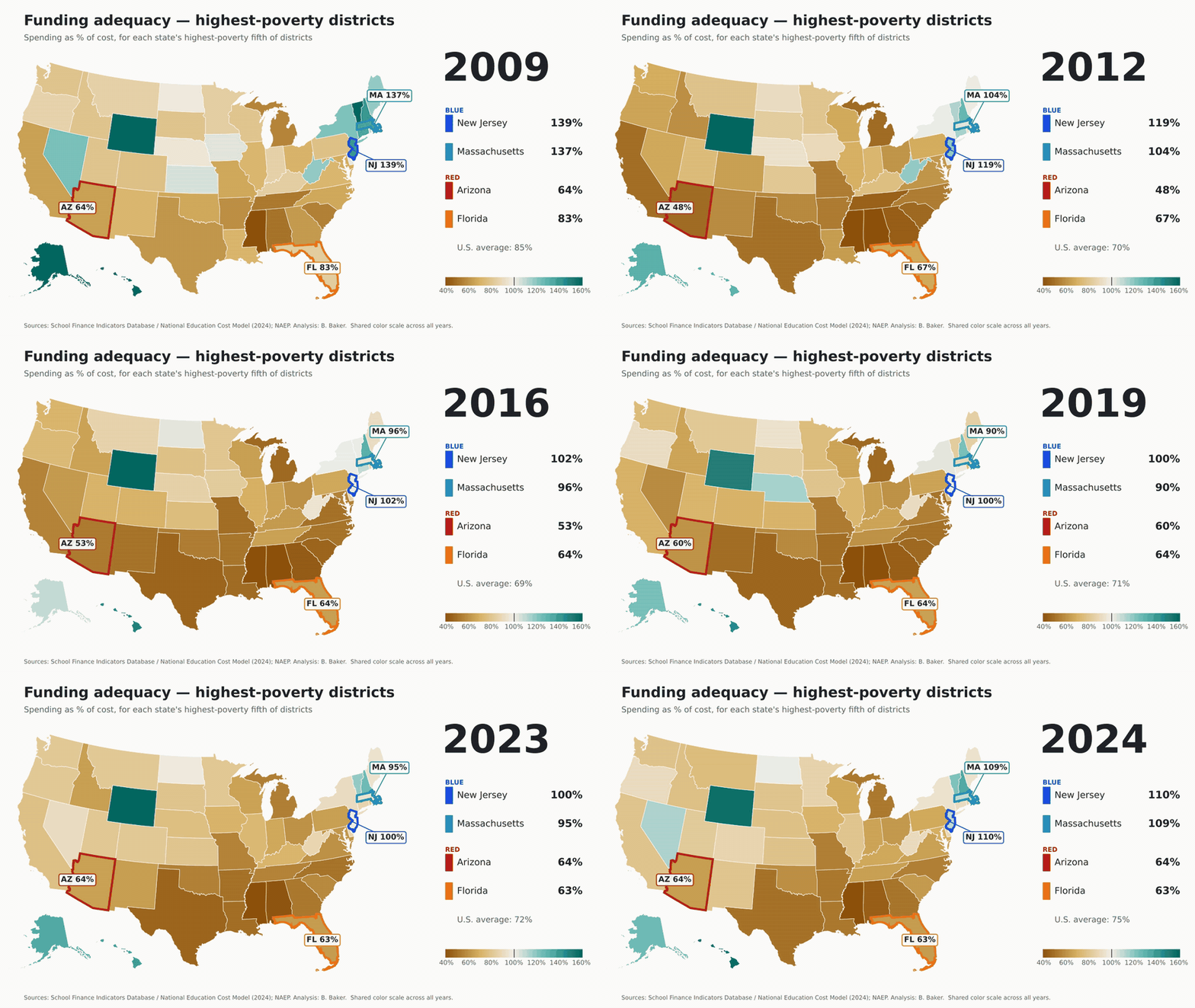
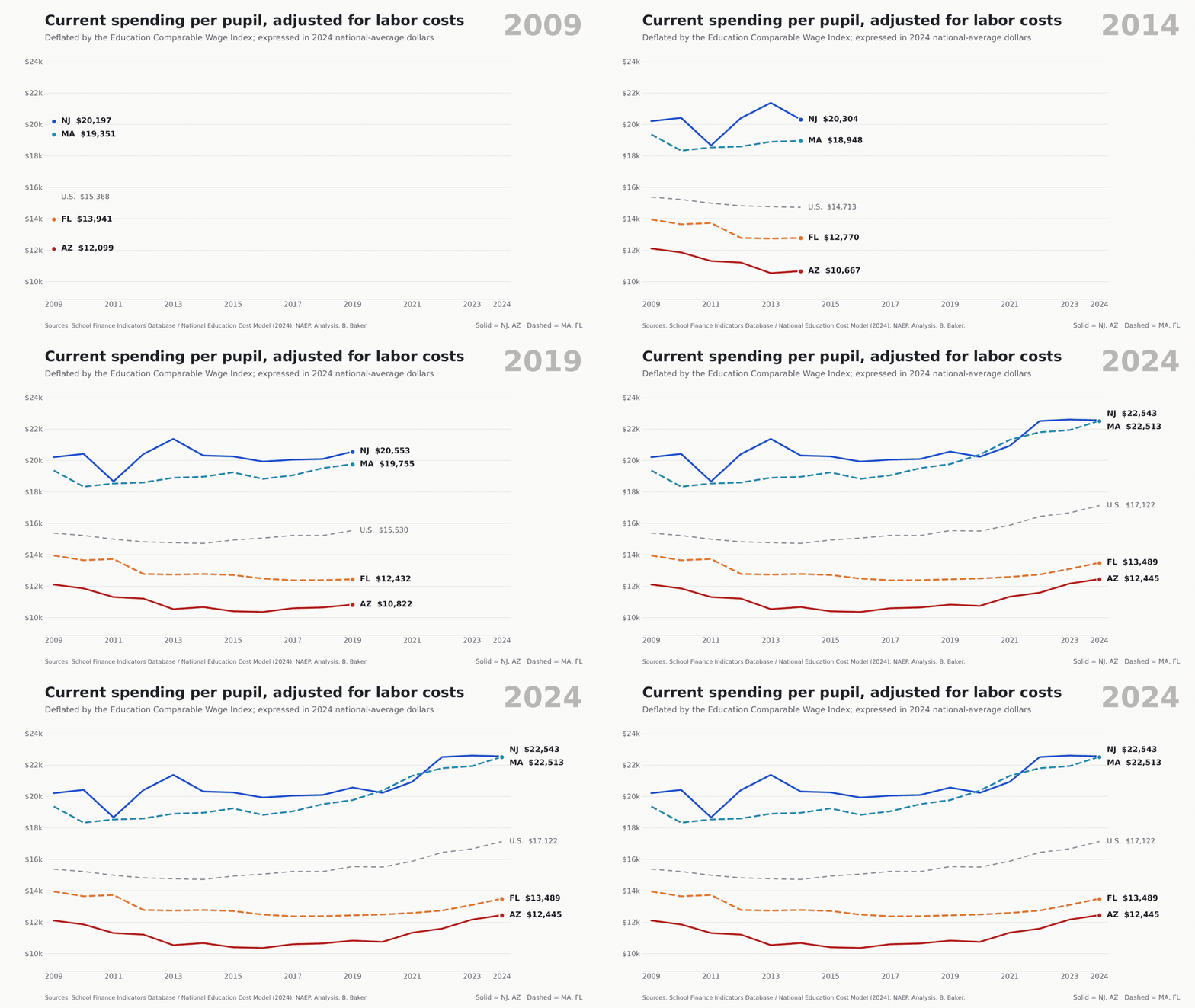
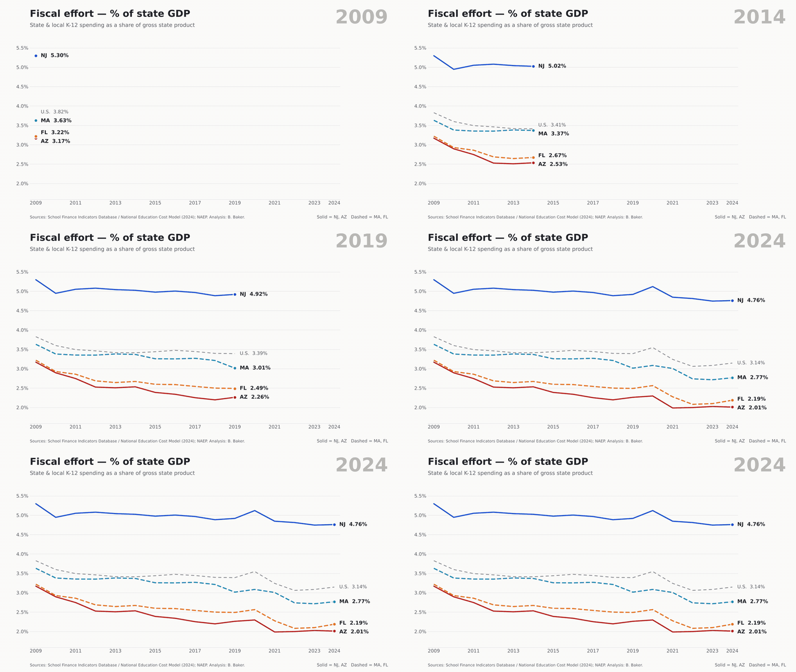
The solution is adequate funding. At least for Florida – here and now. And yes, Florida can afford that solution. Florida is near last in the country on the share of its economic capacity spent on K12 schooling. As a result, Florida school districts actually spend less, in adjusted dollars, per pupil than they did in 1993 and now spend less than Mississippi. Woohooo. Yay for Florida again. As I point out in my report linked above, even if Florida merely spent the same share of state GDP on public ed now as in the mid 2000s, the state would spend nearly 30% more than it does now. That would close a significant portion of the funding gap toward moving the state back to average outcomes. Still not high. But not falling off the cliff they have been for the past several years.

Time to start having the right conversation about school finance in Florida to ensure that all children in Florida have access to “a uniform, efficient, safe, secure, and high quality system of free public schools that allows students to obtain a high quality education…”