New Jersey edition. Download the full brief: Misinform, Not Inform (PDF).
Two graphics from Marguerite Roza’s Edunomics Lab at Georgetown have been showing up in one state after another. Edunomics publishes a version of each for every state. One shows spending rising and NAEP scores falling since 2013. The other scatters every district by spending and test scores and finds no pattern. Wherever they land, they deliver the same message: the state has poured money into its schools and gotten nothing for it.
It’s only a matter of time before they show up in New Jersey. The New Jersey versions are already sitting on Edunomics’ website, ready to be dropped into testimony, op-eds and budget hearings. So here, in advance, is what’s wrong with them, using New Jersey’s own data.
Let me be blunt. Neither graph belongs in a serious policy conversation. Both are built so they cannot show anything other than “money doesn’t matter.” They are far more likely to misinform legislators, judges, school board members and the public than to inform them. Anyone who puts them in front of New Jersey policymakers as evidence about SFRA should be challenged, directly and publicly.
And none of this is new. I’ve been documenting the same moves in Roza’s work since 2009 (Seventeen Years of Roza-Tinted Glasses). New logo. Same tricks.
Exhibit A: the “long-term trend”
Here’s Edunomics’ New Jersey trend graph (source). Spending up 44% to about $26,300 per pupil. Math and reading down.
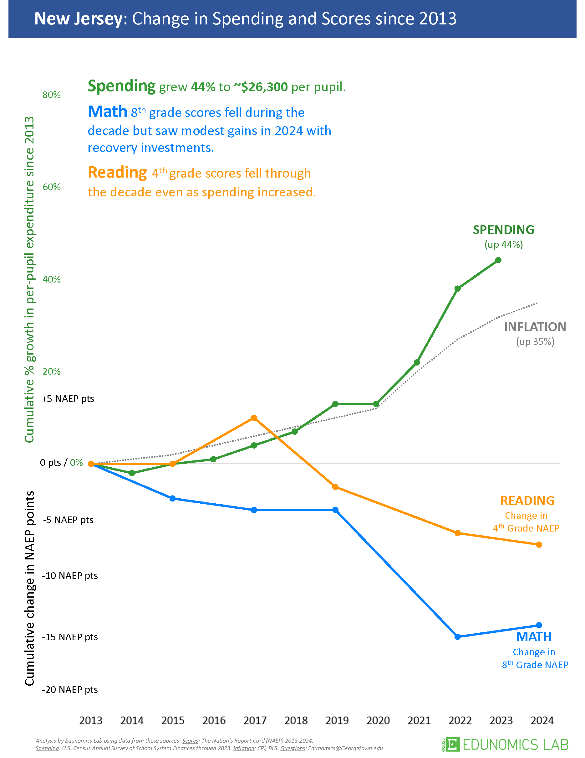
Every design choice in this graph pushes in one direction:
- The starting year. The clock starts in 2013, the one year that all but guarantees spending up and scores down. More on why that’s deliberate in a moment.
- Nominal dollars. The 44% is nominal. The graph’s own inflation line is up 35%. That leaves roughly 7% real growth over a decade, well under 1% a year, and spending tracks inflation almost exactly until the federal pandemic relief years of 2021–2023.
- The wrong deflator, and no cost. The CPI is not the price of teachers in New Jersey’s labor market. Nothing here asks who the kids are or what their outcomes cost.
- Mismatched years and scales. Spending stops in 2023, scores run through 2024, and percent growth and NAEP points share one axis at an arbitrary exchange rate. Rescale either one and the “divergence” grows or shrinks at will.
- No comparison. NAEP fell nationwide after 2019, overwhelmingly in the pandemic years. One state’s spending next to a national decline tells you nothing about whether New Jersey’s dollars mattered.
Why 2013 is intentionally deceitful
“Deceitful” is a strong word. Here’s why it fits.
- 2013 is where the scores topped out. Anyone who works with NAEP knows 2013 is the point where scores nationally leveled off and started to turn down. Start there and almost any state shows flat or falling scores afterward, no matter what it spent.
- 2013 is where the spending cuts hit bottom. By 2013 the recession-era cuts had run their course and per-pupil spending sat near the bottom of the trough. Start there and almost any state shows spending “rising,” even when it’s just recovering lost ground and keeping up with inflation.
- Put those together and the conclusion is built in. Top of the scores, bottom of the spending: the divergence is manufactured by the baseline. Edunomics’ tool makes this graph for every state, and it shows the same picture in nearly all of them. That’s the tell. The conclusion comes from the starting year, not from anything about New Jersey.
- Earlier years were available and left out. State NAEP in reading and math goes back to 2003 for every state. Start in 2009 or 2011 and you’d see what happened first in New Jersey: spending fell from 132% to 111% of the estimated cost of Massachusetts-average outcomes in two years. A baseline that hides the cuts is a choice.
- They’ve been told, repeatedly and in public. I’ve laid this out on social media, on this blog and in a video critique. The 2013 start stays. A misleading choice made once can be a mistake. Keeping it after being told exactly why it misleads is not.
Measure spending against what outcomes actually cost and the story flips. New Jersey’s spending fell from 115% of the estimated cost of Massachusetts-average outcomes in 2013 to 98% in 2024, and from 172% to 147% of the cost of national-average outcomes. The system got less progressive too: districts with 30% child poverty went from 18% more state and local revenue per pupil than districts with none to 9% more, and from 9% more teachers per pupil to 17% fewer.
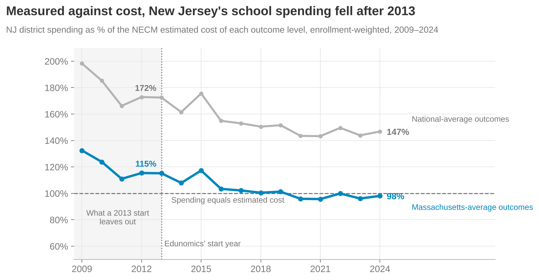
Exhibit B: the “clouds of doubt”
Edunomics’ New Jersey scatter plots each district’s 2024–25 per-pupil expenditure against 2024–25 NJSLA proficiency, crosshairs at the averages (source). Their companion worksheet tells users to go find the schools that spend more but get lower outcomes than similar peers.
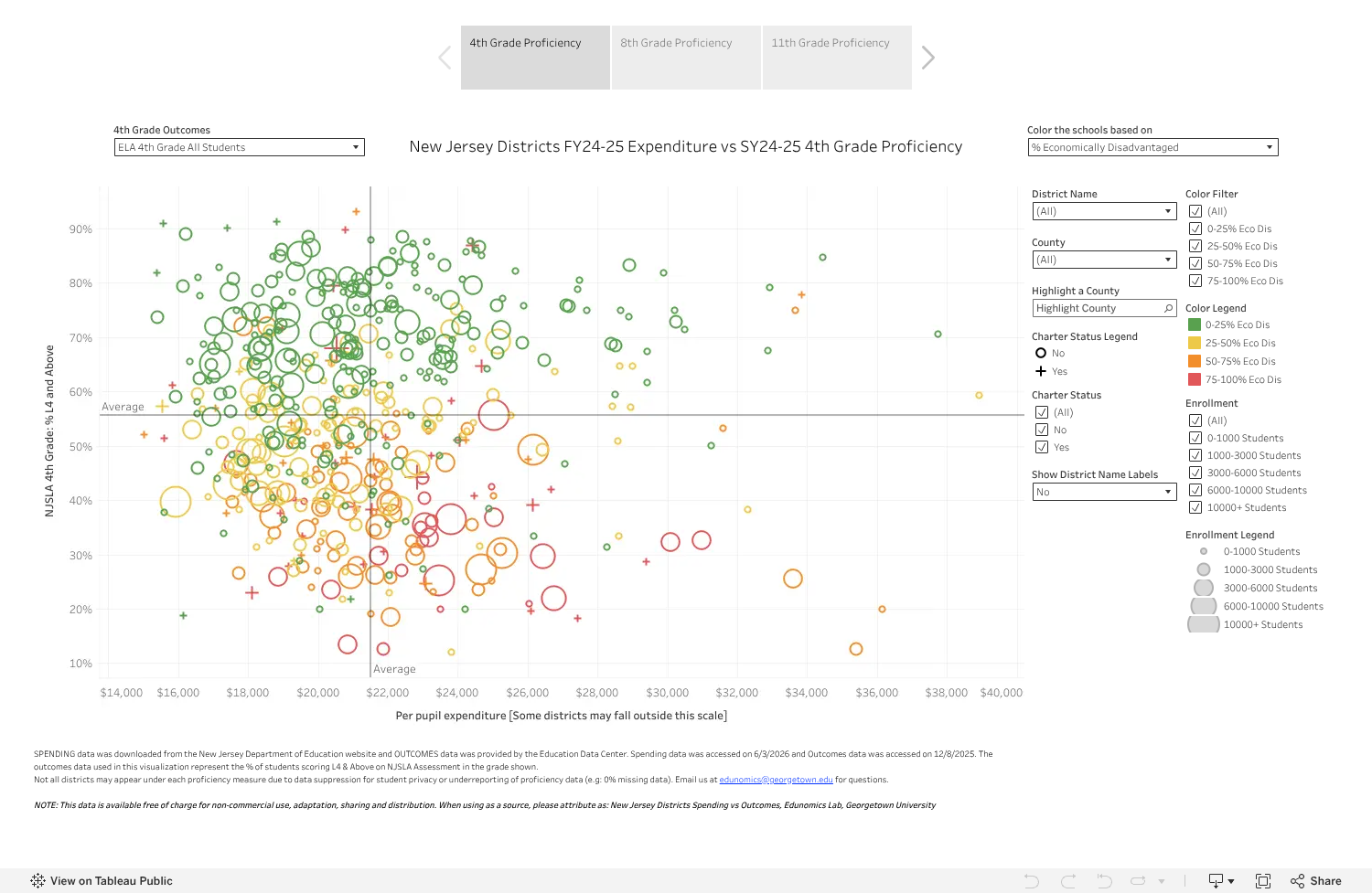
Look at their own colors. The highest-poverty districts, in red and orange, cluster below average proficiency, many of them to the right of average spending. The graph literally displays the pattern that cost explains, then invites you to read it as waste.
Spending is what a school spends. Cost is what it would take to reach a given outcome with the kids it actually serves, in the labor market it actually hires from. Efficiency is the gap between the two. No cost, no efficiency claim. A raw scatter can’t tell you anything about waste (Efficiently Mediocre). What it does do is take the districts furthest below what their kids need and paint a target on them.
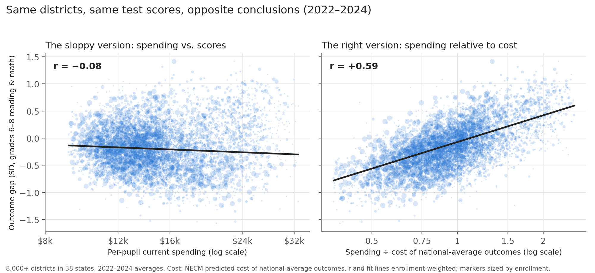
Nationally, same districts, same scores: raw spending and outcomes correlate at −0.08. Spending relative to the cost of national-average outcomes correlates at +0.59.
New Jersey’s own school-level cost model shows the same reversal. In 2024, raw spending correlates with outcomes at −0.17. Spending relative to the cost of current statewide average outcomes correlates at +0.39.
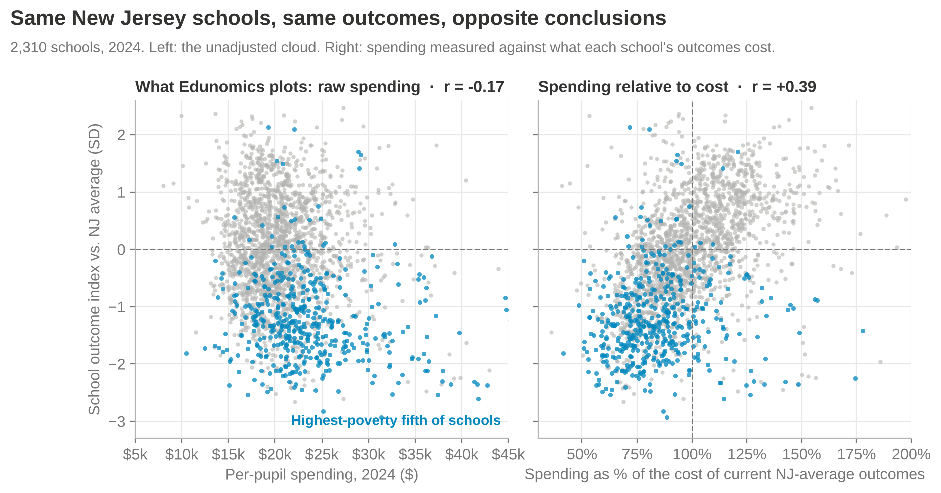
Here’s why. The highest-poverty fifth of New Jersey schools does spend the most per pupil, about $22,600 at the median. But getting those kids to today’s statewide average outcomes would cost about $28,000. They’re at 82% of cost. The lowest-poverty fifth spends about $20,400 against a cost of $17,700: 114%. Of the schools sitting in Edunomics’ “spends more, scores lower” corner, two-thirds spend less than their outcomes would cost, and their median low-income share is 55%, against 24% statewide.
What New Jersey’s evidence actually says
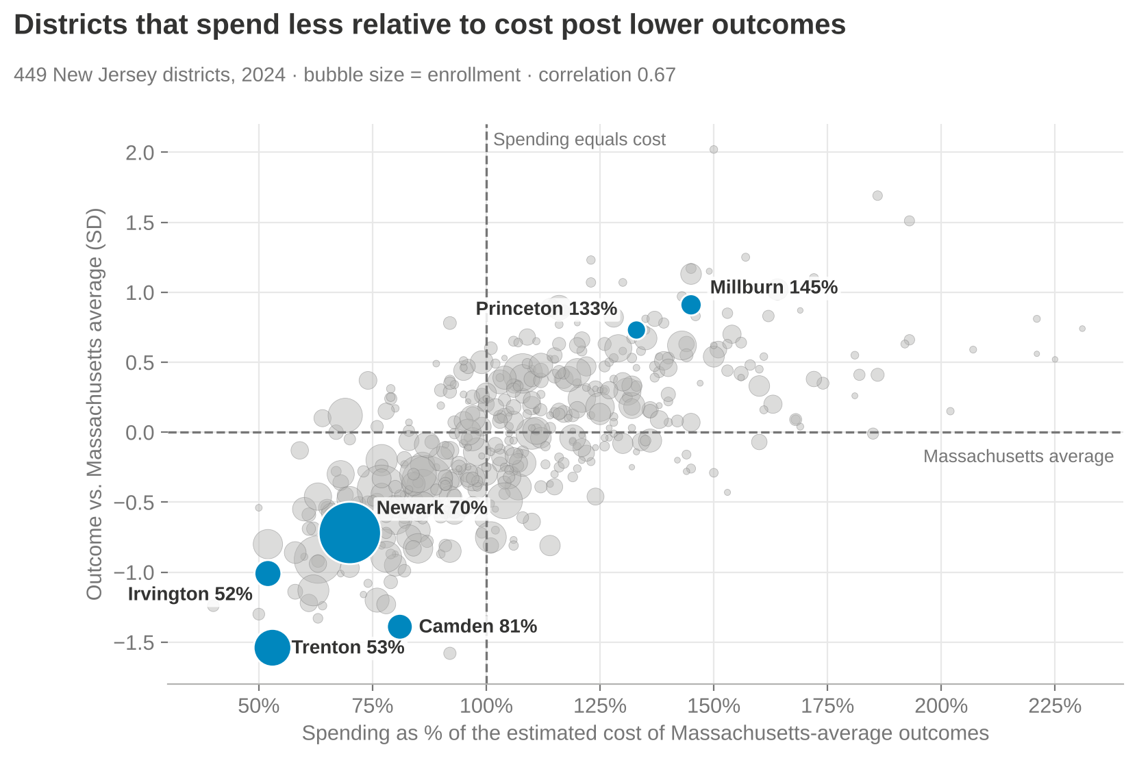
- Across New Jersey’s 449 districts, spending relative to cost and outcomes move together (r = 0.67).
- Money buys more in New Jersey, not less: within states, the payoff to spending relative to cost is about 1.2 in New Jersey, Connecticut and Massachusetts, against 0.44 in Florida and 0.70 in Texas.
- The highest-poverty fifth of districts spent 72% of the cost of Massachusetts-average outcomes in 2024, down from 91% in 2009. The lowest-poverty fifth spent 122%.
- Two independent cost models, the NECM and New Jersey’s own school-level model (NJPP, 2025), agree at 0.72 on spending relative to cost and 0.95 on outcomes. Neither shows high-poverty districts swimming in excess resources.
Bottom line
These graphs do not inform New Jersey’s SFRA debate. They misinform it. They shouldn’t be cited in testimony, budget hearings, litigation or school board training. If someone puts them in front of you, ask two questions out loud: Why 2013? And where is the cost adjustment?
Further reading: Seventeen Years of Roza-Tinted Glasses · Efficiently Mediocre (and the full paper) · Transcript of Video Critiquing Edunomics Graphs


