Or: how to be highly efficient at producing mediocre outcomes, and why your scatterplot of spending and test scores is lying to you.
Every few months someone rediscovers the same chart. Per-pupil spending on one axis, test scores on the other, a shapeless cloud of dots, and a headline that writes itself: We spend more than ever and get nothing for it. Money doesn’t matter. Schools have an efficiency problem. Cue the think-tank panel, the op-ed and the legislator who wants to “hold the line” on school funding.
That chart is not just lazy. It is wrong in a way that points policy in exactly the wrong direction. And the reason is a word the people who make it rarely bother to define: cost.
First, some definitions (yes, again)
I’ve been through this before, but since the lesson apparently hasn’t landed, here are the four terms that get mashed together in nearly every “school efficiency” argument:
- Productivity is what the system produces: the level of student outcomes. More learning, higher outcomes, more productive.
- Spending is what districts actually spend, whatever it buys and whatever the result.
- Cost is the minimum amount that would have to be spent to achieve a given level of outcomes, given the students a district serves and the conditions it operates in (labor markets, scale, poverty, disability, language needs).
- Efficiency is the gap between the two. Spending minus inefficiency equals cost. An efficient district gets the most outcome it can out of what it has, or spends no more than it needs to for the outcomes it gets.
Notice what that last definition requires. You cannot say a district is wasting money unless you know what its outcomes should cost. Efficiency is a statement about spending relative to cost. No cost estimate, no efficiency claim. Full stop.
Back in 2012 I used a car-buying analogy for this: you want an Escalade and you’ve budgeted $25,000. Nobody would call the dealer “inefficient” for failing to sell it to you at that price. The Escalade costs what it costs. Educating a district full of kids in deep poverty, many still learning English, in a high-wage labor market, costs what it costs too. Pretending it costs the same as educating kids in a wealthy suburb is not rigor. It’s just wrong.
Efficiency is not productivity
Here’s the part that tends to get lost. Efficiency and productivity are different things, and they can point in opposite directions:
- You can be highly efficient at producing low outcomes. Spend next to nothing, get outcomes about as good as next to nothing buys, and congratulations: you’re efficient. Your kids are still behind.
- You can be highly productive without being especially efficient. Spend a lot, get well above-average outcomes, fall somewhat short of the best that level of spending could buy. Less efficient. Much better outcomes.
If your policy goal is “kids learn more,” the second is the better place to be. An efficiency ranking alone won’t tell you that. An efficiency ranking with no cost adjustment won’t tell you anything at all.
Why the spending-and-scores chart is garbage
Here’s the chart the money-doesn’t-matter crowd loves, built from real data: 8,000+ districts in 38 states, 2022–2024, with outcomes from nationally normed grade 6–8 reading and math assessments. On the left, per-pupil spending against outcomes. Flat. Slightly negative, even (r = −0.08). Money doesn’t matter!
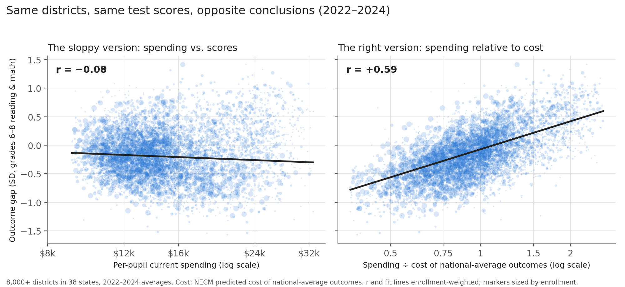
On the right, the exact same districts and the exact same test scores, but spending is expressed relative to what it would cost each district to reach national-average outcomes, given its students and circumstances (from the National Education Cost Model). Now the correlation is about +0.6. Districts with more resources relative to need get substantially better outcomes. Same data. Opposite conclusion.
What happened? The districts that spend more are, on average, the ones serving higher-need kids in higher-cost settings. They do spend more, just nowhere near enough more. The highest-cost fifth of districts spends about $16,700 per pupil against $13,900 in the lowest-cost fifth. But reaching average outcomes would take about $25,200 per pupil in the former and $11,100 in the latter. The high-spending, low-scoring districts aren’t squandering riches. They’re underfunded relative to what their kids need, and it shows.
Now think about what the sloppy chart tells a legislator: those high-spending districts with low scores are the “inefficient” ones, so cut them, or at least stop adding money. That is precisely backwards. It takes the districts that are furthest behind their cost targets and labels them wasteful. That’s not an analytical quirk. It’s a policy recommendation to take money away from the kids who need it most, dressed up as fiscal responsibility.
So what does it look like when you do it right?
In a new brief (full PDF here), I estimate a stochastic frontier model of district efficiency using the National Education Cost Model: roughly 129,000 district-years for about 8,100 districts in 38 states, 2009–2024. The frontier is the best outcome achievable at a given level of spending relative to cost. Each district’s efficiency is its distance from that frontier, expressed as the share of its current resources a fully efficient district would need to reach the same outcomes. I estimate it with and without state fixed effects, because (more on this below) comparing test scores across states is its own can of worms.
The headline findings:
- Money matters, with diminishing returns. A 10 percent increase in resources relative to cost raises frontier outcomes by about 0.07 SD nationally, and about 0.09 SD when comparing districts within the same state. That’s not nothing. It’s a lot.
- Most districts are about equally efficient. The median district operates at about 86 percent efficiency, and nearly three-quarters of district-years fall between 80 and 90 percent. There is a long lower tail, but there’s no evidence here of a system drowning in waste.
- The tail has been growing, and it’s growing within states. The share of districts below 80 percent efficiency doubled, from 11 percent in 2011 to 22 percent in 2024, and the pattern is the same when districts are compared only with others in their own state.
- The “bloated administration” story is tiny. Within their own states, the least efficient districts are more heavily staffed across the board, with more teachers, more aides and more administrators, and they are also smaller and higher-cost. The general administration gap between the most and least efficient districts works out to something like $80–100 per pupil. Anyone promising to close achievement gaps by trimming the central office is selling something.
Florida is efficient. New Jersey is better.
Rank states by average efficiency and you get Idaho, North Carolina, Utah, Florida and Georgia at the top, with Rhode Island, West Virginia, Connecticut, Wyoming and New Jersey at the bottom. Cue the triumphant op-ed about Florida.
Except that across states, average efficiency has essentially zero correlation with average outcomes (r = 0.00). What it does correlate with, strongly, is spending little relative to cost (r = −0.70). The state efficiency ranking is mostly a ranking of how little states spend.
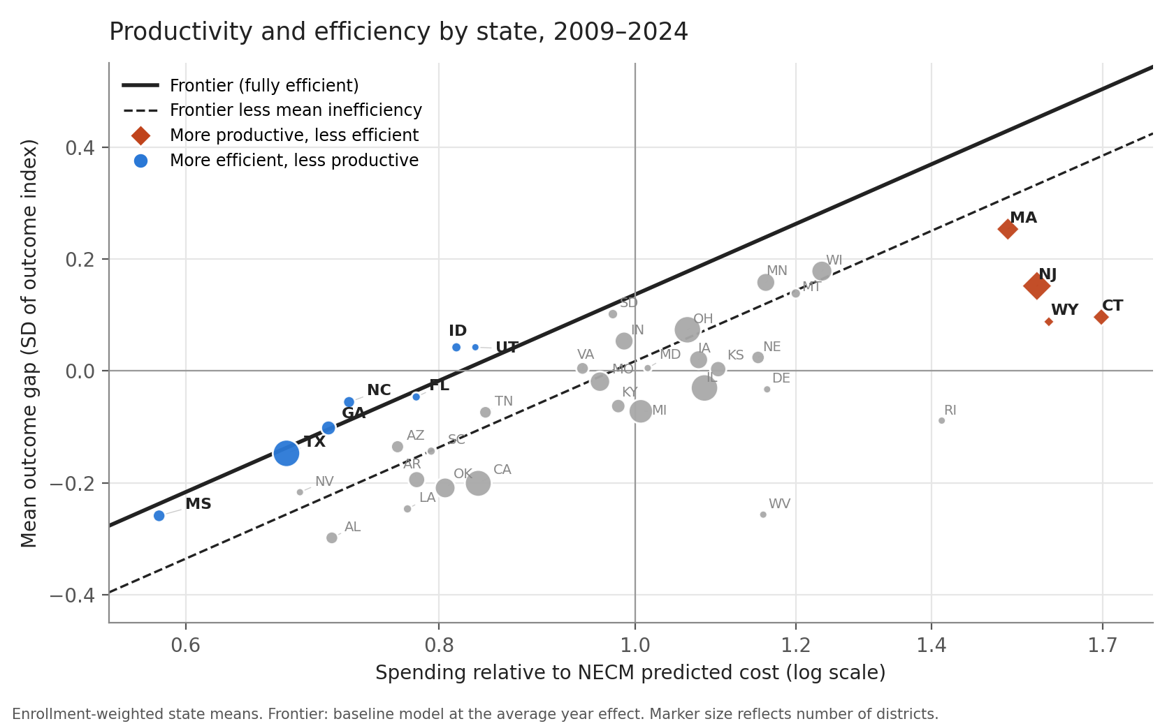
- Florida, North Carolina, Georgia and Texas spend 67–78 percent of what national-average outcomes would cost them, sit close to the frontier, and produce below-average outcomes. They are efficient at producing relatively low outcomes.
- Mississippi is the reductio ad absurdum: it spends 58 percent of cost, ranks 37th of 38 on outcomes, and ranks 7th on efficiency. Very efficient. Very behind.
- Massachusetts, New Jersey and Connecticut spend 50–70 percent above cost and rank 1st, 4th and 7th on outcomes, but 28th, 34th and 36th on efficiency.
New Jersey spends about twice what Florida does per pupil ($19,124 against $9,636 on average over the period), and its students score about 0.20 SD higher. Less efficient? By this measure, sure. But that extra money buys substantially better outcomes. Which would you rather have: Florida’s efficiency or New Jersey’s results?
Is New Jersey’s “inefficiency” just a functional-form artifact? Fair question. Diminishing returns, right? If the frontier flattens out at high spending faster than my log curve allows, it would overstate what New Jersey’s money could buy and make New Jersey look worse than it is. So I checked. The log frontier fits fine all the way up the spending range, including where the data are mostly New Jersey, Connecticut and Massachusetts districts. Quadratic, cubic and spline frontiers trace nearly the same curve, and if anything bend slightly up at the high end. And within states, the payoff to spending relative to cost is steeper, not flatter, in the high spenders: about 1.2 in New Jersey, Connecticut and Massachusetts, against 0.44 in Florida and 0.70 in Texas. New Jersey’s districts simply sit about 0.3 SD below the national frontier across the board. That’s a level shift, not a bend, and it’s exactly what state fixed effects soak up. Once they do, New Jersey (0.905) and Florida (0.917) are about equally efficient. Which brings us to the next problem.
A necessary caveat about test scores across states
The outcome measure here comes from the Stanford Education Data Archive (SEDA), which takes each state’s own reading and math tests and puts them on a common, nationally normed scale. SEDA covers grades 3 through 8, but I use only grades 6 through 8, and on purpose. Middle-grades scores better capture the cumulative effects of state and local education systems: what kids actually know after years in those schools. Some states have particularly inflated early-grade scores, for a variety of reasons, and those scores drop dramatically by grade 8. Lean on grades 3–5 and you reward states for looking good early rather than for what their systems deliver over time. Even so, SEDA can only do so much. Many states have adopted common assessments, but the tests still differ across states and are reported on different scales, and states report spending under different accounting rules. It’s impossible to fully equate these measures across states. So a sizable share of the differences between states, on both the outcome side and the spending side, may be measurement error.
That’s why the brief also estimates everything within states. Once you do, state effects soak up nearly all of the state rankings: the share of variance in efficiency between states drops from about 20 percent to 1 percent. The frontier gets steeper, not flatter, which is what you’d expect if cross-state measurement noise was hiding the payoff to money. And the within-state picture is the one I’d trust for judging districts.
Which is, by the way, one more reason to be skeptical of anyone who throws all fifty states onto one spending-and-scores chart and calls it a finding. They’re stacking measurement error on top of the missing cost adjustment.
The bottom line
- No cost, no efficiency. Any claim about school “efficiency” that doesn’t account for what outcomes cost for the kids actually being served isn’t an efficiency claim. It’s a spending claim with an agenda attached.
- Efficient isn’t the same as good. Being efficient at producing low outcomes is still producing low outcomes.
- Sloppy analysis isn’t harmless. A spending-versus-scores chart systematically labels the most underfunded, highest-need districts as wasteful. Policy built on it takes money from the kids who need it most.
- Money matters. Measured properly, more resources relative to cost buy better outcomes, and the states that spend more get more, even when they don’t spend it perfectly.
The full brief, with methods, state tables and the staffing and spending comparisons, is here: Technical Efficiency in Producing Educational Outcomes: A Stochastic Frontier Analysis Using the National Education Cost Model (PDF).


What you are amply illustrating is that the vast majority of those writing about these topics (or bloviating about them as legislators and too often as policy makers) are illiterate about statistics & in many ways also illiterate about economics. And that is even before we get to how illiterate they are about psychology (which includes learning ) and pedagogy.