Every few months the red-state-miracle story makes the rounds again. Florida’s reading “renaissance.” Texas’s math scores. Low taxes, lean budgets, school choice for all, and results to show for it. Meanwhile California and Illinois are cast as the cautionary tales: high-tax, high-spending, union-run fiscal basket cases pouring money into failing schools. Cue the op-ed. Cue the legislative testimony.
So let’s do the head-to-head the narrative invites. The two largest blue states, California and Illinois, against the two largest red states, Texas and Florida. Same cost model, same adjustments, same NAEP tests, 2009 through 2024.
Here’s the short version. The blue states raised their real investment in schools by more than a third and, on NAEP, held up better than the average state. The red states let their effort slide by roughly 30%, fell further and further behind what it would cost to get their kids to even national average outcomes, and gave back the 8th-grade NAEP advantage they once held. Then, because I can’t help myself, a word of caution for my blue-state friends: you’re not done. Not even close.
Round 1: Is the money enough?
I’ve explained the National Education Cost Model enough times on this blog that some of you could recite it back to me. But briefly: for every district in the country, the model estimates what it would cost to reach national average outcomes given the kids it serves, the wages it has to pay to compete for teachers, its size and its population density. Divide actual current spending by that cost and you get percent of adequate. At 100%, spending covers the cost. As I’ve noted recently, national average is a low bar. It asks only that kids score like the typical American kid.
Statewide, here’s where things stood:
| State | 2009 | 2024 |
|---|---|---|
| Illinois | 101% | 101% |
| California | 84% | 92% |
| Florida | 94% | 70% |
| Texas | 80% | 59% |
In 2009 these four states were bunched together, between 80% and 101%. By 2024 they had split cleanly in two. Texas districts, on average, spend 59 cents for every dollar it would take to get their kids to national average outcomes. Florida spends 70 cents.
But statewide averages always hide the part that matters most. So let’s look at each state’s highest-poverty fifth of districts, the kids for whom adequate funding matters most.
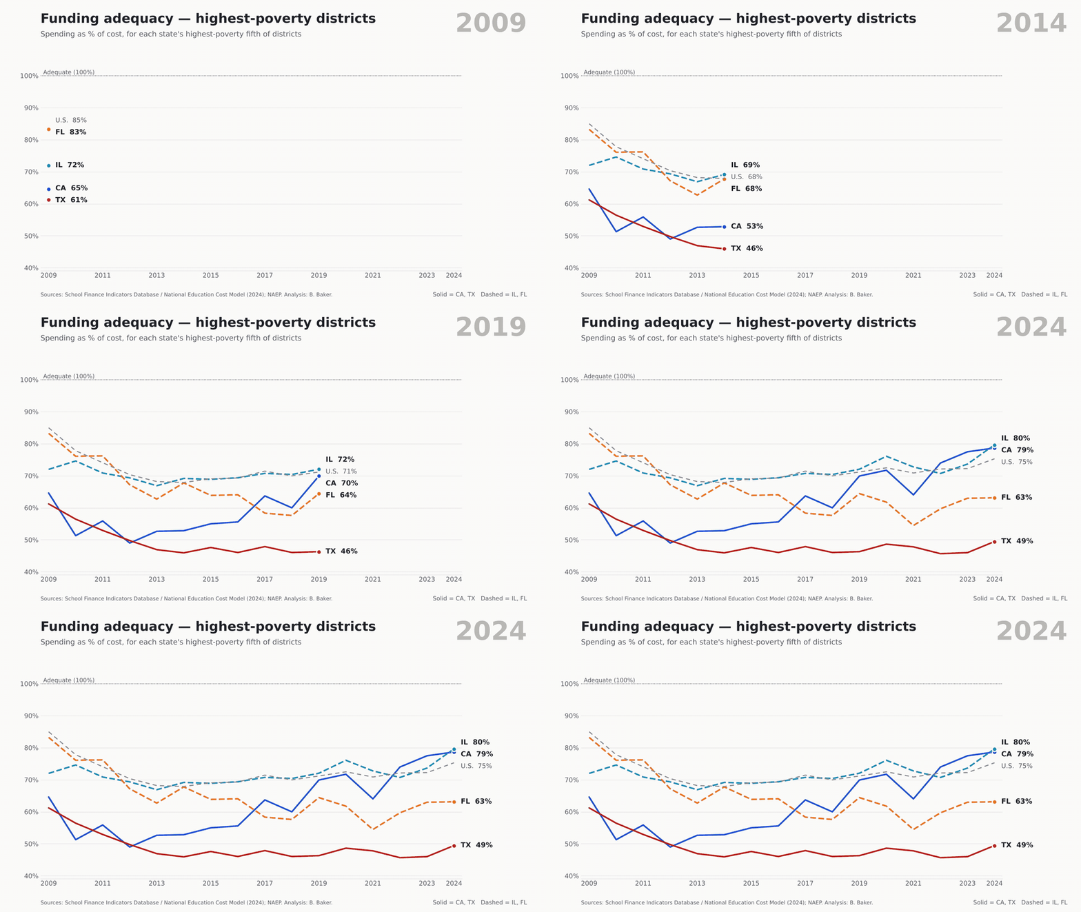
Florida’s highest-poverty districts actually started out as the best funded of the four, at 83% of adequate. They ended at 63%. Texas’s went from 61% to just under 50%. Let that sink in. The highest-poverty districts in Texas are spending about half of what it would take to get their kids to national average outcomes. California’s climbed from 65% to 79%, most of that after the Local Control Funding Formula began phasing in after 2013. Illinois inched up from 72% to 80%.
Or put another way: by 2024, 98% of students in Texas and 98% of students in Florida attended districts funded below adequate levels. Not a typo. Ninety-eight percent. In 2009 it was 73% and 70%. In California it’s now 67%, down from 74%. In Illinois, 51%.
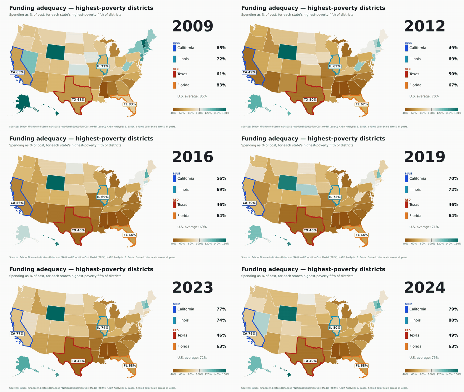
Here’s the same measure across all fifty states. Watch the South.
Round 2: Spending and effort
Now, I can already hear it. “But spending went up everywhere!” In nominal dollars, sure. So did the wages schools have to pay to hire and keep college-educated people. That’s why I adjust spending by the Education Comparable Wage Index, which asks a simple question: can a state buy more teacher time per kid today than it could in 2009?
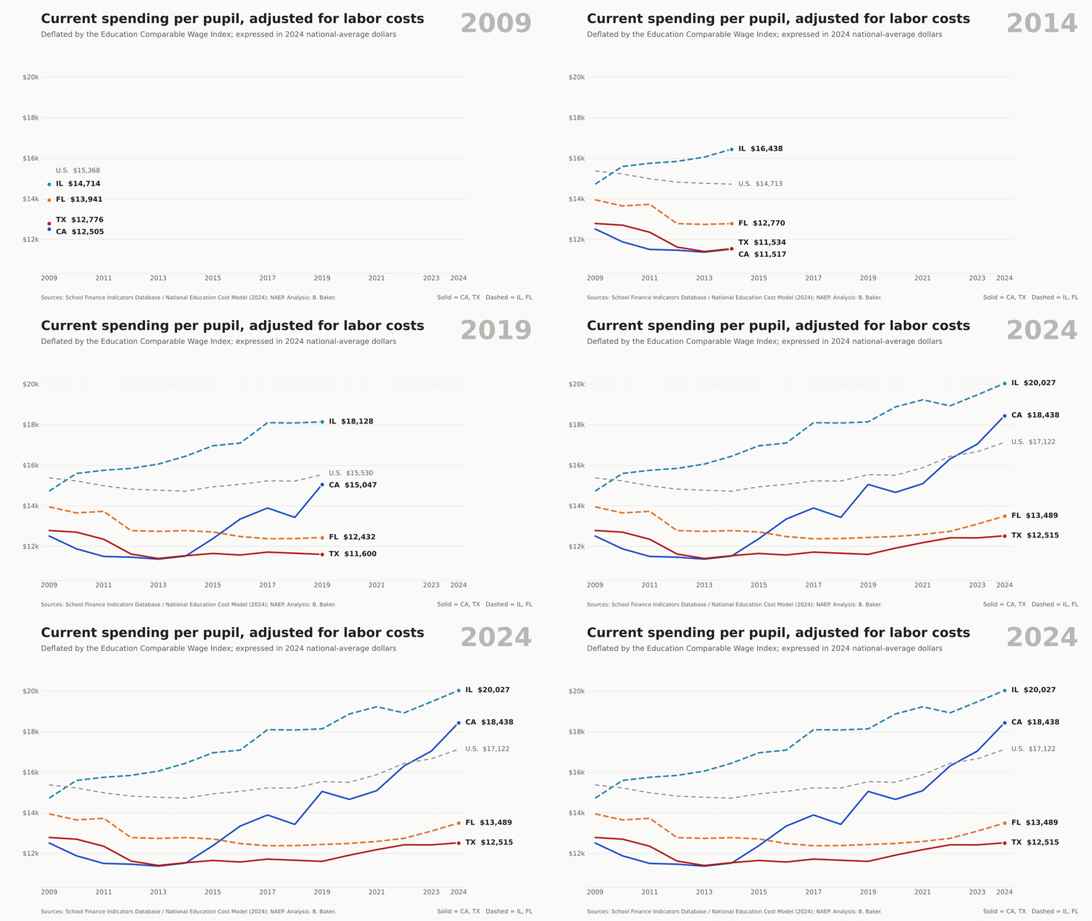
California: up 47%. Illinois: up 36%. Florida: down 3%. Texas: down 2%. In 2024 dollars at national average wage levels, that’s $18,438 in California and $20,027 in Illinois, against $13,489 in Florida and $12,515 in Texas. The U.S. figure was $17,122. Fifteen years, and Texas and Florida are buying less than they were in 2009.
Why? Because they chose to. Here’s fiscal effort, state and local K-12 spending as a share of state GDP:
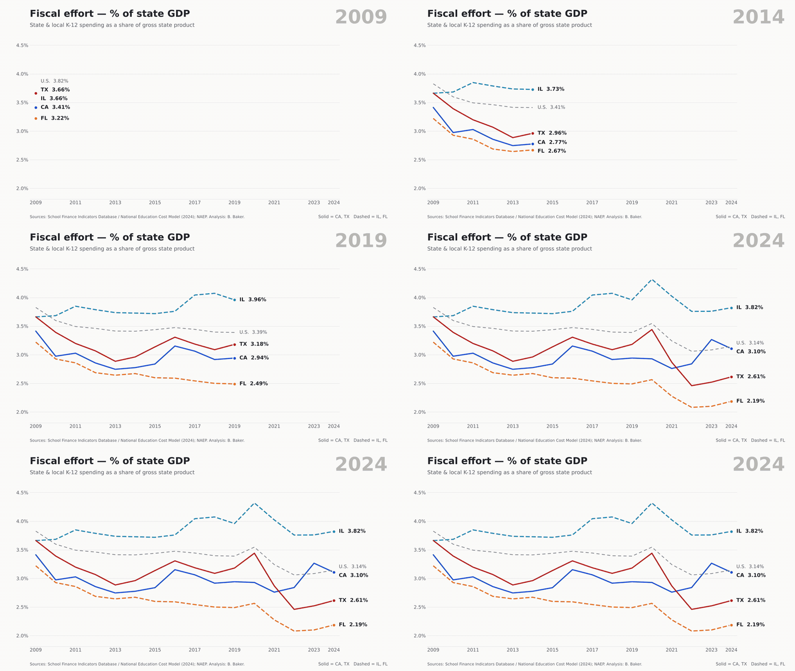
Texas went from 3.66% to 2.61%. Florida from 3.22% to 2.19%. Both cut the share of their economies going to schools by roughly 30%. Measured against personal income, it’s the same story: Texas from 4.7% to 3.3%, Florida from 3.5% to 2.2%. By 2024, Florida put a smaller share of its residents’ income into public schools than any other state, and ranked third-lowest as a share of GDP. Illinois, the supposed poster child for fiscal dysfunction, actually raised its effort a bit, from 3.66% to 3.82% of GDP. California’s dipped slightly, but its economy grew fast enough, and its formula targeted enough of that growth toward high-need districts, that real spending still soared.
This isn’t a story about states that ran out of money. It’s a story about states that decided not to spend it on schools.
Round 3: So what happened to the kids?
This is where the red-state narrative is supposed to save itself. Lean budgets, better results, right? In 2009, Texas really did have the highest 8th-grade NAEP math average of the four, at 287, and Florida wasn’t far behind Illinois. That was the story. Here’s what happened next.
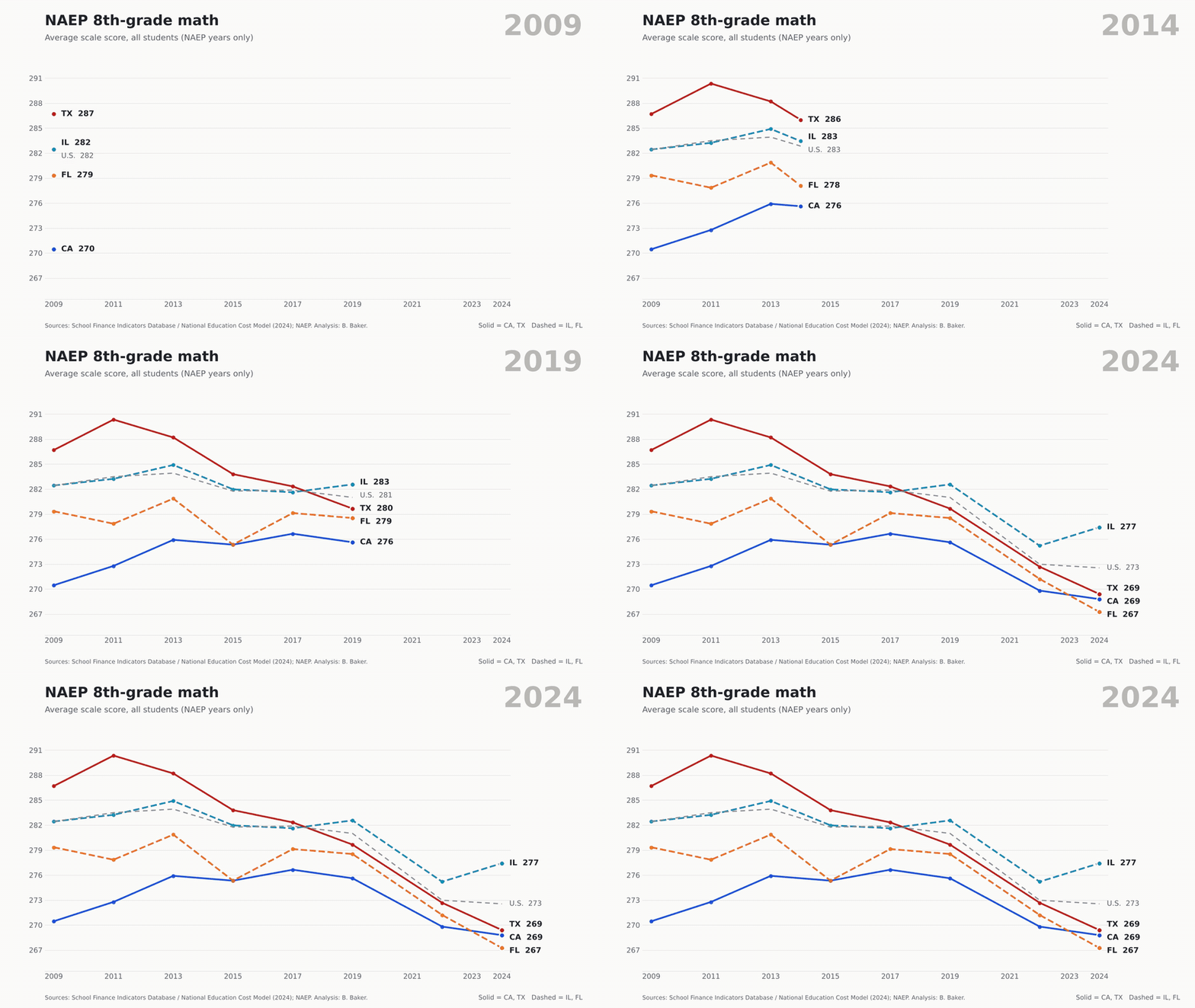
| Math, 2009 → 2024 | Change | Reading, 2009 → 2024 | Change | |
|---|---|---|---|---|
| California | 270 → 269 | −2 | 253 → 254 | +2 |
| Illinois | 282 → 277 | −5 | 265 → 262 | −3 |
| Texas | 287 → 269 | −17 | 260 → 252 | −8 |
| Florida | 279 → 267 | −12 | 264 → 253 | −12 |
| Average state | 282 → 273 | −10 | 263 → 257 | −7 |
Yes, everyone took a hit after the pandemic. The average state lost about 10 points in math and 7 in reading. Against that baseline, Texas and Florida fell further. California and Illinois held up better, and California was the only one of the four to gain in reading. By 2024, the four states sat within about ten points of each other in math, and Texas and Florida had dropped below California in reading.
And no, you can’t blame it all on COVID. Texas’s math average fell 7 points between 2009 and 2019, from 287 to 280, while the average state dipped by about 1. Florida’s reading slide, on the other hand, is mostly post-2019: 263 in 2019, 253 in 2024. So much for the renaissance.
Now, the usual response here is that Texas simply had farther to fall, and California had nowhere to go but up. Fair enough, and it’s a point I’ve been making since at least the great Mis-NAEP-ery of 2013: NAEP gains and losses are highly correlated with where you start. It’s harder to gain, and easier to lose, when you’re already scoring high. It’s easier to gain, and harder to lose, when you’re scoring low. Across the 50 states and D.C., a state’s 2009 8th-grade math score correlates at −0.63 with its change through 2024 (−0.68 in reading). So let’s give everyone credit for their starting point. Texas, starting at 287, would be expected to lose about 12 points in math. It lost 17, about 5.5 points worse than expected, and it came in about 3 points worse than expected in reading. Florida came in about 3.5 points worse than expected in math and 4.5 in reading. California beat its expected change by about 3 points in both subjects. And Illinois, which started right at the national average, beat its expected change by about 5 points in math and 4 in reading. Account for where they started, and the blue states did better than expected while the red states did worse. The lines crossed.
Here’s money and math together. Each dot is a state at each NAEP administration, with the four highlighted states leaving trails behind them.
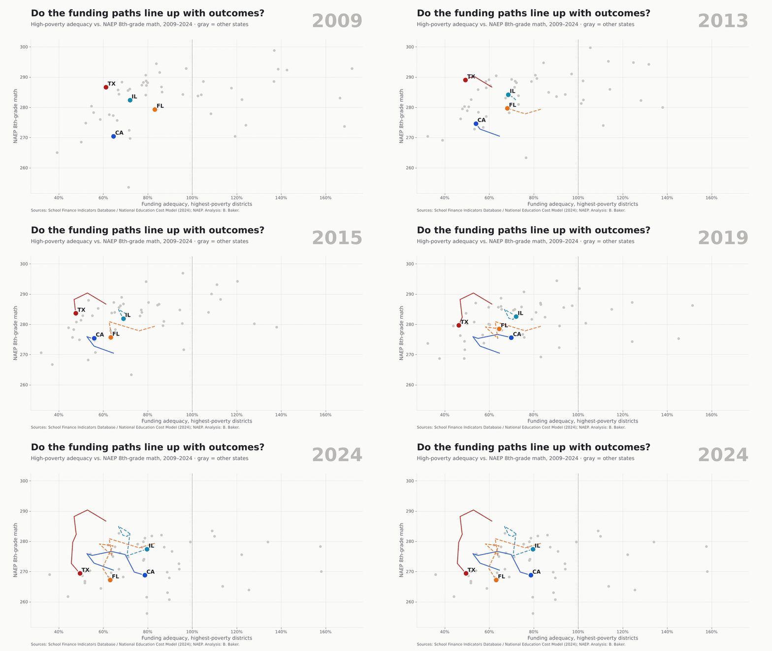
Texas slides down and to the left. Florida slides down and to the left. California moves right. Illinois moves right. You don’t need a regression to see which direction you’d rather be headed.
Unfinished business in the blue states
Before my friends in Sacramento and Springfield start taking victory laps, let’s be clear. Improved is not the same as fixed. Neither state comes close to providing equal educational opportunity. In both, the lowest-poverty districts are funded well above adequate levels, while the highest-poverty districts remain well below.
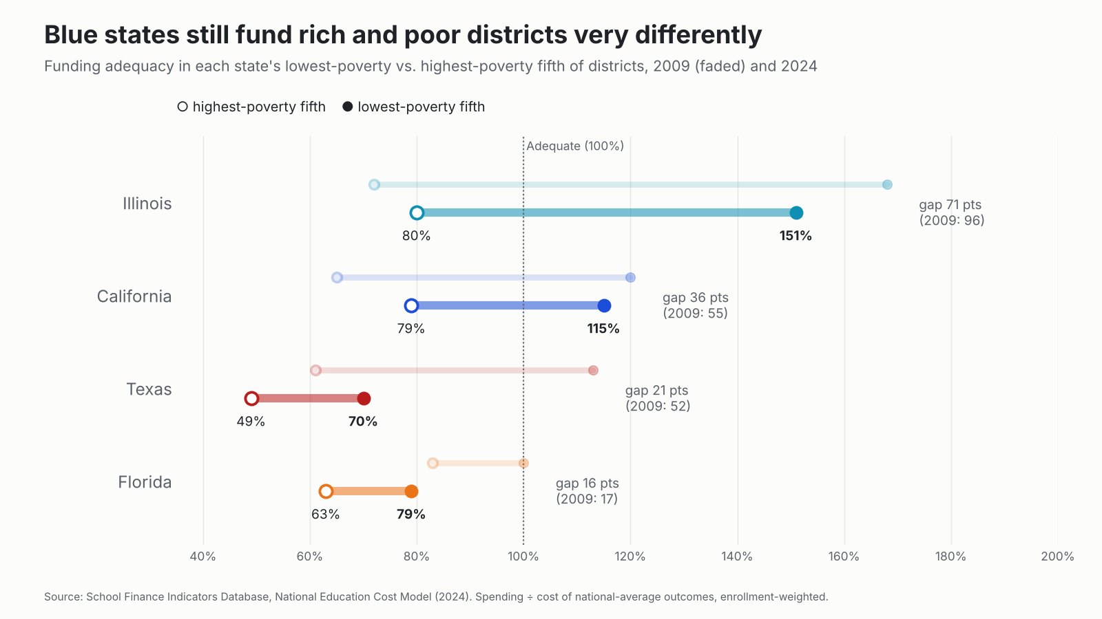
Illinois has the widest gap of the four. Its lowest-poverty districts spend about 151% of what the cost model says they need, roughly $7,100 per pupil above adequate, while its highest-poverty districts sit at 80%, about $5,800 per pupil short. That gap was 96 points in 2009 and is 71 points now. Progress, yes. Equal opportunity, no. Even after the 2017 Evidence-Based Funding reform, state and local revenue per pupil in Illinois is still slightly lower in high-poverty districts than in low-poverty ones (a progressiveness ratio of 0.92). EBF was the right idea. It just hasn’t been funded at anything like the pace needed to finish the job.
California has done more. LCFF cut the gap between its lowest- and highest-poverty districts from 55 points to 36. But California’s highest-poverty districts still fall about $5,600 per pupil short of adequate. In both states, about 95% of students in the highest-poverty districts still attend districts funded below adequate levels.
And no, the smaller gaps in Texas and Florida are not a sign of fairness. They narrowed because the lowest-poverty districts fell below adequacy too. Texas’s lowest-poverty districts went from 113% of adequate to 70%. That’s not equal opportunity. That’s equal inadequacy. Everyone’s screwed, just to varying degrees.
What this does and doesn’t show
Let me be careful here, since I spend a fair amount of time on this blog yelling at people who aren’t. Four states, plotted side by side over time, do not prove that money caused the NAEP divergence. These states differ in demographics, immigration patterns, testing exclusions, policy histories and how hard the pandemic hit. Credible causal answers come from the kind of panel studies the school finance literature has spent two decades building, and that research consistently finds that money matters, especially for kids from low-income families.
What these data do show is that the red-state model of low effort and lean budgets didn’t buy better results over this period. As I argued a couple weeks back, Florida and Texas are very efficient at producing relatively low outcomes. Efficient isn’t the same as good. They held school spending flat in real terms while their highest-poverty districts slid to between half and two-thirds of adequate. Their 8th-grade scores fell further than the average state’s, and further than their starting points would predict.
California and Illinois, the supposed cautionary tales, did the opposite. They raised real spending by more than a third, pushed a good share of it toward higher-need districts, and held up better on NAEP than the average state.
The bottom line
- The red states disinvested. Texas and Florida cut school effort by roughly 30% and let real spending per pupil stall for fifteen years.
- Their poorest districts paid the price. High-poverty districts in Texas now spend about half of what national average outcomes would cost. Florida’s spend under two-thirds. 98% of students in both states attend underfunded districts.
- The NAEP advantage is gone. Texas lost 17 points in 8th-grade math and Florida 12, against 10 for the average state. Even accounting for where each state started, Texas and Florida fell further than expected, while California and Illinois did better than expected.
- The blue states moved in the right direction. Real spending up 36–47%, high-poverty adequacy up, and better NAEP trajectories.
- But they’re not done. Illinois’s rich districts are funded at 151% of adequate while its poor ones sit at 80%. California’s gap is 36 points. Finish the job.
So the next time someone holds up Texas or Florida as proof that you can do more with less, ask them a simple question: more what? Fifteen years of data here, and the answer looks a lot more like “less with less.”
Data notes
All finance measures come from the School Finance Indicators Database. Adequacy uses the National Education Cost Model (2024 release): district current spending per pupil divided by the modeled cost of national average outcomes, aggregated to states as total spending over total cost (enrollment-weighted). Highest- and lowest-poverty districts are the top and bottom fifths of each state’s districts by Census child poverty rate. Labor-cost adjusted spending divides current spending per pupil by the Education Comparable Wage Index, rescaled to 2024 national-average wage levels. Fiscal effort is state and local K-12 spending as a share of gross state product and state and local school revenue as a share of personal income. NAEP figures are 8th-grade state averages for all students, test years only (2009, 2011, 2013, 2015, 2017, 2019, 2022, 2024). Expected NAEP changes come from a simple cross-state regression (50 states and DC) of each state’s 2009–2024 change on its 2009 level; “better or worse than expected” is the residual from that regression.
Sources
- School Finance Indicators Database: state panel and NECM/SEDA district file (data behind all figures)
- Baker, B. D., Weber, M., & Srikanth, A. (2021). Informing federal school finance policy with empirical evidence. Journal of Education Finance, 47(1), 1–25.
- Baker, B. D. (2025). How and why racial isolation affects education costs and the provision of equal educational opportunity. Education Policy Analysis Archives, 33(55).
- Efficiently Mediocre: Why Measuring School Efficiency Requires Measuring Cost (2026), schoolfinance101
- A Philadelphia Story of Underfunding (2026), schoolfinance101
- A few quick thoughts and graphs on Mis-NAEP-ery (2013), schoolfinance101
- National Assessment of Educational Progress (NAEP), state results, grade 8 reading and mathematics


