Blog

Checking the Tab

As follow up to yesterday’s post on the completely fabricated and back-of-the-napkin numbers presented in The Tab,  here’s a quick simulated allocation of the $11,000 foundation + $3,000 poverty weight (applied to free or reduced lunch) + $400 per ELL/LEP child.

The Tab pretty much conceals any real changes or patterns of changes by lumping them into a summary table by groups of districts without any documentation as to how the summary stats were estimated (page 27). Above is what the district by district changes would look like. Looks pretty much like a back-of-the-napkin attempt at roughly break-even analysis. Remember, this is a proposal for the future compared against actual spending from 2007-08 – two years back now!

Specifically, the proposal would appear to reduce funding in Hartford and New Haven by greater amounts than it would increase funding in districts like New Britain and Waterbury and only similarly to the increase for Bridgeport. That is, it levels down high poverty districts as much as it levels some up – a fact concealed by the claims of a net increase of $620 per pupil in the short term. Mind you, The Tab certainly provides no evidence that districts like Hartford and New Haven are massively over-funded, as their own policy solutions would imply. Oh wait… The Tab really doesn’t rely on evidence at all. Silly me.

Just checkin the numbers – the made up numbers.

Why is it OK for Think Tanks to just make stuff up?

Something that has perplexed me for some time in my field of school finance, is why it seems to be okay for policy advocates and “Think Tanks” to just make stuff up. For example, to just make up what level of funding would be appropriate for accomplishing any particular set of goals? or to just make up a figure for how much more a child with specific educational needs requires under state school finance policy. Just “making stuff up” seems particularly problematic for “Think Tanks,” which as far as I can tell should be producing information backed by at least some degree of … Thinking? Perhaps based on some of the more reasonable thinking of the field?

This topic comes to mind today because ConnCan has just released a report (http://www.conncan.org/matriarch/documents/TheTab.pdf)    on how to fix Connecticut school funding which provides classic examples of just makin’ stuff up (page 25). The report begins with a few random charts and graphs showing the differences in funding between wealthy and poor Connecticut school districts and their state and local shares of funding. These analyses, while reasonably descriptive are relatively meaningless because they are not anchored to any well conceived or articulated explanation of “what should be.” Such a conception might be located here or even here (Chapters 13, 14 & 15 are particularly on target)!

The height of making stuff up in the report is the recommended policy solution to the problem which is never clearly articulated. There are problems in CT, but The Tab, certainly doesn’t identify them!

The supposed ideal policy solution involves a pupil-based funding formula where each pupil should receive at least $11,000 per pupil (made up), and each child in poverty (no definition provided – just a few random ideas in a footnote) should receive an additional $3,000 per pupil (also made up) and each child with limited English language proficiency should receive an additional $400 per pupil (yep… totally made up). There is minimal attempt in the report (http://www.conncan.org/matriarch/documents/TheTab.pdf) to explain why these figures are reasonable. They’re simply made up.

The authors do provide some back-of-the-napkin explanations for the numbers they made up – based on those numbers being larger than the amounts typically allocated (not necessarily true). They write off the possibility that better numbers might be derived by way of a general footnote reference to a chapter in the Handbook of Research on Education Finance and Policy by Bill Duncombe and John Yinger which actually explains methods for deriving such estimates.

The authors of The Tab conclude: “Combined with federal funding that flows on the basis of poverty and (in some cases) the English Language Learner weight of an additional $400, the $3,000 poverty weight would enable districts and schools to devote considerable resources to meeting the needs of disadvantaged students.” I’m glad they are so confident in their “made up” numbers! I, however, am less so!

It would be one thing if there was no conceptual or methodological basis for figuring out which children require more resources or how much more they might actually need. Then, I guess, you might have to make stuff up. Even then, it might be reasonable to make at least some thoughtful attempt to explain why you made up the numbers you… well… made up. But alas, such thinking seems beyond the grasp of at least some “think tanks.” Guess what? There actually are some pretty good articles out there which attempt to distill additional costs associated with specific poverty measures… like this one, by Bill Duncombe and John Yinger:

How much more does a disadvantaged student cost?

It’s not like the title of this article somehow conceals its contents, does it? Nor is the journal in which it was published (Economics of Education Review) somehow tangential to the point at hand. This paper, prepared for the National Research Council provides some additional insights into additional costs associated with poverty and methods for estimating those costs.

Rather than even attempt to argue that these figures are somehow founded in something, the authors of The Tab seem to push the point that it really doesn’t matter what these numbers are as long as the state allocates pupil-based funding.  That’s the fix! That’s what matters… not how much funding or whether the right kids get the right amounts. In fact, the reverse is true. The potential effectiveness, equity and adequacy of any decentralized weighted funding system is highly contingent upon driving appropriate levels of funding and funding differentials across schools and districts!

I’ve critiqued the notion of pupil-based funding as a panacea, here:

Review of Fund the Child: Bringing Equity, Autonomy and Portability to Ohio School Finance

Review of Shortchanging Disadvantaged Students: An Analysis of Intra-district Spending Patterns in Ohio

Review of Weighted Student Formula Yearbook 2009

Oh, and also here: http://epaa.asu.edu/epaa/v17n3/

Among other things, in each of these critiques of think-tank reports I question why it seems okay to just make up “weights” and cost figures when applying distribution formulas – either for within or between district distribution.

Just thinking… but not making stuff up!

Playing with Charter Numbers in NJ

About a week ago, I commented that charter school average performance was not much, if any different from the average performance of the poorest urban public schools. This is admittedly an oversimplified comparison, but not one I would have made had I believed it to be deceptive, which it is not – given the available data on New Jersey schools.

Here, I will walk through a more complicated though still imperfect analysis of elementary school performance in host districts and in charter schools based on data from 2004 to 2006 (data I had already compiled for related work). First, let’s begin with some descriptive characteristics of the charter schools and schools of similar grade level (elementary in this case) in their host districts based largely on school reports data from those years.

The table below shows that the data set includes 28 charter schools per year and 173 host district schools of same grade level.  The charters serve about 1,000 tested students and the host district schools about 11,000 tested students.  While the free/reduced lunch share is roughly the same between the two, the free lunch share is higher in the host district schools (these are the poorer students). These differences vary by host district and charters. Newark Charters, for example, are on average (though not all) relatively high poverty.

Note that the average free lunch share in DFG A schools, used in my previous comparison, is 63% (much higher than charters or their hosts on average).

Also higher in the host district schools are the share of children who are LEP/ELL and who are classified as having disabilities. But, the host district schools do have higher total certified salaries per pupil (compiled from state database on personnel salaries).

Slide1

Three year average scale scores are also listed, for the 2004 to 2006 period.

But, the big question is what happens when you throw this all into the mix of a statistical model to evaluate whether charters outperform host district schools, controlling for the fact that they have less needy populations, but fewer resources to work with? Again, this is a simple school level model, which does not account for individual children’s relative gains in charters (treatment effect) compared to otherwise similar children not in charters but in host district schools. It would be wonderful to be able to conduct such analyses in NJ.

This school level model includes a dummy variable for each district that is a host district, such that charter performance in the model is measured against performance of the host district of that charter. The model includes only host districts and their respective charters. The overall charter effect is essentially the average of differences between charters and hosts, across hosts (and their respective charters).

What we see in this model is that charters, on average, are no different from their hosts on the combined math and language scale scores for NJASK from 2004 to 2006.  While the statewide model of the same data shows a strong effect of cumulative salaries per pupil on outcomes, the model within host districts of charters does not – an interesting point to explore. But, other factors play out quite logically – with each student need factor statistically significantly depressing scale scores.

Slide3

So, what does this more complicated, but still not complicated enough analysis tell us? It tells us that average charter school performance from 2004 to 2006 on elementary assessments is  no different from that of average performance in other poor urban schools – specifically the host districts of those charters. It just says this in a more complicated way. Sometimes simple averages – when not deceptive – can be sufficient.

One factor that could turn the findings in favor of charters (as treatment effect) would be if the average starting performance level of charter students, compared to otherwise similar host school students, is lower than that of host school students – which could occur if there is a tendency for parents to look to charters when their children are under-performing. This appears to be the case in the Missouri data in the CREDO study noted below. But, this is unlikely to create a substantial effect.

Again, this is just playing with the numbers, albeit a more rigorous play than my previous posts – leading to the same conclusions.

For more thorough discussions of charter school research, see:

http://epicpolicy.org/think-tank/reviews

Check out specifically, the original NYC Hoxby study, and critique of it, and the CREDO 16 state study and RAND 8 state study.  Exercise caution in linking any specific findings to the New Jersey context.

Illinois Salary Gaps – Do they matter?

I picked up this article on Twitter yesterday, which seemed at first to make a veiled version of the classic “money doesn’t matter” argument, or at least that’s how the tweets and headlines were spun. The article is somewhat more thoughtful, discussing many reasons why teacher salaries vary and how those variations are largely tied to differences in taxable property wealth across Illinois school districts, but the article misses a real opportunity to shed light on some striking disparities across the state and across districts within the Chicago metro area.

http://www.chicagotribune.com/news/education/chi-teacher-salary-09-nov09,0,1639857.story

So, how might we better understand salary variation across Illinois school districts and children, and whether that variation is problematic or not? First, we know that teachers matter! Second, we know from work by Hanushek and Rivkin that the uneven distribution of teaching quality by racial composition of students can explain substantial portions of the growth in achievement gap – black-white gap – between 3rd and 8th grade. http://faculty.smu.edu/millimet/classes/eco7321/papers/hanushek%20rivkin%2002.pdf To quote:

Unequal distributions of inexperienced teachers and of racial concentrations in schools can explain all of the increased achievement gap between grades 3 and 8. (p. 1)

Further, we know from these same authors in an earlier study that:

Table 7 suggests that a school with 10 percent more black students would require about 10 percent higher salaries in order to neutralize the increased probability of leaving. (p. 38 of PDF, not numbered)

https://www.utdallas.edu/research/tsp-erc/pdf/jrnl_hanushek_2004_public_schools_lose.pdf.pdf

Recap – Two major factors determining how well kids do in school are the characteristics of the other kids in the same class and the quality of their teacher. Unfortunately, the characteristics of kids in a given class affects who typically ends up teaching that class. Classrooms with greater shares of minority children end up with less well educated, less experienced teachers. This, in combination with peer effects, produces substantial disparities in outcomes which grow over time. Salary differentials might help to offset these disparities.

As such, it would likely be quite problematic if the teacher salaries in Illinois – WITHIN ANY GIVEN LABOR MARKET – were systematically lower in districts with higher concentrations of black and/or black and hispanic children. By cursory analysis it is rather difficult to disentangle the adverse affect of salary alone. That is, you can’t just take average salaries and try to relate them to average test scores, and then conclude that salaries don’t matter, but student characteristics do. The reality is that the two simultaneously matter and interact in important ways.

In many states, salaries and overall funding are actually comparable between districts with higher minority concentrations and other districts and in some states salaries and overall funding are actually higher (though not necessarily enough higher) in higher minority concentration districts (see: http://eric.ed.gov/ERICWebPortal/custom/portlets/recordDetails/detailmini.jsp?_nfpb=true&_&ERICExtSearch_SearchValue_0=EJ718694&ERICExtSearch_SearchType_0=no&accno=EJ718694.)

OH, BUT NOT IN ILLINOIS!

In my most recent analysis of individual teacher salary data for 2004 to 2008 in Illinois, I find that for a full time teacher, at constant contractual months, same degree level and same experience, and compared to districts in the same labor market, the teacher in a school that is majority black and Hispanic children, is paid about $2,000 less per year. Further, a teacher with a masters degree makes about $8,500 more per year. And, teachers in majority minority schools in Illinois are only about 60% to 70% as likely to hold a masters degree as teachers in predominantly white schools in the same labor market in Illinois.

We also know that the dropout rate is over 7% higher in majority minority districts compared with other districts in the same labor market. The mean ACT is over 4 points lower and the mean proficiency rates on state assessments are about 20% lower in majority minority districts compared to predominantly white districts in the same labor market.

These are striking disparities. And in Illinois, unlike many other states, state policymakers have applied no financial leverage to attempt to resolve these disparities.  No harm no foul? doubtful!

Leaders and Laggards Lags!

A quick note on Center for American Progress Leaders and Laggards report.

On pages 23 & 24, this report attempts to grade state school funding systems and their level of “innovation.” But, the report pays no attention to a) whether these states actually perform well on any measures of outcomes,  b) whether these states actually fund their schools well overall, or c) whether these states actually target any of that funding to where it’s needed most.

Quite simply, this report is complete garbage – at least the finance section! One cannot possibly rate “innovation” of a state school funding system without any regard for whether that system is sufficiently and equitably funded. You can’t stimulate innovation without an investment in Research and Development or the product itself! It really is that simple.

The best Finance grades in the report are given to such education funding laggards as:

Yet, high performing states that actually fund their systems well and target resources where needed most get lousy grades (Massachusetts & New Jersey).  This  stuff is just plain silly!

====

To lighten the mood a bit, here’s Willy Wonka summarizing the Arizona school finance formula: http://www.youtube.com/watch?v=M5QGkOGZubQ

What do NJ Charter Schools Really Spend?

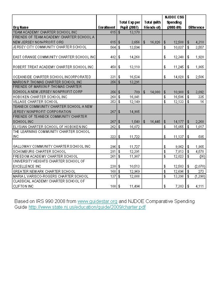
Getting back to the original point of my blog, this post is simply about introducing to the public discourse some actual data on NJ charter school spending. Back when I wrote my textbook on school finance, I found that DC charter schools were having to rely on private contributions to the tune of 14% of their annual operating expenses. One can obtain such information from IRS non-profit tax filings (IRS 990). I did a quick run of New Jersey Charter School IRS 990 filings for 2008, reflecting revenues and expenditures for 2007. I simply combined their tax filing information with their total expenditure information – which does include expenses for facilities.

What is most striking but not surprising is the degree of disparity among charter schools, driven substantially by differences in private fund raising.  Also important to note is that many of these schools spend well over the assumed $11,000 to $12,000 per pupil constantly spun by the media these days. I’ve not yet aligned the performance data with these new financial data, as I need to return to my actual research agenda (this particular analysis is  a part of ongoing research).

Remember also that these schools presently serve few or no special education children, making $16,000 per pupil worth well over $18,000 (assuming 15% special ed students typically at double average cost).

You might say, hey, if the public only has to subsidize $11k to $12k and private contributors pick up the rest, it’s still a bargain for taxpayers, right? Perhaps – but the necessity to rely on $3k to $5k of private contributions for each charter child educated then seriously limits the potential expansion of charter schools.

NJ Charter IRS 990Note from my previous posts and work on private schools, I have also shown that private independent day schools spend well above the average public expenditure. New Jersey private independent schools spent in 2007, an average of $25k to $30k per pupil (day schools only) with some exceeding $30k, also based on IRS 990 data.

My previous research on staffing in charter schools (based on undergraduate college selectivity of teachers) has shown that charters in some states attempt to staff their schools in ways similar to elite private academies – the private independent schools.

There is at least anecdotal evidence that some New Jersey Charter schools wish also to emulate elite private schools. For example, Ethical Community Charter School is founded by individuals previously associated with the Ethical Culture Schools of New York City, including the Fieldston School, a school where I taught for 5 years. An absolutely amazing school, which, by the way, spends well over $30,000 per child per year (even tuition is higher than that). I would argue that it will be quite difficult to emulate the ECFS schools of NYC on a mere $11k to $12k and that substantial private fundraising will be required. But private fundraising shouldn’t be required.

Good schools cost money! Sometimes a lot of money. Good education is expensive, which is not to say that all expensive education is good. My point here is that we are not going to solve our “urban education” problems on the cheap ($11k to $12k per kid), or necessarily any cheaper than what we’re spending currently. Any attempt to do so is likely to cause more harm than good.

[for those hanging on to anecdotal information about private religious school tuition as their basis for assuming good schooling can be done dirt cheap – about $3,500 per kid- please read http://www.epicpolicy.org/files/PB-Baker-PvtFinance.pdf]

The Real NJ Graduation Scam?

Bob Bowdon, of Cartel fame and E-3 make the claim that New Jersey’s poor urban districts are scamming the public and taxpayers by having overstated graduation rates. About half of poor district kids pass the HSPA test, but 85% graduate. Their brilliant solution to this problem, as I’ve noted previously, is to give kids the choice to attend charters – on the argument that charters are less likely to do such scamming?  So, here are some fun numbers.

First, the percent proficient or higher on HSPA MATH Assessments by district factor group for 2008:

Slide1

So, what we have here is that Charters (DFG R) actually had the lowest rate of kids proficient or higher on HSPA (matching my graph on previous posts, but lower here because only math is included). Yep, even lower than the poorest urban publics (DFG A). Yes, this is an average – among general ed test-takers – and averages conceal the highs… but they similarly conceal the lows.

Now, here are graduation rates for the schools by DFG:

Slide2

Wait one second. How can charters have a 97% graduation rate if only about half of the kids pass HSPA? Where’s the scam here? I thought you said that the differential between HSPA proficiency and graduation rates was supposed to be indicative of a scam? And that charters were the solution to the scam? But where is that differential bigger? Charters are lower on HSPA proficiency by a few points and are 12% higher on graduation rate? Now I’m really confused.

Okay – I’m not trying to pick on charter schools here. You guys are mostly working your butts off for a great cause, and quite honestly I don’t hear these completely absurd arguments coming from the charter leaders and teachers themselves. But the supposed “advocacy” out there on your behalf is deeply problematic. Quite honestly, if someone was out there advertising so poorly for my cause, I’d be a little concerned… or perhaps outraged.

Note to Non-Jersey readers about my casual use of Jersey terminology – DFG. In New Jersey, district factor groups or DFGs are a classification scheme that has been used for decades to characterize socio-economic features of public school districts. DFG A districts are generally poor urban districts, but many NJ poor urban districts are relatively small in total enrollment (a cluster of poor urban neighborhoods segregated from their more affluent neighbors). DFG I and J districts are affluent suburban districts. Charters are labeled “R.”

Teacher Evaluation with Value Added Measures

This month, the special issue of the journal Education Finance and Policy on value-added measurement of student outcomes was published. The table of contents is here:

http://www.mitpressjournals.org/toc/edfp/4/4

This is good stuff, authored by leading educational measurement and statistics researchers and economists. These articles provide some important cautionary tales regarding the application of value-added measures of student outcomes for teacher evaluation. Here is a policy brief with a more user friendly summary of some of the content of the special issue:

http://www.wcer.wisc.edu/publications/highlights/v19n3.pdf

Here’s a recent working paper by Jesse Rothstein, Princeton economist who also has an article in the special issue:

http://gsppi.berkeley.edu/faculty/jrothstein/published/rothstein_vam2.pdf

Here’s the concluding sentence of the abstract Rothstein’s paper:

Results indicate that even the best feasible value added models may be substantially biased, with the magnitude of the bias depending on the amount of information available for use in classroom assignments.

On average, the articles in the special issue do show some promise for using value-added assessment in teacher evaluation, with a number of really important caveats and technical stipulations.

Yes, we need access to more student assessment data with linkages to specific teachers – including the range of teachers across which middle and secondary students interact (it’s not as simple as linking the single teacher to a group of children). We need access to such data across multiple states and their assessment systems. Scaling properties of data and test noise play a major role in the precision with which one can isolate teacher or classroom level effects. We have little or no idea, for example, of the extent to which analyses using North Carolina or Texas assessment data relate to New Jersey assessment data, the statistical properties of those data and their usefulness or lack thereof for estimating teacher or classroom effects (unless there are technical papers out there on NJ tests of which I am unaware).

So, these are the main reasons we need to tear down firewalls – to advance the art, science and statistics of value added modeling, school and teacher evaluation and to uncover potential shortcomings where they exist.

Policymakers and pundits diving in head first on these issues need, quite simply, to chill out, perhaps read the special issue above and heed the advice earlier this year from the National Academy of Sciences and figure out how to do this right if we’re going to do it at all.

Diving in too quickly and doing it wrong will make it that much harder to do it right in the long run and will provide that much more ammunition for resistance.

Hawaii’s Funding Mess: My thoughts on why

It is indeed sad to see the state of public schooling in Hawaii. Teachers are furloughed and students are losing valuable classroom time. The state has chosen to use ARRA stimulus funds to fill budget gaps – which has been done by many states – but Hawaii has chosen to cut more than fill.

Arguably, Hawaii’s current education funding problems can be traced back to 2003 and a hard-nosed attempt at revenue-neutral education reforms – Fad-based reforms! Not fact-based ones. Off-the-Shelf School Finance solutions, as Doug Elmer and I describe in a recent article. (http://epx.sagepub.com/cgi/content/abstract/23/1/66)

Some historical context is provided here:

http://archives.starbulletin.com/2003/11/25/news/story2.html

Among other things, Hawaii’s leaders were misled in 2003 to believe that Hawaii already spent far more than necessary on its schools and that decentralized governance alone would solve their problems, driving more money to classrooms without ever having to add a dollar of new revenue.

The report by Bruce Cooper and William Ouchi concluded:

  • If Hawai’i were to reach classroom spending of 65 cents out of each education dollar, it would mean an additional $46,250 to spend on each classroom per year. This diversion of money to non-core uses is typical only of very large school districts.[1]
  • The results of our study bear on the consideration by the state of moving to a new system of management, Weighted Student Formula (WSF).

But this was an argument based on shoddy analysis and poorly documented summaries of state spending (actually, state and local total revenue) – comparisons which the authors of the original report even failed to understand. Yet, their message stuck with Hawaii policymakers.  No more money for schools. Just structural (read superficial) reform.

Oddly enough the original Cooper/Ouchi report which chastised Hawaii’s Board of Education for spending way to much to begin with and driving less than 65% to the classroom, never actually provided legitimate analyses supporting the secondary conclusions of that report – promote decentralized governance and implement a weighted student formula with the money you already have! Doug Elmer and I discuss these issues in this article: http://epx.sagepub.com/cgi/content/abstract/23/1/66

This whole series of events provided the governor and legislature in Hawaii the platform to continue starving the state’s education system while placing blame on the State Board of Education for not acting on their reforms, which in their view, would have solved everything. http://www.kpua.net/news.php?id=9232

Hawaii’s education system problems run much deeper than any superficial, off-the-shelf management guru strategy can solve.

Hawaii is among the few states where fewer than 80% of 6 to 16 year old children attend the public school system (78.8% according to American Community Survey 2005 to 2007). Yes, less than 80% of children in the age groups where most kids attend public schools are in Hawaii’s public schools. And yes, they are the lower income kids compared to their peers in Hawaii private schools.

That said, Hawaii’s educational effort (share of Gross state product spent on public schools) is relatively average to above average among states. Further, cross state comparisons of Hawaii’s educational spending provide mixed messages:  Hawaii’s current spending  – depending on how it’s measured and/or how it’s adjusted for regional cost variation is relatively average to above average (looking at total state and local revenue) or below average (looking at current expenditures per pupil) , adjusted for regional costs.

During the recent economic downturn, Hawaii’s total state revenue decline has been near the middle (upper middle) of the pack nationally – total state revenue losses from peak to June 2009 (p. 20 and 21), according to this Rockefeller Institute Report (best site for this stuff):

http://www.rockinst.org/pdf/government_finance/state_revenue_report/2009-10-15-SRR_77.pdf

This very recent WSJ article (http://online.wsj.com/article/SB125635093976805443.html) shows how Hawaii’s education funding cuts compare to those in states like California, Florida, Georgia and New Mexico – all of which have experienced much greater declines in total state revenue than Hawaii as of earlier this year – according to the Rockefeller Institute analyses linked above.

Even though Hawaii’s total state revenue is not declining as fast as these other states, Hawaii’s cuts to public schools have been comparable or even greater.

A few years back, Scott Thomas (now at Claremont Graduate School) and I were asked to provide analyses for and guidance to the Hawaii Department of Education regarding implementation of the decentralized weighted student funding plan which had been adopted as part of the comprehensive reforms of 2004.  To a large extent, our attempts at modeling financial redistribution options across Hawaii’s schools under revenue neutral assumptions proved to be an exercise in re-arranging deck chairs on the titanic.  Our two reports can be found here:

Part I – includes executive summary and conceptual framing of analyses, along with comparisons to other state formulas

http://sites.google.com/site/schoolfinancepolicy/consulting-reports/Hawaii.Part1%262.2006.pdf?attredirects=0&d=1

Part II & III – includes specific analyses of teacher labor markets, distribution of teachers by qualifications across richer and poorer neighborhoods, locations & islands, and concludes with simulations of redistribution options

http://sites.google.com/site/schoolfinancepolicy/consulting-reports/Hawaii.Part3.2006.pdf?attredirects=0&d=1

On page 34 of the second report, Scott Thomas and I explain:

=======  Begin Excerpt

A recent New York Daily News (7/2/06) editorial opined:

“Rather than simply pumping more gas into this broken down car, it’s time to design a much smarter and more effective way to get from Point A to Point B. A reform idea called ‘weighted student funding’ does just that, making intelligent use of the resources we already devote to education. How? Unlike the current system—which funds school districts through an incredibly complicated calculus—weighted student funding ties the money to the student.” (Cooper)

Increasingly, pundits supporting this view of WSF use the analogy of students carrying with them a need-based backpack of funding. Hawai‘i’s BOE and Committee on Weights now recognizes that in a system already constrained by limited resources, targeting sufficient need-based weighting simply costs more, not less or the same amount of money. As noted in our original report, we do not envy the members of committee charged with redistributing limited resources. If, as our estimates suggest, some schools need 40% more than others on the basis of poverty alone (we believe this to be a low estimate), and if this is to be done with no new money added to the system, then others must necessarily give up 40% of their funding.

In other words, assume Johnny and Malaya both need backpacks and currently they both have $10, sufficient to buy an ordinary backpack at Target or Wal-Mart. But, Malaya, by virtue of combined economic disadvantage and limited English proficiency, needs a $20 backpack. Johnny may need only an $8 backpack—the cheapest available (but with less padded shoulder straps than Johnny is used to). Unfortunately, if we redistribute the necessary resources to Malaya, then Johnny is out of luck altogether. If we leave Johnny with enough for the $8 backpack, then Malaya is out of luck. It’s a lose/lose proposition. For both Johnny and Malaya to get the backpack (read education) they need through a WSF, we will likely have to find more money. We ourselves might view this issue differently if it was plainly obvious that Hawai‘i’s schools are flush with funds and simply squandering those funds on unnecessary, frivolous endeavors. We lack any evidence to support this conclusion.

======= End Excerpt

While I’ve not followed Hawaii closely for the past few years, it would appear that this ship has now begun to sink – widening the gap between the fewer than 80% of children left in public schools (on the ship) in Hawaii and the 20% from first class who had access to life rafts.

I find it most disturbing that much of this mess may have been avoidable had it not been for purely political interests and self-absorbed snake-oil salesmen ready and willing to serve those interests with the simple message that money can’t fix schools.  Off-the-shelf reforms like WSF can!

The reality is that substantive education reform often costs money – sometimes a lot of money and sometimes a lot more than the amount already being spent. Automatically assuming that there’s enough money in a system just because it looks like a big number is not enough. More detailed analysis is required. You can’t starve a system into reform, especially if the reforms cost money. Unfounded assumptions and arguments that there’s plenty of money and that money doesn’t matter and may never matter are not only absurd but are potentially very harmful. It would appear that Hawaii is now becoming a stark example of that harm.

You can rebuild the engine and transmission as many times and in as many ways as you want, but if you don’t eventually put gas in the car, it won’t run!

(my apologies for combining sinking ship metaphors, backpacks and cars that don’t run in a single blog post)
Replicating Robert Treat Academy

With little doubt, Robert Treat Academy in Newark is one of those charter schools that is doing well by common outcome measures and likely by even more important measures than state tests. What we know about are the tests. And even if one controls for a variety of factors about student populations, Treat’s test scores are pretty darn good.

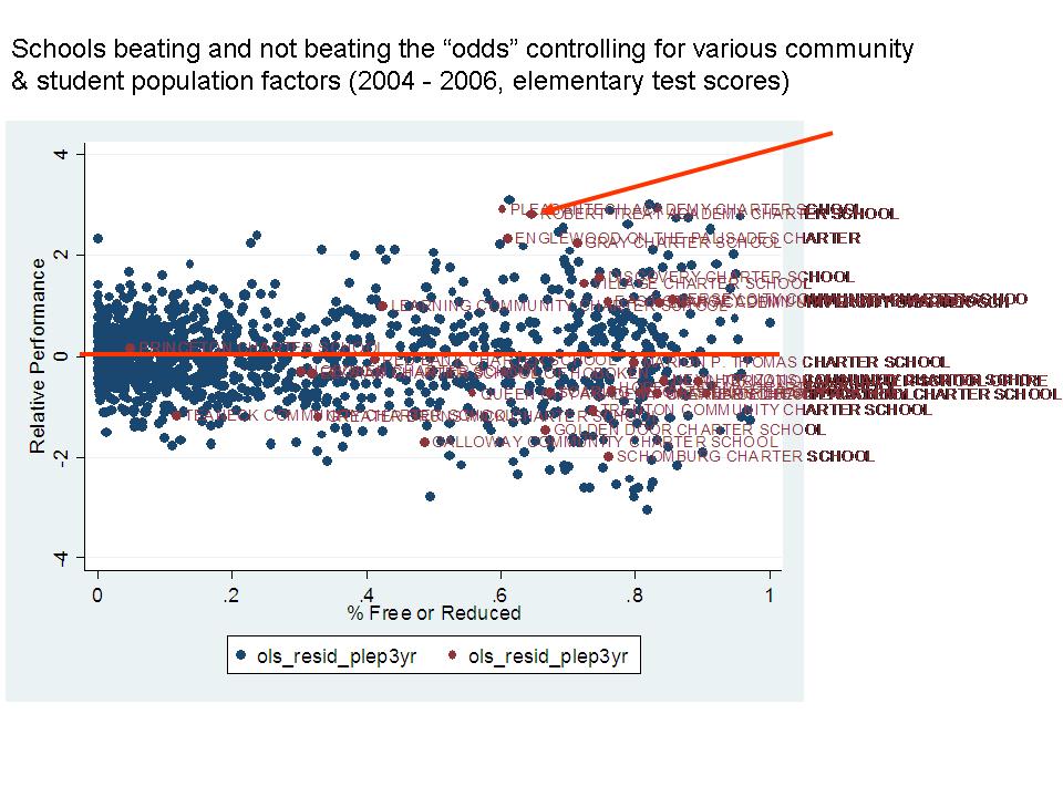
Here’s a figure from a model I re-ran the other day (based on older work), using a variety of school, student population and community factors to control for expected differences in student outcomes. Schools above the line are those that outperformed expectations and those below the line fell below expectations. Charters are in red, and again, there are roughly equal numbers of traditional publics above and below the red line and charters above and below the red horizontal line. Treat is one of those above the line.

Treat Beat

So the argument goes, Treat is producing these test scores with much less money, and therefore we should be able to do the same, with similarly less money across poor urban settings by emulating the Treat model.

I addressed in a previous post how charter schools receive less through the state aid formula than traditional public districts. Again, this should shift somewhat over time, but charters will remain relatively disadvantaged. Using Robert Treat’s IRS 990 for 2007 expenditures (instead of their NJDOE reporting of their expenditure of public charter funding only), Treat shows expenditures per pupil in 2007 around $12,600. I’m still not sure I’ve captured the full expenditure here, because Treat’s IRS 990s show unusually low levels of private contribution for a successful charter school.

That aside, is the Treat miracle replicable across Newark? Or, is Treat different in substantive ways that can’t be spread throughout the system. Here are a few numbers that raise concern.

First, as I noted on a previous post, Robert Treat’s student body is only 3.8% special education in a district with an average of 18.1%.  This is from the special education classification data from NJDOE. In the enrollment files, Treat reports 0%. At 100% additional average expenditure per special education pupil, matching district demographics would raise Treat’s expected spending to $14,868 (1.18 x 12,600 in 2007).

Second, while Robert Treat does show about 62.4% students qualifying for free (130% poverty level) and reduced (185% poverty level) lunch, the free lunch share is about 42.9%. That is, Treat’s free or reduced share is boosted by the share of children who are more well off among the less well off. Note that the model I used above used Free & Reduced shares, not Free alone or the ratio between them.

By contrast, Newark Public Schools in total has 82% free or reduced and 71% free lunch alone.

Treat also reports less than 1% limited English proficient students while Newark City schools report 8.7%.

It’s one thing for me to try to control for these differences in estimating who does and does not “beat” odds, but yet another to take a model that has been successful under certain circumstances and apply it widely under very different circumstances, at the same cost.

It’s all well and good to cite other studies from other cities  and states that show that charter schools on average aren’t “cream-skimming,” (where most of those comparisons are based either on student’s initial performance or on free + reduced shares) but the reality in this case is that Treat Academy is producing its current level of outcomes at its current price tag with a substantively different student population – most notably the absence of children with disabilities. Again, they’re doing well, and even in models I’ve run controlling for some of these things, they still stand out and should be applauded for their efforts and results.

But, given the demography of the entire student population of Newark in particular, replicating this model may prove difficult. Adding more schools that serve fewer of the poorest children and few or no children with disabilities may be significantly problematic for those schools which then serve the larger shares of both.