UARK Study Shamelessly (& Knowingly) Uses Bogus Measures to Make Charter Productivity Claims

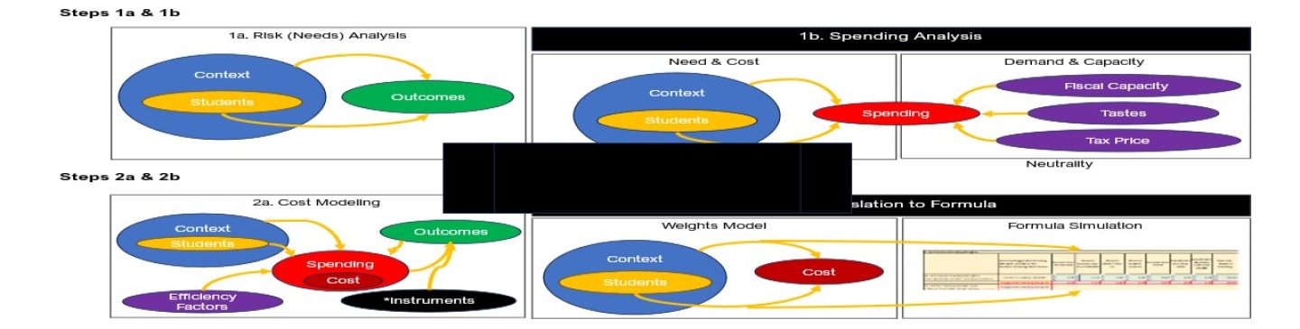
Any good study of the relative productivity and efficiency of charter schools compared to other schools (if such comparisons were worthwhile to begin with) would require precise estimates of comparable financial inputs and outcomes as well as the conditions under which those inputs are expected to yield outcomes.

The University of Arkansas Department of Education Reform has just produced a follow up to their previous analysis in which they proclaimed boldly that charter schools are desperately uniformly everywhere and anywhere deprived of thousands of dollars per pupil when compared with their bloated overfunded public district counterparts (yes… that’s a bit of a mis-characterization of their claims… but closer than their bizarre characterization of my critique).

I wrote a critique of that report pointing out how they had made numerous bogus assumptions and ill-conceived, technically inept comparisons which in most cases dramatically overstated their predetermined, handsomely paid for, but shamelessly wrong claims.

That critique is here: http://nepc.colorado.edu/files/ttruarkcharterfunding.pdf

The previous report proclaiming dreadful underfunding of charter schools leads to the low hanging fruit opportunity to point out that even if charter schools have close to the same test scores as district schools – and do so for so00000 much less money – they are therefore far more efficient. And thus, the nifty new follow up report on charter school productivity – or on how it’s plainly obvious that policymakers get far more for the buck from charters than from those bloated, inefficient public bureaucracies – district schools.

Of course, to be able to use without any thoughtful revision, the completely wrong estimates in their previous report, they must first dispose of my critique of that report – or pretend to.

In their new report comparing the relative productivity and efficiency of charter schools, UARK researchers assert that my previous critique of their funding differentials was flawed. They characterize my critique as focusing on differences specifically – and exclusively in percent free lunch population, providing the following rebuttal:

The main conclusion of our charter school revenue study was that, on average, charter schools nationally are provided with $3,814 less in revenue per-pupil than are traditional public schools. Critics of the report, including Gary Miron and Bruce D. Baker, claimed that the charter school funding gap we reported is largely due to charter schools enrolling fewer disadvantaged students than TPS.7 Miron stated that, “Special education and student support services explains most of the difference in funding.”8 Baker specifically claimed that charter schools enroll fewer students who qualify for free lunch and therefore suffer from deep poverty, compared to TPS.9

We have evidence with which to test these claims that the charter school funding gap is due to charters under-enrolling disadvantaged students, and that the gap would disappear if charters simply enrolled more special education students. To the first point, Table 1 includes aggregate data about the student populations served by the charter and TPS sectors for the 31 states in our revenue study. The states are sorted by the extent to which their charter sector enrolls a disproportionate percentage of free lunch students compared to their TPS sector. A majority of the states in our study (16 out of 31) have charter sectors that enroll a higher percentage of free lunch students than their TPS sector – directly contradicting Baker’s claim. Hawaii charters enroll the same percentage of free lunch students as do Hawaii TPS. For a minority of the states in our study (14 out of 31), their charter school sector enrolls a lower percentage of free lunch students than does their TPS sector.

Here’s the problem with this characterization. My critique was by no means centered on an assumption that charter schools serve fewer free lunch pupils than other schools statewide and that the gap would disappear if populations were more comparable.

My critique pointed out, among other things that making comparisons of charters schools to district schools statewide is misguided – deceitful in fact. As I explained in my critique, it is far more relevant to compare against district schools IN THE SAME SETTING. I make such comparisons for New Jersey, Connecticut, Texas and New York with far greater detail and documentation provided in this new UARK report. So no – they provide no legitimate refutation of my more accurate, precise and thoroughly documented claims.

But that’s only a small part of the puzzle. To reiterate and summarize my major points of critique:

As explained in this review, the study has one overarching flaw that invalidates all of its findings and conclusions. But the shortcomings of the report and its analyses also include several smaller but notable issues. First, it suffers from alarmingly vague documentation regarding data sources and methodologies, and many of the values reported cannot be verified by publicly available or adequately documented measures of district or charter school revenue. Second, the report constructs entirely inappropriate comparisons of student population characteristics—comparing, for example, charter school students to students statewide (using a poorly documented weighting scheme) rather than comparing charter school students to students actually served in nearby districts or with other schools or districts with more similar demographics. Similar issues occur with revenue comparisons.

Yet these problems pale in comparison to the one overarching flaw: the report’s complete lack of understanding of intergovernmental fiscal relationships, which results in the blatantly erroneous assignment of “revenues” between charters and district schools. As noted, the report purports to compare “all revenues” received by “district schools” and by “charter schools,” asserting that comparing expenditures would be too complex. A significant problem with this logic is that one entity’s expenditure is another’s revenue. More specifically, a district’s expenditure can be a charter’s revenue. Charter funding is in most states and districts received by pass-through from district funding, and districts often retain responsibility for direct provision of services to charter school students —a reality that the report entirely ignores when applying its resource-comparison framework. In only a handful of states are the majority of charter schools ostensibly fully fiscally independent of local public districts.3 This core problem invalidates all findings and conclusions of the study, and if left unaddressed would invalidate any subsequent “return on investment” comparisons.

So, back to my original point – any relative efficiency comparison must have comparable funding measures – and this new UARK study a) clearly does not and b) made no real attempt whatsoever to correct or even respond to their previous egregious errors.

The acknowledgement of my critique, highly selective misrepresentation of my critique, and complete failure to respond to the major substantive points of that critique display a baffling degree of arrogance and complete disregard for legitimate research.

Yes – that’s right – either this is an egregious display of complete ignorance and methodological ineptitude, or this new report is a blatant and intentional misrepresentation of data. So which is it? I’m inclined to believe the latter, but I guess either is possible.

Oh… and separately, in this earlier report, Kevin Welner and I discuss appropriate methods for evaluating relative efficiency (the appropriate framework for such comparisons)…. And to no surprise the methods in this new UARK report regarding relative efficiency are also complete junk. Put simply, and perhaps I’ll get to more detail at a later point, a simple “dollars per NAEP score” comparison, or the silly ROI method used in their report are entirely insufficient (especially as some state aggregate endeavor???).

And it doesn’t take too much of a literature search to turn up the rather large body of literature on relative efficiency analysis in education – and the methodological difficulties in estimating relative efficiency. So, even setting aside the fact that the spending measures in this study are complete junk, the cost effectiveness and ROI approaches used are intellectually flaccid and methodologically ham-fisted.

But if the measures of inputs suck to begin with, then the methods applied to those measures really don’t matter so much.

To say this new UARK charter productivity study is built on a foundation of sand would be offensive… to sand.

And I like sand.


On the Real Dangers of Marguerite Roza’s Fake Graph

In my last post, I ranted about this absurd graph presented by Marguerite Roza to a symposium of the New York Regents on September 13, 2011. Since that presentation (but before my post), that graph was also presented by the New York State Commissioner of Education to Superintendents of NY State School Districts (Sept. 26, slide #20). The graph and the accompanying materials are now part of a statewide push in New York to promote an apparent policy agenda, though I lack some clarity on the specifics of that agenda at this point in time.

Because this graph is now part of an ongoing agenda in New York and because critiques by other credible, leading scholars similar to my own but less ranting in style, which were submitted to state officials following the symposium have seemingly been ignored (shelved, shredded, or whatever) I feel the need to take a little more time to explain my previous rant. Why is this graph so problematic? And who cares? How could such a silly graph really cause any problems anyway? Let’s start back in with the graph itself.

How absurd is this graph?

So, here it is again, the Marguerite Roza graph explaining how if we just adopt either a) tech based learning systems or b) teacher effectiveness based policies we can get a whole lot more bang for our buck in public schools. In fact, we can get an astounding bang for our buck according to Roza.

Figure 1. Roza Graph

http://www.p12.nysed.gov/mgtserv/docs/SchoolFinanceForHighAchievement.pdf

As I explained on my previous post, along the horizontal axis is per pupil spending and on the vertical axis are measured student outcomes. It’s intended to be a graph of the rate of return to additional dollars spent. The bottom diagonal line on this graph – the lowest angled blue line – is intended to show the rate of return in student outcomes for each additional dollar spent given the current ways in which schools are run. Go from $5,000 to $25,000 in spending and you raise student achievement by, oh… about .2 standard deviations. I also pointed out that it doesn’t really make a whole lot of sense to assume that there is no return to any type of schooling at $5,000 per pupil. It might be small, but likely something. It should really have been set to $0 for the intercept. It’s also likely that for any of the curves, that they should be… well… curves. You know, with diminishing returns at some point, though perhaps the returns diminish well beyond spending $25,000. But these are just small signs of the sloppy thinking going on in this graph.

The next sign of the sloppy thinking is that the graph suggests that one can use these ill-defined tech-based solutions to get FIVE TIMES the bang for the same buck – a full standard deviation versus only .2 standard deviations – when spending $25,000 per pupil.

So, how crazy is it to assert that these reforms can create a full standard deviation of improvement up the productivity curve – for example, if we spend $25,000 per pupil on tech-based systems as opposed to $5,000 per pupil on tech-based systems? Well, here’s the “standard normal curve” which, for fun, I obtained from the NY Regents Assessment study guide. That’s right, this is from the study guide for the NY Regents test. So perhaps the members of the Board of Regents should take a look. A full standard deviation of improvement would be like moving a class of kids from the 50%ile to the 84.1%ile. That’s no simple accomplishment!

Figure 2. Standard Normal Curve

Let’s put this bang for the buck into context. I joked in my previous post that this blows away Hoxby’s study findings regarding NYC charter schools and closing the Harlem-Scarsdale achievement gap. Hoxby, for example found that students lotteried into charter schools had cumulative gains over their non-charter peers of .13 to .14 standard deviations by grade 3, and annual gains over their non-chartered peers of .06 to .09 standard deviations. Sean Reardon of Stanford explains how the selected models and methods may have inflated those claims! But that’s my point here. Let’s compare Roza’s stylized claims with previous, bold, inflated claims but ones at least based on a real study.

Let’s assume that the bottom line on Roza’s chart represents traditional public schooling in NYC and that traditional public schools in NYC spend about $20,000 per pupil. Following Roza’s graph that would put those students at about .2 standard deviations above what they would have scored if their schools spent only $5,000 per pupil.  Roza’s graph suggests however, that if the same $20,000 per pupil was spent on tech-based learning systems, those students would have scored about .7 standard deviations higher than if only $5,000 was spent, which is also .5 (a half standard deviation) greater than spending on traditional schools. That is, shifting the $20,000 per pupil from traditional schooling to tech-based learning systems would produce an achievement gain that is over FIVE TIMES the annual achievement gains from Hoxby’s NYC charter school study. Of course, it’s not entirely clear what the duration of treatment is in relation to outcome gains in Roza’s graph. Perhaps she means that one could gain this much after 110, 12 or 20 years of exposure to $20,000 per pupil invested in tech-based learning systems?

Figure 3. Roza Graph with Notes


Why is this graph (and the related information) dangerous?

So, let’s assume that many features of the graph are just innocently and ignorantly sloppy. Not a comforting assumption to have to make for a graph presented to a major state policy making body and by someone claiming to be a leading researcher on educational productivity and representing the most powerful private foundation in the country. Setting the intercept at $5,000 instead of $0… Setting such crazy effect magnitudes on the vertical axis. All innocently sloppy and merely intended to illustrate that there might be a better way if we can just think outside the box on school spending.

I have no problem with the idea of exploring outside the box for options that might shift the productivity curve. I have a big problem with assuming… no… declaring outright that we know full well what those options are and that they will necessarily shift the curve in a HUGE way.

I have significant concerns when this type of analysis is used to promote a policy agenda for which there exists little or no sound evidence that the policy agenda is worthwhile either in terms of costs or benefits.

The remainder of the Roza presentation and the presentation that followed basically assert that large shares of the money currently in the public education system are simply wasted. This assumption is also simply not supportable – certainly not by any of the ill-conceived fodder presented at the Regents Symposium by Marguerite Roza or Stephen Frank of Educational Resource Strategies.

For example, Stephen Frank presented slides to suggest that any and all money in the education system that is spent on a) teacher pay for experience above base pay or b) teacher pay for degree levels (any and all degrees) above and beyond base pay c) any compensation for teacher benefits, is essentially wasted and can and should be reallocated.  Here’s one of the slides:

Figure 4. Stephen Frank (ERS) slide:

Essentially, what is being argued is that a school where all teachers are paid only the base salary and receive no health benefits or retirement benefits would be equally productive to a school that does provide such compensation (since we know that those things don’t contribute to student results). That is, it would be equally productive for less than half the expense! Thus, all of that wasted money could be spent on something else, spent differently, to make the school more productive. This is essentially the middle diagonal line of the productivity curve (straight line) chart – spending on teacher effectiveness.  But this is all based on absurdly bold assumptions and slipshod analysis (intentionally deceptive since it’s based on a district with a senior workforce).

I have written about this topic previously, and how pundits (not researchers by any stretch of the imagination) have wrongly extrapolated this assumption from studies that show no strong correlations between student outcomes and whether teachers have or do not have advanced degrees, or studies that show diminishing returns in tested student outcomes to teacher experience beyond a certain number of years. As I explained previously, studies of the association between different levels of experience and the association between having a masters degree or not and student achievement gains have never attempted to ask about the potential labor market consequences of stopping providing additional compensation for teachers choosing to further their education – even if only for personal interest – or stopping providing any guarantee that a teacher’s compensation will grow at a predictable rate over time throughout the teacher’s career.

It is pure speculation and potentially harmful speculation to make this leap.

Who’s most likely to get hurt?

So, let’s say we were to capitulate on these overreaching if not outright absurd and irresponsible claims? What’s the harm anyway? Why not simply allow a little speculative experimentation in our schools? Can’t do worse right? Wrong! We could do worse! Simply pretending that there’s a better way out there, pretending that the productivity curve can be massively adjusted, with no foundation for this assumption means that there is comparable likelihood that revenue-neutral “innovations” could do as much harm as good. Assuming otherwise is ignorant and irresponsible.

But perhaps more disturbingly, when we start talking about where to engage in this speculative experimentation to adjust the productivity curve – excuse me – productivity straight line – we are most often talking about experimenting with the lives and educational futures of the most vulnerable children and families. I suspect that NY State policymakers buying into this rhetoric aren’t talking about forcing Scarsdale to replace small class sizes and highly educated and experienced teachers with tech-based learning systems. This despite the fact that Scarsdale, many other Westchester and Long Island affluent districts are already much further to the right on the spending axis than the state’s higher need cities, including New York City as well as locations like Utica, Poughkeepsie and Newburgh.  Further, as I have discussed previously on this blog, New York State continues to provide substantial state aid subsidies to these wealthy communities while failing to provide sufficient support to high need midsized and large cities.

But instead of providing sufficient resources to those high need cities to be able to provide the types of opportunities available in Scarsdale, the suggestion by these pundits posing as researchers is that it’s absolutely okay… not just okay… but the best way forward… to engage in revenue neutral (if not revenue negative) speculative experimentation which may cause significant harm to the state’s most needy children.

And that is why this graph is so dangerous and offensive.

Dumbest completely fabricated (but still serious?) graph ever! (so far)

Okay. You all know that I like to call out dumb graphs. And I’ve addressed a few on this blog previously.

Here are a few from the past: https://schoolfinance101.wordpress.com/2011/04/08/dumbest-real-reformy-graphs/

Now, each of the graphs in this previous post and numerous others I’ve addressed, like this one (From RiShawn Biddle) had something over the graph I’m going to address in this post. Each of the graphs I’ve addressed previously at the very least used some “real” data. They all used it badly. Some used it in ways that should be considered illegal. Others… well… just dumb.

But this new graph, sent to me from a colleague who had to suffer through this presentation, really takes the cake. This new graph comes to us from Marguerite Roza, from a presentation to the New York Board of Regents in September. And this one rises above all of these previous graphs because IT IS ENTIRELY FABRICATED. IT IS BASED ON NOTHING.

Perhaps even worse than that, the fabricated information on this illustrative graph suggests that its author does not have even the slightest grip on a) statistics, b) graphing, c) how one might measure effects of school reforms (and how large or small they might be) or d) basic economics.

Here’s the graph:

http://www.p12.nysed.gov/mgtserv/docs/SchoolFinanceForHighAchievement.pdf

Now, here’s what the graph is supposed to be saying. Along the horizontal axis is per pupil spending and on the vertical axis are measured student outcomes. It’s intended to be a graph of the rate of return to additional dollars spent. The bottom diagonal line on this graph – the lowest angled blue line – is intended to show the rate of return in student outcomes for each additional dollar spent given the current ways in which schools are run. Go from $5,000 to $25,000 in spending and you raise student achievement by, oh about .2 standard deviations.

Note, no diminishing returns (perhaps those returns diminish well outside the range of this graph?). It’s linear all the way – keep spending an you keep gaining…. to infinity and beyond. But I digress (that’s the basic economics bit above). And that doesn’t really matter – because this line isn’t based on a damn thing anyway. While I concur that there is a return to additional dollars spent, even I would be hard pressed to identify a single estimate of the rate of return for moving from $5k to $25k in per pupil spending.

Where the graph gets fun is in the addition of the other two lines. Note that the presentation linked above includes a graph with only the lower line first, then includes this graph which adds the upper two lines. And what are those lines? Those lines are what we supposedly can get as a return for additional dollars spent if we either a) spend with a focus on improving teacher effectiveness or b) spend “utilizing tech-based learning systems” (note that I hate utilizing the word utilizing when USE is sufficient!). I have it on good authority that the definitions of either provided during the presentation were, well, unsatisfactory.

But most importantly, even if there was a clear definition of either, THERE IS ABSOLUTELY NO EVIDENCE TO BACK THIS UP. IT IS ENTIRELY FABRICATED.  Now, I’ve previously picked on Marguerite Roza for here work with Mike Petrilli on the Stretching the School Dollar policy brief. Specifically, I raised significant concern that Petrilli and Roza provide all sorts of recommendations for how to stretch the school dollar but PROVIDE NO ACTUAL COST/EFFECTIVENESS ANALYSIS. 

In this graph, it would appear that Marguerite Roza has tried to make up for that by COMPLETELY FABRICATING RATE OF RETURN ANALYSIS for her preferred reforms.

Now let’s dig a little deeper into this graph. If you look closely at the graph, Roza is asserting that if we spend $5,000 per pupil either a) traditionally, b) focused on teacher effectiveness or c) on tech-based systems, we are at the same starting point. Not sure how that makes sense… since the traditional approach is necessarily least productive/efficient in the reformy world… but… yeah… okay.  Let’s assume it’s all relative to the starting point for each…which would zero out the imaginary advantages of two reformy alternatives… which really doesn’t make sense when you’re pitching the reformy alternatives.

Most interesting is the fact that Roza is asserting here that if you add another $20,000 per pupil into tech-based solutions – YOU CAN RAISE STUDENT OUTCOMES BY A FULL STANDARD DEVIATION. WOBEGON HERE WE COME!!!!! Crap, we’ll leave Wobegon in the dust at that rate. KIPP… pshaw… Harlem-Scarsdale achievement gap… been there done that! We’re talking a full standard deviation of student outcome improvement! Never seen anything like that – certainly not anything based on… say… evidence?

To be clear, even a moderately informed presenter fully intending to present fabricated but still realistic information on student achievement would likely present something a little closer to reality than this.

Indeed this graph is intended to be illustrative… not real…. but the really big problem is that it is NOT EVEN ILLUSTRATIVE OF ANYTHING REMOTELY REAL.

Now for the part that’s really not funny. As much as I’m making a big joke about this graph, it was presented to policymakers as entirely serious. How or whether they interpreted it as serious, who knows. But, it was presented to policymakers in New York State and has likely been presented to policymakers elsewhere with the serious intent of suggesting to those policymakers that if they just adopt reformy strategies for teacher compensation or buy some mythical software tools, they can actually improve their education systems at the same time as slashing school aid across the board. Put into context, this graph isn’t funny at all. It’s offensive. And it’s damned irresponsible! It’s reprehensible!

Let’s be clear. We have absolutely no evidence that the rate of return to the education dollar would be TRIPLED (or improved at all) if we spent each additional dollar on things such as test score based merit pay or other “teacher quality” initiatives such as eliminating seniority based pay or increments for advanced degrees. In fact, we’ve generally found the effect of performance pay reforms to be no different from “0.” And we have absolutely no evidence on record that the rate of return to the education dollar could be increased 5X if we moved dollars into “tech-based” learning systems.

The information in this graph is… COMPLETELY FABRICATED.

And that’s why this graph makes my whole new category of DUMBEST COMPLETELY FABRICATED GRAPHS EVER!

Newsflash! “Middle Class Schools” score… uh…in the middle. Oops! No news here!

I’ve already beaten the issue of the various flaws, misrepresentations and outright data abuse in the Third Way middle class report into the ground on this blog. And it’s really about time for that to end. Time to move on. But here is one simple illustration which draws on the same NAEP data compiled and aggregated in the Middle Class report. For anyone reading this post who has not already read my others on the problems with the definition of “Middle Class,” and related data abuse & misuse please start there:

My NEPC Review

My NEPC Response to Third Way Memo regarding Methods

My blog response to the argument that I’m simply a Status-quo-er

Again, the entire basis of the Third Way report is that our nation’s middle class schools are under-performing… not meeting expectations… dismal…dreadful… failures!  Now, setting aside the absurd methods used for classifying “middle class” and setting aside that the report mixes units of analysis illogically throughout (districts vs. schools vs. individual families, regardless of district or school attended) and mixes data across generations of high school graduates, how did they really expect middle class schools to perform? Did they expect them NOT to be IN THE MIDDLE? That seems rather foolish. No, wait, it is entirely foolish!

Here’s one very simple example showing the NAEP 8th grade math mean scale scores of children in 2009 by the percent of children in their school who qualify for the National School Lunch Program:

Rather amazingly, what we see here is that as school level % low income increases, NAEP mean scale scores decrease. Interestingly, the NAEP reporting tool chooses to include anomalous categories of 0% and 100%, which, not surprising, don’t fall right in line. Across the low income brackets, but for the anomalous endpoints, the relationship is nearly linear – with mean scale scores declining incrementally from the 1 to 5% low income group to the 76 to 99% category. Note also, that consistent with my previous explanations, the supposed “middle class” is actually to the right hand side – poorer side – of the distribution.

Most importantly… and really no freakin’ surprise… in fact something I shouldn’t ever even have to graph in order to validate it – THE SUPPOSED “MIDDLE CLASS” SCHOOLS FALL WHERE? RIGHT IN LINE! RIGHT IN THE DAMN MIDDLE OF THE CATEGORIES ON EITHER SIDE OF THEM? HOW THE HECK IS THAT PERFORMING UNDER EXPECTATIONS? THAT, MY FRIENDS, IS LUDICROUS! IT’S RIGHT ON EXPECTATIONS – STATISTICALLY!

Whether we as a country are, or whether I specifically am happy with the level or distribution of outcomes in the above figure is an entirely different issue. I might want to see higher outcomes across the board. Personally, I’d love to see the resources leveraged to begin to raise the outcomes on the right hand side of the graph – to reduce the clear linear relationship between low income concentrations and student outcomes.  But I also understand that the national aggregate relationship shown in the figure above has underlying it, the embedded disparities of 50 unique state education systemssome where states are making legitimate efforts to provide resources to improve equity in educational outcomes, and others quite honestly, that have done little or nothing for decades and in some cases have systematically eroded the equity and adequacy of resources over time (well before the current fiscal crisis)!

Fixing these disparities is a large and complex task and one that is not aided by small minded rhetoric and flimsy oversimplified analyses.

Third Way Responds but Still Doesn’t Get It!

Third Way has posted a response to my critique in which they argue that their analyses do not suffer the egregious flaws my review indicates. Specifically, they bring up my reference to the fact that whenever they are using a “district” level of analysis, they include the Detroit City Schools in their entirety in their sample of “middle class.” They argue that they did not do this, but rather only included the middle class schools in Detroit.

The problems with this explanation are many. First, several of their methodological explanations specifically refer to doing computations based on selecting “district” not school level data. For example, Footnote #8 in their report explains:

Third Way calculation based on the following source: New America Foundation, “Federal Education Budget Project,” Accessed on April 22, 2011. Available at: http://febp.newamerica.net/k12

The New America data set provides data at either the state, or DISTRICT level (see lower right hand section of page from link in footnote), not school level. And financial data of this type are not available nationally at the school level. You couldn’t select some and not all schools for financial data. My tabulations of who is in, or out of the sample are based on the district level data from the link in that web site.

Further, the authors later explain to their readers, in Footnote #40, in great detail, how to construct a data set to identify the middle class schools, using the NCES Common Core of Data Build a Table Function. Specifically, the instructions refer to selecting “district” to construct the data set. That selection creates a file of district level, not school level data. As such, a district is in or out in its entirety.

Third Way calculations based on data from the following source: United States, Department of Education, Institute of Education Statistics, National Center for Education Statistics, Common Core of Data. Accessed July 25, 2011. Available at: http://nces.ed.gov/ccd/bat/. The Common Core of Data includes data from the “2008-09 Public Elementary/Secondary School Universe Survey,” “2008-09 Local Education Agency Universe Survey,” and “2000 School District Demographics” from the U.S. Census Bureau. To generate data from the Common Core of Data, in the “select rows” drop down box, select “District.”

In my review, I explain thoroughly that Third Way mixes units of analysis throughout their report, sometimes referring to district level data from the New America Foundation data set, sometimes referring to NCES tabulations of data based on the Schools and Staffing Survey (not even their own original analyses of SASS data), and in some cases referring to data on individual children from the high school graduating class of 1992. In fact, the title of a section of the review is “mixing and matching data sources.” I explained in my review:

The authors seem to have overlooked the fact that NCES tables based on Schools and Staffing Survey data typically report characteristics based on school-level subsidized lunch rates. As such, within a large, relatively diverse district like New York City, several schools would fall into the authors’ middle-class grouping, while others would be considered high-poverty, or low-income, schools. But, many other of the authors’ calculations are based on district-level data, such as the financial data from New America Foundation. When using district-level data, a whole district would be included or excluded from the group based on the district-wide percentage of children qualifying for free or reduced-price lunch. What this means is that the Third Way report is actually comparing different groups of schools and districts from one analysis to another, and within individual analyses.

When referring to district level data, the district of Detroit would be included in its entirety. When referring to aggregations from tables based on the Schools and Staffing Survey, as I explain, some would be in and some would be out.

Further, the authors refer throughout to the groupings by subsidized lunch rates as quartiles. They are not. Quartiles would include even distributions – quarters – of either children, schools or districts. The selected cutoffs of 25% and 75% qualified for free or reduced lunch do not yield quartiles, as shown by their own data.

The bottom line, however, is that the arbitrary, broad and imbalanced subsidized lunch cutoffs chosen by the authors neither work well for district or school level analysis, no less an inconsistent mix of the two. And, the authors fail to understand that applying the same income thresholds across states and regions of the U.S. yields vastly different populations. Having income below 185% of the income level for poverty provides for a very different quality of life in New York versus New Mexico (for some discussion, see: https://schoolfinance101.wordpress.com/2011/09/13/revisiting-why-comparing-naep-gaps-by-low-income-status-doesnt-work/).

But, in their response, the Third Way authors also downplay the importance of any analyses that might have been done with district level data, stating that their most significant conclusions were not drawn from these data.

As I explain in my review, it would appear that their boldest conclusions were actually drawn from data on a completely different measure at a completely different unit of analysis, and for a completely different generation. Most of their conclusions about college graduation rates appear to be based on individuals who graduated from high school in 1992 (by my tracking of their Footnote #90). Further, when evaluating individual family income based data, the measure of middle class is entirely different, and we don’t know whether those children attend “middle class” schools or districts at all. That is, students are identified by a family income measure and placed into quartiles, regardless of the income levels of their schools. We don’t know which of them attended “middle class” schools and which did not. But, we do know that they graduated about 20 years ago, reducing their relevance for the analysis quite substantially.

For these reasons, the reply by the authors does little to help explain or redeem the report. Readers should also note that these (the issues discussed above) were only a subset of the problems with the report, which included, among other things, claims about middle class under-performance refuted by their own tables on the same page.

These are severe methodological flaws of a type one does not see regularly in “high profile” reports making bold claims about the state of American public education. In my view, the Third Way’s bold proclamation about the dreadful failures of our middle class schools, supported only by severely flawed analyses, was worthy of a bold response.

A few additional comments & data clarifications:

In their reply memo, the authors list the total numbers of schools in Detroit and other cities that fall above and below their subsidized lunch cut off points, arguing that these are the actual numbers of schools in each city which they included in their “middle class” group and arguing that this clarification negates entirely my concern as to which districts are and are not included. Again, whether the illogical and unfounded cut points were applied to school or district level data doesn’t actually matter that much. It’s bad analysis either way.

But, the tabulation they provide in the memo, which is likely drawn from school level data from the NCES Common Core, Public School Universe Survey, does not actually relate to the vast majority of tables and analyses reported in their original document. Either the authors simply don’t understand this, or the memo is a knowingly false representation of their analyses. Here’s a quick run down:

  1. Financial data used in the report, for per pupil expenditure calculations are not available at the school level.
  2. Teacher salary and all teacher characteristics comparisons were based on pre-made tables based on Schools and Staffing Survey data, which is a SAMPLE of about 8,000 or so schools out of 100,000 or so nationally. I point out in my review that these pre-made NCES tables reporting on SASS data would have schools within districts falling either side of the cut off lines. The authors do not appear to have actually used SASS data themselves, which would provide much more flexibility in the analysis. Rather, the  authors performed calculations based on tables in NCES reports using SASS data.
  3. NAEP (National Assessment of Educational Progress) data simply can’t be parsed by school within district in any way that would represent all schools within each district that fall above and/or below the cut points used (as implied in their memo). NAEP data could be reported (or drawn from reports) based on average school characteristics, or based on child characteristics. Third Way appears to have used this easy table creator tool from NAEP (see their FN#52). So, yes, the NAEP tabulations would split schools within large districts. But, to be clear, these would not match the numbers of schools counts the report in their memo because NAEP is based on sample data. Further, the problem here is that their report infers a relationship between the students scores on NAEP and the financial data when there is only partial overlap between the two because different units are used for each. Nonetheless, the BIG takeaway regarding the tables of NAEP data are that NAEP scores of students who attend the middle brackets of schools score… in the middle! Suggesting that these data reveal dreadful failures of middle class schools is delusional (in a purely statistical sense, that is)!
  4. The data on college matriculation and on graduation by age 26 (their most bold conclusions) are cited to reports done by others, most significantly to the Bowen book Crossing the Finish Line, which in its early sections (Chapter 2), includes family income quartile data based on the National Longitudinal Studies of the 8th grade class of 1988, and other data in the Bowen book (as I explain in the review) are on select states only. It is entirely inappropriate to extrapolate either the NELS 88 findings, or select state findings to the national population in “middle class” schools. We may know individual family income quartile, but we do not know their schools’ characteristics. Arguably, it is entirely inappropriate for the Third Way, on page 5 of their reply memo to claim regarding the completion rates of 26 year olds that “This is the major finding of our paper,” when it is, in fact, not their finding at all, but rather a citation to a finding in a book by someone else!

While the authors seem to wish to argue that my criticism over the poverty classification applied to district level data does not undermine their major conclusions that is clearly not the case. Given these concerns that exist across a) financial input data, b) teacher characteristics data, c) achievement outcome measures and d) college completion data, and the misalignment of units across all measures, not a single conclusion of the Third Way report remains intact.

One difference between Playin’ Jazz and Policy Research: Comments on the Third Way “Middle Class” Reply

Occasionally on this blog, I slip in some jazz references. I often see commonalities between jazz improvisation and policy analysis. But I think I’ve finally found one thing that is very different.

A lot of jazz teachers will joke around with students about what to do when you’re improvising a solo over chord changes, perhaps to a standard tune, and you happen to land unintentionally on a dissonant note.  Somethin’ with a really sour sound!  The usual advice is if you hit such a note, play it even louder a few more times! Make it sound intentional. Of course, you eventually want to resolve the dissonance, not end on it. But work it until then.

Well, I’m not sure that this principle applies well to policy research. Here’s why. I just completed a review of a report by Third Way, a think tank I’d never heard of previously. Third Way released a report on what it called “Middle Class” schools, and argued that these schools aren’t making the grade. Methodologically, this report was about the most god-awful thing I’ve ever had to read.  Here is the abstract of my review:

Incomplete: How Middle Class Schools Aren’t Making the Grade is a new report from Third Way, a Washington, D.C.-based policy think tank. The report aims to convince parents, taxpayers and policymakers that they should be as concerned about middle-class schools not making the grade as they are about the failures of the nation’s large, poor, urban school districts. But, the report suffers from egregious methodological flaws invalidating nearly every bold conclusion drawn by its authors. First, the report classifies as middle class any school or district where the share of children qualifying for free or reduced-priced lunch falls between 25% and 75%. Seemingly unknown to the authors, this classification includes as middle class some of the poorest urban centers in the country, such as Detroit and Philadelphia. But, even setting aside the crude classification of middle class, none of the report’s major conclusions are actually supported by the data tables provided. The report concludes, for instance, that middle-class schools perform much less well than the general public, parents and taxpayers believe they do. But, the tables throughout the report invariably show that the schools they classify as “middle class” fall precisely where one would expect them to—in the middle—between higher- and lower-income schools.

http://nepc.colorado.edu/thinktank/review-middle-class

In short, the layers of problems with the report were baffling. Among those layers of problems was a truly absurd definition of “middle class” schools, which, when I went to some of the data sources cited in order to evaluate the membership of “middle class” schools, I found school districts including Detroit, Philadelphia and numerous other large poor urban centers. Yet, throughout, the authors suggested that they were characterizing stereotypical “middle class” schools.

So, here’s the fun part. In response to my critique, did the Third Way authors consider at all the possibility that they had not done a very methodologically strong report? That their definition of “middle class” districts might have a few problems? Hell no. What did they do with that dissonant note! They took the advice of jazz instructors, and decided to defend that note, and play it loudly a few more times!

In their own words:

Let us be clear: Our decision to use this criteria was a deliberate choice, grounded in established procedures and data. http://perspectives.thirdway.org/?p=1173

But really. Let’s be more clear. While you might claim to have played this sour note deliberately, or might be trying to convince us as much, it just doesn’t cut it in policy research. Maybe sometimes it doesn’t really work in Jazz that well either. I don’t really like to see people in the front row cringe while I’m playin’ or encourage them to cringe a few more times before I provide them relief.

Please, don’t make me cringe anymore by defending indefensible criteria and shoddy analyses.  It’s time to go back to the woodshed. Go home. Do some practicing. Learn the tunes. Learn the changes. It takes time and discipline and we all play those dissonant notes some time.  I’ve certainly played my share over time. Sometimes we make em’ work. A lot of the time it can’t be done. Perhaps in this way, the discipline of good policy analysis and the discipline of solid jazz improv are quite similar.

A related parable from Jazz history: http://www.guardian.co.uk/music/2011/jun/17/charlie-parker-cymbal-thrown

Oh, and a few more comments. The “middle class” definition issue is but one of many egregious flaws in the report. Among other things, the authors repeatedly refer to quartiles which are not in fact quartiles. The authors make repeated claims inferring that today’s middle class schools are only getting ¼ graduates through college by age 26, but a little detective work shows that this assumption is actually cited back to a source using data on the high school class of 1992 (20 freakin’ years ago). The report confuses individuals from middle class families with students who attended schools that, on average, are middle class (not the same). Finally, the report constantly notes that middle class schools do not meet expectations, while providing tables showing that the middle class students, on average, perform where? In the middle. Right where expected!

Revisiting why comparing NAEP gaps by low income status doesn’t work

This is a compilation of previous posts, in response to the egregious abuse of data presented on Page 3, here: http://www.scribd.com/fullscreen/64717249:

Pundits love to make cross-state comparisons and rank states on a variety of indicators, something I’m guilty of it as well.[1] A favorite activity is comparing NAEP test scores across subjects, including comparing which states have the biggest test score gaps between children who qualify for subsidized lunch and children who don’t. The simple conclusion – States with big gaps are bad – inequitable – and states with smaller gaps must being doing something right!

It is generally assumed by those who report these gaps and rank states on achievement gaps that these gaps are appropriately measured – comparably measured – across states. That a low-income child in one state is similar to a low-income child in another. That the average low-income child or the average of low-income children in one state is comparable to the average of low-income children in another, and that the average of non-low income children in one state is comparable to the average of non-low income children in another.  Unfortunately, however, this is a deeply flawed assumption.

Let’s review the assumption. Here’s the basic framing adopted by most who report on this stuff:

Non-Poor Child Test Score – Poor Child Test Score = Poverty Achievement Gap

Non-Poor Child in State A = Non-Poor Child in State B

Poor Child in State A = Poor Child in State B

These conditions have to be met for there to be any validity to rankings of achievement gaps.

Now, here’s the problem.

Poor = child from family falling below 185% income level relative to income cut point for poverty

Therefore, the measurement of an achievement gap between “poor” and “non-poor” is:

Average NAEP of children above 185% poverty threshold – Average NAEP of children below 185% poverty threshold = “Poverty” achievement Gap

But, the income level for poverty is not varied by state or region.[2]

As a result, the distribution of children and their families above and below the specified threshold varies widely from state to state, and comparing the average performance of the groups of children above that threshold and below it is not particularly meaningful.  Comparing those gaps across states is really problematic.

Here are graphs of the poverty distributions (using a poverty index where 100 = 100%, or income at the poverty level) for families of 5 to 17 year olds in New Jersey and in Texas. These graphs are based on data from the 2008 American Community Survey (from http://www.ipums.org). They include children attending either/both public and private school.

Figure 1

Poverty Distribution (Poverty Index) and Reduced Price Lunch Cut-Point


  Figure 2

Poverty Distribution (Poverty Index) and Reduced Price Lunch Cut-Point


To put it really simply, comparing the above the line and below the line groups in New Jersey means something quite different from comparing the above the line and blow the line groups in Texas, where the majority are actually below the line… but where being below the line may not by any stretch of the imagination be associated with comparable economic deprivation. Further, in New Jersey, much larger shares of the population are distributed toward the right hand end of the distribution – the distribution is overall “flatter.” These distributional differences undoubtedly have significant influence on the estimation of achievement gaps. As I often point out, the size of an achievement gap is as much a function of the height of the highs as it is a function of the depth of the lows.[3]

How does this matter when comparing poverty achievement gaps?

In the above charts, while I show how different the poverty and income distributions were in Texas and New Jersey as an example, those charts don’t explain how/why these distribution differences thwart comparisons of low-income vs. non-low income achievement gaps. Yes, it should be clear enough that the above the line and below the line groups just aren’t similar across these two states and/or nearly every other.

A logical extension of the analysis in that previous post would be to look at the relationship between:

Gap in average family total income between those above and below the free or reduced price lunch cut-off

AND

Gap in average NAEP scores between children from families above and below the free or reduced price lunch cut-off

If there is much (or any) of a relationship between the income gaps and the NAEP gaps – that is, states with larger income gaps between the poor and non-poor groups also have larger achievement gaps – such a finding would call into question the usefulness of state comparisons of these gaps.

So, let’s walk through this step by step.

First, Figure 3 shows the relationship across states between the NAEP Math Grade 8 scores and family total income levels for children in families ABOVE the free or reduced cutoff:

Figure 3

There is a modest relationship between income levels of non-low income children and NAEP scores. Higher income states generally have higher NAEP scores. No adjustments are applied in this analysis to the value of income from one location to another, mainly because no adjustments are applied in the setting of the poverty thresholds. Therein lies at least some of the problem. The rest lies in using a simple ABOVE vs. BELOW a single cut point approach.

Second, Figure 4 shows the relationship between the average income of families below the free or reduced lunch cut point and the average NAEP scores on 8th Grade Math (2009).

Figure 4


This relationship is somewhat looser than the previous relationship and for logical reasons – mainly that we have applied a single low-income threshold to every state and the average income of individuals below that single income threshold does not vary as widely across states as the average income of individuals above that threshold. Further, the income threshold is arbitrary and not sensitive do the differences in the value of any given income level across states.  But still, there is some variation, with some stats have much larger clusters of very low-income families below the free or reduced price lunch threshold (Mississippi).

But, here’s the most important part. Figure 5 shows the relationship between income gaps estimated using the American Community Survey data (www.ipums.org) from 2005 to 2009 and NAEP Gaps. This graph addresses directly the question posed above – whether states with larger gaps in income between families above and below the arbitrary low-income threshold also have larger gaps in NAEP scores between children from families above and below the arbitrary threshold.

Figure 5

In fact, they do. And this relationship is stronger than either of the two previous relationships. As a result, it is somewhat foolish to try to make any comparisons between achievement gaps in states like Connecticut, New Jersey and Massachusetts versus states like South Dakota, Idaho or Wyoming. It is, for example, more reasonable to compare New Jersey and Massachusetts to Connecticut, but even then, other factors may complicate the analysis.

How does this affect state ranking gaps? Re-ranking New Jersey

New Jersey’s current commissioner of education seems to stake much of his arguments for the urgency of implementing reform strategies on the argument that while New Jersey ranks high on average performance, New Jersey ranks 47th in achievement gap between low-income and non-low income children (video here: http://livestre.am/M3YZ).

And just yesterday, a New Jersey Governor’s Task Force report used New Jersey’s egregious poverty achievement gap as the primary impetus for the immediate need for reform: http://www.scribd.com/fullscreen/64717249 (In my view, all that follows in this report is severely undermined by the fact that those who drafted the report clearly do not have even the most basic understanding of data on poverty and achievement!)

To be fair, this is classic political rhetoric with few or no partisan boundaries.

To review, comparisons of achievement gaps across states between children in families above the arbitrary 185% income level and below that income level are very problematic.  In my last post on this topic, I showed that states where there is a larger gap in income between these two groups (the above and below the line groups), there is also a larger gap in achievement.  That is, the size of the achievement gap is largely a function of the income distribution in each state.

Let’s take this all one more, last step and ask – If we correct for the differences in income between low and higher income families – how do the achievement gap rankings change? And, let’s do this with an average achievement gap for 2009 across NAEP Reading and Math for Grades 4 and 8.

Figure 6 shows the differences in income for lower and higher income children, with states ranked by the income gap between these groups:

Figure 6


Massachusetts, Connecticut and New Jersey have the largest income gaps between families above and below the arbitrary Free or Reduced Price Lunch income cut off.

Now, let’s take a look (Figure 7) at the raw achievement gaps averaged across the four tests:

Figure 7


New Jersey has a pretty large raw gap, coming in 5th among the lower 48 states (note there are other difficulties in comparing the income distributions in Alaska and Hawaii, in relation to free/reduced lunch cut points). Connecticut and Massachusetts also have very large achievement gaps.

One can see here, anecdotally that states with larger income gaps in the first figure are generally those with larger achievement gaps.

Here’s the relationship between the two (Figure8):

Figure 8

In this graph, a state that falls on the diagonal line, is a state where the achievement gap is right on target for the expected achievement gap, given the difference in income for those above and below the arbitrary free or reduced price lunch cut-off. New Jersey falls right on that line. States falling on the line have relatively “average” (or expected) achievement gaps.

One can take this the next step to rank the “adjusted” achievement gaps based on how far above or below the line a state falls. States below the line have achievement gaps smaller than expected and above the line have achievement gaps larger than expected. At this point, I’m not totally convinced that this adjustment is capturing enough about the differences in income distributions and their effects on achievement gaps. But it makes for some fun adjustments/comparisons nonetheless. In any case, the raw achievement gap comparisons typically used in political debate are pretty meaningless.

Here are adjusted achievement gap rankings (Figure 9):

Figure 9

Here, NJ comes in 27th in achievement gap. That is 27th from largest. That is, New Jersey’s adjusted achievement gap between higher and lower-income students, when correcting for the size of the income gap between those students, is smaller than the gap in the average state.


[3] For further explanation of the problems with poverty measurement across states, using constant thresholds, and proposed solutions see: Renwick, Trudi. Alternative Geographic Adjustments of U.S. Poverty Thresholds: Impact on State Poverty Rates. U.S. Census Bureau, August 2009. https://xteam.brookings.edu/ipm/Documents/Trudi_Renwick_Alternative_Geographic_Adjustments.pdf

More expensive than what? A quick comment on CAP’s CSR report

The Center for American Progress today release a report on class size reduction authored by Matthew Chingos, who has conducted a handful of recent interesting studies on the topic.

http://www.americanprogress.org/issues/2011/04/pdf/class_size.pdf

This report reads more or less like a manifesto against class size reduction as a strategy for improving school quality and student outcomes. I’ll admit that I’m also probably not the biggest advocate for class size reduction as a single, core strategy for education reform, and that I do favor some balanced emphasis on teacher quality issues. I’m also not the naysayer that I once was regarding class size reduction and its relative costs.  There still exists too little decisive information regarding the cost-benefit tradeoffs between the two – teacher quantity and teacher quality.

I only had a chance to view this report briefly, and one specific section caught my eye – the section titled: CSR, The Most Expensive School Reform.

I found this interesting, because it included a bunch of back of the napkin estimates of the potential costs of CSR (based on reasonable assumptions), BUT PROVIDED NOT ONE SINGLE COMPARISON OF THE COST AND BENEFITS OF CSR TO ANY OTHER ALTERNATIVE.

You see – You can’t say something is the most expensive without actually comparing it to, uh, something else. That’s how cost comparisons work. Cost benefit analysis works this way too. You compare the costs of option A, and outcomes achieved under option A, to the costs of option B, and outcomes achieved under option B.

Implicit in this section of the report is that reducing class size for any given improvement in student outcomes is necessarily more expensive than improving student outcomes by the same amount by improving teacher quality.  In fact, explicit in the title of this section of the report is that pretty much any alternative that might get the same outcome is cheaper than CSR. That’s one freakin’ amazing stretch!

Here are a few quotes provided by Matt Chingos on this point:

A school that pays teachers $50,000 per year (roughly the national average) would save $833 per student in teacher salary costs alone by increasing class size from 15 to 20.30 The true savings, including facilities costs and teacher benefits, would be significantly larger. These resources could be used for other purposes. If all of the savings were used to raise teacher salaries, for example, the average teacher salary in this example would increase by $17,000 to $67,000.

And:

The emerging consensus that teacher effectiveness is the single most important in-school determinant of student achievement suggests that teacher recruitment, retention, and compensation policies ought to rank high on the list.

Chingos goes on to address the various teacher effect and effectiveness based layoff simulations by authors including Eric Hanushek and how those simulations project larger gains than would be achieved by class size reduction. Chingos does acknowledge in the next paragraph that:

Teachers would need to be paid more to compensate them for the loss of job security. Providing bonuses to teachers in high-need subjects and schools would also consume resources. If these policies are more cost-effective than reducing class size, then increasing class size in order to pursue them would increase student achievement.

However, it would seem by the title and the rest of the content of this section that Chingos has jumped to a conclusion on this point. No actual cost comparison is made between improving student outcomes by improving teacher effectiveness versus improving student outcomes by class size reduction.

The relevant research question based on the hypothetical here is:

…on a given labor market with a given supply of teacher quantities and qualities, does the teacher that will teach for a salary of $67,000 with a class of 20 children get a better result than the teacher that will teach for a salary of $50,000 with a class of 15?

I’m not sure we know the answer to that, in part because the teacher labor market research also suggests that while there is sensitivity of teacher labor markets to salaries, it may take quite substantial salary increases to achieve comparable gains to class size reduction. Further, given class size and total student load as a working condition, the same teacher might teach a class of 15 for marginally lower salary than to teach a class of 20 (which could be the difference between a total load, at 6 sections per day, of 90 vs. 120 students, which is a pretty big difference).

I’ve been waiting for years for good answers to this tradeoff, and hoping for data that will provide better opportunities to address this question. Unfortunately, the wait continues.

Dumbest “real” reformy graphs!

So in my previous post I created a set of hypothetical research studies that might be presented at the Reformy Education Research Association annual meeting. In my creation of the hypotheticals I actually tried to stay  pretty close to reality, setting up reasonable tables with information that is actually quite probable.  Now, when we get down to the real reformy stuff that’s out there, it’s a whole lot worse. In fact, had I presented the “real” stuff in my previous post, I’d have been criticized for fabricating examples that are just too stupid to be true. Let’s take a look at some real “reformy” examples here:

1. From Democrats for Education Reform of Indiana

According to the DFER web site post which includes this graph:

True, there are some great, traditional public schools in Indiana and throughout the nation.  We’re also fortunate that a vast majority of our educators excel at their jobs and are dedicated to doing whatever it takes to help students succeed.  However, that doesn’t mean we should turn a blind eye to what ISN’T working.  Case in point?  The following diagram displays how all 5th grade classes in the span of a year in one central Indiana school district are doing on a set of state Language Arts student academic standards.  Because 5th grade classes in Indiana are only taught by one teacher, the dots can be translated to display how well the students of individual teachers are doing.

Now, ask yourself this:  In which dot or class would you want your child?  And, imagine if your child were in the bottom performing classroom for not one but MULTIPLE years.  In spite of lofty claims made by those who defend the current system, refusal to offer constructive alternatives to rectify charts such as the one above represents the sad state of education dialogue in America today.

So, here we have a graph… a line graph of all things, across classrooms (3rd grade graphing note – a bar graph would be better, but still stupid). This graph shows the average pass rates on state assessments for kids in each class. Nothin’ else. Not gains. Just average scores. Gains wouldn’t necessarily tell us that much either. But this is truly absurd.  The author of the DFER post makes the bold leap that the only conclusion one can draw from differences in average pass rates across a set of Indiana classrooms is that some teachers are great and others suck! Had I used this “real” example to criticize reformers, most would have argued that I had gone overboard.

2. Bill Gates brilliant exposition on turning that curve upside down – and making money matter

Now I’ve already written about this graph, or at least the post in which it occurs, but I didn’t include the graph itself.

Gates uses this chart to advance the argument:

Over the last four decades, the per-student cost of running our K-12 schools has more than doubled, while our student achievement has remained flat, and other countries have raced ahead. The same pattern holds for higher education. Spending has climbed, but our percentage of college graduates has dropped compared to other countries… For more than 30 years, spending has risen while performance stayed flat. Now we need to raise performance without spending a lot more.

Among other things, the chart includes no international comparison, which becomes the centerpiece of the policy argument. Beyond that, the chart provides no real evidence of a lack of connection between spending and outcomes across districts within U.S. States.  Instead, the chart juxtaposes completely different measures on completely different scales to make it look like one number is rising dramatically while  the others are staying flat. This tells us NOTHING. It’s just embarrassing. Simply from a graphing standpoint, a blogger at Junk Charts noted:

Using double axes earns justified heckles but using two gridlines is a scandal!  A scatter plot is the default for this type of data. (See next section for why this particular set of data is not informative anyway.)

Not much else to say about that one. Again, had I used an example this absurd to represent reformy research and thinking, I’ d have likely faced stern criticism for mis-characterizing the rigor of reformy research!

Hat tip to Bob Calder on Twitter, for finding an even more absurd representation of pretty much the same graph used by Gates above. This one comes to us from none other than Andrew Coulson of Cato Institute. Coulson has a stellar record of this kind of stuff. So, what would you do to the Gates graph above if you really wanted to make your case that spending has risen dramatically and we’ve gotten no outcome improvement? First, use total rather than per pupil spending (and call it “cost”) and then stretch the scale on the vertical axis for the spending data to make it look even steeper. And then express the achievement data in percent change terms because NAEP scale scores are in the 215 to 220 range for 4th grade reading, for example, but are scaled such that even small point gains may be important/relevant but won’t even show as a blip if expressed as a percent over the base year.

And here’s the Student’s First version of the same old story:

3. Original promotional materials from the reformy documentary, The Cartel (a manifesto on New Jersey public schools)

The Cartel is essentially the ugly step-cousin of Waiting for Superman and The Lottery. I’ve written extensively about the Cartel when it was originally released and then when it made its Jersey tour. Thankfully, it didn’t get much beyond that. Back when it was merely a small time, low budget, ill-conceived, and even more poorly researched pile of reformy drivel, The Cartel had a promotional web site (different from the current one) which included a page of documented facts explaining why reform was necessary in New Jersey. The central message was much the same as the Gates message above. The graphs that follow are nolonger there, but the message is – for example – here:

With spending as high as $483,000 per classroom (confirmed by NJ Education Department records), New Jersey students fare only slightly better than the national average in reading and math, and rank 37th in average SAT scores.

Here are the truly brilliant graphs that support this irrefutable conclusion:

I have discussed these graphs at length previously! I’m not sure it’s even worth reiterating my previous comments. But, just to clarify, it is entirely conceivable that participation rates for the SAT differ somewhat across states and may actually be an important intervening factor? Nah… couldn’t be.

Smart Guy (Gates) makes my list of “Dumbest Stuff I’ve Ever Read!”

Bill Gates (clearly a very smart guy) has just topped my list of Dumbest Stuff I’ve Ever Read for the first few months of 2011. He did it with this post in the Huffington Post and with his talk to State Governors (in which he also naively handed out copies of the book Stretching the School Dollar, which is complete junk):

http://www.huffingtonpost.com/bill-gates/bill-gates-school-performance_b_829771.html

Let’s dissect two bold premises of Gates’ argument about US spending and student outcomes – how we’ve spent ourselves crazy for decades and how we’ve gotten nothing for it – how we spend so much more than other countries, but they kick our butts – his reasons for arguing that now is the time to flip the curve.

Gates opines:

Compared to other countries, America has spent more and achieved less.

To be able to make such a comparison, one would have to be able to accurately and precisely measure education spending levels in the United States relative to education spending levels in other countries, and achievement outcomes of children in the United States compared to otherwise similar children in other countries. We’ve already heard much blog talk about how poverty rates among US children and children in Finland are, well, not really so comparable – Finland having much lower poverty. Clearly, that makes at least some difference.

But let’s focus on the expenditure side of this puzzle for a moment.

We don’t hear enough about how those expenditure figures are, well, not so comparable either.

International education spending comparisons like those presented by the Organization for Economic Cooperation and Development (OECD) and often reported by organizations like McKinsey are, well, bogus…meaningless… uh…not particularly useful. Why? Because they are not comparable. Plain and simple.

Government or public education expenditures in different countries contain different components. A number of my colleagues and I are in the process of better understanding and delineating the components included in public education expenditures across nations. For example, in a country with a national health care system, public education expenditures may not include health care expenses for all employees. That’s not a trivial expense. The same may be true of pension contributions and obligations, where they exist, in other countries. The same is also true for arts and athletic programs in countries where it is more common for those activities to be embedded in community services. But, we’ve yet to fully identify the extent of these differences across nations or how these differences affect the spending comparisons. What we do know is that they do affect the spending comparisons – and likely quite significantly.

So, that in mind, what can we say about how much the US spends with respect to how well our children do, compared to other countries’ spending and outcomes when neither the spending figure nor the children in the system are even remotely comparable? Not much!

Gates opines:

Over the last four decades, the per-student cost of running our K-12 schools has more than doubled, while our student achievement has remained flat, and other countries have raced ahead.

[from a previous post]

We often see pundits arguing that education spending has doubled over a 30 year period, when adjusted for inflation, and we’ve gotten nothing for it. We’ve got modest growth in NAEP scores and huge growth in spending. And those international comparisons… wow!

The assertion is therefore that our public education system is less cost-effective now than it was 30 years ago. But this assumption is based on layers of flawed reasoning, on both sides of the equation.

Here’s a bit of School Finance 101 on this topic:

First, what are the two sides of the equation, or at least the two parts of the fraction? The numerator here is education spending and how we measure it now compared to previously. The major flaw in the usual reasoning is that we are making our comparison of the education dollar now to then by simply adjusting the value of that dollar for the average changes in the prices of goods purchased by a typical consumer (food, fuel, etc.), or the Consumer Price Index.

Unfortunately, the consumer price index is relatively unhelpful (okay, useless) for comparing current education spending to past education spending, unless we are considering how many loaves of bread or gallons of gas can be purchased with the education dollar.

If we wanted to maintain constant quality education over time, the main thing we’d have to do is maintain a constant quality workforce in schools – mainly a teacher workforce, but also administrators, etc. At the very least, if quality lagged behind we’d have to be able to offset the quality losses with additional workers, but the trade-offs are hard to estimate.

The quality of the teacher workforce is influenced much more by the competitiveness of the wages for teachers, compared to other professions, than to changes in the price of a loaf of bread or gallon of gas. If we want to get good teachers, teaching must be perceived as a desirable profession with a competitive wage. That is, to maintain teacher quality we must maintain the competitiveness of teacher wages (which we have not over time) and to improve teacher quality, we must make teacher wages (or working conditions) more competitive. On average, non-teacher wage growth has far outpaced the CPI over time and on average, teacher wages have lagged behind non-teacher wages, even in New Jersey!

Now to the denominator or the outcomes of our education system. First of all, if we allow for a decline in the quality of the key input – teachers – we can expect a decline in the outcomes however we choose to measure them. But, it is also important to understand that if we wish to achieve either higher outcomes, or to achieve a broader array of outcomes, or to achieve higher outcomes in key areas without sacrificing the broader array of outcomes, costs will rise. In really simple terms, the cost of doing more is more, not less. And yes, a substantial body of rigorous peer-reviewed empirical literature supports this contention (a few examples below).

So, as we ask our schools to accomplish more we can expect the costs of those accomplishments to be greater. If we expect our children to compete in a 21st century economy, develop technology skills and still have access to physical education and arts, it will likely cost more, not less, than achieving the skills of 1970. But, we must also make sure we are adequately measuring the full range of outcomes we expect schools to accomplish. If we are expecting schools to produce engaged civic participants, we may or may not see the measured effects in elementary reading and math test scores.

An additional factor that affects the costs of achieving educational outcomes is the student inputs – or who is showing up at the schoolhouse door (or logging in to the virtual school). A substantial body of research (see chapter by Duncombe and Yinger, here) explains how child poverty, limited English proficiency, unplanned mobility and even school racial composition may influence the costs of achieving any given level of student outcomes. Differences in the ways children are sorted across districts and schools create large differences in the costs of achieving comparable outcomes and so too do changes in the overall demography of the student population over time. Escalating poverty, and mobility induced by housing disruptions, increased numbers of children not speaking English proficiently all lead to increases of the cost of achieving even the same level of outcomes achieved in prior years. This is not an excuse. It’s reality. It costs more to achieve the same outcomes with some students than with others.

In short, the “cost” of education rises as a function of at least 3 major factors:

  1. Changes in the incoming student populations over time
  2. Changes in the desired outcomes for those students, including more rigorous core content area goals or increased breadth of outcome goals
  3. Changes in the competitive wage of the desired quality of school personnel

And the interaction of all three of these! For example, changing student populations making teaching more difficult (a working condition), meaning that a higher wage might be required to simply offset this change. Increasing the complexity of outcome goals might require a more skilled teaching workforce, requiring higher wages.

The combination of these forces often leads to an increase in education spending that far outpaces the consumer price index, and it should. Cost rise as we ask more of our schools, as we ask them to produce a citizenry that can compete in the future rather than the past. Costs rise as the student population inputs to our public schooling system change over time. Increased poverty, language barriers and other factors make even the current outcomes more costly to achieve. And costs of maintaining the quality of the teacher workforce change as competitive wages in other occupations and industries change, which they have.

Typically, state school finance systems have not kept up with the true increased costs of maintaining teacher quality, increased outcome demands or changing student demography. Nor have states sufficiently targeted resources to districts facing the highest costs of achieving desired outcomes. See www.schoolfundingfairness.org. And many states, with significantly changing demography including Arizona, California and Colorado have merely maintained or even cut current spending levels for decades (despite what would be increased costs of even maintaining current outcome levels).

Evaluating education spending solely on the basis of changes in the price of a loaf of bread and/or gallon of gasoline is, well, silly.

Notably, we may identify new “efficiencies” that allow us to produce comparable outcomes, with comparable kids at lower cost. We may find some of those efficiencies through existing variation across schools and districts, or through new experimentation. But it is downright foolish to pretend that those efficiencies are simply out there (even if we can’t see them, or don’t know them) and we can simply squeeze the current system into achieving comparable or better outcomes at lower cost.

Closing thought

So, Mr. Gates… neither of your two main premises rests on solid footing. Not only that, but these arguments are so commonplace and so intellectually flimsy and lazy as to be outright embarrassing.

I know you’ve got other things to think about and likely rely heavily on advisers to help you shape these arguments, much like politicians rely heavily on their staffers. Here’s a tip Mr. Gates. YOU ARE GETTING REALLY BAD, DEEPLY FLAWED ADVICE AND INFORMATION WHEN IT COMES TO SCHOOL FUNDING ARGUMENTS.

There are many, many credible school finance and economics of education scholars out there. Those who you have chosen to rely on in many instances – authors of Stretching the School Dollar and others are not credible scholars of school finance or education policy more generally. I tackle some of the other myths driving the current debate in these two recent posts:

School Funding Equity Smokescreens

School Funding Myths & Stepping Outside the “New Normal”

I don’t pretend by any stretch to be the only credible source, or the best one (or even one of the top 20, 50 or 100). And we in the field certainly don’t all agree on all, or perhaps even most topics. I’d try listing the many exceptional school finance and economics of education scholars here, but I’d likely end up leaving some really important ones out. I’ll gladly inform you directly regarding which scholars may provide the most useful information regarding specific topics and issues.

Cheers!

Related Readings

Baker, B.D., Taylor, L., Vedlitz, A. (2008) Adequacy Estimates and the Implications of Common Standards for the Cost of Instruction. National Research Council.  http://www7.nationalacademies.org/CFE/Taylor%20Paper.pdf

Duncombe, W., Lukemeyer, A., Yinger, J. (2006) The No Child Left Behind Act: Have Federal Funds been Left Behind? http://cpr.maxwell.syr.edu/efap/Publications/costing_out.pdf

This second one is a really fun article showing the vast differences in the costs of achieving NCLB proficiency targets in two neighboring states which happen to have very different testing standards. In really simple terms, Missouri has a hard test with low proficiency rates and Kansas and easy test with high proficiency rates. The authors show the cost implications of achieving the lower, versus higher tested achievement standards.