When Dummy Variables aren’t Smart Enough: More Comments on the NJ CREDO Study

This is  a brief follow up on the NJ CREDO study, which I wrote about last week when it was released. The major issues with that study were addressed in my previous post, but here, I raise an additional non-trivial issue that plagues much of our education policy research. The problems I raise today not only plague the CREDO study (largely through no real fault of their own…but they need to recognize the problem), but also plague many/most state and/or city level models of teacher and school effectiveness.

We’re all likely guilty at some point in time or another – guilty of using dummy variables that just aren’t precise enough to capture what is that we are really trying to measure. We use these variables because, well, they are available, and often, greater precision is not. But the stakes can be high if using these variables leads to misclassification/misidentification of schools for closure, teachers to be dismissed, or misidentification of supposed policy solutions deserving greater investment/expansion.

So… what is a dummy variable? Well, a dummy variable is when we classify students as Poor or Non-poor by using a simple, single income cut-off and assigning, for example, the non-poor a value 0f “0” and poor a value of “1.” Clearly, we’re losing much information when we take the entire range of income variation and lump it into two categories. And this can be consequential as I’ve discussed on numerous previous occasions. For example, we might be estimating a teacher effectiveness model and comparing teachers who each have a class loaded with 1s and  few 0s.  But, there’s likely a whole lot of variation across those classes full of 1s – variation between classrooms with large numbers of very low income, single parent & homeless families versus the classroom where those 1s are marginally below the income threshold.

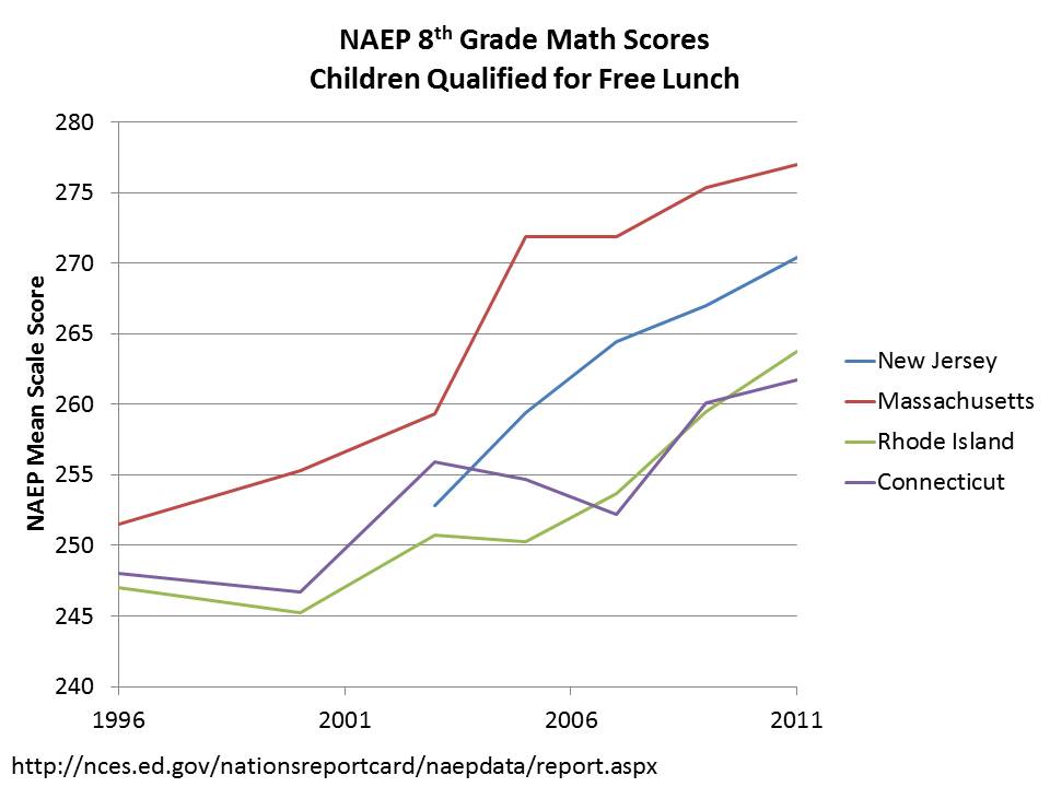
For those who’ve not really pondered this, consider that for 2011 NAEP 8th grade math performance in New Jersey, the gap between non-low income and reduced lunch kids (185% income threshold for poverty) is about the same as the gap between free (130% income level) & reduced!

Slide4

The NJ CREDO charter school comparison study is just one example. CREDO’s method involves identifying matched students who attend charter schools and districts schools based on a set of dummy variables. In their NJ study, the indicators included an indicator for special education status and an indicator for children qualified for free or reduced priced lunch (as far as one can tell from the rather sketchy explanation provided). If their dummy variable matches, they are considered to be matched – empirically THE SAME. Or, as stated in the CREDO study:

…all candidates are identical to the individual charter school student on all observable characteristics, including prior academic achievement.

Technically correct – Identical on the measures used – but identical? Not likley!

The study also matched on prior test score, which does help substantially in providing additional differentiation within these ill-defined categories. But, it is important to understand that annual learning gains  – as well as initial scores/starting point – are affected by a child’s family income status. Lower income, among low income, is associated with increased mobility (induced by housing instability). Quality of life during all those hours kids spend outside of school (including nutrition/health/sleep, etc.) affect childrens’ ability to fully engage in their homework and also likely affect summer learning/learning loss (access to summer opportunities varies by income/parental involvement, etc.). So – NO – it’s not enough to only control for prior scores. Continued deprivation influences continued performance and performance growth. As such, this statement in the CREDO report is quite a stretch (but is typical, boilerplate language for such a study):

The use of prior academic achievement as a match factor encompasses all the unobservable characteristics of the student, such as true socioeconomic status, family background, motivation, and prior schooling.

Prior scores DO NOT capture persistent differences in unobservables that affect the ongoing conditions under which children live, which clearly affect their learning growth!

Now, one problem with the CREDO study is that we really don’t know which schools are involved in the study, so I’m unable here to compare the demographics of the schools actually included among charters with district schools. But, for illustrative purposes, here are a few figures that raise significant questions about the usefulness of matching charter students and district students on the basis  of “special education” as a single indicator, and “free AND reduced” lunch qualification as a single indicator.

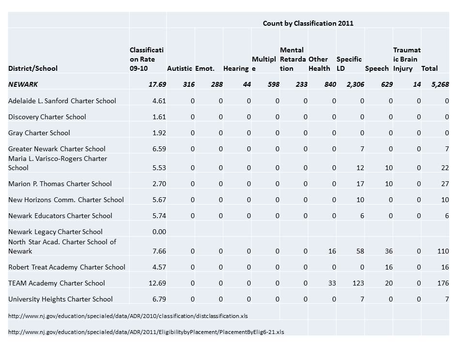
First, here are the characteristics of special education populations in Newark district and charter schools.

Slide1As I noted in my previous post, nearly all special education students in Newark Charter schools have mild specific learning disabilities and the bulk of the rest have speech impairment.  Yet, students in districts schools who may have received the same dummy variable coding are far more likely to have multiple disabilities, mental retardation, emotional disturbance, etc. It seems rather insufficient to code these groups with a single dummy variable… even if the classifications of the test-taker population were more similar than those of the total enrolled population (assuming many of the most severely disabled children were not in that test-taker sample?).

Now, here are the variations by income status – first for district and charter schools in the aggregate:

Slide2

Here, charters in Newark as I’ve noted previously, generally have fewer low income students, but they have far fewer students below the 130% income threshold than they do between the 130% and 185% thresholds. It would be particularly interesting to be able to parse the blue regions even further as I suspect that charters serve an even smaller share of those below the 100% threshold.  Using a single dummy variable, any child in either the red or blue region was assigned a 1 and assumed to be the same (excuse me… “IDENTICAL?”). But, as it turns out, there is about twice the likelihood that the child with a 1 in a charter school was in a family between the 130% and 185% income thresholds. And that may matter quite a bit, as would additional differences within the blue region.

Here’s the distribution of free vs. reduced price lunch across NJ charter schools – among their free/reduced populations.

Slide3

While less than 10% of the free/reduced population in NPS is in the upper income bracket, a handful of Newark Charter schools – including high flyers like Greater Newark, Robert Treat and North Star, have 20% to 30% of their (relatively small) low income populations in the upper bracket of low income. That is, for the “matched child” who attended Treat, North Star or Greater Newark there was a 2 to 3 times greater chance than for the their “peer” in NPS that they were from the higher (low) income group.

Again… CREDO likely worked with the data they have. However, I do find inexcusable the repeated sloppy use of the term “poverty” to refer to children qualified for free or reduced price lunch, and the failure of the CREDO report to a) address any caveats regarding their use of these measures or b) provide any useful comparisons of the differences in overall demographic context between charter schools and district schools.

Ed Schools – The Sequel: Rise of the Intellectually Dead

Warning: The following post contains the elitist musings of an ivory tower professor who has only professed at major research universities, who attended a selective liberal arts college & received his doctorate from an Ivy league institution (well… a branch of one… Teachers College at Columbia).

A while back, I wrote a post on “ed schools” the point of which was to show the shift in production of degrees that had occurred between the early 1990s and late 2000s. When I wrote that first post, ed schools were coming under fire from DC think tanks like the National Center on Teaching Quality (NCTQ), which seemed largely unable to understand the most basic issues of degree production in education (I’m unsure they’ve learned much since then!). And now, it would appear that our esteemed U.S. Secretary of Education has decided that ed schools and teacher preparation will be of primary interest in the second term of this administration.

The problem as I previously indicated, was that most of this rhetoric about ed schools and their supposed failure of society and production of generations of ill-equipped American youth, is that the rhetoric of “ed school” assumes a static definition of ed school – rooted in a 1950s to 1970s characterization of the regional public teachers college, and built on an assumption that teachers obtain their training and a teaching credential – for the one thing they teach – through a single institution as the core of their undergraduate education. Being “teachers colleges,” these schools are obviously lax on admission standards, have curriculum that is neither academically rigorous nor practical, etc. etc. etc. (the conflicting rhetoric in this regard is fun to follow – too much theory… no practical application… but not academically rigorous, etc.), and well… simply must be replaced by a vast set of alternative routes/pathways/programs!

In short, the vast majority of the critique of teacher education assumes this monolithic AND STATIC entity of teacher preparation housed in state colleges and universities. Emporia state in Kansas – that’s you! Monclair in NJ – that’s you! West Georgia – you too! And those state flagships with teacher prep programs? Damn you Rutgers, Michigan, Illinois for producing increasing numbers of underqualified teachers! The wrath of NCTQ and now Arne Duncan will be upon you!

But degree & credential production in education has not entirely been static over time. In fact, anything but! There are clearly emerging trends. And if we believe that there really has been a decline in the academic quality of those receiving credentials in education, it would behoove us to take a close look at those trends. But since no-one else seems to be doing that – especially not NCTQ – I figured I should take another shot at it.

A couple of key points are in order. FIRST – it is important to understand that these days, many initial teaching credentials are already granted through alternate routes outside of undergraduate programs and to individuals with degrees in fields other than education. In addition to non-degree alternate routes which I cannot even capture with the data in this post, many initial teaching credentials are granted through graduate programs – at the masters degree level and an even larger share of additional – second/third credentials received by practicing teachers are obtained through graduate programs. Individual teachers may have collected a handful of different credentials, all from different institutions.

So, let’s take a look at undergraduate and masters degree production trends.

Undergraduate Training

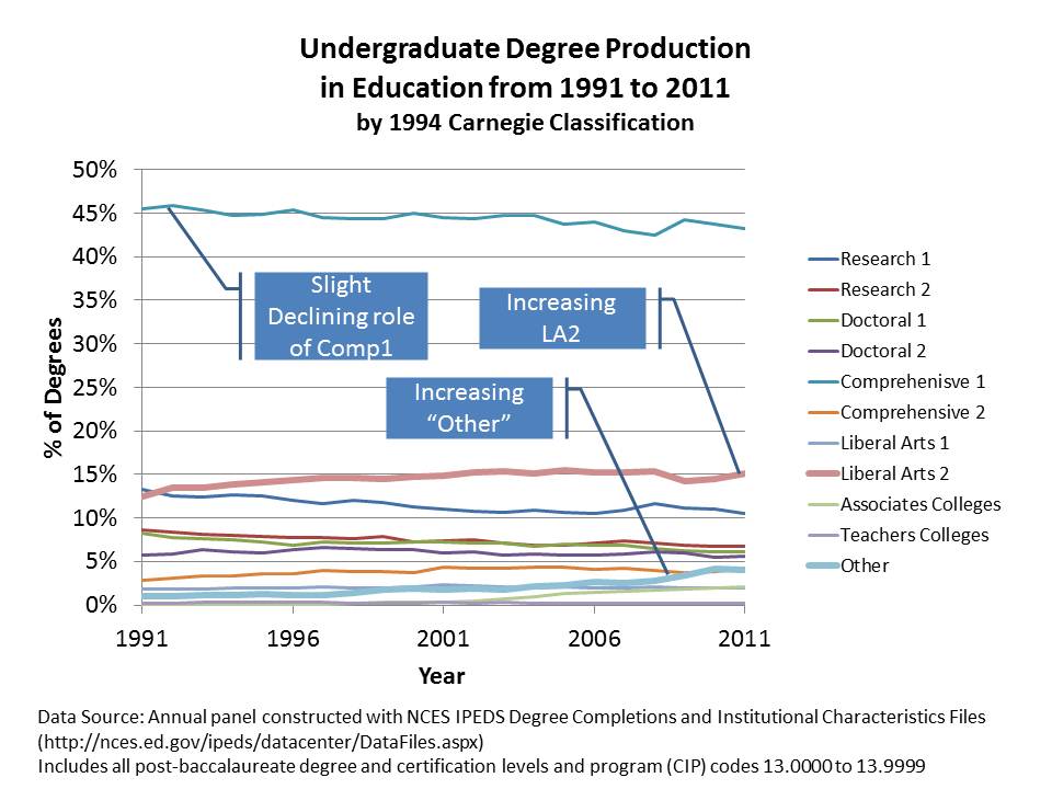
Undergraduate degree production in “education” fields generally (most of which involves teacher preparation) has been most stable over time. Using 1994 Carnegie Classifications (the most stratified system of Carnegie classifications of the past few decades: see end of post for definitions), we see that the percent of degrees being produced by what were the public “teachers colleges” (Comprehensive 1… as opposed to those labeled as “Teachers Colleges”) still hold the lions share, but have declined over time. Research Universities which produced around 14% in 1990 now produce closer to 10% (those are your state flagships & major private universities). So… the major traditional public college and university role is declining slightly in market share.

That loss is being picked up by what is actually a very small subset of colleges – that also tend to be relatively small, and not so prestigious colleges. These are the “LA – Liberal Arts 2” colleges. It’s quite striking that growth in this subset is sufficient to shift the market shares of major state universities and comprehensive regional colleges. Incidentally, LA 2s were among the first to expand rapidly their production of online and distance MBAs… around the same time they started tapping the ed market. (this period overlaps with a trend among financially strapped, less selective colleges making the move to change their name to “university.“)
Slide19

Patterns are also relatively stable by the Barrons’ competitiveness ratings. Notably, colleges right in the middle of the competitiveness ratings have the largest market share. I know this conflicts with reformy ideas that all ed degrees are produced by the worst colleges – but at the undergrad level, it’s a pretty normal distribution. Competitive colleges have a consistent 50% market share. Indeed, they are not the top third. They are also not the bottom! They are… the middle… as one would expect for a profession with modest (at best) earnings expectations.

The next two categories out from there – one up (very) and one down (less), have just under 20%. But, the “less competitive” group seems to be showing an uptick (they are also heavy on those LA2s!). Highly Competitive and Non-Competitive are also relatively comparable, but with non-competitive slightly outpacing highly-competitive.


Slide20

Masters Degrees

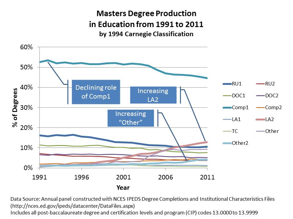
It’s in the production of masters degrees where the real fun stuff is happening. First, let’s take a look at what’s been happening across institutions by type. Note that Comprehensive colleges were, in large part, designed to deliver bachelors and masters degree programs and many from early on had large education programs and teacher preparation programs in particular. But we see in the figure below that the market share of masters degree production for Comp1s has declined over time. So too has the market share for masters degrees for Research Universities (including state flagship universities).

Amazingly, it’s those LA2s again that have risen dramatically in degree production. These lower tier liberal arts colleges (we’re not talkin’ Williams, Haverford, etc… which are LA1s. Those schools aren’t crankin’ up masters in Ed… and they’re also not changing their name to Williams University, etc.), have become the second largest producers of masters degrees in education. Bear in mind that liberal arts colleges, as classified in the 1990s, were never really intended to be handing out graduate degrees – no less massive numbers of them.  LA2s have gone from only about 1% of ed masters production in 1990 to over 10% by 2011.
Slide23

The next figure reclassifies these schools by the competitiveness of their undergraduate programs (since we lack competitiveness measures for graduate programs). What we see here is that masters programs housed in “LESS COMPETITIVE” undergraduate colleges are the ones that are creeping up in market share. To a significant extent, these are online, credential granting programs run through LA2s.
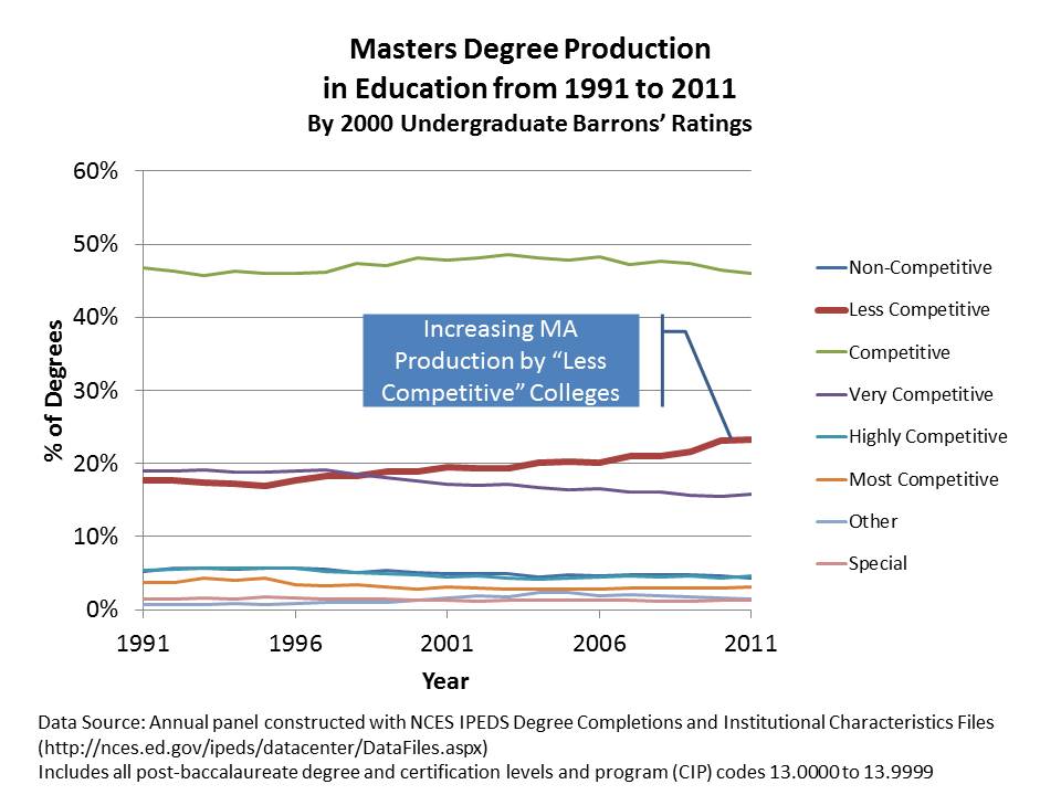
Slide24

So, what we have here, is a rather dramatic expansion of graduate credentials in education being handed out by what some (including myself) might characterize as relatively low quality, non-selective undergraduate institutions that were never meant to be handing out graduate degrees to begin with.  But perhaps that’s just my ivory tower, Research I perspective.

Now lets take a look at the top 20 Masters degree producers in the early 1990s and then in the most recent three years. In the early 1990s, the largest producers were crankin’ out a few thousand over a three year period. These included some early entrants – pre-online era – to the degree mass-production game like Lesley College and National Louis U. But, there were also many programs housed in brick and mortar public universities in the mix, including both state flagships (UT Austin, Ohio State) and other pretty solid academic schools (Harvard, Columbia/TC).  Arguably, these [the public colleges in particular] are the schools now taking the brunt of the blame for the state of teacher preparation – Northern Arizona, Northern Colorado, Eastern Michigan, etc.
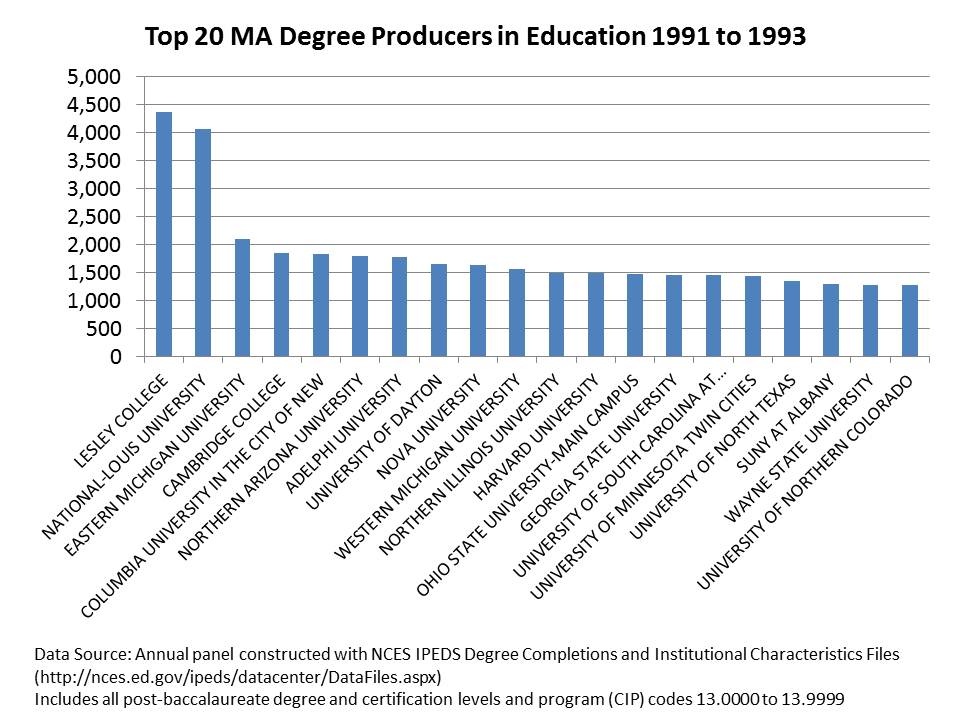
Slide26

But who has actually been crankin’ out the masters degrees and credentials in recent years? And, if there is a decline and pending crisis in education training/preparation, who might instead be to blame? Below is the more recent production of graduate degrees/credentials. First and foremost, we’ve now got schools crankin’ out over 3,000 per year – or 9k per 3 years. Phoenix, Waldon and Grand Canyon together produce more masters degrees than many of the next several combined.  There is a substantial gap in production before one reaches the first traditional teacher preparation program on the list.

Is it possible that the emphasis on traditional “ed schools” within state boundaries as the obvious source of our problems is misplaced?
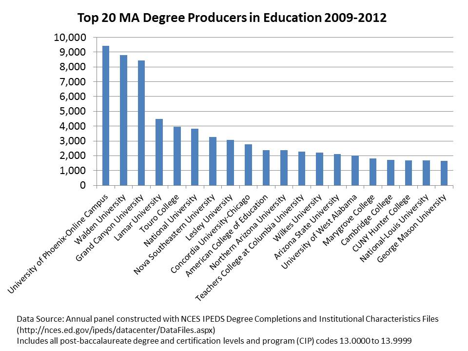
Slide25

Graduate Degree Production in Educational Leadership/Administration

I’ve got one last bit to address here and that’s training in educational leadership/administration, a topic I’ve written about in my academic publications (see below). Degree production in educational leadership has followed many of the same trends we see in education more generally. And there has been comparable push to provide more “alternatives” for gaining access to principal, supervisor and district leadership credentials. NOTE- if you think some of what I’m displaying here makes education grad degree production look like a cesspool, I assure you that when it comes to the production of MBAs, the picture is equally if not even more ugly! (One can buy an MBA almost anywhere… perhaps even more easily than a degree in ed admin… and in many cases which I have observed directly, the level of academic rigor, even within major universities, is hardly different!)

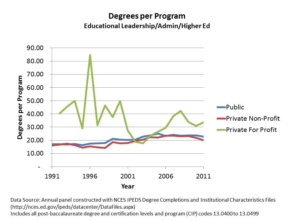
The figure below shows that major research universities have played a declining role in the production of graduate degrees (all levels) in educational administration. Again, it’s those entrepreneurial LA2s that are crankin’ up the production – moving into 2nd place among institution types.
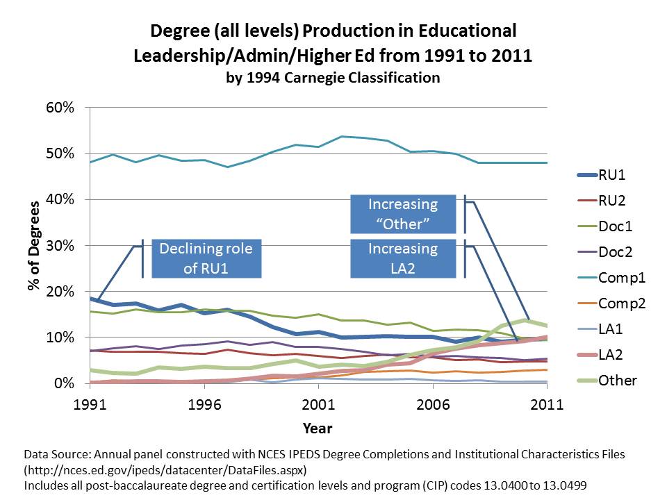
Slide7

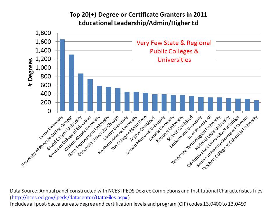
Now lets take a look specifically at doctoral degrees. One can almost kind of understand the mass production masters degrees which in education are often tied to obtaining specific certifications perhaps in additional fields of specialization (special education, etc.). Yes, in many states, administration degrees are structured such that the masters is coupled with building level certification and doctorate with district level certification. Even then, how many doctorates does any one institution need to be cranking out? And who should be granting that level of degree?

By 1990s Carnegie classifications, doctorates should be (have been) largely granted out by Research and Doctoral Universities. Comprehensive colleges were generally masters producing schools, not doctoral granting institutions. These strata were, in fact, intended to reflect the capacity of institutions to grant certain types/levels of degrees.

Already by the early 1990s, Nova Southeastern had pioneered mass production of the education doctorate. But outside of the Nova model, most major producers of doctorates were actual universities (okay… a bit harsh… since NOVA actually is a university, and has a pretty well defined, conventional curriculum for their graduate programs).
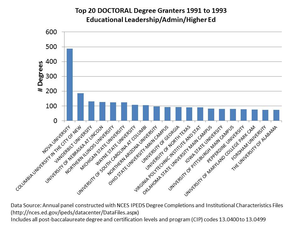
Slide12

In the most recent years, Nova Southeastern has remained strong… but now right up there are such stellar academic powerhouses as Walden, Capella and Phoenix! (and Argosy)… many of which probably occasionally show up as side-bar advertisements on my blog! (as they do when I log into facebook).

A notable change in the past few years is the entrance of USC and Penn to this mix, with their new practitioner preparation programs which apparently crank out a sizable number of doctorates per year.  This raises the interesting question of whether leading universities should try to get into the mass production game? Is the system overall better for it, even if those institutions have to sacrifice some quality in order to mass produce? We’ll have to see if they can keep up with the Waldens and Capellas over the next several years.
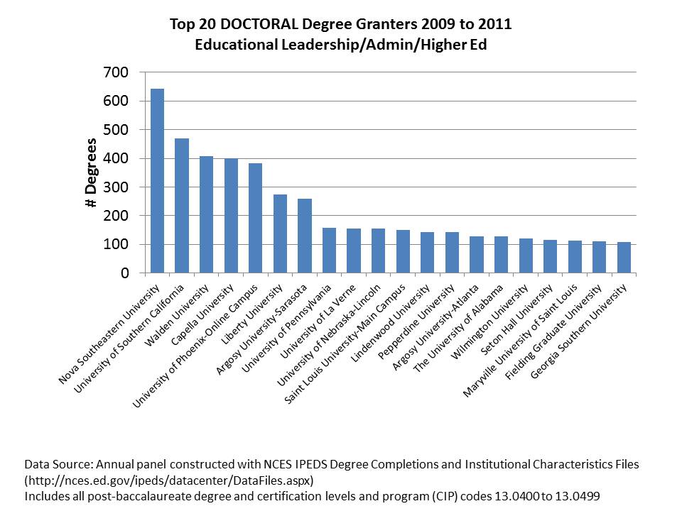
Slide14

Closing Thoughts

To me, these trends are pretty astounding, and serious consideration of these trends must play into any discussion that alarmists might have about the supposed decline in the quality of teacher and administrator preparation (to the extent these alarmists give serious consideration to anything).  Those ringing these alarm bells seem more than happy to suggest that the obvious problem lies with traditional “ed schools” (read, regional and state flagship public colleges and universities) and that the obvious solution is to provide more alternative routes, online options – teacher preparation by MOOC…  (and likely not a MOOC delivered by Stanford U. faculty… but rather through Walden, Capella and the like) & expansion of schools relying on imported, short term labor supply.

I also find it strange to say the least that those who argue that the problem is that our teachers don’t come from the upper third of college graduates seem to believe that the solution is to expand the types programs that tend to grow most rapidly among colleges that cater to the bottom third (less & non-competitive).  To those reformy alarmists who feel they’ve identified the obvious problems and logical solutions, the above data should make sufficiently clear that we’ve already gone down that road.

Further, I’m thoroughly unconvinced that new models purporting to be more selective in the teachers they prepare, but relying largely on a self-credentialing model (we use our teachers to credential our teachers… and only accept as graduate students those who work in our schools?) focused primarily in ideological & cultural indoctrination   are a step in the right direction.  I have little doubt they’ll find a captive audience to self-credential and maintain a viable “business model,” (by requiring their own teachers to take courses delivered by their peers & bosses to achieve the credentials needed to keep their jobs) but this endogenous, back-patting self-validating model is no way to train the future teacher workforce.*

All of this begs the question of what next? Where do we go from here? How to we achieve integrity and quality in the production of degrees and credentials, and more broadly training and preparation of future teachers and administrators? I really don’t have any answers for these questions right now. But I’m pretty sure that the last two decades have taken us the wrong direction!

Related Research

Baker, B.D, Orr, M.T., Young, M.D. (2007) Academic Drift, Institutional Production and Professional Distribution of Graduate Degrees in Educational Administration. Educational Administration Quarterly  43 (3)  279-318

Baker, B.D., Fuller, E. The Declining Academic Quality of School Principals and Why it May Matter. Baker.Fuller.PrincipalQuality.Mo.Wi_Jan7

Baker, B.D., Wolf-Wendel, L.E., Twombly, S.B. (2007) Exploring the Faculty Pipeline in Educational
Administration: Evidence from the Survey of Earned Doctorates 1990 to 2000. Educational
Administration Quarterly 43 (2) 189-220

Wolf-Wendel, L, Baker, B.D., Twombly, S., Tollefson, N., & Mahlios, M.  (2006) Who’s Teaching the Teachers? Evidence from the National Survey of Postsecondary Faculty and Survey of Earned Doctorates.  American Journal of Education 112 (2) 273-300

1994 Carnegie Classifications

  • Research Universities I: These institutions offer a full range of baccalaureate programs, are committed to graduate education through the doctorate, and give high priority to research. They award 50 or more doctoral degrees1 each year. In addition, they receive annually $40 million or more in federal support.
  • Research Universities II: These institutions offer a full range of baccalaureate programs, are committed to graduate education through the doctorate, and give high priority to research. They award 50 or more doctoral degrees1 each year. In addition, they receive annually between $15.5 million and $40 million in federal support.
  • Doctoral Universities I: These institutions offer a full range of baccalaureate programs and are committed to graduate education through the doctorate. They award at least 40 doctoral degrees1 annually in five or more disciplines.
  • Doctoral Universities II: These institutions offer a full range of baccalaureate programs and are committed to graduate education through the doctorate. They award annually at least ten doctoral degrees—in three or more disciplines—or 20 or more doctoral degrees in one or more disciplines.
  • Master’s (Comprehensive) Universities and Colleges I: These institutions offer a full range of baccalaureate programs and are committed to graduate education through the master’s degree. They award 40 or more master’s degrees annually in three or more disciplines. [Includes typical regional, within-state public normal schools/teachers colleges]
  • Master’s (Comprehensive) Universities and Colleges II: These institutions offer a full range of baccalaureate programs and are committed to graduate education through the master’s degree. They award 20 or more master’s degrees annually in one or more disciplines.
  • Baccalaureate (Liberal Arts) Colleges I: These institutions are primarily undergraduate colleges with major emphasis on baccalaureate degree programs. They award 40 percent or more of their baccalaureate degrees in liberal arts fields4 and are restrictive in admissions.
  • Baccalaureate Colleges II: These institutions are primarily undergraduate colleges with major emphasis on baccalaureate degree programs. They award less than 40 percent of their baccalaureate degrees in liberal arts fields4 or are less restrictive in admissions. [Includes many cash-strapped, relatively non-selective, smaller private liberal arts colleges]

*I still like to believe that the most important background attribute of a “good teacher” or school leader is someone who is enthusiastic about their own learning, constantly seeking intellectual growth and challenge and that this attribute is often revealed in the types of advanced studies an individual chooses to pursue. To me, even if the Relay model does tap into a set of graduates of more selective colleges, if the Relay program itself is little more than a workshop on “no excuses” classroom disciplinary practices and typical inspiring edu-guru staff development fodder, then the Relay model is antithetical to developing truly good teachers. A workshop or two and perhaps some practical guidance from peers or teacher leaders – okay. But a graduate degree based on this stuff? Are you kidding? (just watch the RELAY GSE Videos here: http://www.relayschool.org/videos?vidid=5)
When Disinformation is Fueled by Misinformation! CHANCELLOR TISCH, YOU ARE WRONG!

Very recently, I posted a critique of the recent technical report on New York State median growth percentiles to be used in that state’s teacher and principal evaluation system.

Today, I read this piece in the NY Post – an editorial by NY State Board of Regents Chancellor Merryl Tisch, and well, MY HEAD ALMOST EXPLODED!

The point of the editorial is to encourage NY City’s teachers and DOE to agree to a teacher evaluation system based on supposedly objective measures – where “objective measures” seems largely to be code language for estimates of teacher effectiveness derived from student assessment data.

First, I have written several previous posts on the usefulness of NYC’s value-added model for determining teacher effectiveness.

  1. the NYC VAM model retains some persistent biases
  2. the NYC VAM model is highly unstable from year to year
  3. the NYC VAM results capture only a handful of teachers per school and their results tend to jump all over the place
  4. adopting the NCTQ irreplaceables logic, the NYC VAM data are so noisy that few if any teachers are persistently irreplaceable
  5. for various reasons, it is unlikely that these are just early glitches in the system that will get better with time

Setting aside this long list of concerns about the NYC VAM results, I now turn to the NYSED – state median growth percentile data (which actually seem inferior to the NYC VAM model/estimates). In her editorial, Chancellor Tisch proclaims:

The student-growth scores provided by the state for teacher evaluations are adjusted for factors such as students who are English Language Learners, students with disabilities and students living in poverty. When used right, growth data from student assessments provide an objective measurement of student achievement and, by extension, teacher performance.

Let me be blunt here. CHANCELLOR TISCH – YOU ARE WRONG! FLAT OUT WRONG! IRRESPONSIBLY & PERHAPS NEGLIGENTLY WRONG!

[now, one might quibble that Chancellor Tisch has merely stated that the measures are “adjusted for” certain factors and she has not claimed that those adjustments actually work to eliminate bias. Further, she has merely declared that the measures are “objective” and not that they are accurate or precise. Personally, I don’t find this deceptive language at all comforting!]

Indeed, the measures attempt – but fail to sufficiently adjust for key factors. They retain substantial biases as identified in the state’s own technical report. And they are subject to many of the same error concerns as the NYC VAM model.  Given the findings of the state’s own technical report, it is irresponsible to suggest that these measures can and should be immediately considered for making personnel and compensation decisions.

Finally, as I laid out in my previous blog post to suggest that “growth data from student assessments provide an objective measure of student achievement, and, by extension, teacher performance” IS A HUGE UNWARRANTED STRETCH!

While I might concur with the follow up statement from Chancellor Tisch that “We should never judge an educator solely by test scores, but we shouldn’t completely disregard student performance and growth either.” I would argue that school leaders/peer teachers/personnel managers should absolutely have the option to completely disregard data that have high potential to be sending false signals, either as a function of persistent bias or error. Requiring action based on biased and error prone data (rather than permitting those data to be reasonably mined to the extent they may, OR MAY NOT, be useful) is a toxic formula for public schooling quality.

The one thing I can’t quite figure out here is which is the misinformation and which is the disinformation. In any case, both are wrong!

The rest of what I have to say, I’ve already said. But, so readers don’t have to click the link below to access the previous post, I’ve pasted  the entire thing below. Enjoy!

COMPLETE PREVIOUS POST!

I was immediately intrigued the other day when a friend passed along a link to the recent technical report on the New York State growth model, the results of which are expected/required to be integrated into district level teacher and principal evaluation systems under that state’s new teacher evaluation regulations.  I did as I often do and went straight for the pictures – in this case- the scatterplots of the relationships between various “other” measures and the teacher and principal “effect” measures.  There was plenty of interesting stuff there, some of which I’ll discuss below.

But then I went to the written language of the report – specifically the report’s (albeit in DRAFT form)  conclusions. The conclusions were only two short paragraphs long, despite much to ponder being provided in the body of the report. The authors’ main conclusion was as follows:

The model selected to estimate growth scores for New York State provides a fair and accurate method for estimating individual teacher and principal effectiveness based on specific regulatory requirements for a “growth model” in the 2011-2012 school year. p. 40

http://engageny.org/wp-content/uploads/2012/06/growth-model-11-12-air-technical-report.pdf

13-Nov-2012 20:54

Updated Final Report: http://engageny.org/sites/default/files/resource/attachments/growth-model-11-12-air-technical-report_0.pdf

Local copy of original DRAFT report: growth-model-11-12-air-technical-report

Local copy of FINAL report: growth-model-11-12-air-technical-report_FINAL

Unfortunately, the multitude of graphs that immediately preceded this conclusion undermine it entirely. but first, allow me to address the egregious conceptual problems with the framing of this conclusion.

First Conceptually

Let’s start with the low hanging fruit here. First and foremost, nowhere in the technical report, nowhere in their data analyses, do the authors actually measure “individual teacher and principal effectiveness.” And quite honestly, I don’t give a crap if the “specific regulatory requirements” refer to such measures in these terms. If that’s what the author is referring to in this language, that’s a pathetic copout.  Indeed it may have been their charge to “measure individual teacher and principal effectiveness based on requirements stated in XYZ.” That’s how contracts for such work are often stated. But that does not obligate the author to conclude that this is actually what has been statistically accomplished. And I’m just getting started.

So, what is being measured and reported?  At best, what we have are:

  • An estimate of student relative test score change on one assessment each for ELA and Math (scaled to growth percentile) for students who happen to be clustered in certain classrooms.

THIS IS NOT TO BE CONFLATED WITH “TEACHER EFFECTIVENESS”

Rather, it is merely a classroom aggregate statistical association based on data points pertaining to two subjects being addressed by teachers in those classrooms, for a group of children who happen to spend a minority share of their day and year in those classrooms.

  • An estimate of student relative test score change on one assessment each for ELA and Math (scaled to growth percentile) for students who happen to be clustered in certain schools.

THIS IS NOT TO BE CONFLATED WITH “PRINCIPAL EFFECTIVENESS”

Rather, it is merely a school aggregate statistical association based on data points pertaining to two subjects being addressed by teachers in classrooms that are housed in a given school under the leadership of perhaps one or more principals, vps, etc., for a group of children who happen to spend a minority share of their day and year in those classrooms.

Now Statistically

Following are a series of charts presented in the technical report, immediately preceding the above conclusion.

Classroom Level Rating Bias

School Level Rating Bias

And there are many more figures displaying more subtle biases, but biases that for clusters of teachers may be quite significant and consequential.

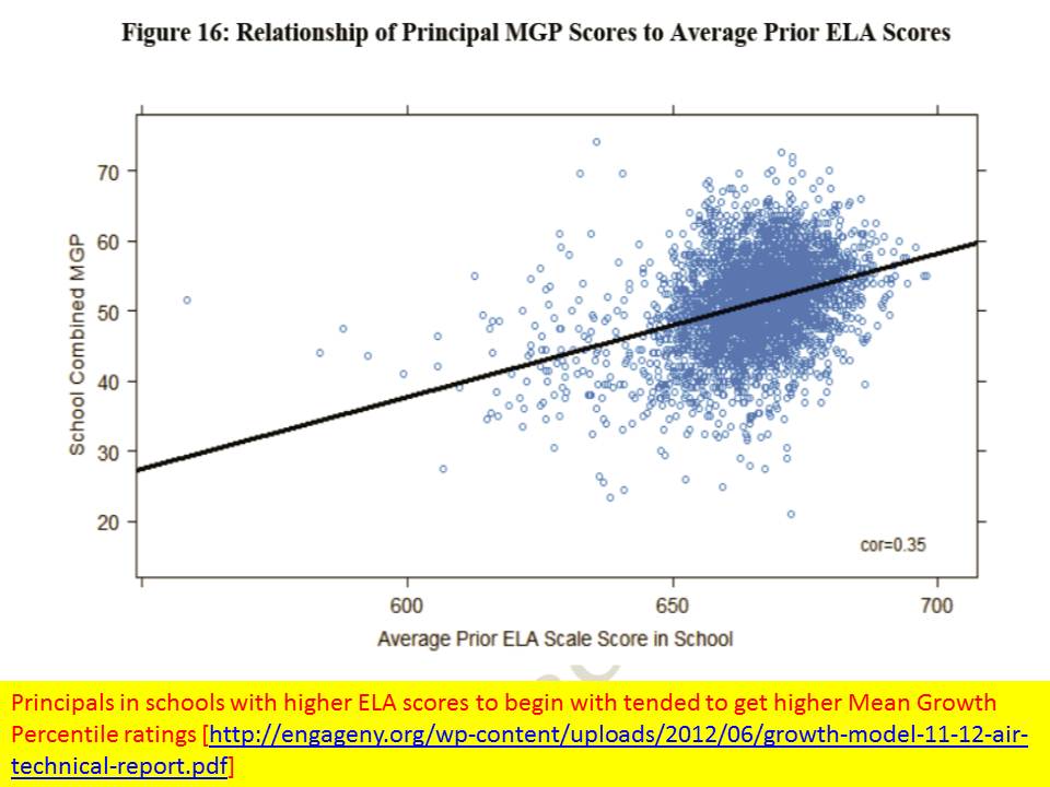
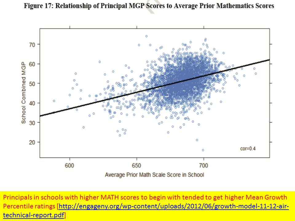
Based on the figures above, there certainly appears to be, both at the teacher, excuse me – classroom, and principal – I mean school level, substantial bias in the Mean Growth Percentile ratings with respect to initial performance levels on both math and reading. Teachers with students who had higher starting scores and principals in schools with higher starting scores tended to have higher Mean Growth Percentiles.

This might occur for several reasons. First, it might just be that the tests used to generate the MGPs are scaled such that it’s just easier to achieve growth in the upper ranges of scores. I came to a similar finding of bias in the NYC value added model, where schools having higher starting math scores showed higher value added. So perhaps something is going on here. It might also be that students clustered among higher performing peers tend to do better. And, it’s at least conceivable that students who previously had strong teachers and remain clustered together from year to year, continue to show strong growth. What is less likely is that many of the actual “better” teachers just so happen to be teaching the kids who had better scores to begin with.

That the systemic bias appears greater in the school level estimates than in the teacher level estimates is suggestive that the teacher level estimates may actually be even more bias than they appear. The aggregation of otherwise less biased estimates should not reveal more bias.

Further, as I’ve mentioned on several times on this blog previously, even if there weren’t such glaringly apparent overall patterns of bias their still might be underlying biased clusters.  That is, groups of teachers serving certain types of students might have ratings that are substantially WRONG, either in relation to observed characteristics of the students they serve or their settings, or of unobserved characteristics.

Closing Thoughts

To be blunt – the measures are neither conceptually nor statistically accurate. They suffer significant bias, as shown and then completely ignored by the authors. And inaccurate measures can’t be fair. Characterizing them as such is irresponsible.

I’ve now written 2 articles and numerous blog posts in which I have raised concerns about the likely overly rigid use of these very types of metrics when making high stakes personnel decisions. I have pointed out that misuse of this information may raise significant legal concerns. That is, when district administrators do start making teacher or principal dismissal decisions based on these data, there will likely follow, some very interesting litigation over whether this information really is sufficient for upholding due process (depending largely on how it is applied in the process).

I have pointed out that the originators of the SGP approach have stated in numerous technical documents and academic papers that SGPs are intended to be a descriptive tool and are not for making causal assertions (they are not for “attribution of responsibility”) regarding teacher effects on student outcomes. Yet, the authors persist in encouraging states and local districts to do just that. I certainly expect to see them called to the witness stand the first time SGP information is misused to attribute student failure to a teacher.

But the case of the NY-AIR technical report is somewhat more disconcerting. Here, we have a technically proficient author working for a highly respected organization – American Institutes for Research – ignoring all of the statistical red flags (after waiving them), and seemingly oblivious to gaping conceptual holes (commonly understood limitations) between the actual statistical analyses presented and the concluding statements made (and language used throughout).

The conclusion are WRONG – statistically and conceptually.  And the author needs to recognize that being so damn bluntly wrong may be consequential for the livelihoods of thousands of individual teachers and principals! Yes, it is indeed another leap for a local school administrator to use their state approved evaluation framework, coupled with these measures, to actually decide to adversely affect the livelihood and potential career of some wrongly classified teacher or principal – but the author of this report has given them the tool and provided his blessing. And that’s inexcusable.

The Secrets to Charter School Success in Newark: Comments on the NJ CREDO Report

Today, with much fanfare, we finally got our New Jersey Charter School Report. The unsurprising findings of that report are that charter schools in Newark in particular seem to be providing students with greater average annual achievement gains than those of similar (matched) students attending district schools. Elsewhere around the state charter schools are pretty much average.

Link to report: http://credo.stanford.edu/pdfs/nj_state_report_2012_FINAL11272012.pdf

So then, the big question is, what exactly is behind the apparent success of Newark Charter schools – or at least some of them enough to influence the analysis as a whole – that makes them successful? Further, and perhaps more importantly, is there something about these schools that makes them successful that can be replicated?

The General Model

Allow me to start by pointing out that the CREDO study uses its usual approach  – a reasonable one given data and system constraints, of identifying matched sets of students from feeder schools (or areas) who end up in district schools and in charter schools. CREDO then compares (estimates) the year to year test score gains of students in the charter and district schools.

The CREDO approach, while reasonable, simply can’t sort out which component of student achievement gain is created by “school factors” (such as teacher quality, length of day/year, etc.) and which factors are largely a function of concentrating non-low income, non-ell, non-disabled females in charter schools while concentrating the “others” in district schools.

School Effect = Controllable School Factors + Peer Group & Other Factors

In other words, we simply don’t know what component of the effect has to do with school quality issues that might be replicated and what component has to do with clustering kids together in a more advantaged peer group. Yes, the study controls for the students’ individual characteristics, but no, it cannot sort out whether the clustering of students with more or less advantaged peers affects their outcomes (which it certainly does). Lottery-based studies suffer the same problem, when lotteried in and lotteried out students end up in very different peer contexts. Yes, the sorting mechanism is random, but the placement is not. The peer selection effect may be exacerbated by selective attrition (shedding weaker and/or disruptive students over time). And Newark’s highest flying charter schools certainly have some issues with attrition.

Given my numerous previous posts, I would suggest Figure 1 as the general model of the secrets of Newark Charter School success.

Figure 1. The General Model

Put simply, while resource use – additional time, compensation, etc. – may be part of the puzzle – the scalable part – the strong sorting patterns of students into charter and district schools clearly play some role – a substantial role – and one that constrains our ability to use “chartering” as a broad-based public policy solution.

One Part Segregation

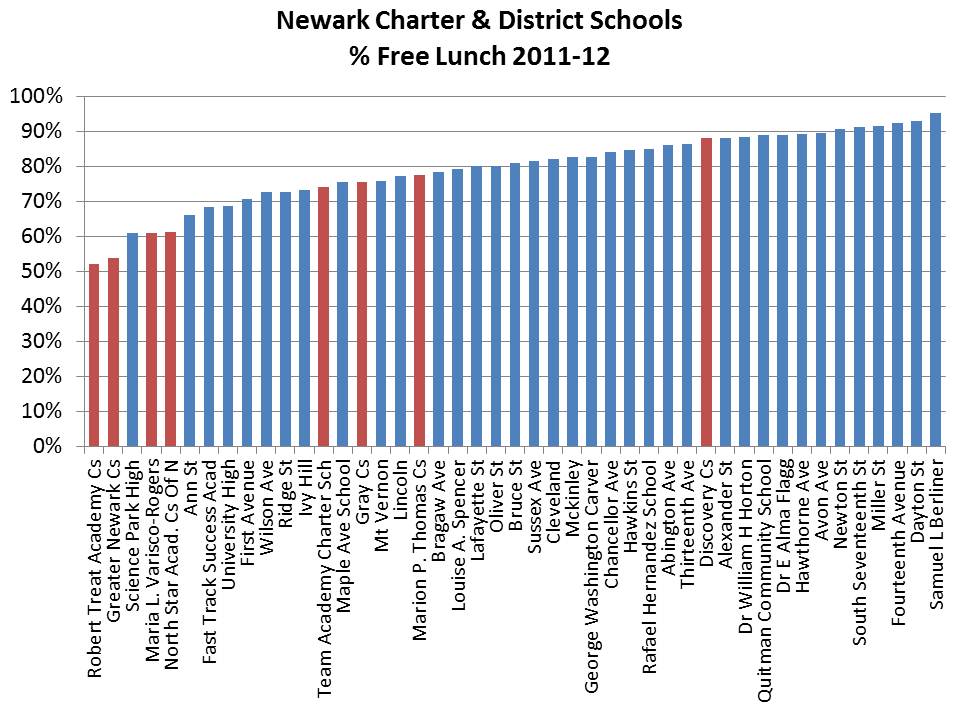
Let’s start by taking a look at the most recent available data on the segregation of students by disability status, free lunch status, gender and language proficiency. Now, the CREDO report is careful to point out that charter school enrollments match the demographics of their feeder schools – and uses this finding as an indication that therefore charter schools aren’t cream-skimming. That’s all well and good…. EXCEPT … that for some (actually many) reason, charter schools themselves end up having far fewer of the lowest income students. See Figure 2.

Figure 2. % Free Lunch

Now, one technical quibble I have with the CREDO report is that it relies on the free/reduced priced lunch indicator to identify economic disadvantage (and then sloppily throughout refers to this as “poverty”). I have shown on numerous previous occasions that Newark charters tend to serve larger shares of the less poor children and smaller shares of the poorer children. So, it is quite likely that the CREDO matched groups of students actually include disproportionate shares of “reduced lunch” children for charters and “free lunch” children sorted into district schools. This is a non-trivial difference! [gaps between free lunch and reduced lunch students tend to be comparable to gaps between reduced lunch and non-qualified students.]

Here are the other sorting issues:

Figure 3. % ELL/LEP

Figure 4. % Female


Figure 5 shows that not only do charter schools in Newark tend to serve far fewer children with disabilities, they especially serve few or no students with more severe disabilities. In fact, they serve mainly students with Specific Learning Disabilities and Speech Language Impairment. Given the data in Table 5, it is actually quite humorous – if not strangely disturbing – that the CREDO study attempted to parse the relative effectiveness of district and charter schools at producing outcomes for children with disabilities using only a single broad classification [Student matching was based on a single classification, creating the possibility that children with speech language impairment in charters were being compared with children with mental retardation and autistic children in district schools. It is likely that most students who took the assessments were those with less severe disabilities in both cases.].

Figure 5. Special Education Distributions

Here are some related findings from (and links to) previous posts

Newark Charter Effects on NPS School Enrollments

New Jersey Charter School Special Education

Newark Charter School Attrition Rates

Here are just a few visuals of how the free lunch shares and female student test-taker shares relate to general education proficiency rates on 8th grade math. Both are relatively strong determinants of cross-school proficiency. And both with respect to gender balance and free lunch balance, Newark Charter schools are substantively different from their district school counterparts.

Figure 6: 8th Grade Math & % Free Lunch

Figure 7: 8th Grade Math & % Female


Now, these are performance level differences, which are not the same as the gain measures estimated in the CREDO study. But, I’ve chosen the 8th grade scores because that is when the charter scores tend to pull away from the district school scores (that is, these are the score levels at the tail end of achieving greater gains). But, the contexts of the gains for charter students are so substantially different from the contexts of achievement gains for district school students that scalability is highly questionable.

As I’ve said before – There just aren’t enough non-disabled, non-poor, fluent English speaking females in Newark to fully replicate district-wide the successes of the city’s highest flying charters.

One Part Compensation

Now, I’ve also written many posts which address the resource advantages and some resource allocation issues for high flying New York City charter schools, which a) also promote substantial student population segregation and b) have been shown in numerous studies to yield positive achievement gains.

I do not intend to imply by my above critique that peer group effect is necessarily the ONLY effect driving Newark Charter’s supposed success. The problem is that because high flying Newark Charters in particular serve such uncommon student populations we can never really sort out the peer group versus school quality effects.

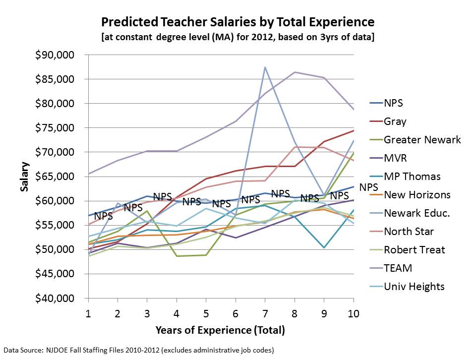
It is certainly reasonable to assume that the additional time and effort spent with these students in some schools – even though they are a more advantaged (less disadvantaged) group – makes a difference.  No excuses charters in Newark like those in New York City tend to provide longer school days and longer school years, and importantly, they compensate their teachers for the additional time & effort. Here’s a simple chart of the average teacher compensation for early career teachers in NPS and Newark Charters. NPS teachers catch back up in later years, but as I’ve pointed out in numerous previous posts, a handful of Newark charters have adopted the reasonable (smart) competitive strategy of leveraging higher salaries and salary growth at the front end to improve teacher retention and recruitment.

Figure 9: Newark Teacher Compensation

Below is a more precise comparison that teases out the differences that aren’t so apparent in Figure 9. For Figure 10, I have used 3 years of data on teachers to estimate a regression model of teacher salaries as a function of experience, degree level and data year.

Some of Newark’s “high flying charters” [North Star, Gray, TEAM] tend to substantially outpace salaries of NPS teachers over the first ten years of a teacher career. Few of these schools have any teachers with more years of experience than 10. Other Newark charter schools maintain at least relatively competitive salaries with NPS.

Now, a critical point here is that as I’ve shown above, teaching in many of these schools comes with the perk of working with a much more advantaged student population. As such,  it is conceivable that even a comparable wage provides recruitment advantage – given the student population difference. Clearly, a higher wage provides a significant recruitment advantage – though in the case of the highest paying school(s), the elevated salary comes with substantial additional obligations.

Figure 10. Modeled Teacher Salary Variation by Experience

Closing Thoughts

So, when all is said and done, this new “charter school” report like many that have come before it leaves us sadly unfulfilled, at least with respect to its potential to provide important policy insights. Most cynically, one might argue the main finding of the report is simply that cream-skimming works – generates a solid peer effect that provides important academic advantages to a few – and serving a few is better than serving none at all (assuming the latter is really the alternative?). Keep it up!  Don’t worry ’bout the rest of those kids who get shuffled off into district schools. Quite honestly, given the huge, persistent differences in student populations between high flying Newark charters and districts schools, and given the relatively consistency of research on peer group effects, it would be shocking if the CREDO report had not found that Newark charters outperform district schools.

While it is likely that there exists some strategies employed by some charters (as well as some strategies employed by some district schools) that are working quite well – THE CREDO REPORT PROVIDES ABSOLUTELY NO INSIGHTS IN THIS REGARD.  It’s a classic “charter v. district” comparison – where it is assumed that “chartering” represents one set of educational/programmatic strategies and “districting” represents another – when in fact, neither is true (see the scatter of dots in my plots above to see the variations in each group!).

AIR Pollution in NY State? Comments on the NY State Teacher/Principal Rating Models/Report

I was immediately intrigued the other day when a friend passed along a link to the recent technical report on the New York State growth model, the results of which are expected/required to be integrated into district level teacher and principal evaluation systems under that state’s new teacher evaluation regulations.  I did as I often do and went straight for the pictures – in this case- the scatterplots of the relationships between various “other” measures and the teacher and principal “effect” measures.  There was plenty of interesting stuff there, some of which I’ll discuss below.
But then I went to the written language of the report – specifically the report’s (albeit in DRAFT form)  conclusions. The conclusions were only two short paragraphs long, despite much to ponder being provided in the body of the report. The authors’ main conclusion was as follows:

The model selected to estimate growth scores for New York State provides a fair and accurate method for estimating individual teacher and principal effectiveness based on specific regulatory requirements for a “growth model” in the 2011-2012 school year. p. 40

http://engageny.org/wp-content/uploads/2012/06/growth-model-11-12-air-technical-report.pdf

13-Nov-2012 20:54

Updated Final Report: http://engageny.org/sites/default/files/resource/attachments/growth-model-11-12-air-technical-report_0.pdf

Local copy of original DRAFT report: growth-model-11-12-air-technical-report

Local copy of FINAL report: growth-model-11-12-air-technical-report_FINAL

Unfortunately, the multitude of graphs that immediately preceded this conclusion undermine it entirely. but first, allow me to address the egregious conceptual problems with the framing of this conclusion.

First Conceptually

Let’s start with the low hanging fruit here. First and foremost, nowhere in the technical report, nowhere in their data analyses, do the authors actually measure “individual teacher and principal effectiveness.” And quite honestly, I don’t give a crap if the “specific regulatory requirements” refer to such measures in these terms. If that’s what the author is referring to in this language, that’s a pathetic copout.  Indeed it may have been their charge to “measure individual teacher and principal effectiveness based on requirements stated in XYZ.” That’s how contracts for such work are often stated. But that does not obligate the author to conclude that this is actually what has been statistically accomplished. And I’m just getting started.

So, what is being measured and reported?  At best, what we have are:

  • An estimate of student relative test score change on one assessment each for ELA and Math (scaled to growth percentile) for students who happen to be clustered in certain classrooms.

THIS IS NOT TO BE CONFLATED WITH “TEACHER EFFECTIVENESS”

Rather, it is merely a classroom aggregate statistical association based on data points pertaining to two subjects being addressed by teachers in those classrooms, for a group of children who happen to spend a minority share of their day and year in those classrooms.

  • An estimate of student relative test score change on one assessment each for ELA and Math (scaled to growth percentile) for students who happen to be clustered in certain schools.

THIS IS NOT TO BE CONFLATED WITH “PRINCIPAL EFFECTIVENESS”

Rather, it is merely a school aggregate statistical association based on data points pertaining to two subjects being addressed by teachers in classrooms that are housed in a given school under the leadership of perhaps one or more principals, vps, etc., for a group of children who happen to spend a minority share of their day and year in those classrooms.

Now Statistically

Following are a series of charts presented in the technical report, immediately preceding the above conclusion.

Classroom Level Rating Bias

School Level Rating Bias

And there are many more figures displaying more subtle biases, but biases that for clusters of teachers may be quite significant and consequential.

Based on the figures above, there certainly appears to be, both at the teacher, excuse me – classroom, and principal – I mean school level, substantial bias in the Mean Growth Percentile ratings with respect to initial performance levels on both math and reading. Teachers with students who had higher starting scores and principals in schools with higher starting scores tended to have higher Mean Growth Percentiles.

This might occur for several reasons. First, it might just be that the tests used to generate the MGPs are scaled such that it’s just easier to achieve growth in the upper ranges of scores. I came to a similar finding of bias in the NYC value added model, where schools having higher starting math scores showed higher value added. So perhaps something is going on here. It might also be that students clustered among higher performing peers tend to do better. And, it’s at least conceivable that students who previously had strong teachers and remain clustered together from year to year, continue to show strong growth. What is less likely is that many of the actual “better” teachers just so happen to be teaching the kids who had better scores to begin with.

That the systemic bias appears greater in the school level estimates than in the teacher level estimates is suggestive that the teacher level estimates may actually be even more bias than they appear. The aggregation of otherwise less biased estimates should not reveal more bias.

Further, as I’ve mentioned on several times on this blog previously, even if there weren’t such glaringly apparent overall patterns of bias their still might be underlying biased clusters.  That is, groups of teachers serving certain types of students might have ratings that are substantially WRONG, either in relation to observed characteristics of the students they serve or their settings, or of unobserved characteristics.

Closing Thoughts

To be blunt – the measures are neither conceptually nor statistically accurate. They suffer significant bias, as shown and then completely ignored by the authors. And inaccurate measures can’t be fair. Characterizing them as such is irresponsible.

I’ve now written 2 articles and numerous blog posts in which I have raised concerns about the likely overly rigid use of these very types of metrics when making high stakes personnel decisions. I have pointed out that misuse of this information may raise significant legal concerns. That is, when district administrators do start making teacher or principal dismissal decisions based on these data, there will likely follow, some very interesting litigation over whether this information really is sufficient for upholding due process (depending largely on how it is applied in the process).

I have pointed out that the originators of the SGP approach have stated in numerous technical documents and academic papers that SGPs are intended to be a descriptive tool and are not for making causal assertions (they are not for “attribution of responsibility”) regarding teacher effects on student outcomes. Yet, the authors persist in encouraging states and local districts to do just that. I certainly expect to see them called to the witness stand the first time SGP information is misused to attribute student failure to a teacher.

But the case of the NY-AIR technical report is somewhat more disconcerting. Here, we have a technically proficient author working for a highly respected organization – American Institutes for Research – ignoring all of the statistical red flags (after waiving them), and seemingly oblivious to gaping conceptual holes (commonly understood limitations) between the actual statistical analyses presented and the concluding statements made (and language used throughout).

The conclusion are WRONG – statistically and conceptually.  And the author needs to recognize that being so damn bluntly wrong may be consequential for the livelihoods of thousands of individual teachers and principals! Yes, it is indeed another leap for a local school administrator to use their state approved evaluation framework, coupled with these measures, to actually decide to adversely affect the livelihood and potential career of some wrongly classified teacher or principal – but the author of this report has given them the tool and provided his blessing. And that’s inexcusable.

And a video with song!

==================

Note:   In the executive summary, the report acknowledges these biases:

Despite the model conditioning on prior year test scores, schools and teachers with students who had higher prior year test scores, on average, had higher MGPs. Teachers of classes with higher percentages of economically disadvantaged students had lower MGPs.

But then blows them off throughout the remainder of the report, and never mentions that this might be important.

Local copy of report: growth-model-11-12-air-technical-report

On the Stability (or not) of Being Irreplaceable

This is just a quick note with a few pictures in response to the TNTP “Irreplaceables” report that came out a few weeks back – a report that is utterly ridiculous at many levels (especially this graph!)… but due to the storm  I just didn’t get a chance address it.  But let’s just entertain for the moment the premise that teachers who achieve a value-added rating in the top 20% in a given year are… just plain freakin’ awesome…. and that districts should take whatever steps they can to focus on retaining this specific momentary slice of teachers.  At the same time, districts might not want concern themselves with all of those other teachers that range only from okay… all the way down to those that simply stink!

The TNTP report focuses on teachers who were in the top 14% in Washington DC based on aggregate IMPACT ratings, which do include more than value-added alone, but are certainly driven by the Value-added metric. TNTP compares DC to other districts, and explains that the top 20% by value-added are assumed to be higher performers.

For the other four districts we studied, we used teacher value-added scores or student academic growth measures to identify high- and low-performing teachers—those whose students made much more or much less academic progress than expected. These data provided us with a common yardstick for teacher performance. Teachers scoring in approximately the top 20 percent were identified as Irreplaceables. While teachers of this caliber earn high ratings in student surveys and have been shown to have a positive impact that extends far beyond test scores, we acknowledge that such measures are limited to certain grades and subjects and should not be the only ones used in real-world teacher evaluations. http://tntp.org/assets/documents/TNTP_DCIrreplaceables_2012.pdf

Let’s take a  stab at this with the NYC Teacher Value-added Percentiles which I played around with in some previous posts.

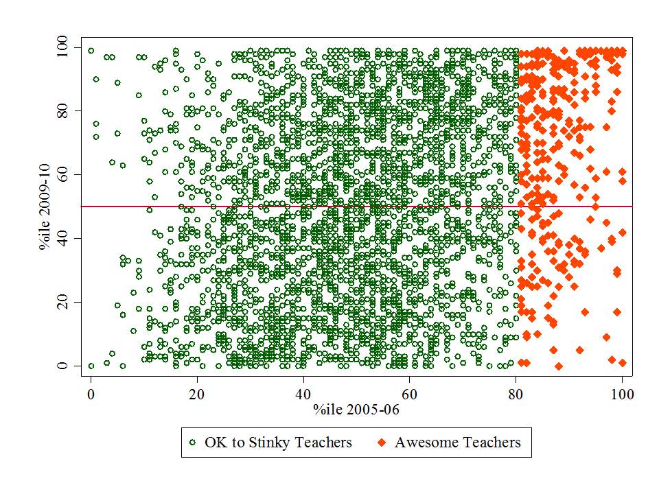
The following graphs play out the premise of “irreplaceables” with NYC value-added percentile data. I start by identifying those teachers that are in the top 20% in 2005-06 and then see where they land in each subsequent year through 2009-10.

NOTE: IT’S REALLY NOT A GREAT IDEA TO MAKE SCATTERPLOTS OF THE RELATIONSHIP BETWEEN PERCENTILE RANKS – BETTER TO USE THE ACTUAL VAM SCORES. BUT THIS IS ILLUSTRATIVE… THE POINT BEING TO SEE WHERE ALL OF THOSE DOTS THAT ARE “IRREPLACEABLE” IN YEAR 1 (2005-06) STAY THAT WAY YEAR AFTER YEAR!

I’ve chosen to focus on the MATHEMATICS ratings here… which were actually the more stable ratings from year to year (but were stable potentially because the were biased!)

See: https://schoolfinance101.wordpress.com/2012/02/28/youve-been-vam-ified-thoughts-graphs-on-the-nyc-teacher-data/

Figure 1 – Who is irreplaceable in 2006-07 after being irreplaceable in 2005-06?

Figure 1 shows that there are certainly more “irreplaceables” (awesome teachers) that remain above the median the following year than fall below it… but there sure are one heck of a lot of those irreplaceables that are below the median the next year… and a few that are near the 0%ile!  This is not, by any stretch to condemn those individuals for being falsely rated as irreplaceable but actually sucking. Rather, this is to point out that there is comparable likelihood that these teachers were wrongly classified each year (potentially like nearly every other teacher in the mix).

Figure 2 – Among those 2005-06 Irreplaceables,  how do they reshuffle between 2006-07 & 2007-08?

Hmm… now they’re moving all over the place. A small cluster do appear to stay in the upper right. But, we are dealing with a dramatically diminishing pool of the persistently awesome here.  And I’m not even pointing out the number of cases in the data set that are simply disappearing from year to year. Another post – another day.

I provide an analysis along these lines here: https://schoolfinance101.wordpress.com/2012/03/01/about-those-dice-ready-set-roll-on-the-vam-ification-of-tenure/

Figure 3 – How many of those teachers who were totally awesome in 2005-06 were still totally awesome in 2009-10?

The relationship between ratings from year to year is even weaker when one looks at the endpoints of the data set, comparing 2005-06 ratings to 2009-10 ones. Again, we’ve got teachers who were supposedly “irreplaceable” in 2005-06 who are at the bottom of the heap in 2009-10.

Yes, there is still a cluster of teachers who had a top 20% rating in 2005-06 and have one again in 2009-10. BUT… many… uh… most of these had a much lower rating for at least one of the in between years!

Of the thousands of teachers for whom ratings exist for each year, there are 14 in math and 5 in ELA that stay in the top 20% for each year! Sure hope they don’t leave!

====

Note: Because the NYC teacher data release did not provide unique identifiers for matching teachers from year to year, for my previous analyses I had constructed a matching identifier based on teacher name, subject and grade level within school. So, my year to year comparisons include only those teachers who are teaching the same subject and grade level in the same school from one year to the next. Arguably, this matching approach might lead to greater stability than might be expected if I included teachers who moved to different schools serving different students and/or changed subject areas or levels.

Teachers Unions: Scourge of the Nation?

UPDATED: 1/29/2015

Let me start by stating that I, myself am somewhat agnostic when it comes to the questions around whether I believe teachers unions are generally good or bad for the overall quality of our education system and for educational equity.  In my personal experiences as a young teacher in the early 1990s, I had my issues with my local teachers unions (in New York State in particular), resulting in some pretty heated battles with local and regional union officials [and some pretty nasty internal politics in my own school].  As a young teacher, I was anything but a fan of the teachers union. But unlike many of my TFA pals [I was a few years too early for TFA, but had friends & later colleagues in the first few waves] who only stuck it out in teaching for a year or two and may have developed similar negative feelings toward their local union, I did outgrow that initial reaction – which in my view- was somewhat isolated – and partly a function of my own youthful ignorance.  I didn’t stick it out in public school teaching much longer than that [the local union actually ran me out!], but did have the unique experience of working in an elite private school that had a union, and I worked in that school during a contract renegotiation.

The idea for this post first came about when I read the following quote in an article in the Economist. This has to be among the most utterly stupid statements I think I’ve ever read in my life:

…no Wall Street financier has done as much damage to American social mobility as the teachers’ unions have. http://www.economist.com/node/21564556

And then there’s this more recent quote:

Many schools are in the grip of one of the most anti-meritocratic forces in America: the teachers’ unions, which resist any hint that good teaching should be rewarded or bad teachers fired. http://www.economist.com/news/leaders/21640331-importance-intellectual-capital-grows-privilege-has-become-increasingly

Now… this quote is these quotes are ridiculous at many levels.  Most notably, the first quote is stupid simply because one could never possible contrive a reasonable quantifiable comparison of the supposed negative effects of either the individual hedge fund manager or the supposed monolithic “teachers union.” It’s the empirical equivalent of arguing whether Superman can beat up Hulk. It’s just asinine.

UPDATE: The second quote above comes from a piece that subsequently implies that teachers’ unions are a major, if not the primary cause of educational inequality across children- specifically between rich and poor children. Here’s a little more on the topic of “teacher equity” in particular. (Post 1 | Post 2)

On the heels of this quote came the Thomas B. Fordham Institute report rating the strength of teachers unions – or unionization more generally – across states.  Perhaps the most useful aspect of this report is that it provides us with insights regarding the heterogeneity of unionization across American states.  Unions and unionization are not monolithic.

As recognized by the Fordham report, we really don’t have an American education system. We have 51 systems. They are all somewhat different, with different standards, different funding systems, different union rules and protections and different student outcomes.  The existing variations across our state systems of education alone render the economist statement utterly stupid and misguided.  Those variations also provide for some fun opportunities to explore the relationship between TB Fordham’s characterization of teachers’ union strength across states and other features of state education systems.

In this post, I use data from several reports that attempt to characterize state education systems to probe two main questions – whether there exists any association between general indicators of education quality across states and union strength, and whether there exists any association between indicators of educational equality across states and union strength.

How is union strength related to funding levels and funding fairness?

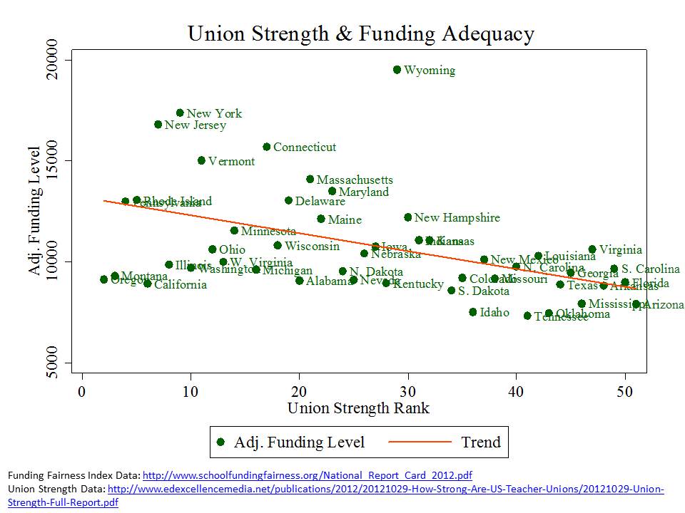
Along with colleagues at the Education Law Center of New Jersey, I have been preparing for the past few years, annual reports on education funding fairness. In the Funding Fairness report, we use a statistical model on three years of national data on all school districts to project the cost adjusted per pupil state and local revenues for all districts and state averages nationally, and we characterize the overall fairness – progressiveness or regressiveness of state school finance systems. Below, I evaluate the relationship between “union strength rank” from the TB Fordham report and funding “levels” (an indicator of adequacy) and funding “fairness” (whether higher poverty districts receive systematically more, or less funding per pupil than lower poverty districts in that state).

An important caveat here since I like to pick on inappropriate graphs myself is that I really should not be making scatterplots where the x-axis variable is a “rank” measure. Rank is not an interval measure. But this is purely for illustrative purposes, so please forgive my misuse of rank data in this way! [or at least if you slam me for it, acknowledge that I pointed this out!]

Figure 1

In Figure 1 we can see that states with stronger teachers unions [left hand end] tend to have more adequate overall funding levels. It is however more clearly the case that states with weak teachers unions (ranked 45 to 50th) tend to have particularly low adjusted funding levels. This is certainly not to suggest any direction of causation. That’s the whole trick here. Most of this is probably quite circular – endogenous. [the union cynic might argue that this merely shows that teachers’ unions have extorted funds from the taxpayer] That states which tend to be more educated and progressive happen to both have stronger teachers unions and to spend more on education – but for those states like California that by historical artifact referendum have systematically deprived their education systems for decades.

Figure 2

Perhaps more to the point of the Economist assertion, we see that states with weaker teachers unions also tend to have less fair funding distributions – or are systems where it is more likely that high poverty districts have systematically fewer resources per pupil than lower poverty ones.  Again, this result is likely a function of the endogenous relationships mentioned previously.

See: http://www.schoolfundingfairness.org/

UPDATE: So, wait a second, if stronger union states tend to have fairer funding distributions, might that actually enhance equity? In a really big, important and substantive way? Hmmm….

How is union strength related to competitiveness of teacher pay?

Here, I look at the relationship between union strength and the relative wage of teachers compared to non-teachers in the same state.  This is a particularly important comparison for two reasons. First of all, the relative competitiveness of teacher wages likely has significant effects on the quality of individuals who choose to enter the teacher workforce versus other employment opportunities (selecting from HS into College).  Overall wage competitiveness can have long run effects on overall teacher workforce quality.  Further, this is the one comparison I make in this post where we might hypothesize a direct, easily interpreted relationship. That is, we might expect stronger unions to lead to more competitive wages.  Here, I compare the weekly wage % (teacher percent of non-teacher) from the Economic Policy Institute with the TBF union strength rank.

Figure 3

Somewhat to my own surprise, this relationship is actually quite strong!… with states having stronger teachers unions also having generally more competitive teacher wages.

See: http://www.epi.org/publication/the_teaching_penalty_an_update_through_2010/

Is union strength associated with NAEP achievement levels?

Now, the usual retort to teacher union bashing is to point out that states like New Jersey and Massachusetts have strong unions and also have high NAEP scores, and states like Alabama and Mississippi have weak unions and low NAEP scores.  Yeah… okay… but clearly there’s a lot goin’ on there that has little or nothing to do with unions.  But let’s indulge this premise a little further with some additional graphs just to see the patterns.

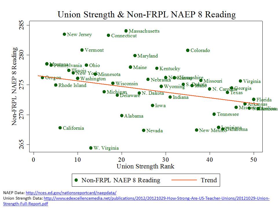
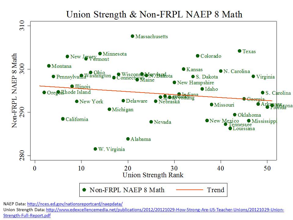
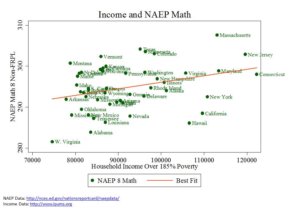
In these first few figures I present the relationship between NAEP scores for children in families above the 185% income level for poverty (not on free or reduced lunch) and union strength. Note that the patterns are similar for scores for children qualified for reduced lunch or for free lunch, but I’ve not included them here… ‘cuz there are already enough graphs in this post. I’d be happy to share them though.  In general, what we see in Figure 4 and Figure 5 is that NAEP scores for non-low income kids tend to be slightly lower – with little clear pattern – in weak union states.

Figure 4

Figure 5

Figure 6, however, clarifies that NAEP scores tend to be higher for non-low income children in states where incomes are higher for non-low income children.

Figure 6 (but income dictates NAEP)

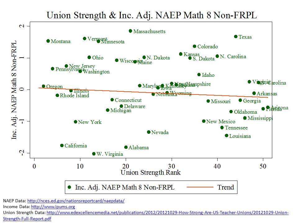
We can use the information in Figure 6 to adjust the NAEP scores (are they higher or lower than would be expected, given the income levels) for household income differences.  When we make that adjustment, we get Figures 7 and 8.

Figure 7 (income adjusted NAEP)

Figure 8 (income adjusted NAEP)

Still we see that adjusted NAEP scores are somewhat though hardly systematically lower in states with weaker unions. What we certainly do not see here is that NAEP Scores are systematically lower in states with stronger unions. That is, Unions certainly aren’t driving NAEP scores into the ground!

But, while the second set of graphs is more appropriate than the first, both are dreadfully oversimplified characterizations of complex relationships.

Is union strength associated with NAEP achievement gaps?

This question is perhaps most on target with the Economist claim. Following the economist logic, one might assert that teachers unions likely lead to larger achievement gaps, thus limiting social mobility. Measuring poverty related income gaps and comparing them across states is tricky, as I’ve discussed in numerous previous posts. Specifically, the size of the achievement gap between kids not qualified for free or reduced lunch and those qualified for either free or reduced lunch tends to be highly related to the size of the income gap between the two groups – as shown in Figure 9! That is, we can’t just do straight up achievement gap comparisons- we must adjust for the income gap.

Figure 9 (Income Gaps and NAEP Gaps)

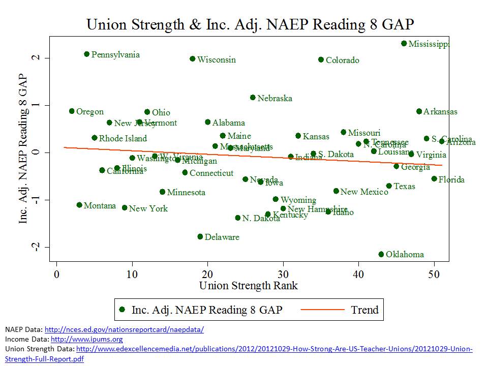
Figure 10 and Figure 11 present the income gap adjusted achievement gaps in relation to union strength rank.  What we see is little or no relationship between union strength and achievement gaps. While this does not illustrate that stronger unions lead to smaller achievement gaps…. It also does not by any stretch illustrate that stronger unions lead to larger achievement gaps… an expectation that might reasonably be derived from the claim made in the Economist.

Figure 10

Figure 11

Then again… these are still cursory… descriptive analyses – using only two variables at a time to characterize education systems that are far more complex than can be legitimately characterized with only two variables at a time. It’s exploratory. It’s a start… and there’s certainly more to be explored here… but likely questions that can never be satisfactorily untangled with available data.

See: https://schoolfinance101.wordpress.com/2011/09/13/revisiting-why-comparing-naep-gaps-by-low-income-status-doesnt-work/

Is union strength associated with NAEP achievement growth?

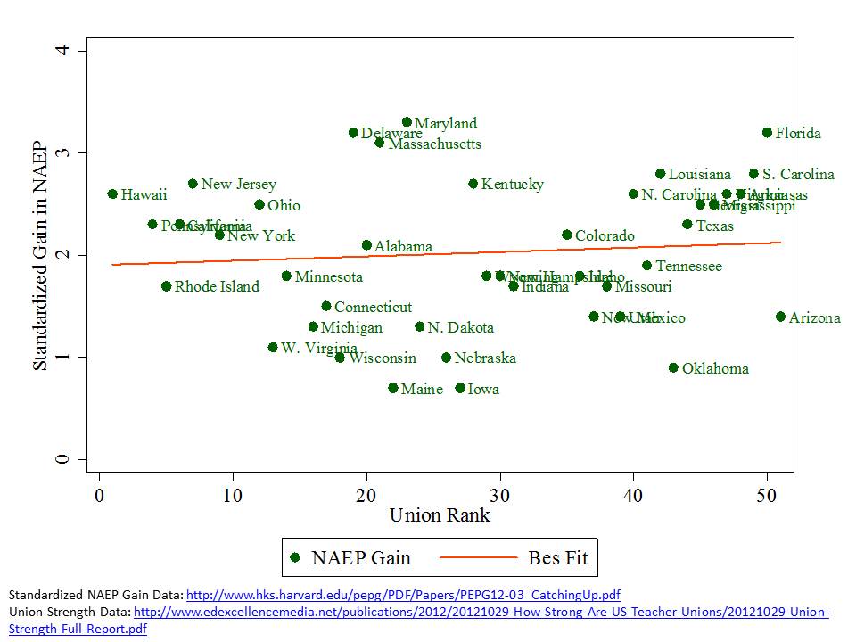
Finally, I suspect that some curmudgeonly reactors to this post will attempt to argue that weak union states have seen more growth in NAEP achievement over time. Well, Figure 12 kind of thwarts that notion as well. Not much relationship there either, but certainly the only one in this post at all that shows even the slightest upward tilt.

Figure 12

But alas, even that tiny upward tilt is a function of the fact that states that saw the greatest growth on NAEP were simply the states that had and still have the lowest overall performance levels – as shown in Figure 13. And, states with lower average performance levels – now and then – tend to have weaker unions.

Figure 13

For a more thorough discussion on this point, see: https://schoolfinance101.wordpress.com/2012/07/27/learning-from-really-bad-graphs-ill-informed-conclusions-thoughts-on-the-new-pepg-catching-up-report/

Conclusions

So what does this all mean then? Are unions good, or are they bad? Do they increase inequality and lower quality? It’s certainly difficult given the data provided above to swallow the bold assertion in the Economist that teachers’ unions are the scourge of the nation and primary cause of declining social mobility.  That’s just a load of unsubstantiated crap!

But then what can we learn here. Well, it is perhaps important that there appears to be at least some likely indirect and certainly endogenous relationship between unionization and funding fairness and funding levels. As I’ve discussed in related research funding fairness and funding levels – and school finance reforms that improve equity and adequacy do matter!  To summarize:

Do state school finance reforms matter? Yes. Sustained improvements to the level and distribution of funding across local public school districts can lead to improvements in the level and distribution of student outcomes. While money alone may not be the answer, more equitable and adequate allocation of financial inputs to schooling provide a necessary underlying condition for improving the equity and adequacy of outcomes. The available evidence suggests that appropriate combinations of more  adequate funding with more accountability for its use may be most promising.

http://www.shankerinstitute.org/images/doesmoneymatter_final.pdf

See also this post in which I probe more specifically the changes in achievement gaps over time in Massachusetts and New Jersey.

Further, the potentially more direct relationship between unionization and relative competitiveness of teacher wages compared to other labor market opportunities may be important in the long run.  In a related policy brief from last winter, I noted:

To summarize, despite all the uproar about paying teachers based on experience and education, and its misinterpretations in the context of the “Does money matter?” debate, this line of argument misses the point. To whatever degree teacher pay matters in attracting good people into the profession and keeping them around, it’s less about how they are paid than how much. Furthermore, the average salaries of the teaching profession, with respect to other labor market opportunities, can substantively affect the quality of entrants to the teaching profession, applicants to preparation programs, and student outcomes. Diminishing resources for schools can constrain salaries and reduce the quality of the labor supply. Further, salary differentials between schools and districts might help to recruit or retain teachers in high need settings. In other words, resources used for teacher quality matter.

http://www.shankerinstitute.org/images/doesmoneymatter_final.pdf

So, while nothing in this post puts to rest the big – unanswerable – questions of the overall equity and quality effects of teachers unions on our supposed monolithic American public education system, these analyses do at least raise serious questions about the notion that teachers unions are the scourge of the nation cause of all of the supposed – also unfounded – ills of American public schooling.

Cheers! It’s good to be back!

Friday Afternoon Graphs: Graduate Degree Production in Educational Administration 1992 to 2011

I’ll let the pictures tell the story this time. [UPDATED – Errors in original]

Data source: http://nces.ed.gov/ipeds/datacenter/DataFiles.aspx

School Labels & Housing Values: Potential consequences of NJDOE’s new arbitrary & capricious school ratings

There exists relatively broad agreement in the empirical literature that perceived quality of local public goods and services – including local public schools – influences significantly the value – as represented in demand/sales prices – of residential property. In other words – perceived school quality affects housing prices and housing values. All else equal, one pays a premium to live in a school district or attendance zone within a district that is associated with a “good” school.

Indeed this “capitalization” of school quality (perceived or real) in home values is at the root of much of the disparity underlying highly residentially segregated state education systems. It’s a long run, complex chicken-egg cycle sort of thing. Some communities have more which allows them to spend more… to improve perceived quality… and capitalize that value into their homes/property values, increasing the town’s ability to raise revenue further, and increasing barriers to entry for families with lower income.

Realtors, the real estate industry and state and local publications like New Jersey monthly and national publications like Newsweek and U.S. News drool over oversimplified characterizations of good and bad schools. As trivial as this stuff may seem to many of us, it is consequential, or at least can be.

Beyond magazine ratings, state school rating schemes have been shown be consequential for home values. The key is that summary type ratings, broad classifications or grades – ACCURATELY REFLECTING QUALITY OR NOT – seem to have the most significant impact. For example, in one recent study specifically evaluating post-NCLB classification schemes & other metrics, authors found that “Results show that while all school quality measures tested have some explanatory power, school district ratings and performance index, which are comprehensive measures of school quality, are the most appropriate measures and are readily capitalized into housing prices.”[1] In one of the better known studies on this topic, David Figlio evaluated the influence of Florida’s letter grading system on home values, finding:

This paper provides the first evidence of the effects of school grade assignment on the housing market. Our results suggest that the housing market responds significantly to the new information about schools provided by these “school report cards,” even when taking into consideration the test scores or other variables used to construct these same grades. These results suggest that innocuous-seeming school classifications may have large distributional implications, and that policy-makers should exercise caution when classifying schools.

http://bear.warrington.ufl.edu/figlio/house0502.pdf

Now, the caveat to Figlio’s findings is the initial shock on housing prices of revealed grades may fade with time.

These findings raise significant questions about the potential impact on housing values located in attendance boundaries of schools granted these new labels by state agencies, in accordance with their NCLB waiver applications.  In their waiver applications state agencies were (seemingly) under the gun to find ways to classify as problem schools and/or failing schools, not exclusively poor minority schools in the inner city. Indeed, many set out to make poor, minority schools their primary target.  As I’ve shown in recent posts on New York and New Jersey, states did indeed classify as failing schools largely those schools that are predominantly poor, predominantly minority and in the inner city.

But, in their effort to marginally diversify their “bad” schools list, states also proposed achievement gap metrics and subgroup metrics to be used for identifying “other” more diverse and less poor schools for disruptive state intervention.  Most of these schools New Jersey ended up being classified as “focus” schools, or “we’re watching you!” schools and we’re going to push interventions on you through our regional achievement centers.  Here’s the list of “focus” schools in generally non-low-income communities (middle and upper income) in New Jersey:

Table 1. Focus Schools in Non-Low-Income Districts

http://www.state.nj.us/education/reform/PFRschools/Priority-Focus-RewardSchools.pdf

A number of “focus” schools occur along the Northeast Corridor around Middlesex County. This is particularly true of “focus” schools in non-low-income (lighter blue) districts.

Figure 1. Locations of Focus, Priority and Reward Schools

All of these schools achieved their “focus” status by having large achievement gaps between two groups either by race, language proficiency or poverty (or disability?… no detail is provided!), rather than by low average or overall performance. Many are middle schools, in part because middle schools serve as a funneling point within mid-sized suburban districts, where children from neighborhood schools first come together in a single location (or perhaps two locations), creating sufficient subgroup sample sizes for calculating gaps.

Notably, a school can only have a measurable achievement gap between ethnic groups if it has at least 30 tested students in each group!  So really, most of the “focus” schools in middle and upper middle class New Jersey districts are middle schools in more diverse districts.

Far fewer of the more affluent schools in the state even have at least 30 members of disadvantaged minority groups taking state assessments in a given year! As such, racial achievement gaps cannot even be calculated for these districts.

Yes, gaps are a problem… but these measures… and resultant classifications are a twisted combination of ignorant and arbitrary.

Ignorant, arbitrary or otherwise, these classifications may have significant consequences for home values. And homeowners in these districts (and those in poor urban “priority” school zones) should be rightfully outraged at this potentially highly consequential abuse of data. [and of course those in “reward” school zones can quietly basque in the glory of their unearned accolades]

After all, it is the broad labeling that matters more than precise and nuanced characterizations of actual schooling quality!

Figure 3 shows the average proficiency rates of the “reward” schools and “focus” schools in Middlesex County – focusing only on those schools with fewer than 20% of children qualified for free lunch. That is, lower poverty schools.  In terms of overall proficiency, the “focus” schools fit reasonably into the broader mix of schools in Middlesex County.

My intent here is certainly not to downplay the gaps that may persist in these schools, though it’s really important to acknowledge that you can only even measure that gap if diversity exists to begin with. My point in this graph and post in general is that the state has created a labeling system misuses measures that weren’t very good to begin with to create arbitrary and capricious school labels that may have real and substantial consequence for home values. In many cases here, districts that are home to a focus school are immediately adjacent to districts that are home to ‘reward’ schools (an equally unearned label!).

Figure 3.

The kicker here is that even if the public were to become wise to the questionable veracity of these labels, that state has used this labeling system in the context of granting itself near unilateral authority to exercise substantial control over the operations of these schools [an authority which may not actually exist!].

So, it’s not just about the labels – which may be entirely meaningless – but it’s also about – much more about – a substantial threat to local governance of those schools. Now, I’ll admit that I have mixed feelings about “local governance,” because it is often local governance that reinforces disparities across children and schools.

But, that said, the state’s choice to use these labels quite explicitly as a threat to local governance – rather than merely as a “label” to increase awareness and encourage increased local accountability – may increase the consequences for local home values. That is, prospective home buyers may be more likely to avoid purchasing homes in neighborhoods or districts where they perceive that they may lose control to the state of their schools and this effect may be much greater than the effect of a negative label alone. Further, it’s entirely possible that in these middle class communities otherwise perceived as having pretty good schools, that public perception would be that proposed state interventions are more likely to make the schools worse than better (in addition to the threat of intervention itself).

Indeed, these are empirical questions and ones I hope to explore over the next few years as annual housing sales data are released.

Gap measurement in NJ: Largest Within-School Gaps: schools with the largest in-school proficiency gap between the highest-performing subgroup and the combined proficiency of the two lowest-performing subgroups. Schools in this category have a proficiency gap between these subgroups of 43.5 percentage points or higher. see: http://www.state.nj.us/education/reform/PFRschools/TechnicalGuidance.pdf


Data, Data, Data? Dissecting & Debunking NJDOE’s State of the Schools Message

Time again for an NJ State of the Schools Address, as reported HERE in NJ Spotlight (with absolutely no critical question/reporting whatsoever! More or less spoon fed regurgitation).

As I’ve written a number of times on this blog, state officials in New Jersey have decided on specific marketing/messaging plan in order to support current policy initiatives. Those policy initiatives involve:

  1. expanding NJDOE authority to impose desired “reforms” (charter/management takeover, staff replacement, etc.) on specific schools otherwise not under their direct authority.
  2. cutting funding from higher poverty, higher need districts and shifting it toward lower poverty, lower need ones.
  3. expanding charter schooling and promoting other  “innovations” in high poverty concentration schools.

The supposed impetus for these reforms is that New Jersey faces a very large achievement gap between low income and non-low income children (one that is largely mis-measured). While it would seem inconsistent to suggest reducing funding in low income districts and shifting it to others, the creative messaging has been that the additional resources are quite possibly the source of the harm… or at the very least those resources are doing no good. Thus, the path to improvement for low income kids is to transfer their resources to others.  What I have found most disturbing about this messaging – other than the ridiculous message itself! – is the flimsy logic and disingenuous presentations of DATA that have been used to advance the argument.

Look if the message is going to be about Data, Data, Data – then now is the time to take a more thorough, context-sensitive look at the data, and try to better understand what’s really going on.

Let’s do a walk through of some of the information presented in the most recent state of the schools presentation.

Here’s a link to the slides from the recent presentation:

http://www.state.nj.us/education/news/2012/0919con.pdf

NJDOE Message

The most recent state of the schools presentation is now in the post-NCLB waiver era, where we are now presented with those template classifications of schools as Priority, Focus and Reward schools.
The state of the schools presentation revolves to a large extent around these categories, because it is those Priority schools that are the target of the most immediate and disruptive interventions.

Below are the slides that were presented to characterize schools by their performance category. The message to be conveyed by these slides was:

  1. Priority Schools are overspenders (or at least very well resourced)
  2. Priority Schools have very well paid teachers who have slightly higher than average experience
  3. Yet still, priority schools have really crummy outcomes!

Therefore, we must have wide latitude to intervene!

EXHIBIT A – PRIORITY SCHOOLS SPEND MORE(?)

EXHIBIT B – PRIORITY SCHOOLS HAVE HIGH PAID TEACHERS & LOW OUTCOMES!

EXHIBIT C- GAPS REMAIN LARGE

Omitted Information What about demographic differences?

Clearly, a few things are being overlooked in the first two slides which claim characterize Priority schools as schools with plenty of resources that simply don’t get the job done. Now, there’s a little more to the story than that!

Most notable, as I show below, priority schools have about 80% of children qualified for free lunch and reward schools less than 10%! Yet as the NJDOE slide above shows, at the high end these school districts spend slightly under 30% more than state average. Notably, this shoddy comparison does not compare these districts to others in their own labor market.

Indeed, New Jersey more than other states has put some money into these districts. See “Is school funding fair?” But, let’s be clear, these margins of funding difference, while helpful, hardly make these districts – given their needs – flush with excess resources!

In fact, the strongest empirical research on this topic suggests that it would take an additional 100% or so per pupil funding for a district that is 100% low income versus a district that is 0% low income. Here, we are looking at nearly that extreme of low income differential, and not nearly that extreme of funding support! So while these districts are better off than similar districts in other states, implying that they’ve got more than enough to close achievement gaps is a huge stretch.

But do those demographic differences matter?

This figure shows just how much the demographic differences represented above matter with respect to student achievement, and specifically how much school demography continues to dictate the performance classification of schools under the NJDOE waiver plan.

As I pointed out on a recent post, NJDOE has basically flagged schools in low income neighborhoods for experimentation and substantial disruption (closure, etc.) with an option to override any/all local input.

Notably, this pattern is likely better than it would otherwise be because of New Jersey’s past efforts to target additional resources to high need settings, including pre-kindergarten programs, smaller class sizes and more competitive teacher salaries than might otherwise exist in these settings.

What about the teacher pay and teacher characteristics claim?

But what about those salaries? The NJDOE slides present a picture of teachers who – by their argument – are certainly paid enough. And, in fact, setting aside (ignoring entirely the demography of the schools), the implication of the NJDOE slides is that hey… we’re paying these teachers a few thousand more than the average teacher in the state, but clearly they just aren’t very good, or at least there are a bunch of them that aren’t and need to be fired! Further, they have slightly more experience than teachers in other schools… yet they still stink… indicating that experience clearly doesn’t matter. Notice that they didn’t present degree levels.

Okay… now let’s do a legitimate walkthrough of the most recent available data on NJ teachers with respect to the performance categories of schools. I use the 2011-12 Fall Staffing Reports and I fit a regression model of teacher salaries for all elementary and middle level classroom teachers (secondary later if I get a chance). In that model, my goal is to compare the salary a teacher would make:

  • at the same experience level
  • with the same degree level
  • having the same job code
  • working full time
  • in the same labor market (and type of district in that market)
  • in the same year

That is, I’m comparing apples with apples. This first graph shows the average difference in salary on the above comparison bases, statewide. Statewide, teachers in priority schools are earning a lower salary and teachers in reward schools a higher salary than teachers in “all other schools.” But these averages do mask some important differences across labor markets.

Here are the North Jersey/NY projected teacher salaries by experience level, where Newark carries significant weight in the model. Priority school salaries by experience are in blue, reward in red. On average, the differences are rather subtle. Reward schools salaries jump ahead in the mid-range, and priority rise again later, but fall behind in the mid range. But, it’s really important to understand, that simply having roughly the same salary does not mean that salary is actually competitive for recruiting and retaining teachers of comparable qualifications! In fact, to get teachers to work in a high need setting is likely to require a substantively higher wage!

As I explain in a recent review of the literature on this topic: With regard to teacher quality and school racial composition, Hanushek, Kain, and Rivkin (2004) note: “A school with 10 percent more black students would require about 10 percent higher salaries in order to neutralize the increased probability of leaving.”33 Others,however, point to the limited capacity of salary differentials to counteract attrition by compensating for working conditions.34 see: http://www.shankerinstitute.org/images/doesmoneymatter_final.pdf

  • Hanushek, Kain, Rivkin, “Why Public Schools Lose Teachers,” Journal of Human Resources 39 (2) p. 350
  • Clotfelter, C., Ladd, H.F., Vigdor, J. (2011) Teacher Mobility, School Segregation and Pay Based Policies to Level the Playing Field. Education Finance and Policy , Vol.6, No.3, Pages 399–438
  • Clotfelter, Charles T., Elizabeth Glennie, Helen F. Ladd, and Jacob L. Vigdor. 2008. Would higher salaries keep teachers in high-poverty schools? Evidence from a policy intervention in North Carolina. Journal of Public Economics 92: 1352–70.

Now let’s look at south jersey, which appears to be the source of most of the deficit that shows up statewide. In South Jersey/Philly metro, teachers in priority schools are making a much lower wage especially in the mid-range. Non-classified and reward schools lead the way on salaries across most of the experience range. Hey… is this chicken or egg? Do salaries matter – or are more advantaged schools simply able to pay higher salaries.

One issue that NJDOE appears to be ignoring entirely is that the classification of these schools may actually lead to additional teacher sorting – making it even harder to staff priority schools with high quality teachers down the line.

Here are the degree levels of classroom teachers in these schools – something notably absent in the NJDOE presentation. The differences between priority and reward schools are quite striking.

PRIORITY SCHOOLS HAVE FAR MORE TEACHERS WITH ONLY A BA AND FEWER WITH AN MA THAN REWARD SCHOOLS!

Finally, here are the concentrations of novice teachers, where a sizable body of research literature points to the problem of teacher churn in high need schools and the relationship between high novice teacher concentrations and lower student outcomes.

What about the performance of low income children in New Jersey?

Again, part of the message being presented in the state of the schools address is that New Jersey in particular has failed its low income children – as indicated by the suspect, over time proficiency rate graphs presented above. These graphs are presented as coupled with the funding/resource graphs to imply that funding is clearly unhelpful at best and harmful at worst when it comes to fixing the achievement gap.

As I’ve written on this blog before, New Jersey has made substantive gains in recent decades for low income children. Further, to make comparisons of achievement gaps, one must focus on the most comparable measures and most comparable settings. In one recent blog post, I compared Massachusetts, Connecticut and New Jersey – which in terms of income distributions and the characteristics of those above and below the Free/Reduced Income thresholds are most similar. The following graphs show that children of HS dropouts and low income children in NJ and MA have both higher levels of performance and have outpaced the gains in performance of similar children in Connecticut and Rhode Island (but especially CT!)

What has New Jersey done to improve performance of low income children?

I also elaborated in that previous that one key difference between these states is that NJ and MA, more than the others have shifted resources toward higher need districts. The first graph shows the disruption over time in the relationship between district income and district resources. MA and NJ have most significantly disrupted this relationship, providing systematically more resources per pupil in lower income districts.

This second graph shows the pattern across districts by poverty in each state. Note that in CT, while a few high poverty districts (Hartford and New Haven) have higher current spending, the CT pattern is less systematic. Further, in those few districts, much of the additional spending is granted through magnet school aid, and thus may have limited positive impact on the districts’ neediest students.

To the best of my understanding, teacher tenure laws are/were strong in each of these states. Few if any districts in these states base teacher evaluation heavily on student test scores – especially during the periods represented in the graphs above – which predate Race to the Top. That is, clearly the differences in low income achievement growth between these states have little/nothing to do with state teacher evaluation policy. To go even further, NJ and CT have relatively small charter school market share, so charter school market share likely is not a major factor either.

Further, as explained in this report, and in this article, substantive and sustained school finance reforms do matter! And the evidence on the effectiveness of these reforms far outweighs the more speculative reforms being suggested as replacements for funding in New Jersey.

What does NJDOE & the current administration propose to do about future funding?

Finally, as I noted previously, the current direction of policy initiatives is to attempt to reshuffle funding away from higher poverty/need districts and toward lower poverty/need ones. Here’s the graph from the previous post.

The Strange Logic of it All?

Coupling this DOOHNIBOR (uh… reverse robinhood) strategy with arguments for disruptive reforms in high poverty settings is illogical at best and reckless and irresponsible at worst.

Children in high poverty settings in New Jersey have made substantive gains over time.

It is quite likely that New Jersey’s investments in the schools and communities of these children have played a significant role in those gains.

Yet, even in New Jersey, where the state has made those efforts, poverty-related disparities do persist and require attention.

There is little or no evidence that expanded charter schooling is substantively improving the outcomes of our lowest income children, largely because those “successful charter schools” of which we most often speak are not serving our lowest income children in any significant numbers, and in some cases are increasing concentrations of disadvantaged children left behind in district schools.

And there’s little evidence that either New Jersey’s failures or gains are a function of an oversimplified good teacher/bad teacher dichotomy, suggesting a need for oversimplified reformy solutions like teacher deselection and/or pay-for-test scores.

Despite the state’s efforts to provide support to high poverty settings/schools, teacher wages still are not where they necessarily need to be in those districts to recruit and retain a high quality applicant pool year after year. There remain disparities in teacher qualifications, including novice teacher concentrations. Teacher quality disparities may be/are an issue – but not in the way they are presently being framed!

These are the basic issues that need to be addressed. They aren’t sexy. They aren’t reformy. They aren’t consistent with the current marketing/messaging of NJDOE.

But they are based on data, data, data, DATA, DATA and more freakin’ Data!

And there’s a lot more where that came from!