Blog

More on NAEP Poverty Gaps & Why State Comparisons Don’t Work

This post is a follow-up to a recent post on how income distributions differ across states and how those income distributions thwart our ability to make reasonable comparisons across states in the size of achievement gaps in relation to low-income status. This series of posts on NAEP poverty gaps comes in response to a tweet on May 4 from Lisa Fleisher of the WSJ.  Lisa was quoting NJ Education Commissioner Cerf on NJ school performance.

  • @lisafleisher Lisa Fleisher
  • Cerf on performance of NJ schools compared w/nation: 5th best in country. But gap btwn rich/poor = 47th highest gap. An “astounding figure”

Cerf has had some difficulties in the past making reasonable (honest) presentations of achievement data – specifically with respect to the influence of poverty measurement.

To review (so you don’t have to necessarily go back and read the other post, which is here):

Here’s the basic framing adopted by most who report on this stuff:

Non-Poor Child Test Score – Poor Child Test Score = Poverty Achievement Gap

Non-Poor Child in State A = Non-Poor Child in State B

Poor Child in State A = Poor Child in State B

These conditions have to be met for there to be any validity to rankings of achievement gaps.

Now, here’s the problem.

Poor = child from family falling below 185% income level relative to income cut point for poverty

Therefore, the measurement of an achievement gap between “poor” and “non-poor” is:

Average NAEP of children above 185% poverty threshold – Average NAEP of children below 185% poverty threshold = “Poverty” achievement Gap

But, the income level for poverty is not varied by state or region. See: https://schoolfinance101.com/wp-content/uploads/2011/03/slide1.jpg

As a result, the distribution of children and their families above and below the specified threshold varies widely from state to state, and comparing the average performance of the groups of children above that threshold and below it is not particularly meaningful.  Comparing those gaps across states is really problematic.

While I showed how different the poverty and income distributions were in Texas and New Jersey as an example, I didn’t necessarily go far enough in that post to explain how/why these distribution differences thwart comparisons of low-income vs. non-low income achievement gaps. Yes, it should be clear enough that the above the line and below the line groups just aren’t similar across these two states and/or nearly every other.

A logical extension of the analysis in that previous post would be to look at the relationship between:

Gap in average family total income between those above and below the free or reduced price lunch cut-off

AND

Gap in average NAEP scores between children from families above and below the free or reduced price lunch cut-off

If there is much of a relationship between the income gaps and the NAEP gaps – that is, states with larger income gaps between the poor and non-poor groups also have larger achievement gaps – such a finding would call into question the usefulness of state comparisons of these gaps.

So, let’s walk through this step by step.

First, here is the relationship across states between the  NAEP Math Grade 8 scores and family total income levels for children in families ABOVE the free or reduced cutoff:

There is a modest relationship between income levels of non-low income children and NAEP scores. Higher income states generally have higher NAEP scores. No adjustments are applied in this analysis to the value of income from one location to another, mainly because no adjustments are applied in the setting of the poverty thresholds. Therein lies at least some of the problem. The rest lies in using a simple ABOVE vs. BELOW a single cut point approach.

Second, here’s the relationship between the average income of families below the free or reduced lunch cut point and the average NAEP scores on 8th Grade Math (2009).

This relationship is somewhat looser than the previous relationship and for logical reasons – mainly that we have applied a single low-income threshold to every state and the average income of individuals below that single income threshold does not vary as widely across states as the average income of individuals above that threshold. Further, the income threshold is arbitrary and not sensitive do the differences in the value of any given income level across states.  But still, there is some variation, with some stats have much larger clusters of very low-income families below the free or reduced price lunch threshold (Mississippi).

BUT, HERE’S THE PUNCHLINE:

This graph shows the relationship between income gaps estimated using the American Community Survey data (www.ipums.org) from 2005 to 2009 and NAEP Gaps. This graph addresses directly the question posed above – whether states with larger gaps in income between families above and below the arbitrary low-income threshold also have larger gaps in NAEP scores between children from families above and below the arbitrary threshold.

In fact, they do. And this relationship is stronger than either of the two previous relationships. As a result, it is somewhat foolish to try to make any comparisons between achievement gaps in states like Connecticut, New Jersey and Massachusetts versus states like South Dakota, Idaho or Wyoming. It is, for example, more reasonable to compare New Jersey and Massachusetts to Connecticut, but even then, other factors may complicate the analysis.

Grading the Governors’ Cuts: Cuomo vs. Kasich vs. Corbett (revised AGAIN!)

Here’s a quick data driven post on Governor’s state aid cuts – or aid changes. So far, I’ve been able to compile data from a few states which make it relatively easy to access and download data on district by district runs of state aid (and one state that does not, but I have good sources of assistance). Here, I compare changes in state aid to K-12 public school districts in Ohio, Pennsylvania and New York.

Let’s start with a review of types of cuts or distributions of cuts that might be applied:

First, cuts might be implemented as  percent of state aid, but might be implemented across different aid programs. States typically have different clumps of state aid that goes out to school districts, some of which are progressively allocated with respect to need and wealth and others which may be allocated flat across districts regardless of local capacity or wealth. And some, like New York State actually still maintain very large aid programs that are distributed in greater amounts to wealthier districts (STAR aid). If one makes proportionate cuts to need based aid, or equalized aid, that generally means making larger cuts to needier districts (on  a per pupil basis). The cuts alone are regressive on their face, and because the cuts are larger for districts with less capacity to replace locally the state cuts the effect tends to be highly regressive. Smaller cuts on wealthier districts are easily replaced with local source funds.

Alternatively, a state might cut a flat percent of flatly allocated aid, or a state might distribute aid cuts as a flat percent of per pupil budgets. The distributional effects – at face value – of these cuts does depend on the distribution of state budgets.  If the overall system is progressive to begin with (higher need districts having larger per pupil budgets) then the cuts are larger on a per pupil basis in higher need districts. If the overall system is flat, or neutral, the proportionate cuts will be flat or neutral on their face. If applied to flatly allocated aid, the cuts are flat, on their face. However, because wealthier districts can more easily replace the same size cut, the distribution effect will likely remain regressive – though not as absurdly regressive as the first option.

Most cuts fall into these two above categories (first three in table), but the possibility exists that a state would actually cut state aid in greater amounts to those districts that either have less need to begin with or districts that can most easily replace that aid with local resources. These would, on their face, be progressively distributed cuts. But, because those districts receiving the largest cuts would be the ones with greatest capacity to bounce back on their own, the distribution effect would likely be flat.

The baseline conditions in a state matter!

This table draws on the School Funding Fairness report I worked on and released last year, which characterizes the baseline conditions for states. It would be particularly problematic, for example, to make the first type of cuts on a state school finance system that is regressive to begin with. It would arguably also be quite offensive to make flat cuts on a regressive system. For more explanation regarding these baseline conditions, see http://www.schoolfundingfairness.org.

New York, while having high average spending per pupil, IS AMONG THE MOST REGRESSIVELLY FUNDED STATE EDUCATION SYSTEMS IN THE NATION. In fact, funding in New York State is only as high as it is because of the very high spending of very affluent suburban districts – suburban districts that, by the way, continue to receive substantial state aid for property tax relief.  New Jersey and Ohio are two of the only states which, in our report, showed systematic positive relationships between funding (state and local) and poverty, albeit Ohio’s funding was much less systematic than that of New Jersey and less progressive overall. Still, Ohio was far more progressive on funding distribution than many other states. Pennsylvania was right down their with New York, among the most regressive in the nation – but PA had begun to phase in a new basic education funding formula which would, if implemented, lead to improvements.

How do the Governor’s cuts play out? Who’s “best” and who’s “worst”

Below are the district by district distributions of per pupil aid changes with respect to student need measures, for Ohio, NY and PA.

In New York, the aid cuts per pupil ARE REGRESSIVE ON THEIR FACE, and fall into the first and worst category above. Higher need districts will have their aid cut nearly $500 per pupil, while many very low need districts see negligible cuts per pupil.

AND NOW FOR THE REAL KASICH CUTS. IF THE CORBETT CUTS WERE SUSPECT AS REPORTED IT ONLY MADE SENSE TO TAKE A SECOND LOOK AT THE KASICH GAME. AND THE PLAYBOOK IS THE SAME!

The playbook is to ignore that federal stabilization money that was intended to be replaced with state aid as it disappeared. Well, here are Kasich’s REAL regressive cuts when comparing 2012 to 2011, with 2011 including the stabilization money:


Ohio’s cuts are particularly interesting. On a per pupil basis, the cuts are systematically smaller in higher poverty districts. The cuts are actually larger in lower need and higher wealth districts (but for a few outliers). These cuts are, on their face, progressive, and will likely lead to a relatively flat distribution of overall per pupil budget changes. I’ve not yet run the second year of aid changes though.

As reported on the PA state portal web size, Basic Education Funding is set to increase by about 2% across PA districts. I’ve certainly heard news of cuts, but the data and official documentation at this point do not show those cuts. The overall state budget data do show huge cuts to other areas of the budget. But BEF funding receives a small boost and SEF (special education funding) is frozen. Because the boost is proportionate to 2010-11 BEF funding which is equalized, the bust is larger in higher need districts. Nonetheless the boost is quite small.

NOW FOR THE REAL PENNSYLVANIA CORBETT CUTS, COURTESY OF THE ED LAW CENTER OF PA:

Why the big difference? Well, I should have caught this one. Indeed the first graph above which shows a 2% increase over prior year is, in fact, a 2% increase over the prior year STATE + FED JOBS money portions of BEF. What they failed to mention is that they chose not to replace the FEDERAL STABILIZATION FUNDING.  In 2010-11:

BEF = STATE AID + SFSF + JOBS

The idea was, that as SFSF disappeared, state aid would be raised to replace that money, or else districts would face substantial budget holes. Corbetts 2012 funding is:

Corbett BEF Aid = 1.02 x (STATE AID 2010-11 + JOBS 2010-11)

Leaving out that other $650 million or so that was also in BEF (from SFSF) in the prior year, and was distributed through the equalized formula.

PA ELC Spreadsheet here!

So, the winner of the worse cuts award in ROUND1 – the battle of Corbett, Kasich, Cuomo – is Cuomo.   Cuomo’s cuts are large and Cuomo’s cuts are regressive on their face! That’s one heck of an accomplishment!

SO, AS IT TURNS OUT BOTH KASICH AND CORBETT ACTUALLY DO MARGINALLY WORSE THAN CUOMO.


BONUS GRAPH – CHRISTIE’s Prior Year New Jersey Cuts


Resource Deprivation in High Need Districts? (& CAP’s goofy ROI)

This post provides a follow-up on two seemingly unrelated topics, both of which can be traced back to the Center for American Progress.

First, there was that wonderful little Return on Investment indicator series that CAP did a while back.

Second, there’s the frequent, anecdotal argument that creeps into CAP/Ed Trust and AEI conversations that high need districts all have enough resources anyway and just have to stop wasting them on things like Cheerleading and Ceramics.

In this post, I provide an abbreviated version of some of the findings one of my recent conference papers.

The goal of the research study was to first identify those districts which fell into various regions or quadrants, applying a framework similar to that used by CAP in their ROI and second, explore the differences in personnel allocation in each group of districts looking for insights into what makes them tick (or not). It’s not a very good framework to begin with, but at least provides a common starting point:

The idea is that districts may fall into four groups. Some are high spending high performers and some are low spending low performers. Others are high spending low performers and still others are low spending high performers. What would be interesting from a policy perspective is whether we really could identify those in Q1 above and those in Q3 above and determine what makes them tick (Q1), or not tick (Q3).

As I discussed in a previous post, CAP took a particularly egregiously flawed approach to correcting/adjusting for various factors and laying out districts across these four quadrants. Here’s a snapshot of their Illinois findings:

The CAP IL snapshot shows plenty of districts in those green and red quadrants. Of course, the CAP snapshot a) fails to full correct for poverty related costs or ELL related costs and b) doesn’t correct at all for economies of scale or population density. If one were to believe the CAP findings, one would assume that there are similar proportions of districts that are in each group – both the expected groups (upper right and lower left) and the less likely groups (upper left and lower right). Of course, CAP also blew it in their interpretation of what’s going on in the lower left. They seemed to chastise these low spending low performing districts for their low performance, rather than acknowledge that these are actually the districts that have been screwed on funding, and are producing exactly what is expected of them in terms of outcomes.

Of course, if one more fully corrects for differences in costs across IL school districts, the actual distribution by quadrant comes out more like this (see conference paper for details on cost adjustment model):

The reality is that there aren’t a whole lot of districts – at least in the Chicago metro area that fall in the upper left and lower right quadrants. In fact, districts are largely where they are expected to be – Some have plenty of resources and do quite well, and others have limited resources and are doing poorly. Now, there is plenty of variance in the lower left and upper right which could be explored for interesting patterns.

Note that Illinois (along with PA and NY) is among the most regressively funded and racially disparately funded systems in the country!

How do resource constraints relate to curricular offerings?

Much of the  conversation of the past few days/weeks by pundits on twitter and in blogs has been on the question of what’s good for the “rich” and what’s good for the “poor.” Let me reframe that issue in this post in terms of what kids have access to in districts in the upper right quadrant of the above figure versus what kids have access to in the lower left quadrant.  Of course, the anecdotal assumption laid out above is that there are actually a whole bunch of districts in the lower right that have elaborate cheerleading and ceramics programs. Say it ain’t so! Okay… it ain’t!

What is so is that students attending districts in the lower left hand quadrant tend to have much less access to advanced curricular opportunities and boutique electives courses than children attending districts in the upper right hand quadrant. Here are a few figures, based on individual staffing assignment data:


Children attending districts in the upper right hand quadrant are nearly 3 times as likely to have access to a teacher assigned primarily to advanced math courses, nearly twice as likely to have access to a teacher primarily assigned to advanced literature or advanced science, and significant more likely to have access to a teacher assigned primarily to advanced social sciences or even seemingly more basic offerings like Algebra and Geometry. Moving deeper into the extremes of the upper right and lower left quadrants magnifies these disparities.  Further, while these distributions are expressed as a percent of total staffing, high spending high outcome districts tend to have significantly more staff per pupil.

Students in the lower left hand quadrant do have more of some stuff. They have a greater density (as a share of total staffing, but NOT on a per pupil basis) of elementary classroom teachers, and teachers in bilingual, alternative and at risk education. They also seem to have marginally more school site administrators. They have only comparable shares of staff allocated to basic level courses.

Implications?

Analyses in the full paper provided little evidence in Illinois or Missouri that high need and low performing districts were squandering their resources on things like cheerleading or ceramics, or, for that matter that there were large numbers of high need low performing districts that really had enough resources to begin with but weren’t using them productively. The classic emergent profile of a high need low performing district in Missouri and Illinois was of a district with highly constrained resources after adjustment for costs, and a district that had largely forgone assigning teachers to advanced content areas and elective courses for which they perhaps expected few students to enroll. Lack of a rich curriculum in high need settings is a significant policy concern and is a concern that cannot likely be remedied by reshuffling deck chairs.  These districts in fact need more total resources than high spending high outcome districts because they must be able to offer both the basic course work to prepare students to gain access to higher level courses, and to offer the higher level courses. Under present circumstances in many states, those resources just aren’t there, and it is very counterproductive to pretend either that they are or that it’s the districts’ fault they aren’t!

Why comparing NAEP poverty achievement gaps across states doesn’t work

Pundits love to make cross-state comparisons and rank states on a variety of indicators (I’m guilty too). A favorite activity is comparing NAEP test scores across subjects, including comparing which states have the biggest test score gaps between children who qualify for subsidized lunch and children who don’t. The simple conclusion – States with big gaps are bad – inequitable – and states with smaller gaps must being doing something right!

It is generally assumed by those who report these gaps and rank states on achievement gaps that these gaps are appropriately measured – comparably measured – across states. That a low-income child in one state is similar to a low-income child in another. That the average low-income child or the average of low-income children in one state is comparable to the average of low-income children in another, and that the average of non-low income children in one state is comparable to the average of non-low income children in another.  LITTLE COULD BE FURTHER FROM THE TRUTH.

Let’s review the assumption. Here’s the basic framing adopted by most who report on this stuff:

Non-Poor Child Test Score – Poor Child Test Score = Poverty Achievement Gap

Non-Poor Child in State A = Non-Poor Child in State B

Poor Child in State A = Poor Child in State B

These conditions have to be met for there to be any validity to rankings of achievement gaps.

Now, here’s the problem.

Poor = child from family falling below 185% income level relative to income cut point for poverty

Therefore, the measurement of an achievement gap between “poor” and “non-poor” is:

Average NAEP of children above 185% poverty threshold – Average NAEP of children below 185% poverty threshold = “Poverty” achievement Gap

But, the income level for poverty is not varied by state or region. See: https://schoolfinance101.com/wp-content/uploads/2011/03/slide1.jpg

As a result, the distribution of children and their families above and below the specified threshold varies widely from state to state, and comparing the average performance of the groups of children above that threshold and below it is not particularly meaningful.  Comparing those gaps across states is really problematic.

Here are graphs of the poverty distributions (using a poverty index where 100 = 100%, or income at the poverty level) for families of 5 to 17 year olds in New Jersey and in Texas. These graphs are based on data from the 2008 American Community Survey (from http://www.ipums.org). They include children attending either/both public and private school.

To put it really simply, comparing the above the line and below the line groups in New Jersey means something quite different from comparing the above the line and blow the line groups in Texas, where the majority are actually below the line… but where being below the line may not by any stretch of the imagination be associated with comparable economic deprivation. Further, in New Jersey, much larger shares of the population are distributed toward the right hand end of the distribution – the distribution is overall “flatter.” These distributional differences undoubtedly have significant influence on the estimation of achievement gaps. As I often point out, the size of an achievement gap is as much a function of the height of the highs as it is a function of the depth of the lows.

For further explanation of the problems with poverty measurement across states, using constant thresholds, and proposed solutions see:

Renwick, Trudi. Alternative Geographic Adjustments of U.S. Poverty Thresholds: Impact on State Poverty Rates. U.S. Census Bureau, August 2009.

https://xteam.brookings.edu/ipm/Documents/Trudi_Renwick_Alternative_Geographic_Adjustments.pdf

Income distributions for each state:

A Little NJ Private School Context

Our current NJ State Board of Education includes former representatives of the Boards of Trustees (or Governors) of two very highly respected private independent schools – Peck (a K-8 school in Morristown) and Newark Academy (in Livingston).

http://www.state.nj.us/education/sboe/boe/

Yes, I’ve chosen to look at these schools because of NJBOE member affiliations with them.  Further, I am familiar with both schools (in addition to many other similar schools).

I do NOT see as a problem, having supporters of excellent private schools on a state board of education whose policies affect primarily the public education system. In fact, I see it as an opportunity (For those trying to read too much into this and suggest I’m being manipulative or sarcastic. Don’t. I really do think it’s important to take a close look at various types of educational institutions as models. These are a unique set of institutions with long and successful track records. Again, my private school study can be found here: http://nepc.colorado.edu/publication/private-schooling-US)

There’s a lot of bluster in the current NJ public education policy debate – over such things as:

I’ve suggested on a number of occasions, taking a closer look the inner workings, spending, policies and practices of elite private schools in particular – those which are not church subsidized – and those which operate on the open market for private schools.  At the very least, one might consider information on these schools for contextual purposes. For example, when considering what we spend in Newark public schools on a population that is majority low income, substantially non-English speaking, and includes 14 to 18% children with disabilities (depending on year of data).

Here are the stats on the two private independent schools, drawn from their web sites and from IRS filings:


Notably, on their web sites – both schools – like nearly any private independent school I can think of – indicate their relatively small class size or low pupil to teacher ratio. Both talk about their levels of teacher experience!  Both spend substantially more per pupil than Newark public schools and both compensate their headmasters at a rate far above and beyond newly proposed public school administrator caps.  These are the realities of the marketplace in which these schools operate.

Questions regarding different practices (with emphasis on personnel policy here), which are not generally available on school websites or in other documentation include:

a) How do  these schools recruit and attempt to retain teachers or headmasters?

b) How is compensation structured? Is there additional pay for degree levels or experience?

c) Are all employees at will, year-to-year or is there some form of continuous contract (implicit or explicit)?

d) What benefits are provided?

e) How are contractual negotiations conducted?

f) How are teacher evaluations conducted? By whom? With what frequency? or Emphasis?

There are a variety of other questions to be asked about these or any types of institutions we might choose to view as models. I welcome any responses to the above questions from representatives of these, or similar institutions, as I have requested in the past.

Newark Acad 2010 990

Newark Academy ~ Quick Facts

Newark Academy ~ Affording NA

Peck 2010 990

The Peck School_ About Peck

The Peck School_ Admissions » Tuition

Debunking Myths: Characteristics of Stayers & Leavers in New Jersey

For this one, the graphs pretty much tell the story. I’ve had these data sitting around for a while and just never got around to making the graphs. I’ve used data on migration patterns across cities and states from the American Community Survey in the past. The American Community Survey data are annual survey data which, among other things, include information on employment status, place of residence, place of work, wage income, household income and a bunch of other useful stuff. Since 2000, ACS has been doing annual data collection and has increased sample sizes from 2005 to 2009, increasing the questions that can be addressed with the data. The ACS data also include questions regarding whether the respondent lived in a different location the previous year. Since you have the current year location, whether an individual lived elsewhere the previous year, and where they lived, it’s relatively easy to tabulate characteristics of individuals who a) live in New Jersey in the current survey year but lived elsewhere the previous year, (Moved In)  b) live in another state in the current year, but lived in New Jersey the previous year (Moved Out), or c) lived in New Jersey in the current and previous year (STAYER).

The idea for this post had come about a long time ago, when I kept hearing over and over again how New Jersey’s taxes (which I wrote about here)  are driving out the state’s highest income (and most productive) residents. As usual, this statement was spun in a number of ways referring loosely to wealth, or income, or “rich” versus poor, but always with the implication that those who otherwise would contribute most to state tax revenues by virtue of their income are the ones headed for the exit. These claims were typically based loosely on a highly questionable secondary report of an earlier study, using data from the earlier part of the decade.

Here’s my quick run at the ACS data on individuals between the ages of 25 to 65 – the majority of wage earners.

Note that the ACS doesn’t survey absolutely everyone. It’s based on a sample. A pretty big sample for these years, but a sample nonetheless. As a result, to project the findings to the total population, one has to use weightings provided in the data (person weight, in this case).

Figure 1. Total numbers of 25 to 65 year olds coming and going

The first figure shows roughly similar numbers of 25 to 65 year olds coming and going. If anything, a few more are coming each year than going.

Figure 2. Income from Wages for those Coming and Going

Figure 2 shows that the income from wages for those coming in is slightly higher than for those leaving.

Figure 3. Household income for those Coming and Going

Household income is also marginally higher for those coming than for those leaving over time.

Figure 4. Education Level of those Coming and Going

This figure shows that on average, those coming into New Jersey have higher levels of education than those leaving. The blue bars, from associates degree or higher, through every higher level of education, are higher than the red bars. That is,those coming into New Jersey tend to be more likely to have a BA or higher, an MA or higher, or a professional or doctorate degree than those leaving New Jersey.

Figure 5. Household Income by State Moved To

Part of the rhetoric – mostly radio talk blather from NJ 101.5 – is that all of those high income earners headed to the exits are headed straight toward those lower tax burden and lower cost of living states like the Carolinas and Florida.  Well, as it turns out, the higher income earners that are leaving NJ – those that have higher household income than those who stay in NJ – happen to be moving to Massachusetts, California or New York – not states that one would typically call tax safe havens – but then again – most of the rhetoric regarding high and low tax states is misguided anyway. Those headed to Southern states and to Pennsylvania tend to have lower household income than those who stay in NJ and tend to have lower income than the average leaver.

TOTAL “MOVED TO” States

Note – The difficulty here is that with the ACS data, income is only reported for the current year, not previous income. So, income levels in this graph are income levels after the move, or in the state moved to and not the income level of the household when in NJ the previous year. That said, it is certainly the case that an income of $60k to $80 in those southern states would not otherwise be over $100k in NJ but for the supposed difference in total taxes. Yes, that lower income may provide comparable housing, etc., but that difference is largely a function of housing price and assessed value, not effective tax rate.

NPR Story: http://www.npr.org/blogs/money/2011/04/29/135813061/studies-rich-dont-flee-high-tax-states

The Perils of Favoring Consistency over Validity: Are “bad” VAMS more “consistent” than better ones?

This is another stat-geeky researcher post, but I’ll try to tease out the practical implications. This post comes about partly, though not directly in response to a new Brown Center/Brookings report on evaluating teacher evaluation systems. From that report, by an impressive team of authors, one can tease out two apparent preferences for evaluation systems, or more specifically for any statistical component of those evaluation systems to be based on student assessment scores.

  1. A preference to isolate as precisely as statistically feasible, the influence of the teacher on student test score gains;
  2. A preference to have a statistical rating of teacher effectiveness that is relatively consistent from year to year (where the more consistent models still aren’t particularly consistent).

While there shouldn’t necessarily be a conflict between identifying the best model of teacher effects and having a model that is reliable over time, I would argue that the pressure to achieve the second objective above may lead researchers – especially those developing models for direct application in school districts – to make inappropriate decisions regarding the first objective.  After all, one of the most common critiques levied at those using value-added models to rate teacher effectiveness is the lack of consistency of the year to year ratings.

Further, even the Brown Center/Brookings report took a completely agnostic stance regarding the possibility that better and worse models exist, but played up the relative importance of consistency, or reliability, of the teacher’s persistent effect over time.

There are “better” and “worse” models

The reality is that there are better and worse value-added models (though even better ones remain problematic). Specifically there are better and worse ways to handle certain problems that emerge from using value-added modeling to determine teacher effectiveness. One of the biggest issues is how well the model corrects for problems of the non-random assignment of students to teachers across classrooms and schools. It is incredibly difficult to untangle teacher effects from peer group effects and/or any other factor within schooling at the classroom level (mix of students/ lighting/heating/ noise/ class size). We can only better isolate the teacher effect from these other effects if each teacher is given the opportunity to work across varied settings and with varied students over time.

A fine example of taking an insufficient model (LA Times, Buddin Model) and raising it to a higher level with the same data are the alternative modeling exercises prepared by Derek Briggs & Ben Domingue of the University of Colorado.  Among other things, Briggs/Domingue shows that by including classroom level peer characteristics in addition to student level dummy variables for economic status and race, significantly reduces the extent to which teacher effectiveness ratings remain influenced by the non-random sorting of students across classrooms.

In our first stage we looked for empirical evidence that students and teachers are sorted into classrooms non-randomly on the basis of variables that are not being controlled for in Buddin’s value-added model. To do this, we investigated whether a student’s teacher in the future could have an effect on a student’s test performance in the past—something that is logically impossible and a sign that the model is flawed (has been misspecified). We found strong evidence that this is the case, especially for reading outcomes. If students are non-randomly assigned to teachers in ways that systemically advantage some teachers and disadvantage others (e.g., stronger students tending to be in certain teachers’ classrooms), then these advantages and disadvantages will show up whether one looks at past teachers, present teachers, or future teachers. That is, the model’s outputs result, at least in part, from this bias, in addition to the teacher effectiveness the model is hoping to capture.

Later:

The second stage of the sensitivity analysis was designed to illustrate the magnitude of this bias. To do this, we specified an alternate value-added model that, in addition to the variables Buddin used in his approach, controlled for (1) a longer history of a student’s test performance, (2) peer influence, and (3) school-level factors.

Clearly, it is important to include classroom level and peer group covariates to attempt to  identify more precisely the “teacher effect,” and remove the bias in teacher estimates that results from the non-random ways in which kids are sorted across schools and classrooms.

Two levels of the non-random assignment problem

To clarify, there may be at least two levels to the non-random assignment problem, and both may be persistent problems over time for any given teacher or group of teachers under a single evaluation system. In other words: Persistent non-random assignment!

As I mentioned above, we can only untangle the classroom level effects, which include different mixes of students, class sizes and classroom settings, or even time of day a specific course is taught, if each teacher to be evaluated has the opportunity to teach different mixes of kids, in different classroom settings and at different times of day and so on. Otherwise, some teachers are subjected to persistently different teaching conditions.

Focusing specifically on the importance of students and peer effect, it is more likely than not, that rather than having totally different groups and types of kids year after year, some teachers:

  • persistently work with children coming from the most disadvantaged family/household background environments;
  • persistently take on the role of trying to serve the most disruptive children.

At the very least, statistical modeling efforts must attempt to correct for the first of these peer effects with comprehensive classroom level measures of peer composition (and a longer trail of lagged test scores for each student). Briggs showed that doing so made significant improvements to the LAT model. And Briggs showed that the LAT model contained substantial biases, and failed specific falsification tests used to identify those biases. Specifically, the effectiveness of a student’s subsequent teacher could be used to predict the effectiveness of their previous teacher. Briggs/Domingue note:

These results provide strong evidence that students are being sorted into grade 4 and grade 5 classrooms on the basis of variables that have not been included in the LAVAM (p. 11)

That is, a persistent pattern of non-random sorting which affects teachers’ effectiveness ratings. And, a persistent pattern of bias in those ratings that was significantly reduced by Briggs’ improved models.

At this point, you’re probably wondering why I keep harping on this term “persistent.”

Persistent Teacher Effect vs Persistent Model Bias?

So, back to the original point, and the conflict between those two objectives, reframed:

  1. Getting a model consistent enough to shut up those VAM naysayers;
  2. Estimating a statistically more valid VAM, by including appropriate levels of complexity (and accepting the reduced numbers of teachers who can be evaluated as data demands are increased).

Put this way, it’s a battle between REFORMY and RESEARCHY. Obviously, I favor the RESEARCHY perspective, mainly because it favors a BETTER MODEL! And a BETTER MODEL IS A FAIRER MODEL!  But sadly, I think that REFORMY will too often win this epic battle.

Now, about that word “persistent.” Ever since the Gates/Kane teaching effectiveness report, there has been new interest in identifying the “persistent effect of teachers” on student test score gains. That is, an obsession with focusing public attention on that tiny sapling of explained variation in test scores that persists from year to year, while making great effort to divert public attention away from the forest of variance explained by other factors. “Persistent” is also the term du jour for the Brown/Brookings report.

A huge leap in those reports referring to “persistent effect” is to expand that phrase from the persistent classroom level variance explained to: “persistent year to year contribution of teachers to student achievement.” (p. 16, Brown/Brookings) It is assumed that any “persistent effect” estimated from any value added model – regardless of the features of that model – represents a persistent “teacher effect.”

But the persistent effect likely contains two components – persistent teacher effect & persistent bias – and the balance of weight of those components depends largely on how well the model deals with non-random assignment. The “persistent teacher effect” may easily be dwarfed by the “persistent non-random assignment bias” in an insufficiently specified model (or one dependent on crappy data).

AND, the persistently crappy model – by failing to reduce the persistent bias – is actually quite likely to be much more stable over time.  In other words, if the model fails miserably at correcting for non-random assignment, a teacher who gets stuck with the most difficult kids year after year is much more likely to get a consistently bad rating. More effectively correct for non-random sorting, and the teacher’s rating likely jumps around at least a bit more from year to year.

And we all know that in the current conversations – model consistency trumps model validity. That must change! Above and beyond all of the MAJOR TECHNICAL AND PRACTICAL CONCERNS I’ve raised repeatedly in this blog, there exists little or no incentive, and little or no pressure from researchers (who should no better) for state policy makers or local public school districts to actually try to produce more valid measures of effectiveness. In fact, too many incentives and pressures exist to use bad measures rather then better ones.

NOTE:

The Brookings method for assessing the validity of comprehensive evaluations works best/only works with a more stable VAM model.  This means that their system provides an incentive for using a more stable model at the expense of accuracy.  As a result, they’ve sort of built into their system – which is supposed to measure accuracy of evaluations – an incentive for less accurate VAM models.  It’s kind of a vicious circle.


Research Warning Label: Analysis contains inadequate measurement of student poverty

I’ll likely regret writing this post at some point. But this is a really, really important issue and one that undermines a very large number of prominent research studies on the effectiveness of various school reforms, especially when evaluated in high poverty contexts.

I blogged about this a few weeks back – the problems of poverty measurement in educational research. But this issue continues to come up in e-mails and other conversations. And it’s a critically important issue that so many researchers callously overlook. My sensitivity to this issue is heightened by the potential problems emergent from using bad poverty measurement in models to be used for rating and comparing teacher effectiveness.

Here, I pose a challenge to my research colleagues out there.

3 Reporting Rules for Studies/Models Using Crude Poverty Measures

Rule 1: Descriptive/Distribution Reporting of Poverty Measure

If using a single dummy variable to identify kids as qualifying for free or reduced price lunch, include sufficient descriptive statistics to show just how much or how little variance you are actually picking up with this measure.  For example, if using this single “low income” indicator, report how many students qualify, and how many students within each nested group.
If, for example, you’ve got 70% of more of your sample identified with this single “low income” dummy variable, then you are assuming that 70% to be statistically equally poor. If, 60% of the classrooms in your sample have 80% or more students who qualify, you are essentially classifying all of those classrooms as being statistically similar. HAVE THE INTEGRITY TO POINT THAT OUT.

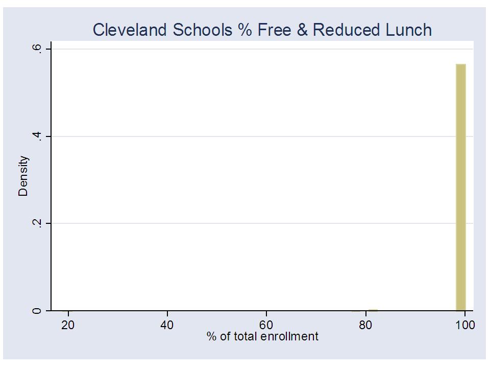
Remember, here’s the variance in % free or reduced lunch across Cleveland Schools.Not very useful, is it?

Is Cleveland just a huge outlier?

Well, in Texas, in 2007:

93% of Dallas elementary schools had over 80% free + reduced lunch

84% of Houston elementary schools had over 80% free + reduced lunch

100% of San Antonio elementary schools had over 80% free + reduced lunch

As such, any analysis which uses only this measure to capture variations in economic status of students across schools within these districts should be interpreted with caution.

Rule 2: Reporting of Relationships between Variance in Poverty and Outcome Measures

If using a single dummy variable to identify kids as qualifying for free or reduced lunch, report the relationship between that variable and student outcome measures. We know from various studies that gradients of poverty and household resources do have strong relationships with student outcome measures. If, at the classroom or school level, the percent of children who qualify for free or reduced lunch has only a modest to weak relationship with classroom or school level outcomes, chances are your poverty measure is junk (That is, there is a greater likelihood that this finding represents a flaw in the poverty measure – lack of variance – than in the likelihood that you are evaluating a system where the poverty-outcome relationship has been completely disrupted. Further, to be confident of the latter, we have to fix the former).

In high poverty settings, your measure may be junk because the range of shares of kids who qualify for free or reduced lunch only varies from about 70% or 80% up to 100%. That is, across nearly all classrooms, nearly all students are from families fall below the 185% income level for poverty. Much of the remaining variation between 80% and 100% is just reporting noise or error.

Any legitimate measure of child poverty or family income status, when aggregated to the classroom or school level will likely be significantly, systematically related to differences in student outcomes. Report it! If it’s not, the measure is likely insufficient. HAVE THE INTEGRITY TO POINT THAT OUT.

EXAMPLE

The following two graphs show us how important it can be to explore using alternative poverty thresholds, such as looking at numbers of children falling below the 130% income threshold versus the 185% threshold in a high poverty setting. The goal is to find the measure that a) works better for picking up variation across school settings or classrooms and b) as a result, picks up poverty variation that may explain differences in student outcomes.

Figure 1 shows the relationship between school level % free OR reduced lunch and 8th grade math proficiency in Newark in 2009

While there appears to be a relationship, most schools fall above 80% free or reduced lunch and the relationship between this poverty measure and student outcomes seems surprisingly weak. On the one hand, we could draw the conclusion that this means that all NPS schools are just so high in poverty that it really doesn’t matter (a ridiculous assertion, to say the least). That all of the kids are poor, and these high poverty levels affect their outcomes similarly, and those remaining variations are all about good and bad teaching, and charter versus traditional public schools.

Figure 2 shows the relationship between school level % free lunch only and 8th grade math proficiency in Newark in 2009

When we use a more sensitive measure, we nearly double the amount of variation we explain in student outcomes, and we severely undermine those conclusions above. From 40% to 80% free lunch there exists a pretty darn strong relationship with student outcomes. Above that, it still erodes somewhat. But this too might be clarified by using an even stricter poverty threshold or a continuous measure of family income. CLEARLY, IT WOULD BE INSUFFICIENT TO USE THE FIRST MEASURE OF POVERTY – FREE + REDUCED – AS A CONTROL VARIABLE IN AN ANALYSIS OF NEWARK SCHOOLS, OR FOR THAT MATTER AN EVALUATION OF NEWARK TEACHERS.

Rule 3: Reporting of Numbers/Shares of Cases Potentially Affected by Omitted Variables Bias (extent to which crude poverty measure compromises validity of model results)

Let’s say you or I have taken each of these first steps, but we decide to go ahead and conduct our analysis of charter school effectiveness, or ratings of individual teacher value added anyway, using the single student level dummy variable for “poorness” (based on free or reduced price lunch).  After all, we’ve got to publish something? Now it is incumbent upon you (or I), the researcher, to appropriately represent the extent to which these data shortcomings may bias your (or my) analyses.

For example, in an analysis of teacher effects, it would be relevant to report the number and share of teachers with classrooms having 80% or more children who qualify. Why? Because you’ve chosen statistically to assume that every one of their classrooms full of children are statistically the same in terms of economic disadvantage – EVEN WHEN THEY ARE NOT!  Those teachers with the lowest income children may be significantly disadvantaged by this “omitted variables” bias in the model.

Why not just report the overall correlation between effectiveness ratings and classroom level % free or reduced lunch? Yeah… You’re banking on getting that low correlation between teacher effectiveness ratings and % low-income, so you can say your ratings aren’t biased by poverty. Not so fast. You’re likely wrong in making that assertion, given the data. Instead, what you’re showing is that your really crappy poverty measure simply failed to pick up real differences in economic status across classrooms and thus failed to correct for differences in true economic status of students when determining teacher ratings. And then, your crappy poverty measure remained uncorrelated with the biased estimates it helped produce. Really helpful? eh?

Fess up to reality, and report the numbers of teachers across which your model does not effectively control for economic status differences among students – all teachers with classrooms that are say, 80% or more, free or reduced price lunch. HAVE THE INTEGRITY TO POINT THAT OUT.

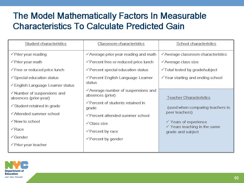
Here are the factors in the NYC Value-added model. How many teachers have classrooms that are treated as statistically equivalent when they are not? Any teacher effectiveness model applied in a high poverty setting – like a large urban district – that relies solely on the single “low-income” dummy variable – is likely entirely invalid for making comparisons across very large shares of teachers included in the model.

EXAMPLE

So, could we really draw wrongheaded conclusions by using insensitive poverty measurement, and by not checking and fully reporting on distributions? Here’s one example how we might make stupid assertions, using data from 2007 on schools in the Cleveland metro and in the City of Cleveland.

Figure 3 shows the relationship across all elementary schools in the metro and in Cleveland city between % free or reduced lunch and percent passing state assessments

Now, lets assume that we are trying to figure out if for some reason, Cleveland has been unusually successful at disrupting the relationship between % free or reduced lunch and student outcomes, and we wish to compare the relationship within Cleveland to the relationship across all schools surrounding Cleveland. If we didn’t do the visual above, we might miss something huge (actually, given the Cleveland quirk – 100% of schools 100% free or reduced, we likely wouldn’t miss this, but in other less extreme cases we might).  Here the pattern shows a very strong relationship between % free or reduced lunch and student outcomes across all schools, and absolutely no relationship between free or reduced lunch and outcomes in Cleveland – A freakin’ miracle! BUT IT’S ENTIRELY BECAUSE THERE’S NO FREAKIN’ VARIATION IN THE POVERTY MEASURE WITHIN CLEVELAND!

We can easily use this same pattern to our advantage to show that the state of Ohio has made progress on the distribution of funding by poverty across schools, but that Cleveland and other cities have not followed through, and are the real problem. That is, that funding per pupil is more tightly related to poverty between districts than across schools within districts. States have fixed the between district problem, but cities have not fixed the within district problem. This is a common Center for American Progress and Ed Trust claim (which is completely unfounded).

Figure 4 shows the estimation of the within and between district funding-poverty relationships for the Cleveland area, in a (completely bogus) way that supports the CAP and Ed Trust claim.

Yes, Cleveland provides and absurd extreme. But, this same problem occurs when comparing any city where variation in the poverty measure across schools ranges from 80% to 100% and where variation in the poverty measure across districts ranges from 0% to 100% (See Newark example above).

No more excuses

The problem for researchers and evaluators is that states maintain multiple data systems that don’t always include the same gradients of data precision. We can find in STATE SCHOOL REPORTS – SCHOOL AGGREGATE DATA systems, information on the numbers and shares of school enrollment that are free lunch, reduced lunch, and sometimes other indicators such as homelessness. But, these data are not included in the STUDENT LEVEL DATA SYSTEM LINKED TO ASSESSMENT OUTCOMES. Instead, those data systems which must be used for value-added modeling or for measuring effectiveness of specific reforms, such as enrollment in charters, include only a handful of simple indicator variables about each student.

Therein lies the typical research excuse – one that I use as well. “It’s what we have! You can’t expect us to use something better if we don’t have it!” No, I can’t. No, we can’t expect you (or I) to use something better if we don’t’ have it. BUT WE CAN EXPECT AN HONEST REPRESENTATION OF THE SHORTCOMINGS OF THESE DATA. And those shortcomings are HUGE, and the stakes are HIGH, especially when we are using these data to compare teacher effectiveness and determine who should be fired, or when we are asserting that charter schools more effective with low income students (if they aren’t actually serving the lower income students).

Readers: Please send along examples of recent prominent studies where the reported statistical model uses only a single indicator for free or reduced lunch to control for either or both a) differences across individual students and b) differences in peer groups, or classroom level effects.

WHAT ABOUT LOS ANGELES, WHERE THE LA TIMES MODEL USED ONLY A SINGLE DUMMY VARIABLE ON FREE+REDUCED LUNCH (actually, the technical report refers ambiguously to students qualified for Title I, with no definition of the variable at all! http://www.latimes.com/media/acrobat/2010-08/55538493.pdf)?

Well, the vast majority of Los Angeles elementary schools have over 80% children qualifying for free + reduced lunch, suggesting that this measure simply won’t capture relevant variation across settings. The majority of LA schools (and classrooms within them) will be treated as statistically equivalent in terms of poverty in a model which only identifies poverty  by free + reduced lunch. (data are from the NCES Common Core for 2008-09)

Simply adjusting the poverty threshold downward to the free lunch cut off, spreads the distribution – capturing considerably more variation across schools:

Still the majority of LAUSD elementary schools are over 80% free lunch, indicating that even this measure is likely not sufficiently sensitive to underlying differences in poverty/economic status. Again, it is simply an irresponsible assertion to claim that these schools which have over 80% of children who fall below the 130%, or 185% income level for poverty are pretty much the same. Using a statistical model that claims to correct for economic status, but uses only this measure to do so – depends on that irresponsible assertion! At the very least, this is an assertion that requires considerably more investigation.

Blank Slate: Private School Leaders Step Up!

I’ve noted on several occasions on Twitter (@schlfinance101) and on my blog that I am actually a supporter of high quality private independent schools. In the 1990s, I was a middle school science teacher at The Fieldston School in Riverdale, NY.  That experience sticks with me to this day as I write about public education policy issues. In fact, Fieldston helped provide the financial support for the pursuit of my doctoral studies at Columbia University, and for that I thank them. Yes, they helped pay for the meaningless advanced degree that eventually led me to leave (so perhaps it was worth it for them?).  Being at a school that supported my own academic/intellectual endeavors was important for me, and I expect I’m not alone in that regard. In high school, I summered at Phillips Exeter Academy after my sophomore year. I attended an expensive, competitive small liberal arts college (Lafayette, in PA – more on that at a later point in time).  I’ve spent much of my time around private education, in particular, the more elite tiers of private education. I have no shame in those affiliations (generally speaking), and on some occasions, I’m actually proud of it.

I have a genuine appreciation for what these institutions can offer.  I am by no stretch of the imagination a private- school-basher (as some would characterize anyone who dares point out that good private schools often spend much more per child than nearby public schools).  Anything but. I am a realist. I am an analyst. I have written extensively about private school spending and characteristics in this report: http://nepc.colorado.edu/publication/private-schooling-US

That said, this blog post is intended to START a conversation. This blog post is an invitation and is specifically an invitation to headmasters, deans and other administrators and board members at leading private independent schools around the country.  You can e-mail me officially, by name and school affiliation, or you can, if you choose to, remain anonymous, as long as you are willing to allow me to at least list your “title” and a brief descriptor of the school you represent (for example: Head of Upper School, Highly Selective Independent Day School in Northeastern City).  There are two issues I invite you to address:

  1. What is your perspective on the importance of class size, either from the perspective of “effectiveness” (on student outcomes) or marketing? Do you feel that class size is important? Why? What drives your decisions about class size in your school? Feel free to stray outside these narrow questions.
  2. What are your thoughts on the recruitment, selection, retention, evaluation and compensation of teachers? (yeah… that’s a lot, but feel free to focus on one or two). What is your ideal approach to teacher evaluation?  What is the current approach in your school, and what are the strengths/weaknesses? Have you changed that approach over time? Who are the key players in the evaluation process and what are their roles? How are evaluations used (dismissal?).   How is compensation structured? Is it performance based and if so, by what types of measures?  Feel free to elaborate on other related issues not listed here.

You may use the comment section below, or you may e-mail me at educpolicy@gmail.com.  If you post in the comments below, you must provide me with a valid e-mail for determining that you are, in fact, who you claim. Comments are held for approval. If you wish to remain anonymous, send an e-mail to the above address and provide me with the relevant – Title – School Descriptor – for how you wish to be identified (that is, not identified). Identify specifically which information in your e-mail you wish for me to post (more importantly, if there’s anything you want to say, but don’t want posted).

Thanks!

Bruce D. Baker

============================

Ron Reynolds of The California Association of Private School Organizations Responds, with a focus on CLASS SIZE:

============================

Dr. Baker,

Sorry this took me so long, but work beckons…

In the interest of full disclosure, I am neither the headmaster, dean, administrator, or board member of “a leading private independent school,” nor do my views necessarily reflect or represent those of any such persons.  I am the executive director of the California Association of Private School Organizations, a statewide association of private school administrative units and service agencies affiliated with the Council for American Private Education.  The views that follow are my own.

Setting aside the question of what criteria designate a “leading” private independent school, independent schools, whether “leading” or otherwise, comprise a relatively small, if remarkable segment of the nation’s private school universe.  Such schools (which I regard as schools affiliated with the National Association of Independent Schools) account for roughly 5 percent of all private schools in the United States, and 11 percent of all private school students enrolled in any of grades K-12.

Journalists frequently write of independent schools as if they were representative of the entire private school universe.  While misleading, the tendency is, to some extent, understandable, given that the National Association of Independent Schools collects and maintains an impressive array of data that is largely inaccessible, or nonexistent for the broader U.S. private school universe.

You, Professor Baker, are no stranger to this problem.  As Willie Sutton did with banks, so did you resort to using private school tax returns as your principal source of information for the paper referenced in your invitation (“Private Schooling in the U.S.: Expenditures, Supply, and Policy Implications”) because that’s where the data are.  While the use of figures contained in IRS Form 990 reflects an admirable degree of ingenuity, such creativity comes at the cost of generalizability – a lacuna which you, admirably, observed.  One piece of information I believe you failed to mention, however, is that private schools operating on a for-profit basis appear to be completely excluded from your analysis.  Such schools do not comprise an insignificant sub-group.  In the state of California, for example, for every independent school there are more than five private schools operating on a for-profit basis (though independent schools, in the aggregate, enroll a greater number of students).

You, of course, are in no way responsible for the absence of such data, and I, to the extent that I am a representative of the broader private school community owe you and others a mea culpa.  Regrettably, the lack of such data also complicates determinations of class size.  In order to address the issue of class size from a broadly inclusive private school perspective, it is necessary to use student-to-teacher ratios as a proxy measure.  I am cognizant that such a proxy presents certain problems, just as you recognized that the use of IRS Form 990 data was less than ideal.

With the preceding caveat in mind, NCES data place the student-teacher ratio for all U.S. public schools in 2007-08 at 15.7.  Some readers will reflexively respond to this datum by saying, or thinking that such a figure is misleading.  After all, not all teachers included in the computation of the ratio are assigned to (regular) classrooms.  A great many, for example, work with children presenting various types of special needs.

While such a qualification undoubtedly possesses merit, it must also be noted that the reduction in class size attributable to the inclusion of special education teachers comes at a considerable cost.  The federal government, for example, currently allocates $11.3 billion (the vast majority of which flows to public schools) through the Individuals with Disabilities Education Act, to support the provision of special education and related services.  I’m not sure whether you, Professor Baker, included such funding in your computation of public school expenditures, but $11.3 billion would provide roughly enough tuition to nearly double the current national Catholic school enrollment.

All of the above is offered by way of cautionary preface to the qualification that any comparative discussion of class size is subject to various contextual and methodological considerations that can prove problematic.  That having been said…

While smaller class sizes, relative to public schools, has long been a hallmark of American private education, significant variability can be inferred to exist within the private school universe.  For example, the (FTE) student-teacher ratio for all California private schools in 2009-10 was 12.5.  Among independent schools, the figure was 9.4.  In for-profit private schools the ratio was 7.8, while among the state’s Catholic schools it was 18.7 – eclipsing the national public school ratio cited above, but falling short of California’s public school student-teacher ratio of 20.8.  (These ratios have been computed using California Department of Education data for 2009-10.)

Magnitude of enrollment appear to be positively correlated with student-teacher ratios.  (Yeah, I know.  D’uh!  But independent schools may present an exception to this observation which, if true, invites comment.)  Among all California private schools with a total enrollment in excess of 100 students, the student-teacher ratio was 13.9, while the ratio was 14.5 for schools with enrollments of more than 250, and 14.8 for schools with enrollments exceeding 500.

Religious orientation would also appear to be a significant factor.  Fully fifty percent of California’s total private school enrollment is located in religious schools with total enrollments exceeding 250.  In these schools, the student-teacher ratio is 16.1 – a figure that is higher than the NCES national public school figure cited above.  Obviously, the generally lower levels of tuition charged by schools whose religious mission includes making their educational program available to every family seeking access tends to reduce financial barriers to enrollment and contribute to presumptively larger class sizes.  Which points to the expectation that an inverse relationship exists between tuition and class size.  (Alas!  If only comprehensive tuition data were available.)

Independent schools, in which tuition is generally higher than that associated with most religious schools (though it must be noted that some religious schools are also classified as independent schools) serve to underscore the preceding observation.  Among California independent schools with enrollments in excess of 500 students, the overall student-teacher ratio is 9.9, fully a third lower than the figure for the remainder of all California private schools with similarly robust enrollments.

At this point, I envision you, Professor Baker, muttering: Now you know why I focused on independent schools in the first place!  So, allow me to tell you, at long last, what I think it is that is being offered/purchased for the money.

The premium paid by private school parents is part of a complex value proposition in which inducements to participation must outweigh associated sacrifices.  Several components of this value proposition involve class size.  As I see it, these components include the provision of an augmented curricular program, and increased access to instructional staff by both students and parents.

You, Professor Baker, taught at The Fieldston School.  A check of that school’s website reveals that Fieldston offers its lower school students a wood shop program, provides dance and visual arts classes to its middle school students, and affords its high school students the opportunity to study Greek, Latin, and/or Mandarin Chinese, in addition to French and Spanish.  Along with its additional courses, the school offers a specialized, pervasive approach to instruction that is expressed as follows:  “At every grade we teach common beliefs such as understanding multiple perspectives, seeing the world beyond the self, creativity and imagination, developing habits of justice, fairness, and empathy, respect for all people and points of view, and a critical approach to decision-making.”

I don’t think it’s much of a stretch to assume that most independent schools offer a more robust variety of classes across the curriculum, and particularly in the arts and humanities, than is generally the case in both public schools and other private schools.  The provision of an augmented curriculum is driven by a combination of factors that include various visions of what is entailed by a robust humanistic education that endeavors to shape the whole person, market demand, and resources.

Your research found that Jewish day schools tended to spend more, per pupil, than other categories of private schools.  These schools generally offer not only a full complement of secular studies courses, but instruction in Hebrew language, bible, rabbinic literature, Jewish history, customs and holidays, and Israel studies.

To some extent, then, I would argue that smaller class size in private schools is a by-product of a more robust prescribed curriculum, coupled with a great number of elective offerings.

I also believe that in exchange for the tuition premium paid by parents there exists an expectation of greater access – both by students and parents – to the instructional staff.  While many in the private school community often view teachers in religiously-oriented schools as members of a family – a voluntary community that coalesces around a shared faith and common core of values, the same is often true of independent school faculty members who identify deeply with the culture and vision associated with their particular school.

In both independent and religious private schools, the expectation of enhanced teacher availability, responsiveness, and commitment is often deeply engrained in the culture of the institution.  Private school parents often possess teachers’ phone numbers and e-mail addresses, and frequently contact them after school hours.  Teachers are expected to provide more robust and time consuming forms of student evaluation, ranging from extended homework assignment feedback, to participation in more frequent student and parent conferences, to in-depth written assessments of student portfolios and/or journals, participation in child study meetings, and extensive written documentation of student growth and academic progress.   Smaller class size is thus, to some extent, a by-product of enhanced labor-intensive expectations held by parents, those involved in school governance, and teachers, themselves.

Best,

Ron

Dr. Ron Reynolds

Executive Director

California Association of Private School Organizations

15500 Erwin St., #303

Van Nuys, CA 91411-1017

==================

My personal response on few points above:

==================

Yes, a major issue in making comparisons between public and private schools is that private schools – because they are less regulated – are simply more varied. This point is, as Ron Reynolds notes, missed by most. As my report discusses, some private schools significantly outspend publics and some spend much less. Some have much smaller classes, and some much larger. Some pay their teachers much less, and some comparable (few private schools pay their teachers much more – the additional money is more often leveraged to broader/deeper curriculum).

Also, it is often the case that the biggest differences in private school class size are not so much a function of smaller elementary grade classes (they are smaller, but not usually half the size), but rather a function of private schools offering a diverse array of elective courses at the secondary level.

Now, from a personal perspective, I agree that the expectation of parental involvement/interaction is greater in the private school setting, especially in a private independent school like Fieldston. However, I would argue that there are some significant counterbalancing factors. For example, at Fieldston, my teaching time consisted of 16 45 minute periods per week – 4 sections meeting 4 times weekly each. Each section typically had fewer than 20 students. On top of that I had 10 to 12 advisees – from among my total student load of less than 80. Maintaining contact with the parents of 12 students, actively, and being responsive to the needier parents from among the 80 students is much less of a task than most public (or Catholic school) teachers would face if expectations were similar. It was far fewer students than I would have had if I was teaching middle school science in a public school with 6 classes, meeting every day of the week, and 25 kids per class. And there was a lot more time in my day to make contacts.  These may be important structural issues to explore. But they all come back to pupil to teacher ratio.

Graph of pupil to teacher ratios over time: https://schoolfinance101.com/wp-content/uploads/2010/10/slide23.jpg

Bruce

==================

Dr. Baker,
“What is your perspective on the importance of class size, either from the perspective of “effectiveness” (on student outcomes) or marketing? Do you feel that class size is important? Why? What drives your decisions about class size in your school? Feel free to stray outside these narrow questions.
STAR Prep Academy is a small school by design and we cap all classes at ten students.  We do this for the following reasons: 1) We believe quite strongly in differentiation.  With a smaller class we can use information about student interests and abilities to differentiate instruction within the class.  With a larger group, teachers have difficulty working on diverse projects that match student needs.  Furthermore, smaller class sizes reduce paperwork, total student load, time spent passing out papers, etc.  Many schools use small class size as a marketing tool, but if they do not actually utilize those small class sizes, it is just a number.
“What are your thoughts on the recruitment, selection, retention, evaluation and compensation of teachers? (yeah… that’s a lot, but feel free to focus on one or two). What is your ideal approach to teacher evaluation?  What is the current approach in your school, and what are the strengths/weaknesses? Have you changed that approach over time? Who are the key players in the evaluation process and what are their roles? How are evaluations used (dismissal?).   How is compensation structured? Is it performance based and if so, by what types of measures?  Feel free to elaborate on other related issues not listed here.”
Teacher evaluation should be done in an developmental manner, allowing veteran teachers an opportunity to share their knowledge base and guide their own development, while new teachers receive more formative guidelines.  While we do not currently use evaluations for compensation, we do consider this as a key component in the future.  We would also add adjunct duties, participation in outside events and other criteria to the compensation model.  Annual raises, outside of COLA do not seem to be appropriate within our environment.
Regards,
Zahir Robb
Head of School
STAR Prep Academy
10101 Jefferson Blvd.
Culver City, CA 90232
(310) 842-8808


ConnCan Cluelessness

Or is it just a school finance Conn-job, in a CAN?

In their response to my Think Tank Review of Spend Smart: Fix Our Broken School Funding System,  ConnCan asserts that I claim that Connecticut’s school finance formula is not broken.  (see: http://ht.ly/4BknI)

As I state in my report, it’s not that the formula is not problematic, but that ConnCan fails to make any reasonable case that it is – even though it is. Their analysis is simply too shoddy, weak, incompetent to validate that it is broken, or how it is broken. I explain:

There may in fact be legitimate concerns over the equity and adequacy of funding to Connecticut schools as a result of significant problems with the Education Cost Sharing Formula. However, the ConnCAN Spend Smart report provides little or no supporting evidence for their claim that the system is broken or how their proposals would be an effective solution if it indeed is in need of repair.23

I actually show some of the problems in my brief, and have shown these problems in the past. My point in the critique is that ConnCan’s shoddy brief does little to help one understand the problems with the CT school finance system, and in fact provides multiple distractions and significant misinformation.

ConnCan also asserts that I claim that their proposal would harm low income children. Rather, I assert that ConnCan recommends only a relatively low weight for children qualifying for free or reduced price lunch and that they ignore entirely districts with high concentrations of LEP/ELL children.

ConnCan argues that I unfairly suggest that they oppose weighting for LEP/ELL children. While they do hold open the possibility that those children might receive supplemental funding in the future, they also suggest that they have done analysis already, or know of analysis, that indicates that it probably isn’t necessary. This suggestion is not backed by anything, and is completely irresponsible.

Here’s their footnote on this point:

―The formula could also hypothetically provide weights for other student needs, such as English Language Learner status. However, data shared by Connecticut State Department of Education with the State‘s Ad Hoc Committee to Study Education Cost Sharing and School Choice show that the measure for free/reduced price lunch also captures most English language learners. In other words, there is a very strong correlation between English language learner concentration and poverty concentration in Connecticut. In addition, keeping the formula simple allows a more generous weight for students in poverty‖ (p. 7, FN 12).

And here’s my response to their footnote:

This finding is cited only ambiguously in a footnote to data shared by CTDOE. In some states, a strong relationship between the two measures might warrant collapsing supplemental aid for LEP and low-income children into one student-need factor—with sufficient additional support to meet the combination and concentration of needs. However, a quick check of the data in Connecticut shown in Figure 1 (below) reveals that several districts have disproportionately high LEP concentrations relative to their low-income concentrations—specifically Norwalk, Danbury, New London, Windham, Stamford and New Britain. (figure in review)

And:

The overall correlations between ELL concentrations and subsidized lunch rates are not sufficiently strong (only a 0.50 correlation in 2008-2009) to select a single factor for addressing both needs. Nor does the report offer any actual analysis in drawing this conclusion (see Table A1, Appendix). Table A1 in the Appendix to this review provides a quick check of the correlations between wealth measures, income measures and student populations for 2005 and 2009.

That nitpicking aside, my big concern with the ConnCan report in this regard is that they provide absolutely no support for any of their recommendations, and in some cases state as fact, conclusions that turn out to be FLAT OUT WRONG.

I explain:

Further, some of the statements and recommendations made in the report, such as those pertaining to LEP/ELL children, are simply wrong. And these factual mistakes have significant consequences for the validity of the report‘s recommendations. By combining the ELL mistake with the proposal that ―money follow the child‖ (the weighted student funding formula), the report‘s recommendations would apparently be a boon to advocates for charter expansion. However, the weighted funding formula is a tangential argument at best, not supported by any of the claims in the report, and one that seeks to divert significant resources from schools with the highest demonstrated needs.

Finally, regarding the issue of poverty and driving money to charters, ConnCAN seems to not fully understand how their own proposal works – which I guess doesn’t really surprise me. Let’s break it down:

  1. CT charters serve fewer free lunch kids (<130% poverty level)  than their host districts, but serve relatively more free or reduced price lunch (<185% poverty level) kids (they have more of the less poor among the poor)
  2. Take any given sum of money and distribute it by free + reduced lunch kids and charters make out better. At a zero sum re-allocation, providing a smaller weight on free or reduced lunch kids versus a larger weight on free only shifts some of that money to charters.
  3. CT charters have very few ELL/LEP kids, so they wouldn’t benefit from a weight on these kids.
  4. Arguing to not have a weight on ELL/LEP kids and to instead reallocate that sum of money to the free or reduced price lunch weight, drives that money into charters – as well as other districts with higher free and reduced price lunch shares but fewer ELL/LEP kids. THIS IS EXACTLY WHAT THEY ARGUE FOR! (see red above)

If we assume state finance formulas to work within fixed budget constraints (which they do), this strategy, based on a lie of no need for an ELL/LEP weight, is effectively robbing the ELL/LEP populations to subsidize the less poor among the poor.  This is a classic weight shifting game.

For the complete review, see: http://nepc.colorado.edu/files/TTR-ConnCan-Baker-FINAL.pdf

Previous policy brief on CT School Finance & Money Follows the Child: CT and Money Follows the Child