Blog

School Finance through Roza-Tinted Glasses: 5 School Funding Myths from a single Misguided Source

I’ve reached a point after these past few years where I feel that I’ve spent way too much time  critiquing poorly constructed arguments and shoddy analyses that seem to be playing far too large a role in influencing state and federal (especially federal) education policy. I find this frustrating not because I wish that my own work got more recognition. I actually think my own work gets too much recognition as well, simply because I’ve become more “media savvy” than some of my peers in recent years.

I find it frustrating because there are numerous exceptional scholars doing exceptional work in school finance and the economics of education whose entire body of rigorous disciplined research seems drowned out by a few prolific hacks with connections in the current policy debate.It may come as a surprise to readers of popular media, but individuals like Mike Petrilli, Eric Osberg, Rick Hess (all listed on the USDOE resource web site) or Bryan Hassel wouldn’t generally be considered credible scholars in school finance or economics of education. I’d perhaps have less concern – and be able to blow this off – if many of the assertions being made by these individuals – and others – weren’t so often completely unsupported by reasonable analysis and if those assertions didn’t lead to potentially dangerous and damaging policies.

This post is specifically about the body of methodologically flimsy research produced in recent years by Marguerite Roza, previously of the Center on Reinventing Public Education and currently an advisor to the Gates Foundation.

Why this post now? I’ve simply lost my patience.

This post is in part a response to the recent unveiling of the U.S. Dept. of Education web site on improving educational productivity http://www.ed.gov/oii-news/resources-framing-educational-productivity. Amazingly, this site lists primarily non-peer reviewed, shoddy work by Marguerite Roza and colleagues and bypasses entirely more serious research on educational productivity or methods for evaluating it.  The quality of some of the examples on this site is particularly abysmal. Yet it is presented as “the work of leading thinkers in the field.” (interesting that “thinkers” is used in place of “researchers.”) Among the worst examples, this site lists as a credible resource the Center for American Progress Return on Investment analysis. (by Ulrich Boser, a great writer on the topic of art theft, but in this case, a bit out of field).

I don’t mind so much that this stuff exists. But it certainly doesn’t belong in a serious policy conversation, nor does it represent “the work of leading thinkers in the field.”

Let’s start with a few common attributes of the worst-of-the-worst types of policy research floating around out there and warping and misguiding the education policy debates in general and school finance debates in particular. For lack of a better term, let’s just call it “hack research.”

Perhaps most importantly, hack research fails to recognize all of the credible work that’s already been done on a topic, typically because the research hack who produced it lacks entirely the discipline to bother to understand that body of work and how to build on it in order to come to new, credible findings and conclusions.

Further, hack research displays little regard for the connection between rigorous analysis and conclusions that may be drawn from it. This stems in part from the lack of discipline to actually conduct rigorous analyses.

Particularly effective hacks will not just ignore the body of existing scholarship but will do so belligerently, proclaiming that no good work has ever been done, no credible methods of analysis do exist, and therefore the time is right for their own creative and new perspective! The hack research method substitute is usually some seemingly intuitive, completely shallow, poorly conceived back-of-the-napkin approach. In other words, the hack research motto is that we must think outside the box, because it’s just too much work to open and unpack that box!

Many of us start as hacks, but eventually grow out of it as we realize that there’s a lot of great stuff out there to read and exceptional scholars from which to learn. And, some non-hacky researchers will occasionally hack. Hack happens. It’s only really problematic when it’s a persistent pattern of hackyness or even gets worse over time.

The most dangerous hacks use their shtick to influence policy with catchy anecdotes, convincing policymakers and major players that they need look no further (at real research, for example) than their own hacky “research.”  And the most effective hacks can spin findings that never were into pure urban legend – well-accepted myths turned realities – with serious policy implications!

Let’s take a look at a number of mythical findings from shoddy research produced by Marguerite Roza in recent years, including a few sources cited on the USDOE resources page.

Myth #1: States have largely solved between district funding disparities and within district disparities are the remaining problem of the day.

Sources of the myth: See references in Baker/Welner article (cited below)

A now common myth in school finance reiterated in numerous sources produced by the Education Trust, Center for American Progress and other DC think tanks and pundits is that states have largely resolved disparities in funding between districts and that persistent disparities are primarily within districts, between schools – a function of illogical district allocation formulas.

In a recent article Kevin Welner and I tackle this argument and dig deeply into the sources behind this argument, which invariably find their way back to Marguerite Roza, then of the Center on Inventing Research Findings – excuse me – Center for Reinventing Public Education (CRPE).

Kevin and I conclude in our article:

 Two interlocking claims are being increasingly made around school finance: that states have largely met their obligations to resolve disparities between local public school districts and that the bulk of remaining disparities are those that persist within school districts. These local decisions are described as irrational and unfair school district practices in the allocation of resources between individual schools. In this article, we accept the basic contention of within-district inequities. But we offer a critique of the empirical basis for the claims that within-district gaps are the dominant form of persistent disparities in school finance, finding instead that claims to this effect are largely based on one or a handful of deeply flawed analyses.

Kevin Welner and I dissect in detail the problematic, “non-traditional” methods Roza and colleagues use for conducting their analyses (ignoring real methods used by real researchers in real publications), but perhaps more interesting are those cases where a narrow, measured finding pertaining to one specific estimate in one specific context becomes a national trend, a dominant reality soon thereafter. Op-Ed columns by Roza on the topic of within versus between district funding disparities include particularly egregious examples. Kevin Welner and I explain:

Following a state high court decision in New York mandating increased funding to New York City schools, Roza and Hill (2005) opined: “So, the real problem is not that New York City spends some $4,000 less per pupil than Westchester County, but that some schools in New York [City] spend $10,000 more per pupil than others in the same city.” That is, the state has fixed its end of the system enough.

This statement by Roza and Hill is even more problematic when one dissects it more carefully. What they are saying is that the average of per pupil spending in suburban districts is only $4,000 greater than spending per pupil in New York City but that the difference between maximum and minimum spending across schools in New York City is about $10,000 per pupil. Note the rather misleading apples-and-oranges issue. They are comparing the average in one case to the extremes in another.

In fact, among downstate suburban[1] New York State districts, the range of between-district differences in 2005 was an astounding $50,000 per pupil (between the small, wealthy Bridgehampton district at $69,772 and Franklin Square at $13,979). In that same year, New York City as a district spent $16,616 per pupil, while nine downstate suburban districts spent more than $26,616 (that is, more than $10,000 beyond the average for New York City). Pocantico Hills and Greenburgh, both in Westchester County (the comparison County used by Roza and Hill), spent over $30,000 per pupil in 2005.[2] These numbers dwarf even the purported $10,000 range within New York City (a range that we agree is presumptively problematic); our conclusion based on this cursory analysis is that the bigger problem likely remains the between-district disparity in funding.

For the full take down, see:

Baker, B. D., & Welner, K. G. (2010). “Premature celebrations: The persistence of interdistrict funding disparities” Educational Policy Analysis Archives, 18(9). Retrieved [date] from http://epaa.asu.edu/ojs/article/view/718

Myth #2: America’s public school system suffers from something called Baumol’s disease, therefore the only solutions must be found outside of public education

Source: Curing Baumol’s Disease: In Search of Productivity Gains in K–12 Schooling Paul Hill, Marguerite Roza

While I don’t think this one really ever caught on, it’s so absurd that it must be addressed. Further, it’s actually cited on the USDOE resources in educational productivity page despite the fact that it offers no useful guidance whatsoever on the topic.

The objective of this policy brief by Paul Hill and Marguerite Roza of CRPE is to explain how American public education suffers from Baumol’s disease, or “the tendency of labor-intensive organizations to become more expensive over time but not any more productive.” Hill and Roza’s attempt at empirical validation that American public education suffers from Baumol’s disease is presented in two oversimplified figures, a graph showing increased number of staff who are not core teachers (Figure 1) and a graph showing that student test scores on the National Assessment of Educational Progress have remained flat over time (Figure 2).  The latter claim that we’ve seen no improvement in NAEP scores over time is contested.[1] And the former claim, when aggregated nationally is not particularly meaningful. The authors provide no empirically rigorous link between the two.

Rather, the casual reader is simply to assume that public schools have added a lot of non-teaching staff and have, on average, nationally seen no yield for that increase costs. Hill and Roza posit:

“While these indicators clearly point to increased costs for education, efforts to quantify productivity changes have been hampered by measurement challenges on the outputs side of the equation. By most accounts, key indicators of outcomes have not shown comparable gains. A thirty-year look at NAEP performance for seventeen year-olds, for instance, suggests that test scores have changed very little.” (p. 3)

While this may, in fact, not be entirely untrue, the authors provide no rigorous validation that “Baumol’s Disease” is a persistent problem of American public schools.

However, without a disease with a catchy name, there would be little reason for their proposed cure. But the proposed cure is no more thoroughly vetted or precisely articulated than the disease.  A central assumption in the Baumol’s disease policy brief is that American public education systems take on one single form, as represented by national averages in the TWO graphs provided, that there is little or no variation within the public education system in terms of resource use or outcomes achieved (e.g. that it all suffers Baumol’s disease), and that therefore the only possible cures are those that come from outside the public education system or at its fringes. That is, that we have nothing to learn from variation within the public education system itself, because there is no such variation. Instead, for example, the authors suggest a closer look at “home schooling, distance learning systems, foreign language learning, franchise tutoring programs, summer content camps, parent-paid instructional programs (music, swimming lessons, etc.), armed services training, industry training/development, apprentice programs, education systems abroad.” (p. 10)

Numerous more credible researchers have spent a great deal of time learning from the heterogeneity of how schools, school districts, and charter schools operate, as well as across states, including studying the relative efficiency of schools that either operate differently or change how they operate. The assumption that the only solutions must come from outside the system is patently absurd, when the “system” consists of 51 policy contexts, over 100,000 schools, 5,000 charter schools and about 15,000 public districts. And it’s just lazy, hack thinking.

While one might gain insights from other labor-intensive industries, or education at the fringes of the current public system, it would be foolish to ignore the extent of variation within the current American public education system, and across traditional public, magnet, charter and private schooling. Arguably, the authors present the view that there is little or nothing to learn from the current system specifically in order to avoid the need for conducting rigorous analysis of it. Further, while such policy briefs may be generously considered as useful conversation starters, we take serious issue with the U.S. Department of Education’s identification of sources of this type, which are purely speculative, and severely lacking in intellectual or empirical rigor, as “Key Readings on Educational Productivity.”

Myth #3: Poor, failing school districts have plenty of money but are squandering too much on Cheerleading and Ceramics when they need to be spending on basics!

Original Source of (the anecdote behind the) myth: “Now is a Great Time to Consider the Per Unit Cost of Everything in Education.”

As I explain in my recent conference paper:

Authors including Marguerite Roza and colleagues of the Center for Reinventing Public Education encourage public outrage that any school district not presently meeting state outcome standards would dare to allocate resources to courses like ceramics or activities like cheerleading. To support their argument, the authors provide anecdotes of per pupil expense on cheerleading being far greater than per pupil expense on core academic subjects like math or English.

  • Imagine a high school that spends $328 per student for math courses and $1,348 per cheerleader for cheerleading activities. Or a school where the average per student cost of offering ceramics was $1,608; cosmetology, $1,997; and such core subjects as science, $739.1

These shocking anecdotes, however, are unhelpful for truly understanding resource allocation differences and reallocation options, and are an unfortunate and unnecessary distraction. For example, the major reason why cheerleading or ceramics expenses per pupil are seemingly high is the relatively small class sizes, compared to those in English or Math. In total, the funds allocated to either cheerleading of ceramics are unlikely to have much if any effect if redistributed to reading or math.

Now, this myth is a rather strange one, because the source from which it comes, which is authored by Marguerite alone, really isn’t totally unreasonable. It’s not useful in any way shape or form, but it’s not unreasonable either. This wacky anecdote about cheerleading and ceramics spending comes from a piece in which Roza is trying to explain the importance of comparing unit costs of providing specific programs/opportunities. This is a rather “no duh” idea, and the working paper and eventual book chapter is built on uninteresting anecdotes, at best. The original point of the paper is that if administrators look at the per unit cost of everything, they might find some things that stand out, and some things that might be reasonably reorganized to be offered at a lower unit cost (for example, the cost of cheerleading was reduced by moving it from a class period drawing on salaried time, to an after school activity, paid by small stipend).

But, the spin from this piece has been that this is all that low performing, poor urban districts need to do. They’ve all got enough. They themselves are responsible for the most persistent inequities – not the states. And they are the ones wasting way too much on things like cheerleading and ceramics. Given that this spin has had far more traction than the more reasonable paper behind it, one might assert that this is precisely what Roza intended.

In my paper, I conclude:

Rather, the emergent story from the data in both states was the contrast between high spending, high outcome districts, and low spending low outcome districts and their respective high schools. On average, high spending, high outcome districts were as one might expect much lower in student poverty concentration and low spending, low outcome districts much higher in poverty. That is, after applying thorough cost adjustment including adjustments for differences in student needs. Interestingly, the most striking differences between these groups of districts were not in the availability of assigned teachers or courses in the arts, but rather in the distribution of advanced versus basic course offerings in curricular areas such as math and physical science.

Note that to begin with, low spending, low outcome schools had fewer teacher main assignments and fewer course assignments per pupil. As such, they were, from the outset, more constrained in their allocation options. Further, there is at least some evidence that when evaluating district wide resource allocation, low resource, low outcome districts see greater necessity or feel greater pressure to allocate a larger overall share of resources to elementary classrooms (based on Illinois findings).

More thorough analyses of this issue see:

Baker, B.D. (2011) Cheerleading, Ceramics and the Non-Productive Use of Educational Resources in High Need Districts: Really? Paper presented at the Annual Meeting of the American Educational Research Association, New Orleans, LA 2011

Myth #4: High schools in Washington State pay math and science teachers less than other teacher despite public interest and state policies which encourage paying them more

Source: Washington State High Schools Pay Less for Math and Science Teachers than for Teachers in Other Subjects Jim Simpkins, Marguerite Roza, Cristina Sepe

This is one that suffers from both major issues identified at the beginning of this rant. First, the disconnect between the “study” and the press release:

The Press Release
http://www.crpe.org/cs/crpe/view/news/111

The analysis finds that in twenty-five of the thirty largest districts, math and science teachers had fewer years of teaching experience due to higher turnover—an indication that labor market forces do indeed vary with subject matter expertise. The subject-neutral salary schedule works to ignore these differences.

The Study
http://www.crpe.org/cs/crpe/download/csr_files/rr_crpe_STEM_Aug10.pdf

That said, the lower teacher experience levels are indicative of greater turnover among the math and science teaching ranks, lending support to the hypothesis that math and science teachers may have access to more compelling non-teaching opportunities than do their peers. (p. 5)

That is, the conclusions of the study itself and the press release are, well, not consistent. But this pattern of behavior is entirely consistent for Roza and CRPE.

In a previous post I address just how ridiculous the methods in this analysis are, in which she compares STEM teacher salaries with non-STEM teacher salaries without any controls for other factors that affect salaries (on the argument that salaries shouldn’t be based on those things – experience and degree level – anyway).

All that Roza really found in this paper was that STEM teachers tend to be younger and as a result have lower average salaries than non-STEM teachers. From that, she spun the argument that because STEM teachers don’t earn more than other teachers, but STEM fields are more competitive, STEM teachers must be leaving teaching at a higher rate, leading to a less experienced pool and lower average salaries (a vicious cycle indeed! But one that’s never validated by the ridiculous analysis).

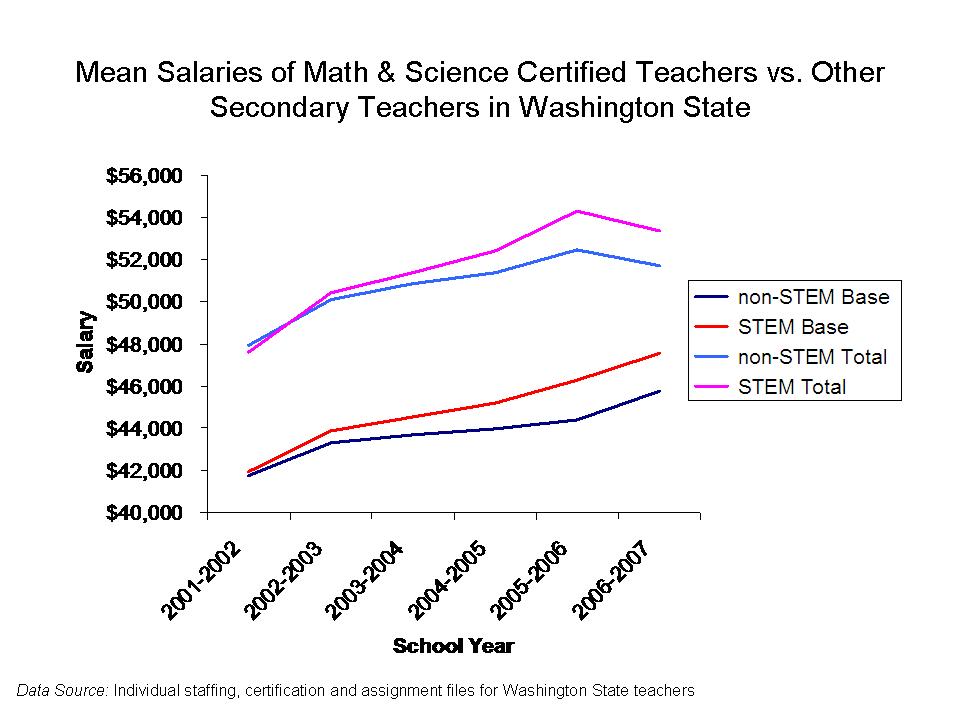
In my post, I actually evaluate several years of teacher level data on all teachers in Washington State, finding most of her conclusions to be flat out wrong. Here’s the figure on mean STEM and non-STEM teacher salaries over time: https://schoolfinance101.com/wp-content/uploads/2010/08/slide42.jpg

I also point out that credible researchers like Lori Taylor of Texas A&M have actually done better analyses of Washington teacher wages and addressed variations in labor market competitiveness by field:

Report on Taylor Study:

http://www.wsipp.wa.gov/rptfiles/08-12-2201.pdf

Taylor Study:

http://www.leg.wa.gov/JointCommittees/BEF/Documents/Mtg11-10_11-08/WAWagesDraftRpt.pdf

Somehow, not surprisingly, Roza was unaware of either this better research or the more credible methods used in this research.

For the full take down, see: https://schoolfinance101.wordpress.com/2010/08/20/new-from-the-center-on-inventing-research-findings/

Myth #5: With our handy-dandy basket of reformy fixes, we can cut significant funding from American public schools and dramatically increase productivity!

Source: Petrilli and Roza

Stretching the School Dollar (Brief)

http://www.edexcellence.net/publications-issues/publications/stretching-the-school-dollar-policy-brief.html

In their policy brief on Stretching the School Dollar, Mike Petrilli of Thomas B. Fordham Institute and Marguerite Roza of the Gates Foundation provide a lengthy laundry list of strategies by which school districts and states might arguably increase their productivity at lower expense, or “stretch the dollar” so to speak.  This policy brief is an extension of the Frederick Hess (American Enterprise Institute) and Eric Osberg (Fordham Institute) edited book by the same title.  We highlight this source because of repeated specific references to this source in Secretary Duncan’s “New Normal” speeches during the Fall of 2010.[2]

Because this policy brief and book specifically list strategies that are intended to improve productivity at comparable or lower expense, it would be particularly relevant for the book or brief to either provide directly or summarize from other sources, rigorous cost-effectiveness analysis of these options, or relative efficiency comparisons of schools and districts employing these options.   But that is apparently asking way too much of Roza or Petrilli. I’ll cut Mike some slack here, because he isn’t the one actually presenting himself as a school finance expert/scholar. That’s Roza’s role in this partnership, therefore the burden falls on her.  But after reading enough work by Roza and colleagues, I’m no-longer convinced that she is even aware that there is a body of research out there on Cost-effectiveness analysis or relative efficiency (more on this later). I certainly encourage her to go buy a copy of Hank Levin and Patrick McEwan’s book, not so subtly titled Cost-Effectiveness Analysis: Methods and Applications. It’s a relatively easy, non-academic read.

I’ll offer a primer on these methods and their application to these questions in a future post. There’s no need to beat a dead horse on this topic. I’ve taken down Roza and Petrilli’s reformy gift basket in two previous posts to which you can refer.

For the full take down, see:

Part 1 – Stretching the Truth, Not Dollars: School Finance in a Can: Unproven and Unsubstantiated Dollar-Stretching State Policies

Part 2 – Stretching the Truth, Not Dollars: Considering the Application of Cost-Benefit Analysis to Teacher Layoff Alternatives

The Offensively Defensive Ideology of Charter Schooling

There now exists a fair amount of evidence that Charter schools in many locations, especially high performing charter schools in New Jersey and New York tend to serve much smaller shares of low income, special education and limited English proficient students (see various links that follow). And in some cases, high performing charter schools, especially charter middle schools, experience dramatic attrition between 6th and 8th grade, often the same grades over which student achievement climbs, suggesting that a “pushing out” form of attrition is partly accounting for charter achievement levels.

As I’ve stated many times on this blog, the extent to which we are concerned about these issues is a matter of perspective. It is entirely possible that a school – charter, private or otherwise – can achieve not only high performance levels but also greater achievement growth by serving a selective student population, including selection of students on the front end and attrition of students along the way. After all, one of the largest “within school effects on student performance” is the composition of the peer group.

From a parent (or child) perspective, one is relatively unconcerned whether the positive school effect is function of selectivity of peer group and attrition, so long as there is a positive effect.

But, from a public policy perspective, the model is only useful if the majority of positive effects are not due to peer group selectivity and attrition, but rather to the efficacy and transferability of the educational models, programs and strategies. To put it very bluntly, charters (or magnet schools) cannot dramatically improve overall performance in low income communities by this approach, because there simply aren’t enough less poor, fluent English speaking, non-disabled children to go around. They are not a replacement for the current public system, because their successes are in many cases based on doing things they couldn’t if they actually tried to serve everyone.

Again, this is not to say that some high performing charters aren’t essentially effective magnet school programs that do provide improved opportunities for select few. But that’s what they are.

But rather than acknowledging these issues and recognizing charters and their successes for what they are (or aren’t), charter pundits have developed a series of very intriguing (albeit largely unfounded) defensive responses (read excuses) to the available data.  These include the arguments that:

  1. Lotteries don’t discriminate and charters have to use lotteries, therefore they couldn’t possibly discriminate!
  2. Charters only appear to have fewer children with disabilities because they actually just provide better, more inclusive programming and choose not to label kids who would get labeled in the public system! In particular, charters do so much better at early grades interventions that they keep kids out of special education in later grades!
  3. While one might think charters are advantaged by having fewer low income children, in reality, Charters suffer significantly from “negative selection.” That is, the parents who choose charters are invariably the parents of kids who are having the most trouble in the public system.
  4. While it appears that Charter middle schools have high rates of attrition between 6th and 8th grade, all schools really do. Charters are no different.
  5. The data are always biased against charters and never in their favor on these issues.

The foundation for these arguments is flimsy in some cases, and manipulative in others.


1. Lotteries don’t discriminate

True, lotteries alone don’t, really can’t discriminate. They are random draws. Among those students whose parents enter them into a lottery for a specific school, those who get picked should be comparable to those who don’t picked.  But that does not by any stretch of the imagination – or by much of the available data – mean that those who end up in charter schools through the lottery system are in any way representative of students who live in the surrounding neighborhoods or attend traditional public schools in the local district.

In other words:

 Lotteried In = Lotteried Out

 Not the same as:

 Charter School Enrollment = Nearby Public School Enrollment

Why aren’t these the same? Well, those who enter the lottery to begin with are only a subset of those who might otherwise attend the local public schools. That subset can be influenced by a number of things, including quite simply, the motivation of a parent to sign up for the lottery, or parental impression regarding the “fit” of the school to the child. So, if the lottery pool is selective, then those lotteried into charters are merely a random group of the selective group.

Pundits frequently point to lottery based studies of charter school effects to make their case that lotteries don’t discriminate and that therefore charter schools serve the same students as traditional public schools.

Richard Ferris and I, in our recent study of New York City Charters note:

As one would expect, Hoxby found no differences between those who were randomly selected and those who entered the lottery but were not selected. This is not the same, however, as saying that the overall population in the charter schools is demographically similar to comparison groups or non-charter public school students. While they do compare the demographics of the charter “applicant pool” to those of the city schools as a whole (see Hoxby‟s Table IIA, page II-2),30 they never compare charter enrollment demographics with those the nearest similar schools or even schools citywide serving the same grade ranges.

http://nepc.colorado.edu/publication/NYC-charter-disparities

2. Charters are just better at dealing with children with disabilities in their regular programs and therefore don’t classify them

This story takes two different forms:

Version 1: Charters simply don’t identify kids because they provide better inclusive programming

This is perhaps conceivable when addressing children with mild specific learning disabilities and/or mild behavioral problems, but much less likely to be the case where more severe disabilities are concerned. In New Jersey and in New York City, many charter schools serve few or no children with disabilities (see: https://schoolfinance101.com/wp-content/uploads/2011/01/charter-special-ed-2007.jpg ).  This can only be accomplished if the only children with disabilities who were present to begin with were those with only the mildest disabilities – making declassification reasonable. Perhaps more importantly, while charter advocates make this claim, I am aware of no rigorous large scale or even individual case study research that provides any validation of this claim.

Version 2: Charters provide better early intervention programs such that by third grade, children don’t need to be classified when they reach the grades where they typically would be classified.

I’ve only heard this argument on a few occasions and it is simply a variation on the first argument. But this argument has important additional holes in it that make it even more suspect than the first argument. Most notably, very large shares of charter schools including charter schools with disproportionately low shares of children with disabilities are charter schools that don’t have lower grades – and serve upper elementary to middle grades. In fact, nationally, 44% of charters start after 3rd grade, and in New Jersey, for example, these are the schools with very low rates of children classified for special education services.

Perhaps more importantly, while charter advocates make this claim, I am aware of no rigorous large scale or individual case study research that provides any validation of this claim.

3. Not only do charters not cream skim, they actually are disadvantaged by negative selection!

That is, among poor children or among non-poor children, some statistical models show a small effect of the average entry performance of those choosing charters to be lower. Actually, the only potential validation I can find of this is from a study of high school charter schools in Florida (and a similar study of high school voucher recipients in Florida), though some other studies speculate the existence of a small negative selection effect without strong empirical validation.

But even if we see negative selection, as typically reported in these studies, we have to consider what it is that is being reported. Typically, what is being reported is:

Initial Performance of Non-Disadvantaged Students in Charters <= Initial Performance of Non-Disadvantaged Students in Traditional Publics

&

 Initial Performance of Disadvantaged Students in Charters <= Initial Performance of Disadvantaged Students in Traditional Publics

And across other categories of student needs (to the extent the attend charters). This could be problematic for making statistical comparisons where one is only able to control for various disadvantages but not to capture the fact that there may be some “negative selection” within these groups (lower initial performance). That would create model bias that works to the disadvantage of charters.

But that’s not what the pundits are claiming. This punditry is rather like the punditry about lotteries not discriminating. The above comparisons do not address the simpler issue of:

% Disadvantaged in Charters < % Disadvantaged in Traditional Public Schools

Rather, they compare initial achievement only among subgroups.

If the traditional public school 90% low income and 10% non-low income and the charter school is only 50% low income and 50% non-low income, the populations are still different – significantly and substantially. The entry performance of the 50% low income is being compared to the entry performance of the 90% low income in the traditional public school. But this does not address the fact that the schools are, overall, very different and the average entry performance of the groups overall are very different. That is, cream-skimming is indeed occurring on the basis of income and of other factors and as a result on the basis of entry performance in across all groups, but charters aren’t necessarily getting the strongest students within those groups.


4. Traditional public schools have attrition too

This is largely true, but with a few qualifiers attached. In general, children residing in lower income communities tend to make more unplanned moves from school year to school year and even during school years. So, mobility is a problem in high poverty settings and it is perhaps reasonable to assume that these poverty induced – housing disruption induced – mobility patterns affect both traditional public school and charter students in some settings.  But, this is only one component of mobility and attrition in the urban schooling setting.

This has been a hot topic lately to some extent because a report released by Gary Miron which used national school enrollment data to look at attrition patterns in KIPP middle schools.  Many who immediately shot back at Miron cited the KIPP study done by Mathematica which was able to more precisely address which students were “retained” versus which actually left. Of course, Gary Miron also cited this study and explained that it had greater precision in some respects, but further explained how in his own calculations it was simply infeasible that all of the attrition could be explained by retention. That is, that the entire difference between the size of the 8th grade cohorts and 6th grade cohorts could be attributed to holding kids back in 6th grade. Unfortunately, while the original Mathematica KIPP study provided some additional insights, it did not provide sufficient disaggregation or precision in explaining the different types of mobility and attrition occurring across KIPP and nearby public schools.

Mathematica subsequently released a more detailed descriptive analysis of student mobility and attrition, which did largely confirm similar aggregate rates of attrition between KIPP and matched public schools. But, while this study does allay some of the concerns regarding perceptions of attrition in KIPP schools, further untangling of inter-school within district mobility is warranted, and the findings that pertain to KIPP middle schools in the Mathematica analysis do not necessarily pertain to any and all charter schools or host districts showing comparable attrition rates.

5. The Data are Always/Only Biased against Charters (never in their favor)

This is one of my favorites because I love data, but recognize their fallibility. The data are what they are. There may be explanations for why one set of schools is more or less likely to have accurate data than another, and why these differences may compromise comparisons. But the data are what they are, with all relevant caveats attached.  What is NOT reasonable is to use the existing data to make a comparison, find that the result isn’t what you wanted it to be, and then explain why the data aren’t what they are… but do so without alternative data.

For example, it is unreasonable to compare host district rates of special education classification and charter special education classification, find that charters have far fewer classified students, and then only provide reasons why the charter classification rates must be wrong… implying that despite what the data say… there really aren’t differences in classification rates… or in ELL/LEP concentrations… or in low income student concentrations. Yes, there may be problems with the data, but data proof speculation about those problems with corrections applying only to the favor of charters is unhelpful and dishonest.

Hoxby & Murarka spend two pages here making arguments for why the dramatically lower reported rates of special education and ELL students in New York charter schools simply must be wrong – systematically under-reported. While some of their arguments may be true and seem reasonable, there is no clear evidence to support their implied argument that in spite of the data, we should assume that charters are actually comparable to traditional public schools. Rather, the data they use shows a finding they don’t like – a finding that NYC charters appear to under-serve ELL children and children with disabilities.

One example of a common data bias that does cut the other way, as I’ve shown on multiple occasions, occurs when comparing rates of low income students in charters and traditional public schools if only comparing those who qualify for “free or reduced price lunch.” When this measure is used alone, charters often do look the same as nearby traditional public schools (at least in NY and NJ). But, when a lower income threshold is used, we see that charters actually serve far fewer of the poorer students.  The “free or reduced lunch” data are insufficient for the comparison, and the bias makes charters look more comparable than they really are.

Oh, and finally: Charter schools are public schools!  Or are they?

Charter pundits get particularly irked when anyone expresses as a dichotomy “charter schools vs. public schools,” referring to charter schools versus “traditional” district schools. Charter pundits will often immediately interrupt to correct the speaker’s supposed error, proclaiming ever so decisively – “let’s get this straight first – CHARTER SCHOOLS ARE PUBLIC SCHOOLS!”

Well, at least in terms of liability under Section 1983 of the U.S. Code, in cases involving employee dismissal (and deprivation of liberty interests w/o due process), the 9th Circuit Court of Appeals has decided that charter schools are not state actors. That is, at least in some regards, they are not public entities, even if they provide a “public” service.  Or at least the companies responsible for managing them and their boards of directors are not held to the same standards as would official state actors – public officials and/or employees.

 Horizon is a private entity that contracted with the state to provide students with educational services that are funded by the state. The Arizona statute, like the Massachusetts statute in Rendell-Baker, provides that the sponsor “may contract with a public body, private person or private organization for establishing a charter school,” Ariz. Rev. Stat. § 15- 183(B), to “provide additional academic choices for parents and pupils . . . [and] serve as alternatives to traditional public schools,” id. § 15-181(A). The Arizona legislature chose to provide alternative learning environments at public expense, but, as in Rendell-Baker, that “legislative policy choice in no way makes these services the exclusive province of the State.”

Merely because Horizon is “a private entity perform[ing] a function which serves the public does not make its acts state action.”

http://www.ca9.uscourts.gov/datastore/opinions/2010/01/04/08-15245.pdf

Addendum (and a catchy tune): Ethics, Social Science Research and VAMing Teachers

A few days ago, I posted my concerns regarding the contorted logic of the Brookings report on evaluating teacher evaluation systems. More recently, NEPC posted a slightly revised version of that blog post here: http://nepc.colorado.edu/files/Passing%20muster%20fails%20muster.pdf

Below is an addition to the NEPC version which was not in my original post, but rather, a comment I had made in response to a comment in my post.

The awkward issue here is that this brief and calculator are prepared by a truly exceptional group of scholars, and not just reform-minded pundits. It strikes me that we technocrats have started to fall for our own contorted logic – that the available metric is the true measure – and the quality of all else can only be evaluated against that measure. We’ve become myopic in our analysis, and we’ve forgotten all of the technical caveats of our own work, simply assuming the
technical caveats of any/all alternatives to be far greater.

Beyond all of that, I fear that technicians working within the political arena are deferring judgment on important technical concerns that have real ethical implications. When a technician knows that one choice is better (or worse) than another, one measure or model better than another, and that these technical choices affect real lives, the technician should – MUST – be up front/honest about these preferences.

Of course, this all got me thinking about our responsibilities as social science researchers and especially as social science researchers attempting to use complex statistical models to affect public policy in ways that in turn has real consequences for real people.

Now, I’m no expert in ethics, so I’ll not opine much further on the topic. However, I believe that I’ve become somewhat sensitized to ethical concerns and dilemmas that occur in such contexts, perhaps by various interactions with some pretty good ethical thinkers over time and perhaps even by my time working at the Ethical Culture Schools in NYC. Interestingly, one noted alum of ECS was J. Robert Oppenheimer (“father of the atomic bomb”), for whom a physics lab at the school is named.

This all reminds me of a song

Demystifying today’s Abbott Decision

First, let’s identify the players:

  1. New Jersey Legislature & Governor, or THE STATE
  2. Children attending Abbott school districts and their legal representation, or THE PLAINTIFFS
  3. THE COURT (NJ Supreme Court)
  4. Other school districts and the children they serve

Now, let’s not go too far back in history, and instead account for the last few years which really define where we are at today, and how this decision makes sense: http://www.judiciary.state.nj.us/opinions/supreme/M129309AbbottvBurke.pdf

Until a few years ago, the State of New Jersey was operating its school funding formula under a series of court orders specifically intended to ensure that children attending school districts known as Abbott districts received sufficient resources to provide them with a constitutionally adequate education (history here: http://edlawcenter.org/ELCPublic/AbbottvBurke/AbbottHistory.htm) .  The original Abbott v. Burke lawsuit was brought on behalf of PLAINTIFF children who resided in specific school districts.

A few years ago (2008-09), the New Jersey Legislature- THE STATE – adopted the School Funding Reform Act of 2008 in a legislative, pro-active attempt to move into a new era in New Jersey school funding, an era not driven by judicial mandates but rather by a legislatively adopted formula. An era where a unified state school finance formula would drive “adequate” (their words, not mine) funding to local public school districts, whether those districts were among those that had previously sued the state over funding or not.

PLAINTIFFS CHALLENGED that formula, saying it would not provide them with adequate resources and should not be considered constitutional.

THE STATE argued that the formula, SFRA, was essentially THE OPERATIONAL DEFINITION OF THEIR CONSTITUTIONAL MANDATE.  That SFRA, by its design and according to its planned implementation was necessarily constitutional.

THE COURT cut THE STATE a break, and indicated that while it wasn’t entirely sure that SFRA really was the operational definition of the constitutional mandate, it was a reasonable attempt and should be allowed to move forward. That is, the COURT was anything but activist, giving THE STATE an opportunity to move forward with their new school finance plan, but holding the STATE to their promise on a 3 year time frame. THE STATE WON, and THE PLAINTIFFS LOST.

Then, all hell breaks loose in the economy and THE STATE (which is now a different set of individuals/Governor/legislators, but that’s not relevant to the legal question at hand) pulls about $1.7 billion out of SFRA, relative to where it would have been if implemented as promised. Again, THE STATE had argued that SFRA implemented as promised was effectively THE OPERATIONAL DEFINITION OF THEIR CONSTITUTIONAL MANDATE.

So today, THE COURT had a really narrow, arguably boring question to answer. They didn’t have to answer the big question of whether SFRA in its current form meets the constitutional standard or what that constitutional standard really meant. They had decided in 2009 that SFRA as planned would meet the constitutional standard, and had accepted THE STATE’s argument to that effect.  Today, THE COURT merely had to decide if SFRA, in its current form – less $1.7 billion – was still implemented as planned? That’s a pretty simple NO.  Right or wrong in any broader sense, whether SFRA is a good formula or a sucky one, the legal question before this court was simply whether SFRA was implemented as planned. And it wasn’t.

Judicial activism? Let’s review. First a definition. Judicial activism is when the judicial branch applies the constitution to invalidate statutes passed by the legislature. While having negative connotations, judicial activism is clearly appropriate under some circumstances. Legislatures do adopt policies that violate individual rights and checks and balances are critical. I guess you could say that this decision invalidates recent budgetary decisions. BUT, and this is a big BUT, all that the court has done here is to uphold the state school finance formula that THE STATE asked them to uphold a few years ago.

The court is merely upholding a legislative action that it already upheld a few years ago (while granting significant deference to the legislature on how that formula would work).  That’s pretty mundane, if you ask me.

Are Abbott districts and Ed Law Center the big winners here? It’s really important to understand here that SFRA was considered to be a reasonable operational definition of the state constitutional obligation because THE PLAINTIFFS LOST in 2009. ELC and Abbotts did not want SFRA and felt that it didn’t provide sufficient additional resources to meet the needs of children in Abbott districts. They lost in 2009. THE STATE won, and SFRA was accepted. So, this time around, ELC and Abbotts had to suck it up and accept that SFRA was the standard, and argue that at least SFRA should be funded as planned and as accepted by the court – BECAUSE IT ALREADY WAS. This new decision today merely affirms the PLAINTIFF’s previous loss.

What about that whole bit about THE STATE only having to reinstate the cuts to Abbott districts – THE PLAINTIFFS? Perhaps this is a technicality, but children in Abbott districts are the original plaintiffs and the ones who continue to be represented in this case – THE PLAINTIFFS. So, it is technically correct in a legal sense that THE STATE would be obligated only to close those funding gaps.

BUT… and this is another BIG BUT… this does leave the door wide open to the possibility that all of those other districts whose current funding levels fall “below adequacy” under SFRA can bring separate lawsuits against the state to have their cuts restored as well (if THE  STATE were to choose to only restore cuts to Abbott districts). After all, THE STATE has said and THE COURT has accepted that SFRA as planned was constitutional. THE COURT has now said that funding below that level is a constitutional violation, seemingly making for a pretty straightforward argument for non-Abbotts below their target funding levels – adequacy funding – under SFRA.  Let the games begin!

Does New Jersey really need more small, segregated schools?

Political pundits and the media frequently point out two major concerns regarding the organization of public school districts in New Jersey.

  • First, that New Jersey, being the most population dense state in the nation, simply has far too many small schools and school districts (largely an artifact of municipal reorganization and alignment that occurred in the late 1890s and first decade of the 1900s).
  • Second, that New Jersey is among the most racially and socioeconomically segregated states in the nation, or more specifically, that many urban communities in New Jersey suffer extreme racial isolation (high concentration of a single race/ethnicity).

I blogged about this topic way back when I first started this blog!

Here’s a snapshot:

So then, one should ask how expansion of charter schools intersects with these two major policy concerns. It would be one thing if New Jersey Charter Schools simply had a track record of a) serving similar student populations and b) consistently outperforming traditional public schools in the same location. That is, one might argue that we can deal with a marginal increase in segregation and additional segmentation of our school system if it’s producing better results (therefore not compromising efficiency). But that’s not the case. New Jersey charter schools, on average, are average.  In particular, there are few if any high performing, high poverty charters. The figure below is from a recent post.

In fact, the NJ charters frequently cited as high flyers also tend to a) serve far lower shares of children qualifying for free lunch, b) serve far fewer LEP/ELL children, and c) some in particular have disproportionately high attrition rates in the middle grades.

I’ve shown on many occasions on this blog, that NJ Charters serve far fewer children with greater educational needs.

But do NJ Charter schools contribute to racial and ethnic segregation in New Jersey? Given the break-even performance of NJ charters, it would make little sense to advance a policy agenda that has the tendency to increase segregation and racial isolation in a state already segregated and racially isolated.

Here are the figures, based on the 2009-10 NCES Common Core of Data, Public School Universe Survey, based on the zip code of school location (LZIP).

I’ve included only elementary and middle schools in the following graphs.

First, here are the charter and non-charter averages for % Free Lunch by zip code:

While statewide averages are relatively comparable, as I’ve discussed numerous times, there are big differences in specific locations. Note the number of zip codes where charters serve far fewer children qualifying for free lunch (light blue bars way below dark blue bars). In a few cases, charters serve higher rates.

Second, here are the charter and non-charter % black populations by zip code:

In many cases, charters serve far higher concentrations of black students than surrounding schools.  This figure provides an intriguing contrast with the previous, suggesting that in fact, in many neighborhoods, Charters are serving the less poor among black populations specifically and are serving black populations almost exclusively in some otherwise mixed race neighborhoods.

Third, here is the distribution of Hispanic enrollments by zip code:

Charter schools seem to be largely underserving Hispanic populations. This may be consistent with their underserving of LEP/ELL children to the extent that there is overlap between LEP/ELL concentrations and Hispanic enrollments within Zip Codes. A few zip codes have higher concentrations of Hispanic children in charter schools but most have far fewer.

Finally, here is the concentration of Asian students by zip code:

A handful of NJ charter schools have highly disproportionate shares of Asian students.

These figures raise important questions about the contribution of charter schools in the broader education policy and public policy context in a state already grappling with significant segregation and racial isolation (and consolidation, or lack thereof). These concerns may be particularly relevant as increased numbers of culture (ethnicity) specific charter schools are proposed, dispersed throughout the state.

Raw Stata output of tabulations: Charter Segregation Raw Output

Graphs of the Day: Texas Private School Enrollments & Expenditures

Below are a series of graphs of the distribution of enrollments and average total expenditures for Texas private schools. I figure these are particularly relevant as the Texas legislature entertains the idea of providing vouchers for private schools in Texas. These data, unfortunately, are from a few years back – based on 2008 IRS tax filings of private schools. Further, because I used IRS filings to determine expenditures, certain groups of schools – most notably Catholic schools – are noticeably underrepresented in the financial analysis. That said, I was able to compile sufficient  data on relatively large numbers of Independent Schools (about 75% of all nationally) and Christian Schools (nearly 1/3… not great, but reasonable numbers). Those two groups of schools represent a significant share of Texas private school enrollments.

Here’s the punchline from these graphs. If we have any expectation that a voucher program is going to provide religious neutrality in access to private schooling or to provide sufficient opportunity to attend high quality non-religious, private independent schools, then voucher levels likely need to be much higher than commonly recommended. This then raises the key policy question – if the vouchers would have to be much higher than the average current public school expenditure – and the outcomes unknown – why would we adopt such a policy?

As the larger study (link) below shows, private schools are not uniformly/systematically “cheaper” and/or “better” than public schools. Rather, they vary widely and there are substantive differences in the programs (class size, etc.) and teacher characteristics in low spending versus high spending private schools.

Further, it is important to consider NOT the TUITION, but the actual per pupil expenditures of schools that are expected to enroll voucher students. Schools will (and can) only absorb so much loss per child, just as they do when setting tuition & financial aid policy while cognizant of their program cost structures. And, as voucher enrollment shares of total enrollments increase, shares of enrollments of families likely (and able) to contribute significantly to annual funds (to offset operating gaps) decreases (a potentially vicious cycle of financial decline).

That out of the way… here are the Texas numbers:

Far more information on the data used here and their policy implications can be found here: http://nepc.colorado.edu/publication/private-schooling-US

Passing Muster Fails Muster? (An Evaluation of Evaluating Evaluation Systems)

The Brookings Institution has now released their web based version of Passing Muster including a nifty calculation tool for rating teacher evaluation systems. Unfortunately, in my view, this rating system fails muster in at least two major ways.

First, the authors explain their (lack of) preferences for specific types of evaluation systems as follows:

“Our proposal for a system to identify highly-effective teachers is agnostic about the relative weight of test-based measures vs. other components in a teacher evaluation system.  It requires only that the system include a spread of verifiable and comparable teacher evaluations, be sufficiently reliable and valid to identify persistently superior teachers, and incorporate student achievement on standardized assessments as at least some portion of the evaluation system for teachers in those grades and subjects in which all students are tested.”

That is, a district’s evaluation system can consider student test scores to whatever extent they want, in balance with other approaches to teacher evaluation.  The logic here is a bit contorted from the start. The authors explain what they believe are necessary components of the system, but then claim to be agnostic on how those components are weighted.

But, if you’re not agnostic on the components, then saying you’re agnostic on the weights is not particularly soothing.

Clearly, they are not agnostic on the components or their weight, because the system goes on to evaluate the validity of each and every component based on the extent to which that component correlates with the subsequent year value-added measure.  This is rather like saying, we remain agnostic on whether you focus on reading or math this year, but we are going to evaluate your effectiveness by testing you on math. Or more precisely, we remain agnostic on whether you emphasize conceptual understanding and creative thinking this year, but we are going to evaluate your effectiveness on a pencil and paper, bubble test of specific mathematics competencies and vocabulary and grammar.

Second, while hanging ratings of evaluation systems entirely on their correlation with “next year’s value added,” the authors choose to again remain agnostic on the specifics for estimating the value-added effectiveness measures. That is, as I’ve blogged in the past, the authors express a strong preference that the value added measures be highly correlated from year to year, but remain agnostic as to whether those measures are actually valid, or instead are highly correlated mainly because the measures contain significant consistent bias – bias which disadvantages specific teachers in specific schools – and doe so year after year after year!

Here are the steps for evaluating a teacher evaluation system as laid out in Passing Muster:

Step 1: Target Percentile of True Value Added

Step 2: Constant factor (tolerance)

Step 3: Correlation of teacher level total evaluation score in current year, with next year value added

Step 4: Correlation of non-value added components with next year’s value added

Step 5: Correlation of this year’s value added with next year’s value added

Step 6: Number of teachers subject to the same evaluation system used to calculate correlation in step 3 ( a correlation with next year’s value added!)

Step 7: Number of current teachers subject to only the non-value added system

In researchy terms, their system is all reliability and no validity (or, at least, inferring the latter from the former).

But, rather than simply having each district evaluate its own evaluation system by correlating its current year ratings with next year’s value-added, the Brookings report suggests that states should evaluate district teacher evaluation systems by measuring the extent that district teacher evaluations correlate with a state standardized value-added metric for the following year.

But again, the authors remain agnostic on how that model should/might be estimated, favoring that the state level model be “consistent” year to year, rather than accurate. After all, how could districts consistently measure the quality of their evaluation systems if the state external benchmark against which they are evaluated was not consistent?

As a result, where a state chooses to adopt a consistently biased statewide standardized value-added model, and use that model to evaluate district teacher evaluation systems, the state in effect backs districts into adopting consistently biased year-to-year teacher evaluations… that have the same consistent biases as the state model.

The report does suggest that in the future, there might be other appropriate external benchmarks, but that:

“Currently value-added measures are, in most states, the only one of these measures that is available across districts and standardized.  As discussed above, value-added scores based on state administered end-of-year or end-of-course assessments are not perfect measures of teaching effectiveness, but they do have some face validity and are widely available.”

That is, value-added measures  – however well or poorly estimated – should be the benchmark for whether a teacher evaluation system is a good one, simply because they are available and we think, in some cases, that they may provide meaningful information (though even that remains disputable- to quote Jesse Rothstein’s review of the Gates/Kane Measures of  Effective Teaching study: “In particular, the correlations between value-added scores on state and alternative assessments are so small that they cast serious doubt on the entire value-added enterprise.” See: http://nepc.colorado.edu/files/TTR-MET-Rothstein.pdf).

I might find some humor in all of this strange logic and circular reasoning if the policy implications weren’t so serious.

(RE)Ranking New Jersey’s Achievement Gap

New Jersey’s current commissioner of education seems to stake much of his arguments for the urgency of implementing reform strategies on the argument that while New Jersey ranks high on average performance, New Jersey ranks 47th in achievement gap between low-income and non-low income children (video here: http://livestre.am/M3YZ). To be fair, this is classic political rhetoric with few or no partisan boundaries.

As I have been discussing on this blog, comparisons of achievement gaps across states between children in families above the arbitrary 185% income level and below that income level are very problematic.  In my last post on this topic, I showed that states where there is a larger gap in income between these two groups (the above and below the line groups), there is also a larger gap in achievement.  That is, the size of the achievement gap is largely a function of the income distribution in each state.

Let’s take this all one more, last step and ask – If we correct for the differences in income between low and higher income families – how do the achievement gap rankings change? And, let’s do this with an average achievement gap for 2009 across NAEP Reading and Math for Grades 4 and 8.

First, here are the differences in income for lower and higher income children, with states ranked by the income gap between these groups:

Massachusetts, Connecticut and New Jersey have the largest income gaps between families above and below the arbitrary Free or Reduced Price Lunch income cut off.

Now, let’s take a look at the raw achievement gaps averaged across the four tests:

New Jersey has a pretty large gap, coming in 5th among the lower 48 states (note there are other difficulties in comparing the income distributions in Alaska and Hawaii, in relation to free/reduced lunch cut points). Connecticut and Massachusetts also have very large achievement gaps.

One can see here, anecdotally that states with larger income gaps in the first figure are generally those with larger achievement gaps.

Here’s the relationship between the two:

In this graph, a state that falls ON THE LINE, is a state where the achievement gap is right on target for the expected achievement gap, given the difference in income for those above and below the arbitrary free or reduced price lunch cut-off. New Jersey falls right on that line. States falling on the line have relatively “average” (or expected) achievement gaps.

One can take  this the next step to rank the “adjusted” achievement gaps based on how far above or below the line a state falls. States below the line have achievement gaps smaller than expected and above the line have achievement gaps larger than expected. At this point, I’m not totally convinced that this adjustment is capturing enough about the differences in income distributions and their effects on achievement gaps. But it makes for some fun adjustments/comparisons nonetheless. In any case, the raw achievement gap comparisons typically used in political debate are pretty meaningless.

Here are adjusted achievement gap rankings:

Here, if I counted my bars right, NJ comes in 27th in achievement gap. That is 27th from largest. That is, New Jersey’s adjusted achievement gap between higher and lower-income students, when correcting for the size of the income gap between those students, is smaller than the gap in the average state.

More on NAEP Poverty Gaps & Why State Comparisons Don’t Work

This post is a follow-up to a recent post on how income distributions differ across states and how those income distributions thwart our ability to make reasonable comparisons across states in the size of achievement gaps in relation to low-income status. This series of posts on NAEP poverty gaps comes in response to a tweet on May 4 from Lisa Fleisher of the WSJ.  Lisa was quoting NJ Education Commissioner Cerf on NJ school performance.

  • @lisafleisher Lisa Fleisher
  • Cerf on performance of NJ schools compared w/nation: 5th best in country. But gap btwn rich/poor = 47th highest gap. An “astounding figure”

Cerf has had some difficulties in the past making reasonable (honest) presentations of achievement data – specifically with respect to the influence of poverty measurement.

To review (so you don’t have to necessarily go back and read the other post, which is here):

Here’s the basic framing adopted by most who report on this stuff:

Non-Poor Child Test Score – Poor Child Test Score = Poverty Achievement Gap

Non-Poor Child in State A = Non-Poor Child in State B

Poor Child in State A = Poor Child in State B

These conditions have to be met for there to be any validity to rankings of achievement gaps.

Now, here’s the problem.

Poor = child from family falling below 185% income level relative to income cut point for poverty

Therefore, the measurement of an achievement gap between “poor” and “non-poor” is:

Average NAEP of children above 185% poverty threshold – Average NAEP of children below 185% poverty threshold = “Poverty” achievement Gap

But, the income level for poverty is not varied by state or region. See: https://schoolfinance101.com/wp-content/uploads/2011/03/slide1.jpg

As a result, the distribution of children and their families above and below the specified threshold varies widely from state to state, and comparing the average performance of the groups of children above that threshold and below it is not particularly meaningful.  Comparing those gaps across states is really problematic.

While I showed how different the poverty and income distributions were in Texas and New Jersey as an example, I didn’t necessarily go far enough in that post to explain how/why these distribution differences thwart comparisons of low-income vs. non-low income achievement gaps. Yes, it should be clear enough that the above the line and below the line groups just aren’t similar across these two states and/or nearly every other.

A logical extension of the analysis in that previous post would be to look at the relationship between:

Gap in average family total income between those above and below the free or reduced price lunch cut-off

AND

Gap in average NAEP scores between children from families above and below the free or reduced price lunch cut-off

If there is much of a relationship between the income gaps and the NAEP gaps – that is, states with larger income gaps between the poor and non-poor groups also have larger achievement gaps – such a finding would call into question the usefulness of state comparisons of these gaps.

So, let’s walk through this step by step.

First, here is the relationship across states between the  NAEP Math Grade 8 scores and family total income levels for children in families ABOVE the free or reduced cutoff:

There is a modest relationship between income levels of non-low income children and NAEP scores. Higher income states generally have higher NAEP scores. No adjustments are applied in this analysis to the value of income from one location to another, mainly because no adjustments are applied in the setting of the poverty thresholds. Therein lies at least some of the problem. The rest lies in using a simple ABOVE vs. BELOW a single cut point approach.

Second, here’s the relationship between the average income of families below the free or reduced lunch cut point and the average NAEP scores on 8th Grade Math (2009).

This relationship is somewhat looser than the previous relationship and for logical reasons – mainly that we have applied a single low-income threshold to every state and the average income of individuals below that single income threshold does not vary as widely across states as the average income of individuals above that threshold. Further, the income threshold is arbitrary and not sensitive do the differences in the value of any given income level across states.  But still, there is some variation, with some stats have much larger clusters of very low-income families below the free or reduced price lunch threshold (Mississippi).

BUT, HERE’S THE PUNCHLINE:

This graph shows the relationship between income gaps estimated using the American Community Survey data (www.ipums.org) from 2005 to 2009 and NAEP Gaps. This graph addresses directly the question posed above – whether states with larger gaps in income between families above and below the arbitrary low-income threshold also have larger gaps in NAEP scores between children from families above and below the arbitrary threshold.

In fact, they do. And this relationship is stronger than either of the two previous relationships. As a result, it is somewhat foolish to try to make any comparisons between achievement gaps in states like Connecticut, New Jersey and Massachusetts versus states like South Dakota, Idaho or Wyoming. It is, for example, more reasonable to compare New Jersey and Massachusetts to Connecticut, but even then, other factors may complicate the analysis.