My goal in this post is to explain why it is vitally important in the current policy debate that we pay careful attention to how child poverty is measured and what is gained and lost by choosing different versions of poverty measures as we evaluate education systems, schools and policy alternatives.
This post is inspired by a recent exceptional column on a similar topic by Gordon MacInnis, on NJ Spotlight. See: http://www.njspotlight.com/stories/11/0323/1843/
There is a great deal of ignorance and in some cases belligerent denial about persistent problems with using excessively crude measures to characterize the family backgrounds of children, specifically measuring degrees of economic disadvantage.
As an example of the belligerent denial side of the conversation, the following statements come from a recent slide show from officials at the New Jersey Department of Education, regarding their comparisons of charter school performance, and in response to my frequently expressed concern that New Jersey Charter schools tend to serve larger shares of the “less poor among the poor” children. Here’s the graph for Newark schools.
That is, New Jersey Charter Schools which operate generally in high poverty settings, tend to serve somewhat comparable shares of children qualifying for free AND REDUCED price lunch, when compared to neighborhood schools, but serve far fewer children who qualify for FREE LUNCH ONLY.
NJDOE official’s recent response to this claim is as follows:
- The state aid formula does not distinguish between “free” and “reduced”-price lunch count.
- New Jersey combines free and reduced for federal AYP determination purposes
- All students in both these categories are generally used by researchers throughout the country as a good enough proxy for “economically disadvantaged”
- And most important, research shows that concentration of poverty in schools creates unique challenges, and most charters in NJ cross a threshold of concentrated poverty that makes these distinctions meaningless
Whether New Jersey uses this crude indicator in other areas of policy does not make it a good measure. In some cases, it may be the only available measure. But that also doesn’t make it a good one. And whether researchers use the measure when it’s one of the only measures available also does not make it a good measure.
Any thoughtful and reasonably informed researcher should readily recognize and acknowledge the substantial shortcomings of such crude income classification, and the potential detrimental effects of using such a measure within an analysis or statistical model.
The final bullet point is just silly. The final statement claims that since charters and non-charters in New Jersey cities are all “poor enough” there’s really no difference. This claim relies on selecting a threshold for identifying poverty that is simply too high to capture the true differences in poorness – real, legitimate and important differences – with significant consequences for student outcomes.
To put it quite simply, the distinction between various levels of poverty and measures for capturing those distinctions are not trivial and not meaningless. Rather, they are quite meaningful and important, especially in the current policy context.
Here’s a run-down on why these differences are not trivial:
What are the “official” differences in those who qualify for free versus reduced priced lunch?
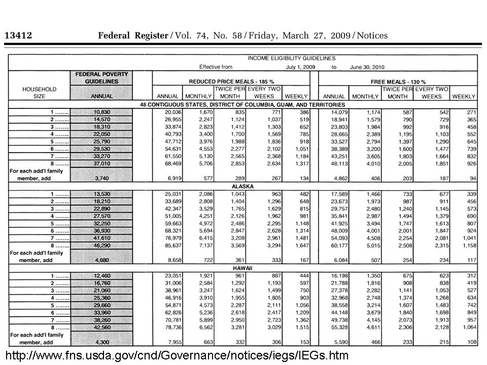
Figure 1 provides the income definitions for families to qualify for free versus reduced price lunch. This information is relatively self-explanatory. Families qualifying for reduced price lunch have income at 185% of the poverty level. Families qualifying for free lunch fall below income of 130% of the poverty level.
Figure 1: Income cut-offs for families qualifying for the National School Lunch Program
Unfortunately, a secondary problem with these cut-offs for discussion another day, is that these thresholds do not vary appropriately across regions and between rural and urban areas. The same income might go further in providing a reasonable lifestyle in Texas than in the New York metropolitan area. Trudi Renwick has done some preliminary work providing state level adjusted poverty estimates to correct for this problem: http://www.census.gov/hhes/povmeas/methodology/supplemental/research.html
If these distinctions are trivial and meaningless, why are there such large differences in NAEP performance?
Now the fact that the income levels which qualify a family for free or reduced lunch are different does not necessarily mean that these differences are important to education policy analysis. In fact, one thing that we do know is that because the income thresholds fit differently in different settings and different regions, different measures work better in different settings (lower-income thresholds in southern and southwestern states, for example).
But why do we consider these measures in education policy research to begin with? The main reason we consider poverty measures in education policy research is because it is generally well understood that children’s economic well-being is strongly associated with their educational outcomes, and with our ability to improve those outcomes and the costs of improving those outcomes. In most thorough, social science analysis of these relationships, extensive measures of family educational background, actual income (rather than simple categories), numbers of books in the household, and other measures are used. But such measures aren’t always readily available. It is more common to find, in a state data system, a simple indicator of whether a child qualifies for free or reduced price lunch. That doesn’t make it good though. It’s just there.
But if, for example, we could look at achievement outcomes of kids who qualified for free lunch only, and for kids who qualified for reduced price lunch, and if we saw significant differences in their achievement, then it would be important to consider both… or consider specifically the indicator more strongly associated with lower student outcomes. The goal is to identify the measure, or version of the measure that is sensitive to the variations in family backgrounds in the setting under investigation and is associated with outcomes.
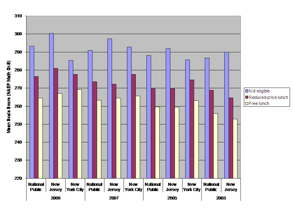
Figure 2 piggy backs on Gordon MacInnis examples comparing NAEP achievement gaps between non-low income students (anything but a homogeneous group) and students who qualify for free or for reduced price lunch. In figure 2 I graph NAEP 8th grade math outcomes for 2003 to 2009. What we see is that the average outcomes for students who qualify for free lunch are much lower than those who qualify for reduced price lunch. In fact, the gap between free and reduced is nearly as big in some cases as the gap between reduced and not qualified!
Figure 2: Differences in 8th grade Math Achievement by Income Status 2003-2009
Can every school in Cleveland be equally poor?
Another issue is that when we use the free or reduced price lunch indicator, and apply that indicator as a blunt, dummy variable to kids in high poverty settings – like poor urban core areas – we are likely to find that 100% of children qualify. Just because 100% of children receive the “qualified for free or reduced lunch” label does not by any stretch of the imagination mean that they are all on equal “economic disadvantage” footing. That they are all “poor enough” to be equally disadvantaged.
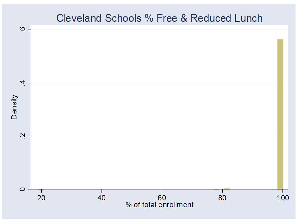
Let’s take a look at Cleveland Municipal School District and the distribution of schools by their rate of free and reduced lunch. There it is in Figure 3 – Nearly every school in Cleveland is 100% free or reduced price lunch. So, I guess they are all about the same. All equally poor. No need to consider any differential treatment, funding, policies or programs? Right?
Figure 3: Distribution of Cleveland Municipal School District % Free or Reduced Price Lunch Rates
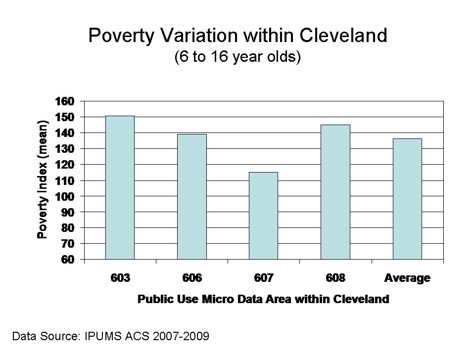
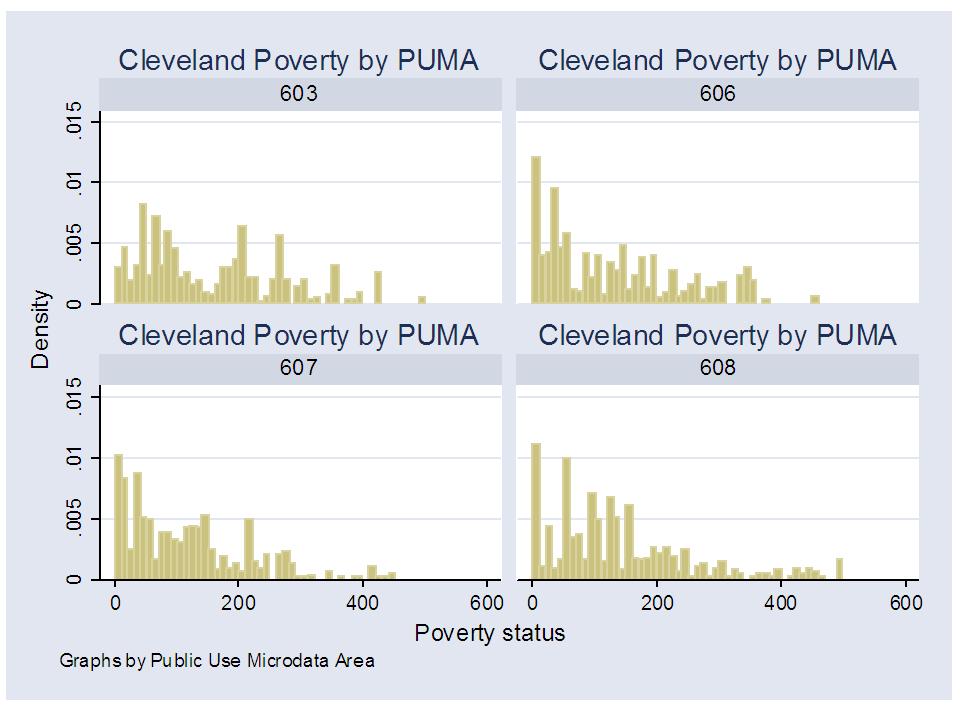
Well, not really! That would be a truly stupid assertion, and I expect anyone working within Cleveland Municipal School District can readily point to those neighborhoods and schools that serve far more substantively economically disadvantaged students than others. The data I have for this analysis are not quite that fine-grained – to go to the neighborhood level – but in Figure 4 I can break the city into 4 areas, and show the average poverty index level for families with public school enrolled children between the ages of 6 and 16. The poverty index is income relative to the poverty level where 100 is 100% level, and 185 would be roughly the level that qualifies for reduced price lunch, for example. Figure 4 shows the average differences across 4 areas of the city – classified in the American Community Survey as Public Use Microdata Areas, or PUMAs.
Figure 4: Average “Poverty Index” by Public Use Microdata Area within Cleveland
Figure 5 shows the distributions for each area, and they are different. Clearly, not all Cleveland neighborhoods are comparably economically disadvantaged, even in 100% of the schools are 100% free or reduced price lunch!
Figure 5: Poverty Index distribution by Public Use Microdata Area within Cleveland
Why is this so important in the current policy context?
So then, who really cares? Why does any of this matter? And why now? Well, it has always mattered, and responsible researchers have typically sought more fine-grained indicators of economic status, where available. But we are now in an era where policy researchers are engaged in fast-paced, fast-tracked use of available state administrative data in order to immediately inform policy decision-making. This is a dangerous data environment, and crude poverty measurement has potentially dire consequences. Here are a few reasons why:
- Many if not most models rating teacher or school effectiveness rely on a single dummy variable indicating that a child does or does not come from a family that falls below the 185% income level for poverty.
I’ve actually been shocked by this. Reviewing numerous pretty good and even very high quality studies estimating teacher effects on student outcomes, I’ve found an incredible degree of laziness in the specification of student characteristics – specifically student poverty.
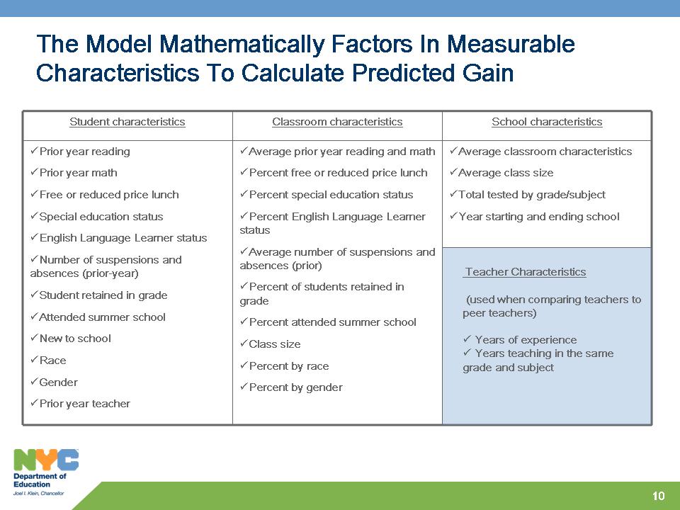
Figure 6 shows the poverty components of the New York City Teacher Effectiveness Model. Yep – there it is, a simple dichotomous indicator of qualifying for free or reduced price lunch. No way at all to differentiate between teachers of marginally poor, and very poor children.
Figure 6: Measures included in New York City Teacher Effectiveness Model
In a value-added model of teacher effects, if we use only a crude Yes or No indicator for whether a child is in a family that falls below the 185% income level for poverty, that child who is marginally below that income level is considered no different from the child who is well below that income level – homeless, destitute, multi-generational poverty. Further, in many large urban centers, nearly all children fall below the 185% income level (imagine doing this in Cleveland?). But they are not all the same! The variations in economic circumstances faced by children across schools and classrooms is huge. But the crude measurement ignores that variation entirely. And the lack of sensitivity of these measures to real differences in economic disadvantage likely adversely affects teachers of much poorer children – a model bias that goes unchecked for lack of a more precise indicator to check for the bias!
- This problem is multiplied by the fact that when these models evaluate the influence of peers on individual student performance, the peer group is also characterized in terms of whether the peers fall below this single income threshold.
In a teacher effectiveness model, the poverty measurement problem operates at two levels. First, at the individual student level mentioned above, where one cannot delineate between the student from a low-income family and the student from a very low income family. Second, “better” value-added teacher effectiveness models also attempt to account for the characteristics of the classroom peer group. But, we are stuck with the same crude measure, which prohibits us from evaluating the effect on any one student’s achievement gains of being in a class of marginally low-income peers versus being in a class of very low-income peers.
Okay, you say, the “best” value added models – especially those used in high stakes teacher evaluation would not be so foolish as to use such a crude indicator. BUT THEY DO, JUST LIKE THE NYC MODEL ABOVE. AND THEY DO SO QUITE CALLOUSLY AND IGNORANTLY. Why? Because it’s the data they have. The LA Times model uses a single dummy variable for poverty, and does not even include a classroom peer effect aggregation of that variable.
- Many comparisons of charter and traditional public schools that seek to evaluate whether charters are serving representative populations only compare the total of children qualifying for free or reduced price lunch, or similarly apply simple indicators of free or reduced price lunch status to individual students.
Yet, charter schools seem invariably to serve much more similar rates of children qualifying for free or reduced price lunch when compared to nearby traditional public schools, but serve far fewer children in the lower-income group which qualify for free lunch. Charters seem to be serving the less poor among the poor, in poor neighborhoods, in Newark, NJ or in New York City. Given that the performance differences among these subgroups tend to be quite large, using only the broader classification masks these substantial differences.
In conclusion
Yes, in some cases, we continue to be stuck with these less than precise indicators of child poverty. In some cases, it’s all we’ve got in the data system. But it is our responsibility to seek out better measures where we can, and use the better measures when we have them. We should, whenever possible:
- Use the measure that picks up the variation across children and educational settings
- Use the measure that serves as the strongest predictor of educational outcomes – the strongest indicator of potential educational disadvantage.
- And most importantly, when you don’t have a better measure, and when the stakes are particularly high, and when the crude measure might significantly influence (bias) the results, JUST DON’T DO IT!
Don’t attempt to draw major conclusions about whether charter schools (or any schools or programs for that matter) can do “as well” with low-income children when the indicator for “low income” encompasses equally every child (or nearly every child) in the city in both traditional public and charter schools.
Don’t attempt to label a teacher as effective or ineffective at teaching low-income kids, relative to his or her peers, when your measure of low-income is telling you that nearly all kids in all classrooms are equally low-income, when they clearly are not.
And most importantly, don’t make ridiculous excuses for using inadequate measures!
Also see Lubienski & Crane’s article, Beyond Free Lunch, Education Policy Analysis Archives, 18(11) (entire issue).
Thanks for noting this. I had intended to refer to this in the post, but had forgotten the title.
Thank you so much for this post, and for consistently calling on researchers (and policy-makers using that research) to be more responsible in their design and reporting!
Just a side note comparing reduced lunch income qualifiers with current teachers salaries. As a teacher, my children would have received reduced lunchs for many years! I have a “cadillac” health plan, but my kids can’t eat that!
I can hear the “reformers” [sic] now…”we can’t wait for more study; we’ll lose another generation of kids”…so better to lose two (or ten) generations of kids chasing windmills of romantic policy ideas that just make too much “common sense” not to act on–despite their potential for being wrong.
Add to this the fact that eligibility for free and reduced-price school lunches is determined entirely by self-reporting w/o income documentation. This certainly distorts the true incidence of poverty, and distorts it differently in different locations — in our district, to take one example, high school students participate in the lunch program at laughably low levels, presumably because of the stigma involved for older students.