Blog

Professionals 2: Pundits 0! (The shifting roles of practitioners and state education agencies)

Professionals, Pundits and Evidence Based Decision Making

In Ed Schools housed within research universities, and in programs in educational leadership which are primarily charged with the training of school and district level leaders, we are constantly confronted with deliberations over how to balance teaching the “practical stuff” and “how to” information on running a school or school district, managing personnel, managing budgets, etc. etc. etc., and the “research stuff” like understanding how to interpret rigorous research in education and related social sciences (increasingly economic research).  Finding the right balance between theory, research and practice is an ongoing struggle and often the subject of bitter debate in professional programs housed in research universities.

Over the past year, I’ve actually become more supportive of the notion that our future school and district leaders really do need to know the research, understand statistics and other methods of inquiry and be able to determine how it all intersects with their daily practice, even when it seems like it couldn’t possibly do so.

Unfortunately, a major reason that it has become so important for school leaders to know their shit is because state agencies, including departments of education, which to some extent are supposed to be playing a “technical support role,” have drifted far more substantially toward political messaging than technical support, and have in many cases drifted toward driving their policy agendas with shoddy fact sheets, manifestos and other shallow, intellectually vacuous but “easy to digest” Think Tank fodder.

In many cases, this intellectually vacuous, technically bankrupt think tank fodder is actually being trotted out by state education agencies as technical guidance to local school administrators.

Punditry in NY State

SchoolFinanceForHighAchievement

commissioner-nyscoss-presentation-092611

nyssba2011

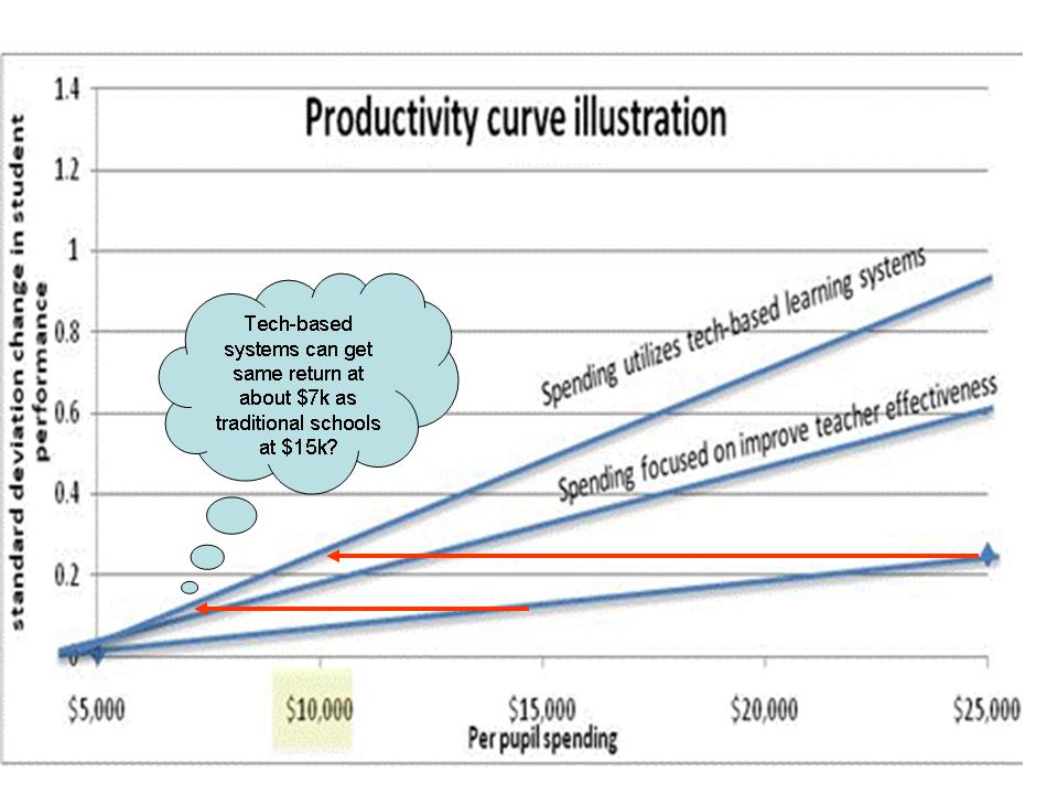
For example, I’ve mentioned these two graphs previously on this blog, which have now been repeatedly trotted out by New York State Education Commissioner John King in presentations to local school officials.

The first graph fabricates an argument that putting more funding into current practices in schools would necessarily be less efficient than putting more funding into either a) alternative compensation schemes which pay teachers based on performance (or at least not on experience and degree level) or b) tech-based solutions. While the latter is never even defined, neither has been shown to produce

Figure 1

The second graph basically argues that most money currently in schools is simply wasted because it’s allocated to portions of compensation that aren’t directly tied to performance. More or less and extension of the first graph, by a different author.

Figure 2

The latest version of the NYSED/King presentation also includes an exaggerated representation of what some refer to as the Three Great Teachers legend. That is, based on estimates from a study in the 1990s, that having three great teachers in a row can close any/all achievement gaps. This is a seriously misguided overstatement/extrapolation from this one study.

Figure 3

To put it bluntly, these various materials compiled and presented by the New York State Education Department are, well, in most cases, not research at all, and in the one case, a gross misrepresentation of a single piece of research on a topic where there are numerous related sources available.

NY Professionals Respond (albeit not directly to the information above, but concurrent with it)

Thankfully, a very large group of Principals on Long Island have been doing their reading, and have been making more legitimate attempts to understand and interpret research as applies to their practice.

APPR_Position_Paper_10Nov11

The principals were primarily concerned with the requirement under new state policies that they begin using student assessment data as a substantial component of teacher evaluation. The principals raised their concerns as follows:

Concern #1: Educational research and researchers strongly caution against teacher evaluation approaches like New York Stateʼs APPR Legislation

A few days before the Regents approved the APPR regulations, ten prominent researchers of assessment, teaching and learning wrote an open letter that included some of the following concerns about using student test scores to evaluate educators1:

a) Value-added models (VAM) of teacher effectiveness do not produce stable ratings of teachers. For example, different statistical models (all based on reasonable assumptions) yield different effectiveness scores.2 Researchers have found that how a teacher is rated changes from class to class, from year to year, and even from test to test3.

b) There is no evidence that evaluation systems that incorporate student test scores produce gains in student achievement. In order to determine if there is a relationship, researchers recommend small-scale pilot testing of such systems. Student test scores have not been found to be a strong predictor of the quality of teaching as measured by other instruments or approaches4.

c) The Regents examinations and Grades 3-8 Assessments are designed to evaluate student learning, not teacher effectiveness, nor student learning growth5. Using them to measure the latter is akin to using a meter stick to weigh a person: you might be able to develop a formula that links height and weight, but there will be plenty of error in your calculations.

Citing:

  1. Baker, E. et al. (2011). Correspondence to the New York State Board of Regents. Retrieved October 16, 2011 from: http://www.washingtonpost.com/blogs/answer-sheet/post/the-letter-from-assessment-experts-the-ny-regentsignored/2011/05/21/AFJHIA9G_blog.html.
  2. Papay, J. (2011). Different tests, different answers: The stability of teacher value-added estimates across outcome measures. American Educational Research Journal 48 (1) pp 163-193.
  3. McCaffrey, D. et al. (2004). Evaluating value-added models of teacher accountability. Santa Monica, CA.; Rand Corporation.
  4. See Burris, C. & Welner, K. (2011). Conversations with Arne Duncan: Offering advice on educator evaluations. Phi Delta Kappan 93 (2) pp 38-41.
  5. New York State Education Department (2011). Guide to the 2011 Grades 3-8 Testing Program in English Language Arts and Mathematics. Retrieved October 18, 2011 from http://www.p12.nysed.gov/apda/ei/ela-mathguide-11.pdf .
  6. Committee on Incentives and Test-Based Accountability in Education of the National Research Council. (2011). Incentives and Test-Based Accountability in Education. Washington, D.C.: National Academies Press.
  7. Baker, E. et al (2010). Problems with the use of test scores to evaluate teachers. Washington, D.C. Economic Policy Institute. Retrieved October 16, 2011 from: http://epi.3cdn.net/b9667271ee6c154195_t9m6iij8k.pdf; Newton, X. et al. (2010). Value-added modeling of teacher effectiveness: An exploration of stability across models and contexts. Education Policy and Analysis Archives. Retrieved October 16, 2011 from http://epaa.asu.edu/ojs/article/view/810/858. ; Rothstein, J. (2009). Student sorting and bias in value-added estimation: Selection on observables and unobservables. Education Finance and Policy, 4(4), 537–571.

In short, the principals built their case against the punditry that’s been hoist upon them, on a reasonable read of existing research. Thankfully, they had the capacity to do so, and the interest in pursuing guidance from experts around the country in crafting their response. I urge you to read the remainder of their memo and compare the rigor of evidence behind their arguments to the type of content that has most recently been presented to them in recent months.

New Jersey Punditry

The New York principals backlash was relatively high profile. A similar situation occurred last winter/spring in New Jersey, but went largely unnoticed, at least nationally.  At that time, a Task Force established by the Governor released its report on how to reform teacher evaluation.  The Task Force had been charged with developing an evaluation system based at least 50% on use of student assessment data. So, of course, they did. The task force include an odd array of individuals. It was not, as does occur in some cases, a true “citizen task force” of lay persons providing their lay perspectives. Rather, it was cast as a task force of interested and knowledgeable constituents.

Here is their report: NJ Teacher Effectiveness Task Force

The task force does have a bibliography on their report listing a number of potentially useful sources. Whether they actually read any of them or understood any of the content is highly questionable, given the content of the recommendations and footnotes actually cited to validate their recommendations.

And here are the majority of the footnotes (those which actually site some supposed source of support) from the teacher evaluation section (excludes principal section) or their report, and the claims those footnotes are intended to support:

NJ Educator Effectiveness Task Force Report

Claim: And when used properly, a strong evaluation system will also help educators become more effective.2
Source: 2 For more on this subject, see the discussion in DC IMPACT: http://dc.gov/DCPS/Learn+About+Schools/School+Leadership/IMPACT+(Performance+Assessment)

Claim: The Task Force recommends that the new system have four summative categories: Highly Effective, Effective, Partially Effective, and Ineffective. The number of rating categories should be large enough to give teachers a clear picture of their performance, but small enough to allow for clear, consistent distinctions between each level and meaningful differentiation of teacher performance3
Source: 3 “Teacher Evaluation 2.0,” p. 7, The New Teacher Project, 2010.

Claim: The state review and approval of measurement tools and their protocols will assure that they are sufficiently rigorous, valid, and reliable while also providing districts flexibility to innovate and develop their own tools.4
Source: 4 The Bill and Melinda Gates Foundation in collaboration with many prominent research organizations are in the process of testing a wide array of measurement tools in the Measuring Effective Teaching project: http://metproject.org/

Claim: Studies have found that the results of student surveys can be tightly correlated with student achievement results. Persuasive evidence can be found in the Gates MET study, which uses a survey instrument called Tripod.5
Source: 5 Learning about Teaching: Initial Findings from the Measures of Effective Teaching Project, Bill and Melinda Gates Foundation, 2009

Claim: Growth scores are a fairer and more accurate means of measuring student performance and teachers’ contributions to student learning. In fact, over half of the states surveyed by the Council of Chief State School Officers (CCSSO)—24 out of 43—reported that they either already do or plan to use student growth in analyzing teacher effectiveness.7
Source: 7 State Growth Models for School Accountability: Progress on Development and Reporting Measures of Student Growth, 2010, by the Council of Chief State School Officers.

In short, most of these claims amount to either a) because The New Teacher Project said so, b) because Washington DC does it in the IMPACT evaluation model or d) because one preliminary release study from the Gates foundation included inferences to this effect.

NJ Professional Response

Like those pesky informed Long Island principals, a group of New Jersey educators responded, through an organization spearheaded by a local superintendent who has immersed himself in the relevant research on the issues and has maintained constant open communication with and attended many sessions presented by economists engaged in teacher evaluation studies.   The New Jersey group also engaged researchers from the region to assist in the development of their report.

Here’s a portion of their report, which was drafted concurrent with the Task Force Activities (and presented to the Task Force, apparently to no avail):

EQUATE REPORT: NJ EQuATE Report

Once again, the professionals have far outpaced the pundits in their intellectual rigor, use and interpretation of far more legitimate, primarily peer reviewed research.

Summing it all up…

I am so thankful these days that we have in our schools, professionals like these who a) are willing to speak out in the face of pure punditry, and b) are capable of making such a strong and well reasoned case for their own policy proposals or at the very least for why they should not be backed into the ill-conceived, poorly grounded policy proposals of their governing bodies.

I expect that many “reformy” types and the politicos they support are thinking that these necessarily dumb, high paid bureaucrat local public school administrators should just sit down and shut up (as in this case) and adopt the policies that they are being told to adopt by those (often highly educated pundits) who simply know better. How pundits “know better,” stumps me, because the quality of evidence behind their all knowing-ness is persistently weak.

I might be more inclined to accept and argument for state policy preferences and technical capacity over local resistance if the contrast in the quality of information being presented by the pundits and professionals wasn’t so damn stark.

Regardless of political disposition (which is obviously an impossible hypothetical to achieve), if each of these sources was handed to me as a paper to grade in a graduate class (even in a school of education), differentiating among them would be quite easy.

The NYSED materials include completely fabricated information, ill-defined concepts, little basis in peer reviewed (or any “real”) research, and such utterly silly things as claiming that we can quadruple outcomes by moving to some undefined strategy.  Yes, this stuff was presented to them by experts they hired. But rather than even attempt to think critically about any of it (and realize it was junk) they simply copied and pasted it into their report and took it on the road. This work fails on any level.

The NJ Task Force report which argues that NJ should adopt a multi-category effectiveness classification system (without any understanding of the information lost in aggregation or problems of aggregating around uncertain cut points), merely because TNTP said so, and suggests use of growth measures is “fair” by citation to a Council of Chief State School Officers report, and bases much of the rest of their recommendations on “what Washington DC did.” Yeah, I’ve read student papers like this. They fail too! Most of my students know full well not to hand me this kind of crap, even if they believe I’m sympathetic to their ultimate conclusion.

But the memo prepared by the NY principals and the report by the NJ professionals are pretty darn good when viewed as a paper I might have to grade. They use real research, and for the most part, use it responsibly. Their recommendations and criticisms are generally well thought out.  For that I applaud them.

That said, it is certainly discomforting that local practitioners have had to counter the pure punditry of the very agencies which arguably should be attempting to provide legitimate, well grounded technical support.

More Inexcusable Inequalities: New York State in the Post-Funding Equity Era

I did a post a short while back about the fact that there are persistent inequities in state school finance formulas and that those  persistent inequities have real consequences for students’ access to key resources in schools – specifically their access to a rich array of programs, services, courses and other opportunities.  In that post I referred to the post school funding equity era as this perceived time in which we live. Been there, done that. Funding equity? No problem. We all know funding doesn’t matter anyway. Funding can’t buy a better education. It’s all about reform. Not funding. And we all know that the really good reformy strategies can, in fact, achieve greater output with even less funding. Hey, just look at all of those high flying, no excuses charter schools. Wait… aw crap… it seems that many of them actually do spend quite a bit. But, back to my point. Alexander Russo put up a good post today about those pesky school funding gaps, asking whatever happened to them? And he nailed it when he pointed out:

 If funding didn’t matter, then rich districts wouldn’t bother taxing themselves to provide resources to local kids.  If funding didn’t matter, high-performing charter schools wouldn’t cost so much.  Until and unless funding matters again in the public debate over education, I fear that we’ll largely be left fiddling at the margins (which is what it feels like we’re doing now).

I will have much more to say in the near future about the mythology about whether, why and how money matters in education. In this post, I’d just like to illustrate some of the extremes in access to resources that persist across school districts in New York State, which along with Illinois (the topic of Russo’s post) remains among the most inequitable states in the nation. (see: http://www.schoolfundingfairness.org)

Let’s start here.

This is a snapshot if the total expenditures per pupil and the need and cost adjusted expenditures per pupil of some of the MOST and LEAST advantaged school districts in New York State (in terms of a mix of need & spending measures). Without any adjustment for needs and costs, the high poverty, high need districts in many cases are spending below $16,000 per pupil, and the Top 30 districts nearly double that. When adjusted for needs/costs, the disparities widen dramatically.

Even worse, as I’ve explained a few times on this blog, New York State actually uses state aid to help support these disparities, by giving unnecessarily large sums of aid to the top group while continuing to cut aid from the bottom. Here is the distribution of some of that aid:

And here is the distribution of the most recent per pupil cuts in aid:

This all results in a rather ugly pattern of disparities that look rather like this, when we compare current need and cost adjusted funding levels with current district outcomes, as I did in a recent post on Illinois and Connecticut schools:

Because NY has so many districts, I’ve included only the relatively large ones here. This graph shows that districts with more need and cost adjusted funding tend to have higher outcomes and those with less need and cost adjusted funding tend to have lower outcomes. But, this graph is not intended to be a causal representation of that relationship. Rather, it’s intended to display the patterns of disparity across these districts. In the Lower Left are districts that are very high need, very low resources and very low outcomes. Among the standouts in this group are Utica and Poughkeepsie (in red in the first table above).  In the upper right hand corner of the picture are the lower need, high resource and high outcome districts.

What I’ve been finding most interesting though hardly surprising in my research is just how stark the consequences of these disparities are in terms of the actual programs and services provided within these districts. Reformy logic has told us in the past (see: https://schoolfinance101.wordpress.com/2011/05/05/resource-deprivation-in-high-need-districts-caps-goofy-roi/) that really, these districts in the lower left have more than enough money but they insist on wasting it all on junk like cheerleading and ceramics when they should be putting it into basic math/reading coursework.  Alternatively, related reformy logic is that these districts are really just wasting it all on paying additional salaries for experience and degree levels when they could just pay teachers the base salary and do just as well (I’m sure Utica would have great luck in recruiting and retaining teachers with that kind of salary structure. Actually, one of the better articles on relative salaries and teacher job choices uses data on upstate NY cities: http://citeseerx.ist.psu.edu/viewdoc/download?doi=10.1.1.142.5636&rep=rep1&type=pdf)

Setting aside these, well, completely stupid and unfounded claims (which are so pervasive in today’s education policy debate, especially in NY State), these next few slides take a look at the types of disparities in access to specific courses and opportunities faced by students in New York State’s schools.

First, here are a few slides using data from the Office of Civil Rights data collection on AP participation rates and participation in other key milestone courses.These data are shown with respect to district poverty rates, and poor small city districts (and some less poor, but still not advantaged ones) are highlighted.

This first slide shows the ratio of students in 7th grade (early) algebra to those taking algebra in  high school. As poverty rates increase, rates of participation in early algebra decline.Clearly, to a large extent, this pattern occurs because fewer students in these districts are prepared for early algebra.

This slide shows overall participation in advanced placement courses. Overall, AP participation declines as poverty increases. Again, this is likely partly due to differences in readiness for these courses among higher poverty populations.

But, it’s also likely due to differences in access to/availability of resources.   For a high need district to both a) provide the advanced opportunities for kids in middle and secondary school and b) make sure kids are prepared to take advantage of those opportunities, those districts would need additional resources on the front end – to make sure kids are prepared for early algebra and on the back end to be able to provide the advanced courses once kids are prepared.

The contrast between the top 30 and bottom 30 (and small city) districts in New York State, as evidenced by the allocation of teaching assignments is striking and disturbing. Let’s start with allocation of teaching assignments to advanced and college credit courses (all are not included). I’ve tallied teaching assignments per 1,000 student (in the group of schools, excluding NYC) based on statewide staffing data from 2010-11.This is very preliminary stuff, from a large data set on all teacher assignments in NY State.

What this first tally shows is that in the high performing, high spending, affluent school districts, there are .5 teacher assignments per 1,000 pupils allocated to AP Physics B. In low performing, low spending, high poverty districts, there are only .05 teacher assignments per 1,000 pupils. That adds up to a disparity ratio of 8.61. In other words, pupils in advantaged districts have nearly 9 times the access to teachers assigned to AP Physics as do pupils in disadvantaged districts. In nearly every and any college credit or AP course, disparity ratios run from about 2 to 9 fold differences. The same is true for disparities specifically between the top districts and poor small city districts which largely fall in the lower left of the Quadrant figure above.

Now, you might be saying…well… they don’t have these programs because of all of their frivolous spending on music and arts. Not so much.

On average, most middle and secondary music and arts staffing assignments also run at about a 2 fold or greater disparity between high and low need/resource districts in New York State.  Kids in high need, low resource, low outcome districts have substantially less access to band, chorus, orchestra, private instrumental or vocal lessons…. and JAZZ BAND! This is not an exhaustive list. And a handful of arts opportunities are allocated roughly with parity (1:1), but high need, low resource districts do not have substantially greater resources allocated to any of these areas and generally have much less.

The one area where the resource balance shifts systematically is in the allocation of remedial and special education related staffing assignments. Here are some examples. Even in special education, in some cases high resources districts retain their advantage. But on average, the higher need, lower resource districts are driving additional resources into special education related teaching assignments. And just to clarify, no, these districts are not way ahead on class size reduction. A few are. Others clearly are not!

In general in NY State, high need districts are, well, screwed. And as I’ve shown in recent posts, the current leadership in New York State has done little to really help – and arguably much to hurt.

Inequity still matters.

Funding inequity has real consequences for the programs, services and educational opportunities that can be provided to kids.

Anyone who suggests otherwise – that funding is somehow irrelevant to any and all of this – is, well, full of crap. These things cost money. Providing both/and costs more than providing either/or.

To reiterate, this is not the post-funding era!

In fact, quite depressingly, we may be sitting at the edge of a new era of dramatic educational inequalities unlike any we’ve experienced in recent decades.


MPR’s Unfortunate Sidestepping around Money Questions in the Charter CMO Report

Let me start by pointing out that Mathematica Policy Research, in my view, is an exceptional research organization. They have good people. They do good work and have done much to inform public policy in what I believe are positive ways. That’s why I found it so depressing when I started digging through the recent report on Charter CMOs – a report which as framed, was intended to explore the differences in effectiveness, practices and resources of charter schools operated by various Charter Management Organizations.

First, allow me to point out that I believe that the “relative effectiveness of CMOs” is not necessarily the right question – though it does have particular policy relevance when framed that way. Rather, I believe that the right questions at this point are not about charter versus non-charter, KIPP versus Imagine or White Hat, but rather about what these schools are doing, and whether we have evidence that it works (across a broad array of students and outcome measures). Then, once we get a better picture of what is working… and for that matter … what is not, we also need to consider very carefully… and in detail… the cost structure of the alternatives – that is, if what they are doing is really alternative to (different from) what others are doing. Of course, it is relevant from a measured expansion strategy to know which management organizations have particularly effective strategies. But we only develop useful information on how to transfer successes beyond the charter network by understanding the costs and effects of the strategies themselves.

So, as I read through the Mathematica CMO study, I was curious to see how they addressed resource issues.  What I found in terms of “money issues” were three graphs… each of which were pretty damn meaningless, and arguably well below Mathematica’s high quality research standards.

Here’s the first graph. It shows what I believe to be the average per pupil spending of charter schools by the CMO network and shows a very wide range. Now, This one bugs me on a really basic level, because as far as I can tell, the authors didn’t even try to correct their spending measures for differences in regional costs. So, any CMO which operates more schools in lower cost labor markets will appear lower and any CMO in higher cost labor markets will likely appear higher. In short, this graph really means absolutely nothing. It tells us nothing at all.

Figure 1

Source: http://www.mathematica-mpr.com/publications/PDFs/Education/cmo_final.pdf

Rule #1: Money always needs to be evaluated in context.  Actually, the easiest way to deal with regional or local corrections is to simply compare the expenditures to average expenditures of other school types in the same labor market.  That is, what percent above or below traditional public schools and/or private schools is charter spending among schools in the same labor market (can use Core Based Statistical Areas as a proxy for labor market). Notably, the tricky part here is figuring out the relevant spending components, such as equating traditional public school facilities, special education and transportation costs with cost responsibilities of charters. Alternatively, one can use something like the NCES Education Comparable Wage Index (though dated now) to adjust spending figures across labor markets.

In their second figure, Mathematica compares reported IRS filing expenditures to public subsidy figures. But rather than bothering to dig up the public subsidy figures themselves, Mathematic relies on figures from a dated and highly suspect report – the Public Impact/Ball State report on charter school finances. I’ve written previously about the many problems with the data in this report. There’s really no reason Mathematica should have been relying on secondary reported data like these when it’s pretty damn easy to go to the primary source.  Further, this graph doesn’t really tell us anything either.

Figure 2

Source: http://www.mathematica-mpr.com/publications/PDFs/Education/cmo_final.pdf

What do we really need and want to know? We need to know:

  1. Does it cost more and how much more to do the kinds of things the report identifies as practices of successful charter schools, such as running marginally smaller schools with smaller class sizes?
  2. What kind of wages are being paid to recruit and retain teachers who are working the extra hours and delivering the supposedly more successful models?
  3. How does the aggregate of these spending practices stack up against other types of schools in given local/regional economic contexts?

The financial analyses provided by Mathematica may as well not even be there. Actually, it would be a much better report if those graphs were just dropped. Because they are meaningless. They are also simply bad analyses. Analyses that are certainly well below the technical quality of research commonly produced by Mathematica.

Here are a few examples of what I’ve been finding on these questions, from recent blog posts, but part of a larger exploration of what we can learn from extant data on charter school resource allocation.

First, here’s some data on KIPP schools expenditures compared in context in NYC. That is, comparing the relevant school site expenditures (with footnote on the odd additional spending embedded in KIPP Academy financial reports) within NYC.  Here, it would appear that KIPP schools in certain zip codes in NYC may be significantly outspending traditional public schools serving the same grade ranges in the same zip codes (perhaps more consistently if we spread the KIPP Academy spending across the network, as I discuss in my report below [end of post]). The next step here is to compare the underlying salary structures, class sizes and other factors which explain (or are a result of) these spending differences. I’m not there yet with this analysis. More to come.

Figure 3

Second, Here’s how KIPP (and other charter) school spending per pupil compares in Houston Texas, based only on the school site spending reports from the Texas Education Agency, and not necessary including additional CMO level allocations (in the works).  Clearly, there’s some screwy stuff to be sorted out here as well. My point with these figures is merely to show how one can put spending in context and use more relevant numbers. Again, there are similar next steps to explore.

Figure 4

From a related recent post, here again are the class sizes and salary structure of Amistad Academy, a successful Achievement First school in New Haven Connecticut.  If there are two things that really drive the cost of operating any particular educational model it’s a) the quantity of staff needed to deliver the model – as can be measured in terms of class sizes (number of teachers), b) the price that must be paid for each staff member in order to recruit and retain the kind of staff you want to be delivering that model.

Figure 5

Figure 6

These figures show that two strategies employed by Amistad are a) lower early grades class sizes and b) much higher teacher salaries across the entire range of experience (among the experience range held by Amistad teachers) but especially in the early –mid-career stages.  These are potentially expensive strategies to replicate and/or maintain. But, they may just be good strategies… and may actually be the most cost –effective approach. We’ll never know if we don’t actually take the time to study it. We may also find that these approaches become more expensive as we attempt to scale them up and put greater strain on local teacher labor markets (supply).

Notably, I’ve been finding similar approaches to teacher compensation in the more recognized New Jersey Charter schools. I have shown previously, and here it is again, that schools like TEAM Academy seem to be shooting for higher salaries than neighboring/host public districts.  So too are schools like North Star Academy. But others (often less stellar [pun intended] charters) are not.

Figure 7


Now’s the time to get more serious about digging into the resource issues and providing useful information on the underlying cost structure of the educational models and strategies being used in successful charter networks, individual schools or anywhere for that matter.

Mathematica is far from alone in paying short shrift to these questions.  Roland Fryer’s Houston Apollo 20 study provided only marginally less flimsy analysis of the costs associated with the “no excuses” model (and made unsupported assertions regarding the relationship of Apollo 20 costs to “no excuses” charter school costs see http://www.houstonisd.org/HISDConnectEnglish/Images/Apollo/ApolloResults.pdf, full paper provides only marginally more information re: costs)

So, why do I care so much about this… and more importantly… why should anyone else? Well, as I explained in a previous post there’s a lot of mythology out there about education policy solutions – like no excuses charter schools – that can do more with less. That can get better outcomes for less money.  Most of the reports that pitch this angle simply never add up the money. And they fail to do any analysis of what it might cost to implement similar strategies at greater scale or in different contexts.  Is it perhaps possible that most improvements will simply come at greater overall cost?

Here’s the other part that’s been bugging me. It has often been asserted that the way to fix public schools is to either A) replace them with more charter schools and B) stop bothering with small class size and get rid of additional pay for things like increased experience.

As far as I can tell from the available data Option A and Option B above may just involve diametrically opposed strategies. As far as I’ve seen in many large data sets, charter schools that we generally acknowledge as “successful” are trying to pay teachers well and their teacher salaries are generally highly predictable as a function of experience (based on regression models of individual teacher data). That said, the shape of their salary schedules is often different from their hosts and surroundings – different in a way I find quite logical. Further, Charters with additional resources seem to be leveraging those resources at least partly to keep class sizes down (certainly not in the 35 to 40 student range of many NYC public schools, or CA schools).  Total staffing costs may still be lower mainly because charter teachers and other staff still remain “newer.” But sustaining current wage premiums may be tricky as charter teachers stay on for longer periods.

Again, in my preliminary analyses, I’m seeing some emphasis in some cases on early grades which makes sense. What I’m not seeing is dramatically lower spending, with very large class sizes, flat (w/respect to experience) but high teacher salaries (maximized w/in the budget constraint) – at least among high flying charters.  That is, I’m not seeing a complete disregard for class size reduction in order to achieve the wage premium. I’m seeing both/and, not either or (and both/and is more expensive than either/or).

So, on the one hand, pundits are arguing to expand “successful” charter schools which are pursuing rather traditional resource allocation strategies, while arguing that public school resource allocation strategies are fatally flawed and entirely inefficient. They only get away with this argument because they fail to explore in any depth how successful charter schools allocate resources and the cost implications of those strategies. It’s time to start taking this next step!

See also:

From: Baker, B.D. & Ferris, R. (2011). Adding Up the Spending: Fiscal Disparities and Philanthropy among New York City Charter Schools. Boulder, CO: National Education Policy Center. Retrieved [date] from http://nepc.colorado.edu/publication/NYC-charter-disparities.

When VAMs Fail: Evaluating Ohio’s School Performance Measures

Any reader of my blog knows already that I’m a skeptic of the usefulness of Value-added models for guiding high stakes decisions regarding personnel in schools. As I’ve explained on previous occasions, while statistical models of large numbers of data points – like lots of teachers or lots of schools – might provide us with some useful information on the extent of variation in student outcomes across schools or teachers and might reveal for us some useful patterns – it’s generally not a useful exercise to try to say anything about any one single point within the data set. Yes, teacher “effectiveness” estimates tend to be based on the many student points across students taught by that teacher, but are still highly unstable. Unstable to the point, where even as a researcher hoping to find value in this information, I’ve become skeptical.

However, I had still been holding out more hope that school level aggregate information on student growth – value added estimates – might still be more useful mainly because it represents a higher level of aggregation. That is, each school is indeed a single point in a school level analysis, but that point represents an aggregation of student points and more student points than would be aggregated to any one teacher in a school. Generally, school level value-added measures BECAUSE of this aggregation are somewhat more reliable.

I’m in the process of compiling data as part of a project which includes data on Ohio public schools. Ohio makes available school level value added ratings as well as traditional school performance level ratings. For that, I am grateful to them. Ohio also makes school site financial data available. Thanks again Ohio!

At the outset of any project, I like to explore the properties of various measures provided by the state. For example, to what extent are current accountability measures a) related to the same measures in the previous years, and b) related to factors such as student population characteristics?

Matt Di    Carlo over at http://www.shankerblog.org (see: http://shankerblog.org/?p=3870) has already addressed many/most of these issues with regard to the Ohio data. But, I figured I’d just reiterate these points with a few additional figures, focusing especially on the school level value added ratings.

As Matt Di         Carlo has already explained, Ohio’s performance index which is based on percent passing data is highly sensitive to concentrations of low income students.

Ohio performance index and % free lunch:

Nothing out of the ordinary here (except perhaps the large number of 0 values, which I didn’t bother to exclude – and which really compromise my r-squared… will fix if I get a chance). On this type of measure, this is pretty much expected and common across state systems. This is precisely why many state accountability system measures systematically penalize higher poverty schools and districts. Because they depend on performance level comparisons and because performance levels are highly sensitive to student/family backgrounds.

As a result, these heavily poverty biased measures are also pretty stable over time. Here’s the year to year correlation of the performance Index.

I’ve pointed out previously that one good way to get more stable performance measures over time – for schools, districts or for teachers – is to leave the bias in there. That is, keeping the measure heavily biased by student population characteristics keeps the measure more stable over time – if the student populations across schools and districts remain stable. More reliable yes. More useful, absolutely NOT.

It’s  pretty  much the case that the performance index received by a school this year will be in line with the index received the previous year.

Therein lies part of the argument for moving toward gain or value-added ratings. Note however that an exclusive emphasis on value-added without consideration for performance level means that we can ignore persistent achievement gaps between groups and the overall level of performance of lower performing groups.  That’s at least a bit problematic from a policy perspective! But I’ll set that aside for now.

Let’s take a look at what we can resolve and can’t resolve in Ohio school ratings by moving toward their value-added model (technical documentation here: http://www.ode.state.oh.us/GD/Templates/Pages/ODE/ODEDetail.aspx?Page=3&TopicRelationID=117&Content=113068)

As I noted above, I’d love to believe that the school level value-added estimates would provide at least some useful information to either policymakers or school officials. But, I’m now pretty damn skeptical, and here’s more evidence regarding why. Here is the relationship between 2008-09 and 2009-10 school value added ratings using the overall “value added index.”

Note that any district in the lower right quadrant is a district that had positive growth in 2009 but negative in 2010. Any district that is in the upper left had negative growth in 2009 and positive in 2010. It’s pretty much a random scatter. There is little relationship at all between what a school received in 2009 and in 2010 (or in 2008 or earlier for that matter).

So, imagine you are a school principal and year after year your little dot in this scatter plot shows up in a completely different place – odds are quite in favor of that! What are you to do with this information? Imagine trying to attach state accountability to these measures? I’ve long expressed concern about attaching any immediate policy actions to this type of measure. But in this case, I’m even concerned as to whether I have any reasonable research use for these measures. They are pretty much noise.

Here’s a little fishing into the rather small predictable shares of variation in those measures:

As it turns out, the prior year index is a stronger (though still weak) predictor of the current year index. But, it’s also the case that districts that had higher overall performance levels in the prior year tended to have lower value added the following year, and districts with higher % free lunch and higher % special ed population also had lower value added (among those starting at the same performance index level). That is some of the predictable stuff here is bias… indicative of model-related (if not test related) ceiling effects as well as demographic bias. That’s really unhelpful, and likely overlooked by most playing around with these data.

I get a little further if I use the math gains (the reading gains are particularly noisy).

These are ever so slightly more predictable than the aggregate index. But not a whole lot. But, they too are also a predictable function of stuff they shouldn’t be:

Again, districts that started with higher performance index have lower gain, and districts with higher free lunch and special ed populations have lower gain… and yes… these biases cut in opposite directions. But that doesn’t provide any comfort that they are counterbalancing in any way that makes these data at all useful.

If anything, the properties of the Ohio value-added data are particularly disheartening.  There’s little if anything there to begin with and what appears to be there might be compromised by underlying biases.

Further, even if the estimates were both more reliable and potentially less biased, I’m not quite sure how local district administrators would derive meaning from them – meaning that would lead to actions that could be taken to improve – or turn around their school in future years.

At this point and given these data, the best way to achieve a statistical turn around is probably to simply do nothing and sit and wait until the next year of data. Odds are pretty good your little dot (school) on the chart will end up in a completely different location the next time around!


Digging for Consistent, Comprehensive Financial Data on New Jersey Charter Schools

I’ve commented in the past about the difficulties of obtaining reconcilable data on finances of New Jersey Charter Schools. What do I mean by reconcilable? Well, when I’m looking at financial data on charter schools in particular, I like to be able to see some relationship between expenditure and revenue data reported on IRS 990 filings (Tax returns of the non-profit boards/foundations/agencies that operate the charters) and state government (department of ed) reported expenditures and/or any annual financial report documents that might be required by charter authorizers. This really is an authorizer/accountability issue. A financial reporting requirement issue.

When I did my study on New York City Charter schools last year I was quite pleased to find a) annual financial reports on nearly all NYC charters housed by the State University of New York, b) IRS 990 filings for nearly all NYC charter schools, and c) a pretty strong relationship between the reported expenditures on one form and the reported expenditures on the other. Here are two graphs of those relationships – the first including the higher outliers (which is partly a reporting issue, with KIPP Academy embedding systemwide expenses-an issue consistent on both forms).

Example: NYC Charters

Here’s how it looks if I focus on those spending less than $20,000 per pupil:

Example: NYC Charters

So, in NYC, I have pretty solid information from both sources, well aligned but with some notable exceptions. Some of these exceptions were further reconciled, or at least changed positions, when we added in expenditures from affiliated foundations (Harlem Children’s Zone, HCZ in particular).

In New Jersey, financial data on charter schools seems to be improving, but remains sparse. For example, in my most recent search of IRS 990 filings through Guidestar, I was able to obtain the following distribution of numbers of institutions by most recent available year –

2010 (2009-10 school year) = 40

2009 (2008-09 school year) = 8

2005 = 1

2004=1

2003=3

1998 = 1

Yet, the New Jersey Department of Education (NJDOE) reports data on 64 charter schools (63 with expenditure data). So, I can still only easily access up-to-date IRS filings on about 2/3 of NJ charter schools. This to me, is a concern, but it is a massive improvement over the past few years. I now actually have enough data from each source to check the relationship between the two, and where data are reported, that relationship is strong:

But we still have limited information on many NJ charter schools, and only a single source of data on which to rely. Indeed, it is the official state department of education data, but it’s always nice to be able to reconcile with other official data/filings/reports.

Note also that in NY, the points that fall in line, fall right in line – on a straight line – with exactly reconcilable numbers. The NJ ones which are reported are getting better… mostly in line.

Here’s how the spending per pupil rankings play out in NJ using each source. First, the IRS 990 data:

Next the NJDOE spending guide data:

Note that things change a bit when we add in those cases where IRS 990s weren’t reported.

So, there are a lot of schools missing in that first graph, and adding the others in does change things a bit. But I’d like to see both forms of data readily available on an annual basis.

Among other things, these data reveal some striking differences in spending, which perhaps result at least partly from access to non-public funding, but also partly result from differences in host district funding. An important question here is whether these differences are driven systematically by differences in the needs of the student populations served by these particular schools.

That is, are the differences in spending across charters a predictable function of various student needs, such as concentrations of low income children, English language learners or children with disabilities?

Are the differences in spending across charters partially explained by regional differences in labor costs? (e.g. competitive wages for school employees such as teachers?)

That is, to what extent to these substantial differences in spending across charters enhance equity, as opposed to eroding it.  And to what extent should we be concerned about the role of charters within the public system eroding equity (e.g. are traditional resource equity concerns relevant when individuals and families choose less well resourced schools? Do more well resourced schools tend to have longer waiting lists? Makes for a fun legal question, as well as a moral/ethical question).

I’ll explore these issues in a future post. For now, I’ve just been trying to get enough coverage of data on the financing of NJ charter schools in order to be able to conduct such analysis. And it has been very frustrating that such data are not readily available for all schools and easily reconcilable.


A Look at State Aid Cuts in New York State 2011-12

Following is another in my school finance geeky series of straight-up analyses of state school finance formulas. I wrote about New Jersey’s funding formula few days ago. This analysis focuses specifically on the cuts levied across NY school districts for 2011-12 and the underfunding of the foundation formula for select districts.

In 2007, New York State adopted the new Foundation Aid Program.

A full critique of that state aid program can be found here: NY Aid Policy Brief_Fall2011_DRAFT6

That school funding formula was argued by the state to represent the state’s constitutional obligation to provide for a sound basic education. That argument was built on the assumption that the underlying base aid for the formula would be calculated by estimating the average instructional spending per pupil of districts statewide that were performing well, or achieving 80% proficiency on state assessments.[1] By 2011-12, the foundation level was to be set to $6,535.[2] For each district, the sound basic level of funding would be determined by multiplying the foundation funding level times that district’s Pupil Need Index to account for variations in student populations to be served, and Regional Cost Index to account for variations in regional labor costs.

Target “Sound Basic” Funding per Pupil = Foundation x PNI x RCI

            Next, to determine each district’s total sound basic, or foundation formula funding target, this per pupil funding figure was to be multiplied times the Total Aidable Foundation Pupil Units, or TAFPU. TAFPU is based on district enrollments, but includes additional weightings to account for student needs, such as students with disabilities and summer school pupils.

Total Sound Basic Funding Target = Sound Basic Funding per Pupil x TAFPU

            Next, for each district, the state determines the share of the total to be raised locally and the share to be distributed in state foundation aid. A district receives the greater of aid levels based on two different calculations:

State Foundation Aid = Total Sound Basic Funding Target – Expected Minimum Local Contribution

OR

State Foundation Aid = Total Sound Basic Funding Target x State Aid Sharing Ratio

 Applying the Formula to Small Cities and New York City

We can apply these calculations to determine the aid that should have been received in 2011-12 by several of the state’s small cities and by New York City, based on data and parameters from state aid runs as provided on April 1, 2011. (again… this is how it hypothetically works).

Table 1 shows the first portion of the calculations

Note that these are all high need districts, though Tonawanda and North Tonawanda are certainly lower need than Utica or New York City. Among the districts Utica has by far the highest pupil need index. New York City and other downstate Hudson Valley districts have the highest labor market cost estimates. All but Tonawanda and North Tonawanda receive target per pupil funding levels over $10,000.

In the next step, we determine the total foundation funding and the state share of that funding target.

Table 2. Calculation of Promised State Aid

For example, for Albany, the target per pupil funding is $12,179. The expected minimum local contribution is $4,749 and the difference between the two is $7,430 per pupil. In the case of Albany, that difference becomes the state aid per pupil amount. Multiply that amount times the aidable pupils, and you’ve got a total state aid of about $93.5 million. For New York City, it turns out that the higher aid amount is allotted by using the State Aid Sharing Ratio instead of the difference between target funding and estimated local contribution. By the final calculation, New York City would receive about $8.6 billion in aid.

 Broken Promises: Aid Freezes and Gap Elimination

But, this is all hypothetical. This is all entirely based on the promised foundation aid formula. This is all based on the foundation aid formula that the state has argued is by its design the manifestation of the state’s own constitutional obligation to provide a sound basic and meaningful high school education to children across New York State.  Note that I have provided an entirely separate report which explains the insufficiency of these targets and the rationale behind them. But let’s accept these targets for the moment and explore the extent to which even these modest promises have been ignored. Because we are dealing with really big numbers here, Table 3 reports those numbers in millions.

Table 3. Foundation Freezes and Gap Reductions (or are they just aid cuts?)

For Albany, the sound basic level of aid calculated by the legislature’s own formula is about $93.5 million. But, from the start, foundation aid was frozen at prior year levels, which were actually frozen at the levels of the year prior to that. For Albany, the aid freeze brings them down to $56.7 million, or a $37 million shortfall from their sound basic aid calculation. For New York City, the freeze alone pulls out $2.4 billion in aid. For small cities, the total reduction from the freeze, the total underfunding of sound basic aid, is about $271 million.

But it doesn’t end there. The state budget for 2011-12 does not promise to fund even that frozen level of aid. Rather, an additional “Gap Elimination Adjustment” was applied to cut aid further. At the last minute of the legislative session, there was partial reduction of this adjustment, but not full reduction. The adopted Gap Elimination adjustment removes another $12.5 million from Albany, bring their actual state aid level for 2011-12 to rest at $44.2 million, or less than half of their sound basic aid target. The total funding gap for small cities is $370 million. And the total funding gap for New York City after the Gap Elimination adjustment is $3.2 billion.

In summary, even if we pretend that the current foundation formula does provide for a sound basic education, even if we ignore that the current foundation formula is set to relatively low success rates on an assessment where scores had become inflated over time, the New York State Legislature has fallen 30% to 50% or more below these funding promises for many high need, large districts. Statewide, the foundation formula shortfall before Gap Elimination adjustment is approximately $5.5 billion, and after gap elimination adjustment is $8.1 billion. While the current formula itself falls short in many ways, the New York Legislature faces a serious uphill climb simply to keep their own promises.

Spreadsheet of Calculations: Funding Gap NY Calculations

Note: Analysis above focuses on the Foundation Aid Program. Other aids outside this formula include:

F(FA0013) 00 2011-12 CHARTER SCHOOL TRANSITIONAL

G(FA0029) 00 2011-12 HIGH TAX AID

H(FA0065) 00 2011-12 SUMMER TRANSPORTATION AID

I(FA0069) 00 2011-12 TRANSPORTATION AID W/O SUMMER

J(FA0073) 00 2011-12 BUILDING AID

K(FA0077) 00 2011-12 BUILDING  REORG INCENTIVE AID

L(FA0081) 00 2011-12 OPERATING REORG INCENTIVE AID

M(FA0085) 00 2011-12 NON-CMPNT COMPUTER ADMIN AID

N(FA0089) 00 2011-12 NON-CMPNT CAREER EDN AID

O(FA0021) 00 2011-12 NON-CMPNT ACADEMIC IMPROVMT AID

P(FA0093) 00 2011-12 BOCES AID

Q(FA0097) 00 2011-12 PUBLIC EC HIGH COST AID

R(FA0101) 00 2011-12 PRIVATE EXCESS COST AID

S(FA0105) 00 2011-12 SOFTWARE AID

T(FA0109) 00 2011-12 LIBRARY MATERIALS AID

U(FA0113) 00 2011-12 TEXTBOOK AID

V(FA0117) 00 2011-12 HARDWARE & TECHNOLOGY AID

W(FA0121) 00 2011-12 FULL DAY K CONVERSION

X(FA0125) 00 2011-12 UNIV PREKINDERGARTEN AID

Y(FA0033) 00 2011-12 SUPPLEMENTAL PUB EXCESS COST

Z(FA0185) 00 2011-12 ACADEMIC ENHANCEMENT AID

More with Less or More with More & Why it Matters!

I did a piece a short while back on TEAM Academy, a Charter school which I thus far admire in Newark, NJ. I admire the school because, while the data I’ve been able to gather from official sources still indicates that TEAM is far from a statistical match with its surroundings, and appears to have greater cohort attrition than I might like to see, I am, at this point, comfortable stating that TEAM Academy is more comparable than others to its surroundings than other Newark Charters.

Allow me to restate why I care about the comparability piece of the puzzle. First, let me say that I do believe that there is (or at least may be) an important role in urban school systems or any school systems for that matter, for schools that aren’t entirely comparable. That’s the case for Magnet schools for example, which have in some rigorous studies been shown to produce positive outcomes for kids who attend. (see: http://citeseerx.ist.psu.edu/viewdoc/download?doi=10.1.1.152.385&rep=rep1&type=pdf)

But, when schools like magnet schools show positive outcomes we must recognize them for what they are and not make bold assumptions that those schools can easily be replicated districtwide or nationwide for “all kids” otherwise “trapped” in “failing schools.” Magnet or other selective schools’ success is likely significantly contingent on the student population served. The same goes for some charter schools, a key point of which is that it is foolish to ever lump all charters into one basket as if they represent a single reform strategy. They are a diverse mix of schools. Some serve more comparable populations to surrounding district schools and operate more similarly to open enrollment public schools while others are far more similar to magnet schools in terms of population served and in terms of the curriculum that can then be delivered to that population. When charters are effectively magnet schools (like North Star in Newark) scalability must be viewed differently (in part because the “success” of the school is as likely dependent on the selective student body as it is on any program/services/curriculum provided).

But the debate on scalability of “successful” charters goes beyond just the student population comparability issue. Far too often the rhetoric around successful charters involves the following three part claim:

Claim: Successful charter schools serve the same students, for less money and get better outcomes than traditional public schools.

Rarely if ever are these three components sufficiently validated.  This is especially true of the same students and less money prongs of the argument.  If policymakers accept on faith that pundits are truthful in these claims, policymakers may develop a false confidence as to how easily and how cheaply charter expansion can lead to improved outcomes.  It would behoove policymakers to take a much closer look at all three prongs of the issue, and consider each of these possibilities in Table 1.

Table 1. Framework of Possibilities

Note that this table can be expanded to include those cases of charters that serve non-comparable populations that are more needy than nearby traditional public schools (a focus of many specialized charters)

As I noted in my post regarding TEAM Academy, while the expenditure comparisons (particularly in New Jersey) are complicated they are critically important. And, perhaps my most important statement in that post is that there is no shame in spending more to provide a good education. Charter supporters (or anyone for that matter) should not understate the costs of their additional efforts. Charter supporters should not downplay the importance of class size reduction, teacher salaries, extended learning time in an effort to fit themselves into a category in Table 1 into which they don’t really belong.

Policymakers need to know what works and why it works. If a charter school is really freakin’ successful by spending more money on certain things and/or spending it differently, that’s important to know, even if their overall success is partly contingent on serving a selective population. Simply adopting the rhetoric of serving the same students, for less money and getting better outcomes than traditional public schools is unhelpful when it’s simply not true. Even worse, it’s potentially harmful to promote expansion on such a false premise.

So, here are a few more examples which come from preliminary explorations which are part of a much bigger project to get a handle on charter spending. Note that I began this project over a year ago and released a detailed report on New York City charter spending last year: http://nepc.colorado.edu/publication/NYC-charter-disparities. That report provides important supporting detail for this post regarding making sound comparisons of spending in Charters and traditional public schools in NYC.

Let’s start with a look at Amistad Academy, a well-known high performing charter school in New Haven Connecticut and part of the Achievement First network (www.achievementfirst.org). By usual accounts, Amistad is a high flying charter school. Let me be absolutely clear about this – I’m not crapping on Amistad. To the best of my data-driven understanding, it’s a very good school providing strong academic opportunities for kids in New Haven. But, from a policy standpoint, it’s worth at least cursory exploration of data on the three prongs above.

The following analyses use a mix of data from the National Center for Education Statistics Common Core of Data, from the CTDOE data system (http://sdeportal.ct.gov/Cedar/WEB/ct_report/DTHome.aspx) and from Guidestar (www.guidestar.or). In order to have all data elements lined up to a common fiscal and enrollment year, I’ve focused on school year 2008-09 here.

Figure 1. Amistad % Free Lunch compared to New Haven Schools

Figure 2. Map of Amistad % Free Lunch compared to Surround Schools


NOTE: I’m informed (see comment below) that the school location for Amistad is not correct. Note that the school location is based on the latitude and longitude as provided in the NCES Common Core of Data (www.nces.ed.gov/ccd/bat). As I suspected might be the case, the CCD Lat/Lon indicates the location of the Central Office of Achievement First (403 James Street). Amistad is located over in the area indicated, near many high poverty traditional public schools. (130 Edgewood Avenue New Haven, CT 06511)

So, Figure 1 and Figure 2 show quite decisively that Amistad is not serving a population which is comparable to surroundings in terms of % qualified for free lunch. Amistad also reports 0% LEP/ELL [no data] while the district reports 12.6% (http://sdeportal.ct.gov/Cedar/WEB/ct_report/EllDTViewer.aspx)

Now, let’s take a look at Amistad’s per pupil spending compared to New Haven public schools. Note that it’s generally not a great idea to try to compare against the district as a whole. If we are comparing Amistad’s performance to elementary and middle schools in New Haven, we should be comparing Amistad’s spending to elementary and middle schools. I’ll provide examples for KIPP charter schools in NYC and Houston at the end of this post.

One must also figure out what components are “in” and what components of spending are “out “ when making a host district comparison to charter spending. For example, host districts are responsible for transportation of children to charters in CT. So, that spending should be removed from host district spending. Note that Amistad logically reports no expenditures on transportation in CTDOE spending reports. http://sdeportal.ct.gov/Cedar/WEB/ct_report/FinanceDTViewer.aspx

Further, host districts are responsible for costs of all resident children with disabilities, and it is difficult to discern whether any of these costs (other than the regular education costs of those students) show up in the charter expenditures. Amistad reports no percentage of spending on special education in CTDOE reports (reporting its total general expenditure figure instead). It is most likely that a large share if not all of the district special education spending should be excluded from the district spending figure. http://sdeportal.ct.gov/Cedar/WEB/ct_report/FinanceDTViewer.aspx

Finally, Amistad is part of a national network which might be considered analogous to its “district,” and expenditures by that national organization should be included. I’ve played it very conservative by only prorating the “administrative” expenses (www.guidestar.org) of Achievement First Inc. across all students in the network, for an additional $218 per pupil. (www.achievementfirst.org)

Figure 3. Per pupil Spending in Amistad Academy and New Haven

Data Sources: New Haven City & Amistad CTDOE http://sdeportal.ct.gov/Cedar/WEB/ct_report/FinanceDTViewer.aspx Amistad Academy IRS 990 from www.guidestar.org (Total expenditures =  $9,575,340, enrollment = 641 in 2008-09)

[1] Host districts are responsible for transportation costs for in district students enrolled in charters.

[2] 18.08% of New Haven Public Schools total expense is on special education.  Amistad reported total expenditures as special educ. expenditures & 0% to special education in 2008-09. See: http://sdeportal.ct.gov/Cedar/WEB/ct_report/FinanceDTViewer.aspx

[3] Achievement First Administrative Expense in subsequent year (guidestar.org) $1.125 million with cumulative enrollment 2010-11 of approximately 5,150 (tallied from achievementfirst.org)

So, Figure 3 shows that Amistad academy at the very least spends comparable to New Haven district wide spending after excluding transportation, and spends quite a bit more than New Haven district per pupil if we exclude all of New Haven’s special education spending. Even if we excluded only a portion of New Haven’s special education spending (likely more appropriate), Amistad’s spending would be quite a bit higher than New Haven Public Schools.  Again, there should be no shame in trying to spend more to provide a good school. Rather, it’s arguably quite noble.

I’m not a big fan of relying exclusively on aggregate spending figures. Rather, I prefer to dig under the hood a bit to see how those dollars are leveraged. This is especially important if we really want to figure out how to replicate the successes of a school like Amistad, albeit with a very different population.

Figure 4 shows the class sizes by grade level in Amistad and New Haven public schools based on CTDOE data from 2008-09.  Amistad appears to have leverage money for smaller class sizes in the lower grades, a choice which arguably makes sense given the existing research on the effects of class size reduction. Overall, Amistad has lower class sizes than the district at the same grade level. And that costs money.

Figure 4. Class Size by Grade Level

Now, on to teacher salaries. In my previous post on TEAM Academy in Newark, NJ, I found that TEAM had scaled up teacher salaries on the front end of experience and paid much higher salaries than Newark Public Schools (no easy accomplishment), for new to mid-career teachers, putting TEAM in a pretty good position for local recruitment and retention. Figure 5 shows that Amistad has done much the same. To construct Figure 5 I used 6 years of data on individual classroom teachers in Connecticut and estimated a teacher salary model as a function of experience, degree level and year of the data. I estimated separate models for New Haven schools and for Amistad, and used those models to impute the implicit teacher salary schedule.

Amistad is paying more on the front end, and far outpacing the district across the first several years of the salary schedule (figures jump around for later years in Amistad due to very few teachers in those categories). And perhaps this allows Amistad to recruit and retain the teachers it wants. More exploration is warranted.

Figure 5. Modeled Teacher Salaries by Degree and Experience Level

So, in summary, what we have here is a high performing school that does not serve the same population, spends more than the local district and chooses to leverage spending toward class size reduction in the early grades and toward competitive early to mid-career teacher salaries. That’s a realistic look at a school that by many accounts is a darn good one.

[but a look I suspect some will still take offense to]

The population differences of the school create serious limitations for determining its scalability. That is, is the performance a function of the students or of the school? That’s hard to tell (even in a rigorous lottery based analysis). Further, the expense of the Amistad model of reduced class size and higher wages on the front end may cause some policymakers to balk. But that expense may be indicative of what’s actually needed, even with a more selective student population.

Perhaps more importantly, even with publicly available macro level data we can gain some insights into how the additional money is leveraged. And it would appear that Amistad is doing things I would consider quite logical, such as early grade class size reduction and paying competitive teacher wages. Those aren’t necessarily the sexy things the “cool kids” might be expecting. And those are both things that cost money. It would be hard to run a school with both reduced class sizes AND competitive wages while spending substantially less. And it is critically important that we recognize this!

Addendum: Making school level spending comparisons in New York City and Houston

Note that a major shortcoming of the Connecticut data above is that they don’t allow for comparison of New Haven schools spending by grade level or individual comparable schools. I have begun large scale analysis of school site expenditure in numerous other contexts. Below are two examples of school site comparison against same grade level schools – including comparable budget components (as well as spelling out in the fine print those aspects which aren’t directly comparable – see FN about KIPP Academy financial reporting – much more detail in my NEPC report).

A1. KIPP Schools in New York City (preliminary analysis)

Like Amistad, and KIPP middle schools in NYC appear to be spending more than NYC public middle schools in the same parts of the city. They are a) not serving comparable populations and b) spending more (even if we spread KIPP Academy spending across all schools and if we exclude KIPP to College spending).

Making the appropriate corrections for facilities access is complicated in Connecticut because facilities expenses are not broken out for the Charters. The CTDOE figures for Amistad and New Haven above contain the same reported components (when transportation & special education are excluded for New Haven), but facilities lease payments may be (are likely) embedded in operating expenses of Amistad (& tend to run around $1,500 per pupil in NJ cities, and over $2,000 per pupil in Manhattan). However, New Haven remains responsible for upkeep and renovation for its facilities as well as any payments on debt that may exist. That is, district facilities are not, as some might argue “free.” So, for example, Amistad spends about $828 per pupil on plant operations and maintenance, while New Haven spends $1,735 per pupil in 2008-09 (a difference of $907). But, on administrative & support services, New Haven spends $1,863 per pupil and Amistad spends $3,585 per pupil (a difference of $1,722). This latter figure likely includes a significant lease payment (or some other peculiar overhead expense), but is partially offset by the differences in operations and maintenance (net difference of $1,722 – $907 = $815, which is smaller than the total expenditure differences reported above, but does close some of the gap). But these back of the napkin approaches only get you so far.

I have greater capacity to correct for these differences in my more detailed NYC data used previously in my NEPC report and used above.

A2: KIPP (and all other charters) in Houston (preliminary analysis)

http://ritter.tea.state.tx.us/perfreport/aeis/2010/DownloadData.html

One can see in the figure above that many of the KIPP schools in Houston are spending well above a) most other charters b) most Houston public schools and c) the Houston district average expenditure. Yes, charters on the whole are a mixed bag. Many are quite low spending. These data likely need much more cleaning and cross-checking. But they are generally accessible through the TEA web site.

========================

NOTE: All data used in these posts come from official state, federal and IRS documents, in a few cases through respected aggregators of data (guidestar.org).  In a few cases above, I rely on total enrollment counts from the organization web site (Achievement First). Generally, I rely on official data and provide URLs to data sources so that any and all analyses can be checked, replicated, etc.  If you are a representative of a school and believe your data to be “wrong,” I will typically respond by at least checking that I have not made an error in reporting the data. But, if the data are what they are, then I suggest that you go to the source for any corrections. Most of these data are reported by the schools themselves to the state and federal agencies in question. I just report them as they are, and do certainly attempt to reconcile anything that appears out of line – and will make corrections when the correction can be validated.


Thoughts on Improving the School Funding Reform Act (SFRA) in NJ

I’ve seen a number of tweets and vague media references of late about the fact that NJ Education Commissioner Cerf will at some point in the near future be providing recommendations for how to change the School Funding Reform Act of 2008.

I also have it on good authority that NJDOE has convened a working group to discuss how to alter SFRA and are bringing in outside consultants for ideas. To no surprise, I’ve been left out of these conversations, despite my narrowly focused expertise on these very topics.

SFRA is subject to review by the department. Most of SFRA is laid out in statute, or laws passed by the legislature. But, as I understand it, the department of education does have some latitude to “tweak” parameters within SFRA. For example, adjusting/changing various weights and other factors which drive more money to some districts and less to others.

Now, I hate to stick my nose in on this process with my own preemptive recommendations, but you see, this happens to be a topic I know something about. After all, if within my broad areas of expertise on education policy/finance there is one area in which I really specialize it’s the design of state school finance formulas to meet student needs. And, I happen to have a little background on NJ’s SFRA. So, here’s my free advice. A little pro-bono technical advisement.

First, keep in mind that I have in the past testified on problems with SFRA, specifically focusing on what I consider to be technical errors made in the original design of the formula which fall under the umbrella of “tweakable” stuff.  I also happen to have done research  conference presentations and have published peer reviewed research related to some of the problematic features of SFRA – specifically the way the state chose to adjust for competitive wage variation across settings and the way the state chose to fund special education.

My apologies to all the non-Jersey and non-finance geeks out there for whom this analysis is going to quickly go technical. Can’t avoid it. Would take far too much space to provide full background on each issue. But I do have complete related documentation linked throughout. My reason for this post is simply to get this stuff out there. To make it known what the actual, technical issues are and what should be addressed when talking about “tweaking” SFRA. Some background is in order though, if for no other reason to explain how I’ve narrowed my scope here.

First, state school funding formulas like SFRA start out by calculating an “adequacy budget” target for each school district:

Adequacy Budget = (Base Funding + Student Need Funding) x Geographic Cost Variation

Typically, the student need category includes additional funding for a) low income children, b) children with limited English language proficiency, and c) children with disabilities. Under geographic cost variation, states generally adjust for geographic variation in competitive wages (how much more does it cost to pay teachers competitively in one labor market versus another) and for small, remote and sparsely populated districts (economies of scale & sparsity). The latter issue is less relevant in NJ.

Typically the second step in a state school finance formula is the parsing of state versus local responsibility to pay for the adequacy budget:

Foundation Formula State Aid = Adequacy Budget – Local Fair Share

This part is important too, especially for balancing tax equity concerns. But, in this post and in most of my analyses of SFRA, I’m focused on getting those adequacy targets correct.  And with SFRA, there is plenty to talk about.

SFRA emerged in part from an analysis prepared for the department of education on the costs of providing an adequate education. That report, by John Augenblick and Associates was produced to the department around 2003, but was not released by the department until 2006. Elements of that report were used to guide a new school funding formula adopted in 2008 – SFRA.

It’s really important to understand that the adoption of state school funding formulas is necessarily a political process. That’s just reality. One can ponder a world in which we substitute technical expertise for political deliberation as somehow being the perfect substitute, but even I understand that’s not realistic.

And quite honestly the quality of technical advisement varies widely. I would go so far as to say that some technical advisement is clearly better than other technical advisement, and some is not worth a damn. For examples of the latter, see: https://schoolfinance101.wordpress.com/2011/06/06/roza-tinted-reality/   and:  https://schoolfinance101.wordpress.com/2011/04/01/publicincompetence/

So, the reality is that legislatures adopt something, perhaps with technical advisement and state courts are available to hear any legally relevant grievances (and consider technical advisement) to evaluate whether those concerns rise to the level of constitutional violation.

I often assist in identifying what those grievances are. Here, I’m pointing mainly to technical quibbles over what came out of the legislative process in New Jersey. These are technical quibbles for which I would argue the research suggests there is a “right way” to do things and the New Jersey legislature and department of education chose the “wrong way.” These are technical quibbles which result in relatively modest, though important corrections to the setting of district “adequacy budgets.” And these are technical quibbles which the court appointed special master decided did not rise to a level of constitutional violation. That is, SFRA was “good enough” to meet constitutional muster.

So then, I suggest that the departmental (regulatory) review process is the right time to address these technical problems.

Table 1 provides my short list of relatively easy fixes.

First, when adopting SFRA someone, somewhere along the line suggested that the formula provide substantially greater money for each high school student than for each elementary student and marginally more money for each middle school student than for each elementary student. But, there is no clear evidence – no firm research basis for such differentiation. No evidence, for example, that it costs more to provide equal educational opportunity in districts that have a larger share of secondary than elementary students. Rather, differences that do exist in spending on high school versus elementary students are merely artifacts of the ways in which districts have typically spent regardless of which children would benefit more from additional expenditure. The most problematic feature of this adjustment is that higher poverty districts tend to have smaller shares of their total enrollment in high school, meaning that this adjustment drives more money to lower poverty and less to higher poverty districts. And it does so without any real justification. This pattern occurs for a variety of reasons, including dropout rates but also family migration patterns and family economic status shifts with maturation.

Second, when determining how to include an adjustment for differences in competitive wages across areas of New Jersey, department officials decided to rely conceptually on a new approach proposed by the National Center for Education Statistics – the Comparable Wage Index (see link below). But then they abandoned the actual index and the actual methods behind it to come up with their own. In their own method, NJDOE looked not at labor market level wages but at county level wages of non-teachers (controlling for age, occupation, industry and education level). By using county level data, NJDOE officials came up with a “geographic cost adjustment” that gives the biggest adjustments to the highest income counties (Bergen, Morris, Essex) rather than broadly applying the adjustment to regions of the state. Most problematically, this GCA gives a bigger funding boost to affluent Ridgewood (Bergen) than to nearby Paterson (Passaic) and to Franklin Township than to New Brunswick. That’s just wrong!

Third, and this is a big one, when adopting SFRA the choice was made to fund special education by a method called Census Based funding. That is, assuming that every district really has or should have the same share of population in need of services. They set the rate to 14.69% of students. The argument is that districts with more than that have simply been identifying more to chase additional funding and not that they actually have greater need. I address the flaws of this logic extensively in the linked research article below. Of course, the most absurd aspect of financing every district as if they have 14.69% children with disabilities is the assumption that it is somehow appropriate to fund many districts at that level who actually have far fewer children in need. Fiscal prudence this is not! But again, it does tend to reduce funding in higher poverty urban districts as well as larger, poor remote southern NJ towns (see my research article).

Fourth, in another seemingly back of the napkin exercise, someone decided that a child who is both from a low income background and with limited English language proficiency clearly doesn’t need the additional funding tied to both characteristics, and instead should be provided something in between. So, they instituted a “combination weight” which was a marginal increase over the low income weight, instead of the sum of the low income weight and LEP/ELL weight. I could probably make a stronger case that increased concentrations of both needs in districts serving very high concentrations of children who are both low income and non-English speaking leads to escalating not diminishing costs. Clearly, use of this weight instead of using the sum of the two reduces funding to the districts with the highest concentrations of students who are both poor and non-English speaking. Further, if a district is majority low income, each marginal child who is non-English speaking is more likely to be both and receive the lower combination weight.

Table 1. Summary of Current Errors and Proposed Fixes

Errors in Original SFRA 2008-09 How it Works  Why it’s Wrong Alternative
Grade Level Weight 1.0 Elementary Based on back of the napkin analysis. No real basis in true cost differential. Disadvantages higher poverty districts with lower share of children in upper grades. Eliminate (Revenue neutral, set to average)
1.04 Middle
1.17 Secondary
Geographic Cost Adjustment Based on non-teacher wages in county County is the wrong unit for this analysis. Should be labor market (clusters of counties). Current approach rewards affluent counties (Bergen, Morris, Somerset). Labor Market Based Comparable Wage Index
Census Based Funding of Special Education Special education funding is allocated in flat amount assuming each district has 14.69% children qualified for special education. This assumption is wrong and it leads to significant inequities in special education funding per child with actual needs.  Allocate on need basis
Combination Weight Children who are both ELL and Low Income do not receive weighted funding for both, but rather receive an adjustment between the two. Reduction was based on back of the napkin estimate, and signifcanlty draws funding away from most needy districts. Reinstate full weighting for both

Here is a link to my full report in which I first identify these issues:

Baker.PJP-SFRA.Report.WEB (My complete report explaining the above problems)

Figure 1 shows what happens if we run a formula simulation based on the original 2008 SFRA parameters, and if we incrementally fix each one of these errors.

First, I remove the Combination weight and replace it with an option where each child can receive the sum of the at risk weight and the LEP/ELL weight if they qualify for both.  Table 2 below shows that taking this approach raises the combo weight cost for TYPE 3 districts from $212 million to $330 million. And, looking at the second set of bars in Figure 1, it increases funding in lower income, higher need districts. Note that these are shifts in the total adequacy targets, for which costs will be shared between the state and local districts (albeit increasing targets more in districts heavily reliant on state aid).

Second, I allocate special education funding according to actual concentrations of children with disabilities. This does come at an increased total cost as well, raising total target funding for special education from $991 million to just over $1 billion. Again, total, to be funded by state and local, but again with stronger effect on districts more dependent on state aid.

Third, I get rid of that pesky grade level adjustment and replace it with the revenue neutral average foundation funding level. This does drive some more money into lower income districts.

Fourth, I replace the county level geographic cost adjustment with the National Center for Education Statistics adjustment, set to a statewide average of 1.0 (to make it more revenue neutral). This ain’t perfect. The NCES index has some “rough edges” (see my linked paper). But it’s still more justifiable in general, even if it does hurt some districts which actually need more help. This issue really requires a complete redo!

Figure 1. Simulation based on Operating Type 3 Districts

Table 2 provides some fiscal implications, as noted above, but it’s important to understand that these fiscal implications are based on a simulation of only Type 3 districts (which does include most of the kids). Table 2 is intended to show the patterns of reshuffling that would occur with these corrections.

Table 2. Simulation based on Operating Type 3 Districts

Formula Component Status Quo Remove Combo Fix Special Ed Remove Grade Level Fix GCA Fix All
Total Base Cost $9,547 $9,547 $9,547 $9,547 $9,547 $9,547
Total Cost of At Risk $1,610 $1,610 $1,610 $1,611 $1,610 $1,610
Total Cost of LEP/ELL $70 $70 $70 $70 $70 $70
Total Cost of Combo $212 $330 $212 $212 $212 $330
Total Cost of Special Ed Base $991 $991 $1,018 $991 $991 $1,018
Full State Funding
Total Cost of Special Ed Categorical $496 $496 $509 $496 $496 $509
Bottom Line Before Regional Wage Index $12,926 $13,044 $12,966 $12,927 $12,926 $13,084
Bottom Line After Regional Wage Index $13,007 $13,126 $13,043 $13,008 $13,041 $13,198

Figure 2. Distribution of Need-based Adjustments before Adjustment

(excludes special education)

Figure 3. Distribution of Need-based Adjustments after Adjustment (Fix All)

(excludes special education)

The bottom line here is that the reason each and every one of these corrections is important is that each of the original errors of logic and analysis that found their way into the SFRA formula shifts funding away from higher need and toward lower need districts. These aren’t huge shifts, but they’re not trivial either.

For those who wish to play around, here’s the simulation:

Aid Simulation (MS Excel File with Macros)

And for those wishing some additional technical reading to explain my arguments above, here are links to some of my related writing.

AERA.WageIndexPaper.March2008 (Conference Paper on Problems with NJ Wage Index)

Link to Published Article on Problems with Census Based Special Education Funding

Cheers!

Dear Mr. Mulshine – Please check your “facts”

I was reading this column by Paul Mushine yesterday in which Mr. Mulshine opines about the exorbitant property taxes being paid by our Governor. Now, personally, I’d prefer to keep our Governor out of this. This isn’t about him. It’s about an expensive house in a relatively wealthy suburban town in Morris County and the property taxes you have to pay when you live in an expensive house. Let’s keep it at that. Mulshine points to the rather eye-popping annual property taxes on the house which are over $37,000.

Mulshine attributes the high property tax bill to state policies which take suburban money and give it to poor urban cities and school districts, referring more than once to the state school finance formula.

As Mulshine argues:

Just when the heck is he going to demand we change the formula for handing out state property-tax relief?

Under the current formula, suburban taxpayers get socked to transfer wealth to the cities. And few suburbs fare quite as badly as Christie’s own home town, Mendham Township in Morris County. I like to bring that thorny fact up when I question him at press conferences.

http://blog.nj.com/njv_paul_mulshine/2011/10/youd_have_to_be_president_to_a.html

(emphasis added). Thorny fact? Really?

Mulshine seems to forget that the primary reason that a tax bill would be high is…well… because the tax is being paid on a property that has a very high taxable assessed value! In other words, the main reason someone pays a higher tax bill is because they live in a more expensive house. And, by the way, it has to be a pretty expensive house to generate a tax bill that high (over $2 million).

By Mulshine’s metric of fairness – property tax bill – the most disadvantaged people in the state must therefore be those who live in the most expensive houses – because those are the houses with the largest tax bills, even if we all paid the same tax rate on our homes.  So, owning an expensive house is the root of the greatest unfairness of New Jersey tax policy?

Let me offer up a few alternative metrics drawn from data (albeit a few years old) on municipalities and school districts from nj.com’s “jersey by the numbers.” Let’s take a look at two better measures across municipalities in Morris and Essex county. I’ve included Essex to bring some of the poorer urban communities into the picture, since Morris has few.

Let’s look first at the effective tax rate with respect to home values. That is, are towns with higher value homes paying a higher or lower percent of their home value in property taxes?

Now let’s look at whether individuals are paying a higher percent of their income in property taxes in towns with higher or lower income.

While these data are now somewhat old, there is little reason to believe that these patterns have shifted much if any, especially due to state tax and spending policies. First, these things tend to be relatively stable. Second, 2005 was around the peak of Abbott funding, the end of the major scaling up of funding from 1998 to 2005, prior to the new formula which actually spread money more widely.

Now, these are important metrics for evaluating Mulshine’s premise of the wrongs of current redistributive policies. Why? Because if current policies really do go overboard at redistributing suburban wealth to the urban core, then we should see that a) effective tax rates on properties are actually higher in the suburbs – that is the tax bill divided by the home value, and b) that property taxes paid as a share of income are higher in the suburban districts than the urban core.

Both of the above charts suggest that current NJ policies of school and municipal aid have not, in fact, over-corrected by driving too much relief into poor urban communities. In fact, effective property tax rates remain much higher in places like East Orange, Irvington and Orange than in Mendham or Essex Fells. Further taxes as a percent of income are much higher in East Orange, Nutley and Belleville than in Mendham.

But, Mendham and some other more affluent suburban communities do tend to be quite high on this measure and there are a few explanations for this. First, many of the towns high on this measure have very little commercial or industrial property to tax for public services. A tax equity oriented policy remedy to this problem is to require regional redistribution of property tax revenues from these non-residential properties (a topic of some academic literature in the past). Second, in some of these towns, we may see more individuals living beyond, or at least at the edges of their means – perhaps purchasing more house than their income can afford.

So, what is one to do if they are unhappy with a $37,000 annual property tax bill? The simplest answer is to move into a cheaper house.


On the Real Dangers of Marguerite Roza’s Fake Graph

In my last post, I ranted about this absurd graph presented by Marguerite Roza to a symposium of the New York Regents on September 13, 2011. Since that presentation (but before my post), that graph was also presented by the New York State Commissioner of Education to Superintendents of NY State School Districts (Sept. 26, slide #20). The graph and the accompanying materials are now part of a statewide push in New York to promote an apparent policy agenda, though I lack some clarity on the specifics of that agenda at this point in time.

Because this graph is now part of an ongoing agenda in New York and because critiques by other credible, leading scholars similar to my own but less ranting in style, which were submitted to state officials following the symposium have seemingly been ignored (shelved, shredded, or whatever) I feel the need to take a little more time to explain my previous rant. Why is this graph so problematic? And who cares? How could such a silly graph really cause any problems anyway? Let’s start back in with the graph itself.

How absurd is this graph?

So, here it is again, the Marguerite Roza graph explaining how if we just adopt either a) tech based learning systems or b) teacher effectiveness based policies we can get a whole lot more bang for our buck in public schools. In fact, we can get an astounding bang for our buck according to Roza.

Figure 1. Roza Graph

http://www.p12.nysed.gov/mgtserv/docs/SchoolFinanceForHighAchievement.pdf

As I explained on my previous post, along the horizontal axis is per pupil spending and on the vertical axis are measured student outcomes. It’s intended to be a graph of the rate of return to additional dollars spent. The bottom diagonal line on this graph – the lowest angled blue line – is intended to show the rate of return in student outcomes for each additional dollar spent given the current ways in which schools are run. Go from $5,000 to $25,000 in spending and you raise student achievement by, oh… about .2 standard deviations. I also pointed out that it doesn’t really make a whole lot of sense to assume that there is no return to any type of schooling at $5,000 per pupil. It might be small, but likely something. It should really have been set to $0 for the intercept. It’s also likely that for any of the curves, that they should be… well… curves. You know, with diminishing returns at some point, though perhaps the returns diminish well beyond spending $25,000. But these are just small signs of the sloppy thinking going on in this graph.

The next sign of the sloppy thinking is that the graph suggests that one can use these ill-defined tech-based solutions to get FIVE TIMES the bang for the same buck – a full standard deviation versus only .2 standard deviations – when spending $25,000 per pupil.

So, how crazy is it to assert that these reforms can create a full standard deviation of improvement up the productivity curve – for example, if we spend $25,000 per pupil on tech-based systems as opposed to $5,000 per pupil on tech-based systems? Well, here’s the “standard normal curve” which, for fun, I obtained from the NY Regents Assessment study guide. That’s right, this is from the study guide for the NY Regents test. So perhaps the members of the Board of Regents should take a look. A full standard deviation of improvement would be like moving a class of kids from the 50%ile to the 84.1%ile. That’s no simple accomplishment!

Figure 2. Standard Normal Curve

Let’s put this bang for the buck into context. I joked in my previous post that this blows away Hoxby’s study findings regarding NYC charter schools and closing the Harlem-Scarsdale achievement gap. Hoxby, for example found that students lotteried into charter schools had cumulative gains over their non-charter peers of .13 to .14 standard deviations by grade 3, and annual gains over their non-chartered peers of .06 to .09 standard deviations. Sean Reardon of Stanford explains how the selected models and methods may have inflated those claims! But that’s my point here. Let’s compare Roza’s stylized claims with previous, bold, inflated claims but ones at least based on a real study.

Let’s assume that the bottom line on Roza’s chart represents traditional public schooling in NYC and that traditional public schools in NYC spend about $20,000 per pupil. Following Roza’s graph that would put those students at about .2 standard deviations above what they would have scored if their schools spent only $5,000 per pupil.  Roza’s graph suggests however, that if the same $20,000 per pupil was spent on tech-based learning systems, those students would have scored about .7 standard deviations higher than if only $5,000 was spent, which is also .5 (a half standard deviation) greater than spending on traditional schools. That is, shifting the $20,000 per pupil from traditional schooling to tech-based learning systems would produce an achievement gain that is over FIVE TIMES the annual achievement gains from Hoxby’s NYC charter school study. Of course, it’s not entirely clear what the duration of treatment is in relation to outcome gains in Roza’s graph. Perhaps she means that one could gain this much after 110, 12 or 20 years of exposure to $20,000 per pupil invested in tech-based learning systems?

Figure 3. Roza Graph with Notes


Why is this graph (and the related information) dangerous?

So, let’s assume that many features of the graph are just innocently and ignorantly sloppy. Not a comforting assumption to have to make for a graph presented to a major state policy making body and by someone claiming to be a leading researcher on educational productivity and representing the most powerful private foundation in the country. Setting the intercept at $5,000 instead of $0… Setting such crazy effect magnitudes on the vertical axis. All innocently sloppy and merely intended to illustrate that there might be a better way if we can just think outside the box on school spending.

I have no problem with the idea of exploring outside the box for options that might shift the productivity curve. I have a big problem with assuming… no… declaring outright that we know full well what those options are and that they will necessarily shift the curve in a HUGE way.

I have significant concerns when this type of analysis is used to promote a policy agenda for which there exists little or no sound evidence that the policy agenda is worthwhile either in terms of costs or benefits.

The remainder of the Roza presentation and the presentation that followed basically assert that large shares of the money currently in the public education system are simply wasted. This assumption is also simply not supportable – certainly not by any of the ill-conceived fodder presented at the Regents Symposium by Marguerite Roza or Stephen Frank of Educational Resource Strategies.

For example, Stephen Frank presented slides to suggest that any and all money in the education system that is spent on a) teacher pay for experience above base pay or b) teacher pay for degree levels (any and all degrees) above and beyond base pay c) any compensation for teacher benefits, is essentially wasted and can and should be reallocated.  Here’s one of the slides:

Figure 4. Stephen Frank (ERS) slide:

Essentially, what is being argued is that a school where all teachers are paid only the base salary and receive no health benefits or retirement benefits would be equally productive to a school that does provide such compensation (since we know that those things don’t contribute to student results). That is, it would be equally productive for less than half the expense! Thus, all of that wasted money could be spent on something else, spent differently, to make the school more productive. This is essentially the middle diagonal line of the productivity curve (straight line) chart – spending on teacher effectiveness.  But this is all based on absurdly bold assumptions and slipshod analysis (intentionally deceptive since it’s based on a district with a senior workforce).

I have written about this topic previously, and how pundits (not researchers by any stretch of the imagination) have wrongly extrapolated this assumption from studies that show no strong correlations between student outcomes and whether teachers have or do not have advanced degrees, or studies that show diminishing returns in tested student outcomes to teacher experience beyond a certain number of years. As I explained previously, studies of the association between different levels of experience and the association between having a masters degree or not and student achievement gains have never attempted to ask about the potential labor market consequences of stopping providing additional compensation for teachers choosing to further their education – even if only for personal interest – or stopping providing any guarantee that a teacher’s compensation will grow at a predictable rate over time throughout the teacher’s career.

It is pure speculation and potentially harmful speculation to make this leap.

Who’s most likely to get hurt?

So, let’s say we were to capitulate on these overreaching if not outright absurd and irresponsible claims? What’s the harm anyway? Why not simply allow a little speculative experimentation in our schools? Can’t do worse right? Wrong! We could do worse! Simply pretending that there’s a better way out there, pretending that the productivity curve can be massively adjusted, with no foundation for this assumption means that there is comparable likelihood that revenue-neutral “innovations” could do as much harm as good. Assuming otherwise is ignorant and irresponsible.

But perhaps more disturbingly, when we start talking about where to engage in this speculative experimentation to adjust the productivity curve – excuse me – productivity straight line – we are most often talking about experimenting with the lives and educational futures of the most vulnerable children and families. I suspect that NY State policymakers buying into this rhetoric aren’t talking about forcing Scarsdale to replace small class sizes and highly educated and experienced teachers with tech-based learning systems. This despite the fact that Scarsdale, many other Westchester and Long Island affluent districts are already much further to the right on the spending axis than the state’s higher need cities, including New York City as well as locations like Utica, Poughkeepsie and Newburgh.  Further, as I have discussed previously on this blog, New York State continues to provide substantial state aid subsidies to these wealthy communities while failing to provide sufficient support to high need midsized and large cities.

But instead of providing sufficient resources to those high need cities to be able to provide the types of opportunities available in Scarsdale, the suggestion by these pundits posing as researchers is that it’s absolutely okay… not just okay… but the best way forward… to engage in revenue neutral (if not revenue negative) speculative experimentation which may cause significant harm to the state’s most needy children.

And that is why this graph is so dangerous and offensive.