Blog

Dear Mr. Mulshine – Please check your “facts”

I was reading this column by Paul Mushine yesterday in which Mr. Mulshine opines about the exorbitant property taxes being paid by our Governor. Now, personally, I’d prefer to keep our Governor out of this. This isn’t about him. It’s about an expensive house in a relatively wealthy suburban town in Morris County and the property taxes you have to pay when you live in an expensive house. Let’s keep it at that. Mulshine points to the rather eye-popping annual property taxes on the house which are over $37,000.

Mulshine attributes the high property tax bill to state policies which take suburban money and give it to poor urban cities and school districts, referring more than once to the state school finance formula.

As Mulshine argues:

Just when the heck is he going to demand we change the formula for handing out state property-tax relief?

Under the current formula, suburban taxpayers get socked to transfer wealth to the cities. And few suburbs fare quite as badly as Christie’s own home town, Mendham Township in Morris County. I like to bring that thorny fact up when I question him at press conferences.

http://blog.nj.com/njv_paul_mulshine/2011/10/youd_have_to_be_president_to_a.html

(emphasis added). Thorny fact? Really?

Mulshine seems to forget that the primary reason that a tax bill would be high is…well… because the tax is being paid on a property that has a very high taxable assessed value! In other words, the main reason someone pays a higher tax bill is because they live in a more expensive house. And, by the way, it has to be a pretty expensive house to generate a tax bill that high (over $2 million).

By Mulshine’s metric of fairness – property tax bill – the most disadvantaged people in the state must therefore be those who live in the most expensive houses – because those are the houses with the largest tax bills, even if we all paid the same tax rate on our homes.  So, owning an expensive house is the root of the greatest unfairness of New Jersey tax policy?

Let me offer up a few alternative metrics drawn from data (albeit a few years old) on municipalities and school districts from nj.com’s “jersey by the numbers.” Let’s take a look at two better measures across municipalities in Morris and Essex county. I’ve included Essex to bring some of the poorer urban communities into the picture, since Morris has few.

Let’s look first at the effective tax rate with respect to home values. That is, are towns with higher value homes paying a higher or lower percent of their home value in property taxes?

Now let’s look at whether individuals are paying a higher percent of their income in property taxes in towns with higher or lower income.

While these data are now somewhat old, there is little reason to believe that these patterns have shifted much if any, especially due to state tax and spending policies. First, these things tend to be relatively stable. Second, 2005 was around the peak of Abbott funding, the end of the major scaling up of funding from 1998 to 2005, prior to the new formula which actually spread money more widely.

Now, these are important metrics for evaluating Mulshine’s premise of the wrongs of current redistributive policies. Why? Because if current policies really do go overboard at redistributing suburban wealth to the urban core, then we should see that a) effective tax rates on properties are actually higher in the suburbs – that is the tax bill divided by the home value, and b) that property taxes paid as a share of income are higher in the suburban districts than the urban core.

Both of the above charts suggest that current NJ policies of school and municipal aid have not, in fact, over-corrected by driving too much relief into poor urban communities. In fact, effective property tax rates remain much higher in places like East Orange, Irvington and Orange than in Mendham or Essex Fells. Further taxes as a percent of income are much higher in East Orange, Nutley and Belleville than in Mendham.

But, Mendham and some other more affluent suburban communities do tend to be quite high on this measure and there are a few explanations for this. First, many of the towns high on this measure have very little commercial or industrial property to tax for public services. A tax equity oriented policy remedy to this problem is to require regional redistribution of property tax revenues from these non-residential properties (a topic of some academic literature in the past). Second, in some of these towns, we may see more individuals living beyond, or at least at the edges of their means – perhaps purchasing more house than their income can afford.

So, what is one to do if they are unhappy with a $37,000 annual property tax bill? The simplest answer is to move into a cheaper house.


On the Real Dangers of Marguerite Roza’s Fake Graph

In my last post, I ranted about this absurd graph presented by Marguerite Roza to a symposium of the New York Regents on September 13, 2011. Since that presentation (but before my post), that graph was also presented by the New York State Commissioner of Education to Superintendents of NY State School Districts (Sept. 26, slide #20). The graph and the accompanying materials are now part of a statewide push in New York to promote an apparent policy agenda, though I lack some clarity on the specifics of that agenda at this point in time.

Because this graph is now part of an ongoing agenda in New York and because critiques by other credible, leading scholars similar to my own but less ranting in style, which were submitted to state officials following the symposium have seemingly been ignored (shelved, shredded, or whatever) I feel the need to take a little more time to explain my previous rant. Why is this graph so problematic? And who cares? How could such a silly graph really cause any problems anyway? Let’s start back in with the graph itself.

How absurd is this graph?

So, here it is again, the Marguerite Roza graph explaining how if we just adopt either a) tech based learning systems or b) teacher effectiveness based policies we can get a whole lot more bang for our buck in public schools. In fact, we can get an astounding bang for our buck according to Roza.

Figure 1. Roza Graph

http://www.p12.nysed.gov/mgtserv/docs/SchoolFinanceForHighAchievement.pdf

As I explained on my previous post, along the horizontal axis is per pupil spending and on the vertical axis are measured student outcomes. It’s intended to be a graph of the rate of return to additional dollars spent. The bottom diagonal line on this graph – the lowest angled blue line – is intended to show the rate of return in student outcomes for each additional dollar spent given the current ways in which schools are run. Go from $5,000 to $25,000 in spending and you raise student achievement by, oh… about .2 standard deviations. I also pointed out that it doesn’t really make a whole lot of sense to assume that there is no return to any type of schooling at $5,000 per pupil. It might be small, but likely something. It should really have been set to $0 for the intercept. It’s also likely that for any of the curves, that they should be… well… curves. You know, with diminishing returns at some point, though perhaps the returns diminish well beyond spending $25,000. But these are just small signs of the sloppy thinking going on in this graph.

The next sign of the sloppy thinking is that the graph suggests that one can use these ill-defined tech-based solutions to get FIVE TIMES the bang for the same buck – a full standard deviation versus only .2 standard deviations – when spending $25,000 per pupil.

So, how crazy is it to assert that these reforms can create a full standard deviation of improvement up the productivity curve – for example, if we spend $25,000 per pupil on tech-based systems as opposed to $5,000 per pupil on tech-based systems? Well, here’s the “standard normal curve” which, for fun, I obtained from the NY Regents Assessment study guide. That’s right, this is from the study guide for the NY Regents test. So perhaps the members of the Board of Regents should take a look. A full standard deviation of improvement would be like moving a class of kids from the 50%ile to the 84.1%ile. That’s no simple accomplishment!

Figure 2. Standard Normal Curve

Let’s put this bang for the buck into context. I joked in my previous post that this blows away Hoxby’s study findings regarding NYC charter schools and closing the Harlem-Scarsdale achievement gap. Hoxby, for example found that students lotteried into charter schools had cumulative gains over their non-charter peers of .13 to .14 standard deviations by grade 3, and annual gains over their non-chartered peers of .06 to .09 standard deviations. Sean Reardon of Stanford explains how the selected models and methods may have inflated those claims! But that’s my point here. Let’s compare Roza’s stylized claims with previous, bold, inflated claims but ones at least based on a real study.

Let’s assume that the bottom line on Roza’s chart represents traditional public schooling in NYC and that traditional public schools in NYC spend about $20,000 per pupil. Following Roza’s graph that would put those students at about .2 standard deviations above what they would have scored if their schools spent only $5,000 per pupil.  Roza’s graph suggests however, that if the same $20,000 per pupil was spent on tech-based learning systems, those students would have scored about .7 standard deviations higher than if only $5,000 was spent, which is also .5 (a half standard deviation) greater than spending on traditional schools. That is, shifting the $20,000 per pupil from traditional schooling to tech-based learning systems would produce an achievement gain that is over FIVE TIMES the annual achievement gains from Hoxby’s NYC charter school study. Of course, it’s not entirely clear what the duration of treatment is in relation to outcome gains in Roza’s graph. Perhaps she means that one could gain this much after 110, 12 or 20 years of exposure to $20,000 per pupil invested in tech-based learning systems?

Figure 3. Roza Graph with Notes


Why is this graph (and the related information) dangerous?

So, let’s assume that many features of the graph are just innocently and ignorantly sloppy. Not a comforting assumption to have to make for a graph presented to a major state policy making body and by someone claiming to be a leading researcher on educational productivity and representing the most powerful private foundation in the country. Setting the intercept at $5,000 instead of $0… Setting such crazy effect magnitudes on the vertical axis. All innocently sloppy and merely intended to illustrate that there might be a better way if we can just think outside the box on school spending.

I have no problem with the idea of exploring outside the box for options that might shift the productivity curve. I have a big problem with assuming… no… declaring outright that we know full well what those options are and that they will necessarily shift the curve in a HUGE way.

I have significant concerns when this type of analysis is used to promote a policy agenda for which there exists little or no sound evidence that the policy agenda is worthwhile either in terms of costs or benefits.

The remainder of the Roza presentation and the presentation that followed basically assert that large shares of the money currently in the public education system are simply wasted. This assumption is also simply not supportable – certainly not by any of the ill-conceived fodder presented at the Regents Symposium by Marguerite Roza or Stephen Frank of Educational Resource Strategies.

For example, Stephen Frank presented slides to suggest that any and all money in the education system that is spent on a) teacher pay for experience above base pay or b) teacher pay for degree levels (any and all degrees) above and beyond base pay c) any compensation for teacher benefits, is essentially wasted and can and should be reallocated.  Here’s one of the slides:

Figure 4. Stephen Frank (ERS) slide:

Essentially, what is being argued is that a school where all teachers are paid only the base salary and receive no health benefits or retirement benefits would be equally productive to a school that does provide such compensation (since we know that those things don’t contribute to student results). That is, it would be equally productive for less than half the expense! Thus, all of that wasted money could be spent on something else, spent differently, to make the school more productive. This is essentially the middle diagonal line of the productivity curve (straight line) chart – spending on teacher effectiveness.  But this is all based on absurdly bold assumptions and slipshod analysis (intentionally deceptive since it’s based on a district with a senior workforce).

I have written about this topic previously, and how pundits (not researchers by any stretch of the imagination) have wrongly extrapolated this assumption from studies that show no strong correlations between student outcomes and whether teachers have or do not have advanced degrees, or studies that show diminishing returns in tested student outcomes to teacher experience beyond a certain number of years. As I explained previously, studies of the association between different levels of experience and the association between having a masters degree or not and student achievement gains have never attempted to ask about the potential labor market consequences of stopping providing additional compensation for teachers choosing to further their education – even if only for personal interest – or stopping providing any guarantee that a teacher’s compensation will grow at a predictable rate over time throughout the teacher’s career.

It is pure speculation and potentially harmful speculation to make this leap.

Who’s most likely to get hurt?

So, let’s say we were to capitulate on these overreaching if not outright absurd and irresponsible claims? What’s the harm anyway? Why not simply allow a little speculative experimentation in our schools? Can’t do worse right? Wrong! We could do worse! Simply pretending that there’s a better way out there, pretending that the productivity curve can be massively adjusted, with no foundation for this assumption means that there is comparable likelihood that revenue-neutral “innovations” could do as much harm as good. Assuming otherwise is ignorant and irresponsible.

But perhaps more disturbingly, when we start talking about where to engage in this speculative experimentation to adjust the productivity curve – excuse me – productivity straight line – we are most often talking about experimenting with the lives and educational futures of the most vulnerable children and families. I suspect that NY State policymakers buying into this rhetoric aren’t talking about forcing Scarsdale to replace small class sizes and highly educated and experienced teachers with tech-based learning systems. This despite the fact that Scarsdale, many other Westchester and Long Island affluent districts are already much further to the right on the spending axis than the state’s higher need cities, including New York City as well as locations like Utica, Poughkeepsie and Newburgh.  Further, as I have discussed previously on this blog, New York State continues to provide substantial state aid subsidies to these wealthy communities while failing to provide sufficient support to high need midsized and large cities.

But instead of providing sufficient resources to those high need cities to be able to provide the types of opportunities available in Scarsdale, the suggestion by these pundits posing as researchers is that it’s absolutely okay… not just okay… but the best way forward… to engage in revenue neutral (if not revenue negative) speculative experimentation which may cause significant harm to the state’s most needy children.

And that is why this graph is so dangerous and offensive.

Dumbest completely fabricated (but still serious?) graph ever! (so far)

Okay. You all know that I like to call out dumb graphs. And I’ve addressed a few on this blog previously.

Here are a few from the past: https://schoolfinance101.wordpress.com/2011/04/08/dumbest-real-reformy-graphs/

Now, each of the graphs in this previous post and numerous others I’ve addressed, like this one (From RiShawn Biddle) had something over the graph I’m going to address in this post. Each of the graphs I’ve addressed previously at the very least used some “real” data. They all used it badly. Some used it in ways that should be considered illegal. Others… well… just dumb.

But this new graph, sent to me from a colleague who had to suffer through this presentation, really takes the cake. This new graph comes to us from Marguerite Roza, from a presentation to the New York Board of Regents in September. And this one rises above all of these previous graphs because IT IS ENTIRELY FABRICATED. IT IS BASED ON NOTHING.

Perhaps even worse than that, the fabricated information on this illustrative graph suggests that its author does not have even the slightest grip on a) statistics, b) graphing, c) how one might measure effects of school reforms (and how large or small they might be) or d) basic economics.

Here’s the graph:

http://www.p12.nysed.gov/mgtserv/docs/SchoolFinanceForHighAchievement.pdf

Now, here’s what the graph is supposed to be saying. Along the horizontal axis is per pupil spending and on the vertical axis are measured student outcomes. It’s intended to be a graph of the rate of return to additional dollars spent. The bottom diagonal line on this graph – the lowest angled blue line – is intended to show the rate of return in student outcomes for each additional dollar spent given the current ways in which schools are run. Go from $5,000 to $25,000 in spending and you raise student achievement by, oh about .2 standard deviations.

Note, no diminishing returns (perhaps those returns diminish well outside the range of this graph?). It’s linear all the way – keep spending an you keep gaining…. to infinity and beyond. But I digress (that’s the basic economics bit above). And that doesn’t really matter – because this line isn’t based on a damn thing anyway. While I concur that there is a return to additional dollars spent, even I would be hard pressed to identify a single estimate of the rate of return for moving from $5k to $25k in per pupil spending.

Where the graph gets fun is in the addition of the other two lines. Note that the presentation linked above includes a graph with only the lower line first, then includes this graph which adds the upper two lines. And what are those lines? Those lines are what we supposedly can get as a return for additional dollars spent if we either a) spend with a focus on improving teacher effectiveness or b) spend “utilizing tech-based learning systems” (note that I hate utilizing the word utilizing when USE is sufficient!). I have it on good authority that the definitions of either provided during the presentation were, well, unsatisfactory.

But most importantly, even if there was a clear definition of either, THERE IS ABSOLUTELY NO EVIDENCE TO BACK THIS UP. IT IS ENTIRELY FABRICATED.  Now, I’ve previously picked on Marguerite Roza for here work with Mike Petrilli on the Stretching the School Dollar policy brief. Specifically, I raised significant concern that Petrilli and Roza provide all sorts of recommendations for how to stretch the school dollar but PROVIDE NO ACTUAL COST/EFFECTIVENESS ANALYSIS. 

In this graph, it would appear that Marguerite Roza has tried to make up for that by COMPLETELY FABRICATING RATE OF RETURN ANALYSIS for her preferred reforms.

Now let’s dig a little deeper into this graph. If you look closely at the graph, Roza is asserting that if we spend $5,000 per pupil either a) traditionally, b) focused on teacher effectiveness or c) on tech-based systems, we are at the same starting point. Not sure how that makes sense… since the traditional approach is necessarily least productive/efficient in the reformy world… but… yeah… okay.  Let’s assume it’s all relative to the starting point for each…which would zero out the imaginary advantages of two reformy alternatives… which really doesn’t make sense when you’re pitching the reformy alternatives.

Most interesting is the fact that Roza is asserting here that if you add another $20,000 per pupil into tech-based solutions – YOU CAN RAISE STUDENT OUTCOMES BY A FULL STANDARD DEVIATION. WOBEGON HERE WE COME!!!!! Crap, we’ll leave Wobegon in the dust at that rate. KIPP… pshaw… Harlem-Scarsdale achievement gap… been there done that! We’re talking a full standard deviation of student outcome improvement! Never seen anything like that – certainly not anything based on… say… evidence?

To be clear, even a moderately informed presenter fully intending to present fabricated but still realistic information on student achievement would likely present something a little closer to reality than this.

Indeed this graph is intended to be illustrative… not real…. but the really big problem is that it is NOT EVEN ILLUSTRATIVE OF ANYTHING REMOTELY REAL.

Now for the part that’s really not funny. As much as I’m making a big joke about this graph, it was presented to policymakers as entirely serious. How or whether they interpreted it as serious, who knows. But, it was presented to policymakers in New York State and has likely been presented to policymakers elsewhere with the serious intent of suggesting to those policymakers that if they just adopt reformy strategies for teacher compensation or buy some mythical software tools, they can actually improve their education systems at the same time as slashing school aid across the board. Put into context, this graph isn’t funny at all. It’s offensive. And it’s damned irresponsible! It’s reprehensible!

Let’s be clear. We have absolutely no evidence that the rate of return to the education dollar would be TRIPLED (or improved at all) if we spent each additional dollar on things such as test score based merit pay or other “teacher quality” initiatives such as eliminating seniority based pay or increments for advanced degrees. In fact, we’ve generally found the effect of performance pay reforms to be no different from “0.” And we have absolutely no evidence on record that the rate of return to the education dollar could be increased 5X if we moved dollars into “tech-based” learning systems.

The information in this graph is… COMPLETELY FABRICATED.

And that’s why this graph makes my whole new category of DUMBEST COMPLETELY FABRICATED GRAPHS EVER!

More Detail on the Problems of Rating Ed Schools by Teachers’ Students’ Outcomes

In my previous post, I explained that the new push to rate schools of education by the student outcome gains of teachers who graduated from certain education schools is a problematic endeavor… one unlikely to yield particularly useful information, and one that may potentially create the wrong incentives for education schools.  To reiterate, I laid out 3 reasons (and there are likely many more) why this approach is so problematic. Here, I divide them out a bit more – 4 ways.

  1. parsing out individual teacher’s academic backgrounds – that is if teachers hold credentials and degrees from may institutions, which institution is primarily responsible for their effectiveness?
  2. the teacher workforce in most states includes a mix of teachers from a multitude of within and out-of-state institutions, public and private, with many of those institutions having only a handful of teachers in some states. States will not be able to evaluate all pipelines reliably. Does this mean that states should just cut off teachers from other states, or from institutions that don’t produce enough of their teachers to generate an estimate of the effectiveness of those teachers?
  3. because of the vast differences in state testing systems, and differences in the biases in those testing systems toward either higher or lower ability student populations (floor and ceiling effects), graduates of a given teaching college who might for example flock to affluent suburban districts on each side of a state line might find themselves falling systematically at opposite ends of the effectiveness ratings. The differences may have little or nothing to do with actually being better or worse at delivering one state’s curriculum versus another, and may instead have everything to do with the ways in which the underlying scales of the tests lead to bias in teacher effectiveness ratings. We already know from research on Value Added estimates that the same teacher may receive very different ratings on different tests, even on the same basic content area (math).
  4. and to me, this is still the big one, that graduates of teaching programs are simply not distributed randomly across workplaces. This problem would be less severe perhaps if they were distributed in sufficient numbers across various labor markets in a state, where local sample sizes would be sufficient for within labor market analysis across all institutions. But teacher labor markets tend to be highly local, or regional within large states.

I showed previously how the rates of children qualifying for free or reduced price lunch varies significantly across schools of graduates of Kansas teacher preparation programs:

Racial composition varies as well:

But perhaps most importantly, the above to charts are merely indicative of the fact that the overall geographic distribution of teacher prep program graduates varies widely. Some are in low-income remote rural settings, with very small class sizes, while others are near the urban core of Kansas City, either in sprawling low poverty suburbs or in the very poor, relatively population dense inner urban fringe.  Making legitimate comparisons of the relative effectiveness of teachers across these widely varied settings is a formidable task for even the most refined value-added model and even that may be too optimistic.

Here’s the geographic distribution of teacher graduates of the major public teacher preparation institutions in Kansas:

The Kansas City suburbs in this figure are covered in Red (KU), Purple (K-State) and Orange (Emporia State) does, and a significant number of blue ones (Pitt State). Western Kansas is dominated by Green Dots (Hays State) and southeast Kansas by blue ones (Pitt State). Wichita is dominated by black dots (Wichita State). Nearly all of these clusters are local/regional, around the locations of the universities. Certainly, much of the distribution is also dependent upon demand for teachers, where the greatest growth has been in the Kansas City suburbs to the south and west (out toward Lawrence, home to KU).

Here it is peeled back. First KU:

Next K-State:

Wichita State:

Fort Hays State:

Pittsburg State:

Emporia State:

Even if we assume that value added models could be an effective tool for a) rating teacher effectiveness and b) aggregating that teacher effectiveness to their preparation institutions, it is a stretch to assume that we could find any reasonable way to reliably and validly compare the effectiveness of the graduates of these public institutions, given that they are clustered in such vastly different educational settings – with widely varied resource levels, widely varied class sizes, kids who sit on buses for widely varied amounts of time, widely varied poverty levels, immigration patterns and numerous other factors (it’s that other “unobservable” stuff that really complicates things!). The only reasonable statistical solution would be to have  graduates of Kansas teacher preparation programs randomly assigned to Kansas schools upon graduation.

As I noted on my previous post, I’m not entirely opposed to exploring our ability to generate useful information by testing statistical models of teacher effectiveness aggregated in this way (to preparation institutions or pipelines). It is certainly more reasonable to use these information in the aggregate for “program evaluation” purposes than for rating individual teachers. But, even then, I remain skeptical that these data will be of any particular use either for state agencies in determining which institutions should or should not be producing teachers, or for the institutions themselves. It is a massive leap, for example, to assume that a teacher preparation institution might be able to look at the value-added ratings based on the performance of students of their graduates, and infer anything from those ratings about the programs and courses their graduates took as they pursued their undergraduate (or graduate) degrees. Though again, I’m not opposed to seeing what, if anything, one can learn in this regard.

What would be particularly irresponsible – and what is actually being recommended – is to accept this information as necessarily valid and reliable (which it is highly unlikely to be) and to mandate the use of this information as a substantial component of high stakes decisions about institutional accreditation.

Misinformed charter punditry doesn’t help anyone (especially charters!)

Download slides of figures below: TEAM Academy Slides Oct 5 2011

Link to NCES Common Core Build a Table: http://nces.ed.gov/ccd/bat/

Link to Special Education Data (NJDOE): http://www.nj.gov/education/specialed/data/ADR/2010/classification/distclassification.xls

Link to School Report Card Download (NJDOE): http://education.state.nj.us/rc/rc10/database/RC10%20database.xls

Link to Enrollment Data 2010-11 (NJDOE):  http://www.nj.gov/education/data/enr/enr11/enr.zip


Misinformed charter punditry doesn’t help anyone. It doesn’t help the public to make more informed decisions either about choices for their own children or about policy preferences more generally. It also doesn’t help charter operators get their jobs done and it doesn’t help those working in traditional public schools focus on things that really matter.  This post is in direct response to the irresponsible and unjustified statement below from a recent editorial in the NJ Star Ledger:

The best of these schools, like the TEAM Academy in Newark, are miracles in our midst. With the same demographic mix of students as district schools, their kids are doing much better in basic skills. And they are doing it for less money, in a setting that is safe and orderly.

http://blog.nj.com/njv_editorial_page/2011/10/nj_sets_right_course_on_charte.html

Nearly every phrase in this statement is misleading or simply wrong. And that’s a shame. My apologies for being trapped in meetings yesterday and not having a chance to return calls on this topic. I might have been able to head this off.  Perhaps most disturbingly, this stuff really doesn’t help out TEAM Academy much either. Readers of my blog know that I often go after stories about the high flying Newark and Jersey City charters which, for the most part, stick out like sore thumbs when it comes to demographics and attrition. Readers also realize that it is not that I think these schools are doing a bad job. Rather, I think many are doing a great service. But, I am concerned that the media often deceives the public into believing that the “successes” of schools like North Star and Robert Treat can be scaled up to improve the entire system, which they cannot, because they simply do not serve students like those in the rest of the system.

My readers also know that I’ve generally left TEAM Academy alone here, and for a few reasons. First, TEAM’s demographics are less extreme outliers than those of the other high flyers. Second, TEAM’s outcomes are also more modest, but pretty good. Third, and perhaps this is revealing of preferential treatment on my part, but the head of TEAM, Ryan Hill has always been one for open and honest conversation on these very topics – perhaps because he understands fully that I’m not out to get him, or any other charter leaders here. Rather, I’m out to paint a realistic picture of what’s going on.

So, here I’m going to paint a realistic picture of TEAM Academy. This is not criticism. It’s realism. And again, I do appreciate Ryan Hill’s efforts and TEAM’s role in the Newark community. That’s why I think the above statement is so irresponsible. It sets an inappropriate bar and casts TEAM in an inappropriate light. It’s not a miracle. It doesn’t serve the same population. It spends quite a bit (but spending is all relative) and pays its teachers particularly well.

First, here are the percentages of children qualified for free lunch within the TEAM zip code in Newark:

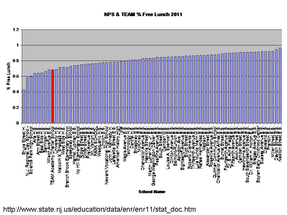
Here’s an updated graph of TEAM vs. all NPS schools districtwide, using % free lunch data from 2010-11 from the NJDOE enrollment files: http://www.state.nj.us/education/data/enr/enr11/stat_doc.htm


I have previously reported on special education data, which are sorely lacking in NJ at the school level. Suffice it to say that all official reports indicate lower special education enrollments in TEAM than district averages, but unofficial and district provides school site reports for Newark Public Schools vary widely. Here’s the most recent classification data at the district level for Essex County districts and select Newark charters:

While TEAM has a much higher classification rate than other “high-flying” Newark charters, its total rate is still much lower than Newark Public Schools. Further, we have no information on the enrollment of children with severe disabilities.

Second, here are the cohort attrition rates for Newark charters. Indeed TEAM has lower attrition than some, but still shows significant attrition from year to year (old slide, so North Star is highlighted). We don’t know much about the nature of that attrition, nor can these data tell us about it.

Now on to resource issues. According to TEAM Academy’s IRS 990 form, the school spent in 2010:

Total Program Expenditures = $19,452,929

TEAM IRS 990

On 1,050 students

For a total per pupil of $18,527

It is important to understand that this figure may not be a full representation of what TEAM spends. It does not include additional expenditures on school activities by the national KIPP organization under which TEAM operates (which may include professional development, instructional materials, other gifts/stipends, etc.).

It is critically important to understand that this figure is not directly comparable to NPS total district budget per pupil for many reasons.  NJDOE data for making such comparisons are problematic in a number of ways, and newly revised data are no better than the older data.

This figure would need to be compared with an appropriate school site expenditure figure for NPS schools serving similar grade levels and populations.  For example, NPS district expenditures include the expenditures for transportation of charter students (which should be added to charter expense, not counted on host district expense). Further, one must acknowledge that since TEAM serves a far fewer children with disabilities than the district, especially those with more severe disabilities, TEAMs per pupil costs are lower. Note that spending on children with disabilities often consumes about 25%  of district budgets (to serve about 14 to 16% of children, on average).* Appropriate comparisons would include relevant facilities expenses (annualized) for both charter and host.*  I wrote extensively about the complexities of making similar comparisons in NYC last winter: http://nepc.colorado.edu/publication/NYC-charter-disparities And I continue to work on this topic, as it applies to NJ districts and charter schools.

But here is perhaps the most important point that can be made about resources…

There should be no shame in trying to spend enough money to actually provide a decent education!

It is twisted logic to assume otherwise! And the Star Ledger editorial ignorantly advances this twisted logic.

There’s no shame in doing more with more or even similar levels of resources (if that is indeed what’s happening).

Here are some insights into how TEAM spends. Many pundits these days talk about how we shouldn’t be throwing so much money at those already overpaid teachers.  Well, here’s how TEAM Academy’s salaries stack up against some nearby public districts and against some other charters. This is an unfinished analysis, based on actual individual teacher salaries from a statewide database.

TEAM has strategically, I would argue, put itself in a position to recruit top new teaching candidates on the front end and scaled up salaries to retain teachers who’ve made it past those rough first few years. Yes, TEAM is leveraging its resources to pay competitive wages (something not so hip and cool in today’s reformy rhetoric), which I would argue is a smart move. And, in the Newark context it’s not a difficult move because the NPS district salary schedule is so flat on the front end. It’s easy to beat. And relative salaries matter. Indeed, TEAM has placed more value on early-mid career than late career, but it’s not that TEAM reduces salaries for later career teachers, but rather that TEAM salaries climb earlier. As of now, TEAM doesn’t have many “senior” teachers, partly because it hasn’t been around that long.

Again, to summarize:

  • It’s not a miracle but it just may be a pretty good school.
  • It doesn’t serve the same population, but serves more similar population than many other high-flying charters.
  • It spends quite a bit and pays its teachers particularly well, but structures that pay differently.

AND THERE’S ABSOLUTELY NOTHING WRONG WITH THAT. (even if it doesn’t make good news copy!)

So, that’s my “real” TEAM story – at least in data terms. I assume Ryan Hill can provide some insights from the trenches (perhaps while humming this catchy tune: http://www.youtube.com/watch?v=gQjFHxJ9IKs)!

*For example, special education costs per pupil within a district budget that spends $20,000 per pupil might be $5,000 per pupil, or 25% (based specifically on analysis of special education expenditures in Connecticut districts). In New York City, the Independent Budget Office (see my NEPC report on charter spending above) estimated occupancy costs for facilities to be approximately $2,700 per pupil. That is to say, on balance, the differences in district special education population costs (relative to Charter special education costs) would typically more than offset differences in facilities costs per pupil, assuming district schools have $0 facilities costs (which is an extreme, incorrect assumption).

DATA UPDATE – HERE ARE TEAM ACADEMY’S 2010 OUTCOMES IN PERSPECTIVE

The following graphs do a relatively simple comparison of proficiency rates by schoolwide % of children qualifying for free lunch. Two data issues are important to recognize here:

1) I’ve used schoolwide % free lunch here instead of test taker % free or reduced lunch because, as I’ve explained numerous times before, the vast majority of Newark families fall below the 185% income threshold and qualify for at least reduced price lunch. As such, that measure captures little or no difference across schools. But there are differences, and those differences are captured by looking at the lower income threshold for reduced price lunch.

2) Because charter schools including TEAM serve so many fewer children with disabilities and few or no children with severe disabilities, one must compare the proficiency rates of GENERAL test takers only. If, for example, a host district has 10% more kids with disabilities and those kids are invariably non-proficient, that’s a 10% proficiency difference to begin with.

In these figures, I’m considering only low income concentrations with respect to outcomes. On that basis alone, TEAM is marginally above expectations a) overall, and b) on most grade level assessments. On the high school assessment, TEAM does somewhat better, but schools are pretty much scattered all over the place. It’s a solid school, but no miracles.

Rating Ed Schools by Student Outcome Data?

Tweeters and education writers the other day were  all abuzz with talk by U.S. Secretary of Education Arne Duncan of the need to crack down on those god-awful schools of education that keep churning out teachers who don’t get sufficient value-added out of their students.

see: http://www.educatedreporter.com/2011/10/teacher-training-programs-missing-link.html?utm_source=twitterfeed&utm_medium=twitter

Once again, the conversations were laced with innuendo that it is our traditional public institutions of higher education that have simply failed us in teacher preparation. They accept weak students, give them all “As” they don’t deserve and send the out to be bad teachers. They, along with the lazy greedy teacher graduates they produce simply aren’t  cutting it, even after decades of granting undergraduate degrees and certifications to elementary and secondary teachers.

This is a long post, so I’ll break it into parts. First, let’s debunk a few myths – a) regarding who is cranking out degrees and credentials in the field of education and b) regarding whether education policy should ever be guided by the actions of Louisiana or Tennessee. Second, let’s take a look at teacher production and distribution across schools in a handful of Midwest & plains states.

Who’s crankin’ out the credentials?

Allow me to begin this post by reminding readers – and POLICYMAKERS – that many initial credentials for teachers these days aren’t granted at the undergraduate level – but rather as expedited graduate credentials. Further, the mix of institutions granting those degrees has changed substantially over the decades, and perhaps that’s the real problem?

Here’s the mix of masters degree production in 1990:

And again in 2009:

Yes, by 2009, thousands of teaching credentials and advanced degrees were being churned out each year by online mass production machines. Perhaps if we really feel that there has been a precipitous decline in teaching quality, these shifts may be telling us something! What has changed? Who is now cranking out the credentials/degrees?

Now, I’m no big fan of the types of accountability systems and self-regulation that have been in place for education schools (specifically credential granting programs) in recent years.I tend to feel that these systems largely reward those who do the best job filling out the paperwork and listing that they have covered specific content standards (a syllabus matching exercise), while many simply lack qualified faculty to deliver on such promises. For more insights, see:

  • Wolf-Wendel, L, Baker, B.D., Twombly, S., Tollefson, N., & Mahlios, M. (2006)
    Who’s Teaching the Teachers? Evidence from the National Survey of Postsecondary
    Faculty and Survey of Earned Doctorates. American Journal of Education 112 (2) 273-
    300

A colleague of mine at the University of Kansas (we’ve now both moved on) used to joke that we should simply list on our accreditation forms the names of all of the already accredited institutions that are plainly and obviously worse than us (Kansas). That should be sufficient evidence, right?

But, simply because current systems of ed school accountability may not be cutting it does not mean that we should rush to adopt the toxic foolish policies being thrown out on the table in current policy conversations, including the recent punditry of Arne Duncan on the matter.

First, let’s dispose of the notion that Louisiana and Tennessee can ever be used as model states.

Specifically, we are being told that states must look to Louisiana and Tennessee as exemplars for reforming teacher preparation evaluation. Exemplars yes. Positive ones? Not so much. Allow me to point out that I don’t ever intend to consider Louisiana or Tennessee as a model for education policies until or unless either state actually digs their public education system out of the basement of American public schooling. These states are a disgrace at numerous levels, and not because they have high concentrations of low-income children. Rather, because both put little financial effort into their education systems and perform dismally. Both have large shares of children exported entirely. They are not models!  Here’s my stat sheet on the two:

Sure, not a single measure in the table above relates to the teacher evaluation proposals on the table. And true, these states have adopted novel (putting the best light on it) models for evaluating teacher preparation programs. But, when put into the context of these states, one will likely never know whether or if those models of teacher prep program evaluation are worth a damn. Further, when placed into a context of states with such a historic record of deprivation of their public education systems, one might even question the motives of the “crack down” on teacher education. Can a state really be serious about improving public education with the record presented above?

Suggesting that these states are now models because they have decided to rate teacher education programs on the basis of the test scores of students of teachers who graduated from each program does not, can not, make these states models.

Perils of evaluating teacher preparation programs by value-added scores of the students of teachers who graduated from them?

Here’s where it gets tricky and really messy and for at least three major reasons. The proposals on the table suggest that the quality of teacher preparation programs can somehow be measured indirectly by estimating the average effect on student outcomes of teachers who graduated from institution x versus institution y.  Further, somehow, evaluation of these teacher preparation programs can be controlled through state agencies, with specific emphasis on state accredited teacher producing institutions.

  • Reason #1: Teachers accumulate many credentials from many different institutions over time. Attributing student gains of a teacher (or large number of teachers) to those institutions is a complex if not implausible task. Say, for example that a teacher in St. Louis got an undergraduate degree from Washington University in St. Louis, but not a teaching degree. The teacher got the position on emergency or temporary certification (perhaps through some type of “fellows” program) with little intent to make it a career – decided he/she loved teaching – and eventually got credentialed time through William Woods University (a regional mass producer of teacher and administrator credentials). Is the credential institution, or the undergraduate institution responsible for this teacher’s success or failure?
  • Reason #2: If one looks at the data on the teacher workforce in any given state, one finds that teachers hold their various degrees from many, many institutions – institutions near and far. True, there are major producers and minor producers of teachers for any given labor market. But, in any given labor market or state, one is likely to find teachers with degrees from 10s to 100s of institutions. In some cases, there may be only a few teachers from a given institution (for example Michigan State graduates teaching in Wisconsin).  That makes it hard to generate estimates of effectiveness. Should states simply cut off these institutions? Send their graduates home? Never let them in? Further, while teachers do in many cases come from within-state public institutions, they also come from a scattering of institutions in border states, especially where metropolitan labor markets spread across borders.  Value-added estimates of teacher effectiveness will depend partly on state testing systems (ceiling effects, floor effects).  What is an institution to think/do when its graduates are rated highly in one state’s value-added model, but low in another? Does that mean they are good, for example at teaching Iowa kids but not Missouri ones? Iowa curriculum but not Missouri curriculum? Or simply whether the underlying scales of the state tests were biased in opposite directions? Can/should states start to erect walls prohibiting inter-state transfer of credentials? (after years of working toward the opposite!)
  • Reason #3: It will be difficult if not entirely statistically infeasible to generate non-biased estimates of teacher program effectiveness since graduates are NOT RANDOMLY DISTRIBUTED ACROSS SETTINGS. I would have to assume that what most states would try to do is to estimate a value-added model which attempts to sort out the average difference in student gains of teachers from institution A and from institution B, and in the best case, that model would include a plethora of measures about teaching contexts and students. But these models can only do so much in that regard. While this use of the value-added method may actually work better than attempts to rate the quality of individual teachers, it is still susceptible to significant problems, mainly those associated with non-random distribution of graduates. Here are a few examples from the middle of the country:

The first focuses on recent graduates of in-state Kansas institutions and the characteristics of schools in which they worked during their first year out. The average rate of children qualified for subsidized lunch ranges from under 20% to nearly 50%. Further, this average actually varies to this extent largely because teachers are sorted into geographic pockets around the state which differ in many regards. The most legitimate statistical comparisons that can be made across teacher prep graduates from these institutions are the comparisons across those working in similar settings. In some cases, the overlap between working conditions of graduates of one institution and another is minimal. And Kansas is a relatively homogeneous state compared to many!

Here’s Missouri, with teachers having 5 or fewer years of experience, and the percent free or reduced price lunch in schools where the teachers currently work. I’ve limited this figure to those institutions producing only very large numbers of Missouri teachers, which is less than half of the entire list. Notably, many of these institutions are from border states, including University of Northern Iowa and Arkansas State University. These universities tend to produce teachers for the nearest bordering portions of Missouri.

Again, there are substantial differences in the average low-income population in schools of graduates from various universities. Not here that graduates of the state flagship university – University of Missouri at Columbia – tend to be in relatively low poverty schools. Assuming the state testing system does not suffer ceiling effects, this may advantage Mizzou grads. Kansas grads above have a similar advantage in their state context. Graduates of Arkansas State, and of Avila College near Kansas City may not be so lucky.

Just to beat this issue into the ground… here’s a Wisconsin analysis comparable to the Missouri analysis. Graduates of Milwaukee area teacher prep institutions including UW-Milwaukee, Marquette and Cardinal Stritch may have significant overlap in the types of populations served by their graduates. But most are in higher poverty settings than graduates of the various state regional colleges. Again, only the BIG producers are even included in this graph. And the differences are striking statewide. And graduates are substantially regionally clustered further complicating effectiveness comparisons across teacher producing institutions.

These are just illustrations of the differences in one single parameter across the schools/students of graduates of teacher preparation programs. The layers difference in working conditions go much deeper, and include, for example, substantial variations in average class sizes taught, as well as significant often unmeasured neighborhood level differences in diverse metropolitan areas. Teacher labor markets remain relatively local. Teachers remain most likely to teach in schools like the ones they attended, if not the exact ones. Teacher placement is non-random. And that non-randomness presents serious problems for evaluating the quality of teacher preparation programs on the basis of student outcomes.

Is it perhaps interesting as exploratory research to attempt to study the relative “efficacy” of teacher prep programs by these and other measures to see what, if anything, we can learn? Perhaps so.

Is it at all useful to enter so blindly into using these tools immediately in making high stakes accountability decisions about institutions of higher education? Heck no! And certainly not because policymakers in Louisiana or Tennessee said so!

Ed Next’s triple-normative leap! Does the “Global Report Card” tell us anything?

Imagine trying to determine international rankings for tennis players or soccer teams entirely by a) determining how they rank relative to the average team or player in their country, then b) having only the average team or player from each country play each other in a tournament, then c) estimating how the top teams would rank when compared with each other based only on how their country’s average teams did when they played each other and how much better we think the individual teams or players are when compared to the average team or player in their country? Probably not that precise or even accurate, ya’ think?

Jay Greene and Josh McGee have produced a nifty new report and search tool that allows the average American Joe and Jane to see how their child’s local public school districts would stack up if one were to magically transport their district to Singapore or Finland.

 http://globalreportcard.org/

Even better, this nifty tool can be used by local newspapers to spread outrage throughout suburban communities everywhere across this mediocre land of ours.

To accomplish this mystical transportation, Greene and McGee rely on wizardry not often employed in credible empirical analysis: The Triple Normative Leap. Technically, it’s two leaps, across three norms. That is, the researcher-acrobat jumps from one normalized measure based on one underlying test, to another, and then to yet another (okay, actually to 50 others!). This is impressive, since the double-normative leap is tricky enough and has often resulted in severe injury.

To their credit, the authors provide pretty clear explanations of the triple-normative leap
and how it is used to compare the performance of schools in Scarsdale, NY to kids in Finland without ever making those kids sit down and take an assessment that is comparable in any
regard.

For example, the average student in Scarsdale School District in Westchester County, New York scored nearly one standard deviation above the mean for New York on the state’s math exam. The average student in New York scored six hundredths of a standard deviation above the national average of the NAEP exam given in the same year, and the average student in the United States scored about as far in the negative direction (-.055) from the international average on PISA. Our final index score for Scarsdale in 2007 is equal to the sum of the district, state, and national estimates (1+.06+ -.055 = 1.055). Since the final index score is expired in standard deviation units, it can easily be converted to a percentile for easy interpretation. In our example, Scarsdale would rank at the seventy seventh percentile internationally in math.

Note: Addition and spelling errors in Jay Greene’s original web-based materials: http://globalreportcard.org/about.html

Now, Greene and McGee do recognize the potential limitations of making this leap across non-comparable assessments, with potentially non-comparable distributions. In their technical appendix, which few other than geeky stat guys like me will ever read, they explain:

In order to construct the Global Report Card we combine testing information at three separate levels of aggregation: state, national, and international. At each level we use the available testing information to estimate the distribution of student achievement. To allow for direct comparisons across state and national borders, and thus testing instruments, we map all testing data to the standard normal curve.

We must make two assumptions for our methodology to yield valid results. First, mapping to the standard normal requires us to make the assumption that the distribution of student achievement on each of the testing instruments is approximately normal at each level of aggregation (i.e. district, state, national). Second, to compare the distribution of student achievement across testing instruments we assume that standard deviation units are relatively similar across the 2 testing instruments and across time. In other words we assume that being a certain distance from mean student performance in Arkansas is similar to being the same distance from mean student performance in Massachusetts.

http://globalreportcard.org/docs/AboutTheIndex/Global-Report-Card-Technical-Appendix-8-30-11.pdf

So, they appropriately lay out the important assumptions that to actually rate individual districts in the U.S. against international standards, based on relative position to a) other districts in their state, b) their state to the entire U.S., and then c) the entire U.S. relative to other countries, one must have a reasonable expectation that the distributions at each level are a) normal and b) have similar ranges. The range piece is key here because the spread of scores at any level dictates how many points a district can gain or lose when making each leap.  Again, they appropriately lay out these potential concerns. And then, true-to-form, they ignore them entirely. They don’t even test whether these assumptions hold.

The way I see it, if you’re going to point out a limitation and completely ignore it, you should at least point it out in the body of the report, not the appendix.

Setting aside that little concern for now, here’s how it all works. Walking backwards through their analysis each US district starts with penalty points based on the U.S. mean on PISA compared to the international mean.  That is, every district in the US is given a penalty point (-.055) partly because of the legitimately low performance of large numbers of US students in states that have thrown their public education systems under the bus, including Arizona, Colorado… but more strikingly, Louisiana and the deep south.

Now, a high performing state might then be able to offset their national penalty by outperforming U.S. norms… but only to the extent that NAEP has a wide enough distribution to allow a high performer to gain enough points back to make up that ground. If NAEP has a narrower range than the PISA distribution, even if you rock on NAEP, you can’t gain back the ground lost. In theory, this might even make some sense, but it would depend on the truth of the report’s key assumptions, which (as noted) are never tested.

The next move in the triple-normative leap is the move to the wacky collection of state assessments and their widely varied scale score distributions. High performing districts in a state like California, where the mean NAEP score of California gives everyone another layer of penalty to start, and a big one at that, are screwed. California high performers get a NAEP based penalty on top of their US average penalty and have to make up that entire deficit with standard deviations on state assessments. They’ve got a lot of ground to make up in standard deviations from their own state mean on their state assessment (if it’s even possible).

Let’s take a look at some of the actual district level distributions of standardized mean scale scores on state assessments. Remember, Green and McGee’s triple normative leap only works well to the extent that state assessments are a) normally distributed, b) have similar range and c) are not particularly skewed in one direction or the other.

Note that these graphs are of the normalized distributions of scale scores.

Here’s California

Here’s Ohio

And Here’s Indiana

Oh well, so much for that little assumption. Perhaps most importantly, these distributions show that it depends quite a bit on what state your district is in whether your district has reasonable likelihood of making up 1, 2 or 3 points in the last normative leap.

Remember, every district loses over half a point from the start based on U.S. PISA performance. California districts actually appear to have greater opportunity to make up more ground on the last leap, because the spread of California normed scores on state assessments is wider. But, they’ll need it, since their state average performance on NAEP gets all districts in the state a large penalty.

Anyway, while it may be fun to play with Green and McGee’s nifty web-based search tool, it really doesn’t give us much a picture as to how individual local public school districts in the U.S. stack up against foreign nations. It’s just too much of a stretch to assume that a district’s normative position on quirky state assessments, with non-normal distributions, can actually be translated with any precision to represent that district’s position within the performance distribution of schools in Finland or Singapore.

So, while it may be fun to play with the tool and see how different local public school districts compare, more or less to one another as they relate to other countries, it is totally inappropriate to make bold claims that any of these findings speak to the supposed “mediocrity” of the best public schools in the U.S. Many may appear mediocre when transported internationally for no reason other than the penalty points assessed to them in the first two normative leaps (national and state mean), neither of which has much to do with their own performance.

And these concerns ignore the fact that we are dealing with substantively different assessment content. See: http://nepc.colorado.edu/thinktank/review-us-math

Addendum:

McGee was kind enough to open a discussion on the topic below, and clarified… which what I was assuming already… that:

“We assume that being a certain distance from mean student performance in Arkansas is relatively similar to being the same distance from mean student performance in Massachusetts.”

My response is that the spread or variance issue is critically important here, even, and especially when making this kind of assumption. It comes down to the reasons for the differences in spread (like the differences seen in the above histograms).

The variance in each state’s assessments across districts contains some variance that truly indicates differences in performance and some that indicates differences in tests. The problem is that we can’t tell which portion of the spread is “real” variation in performance across districts (driven largely by demographic differences) and which is a function of the different assessments – especially the different assessments across states. Some of the variance is clearly constrained by the underlying testing differences, and may also be upper or lower limit constrained.

Third Way’s “Revisionist Analysis” [Bold-faced lie!]

I know I said I’d stop addressing the Third Way report on Middle Class Schools, but I do have one more thing to point out. Third Way issued a memo in which it aggressively attacked my assertion that they had used district level data to characterize middle class schools. Again, this assertion was relevant to showing the absurdity of their classification scheme, but there were numerous other problems with the report.

My NEPC Review

My NEPC Response to Third Way Memo regarding Methods

Third way claims my analyses to be “fatally flawed” because, as they claim in their follow-up memo, their analyses were actually at the school level and did not, as I show in tables in my review, contain all schools in poor cities including Detroit, Philadelphia or Chicago. Allow me to point out that what I actually said in my review was:

That is, these large urban districts are counted in any Third Way district-level analyses as middle-class districts.

I was very clear in my review that the table of large cities pertained specifically to “district-level” analyses in the Third Way report. I further explained extensively the problems with their continued mixing of school, individual family and district units.

But here’s the kicker based on one last check of their original report and the follow-up memo. In the follow up memo, the authors include this footnote to explain their methods – focusing on how they collected school level data from the NCES Common Core (school level data that never actually show up in any form, any table, in their original report). Note the part in this footnote where they explain selecting “school” as the unit of analysis:

Footnote in Memo

http://content.thirdway.org/publications/446/Third_Way_Memo_-_A_Response_to_the_National_Education_Policy_Center_.pdf

Footnote #8 Third Way calculations based on data from the following source: United States, Department of Education, Institute of Education Statistics, National Center for Education Statistics, Common Core of Data. Accessed September 22, 2011. Available at: http://nces.ed.gov/ccd/bat/. The Common Core of Data includes data from the “2008-09 Public Elementary/Secondary School Universe Survey,” “2008-09 Local Education Agency Universe Survey,” and “2000 School District Demographics” from the U.S. Census Bureau. To generate data from the Common Core of Data, in the “select rows” drop down box, select “School.” Then select next. On the following page, in the “select columns” drop down box, choose the “Students in Special Programs” option. Select the box next to “Total Free and Reduced Lunch Students.” Then in the drop down box, select “Contact Information” option. Then select the box next to “Location City.” Then go back to the “select columns” drop down box and select the “Enrollment by Grade” option.  Then select the box next to “11th Grade enrollment.”  Then go more time to the “select columns” drop down box, choose “Total enrollment.” Then select the box next to “Total students.” Then select next. On the next page, choose “Illinois.” Then click the “view table” option. Once the table is compiled, download the table into Excel.csv by clicking that option at the top of the page. To calculate the number of high schools in Chicago with a student population of between 26-75% eligible for NSLP, we performed the following steps: 1) We first sorted by schools based on % NSLP (number of students eligible for free or reduced lunch divided by total number of students enrolled). 2) We then pulled out the schools that had enrollment in 11th grade. 3) We then sorted the schools based on location city, and pulled out the schools located in the City of Chicago.

Now, check out the two related (copied and pasted) footnotes from their original report. Each indicates using DISTRICT level data.

In short, the follow up memo was simply a lie – a flat out lie – and included revisionist analysis completely unrelated to any information actually presented in the original report.

I have retained copies of the originals, if the authors should choose to now go back and edit/change these footnotes.

Doing crappy analysis is one thing. Trying to cover it up by lying and revising while leaving the trail behind really doesn’t help.

Original Report

http://content.thirdway.org/publications/435/Third_Way_Report_-_Incomplete_How_Middle_Class_Schools_Aren_t_Making_the_Grade_-_PRINT.pdf

Footnote #40 Third Way calculations based on data from the following source: United States, Department of Education, Institute of Education Statistics, National Center for Education Statistics, Common Core of Data. Accessed July 25, 2011. Available at: http://nces.ed.gov/ccd/ bat/. The Common Core of Data includes data from the “2008-09 Public Elementary/Secondary School Universe Survey,” “2008-09 Local Education Agency Universe Survey,” and “2000 School District Demographics” from the U.S. Census Bureau. To generate data from the Common Core of Data, in the “select rows” drop down box, select “District.” Then select next. On the following page, in the “select columns” drop down box, choose the “Census 2000 – Household Income, Occupancy and Size” option. Then check the box next to “Median Family Income.” Then go back to the “select columns” drop down box, choose the “Students in Special Programs” option. Select the box next to “Total Free and Reduced Lunch Students.” Then go back one more time to the “select columns” drop down box, choose “total enrollment.” Then select the box next to “total students.” Then select next. On the next page, choose the “Select 50 States + DC” filter from the drop down box. Then click the “view table” option. Once the table is compiled, download the table into Excel.csv by clicking that option at the top of the page. To calculate average household income by school district, we performed the following steps: 1) We first sorted school districts based on % NSLP (number of students eligible for free or reduced lunch divided by total number of students enrolled). 2) Using CPI for 2009, we adjusted the incomes for inflation. 3) We then found the median household income, based on the following groupings: 0-25.44%, 25.45-75.44%, 75.45-100% NSLP.

Footnote #88 Third Way calculations based on data from the following source: United States, Department of Education, Institute of Education Statistics, National Center for Education Statistics, Common Core of Data. Accessed July 25, 2011. Available at: http://nces.ed.gov/ccd/ bat/. The Common Core of Data includes data from the “2008-09 Public Elementary/Secondary School Universe Survey”, “2008-09 Local Education Agency Universe Survey,” and “2000 School District Demographics” from the Census Bureau. To generate data from the Common Core of Data, in the “select rows” drop down box, select “District.” Then select next. On the following page, in the “select columns” drop down box, choose the “Census 2000 – Household Income, Occupancy and Size” option. Then check the box next to “Median Family Income.” Then go back to the “select columns” drop down box, choose the “Students in Special Programs” option. Select the box next to “Total Free and Reduced Lunch Students.” Then go back one more time to the “select columns” drop down box, choose “total enrollment.” Then select the box next to “total students.” Then select next. On the next page, choose the “Select 50 States + DC” filter from the drop down box. Then click the “view table” option. Once the table is compiled, download the table into Excel.csv by clicking that option at the top of the page. To calculate average household income by school district, we performed the following steps: 1) We first sorted school districts based on % NSLP (number of students eligible for free or reduced lunch divided by total number of students enrolled). 2) Using CPI for 2009, we adjusted the incomes for inflation. 3) We then found the median household income, based on the following groupings: 0-25.44%, 25.45-50.44%, 50.45-75.44%, 75.45-100% NSLP.

Newsflash! “Middle Class Schools” score… uh…in the middle. Oops! No news here!

I’ve already beaten the issue of the various flaws, misrepresentations and outright data abuse in the Third Way middle class report into the ground on this blog. And it’s really about time for that to end. Time to move on. But here is one simple illustration which draws on the same NAEP data compiled and aggregated in the Middle Class report. For anyone reading this post who has not already read my others on the problems with the definition of “Middle Class,” and related data abuse & misuse please start there:

My NEPC Review

My NEPC Response to Third Way Memo regarding Methods

My blog response to the argument that I’m simply a Status-quo-er

Again, the entire basis of the Third Way report is that our nation’s middle class schools are under-performing… not meeting expectations… dismal…dreadful… failures!  Now, setting aside the absurd methods used for classifying “middle class” and setting aside that the report mixes units of analysis illogically throughout (districts vs. schools vs. individual families, regardless of district or school attended) and mixes data across generations of high school graduates, how did they really expect middle class schools to perform? Did they expect them NOT to be IN THE MIDDLE? That seems rather foolish. No, wait, it is entirely foolish!

Here’s one very simple example showing the NAEP 8th grade math mean scale scores of children in 2009 by the percent of children in their school who qualify for the National School Lunch Program:

Rather amazingly, what we see here is that as school level % low income increases, NAEP mean scale scores decrease. Interestingly, the NAEP reporting tool chooses to include anomalous categories of 0% and 100%, which, not surprising, don’t fall right in line. Across the low income brackets, but for the anomalous endpoints, the relationship is nearly linear – with mean scale scores declining incrementally from the 1 to 5% low income group to the 76 to 99% category. Note also, that consistent with my previous explanations, the supposed “middle class” is actually to the right hand side – poorer side – of the distribution.

Most importantly… and really no freakin’ surprise… in fact something I shouldn’t ever even have to graph in order to validate it – THE SUPPOSED “MIDDLE CLASS” SCHOOLS FALL WHERE? RIGHT IN LINE! RIGHT IN THE DAMN MIDDLE OF THE CATEGORIES ON EITHER SIDE OF THEM? HOW THE HECK IS THAT PERFORMING UNDER EXPECTATIONS? THAT, MY FRIENDS, IS LUDICROUS! IT’S RIGHT ON EXPECTATIONS – STATISTICALLY!

Whether we as a country are, or whether I specifically am happy with the level or distribution of outcomes in the above figure is an entirely different issue. I might want to see higher outcomes across the board. Personally, I’d love to see the resources leveraged to begin to raise the outcomes on the right hand side of the graph – to reduce the clear linear relationship between low income concentrations and student outcomes.  But I also understand that the national aggregate relationship shown in the figure above has underlying it, the embedded disparities of 50 unique state education systemssome where states are making legitimate efforts to provide resources to improve equity in educational outcomes, and others quite honestly, that have done little or nothing for decades and in some cases have systematically eroded the equity and adequacy of resources over time (well before the current fiscal crisis)!

Fixing these disparities is a large and complex task and one that is not aided by small minded rhetoric and flimsy oversimplified analyses.

Insult of insults from Third Way – Baker, You… You… Status Quo…er!

I gotta admit that my favorite part of the Third Way memo responding to my critique of their “Middle Class” report is the end of the memo.

Here are the two concluding paragraphs from the Third Way memo in reply to my rather harsh critique of their report:

 There are 52,860 public and charter schools that fall within our definition of middle-class schools, and they educate 25.7 million16 students. The message from Dr. Baker and the NEPC seems to be—let’s ignore them. In fact, let’s not even define them. Our view is that there is immense potential out there. These schools are failing in their basic mission—to become college factories.

From our perspective, college graduation rates of 31% and 23% in the second and third NSLP groupings, respectively—as our report presents—are unacceptable for America’s economic future. Clearly, the NEPC and Dr. Baker disagree and are satisfied with the status quo. We are not.

Yes, there it is. The insult of insults in reformyland! I am, as a result of critiquing their near criminal abuse of data, a… a… Status Quo-er!

Obviously, anyone (like me) who might take offense at such egregious representation of data must be a defender of the status quo. That is the worst offense in today’s reform debate. Especially if the egregious abuse of data was done with good intentions? Right? Done with the good intentions of letting the American public understand just how awful their schools are!  They need to know. America needs to know! And now! This can’t wait! Even if we have to classify information illogically or draw conclusions that don’t even match our data?

Look, bad data analyses and bombastic conclusions about our supposed education apocalypse do little or nothing to start a genuine conversation about either the true current conditions of our schools or whether we should be considering systemic changes.

Often, such crisis mode reporting has as its central objective, encouraging the public and policymakers to act in haste and adopt ill-conceived (often self-serving) policy before they know what’s really going on. That is, let’s get in a panic and adopt something really stupid and fast.  Any reader should be wary of and evaluate critically crisis-mode reports like the Third Way middle class report. Some such reports may ultimately reveal important issues and some even with a degree of immediacy. Third Way’s report reveals neither.