A Few Additional CT Charter Figures

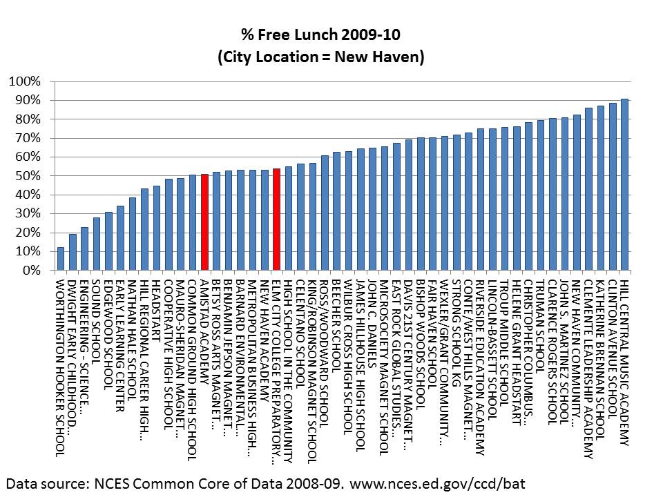
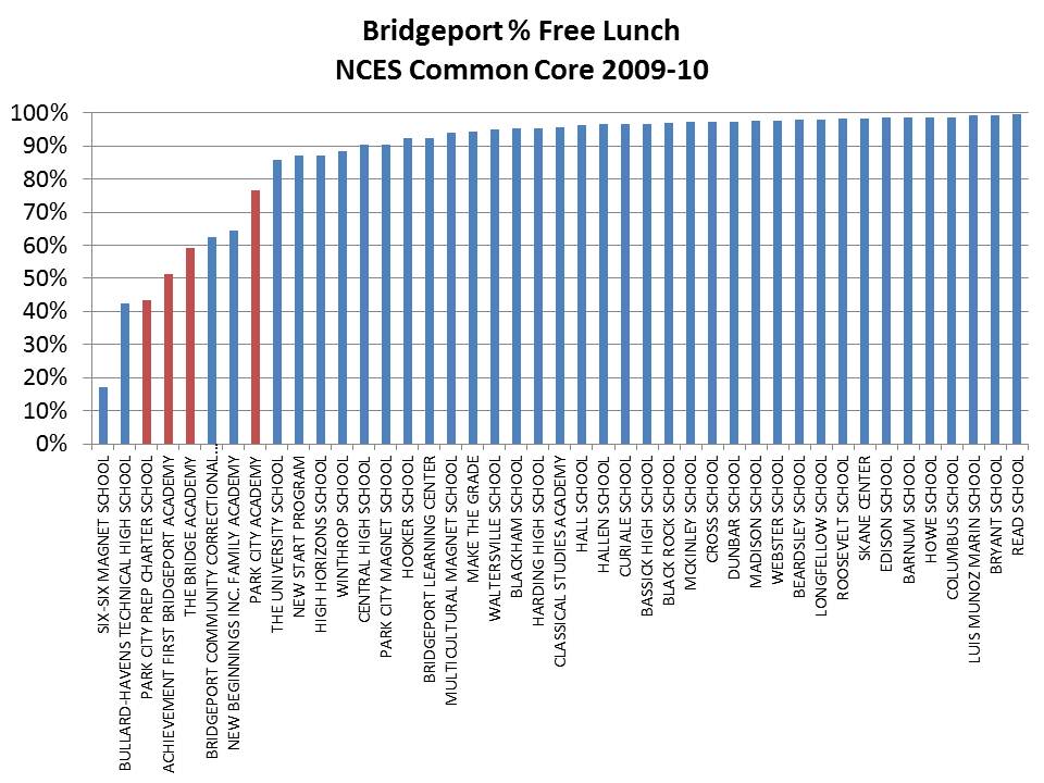
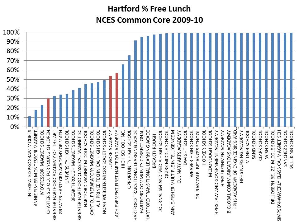
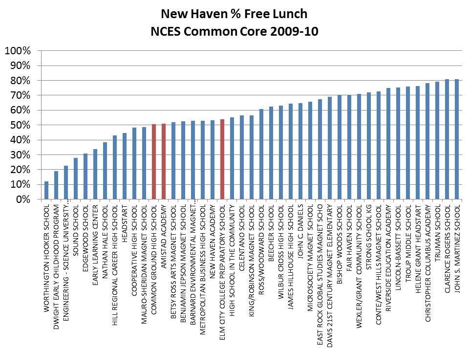
I was admittedly in a bit of a rush the other day to pull together some figures on CT charter schools based largely on data I had previously compiled, some of which only included Achievement First charter schools.  Here, I include all charter schools in Hartford, New Haven and Bridgeport, and address only the % Free Lunch numbers using the most recent available data from the NCES Common Core of Data, which are from 2009-10.  A few quick points are in order.

First, this is not “old” data per se. It is one year lagged from the  most recent official state data (2010-11). Current year (2011-12) data would not be appropriate for use until the close of the year. Thus 2010-11 would be the most recent complete data, if available. Also, these types of data tend to be relatively stable over time. They don’t shift much over a 2 year period, but I’ll keep updating as complete end of year data become available. The burden of reporting accuracy falls on the schools and districts.

Second, this is not a “study.” A study, so to speak, in my view, requires far more extensive analysis than this. And yes, this is a topic on which I have conducted those more extensive analyses (though not specifically involving CT charter schools). This is a blog, and in this blog post and in the previous blog post on CT Charter schools I have merely rendered graphs of the existing data as reported by the schools. There’s no data editing involved, and no tricky statistical analyses ( like the regression model of wages in my CT teacher post – which come from previous work). It’s just graphs. Then why bother? Well, I bother because much of what I see in the ongoing debate over CT charter schools (and charters in some other locations) is guided by misinformation, or at least misconceptions (of charters beating the odds with the “same” students – proving poverty doesn’t matter! nor does money?).  Misinformation that is easily enough correctable with a simple graph or two, or map, or even table of the numbers. Hey… all of these numbers are available to each and every one of you. I’ve provided posts in the past where I explain how to get them and how to summarize and graph them.  I wish someone else would save me the time, and go make their own graphs, or at least present and discuss the existing data to provide relevant context for current policy discussions. But alas, I’ve not seen that happening (though a few individuals have jumped into the game). Thus, I stick my nose, uninvited into another state’s business once again.

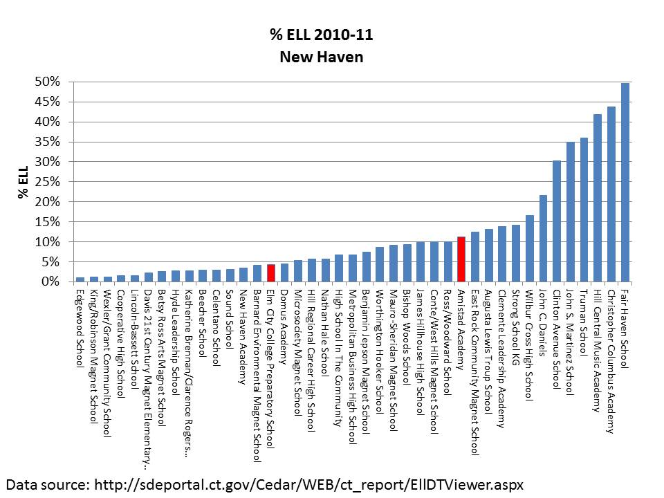
All of that said, here are a few more graphs:

The upshot of these graphs is that it would certainly be unfair to criticize Achievement First specifically for serving fewer low income children than district schools in these major cities. In fact, in both New Haven and Hartford, the Achievement First charters have the higher low income concentrations among the charters, and in Bridgeport they are not the lowest.

It is also important to understand that districts have to a large extent self-induced economic segregation through their own magnet school programs. I’ve addressed the same issue regarding Newark, NJ in the past. So, economic segregation within these cities is not entirely driven by the presence of charters but rather by the complex mix of district traditional and magnet schools coupled with the introduction and expansion of charters.


SB24 won’t solve CT’s real Teacher Equity Problems

Connecticut’s SB 24 appears to be little more than boilerplate reformy legislation which, like similar legislation in other states, creates a massive smokescreen concealing the very real problems facing Connecticut school districts. I addressed in a previous post my concern that SB24’s emphasis on charter expansion as a solution for high poverty districts is misguided, mainly because most of those successful charter schools in CT are currently achieving their successes at least in part by NOT serving high poverty populations. And another part may be the additional resources of these schools, used for such things as increased school time, supported by increased teacher salaries.  But SB24 comes with few resources attached. The other major elements of SB24 involve teacher “effectiveness” with significant emphasis on use of student performance measures for teacher evaluation. For numerous posts on this topic, see: https://schoolfinance101.wordpress.com/category/race-to-the-top/value-added-teacher-evaluation/

A few points are in order before I move on.

First, even if we make value added measures about 20% of an evaluation system, and observations and other measures cover the rest, if the value-added measures vary most (which they are likely to, simply because they will be reported as statistically norm-referenced), then the value added measures likely become the tipping point more often than not. This is hugely problematic, given our inability to fully remove bias from these measures, and the fact that they remain so damn noisy as to hardly be useful at all (and are easily manipulated to yield different results for individual teachers)

Second, arguing that somehow using these noisy, potentially biased measures for personnel management or even mass deselection of teachers will somehow improve the equity of the distribution of teachers across advantaged and disadvantaged schools is simply absurd! This is especially the case if absolutely no attention is paid to existing underlying disparities in working conditions and teacher compensation.

The Real Connecticut Problem(s)

So, let’s take a look at what’s really going on in Connecticut regarding the distribution and compensation of teachers. But, let me begin with a bit of background literature on the relationship between funding and teacher quality. Rather than reinvent the wheel here, allow me to rely on a section of a policy brief I wrote last fall for Shanker Institute:

The Coleman report looked at a variety of specific schooling resource measures, most notably teacher characteristics, finding positive relationships between these traits and student outcomes. A multitude of studies on the relationship between teacher characteristics and student outcomes have followed, producing mixed messages as to which matter most and by how much.[i] Inconsistent  findings on the relationship between teacher “effectiveness” and how teachers get paid – by experience and education – added fuel to “money doesn’t matter” fire. Since a large proportion of school spending necessarily goes to teacher compensation, and (according to this argument) since we’re not paying teachers in a manner that reflects or incentivizes their productivity, then spending more money won’t help.[ii] In other words, the assertion is that money spent on the current system doesn’t matter, but it could if the system was to change.

Of course, in a sense, this is an argument that money does matter. But it also misses the important point about the role of experience and education in determining teachers’ salaries, and what that means for student outcomes.

While teacher salary schedules may determine pay differentials across teachers within districts, the simple fact is that where one teaches is also very important in determining how much he or she makes.[iii] Arguing over attributes that drive the raises in salary schedules also ignores the bigger question of whether paying teachers more in general might improve the quality of the workforce and, ultimately, student outcomes. Teacher pay is increasingly uncompetitive with that offered by other professions, and  the “penalty” teachers pay increases the longer they stay on the job.[iv]

A substantial body of literature has accumulated to validate the conclusion that both teachers’ overall wages and relative wages affect the quality of those who choose to enter the teaching profession, and whether they stay once they get in. For example, Murnane and Olson (1989) found that salaries affect the decision to enter teaching and the duration of the teaching career,[v] while Figlio (1997, 2002) and Ferguson (1991) concluded that higher salaries are associated with more qualified teachers.[vi] In addition, more recent studies have tackled the specific issues of relative pay noted above. Loeb and Page showed that:

“Once we adjust for labor market factors, we estimate that raising teacher wages by 10 percent reduces high school dropout rates by 3 percent to 4 percent. Our findings suggest that previous studies have failed to produce robust estimates because they lack adequate controls for non-wage aspects of teaching and market differences in alternative occupational opportunities.”[vii]

In short, while salaries are not the only factor involved, they do affect the quality of the teaching workforce, which in turn affects student outcomes.

Research on the flip side of this issue – evaluating spending constraints or reductions – reveals the potential harm to teaching quality that flows from leveling down or reducing spending. For example, David Figlio and Kim Rueben (2001) note that, “Using data from the National Center for Education Statistics we find that tax limits systematically reduce the average quality of education majors, as well as new public school teachers in states that have passed these limits.”[viii]

Salaries also play a potentially important role in improving the equity of student outcomes. While several studies show that higher salaries relative to labor market norms can draw higher quality candidates into teaching, the evidence also indicates that relative teacher salaries across schools and districts may influence the distribution of teaching quality. For example, Ondrich, Pas and Yinger (2008) “find that teachers in districts with higher salaries relative to non-teaching salaries in the same county are less likely to leave teaching and that a teacher is less likely to change districts when he or she teaches in a district near the top of the teacher salary distribution in that county.”[ix]

With regard to teacher quality and school racial composition, Hanushek, Kain, and Rivkin (2004) note: “A school with 10 percent more black students would require about 10 percent higher salaries in order to neutralize the increased probability of leaving.”[x] Others, however, point to the limited capacity of salary differentials to counteract attrition by compensating for working conditions.[xi]

Finally, it bears noting that those who criticize the use of experience and education in determining teachers’ salaries must of course produce a better alternative, and there is even less evidence behind increasingly popular ways to do so than there is to support the policies they intend to replace. In a perfect world, we could tie teacher pay directly to productivity, but contemporary efforts to do so, including performance bonuses based on student test results,[xii] have thus far failed to produce concrete results in the U.S. More promising efforts to measure productivity, such as new teacher evaluations that incorporate heavily-weighted teacher productivity measures based on their students’ test scores, are still a work in progress, and there is not yet evidence that they will be any more effective (or cost-effective) in attracting, developing or retaining high-quality teachers.

To summarize, despite all the uproar about paying teachers based on experience and education, and its misinterpretations in the context of the “Does money matter?” debate, this line of argument misses the point. To whatever degree teacher pay matters in attracting good people into the profession and keeping them around, it’s less about how they are paid than how much. Furthermore, the average salaries of the teaching profession, with respect to other labor market opportunities, can substantively affect the quality of entrants to the teaching profession, applicants to preparation programs, and student outcomes. Diminishing resources for schools can constrain salaries and reduce the quality of the labor supply. Further, salary differentials between schools and districts might help to recruit or retain teachers in high need settings. In other words, resources used for teacher quality matter.

So then, how does this all play out in Connecticut? By the reformy rhetoric being so casually tossed about one would think that all of those urban CT teachers must already be being paid lavishly and certainly more than enough than would be required to get the best and brightest CT college grads to want to teach in Bridgeport or New Britain.

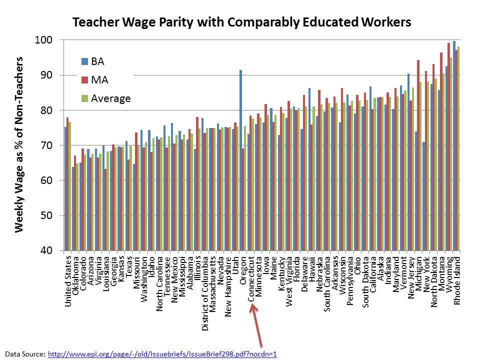
Let’s start with wages relative to non-teaching professions. Allegretto, Corcoran and Mishel identify Connecticut as having a relatively average teaching penalty.

In Connecticut, the average weekly wages of teachers are about 77.6% of the average weekly wages of similarly educated non-teachers.

But, we also know that Connecticut’s good schools and districts are pretty darn good. So perhaps the issue isn’t so much about the average, but about the disparities. Besides, the core rhetoric around the proposed reforms seems to be much about the achievement gap in CT, which is indeed large even when corrected for the income gap.

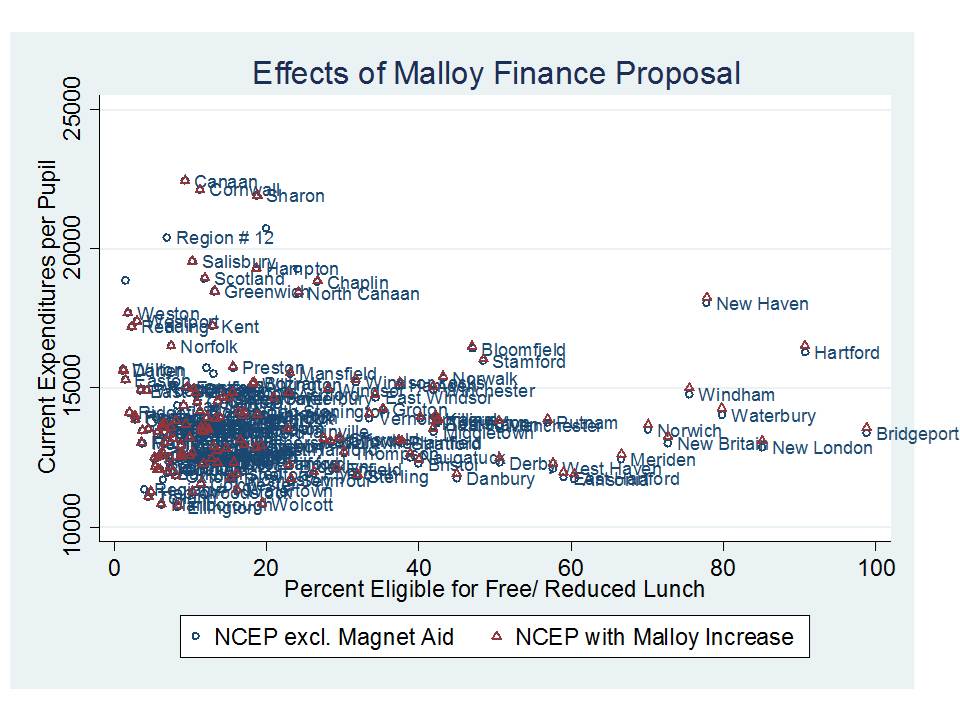
Let’s quickly revisit my representation of which districts in CT are most disadvantaged, when we look at the relationship between cost and need adjusted per pupil expenditures and average current outcomes:

Expressing the funding as difference from the average, and throwing some cutpoints into the picture to create some fun groups for comparison, I get:

So, I’ve got the advantaged districts which have high adjusted spending and high outcomes. I’ve got my overall group of disadvantaged districts which have low adjusted spending and low outcomes, and a particularly screwed subset of these districts which I call severely disadvantaged (including Bridgeport and New Britain).

Now, recall, that the funding side of the Malloy plan isn’t going to do a whole lot to help out these districts.

Notice that huge infusion of funding represented by the red triangles relative to prior year Net Current Expenditures. Oh wait. There really isn’t any. But what’s funding got to do with it anyway? (go back and read the above section!)

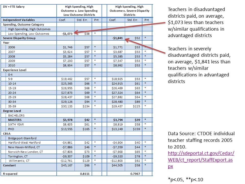
So, I’ve taken the teacher level salary and characteristics data to estimate two different models of the differences in teacher characteristics between the advantaged and disadvantaged districts and between the advantaged and severely disadvantaged districts. First, let’s look simply at salary parity at constant teacher characteristics. NOTE THAT IT WOULD TAKE NOT ONLY AN EQUAL, BUT HIGHER SALARY, FOR EXAMPLE, TO GET TEACHERS WITH SPECIFIC QUALIFICATIONS TO WORK IN BRIDGEPORT AS OPPOSED TO WESTPORT.

Here’s the salary model, with comments in the margins:

All else equal, teachers in disadvantaged districts are still behind their peers in advantaged districts within the same labor market. Reformy platitudes and test based evaluation will not fix that!

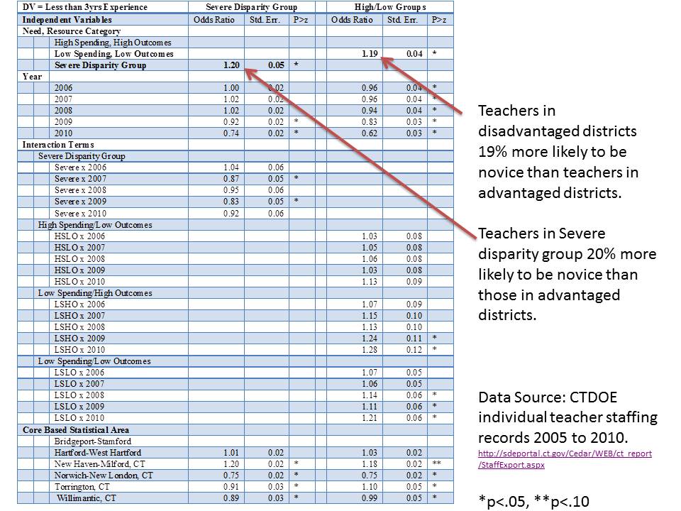
Now, here’s a logistic regression of the likelihood that a teacher is a novice, or in his/her first 3 years of teaching. This is a commonly used marker for teacher quality inequity, because a substantial body of literature has found that concentrations of novice teachers (i.e. teachers with less than 3 or 4 years of experience) can have significant negative effects on student outcomes.[1] Rivkin, Hanushek, and Kain (2005) find that teacher experience is important in the first two years of a teaching career (but not thereafter).[2]  Hanushek and Rivkin note that: “we find that identifiable school factors – the rate of student turnover, the proportion of teachers with little or no experience, and student racial composition – explain much of the growth in the achievement gap between grades 3 and 8 in Texas schools.”[3] Notably, evidence from a variety of state and local contexts, provides a consistent picture that higher concentrations of novice teachers are associated with negative effects on student outcomes.

Here are the models:

So, kids in classrooms in severely disadvantaged or generally disadvantaged districts are each about 20% more likely to face novice teachers. Note that they are also more likely to be in larger classes, specifically if they are in the severe disparity group!

Again, SB24’s reformy platitudes will do nothing to remedy this disparity.

Put simply, the SB24 teacher effectiveness provisions are a massive smokescreen that do little or nothing to address persistent underlying disparities across CT districts. Worse, the misguided emphasis on reducing job security and focusing on problematic performance metrics will likely do more harm than good for children in the most disadvantaged districts.


 REFERENCES

[i] Hanushek, E.A. (1971) Teacher Characteristics and Gains in Student Achievement: Estimation Using MicroData. Econometrica 61 (2) 280-288

Clotfelter, C.T., Ladd, H.F., Vigdor, J.L. (2007) Teacher credentials and student achievement: Longitudinal analysis with student fixed effects. Economics of Education Review 26 (2007) 673–682

Goldhaber, D., Brewer, D. (1997) Why Don’t Schools and Teachers Seem to Matter? Assessing the Impact of Unobservables on Educational Productivity. The Journal of Human Resources, 332 (3) 505-523

Ehrenberg, R. G., & Brewer, D. J. (1994). Do school and teacher characteristics matter? Evidence from High School and Beyond. Economics of Education Review, 13(1), 1-17.

Ehrenberg, R. G., & Brewer, D. J. (1995). Did teachers’ verbal ability and race matter in the 1960s? Economics of Education Review, 14(1), 1-21.

Jepsen, C. (2005). Teacher characteristics and student achievement: Evidence from teacher surveys. Journal of Urban Economics, 57(2), 302-319.

Jacob, B. A., & Lefgren, L. (2004). The impact of teacher training on student achievement: Quasi-experimental evidence from school reform. Journal of Human Resources, 39(1),50-79.

Rivkin, S. G., Hanushek, E. A., & Kain, J. F. (2005). Teachers, schools, and academic achievement. Econometrica, 73(2), 471.

Wayne, A. J., & Youngs, P. (2003). Teacher characteristics and student achievement gains. Review of Educational Research, 73(1), 89-122.

For a recent review of studies on the returns to teacher experience, see:

Rice, J.K. (2010) The Impact of Teacher Experience: Examining the Evidence and Policy Implications. National Center for Analysis of Longitudinal Data in Educational Research.

[ii] Some go so far as to argue that half or more of teacher pay is allocated to “non-productive” teacher attributes, and so it follows that that entire amount of funding could be reallocated toward making schools more productive.

See, for example, a recent presentation to the NY State Board of Regents from September 13, 2011 (page 32), slides by Stephen Frank of Education Resource Strategies: http://www.p12.nysed.gov/mgtserv/docs/SchoolFinanceForHighAchievement.pdf

[iii] Lankford, H., Loeb., S., Wyckoff, J. (2002) Teacher Sorting and the Plight of Urban Schools. Educational Evaluation and Policy Analysis 24 (1) 37-62

[iv] Allegretto, S.A., Corcoran, S.P., Mishel, L.R. (2008) The teaching penalty : teacher pay losing ground. Washington, D.C. : Economic Policy Institute, ©2008.

[v] Richard J. Murnane and Randall Olsen (1989) The effects of salaries and opportunity costs on length of state in teaching. Evidence from Michigan. Review of Economics and Statistics 71 (2) 347-352

[vi] David N. Figlio (2002) Can Public Schools Buy Better-Qualified Teachers?” Industrial and Labor Relations Review 55, 686-699. David N. Figlio (1997) Teacher Salaries and Teacher Quality. Economics Letters 55 267-271. Ronald Ferguson (1991) Paying for Public Education: New Evidence on How and Why Money Matters. Harvard Journal on Legislation. 28 (2) 465-498.

[vii] Loeb, S., Page, M. (2000) Examining the Link Between Teacher Wages and Student Outcomes: The Importance of Alternative Labor Market Opportunities and Non-Pecuniary Variation. Review of Economics and Statistics 82 (3) 393-408

[viii] Figlio, D.N., Rueben, K. (2001) Tax Limits and the Qualifications of New Teachers. Journal of Public Economics. April, 49-71

See also:

Downes, T. A. Figlio, D. N. (1999) Do Tax and Expenditure Limits Provide a Free Lunch? Evidence on the Link Between Limits and Public Sector Service Quality52 (1) 113-128

[ix] Ondrich, J., Pas, E., Yinger, J. (2008) The Determinants of Teacher Attrition in Upstate New York. Public Finance Review 36 (1) 112-144

[x] Hanushek, Kain, Rivkin, “Why Public Schools Lose Teachers,” Journal of Human Resources 39 (2) p. 350

[xi] Clotfelter, C., Ladd, H.F., Vigdor, J. (2011) Teacher Mobility, School Segregation and Pay Based Policies to Level the Playing Field. Education Finance and Policy , Vol.6, No.3, Pages 399–438

Clotfelter, Charles T., Elizabeth Glennie, Helen F. Ladd, and Jacob L. Vigdor. 2008. Would higher salaries keep teachers in high-poverty schools? Evidence from a policy intervention in North Carolina. Journal of Public Economics 92: 1352–70.

[xii] For recent studies specifically on the topic of “merit pay,” each of which generally finds no positive effects of merit pay on student outcomes, see:

Glazerman, S., Seifullah, A. (2010) An Evaluation of the Teacher Advancement Program in Chicago: Year Two Impact Report. Mathematica Policy Research Institute. 6319-520

Springer, M.G., Ballou, D., Hamilton, L., Le, V., Lockwood, J.R., McCaffrey, D., Pepper, M., and Stecher, B. (2010). Teacher Pay for Performance: Experimental Evidence from the Project on Incentives in Teaching. Nashville, TN: National Center on Performance Incentives at Vanderbilt University.

Marsh, J. A., Springer, M. G., McCaffrey, D. F., Yuan, K., Epstein, S., Koppich, J., Kalra, N., DiMartino, C., & Peng, A. (2011). A Big Apple for Educators: New York City’s Experiment with Schoolwide Performance Bonuses. Final Evaluation Report. RAND Corporation & Vanderbilt University.


[1] See Charles T. Clotfelter, Helen F. Ladd and Jacob L. Vigdor, “Who Teaches Whom? Race and the distribution of novice teachers,” Economics of Education Review 24, no. 4 (August, 2005): 377-392;   See Charles T. Clotfelter, Helen F. Ladd and Jacob L. Vigdor, “Teacher sorting, teacher shopping, and the assessment of teacher effectiveness,” Sanford Institute of Public Policy, Duke University, 2004; and Hanushek, Kain, and Rivkin, “Teachers, schools, and academic achievement.”

[2] Hanushek, Kain, and Rivkin, “Teachers, schools, and academic achievement.”

Snapshots of Connecticut Charter School Data

In several previous posts I have addressed the common argument among charter advocacy organizations (notably, not necessarily those out there doing the hard work of actually running a real charter school – but the pundits who claim to speak on their behalf) that charter schools do more, with less while serving comparable student populations. This argument appears to be a central theme of current policy proposals in Connecticut, which, among other things, would substantially increase funding for urban charter schools while doing little to provide additional support for high need traditional public school districts. For more on that point, see here.

I’ve posted some specific information on Connecticut charter schools in previous posts, but have not addressed them more broadly. Here, I provide a run-down of simple descriptive data, widely available through two major credible sources. Easy enough to replicate any/all of these analyses on your own with the publicly available data:

Connecticut State Department of Education (CEDaR) reports

National Center for Education Statistics Common Core of Data

Since the common claim is that charters do more (outcomes) with less (funding) and while serving the same kids (demographics), it is relevant to walk through each of these prongs of the argument step by step.

DEMOGRAPHIC COMPARISONS

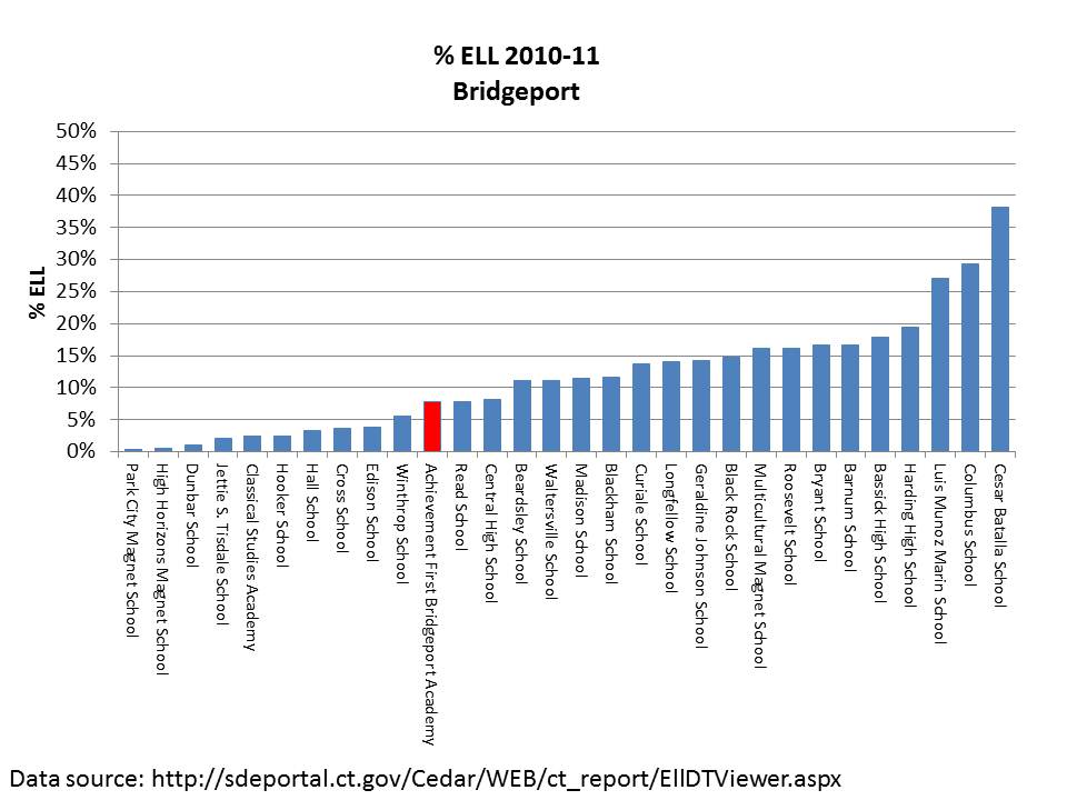
These graphs focus on Connecticut’s most acclaimed high-flying charter schools, those affiliated with Achievement First, and the graphs are relatively self explanatory.

Note: % Free lunch information comes form 2009-10 NCES Common Core of Data and includes all schools identified as being located within the city limits. % ELL data is from 2010-11 CEDaR system and includes Achievement First Charters and District Schools (leading to smaller numbers of total schools due to special school and other charter exclusions). Special education data are gathered from individual school snapshot reports (CEDaR).
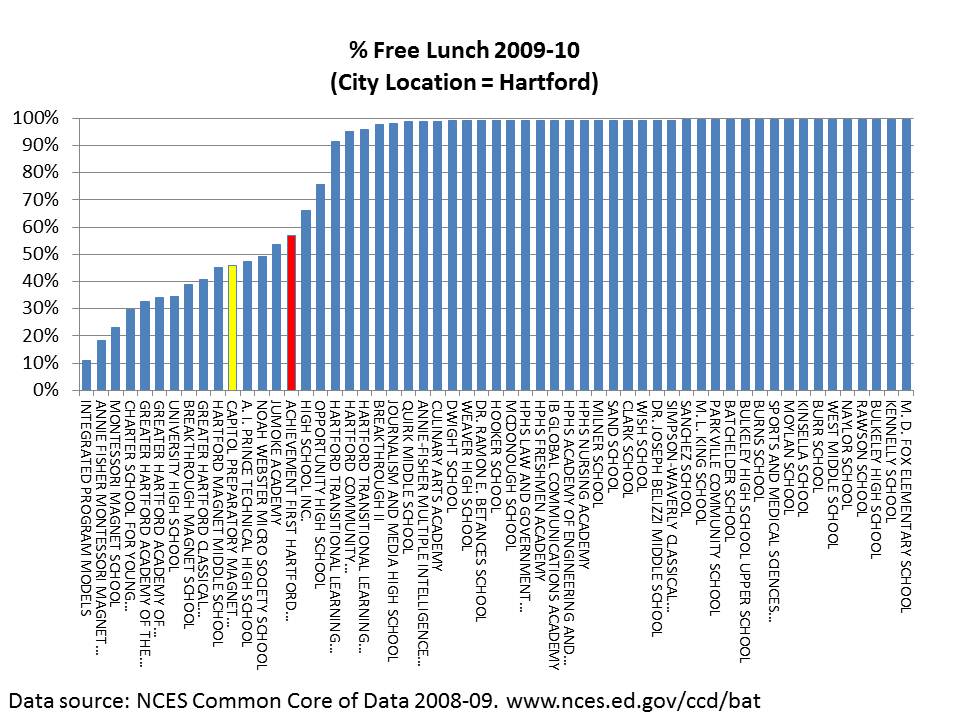
For fun, in this one, I’ve also noted the position of Capital Prep – which is a magnet school, and it is well understood that the student populations at Hartford magnets are substantively different from Hartford regular public schools. But strangely, there is even substantial rhetoric out there about this school being an example of beating the odds!?!
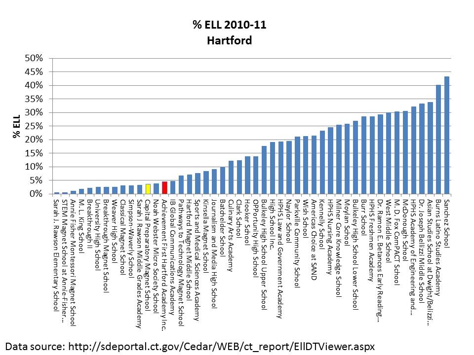
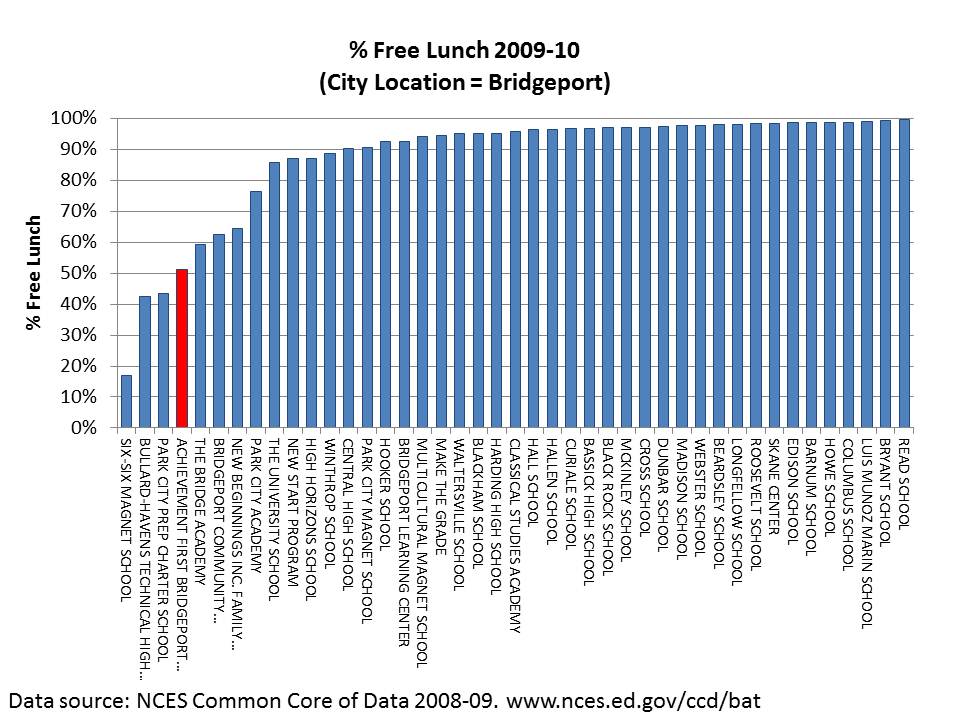
Finally:
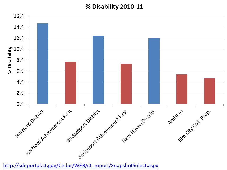
Put very simply – Achievement First Charter schools DO NOT SERVE STUDENT POPULATIONS COMPARABLE TO DISTRICT POPULATIONS.

I have explained previously how this is relevant to broader policy discussions. Specifically, it is relevant to the claim that these schools can serve as a model for expansion yielding similar outcomes for all children in New Haven, Bridgeport or Hartford. In very simple terms, there are not enough non-low income, non-disabled and non-ELL kids around in these settings to broadly replicate the outcomes that these schools may be achieving.  Again, this public policy perspective contrasts with the parental choice perspective. While from a public policy perspective we are concerned that these outcomes may be merely a function of selective demography, from a personal/parental choice perspective within any one of these cities, the concern is only for the outcomes, and achieving those outcomes by having a desirable peer group is as desirable as achieving those outcomes by providing higher quality service.

FINANCIAL & OTHER RESOURCE COMPARISONS

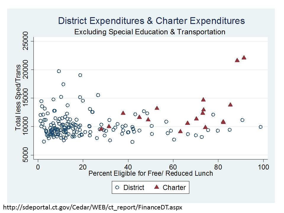
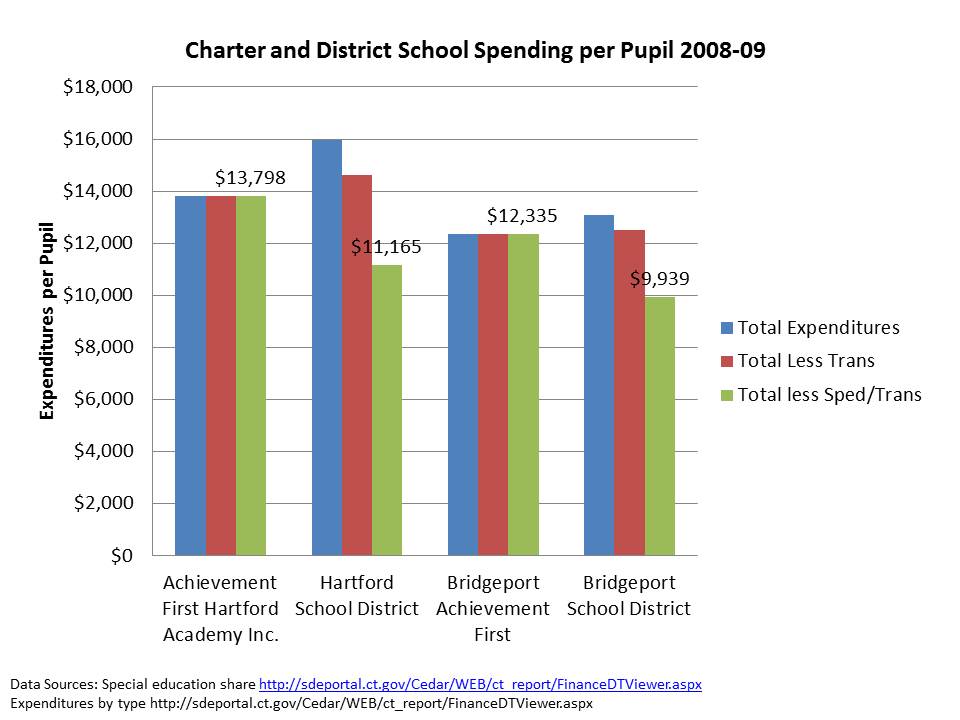
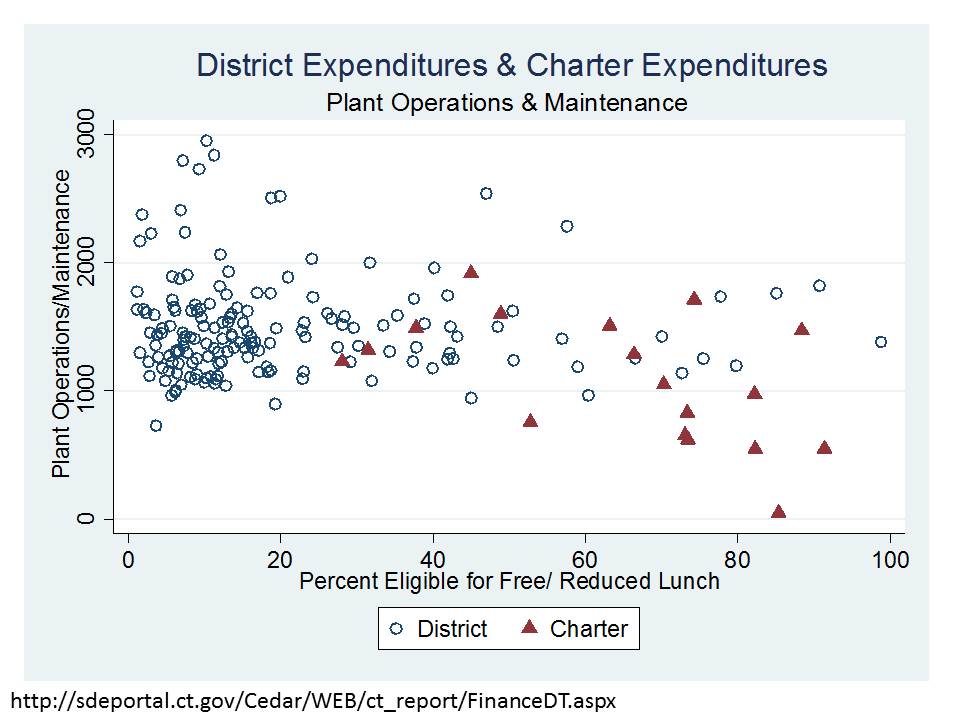
Below (at end of post) I provide an important explanation/discussion of issues in comparing charter school and traditional public district finances. First and foremost, it is important to understand simply from the above comparisons, that these schools serve substantively different student populations, thus equal dollar inputs is, from the outset, an inappropriate fairness metric. But the complexities go beyond that. In CT and other locations, host districts retain responsibility for transportation and special education costs, even for students attending charters. Thus, it would be reasonable, as I did in a previous post to subtract out those expenditures from district budgets when comparing to charter spending. Now, on the other side, Charters do often have to lease facilities at their own expense, which in a state like CT would typically run about $1,500 to $2,000 per pupil. More in NYC, similar in NJ. But, while charter advocates would have you believe that districts have $0 cost of facilities, that is not necessarily true. For CT public districts, plant operations expenses per pupil tend to be on the order of $1,000 to $2,000 per pupil, and large urban districts maintaining significant capital stock with significant deferred maintenance tend to be toward the high end. More discussion of the factors which cut each way is in the note at the end of the post. So, here’s a quick run-down on charter and district expenditures in CT, cut different ways (all expressed in per pupil terms, and with respect to district/charter % Free or Reduced price lunch shares):
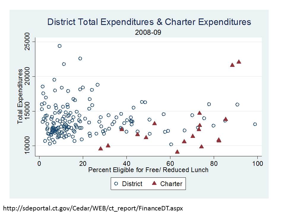
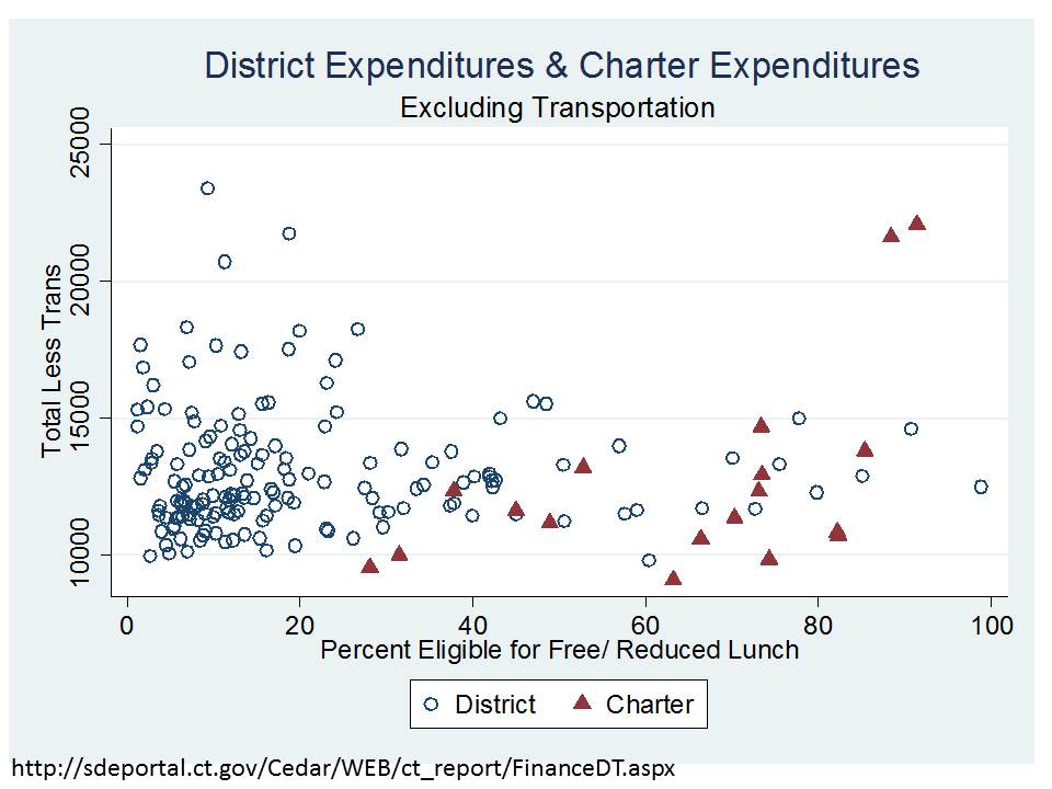
So… after taking out special education and transportation, charters appear relatively well resourced.

EVEN IF WE ASSUME THAT THE NET DIFFERENCE IN FACILITIES COST IS ABOUT $1,000 PER PUPIL BETWEEN CHARTER AND DISTRICT SCHOOLS, CHARTERS ARE IN PRETTY GOOD SHAPE IN CT.  (That assumption would pull the $1,000 per pupil off the charter estimates above). This would assume the facilities maintenance/operations/debt service in hosts to be about $1,000 and lease/operations/maintenance for charters to be about $2,000 per pupil.

Here’s an alternative angle (from previous post)
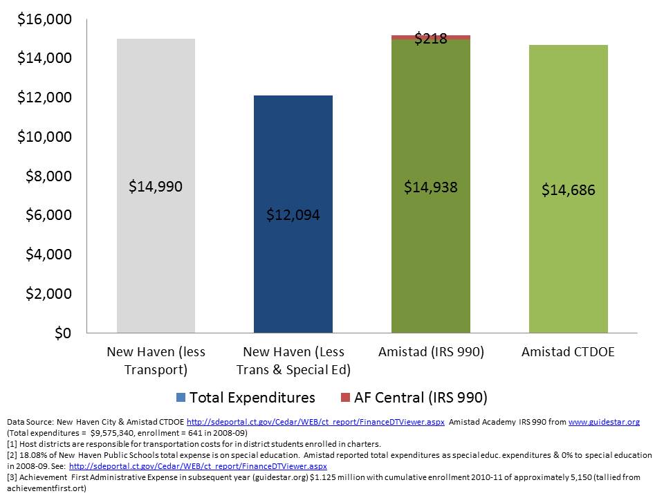
I also showed in a previous post that for Amistad, the funding difference translates to both a class size advantage and salary advantage:
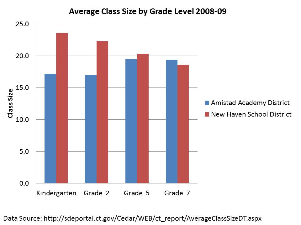
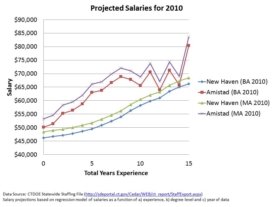
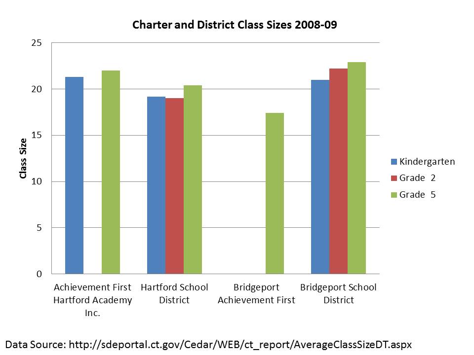
Class sizes are more mixed in Hartford, but in Bridgeport (the least well funded urban district), Achievement First offers much smaller class size:
OUTCOMES

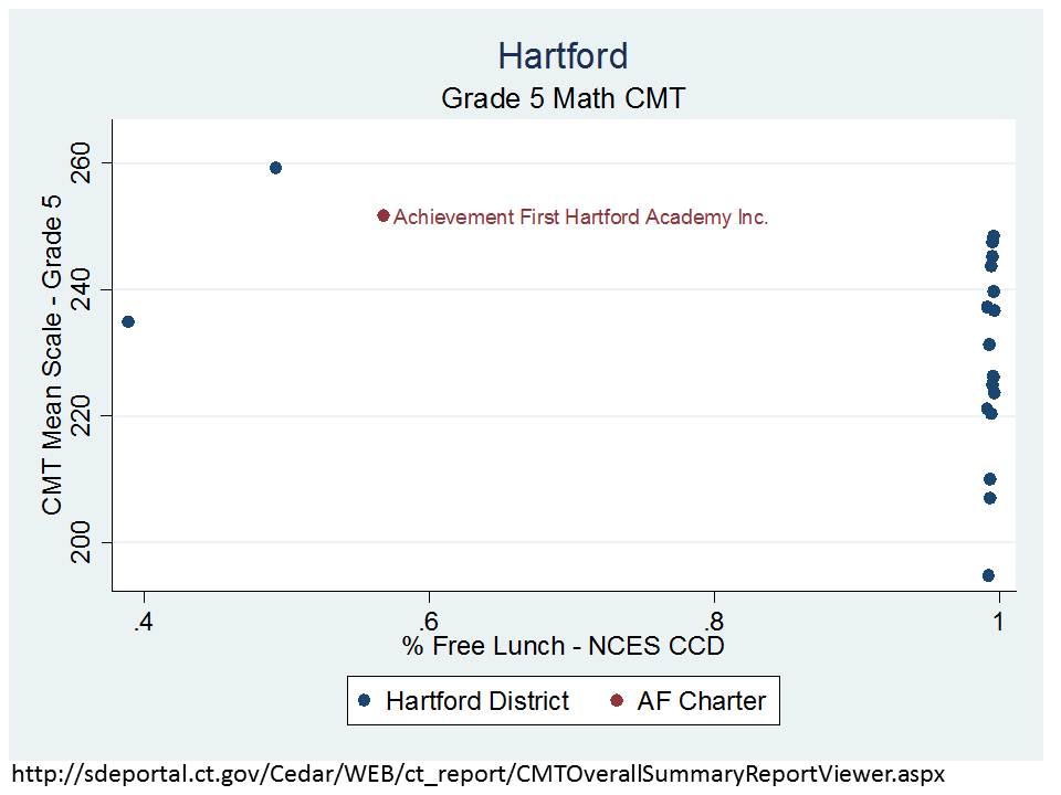
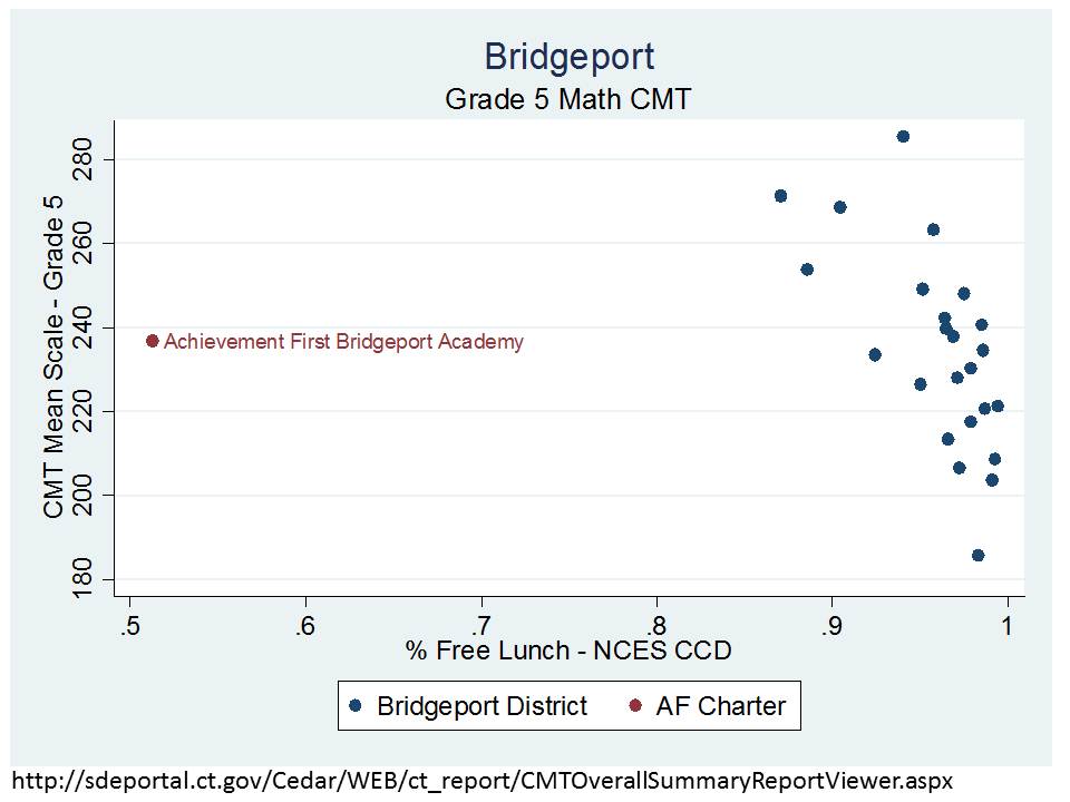
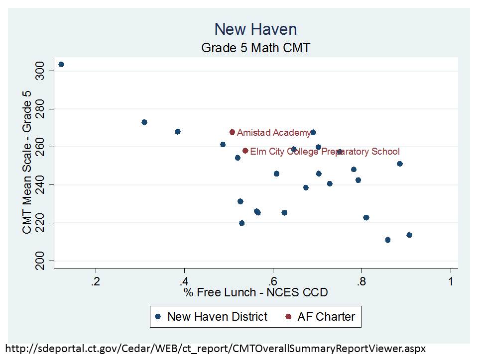
The final prong of the argument involves those higher outcomes – those beating the odds with the same kids and less money – outcomes.  Here are a few samples of the 5th grade math outcomes by district, focusing on the position of the Achievement First charter schools. I’ve graphed the school level 5th grade math 2010-11 Connecticut Mastery Test mean scale score by school level % Free Lunch (prior year). It’s important to understand that these charter schools not only have much lower % Free Lunch but also tend to have low ELL populations and also have much lower shares of enrollment with disabilities.

Here’s Hartford, where the Achievement First school looks so unlike nearly every Hartford public school reporting 5th grade math scores that it’s hard to even make a comparison. But, the two dots over near the Achievement First school do perform similarly.
Comparisons are comparably ridiculous in Bridgeport.
But more reasonable in New Haven! Even then, Amistad and Elm City Prep fall somewhat in line with New Haven schools serving similar % Free Lunch.
A statewide look at 7th grade math scores provides a better showing especially for Achievement First schools, but the analysis is hardly decisive. Note that this graph uses % Free or Reduced Lunch from CEDaR sources. Using such a high income threshold for low income status tends to mash schools in urban districts against the right hand side of the figure, removing some important variation.  I’ll redo with % free if/when I get the chance. This graph includes schools statewide, including affluent suburban schools. Among the notable features of the graph is that low income status matters, whether for charter schools or for traditional district schools. Most fall along the trendline.

In this case, the Achievement First schools in particular have higher math mean scale scores than traditional public schools serving the same % Free Lunch, BUT… this DOES NOT ACCOUNT FOR THE ADDITIONAL DIFFERENCES IN ELL AND SPECIAL EDUCATION WHICH MAY (WILL) SUBSTANTIALLY INFLUENCE THESE COMPARISONS!
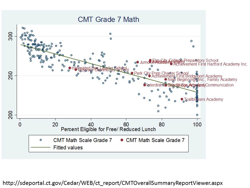
Perhaps most importantly, these scatterplots are essentially little more than descriptive comparisons of mean scale scores against schools similar on a single parameter (% Free Lunch). BUT, even this simple adjustment serves to undermine the current rhetoric in Connecticut, as I discussed in a previous post.

NOTE: Charter-District School Spending Comparisons & the Facilities Cost Issue

A study frequently cited by charter advocates, authored by researchers from Ball State University and Public Impact, compared the charter versus traditional public school funding deficits across states, rating states by the extent that they under-subsidize charter schools.[1] The authors identify no state or city where charter schools are fully, equitably funded. But simple direct comparisons between subsidies for charter schools and public districts can be misleading because public districts may still retain some responsibility for expenditures associated with charters that fall within their district boundaries or that serve students from their district. For example, under many state charter laws, host districts or sending districts retain responsibility for providing transportation services, subsidizing food services, or providing funding for special education services. Revenues provided to host districts to provide these services may show up on host district financial reports, and if the service is financed directly by the host district, the expenditure will also be incurred by the host, not the charter, even though the services are received by charter students. Drawing simple direct comparisons thus can result in a compounded error: Host districts are credited with an expense on children attending charter schools, but children attending charter schools are not credited to the district enrollment.  In a per pupil spending calculation for the host districts, this may lead to inflating the numerator (district expenditures) while deflating the denominator (pupils served), thus significantly inflating the district’s per pupil spending. Concurrently, the charter expenditure is deflated.

Correct budgeting would reverse those two entries, essentially subtracting the expense from the budget calculated for the district, while adding the in-kind funding to the charter school calculation. Further, in districts like New York City, the city Department of Education incurs the expense for providing facilities to several charters. That is, the City’s budget, not the charter budgets, incur another expense that serves only charter students. The Ball State/Public Impact study errs egregiously on all fronts, assuming in each and every case that the revenue reported by charter schools versus traditional public schools provides the same range of services and provides those services exclusively for the students in that sector (district or charter).

Charter advocates often argue that charters are most disadvantaged in financial comparisons because charters must often incur from their annual operating expenses, the expenses associated with leasing facilities space. Indeed it is true that charters are not afforded the ability to levy taxes to carry public debt to finance construction of facilities. But it is incorrect to assume when comparing expenditures that for traditional public schools, facilities are already paid for and have no associated costs, while charter schools must bear the burden of leasing at market rates – essentially and “all versus nothing” comparison. First, public districts do have ongoing maintenance and operations costs of facilities as well as payments on debt incurred for capital investment, including new construction and renovation.  The average “capital outlay” expenditure of public school districts  in 2008-09 was over $2,000 per pupil in New York State, nearly $2,000 per pupil in Texas and about $1,400 per pupil in Ohio. Based on enrollment weighted averages generated from the U.S. Census Bureau’s Fiscal Survey of Local Governments, Elementary and Secondary School Finances 2008-09 (variable tcapout): http://www2.census.gov/govs/school/elsec09t.xls

Second, charter schools finance their facilities by a variety of mechanisms, with many in New York City operating in space provided by the city, many charters nationwide operating in space fully financed with private philanthropy, and many holding lease agreements for privately or publicly owned facilities. New York City is not alone it its choice to provide full facilities support for some charter school operators (http://www.thenotebook.org/blog/124517/district-cant-say-how-many-millions-its-spending-renaissance-charters). Thus, the common characterization that charter schools front 100% of facilities costs from operating budgets, with no public subsidy, and traditional public school facilities are “free” of any costs is wrong in nearly every case, and in some cases, there exists no facilities cost disadvantage whatsoever for charter operators.

Baker and Ferris (2011) point out that while the Ball State/Public Impact Study claims that charter schools in New York State are severely underfunded, the New York City Independent Budget Office (IBO), in more refined analysis focusing only on New York City charters (the majority of charters in the State), points out that charter schools housed within Board of Education facilities are comparably subsidized when compared with traditional public schools (2008-09). In revised analyses, the IBO found that co-located charters (in 2009-10) actually received more than city public schools, while charters housed in private space continued to receive less (after discounting occupancy costs).[1] That is, the funding picture around facilities is more nuanced that is often suggested.

Batdorff, M., Maloney, L., May, J., Doyle, D., & Hassel, B. (2010). Charter School Funding: Inequity Persists. Muncie, IN: Ball State University.

NYC Independent Budget Office (2010, February). Comparing the Level of Public Support: Charter Schools versus Traditional Public Schools. New York: Author, 1

NYC Independent Budget Office (2011) Charter Schools Housed in the City’s School Buildings get More Public Funding per Student than Traditional Public Schools. http://ibo.nyc.ny.us/cgi-park/?p=272

NYC Independent Budget Office (2011) Comparison of Funding Traditional Schools vs. Charter Schools: Supplement http://www.ibo.nyc.ny.us/iboreports/chartersupplement.pdf

Additional Figures
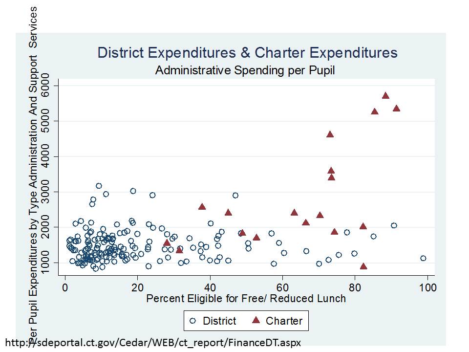
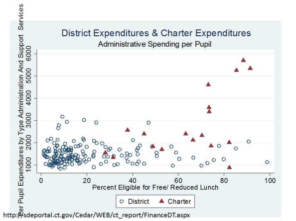
Administrative expenses in charters often include facilities lease agreements in addition to any recruitment/marketing expenses and growth/expansion.
A comment on the “I pay your salary” and “I pay twice for schools” arguments

Taxpayer outrage arguments are in style these days (as if they ever really go out of style). Two particular taxpayer outrage arguments that have existed for some time seem to be making a bit of resurgence of late. Or, at least I think I’ve been seeing these arguments a bit more lately in the blogosphere and on twitter.  First, since now is the era of crapping on public school teachers and arguing for increased accountability specifically on teachers for improving student outcomes, there’s the “I pay your salary so you should cower to my every demand” argument (I’ve heard only a few warped individuals take this argument this far, but sadly I have!).  Second, there’s the persistent I pay for those schools and don’t even use them argument, or the variant on that argument that I pay twice for schools because I send my kids to private schools.

I (the taxpayer) pay your (the teacher) salary

This is a strange, obnoxious and easily diminished argument. Not that it’s not important to be sensitive to the demands of school constituents, but rather, that it’s more important to be sensitive to the demands of the broader public regarding their preferences for public schools more so than it is to be hypersensitive to any one loud-mouthed individual who would invoke this obnoxious argument. I explain more about that broader public under the next topic below.

For this one, a simple hypothetical is in order. Let’s assume the individual invoking this argument owns a residential property valued at $350,000 in a school district serving 5,000 students, where that district spends about $15,000 per pupil per year and where the effective property tax for schools is about 1.5%.  So, the school property tax bill on this house is 1.5% x 350k = $5,250.  Meanwhile the school total budget is 5k x 15k = 75 million. So, this one household is contributing far less than 1% (about .007%) of the district budget (which is then about $4.20 of a $60,000 teacher salary). And other households and owners of other property types within the district, as well as the broader base of taxpayers contributing to the state aid pot and any federal revenue sources all play a part in paying the salaries of teachers in this school.

This is by no means to suggest that any one person’s “say” in a district should be proportionate to one’s tax bill as a share of the budget. But rather, that one voice is one voice from the broader mix of voices that contribute to the financing of and shaping of public goods and services like schools.

[implications of disproportionate philanthropic giving from within or outside a district raise other serious questions to be addressed another day]

I (the taxpayer) pay for those public schools and don’t even use them!

Thus is the nature of public versus private goods. In the simplest model, taxpayers in a municipality contribute property taxes for a mix of public services, including local parks, fire protection, police and schools. I probably use our public park much less than others, and I rarely get a chance to attend the summer concert series. Should I get a refund for my contributed share, so that I can put that money towards buying Broadway tickets or a family vacation instead? Hey, I’m paying twice for entertainment and don’t even attend those free concerts in the park. And, I never sat on one of those benches. Can I please get a refund for my share of the cost of installing those benches and maintaining them, so I can invest in my own benches in my own back yard? And about those fancy fire trucks. We’ve had a few house fires in my town in my time living there. Why am I paying for the fire trucks to go to someone else’s house? Let’s say I live in a town that has public tennis courts, but I decide I want to join a private tennis club. Should I get a refund for the public courts I don’t use? In the amount of property tax I contributed? How about roads? Should I have to pay for roads I don’t ever intend to drive on?

Of late, I’ve been seeing the private school parent argument that “I pay twice for schools, since I pay my taxes for the public schools and pay private tuition.” This one is frequently invoked in conversations involving voucher and tuition tax credit programs. It should be noted that many residents of any given community pay taxes for schools – and all of the other stuff above – but may or may not use any of all of it. Families without school aged children also pay for schools. Further, since schools are financed by a mix of local, state and federal revenues, lots of different people, within and outside of any given community, are contributing to the financing of that community’s schools (to the extent that the schools receive intergovernmental revenue). Thus is the nature of publicly financed services.

But there’s even more to it than that. The above statements make the uninformed assumption that one receives absolutely no benefit from the presence and quality of these public goods and services simply because one does not make direct use of them. In reality (as well as in economic theory – which doesn’t always match reality), there’s this thing called capitalization! There is value to living in a community with such amenities as nice parks, good schools and police and fire protection. That value exists whether you actually use those things or not. That value is reflected in property values. As the quality and mix of services changes, those changes may be reflected in property values. Communities that have relatively better schools over time (even as reflected in crude grading systems in state accountability systems) see increases to property values. Residential property owners, not just those with kids in the public schools, see this benefit.

In short, the “I pay twice”, or “I pay for a service or amenity I don’t use” argument presents a dreadful oversimplification and misunderstanding of very basic principles of the provision of public goods and  services.

Instead, if taxpayers really want something to fuss about, read my previous post!


Revisiting NJOSA & the Lakewood Effect

The current version of the New Jersey Opportunity Scholarship Act would pilot the tuition tax credits for private schooling in the following locations:

  • Asbury Park City School District
  • Camden City School District
  • Elizabeth City School District
  • Lakewood City School District
  • Newark City School District
  • City of Orange School District
  • Passaic City School District, and
  • City of Perth Amboy School District

http://www.njleg.state.nj.us/2012/Bills/S2000/1779_I1.PDF

http://www.njspotlight.com/stories/12/0316/0145/

NJOSA is often pitched publicly as a scholarship program that would allow students trapped in failing urban districts to exercise the choice to select a better alternative – implicit in this argument is that any private school option a student might choose would necessarily be a better alternative. Also suggestive in the rhetoric around NJOSA is that this program is mainly focused on kids in places like Camden and Newark – the stereotypical New Jersey urban centers.

NJOSA would provide scholarships to children in families below the 250% income threshold for poverty. The text of the bill indicates that eligible children are those either attending a chronically failing school in one of the districts above or eligible to enroll in such school in the following year (which would seem to include any child within the attendance boundaries of these districts even if presently already enrolled in private schools).

“children either attending a chronically failing school or eligible to enroll in a chronically failing school in the next school year.”

I have discussed NJOSA numerous times on this blog, specifically focusing on the Lakewood effect here & here.

Many in New Jersey probably already understand that the above list contains some intriguing outliers, but I suspect few understand just how big these outlier effects are. One would naturally assume that Newark, for example, would be the major target of NJOSA scholarship recipients? Right? That’s our stereotypical urban core with failing schools from which kids need to escape.

Here’s what the Newark private school market looks like.

This map uses data on individual private schools, their locations, and enrollments from the 2007-08 National Center for Education Statistics, Private School Universe Survey, which also includes classifications of religious affiliation/status. Purple circles are religious private schools and green circles are those who’s primary affiliation is listed as non-religious (independent of a specific church/religion). Circle size indicates enrollment size. Bigger circles are the bigger schools.

I also use U.S. Census Bureau American Community Survey data to identify the number of total children and children in families below the 250% income threshold attending private school within each Public Use Micro Data Area (PUMA). Blue numbers indicate total private enrollments, and red numbers indicate low income private school enrollments.

Currently, there are about 3400 private schooled students residing in Newark, and there are about 2,000 who actually fall below the 250% poverty-income threshold. So, that’s a sizeble number of Newark children who might quality for NJOSA scholarships, in addition to others who might apply who are presently enrolled in public schools.

It would seem by the language in the bill that a current privately schooled student would merely have to be eligible to attend their local public school, but not actually do so.

Here’s what the Passaic/Clifton private school market looks like (neither one is big enough to be its own PUMA):

The Passaic/Clifton PUMA has nearly as many low income private school enrolled children as Newark – 1,619, despite much smaller total population. And by far the largest private school in the area is Yeshiva Ktana.

But the most striking example is that of Lakewood, as I have discussed in the past. Since Lakewood remains in this bill, even though there’s nothing really new I’m presenting here, I felt the need to reiterate just how big a deal this is.

Here’s the Lakewood private school marketplace & current enrollments:

Based on the Census ACS data from a few years back, there were over 17,000 privately schooled students in Lakewood, and OVER 10,400 OF THOSE STUDENTS WERE IN FAMILIES THAT REPORTED THEMSELVES AS BEING BELOW THE 250% POVERTY-INCOME THRESHOLD!

Recall that Newark had about 2,000 low income private school enrolled children.

Orange/East Orange combined have under 900.

All of the cities around Asbury Park combined about 400 (meaning that Asbury Park alone is likely much less).

Camden about 1,300

Elizabeth about 1,000

The entire area (several towns/districts) around Perth Amboy about 1,000 (meaning that Perth Amboy is likely only a fraction of that amount)

And again, Lakewood, over 10,000! (and Passaic, another significant amount)

In other words, all of the other locations combined do not have the sum total of low income private school enrolled children that Lakewood has. Lakewood would likely be the epicenter of NJOSA scholarship distribution. I noted in my first post on this topic that if the average scholarship amounts were as proposed, the Lakewood Yeshiva schools would stand to take in as much as $67 million per year in these indirect taxpayer subsidies.

The clever subversion of taxpayer rights

I have a secondary, related concern when it comes to Tuition Tax Credits, these days, often framed as “Opportunity Scholarship Acts.”

Tuition Tax Credit programs create an indirect subsidy of private schooling, whereas Vouchers provide a direct subsidy.  The latter is a more honest approach and one that at least allows for legal recourse by concerned taxpayers – even if they eventually lose. It is currently the case that voucher programs which provide direct subsidies to families, even where the majority of those families choose to use their subsidy for religious schooling, are constitutional under the U.S. Constitution (but not under some state constitutions which expressly prohibit use of public funding for religious education). Specifically, the U.S. Supreme Court has determine that these subsidies do not violate the establishment clause of the U.S. Constitution, because the distribution of the subsidy is mediated through individual/family choices and the subsidy/voucher program (at least by Cleveland design) is neutral to religion (see: http://www.oyez.org/cases/2000-2009/2001/2001_00_1751  – the dissent is worth listening to)

This is not to say, however that a state might not be vulnerable to legal challenge over a voucher system if it could be shown that the state had actually made policy decisions with the intent of guiding students and resources toward specific religious schools/institutions, but rather that the Cleveland model did pass muster. One might certainly scrutinize the NJ legislature’s choice to include Lakewood in NJOSA, with the Lakewood Yeshiva schools essentially as the primary beneficiary of the program. This would seem somewhat analogous to a 1990s scenario where NY State redrew one district’s boundaries so as to encompass a single homogeneous religious community (see: http://www.oyez.org/cases/1990-1999/1993/1993_93_517) Could NY State now go back and pilot a voucher program in Kiryas Joel instead? Would the choice of a homogeneous religious community to pilot a voucher program violate the establishment clause? Would it be substantively different from the more “neutral” Cleveland Voucher program? Maybe.

But, here’s the kicker with Tuition Tax Credit programs.  They are indirect subsidies, generated by providing full tax credits to corporations to gift money to a state approved (independently governed) entity (voucher governing body). Thus, a hole of “X” is created in the state budget. That hole is paid for by the fact that the state no-longer has to allocate state aid (>or= X) to local public districts where students accept the scholarship to attend private schools instead. It’s the mathematical equivalent of simply allocating the same sum in state revenue directly to private schools, but it’s achieved indirectly through a third party entity.

Who cares? Why is that important? If the state has gamed this system to favor and disproportionately subsidize a specific religion, can’t we still do something about it? The answer to that question is probably not, at least via legal action!  The U.S. Supreme Court has recently determined that taxpayers do not have legal standing to challenge the distribution of these indirect subsidies. As far as we can tell no one really seems to have a right to challenge these policies for potentially violating the establishment clause. If if was a voucher program- direct subsidy – there would most likely at least exist the right of taxpayers to challenge the policy in court, even if it was eventually determined that the policy was constitutional (sufficiently similar to the Cleveland model). But the indirect tuition tax credit approach cleverly permits diversion of tax revenues while negating entirely taxpayer rights to challenge that diversion. See: http://www.oyez.org/cases/2010-2019/2010/2010_09_987

In other words, the court never even gets to address the substantive question of whether the legislature has intentionally gone out of its way to favor and subsidize a specific religion.
(Real) Graph vs (Fake) Graph Friday

This post provides a quick follow up to yesterday’s post (late last night) when I critiqued a questionable graph from an NJDOE presentation here: State of NJ Schools presentation 2-29-2012

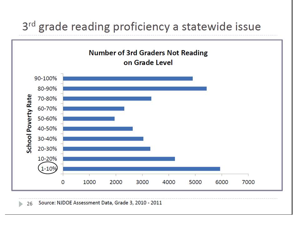
It turns out that the slide presentation had many comparable graphs that deserve at least some attention. First, there’s this graph which attempts to argue that early reading proficiency is a statewide issue, and not just a problem of low income urban neighborhoods:
Rather impressive eh? Certainly gives the impression that early reading deficits are concentrated not in the poorest districts but in the least poor ones.

Why would someone make such an argument? Well, one reason would be if this argument was being coupled with arguments to redistribute funding to those less poor district to help them out – to argue that educational “risk” is not concentrated in poor districts, but rather distributed across all districts.

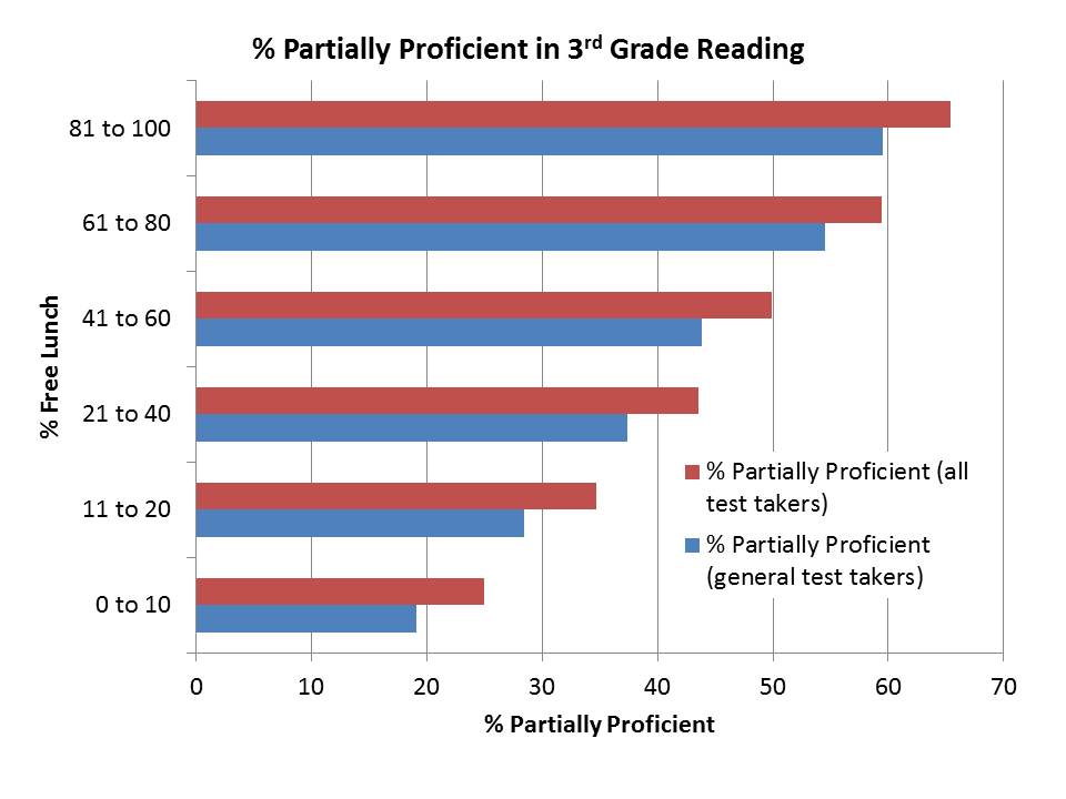
The problem here is that it’s completely absurd to compare total counts of students who are non-proficient across groups without any regard for the total counts of all students. That is, what percent of kids are proficient in each poverty group. Well, here’s what that picture ends up looking like:

Pretty much as we might expect. Lack of reading proficiency in 3rd grade as measured on state assessments is a much bigger problem in higher poverty districts, with poverty here measured as % Free Lunch and with reading proficiency tabulated for general test takers

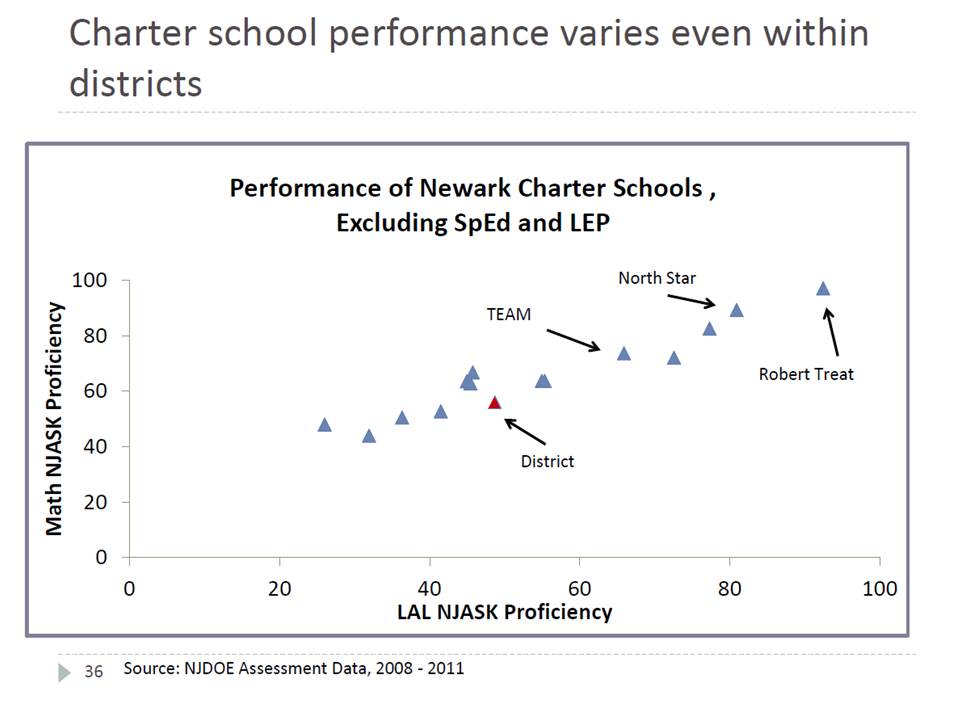
Here’s the next graph, which compares charter school reading and math proficiency rates in Newark to Newark Public Schools:

In this case, the title is somewhat appropriate in that charter school performance does indeed vary in Newark. But the graph is pretty much meaningless and deceptive.

The graph relates average Language Arts and Math proficiency across schools showing basically that schools which are higher on one are also higher on the other. That’s really no big surprise. But the graph ignores entirely the substantive student population differences that explain a large portion of the difference in these proficiency rates. The graph appears to be not-so-subtly constructed to reinforce the central point of this section of the presentation slides – that charters outperform district schools.  That point continues to be built on analyses that were already thoroughly debunked many times over. This graph goes a step further by then cherry picking a few charters to name – all of which appear superior to the “District.”

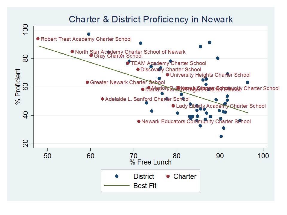
So, what does it look like if we take all of these schools, and separate the district into it’s schools, and plot the combined proficiency rates with respect to % Free Lunch? Well, here it is:INCLUDES NJASK3 TO NJASK8 (no HSPA)

Yes, this graph reinforces the title of the NJDOE graph, but in a much more reasonable light. That said, there are a number of other student population factors that would need to be accounted for in a more thorough analysis. 

Among other things, while the first graph appears to suggest that TEAM Academy is a relative laggard compared to schools like North Star or Robert Treat, my representation here shows that TEAM is actually further above it’s expected performance than either of the other two. TEAM simply serves a lower income population than the other two. Further, district schools serving similar populations do similarly well. And several charter schools do as poorly (and worse) than comparable district schools.


Amazing Graph Proves Poverty Doesn’t Matter!(?)

I just couldn’t pass this one up. This is a graph for the ages, and it comes from a presentation by the New Jersey Commissioner of Education given at the NJASA Commissioner’s Convocation in Jackson, NJ on Feb 29. State of NJ Schools presentation 2-29-2012

Please turn to Slide #24:

The title conveys the intended point of the graph – that if you look hard enough across New Jersey – you can find not only some, but MANY higher poverty schools that perform better than lower poverty schools.

This is a bizarre graph to say the least. It’s set up as a scatter plot of proficiency rates with respect to free/reduced lunch rates, but then it only includes those schools/dots that fall in these otherwise unlikely positions. At least put the others there faintly in the background, so we can see where these fit into the overall pattern. The suggestion here is that there is not pattern.
The apparent inference here? Either poverty itself really isn’t that important a factor in determining student success rates on state assessments, or, alternatively, free and reduced lunch simply isn’t a very good measure of poverty even if poverty is a good predictor. Either way, something’s clearly amiss if we have so many higher poverty schools outperforming lower poverty ones. In fact, the only dots included in the graph are high poverty districts outperforming lower poverty ones. There can’t be much of a pattern between these two variables at all, can there? If anything, the trendline must be sloped up hill? (that is, higher poverty leads to higher outcomes!)

Note that the graph doesn’t even tell us which or how many dots/schools are in each group and/or what percent of all schools these represent. Are they the norm? or the outliers?

So, here’s the actual pattern:

Hmmm… looks a little different when you put it that way. Yeah, it’s a scatter, not a perfectly straight line of dots. And yes, there are some dots to the right hand side that land above the 65 line and some dots to the left that land below it.

BUT THE REALITY IS THAT FREE/REDUCED LUNCH ALONE EXPLAINS ABOUT 2/3 OF THE VARIATION IN PROFICIENCY RATES ACROSS SCHOOLS!

Do free/reduced lunch rates explain all of the variance? Of course not. Nothing really does, in part because the testing data themselves include noise, and reducing the testing data to percentages of kids over and above arbitrary thresholds introduces other noise. So all of the variance can’t be explained no-matter how many variables we throw at it. We can, however, take some additional easily accessible variables from the school report cards and explain a little more of the variation:

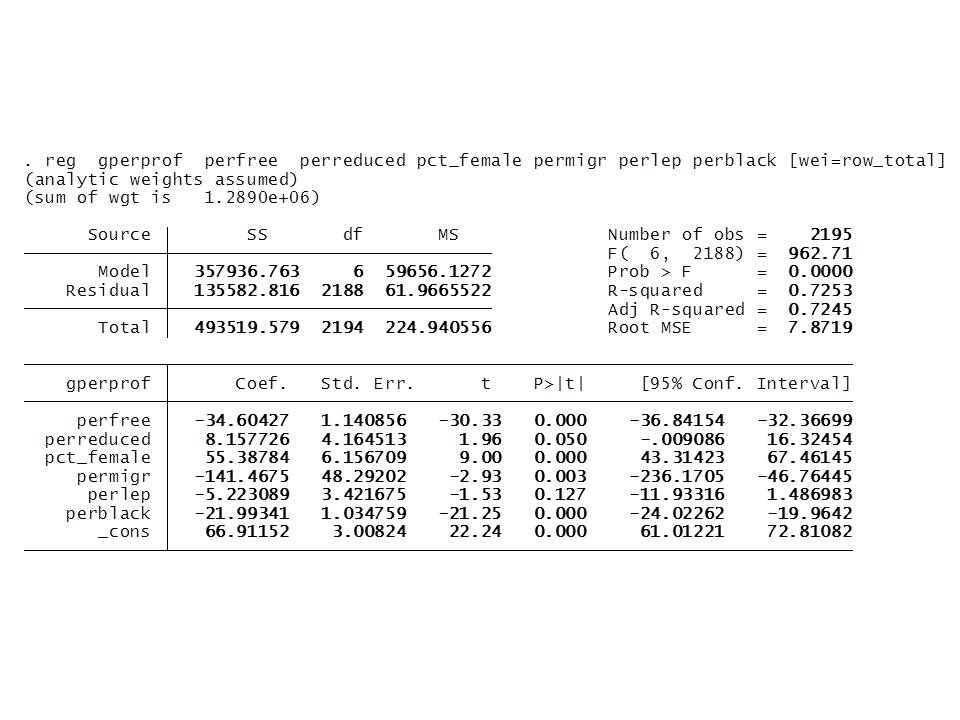
But, % free lunch remains the dominant factor, along with % black and % female. Combining free/reduced produces a somewhat weaker effect than using % free alone.

Lengthy, somewhat related tangent

Back in 2007-2008, while I was still at the University of Kansas, I was involved in a study of factors associated with production of outcomes and relative efficiency of New Jersey schools. Most of the data were generally insufficient for academic publication, but we did have some fun playing and figuring out what was there.

The study was designed to figure out a) which background factors really accounted for differences in NJ school performance, and b) what were the differences in characteristics of schools that appeared to do better or worse than expected.

Here are a few snapshots of what I found back then, constructing models of school level outcomes for New Jersey schools using data from 2004 to 2006 (all publicly accessible data).

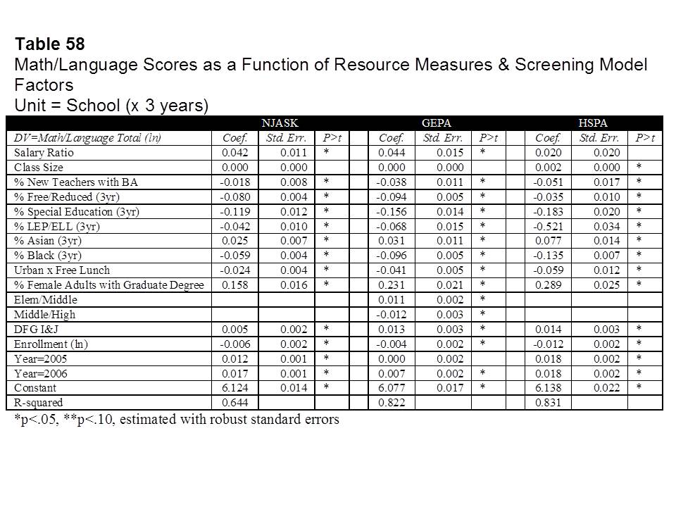
First, using a combination of background demographic factors, school characteristics and other school resource measures we were able to explain as much as 82% of the variation in 8th grade (then GEPA) outcomes. Still, % free and reduced lunch played a (the) dominant role, along with other related factors including special education shares, racial composition, % of female adults living in the surrounding area holding a Graduate degree, and an indicator that the school was in an affluent suburban district (DFG I or J).

We played around with multiple options and this is where we ended up. One of the more interesting revelations was that poverty seemed to have stronger effects on outcomes in population dense urban centers (our Urban x Free Lunch interaction term). This finding is common and can be explained in multiple ways (I’ll have to get to that another time).

We also found that certain resource measures were associated with higher (or lower) outcome schools. Schools where teachers had higher salaries than other similar teachers (by degree and experience) in the surrounding labor market tended to have higher outcomes. And schools with larger shares of teachers in their first three years with only a BA had lower outcomes.

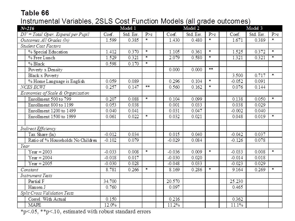
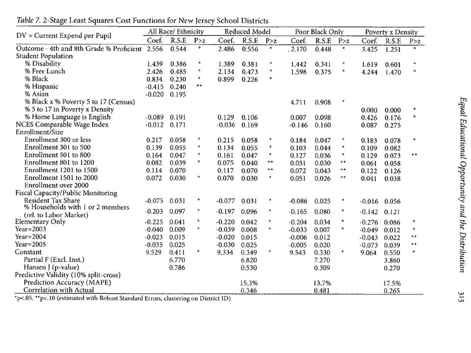
We (I) actually took the analyses a step further and estimated preliminary models of the costs of producing desired outcome targets (models which I subsequently improved upon). The key element of these models was to figure out if there were, in fact, alternative or additional demographic measures for districts that might help to better capture which districts have legitimately higher costs of achieving desired student outcomes. That is, what kind of stuff should be weighted, and/or weighted more heavily in the state school finance formula.  Specifically, what alternatives do we have for addressing poverty?

This was the first attempt:

And this was the second attempt (in a published article):

  • Baker, B.D., Green, P.C. (2009) Equal Educational Opportunity and the Distribution to State Aid to Schools: Can or should racial composition be a factor? Journal of Education Finance 34 (3) 289-323

What we found was that poverty (measured by % free lunch) indeed strongly affects the costs of improving student outcomes, specifically applied to New Jersey districts, in one case focusing only on K-12 unified districts and in the second case all NJ districts. This finding is not a revelation.

We also found that one might capture additional “costs” by including measures of school district racial composition, and we discuss the legal implications of this finding in several related articles (here, here & here). But, we also point out that there are alternatives for capturing some of the same effect, including the Urban x Poverty interaction.

So yes, we can make our statistical models and analyses ever more nuanced to more thoroughly explain the links between student backgrounds and student outcomes, and the costs of improving those outcomes. And, to the extent we can, we should.  But the fact is that poverty still matters, and it seems to matter statistically even when we measure it with the imperfect, crude proxy of children qualified for free or reduced price lunch.

In summary, despite the apparent brilliant wisdom conveyed in the graph at the outset of this post:

  1. Poverty as measured by free and reduced lunch status remains a very strong predictor of variations in proficiency rates across New Jersey schools; and
  2. Various measures of poverty, including free lunch status, and census poverty rates interacted with urban population density strongly influence the costs of improving outcomes across New Jersey school districts (and to an extent that far exceeds the weights in the current school finance formula).

But it’s still a really fun graph!

Here’s a link to a related article on schools supposedly “beating the odds” (like those in the above graph)

And here’s a link to my preliminary analyses which never saw the light of day (rough and unedited, in its original draft form): BAKER.DRAFT.JUNE_08

About those Dice… Ready, Set, Roll! On the VAM-ification of Tenure

A while back I wrote a post (and here) in which I explained that the relatively high error rates in Value-added modeling might make it quite difficult for teachers to get tenure under some newly adopted and other proposed guidelines and much easier to lose it, even after waiting years to get lucky [& yes I do mean LUCKY] enough to obtain it.

The standard reformy template is that teachers should only be able to get tenure after 3 years of good ratings in a row and that teachers should be subject to losing tenure if they get 2 bad years in a row.  Further, it is possible that the evaluations might actually stipulate that you can only get a good rating if you achieve a certain rating on the quantitative portion of the evaluation – or the VAM score. Likewise for bad ratings (that is, the quantitative measure overrides all else in the system).

The premise of the dice rolling activity from my previous post was that it is necessarily much less likely to roll the same number (or subset of numbers) three times in a row than twice (exponentially in fact). That is, it is much harder to overcome the odds based on error rates to achieve tenure, and much easier to lose it. Again, this is much due to the noisiness of the data, and less due to the difficulty of actually being “good” year after year. The ratings simply jump around a lot. See my previous post.

So, for those of you energetic young reformy wanna be teachers out there thinkin’ – hey, I can cut it – I’ll take my chances and my “good” teaching will overcome those odds – generating year-after-year top quartile rankings? Alot of that is totally out of your control! [Look, I would have been right there with you when I graduated college]

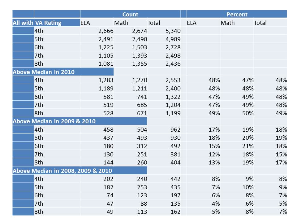
But my first post on this topic was all in hypothetical-land. Now, with the newly released NYC teacher data we can see just how many teachers actually got three-in-a-row in the past three years [among those actually teaching the same subject and grade level in the same school], applying different ranges of “acceptableness” or not.

So, here, I give the benefit of the doubt, and set a reasonably low bar for getting a good rating – the median or higher [ignoring error ranges and sticking with the type of firm cut-points that current state policies and local contracts seem to be adopting]. Any teacher who gets the median or higher 3 years in a row can get tenure! otherwise, keep trying until you get your three in a row? How many teachers is that? How many overcome the odds of the randomness and noise in the data? Well, here it is:

As percentiles dictate (by definition) about half of the teachers in the data are in the upper half in the most recent year. But, only about 20% of teachers in any grade or subject are above the median two years in a row. Further, only about 6 to 7% actually were lucky enough to land in the upper half for three years running!  Assuming stability remains relatively similar over time, we could expect that in any three year period, about 7% of teachers might string together three above-the-medians in a row. At that pace, tenure will be awarded rather judiciously. (but actually, stability in the most recent year over prior is unusually high)

Let’s say I cut teachers a break and only take tenure away if they get two in a row not in the bottom half, but rather all the way down into the bottom third!  What are the odds? How many teachers actually get two years in a row in the bottom third?

Well, here it is:

That’s rather depressing isn’t it. The chances of ending up in the bottom third two years in a row are about the same as the chances of ending up in the top half three years in a row!

Now, perhaps you’re thinkin’ Big Deal. So you jump into and out of the edges of these categories. That just means you’re not really solidly in the “good” or the “bad” and it should take you longer to get tenure. That’s fair? After all, it’s not like any substantial portion of teachers are actually jumping back and forth between the top half and the bottom third?

  • In ELA,  14% of those in the top half in 2010 were in the bottom third in 2009
  • In ELA, 23.9% in the top half in 2009 were in the bottom third in 2010
  • In Math (where the scores are more stable in part because they appear to retain some biases), 9% of those in the top half in 2010 were in the bottom third in 2009
  • In Math, 26% of those in the bottom third in 2009 were in the top half in 2010 and nearly 16% of those in the top half in 2009 ended up in the bottom third in 2010.

[corrected]

Most of these shifts if not nearly all of them are not because the teacher actually became a good teacher or became a bad teacher from one year to the next.

The big issue here is the human side of this puzzle. None of the existing deselection or tightened tenure requirement simulations of the supposed positive effects of leveraging VAM estimates to improve student outcomes makes even halfhearted attempts to account for human behavioral responses to a system driven by these imprecise and potentially inaccurate metrics. All adopt the oversimplified “all else  equal” assumption of an unending supply of new teacher candidates that are equal in quality to the  current average teacher and with comparable standard deviation.

Reformy arguments ratchet these assumptions up a notch. The most reformy arguments in favor of moving toward these types of tenure and de-tenuring provisions posit that making tenure empirically performance based and de-selecting the “bad” teachers will strengthen the teaching profession. That better applicants – the top third of college graduates – will suddenly flock to teaching instead of other currently higher paying professions.

But, with so little control over one’s destiny is that really likely to be the case? It certainly stands to be a frustrating endeavor to achieve any level of job stability. And it doesn’t look like average compensation will be rising in the near future to compensate for this dramatic increase in risk. Further, if we tie compensation to these ratings either as one-time bonuses or as salary adjustments, many teachers who, by chance, get good ratings in one year will, by chance again, get bad ratings the next year.  Teachers will have a difficult time even guessing at what their compensation might look like the following year. And since the ratings are necessarily relative (based on percentiles) the distribution of additional compensation must involve winners and losers. The luckier one or a handful of teachers get in a given year, the larger the share of the merit pot they receive and the less others receive.  Once again, I do mean LUCK.

Who will really be standing in line to take these jobs? In the best case (depending on one’s point of view), perhaps a few additional energetic grads of highly selective colleges will jump into the mix for a couple of years. But as these numbers and frustrations play out over time, the pendulum is certainly likely to swing the other direction.

More risk and more uncertainty without any sign of significantly increased reward is highly unlikely to improve the teaching profession and far more likely to make things much worse, especially in already hard to staff schools and districts!

These numbers are fun to play with. I just can’t stop myself. And they have endless geeky academic potential. But I’m increasingly convinced that they have little practical value for improving school quality. And I’m increasingly disturbed by how policy makers  have adopted absurd, rigid requirements around these anything but precise and questionably accurate metrics.


Seeking Practical Uses of the NYC VAM Data???

A short while back, in a follow up post regarding the Chetty/Friedman/Rockoff study I wrote about how and when I might use VAM results, if I happened to be in a decision making role in a school or district:

I would want to be able to generate a report of the VA estimates for teachers in the district. Ideally, I’d like to be able to generate a report based on alternative model specifications (option to leave in and take out potential biases) and on alternative assessments (or mixes of them). I’d like the sensitivity analysis option in order to evaluate the robustness of the ratings, and to see how changes to model specification affect certain teachers (to gain insights, for example, regarding things like peer effect vs. teacher effect).

If I felt, when pouring through the data, that they were telling me something about some of my teachers (good or bad), I might then use these data to suggest to principals how to distribute their observation efforts through the year. Which classes should they focus on? Which teachers? It would be a noisy pre-screening tool, and would not dictate any final decision.  It might start the evaluation process, but would certainly not end it.

Further, even if I did decide that I have a systematically underperforming middle school math teacher (for example), I would only be likely to try to remove that teacher if I was pretty sure that I could replace him or her with someone better. It is utterly foolish from a human resource perspective to automatically assume that I will necessarily be able to replace this “bad” teacher with an “average” one.  Fire now, and then wait to see what the applicant pool looks like and hope for the best?

Since the most vocal VAM advocates love to make the baseball analogies… pointing out the supposed connection between VAM teacher deselection arguments and Moneyball, consider that statistical advantage in Baseball is achieved by trading for players with better statistics – trading up (based on which statistics a team prefers/needs).  You don’t just unload your bottom 5%  or 15% players in on-base-percentage and hope that players with on-base-percentage equal to your team average will show up on your doorstep. (acknowledging that the baseball statistics analogies to using VAM for teacher evaluation to begin with are completely stupid)

With the recently released NYC data in hand, I now have the opportunity to ponder the possibilities. How, for example, if I was the principal of a given, average sized school in NYC, might I use the VA data on my teachers to council them? to suggest personnel changes? assignment changes, or so on? Would these data, as they are, provide me any useful information about my staff and how to better my school?

For this exercise, I’ve decided to look at the year to year ratings of teachers in a relatively average school. Now, why would I bother looking at the year to year ratings when we know that the multi-year averages are supposed to more accurate – more representative of the teacher’s over time contributions? Well, you’ll see in the graphs below that those multi-year averages also may not be that useful. In many cases, given how much teacher ratings bounce around from year to year, it’s rather like assigning a grade of “C” to the kid who got Fs on the first two tests of the semester, and As on the next two or even a mix of Fs and As in some random sequence. Averages, or aggregations, aren’t always that insightful. So I’ve decided to peel it back a bit, as I likely would if I was the principal of this school seeking insights about how to better use my teachers and/or how to work with them to improve their art.

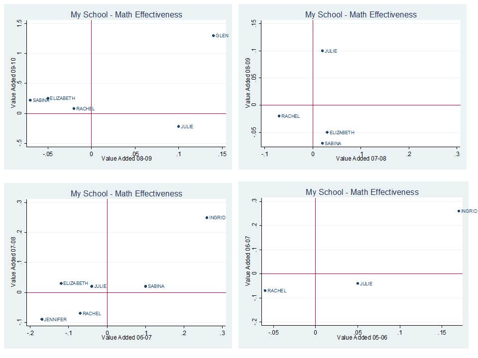
Here are the year to year Math VA estimates for my teachers who actually continue in my building from one year to the next:

Focusing on the upper left graph first, in 2008-09, Rachel, Elizabeth and Sabina were somewhat below average. In 2009-10 they were slightly above average. In fact, going to the prior year (07-08), Elizabeth and Sabina were slightly above average, and Rachel below. They reshuffle again, each somewhat below average in 2006-07, but only Rachel has a score for the earliest year. Needless to say, it’s little tricky figuring out how to interpret differences among these teachers from this very limited view of very noisy data. Julie is an interesting case here. She starts above average in 05-06, moves below average, then well above average, then back to below. She’s never in the same place twice. There could be any number of reasons for this that are legitimate (different class composition, different life circumstances for Julie, etc.). But, more likely it’s just the noise talkin’! Then there’s Ingrid, who held her own in the upper right quadrant for a few years, then disappears. Was she good? or lucky?  Glen also appears to be a tw0-in-a-row Math teaching superstar, but we’ll have to see how the next cycle works out for him.

Now, here are the ELA results:

If we accept these results as valid (a huge stretch), one might make the argument that Glen spent a bit too much of his time in 2008-09 trying to be a Math teaching superstar, and really shortchanged ELA. But he got it together and became a double threat in 2009-10?  Then again, I think I’d have to wait and see if Glen’s dot in the picture actually persists in any one quadrant for more than a year or two, since most of the others continue to bounce all over the place. Perhaps Julie, Rachel, Elizabeth and Sabina really are just truly average teachers in the aggregate – if we choose to reduce their teaching to little blue dots on a scatterplot. Or perhaps these data are telling me little or nothing about their teaching. Rachel and Julie were both above average in 05-06, with former? colleague (or left the VAM mix) Ingrid. Rachel drops below average and is joined by Sabina the next year. Jennifer shows up as a two-year very low performer, then disappears from the VAM mix. But Julie, Rachel, Sabina and Elizabeth persist, and good for them!

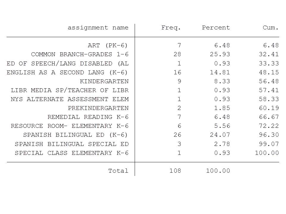
So, now that I’ve spent all of my time trying to figure out if Glen is a legitimate double-threat superstar and what, if anything I can make of the results for Julie, Rachel, Elizabeth and Sabina, It’s time to put this back into context, and take a look at my complete staffing roster for this school (based on 2009-10 NYSED Personnel Master File). Here it is by assignment code, where “frequency” refers to the total number of assigned positions in a particular area:

So, wait a second, my school has a total of 28 elementary classroom teachers. I do have a total of 11 ELA and 10 Math ratings in 2009-10, but apparently fewer than that (as indicated above) for teachers teaching the same subject and grade level in sequential years (the way in which I merged my data). Ratings start in 4th grade, so that knocks out a big chunk of even my core classroom teachers.

I’ve got a total of 108 certified positions in my school, and I’m spending my time trying to read these tea leaves which pertain to, oh… about 5% of my staff (who are actually  there, and rated, on multiple content areas, for more than a few years).

By the way, by the time I’m looking at these data, it’s 2011-12, two years after the most recent value-added estimates and not too many of my teachers are posting value-added estimates more than a few years in a row. How many more are gone now? Sabina, Rachel, Elizabeth, Julie? Are you still even there? Further, even if they are there, I probably should have been trying to make important decisions in the interim and not waiting for this stuff. I suspect the reports can/will be produced more likely on a 1 year lag, but even then I have to wait to see how year-to-year ratings stack up for specific teachers.

From a practical standpoint, as someone who would probably try to make sense of this type of data if I was in the role of school principal (‘cuz data is what I know, and real “principalling” is not!), I’m really struggling to see the usefulness of it.

See also my previous post on Inkblots and Opportunity Costs.

Note for New Jersey readers: It is important to understand that there are substantive differences between the Value-added estimates produced in NYC and the Student Growth Percentile’s being produced in NJ. The bottom line – while the value-added estimates above fail to provide me with any meaningful insights, they are conceptually far superior (for this purposes) to SGP reports.

These value-added estimates actually are intended to sort out the teacher effect on student growth. They try to correct for a number of factors, as I discuss in my previous post.

Student Growth Percentiles do not even attempt to isolate the teacher effect on student growth, and therefore it is entirely inappropriate to try to interpret SGP’s in this same way. SGPs could conceivably be used in a VAM, but by no means should ever stand alone.

They are NOT A TEACHER EFFECTIVENESS EVALUATION TOOL. THEY SHOULD NOT BE USED AS SUCH.  An extensive discussion of this point can be found here:

https://schoolfinance101.wordpress.com/2011/09/02/take-your-sgp-and-vamit-damn-it/

https://schoolfinance101.wordpress.com/2011/09/13/more-on-the-sgp-debate-a-reply/

You’ve Been VAM-IFIED! Thoughts (& Graphs) on the NYC Teacher Data

Readers of my blog know I’m both a data geek and a skeptic of the usefulness of Value-added data specifically as a human resource management tool for schools and districts. There’s been much talk this week about the release of the New York City teacher ratings to the media, and subsequent publication of those data by various news outlets. Most of the talk about the ratings has focused on the error rates in the ratings, and reporters from each news outlet have spent a great deal of time hiding behind their supposed ultra-responsibleness of being sure to inform the public that these ratings are not absolute, that they have significant error ranges, etc.  Matt Di Carlo over at Shanker Blog has already provided a very solid explanatory piece on the error ranges and how those ranges affect classification of teachers as either good or bad.

But, the imprecision – as represented by error ranges – of each teacher’s effectiveness estimate is but one small piece of this puzzle. And in my view, the various other issues involved go much further in undermining the usefulness of the value added measures which have been presented by the media as necessarily accurate albeit lacking in precision.

Remember, what we are talking about here are statistical estimates generated on tests of two different areas of student content knowledge – math and English language arts.  What is being estimated is the extent of change in score (for each student, from one year to the next) on these particular forms of these particular tests of this particular content, and only for this particular subset of teachers who work in these particular schools.

We know from other research (from Corcoran and Jennings, and form the first Gates MET report) that value added estimates might be quite different for teachers of the same subject area if a different test of that subject is used.

We know that summer learning may affect student annual value added, yet in this case, NYC is estimating teacher effectiveness on student outcomes from year to year. That is, the difference in a students’ score on one day in the spring of 2009 to another in the spring of 2010, is being attributed to a teacher who has contact, for a few hours a day with that child from September to June (but not July and August).

The NYC value-added model does indeed include a number of factors which attempt to make fairer comparisons between teachers of similar grade levels, similar class sizes, etc. But we also know that those attempts work only so well.

Focusing on error rate alone presumes that we’ve got the model and the estimates right – that we are making valid assertions about the measures and their attribution to teaching effectiveness.

That is, that we really are estimating the teacher’s influence on a legitimate measure of student learning in the given content area.

Then error rates are thrown into the discussion (and onto the estimates) to provide the relevant statistical caveats about their precision.

That is, accepting that we are measuring the right thing and rightly attributing it to the teacher, there might be some noise – some error – in our estimates.

If the estimates lack validity, or are biased, the rate of noise, or error around the invalid or biased estimate is really a moot point.

In fact, as I’ve pointed out before on this blog, it is quite likely that value added estimates that retain bias by failing to fully control for outside influences are actually likely to be more stable over time (to the extent that the outside influences remain more stable over time). And that’s not a good thing.

So, to the news reporters out there, be careful about hiding behind the disclaimer that you’ve responsibly provided the error rates to the public. There’s a lot more to it than that.

Playing with the Data

So, now for a little playing with the data, which can be found here:

http://www.ny1.com/content/top_stories/156599/now-available–nyc-teacher-performance-data-released-friday#doereports

I personally wanted to check out a few things, starting with assessing the year to year stability of the ratings. So, let’s start with some year to year correlations achieved by merging the teacher data reports across years for teachers who stayed in the same school teaching the same subject area to the same grade level. Note that teacher IDs are removed from the data. But teachers can be matched within school, subject and grade level, by name over time (by concatenating the dbn [school code], teacher name, grade level and subject area [changing subject area and grade level naming to match between older and newer files]). First, here’s how the year to year correlations play out for teachers teaching the same grade, subject area and in the same school each year.

Sifting through the Noise

As with other value-added studies, the correlation across teachers in their ratings from one year to the next seem to range from about .10 to about .50. Note that between 2009-10 and 2008-09 Math value-added estimates were relatively highly correlated, compared to previous years (with little clear evidence as to why, but for possible changes to assessments, etc.). Year to year correlations for ELA are pretty darn low, especially prior to the most recent two years.

Visually, here’s what the relationship between the most recent two years of ELA VAM ratings looks like:

I’ve done a little color coding here for fun. Dots coded in orange are those that stayed in the “average” category from one year to the next. Dots in bright red are those that stayed “high” or “above average” from one year to the next and dots in pale blue were “low” or “below average” from one year to the next. But there are also significant numbers of dots that were above average or high in one year, and below average or low in the next.  9 to 15% (of those who were “good” or were “bad” in the previous year) move all the way from good to bad or bad to good. 20 to 35% who were “bad” stayed “bad” & 20 to 35% who were “good” stayed “good.” And this is between the two years that show the highest correlation for ELA.

Here’s what the math estimates look like:

There’s actually a visually identifiable positive relationship here. Again, this is the relationship between the two most recent years, which by comparison to previous years, showed a higher correlation.

For math, only about 7% of teachers jump all the way from being bad to good or good to bad (of those who were “good” or “bad” the previous year), and about 30 to 50% who were good remain good, or who were bad, remain bad.

But, that still means that even in the more consistently estimated models, half or more of teachers move into or out of the good or bad categories from year to year, between the two years that show the highest correlation in recent years.

And this finding still ignores whether other factors may be at play in keeping teachers in certain categories. For example, whether teachers stay labeled as ‘good’ because they continue to work with better students or in better environments.

Searching for Potential Sources of Bias

My next fun little exercise in playing with the VA data involved merging the data by school dbn to my data set on NYC school characteristics. I limited my sample for now to teachers in schools serving all grade levels 4 to8 and w/complete data in my NYC schools data, which include a combination of measures from the NCES Common Core and NY State School Report Cards. I did a whole lot of fishing around to determine whether there were any particular characteristics of schools that appeared associated either or both with individual teacher value added estimates or with the likelihood that a teacher ended up being rated “good” or “bad” by my aggregations used here.  I will present my preliminary findings with respect to those likelihoods here.

Here are a few logistic regression models of the odds that a teacher was rated “good” or rated “bad” based on a) the multi-year value-added categorical rating for the teacher and b) based on school year 2009 characteristics of their school across grades 4 to 8.

After fishing through a plethora of measures on school characteristics (because I don’t have classroom characteristics for each teacher), I found that with relative consistency, using the Math ratings, teachers in schools with higher math proficiency rates tended to get better value added estimates for math and were more likely to be rated “good.” This result was consistent across multiple attempts, models, subsamples (Note that I’ve only got 1300 of the total math teachers rated here… but it’s still a pretty good and well distributed sample). Also, teachers in schools with larger average class size tended to have lower likelihood of being classified as “above average” or “high” performers. These findings make some sense, in that peer group effect may be influencing teacher ratings and class size may effects (perhaps as spillover?) may not be fully captured in the model. The attendance rate factor is somewhat more perplexing.

Again, these models were run with the multi-year value added classification.

Next, I checked to see if there were differences in the likelihood of getting back to back good or back to back bad ratings by school characteristics. Here are the models:

As it turns out, the likelihood of achieving back to back good or back to back bad ratings is also influenced by school characteristics. Here, as class size increases by 1 student, the likelihood that a teacher in that school gets back to back bad ratings goes up by nearly 8%. The likelihood of getting back to back good ratings declines by 6%. The likelihood of getting back to back good ratings increases by nearly 8% in a school with 1% higher math proficiency rate in grades 4 to 8.

These are admittedly preliminary checks on the data, but these findings in my view do warrant further investigation into school level correlates with the math value added estimates and classifications in particular. These findings are certainly suggestive of possible estimate bias.

Who Gets VAM-ED?

Finally, while there’s been much talk about these ratings being released for such a seemingly large number of teachers – 18,000 – it’s important to put those numbers in context in order to evaluate their relevance. First of all, it’s 18,000 ratings, not teachers. Several teachers are rated for both math and ELA, bringing the total number of individuals down significantly from 18,000.  In still generous terms, the 18,000 or so are more like “positions” within schools, but even then, the elementary classroom teacher covers both areas even within the same assignment or position.

Based on the NY State Personnel Master File for 2009-10, there were about 150,000 (linkable to individual schools including those in the VA reports) certified staffing assignments in New York City in 2009-10 (where individual teachers cover more than one assignment). In that light, 18,000 is not that big a share.

But let’s look at it at the school level using two sample schools. For these comparisons I picked two schools which had among the largest numbers of VA math estimates (with many of the same teachers in those schools having VA ELA estimates).  The actual listing of teacher assignments is provided for two schools below, along with the number of teachers for whom there were Math VA estimates.  Again, these are schools with among the highest reported number (and share) of teachers who were assigned math effectiveness ratings.

In each case, we are Math VAM-ing around 30% of total teacher assignments [not teachers, but assignments] (with substantial overlap for ELA). Clearly, several of the teacher assignments in the mix for each school are completely un-VAM-able. States such as Tennessee have adopted the absurd strategy that these other staff should be evaluated on the basis of the scores for those who can be VAM-ed.

A couple of issues are important to consider here. First, these listings more than anything convey the complexity of what goes on in schools – the type of people who nee to come together and work together collectively on behalf of the interests of kids. VAM-ing some subset of those teachers and putting their faces in the NY Post is unhelpful in many regards. Certainly there exist significant incentives for teachers to migrate to un-vammed assignments to the extent possible.   And please don’t tell me that the answer to this dilemma is to VAM the Orchestra conductor or Art teacher. That’s just freakin’ stupid!

As Preston Green, Joseph Oluwole and I discuss in our forthcoming article in the BYU Education and Law Journal, coupling the complexities of staffing real schools and evaluating the diverse array of professionals that exist in those schools with VAM-based rating schemes necessarily means adopting differentiated contractual agreements, leading to numerous possible perverse incentives and illogical management decisions (as we’ve already seen in Tennessee as well as in the structure of the DC IMPACT contract).