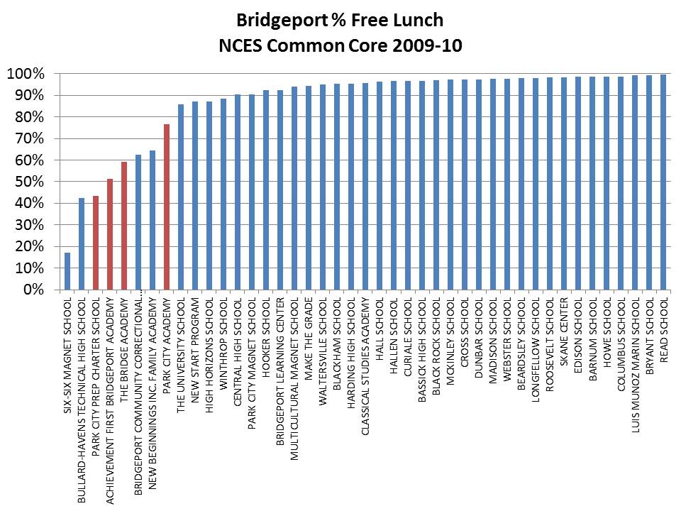
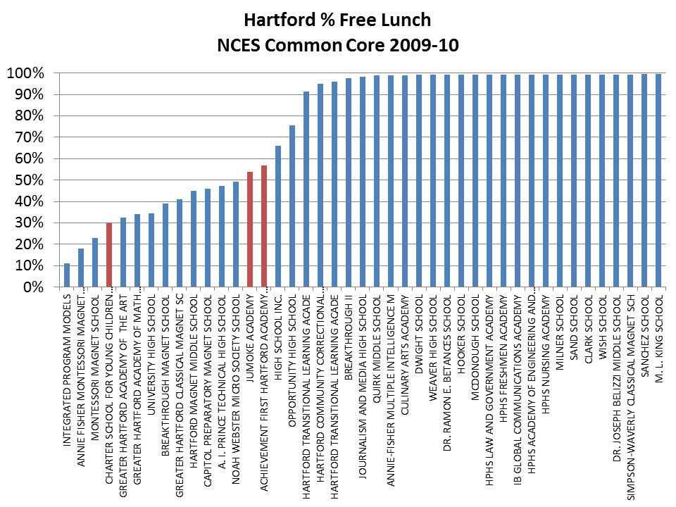
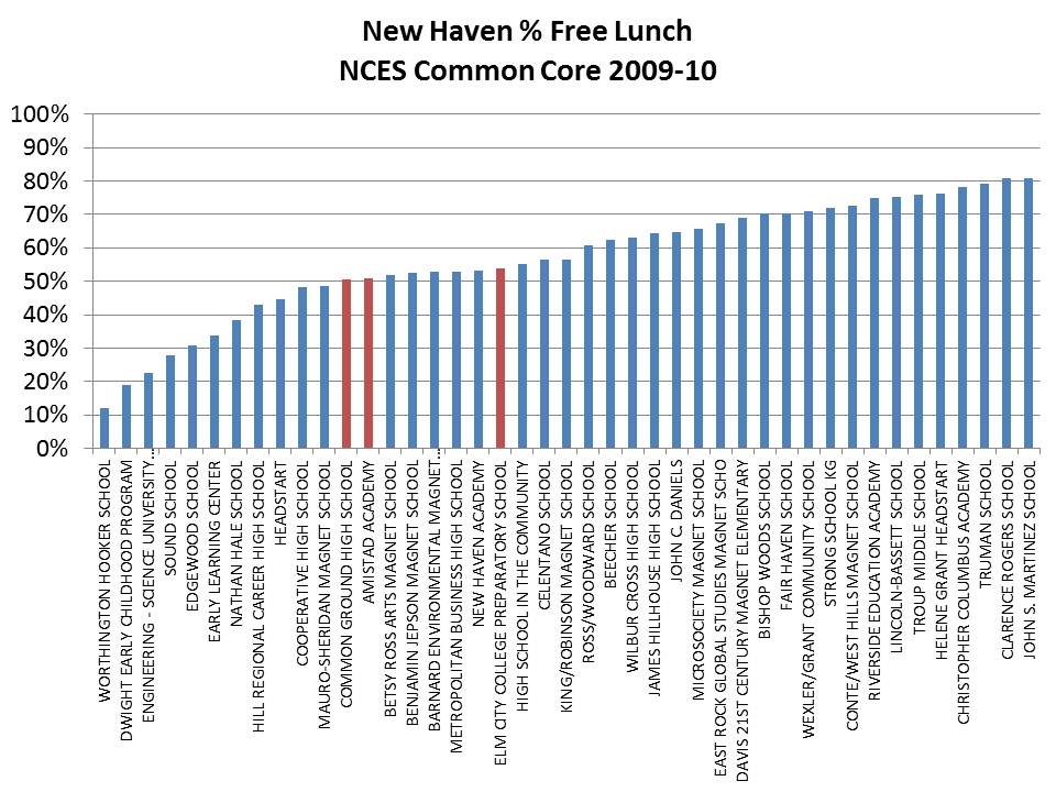
I was admittedly in a bit of a rush the other day to pull together some figures on CT charter schools based largely on data I had previously compiled, some of which only included Achievement First charter schools. Here, I include all charter schools in Hartford, New Haven and Bridgeport, and address only the % Free Lunch numbers using the most recent available data from the NCES Common Core of Data, which are from 2009-10. A few quick points are in order.
First, this is not “old” data per se. It is one year lagged from the most recent official state data (2010-11). Current year (2011-12) data would not be appropriate for use until the close of the year. Thus 2010-11 would be the most recent complete data, if available. Also, these types of data tend to be relatively stable over time. They don’t shift much over a 2 year period, but I’ll keep updating as complete end of year data become available. The burden of reporting accuracy falls on the schools and districts.
Second, this is not a “study.” A study, so to speak, in my view, requires far more extensive analysis than this. And yes, this is a topic on which I have conducted those more extensive analyses (though not specifically involving CT charter schools). This is a blog, and in this blog post and in the previous blog post on CT Charter schools I have merely rendered graphs of the existing data as reported by the schools. There’s no data editing involved, and no tricky statistical analyses ( like the regression model of wages in my CT teacher post – which come from previous work). It’s just graphs. Then why bother? Well, I bother because much of what I see in the ongoing debate over CT charter schools (and charters in some other locations) is guided by misinformation, or at least misconceptions (of charters beating the odds with the “same” students – proving poverty doesn’t matter! nor does money?). Misinformation that is easily enough correctable with a simple graph or two, or map, or even table of the numbers. Hey… all of these numbers are available to each and every one of you. I’ve provided posts in the past where I explain how to get them and how to summarize and graph them. I wish someone else would save me the time, and go make their own graphs, or at least present and discuss the existing data to provide relevant context for current policy discussions. But alas, I’ve not seen that happening (though a few individuals have jumped into the game). Thus, I stick my nose, uninvited into another state’s business once again.
All of that said, here are a few more graphs:
The upshot of these graphs is that it would certainly be unfair to criticize Achievement First specifically for serving fewer low income children than district schools in these major cities. In fact, in both New Haven and Hartford, the Achievement First charters have the higher low income concentrations among the charters, and in Bridgeport they are not the lowest.
It is also important to understand that districts have to a large extent self-induced economic segregation through their own magnet school programs. I’ve addressed the same issue regarding Newark, NJ in the past. So, economic segregation within these cities is not entirely driven by the presence of charters but rather by the complex mix of district traditional and magnet schools coupled with the introduction and expansion of charters.


