State Ranking Madness: Who spends most/least?

Ranking the states by different methods

Every year, through many different sources, state politicians and political activists make great waves over which state spends more on public education, and which spends less. Who’s in first place? Who’s in last? Those from differing perspectives have different motives. Politicians and anti-tax, anti-government activists search for their way to find that “our states spends more than everyone else and gets nothing for it,” while others hoping to increase education spending search frantically for low ratings – “We’re in last place and that’s a disgrace!” Of course, not everyone can be in first or last place and it’s pretty damn hard to tweak the numbers to move a state from near the top to near the bottom. Here, I’ll present a few alternative, reasonable rankings – the last two of which, I believe are most reasonable, though for some states still differ significantly.

First, let’s begin with the simplest version of the numbers- the straight up averages of school district state and local revenue per pupil (weighted by the number of pupils in each district). Now, I use the state and local revenue per pupil instead of current expenditures per pupil because state and local revenue gives a complete picture of state and local resources allocated to local public school systems and excludes expenditures of federal funds.

Politicians in New Jersey and New York love to make claims that their state is highest spending in the nation (and we get nothing for it!). Even at this most basic level, these claims are wrong. Close, but still wrong. Hooray for Vermont! But isn’t that really part of Canada anyway?

FIGURE 1

Of course, the cost of running a school varies quite significantly across states with a large share (though not all) of that variation being tied to regional differences in the competitive wage one must pay to teachers. Here, I use a competitive wage index developed by the National Center for Education Statistics (by Lori Taylor and Bill Fowler) which uses variation in non-teacher wages across labor markets to correct for variation in teacher wages. http://nces.ed.gov/edfin/adjustments.asp

FIGURE 2

Some reshuffling occurs. States like California, for example drop quite a bit because California is certainly a more expensive place to live and higher wage state. But, we may be assuming too strong a role for the wage adjustment here – assuming that state and local revenues per pupil should move on a 1 for 1 basis with wage variation. Nonetheless, not a totally unreasonable comparison.

We might also wish to consider the student populations that states must educate with their funding at present levels. That is, how much are these current dollars worth toward achieving common outcomes across students? Many cost factors influence the cost of achieving common outcomes across children, as discussed in this paper –http://surface.syr.edu/cgi/viewcontent.cgi?article=1102&context=cpr – by William Duncombe and John Yinger of the Maxwell School at Syracuse University. But, this particular paper focuses on the additional costs associated with children in poverty. Duncombe and Yinger determine that the additional cost per child falling below the federal poverty line is approximately 150% of the cost of achieving the same outcomes with a non-poor child. They also find that the additional costs associated with counts of children falling below the 185% poverty threshold are approximately 100% above average costs. Now, I go very conservative here, and I apply only a 100% weight of additional cost to children qualifying as being in poverty, using U.S. Census Bureau Small Area Income and Poverty Estimates.

FIGURE 3

But, we’ve been learning more of late about problems with using the same income thresholds for poverty across states with very different costs of living. Recently, the U.S. Census Bureau put out this exceptional paper which includes adjusted poverty measures for each state, based on three different adjustment methods – http://www.census.gov/hhes/www/povmeas/papers/Geo-Adj-Pov-Thld8.pdf. In general, the adjustments lead to much higher actual poverty rates in states with very high costs of living such as New York and California. If we use those poverty rates instead of the previous ones to adjust spending for poverty, we get this:

FIGURE 4

In this case, California moves into 49th place, or third from bottom with Washington DC in the analysis.

We’re still missing a pretty big piece of the puzzle here – additional costs associated with economies of scale and population sparsity (for more information on economies of scale see: http://www-cpr.maxwell.syr.edu/efap/Publications/Revisiting_Economies.pdf). Notice that Wyoming and Alaska are our big spenders here. Now, there’s probably no adjustment we can find to fully account for the many ways in which Alaska is different from the lower 48. Nor do the poverty corrections seem to fully address the difficulties of Washington DC. It’s all pretty imperfect. That said, I take one more stab at things, based on a regression model which attempts to control for a) competitive wage variation, b) economies of scale and population density and c) poverty. The idea here is to account for the fact that some states have a need for very small schools and districts because of their small populations which are spread across vast rural expanses. The model attempts to avoid giving a break to other states like New Jersey or Illinois that have many tiny racially segregated enclaves in densely populated suburbs. And here are the results:

FIGURE 5

An important difference when using a regression model to determine relationships between cost factors and revenue levels – instead of just dividing by the cost factors – is that the model determines the weight of those cost factors. On thing that happens in the figure above is that the influence of wage differentials is “softened.” The model-based projections do not assume a 1 for 1 relationship between competitive wages and revenue. As a result, California does not come out as low as in previous figures. Also, the model is projecting state and local revenues for a district with X% poor children. The projection is for an “equated” condition. But, if the state has far more children in higher poverty settings, and those settings have fewer resources, the model projection does not necessarily reflect the average actual conditions. However, for California in particular, there really isn’t a systematic relationship between poverty and revenues across districts – a finding that is as bad as it might seem good. In fact, it’s just bad!

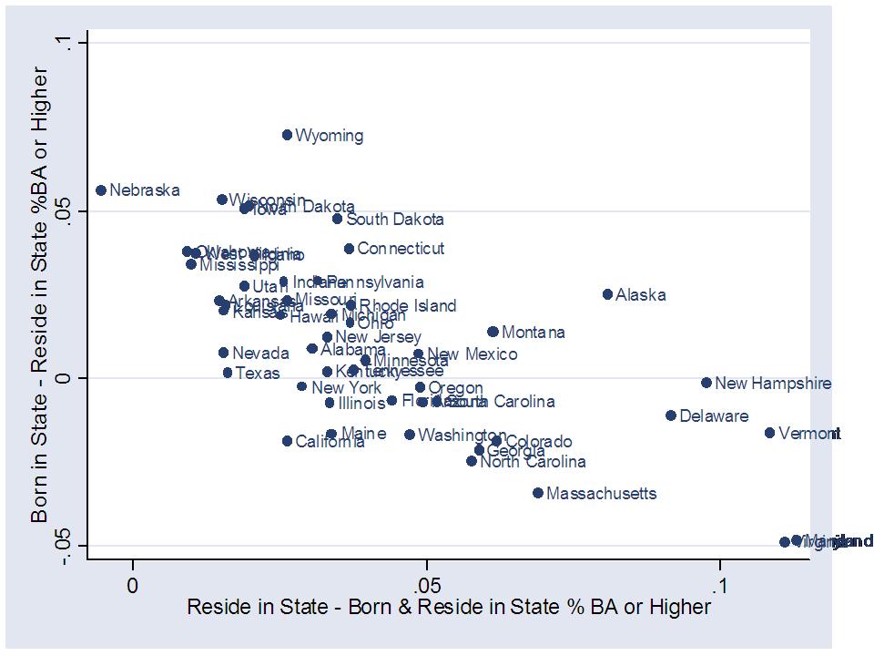
Aren’t the differences really all about state wealth?

I would be remiss if I didn’t include at least a few ugly scatterplots in this post. So here goes. The first two scatterplots here show that state and local revenues per pupil are somewhat modestly related to state average poverty rates (not adjusted regionally) and to the household income levels of families with children in the public school system.

FIGURE 6

FIGURE 7

However, this final figure shows that state and local revenues per pupil are equally related to the effort a state puts up, where effort is measured in terms of state and local revenue per pupil as a share of gross domestic product by state, or gross state product. That is, some states that don’t raise much revenue per pupil simply don’t try that hard. Very few high spending states have low effort. Tennessee, Louisiana, Oklahoma, Arizona and South Dakota are near the bottom because they don’t put up much effort. Mississippi puts up average effort, but just can’t raise much revenue. I’m far more empathetic to Mississipi’s plight! Well, our highest spender, Vermont in some cases, is off the charts on effort. Despite having less capacity than states like New York or New Jersey, Vermont still manages to outspend them.

FIGURE 8

While it makes great rhetoric to claim “first in the nation” or “last in the nation” or “most expensive,” the best one can really do here is to delineate in terms of relatively high or relatively low. Not great headline stuff, but that’s how it goes. New Jersey – NOT THE HIGHEST IN THE NATION – rather, “relatively high.” California – NOT LAST IN THE NATION – but damn close to it by some measures, and still low by others!

What does the education level of 25 to 34 year olds really mean?

About a week ago, The College Board released their latest status report in their college completion series.

http://completionagenda.collegeboard.org/sites/default/files/reports_pdf/Progress_Executive_Summary.pdf

The parts of the report that seemed to grab the most media attention were those related to a) comparing the US to other countries on the percent of 25 to 34 year olds who hold an associates degree or higher and b) comparing US states to one another on the same measure.

Newspapers across the country ran with this stuff and Twitter was buzzing with punditry on what these indicators meant about the quality of K-12 public schools in each state. Our public schools must be failing us if we’re only 24th on the education level of our younger adults – one Missouri pundit tweeted (related news story here).

The first thing that caught my eye was that Washington, DC was first in the rankings of percent of 25 to 34 year olds with an associates degree or higher.  Of course it is. Washington DC is a magnet for recent college graduates. Clearly, this particular indicator says as much about the employment options for a young, college educated workforce as it does about a state’s own education system. This indicator also tells us something about the education level and expectations of the previous generation – parents of these 25 to 34 year olds, whether in the same state or elsewhere. And, this indicator may also tell us something about the extent to which a state imports or exports college students.

So, I decided to play with some data…’cuz that’s what I like to do… just to see how these rankings might change if I tweaked them a bit.

I decided it might be fun to look at the differences in the rates of college educated adults – % of 25 to 34 year olds with a bachelors degree or higher – across states in three different ways:

  1. percent of 25 to 34 year old current adult residents who hold a BA or higher
  2. percent of 25 to 34 year old adult current residents who were born in the state who hold a BA or higher
  3. percent of 25 to 34 year old adults who were born in the state, whether they continue to reside there or not, who hold a BA or higher

It would seem to me that the second of these measures is most on target – the percent of the native population that holds a certain level of education. Needless to say, when I focus on the second measure, the rankings change somewhat. Here it is:

Table 1

Education Level (% BA or Higher) of the 25 to 34 Year Old Population by State

U.S. Census – American Community Survey 2006 to 2008

Data Source: Steven Ruggles, J. Trent Alexander, Katie Genadek, Ronald Goeken, Matthew B. Schroeder, and Matthew Sobek. Integrated Public Use Microdata Series: Version 5.0 [Machine-readable database]. Minneapolis: University of Minnesota, 2010.

Washington DC which ranks 1st on resident college graduates drops to 24th on native college graduates. MA, NY and NJ which were 2, 5 & 4, are now 1, 2, 3. Virginia goes from 9th to 26th and Maryland goes from 6th to 15th when only natives are considered. This is likely a DC effect as well. NH also drops quite a bit. Wisconsin rises quite a bit. Overall, there are some pretty big changes here.

Here are a few scatterplots – ‘cuz nothin’ is more fun than a good scatterplot.

This one shows on the horizontal axis, the share of 25 to 34 year old residents who are natives (born there).  On the vertical axis is the % BA or higher for all current residents. There’s DC, way above the rest on the vertical axis and pretty far to the left on the horizontal – that is, not too many 25 to 34 year olds who live there, were born there. The native share is only lower in Nevada. But Nevada doesn’t seem to be importing college grads!

This one shows the relationship between the % BA or higher among all current residents (horizontal axis) and % BA or higher among native residents (born and live there). Clearly there’s a pretty strong relationship between the two. But, there is enough variation to really change some rankings. Mass is high either way.  The big movers are those identified above, like Maryland, Virginia and New Hampshire, which have much more educated resident young adult populations than native resident young adult populations.

This one puts the “native share” again on the horizontal axis. On the vertical axis is a measure of the difference in the education level of all current residents (25 to 34) and native current residents. It’s somewhat of a net “import” effect measure. How much more educated is the current resident population than the born and raised population? Now, this is net difference, including the fact that some individuals who were born and raised in a state might have left and become more educated. Big net importers here appear to be Maryland, Virginia and Vermont and New Hampshire (Vermont surprised me a bit here… since there isn’t a whole lot of industry to attract college grads, but Burlington does always make those “great places to live” lists). It might also be a small sample size issue with the Vermont data. At the other end of the picture are Nebraska and Nevada, which don’t appear to importing a more educated adult population. Strangely, all but Nebraska are in the positive zone on this measure (note that this measure does not have to be net-zero across states because between state migration is not the only type of migration occurring. International migration may also affect these differences. This may also reflect the fact that more educated individuals tend to be more mobile. Just pondering).

In this one, we have the “native share” again on the horizontal axis, and the difference between the education level of those born in the state – whether they stayed or not – and those who reside in the state. This is somewhat of a net “export” measure. In this case, it would appear that Wyoming is the big loser. So too are Nebraska and Wisconsin. This is the one interesting piece about Wyoming. In the rankings above, Wyoming doesn’t move much. It’s 47th in % BA for current residents and 48th for native residents. But, Wyoming does much better on the education level of those born in the state, whether they stay or not – which apparently they don’t if they have a BA or higher.

So what does all of this mean? Probably not much. These figures and additional analyses certainly tell a more nuanced story than the media buzz of last week. But, it’s hard to really link much of this back to the quality of states’ underlying elementary and secondary education systems. Far too many factors are in play here, and even tweaking this one factor – whether residents are native residents or not- has significant consequences for state rankings.

So much for attaching any simple, bold statement about [YOUR STATE HERE] to that huge, pull-out multi-color map in the College Board Report!


The Gist Twist(s) & Rhode Island School Finance

So, I’ve tried not to… but I’ve been following the relatively uninformed debate over Rhode Island’s nifty new Foundation Aid formula on the National Journal “Experts” Blog.

http://education.nationaljournal.com/2010/06/a-funding-formula-for-success.php#comments

Yep, Rhode Island has invented the… wheel… or perhaps bread… one or the other. Pretty much a run-of-the-mill foundation aid formula here. And that’s not necessarily a bad thing. But there are a number of “wait and see” issues here… like how well the crafty state-local matching aid formula will work and to what extent the single relatively small and completely arbitrary poverty weight will actually drive additional funding to higher poverty districts.

One thing really caught my eye in Deborah Gist’s response to David Sciarra. Mr. Sciarra criticized the inclusion of New Hampshire in the calculation of the foundation aid level for the 2010-11 incarnation – adoption year incarnation of the nifty new bread/wheel. Here’s how Gist responds:

1. Our core instructional amount was based on national research, using data from the NCES, is sufficient to fund the requirements of the Rhode Island Basic Education Program, and it in no way focused on states with low per-pupil expenditures. In fact, we looked particularly carefully at our neighboring states, which have some of the highest per-pupil expenditures in the nation, and we included only those states that have an organizational structure and staffing patterns similar to ours.

First, I must say that it is a strange use of the term “national research” to refer to simply taking averages of spending data from states collected from a national survey, jointly from the National Center for Education Statistics and Census Bureau. It’s an annual survey. Collection of data. Not national research. It could be used for research. Heck, I love those data and know them oh too well. Which brings me to the Gist Twist here. And, it’s a three part twist.

You see, the goal is to identify an underlying “foundation” level of funding for school districts in Rhode Island.

Twist Part I: The first part of the twist, which I will not dig through here in great detail, is the pruning back of core instructional expenditures, a definition in the NCES data intended to be reported uniformly across states, albeit imperfect. The choice of core versus all current operating expense clearly drops the foundation value, and quite significantly. What remains unknown is the extent to which other aid beyond the foundation formula will actually address those other cost areas. In 2007-08, Rhode Island instructional spending per pupil was about $8,500 and current operating expenditures per pupil over $14,000. That’s a big difference to cover with other aid. Let’s hope they do.

Twist Part II: I was also quite intrigued by Gist’s explanation of how national data were used, and her defense to the accusation that they picked low spending states and took the average of the low spending states. Gist responds by saying they took “neighbors” of Rhode Island, which are, of course high spending states.

Here’s how the actual legislation describes the process:

(1) The core instruction amount shall be an amount equal to a statewide per pupil core instruction amount as established by the department of elementary and secondary education, derived from the average of northeast regional expenditure data for the states of Rhode Island, Massachusetts, Connecticut, and New Hampshire from the National Center for Education Statistics (NCES) that will adequately fund the student instructional needs as described in the basic education program and multiplied by the district average daily membership as defined in section 16-7-22.

http://www.ride.ri.gov/Finance/Funding/FundingFormula/Docs/H8094Aaa_FINAL_6_10_10.pdf

Even though I love maps, I won’t post one here. Maybe it’s because I used to teach in New Hampshire, and once lived in eastern Connecticut that I realize that one of these two is actually a neighbor of Rhode Island and one is not. Okay… for those of you pulling out your maps to figure out how all of those tiny New England states line up… yeah… New Hampshire does not neighbor Rhode Island. So then, why include New Hampshire in the calculation of the average instructional expenditures to set the Rhode Island foundation. Okay… let’s set aside the fact that this whole approach is actually not a reasonable way to identify the costs of meeting Rhode Island’s education standards, in Rhode Island districts and charter schools. But if you’re going to go down this road, the decisions should be somewhat justifiable.

Here’s the average core instructional spending per pupil for the states used:

Hmmmm… which one of these is not like the others? Yeah… New Hampshire’s per pupil spending is somewhat lower. But, it is a smaller state than the other two, and thus has lessened effect on the averages.  Oh… by the way… “similar organizational structure” as noted by Gist above, was her/their way of cutting out Vermont from the averages – because Vermont has too many non-unified districts – or actually – because Vermont is the highest spending of these states.

Here’s the effect on the averages. Including New Hampshire brings the average down by just under $200 per pupil. While this doesn’t seem like a lot, it’s about 1/3 of the difference between Rhode Island’s current spending per pupil and the target spending. That is, including New Hampshire cuts the aggregate increases in funding (difference between RI current and Target) required by about 1/3 … but that’s before we get to Part III of the twist.

Twist Part III: As far as I can tell, the proposed foundation level for fy2010-11 or even fy2011-2012? is to be set at $8,295.  Please correct me if this is not true.  That’s the amount cited here on slide #8:

http://www.ride.ri.gov/Finance/Funding/FundingFormula/Docs/Formula_PPT.pdf

And in any other documentation in which a foundation number is cited. These documents are generally from this past winter/spring leading up to passage of the legislation. So what’s wrong with that?  Well, the average spending of CT, MA and NH which comes out to about $8,295 (actually, mine comes out to $8,259) is from data from fiscal year 2006-07. Are they really basing the 2010-11 or 2011-12 foundation level on 2006-07 data?  Take a look at my second graph above. The 2007-08 data came out the other day. And, as it turns out, the 2007-08 Rhode Island average core instructional spending per pupil was over $8,500. That’s actually more than the new foundation level.

That’s not to say that it can’t be reasonable to have a foundation level that’s less than current average spending. After all, the average spending is the average of all districts, including their varied needs. It is conceivable that the current average is more than sufficient… to achieve current average performance in districts with less than average needs. But that’s not how this is being spun at all. Rather, it’s being spun as a breakthrough based on thorough and thoughtful empirical analysis.  That’s hardly the case.

Quite honestly, Ms. Gist and the RI legislature may have been better off saying that the foundation level will be set at $8,295 because that’s how much we are willing to pay for – not this silly back of the napkin justification of the amount they were willing to pay for. That in mind, this foundation formula and its arbitrary weights – excuse me – weight – actually bring us backwards, not forwards in the school finance debate, making a mockery of “research” and its potential use for informing state school finance policy.

Sorry… got a little edgy at the end there.

And here’s a little extra credit reading which actually covers national research on estimating the cost of achieving state standards. It’s from the National Research Council of all places: http://www7.nationalacademies.org/CFE/Taylor%20Paper.pdf

Follow up note:

As the statute reads, RI itself would also be included in the average calculation, lowering the value further. It makes little sense to include current average (or even 3 year old average) spending of the state you are trying to “fix” in the average spending to inform the foundation level if the assumption is that the state has, for lack of any real formula, fallen behind in regional competitiveness. Of course, it hasn’t fallen behind New Hampshire. So… my above averages do not include Rhode Island itself and are intended only to be illustrative of the arbitrary (well… not really arbitrary… intentional) choice of including New Hampshire in the calculation.

By the way… I wonder if Deborah Gist can see New Hampshire from her window, or does Massachusetts actually get in the way?

An Alternative Look at the Census Financial Data

The spin is on. As soon as the annual school district level U.S. Census fiscal survey data are released, news outlets across the country take their shot a spinning the data to show just where their state stands. New York #1! Utah… dead last! Hawaii “above average.” Spending just really high (totally out of context)! Typically, news outlets point out spending is high when they wish to argue that it’s too high… and we should do something to curb it. No mention is made of outcomes achieved with that spending, or which districts in the state are responsible for the high average. When spending is reported as low, the spin is generally that it is too low, and that state policymakers should do something about it.

Allow me to briefly present a slightly more nuanced picture. For the past few years, and in a number of publications, I have used a statistical model of the national school finance data to correct for such issues as a) economies of scale and population density, b) regional variation in competitive wages, and c) variations in student needs. I use this model to project what a school district, with comparable characteristics, would have in state and local revenue per pupil in each state. The methods of this madness were used in this study: http://epaa.asu.edu/ojs/article/viewFile/718/831

Here are some of the results with the 2007-08 Census Fiscal Survey data (with the model built on data from 2005-06, 2006-07  & 2007-08).

Before getting to the modeled estimates of comparable state and local revenue, lets take a quick look at the relative educational effort of each state, or the combined State and Local Revenues for K-12 education as a share of Gross State Product. Vermont and New Jersey lead the pack on this on, with other states including Maryland and New York in the mix. Note, however, that this effort can be quite unevenly distributed. In fact, it may be the case that a significant amount of effort is going into local property tax revenues being raised by the richest communities in a state. Yeah… it’s still a lot of effort, but selectively distributed among those who can put up that effort and choose to as long as it benefits (or is perceived to benefit) their own children. Total effort provides a limited window, but important one nonetheless.

Fun Fact about this first table – TAKE A LOOK AT OUR RACE TO THE TOP, ROUND 1 WINNERS! (47TH & 50TH ON EFFORT!!!!)

Now to the model based estimates of who’s really in the top and bottom ten on state and local revenue per pupil for elementary and secondary education. Let’s begin by looking at those states where the lowest poverty districts have the highest and lowest resources.

Yep, New York is #1 in per pupil state and local revenues for very low poverty districts! Indeed, very affluent Long Island and Westchester County school districts in New York State spend about as much as any districts in the nation, largely because they have the financial capacity to do so (and partly because the state has enabled them to!)

Next in line in funding for very low poverty districts are Wyoming and Vermont, which really don’t have many children attending incredibly high poverty districts. Notably, New Jersey falls well behind New York state for low poverty districts, and many of New Jersey’s affluent suburbs lie in the same labor market with the higher spending affluent New York suburbs. And then there’s Tennessee – one of our great RttT winners.  Of course, as I have shown on a previous post, this works fine for TN, which as the lowest state assessment cut scores – so most of the kids pass the tests anyway (low standards & low funding – a winning combination indeed)!  

The next table ranks per pupil funding for high poverty districts.  Notably, New York is NOT in first place on this one. New York drops to 6th, but the situation is somewhat more complicated. While this might appear okay, it can be particularly difficult for high poverty New York state school districts to recruit and retain high quality teachers when they are surrounded by so many affluent districts which already hold the recruitment and retention advantage, and have substantially more resources. For high poverty districts, New Jersey and Wyoming come in first. Wyoming is simply high across the board. And yep… there’s Tennessee again – our RttT winner in 47th place!

This next table ranks the within-state FAIRNESS of the state school funding distribution – where fairness is determined by taking the ratio of high poverty funding to low poverty funding – with the implicit assumption that state school finance systems should provide for additional support in districts serving children with greater needs. Now, this table must be taken in the context of the previous two. For example, Utah comes in first on “fairness.” But, in this case, this merely means that low poverty districts in Utah get nothing, and high poverty districts in Utah get next to nothing! In a twisted sense, that’s “fair?????”

Among states not at the bottom in overall resources, New Jersey, Ohio, Minnesota and Massachusetts seem to be driving additional resources into higher need, higher poverty districts.

States  at the other end of the spectrum include New York, Pennsylvania and Illinois. These are among the historically least equitable large, diverse states in the country. Now, to Pennsylvania’s credit, these calculations precede the phase-in of their new funding formula which the governor has continued to support even during the recession. New York and Illinois are another story. Yeah… New York also implemented – okay – kind of planned to implement a new formula. That didn’t get very far, and it is highly unlikely (okay, almost entirely unlikely based on other analysis I’ve conducted on more recent NY data) that NY has actually improved since 2007-08.  Illinois hasn’t even tried – in fact, Illinois just keeps getting worse and worse!

Now for an obligatory point – Many argue that the overall funding level in states is simply a function of their wealth. Wealthier states, like wealthier school districts within states simply have the ability to spend more. That is indeed partly true. But effort also matters – remember that first slide above?  This scatterplot shows the relationship between state effort and funding levels in a hypothetical average poverty school district. There’s actually a reasonably strong relationship here, but for a few quirky outliers. In fact, based on additional analyses, a state’s effort explains about as much of the funding level as does a state’s wealth.

So, Mississippi is a very poor state that puts up relatively average effort, but simply can’t get very far with that effort. By contrast, Tennessee and Louisiana both have much higher fiscal capacity (measured by gross state product per capita) than Mississippi, but they simply don’t use it. Tennessee has little excuse for its spending level! Nor does Louisiana!

Finally, here’s a snapshot of the association between 8th grade reading and math NAEP performance and funding levels across states. As it turns out, funding levels for high poverty settings were most strongly associated with NAEP performance for all students. As one can see, there exists a reasonable correlation between funding levels and NAEP mean scale scores. That said, as I have noted in previous posts regarding such relationships, there’s a lot of circular stuff all tangled up in here. Wealthier states with more educated adult populations supporting higher education spending – and supporting and encouraging their children to do well in school, etc.  But, it is difficult to conceive how a state in the bottom left corner of this picture (very low funding in high poverty districts – and most likely, low funding across the board) can begin to lift itself out of that corner – or Race to the Top. Financial resources are a necessary underlying condition, albeit easier to achieve in some states than in others.

Note: Difficulties arise when trying to make simple comparisons of funding levels and funding gaps with achievement gaps between poor and non-poor children in each state a) because income thresholds used for subsidized lunch status characterize very different populations from one region of the country to another and from rural to urban settings within states, and b) because gaps between non-poor and poor children in states depend significantly on how wealthy are the non-poor and how poor are the poor. Sadly, these complexities make it very difficult if not impossible to use NAEP data to untangle the relationship between funding differences between lower and higher poverty districts, and outcome differences between children attending those districts in different states:

I discuss the poverty measurement problems here:

https://schoolfinance101.wordpress.com/2009/11/27/title-i-does-not-make-rich-states-richer/

Kevin Welner and I discuss evaluating the relationship between state school funding distribution and student outcomes here:

https://schoolfinance101.com/wp-content/uploads/2010/05/doreformsmatter_formatted.pdf

Pondering Legal Implications of Value-Added Teacher Evaluation

I’m going out on a limb here. I’m a finance guy. Not a lawyer. But, I do have a reasonable background on school law thanks to colleagues in the field like Mickey Imber at U. of Kansas and my frequent coauthor Preston Green at Penn State. That said, any screw ups in my legal analysis below are my own and not attributable to either Preston or Mickey. In any case, I’ve been wondering about the validity of the claim that some pundits seem to be making that these new teacher evaluation policies are going to make it easier and less expensive to dismiss teachers.

=====

A handful of states have now adopted legislation which mandates that teacher evaluation be linked to student test data. Specifically, legislation adopted in states like Colorado, Louisiana and Kentucky and legislation vetoed in Florida follow a template of requiring that teacher evaluation for pay increase, for retaining tenure and ultimately for dismissal must be based 50% or 51% on student “value-added” or “growth” test scores alone. That is, student test score data could make or break a salary increase decision, but could also make or break a teacher’s ability to retain tenure. Pundits backing these policies often highlight provisions for multi-year data tracking on teachers so that a teacher would not lose tenure status until he/she shows poor student growth for 2 or 3 years running. These provisions are supposed to eliminate the possibility that random error or a “bad crop of students” alone could determine a teacher’s future.

Pundits are taking the position that these new evaluation criteria will make it easier to dismiss teachers and will reduce the costs of dismissing a teacher that result from litigation. Oh, how foolish!

The way I see it, this new crop of state statutes and regulations which include arbitrary use of questionable data, applied in a questionably appropriate way will most likely lead to a flood of litigation like none that has ever been witnessed.

Why would that be? How can a teacher possibly sue the school district for being fired because he/she was a bad teacher? Simply writing into state statute or department regulations that one’s “property interest” to tenure and continued employment must be primarily tied to student test scores does not by any stretch of the legal imagination guarantee that dismissal based on student test scores will stand up to legal challenges – good and legitimate legal challenges.

There are (at least) two very likely legal challenges that will occur once we start to experience our first rounds of teacher dismissal based on student assessment data.

Due Process Challenges

Removing a teacher’s tenure status is denial of a teacher’s property interest and doing so requires “due process.” That’s not an insurmountable barrier, even under typical teacher contracts that don’t require dismissal based on student test scores. Simply declaring that “a teacher will be fired if he/she shows 2 straight years of bad student test scores (growth or value-added)” and then firing a teacher for as much does not mean that the teacher necessarily was provided due process. Under a policy requiring that 51% of the employment decision be based on student value added test scores, a teacher could be wrongly terminated due to:

a) Temporal instability of the value-added measures

http://www.urban.org/UploadedPDF/1001266_stabilityofvalue.pdf

Ooooh…Temporal instability… what’s that supposed to mean? What it means is that teacher value-added ratings, which are averages of individual student gains, tend not to be that stable over time. The same teacher is highly likely to get a totally different value added rating from one year to the next. The above link points to a policy brief which explains that the year to year correlation for a teacher’s value added rating is only about .2 or .3. Further, most of the change or difference in the teacher’s value added rating from one year to the next is unexplainable – not by differences in observed student characteristics, peer characteristics or school characteristics. 87.5% (elementary math) to 70% (8th grade math) noise! While some statistical corrections and multi-year measures might help, it’s hard to guarantee or even be reasonably sure that a teacher wouldn’t be dismissed simply as a function of unexplainable low performance for 2 or 3 years in a row. That is, simply due to noise, and not the more troublesome issue of how students are clustered across schools, districts and classrooms.

b) Non-random assignment of students

The only fair way to compare teachers’ ability to produce student value-added is to randomly assign all students, statewide to all teachers… and then of course, to have all students live in exactly comparable settings with exactly comparable support structures outside of school, etc., etc. etc. That’s right. We’d have to send all of our teachers and all of our students to a single boarding school location somewhere in the state and make sure, absolutely sure that we randomly assigned students, the same number of students to each and every teacher in the system.

Obviously, that’s not going to happen. Students are not randomly sorted and the fact that they are not has serious consequences for comparing teachers’ ability to produce student value-added. See: http://gsppi.berkeley.edu/faculty/jrothstein/published/rothstein_vam2.pdf

c) Student manipulation of test results

As she travels the nation on her book tour, Diane Ravitch raises another possibility for how a teacher might find him/herself out of a job by no real fault of actual bad teaching. As she puts it, this approach to teacher evaluation puts the teacher’s job directly in the students’ hands. And the students can, if they wish, choose to consciously abuse that responsibility.  That is, the students could actually choose to bomb the state assessments to get a teacher fired, whether it’s a good teacher or a bad one. This would most certainly raise due process concerns.

d) A whole bunch of other uncontrollable stuff

A recent National Academies report noted:

“A student’s scores may be affected by many factors other than a teacher — his or her motivation, for example, or the amount of parental support — and value-added techniques have not yet found a good way to account for these other elements.”

http://www8.nationalacademies.org/onpinews/newsitem.aspx?RecordID=1278

This report generally urged caution regarding overemphasis of student value-added test scores in teacher evaluation – especially in high stakes decisions. Surely, if I was an expert witness testifying on behalf of a teacher who had been wrongly dismissed, I’d be pointing out that the National Academies said that using the student assessment data in this way is not a good idea.

Title VII of the Civil Rights Act Challenges

The non-random assignment of students leads to the second likely legal claim that will flood the courts as student testing based teacher dismissals begin – Claims of racially disparate teacher dismissal under Title VII of the Civil Rights Act of 1964.  Given that students are not randomly assigned and that poor and minority – specifically black – students are densely clustered in certain schools and districts and that black teachers are much more likely to be working in schools with classrooms of low-income black students, it is highly likely that teacher dismissals will occur in a racially disparate pattern. Black teachers of low-income black students will be several times more likely to be dismissed on the basis of poor value-added test scores. This is especially true where a statewide fixed, rigid requirement is adopted and where a teacher must be de-tenured and/or dismissed if he/she shows value-added below some fixed value-added threshold on state assessments.

So, here’s how this one plays out. For every 1 white teacher dismissed on value-added basis, 10 or more black teachers are dismissed –  relative to the overall proportions of black and white teachers. This gives the black teachers the argument that the policy has racially disparate effect. No, it doesn’t end there. A policy doesn’t violate Title VII merely because it has racially disparate effect. That just starts the ball rolling – gets the argument into court.

The state gets to defend itself – by claiming that producing value-added test scores is a legitimate part of a teacher’s job and then explaining how the use of those scores is, in fact neutral with respect to race. It just happens to have the disparate effect. Right? But, as the state would argue, that’s a good thing because it ensures that we can put better teachers in front of these poor minority kids, and get rid of the bad ones.

But, the problem is that the significant body of research on non-random assignment of students and its effect of value added scores indicates that it’s not necessarily differences in the actual effectiveness of black versus white teachers, but that the black teachers are concentrated in the poor black schools and that student clustering and not teacher effectiveness is leading to the disparate rates of teacher dismissal.  So they weren’t fired because they were precisely measurably ineffective, they were fired because they had classrooms of poor minority students year after year? At the very least, it is statistically problematic to distill one effect from the other! As a result, it’s statistically problematic to argue that the teacher should be dismissed! There is at least equal likelihood that the teacher is wrongly dismissed as there is that the teacher is rightly dismissed. I suspect a court might be concerned by this.

Reduction in Force

Note that many of these same concerns apply to all of the recent rhetoric over teacher layoffs and the need to base those layoffs on effectiveness rather than seniority. It all sounds good, until you actually try to go into a school district of any size and identify the 100 “least effective” teachers given the current state of data for teacher evaluation. Simply writing into a reduction in force (RIF) policy a requirement of dismissal based on “effectiveness” does not instantly validate the “effectiveness” measures. And even the best “effectiveness” measures, as discussed above, remain really problematic, providing tenured teachers reduced on grounds of ineffectiveness multiple options for legal action.

Additional Concerns

These two legal arguments ignore the fact that school districts and states will have to establish two separate types of contracts for teachers to begin with, since even in the best of statistical cases, only about 1/5 of teachers (those directly responsible for teaching math or reading in grades three through eight) might possibly be evaluated via student test scores (see: https://schoolfinance101.wordpress.com/2009/12/04/pondering-the-usefulness-of-value-added-assessment-of-teachers/)

I’ve written previously about the technical concerns over value-added assessment of teachers and my concern that pundits are seemingly completely ignorant of the statistical issues. I’m also baffled that few others in the current policy discussion seem even remotely aware of just how few teachers might – in the best possible case – be evaluated via student test scores, and the need for separate contracts. But, I am perhaps most perplexed that no-one seems to be acknowledging the massive legal mess likely to ensue when (or if) these poorly conceived policies are put into action.

I’ll save for another day the discussion of just who will be waiting in line to fill those teaching vacancies created by rigid use of test scores for disproportionately dismissing teachers in poor urban schools. Will they, on average, be better or perhaps worse than those displaced before them? Just who will wait in this line to be unfairly judged?

For a related article on the use of certification exams for credentialing teachers, see:

Green, P.C., Sireci, S.G. (2005) Legal and Psychometric Criteria for Evaluating Teacher Certification Tests.  Educational Measurement: Issues and Practice. Volume 19 Issue 1, Pages 22 – 31

And the (RttT) winners are…

In a previous post, I bemoaned the list of Race to the Top Nominees:

https://schoolfinance101.wordpress.com/2010/03/04/and-the-rttt-nominees-are/

Today, we have our winners – Delaware and Tennessee. Here’s my own summary of where these states stand on a number of key indicators. See previous post for discussion.

A helpful colleague offered the following summary bullet points for the above table (which I just didn’t have time to do myself when I first posted this). It’s a little hard to quote a table, so here’s the bottom line:

  • Delaware is dead last in the nation in terms of its effort to fund public education, despite that state having the nation’s greatest fiscal capacity (largest per capita GDP).
  • Delaware is also dead last in the nation in terms of its public schools serving school-aged kids:  21% of its school-aged kids do not attend the public schools.
  • Tennessee is ranked 4th from last in states’ efforts to fund public education.  Tennessee is also among the lowest scoring states on the NAEP assessments.
    • (“Effort” is here defined as state and local spending relative to state fiscal capacity, with “fiscal capacity” measured as per capita GDP.)

So then, who cares? or why should we? Many have criticized me for raising these issues, arguing “that’s not the point of RttT.  It’s (RttT)not about equity or adequacy of funding, or how many kids get that funding. That’s old school – stuff of the past – get over it! This…  This is about INNOVATION! And RttT is based on the ‘best’ measures of states’ effort to innovate… to make change… to reach the top!”

My response is that the above indicators measure Essential Pre-Conditions! One cannot expect successful innovation without first meeting these essential preconditions.  If you want to buy the “business-minded” rhetoric of innovation, which I wrote about here , you also need to buy into the reality that the way in which businesses achieve innovation also involves investment in both R&D and production (coupled with monitoring production quality). You can have all of the R&D and quality monitoring systems in the world, but if you go cheap on production and make a crappy product – you haven’t gotten very far.  On average, it does cost more to produce higher quality products.

This also relates to my post on common standards and the capacity to achieve them. It’s great to set high standards, but if don’t allocate the resources to achieve those standards, you haven’t gotten very far! It costs more to achieve high standards than low ones. Tennessee provides a striking example in the maps from this post! (their low spending seems generally sufficient to achieve their even lower outcome standards!)

That in mind, should states automatically be disqualified from RttT for doing so poorly on these Essential Preconditions? Perhaps not. After all, these are states which may need to race to the top more than others (assuming the proposed RttT strategies actually have anything to do with improving schools). But, for states doing so poorly on key indicators like effort and overall resources, or even the share of kids using the public school system, those states should at least have to explain themselves – and show how they will do their part to rectify these concerns.

Proposed NJ State Aid Cuts 2010-11

Here’s a quick run down on the distribution of cuts to state aid for New Jersey school districts for 2010-2011. Much has been made in the media about how the cuts are most severe for wealthy communities. The graphs below show that that depends much on what you’re looking at. Yes, these communities lose a much larger share of their state aid, but their general fund budgets are much less dependent on state aid. When viewing the cuts in terms of per pupil aid cuts, the cuts are actually higher in higher poverty districts.

As a refresher – District Factor Groups are essential wealth/income classifications, where I and J are relatively wealthy generally suburban districts and A and B represent poorer, often (though not entirely) urban core districts.

Swatting Flies: Kansas City, NJ Tax Limits, NCLB Blueprint & Private School “Costs”

There’s just not enough time in the day to deal with all of the absurdity out there right now and to do so in any thorough way. So, here are a couple of quick replies to what I’ve seen in the past week.

1. Cato released They Spent What? http://www.cato.org/pubs/pas/pa662.pdf in an attempt to show how much more public school districts in any one location spend than “private schools.” So, Cato took total expenditure data (all capital outlay, etc.) for urban public school systems for 2009 and divided it by enrolled students to get a maximized total expenditure figure for public school districts. Then, they compared this maximized public expenditure figure to a “median” (not mean, or mean weighted by actual # of students served, but a deflated, school level median) tuition level from a national sample of private schools (about 2,300) from 2003-04 and rather arbitrarily assumed that tuition from 2003-04 represents 80% of total expenditures and that private school tuition rose by $347 per year between 2003-04 and 2009.  Note that even at the region level (not the city level used by Cato) the Schools and Staffing Survey includes relatively small samples of private schools. Further, Cato provides little justification for either the 80% or $347 figure – except to refer to their own “expert” on the topic (and some location specific reports). For a better analysis of actual private school spending with detail on samples and data sources, see: http://epicpolicy.org/publication/private-schooling-US (note that I make one similar inappropriate comparison in this report where I used operating expenditures for Wash DC in the discussion section. Other than that, this report compares totals to totals and based on actual financial documents of private schools).

2. Much has been made in recent days of the closure of about half of the Kansas City Missouri Public Schools. Some have compared this event to Central Falls firings – Taking a hard line on “failing urban schools in need of reform.” Wow… that’s a stretch. Others have casually thrown around rhetoric of $2 billion dollars wasted on social engineering in Kansas City, in reference to desegregation litigation that extended from the 1970s through 2003. For a more precise history of what actually went on during the desegregation litigation, see: http://law.bepress.com/expresso/eps/1213/

Also, note that in 2006 (2007?), the Missouri legislature passed a law which allowed the remaining predominantly white residential corner of Kansas City Missouri School District to vote itself out of KCMSD and into a neighboring predominantly white district (since the deseg case was over, apparently this was okay). This resulted in the transfer of a large share of children and a handful of school facilities to Independence, MO. As a result of this and other factors (including increased charter school enrollment), KCMSD now serves about half the number of children it did when I first lived there about 12 years ago.  While I’m unaware of the specific reorganization plan to be implemented, it would seem that some reorganization might be warranted. But, it should also be acknowledged that the State of Missouri has, since 1995, continuously pulled back financial support for KCMSD while advancing policies that leave KCMSD with a more needy, albeit smaller, student population to serve. More on this at a later point.

3. New Jersey’s Governor has proposed a constitutional amendment placing a cap on both local property tax growth and on state expenditure growth. It would appear that the proposal would allow for local referendum to override the cap, but it is a cap nonetheless and one based on an arbitrary constraint of 2.5%. What do we know about such “Tax and Expenditure Limitations,” or TELs? In short, they are generally bad policy which do not lead to “economic growth” (“private” sector growth) and which often lead to decreases in a) the quality of public school teachers and b) student outcomes.  That is, hard caps on state expenditures and/or local property taxes tend to harm public service quality – specifically public education – and really don’t provide other economic growth benefit. Colorado’s TABOR is a particularly striking example. The local override option would result in significant inequities across municipalities and school districts which have widely varied capacity to achieve an override. Link to analysis of Massachusetts’ Prop 2 1/2.

4. Finally, the NCLB Blueprint (http://www2.ed.gov/policy/elsec/leg/blueprint/blueprint.pdf) was released by the Dept. of Ed. The Blueprint contains only this short reference to “equity,” and seems to emphasize the district responsibility over the state responsibility – in part by the sequence of their reference, but also by reference to “comparability” which is terminology specifically related to within district allocations and Title I aid.

Greater equity. To give every student a fair chance to succeed, and give principals and teachers the resources to support student success, we will call on school districts and states to take steps to ensure equity, by such means as moving toward comparability in resources between high- and low-poverty schools.

As I’ve noted many times before, the greatest disparities between higher and lower poverty schools are those that exist between, not within districts, largely because few districts have both high and low poverty schools. Rather, there are higher and lower poverty districts. I will post more on this topic when my forthcoming article on within versus between district disparities comes out in the near future.

And the (RTTT) Nominees are…

Not much time today to analyze, but I can’t pass up the opportunity for some quick comments on the Race to the Top Finalists announced today. The list is indeed a mixed bag (DC, CO, DE, DC, FL, GA, IL, KY, LA, MA, NY, NC, OH, PA, RI, SC, TN).

And yes, the list does include three of the most talked about early heavy favorites – and my favorites, of course – Louisiana, Tennessee and Illinois. (and there are many more comments on these states and their RTTT prospects throughout my earlier blog posts).

Here’s my rap sheet on these states in particular, and why I find it so completely absurd that simply a) removing caps on numbers of charter schools coupled with b) removing firewalls between teacher and student data are the primary criteria (or at least seem to be) for the big race.

It’s not just that some of these states have mildly problematic policies from a critical academic perspective. Rather, these three states in particular have compiled a record of education policies – both on the fiscal input end and on the outcome, standards and accountability end which are outright disgraceful.

The only thing going for Tennessee’s education system – beyond its data quality – is the fact that funding is relatively equitable within the state (compared to many states). But, that’s only because everyone has next to nothing! Tennessee currently maintains the least well-funded, overall, education system in the nation after correcting for costs associated with a) poverty, b) economies of scale and sparsity and c) regional competitive wage variation.

And not only is Tennessee dead last in overall funding, but it is also dead last in the rigor of its testing standards, when compared against NAEP proficiency standards. So, can the data really be that good if the standards are so low? if the proficiency rates on state assessments are so high even though the state ranks near the bottom on NAEP proficiency?

So, Tennessee spends little and expects little, but measures it well! In addition, Tennessee’s low spending appears to be largely a function of lack of effort, not lack of wealth. Tennessee is 4th lowest in the nation on the percent of gross state product spent on schools. Further Tennessee has the largest income gap between children not in the public schools and children in the public schools.

I’ve written more about Louisiana’s prospects in the past. Louisiana, like Tennessee, has mainly itself to blame for its low spending. Louisiana is 3rd lowest in the nation on the percent of GSP allocated to public schools. Coupled with that, Louisiana has the 3rd smallest share of 6 to 16 year olds in the public school system and the 3rd largest income gap between those in and not in the system. Louisiana’s own state testing standards are relatively average, but its NAEP outcomes are right there at the bottom (okay… 3rd from bottom across math and reading, grades 4 and 8 in 2007).

So, these two standout RTTT finalists are states that have pretty much chosen to throw their public education systems under the bus. Yet, they are somehow racing to the top!??

So, how does Illinois fit into this mess? Instead of throwing its entire system under the bus, Illinois has merely chosen to sacrifice the education of poor and minority children. Illinois maintains among the least equitable state school funding systems in the nation with among the largest funding gaps between wealthy and poor, minority and non-minority districts.  And, as it turns out, Illinois also has very low testing standards when mapped to NAEP standards.

Slides from recent presentation to National Urban League.

National Urban League Presentation

Who’s next? And who is really to blame?

Apparently, we now have a national initiative underway to replicate the Central Falls, Rhode Island drama across poor urban and inner urban fringe schools and districts. This national initiative places blame for school failure directly on school principals (who, by necessity must be replaced if reform is to happen) and on at least 50% of each failing school’s teachers. Once again, there is no attention paid to whether or not the STATE has, in fact, fulfilled its obligation to provide (or ensure) equitable and adequate financial resources for the district or schools under fire. None – no mention of it whatsoever. Clearly, it must be the principal’s and teachers’ fault if a school fails, regardless of the resources available to that school or host district???

Few locations nationwide provide more stark examples than Duncan’s home state of Illinois for why this “blame the school,” “blame the teachers,” “blame the central district office” perspective is so deeply problematic.

To date (assuming Pennsylvania continues to follow through on its finance reforms), Illinois maintains the most regressive state school finance system in the nation. What I mean by this is that Illinois maintains a system whereby higher poverty school districts – and higher minority concentration school districts – receive systematically less state and local revenue per pupil than lower poverty ones. And the disparities in Illinois are far greater than almost anywhere else in the country.

Here, for example, is the relationship between the relative level of state and local revenue per pupil (2007-08) and district shares of low-income children for school districts in the immediate Chicago region. 1.0 on the vertical axis represents the average state and local revenue. A value of less than 1.0 indicates less than average state and local revenue in the region. As poverty increases, relative state and local revenue decreases. There are no fancy cost adjustments applied here. This is just straight up, state and local revenue – the bulk of school funding.

So – why does this matter? The reality is that these much higher need districts require more, not fewer resources if we expect them to approach comparable outcomes. On the one hand, they need more resources in order to provide greater staffing intensity (staffing quantities) to provide the level of services needed to overcome background differences of the children they serve. In addition, it is increasingly well understood that to recruit and retain comparably qualified teachers into higher poverty, higher minority concentration settings requires a higher wage than in surrounding districts which happen to have more desirable working conditions. In short, higher need districts require a greater number of comparable teachers, who come at a higher price per teacher. That gets expensive.  So, even if these higher poverty districts had comparable state and local revenue, they’d be in a bind.

Here’s a map of district composite test scores expressed as standard deviations from the mean of districts serving comparable grade levels (because proficient rates tend to shift by grade level). Deeper brown colors are the “low performers” and darker blue colors are the “high performers.” We can quickly identify a few good candidates for whipping out the Central Falls playbook! There they are – in Deep Brown… the failures… who must be reformed… replaced…!!! And of course, it’s their own darn fault! Mismanagement. An abomination. Our kids deserve better!!!!! How dare these adults treat them so poorly!!!! (in this map, purple dots indicate majority Hispanic schools and red dots, majority black schools).

Okay, enough of that. Note above that most of these low performing districts are also districts with majority black or Hispanic schools. Here’s the same map but with school poverty represented as circle size. Notably, these low performing districts also have very high poverty schools.

Now let’s go back to the scatterplot of relative state and local revenues, but focus on the highest poverty school districts:

Our very low performing, high poverty districts are also very low in state and local revenue per pupil relative to their surrounding districts! Again, this graph includes no fancy attempt to adjust the value of state and local revenues for the different costs and needs faced by these districts.

But, this map does!!! Here, I have estimated a statistical model to determine the relative costs in each district of achieving state average composite scores, and from that model I have calculated just how much more (or less) each district would need to spend per pupil in order to be able to achieve state average outcomes (if it did so at average efficiency).Districts in the deepest red color would need over $5,000 more in per pupil current operating spending in order to have a shot at achieving average outcomes. Districts in blue have well more than what they need in order to achieve averageness.

Each of our Central Falls candidates is in deep red here. Each has well less than it would need in order to achieve average outcomes. And that deficit is a function of inequitable and selectively inadequate state funding for local public school districts.

Should we really be blaming, exclusively, the teachers and principals in these schools and districts for their failures? Does adequate and equitable state and local funding of these schools and districts have absolutely no place in the current policy discourse? How can two guys from Illinois take such a stand and do so with a straight face?

Isn’t the state at least partly to blame for which schools and districts are failing under the STATE’s accountability system and under the STATE’s approach to financing schools? Do we really think that we can fix these schools and districts by dumping half the teachers, firing the principal and giving them a one time infusion of federal funding without ever addressing the systemic failures of the state’s education policies?

I’m not trying to argue that these schools and districts actually do have great teachers who should be considered untouchable. They may not. They may have among the least qualified teachers available on the local labor market. It might even actually be a good idea to replace some or many of them. But, replacing these teachers with “better” teachers will require appropriate sustained resource levels – not a one shot infusion of federal bailout, or a constant churning of cadres of eager, well-educated and well-meaning volunteers.