Introducing the Reform-Inator!

Introducing the Coolest New Gadget of the Year – just in time for last-day shopping! The Reform-inator!

  1. Can be used to instantly fire and/or de-tenurize teachers. However, in order to use the reform-inator for these purposes you must line up 100 teachers including all of the good, bad and average ones. The reforminator is a bit touchy… and misfires quite frequently … hitting an average teacher instead of a truly bad one about 35% of the time, and hitting a good teacher instead of a truly bad one about 20% of the time. But what the heck… go for it. Thin the herd. Probabilities are in your favor, if only marginally. And besides, there will be plenty more teachers willing to step up and face the firing line next year.
  2. Can be used to instantly replicate (or new reformy term: scalify, or scalification) only the upper half of charter schools, because we all know that the upper half of charter schools are … well… better than average ones, and well… good charters are good… and bad ones bad (but no need to talk about those, just as there’s no need to talk about the good traditional public schools)… so we really want to replicate and expand only those good charters (primarily by reduced regulation, increased numbers of authorizers and reduced oversight requirements, even though the track record to date hasn’t really shown that to be easily accomplished).
  3. Can be used to take anything that is presently about 7% smaller than it was in the past, and make it disappear entirely – GONE… ALL GONE… just like all of the money for public schools. It’s not just recessed – temporarily diminished – It’s just gone. Vanished. Time to shut it all down! No more sweetheart deals (especially in those really crazy overspending states like Arizona and Utah)!
  4. Can instantly make value-added estimates of teacher effectiveness the “true” measure of teacher effectiveness, and further, can make value-added estimates of teacher effectiveness a stronger predictor of themselves… which of course, are the true measure of effectiveness (stronger than a weak to moderate correlation, that is). Use the special self-validation trigger for this particular effect. Also works for low self-esteem.
  5. Can be used to locate Superman (‘cuz I sure can’t find him in these scatterplots of NYC charter school performance compared to traditional public schools, or these from Jersey either).
  6. Will eliminate entirely anything that might be labeled as Status Quo! Because we all know that if it’s status quo – it’s got to go (or at the very least, the first reformy role of logic: “anything is better than the status quo”)
  7. Most importantly, like any good REFORMY tool, it’s got a Trigger!

Other ideas?

Is it the “New Normal” or the “New Stupid?”

I’ll admit from the start that I’m recycling some arguments here (okay… all of the arguments) … but this stuff needs to be reinforced, over and over again. Quite honestly, to me, from a school finance perspective, this is the most important issue that has surfaced in the past year, and potentially the most dangerous and damaging for the future of American public education.

Robert Reich of Berkeley recently wrote of the Attack on American Education:

http://wallstreetpit.com/54502-the-attack-on-american-education

Specifically, Reich pointed to substantial budget cuts across states as evidence of our de-investment in public schooling. Here are the first three states (by alphabetical order), and the education spending cuts mentioned by Reich in his blog post:

  • Arizona has eliminated preschool for 4,328 children, funding for schools to provide additional support to disadvantaged children from preschool to third grade, aid to charter schools, and funding for books, computers, and other classroom supplies. The state also halved funding for kindergarten, leaving school districts and parents to shoulder the cost of keeping their children in school beyond a half-day schedule.
  • California has reduced K-12 aid to local school districts by billions of dollars and is cutting a variety of programs, including adult literacy instruction and help for high-needs students.
  • Colorado has reduced public school spending in FY 2011 by $260 million, nearly a 5 percent decline from the previous year. The cut amounts to more than $400 per student.

As I have mentioned on numerous previous occasions, even the assumption that these cuts represent “de-investment” (suggesting cutting back on something that has been scaled up over time) is flawed, because it accepts that these states actually invested to begin with. Reich points out that current attack is a seemingly unprecedented attack on public education budgets across states, in both K-12 and higher education and arguably an attack on promoting an educated society more generally:

Have we gone collectively out of our minds? Our young people — their capacities to think, understand, investigate, and innovate — are America’s future. In the name of fiscal prudence we’re endangering that future.

But even Reich’s arguments fail to point out that in many of these states, the attack on education and de-investment (if there ever was significant investment, or scale up) has been occurring for decades. In good times, and in bad… Bad economic times just provide a more convenient excuse. Couple that with all of the new rhetoric about the “New Normal” and the excuses to slash-and-burn public school funding are at an all time high.

Let’s review:

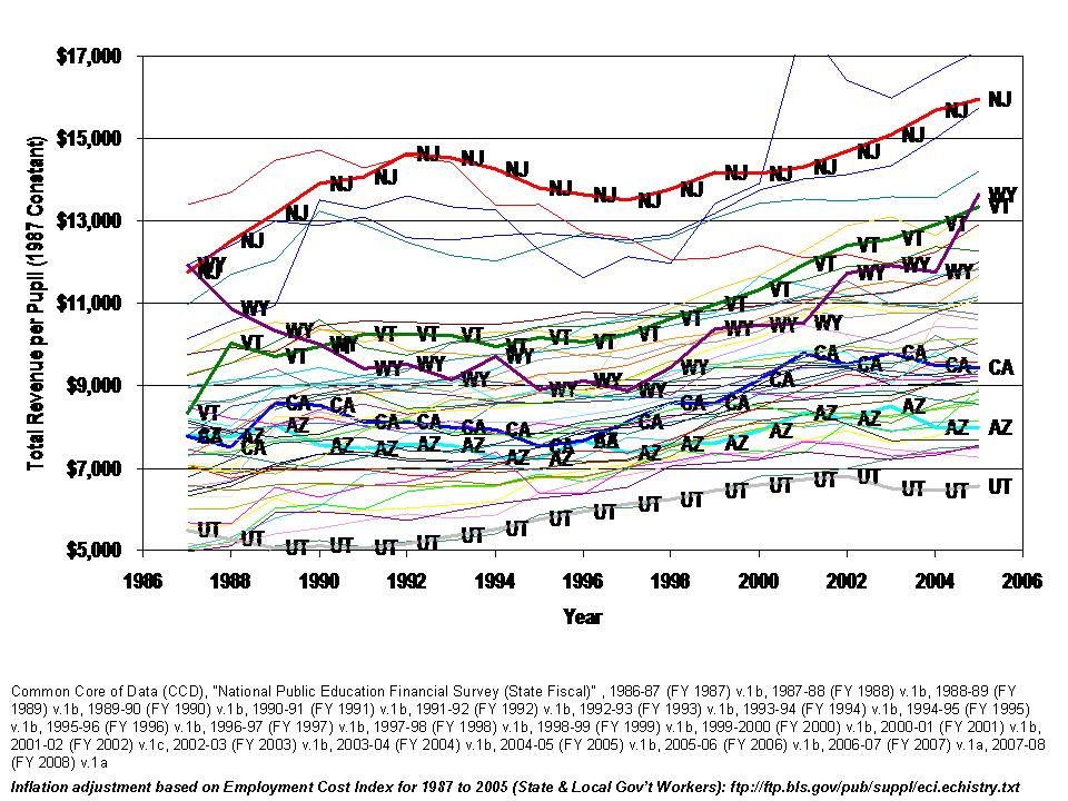
First, here’s where the above three states fit into comparisons of state and local education revenue per pupil. Yes, some of the higher spending states are cutting back as well, if you read down Reich’s list of education spending cuts, but these three states have a particularly rich history of low spending and education cutbacks (including year after year mid-year funding recisions, even in good economic times in Colorado) .

Figure 1

Okay,so who cares if they aren’t spending that much. Maybe it’s because they’ve been taxing themselves to death… like we all have, obviously… we all know that… and that education spending is simply eating away at their economies. It’s just not sustainable!

So, here are direct expenditures on education (k-12 and higher ed) as a percent of aggregate personal income for each state. California has been flat, and low for over 30 years and Colorado and Arizona which were once relatively high, have decreased their effort consistently for about 30 years, in a race to the bottom.

Figure 2

Total Direct Education Spending as a Percent of Personal Income

Yeah but… yeah but….yeah but… it’s because their total taxes are so darn high. This is just education. Well then:

Figure 3

Yes, even on these, California is perhaps somewhat above average, whereas Colorado in recent years has been sitting near the bottom. Arizona jumped up in recent years, but is by no means high, compared with other states or trended, over time, out of control.

But even then, we know they’ve all gone wild on teacher hiring… bloating that teacher workforce, reducing class sizes and pupil teacher ratios to inefficiently low levels:

Figure 4

Pupil to Teacher Ratios over Time

Okay, well maybe not California, Arizona or Colorado (or Utah… in Gray at the top of the figure). California did increase teacher numbers in the late 1990s with class size reduction, but that flattened out and increased since, with lack of financial support.

But we all know that none of this matters anyway, right?

In fact, REFORMY logic dictates that it’s those states which have been spending like crazy, wasting their effort and paying for way too many teachers that are a real drag on our national test scores AND our economy.

The problem is not states like California, Arizona or reformy standouts like Colorado (or Tennessee or Lousiana), but rather, those over-educated curmudgeonly high spending non-reformy, low pupil teacher ratio states like Vermont, Massachusetts and New Jersey.

They – yes they – with their gold-plated schools are the shame of our nation (and why we can’t be Finland, right?)!  Our national education emergency (if there is one) is certainly not the fault of those states exercising consistent and appropriate fiscal austerity in good times or in bad.

Well:

Figure 5

Relationship Between State & Local Revenue per Pupil (for high poverty districts) & NAEP Mean Scale Scores

www.schoolfundingfairness.org

On average, states like Arizona and California which have high need student populations, but have thrown their public schools under the bus, are a significant drag on our national performance.

And this is due to lack of effort as much as it is lack of capacity.  Higher effort states also tend to be the higher spending states which also tend to have the higher outcomes. And, when taken as a separate group, compare quite favorably on international performance comparisons.

Figure 6

Relationship between Fiscal Effort and Level of Financial Resources

www.schoolfundingfairness.org

Finally, these differences in outcomes, effort and pupil to teacher ratios are not all about differences in poverty. Again, I’ve already pointed out that these states have high pupil-to-teacher ratios and low spending not because they are poor but rather because they don’t put up the effort.

And now we are boldly (and belligerently) encouraging them to “do more with less” by which we actually mean “do even less with less?”

To clarify how poverty rates fit within this picture, Figure 7 provides adjusted state poverty estimates (see citation below figure) and pupil to teacher ratios. At their respective poverty levels, each of these states has higher – if not much higher than average pupil to teacher ratios. They also have much lower than average per pupil spending.

Figure 7

State Cost Adjusted Poverty Estimates and Pupil to Teacher Ratios

Renwick, Trudi. Alternative Geographic Adjustments of U.S. Poverty Thresholds: Impact on State Poverty Rates. U.S. Census Bureau, August 2009

Further, while these states have higher pupil to teacher ratios than other states with similar poverty rates, they also have very low outcomes even compared to other states with similar corrected poverty rates. Colorado remains somewhat in the middle of the pack on outcomes, having a lower poverty population than either Arizona or California and also having more recently slashed and burned its public education system. Colorado pupil to teacher ratios have also remained closer to those of other states, and much lower than California or Arizona.

Figure 8

State Cost Adjusted Poverty Estimates and NAEP Mean Outcomes


How does this all fit into the long-run picture of investment in public schooling? Yes, we’ve had the most significant economic downturn in several decades. State budgets took a hit, and good information on that budget hit can be found at www.rockinst.org, where, among other things, data show that the most recent quarterly estimates of state revenue are still about 7% off their peak in 2008. That’s 7% – not 100%, not 20% (even more important is the variation across states). It’s a hole. But it’s not ALL GONE (and only a complete fool would argue as much)! Note that there have been in the past few decades at least two other significant economic slowdowns/downturns that affected state revenues and education spending – from about 1989 to 1992 – with lagged effects in some regions, and from 2001 to 2002 (post 9/11 shock).  In some states, education spending rebounded in the wake of these downturns, but in others, state legislatures continued to constrain if not outright slash-and burn state education budgets (while expanding tax cuts) throughout the economic good times that followed each downturn (1996ish to 2001 and 2002 t 2008).

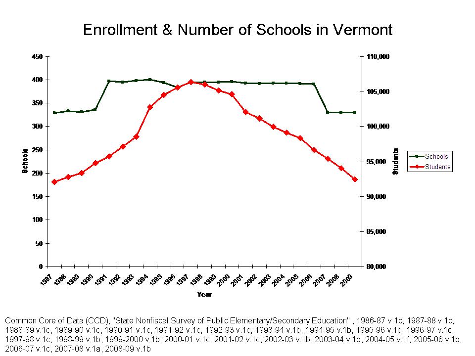
What’s different now? Why are we sitting at the edge of a much more dangerous policy agenda? Well, the recent economic downturn was greater. But again, recent data shows the beginnings of a rebound. What is most different is that we are now faced with this completely absurd argument of The New Normal – as a national agenda to scale back education spendingEVEN IN STATES WHERE IT HAD ALREADY BEEN SCALED BACK FOR DECADES. But who knew? Didn’t every state just spend out of its freakin’ mind for …oh… the past hundred years or so?

The New Normal argument that we must cut back our bloated education budgets and increase class sizes and pupil to teacher ratios back to reasonable levels is, at best, based on the shallowest understanding of (hyper-aggregated & overstated) national “trends” in education spending and pupil to teacher ratios, coupled with complete obliviousness to the variations in effort and spending and pupil to teacher ratios that exist across states, and for that matter, the demographic trends in some states which make it appear as if education spending has spiraled out of control (Vermont). That is, if we assume that those pitching-tweeting-blogging The New Normal have even the first clue about trends in education spending, state school finance systems, and the quality of public schooling across states to begin with. Personally, I’m not sure they do. In fact, I’m increasingly convinced they don’t.

Still searching for that pot of gold

The rhetoric about our decades-long drunken spending spree just won’t stop, nor will the rhetoric that the money is all gone. All of it. Nothin’ left. We spent it all. We taxed ourselves to the limit and those damn teachers unions and public schools just took it all and left us with the bill. It’s gone! all gone!

Here are some recent quotes/comments from pundits who’ve done little analytically but to offer a few absurd back of the napkin explanations for why they believe that a) we’ve been on a drunken spending spree and b) it’s all gone!

Andy Rotherham in Time:

the golden age of school spending is likely coming to an end.

http://www.time.com/time/nation/article/0,8599,2035999,00.html

There’s so much more in this article, including statements about how it’s plainly obvious that for each worker added to a private firm, there is an immediate incremental return in production output (each additional worker adds $x worth of output to any private firm) whereas in education we continue to add workers and see nothing in return. Both parts of this assumption are… well… just nutty.

So, Rotherham has given us the argument that our “golden age” of school spending is coming to an end. And Mike Petrilli, in a twitter-battle with Diane Ravitch has laid down the Petrillian Truth (roll with that one Mike…it’s got a nice ring) that “The Money is Gone!”

MichaelPetrilli: That’s a great line, Diane, but it doesn’t solve the problem. The money is gone. We have to help schools cut smart.
http://educationnext.org/in-which-i-debate-diane-ravitch-in-140-characters-or-less/

That’s right. It’s all gone. It’s freakin’ gone. Cut, cut, cut. Cut it all. Zero out public education. It doesn’t matter what state you live in, what part of the country, your state has taxed you to the limit and has spent it all on the edu-bureaucracy. Every state… the whole nation has simply been pouring money into schools and they have to stop because the money is gone.

Okay, really, how much is gone? And has any of it come back yet? Is it really all gone forever? Is 20% gone, 50%, or perhaps even 70%? Must we reset the system to an average cost that is, say, 20% below where it was in 2008? 10?

You know, there are actually legitimate researchers and organizations out there tracking the condition of state and local revenues. And while these have been some tough times, their findings are somewhat less apocolyptic than the comments of Rotherham and Petrilli above… who don’t actually look at state budget data when making these claims. Here are the findings from the most recent quarterly report from the Rockefeller Institute:

The Rockefeller Institute’s compilation of data from 48 early reporting states shows collections from major tax sources increased by 3.9 percent in nominal terms compared to the third quarter of 2009, but was 7.0 percent below the same period two years ago. Gains were widespread, with 42 states showing an increase in revenues compared to a year earlier. After adjusting for inflation, tax revenues increased by 2.6 percent in the third quarter of 2010 compared to the same quarter of 2009. States’ personal income taxes represented a $2.5 billion gain and sales taxes a $2.0 billion gain for the period.
www.rockinst.org

Yes, revenues are down. State revenues are still rolling in about 7% below where they were in 2008, but in most states have begun to rebound… in order to reach that level. We took a hit. States took a hit. Some took a bigger hit than others and some are rebounding more quickly and others more slowly.

But, I must also reiterate that not every state really put their heart into public schools or the combination of their elementary and secondary and higher education systems to begin with. Many have already been systematically reducing their spending effort for years.

A few national graphs first. Here’s total state and local government expenditure as a share of personal income over time.Yes, on average, it has climbed slightly over 30 years. And, it has oscillated in between, with government expenditure (state and local) declining as a share of personal income during those periods when personal income grew quickly.

Elementary, secondary and higher education do make up a sizable share of this spending – albeit not clearly a drunken spree. Here’s education direct expenditures as a share of state and local general expenditures over the same time period.

So, the reality is that education spending first declined as a share of general spending and has since leveled off. So actually, it may be some of that other stuff that’s creating pressure on the system, a point duly acknowledged by Rotherham. But, the current argument seems to be that public schools are discretionary – negotiable – and all of that other stuff is not. Either way, even the total growth in the previous figure is not that disconcerting.  A whole other discussion for a later point in time is the issue of how many states have kicked non-current expenditures (pension obligations and other debt) down the road for someone else to deal with.

Most importantly, however, here are the differences in direct education spending as a share of personal income across states. When it comes to public K-12 and higher education systems, states vary widely. Some have provided high levels of support for schools, allocated that support fairly and maintained appropriate levels of effort to finance their education systems. Others have thrown their education systems under the bus. They don’t need some data-proof ideologue to tell them that the money is gone and now’s the time to cut.

This figure, like the ones in my previous “bubble” post, shows the variation in “effort” across states – measured somewhat differently – but same conclusion. That’s the thing – I keep taking different angles on these data and they keep telling me similar stories – that many states have actually systematically reduced their “effort” to finance public education systems over time, and yes, some have increased effort. And, there’s an interesting story behind each trend. Again, Vermont has systematically scaled up education spending relative to personal income over time. New Jersey has increased over time as well, but New Jersey has only risen to  a relatively below average position over time. By contrast, Colorado and Arizona both provide LESS DIRECT SPENDING ON EDUCATION AS A SHARE OF PERSONAL INCOME IN 2008 THAN THEY DID IN 1977!!!!!!!!!!  And they are not the only ones.  Perhaps those states need a correction in the other direction?

It will indeed be interesting to see how these “effort” measures shift as income takes a temporary hit and a bigger one that it has in the past. Most of the differences in the level of “effort” in the above figure are a function of income. States with higher personal income are able to raise what they need in education spending with a much smaller share of income. Even New Jersey, which is a relatively high spending state has relatively low effort. Other lower effort states include Connecticut and Massachusetts.

But, back to the point – These national aggregate claims that we’re tapped out – all of us – and every state – are entirely inappropriate and irresponsible. Let’s take a hard look and a more precise look at what’s really going on. Let’s focus our attention on useful quarterly reports like those from Rockefeller Institute on the condition of state revenue and lets provide appropriately differentiated instruction to states based on the widely varied conditions they face and the widely varied levels of effort they’ve applied thus far toward improving their education systems. The current rhetoric is unhelpful, and sadly, I think that’s the point!

The problem? Cheerleading and Ceramics, of course!

David Reber with the Topeka Examiner had a great post a while back (April, 2010) addressing the deceptive logic that we should be outraged by supposed exorbitant spending on things like cheerleading and ceramics, and not worry so much about the little things, like disparities between wealthy and poor school districts. I finally saw this post today, from a tweet, and realized I had not yet blogged on this topic.

This logic/argument comes from the “research” of Marguerite Roza, who, well, has a track record of making such absurd arguments in an effort to place blame on poor urban districts and take attention away from disparities between poor urban districts and their more affluent suburban neighbors.

This new argument is really just more of the same ol’ flimsy logic from this crew. For the past several years, Roza and colleagues have attempted to argue that states have largely done their part to fix inequities in funding between school districts, and that now, the burden falls on local public school districts to clean up their act. Here’s an excerpt from one of my recent articles on this topic:

On other occasions, Roza and Hill have argued that persistent between-district disparities may exist but are relatively unimportant. Following a state high court decision in New York mandating increased funding to New York City schools, Roza and Hill (2005) opined: “So, the real problem is not that New York City spends some $4,000 less per pupil than Westchester County, but that some schools in New York [City] spend $10,000 more per pupil than others in the same city.” That is, the state has fixed its end of the system enough.

This statement by Roza and Hill is even more problematic when one dissects it more carefully. What they are saying is that the average of per pupil spending in suburban districts is only $4,000 greater than spending per pupil in New York City but that the difference between maximum and minimum spending across schools in New York City is about $10,000 per pupil. Note the rather misleading apples-and-oranges issue. They are comparing the average in one case to the extremes in another.

In fact, among downstate suburban[1] New York State districts, the range of between-district differences in 2005 was an astounding $50,000 per pupil (between the small, wealthy Bridgehampton district at $69,772 and Franklin Square at $13,979). In that same year, New York City as a district spent $16,616 per pupil, while nine downstate suburban districts spent more than $26,616 (that is, more than $10,000 beyond the average for New York City). Pocantico Hills and Greenburgh, both in Westchester County (the comparison County used by Roza and Hill), spent over $30,000 per pupil in 2005.[2] These numbers dwarf even the purported $10,000 range within New York City (a range that we agree is presumptively problematic); our conclusion based on this cursory analysis is that the bigger problem likely remains the between-district disparity in funding.

http://epaa.asu.edu/ojs/article/viewFile/718/831

My article (with Kevin Welner) goes on to show how states have far from resolved between district disparities and that New York State in particular has among the most substantial persistent disparities between wealthy and poor school districts.For more information on persistent between district disparities that really do exist, see: Is School Funding Fair?.

I have a forthcoming paper this spring where I begin to untangle the new argument about poor urban districts really having plenty of money but simply wasting it on cheerleading and ceramics. Here’s a draft of a section of the introduction to that paper:

A handful of authors, primarily in non-peer reviewed and think tank reports posit that poor urban school districts have more than enough money to achieve adequate student outcomes and simply need to reallocate what they have toward improving achievement on tested subject areas. These authors, including Marguerite Roza and colleagues of the Center for Reinventing Public Education encourage public outrage that any school district not presently meeting state outcome standards would dare to allocate resources to courses like ceramics or activities like cheerleading. To support their argument, the authors provide anecdotes of per pupil expense on cheerleading being far greater than per pupil expense on core academic subjects like math or English.

Imagine a high school that spends $328 per student for math courses and $1,348 per cheerleader for cheerleading activities. Or a school where the average per-student cost of offering ceramics was $1,608; cosmetology, $1,997; and such core subjects as science, $739.[1]

These shocking anecdotes, however, are unhelpful for truly understanding resource allocation differences and reallocation options. For example, the major reason why cheerleading or ceramics expenses per pupil are highest is the relatively small class sizes, compared to those in English or Math. In total, the funds allocated to either cheerleading of ceramics are unlikely to have much if any effect if redistributed to reading or math.

Further, the requirement that poor urban (or other) districts currently falling below state outcome standards must re-allocate any and all resources from co-curricular and extracurricular activities toward improving achievement on tested outcomes may increase inequities in the depth and breadth of curricular offerings between higher and lower poverty schools – inequities that may be already quite substantial. That is, it may already be the case that higher poverty districts and those facing greater resource constraints are reallocating resources toward core, tested areas of curriculum and away from more advanced course offerings which extend beyond the tested curriculum and enriched opportunities including both elective courses and extracurricular activities.  Some evidence on this point already exists.

The perspective that low performing districts merely need to reallocate what they already have is particularly appealing in the current fiscal context, where state budgets and aid allocations to local public school districts are being slashed. Accepting Roza’s logic, states under court mandates or in the shadows of recent rulings regarding educational adequacy, but facing tight budgets may simply argue that high poverty and/or low performing districts should shift all available resources into the teaching of core, tested subjects. Lower poverty districts with ample resources that exceed minimum outcome standards face no such reallocation obligations, leading to substantial differences in depth and breadth of curriculum. Arguably a system that is both adequate and fair would protect the availability of deep and broad curriculum while simultaneously attempting to improve narrowly measured outcomes.

More later as this research progresses.


[1] “Downstate Suburban” refers to areas such as Westchester County and Long Island and is an official regional classification in the New York State Education Department Fiscal Analysis and Research Unit Annual Financial Reports data, which can be found here: http://www.oms.nysed.gov/faru/PDFDocuments/2008_Analysis.pdf and http://www.oms.nysed.gov/faru/Profiles/profiles_cover.html

[2] Interestingly, however, Bridgehampton and New York City have relatively similar “costs” due to Bridgehampton’s small size and New York City’s high student needs (see Duncombe and Yinger, 2009). The figures offered in this paragraph are based on Total Expenditures per Pupil from State Fiscal Profiles 2005. http://www.oms.nysed.gov/faru/Profiles/profiles_cover.html. Results are similar when comparing current operating expenditures per pupil.

Potential abuses of the Parent Trigger???

This article in the LA Times has been getting a lot of buzz today – http://www.latimes.com/news/local/la-me-compton-parents-20101207,0,1116485.story

The article discusses the use of what is called a “parent trigger” policy.  Here’s the synopsis:

On Tuesday, they intend to present a petition signed by 61% of McKinley parents that would require the Compton Unified School District to bring in a charter company to run the school. Charter schools are independently operated public schools.

“I know it’s never been done before, but I want to step up because I’m a parent who cares about my children and their education,” Murphy said Monday. She and other parents were meeting with organizers from Parent Revolution, a nonprofit that lobbied successfully last year for the so-called parent-trigger law.

So, what you’ve got is 61% of parents in a community pushing for a school to be converted to a charter school and potentially pushing for that school to be a specific type of charter school. This presents all sorts of interesting – and twisted possibilities.

I wrote about a week ago on how some charter schools, like North Star Academy in Newark have established themselves as the equivalent of elite magnet schools – potentially engaging in activities such as pushing out lower performing kids over time.

So, my question for the day is whether these “parent trigger” policies might allow a simple majority of parents – or some defined majority share – to force a reorganization of their neighborhood school into a charter – that would subsequently weed out those other “less desirable kids?”

That is, does this new policy of simple majority (mob) rule allow parents in a specific community to redefine their neighborhood school so that the school no-longer serves lower performing kids or kids whose parents are less able or for that matter less interested in engaging in a level of parent involvement that might be required by a specific charter operator? In short, can the majority of parents effectively kick out a minority of parents that they don’t like – including parents of kids with disabilities or non-English speaking parents?

Sure, you say – charters can’t discriminate in this way because they must rely on lotteries for admissions and must take children with disabilities and those unable to speak English. They would have to accept those kids in the neighborhood. Yes, by law this might be true. But experience with many charters proves otherwise. Many do rely on attrition to boost scores – somehow avoid serving kids with disabilities and non-English speaking kids. But the neighborhood school couldn’t do the same.

Taking this a step further, envision a neighborhood split along language, ethnic or even religious lines. Can the parents of the majority group force their neighborhood school to be reconstituted as a cultural, language or for that matter religion (argued as culture) specific school that is effectively hostile to the minority?

Hey education law friends – help me out with the possibilities here?

Ed Schools

Ed schools seem to make an easy target in public policy debates over the quality of American public schooling and the American teacher workforce.

In many recent lopsided “ed school as the root of all evil” presentations, “Ed Schools,” are treated as some easily defined, static entity over time. In the book of reformyness (chapter 7, verse 2), “Ed Schools” necessarily consist of some static set of traditional higher education institutions – 4 year teachers colleges including regional state colleges and flagship universities – where a bunch of crusty old education professors spew meaningless theory at wide-eyed undergrads (who graduated at the bottom of their high school class) seeking that golden ticket to a job for life – with summers off.

In order to craft a clearly understandable (albeit entirely false) dichotomy of policy alternatives, pundits then present teachers who have obtained alternative certification as a group of individuals, nearly all of whom necessarily attended highly selective colleges and majored in something really, really rigorous and then received their certification through some more expeditious and clearly much more practical and useful fast-tracked option.

This was certainly the theme of a discussion (hashtag #edschools) at Thomas B. Fordham Institute actively tweeted the other day by Mike Petrilli and a few others.  What I found most interesting was that no-one really challenged the assumptions that “ed schools” are some easily definable group of traditional higher education institutions – that this has been unchanged over decades – and that teacher training is some consistent, exclusive domain of traditional public higher education institutions – specifically as an undergraduate degree granting enterprise? That there are and have always been, oh… about a thousand or so ed schools… that well… keep on doing the same damn thing over and over again (for the past 50 years, one participant tweeted) … and well… no one ever shuts down the bad Ed Schools… and that’s why we’re in such bad shape! It’s really that simple.

Because this characterization is simply assumed to be true, the obvious way to crack this broken and declining system is to expand alt. certification and allow more non-traditional, for profit and entrepreneurial organizations – especially non-university organizations to grant teaching credentials – heck – let’s let them actually grant degrees. Who needs brick-and-mortar colleges anyway? Given the assumed static nature of the declining and antiquated system of “Ed Schools” that has brought us to our knees, this is the only answer!!!!!

One of my favorite tweets from the event was from Mike Petrilli, relaying a comment by Kate Walsh:

Walsh: There are 1410 Ed schools in the country. NCTQ spent 5 years determining that number.

You know what Kate, by the time you were done figuring that out (however you did), the number had already changed. Also, FYI, there are actually some data sources out there that might have been helpful for tabulating the existing degree granting programs and the numbers of degrees conferred by those programs.

So, let’s take a look at some of the data on degrees conferred across all education fields in 1990, 2000 and 2010.

Let’s start with a quick look at the total degrees conferred in “education” as defined by degree classification codes (CIP Codes), across all institutions granting such degrees nationally. The interesting twist here is that bachelor’s degree production of education degrees has been relatively constant over time for about 20 years and perhaps longer. Doctoral degree production increased from 1990 to 2000, but stagnated after that. On the other hand, Master’s degree production has skyrocketed.

Now, one might try to argue that what that’s really about is all of those currently practicing teachers who are just accumulating those worthless master’s degrees to get that salary bump. I will write more on this topic at a later point, but that’s not likely the dominant scenario. Yes, many of the master’s degrees are obtained to broaden fields of certification in order to give current teachers more options – either assignment options in their current districts, or other job opportunities. AND, many of the masters degrees these days are initial credentials granted to individuals who did not receive their teaching credential as an undergraduate. Many initial teaching credentials are granted at the master’s, not bachelor’s level. A substantial amount of teacher training goes on at the master’s, not undergraduate level. No matter the case, the master’s degrees – of which there are so many – and so many more being granted than bachelors degrees – are the interesting story here.

Is it really that the same old traditional higher education institutions with crusty old, out of date professors, are now just spewing out masters degrees? Or is something else at work here?

Well, here are the top 25 MA producers in education back in 199o. Even at that time, the largest master’s degree granting institutions were not the top universities – or even the top teachers colleges. But, some of those schools were at least in the mix. Teachers College of Columbia University, Ohio State, Michigan State and Harvard all appear in the top 25 in 1990.

Here are the top 25 master’s producers in 2000. Here, the tide begins to shift a bit. Schools like NOVA Southeastern with their online programs, and National-Louis grow even bigger than they had been a decade earlier. Teachers College retains a top 25 spot, as does Ohio State, and University of Minnesota makes the list. Harvard is gone.

By 2009, “Ed Schools” are a substantially different mix. Not only that, but look at the volume of degree production. Back in 1990, Ed Schools at respectable major universities were putting out about 600 master’s degrees in education related fields per year. They held on to similar rates in 2000 and still in 2009. But by 2009, Walden University and U. of Phoenix were each cranking out 4,500+ master’s degrees per year. Grand Canyon U. comes in next in line. These are the entrepreneurial up-starts that are the product of minimized regulation of teaching credentials.

If there truly has been a decline in the quality of the teacher workforce, and if pundits truly believe that this supposed decline is related somehow to “Ed Schools,” then it might behoove those same pundits to explore the dramatic changes that have, in fact, already occurred in the “Ed School” marketplace.

If there has been a dramatic decline in teacher preparation, and in specialized training, it may be worth taking a look at those institutions that have emerged to dominate the production of education degrees and credentials in recent years. After all, Walden and Phoenix each produce 5 to 10 times the master’s degree credentials in education of major public universities. And, production of education master’s degrees is now nearly double the level of production of education bachelor’s degrees. And many of these entrepreneurial start-ups specifically frame their master’s programs as an option for individuals with a bachelor’s degree in “something else” to obtain a teaching credential.

Is even more deregulation and entrepreneurial teacher preparation what we really need? Can one really blame the traditional higher education institutions, whose share of production has declined steadily for decades, for declining teacher quality? Only if you ignore these trends, which I expect these pundits will continue to do.


Searching for Superguy in Jersey…

A short while back I did a post called Searching for Superguy in Gotham.  In that post, I tackled the assumption that Superguy was easily identifiable as a hero leader of charter schools – or at least that was one distorted portrayal of Superguy in Waiting for Superman. Now, I should point out here that I really don’t know of anyone actually out there running charter schools who wishes to portray him/herself in this way. So, to be absolutely clear, this post is in no way an attack on those who are out there just trying to do the best job they can for kids in need.

This post IS a criticism of the punditry around charter schools- the notion that charter schools are easy to pick out from the crowd of urban (or other) schools- because they are necessarily, plainly and obviously better. That classic argument that the upper half is better than average!

This was the basis of my Searching for Superguy in Gotham activity. In that activity, I estimated a relatively simple statistical model to determine which schools performed better than expected, given their students and location and which schools performed less well than expected, given their students and location. I had been planning all along to do something similar with New Jersey Charter Schools. Now is that time!!!!!

As I did with New York City charter schools, I have estimated a statistical model of the proficiency rates of each charter school and each other school in the same New Jersey city. In the model, I correct for a) free lunch rates, b) homelessness rates, c) student racial composition (Hispanic and black). AND, I compare each test – grade level and subject – to the same test across all schools. AND, I compare each school to other schools in the same city (by using a “city” dummy variable). I obtained all necessary variables from a) NJ school report cards (outcome measures) and b) NJ enrollment data file (free lunch, race, homelessness) and c) NCES Common Core of data for “city” location of school.

So now, the search for Jersey Superguy begins! Let’s start with 4th Grade Math performance in 2009. This scatterplot includes all schools with ASK4 Math scores in cities where charters existed in 2009. Schools above the red horizontal line are schools that “beat the odds.” That is, they are schools that had proficiency rates that were above the expected proficiency rates for that school, given its students, the test, and the location (city). Schools below the red line are schools that did not meet expectations. So, is superman (mythical super charter school leader) hiding in one of those dots way at the top of the scatter? Is he in a high-flying, high poverty school? Is he in a high-flying low poverty school? Certainly, he could not be down in the lower half of the graph.


CLICK HERE TO SEE WHICH SCHOOLS ARE CHARTERS AND WHICH ARE DISTRICT SCHOOLS

CLICK HERE FOR A CLOSE UP ON NEWARK SCHOOLS OVER AND UNDER THE LINE

NOTE: I’m in the process of fixing a data error that occurs on a few charter schools (affecting merging of data).  These figures still include the merge error, but the overall distributions are not affected. Schools affected include: Environment Community School, Liberty Academy, Hope Academy, International CS of Trenton, Jersey City Community CS and Jersey City Golden Door. I HAVE  NOW EXCLUDED MISMATCHED SCHOOLS.

The source of the error is the NJDOE enrollment file, which, for example identifies Environment Community School as both 80_6232_920 (county, district, school) and as 80_6235_900.  The first of these codes is correct. The second is for Liberty Academy CS (according to the School Report Card and according to NCES data).

Now, let’s take a look at the 8th Grade Math outcomes. Here’s the statewide scatterplot:


Surely superguy must be hangin’ out in one of those high flyin’ dots way at the top of the scatter?

CLICK HERE TO SEE WHICH SCHOOLS ARE CHARTERS AND WHICH ARE DISTRICT SCHOOLS

CLICK HERE FOR A CLOSE UP ON NEWARK SCHOOLS OVER AND UNDER THE LINE

As you can see, there are plenty of charters and traditional public schools above the line, and below the line. The point here is by no means to bash charters. Rather, this is about being realistic about charters and more importantly realistic about the difficulty of truly overcoming the odds. It’s not easy and any respectable charter school leader or teacher and any respectable traditional public school leader or teacher will likely confirm that. It’s not about superguy. It’s about hard work and sustained support – be it for charters or for traditional public schools.

As I noted in my previous searching for superguy post:

Yeah… I’d like to be a believer. I don’t mean to be that much of a curmudgeon. I’d like to sit and wait for Superguy – perhaps watch a movie while waiting (gee… what to watch?). But I think it would be a really long wait and we might be better off spending this time, effort and our resources investing in the improvement of the quality of the system as a whole. Yeah, we can still give Superguy a chance to show himself (or herself), but let’s not hold our breath, and let’s do our part on behalf of the masses (not just the few) in the meantime.

TECHNICAL APPENDIX

Here is a link to the model used for generating the over/under performing graphs above

And here is a separate model  in which I test whether Charter schools on average outperform traditional public  schools in the same city. This model shows that they don’t, or at least that their 1 to 3 percentage point edge on proficiency is not statistically significant. But whether charters on average outperform – or don’t – traditional public schools is not the point. The point is that like traditional public schools – they vary – and it’s important for us to get a handle on how and why all schools vary in their successes and failures – charter or not.

Complete slide set here: New Charter Figures Nov 12

BONUS MAPS

Here are some updated maps of the demographics and adjusted performance measures of charter and district schools in Newark.

First, % Free Lunch 2009-10:

Next, a new one, % LEP/ELL – note that the % LEP/ELL for NWK charters is so low, therefore their dots are so small that the star indicating “charter” covers them entirely:

Finally, here are the Beating the Odds figures converted into color coded circles – with large purple circles being high performers – better than expectations – medium size pale dots being relatively average performers – and large yellow dots performing below expectations:

Jersey City % LEP/ELL

Jersey City % Free Lunch

Jersey City Performance Index

Getting all “bubbly” over that spending “bubble?”

Let me just say that I hate this graph!

FIGURE 1 – NATIONAL TRENDS IN PUPIL TO TEACHER RATIOS

Why? Well, this is my own version of the graph… but it is a graph that has been used many times over, of late, to make the argument that American public schools have simply been drowning in an excess of public funding for decades and that public school districts nationally have leveraged all of that additional money over time to flood classrooms with additional staff. Of course, this framing is being used to set up the argument that it’s time for a logical correction – a return to sanity – a return to reasonable class sizes, etc. etc. etc.

First of all, even this national graph – which isn’t particularly meaningful – shows a reduction of slightly over 2 students per teacher over the past 25 years. Chop off the period prior to 1985 and the most dramatic shifts in pupil to teacher ratio are wiped away.

Second, national averages just aren’t that meaningful.  Claims like this one, from Mike Petrilli of Fordham Institute, misunderstand entirely the variation in resources across states and variation in effort across states:

The tough-love message to superintendents and school boards nationwide should be clear: The day of reckoning has arrived; let the de-leveraging begin. The spending bubble is over. No more adding staff at a pace that outstrips student enrollment; no more sweetheart deals on pensions or health insurance; no more whining about “large” class sizes of twenty-five. It’s time to live within our means.

http://www.edexcellence.net/flypaper/index.php/2010/11/welcome-to-a-new-era-of-restraint/

The new “reform” story line is that all states have been spending out of control they have taxed their citizenry to death and have spent most of that money hiring more and more teachers even while student populations have stagnated. Further, we have done all of this out of control spending and class size reduction while seeing absolutely no return for our dollar! Pretty simple!  Very compelling, eh? NO.

When one takes a look at individual states – in terms of relative tax burden, changes in tax burden over time – in terms of changes in pupil to teacher ratios over time – and in terms of student outcomes in relation to pupil to teacher ratios and tax burdens – it’s pretty damn hard to find states which actually fit that story line. And public K-12 education is largely a state and local endeavor, not a federal one.

So, let’s take a state by state look. Let’s start here – with the total revenues per pupil – state aggregate – including state, local and federal sources. I’ve adjusted these for inflation (Employment Cost Index – Gov’t Workers), but not for regional variation. For more information on comparing across states, see THIS POST. (<–See this link if you want to know how states rank compared to one another on state and local revenues).

FIGURE 2 – TOTAL REVENUES PER PUPIL – INFLATION ADJUSTED, NOT REGIONALLY ADJUSTED (2005 Dollars)

What this shows us is that there’s quite a bit of variation in revenues for local public school districts across states, with some states investing a lot – like New Jersey, Vermont and Wyoming and some not so much – like Utah, Arizona and California. This graph also tells us that many states really didn’t see consistent spending/district revenue growth throughout the period. No massive… long term… uniform… spending bubble… from which they all benefited.

The patterns of revenue increases mirror patterns of pupil to teacher ratio change over time. Yes, some states like Vermont, Wyoming and New Jersey did see pupil to teacher ratios decline. But, not so for Utah, California (after 1998) or Arizona. In fact, in Arizona pupil to teacher ratios increased over time!

FIGURE 3 – PUPIL TO TEACHER RATIOS ACROSS STATES AND OVER TIME

And, it is similarly foolish to assert that all states put themselves over the brink in terms of taxes to support all of this supposedly lavish spending. Here are the state and local direct expenditures as a percent of personal income across states:

FIGURE 4 – STATE AND LOCAL DIRECT EXPENDITURES (All, not just Educ.) AS A PERCENT OF PERSONAL INCOME

Look at New Jersey, which has provided relatively high levels of funding, with increases in the early 1990s and again from 1998 to 2003 (though lagging in the middle). New Jersey is not among highest at all on state and local direct expenditures as a percent of personal income – because incomes in New Jersey are quite high. Arizona is also relatively low and Utah and California only average – not high. The “high” state and local direct spending burden states in this mix are Wyoming and Vermont.

So then, what about that story line we’re being told applies across our nation’s schools –

  1. that they’ve been swimming in money for decades – a huge ongoing spending bubble – and
  2. that they’ve spent it all on pupil to teacher ratios – increasing teacher quantity not quality – and
  3. that they’ve taxed their state residents to death in the process – and
  4. got nothing for it in improved student outcomes.

Well, the only state that seems to come close here is Vermont (and perhaps Wyoming) – which does have high and growing public expenditure burden (and the highest “effort” index at www.schoolfundingfairness.org), increased education spending per pupil over time and continued decline in pupil to teacher ratios.

Of course, that last part of the story line about outcome failure doesn’t fit so well, because Vermont does very well on outcomes (See this article for discussion of empirical research on results of Vermont school finance reforms: https://schoolfinance101.com/wp-content/uploads/2010/01/doreformsmatter-baker-welner.pdf)

It also turns out that even Vermont’s “bubble” story isn’t so simple. Vermont really hasn’t been adding significant numbers of additional staff and spending a lot more in recent years. Rather, Vermont is experiencing a significant decline in student population – but has not adjusted its public education system accordingly – reorganizing into more efficiently organized schools and districts. You see, if you spend the same amount and retain similar numbers of teachers, when enrollments decline, pupil to teacher ratios decline and per pupil spending goes up. Yeah… same effect as a spending bubble – but very different cause. And yes, this is something that should be addressed. But again – somewhat different issue! Except for an infusion of funding in the late 1990s in response to school funding equity litigation – Vermont has not necessarily been on a wild education spending binge to reduce class sizes – Rather, the state is a victim of declining school-aged population, resulting in declining enrollment and declining pupil to teacher ratios.

Here’s Vermont enrollment over this same period.

FIGURE 5 – VERMONT ENROLLMENTS

This map shows the locations and enrollment of Vermont schools. Small red dots are schools with 50 or fewer students and small orange/brown dots have 50 to 100.  In some areas of the state, you can find small red dots within a few miles of each other (many of which are small town schools – in separate towns – actually serving the same grade levels/ranges).

FIGURE 6 – LOCATIONS AND ENROLLMENT SIZES OF VERMONT SCHOOLS

Okay, so if this story line doesn’t even fit for Vermont, then who? Perhaps no-one! Arguments built on assumptions of “national trends” regarding financing, class size and/or most features of our public education systems – our 50 and then some systems – are generally unhelpful (if not entirely misguided).

Arguments that encourage state legislators across the nation – including those in states like Utah, Arizona and California that now is the time to cut, cut, cut, because we just went through decades of spend, spend, spend, are downright ignorant and irresponsible.

And please check out this post: https://schoolfinance101.wordpress.com/2010/10/27/when-schools-have-money/ where I explain that within states – especially inequitable states like NY or IL – if and when anyone did benefit from reduced pupil to teacher ratios and more importantly smaller class sizes, it was often those in the most affluent communities.

No more “sweetheart deals” for poor schools…

Fordham Institute’s Mike Petrilli is showing his “tough love” for public schools in these tough economic times:

The tough-love message to superintendents and school boards nationwide should be clear: The day of reckoning has arrived; let the de-leveraging begin. The spending bubble is over. No more adding staff at a pace that outstrips student enrollment; no more sweetheart deals on pensions or health insurance; no more whining about “large” class sizes of twenty-five. It’s time to live within our means.

http://www.edexcellence.net/flypaper/index.php/2010/11/welcome-to-a-new-era-of-restraint/

Of course, a major problem with this assertion for anyone who has read… well… much of anything about school funding in the past decade or so, is the underlying assumption that schools nationwide, uniformly and especially poor urban districts have simply been punch drunk on excess funding resources for the past few decades… with dramatic increases for all especially from the 1990s forward.

Now Mike Petrilli is actually better than many on this point, on most occasions.  But the problem with Petrilli’s statement above is that it fails to recognize the incredible variation that persists across states and school districts, and perpetuates the myth of school districts nationally and uniformly being punch drunk on the public dollar – the “bubble” is over. The “bubble” that everyone enjoyed!

Here are two recent sources which show the extent of persistent disparities across states and across districts within states by district poverty rates:

  1. Is School Funding Fair? www.schoolfundingfairness.org
  2. Baker, B.D., Welner, K.G. (2010) Premature celebrations: The persistence of inter-district funding disparities. Education Policy Analysis Archives. http://epaa.asu.edu/ojs/article/viewFile/718/831

In our report on Fair School Funding, we show just how large the funding disparities are across states and also show that in many states, higher poverty districts still receive systematically fewer resources per pupil – and that’s in dollars adjusted for regional wage variation, economies of scale and population density – no fancy weights to reduce spending for poverty differences themselves. Yes, in some, many states, higher poverty districts have far fewer resources than lower poverty ones! Shocking, I know.

Further, the first of these sources explains that much of the deprivation of resources that has occurred in certain states is a function of complete and utter lack of state financial effort – not lack of capacity.

Additionally, in the second article above, Kevin Welner and I show by a similar method that overall, nationally, there remains a positive relationship between school district state and local revenues and resident income levels (across districts within states). Here’s a figure from our report, based on a regression model characterizing the relationship between median household income and state and local revenues per pupil over time.  Even by 2005, that relationship remained positive – and still does through 2008. Some progress was made through 1996, and then leveled off.

Figure 1

Relationship between Median Household Income and State & Local Revenues per Pupil (District Level) Nationally

More interesting, however, is the variation in support for schools generally, across states, and for higher poverty schools within states.

Yes, state budgets oscillate over time. There are good times and there are bad times. But some… if not many states… have chosen consciously to use the argument of “tough economic times” to throw their public education systems under the bus. Heck, many of these states used the good economic times to argue for throwing their education systems under the bus. Wouldn’t want to slow the economy by “overtaxing” and spending too much on schools.

Here are some snapshots of state spending, from a recent post.

Figure 2

Figure 3

For more information on these graphs, see my earlier post on State Ranking Madness. Suffice it to say that not all states have put a lot of funding into their schools and these figures come from 2007-008, the front end of the downturn – or back side of the supposed bubble. Some states like Utah and Tennessee allocate very little to their public education systems. Perhaps those are poor states that simply can’t afford to do more? Perhaps they were “taxed to death” in the good times – during that bubble – and simply can’t sustain that in the bad times!  That’s simply not the case!

Figure 4 shows the relationship between state and local revenue levels and the percent of gross state product spent on schools (from an earlier post). Tennessee, which is near the bottom on state and local revenue is also near bottom on “effort,” along with Louisiana, Colorado and North Carolina. These states are using far less of their capacity to support public education. Their lagging resources are a function of political choices as much if not more than a function of economic conditions.

Figure 4

As it turns out, these states also somehow missed out on that whole bubble thing. Figure 5 shows the ECWI (Education Comparable Wage Adjustment) adjusted current operating expenditures per pupil from 1997 to 2005 (range for which ECWI is available) for states we classify as “highlands” in our fairness report. Adjusted for competitive wage growth (of non-teachers in same labor markets), per pupil spending in Tennessee stayed a) relatively flat and b) below all others in its region. Where’s their bubble? Where’s all of that punch drunk public spending? Well, perhaps if we could take it back to about 1920 or so. Then we’d find the bubble?

Figure 5

Utah is my new favorite standout these days, and is shown in this figure.Yeah… you have to look carefully to find Utah per pupil spending down their blending in with the horizontal axis of the graph. Utah per pupil spending is a) absurdly lower than all others around it and b) really, really, flat over time. Hey, where’s that bubble? Where’s all that punch drunk public expenditure? In fact, the only state with a really steady climb in spending here is Wyoming (perhaps Montana also).

Figure 6

Oh, and back to that issue of how all of these states have taxed themselves to oblivion to support that punch drunk spending binge. This figure shows the cumulative taxes as a percent of income with a handful of states including Utah and Tennessee identified.  Note that for most states, these trends change little even if we take the graph back to 1980. While the above “effort” figure focuses only on public K-12 funding as a share of gross state product, this graph focuses on all tax revenues as a share of income. Yeah… Tennessee and Utah really taxed themselves to death to support their massive spending bubble (albeit my time line is slightly different… but heck… there wasn’t a bubble anyway). We really need to bring their taxes and spending back into line. Really!

Figure 7


I’d find it pretty hard to argue that schools – and the adult interests who run schools – in states like Louisiana, Utah, Colorado and Tennessee have been punch drunk  for decades and need to get with the program and learn how to live within their means! MAKING BROAD NATIONAL STATEMENTS TO THIS EFFECT IS DOWNRIGHT ABSURD, GIVEN THAT PUBLIC SCHOOL FINANCE REMAINS PRIMARILY A STATE AND LOCAL FUNCTION!

Just as spending levels vary across states, so do funding levels vary across children, schools and districts within states. That is the central concern in Is School Funding Fair? Funding fairness, like overall funding levels, varies widely across states, even within regions. Figure 8 shows that among the mid-atlantic states, only New Jersey reversed the relationship between household income and school district revenues. Even then, many affluent suburban New Jersey districts continue to outpace spending of their poorer urban neighbors. New York State remains among the most regressively funded states in the nation, with affluent districts continuing to far outspend New York City schools and schools in other poorer mid-size and small cities around the state.

Figure 8

Trends in Income-Revenue Relationships in Mid-Atlantic States

Figure 9 shows the same trends for North Central states, where Illinois is the standout of not only maintaining a regressive distribution of resources but actually increasing in regressiveness of funding from 1998 to 2005. Over time, affluent suburban Chicago school districts have continually outpaced state and local revenues of poorer urban, minority districts.

Figure 9

Trends in Income-Revenue Relationships in North Central States

Figure 10 compares the within state fairness measure with the measure of overall support for public education. Some states like Florida and North Carolina simply spend little, while having reasonable capacity to spend more, and distribute what they have inequitably. Tennessee spends little – distributing those shares of near nothing relatively equitably – a strange variation on fairness.

Figure 10

Relationship between Fairness and Overall Support for Public Schooling

This argument that it’s time to accept reality, tighten our belts, etc. etc. etc. is essentially an argument that we should simply let class sizes climb back over 25 or 30 per classroom in poor urban districts and that we have no choice in the matter because there just isn’t enough money to do otherwise. There’s just no more money… in New Jersey, in Tennessee, in Louisiana, in Colorado, in Utah… you name it. They’ve all tried their hardest and spent themselves into oblivion while teachers, administrators and public education bureaucrats have been throwing extravagant parties on the public dime! That’s just how it is???????

I’m not buying it.  I assure you that within states, affluent suburban districts will be among the last to increase class sizes (as I discuss in When Schools Have Money) , unless state imposed spending limits force them to.  And I assure you that some states that already put up the least effort to support their public schools will proclaim most loudly the need to do even less – raising class sizes from 35 toward 40 (or cutting corners elsewhere).  The level of financial support provided to public education systems may, on average, be tied to general economic conditions. But the extent to which that support varies so widely across states and the extent to which states allocate those resources fairly across wealthier and poorer communities, is significantly if not predominantly in the control of states.

I close this with a favorite video clip – A Utah/Tennessee (and others) perspective on education funding!

Pondering the “Master’s Bump”

Last month, I wrote a post titled “The Research Question that Wasn’t Asked,” in which I questioned whether many of us have overstated the connection between research on teachers with advanced degrees and compensation policies that link compensation to advanced degrees.

I pointed out in my post that:

Studies of the association between different levels of experience and the association between having a master’s degree or not and student achievement gains have never attempted to ask about the potential labor market consequences of stopping providing additional compensation for teachers choosing to further their education – even if only for personal interest – or stopping providing any guarantee that a teacher’s compensation will grow at a predictable rate over time throughout the teacher’s career.

Many, like Rotherham but even more so, NCTQ, present this as a “research given.”  That clearly, it’s just dumb to pay teachers more who possess attributes we know are not associated with student achievement differences (across teachers). Is it possible, however, that changing these conditions could have significant labor market consequences? Perhaps good… but equally likely… unintended negative consequences.

Yes, teachers with any old masters degree or teachers with more than 10 years behind them might not, on average, be “measurably more productive.” But does the option to pay and recruit more experienced teachers or teachers with masters’ degrees enhance the likelihood that a district can attract teachers who are actually better teachers? I’m not so sure that the answer to this question unasked is so obvious that we need not ask it. So let’s stop pretending that it is.

In another recent post – When Schools have Money – I pointed out how all of the cool kids on the reform block have also come to the undisputed conclusion that smaller class sizes are an inefficient waste of resources and that we should instead focus our resources on hiring better rather than more teachers (as if a simple tradeoff) – even increasing class size to free up the money to increase wages (ignoring that larger student load is a working condition that might offset much of the competitive advantage gained from the higher wage).

In that post, I pointed out how one of the defining features of both high spending traditional public school districts and of high spending elite private schools is SMALLER CLASS SIZE. It’s a selling point for those private schools – appealing to parents choosing to pay the high tuition – and also appealing to parents of school aged children choosing a neighborhood to live in. Apparently, small class size is also a preferred strategy of the very high spending Harlem Children’s Zone charter schools (more on this at a later point).  In this post, I concluded:

For some reason these private schools and affluent public school districts – more specifically those who support these schools – exhibit a strong preference for small class size even when given wide latitude to choose differently. Perhaps they are on to something?

That got me to thinking – thinking about the potential relationship between these posts, in part based on my research findings using state data systems and studying the distribution of teacher and principal academic backgrounds and credentials. AND, considering the simple logic that … if both highly successful and unsuccessful school districts do these things (pay based on degrees and experience) can these things really be the primary cause of failure in the unsuccessful districts?

As mentioned in my first post above, I suspect that most school districts which offer a significant “bump” for teachers holding a master’s degree are not doing so on some assumption of a direct, simple, causal link between holding a master’s degree or not, and teaching effectiveness (measured exclusively by student achievement gains).

Yes, it would be one thing if the argument for offering a salary bump for a master’s degree was predicated entirely on the assumption of specific average achievement gains resulting from a teacher having a master’s degree.  Then one day, we find out that having a master’s degree isn’t associated with the assumed achievement gains. Problem identified. Therefore, we must stop providing the salary increment. Solution found.  Money saved. All is well and good. But very little is that simple, especially in complex social systems like teacher labor markets.

I suspect that the “master’s bump” more likely exists in many districts as a competitive recruitment/retention tool. Districts offer this bump (or agree to it, through negotiations) because they prefer the option to recruit teachers who have obtained higher degrees, for any number of reasons. In addition, districts offer this bump so that current teachers are incentivized to further their education (or to recruit teachers interested in pursuing further education). Districts may offer this bump knowing full well that many teachers will use it to get the degree, stick around for a few years at the higher salary, and then use their degree to pursue other opportunities. Even then, the district may have benefited from providing a favorable work environment that encouraged teachers to pursue further education and advance their own careers.

It may also be that the master’s bump saves districts money, in that they would otherwise raise all teachers’ wages to the level currently paid for a teacher with a master’s degree. Having a share of teachers with only a bachelor’s degree paid at a lower wage therefore reduces the total. That is, perhaps it’s not a master’s bump at all? Perhaps it’s a bachelors’ deduction?

The “master’s bump” is likely to be used more by some districts than others. My previous analyses suggest that more affluent school districts in metropolitan areas tend to offer a larger master’s bump. This is certainly the case in the Chicago metro area. Yep, there they go again – those highly successful, high spending districts – throwing their money at things that we know have no effect on student learning?

Here’s a quick snapshot of a) the distribution of master’s degree (or higher) salary premiums (master’s bump) across New Jersey districts, by wealth/income group (district factor group) and b) the distribution of teachers holding master’s degrees (or higher) by district wealth/income group.

FIGURE 1: Salary premium associated with holding a master’s degree for teachers in wealthier (District Factor Groups I&J) and poorer (District Factor Groups A&B) New Jersey school districts

So, what we see here is that districts in the wealthiest two factor groups provide the largest master’s bump. Are they just being wasteful? As with the preference for seemingly frivolous smaller class sizes, affluent districts in New Jersey, like elsewhere, tend to offer larger premiums for teachers with advanced degrees. It may be that there is simply public demand in these communities for small classes taught by teachers with advanced degrees. Perhaps the public has not been clued in that these preferences are misguided? Or once again, perhaps these affluent and generally successful school districts and their patrons are on to something?

FIGURE 2: Percent of teachers holding master’s degrees in wealthier (District Factor Groups I&J) and poorer (District Factor Groups A&B) New Jersey school districts

Figure 2 merely validates that the districts offering larger premiums for teachers with a master’s degree also seem to have more of them. It would be a stretch to try to link the two as a causal relationship, given that many other factors are in play. Nonetheless, the apparent preference for teachers with a master’s degree in high wealth districts is realized in the percentages that actually hold a master’s degree.

FIGURE 3: Comparison of wealthy district and poor district wages for a teacher with a master’s degree across experience levels in 2009-10

Figure 3 shows that at the master’s degree level, poorer districts even in New Jersey – which provides substantial additional support to those districts – just can’t keep up with affluent district teacher wages. And one reason is the larger master’s bump provided in the wealthier suburban districts.

Notably, the poorer districts in these graphs have fewer teachers holding master’s degrees and provide a smaller master’s bump. That is, these districts are not “wasting” as much money on frivolous degrees as their wealthier peers. Is it really logical then to suggest that the presence of the “master’s bump” is in any way clearly associated with the difficulties of improving performance in high poverty districts? Low poverty successful districts are doing it even more! Can we make any assertion in this regard at all? Do we really know that we could simply recapture money “wasted” by these districts on masters’ degrees and use that money more wisely to improve outcomes? I’m skeptical. In fact, one could equally logically argue that we should provide sufficient funds to the poorer districts to offer higher salaries and a larger master’s bump, to put them in better position to recruit and retain the teachers currently flocking to high wealth districts.

Does offering a substantial premium for teachers with higher levels of educational attainment allow districts to attract and retain better teachers than they might if they didn’t offer this bump?  We don’t know if it does (as far as I can tell), AND we don’t know that it doesn’t! Further, if some districts stopped offering the masters bump, would it affect, positively or negatively, the quality of teachers they could attract?  We don’t know (as far as I can tell). These are very different questions than the ones that have been addressed in existing research, and these are questions that have not been sufficiently explored. Thus, we should not be so quick to assume that we know the simple and obvious solutions.