Ed Waivers, Junk Ratings & Misplaced Blame: Jersey Edition

I’ve been writing over the past few weeks about NCLB waivers and the schools that are being targeted by states under the waiver program as targets for federally endorsed state intervention. [all of which is built on highly suspect legal/governance assumptions]

My concerns here operate at a number of levels. First, the current Federal Administration has again used an “incentive” application process to coerce states to adopt really, really ill-conceived policy frameworks. These policy frameworks consist of two major parts:

  1. school and district performance classification schemes that are largely if not entirely built on misinterpretation and misrepresentation of generally low quality data; and
  2. poorly vetted, ill-conceived, aggressive/abrupt (closure, turnaround) intervention strategies as likely (if not more so) to do harm as they are to do any good.

So… yeah… it boils down to ramming bad, disruptive restructuring plans down the throats of schools/districts/communities that have been classified by biased, and unjustifiable measures. Further, much of this is being proposed without carefully evaluating whether there exists legal authority to do any of it.

Junk Classifications 101

So, let’s take a look at how the school classifications have played out in New Jersey. New Jersey, like other states proposed to classify its worst schools as Priority schools – subject to immediate disruptive intervention, the next lowest set as Focus schools – the you’re next/we’re watching you schools – and another set as “reward” schools – or you kick ass so we’re gonna give you a prize!

Matt Di                                  Carlo over at Shanker Blog has given considerable attention to the issue of state school grading systems and the extent to which they measure or even attempt to measure school effects on student test scores (not to be conflated with actual school “effectiveness”), or instead simply capture the compounded influence of a variety of student background factors on various accountability measures. In other words, are school ratings simply classifying poor minority schools as bad schools and thus branding their teachers and administrators as necessarily ineffective, while not even attempting to actually discern their effectiveness.

Further, in my last post on New York City schools I showed that while there were subtle differences in mean teacher percentile rank across schools rated as the worst (priority) versus those rated best (good standing), a) there were still many “best” schools where teacher average test score effect was much lower than in “worst” schools and b) schools that had lower income students and more minority students were still much more likely to be rated as among the “worst” even if their teacher “effects” were similar.

New Jersey Classifications

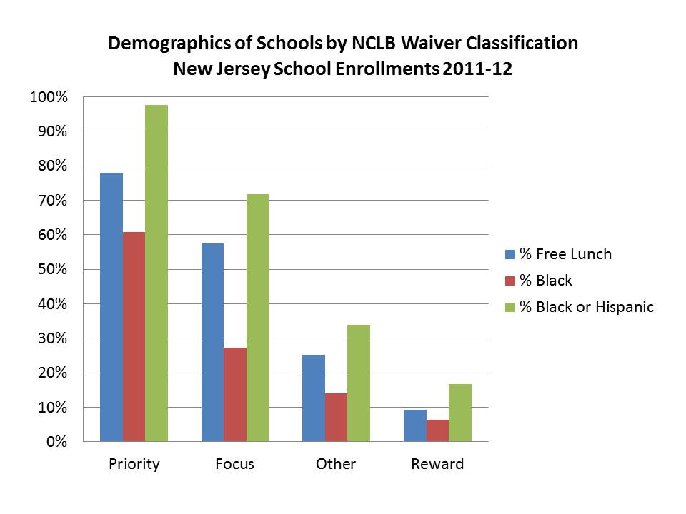
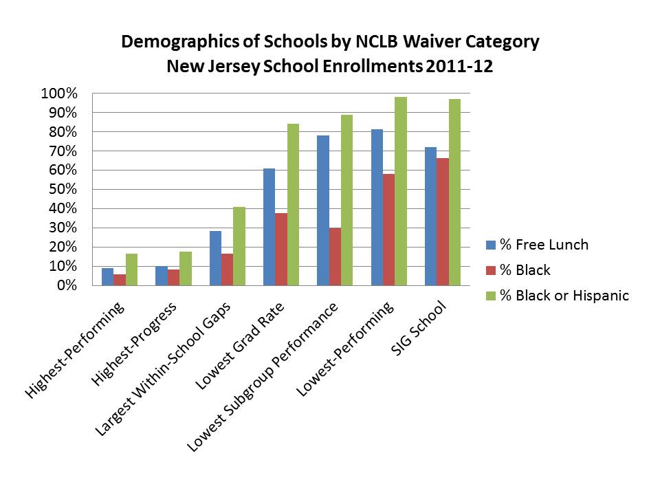
This first figure shows the demographic composition of schools by their classification. Perhaps the most astounding feature of this graph is that priority schools are nearly 100% black and Hispanic, while reward schools have very low levels of low income, black or Hispanic students.
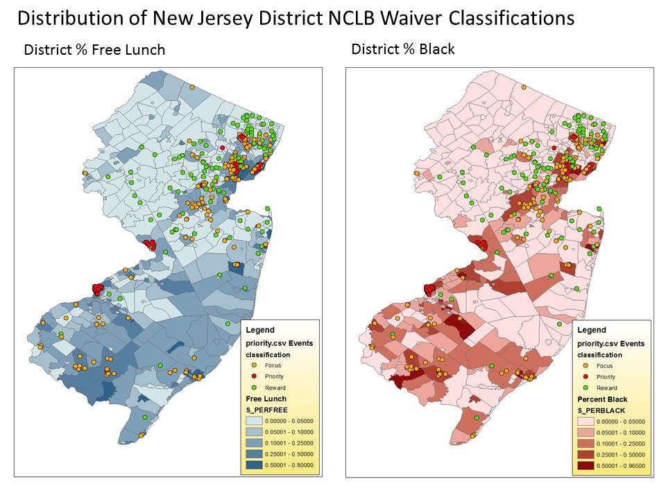
Here are a few maps to illustrate the geographic distribution of priority, focus and reward schools, for those who know Jersey. We can see that the priority schools are concentrated in the larger, poorest urban centers and focus schools in and around other poor cities/towns.

Not surprisingly, the reward schools for the most part are scattered through the more affluent suburbs of northern Bergen County and out through the most affluent areas of north central NJ (Morris/Somerset/Hunterdon). Okay… I was actually surprised that they had concocted a rating system that was so absurdly biased. The second set of maps shows that there are some reward schools in the northern half of the city of Newark (the area with lower black population share).
Underlying Measures for Classification

It was assumed that states would be proposing ratings based on a mix of status and improvement measures… and that doing so would somehow mitigate the extent of demographic bias in the classifications. States could also use subgroup and achievement gap measures. States wouldn’t, for example, simply be proposing to step in and close down all of the majority low income and minority schools and turn them over to private management/or otherwise displace their entire teaching and administrative staffs.

Of course, the measures available in most states aren’t always that useful to sifting through the demographic biases.New Jersey’s are particularly bad. The following figure shows the racial and low income composition of schools by the types of measures that determined their status. Both the progress ratings and the performance level ratings are hugely biased! As it turns out, so are the achievement gap and subgroup measures. Notably, many affluent New Jersey districts (where the reward schools are) likely have too few low income or minority students to even report gaps.
Remedying Poverty by Deprivation?

In my analysis of New York State, I also showed that priority schools are far more likely to appear in school districts that have been most underfunded by the state of New York relative to its own promised school funding formula (the one the state adopted/proposed as a remedy to court order several years back).

Now, New York state has one of the worst state school finance systems in the nation. One in which districts with more needy students have systematically fewer resources. New Jersey is a far cry from New York in this regard. New Jersey has done better than most states with respect to funding equity and adequacy. 

And compared to demographically similar states, New Jersey has some positive results to show for its overall funding effort and for its targeting to high poverty districts.

But lately, New Jersey has started down a different road in state school finance policy. The state has chosen in recent and proposed for future years to significantly underfund their own legislatively adopted state school finance formula.

That in mind, the following slides present an analysis somewhat similar to that presented in New York State, but looking forward instead of back. I’m not proposing some lofty “what should be” funding levels based on academic analysis here. Rather, I’m simply looking at the extent to which New Jersey is currently, and proposed to fund districts under its own formula SFRA. This is the formula that was adopted by the legislature under the previous administration and was subsequently upheld by the state court. More on these issues in a later post.

I’ve not had time to reconstruct my own simulations of SFRA projected out over the next several years, so I’ve used data pulled together by the Education Law Center and SOS NJ in which they have projected (SOS NJ) out the SFRA funding shortfalls for each district for the next 5 years. The figure below shows that in the current year, funding shortfalls from the current legislated formula are smaller in districts that are home to priority and focus schools (note that the formula itself significantly reduced targeted effort to these districts when it was implemented).

But, over the next few years, it is expected that as these schools – priority and focus – are subjected to takeover/overhaul/closure – their districts will be increasingly shorted in their funding with respect to what the formula estimates.  That is, the overall strategy here appears to be to identify high need schools for takeover/closure and then systematically and substantially reduce their financial support over time.

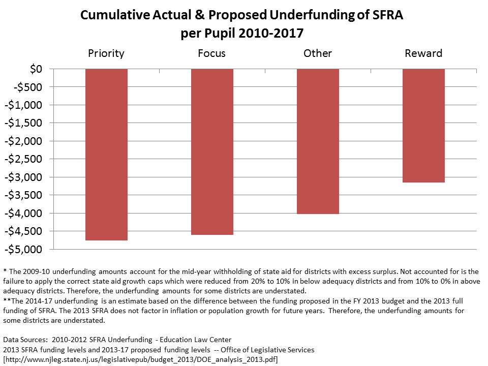
Cumulatively, over the next five years, districts of priority schools stand to lose much more on a per pupil basis (relative to what the formula dictates they should receive) than districts of reward schools.

Put bluntly, the goal is to “reform”(?) priority and focus schools and close achievement gaps by taking all of that harmful money away from them and giving it to others who are far less needy! Yeah… that’ll learn-’em!

This is all strangely consistent with the framing of the commissioners report, that was not a report, on school funding and achievement gaps in New Jersey. In that report, Commissioner Cerf essentially proposed (via a series of bad and worse graphs) that the road toward closing New Jersey’s achievement gap should be paved by reducing funding to high need minority districts and shifting it to lower need, lower minority concentration districts. Strange logic indeed.

And these reductions presented above don’t account fully for the plethora of other alterations proposed to the state school funding formula that might further reduce funding to higher need districts – funding to districts that are home to priority and focus schools.

The following posts critique some of the proposed changes, and address other related issues:

Closing Thoughts

As I noted on my previous post, I can hear the reformy outcry now that this is all warranted because we’ve provided poor and minority kids the worst schools and worst teachers for so many years. This is merely an attempt to remedy this persistent, intractable disparity.  The problem with this logic is the placement of blame (in addition to the questionable legal authority and ill-conceived remedies).

We’re not measuring school performance here. There’s no basis in these classification schemes for implying that the teachers and administration are the ones who failed the children. These are junk, gerrymandered classification schemes. They are based on arbitrary distinctions being made with inadequate data/information.

Follow up on Ed Waivers, Junk Rating Systems & and Misplaced Blame – New York City’s “Failing” Schools

About a week ago, I put up a post explaining a multitude of concerns I have with the current NCLB waiver process and how it is playing out at the state level. To summarize, what we have here is the executive branch of the federal government coercing state officials to simply ignore existing federal statutes, by granting waivers to state officials who adopt the current administration’s preferred education reform strategies. Setting aside the legal/governance concerns, which are huge, few if any of these preferred strategies are informed by any sound research/analysis.

Equally if not more disturbing is how this waiver process is playing out at ground level, and the message it sends.  Once again (as in Race to the Top) the administration has encouraged the adoption of ill-conceived homogenized policy frameworks across states. States are encouraged, through the waiver application process, to propose how they will abuse data yielded by their generally inadequate data systems to inappropriately classify local public schools as a) in good standing, b) focus or c) priority.  States have been granted some flexibility as to how they will abuse their own data to gerrymander local schools into these categories.

Once schools are placed into these categories – regardless of any validity check on the meaning of those categories – those schools become subject to a prescribed set of largely unproven state intervention options – with yet another layer of complete disregard for statutory and constitutional authority (state statutes & constitution) of states to take such action.

In short, what we have is the federal executive branch  using authority it doesn’t have to grant states authority they don’t necessarily have, to unilaterally impose substantive changes on individual local public schools.

But I digress, yet again.

So, what about those categories? And how do they break down? In other words, which districts and which children are most likely to be subjected to these interventions/experimentation?

I started last week with the state of New York, pointing out that on average, New York State has (ab)used its currently available data to characterize as priority schools and focus schools, primarily those schools that are a) high in poverty, b) high in minority concentration, c) low in taxable property wealth and d) low in aggregate household income per capita.

To rub salt in the wound, even though back in 2003 New York State was ordered to correct deficiencies in school funding across districts, and even thought state itself proposed a relatively inadequate formula to address those disparities, the state has continued to ignore its own formula – shorting by the largest amounts, those districts that are home to the most priority schools. (for a thorough analysis, see: https://schoolfinance101.com/wp-content/uploads/2010/01/ny-aid-policy-brief_fall2011_draft6.pdf)

This is where we last left off:

But, my analysis last week largely left out New York City schools. Bear in mind that New York City like many other high need districts around the state continues to be substantially shorted under the state’s own proposed foundation funding formula.

Demographics in New York City

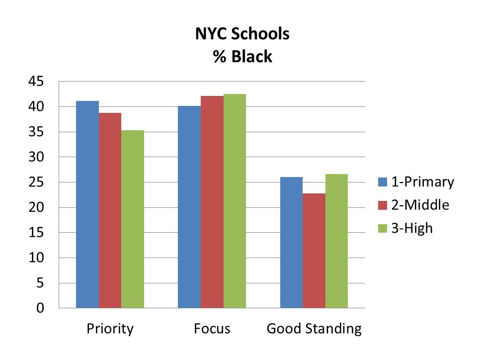
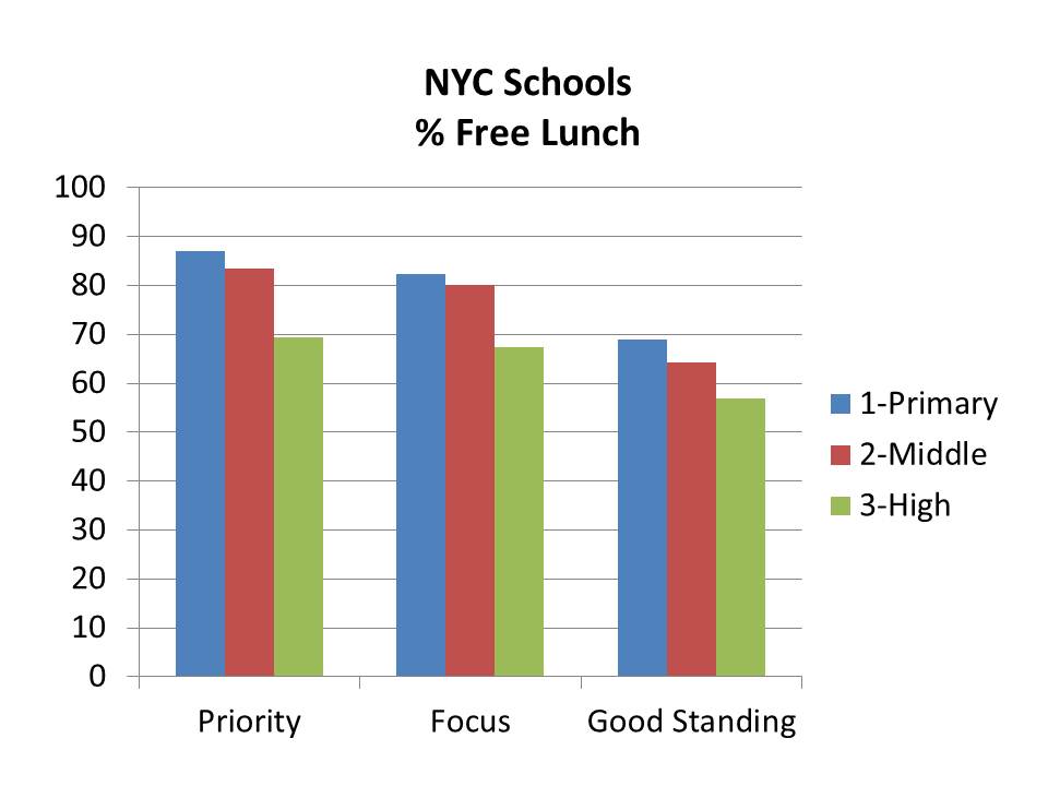
First, let’s do a walk-through of the demographic characteristics of New York City schools by their classification under the new state rating system. Bear in mind that the degree of variation in demography across schools in New York City is somewhat more limited than across the state as a whole.  On average, in New York City, more schools have higher average minority concentrations and higher average low income concentrations than the state as a whole.

The following figures play out largely as one might expect – with priority schools having a) the highest concentrations of low income students, b) elevated concentrations of black and Hispanic students, c) and the highest concentrations of LEP/ELL and special education students.

In other words, it would certainly seem that while reformy-rhetoric dictates that demography should not determine destiny, demography remains a pretty strong determinant of a school’s post-nclb-waivery-classification-status.

When I run statistical tests of the relationship between demographic factors and the likelihood that a school is identified as a “priority” school, I find:

  1. A 1% increase in % Free Lunch (controlling for grade level) is associated with a 4.6% (p<.01) increase in the likelihood of being classified as a “priority” school.
  2. A 1% increase in % Black (controlling for grade level) is associated with a 1.2% (p<.01) increase in the likelihood of being classified as a “priority” school.
  3. A 1% increase in % Hispanic (controlling for grade level) is associated with a 2.1% (p<.01) increase in the likelihood of being classified as a “priority” school.
  4. A 1% increase in % Special Education (controlling for grade level) is associated with a 13% (p<.01) increase in the likelihood of being classified as a “priority” school.

Resources by Demographics in New York City

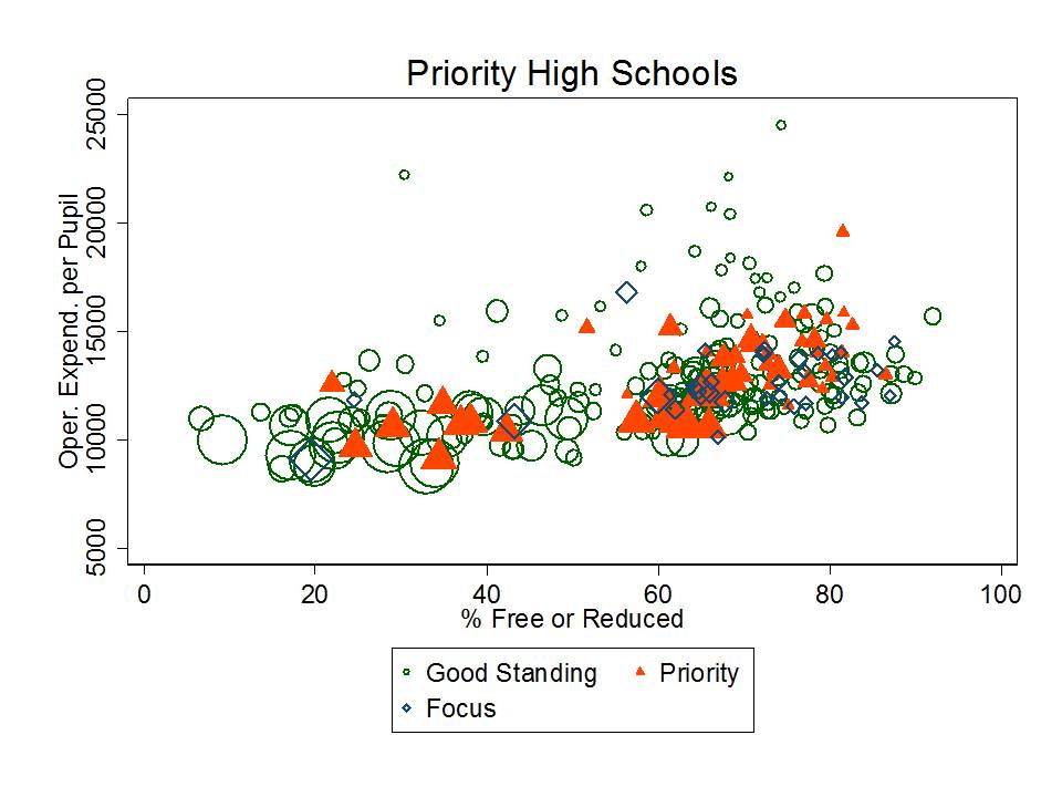
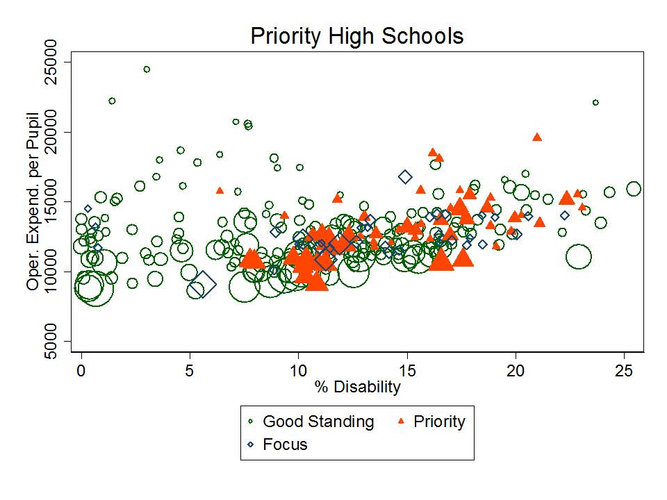
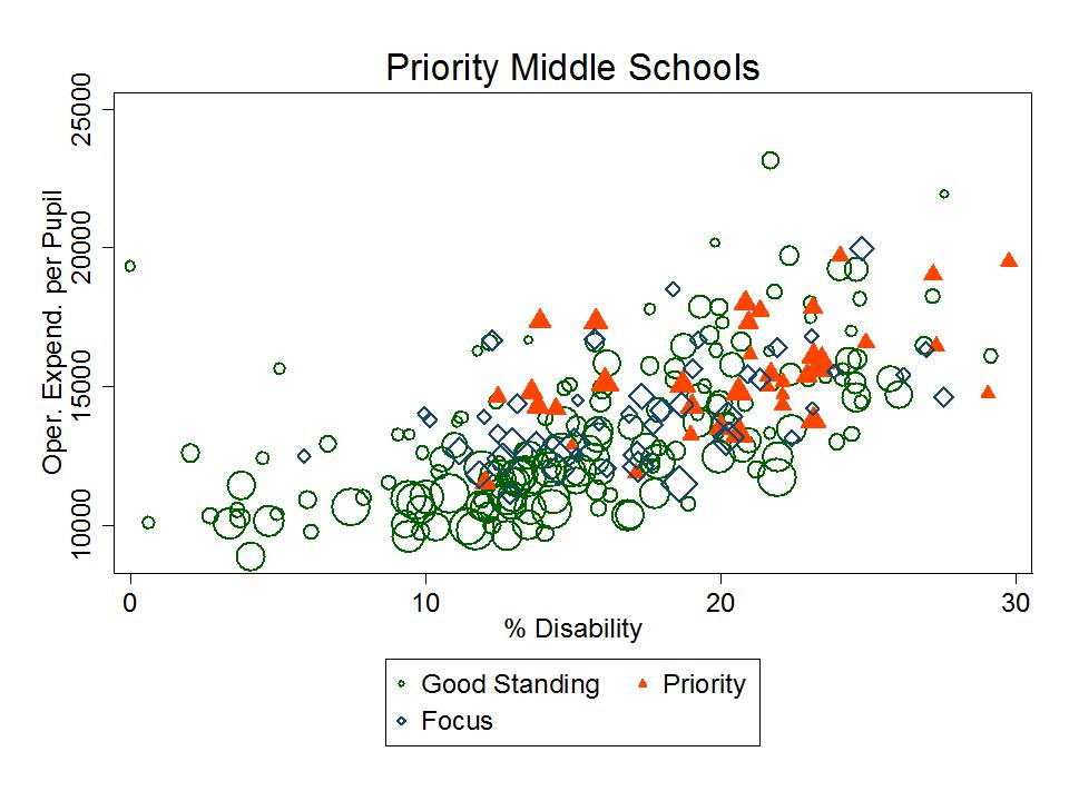
My next cut at the NYC data explores the position of priority schools with respect to a) low income students, b) special education students and c) per pupil spending (school level).

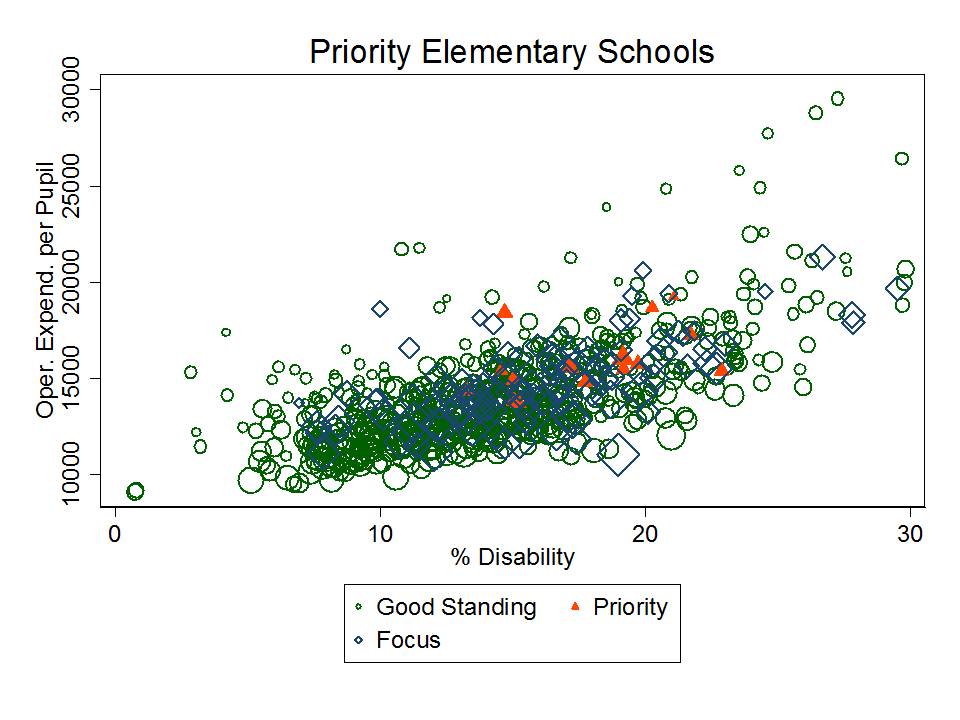
In the first two figures, we see that priority secondary schools (or at least those serving students through the secondary grades) are somewhat spread out by % free or reduced lunch. Note that bubble/diamond/triangle size indicates school size. However, there don’t appear to be any priority high schools among the lowest poverty schools, and a relatively large share appear among the higher poverty schools. They are relatively average, compared to schools with similar % free or reduced lunch, in terms of their school site spending.

In the second figure, we can see that those high schools identified as priority all have at least a minimum threshold of children with disabilities. But, all high schools with few or no children with disabilities are in good standing. That includes numerous relatively small high schools that also have much higher per pupil spending even though they have far fewer children in special education.

Priority middle schools also have relatively average per pupil spending compared to schools with similar concentrations of low income or special education students – but they all tend to have relatively high concentrations of low income children and children with disabilities.

None of the middle schools with lower concentration of low income children or children in special education are classified as priority schools.

For elementary schools, priority schools (again in red… but somewhat hidden behind others) tend to be very high in concentrations of low income students and moderately high in concentrations of children with disabilities. Again, they are relatively average in their per pupil spending compared to similar schools.

Outcomes in New York City

Now, the findings in the previous section might… might… on the outside chance suggest that there really is something about these priority schools that warrants additional investigation. After all, they do have similar resources to other schools serving high need populations. And while the priority schools tend to have high need populations, other schools with similarly high need populations and similar resource levels are either “focus” schools or “in good standing.”

But, it is still important to remember that the state has NOT identified as priority schools, any schools that serve low need populations and do less will in terms of outcomes compared to other schools serving low need populations and with comparable resource levels.

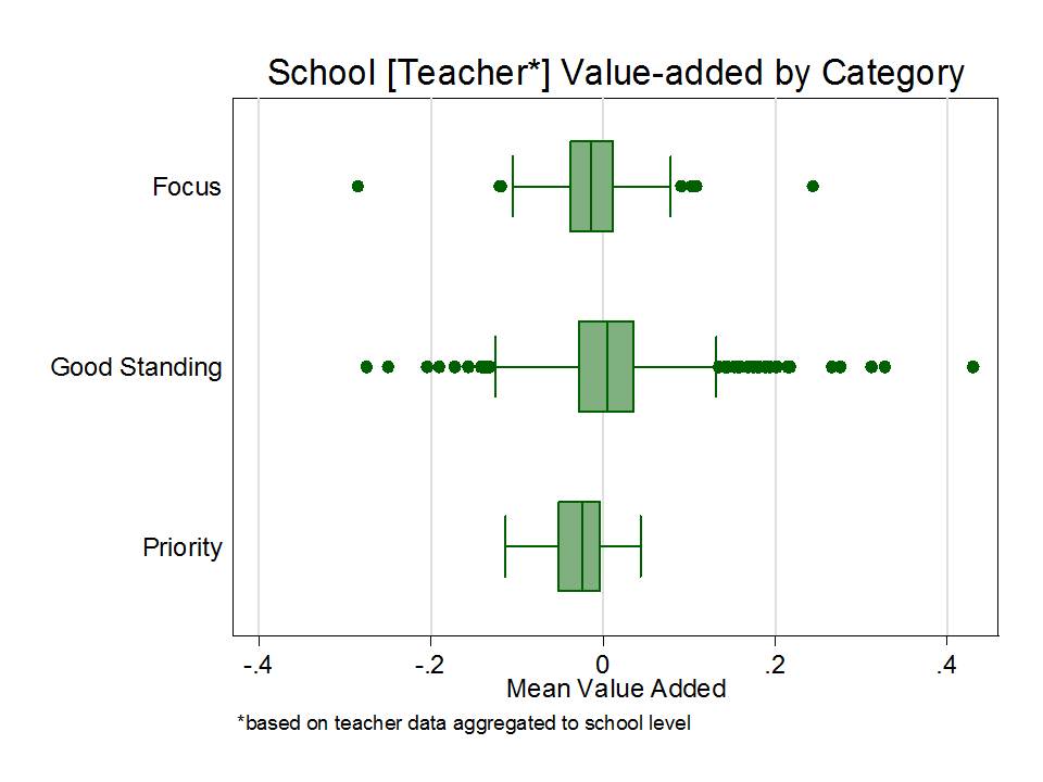
For this next graph, I took the NYC teacher level value-added data and averaged them to the school level for all teachers in each school, as in my previous post on NYC charter school teachers. (caveats included on previous post). Note that I’ve removed quite a bit of the variation in these value-added scores by aggregating them to the school level prior to constructing this graph.

While the differences in mean teacher value-added do fall in the right rank order – highest mean for good standing, second for focus and lowest for priority, the variations among schools around these means certainly muddy the waters a bit. Yes, the means are different, but the boxes overlap quite substantially!  And the consequences of being in one group versus another are quite substantial.

Shouldn’t it be the case that no priority schools have “better” average teachers (by the limited noisy measure used here) than schools in “good standing?” How does it make sense that there are schools in “good standing” that fall well below the average for teacher value-added of “priority” schools, even if those cases are relatively rare?

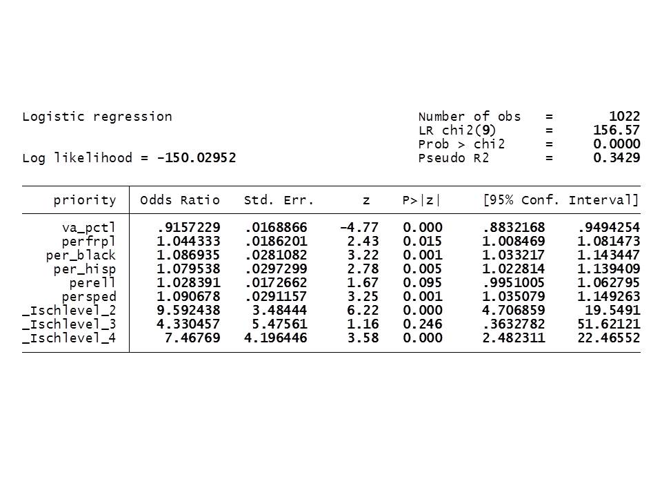
For one last statistical shot at teasing out what’s going on here, I ran a logistic regression to figure out a) whether and to what extent these differences in value-added are significant predictors of landing in priority status and b) whether a school that has more low income and minority students is more likely to land in priority status – even if it has the same teacher value-added scores?  That is, even if those statistically “bad” teachers aren’t to blame!

In other words, is there racial/socio-economic bias in the school ratings among schools with similar teacher value added?

Here it is:

For interpretation, I used the average value-added percentile of teachers here (in place of the standardized value-added score).

What this output shows is that for a 1 percentile rank increase in the school average teacher value added, a school is about 8.4% less likely (91.6%% as likely) to be classified as priority. Having a higher aggregate value-added teacher percentile rank significantly reduces the likelihood that a schools is identified as priority. That makes sense… but certainly isn’t the whole story… and as the graph above shows, there’s a fair amount of variation within each category.

Here’s the problem. Even among schools that have the same aggregate teacher value added percentile:

  1. schools with 1% higher free or reduced price lunch are 4.4% more likely to be classified as priority
  2. schools with 1% more black children are 8.7% more likely to be classified as priority
  3. schools with 1% more Hispanic children are nearly 8% more likely to be classified as priority
  4. schools with 1% more children with disabilities are 9% more likely to be classified as priority.

And each of these biases is significant, and of non-trivial magnitude, as well.

Let’s review what this means in simple, blunt terms.

These findings mean that even in schools where the teachers have the same average value added rank/percentile, schools with more low income, minority and special education children are more likely to face anti-democratic intervention!!!!!

Now that doesn’t seem to make a whole lot of sense when the supposed reason for the need for these interventions is that these poor, minority schools simply have all of the “bad teachers,” and when a central strategy to be employed is to replace/displace the school staff.

Closing Thought

I can hear the reformy outcry that this whole multi-level coercive illegal power grab to impose reformy intervention is in fact a critical step toward guaranteeing that demography isn’t destiny… to make widely known the fact that we’ve continued to provide minority and low income students the worst teachers and the worst schools. And that those teachers and schools must go [even if many of them outperform teachers in schools in “good standing” on their noisy/biased VAM estimate?]! Even if that means complete disregard for our current system of government. And even if that means that the parents, children and employees in these schools have to be forced to forgo additional constitutional and statutory protections (depending on the imposed reform).

It would be one thing if the measurement systems we were using to classify these schools as “failing” were valid for making such decisive declarations. That is, valid for making the assertion that it is the quality of the school and its teachers – and other controllable factors – that are primarily responsible for the performance.

Such arguments would be more reasonable if the disparate impact shown here was actually a disparate impact of school quality variation rather than a disparate impact in the application biased of school ratings, constructed from inadequate measures and inappropriate analysis (utter disregard for error, bias, etc., etc., etc.).

Ed Waivers, Junk Rating Systems & Misplaced Blame: Case 1 – New York State

I hope over the next several months to compile a series of posts where I look at what states have done to achieve their executive granted waivers from federal legislation. Yeah… let’s be clear here, that all of this starts with an executive decision to ignore outright, undermine intentionally and explicitly, federal legislation. Yeah… that legislation may have some significant issues. It might just suck entirely. Nonetheless, this precedent is a scary one both in concept and in practice. Even when I don’t like the legislation in question, I’m really uncomfortable having someone unilaterally over-ride or undermine it. It makes me all the more uncomfortable when that unilateral disregard for existing law is being used in a coercive manner – using access to federal funding to coerce states to adopt reform strategies that the current administration happens to prefer. The precedent at the federal level that legislation perceived as inconvenient can and should simply be ignored seems to encourage state departments of education to ignore statutory and constitutional provisions within their states that might be perceived similarly as inconvenient.

Setting all of those really important civics issues aside – WHICH WE CERTAINLY SHOULD NOT BE DOING – the policies being adopted under this illegal (technical term – since it’s in direct contradiction to a statute, with full recognition that this statute exists) coercive framework are toxic, racially disparate and yet another example of misplaced blame.

States receiving waivers have generally followed through by using their assessment data in contorted and entirely inappropriate ways to create designations of schools and districts, where those designations then permit state officials to step in and take immediate actions to change the governance, management and whatever else they see fit to change in these schools (and whether they have such legal authority or not).

Priority schools are the bottom of the heap, or bottom 5% and are subject to the most aggressive, and most immediate unilateral interventions (seemingly with complete disregard for existing state statutory or constitutional rights of attending children, their parents or local taxpayers, as well as explicit disregard for existing federal law).

Implicit in these classifications – and the proposed response interventions – is the assumption that priority schools are simply poorly run schools – schools with crummy leaders and lots of bad, lazy, pathetic and uncaring teachers… who have thus caused their school to achieve priority status. They clearly must go… or at least deserve one heck of a shaking up! Couldn’t possibly be anyone else’s fault. After all, the state must have clearly already done its part to provide sufficient financial resources, etc. etc. etc. It must be the bad teachers and crappy principals. That’s all it can be! Therefore, we must have immediate wide-reaching latitude to step in and kick out the bums – and heck – just close those schools and send those kids elsewhere, or convert those schools to “limited public access, privately governed and managed institutions” (privately manged charters) where layers of constitutional rights for employees and students may be sacrificed.

New York State’s Waiver Hit List

New York State Education Department released their hit list of schools recently.

http://www.p12.nysed.gov/accountability/ESEADesignations.html

Here’s quick run down of some key characteristics of schools and districts under each designation.

Demographics of Hit List Schools Statewide

I did a quick merge of the above classification data with data from the 2011 NYSED school report cards to generate the graph below, weighted by school enrollment.

https://reportcards.nysed.gov/

Notably, schools in “good standing” are lowest BY FAR in % of children qualified for free lunch, percent of children who are black, or Hispanic, and are also generally lower in percent of children who are limited in their English Language Proficiency. Race and poverty differences are particularly striking!

In short, the Obama/Duncan administration has given NY State officials license to experiment disproportionately on low income and minority children – or for that matter – simply close their schools. No attempt to actually legitimately parse “blame” or consider the possibility that the state itself might share in that blame.

AFTER ALL, NEW YORK STATE CONTINUES TO MAINTAIN ONE OF THE MOST REGRESSIVE STATE SCHOOL FINANCE SYSTEMS IN THE COUNTRY! 

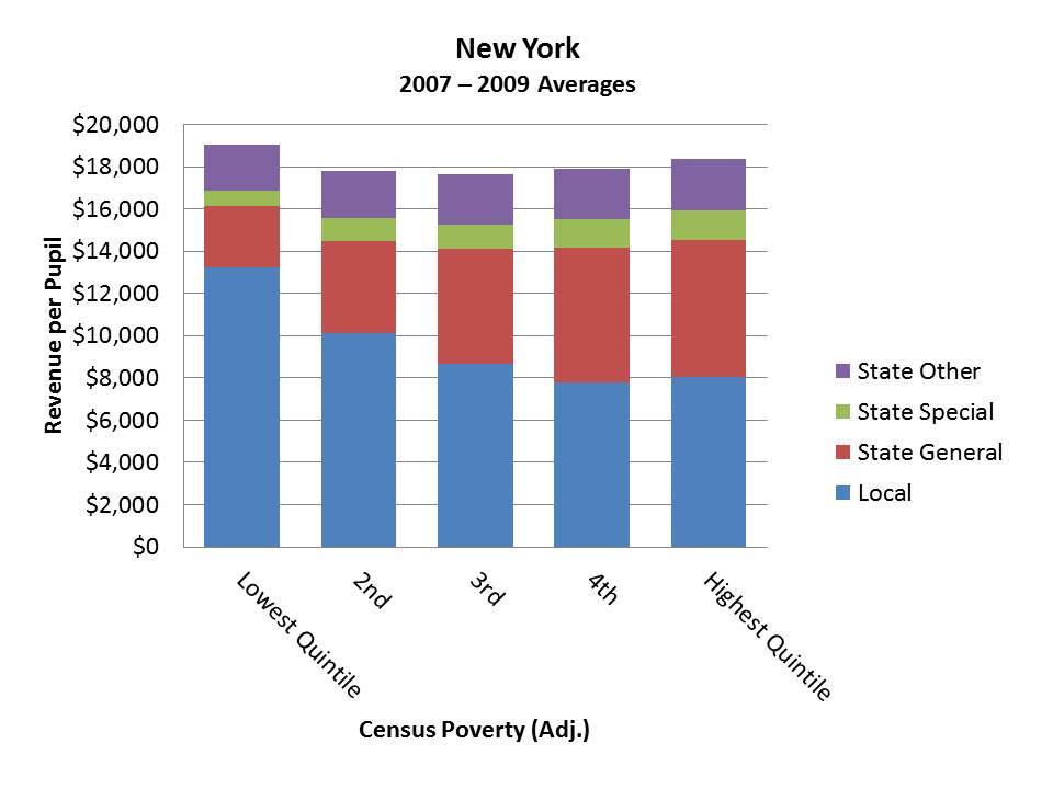
And the underlying disparities in that system are quite striking!

But perhaps, if we just require all of these priority schools to be turned over to charter operators from New York City, they can work their miracles statewide – for less money – with the same kids – and generating decisively better outcomes????? And of course, dramatically reducing labor costs??? Okay… so the data don’t really support any of that.

Economics of Hit List School Districts Statewide

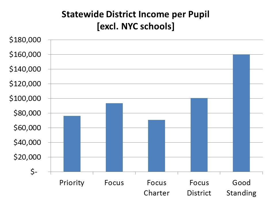
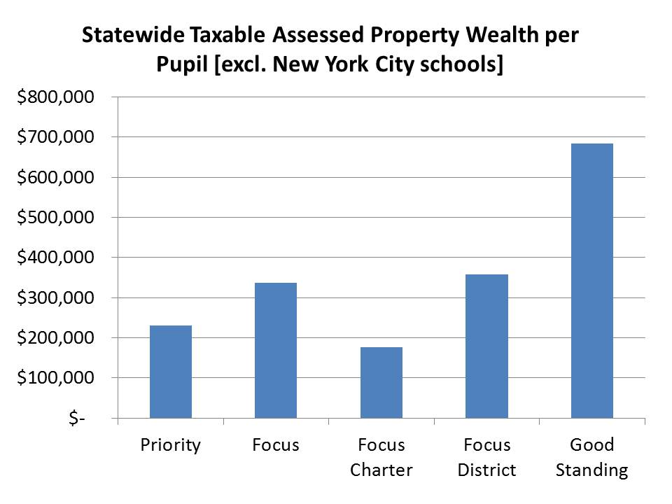
Here’s another perspective on the districts that house schools across these categories. New York State’s school funding model derives a combined wealth ratio based on two key factors that seem to be strong determinants of the local revenue those districts can raise on their own – Income per Pupil (aggregate income of residents divided by district enrollment) and Taxable Assessed Property Values per Pupil. Here’s how these two measures play out across categories (excluding New York City schools, where income and property wealth are a) difficult to accurately compare with the rest of the state and b) disproportionately weigh on the comparisons).

Say it ain’t so? Really, are the districts of schools that are in “good standing” that much higher income and that much higher in taxable property wealth than the schools that are identified as priority schools? Couldn’t be. The economics of these local communities clearly has nothing to do with it? Does it? It’s those damn lazy, apathetic teachers and their greedy overpaid administrators!

State Funding of Hit List School Districts Statewide

A while back, I wrote this brief:  NY Aid Policy Brief_Fall2011_DRAFT6

In the brief, I explain the layers of problems of the New York State foundation aid formula. I also wrote this blog post: https://schoolfinance101.wordpress.com/2011/11/08/more-inexcusable-inequalities-new-york-state-in-the-post-funding-equity-era/

In the brief, I explain how the current New York State school foundation aid formula is hardly equitable or adequate for meeting the needs of children attending the state’s highest need districts. But to rub salt in the wound – FOR THE PAST SEVERAL YEARS, THE GOVERNOR AND LEGISLATURE HAVE CHOSEN TO DISREGARD ENTIRELY THEIR OWN WOEFULLY INADEQUATE STATE AID FORMULA.

Even worse, when the Governor and Legislature have levied CUTS TO THAT FORMULA, they have levied those cuts such that they disproportionately cut more state aid per pupil from the higher need districts. As of 2011-12, some high need districts including the city of Albany had shortfalls in state funding (from what would be expected if the foundation formula was actually funded) that were greater than the total foundation aid they were actually receiving.

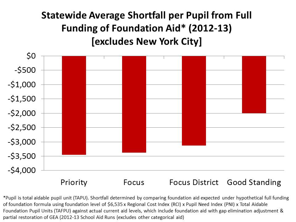
So, here’s one last graph for my statewide analysis – in which I summarize the foundation formula shortfalls per pupil by district, for the schools in each class. The foundation formula shortfall compares:

  1. What should be: full foundation formula aid that would be received per total aidable foundation pupil unit, using the 2011-12 Foundation Level (on Page 21, here: http://www.oms.nysed.gov/faru/PDFDocuments/Primer12-13A.pdf) and multiplying that foundation level times the regional cost index and pupil need index (and then determining the state share per the formula as described in the above linked document).  To be concise, this is the “what should be” target, but is based on last year’s target. So I’m being generous to the state, because the foundation level should have gone up again from 2011-12 to 2012-13 (see p. 21)
  2. What is: actual state foundation aid to be received from 2012-13 Aid Runs, with foundation aid adjusted for Gap Elimination Adjustment and partial restoration of GEA.

So… here are the funding gaps by status, with respect to the state’s own inadequate funding targets:

So, with respect to its own formula, the state is pretty much underfunding everyone. Of course, as I’ve noted on many previous occasions, the state is also dumping disproportionate unneeded tax relief aid into the wealthiest districts, which also happen to have the schools in “good standing.”

What we have here is that the state is most substantially underfunding – WITH RESPECT TO ITS OWN FUNDING FORMULA – the districts that house the majority of children enrolled in schools that the state has identified as “priority” schools.

Hey… here’s an idea for ya’…WHY NOT MAKE IT A PRIORITY TO ACTUALLY FUND THESE SCHOOL DISTRICTS AT AT LEAST THE LEVEL THAT YOU, THE STATE HAVE DECLARED ADEQUATE FOR THEM?

Is it reasonable to play this subversive “blame the teachers and administrators” game and kick them out and close their school when it is you… the STATE that has shorted them disproportionately on funding – FOR YEARS – with respect to your own funding formula benchmarks.

We can discuss the adequacy of those funding benchmarks another day. (read the brief: NY Aid Policy Brief_Fall2011_DRAFT6)

Additional analysis of New York City schools hopefully in the near future!

Helicopters can improve minority college attendance & other misguided policy implications: Comments on the Brookings “Voucher” Study

Here’s my quick response to the Brookings report released yesterday on the long term effects of vouchers on a randomized pool of participants in New York City.

Let’s say I conducted a study in which I rented a fleet of helicopters and used those helicopters to, on a daily basis, transport a group of randomly selected students from Camden, NJ to elite private day schools around NJ and Philadelphia. I then compared the college attendance patterns of the kids participating in the helicopter program to 100 other kids from Camden who also signed up for the program but were not selected and stayed in Camden public schools. It turns out that I find that the helicopter kids were more likely to attend college – therefore I conclude logically that “helicopters improve college attendance among poor, minority kids.” The simple policy solution then is to rent more helicopters and use them to send kids, well, wherever. After all, it’s the helicopters that matter????? Clearly, that would be a ridiculous assertion.

Similarly, the “major” findings of the new Brookings study were that, in particular, black participants in the voucher program seemed to have an increased likelihood of attending college. The study involved a randomized pool of individuals who qualified, applied and received the vouchers (and attended a private school) and those who qualified, applied and didn’t receive the vouchers.

The study purports to find [or at least the media spin on it] that “vouchers” as a treatment, worked especially for black students. I won’t  spend my time quibbling over design and statistical issues here, because I think the simplest issue to address – the big one – is the definition of the treatment itself.

This is not necessarily a study of whether “vouchers” as a treatment affect long run outcomes. Just like my hypothetical above had little to do with helicopters! Rather, it is a study of using “vouchers” as a funding mechanism to place a relatively small sample of low income minority children into a set of schools with fewer low income and minority peers. Schools that happen to be private schools. So it’s not really a study of whether “private schools” are more (or less) effective either. As such, the study really has little or no policy implications for “voucher systems” themselves, or private schooling.

Personally, I was struck to find that the only reference to peer group or peer composition was in a single sentence at the end of the report – but this sentence really says it all:

To the extent that student learning is dependent on peer quality the impacts reported here could easily change.

Yeah… that’s no throwaway line here! In fact it has the potential to completely re-frame the entire paper.

So what is the treatment?

Well, the use of a “voucher” system to alter the educational setting for a group of kids is most certainly not the treatment. Voucher is merely the mechanism used here to achieve the treatment.  It may be a policy mechanism that is useful under limited circumstances to achieve changes in educational setting. But the “voucher” is NOT the treatment.

And the use of vouchers in this narrow context may have few if any policy implications for new voucher programs in Indiana or Louisiana if they do not result in low income minority students being better integrated with higher income peers predisposed to have college aspirations.

The sector of schooling is most certainly not the treatment either – public or private school – catholic or non-religious school. While the sector of schooling is a variable in this analysis, it also may or may not have anything to do with the characteristics of the educational setting that most influenced college going behaviors. There’s a whole separate body of literature on that topic that is notably absent in this report. And it’s quite possible that we could find a policy mechanism which has nothing to do with either vouchers or private, or catholic schools which shifts more low income minority students into educational settings that promote college going behaviors.

So before we get in some huge tizzy about “vouchers” and “private school” effects, lets go back and define the treatment in this study for what it actually is and then try to figure out what it means in terms of effective policies for increasing college attendance among low income and minority students.

Tangent:  I found this paragraph particularly interesting:

The voucher offer also has a much larger impact than does exposure to a more effective teacher. Elementary school teachers who are one standard deviation more effective than the average teacher are estimated to lift their students’ probability of going to college by 0.49 percentage points at age 20, relative to a mean of 38 percent, an increment of 1.25 percent (Chetty et al. 2011b). If one extrapolates that finding (as the researchers do not) to three years of effective teaching, the impact is 3.75 percent. The impacts identified here for African American students—an increase of 24 percent—are many times as large.

Basically, what this paragraph/extrapolation boils down to is the distinct possibility that the variations in setting (largely peer group) achieved in this voucher study yield what appear to be stronger effects than the measured (really noisy measured – which may matter here) variations in teacher effect in the Chetty study. In other words, quite possibly… peer composition is actually the strongest in-school effect on long term student outcomes!?? [note that this is speculative based on the somewhat questionable comparison made in the above paragraph].

Second Tangent: Quite honestly, the cost comparison comments in this paragraph are so shoddy, poorly documented, etc. that they do much to undermine the report and should be cut.

These impacts are somewhat larger than the long-term impacts of the much more costly class-size intervention in Tennessee. Dynarski et al. (2011) estimate that being assigned to a smaller class in the early elementary grades increased college enrollment rates among African Americans by 19 percent (5.8 percentage points on a base of 31 percent). Reduction of class size in Tennessee was estimated to cost $12,000 per student (Dynarski et al. 2011), whereas the social cost of the SCSF intervention was about $4,200 per student to the foundation and reduced costs to the taxpayer by reducing the number of students who would require instruction within the public sector. If the government had paid for the voucher, the expenditure could have taken the form of a simple transfer from the public sector to the private sector, which in the long run need not add to the per-pupil cost of education. In fact, it could decrease costs because Catholic schools spend less on average than public schools. Around the time of the SCSF evaluation, New York City public schools spent more than $5,000 per student, as compared to $2,400 at Catholic schools (Howell and Peterson 2006, 92).

First, this paragraph and the sources it cites provide little if any solid evidence regarding “costs” and “expenditures” citing only that the Archdiocese of NY at the time said so (p. ii) regarding Catholic school costs being about $2,400 per pupil (and ballparking out of nowhere the $5k public district figure). This paragraph also compares estimated expenditures on one strategy (class size reduction) in one context (TN) and point in time to partial subsidies on another strategy in another context at another point in time.  A while back, I criticized another report, also by Matt Chingos (nothin’ personal, I generally like his work) in which he referred to Class Size Reduction as the “Most Expensive School Reform” without legitimately comparing the costs of CSR to any other reform.  The above paragraph is strikingly similar in its gaping holes of logic and evidence. I could go on and on. The authors also make no attempt to provide reasonable assumptions & estimates for the full cost of operating and scaling up a large scale voucher system. As such, this stuff really has not place in this paper.  For a more thorough discussion/analysis of public/private school spending, see: http://nepc.colorado.edu/publication/private-schooling-US

Since the authors didn’t actually conduct any real analysis of schooling resources/finances, they really shouldn’t have gone there in their conclusions. This kind of back of the napkin, half-baked cost savings assertion really cheapens a study that does have some interesting findings to offer.

Friday Finance 101: On Parfaits & Property Taxes

Public preference for property taxes stands in perfect inverse relation to the public taste for parfaits. Everybody loves parfaits[i] and everybody hates property taxes.[ii] No, I don’t plan to spend this blog post bashing parfaits. I do like a good parfait. But, even more blasphemous, I intend to shed light on some of the virtues of much maligned property taxes.

I often hear school funding equity advocates argue that if we could only get rid of property taxes as a basis for funding public schools, we could dramatically improve funding equity. The solution, from their standpoint is to fund schools entirely from state general funds – based on rationally designed state school finance formulas – where state general fund revenues are derived primarily from income and sales taxes.  In theory, if the state controls the distribution of all resources to schools and none are raised locally through property taxes, the system can be made much fairer, even more progressive with respect to student needs and cost variation (as I discuss in this post).

Property Taxes are Less Volatile and their Decline (when/if there is one) Lags

The most recent cries for why the property tax is problematic came about because property tax revenues in some locations continue to decline marginally even as state revenues are rebounding! Damn those property tax revenues! Why don’t they rebound too?

As reported in The Atlantic, the question was: why are we still firing teachers even as the economy is rebounding (albeit slowly)? The answer- declining home values and thus declining revenues from taxes on those home values. Mind you, residential properties are only a share of taxable property values, and a much smaller share in some districts/locations than others. But more on that later.

The article in the Atlantic pointed to U.S. Census data on tax collections which are also summarized in recent reports from the Rockefeller Institute (www.rockinst.org), one of my most trusted sources for information on state and local tax policy. Consistently good stuff!  Figure 1 shows the fluctuations in state and local tax revenue sources over time. And yes, Figure 1 does show that property tax revenues continue to decline modestly. But figure 1 also shows that property tax revenues a) have much more consistently stayed in the positive zone since the early 1980s and b) have generally been much less volatile than income or sales tax revenues. Look at the most recent two downturns, in 2002-03 and 2009 to present.

Personal income tax revenues are most volatile, especially in states where larger shares of income are non-wage income.  You certainly don’t want all your eggs in that basket. And it was, in fact, state budgets that got most slammed, especially in states most reliant on personal income tax. Now this is not a case for eliminating the personal income tax. What goes down also goes up. And the personal income tax can be structured progressively and revenues from it can be distributed to improve equity. In education – or really any public service financed by a mix of income, sales and property taxes – property taxes serve as a buffer to the system – a stabilizer. While that buffer is not fairly distributed – wealthy communities having greater ability to buffer their aid losses than poorer ones – states could responsibly redistribute remaining state aid to those who need it most, or at least levy cuts in a pattern least harmful to the most needy, accounting for those with the strongest buffer. (which is not to say that states do, but rather that they could).

Figure 1. Rockefeller Institute Analysis of Revenue Volatility

 http://www.rockinst.org/pdf/government_finance/2012-07-16-Recession_Local_%20Property_Tax.pdf

The other point here that The Atlantic latched onto is that property tax revenue decline, if and when it happens, occurs in a lag. They decline after others start going back up. So yes, while it does suck that property tax revenues haven’t rebounded right away, it sucks a lot less than if property tax revenues had tanked to the same degree and at the same time as sales and income tax revenues. Further, the blow of declining property tax revenues could now be softened with the political will to tap rebounding incomes and sales. (yes… could…)

Having these revenue cycles, be, well… off cycle with one another is helpful… or at least less harmful.

In short, for all their other faults property taxes help balance the revenue portfolio for public services. They are the stable, safer investment in that portfolio. Shifting too dramatically away from property taxes places a greater burden on the state to provide additional state aid for property wealthy and property poor districts. And we know who’s likely to win out in that tug of war.

Overall Funding Equity is NOT a Function of Whether the State Pays a Larger Share

Now here’s the real kicker. While school funding equity advocates like to believe that fully state funded systems would somehow be magically more equitable because state share has increased, it is not generally the case that states where school districts are more reliant on local revenue have less equitable school funding systems. In fact, as we found in our school funding fairness report, there exists no relationship at all between overall school funding fairness and the percent of money that comes from state versus local resources. Figure 2 illustrates this stunning lack of relationship.

Figure 2. Relationship between State Share and Funding Fairness

http://schoolfundingfairness.org/downloads_popup.htm# (2010, p. 35)
How can that be? Why, if more money comes from the state wouldn’t that improve funding equity? Clearly the ability to raise funds from local property taxes is inequitable? Thus, state aid is needed to counterbalance that inequity. More state aid, more equity! Viola.

But alas, as I’ve discussed many times previously on this blog, state aid formulas are the output of an ugly political process – and that’s just how it has to be. I’d love to substitute my infinite wisdom for the political meat-grinder – but that would be about as arrogant and disrespectful to our American political system as… well…  executive waivers from Federal statutory obligations. In fact, it would be equivalent to trying to use executive or regulatory (departmental) authority to rewrite components of a state school finance system that are spelled out in statute. Nah… that would be just wrong!

Some times, as in Figure 3, the political meat-grinder, under some influence of that other branch of state government – the judicial branch – produces a state school finance system that, while heavily reliant on local property taxes, still manages to achieve pretty darn good relative equity. See Figure 3- New Jersey.

 Figure 3. Equitable state w/Heavy Property tax Reliance

But other times, even when a state school finance system is heavily state funded, with relatively small local share, that system still ends up incredibly inequitable and regressive with respect to student needs. See Figure 4 – North Carolina.

Figure 4. Inequitable State with Low Property tax Reliance


And yes, sometimes, you do have a state that is very heavily reliant on local property taxes and has a very inequitable distribution of resources, like New York! But hey, at least it’s a stable inequity over time, right? Nothin’ like dramatic disparities that stand the test of time!

 Figure 5. Inequitable State with Higher Property Tax Reliance


And every state’s a bit different from every other – creating its own brand of state endorsed inequities – seemingly regardless of how dependent, or not, that state system is on local property taxes.

General State Equalization Aid IS Property Tax Relief Aid to those who need it most!

Now, it’s not entirely the fault of the property tax that we have these disparities in states like North Carolina and New York. Clearly something else is going on. I won’t go too deep on that here, because I’ve got a really fun paper coming out this September in which I go painfully deep on this topic. The paper will be rolled out in a public event in DC – more on that later. But clearly, if states more reliant on property taxes are not generally less equitable, there’s other stuff going on. Hey, just look at all of that state aid in North Carolina going to the lowest poverty districts, even when higher poverty districts could likely use a bit more. And what about the aid going to the wealthiest New York districts, a topic I’ve written about many times here? How does state aid get so screwed up as to not help?

One common argument among state legislators, especially those from property wealthy communities is that their communities need property tax relief. It’s easy to hold up the tax bill on a $2 million dollar home in New York or New Jersey and get an eye-popping response. What? You mean you pay over $30,000 a year in property tax? Clearly you need tax relief! Uh… but wait, despite the eye-popping tax bill, the effective tax rate on that house might just be lower than the effective tax rate on the $200,000 home in Newark, NJ or Utica, NY! The tax bill is high because of the value of the house, not because of some unfair tax policy or aid distribution scheme.

The bottom line is that general state aid to schools – the equity enhancing aid – is already designed to promote tax equity. State aid to schools and property tax relief, are, to a large extent flip sides of the same coin. When a community gets more in aid, they need to raise less locally to achieve the desired quality of service. If they get less in state aid, they need to raise more. Communities with greater capacity to raise more should, in turn, get less.  There’s no reason to then turn around and say that those with greater capacity to raise more all of the sudden need a break… and need additional aid… that could have otherwise gone to those with less capacity? Such an argument presumes that the state has already over-corrected tax inequities between rich and poor communities. Highly unlikely! Even New Jersey, which has corrected more than many by providing aggressively targeted state aid hasn’t gone that far. See this post!  Effective tax rates remain lower in NJ districts with higher property values (at the peak of aid targeting).

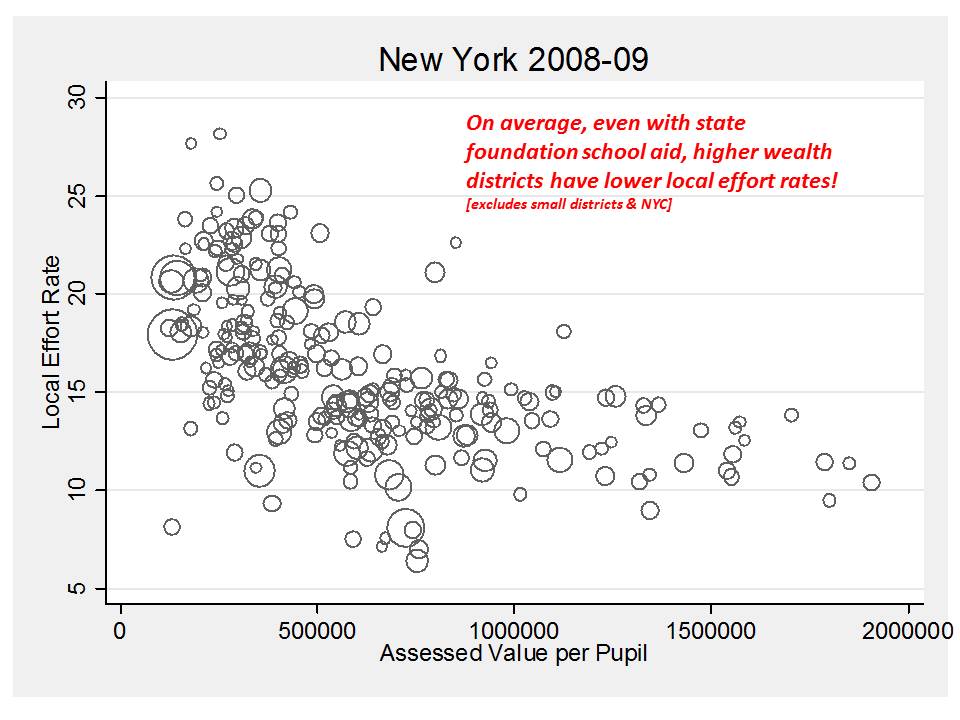
New York certainly hasn’t “over-corrected,” the property tax burden across districts, warranting the counterbalancing distribution of un-equalization aid. Figure 5 shows the relationship between taxable property values per pupil and local effort rates. Local effort rates remain systematically higher in lower wealth communities.

Figure 5. Insufficient General Aid and Persistent Tax Inequities


But, as I’ve discussed on a number of occasions on this blog previously, New York still goes out of its way to operate a completely separate property tax relief subsidy program, which on average, spends more state resources each year to buy down property taxes in richer rather than poorer communities. See Figure 6.

Figure 6. Un-equalizing Distribution of Unnecessary Aid


 So the point of this seemingly tangential portion of this post is that states like New York and others, find ways to consume state resources toward making school funding less equitable. It’s not entirely the property tax that’s at fault here. Rather, it’s the use of state resources to buy down property taxes in wealthy communities – actually encouraging even more spending in these communities that already have greater capacity and are exerting less effort. Go figure.

And that’s ONE OF MANY REASONS why simply increasing the level of support coming from the state doesn’t always improve school funding equity. Heck, North Carolina barely even tries to equalize (adjust) general school aid for differences in local capacity. You get more or less the same state aid per pupil no matter how wealthy or poor. Thus, whatever disparities exist in local revenue are simply added onto with state aid.

Closing Thoughts

There are lots of ways to make property taxes “better” and “fairer.” But even in their current form, property taxes play an important role in stabilizing the revenue on which our public schooling system operates.  Further, overemphasis on the classic, savage inequalities of American public schooling that emerge from the inequitable mess that is property taxation may distract from the reality that state school finance systems often make things worse rather than better, replacing savage inequalities with stealth inequalities.

The solution is not to get rid of property taxes but to integrate them wisely into state school finance systems, use other state revenues to better achieve overall funding equity by aggressively targeting those revenues, count on property taxes as a portfolio stabilizer and, to the extent possible, seek ways to improve equity with property taxes and improve the equity of property taxation.


[i] Donkey (2001) Shrek.  

[ii] http://businessweekly.readingeagle.com/?p=2860 (okay, this is an indirect cite to the Tax Foundation, which isn’t really the most credible source on Tax Policy. See: https://schoolfinance101.wordpress.com/2010/03/17/just-the-facts-nj-taxes-teacher-salaries-and-spending-fluff/)

Poverty Counts & School Funding in New Jersey

NJ Spotlight today posted a story on upcoming Task Force deliberations and public hearings over whether the state should continue to target funding in its school finance formula to local districts on the basis of counts of children qualifying for free or reduced priced lunch.  That is, kids from families who fall below the 185% income threshold for poverty.

The basic assumption behind targeting additional resources to higher poverty schools and districts is that high need districts can leverage the additional resources to implement strategies that help to improve various outcomes for children at risk. I have discussed this issue at length in this related post.  New Jersey has done this better than most states over time. (evidence on outcomes here)

The idea is to find the indicator or measure that seems to best capture the likelihood that children will struggle in school – that they will enter kindergarten less prepared and have access to fewer out of school resources during their time in school (including limited summer learning opportunities). A variety of socioeconomic indicators might be considered. But often, the information that happens to be most available is counts of kids who are from low income families, as identified through the National School Lunch Program income criteria.  And, as a measure of convenience, it tends to work quite well. I compare this measure below with Census poverty measures, based on children in families living in a certain area (within school district boundaries) who fall below the much lower income threshold of 100%, which has some advantages but also some major shortcomings.

Of course, in the political context, this is really all about finding ways to deliver more aid to districts whose representatives/political leaders wield the most power in the political debate. That’s just the nature of the beast – the politics of school finance. Sometimes it goes well for the kids who need it most… other times, not so much.  I watched this play out in Kansas a few years back, and have seen similar conversations occur across other states.

Typically, the whole thing plays out according to the following politically motivated steps:

  1. Manufacture some scandalous but largely irrelevant, anecdotal manifesto about how local district officials are egregiously mislabeling children as low income in order to hoard and misappropriate obscene sums of state aid.
  2. Manufacture other claims that poverty really doesn’t matter anyway and certainly these poverty measures have little or nothing to do with determining whether children are likely to do well in schools.
  3. Assign a task force composed mainly of lay people with little or no expertise in education policy, finance or specifically the measurement of poverty, to swallow whole the manufactured evidence and generate politically convenient policy recommendations.

As I mentioned, Kansas went through this process while I lived there – establishing an “At Risk Council,” and now New Jersey is headed down a similar road. In Kansas, the political strategy of using the Task Force to reduce poverty based funding and drive more to the suburbs was thwarted by the assignment of a knowledgeable individual to head the task force – or At Risk Council – former Commissioner Andy Tompkins. In the end, Tomkins and the Kansas At Risk Council concluded:

The Council continues to believe that the best state proxy for identifying at-risk students is poverty, whether that be measured by free or free and reduced price lunches.

Darn them. Blasphemy! Amazingly, Andy Tompkins was not exiled from Kansas for his leadership in this matter, and he remains one of the kindest, most thoughtful individuals with whom I’ve ever interacted on state education policy issues!

Report here: LEG At-Risk Council Report SFFF

Of course, Kansas legislators still found additional clever ways to shift money away from higher need and toward lower need districts.

In any case, even though no-one asked me… nor do I really want to be asked to participate in such a charade, here are the questions and considerations that should guide the choice of measures for determining state aid distribution.

Two Key Questions:

First, the questions… and the data on New Jersey schools and districts.

Is the Poverty Measure Correlated with Other Poverty Measures?

It is indeed desirable to find some measure on which to base funding allocations that can’t be gamed, or manipulated by those who stand to receive the additional funding. But that’s not always feasible (or cost effective). And, even if a count method does involve local district officials gathering data, it can still be checked/audited (in a  more thorough and responsible way than checking a smattering of individual families forms for those who fall closest to the income threshold, necessarily ignoring those who fall just the other side of the threshold but didn’t file).

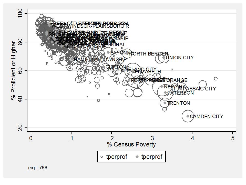
One reasonable way to evaluate district collected data on children qualifying for free or reduced lunch is to evaluate the relationship between the free/reduced lunch concentrations and census poverty estimates based on resident populations. Here are three versions of that comparison:

Figure 1. Relationship between Census Poverty 2010 and District Free/Reduced Lunch 2011

In this first figure we see that Census poverty rates tend to range from 0 to about 45% and free/reduced rates – children in families under a much higher income threshold, up to about 100%. In fact, as I’ve noticed in many analyses, the free/reduced lunch data tend to get messy above 80%, suggesting that this is the range within which local administrators may be maxing out their ability to get parents to comply & file paperwork. Here, we see that even though poverty rates keep climbing, free/reduced rates seem to level off. Arguably, if anything is going on here, it’s that very high poverty districts like Camden and Trenton – which fall “below the curve” are under-reporting their free/reduced rates – with some possibility of marginal over-reporting in Elizabeth.

Overall, however, census poverty explains nearly 90% of the variation in free/reduced rates. In other words, free/reduced lunch makes a pretty darn good proxy.

In this second figure, I’ve tried to better tease out the districts that may be under or over reporting by cleaning up that non-linear relationship and expressing both measures in their natural logarithm form. Here, we see that the relationship remains very strong and still slightly curved. If there were districts substantially over-reporting free/reduced lunch, they would appear to pop above the outer/upper edge of the curve. There’s not much of that going on. On the other hand, there are a number of districts that are relatively low in poverty but report disproportionately low free/reduced lunch rates – that is, under-reporting.

Figure 2. Logged Relationship (natural log) between Census Poverty and Free/Reduced Lunch

In general, these figures show that free/reduced lunch rates are a pretty darn good proxy for district poverty rates. And at least this analysis here doesn’t indicate substantial, systematic (beyond predicted, based on resident child poverty rates) mis-classification.

Is the Poverty Measure Correlated with Student Outcomes?

The “big question” is which version of the measure better captures differences in student outcomes – or predicts educational disadvantage.  This is straightforward enough to check as well. The first figure hear shows the relationship between free/reduced lunch rates and proficiency rates on state assessments in 2011.

Now, I know, we’ve been told that this relationship doesn’t really exist. There are lots of schools that flat out buck this trend, right? So much so that it’s not even a trend, right? In fact, we’ve even been fed a totally absurd graph which purports to validate that free/reduced lunch really doesn’t relate to performance.  Oh wait… and we’ve been fed even more ridiculous graphs to reinforce this point!

Setting aside all of that stuff, Figure 3 shows that % free/reduced lunch alone explains about 81% of the variation in proficiency rates across districts.  So, it’s a pretty reasonable proxy of educational disadvantage.

Figure 3. Free/Reduced Lunch & Proficiency in 2011

Now, I do have some concerns about the extent to which this relationship erodes at and approaching free/reduced rates above 80%. Is it really that Camden and Trenton perform that poorly compared to Union and Elizabeth despite serving even less poor populations? Or might the story be more complex than this. Figure 4 which shows the relationship between Census Poverty and proficiency sheds some additional light on this issue.

Figure 4. Census Poverty and Proficiency

Figure 4 suggests that Camden and Trenton are actually a) higher poverty than Elizabeth (and Camden higher than Union) and b) perform more or less where they are expected to [somewhat below… as opposed to well below]. This is an interesting contrast that adds some support to my speculation above that these very high poverty cities may in fact be understating their poverty rates in their free/reduced lunch data. Indeed, there may be some overstating in Union and Elizabeth, but neither “popped” substantially above the curve in the previous charts.

Census poverty rates, while capturing a unique story of difference between Camden and Trenton vs. Union and Elizabeth do slightly less well at explaining variations in proficiency rates, making the free/reduced count preferable in this regard.

Additional Policy Considerations:

Given all of this, there are a few additional considerations when pondering which measure to actually use in state school finance policy.

More Stringent Count Methods require Larger Weights

First, if we choose to use a more stringent income threshold for poverty, like the census poverty measure, we would need to assign the appropriate weight to drive the appropriate amount of funding to high need districts. Simply changing our method of counting kids in poverty doesn’t change the needs of Camden or Trenton. It merely recasts those needs with an alternative measure. More stringent measures require larger weights, an issue that has been explored empirically.

The applies to the choice of using free lunch (130% income threshold) as opposed to free or reduced lunch. Using free lunch only might permit better differentiation between high poverty districts, but a higher weight would then be required to drive sufficient funds to those districts.

Problems with Residential/Geography Based Measures in New Jersey

Census poverty measures are limited in their usefulness in the current New Jersey policy context, because they are based on location of residence and linked to geographic boundaries of school districts. New Jersey has significant numbers of non-unified, regional secondary school districts for which poverty estimates may be imprecise or inaccurate.

Further expansion of charter schools and inter-district choice programs complicates use of measures based on place of residence. Funding to schools must be sensitive to the demographics of students enrolled in those schools.  It would be entirely inappropriate, for example, to require a sending district like Newark or Camden to pay charter or other district tuition on the basis of their own average resident poverty rate if the charter school or receiving district is not taking a comparable share of children in poverty. This is certainly the case in Newark.

As a result, free or free and reduced price lunch measures remain preferable.

So, that’s my 2 cents (okay, more like a few dollars worth) of advice on this issue.

More on this later, no doubt, when the Task Force releases its final recommendations.

Related paper on poverty measurement.

http://aefpweb.org/sites/default/files/webform/VOL%20I-POVERTY%20REPORT-METHODOLOGY%202011-21-12%20CLEAN.docx

Effects of Charter Enrollment on Newark District Enrollment

In numerous previous posts I have summarized New Jersey charter school enrollment data, frequently pointing out that the highest performing charter schools in New Jersey tend to be demographically very different from schools in their surrounding neighborhoods and similar grade level schools throughout their host districts or cities. I have tried to explain over and over that the reason these differences are important is because they constrain the scalability of charter schooling as a replicable model of “success.” Again, to the extent that charter successes are built on serving vastly different student populations, we can simply never know (even with the best statistical analyses attempting to sort out peer factors, control for attrition, etc.) whether the charter schools themselves, their instructional strategies/models are effective and/or would be effective with larger numbers of more representative students.

Here, I take a quick look at the other side of the picture, again focusing on the city of Newark. Specifically, I thought it would be interesting to evaluate the effect on Newark schools enrollment of the shift in students to charter schools, now that charters have taken on a substantial portion of students in the city. If charter enrollments are – as they seem to be – substantively different from district schools enrollments, then as those charter populations grow and remain different from district schools, we can expect the district schools population to change.  In particular, given the demography of charter schools in Newark, we would expect those schools to be leaving behind a district of escalating disadvantage – but still a district serving the vast majority of kids in the city. I’m not sure why I never got around to looking this issue. I’ve certainly explored it in Pennsylvania with respect to special education populations (where there exists an incentive for PA charters to serve low need special education students, leaving high need ones behind for the district to serve with fewer resources).

First, here are the data sources on which I am relying for this analysis:

1) school level enrollment data 2010-11: http://www.nj.gov/education/data/enr/enr11/stat_doc.htm

2) school directory (for identifying city location): http://education.state.nj.us/directory/schoolDL.php

3) special education classification & placement: http://www.nj.gov/education/specialed/data/ADR/2010/EligibilitybyPlacement/PlacementByElig6-21.xls

[Placement by eligibility 6 to 21 year olds. I left of 3 to 5 year olds for now]

This is a rough first cut at an analysis that should be done in greater depth at some point and for more than just Newark. Consider this to be illustrative.

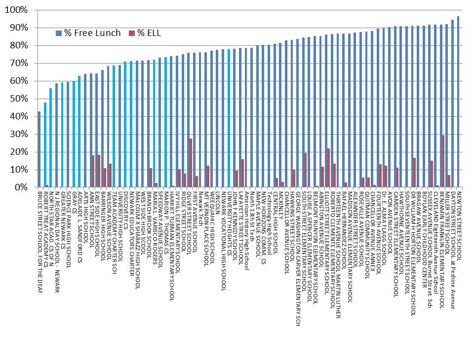
Here’s my usual starting point – % free lunch and % ell by school for schools with their city of location as Newark.

Again, most of the charter schools in Newark have very low % Free Lunch or % ELL when compared with other schools in Newark, except for a handful of NPS specialized and magnet schools. Indeed, the district does impose a significant degree of segregation on itself.

The real trick in all of this is to figure out how to balance the presence of these specialized schools, charter schools and district schools to create the best set of opportunities for the largest share of children.

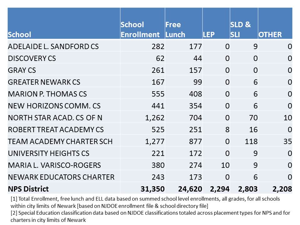
If we take the school level enrollments for charter schools in Newark and for NPS schools in Newark and sum them up we get the following distribution of students:

Table 1. Summed School Level Enrollments* from Enrollment File

SLI = speech/language impairment, SLD = specific learning disability.

*Note that if we look at the district enrollment data, NPS enrollment is actually greater than the figure above, and greater in each other category. Some of the difference is a function of special education out of district placements, where many of those students are both disabled and low income. District reported totals are enrollment = 33,279, free lunch = 26,320, ELL = 2,665 (leading to slightly higher disadvantaged shares than above). see: http://www.nj.gov/cgi-bin/education/data/enr11plus.pl

A noticeable feature of Table 1 is that for the most part, charter schools aren’t serving many children with disabilities to begin with. But, they are especially not serving children with disabilities other than mild specific learning disabilities or speech/language impairment.

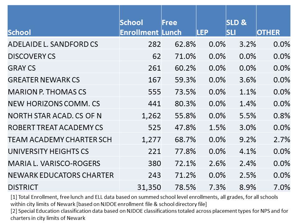
Table 2 puts Table 1 into percentages.

Table 2. District school and charter school enrollment characteristics by percent

Here, we see that few charters in Newark have anywhere near the % free lunch share of the district as a whole. The differences are especially large for Robert Treat, North Star and Greater Newark. The differences are even more striking for LEP and special education classifications, except for TEAM which enrolls a sizable share of SLD/SLI students, but very few more severe disabilities.

Now, here’s another angle on the student populations. Table 3 shows the effect of extracting these charter enrollments from the district enrollments. In the first column, I include the summed enrollments of all schools in the city of Newark including charter schools (but not private schools). In the second column I include the summed enrollments of Newark Public schools within the city of Newark.

The fourth column is particularly important. This column shows that:

  1. Charter schools listed above have absorbed about 15% of the district total enrollment. 
  2. But, these charter schools have absorbed only 13% of the district’s lowest income children.
  3. Further, they have absorbed less than 1% of the district’s ELL population.
  4. They have absorbed only 8.3% of the district’s low need special education population
  5. And, they have absorbed only 2% of the district’s higher need special education population (most of these being students listed in the broad, “other health impairment” category and attending TEAM academy).

For charter schools not be be having a negative effect on district enrollment characteristics, they would have to be – in the aggregate – absorbing 15% of each special needs group. But clearly they are not. Thus, we can expect that those left behind in district schools are becoming a higher and higher need group as charter enrollments expand (unless they become more representative in the aggregate).
Table 3. District & Charter Enrollments & Effect of Charter Enrollments on District

  • Thus far, growth in enrollment of the charters included here has led to an increase in district schools % free lunch of 2%.
  • Thus far, growth in enrollment of the charters included here has led to an increase in the district schools % ELL of greater than 1% (given that the rate is only around 7%, this is sizable).
  • Charter enrollment growth has also led to growth in concentrations of children with lower and especially higher cost disability classifications.

Again – this is just a cursory, preliminary cut at these data based on simply summing up the available enrollment data from 2010 and 2011.

There are numerous potential additional complexities here. For example, does the presence of some high flying charters keep some families in the district that might otherwise seek to move elsewhere? That is, if the charters weren’t there, would the district lose less needy students to out-migration? That’s possible, but likely in smaller shares than seen here.

My main point here is that this is yet another issue of New Jersey charter schooling that requires much more in-depth investigation… with improved data on specific student level mobility… and also exploring the effect of charter enrollment attrition mid-year on nearby school population characteristics.

These issues are particularly worthy of additional exploration as NJDOE considers massive charter expansion in other cities such as Camden. Again, if the successes of some of these charters are largely contingent on the selective populations they serve, the successes of these charters (a) may be limited in their replicability and b) may be coming at significant expense to other children left behind.

Further, these issues are of critical importance when determining the appropriate approach to financing charter schools and their host districts. As I have noted previously, Pennsylvania has chosen among the worst approaches for dealing with special education charter school financing. New Jersey must avoid a comparable debacle (and thus far, has largely done so). All student needs based funding must be distributed with respect to the actual needs of students served – especially in the case of children with disabilities.  That is, if a charter school serves a district student with a mild, specific, low cost disability, they should be subsidized specifically on that basis, so as to ensure that sufficient funding is left for the district to serve remaining higher need students. New Jersey charter school financial data continue to be woefully inadequate for detailed analysis. More on that at a later point.

Cheers!


A not so modest proposal: My new fully research based school!

It’s about time we all suck it up and realize that the best of economic research on factors associated with test score gains not only can, but must absolutely drive the redesign of our obviously dreadful American public education system! [despite substantial evidence to the contrary!]

With that in mind, I have selectively mined some of my own favorite studies and summaries of studies in order to develop a framework for the absolutely awesomest school ever! I’ve chosen to focus on only economic studies of measurable stuff that is actually associated with measured test score gains. After all, that’s what matters – that’s all that matters!

Mind you that this school will be awesomest not merely in terms of overall effectiveness, but also in terms of bang for the buck, because I’m not messin’ around with expensive curriculum or elaborate facilities… or high priced consultants… or really expensive strategies like class size reduction.

I’ve chosen to avoid enrolling grades K-3 since the research is actually pretty strong that I should offer smaller class sizes in those grades. If I don’t have those grades, I guess I don’t have to worry about class size! Right?  In the absence of such clear research for grades 4 to 8 (or my choice to ignore that which really is relevant), I’ve decided that when it comes to class size, anything goes.

I’m goin’ for low hangin’ fruit here. Keepin it simple – with class sizes of 60 or so (since we know that doesn’t matter???) , running my school in a vacant lot and with absolutely no administration and/or supervision – since I’ve negated the need for the principal role in guiding high quality teacher selection by using an alternative, necessarily cost effective strategy!

So, here goes… Here’s my Econometric Academy Middle School (Grades 4 to 8).

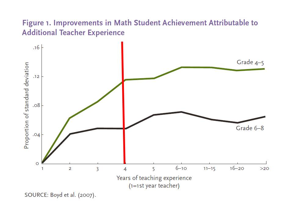
Hire and keep only those teachers who have exactly 4 years of experience

First, and foremost, since the research on teacher experience and degree levels often shows that student value-added test scores tend to level off when teachers reach about the 4th year of their experience, I see absolutely no need to have teachers on my staff with any more or less than 4 years experience, or with a salary of any greater than a 4th year teacher with a bachelors degree might earn. Anything above and beyond this is simply inefficient. Paying a teacher more after the 4th year is simply inefficient. Boosting 4th year pay is also inefficient if I can simply, in perpetuity, employ only teachers with exactly 4 years experience.

Here’s a graph from a Calder Center report summarizing the student test score gains in relation to teacher experience.

http://www.caldercenter.org/UploadedPDF/1001455-impact-teacher-experience.pdf

Now, I’ve reviewed the various economic simulations that suggest that dismissing teachers on the basis of student value added test scores is a reasonable approach to, over time, increasing teacher quality. For my nifty new school, I choose to believe in their assumption that there will always exist a normally distributed flow of new applicants whose average quality is the same as the current pool of teachers.

My approach allows me not to even worry about selecting out the bottom 5 or 10% and replacing them with average teachers. Instead, I’m going for cost-effectiveness! You see, if the average teacher has already achieved their likely best value-added outcomes by year 4, then (accepting the current experience based pay system) at year 4 I’ve got teachers who are at their maximum productivity and the lowest wage – and I don’t have to ever worry about paying them more! That’s totally freakin’ awesome! I just have to make sure that every year, when I let my entire staff go, I get out there and find a totally new crop of teachers who have just completed their third year of teaching elsewhere – and are at least “average” among soon-to-be 4th year teachers at producing outcomes. Thus, every year, I will have teachers who have the average production of 4th year teachers and the average wage of 4th year teachers.

That is, they are necessarily better than average in terms of cost effectiveness.

This is a no brainer!

Implement carb loading on testing days, scaled up w/grade level (& in spring where fall-spring assessments are given)

Now, let’s shoot for some somewhat more obscure ideas… that have great potential to yield some nice marginal gains to tests scores on top of my already optimally staffed school. For my next few clever strategies, I turn to the work of David Figlio formerly of the University of Florida and currently at Northwestern (yes… this is a sarcastic post… but Figlio is a truly exceptional scholar… really clever guy… and one of the nicest people you could ever meet. Plus, he produces some really fun food-for-thought!).

Research from back in 2002 found that under Virginia’s accountability system, many school districts were adjusting their lunch menus to increase carb loading on SOL (uh… standards of learning) testing days. More importantly, David Figlio and colleagues found that it worked!

Using detailed daily school nutrition data from a random sample of Virginia school districts, we find that school districts having schools faced with potential sanctions under Virginia’s Standards of Learning (SOL) accountability system apparently respond by substantially increasing calories in their menus on testing days, while those without such immediate pressure do not change their menus. Suggestive evidence indicates that the school districts who do this the most experience the largest increases in pass rates.

Specifically, the authors note:

We observe that the estimated effect of calorie manipulation is positive across all five tests, and is statistically significant, despite the extremely small effective sample size, in the case of mathematics. (Figlio, food for thought)

http://citeseerx.ist.psu.edu/viewdoc/download?doi=10.1.1.159.8754&rep=rep1&type=pdf

Yeah… this is really low hanging fruit (perhaps quite literally) for my bang-for-the-buck econometric academy. All I have to do is carefully plan out my school menus to optimize their influence on student test scores. I might want to think carefully about how to play this right in a value-added structure. For example, if we have fall-spring assessments, do I carb load only in the spring?

(from the authors acknowledgement section)

The opinions expressed in this paper do not necessarily reflect those of their employers, funders, or young children, the latter of whom respectfully disagree with the authors’ derogatory characterization of “empty calories.” We, in turn, blame them for any remaining errors.

Rename all students prior to entry

Figlio has also produced an intriguing series of studies that consider how students’ names affect their behavior and performance in school. There’s some more low hanging fruit for making my school the best performing school ever with little additional costs! The policy implications are absolutely clear from the research – I must review the names of all incoming 4th graders for two potential performance inhibiting characteristics. First, are their boys who have names that sound like girls names? Second, are there kids with either names that sound “black” or names that sound like they were given by less educated and/or lower class parents.  Next, I simply have to require that the parents of their kids change their names prior to starting 4th grade. To aid these parents in making good name choices, I will have available a list of gender appropriate, Asian sounding names, because that too is backed by the research!

Here’s the research behind my brilliant, cost-effective proposal… and it is both statistically significant, and compelling!

Racially identifiable names:

The persistence of the Black-White test score gap, and its widening over the course of the school cycle, is an issue of significant public policy concern. This paper presents evidence that a portion of these patterns could be due to the names given particularly prevalently to Black children. Children with names associated with low socio-economic status, and to a limited degree, with “Blackness” per se, tend to score lower on their reading and mathematics tests, relative to their siblings with less race or class-identifiable names.

This hypothesis is also bolstered by the finding that the opposite set of results are observed in the instance of Asian families, for whom a racially-identifiable name may signal attributes that are perceived to be associated with success. Asian children with racially-identifiable names apparently face higher teacher expectations and also tend to score higher on examinations.

http://faculty.smu.edu/Millimet/classes/eco7321/papers/figlio.pdf

Boys with female sounding names:

 I find that, as suggested above, boys with female-sounding names tend to misbehave  disproportionately in sixth grade, as compared to other boys and to their previous (relative) behavior patterns. In addition, I find that behavior problems, instrumented with the distribution of boys’ names in the class, are associated with increased peer disciplinary problems and reduced peer test scores, indicating that disruptive behavior of students has negative ramifications for their peers.

http://www.aeaweb.org/assa/2005/0107_1430_1102.pdf

Have salaries based entirely – not just partially – on loss aversion tied to test score gains

Finally, what kind of econometric academy would I have if I didn’t totally buy into the most recent study on  loss aversion as a compensation strategy! Roland Fryer and colleagues have provided us a real gem here. Fryer and colleagues find:

In this paper, we demonstrate that exploiting the power of loss aversion—teachers are paid in advance and asked to give back the money if their students do not improve sufficiently—increases math test scores between 0.201 (0.076) and 0.398 (0.129) standard deviations.

http://scholar.harvard.edu/sites/scholar.iq.harvard.edu/files/fryer/files/enhancing_teacher_incentives.pdf

Now, I’m going all out with this one. Every teacher gets paid their full salary at the beginning of the year (I’ll have to use some kind of accounting trick to deal with the timing of my state aid and local transfer payments, or once I’m up and running, rely on the money I took back from the previous year teachers to pay those up front salaries the next year). If your kids’ scores don’t increase more than the average, you lose your whole salary (see, it’s all relative, I get half the salaries back every year no matter what!).

I can see how this strategy might create a divisive culture in some schools or might create animosity between teachers and administrators for teachers who repeatedly lose compensation – and may lose that compensation largely as a function of random error and/or omitted variables bias in the model designed to estimate their effectiveness. Yeah… I can see how taking teachers’ salaries away for factors that may be entirely outside their control could really piss them off, more than actually inspiring them to try to control these uncontrollable in a subsequent year.

But, my school is different. I really don’t have administration… because decisions are already made, by me, at a great distance. Besides, I don’t have to see any of my teachers the following year anyway because they all get dismissed every year, and a new crop of 4th year teachers – equal to the previous – comes in (at least I think they will…). I just have to inspire them (scare the crap out of them) to kick some butt for that one year!

And that my friends, is the Econometric Academy of Achievement Test Excellence!


Closing thoughts

But seriously, much of the past week or so seems to have been dominated by discussions of Roland Fryer’s new NBER working paper indicating that while typical merit pay incentives don’t seem to influence student outcomes (by increasing teacher effort), when those incentives are paid up front, and taken back in response to lower performance, gains can be noticed. The buzz phrase (and theoretical framework) for the analysis is “loss aversion,” and a common assumption is that people may have more incentive to work harder if they fear losing something they already have, as opposed to gaining something they never had.

This stuff is fun to ponder (in a warped, academic sort of way), and potentially interesting as a research topic. But it’s all highly questionable in terms of usefulness for improving school quality (note that I said school quality, not test score gains!).

And that’s true of a lot of educational, psychological and econometric research related to schools. It’s especially true of any one of these branches of research in isolation!

The real key with most of these studies and others like them is to avoid the leap that these studies have immediate decisive policy implications – that they can and should be used to inform school reform – school redesign and state and federal education policy more broadly. Yes, each bit of information can advance our understanding. But, we must avoid the urge to assume that each new tidbit provides a new silver bullet answer and also negates all that we’ve learned previously.

Policymakers (and newspapers) want research with immediate and obvious policy implications. They want the silver bullet. They want the breakthrough that negates all previous understanding – that tells us why everything we’ve done to date is wrong and paints a clear path forward. Unfortunately, too many researchers feel compelled to play along.

Consider the great Chetty, Friedman and Rockoff one great teacher can earn a classroom of kids and extra quarter million dollars study, from this past winter. Many policymakers leaped to use that study as an immediate call to use value-added data for teacher de-selection policies. That call was endorsed by one of the authors own media quotes in which he asserted that we should fire sooner than later! (and that assertion was built on an overly bold if not absurd extrapolation of the earnings effect based on the single age at which the earnings effect was largest).

Similar overreaching for immediate policy implications appeared in the author-endorsed media spinning of Roland Fryer’s piece on “no excuses” charter schools in New York City, where despite not even attempting to accurately measure school expenditures, or the cost of “no excuses strategies” Fryer  fueled the media assertion that “no excuses” strategies and NOT money are the answer to improving urban school performance (partly in language embedded in the working paper itself).

If we are willing to accept these types of bold immediate policy recommendations, then we might actually be willing to accept the school I’ve laid out above as a reasonable proposition. My research based academy above might actually produce some marginally greater value-added estimates on student achievement data than it would for the same group of kids if I didn’t strategically carb load on testing days, change the kids names (to alter teachers’ expectations of them) and threaten their teachers with complete loss of salary.

And it might even be a really efficient approach to value-added gains if my (completely ridiculous) assumption holds that I can find a pool of average 4th year teachers willing to enter such a toxic environment for a single year, every year at an average 4th year salary. Yeah… that’s one $#!+load of assumptions (worthy of a few pages of appropriately formatted footnotes!).

But I’m pretty sure it would be a really sucky place to work as a teacher or to attend as a student. And call me a sappy, post-empiricist, sucker, but that matters too!

Learning from Really Bad Graphs & Ill-informed Conclusions: Thoughts on the New PEPG “Catching Up” Report

A new policy paper from Eric Hanushek, Paul Peterson & Ludger Woessmann has been receiving considerable attention. This despite numerous completely outlandish assertions drawn from junk charts that fill the pages of this reformy manifesto.

Look, I’ve said it before and will say it again. Eric Hanusek has contributed a great deal of high quality research to the fields of education policy and economics of education over the years and I have in the past and continue to this day to rely heavily on much of it to inform my own analyses and thinking in education policy. But this kind of stuff is really just infuriating. Rather than spend too much time venting, let’s try to use this new report for instructive purposes – to instruct the casual reader how to debunk and distill complete and utter BS when presented with pretty scatterplots and glossy formatting.

First, for your reading pleasure, the complete brief may be found here: http://www.hks.harvard.edu/pepg/PDF/Papers/PEPG12-03_CatchingUp.pdf

Before I go down this road, allow me to point out that it’s one thing to offer up this type of analysis as a conversation starter… or even as a provocation with all relevant caveats and disclaimers. It’s yet another to present information of this caliber (or lack thereof) as a serious attempt at immediate influence over policy. There’s a huge freakin’ difference there. And it is certainly my impression that this brief, by its framing, is indeed intended to shape the immediate policy conversation as much if not more so than to generate speculative, intellectual musings over the various possible meanings of the charts.

Further I’m particularly concerned with the way in which much of the information is presented and the way in which conclusions are drawn from that information. This is where this brief can be useful and illustrative – where we can turn this clumsy manifesto into a teaching moment.  I’ll tackle three specific issues here:

  1. measures matter, especially when we are dealing with money and test scores,
  2. the complexity of educational systems is difficult to untangle two-measures at a time,
  3. always watch out for the ol’ bait and switch! (sometimes it’s really obvious!)

The report presents numerous international comparisons (that’s the focus) of similar rigor to the state level comparisons I critique here. I’m just a bit pressed for time, and had the state data more readily available.

Measures Matter!

Okay… so here’s the first graph that drove me up the freakin’ wall. This graph is a classic extension of what I refer to as the Hanushekian cloud of uncertainty.

Figure 1 – State Spending Increases & Test Score Gains (from report)

For decades, Hanushek has been presenting deceptively oversimplified scatter plots of school district, state level and international data on education spending and outcome measures. These scatterplots in and of themselves are invariably freakin’ meaningless.  I evaluate this body of literature by Hanushek as a whole in my policy brief Revisiting the Age Old Question: Does Money Matter in Education?  

This graph provides a new twist, comparing the dollar increases in spending to the NAEP average annual gain. Hanushek uses this graph to draw the following conclusions:

 According to another popular theory, additional spending on education will yield gains in test scores. To see whether expenditure theory can account for the interstate variation, we plotted test-score gains against increments in spending between 1990 and 2009. As can be seen from the scattering of states into all parts of Figure 9, the data offer precious little support for the theory.

On average, an additional $1,000 in per-pupil spending is associated with a trivial annual gain in achievement of one-tenth of 1 percent of a standard deviation.

Michigan, Indiana, Idaho, North Carolina, Colorado, and Florida made the most achievement gains for every incremental dollar spent over the past two decades.

(keep an eye on Michigan and Indiana – we’ll hear from them again later. Here, they are AWESOME – getting bang for the buck… Of course, one can look good on this indicator by simply not spending much more and showing commensurately paltry outcome gains!)

I love the sarcastic use of “precious” in this quote. But I digress.

But there are at least a few small – okay… pretty damn big … okay … huge… completely undermining – problems with using this scatterplot to draw these conclusions.

Let’s set aside the outcome measure for now and focus on two other not-so-trivial issues. First and foremost, a $1,000 increase in spending in Louisiana and a $1,0000 increase in spending in New Jersey or Connecticut may… just may… not be worth the same. Does $1,000 more go as far to improving competitiveness of teacher salaries in New Jersey as it does in New Mexico? Uh… not so much.  In fact, the National Center for Education Statistics Education Comparable Wage Index indicates that competitive wages in New Jersey are substantially greater than in Louisiana, significantly altering the value of the additional dollar.  Second… it’s possible that other factors may actually play a role too?

Let’s shatter the spending measure & related conclusions first! Here’s an alternate view – taking the current expenditures per pupil from 2008-09 over the current expenditures for 1990-91 – that is, expressing them effectively as a percent increase over base year (albeit not inflation adjusted – see this post for more on this topic).

Figure 2

Hmmm… as it turns out, New Jersey spending really didn’t increase much as a percent over the base year. Louisiana, however, did. In fact, Louisiana actually had among the highest growth among states.  Well then, that would mean that New Jersey really kicked some butt! Not much spending increase at all… and some pretty damn good outcome gain!

The bottom line however, is that either scatterplot is pretty meaningless, with mine arguably slightly less meaningless than the original! But neither really useful for making any bold statements about state aggregate spending and outcome gains. Again, in my policy brief on Money Matters, I explore these issues in much greater detail. Referring to more rigorous studies attempting to link spending and outcome measures, I explain:

They [more recent studies] also, however, raised new, important issues about the complexities of attempting to identify a direct link between money and student outcomes. These difficulties include equating the value of the dollar across widely varied geographic and economic contexts, as well as in accurately separating the role of expenditures from that of students’ family backgrounds, which also play some role in determining local funding.

http://www.shankerinstitute.org/images/doesmoneymatter_final.pdf

I can’t pass up this seemingly tangential point.  I took particular enjoyment in this finding from Hanushek’s new report:

Maryland, Massachusetts, and New Jersey enjoyed substantial gains in student performance after committing substantial new fiscal resources.

Hanushek went to great lengths in an earlier book and in related policy papers to make the case the New Jersey was a classic example of failed massive spending increases and he has repeatedly cited New Jersey’s failures (as recently as this spring – my rebuttal here!) as a reason why other states should not increase funding for schools. Kevin Welner and I discuss this Hanushekian claim extensive in a recent article in Teachers College Record.

Isn’t that precious?

Two Measures Generally Insufficient for anything but Playful Speculation & Exploration!

As I noted above, the second reason why we should NOT take the Hanushekian cloud seriously, nor should we take the other graphs in the new report too seriously is that they attempt to draw inappropriately bold conclusions from graphs involving only two variables at a time. This approach can be useful for exploring patterns and/or raising questions. We all should spend much time exploring visual representations of our data- getting to know our data – our measures and how they relate. But to take this information and assert that spending matters little, or to go even further and make claims that the South is rising again… and that accountability driven policies of southern states are leading to disproportionate gains while curmudgeonly anti-reformy anti-accountability Midwest states are suffering, is just absurd.  I’ll dig into these conclusions a bit more in the next and final section.

What else might be going on here? Well, one likely issue requiring at least some more exploration is whether there are any substantive changes in the demography of these states. Yeah… it’s just possible that states that saw greater improvement saw less increase in poverty. Uh… and yeah… it’s possible that states that started lower gained more. Now, the authors acknowledge this latter point, but then brush it off. Instead, they assert that a likely alternative explanation is that Midwest states were riding high on their past successes and great universities, and simply got complacent.

Here are a few figures to chew on.

Figure 3 – Demographics and Outcome Change

Note that Hanushek, Peterson and Woessmann make a big deal about the great performance of Louisiana, Delaware, Maryland and Florida and the particularly sucky performance of Michigan, Indiana, Minnesota and Wisconsin. Uh… wait, weren’t Indiana and Michigan awesome above – for getting those paltry outcome gains for little or no additional investment? Yeah… but now they suck. Really… suck… because… they’re complacent… and not reformy.   As it turns out, the states referred to as generally awesome by the authors also had generally less increase in % low income students.

Figure 4 – Starting Performance Level and Outcome Change

While the authors acknowledge that starting performance levels are associated with outcome change, they go to great lengths to blow off this issue, arguing a) that it explains a relatively small share of the variation (uh… only about a quarter of it… which is actually quite large for this type of data/analysis) and b) that other plausible explanations involving the southern reformyness vs. midwestern complacency dichotomy may explain much of the rest of the difference? (without any evidence to support this notion!).

Yes. Starting level does seem to matter! And that can’t be overlooked, or brushed aside.

Together, change in % free lunch and 1992 8th grade math score explain about 41% of the variation in annual gain across the 34 states for whom each measure is available.

Ye Ol’ Bait & Switch

But there are bigger and more obvious problems with the conclusions drawn in this report… that don’t really even require much statistical digging. A classic deceptive strategy used in this type of reporting is ye ol’ bait and switch and/or conflating one group identification with another.

Ye ol’ bait and switch is often used in voucher debates where pundits will point to elite private schools as examples of the choices that all children/families should have and will then point to the average tuition of Catholic elementary schools (circa 1999) as an example of the cost of private education (see: http://nepc.colorado.edu/publication/private-schooling-US). Uh… 1999 national average Catholic elementary school tuition won’t cover much of the tuition at Sidwell Friends in 2012!

An entire subsection of the Hanushek, Peterson and Woessmann report is titled Is the South Rising Again? Much attention is paid in the report to the premise that southern states are staging an impressive comeback and that this impressive comeback is a function of their forward thinking in the 1990s and 2000s.

Specifically, the authors laud the achievement gains of Louisiana, Delaware, Maryland and Florida! All, of course, “southern.”

And specifically, the authors laud the early reformyness of Tennessee, North Carolina, Florida, Texas, and Arkansas – as providing possible explanations for the high performance of southern states!

Wait a second…. Those aren’t the same freakin’ states are they? What’s up with that? Did they really do that? Did they really frame it that way?

Here’s what the report says:

Five of the top-10 states were in the South, while no southern states were among the 18 with the slowest growth. The strong showing of the South may be related to energetic political efforts to enhance school quality in that region. During the 1990s, governors of several southern states—Tennessee, North Carolina, Florida, Texas, and Arkansas—provided much of the national leadership for the school accountability effort, as there was a widespread sentiment in the wake of the civil rights movement that steps had to be taken to equalize educational opportunity across racial groups. The results of our study suggest those efforts were at least partially successful.

Meanwhile, students in Wisconsin, Michigan, Minnesota, and Indiana were among those making the smallest average gains between 1992 and 2011. Once again, the larger political climate may have affected the progress on the ground. Unlike in the South, the reform movement has made little headway within midwestern states, at least until very recently. Many of the midwestern states had proud education histories symbolized by internationally acclaimed land-grant universities, which have become the pride of East Lansing, Michigan; Madison, Wisconsin; St. Paul, Minnesota; and Lafayette, Indiana. Satisfaction with past accomplishments may have dampened interest in the school reform agenda sweeping through southern, border, and some western states.

Keep in mind that Louisiana and Delaware didn’t get all reformy until the Race to the Top Era. Further as shown above, Louisiana actually had one of the largest proportionate increases in funding and Louisiana had relatively low growth in low income students.

Here’s a look at the BAIT and at the SWITCH, where I consider the bait to be those precious high outliers – the over-performers in the analysis, and the switch to be the states that were lauded as implementing policies that are likely behind this performance. As it turns out, while those early accountability/reform states also saw pretty good gains, their gains are more or less in line with gains of other states that had similar starting point – at least on 8th grade math (my apologies for simply not having the time to combine all NAEP scores, but the 8th grade math starting point explains 27% of the variation in gain, and along with free lunch change explains 41% of the variation in gain. Not bad, and more than Hanushek, Peterson and Woessmann suggest!).

Figure 5 – The BAIT… and the SWITCH!

Why is this relevant? The assertion being made in this report is essentially that the SWITCH group of states were implementing desired policies… policies that the sucky states like Michigan and Indiana should perhaps consider – or at least should have instead of resting on their laurels. Then, perhaps they could have looked more like the  precious bait. The problem is that the only overlap between the BAIT and the SWITCH is Florida – hardly a stereotypical “southern” state… and one whose reformyess and NAEP gains have been discussed & critiqued extensively by others in recent years (not time for that here). And then of course, we have the proclamation of the suckyness of Michigan and Indiana. Okay… which is it?

The bottom line in all of this is that this new report doesn’t tell us much. I don’t really have a problem with that. What I have a problem with is assuming that it does.

I do have a problem with particularly junky charts/analysis like the one asserting that spending increases have no relationship to outcome increases – with no consideration at all for the regional differences in the value of those increases – and all of the other variables that may… just may… play some role! That’s just lazy and sloppy and inexcusable.

But, at least I’ve got a new handout for discussion & critique for the first week of my fall semester class on data analysis and reporting!

Moneyball, Superman, Angry Royals Fans and Education Reform?

These past few days have been interesting, as I’ve followed more than usual, the festivities around the Major League Baseball All Star Game. I’ve followed the festivities in part because the game was in Kansas City this year and I lived in the Kansas City ‘burbs for 11 years up until 2008. I’m an east coast guy – born & raised Vermonter, livin’ in Jersey – college in PA, masters in CT, Doc in NYC… also taught in NH. I love east coast cities, and I probably fit the typical east coast snob profile. But some of the events that went down this week at the ASG left me feeling a bit uneasy.  Now, even as a kid, I kind of like the Royals. They were pretty damn good when I was growing up, and had that cool stadium with the fountains. While we lived in KC, we went to quite a few games… ‘cuz tickets were cheap and accessible.[1]

As I sat down to watch the Home Run Derby, I happened to be checking twitter – where I still follow some Kansas City media folks. I starting seeing tweets with the hashtag #boocano… along with links to explanations as to why KC fans should boo when Yankee Robinson Cano comes to bat.  Even as the booing actually happened… and it was quite impressive… the story I was getting from ESPN was strangely disconnected from the story I was getting from my KC tweets.

In case you missed it here’s some video from the stands at the K:

http://www.youtube.com/watch?v=LZlQk861C5c&feature=plcp

http://www.youtube.com/watch?v=sPl9Ez8dE6w&feature=plcp

In fact, ESPN wasn’t sharing much of anything… rather, suggesting that the KC fans were being inappropriate and expressing sour grapes simply because their guy (who must suck, because he’s a Royal) didn’t get picked for the home run derby. Eventually, ESPN and also Fox would post on their websites, stories of how Kansas City fans were “classless” and rude, while never actually sharing the details behind why Royals fans booed Cano.  For my east coast peers, here’s a Kansas City run down on what actually happened, since the national media found it far more convenient to demonize the rough and tumble, classless meanies in Kansas City rather than the upstanding and esteemed Yankee Cano.

As someone from the east, who headed to KC for 11 years after living in Yonkers, teaching and attending grad school in NYC… I found KC… and its sports fans to be frustratingly mild & passive, but still enthusiastic. Rough and tumble, rude, classless meanies? Nah… those are attributes of the fan base of my team – the Red Sox (remember, I’m a born/raised New Englander) – and we’re damn proud of it!

The national media spin was that KC fans were over-reacting because Billy Butler wasn’t picked for this inconsequential event. There was no mention of the fact that Cano said he would likely pick him – for this inconsequential event. That’s what fueled the whole #boocano movement in social media. So, the whole Boo Cano thing itself was about a lie and a broken promise [whether obnoxious and condescending or simply oblivious on Cano’s part] and was really directed at Cano himself. This wasn’t about some misguided, misplaced Yankee envy from a poor Midwestern team that just can’t get its own act together.

 What does this have to do with Education Reform?

The subsequent national media spin was both interesting and disturbing to me –  and I began to see all sorts of parallels between a) the national media coverage of this event and the national media coverage of (and spin on) “education reform” (such as NBC’s Education Nation & Waiting for Superman), and b) the real inequities of major league baseball that thwart any possibility that it will ever be a legitimate, fair competition, and the real inequities of American education that thwart any possibility that kids, regardless of where they grow up will ever have equal opportunity for social mobility.

I was particularly struck by how the national media constructed a storyline that allowed them to generate sympathy for Cano while demonizing Royals fans, blatantly suppressing the actual reasons why those Royals fans were so angry. It’s rather like the demonization of teachers in the ed reform debates (finding the right visuals of teachers as angry mobs protesting, carrying pickets decrying salary cuts & furloughs, etc.). It’s just bizarre. Teachers tend to be about as angry & aggressive and threatening…on average, as, well… Royals fans!

Why, then, are the Royals fans the preferred demons in this story line, and the Yankees and Cano the upstanding victims?  This one particular blog post seems to have nailed it best:

It’s perfectly fine for Phillies fans to be passionate for their team. It’s a crime for the Royals faithful to do the same. Why? Because we’re supposed to be the doormats. Doormats do not speak out about being walked out. They do not protest their role as a cleaner of the feet of the social elite. They do their jobs quietly.

http://kingsofkauffman.com/2012/07/10/we-will-remain-silent-no-longer/?utm_source=twitterfeed&utm_medium=twitter

Even worse, doormats are supposed to feel lucky they are allowed to be the doormats for the elite. Doormats are supposed to know their place, sit down, shut up and take it. Questioning one’s place, as a doormat, is certainly out of the question! [again… this isn’t what the Cano thing was about initially… it wasn’t about salary equity… Yankee envy… etc. It was about Cano. The media response – referred to by one Boston outlet as “yankee Jazeera”, however, was all too illustrative of the media interest in preserving the inequities of baseball – and the status of the Kansas City Royals as doormats!]

What Do Moneyball and Superman Have in Common?

There was a time when Royals fans were legitimately angry and outspoken about the financial inequities of Major League Baseball. They even had the gall to stage a protest against the Yankees when they came to town in 1999. Royals fans donned t-shirts which said “share the wealth” on their backs, and about 3,000 fans with the shirts turned their backs to the Yankees.

Arguments over making baseball more legitimately competitive by capping salaries and/or aggressively sharing revenue seem to have died down since that time. Much like arguments about school funding equity or adequacy that were more prominent a few decades ago. I guess this is because in both cases we have simply come to realize that money really doesn’t matter in either case. Low payroll teams have as much chance as anyone else of winning? And of course we all know about those charter schools serving low income kids that consistently beat the odds with so few resources?

Hmmm… that still doesn’t make a whole lot of sense? Why would public sentiment shift so sharply away from these glaring inequities. Cleary, even if other stuff in addition to money matters, having a level financial playing field is still relevant? As I explained in a recent post, there is certainly no evidence that more equitable student outcomes are attainable in a less financial equitable system. And there’s certainly no evidence that baseball is fairer by virtue of the huge salary inequities!

When did we become so distracted? How? Why?

Moneyball and Superman!

The American public has to a large degree been duped by clever media portrayals of statistical anomalies and superhero disinformation.

First, let’s take a look at some of the baseball evidence. Here’s the relationship for the current year between win/loss percent and team salaries up to the All Star Break, for the American League (where salary disparities are greatest).

FIGURE 1

Now, here is a look at cumulative salaries and cumulative won/loss percentages from 2009 to the all star break of 2012.

FIGURE 2

Yeah… there’s actually a pattern here. In fact, in the AL, salary variation alone explains nearly half of the variation in won/loss percentage, when taken over time. Money may not be “everything” but it’s clearly something!

But… but… but… MONEYBALL! The concept of Moneyball and its popularity provide MLB an excuse to ignore that which makes the entire sport illegitimate. The idea that if teams just got clever with their statistical analysis – thought about baseball differently – they could realize that this salary stuff is really completely meaningless. Who needs to pay big bucks? It’s about being smart! Yeah… exactly what the big dollar teams would like everyone else to think.

Those wishing to maintain the distraction will often use more anecdotal and less relevant characterizations of the numbers – such as pointing out that in most years the highest payroll team does not win the World Series – and/or that sometimes low payroll teams do really well – MONEYBALL!

Two important points are in order here. First, even if a team does come up with a clever strategy that works well in one season like finding the cheapest players who add value to the team, as other teams catch on and adopt similar strategies, the market adjusts and those with the big bucks still win.

Second, outliers and/or outlier seasons are not a basis for making judgments about what is better policy for achieving a legitimate competitive playing field for Major League Baseball.

This is much the same argument – and a similar distraction being used in the education reform debates. The argument is that parents and kids in low income districts need to shut up and sit down, not ask for a fair share of funding. Instead, they should play moneyball! Or… uh… no money… ball. And, since they are incapable of determining the rules for themselves, we shall impose upon them a statistical system of teacher reshuffling and deselection!  We’ll moneyball their schools for them – through ill-conceived reformy state mandates… with few or no additional resources attached!

Let’s take a look at two of our least equitable states, New York and Illinois. I’ve used these graphs before in posts, and they come from this recent paper: https://aefpweb.org/sites/default/files/webform/Baker.AEFP_.NY_IL.Unpacking.Jan_2012.pdf

FIGURE 3: ILLINOIS PUBLIC SCHOOL DISTRICTS 2008-09

FIGURE 4: NEW YORK PUBLIC SCHOOL DISTRICTS 2008-09

Each of these graphs (statistical analysis explained in the linked paper) shows that in each state there are districts that have very high resource levels – after adjusting for student needs and district cost factors – and there are districts that have lower resource levels.

In each case, higher need districts, serving very low income populations and lacking the resources to get the job done have systematically lower outcomes.  In really simple terms, there are winners and there are losers – there are Royals and there are Yankees – and there are resource disparities that match.

The whole idea behind Waiting for Superman, like Moneyball, is similarly to assert (read deceive) that there are these clever costless strategies out there being used by (mainly charter) schools that simply beat the odds, while serving the very same kids and while having no special, additional resources upon which to draw.

It’s got nothing at all to do with money! Instead, like the 2002 Oakland A’s, schools that beat the odds know how to buck the standard practices of the game, recruit exceptional team players, and callously – I mean efficiently – dump those who don’t immediately produce.

Unfortunately, many modern reform strategies and rhetoric are little more than distractions from the root issues of inequity in the American Education System – just like Moneyball was a convenient distraction from the inequities that plague MLB. While there might be some legitimate lessons to be learned in each case (including lessons on using statistics in decision making, where relevant), neither moneyball nor superman validate a claim that money really doesn’t matter.  It does.

Again, it’s utterly foolish to assert that baseball is fairer by maintaining salary inequity, and similarly ridiculous to assert that equitable schooling can be more easily achieved with vastly inequitable funding.

How Education is Different from Baseball

Now, here’s the big difference between public schooling and Major League Baseball:

Educating future generations of children isn’t a freakin’ game!

Yeah – Major League Baseball will never have any credibility as a legitimate competitive sport as long as it permits some teams to spend more than 3.5 times what other teams do. Arguably, MLB has little interest in favoring such credibility over generating revenues. MLB likely benefits more as a commercial for-profit entity by maintaining the disparity than by quashing it. TV revenues are likely higher when the World Series includes big market teams. So it’s in the interest of MLB to increase the odds that big market teams make the series.  So, I accept that the revenue interests of the sport override any efforts to make it a legitimate competition. So be it.

One can make a similar case that it’s in the interest of those who have the resources in elementary and secondary education to suppress the odds of children from lower income families competing for admission to colleges and universities. But while it may be reasonable to overlook such interests in Baseball, I find it somewhat more offensive when it comes to kids and their schools.

So, yeah… I think the Royals fans were just fine when the booed Cano and the media was simply wrong for demonizing them while selectively presenting facts.

But those Royals fans were even more right when they donned those t-shirts back in 1999.  Yeah… it is the money. Money matters. Equity matters.

And don’t let Moneyball or Superman convince you otherwise.


[1] funny tangent – being an east coast snob [having just finished my doc work at Columbia the previous year] and understanding how ticket access works back east, when I went to get our first Royals tickets, I called in a favor through a friend in the MLB central office, to get us some extra-special seats… they gave me the phone # of someone in the Royals front office… who seemed to think I was being a total ass by trying to get a favor… free tickets… from a team that could really use the ticket revenue! In retrospect, he was totally right!