About a week ago, I put up a post explaining a multitude of concerns I have with the current NCLB waiver process and how it is playing out at the state level. To summarize, what we have here is the executive branch of the federal government coercing state officials to simply ignore existing federal statutes, by granting waivers to state officials who adopt the current administration’s preferred education reform strategies. Setting aside the legal/governance concerns, which are huge, few if any of these preferred strategies are informed by any sound research/analysis.
Equally if not more disturbing is how this waiver process is playing out at ground level, and the message it sends. Once again (as in Race to the Top) the administration has encouraged the adoption of ill-conceived homogenized policy frameworks across states. States are encouraged, through the waiver application process, to propose how they will abuse data yielded by their generally inadequate data systems to inappropriately classify local public schools as a) in good standing, b) focus or c) priority. States have been granted some flexibility as to how they will abuse their own data to gerrymander local schools into these categories.
Once schools are placed into these categories – regardless of any validity check on the meaning of those categories – those schools become subject to a prescribed set of largely unproven state intervention options – with yet another layer of complete disregard for statutory and constitutional authority (state statutes & constitution) of states to take such action.
In short, what we have is the federal executive branch using authority it doesn’t have to grant states authority they don’t necessarily have, to unilaterally impose substantive changes on individual local public schools.
But I digress, yet again.
So, what about those categories? And how do they break down? In other words, which districts and which children are most likely to be subjected to these interventions/experimentation?
I started last week with the state of New York, pointing out that on average, New York State has (ab)used its currently available data to characterize as priority schools and focus schools, primarily those schools that are a) high in poverty, b) high in minority concentration, c) low in taxable property wealth and d) low in aggregate household income per capita.
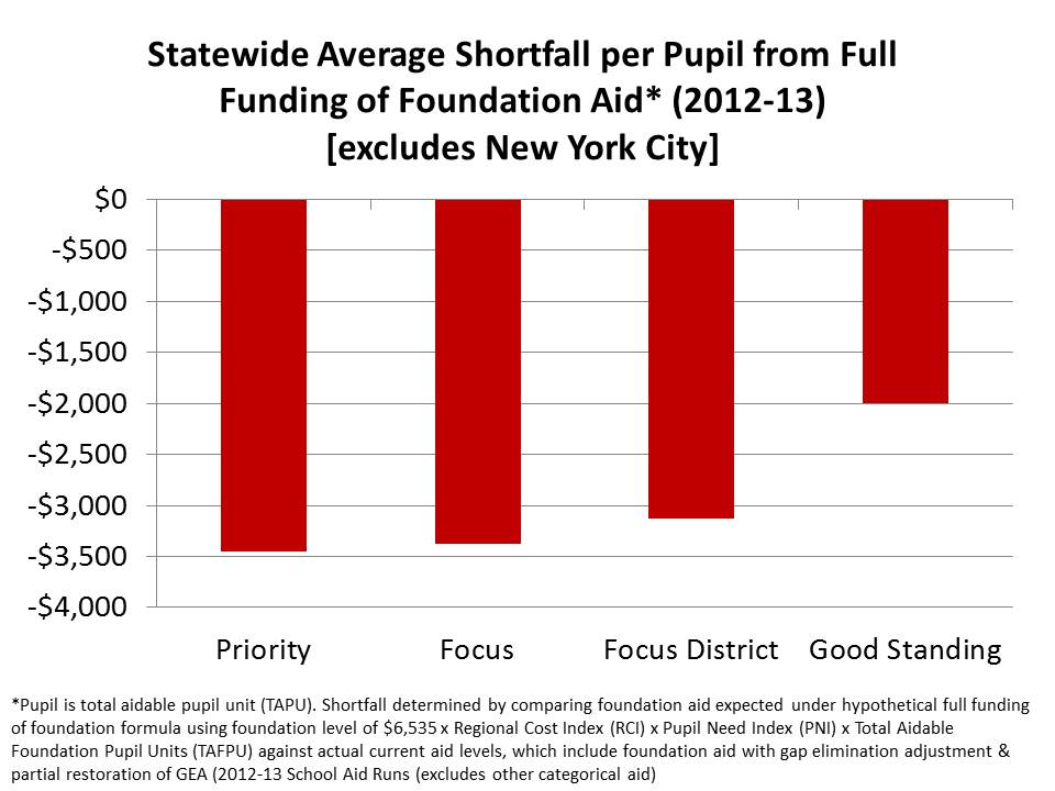
To rub salt in the wound, even though back in 2003 New York State was ordered to correct deficiencies in school funding across districts, and even thought state itself proposed a relatively inadequate formula to address those disparities, the state has continued to ignore its own formula – shorting by the largest amounts, those districts that are home to the most priority schools. (for a thorough analysis, see: https://schoolfinance101.com/wp-content/uploads/2010/01/ny-aid-policy-brief_fall2011_draft6.pdf)
This is where we last left off:
But, my analysis last week largely left out New York City schools. Bear in mind that New York City like many other high need districts around the state continues to be substantially shorted under the state’s own proposed foundation funding formula.
Demographics in New York City
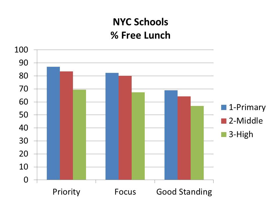
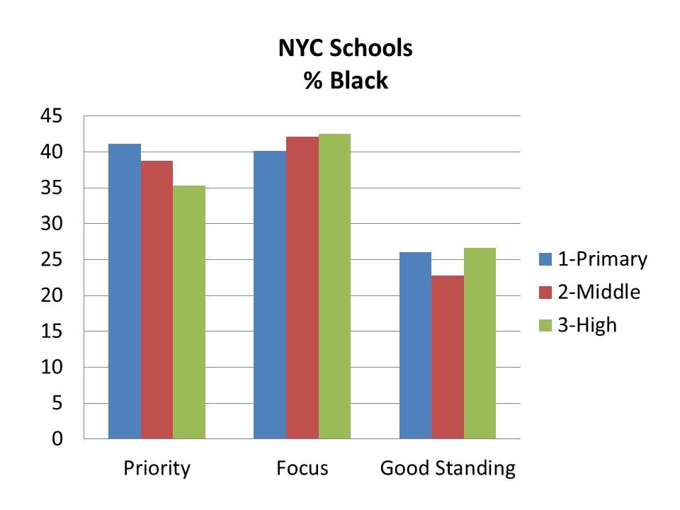
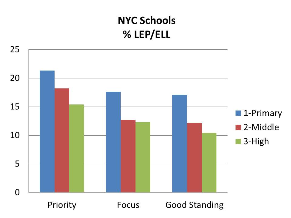
First, let’s do a walk-through of the demographic characteristics of New York City schools by their classification under the new state rating system. Bear in mind that the degree of variation in demography across schools in New York City is somewhat more limited than across the state as a whole. On average, in New York City, more schools have higher average minority concentrations and higher average low income concentrations than the state as a whole.
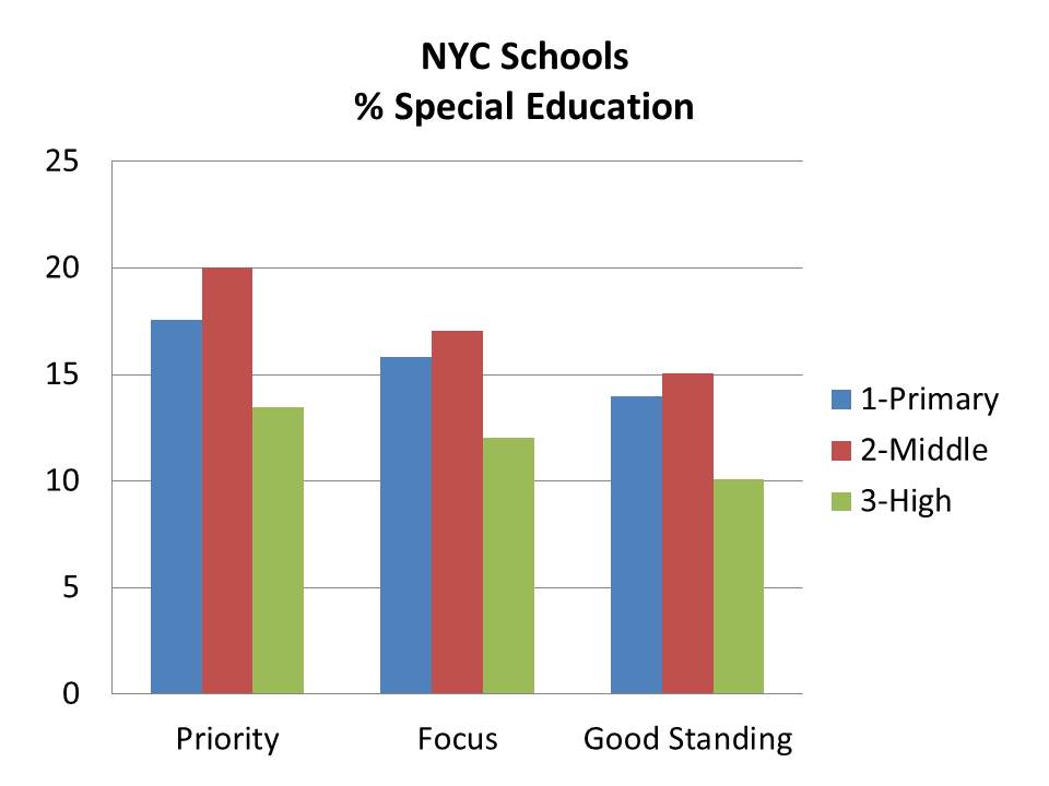
The following figures play out largely as one might expect – with priority schools having a) the highest concentrations of low income students, b) elevated concentrations of black and Hispanic students, c) and the highest concentrations of LEP/ELL and special education students.
In other words, it would certainly seem that while reformy-rhetoric dictates that demography should not determine destiny, demography remains a pretty strong determinant of a school’s post-nclb-waivery-classification-status.
When I run statistical tests of the relationship between demographic factors and the likelihood that a school is identified as a “priority” school, I find:
- A 1% increase in % Free Lunch (controlling for grade level) is associated with a 4.6% (p<.01) increase in the likelihood of being classified as a “priority” school.
- A 1% increase in % Black (controlling for grade level) is associated with a 1.2% (p<.01) increase in the likelihood of being classified as a “priority” school.
- A 1% increase in % Hispanic (controlling for grade level) is associated with a 2.1% (p<.01) increase in the likelihood of being classified as a “priority” school.
- A 1% increase in % Special Education (controlling for grade level) is associated with a 13% (p<.01) increase in the likelihood of being classified as a “priority” school.
Resources by Demographics in New York City
My next cut at the NYC data explores the position of priority schools with respect to a) low income students, b) special education students and c) per pupil spending (school level).
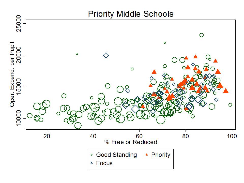
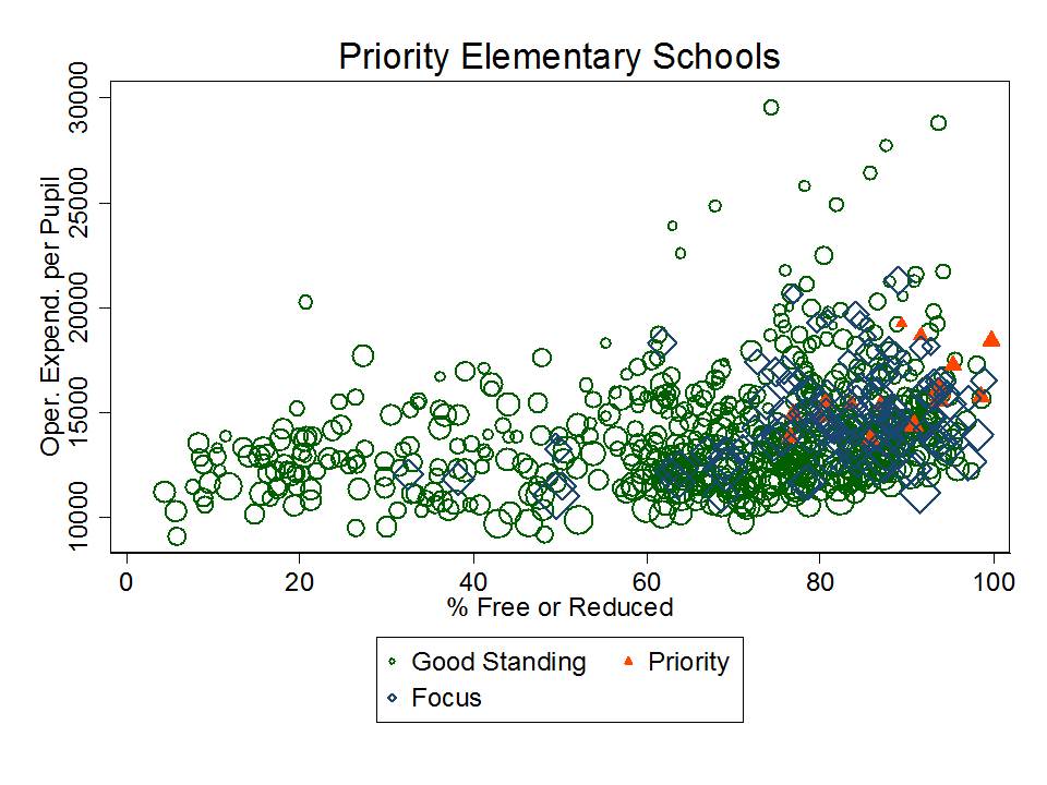
In the first two figures, we see that priority secondary schools (or at least those serving students through the secondary grades) are somewhat spread out by % free or reduced lunch. Note that bubble/diamond/triangle size indicates school size. However, there don’t appear to be any priority high schools among the lowest poverty schools, and a relatively large share appear among the higher poverty schools. They are relatively average, compared to schools with similar % free or reduced lunch, in terms of their school site spending.
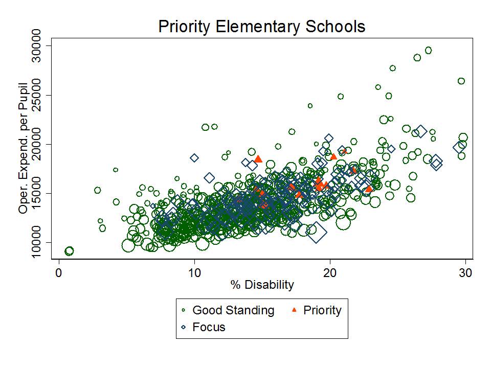
In the second figure, we can see that those high schools identified as priority all have at least a minimum threshold of children with disabilities. But, all high schools with few or no children with disabilities are in good standing. That includes numerous relatively small high schools that also have much higher per pupil spending even though they have far fewer children in special education.
Priority middle schools also have relatively average per pupil spending compared to schools with similar concentrations of low income or special education students – but they all tend to have relatively high concentrations of low income children and children with disabilities.
None of the middle schools with lower concentration of low income children or children in special education are classified as priority schools.
 For elementary schools, priority schools (again in red… but somewhat hidden behind others) tend to be very high in concentrations of low income students and moderately high in concentrations of children with disabilities. Again, they are relatively average in their per pupil spending compared to similar schools.
Outcomes in New York City
Now, the findings in the previous section might… might… on the outside chance suggest that there really is something about these priority schools that warrants additional investigation. After all, they do have similar resources to other schools serving high need populations. And while the priority schools tend to have high need populations, other schools with similarly high need populations and similar resource levels are either “focus” schools or “in good standing.”
But, it is still important to remember that the state has NOT identified as priority schools, any schools that serve low need populations and do less will in terms of outcomes compared to other schools serving low need populations and with comparable resource levels.
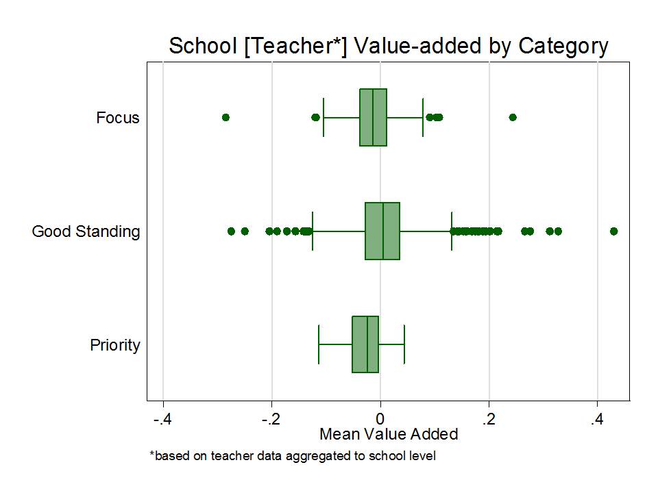
For this next graph, I took the NYC teacher level value-added data and averaged them to the school level for all teachers in each school, as in my previous post on NYC charter school teachers. (caveats included on previous post). Note that I’ve removed quite a bit of the variation in these value-added scores by aggregating them to the school level prior to constructing this graph.
While the differences in mean teacher value-added do fall in the right rank order – highest mean for good standing, second for focus and lowest for priority, the variations among schools around these means certainly muddy the waters a bit. Yes, the means are different, but the boxes overlap quite substantially! And the consequences of being in one group versus another are quite substantial.
Shouldn’t it be the case that no priority schools have “better” average teachers (by the limited noisy measure used here) than schools in “good standing?” How does it make sense that there are schools in “good standing” that fall well below the average for teacher value-added of “priority” schools, even if those cases are relatively rare?
For one last statistical shot at teasing out what’s going on here, I ran a logistic regression to figure out a) whether and to what extent these differences in value-added are significant predictors of landing in priority status and b) whether a school that has more low income and minority students is more likely to land in priority status – even if it has the same teacher value-added scores? That is, even if those statistically “bad” teachers aren’t to blame!
In other words, is there racial/socio-economic bias in the school ratings among schools with similar teacher value added?
Here it is:
For interpretation, I used the average value-added percentile of teachers here (in place of the standardized value-added score).
What this output shows is that for a 1 percentile rank increase in the school average teacher value added, a school is about 8.4% less likely (91.6%% as likely) to be classified as priority. Having a higher aggregate value-added teacher percentile rank significantly reduces the likelihood that a schools is identified as priority. That makes sense… but certainly isn’t the whole story… and as the graph above shows, there’s a fair amount of variation within each category.
Here’s the problem. Even among schools that have the same aggregate teacher value added percentile:
- schools with 1% higher free or reduced price lunch are 4.4% more likely to be classified as priority
- schools with 1% more black children are 8.7% more likely to be classified as priority
- schools with 1% more Hispanic children are nearly 8% more likely to be classified as priority
- schools with 1% more children with disabilities are 9% more likely to be classified as priority.
And each of these biases is significant, and of non-trivial magnitude, as well.
Let’s review what this means in simple, blunt terms.
These findings mean that even in schools where the teachers have the same average value added rank/percentile, schools with more low income, minority and special education children are more likely to face anti-democratic intervention!!!!!
Now that doesn’t seem to make a whole lot of sense when the supposed reason for the need for these interventions is that these poor, minority schools simply have all of the “bad teachers,” and when a central strategy to be employed is to replace/displace the school staff.
Closing Thought
I can hear the reformy outcry that this whole multi-level coercive illegal power grab to impose reformy intervention is in fact a critical step toward guaranteeing that demography isn’t destiny… to make widely known the fact that we’ve continued to provide minority and low income students the worst teachers and the worst schools. And that those teachers and schools must go [even if many of them outperform teachers in schools in “good standing” on their noisy/biased VAM estimate?]! Even if that means complete disregard for our current system of government. And even if that means that the parents, children and employees in these schools have to be forced to forgo additional constitutional and statutory protections (depending on the imposed reform).
It would be one thing if the measurement systems we were using to classify these schools as “failing” were valid for making such decisive declarations. That is, valid for making the assertion that it is the quality of the school and its teachers – and other controllable factors – that are primarily responsible for the performance.
Such arguments would be more reasonable if the disparate impact shown here was actually a disparate impact of school quality variation rather than a disparate impact in the application biased of school ratings, constructed from inadequate measures and inappropriate analysis (utter disregard for error, bias, etc., etc., etc.).
