Blog

Smart Guy (Gates) makes my list of “Dumbest Stuff I’ve Ever Read!”

Bill Gates (clearly a very smart guy) has just topped my list of Dumbest Stuff I’ve Ever Read for the first few months of 2011. He did it with this post in the Huffington Post and with his talk to State Governors (in which he also naively handed out copies of the book Stretching the School Dollar, which is complete junk):

http://www.huffingtonpost.com/bill-gates/bill-gates-school-performance_b_829771.html

Let’s dissect two bold premises of Gates’ argument about US spending and student outcomes – how we’ve spent ourselves crazy for decades and how we’ve gotten nothing for it – how we spend so much more than other countries, but they kick our butts – his reasons for arguing that now is the time to flip the curve.

Gates opines:

Compared to other countries, America has spent more and achieved less.

To be able to make such a comparison, one would have to be able to accurately and precisely measure education spending levels in the United States relative to education spending levels in other countries, and achievement outcomes of children in the United States compared to otherwise similar children in other countries. We’ve already heard much blog talk about how poverty rates among US children and children in Finland are, well, not really so comparable – Finland having much lower poverty. Clearly, that makes at least some difference.

But let’s focus on the expenditure side of this puzzle for a moment.

We don’t hear enough about how those expenditure figures are, well, not so comparable either.

International education spending comparisons like those presented by the Organization for Economic Cooperation and Development (OECD) and often reported by organizations like McKinsey are, well, bogus…meaningless… uh…not particularly useful. Why? Because they are not comparable. Plain and simple.

Government or public education expenditures in different countries contain different components. A number of my colleagues and I are in the process of better understanding and delineating the components included in public education expenditures across nations. For example, in a country with a national health care system, public education expenditures may not include health care expenses for all employees. That’s not a trivial expense. The same may be true of pension contributions and obligations, where they exist, in other countries. The same is also true for arts and athletic programs in countries where it is more common for those activities to be embedded in community services. But, we’ve yet to fully identify the extent of these differences across nations or how these differences affect the spending comparisons. What we do know is that they do affect the spending comparisons – and likely quite significantly.

So, that in mind, what can we say about how much the US spends with respect to how well our children do, compared to other countries’ spending and outcomes when neither the spending figure nor the children in the system are even remotely comparable? Not much!

Gates opines:

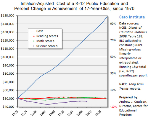
Over the last four decades, the per-student cost of running our K-12 schools has more than doubled, while our student achievement has remained flat, and other countries have raced ahead.

[from a previous post]

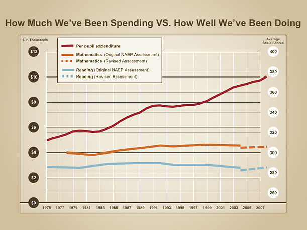
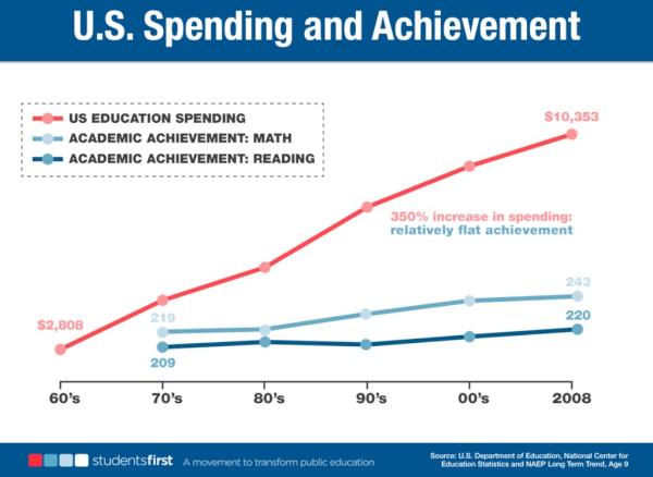
We often see pundits arguing that education spending has doubled over a 30 year period, when adjusted for inflation, and we’ve gotten nothing for it. We’ve got modest growth in NAEP scores and huge growth in spending. And those international comparisons… wow!

The assertion is therefore that our public education system is less cost-effective now than it was 30 years ago. But this assumption is based on layers of flawed reasoning, on both sides of the equation.

Here’s a bit of School Finance 101 on this topic:

First, what are the two sides of the equation, or at least the two parts of the fraction? The numerator here is education spending and how we measure it now compared to previously. The major flaw in the usual reasoning is that we are making our comparison of the education dollar now to then by simply adjusting the value of that dollar for the average changes in the prices of goods purchased by a typical consumer (food, fuel, etc.), or the Consumer Price Index.

Unfortunately, the consumer price index is relatively unhelpful (okay, useless) for comparing current education spending to past education spending, unless we are considering how many loaves of bread or gallons of gas can be purchased with the education dollar.

If we wanted to maintain constant quality education over time, the main thing we’d have to do is maintain a constant quality workforce in schools – mainly a teacher workforce, but also administrators, etc. At the very least, if quality lagged behind we’d have to be able to offset the quality losses with additional workers, but the trade-offs are hard to estimate.

The quality of the teacher workforce is influenced much more by the competitiveness of the wages for teachers, compared to other professions, than to changes in the price of a loaf of bread or gallon of gas. If we want to get good teachers, teaching must be perceived as a desirable profession with a competitive wage. That is, to maintain teacher quality we must maintain the competitiveness of teacher wages (which we have not over time) and to improve teacher quality, we must make teacher wages (or working conditions) more competitive. On average, non-teacher wage growth has far outpaced the CPI over time and on average, teacher wages have lagged behind non-teacher wages, even in New Jersey!

Now to the denominator or the outcomes of our education system. First of all, if we allow for a decline in the quality of the key input – teachers – we can expect a decline in the outcomes however we choose to measure them. But, it is also important to understand that if we wish to achieve either higher outcomes, or to achieve a broader array of outcomes, or to achieve higher outcomes in key areas without sacrificing the broader array of outcomes, costs will rise. In really simple terms, the cost of doing more is more, not less. And yes, a substantial body of rigorous peer-reviewed empirical literature supports this contention (a few examples below).

So, as we ask our schools to accomplish more we can expect the costs of those accomplishments to be greater. If we expect our children to compete in a 21st century economy, develop technology skills and still have access to physical education and arts, it will likely cost more, not less, than achieving the skills of 1970. But, we must also make sure we are adequately measuring the full range of outcomes we expect schools to accomplish. If we are expecting schools to produce engaged civic participants, we may or may not see the measured effects in elementary reading and math test scores.

An additional factor that affects the costs of achieving educational outcomes is the student inputs – or who is showing up at the schoolhouse door (or logging in to the virtual school). A substantial body of research (see chapter by Duncombe and Yinger, here) explains how child poverty, limited English proficiency, unplanned mobility and even school racial composition may influence the costs of achieving any given level of student outcomes. Differences in the ways children are sorted across districts and schools create large differences in the costs of achieving comparable outcomes and so too do changes in the overall demography of the student population over time. Escalating poverty, and mobility induced by housing disruptions, increased numbers of children not speaking English proficiently all lead to increases of the cost of achieving even the same level of outcomes achieved in prior years. This is not an excuse. It’s reality. It costs more to achieve the same outcomes with some students than with others.

In short, the “cost” of education rises as a function of at least 3 major factors:

  1. Changes in the incoming student populations over time
  2. Changes in the desired outcomes for those students, including more rigorous core content area goals or increased breadth of outcome goals
  3. Changes in the competitive wage of the desired quality of school personnel

And the interaction of all three of these! For example, changing student populations making teaching more difficult (a working condition), meaning that a higher wage might be required to simply offset this change. Increasing the complexity of outcome goals might require a more skilled teaching workforce, requiring higher wages.

The combination of these forces often leads to an increase in education spending that far outpaces the consumer price index, and it should. Cost rise as we ask more of our schools, as we ask them to produce a citizenry that can compete in the future rather than the past. Costs rise as the student population inputs to our public schooling system change over time. Increased poverty, language barriers and other factors make even the current outcomes more costly to achieve. And costs of maintaining the quality of the teacher workforce change as competitive wages in other occupations and industries change, which they have.

Typically, state school finance systems have not kept up with the true increased costs of maintaining teacher quality, increased outcome demands or changing student demography. Nor have states sufficiently targeted resources to districts facing the highest costs of achieving desired outcomes. See www.schoolfundingfairness.org. And many states, with significantly changing demography including Arizona, California and Colorado have merely maintained or even cut current spending levels for decades (despite what would be increased costs of even maintaining current outcome levels).

Evaluating education spending solely on the basis of changes in the price of a loaf of bread and/or gallon of gasoline is, well, silly.

Notably, we may identify new “efficiencies” that allow us to produce comparable outcomes, with comparable kids at lower cost. We may find some of those efficiencies through existing variation across schools and districts, or through new experimentation. But it is downright foolish to pretend that those efficiencies are simply out there (even if we can’t see them, or don’t know them) and we can simply squeeze the current system into achieving comparable or better outcomes at lower cost.

Closing thought

So, Mr. Gates… neither of your two main premises rests on solid footing. Not only that, but these arguments are so commonplace and so intellectually flimsy and lazy as to be outright embarrassing.

I know you’ve got other things to think about and likely rely heavily on advisers to help you shape these arguments, much like politicians rely heavily on their staffers. Here’s a tip Mr. Gates. YOU ARE GETTING REALLY BAD, DEEPLY FLAWED ADVICE AND INFORMATION WHEN IT COMES TO SCHOOL FUNDING ARGUMENTS.

There are many, many credible school finance and economics of education scholars out there. Those who you have chosen to rely on in many instances – authors of Stretching the School Dollar and others are not credible scholars of school finance or education policy more generally. I tackle some of the other myths driving the current debate in these two recent posts:

School Funding Equity Smokescreens

School Funding Myths & Stepping Outside the “New Normal”

I don’t pretend by any stretch to be the only credible source, or the best one (or even one of the top 20, 50 or 100). And we in the field certainly don’t all agree on all, or perhaps even most topics. I’d try listing the many exceptional school finance and economics of education scholars here, but I’d likely end up leaving some really important ones out. I’ll gladly inform you directly regarding which scholars may provide the most useful information regarding specific topics and issues.

Cheers!

Related Readings

Baker, B.D., Taylor, L., Vedlitz, A. (2008) Adequacy Estimates and the Implications of Common Standards for the Cost of Instruction. National Research Council.  http://www7.nationalacademies.org/CFE/Taylor%20Paper.pdf

Duncombe, W., Lukemeyer, A., Yinger, J. (2006) The No Child Left Behind Act: Have Federal Funds been Left Behind? http://cpr.maxwell.syr.edu/efap/Publications/costing_out.pdf

This second one is a really fun article showing the vast differences in the costs of achieving NCLB proficiency targets in two neighboring states which happen to have very different testing standards. In really simple terms, Missouri has a hard test with low proficiency rates and Kansas and easy test with high proficiency rates. The authors show the cost implications of achieving the lower, versus higher tested achievement standards.

School Funding Equity Smokescreens: A note to the Equity Commission

In this blog post, I summarize a number of issues I’ve addressed in the past. In my previous post, I discussed general reformy myths about school spending. In this post, I address smokescreens commonly occurring in DC beltway rhetoric about school funding equity and adequacy. School funding is largely a state and local issue, where even that “local” component is governed under state policies. So I guess that makes it a state issue, really. Occasionally, the federal government will dabble in the debate over how or whether to intervene more extensively in state and local public school finance.  Now is one of those times where the federal government is again at least paying lip services to the question of equity – with some implication that they may even be talking about school funding equity. The federal government has created an equity commission!

One of my fears is that this current discussion of funding equity will be typical of recent beltway discussions of school funding, and be trapped in the constant fog of School Funding Smokescreens and insulated entirely from more legitimate representations and analyses of the critical issues that should be addressed.

So, for you – the equity commission – here’s a quick run down on School Funding Smokescreens:

1. On average, nationally, we now put more funding into higher poverty school districts than lower poverty ones (to no avail)

This argument seems to be popping up more and more of late, and often with the table below attached. This table is from the National Center for Education Statistics and shows the average current operating expenditure per pupil of school districts nationally over time. The table would appear to show that in 1994-95, low poverty school districts had between $300 and $400 less in per pupil spending than higher poverty ones. By 2006-07, the highest poverty quintile of school districts had about $100 per pupil more than the lowest poverty quintile. That’s it. We’re done. Equity problems fixed. No more savage inequalities. And after all of this fixing of school finance equity, we really got nothing for it. Achievement gaps are still unacceptably large and NAEP scores stagnant? Right? All of this after dumping a whole extra $100 per pupil into high poverty districts. I guess we should be rethinking this crazy strategy of systematically pouring so much into high poverty districts.

Table 1

NCES Oversimplification of Funding Differences by Poverty


Well, to begin with, a $100 difference really wouldn’t be that much anyway, given that the costs of actually meeting the needs of children from economically disadvantaged backgrounds are much greater than this. Setting that (really important) question aside, this table provides a less than compelling argument that we as a nation have accomplished improved funding equity for kids in high poverty districts.

Here’s the underlying scatter of school districts that lead to the neatly packed aggregations above. In the graph below, districts are plotted by current expenditures per pupil with respect to census poverty rates, using 2007-08 data. Clearly there is substantial variation in current spending. In fact, the underlying relationship isn’t even a relationship at all. It’s all over the place. And yes, if you fit a trend line – if you take out a huge magnifying glass – you can see that the trendline is ever so slightly higher in the higher poverty schools than in the lower poverty ones (perhaps about $100?). It’s not systematic. It’s not statistically significant. It’s pretty darn meaningless.

Figure 1

Pattern of school districts underlying Table 1


In our recent report Is school funding fair? we conducted a far more rigorous analysis of state and local revenue per pupil with respect to poverty, for each state. What we showed was that there exists huge variation across states both in the overall level of resources available to local public school districts and in the differences in state and local revenue in higher and lower poverty districts.  In that report, we showed that 9 states have statistically significantly lower state and local revenue per pupil in higher poverty districts (after controlling for economies of scale and competitive wage variation). Overall, half of states had lower funding per pupil in higher poverty districts (with many of those approximately the same).

Among the worst states were New York, Illinois and Pennsylvania. Let’s pull Illinois forward in Figure 1 – and also look at state and local revenues (excluding federal support, to focus on state policies) in place of current expenditures.

Figure 2

State and local revenues with respect to poverty, with Illinois highlighted


Now, when we exclude federal revenues the overall line tips slightly downward. The federal effect is slight, but there. More strikingly, when we pull Illinois forward in the picture, we see that funding by poverty across Illinois districts is highly regressive, and is systematic and statistically significant. Funding inequities across Illinois districts are far from being resolved. AND ILLINOIS IS NOT ALONE. I could go on and on with this.

2. The remaining (Because of #1), most egregious disparities in funding and teacher quality occur across schools within districts (because of politically motivated and corrupt local administrators) and these disparities are what cause the persistent racial achievement gaps (the reason those gaps haven’t improved since we’ve fixed between district inequity)

To many, this argument seems absurd (and is) on its face. Who really says that? Does anyone? Am I just makin’ this stuff up? No. And in fact, because this argument has become so pervasive of late, I even had to take the time to write a fairly extensive research article on the topic. See: http://epaa.asu.edu/ojs/article/view/718

I have written about this topic on my blog on several occasions and much of my writing on this topic can be found by reading my critiques of reports from the Center for American Progress and from the Education Trust. Here are some choice quotes where CAP and Ed Trust frame this argument – or blow this smoke!

Center for American Progress

State funding formulas tend to exert an equalizing effect on per pupil revenues between districts, on average, and not by accident. These formulas were sculpted by two generations of litigation and legislation seeking equitable or adequate funding for property-poor school districts.

Scandalous inequity in the distribution of resources within school districts has plagued U.S. education for more than a hundred years.

empirical literature documenting the extent of within-district inequity is astonishingly thin. [my reply: well, not if you actually read the research on the topic]

Center for American Progress

The outcome of such practices is predictable: A further widening of the dangerous achievement gap that has become endemic in American schools today.

Education Trust

Many states have made progress in closing the funding gaps between affluent school districts and those serving the highest concentrations of low-income children. But a hidden funding gap between high-poverty and low-poverty schools persists between schools within the same district.

These gaps occur partly because teachers in wealthier schools tend to earn more than their peers in high-poverty schools and because of pressure to “equalize” other resources across schools.

All of these claims that within district inequities are the major source of persistent inequity and that our failure to close within district funding and teacher quality gaps (having already fixed between district ones) are the reason for persistent black-white and poor-non-poor achievement gaps might be reasonable if poor children and non-poor children and black children and white children actually lived in the same school districts. BUT, IN GENERAL,* THEY DO NOT! As a result this argument is patently absurd, ridiculous, irresponsible and ignorant. It’s one massive distraction. A smokescreen of monumental proportion!

Here’s a quick visual of the reality that any informed analyst (or anyone who simply lives in the real world) understands. Below are two maps of the Chicago metropolitan area. On the left is a map which shows school districts and the level of state and local revenue per pupil in each of those districts. We know from above that Illinois maintains a very regressive state school finance formula. That is, higher poverty districts have less funding than lower poverty ones. Note that the diagonal shading indicates the location of districts that have majority minority (black and Hispanic) enrollment. As it turns out, most of those districts are in the orange – lower funding levels.

Now, CAP and Ed Trust would have you believe otherwise to begin with (that poor minority districts already have enough money), but would then go further to say that the real problem is that these Illinois districts are putting money into their white, rich schools at the expense of their poor black and Hispanic ones. How is that even possible?

Okay, so let’s look at the right hand panel, in which I have indicated the locations of individual schools, with majority black schools in red and majority Hispanic schools in purple. Majority white schools are in white. NOTE THAT THE WHITE DOTS TEND TO BE DISTRICTS ENTIRELY SEPARATE FROM THE PURPLE OR RED ONES. AND ONLY CHICAGO PUBLIC SCHOOLS HAS MUCH OF A MIX OF PURPLE AND RED. Only a handful of districts have both white and majority minority schools. Also, only a handful of districts have both low(er) poverty and high poverty schools. Districts are highly segregated.

Figure 3

State and Local Revenue and the Location of Majority Minority Schools in Illinois


FEW IF ANY SCHOOL DISTRICTS IN THIS MAP HAVE THE OPPORTUNITY TO REDISTRIBUTE RESOURCES ACROSS THEIR “RICH” AND “POOR” OR “BLACK” AND “WHITE” SCHOOLS – BECAUSE THEY DON’T HAVE BOTH!!!!!  Yes, Chicago Public Schools and a few other districts can re-allocate between poor black and poor Hispanic schools. But such re-allocation accomplishes little toward improving educational equity in the Chicago metro area or State of Illinois.

Now… to those at Ed Trust and CAP – if you really don’t mean this, I dare you to actually say it. Say that between district differences in demographics and funding are THE BIG ISSUE. At least as big if not much bigger than within district differences. Say it. Acknowledge it. I challenge you. Release another hastily crafted report and press release – but this time – having conclusions that are at least reasonably grounded in reality.  The data are unambiguous in this regard. Yes, within district disparities exist and it is important to address them. I will certainly admit that, and I’ve never said otherwise.  But solving within district resource variation alone will accomplish very little.

*Clarification – In states with county-wide districts, and large diverse populations, like Florida, one is more likely to see between school  within district segregation to be a greater problem.

3. High need, poor urban districts (in addition to misallocating all of their resources to the schools serving rich white kids in their district???) are simply wasting massive sums of money on things like cheer leading and ceramics.

This is another absurd and empirically unfounded argument. Again, you ask, is anyone really saying that high need, low performing school districts are actually wasting money on cheerleading and ceramics that could easily be translated into sufficient resources for improving reading and math performance (can we really fire the cheer leading coach and hire 6 more math specialists)? Surely no-one is advancing an argument – SMOKESCREEN – that utterly absurd. But again, these quotes can be found all over the Beltway talk-circuit regarding the best fixes for school funding inequities and inefficiencies (and nifty was to stretch that school dollar).

Here’s the advertisement headline from a recent beltway discussion at the Urban Institute:

Urban Institute Event Headline (based on content from Marguerite Roza)

Imagine a high school that spends $328 per student for math courses and $1,348 per cheerleader for cheerleading activities. Or a school where the average per-student cost of offering ceramics was $1,608; cosmetology, $1,997; and such core subjects as science, $739.

I’ve only recently begun exploring more deeply the resource differences across school districts that fall into different performance and efficiency categories. I’ve been specifically looking at Illinois and Missouri school districts, and estimating statistical models to determine which districts are:

a) resource constrained and low performing (low-low)

b) resource constrained and high performing (low-high)

c) resource rich and high performing (high-high)

d) resource rich and low performing (high-low)

These categories are based on thoroughly cost adjusted analysis. As such, a district identified as having low or constrained “resources” may actually spend more per pupil in nominal dollars than a district identified as having high resource levels. The resource levels are adjusted for various cost pressures including differences in student needs. I should be posting the forthcoming paper on my research page some time in the next month. But here’s a preview.

In both states, most districts fall into categories a) and c), where you would expect. There’s somewhat more “scatter” in Missouri, either because Missouri has some better funded high need districts (less regressive than Illinois) or because my statistical model just isn’t working quite right. I picked these neighboring states because Missouri is less regressive than Illinois and because I had similar data on both. So, the big question here is – if I compare the dominant categories of resource constrained low performing schools to resource rich high performing ones what do we actually see in the organization of their staffing and course delivery?

In Missouri, I tabulate each individual course to which teachers are assigned. In Illinois my tabulation is by the main assignment of each teacher. To begin with, in both states, the high spending high performing schools have more course offerings per pupil and more teachers per pupil (and smaller class sizes). These differences are far greater under the more regressive Illinois policies.

Here are a few fun visuals of what I’m finding so far, expressed in “shares of staff” allocation and relating staffing allocations in low-low districts to those of high-high districts.

The first two graphs compare the main assignments of teachers in high resource high performing Illinois schools (high school assignments only) to those in low resource low performing ones. The diagonal line represents “comparable” allocation to high resource high performing schools. Assignments falling below the line represent “deficits” (relative) in low resource low performing schools.

Across all assignment areas, Figure 4 shows that kids in low resource low performing schools tend to have reduced access to physical education, biology, chemistry and foreign language. Sadly, no indicator for ceramics in these data.

Figure 4

Allocation of Main Teaching Assignments in Illinois Districts


Focusing on less frequent assignment areas – lower budget share & staff allocation areas – Figure 5 shows that in Illinois, kids in low resource low performing schools tend to have reduced access to advanced math and science courses and drivers education, but have greater access to basic courses. That is, these districts are already channeling their resources to the basic, at the detriment of potentially important advanced coursework in math and science, and even basic coursework in biology and chemistry.

Figure 5

Allocation of Main Teaching Assignments in Illinois Districts (less frequent assignments)


Missouri – despite having somewhat higher relative resource levels in higher poverty settings (than Illinois, but still regressive), shows very similar patterns. Figure 6 shows reduced access to physical education for kids in low resource low outcome schools and elevated access to “general” math and language arts courses.

Figure 6

Allocation of Assigned Courses in Missouri Districts


Kids in low resource low outcome schools have reduced access to advanced math courses including calculus and trigonometry, and reduced access to chemistry. They have higher shares of teachers in special education, basic life skills, earth and physical (basic/introductory) science and in JROTC. Again, significant reallocation to “basics” is already occurring and within significant resource constraints.

Figure 7

Allocation of Assigned Courses in Missouri Districts (less frequent courses)


Also, LET IT BE KNOWN THAT HIGH SPENDING HIGH PERFORMING SCHOOLS IN MISSOURI HAVE TWICE AS MANY CERAMICS COURSE OFFERINGS PER PUPIL AS LOW SPENDIGN LOW PERFORMING MISSOURI SCHOOLS!!!!!

4. None of this school funding equity – between district stuff – matters anyway!

Rigorous peer reviewed studies do show that state school finance reforms matter. Shifting the level of funding can improve the quality of teacher workforce and ultimately the level of student outcomes and shifting the distribution of resources can shift the distribution of outcomes.

We conclude that there is arbitrariness in how research in this area appears to have shaped the perceptions and discourse of policymakers and the public. Methodological complexities and design problems plague finance impact studies. Advocacy research that has received considerable attention in the press and elsewhere has taken shortcuts toward desired conclusions, and this is troubling. As demonstrated by our own second look at the states discussed in Hanushek and Lindseth’s book, the methods used for such relatively superficial analyses are easily manipulable and do not necessarily lead to the book’s conclusions. Higher quality research, in contrast, shows that states that implemented significant reforms to the level and/or distribution of funding tend to have significant gains in student outcomes. Moreover, we stress the importance of the specific nature of any given reform: positive outcomes are likely to arise only if the reform is both significant and sustained. Court orders alone do not ensure improved outcomes, nor do short-term responses.

Dice Rolling Activity for New Jersey Teachers

Yesterday, New Jersey’s Education Commissioner announced his plans for how teachers should be evaluated, what teachers should have to do to achieve tenure, and on what basis a teacher could be relieved of tenure. In short, Commissioner Cerf borrowed from the Colorado teacher tenure and evaluation plan which includes a few key elements (Colorado version outlined at end of post):

1. Evaluations based 50% on teacher effectiveness ratings generated with student assessment data – or value-added modeling (though not stated in those specific terms)

2. Teachers must receive 3 positive evaluations in a row in order to achieve tenure.

3. Teachers can lose tenure status or be placed at risk of losing tenure status if they receive 2 negative evaluations in a row.

This post is intended to illustrate just how ill-conceived – how poorly thought out – the above parameters are. This all seems logical on its face, to anyone who knows little or nothing about the fallibility of measuring teacher effectiveness or probability and statistics more generally. Of course we only want to tenure “good” teachers and we want a simple mechanism to get rid of bad ones. If it was only that easy to set up simple parameters of goodness and badness and put such a system into place. Well, it’s not.

Here’s an activity for teachers to try today. It may take more than a day to get it done.

MATERIALS: DICE (well, really just one Die)! That’s all you need!

STEP 1: Roll Die. Record result. Roll again. Record result. Keep rolling until you get the same number 3 times in a row. STOP. Write down the total number of rolls.

STEP 2: Roll Die. Record result. Roll again. Record result. Keep rolling until you get the same number 2 times in a row. STOP. Write down the total number of rolls.

Post your results in the comments section below.

Now, what the heck does this all mean? Well, as I’ve written on multiple occasions, the year to year instability of teacher ratings based on student assessment scores is huge. Alternatively stated, the relationship between a teacher’s rating in one year and the next is pretty weak. The likelihood of getting the same rating two straight years is pretty low, and three straight years is very low. The year to year correlation, whether we are talking about the recent Gates/Kane studies or previous work, is about .2 to .3. There’s about a 35% chance that an average teacher in any year is misidentified as poor, given one year of data, and 25% chance given two years of data. That’s very high error rate and very low year to year relationship. This is noise. Error. Teachers – this is not something over which you have control! Teachers have little control over whether they can get 3 good years in a row. AND IN THIS CASE, I’M TALKING ONLY ABOUT THE NOISE IN THE DATA, NOT THE BIAS RESULTING FROM WHICH STUDENTS YOU HAVE!

What does this mean for teachers being tenured and de-tenured under the above parameters? Given the random error, instability alone, it could take quite a long time, a damn long time for any teacher to actually string together 3 good years of value added ratings. And even if one does, we can’t be that confident that he/she is really a good teacher. The dice rolling activity above may actually provide a reasonable estimate of how long it would take a teacher to get tenure (depending on how high or low teacher ratings have to be to achieve or lose tenure). In that case, you’ve got a 1/6 chance with each roll that you get the same number you got on the previous. Of course, getting the same number as your first roll two more times is a much lower probability than getting that number only one more time. You can play it more conservatively by just seeing how long it takes to get 3 rolls in a row where you get a 4, 5 or 6 (above average rating), and then how long it takes to get only two in a row of a 1, 2, or 3.

What does that mean? That means that it could take a damn long time to string together the ratings to get tenure, and not very long to be on the chopping block for losing it. Try the activity. Report your results below.

Each roll above is one year of experience. How many rolls did it take you to get tenure? And how long to lose it?

Now, I’ve actually given you a break here, because I’ve assumed that when you got the first of three in a row, that the number you got was equivalent to a “good” teacher rating. It might have been a bad, or just average rating. So, when you got three in a row, those three in a row might get you fired instead of tenured. So, let’s assume a 5 or a 6 represent a good rating. Try the exercise again and see how long it takes to get three 5s or three 6s in a row. (or increase your odds of either success or failure by lumping together any 5 or 6 as successful and any 1 or 2 as unsuccessful, or counting any roll of 1-3 as unsuccessful and any roll of 4 -6 as successful)

Of course, this change has to work both ways too. See how long it takes to get two 1s or two 2s in a row, assuming those represent bad ratings.

Now, defenders of this approach will likely argue that they are putting only 50% of the weight of evaluations on these measures. The rest will include a mix of other objective and subjective measures. The reality of an evaluation that includes a single large, or even significant weight, placed on a single quantified factor is that that specific factor necessarily becomes the tipping point, or trigger mechanism. It may be 50% of the evaluation weight, but it becomes 100% of the decision, because it’s a fixed, clearly defined (though poorly estimated) metric.

In short, based on the instability of measures alone, the average time to tenure will be quite long, and highly unpredictable. And, those who actually get tenure may not be much more effective, or any more, than those who don’t. It’s a crap shoot. Literally!

Then, losing tenure will be pretty easy… also on a crap shoot… but your odds of losing are much greater than your odds were of winning.

And who’s going to be lining up for these jobs?

Summary of research on “intertemporal instability” and “error rates”

The assumption in value-added modeling for estimating teacher “effectiveness” is that if one uses data on enough students passing through a given teacher each year, one can generate a stable estimate of the contribution of that teacher to those children’s achievement gains.[1] However, this assumption is problematic because of the concept of inter-temporal instability: that is, the same teacher is highly likely to get a very different value-added rating from one year to the next.  Tim Sass notes that the year-to-year correlation for a teacher’s value-added rating is only about 0.2 or 0.3 – at best a very modest correlation.  Sass also notes that:

About one quarter to one third of the teachers in the bottom and top quintiles stay in the same quintile from one year to the next while roughly 10 to 15 percent of teachers move all the way from the bottom quintile to the top and an equal proportion fall from the top quintile to the lowest quintile in the next year.[2]

Further, most of the change or difference in the teacher’s value-added rating from one year to the next is unexplainable – not by differences in observed student characteristics, peer characteristics or school characteristics.[3]

Similarly, preliminary analyses from the Measures of Effective Teaching Project, funded by the Bill and Melinda Gates Foundation found:

When the between-section or between-year correlation in teacher value-added is below .5, the implication is that more than half of the observed variation is due to transitory effects rather than stable differences between teachers. That is the case for all of the measures of value-added we calculated.[4]

While some statistical corrections and multi-year analysis might help, it is hard to guarantee or even be reasonably sure that a teacher would not be dismissed simply as a function of unexplainable low performance for two or three years in a row.

Classification & Model Prediction Error

Another technical problem of VAM teacher evaluation systems is classification and/or model prediction error.  Researchers at Mathematica Policy Research Institute in a study funded by the U.S. Department of Education carried out a series of statistical tests and reviews of existing studies to determine the identification “error” rates for ineffective teachers when using typical value-added modeling methods.[5] The report found:

Type I and II error rates for comparing a teacher’s performance to the average are likely to be about 25 percent with three years of data and 35 percent with one year of data. Corresponding error rates for overall false positive and negative errors are 10 and 20 percent, respectively.[6]

Type I error refers to the probability that based on a certain number of years of data, the model will find that a truly average teacher performed significantly worse than average.[7] So, that means that there is about a 25% chance, if using three years of data or 35% chance if using one year of data that a teacher who is “average” would be identified as “significantly worse than average” and potentially be fired.  Of particular concern is the likelihood that a “good teacher” is falsely identified as a “bad” teacher, in this case a “false positive” identification. According to the study, this occurs one in ten times (given three years of data) and two in ten (given only one year of data).

Same Teachers, Different Tests, Different Results

Determining whether a teacher is effective may vary depending on the assessment used for a specific subject area and not whether that teacher is a generally effective teacher in that subject area.  For example, Houston uses two standardized test each year to measure student achievement: the state Texas Assessment of Knowledge and Skills (TAKS) and the nationally-normed Stanford Achievement Test.[8] Corcoran and colleagues used Houston Independent School District (HISD) data from each test to calculate separate value-added measures for fourth and fifth grade teachers.[9] The authors found that a teacher’s value-added can vary considerably depending on which test is used.[10] Specifically:

among those who ranked in the top category (5) on the TAKS reading test, more than 17 percent ranked among the lowest two categories on the Stanford test.  Similarly, more than 15 percent of the lowest value-added teachers on the TAKS were in the highest two categories on the Stanford.[11]

Similar issues apply to tests on different scales – different possible ranges of scores, or different statistical modification or treatment of raw scores, for example, whether student test scores are first converted into standardized scores relative to an average score, or expressed on some other scale such as percentile rank (which is done is some cases but would generally be considered inappropriate).  For instance, if a teacher is typically assigned higher performing students and the scaling of a test is such that it becomes very difficult for students with high starting scores to improve over time, that teacher will be at a disadvantage. But, another test of the same content or simply with different scaling of scores (so that smaller gains are adjusted to reflect the relative difficulty of achieving those gains) may produce an entirely different rating for that teacher.

Brief Description of Colorado Model

Colorado, Louisiana, and Tennessee have teacher evaluation systems proposed that will require 50% or more of the evaluations to be based on their students’ academic growth.  This section summarizes the evaluation systems in these states as well as the procedural protections that are provided for teachers.

Colorado’s statute creates a state council for educator effectiveness that advises the state board of education.[12] A major goal of these councils is to aid in the creation of teacher evaluation systems that “every teacher is evaluated using multiple fair, transparent, timely, rigorous, and valid methods.”[13] Considerations of student academic growth must comprise at least 50% of each evaluation.[14] Quality measures for teachers must include “measures of student longitudinal academic growth” such as “interim assessments results or evidence of student work, provided that all are rigorous and comparable across classrooms and aligned with state model content standards and performance standards.”[15] These quality standards must take diverse factors into account including “special education, student mobility, and classrooms with a student population in which ninety-five percent meet the definition of high-risk student.”[16]

Colorado’s statute also calls for school districts to develop appeals procedures.  A teacher or principal who is deemed ineffective must receive written notice, documentation used for making this determination, and identification of deficiency.[17] Further, the school district must ensure that a tenured teacher who disagrees with this designation has “an opportunity to appeal that rating, in accordance with a fair and transparent process, where applicable, through collective bargaining.”[18] If no collective bargaining agreement is in place, then the teacher may request a review “by a mutually agreed-upon third party.”[19] The school district or board for cooperative services must develop a remediation plan to correct these deficiencies, which will include professional development opportunities that are intended to help the teacher achieve an effective rating in her next evaluation.[20] The teacher or principal must receive a reasonable amount of time to correct such deficiencies.[21]


[1] Tim R. Sass, The Stability of Value-Added Measures of Teacher Quality and Implications for Teacher Compensation Policy, Urban Institute (2008), available at http://www.urban.org/UploadedPDF/1001266_stabilityofvalue.pdf. See also Daniel F. McCaffrey et al., The Intertemporal Variability of Teacher Effect Estimates, 4 Educ. Fin. & Pol’y, 572 (2009).

[2] Sass, supra note 27.

[3] Id.

[4] Bill & Melinda Gates Foundation, supra note 26.

[5] Peter Z. Schochet & Hanley S. Chiang, Error Rates in Measuring Teacher and School Performance Based on Student Test Score Gains (NCEE 2010-4004). Washington, DC: National Center for Education Evaluation and Regional Assistance, Institute of Education Sciences, U.S. Department of Education (2010).

[6] Id.

[7] Id. at 12.

[8] Sean P. Corcoran, Jennifer L. Jennings & Andrew A. Beveridge, Teacher Effectiveness on High- and Low-Stakes Tests, Paper presented at the Institute for Research on Poverty summer workshop, Madison, WI (2010).

[9] Id.

[10] Id.

[11] Id.

[12] Co. Rev. Stat. § 22-9-105.5(2)(a) (2010).

[13] Id. § 22-9-105.5(3)(a).

[14] Id.

[15] Id.

[16] Id.  The statute also calls for the creation of performance evaluation councils that advise school districts.  Id. § 22-9-107(1).  The performance evaluation councils also help school districts develop teacher evaluation systems that must be based on the same measures as that developed by the state council for educator effectiveness.  Id. § 22-9-106(1)(e)(II).  However, the performance evaluation councils lose their authority to set standards once the state board has promulgated rules and the initial phase of statewide implementation has been completed.  Id. § 22-9-106(1)(e)(I).

[17] Id. § 22-9-106(3.5)(b)(II).

[18] Id.

[19] Id.

[20] Id.

[21] Id.

School Funding Myths & Stepping Outside the “New Normal”

I’ve been writing quite a bit lately about rather complex state school finance formula issues. That is much the point of this blog.  But it may be hard for some to see how my recent posts on school finance relate back to the broader reform agenda, and to understand the implications of these posts for state policies. Let me try to summarize these posts – posts on spending bubbles, the “New Normal” and school finance PORK.  My overarching goal in these posts is to explain that much of the reformy rhetoric about budget cuts and the “New Normal” is based on myth about how school funding works and what we should be doing in these catastrophic economic times.

Here are the myths and some of the realities.

Reformy myth #1: That every state has done its part and more, to pour money into high need, especially poor urban districts. It hasn’t worked, mainly because teachers are lazy and overpaid and not judged on effectiveness, measured by value-added scores. So, now is the time to slash the budgets of those high need districts, where all of the state aid is flowing, and fire the worst teachers. And, it will only help, not hurt.

Reality: Only a handful of states have actually targeted substantial additional resources to high need districts. See www.schoolfundingfairness.org. And the effort of states to finance their elementary and secondary education systems varies widely. Some states have in fact systematically reduced their effort to finance local public schools for decades. That is, the tax burden to finance public schools in some states is much lower now than it was decades ago. Very few states apply much higher effort than in the past.  See: https://schoolfinance101.wordpress.com/2010/12/23/is-it-the-new-normal-or-the-new-stupid/

Reformy myth #2: The only aid to be cut, the aid that should be cut, and the aid that must be cut in the name of the public good, is aid to high need, large urban districts in particular. The argument appears to be that handing down state aid cuts as a flat percent of state aid is the definition of “shared sacrifice.” And the garbage analysis of district Return on Investment by the Center for American Progress, of course, validates that high need urban districts tend to be least efficient anyway. Therefore, levying the largest cuts on those districts is entirely appropriate.

Reality: As I have discussed in my series of recent posts, if there are going to be cuts – if states really believe that cuts to state aid are absolutely necessary, many state aid formulas include aid that is more appropriate to cut. That is, aid to districts who really don’t need that aid. Aid to districts that can already spend well above all others with less local effort. Aid to districts that will readily replace their losses in state aid with additional local revenues (or even private contributions). That’s the pork, and that’s where cuts, if necessary, should occur.

Reformy myth #3: The general public is fed up and don’t want to waste any more of their hard earned tax dollars on public schools. They are fed up with greedy teachers with gold plated benefits and fed up with high paid administrators. They don’t care about small class sizes and…well… are just fed up with all of this taxing and spending on public schools that stink. As a result, the only answer is to cut that spending and simultaneously make schools better.

Reality: The reality is that local voters in a multitude of surveys rate their own local public schools quite highly and that local voters when given the opportunity, even during the recent economic downturn, show very high rates of support for school budgets – including budgets with significant increased property taxes (the most hated tax). As I noted in a previous post, when New Jersey handed down state aid cuts to 2010-2011 school budgets and when- for the first time in a long time- the majority of local district budgets statewide failed to achieve approval from local voters, it was still the case that the vast majority (72%) of local budgets passed in affluent communities – in most cases raising sufficient local property tax resources to cover the state aid cuts. In another case, local residents in an affluent suburban community raised privately $420,000 to save full day kindergarten programs. Meghan Murphy’s analysis of Hudson Valley school districts shows that New York State districts also have attempted to counterbalance state aid cuts with property tax increases, but that the districts have widely varied capacity to pull this off.  Parents in a Kansas district are suing in federal court requesting injunctive relief to allow them to raise their taxes for their schools (they use faulty logic and legal arguments, but their desire for better schools should be acknowledged!).

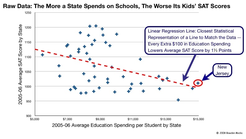
Reformy myth #4: None of this school funding stuff matters anyway. It doesn’t matter what the overall level of funding is and it doesn’t matter how that funding is distributed. As evidence of this truthiness, reformers point to 30+ years of huge spending growth coupled with massive class size reduction and they argue… flat NAEP scores, low international performance and flat SAT scores. Therefore, if we simply cut funding back to 1980 levels (adjusted only for the CPI) and fire bad teachers, we can achieve the same level of outcomes for one heck of a lot less money.

Reality: First of all, these comparisons of spending now to spending then are bogus. I address the various factors that influence the changing costs of achieving desired educational outcomes in this post: https://schoolfinance101.wordpress.com/2011/01/12/understanding-education-costs-versus-inflation/. Second, rigorous peer reviewed studies do show that state school finance reforms matter. Shifting the level of funding can improve the quality of teacher workforce and ultimately the level of student outcomes and shifting the distribution of resources can shift the distribution of outcomes. http://www.tcrecord.org/content.asp?contentid=16106 Similarly, constraining education spending growth over the long term can significantly harm the quality of public schools. See: https://schoolfinance101.wordpress.com/2010/04/22/a-few-quick-notes-on-tax-and-expenditure-limits-tels/

An opportunity for states?

I would argue that now… right now… represents a real opportunity for those states who actually want to step up, and really invest in the quality of their education systems and use the quality of their education systems to drive their economic futures.

I stumbled across this article http://www.foxnews.com/us/2011/02/13/states-offer-tax-breaks-guarantee-jobs/ on the Fox News website the other day, and it presents some useful insights for state policy makers regarding tax policy decisions and economic growth. I’ve written about the same point very early in my blogging (that the Small Business Survival Index in particular, misses some big points about location selection). Here’s a short section of the Fox News piece:

But there’s a catch to the anti-tax, pro-business rhetoric: Businesses consider a range of factors when deciding where to locate, including the quality of schools, roads and programs that rely on a certain level of public spending and regulation. And evidence suggests there is little correlation between a state’s tax rate and its overall economic health.

“Concerns about taxes are overstated,” said Matt Murray, a professor of economics at the University of Tennessee who studies state finance. “Labor costs, K-12 education and infrastructure availability are all part of a good business climate. And you can’t have those without some degree of taxation.”

States’ tax rates also do not predict their resilience during an economic downturn.

Arguably, no time is better than now. Other states are jumping on board with the “New Normal” reformy logic that slashing education budgets, increasing class sizes and narrowing curriculum around tested content areas is the only way to go. Yet, educated parents invariably want small class sizes (often topping the list of preferences for private or public schools) and want their children to have intellectually stimulating and broad, enriched curriculum. The current environment presents a great opportunity for some states to step outside the “New Normal” and truly race to the top with real investment in their public schooling systems.

Reformy Disconnect: “Quality Based” RIF?

I addressed this point previously in my post on cost-effectiveness of quality based layoffs, but it was buried deep in the post.

Reformers are increasingly calling for quality based layoffs versus seniority based layoffs, as if a simple dichotomy. Sounds like a no brainer when framed in these distorted terms.

I pointed out in the previous post that if the proposal on the table is really about using value-added teacher effect estimates versus years of service, we’re really talking about the choice between significantly biased and error prone – largely random – layoffs versus using years of service. It doesn’t sound as much like a no brainer when put in those terms, does it? While reformers might argue that seniority based layoffs are still more “error prone” than effectiveness rating layoffs, it is actually quite difficult to determine which, in this case, is more error prone. Existing simulation studies identifying value-added estimates as the less bad option, use value-added estimates to determine which option is better. Circular logic (as I previously wrote)?

We’re having this policy conversation about layoffs now because states are choosing (yes choosing, not forced, not by necessity) to slash aid to high need school districts that are highly dependent on state aid, and will likely be implementing reduction in force (RIF) policies. That is, laying off teachers. So, reformy pundits argue that they should be laying off those dead wood teachers – those with bad effectiveness ratings, instead of those young, energetic highly qualified ones.

So, here are the basic parameters for quality-based RIF:

1. We must mandate test-score based teacher effectiveness ratings as a basis for teacher layoffs.

2. But, we acknowledge that those effectiveness ratings can at best be applied to less than 20% of teachers in our districts, specifically teachers of record – classroom teachers – responsible for teaching math and reading in grades 3 to 8 (4 to 8 if only annual assessment data)

3. Districts are going to be faced with significant budget cuts which may require laying off around 5% or somewhat more of their total staff, including teaching staff.

4. But, districts should make efforts to layoff staff (teachers) not responsible for the teaching of core subject areas.

Is anyone else seeing the disconnect here? Yeah, there are many levels of it, some more obvious than others. Let’s take this from the district administrator’s/local board of education perspective:

“Okay, so I’m supposed to use effectiveness measures to decide which teachers to lay off. But, I only have effectiveness measures for those teachers who are supposed to be last on my list for lay offs? Those in core areas. The tested areas. How is that supposed to work?”

Indeed the point of the various “quality based layoff” simulations that have been presented (the logic of which is problematic) is to layoff teachers in core content areas and rely on improved average quality of core content teachers over time to drive system wide improvements. These simulations rely on heroic assumptions of a long waiting list of higher quality teacher applicants just frothing at the mouth to take those jobs from which they too might be fired within a few years due to random statistical error (or biased estimates) alone.

That aside, reduction in force isn’t about choosing which teachers to be dismissed so that you can replace them with better ones. It’s about budgetary crisis mode and reduction of total staffing costs. And reduction in force is not implemented in a synthetic scenario where the choice only exists to lay off either core classroom teachers based on seniority, or core classroom teachers based on effectiveness ratings (the constructed reality of the layoff simulations). Reduction in force is implemented with consideration for the full array of teaching positions that exist in any school or district. “Last in, first out” or LIFO as reformy types call it, does not mean ranking all teachers systemwide by experience and RIF-ing the newest teachers regardless of what they teach, or the program they are in. Specific programs and positions can be cut, and typically are.

And it is unlikely that local district administrators in high need districts would, or even should, look first to cut deeply into core content area teachers. So, a 5% staffing cut might be accomplished before ever cutting a single teacher for whom an effectiveness rating occurs – or very few. So, in the context of RIF, layoffs actually based on effectiveness ratings are a drop in the bucket.

So now I’m confused. Why is this such a pressing policy issue here and now? Does chipping away at seniority based provisions really have much to do with improving the implementation of RIF policies? Perhaps some are using the current economic environment and reformy momentum to achieve other long-run objectives?

Pork Hunting 101: Shredding the Pork

I love a good pulled pork sandwich. In fact, it’s one of my favorite foods. And the best damn pork sandwich I can think of is the Hog Heaven at Oklahoma Joe’s in the side of a freakin’ gas station in Kansas City, Kansas. I expect that this statement will perhaps be the most controversial statement I’ve made on this blog thus far.  Really… it’s awesome… and one of the few things I really miss about being in Kansas City.

That aside, I’ve been blogging lately about a different kind of PORK – school finance pork.  I started this pork campaign with a posting on state aid in New York after the announcement of Governor Cuomo’s proposed budget and education cuts. Despite large amounts of aid still being allocated to some of the wealthiest school districts in the nation, the good democratic Governor of New York decided it was somehow most appropriate to largely protect that aid, and instead slam the highest need, large urban, mid-sized city and poor rural districts in the state.

This post provides a primer on finding pork in state school finance formulas. It’s a two part process that begins with screening for pork, and then involves more intensive investigative research.

What is School Finance Pork? School finance pork is state aid that is currently being allocated to districts that otherwise don’t really need that aid. In this case, need is defined in terms of the needs of the students to be served AND in terms of the ability of the local public school districts and its residents and property owners to pay the cost of those services. In overly simple terms, some local public school districts can easily pay for the full cost of their needed educational programs and services on their own and with much less effort (tax effort) than others. Allocating state aid to these districts while depriving others with greater student needs and the inability to meet those needs is inexcusable. Cutting aid to needier communities who are unable to replace those lost revenues, while retaining aid to the wealthy is inexcusable. That’s PORK. And like other political pork-barrel spending, it exists because state legislators negotiate for state aid formulas that bring something home to their own districts.

How do legislators generate PORK? Pork can be generated by at least two different approaches. In the first approach, legislators actually try to manipulate the general state aid formula to find ways to argue that it’s actually more expensive to educate kids in wealthier communities, or alternatively that its cheaper to educate kids in poor communities. If legislators can raise the foundation funding targets to wealthy communities they can increase the likelihood that they can drive state support to those districts. Seems a bit of a stretch, but it’s been done by many. A second “within the formula” approach to generating pork is to adopt “minimum state aid” and/or hold harmless aid provisions that guarantee that no matter how wealthy a district is, that the state will still pick up X% of its formula funding. That is, the state will cover X% even if the district can raise double what it needs with very little tax effort. Another type of pork is Outside the Formula pork. It can be tricky (though not impossible) for legislators to sufficiently manipulate a state aid formula to provide more aid to wealthier districts. It’s relatively easy for state legislators to adopt outside the formula aid programs that allocate aid in very different ways – like flat allocations per pupil across all districts, regardless of local wealth, or even like New York’s property tax relief targeted to wealthier communities.

How do we screen for Pork? Here, I provide a few examples of screening for pork, using a national data set – the U.S. Census Bureau’s Fiscal Survey of Local Governments. As we stated in our Is School Funding Fair? A bare minimum goal of a state school finance formula would be to achieve a FLAT relationship between poverty and state and local revenue per pupil. Ideally, state school finance formulas would result in additional resources targeted to higher poverty districts – that is – systematically higher state and local revenue per pupil in higher poverty districts. One can take and state’s school finance data – here from 2007-08 – and make a graph of the a) local revenue per pupil, b) state aid per pupil and c) total revenue per pupil across districts by poverty. Here’s Texas:

I’ve dropped very small districts because they tend to scatter the pattern for a variety of legitimate cost related reasons.  Blue circles represent the state and local revenue per pupil, which on average in Texas has a slight downward slope. Red triangles are the local revenue. Clearly, the lower poverty districts are raising quite a bit in local revenue but the higher poverty districts aren’t raising much. On average the state aid in green squares is being allocated in inverse proportion to the local revenue… but not that aggresively. For example, if we look way to the upper left…. we’ve got some red triangles – local revenue per pupil – above $10,000 per pupil. That is, some of these very low poverty districts are able to raise on their own, over $10k per pupil. But look at the trajectory of the state aid allotments – those districts are still getting a significant amount of state aid – enough to still raise their totals even higher as pointed out by yellow arrows. Would it not make more sense for this aid to be allocated to the districts at the far right hand side of the picture? Amazingly, the state aid distribution slope in Texas is quite gradual – to be kind. It would appear to include significant “flat” distributions of either or both minimum aid and/or outside the formula aid which goes to lower poverty and/or higher wealth districts the expense of higher need, lower wealth districts. THAT’s PORK!

Here’s New York, when using the same data set:

And here’s Pennsylvania:

In Pennsylvania, minimum aid provisions and flat distribution of Special Education aid are partly to blame.

And here’s Illinois:

Illinois also has minimum aid provisions in the form of alternative formulas for districts otherwise too wealthy to receive aid through the primary foundation formula. And Illinois allocates numerous categorical aids outside the formula in ways that reinforce the aggregate disparities.

So, here are four states and in each one, total state and local revenue per pupil is slightly to significantly lower per pupil in higher poverty than in lower poverty districts. And in each state, the state aid is distributed in ways that guarantee the provision of at least some – sometimes significant – aid per pupil to districts that on their own are raising and spending significantly more money per pupil than their much higher need counterparts.

How do we identify the source of the Pork? This part is a bit harder, and requires much more detailed investigation of the state school finance formulas and of the “runs” of state aid programs. I hope to get a chance to provide more information on pork finding at a later point. But for those interested in exploring these issues on their own, there are two sources of information that are critical to the search – a) the documentation that  explains the calculations behind the allocation of state aid and b) much more importantly, what are called the “runs” of state aid allocations to local public school districts that are used by legislators to negotiate changes to the aid formula and/or the distribution of cuts. It’s that time of year – legislative session season. And legislators are interested to see which pieces of the aid formula will bring home pork, or how cuts will affect their districts. If you’re as warped as I am about this stuff… and actually really like digging through these numbers… contact your state legislators and find out who to get in touch with in order to get an electronic spreadsheet run of the various district by district state aid allocations. And be sure to get other basic district data, including wealth measures (property wealth and income) and enrollment characteristics (Total enrollments and student needs).  Play around with graphs of aid (divided by pupils – per pupil aid) with respect to wealth and need measures – and look for those aid programs in particular that appear to allocate systematically more aid to districts that are otherwise less needy. Feel free to e-mail me spreadsheets of those runs. If I get a chance, I’ll see what pork I can find!

Cheers.

And here’s to Pork!

Disparate thinking: The administration’s blind eye & racially disparate impact

Apparently the U.S. Department of Education has decided to take on public education policies that not only are intentionally racially discriminatory, but also state and local policies that happen to have a racially disparate impact on certain populations. Now, these are departmental regulations, not statutes and not a constitutional protection, so this doesn’t mean that advocates can start filing lawsuits on behalf of groups disparately affected by education policies (except where other state laws prohibiting disparate impact exist, like Illinois). But, it does mean that the U.S. Department of Education can use its biggest available threat – denial of funding – to pressure state and local education agencies to change policies that result in racially disparate impact.

Statistically, what disparate impact means is that the policy in question results in a disproportionate effect on one group of individuals versus another, where “groups” are defined by race, ethnicity or national origin. There are many occurrences in public education where racially disparate impact rears its ugly head. For example, racially disparate classification rates of children with disabilities, or racially disparate rates of disciplinary action. Identifying appropriate policy changes to reduce racially disparate impact in any of these areas, while not compromising other interests is indeed important – such as making sure that kids with legitimate special education needs still get identified and served, or making sure appropriate discipline is handed out where necessary.

The administration’s renewed interest in racially disparate impact was announced almost a year ago, and has apparently crept back into the conversation in the past few weeks.

Here’s the Education Week synopsis:

At the Feb. 11 briefing, Ricardo Soto, the deputy assistant secretary for the Education Department’s office for civil rights, elaborated on the office’s new policy, saying that the Obama administration is “using all the tools at our disposal,” including “disparate-impact theory,” to ensure that schools are fairly meting out discipline to students. Some research shows, for instance, that suspension rates for African-American males in middle school can be nearly three times as high as those for their white, male peers.

So, the interest here is specifically the racially disparate distribution of disciplinary actions. That’s all well and good. We should explore these issues and resolve them appropriately if we can. Once again, the usual target is local public school districts because when it comes to any of today’s education policy issues – in the eyes of the current administration and their closest advisers – only local public districts and local administrators can be to blame (even when it comes to funding disparities?).

But, as my readers know, this a school finance blog, and that means that eventually this topic is coming back around to school finance (okay, not always). Could it possibly be that some states actually continue to operate state school finance formulas that produce “racially disparate” effects? That is, that districts serving larger shares of minority children have systematically (statistically) less state and local revenue (the revenue under control of state policy) than districts with fewer minority children? And if so, which states might those be?

Clearly, substantial disparities in the quality of education received (funding, class sizes, teacher credentials, etc.) by minority children as a function of state policies to provide, or not, sufficient financial support to their schools is at least equally relevant to rates of discipline referrals of minority versus non minority children attending the same school or district.

In our report Is School Funding Fair?, We evaluated states in terms of whether they provided for systematically more or less state and local revenue per pupil in higher versus lower poverty districts.  Now, which states did the worst on this measure? Among the big ones, the most poverty disparate states in funding were Illinois, Pennsylvania and New York! New York makes this list largely because of its Pork barrel finance policies. And believe, me, Pennsylvania and Illinois have similar pork to shred. But poverty related disparities while important, don’t fall under this racially disparate impact umbrella. The real question here is which states have the largest racial disparities in school funding?

A few years back, Robert Bifulco, now at the Maxwell School at Syracuse, did a nice quick number crunch on black-white funding disparities nationally, in the Journal of Education Finance. On average, Bob found that without any corrections for costs related to student needs, or other costs, districts with higher concentrations of black enrollments had marginally higher per pupil spending. But after correcting for costs and needs, districts with higher black enrollments had lower per pupil spending. But, these findings, while interesting and useful, look at the nation as a whole, and, if I recall, do some breakouts by region.

Just like the poverty related variation we show in the fairness report, racial disparities in funding also vary widely across states. And those disparities occur for a variety of reasons. Yes, to some extent those disparities exist because of differences in local property wealth in blacker versus whiter communities and the state’s failure to allocate sufficient aid to offset those disparities. And in many places, those disparities in property values are largely a function of carefully planned racial segregation of housing stock and distribution of other property types (Brilliant article on real estate development in the Kansas City metro: http://www.tulane.edu/~kgotham/RestrCovenants.pdf)

BUT CAN A STATE LIKE NEW YORK REALLY CLAIM THAT THERE’S  JUST NOT ENOUGH AID AVAILABLE TO FIX THE RACIAL DISPARITIES WHEN IT IS DUMPING TAX RELIEF AID AND MINIMUM FOUNDATION AID INTO THE WEALTHIEST DISTRICTS IN THE COUNTRY? Redistributing the pork might not erase the disparities entirely, but it’s a start.

Other disparities actually exist by the design of the aid formulas, and various Tricks of the Trade that create racial disparities in funding – deceptively and arguably quite intentionally. Here’s an outstanding sarcastic, critical analysis of how Kansas legislators gamed their finance system to embed racially disparate effects over time: http://www.pitch.com/2005-04-14/news/funny-math/ (after reading this, consider the role of real estate development addressed in the Kansas City article above!)

Quick side-bar – This brilliant piece of school finance journalism is written by Tony Ortega, when he was in Kansas City (written from the perspective of a KC Strip Steak… it’s a Kansas City thing). Now, Tony is editor and chief of the Village Voice in NY. He Tony, how ‘bout that New York finance stuff? Subsidies for Scarsdale, while cutting Utica and Middletown, or Mt. Vernon? (even if from the perspective of a NY Strip Steak?)

There are lots of Tricks of the Trade used to reduce aid to high minority districts. A favorite choice of state legislators is to allocate aid based on average daily attendance rather than enrollment. Higher poverty, higher minority concentration districts tend to have lower attendance rates… thus reducing their aid, compared to what they would receive if the aid was allocated on the number of enrolled pupils.

There was a brief period in the late 1990s when three separate federal court challenges were filed against racially disparate state school finance systems – in Pennsylvania (Powell v. Ridge), in New York (AALDF v. State) and in Kansas (Robinson v. Kansas). These cases were cut off by a series of related decisions in the early 2000s (which basically said that an individual does not have a right to sue over racially disparate effects, because the language of “racially disparate” effects appears only in regulations and not in the Civil Rights statutes themselves).

Interestingly, around that time, the Illinois legislature countered with state legislation that prohibits policies having racially disparate effect (Illinois Civil Rights Act of 2003). And as it turns out, Illinois school districts are applying this law to challenge the Illinois school funding formula – a formula that is among the most racially disparate in the nation.

http://www.jenner.com/news/news_item.asp?id=15009924

So, what’s my point here? I’m doing a bit of rambling. Well, here’s my best shot at a synopsis.

1. Yes, it is important that the current administration explore the reasons for, and possible resolutions of racially disparate effects in such areas as discipline referrals or special education placement rates (although they appear focused on the former, not latter).

2. Yes, there exists the likelihood that local public school districts are engaged in practices that harm minority populations, ranging from the previously mentioned issues, to others such as highly tracked curricular offerings which result in significant within school and within district segregation, as well as attempts by some local boards of education to undo long running diversity plans.

3. But, I would argue, that while these issues are important, there are other at least equally important issues to be addressed – substantial racial disparities in funding and resulting programs and services – in some states far more than others. AND ILLINOIS IS ONE OF THOSE STATES!

4. And those racial disparities in funding are not entirely a result of not enough money to offset differences in local wealth, or neglect of the state aid formula (underfunding the formula) – WHICH IS BAD ENOUGH – but are largely a function of maintaining PORK in affluent communities at the expense of poor minority districts, and of Tricks of the Trade – or specific provisions in state school funding formulas that drive money to whiter districts and create or reinforce racial disparities.

READINGS

Green, P.C., Oluwole, J., Baker, B.D. (2010) Getting their hands dirty: How Alabama’s public officials may have maintained separate and unequal education. West’s Education Law Reporter 253 (2) 503‐
520

Green, P.C., Baker, B.D., Oluwole, J. (2008) Obtaining racial equal educational opportunity through school finance litigation. Stanford Journal of Civil Rights and Civil Liberties IV (2) 283‐338

Baker, B.D., Green, P.C. (2005) Tricks of the Trade: Legislative Actions in School Finance that Disadvantage Minorities in the Post‐Brown Era American Journal of Education 111 (May) 372‐413

Baker, B.D., Green, P.C. (2003) Commentary: The Application of Section 1983 to School Finance Litigation. West’s Education Law Reporter. 173 (3) 679‐696

Green, P.C., Baker, B.D. (2002) Circumventing Rodriguez: Can plaintiffs use the Equal Protection Clause to challenge school finance disparities caused by inequitable state distribution policies? Texas
Forum on Civil Liberties and Civil Rights 7 (2) 141 – 165

Where’s the Pork? Mitigating the Damage of State Aid Cuts

This is a very long and complicated post, so I’ll give you a few take home points up front…

Equity Center Radio on School Finance Pork: http://216.246.105.5/Audio_Recordings/2011-0053_ECRadio_Bruce_Baker_02-18-2011.mp3

Take home points

  1. Crude assumptions promoted by the “new normal” pundit crowd that across the board state aid cuts are a form of shared sacrifice are misguided and dreadfully oversimplified.
  2. State aid cuts hurt some districts and the children they serve more than others, even when those aid cuts are “flat” across districts. Districts with greater capacity will readily recover their losses (and then some) with other revenue sources. Those who can’t are out of luck.
  3. State aid cuts as a proportion of state aid are particularly bad because they take the most from those who need the most.
  4. Some might find it surprising that many state school finance formulas contain special provisions that allocate relatively large sums of aid to very affluent school districts – districts that could easily pay for the difference on their own and serve relatively low need student populations. One can readily identify hundreds of millions of dollars in New York State being allocated as aid to some of the nation’s wealthiest school districts.
  5. State legislators and Governors often protect this aid – which I refer to as school finance PORK – even while slashing away disproportionately at aid for the neediest districts.
  6. That’s just wrong!

Now for the lengthy post…

It’s budget proposal and state-of-the-state time of year right now. And Governors from both parties are laying out their state budget cuts, many refusing to consider any type of “revenue enhancements” (uh… tax increases). These include New York’s Governor Cuomo suggesting a 7% cut to state aid.

There exists a baffling degree of ignorance being spouted by pundits about school budget cuts. Stuff like – NY’s Governor cut school funding by 7%… Now, school districts need to figure out how to cut their spending by 7%! Everyone, 7% less, across the board! Shared sacrifice! It will make everyone better and more efficient in the long run (especially those high poverty districts that we know are least efficient of all)! Pundits argue – Cuts have to be made. Cuomo’s cuts are a perfect example of this reality (from a Dem. Governor). Everyone will be cut. Just suck it up and learn to deal with the New Normal.

Wrong – at so many levels it’s hard to even begin explaining reality to those pundits who’ve clearly never even taken the most basic course on public finance or public school finance and have absolutely no understanding of the interplay between “local” property tax revenues and state aid, or the process of school budget planning and adoption. More on this later.

Thankfully, most readers of my blog and many in the general public actually seem to understand this stuff better than the blowhards (bloghards and tweethards) leading the “new normal” campaign from their DC think tanks. Particularly astute are those families with children who have interest in the quality of their local public schools and live in states where local school district budget setting remains at least partially an open public budgeting process.

And there a few good education writers out there who have developed a solid grip on the interplay between state and local revenues and the resulting effects of state aid cuts. Meghan Murphy, in the Hudson Valley in New York State has done some particularly nice writing on the topic: http://www.recordonline.com/apps/pbcs.dll/article?AID=/20100426/NEWS/100429738

My reason for this post is to expand on a point made by Meghan Murphy in her writing on Hudson Valley Districts and by David Sciarra in this Education Week Article:

But David G. Sciarra, the executive director of the Education Law Center, argued that if states cut funding to school districts during this difficult financial period, the pain will be felt most by disadvantaged students. Impoverished districts have little local property-tax wealth to draw from, and so state aid is a lifeline, said Mr. Sciarra, whose Newark, N.J.-based group advocates for poor students and schools. He urged state officials to work cooperatively with districts in the years ahead to set budget priorities so that current inequities aren’t made worse.

State officials “have an obligation to look for better ways to spend money,” Mr. Sciarra said, but “they’ve got to be very careful in how they do this. Across-the-board cuts and freezes have a negative impact on schools in need.” Ideas about how to cut spending are often proposed at “30,000 feet,” he said, but officeholders need to “take a serious look at how [cuts] would play out in their state.”

Yes, that’s the point. Cuts don’t mean “cuts” or “across the board” uniform distribution, “shared sacrifice,” at least not as they are typically implemented. In general, cuts to state aid lead to increased inequity. They hurt some more than others. Some districts, in fact, have little problem overcoming cuts – rebalancing their budgets, while others, well, to put it simply – are screwed. In many states, those most screwed by aid cuts are those who’ve been most screwed all along.

The model underlying local school budgets is that local voter/citizen/parent/homeowners (not entirely overlapping) desire a certain level or quality of schooling, usually in tangible terms like class sizes or specific programs they wish to see in their schools. That is, the local voter may not be able to “guess” the per pupil expenditure of their district (nor is it particularly relevant if they can) and evaluate whether it’s enough, too much or too little, but the local voter can evaluate whether that per pupil dollar buys the programs and services – and class sizes that voter wants to see in his/her local school district and whether they are willing to add another dollar to that mix.

When the state cuts aid to local school districts the usual first local response is to figure out how to raise at least an equal sum of funding – plus additional funding to accommodate increased costs – so as to maintain the desired schooling (class sizes, programs, etc.). Few local voters seem to really want to cut back service quality. Depending on the state (or type of district within the state), district officials put together a budget requiring a specific amount of revenue – which in turn dictates the property tax rate required to raise that revenue – given the state aid allotted – and then the budget is approved by referendum – or other adoption (or back-up mediation) process.

Clearly some communities have much greater capacity than others to offset their state aid losses with additional local revenues!

For example, when New Jersey handed down state aid cuts to 2010-2011 school budgets and when- for the first time in a long time- the majority of local district budgets statewide failed to achieve approval from local voters, it was still the case that the vast majority (72%) of local budgets passed in affluent communities – in most cases raising sufficient local property tax resources to cover the state aid cuts. In another case, local residents in an affluent suburban community raised privately $420,000 to save full day kindergarten programs. Meghan Murphy’s analysis of Hudson Valley school districts shows that New York State districts also have attempted to counterbalance state aid cuts with property tax increases, but that the districts have widely varied capacity to pull this off.  Parents in a Kansas district are suing in federal court requesting injunctive relief to allow them to raise their taxes for their schools (they use faulty logic and legal arguments, but their desire for better schools should be acknowledged!)

Distribution of State Sharing

There’s a bit of important background to cover here. State aid formulas drive state funding – usually from income and sales tax revenues collected to the state general fund – out to local public school districts based on a number of different factors. Typically these days, state funding formulas start with a calculation of the amount of money – state and local – that should be available at a minimum in order to provide adequate public schools. That is, each district is assigned a target amount of state and local funding. That target amount usually varies by the types of students served in a district and by other factors such as regional labor costs and remote, rural locations. In any case, each district ends up with a different estimate of total funding needs.

Next, the aid formula includes a calculation of the amount of that funding target that should be paid for with local property taxes – a local fair share, per se, or local contribution. One approach is to determine how much each district would raise if each district adopted a uniform property tax rate. For those districts that raise more than their target funding with that tax rate alone, the state would kick in nothing. For those districts that implement the local fair share tax rate and still come up short of their target funding, the state would apply aid to cover the difference.

So, for example, you might have three districts in a state, where:

  • The first district has a very low need student population (almost all from affluent, educated families), and has significant taxable property wealth. That district might have a target funding per pupil of $10,000, and might be able to raise all of it with an even lower tax rate than would be required. In fact, if they put up the local fair share tax rate, they might raise $20,000 per pupil. And the school finance system might allow them to do that.
  • A second, “middle class” district that has a modest share of children in poverty in the district, leading to an estimated target funding of $12,000 per pupil. The district adopts the local fair share tax rate and raises $8,000. The state allocates the additional $4000.
  • And the third district, a high need district with weak property tax base, might end up with an estimated target funding of $15,000 per pupil and after adopting the local fair share tax rate only raises $2,000 per pupil, so the state allocates $13,000.

THAT’S THE BASIC STRUCTURE OF A ‘FOUNDATION AID’ FORMULA!!!!

Now, I should be very clear here that the relationship between student needs and tax base is not really that simple. Both parts of this puzzle are critical to the formula and don’t always move in concert. There exist districts with high value tax base and high need student population and vice versa, and for many reasons.

Here’s an example of the distribution of the basic “sharing ratio” for New York State school districts, with respect to district Income/Wealth (IWI) ratio. For the lowest income/wealth districts, the state share is about 90%. For wealthier districts, that ratio – in theory – drops to 0.

Figure 1: NY State Sharing Ratio by District Income/Wealth


Types of Cuts

When it comes to state aid cuts, there’s really nothing for the state to cut from the first district above – that is – unless for some reason the state is giving other money to that district that can raise double it’s need target with the same local tax rate and no state support. But that would be silly, right? More later on that. Here are the two most common approaches to handing out cuts:

Option 1: Cut state aid proportionately across the board

This is actually usually the worst option and most regressive. Let’s take our districts above. A 5% cut to state aid for our first district is, of course, nothing. A 5% cut for our middle class district is $200 per pupil. A 5% cut to state aid for our high need district is $650 per pupil. Yes – the biggest cut comes down on the highest need district.

This distribution of cuts is problematic for two reasons. First, the biggest cut falls on the neediest kids. Second, the biggest cut falls on the district with the least capacity to offset that cut. I’m assuming here that these districts have all adopted the local fair share property tax rate. That rate only raises $2,000 per pupil in revenue for the high need district whereas the same rate raises 4X as much in the middle class district. Clearly for this reason alone, even if the cuts were in equal amounts per pupil, the middle class district would have a much easier time replacing the aid cut with local resources. Further, there a plethora of additional factors that increase the likelihood that the middle class district can offset the cut more easily than the high need, low-income district.

Option 2: Cut funding targets proportionately across the board

A better, though still problematic approach is for the state to recalculate the funding targets – – to reduce that level by just enough to result in the same state aid savings. Taking this approach leads to a constant per pupil cut in state aid across districts, for those districts receiving at least as much state aid per pupil as is being cut.

This too is of no consequence for our district that needs no foundation aid. Let’s say this approach leads to a $400 per pupil across the board reduction in target funding. If we still assume that districts are to raise the same amount of local revenue (local fair share of the fully funded target amount, as opposed to raising the local share of the lowered amount), this would result in a 10% aid cut to the middle class district ($400/$4000) and a 3.1% cut to the high need district. The per pupil target funding change would be the same. But the middle class district would certainly complain that their cut as percent of aid is much larger. But again, that district has 4X the local revenue raising capacity on a dollar per pupil basis, and in this case, they still got less than 4X the per pupil cut.

Even this approach is likely to lead to larger average budget reductions in higher need districts.

Again, there are tons of additional factors involved, and various ways that states might cut aid differently to yield different distributional effects across districts.

State Aid Formulas have Lots of Parts! Some better than others!

The state aid cut scenarios presented above assume a logical and oversimplified world of state aid and local district budgets in many ways. The cut scenarios presented above adopt one really big assumption about state aid to local schools – an assumption that may not be and usually isn’t entirely true:

That the only state aid available to cut is aid that is allocated in proportion to wealth and need across districts. That because state aid is allocated in greater proportion – if not almost in its entirety to poor and need school districts, then those districts must necessarily suffer most from the cuts! As a result, the best you can do is to spread evenly those cuts across wealthy and poor, higher and lower need districts and live with the fact that some will bounce back easier than others.

The fact is that state aid formulas may at their core be built on a seemingly logical foundation funding structure with state and local sharing as described above.  But rarely these days does a state aid formula make it into law without a multitude of adjustments and other PORK added on. Yes, Pork! School finance pork and lots of it. Clearly state reps from those towns that would otherwise get nothing from the general aid formula are going to search for a way to bring home some pork.

Here are a few examples of school finance pork from the New York State school finance formula:

1) Minimum Foundation Aid: Like many state funding formulas, even though the first (and most logical) iteration of calculations for estimating the district state share of funding would end up providing 0% state aid to many districts, those formulas include a floor of funding – a minimum guarantee of state aid. That’s right, even our district above that could raise double their target funding by applying the local fair share tax rate would get something. Perhaps this is a reasonable tradeoff when the money is there. But do we really want to keep allocating that money to a district that’s a) fine on its own and b) could easily replace the money with modest increases to local taxes – and would do so.

Here, for example, is the effect of New York State’s minimum threshold factor on foundation aid. The red diamonds indicate the foundation state aid that would be received if districts got what is initially calculated to be their state share. State share hits 0 at an income/wealth index around 1.0 in the basic calculation. But, the actual calculation of state share includes a few adjustments shown in blue squares. First, between income/wealth ratios of about 1.0 to 2.0, the actual state share cuts the corner providing more gradually declining aid rather than going straight to 0. Then, above IWI of 2.0 it never hits 0, but rather levels off providing a minimum allotment of several hundred to about $1,000 per pupil to even the wealthiest districts in the state (which, by the way, are among the wealthiest in the nation!).

Figure 2: Application of Original Calculation and Adjusted Calculation for State Aid Share


Altogether, the adjustments – which also yield additional aid for New York City  – add up to nearly $3.8 billion dollars. That’s right… $3.8 billion (where’s that NY Mega Millions guy when you need him?). Now, assuming that it’s hard to get the sharing ratio correct for NYC to begin with and that it is a very high need district that in fact needs this aid, it’s really just over $2.0 billion in potential excess allocation that could be redistributed. That ain’t chump change.

But let’s go really conservative here, and just look at the minimum aid being shuffled out to the richest communities. That alone is still $134 million dollars.

At the very least, if you’re going to cut state aid, cut this first! If you’re not going to cut, consider redistributing this.

2) School Tax Relief Aid: Many state aid formulas include a variety of other types of aid, some which are distributed in flat amounts across all districts regardless of need, and some which may be even allocated in inverse proportion to what most would consider needs – either local capacity related needs or educational programming and student needs. Such is the politics of school finance. For those really interested in this stuff, see the following two articles:

Baker, B.D., Green, P.C. (2005) Tricks of the Trade: Legislative Actions in School Finance that Disadvantage Minorities in the Post-Brown Era American Journal of Education 111 (May) 372-413

Baker, B.D., Duncombe, W.D. (2004) Balancing District Needs and Student Needs: The Role of Economies of Scale Adjustments and Pupil Need Weights in School Finance Formulas. Journal of Education Finance 29 (2) 97-124

New York State’s piece de resistance is a program called STAR, or School Tax Relief program. In simple terms, STAR provides state aid in disproportionate amounts to wealthy communities to support property tax relief. Here’s the distribution of STAR aid with respect to district income/wealth ratios:

Figure 3: STAR Aid per pupil and District Income/Wealth Ratio


Excluding STAR aid to NYC, the aid program in 2008-09 provided $642 million in aid to districts with an income/wealth ratio over 1.0! Even in New York State, that’s not chump change. It’s over $150 million to the wealthiest districts. Add these hundreds of millions to those above and we’re getting somewhere.

Once again, at the very least, if you’re going to cut state aid, cut this first! If you’re not going to cut, consider redistributing this.

For more information on the equity consequences of STAR (as well as simulated solutions), see: http://eus.sagepub.com/content/40/1/36.abstract

A closer look at aid to the wealthy in New York State

Here’s a closer look at minimum foundation aid and STAR aid received by several of the state’s wealthier communities (at least statistically wealthier). Note that our recent report on school funding fairness (www.schoolfundingfairness.org) identified New York State (along with Illinois and Pennsylvania) as having one of the most regressively financed systems in the nation. On average, low poverty districts have greater state and local revenue than high poverty ones, yet the state is still allocating significant sums of aid to low poverty districts!

Table 1: Aid to the Wealthy in New York

This table shows that many of these wealthier communities are picking up millions in STAR aid and upwards to a thousand dollars per pupil in basic foundation aid. Yes, the state is subsidizing the spending – quite significantly – of some of the wealthiest districts in the nation, while maintaining a regressive system as a whole. And now, while cutting aid disproportionately from poor districts.

The distribution of proposed aid cuts

Here is the distribution of the Governor’s proposed cuts in foundation aid to NY State school districts, on a per pupil basis, with respect to Income/Wealth Ratios of school districts:

Figure 4: Governor’s proposed cuts to foundation aid and income/wealth ratios


The income/wealth ratio is along the horizontal axis. The per pupil cuts in aid are on the vertical axis. Here, I’ve represented district size by the size of the “bubble” in the graph. New York City is the bowling ball here! And NYC gets a larger per pupil cut than many much wealthier districts – wealthy districts that actually receive aid! Excuse me, PORK!

Yes, districts with very high income/wealth ratios will experience little cut at all. $100 per pupil or so will look like a big cut of their $1000 per pupil in foundation aid, but some low wealth districts will actually see their foundation aid cut by $1000 per pupil.

And with respect to the Pupil/Need Index:

Figure 5: Governor’s proposed cuts to foundation aid and pupil need index


In this figure, as student needs increase, per pupil cuts in aid increase. Yep, that’s right, districts that NY State itself identifies as having higher needs receive larger per pupil cuts in aid, even while the PORK… yes PORK is retained in the system! All the while, the state continues to allocate minimum foundation aid and STAR funding to wealthy districts.

Summing it up

Yes, it may suck for legislators or the Governor to tell Scarsdale, Pocantico Hills or Locust Valley that there’s just not enough aid to continue to subsidize their “tax relief” (PORK)  or to subsidize their very small class sizes and rich array of elective courses and special programs with add-ons such as minimum foundation aid. But aid programs for these districts are merely the bells and whistles – or PORK – of state school finance policies, the political tradeoffs which are often needed to get a formula passed. It’s not a politically easy task, but it’s time to collect that pork and redistribute it to where it’s actually needed.

Further, it is highly unlikely that these districts will actually go without those bells and whistles – that they will forgo their furs and Ferraris. Yes, we all know that school finance formulas are a complicated mix of political tradeoffs. The goal of this post is to make that painfully clear. Let’s call it what it is – school finance Pork. And let’s take that pork and make better use of it. And let’s make it absolutely clear that protecting the pork while slashing basic needs is entirely unacceptable.

There may not be enough pork in the system to either cover all of the proposed cuts, or to be redistributed to fully resolve the funding deficits of higher need districts. But in New York State and many others, there’s quite a bit – quite a bit of aid that could be either used to make the formula fairer to begin with or to buffer the neediest districts and children they serve from suffering the most harmful and real funding cuts.

Note: On Cuts and Caps

Now, some of what I discuss herein is complicated by the current bipartisan political preference to show affluent communities that we’re not going to push these costs off onto them in the form of property tax increases – or backhanded property tax increases through state aid cuts. Instead, we’ll tell them they simply can’t raise their property taxes to cover the difference. That’ll learn ’em!

Capping property taxes while cutting state aid, is simply lying about the true cost of the programs and services desired by local citizens, who invariably have supported tax increases for their local schools and have reverted to major private giving when tax increases were not feasible. There are legitimate reasons to control local spending variation – a topic for another day – and states need to have such policy tools available. But slash-and-cap policies are generally shortsighted and ill-conceived.

Cutting and limiting property taxes merely shifts the burden in yet a different direction – increased fees, private fundraising, volunteering etc. All of which increase inequities in access to quality schooling.

Yeah, I know… all of the pundity types are saying that voters are fed up… they totally underestimate what’s being spent on their schools and they’re totally fed up with paying higher taxes. They don’t want any more of this school spending – bloated bureaucracy, etc. I might buy that if the local voter behavior in affluent communities with preferences for high quality schooling actually supported that argument. But it doesn’t!

If it doesn’t work, don’t do it! CAP’s ROI

The Center for American Progress released its new Return on Investment (ROI) Index for K-12 public school districts of greater than 250 students this week. I should note in advance that I had the opportunity to provide advice on this project early on, and occasionally thereafter and I do believe that at least some involved had and still have the best intentions in coming up with a useful way to represent the information at hand. I’ll get back to the validity of the information at hand in a moment.

First, I need to point out that the policy implications and proposals, or even general findings presented in the report cannot be supported by the analysis (however well or poorly done). The suggestion that billions of dollars might be saved nationally (little more than a back-of-the-napkin extrapolation) at no loss to performance outcomes, based on the models estimated is a huge, unwarranted stretch and quite simply arrogant, ignorant and irresponsible.

The method used provides no reasonable basis for the claim that all low “rate of return” districts could simply replicate the behaviors of high “rate of return” districts and achieve the same or better outcomes at lower cost. The limitations of these methods, when applied in their best and most rigorous complete possible form, no less in this woefully insufficient and incomplete form simply do not allow for such extrapolation.

Further, given the crudeness of the models and adjustments used in the analysis, it is inappropriate to make too much, if anything of supposed differences in the characteristics of districts with good versus bad rate of return indices. You can do some fun hunting and pecking through the maps, but that’s about it!

For example, one major finding is that districts with good ROI’s spend less on administration. However, much more rigorous studies using better data and more appropriate models exploring precisely the same question have found the opposite. The CAP ROI methods are insufficient to draw any conclusion in this regard.

There is little basis in this analysis that states need to provide fairer funding – except that funding does appear to vary within states. But how funding varies is not explored. I like the idea of improving funding fairness, but a better basis for that argument can be found here: www.schoolfundingfairness.org.

And there is no basis for suggesting that fairer funding would be accomplished by student-based funding. Evidence to the contrary might be found here: http://epaa.asu.edu/ojs/article/view/5. This is report writing 101. Be sure that your policy implications follow logically from your findings, and that your findings are actually justified by your analysis.

It was also concluded that on average, higher poverty districts are simply less efficient. When you estimate a model of this type, where you are trying to account for various factors, such as cost factors, outside the control of local school districts – but you aren’t really sure you’ve accomplished the task – when you see a result like this it is a rather basic step to ask yourself – Did I really control sufficiently for costs related to child poverty? Is this finding real? Or is it an indication of bias in my model? A failure to capture real, important differences in the characteristics of these districts?

That single bias – failure to fully account for poverty related costs – is pervasive throughout the entire CAP ROI analysis. There is a strong relationship between poverty and supposed inefficiency in most states in the analysis. That bias exists in states where the state has provided additional resources to higher poverty districts, making them higher spending on average, and that bias exists even in states where spending per pupil is systematically lower in higher poverty districts. And every map and scatterplot in the analysis must be viewed carefully with an understanding of the pervasive, uncontrolled bias against higher poverty districts. A bias that results largely from failure to fully account for cost variation.

Okay, now that I’ve said that rather bluntly, let’s walk through the three different ROI approaches, and what they are missing.

Basic ROI

In any of the ROI’s you’ve got two sides to the analysis. You’ve got the student outcome measures (which I’ll spend less time on), and you’ve got the per pupil spending measures. Within the per pupil spending measures, you’ve got cost adjustments for the “cost” of meeting student population needs and cost adjustments for addressing regional differences in competitive wages for school personnel. The Basic ROI uses an approach similar to that used by Education Week in Quality Counts as a basis for calculating “cost adjusted spending per pupil.”

Weighted Pupil Count = Enrollment + .4*Free Lunch Count + .4*ELL Count + 1.1*IEP Count

After using the weighted pupil count to generate a student need adjustment, CAP uses the NCES Comparable Wage Index to adjust for regional variation in wages. So, they try to adjust for student needs, using a series of arbitrary weights, and for regional wage variation.

The central problem with this approach is that it relies on setting rather arbitrary weights to account for the cost differences associated with poverty, ELL and special education. And in this case, CAP, like Ed Week, shot low – claiming those low weights to be grounded in research literature, but that claim is a stretch at best and closer to a complete misrepresentation. More below.

Adjusted ROI

For the adjusted ROI, CAP uses a regression equation which compares the actual spending of each district to the predicted spending of each district, given student population characteristics. Here’s their equation:

ln(CWI adjusted ppe)= β0 + β1% free lunch + β2 % ELL+ β3 % Special Ed + ε

Now, this method is a reasonable one for comparing how much districts spend, but has little or nothing to do with adjusting for the costs of achieving comparable educational outcomes – a true definition of cost. That is, one can use a spending regression model to determine if a state, on average spends more on high poverty than on low poverty districts. But this is a spending differential not a cost factor. It’s useful, and has meaning, but not the right meaning for this context. One would need to determine how much more or less needs to be spent in order to achieve comparable outcomes.

So, for example, using this approach it might be determined that within a state, higher poverty districts spend less on average than lower poverty districts. This negative or regressive poverty effect would become the cost adjustment. That is, it would be assumed that higher poverty districts have lower costs than lower poverty ones. NO. They have lower spending, but they still most likely have higher costs of achieving constant educational outcomes. Including outcomes and holding outcomes constant is the key – AND MISSING – step toward using this approach to adjust for costs.

Further, the overly simplistic equation above completely ignores significant factors that do affect cost differences and/or spending differences across districts, such as economies of scale and population sparsity as well as more fine grained differences in teacher wages needed to recruit or retain comparable teachers across districts of differing characteristics within the same labor market.

Predicted Efficiency

Finally, there’s the predicted efficiency regression equation, which attempts to generate a predicted achievement level based on a) cost adjusted per pupil spending, b) free lunch, ELL and special education shares. This one, like the others doesn’t attempt to adjust for economies of scale or sparsity and suffers from numerous potential problems with figuring out how and why each district’s actual performance differs from its predicted performance.

achievement = β0 + β1 ln(CWI adjusted ppe) + β2 % free lunch + β3 % ELL + β4 %Special Ed + ε

In this (dreadfully over-) simplified production function approach, any individual district’s actual outcomes could be much lower than predicted or much higher than predicted for any number of reasons. It would appear from scanning through the findings that this particular indicator is most biased with respect to poverty.

Summary of what’s missing or mis-specified

The table below summarizes the three ROI indices – or at least the “adjusted expenditure” side of those indices – with respect to what we know are the major cost factors that must be accounted for in any reasonable analysis of education spending data in relation to student outcomes. Here, the basic conception of cost, and cost difference is “what are the differences in cost toward achieving comparable outcome objectives?” Cost cannot be estimated without an outcome objective.

First, I would argue that the selected weights in the Basic ROI are simply too low, especially in certain parts of the country.

Second, none of the models address economies of scale. CAP notes this, but in a section of the report most will never read. Instead, we’ll all see the pretty maps that tell us that all of the rural districts in the upper Hudson Valley in NY State or in north Central Pennsylvania are really, really inefficient.

Third, recall that the “adjusted ROI” model really doesn’t control for cost at all, but rather for underlying spending variation, without respect for outcomes.

Table 1


Regarding pupil need weights in particular, there exists at least some literature – the most rigorous and direct literature on the question – which suggests the need for much higher weights than those used by CAP. For example, Duncombe and Yinger note that in two versions of their models:

Overall, this poverty weight ranges from 1.22 to 1.67 (x census poverty rate), the LEP weight ranges from 1.01 to 1.42, and the special education weight varies from 2.05 to 2.64.

Across several models produced in this particular paper, one might come to a rounded weight on Census poverty of about 1.5 or weight on subsidized lunch rates of about 1.0 (100% above average cost, or 2x average, more than double the CAP weight), a weight on limited English proficient students around 1.0 and on special education students over 2.0 (slightly less than double the CAP weight).

Other work by me, along with Lori Taylor and Arnold Vedlitz, done for the National Academies of Science, reviewing numerous studies also comes to higher average weights – using credible methods – for children in poverty.

While one can quibble over the selection of “cost” weights from literature, the bigger deal for me remains that the findings of the various ROIs reflect such a strong bias that any reasonable researcher would be obligated to explore further, and perhaps test out alternative research based weights as a way to reduce the bias. It’s a never ending battle, and when you’ve improved the distribution in one state, you’ve likely messed it up in another (because different patterns of poverty and distributions of ELL children lead to different appropriate weights in different settings – even within a state). But this happens – if it turns out to simply be unreasonable to identify a global method for estimating ROIs across school districts and across states, THEN STOP!!!!! DON’T DO IT!!!!! IT JUST DOESN’T WORK!!!!

Here is an example of how much a corrected cost adjustment might matter, when compared with the Basic ROI. The scatterplot below includes one set of dots (red triangles) which represent adjusted operating expenditures of Illinois school districts using the Basic ROI weights. The other set of dots (blue circles) uses a cost index derived from a more thorough statistical model of the costs of achieving statewide average outcomes for Illinois school districts. For the highest poverty districts, the adjusted spending figures drop by $4,000 to $5,000 per pupil when the more thorough cost adjustment method is used. This is substantial, and important, since the ROI is much more likely to identify these districts as inefficient and might be used by state policy makers to argue that cuts to these districts are appropriate (when they clearly are not).

Figure 1


How you specify models to identify efficient or inefficient districts matters, a lot!

Here’s one example of how this type of analysis can produce deceiving results, simply based on the “shape” of the line fit to the scatter of districts. Below is a scatterplot of the cost adjusted spending per pupil for Illinois school districts (unified K-12 districts) in 2008, and the proficiency rates (natural log) for those districts. In this case, I’m actually using much more fully cost adjusted spending levels, accounting for regional and more local wage variation, accounting for desired outcome levels, for poverty, language proficiency, racial composition and economies of scale. As a result, the graph actually shows a reasonable relationship between cost adjusted operating expenditures per pupil and actual outcomes. Spending – when appropriately adjusted – is related to outcomes.

Figure 2


Even then, it’s a bit hard to figure out what shape “best fit” line/curve should go through this scatter. If I throw a straight line in there, and compare each district against the straight line, those districts below the line at the left hand side of the picture are identified as really inefficient – getting much lower outcome than the trendline predicts. But, if I were to fit a curve instead (I’ve simply drawn this one, for illustrative purposes), I might find that some districts previously identified as below the line are now above the line. Are they inefficient, or efficient? Who really knows, in this type of anlaysis!

My biggest problem with the CAP production function analysis is that they came to a result that is so strongly biased on the basis of poverty and instead of questioning whether the model was simply biased – missing important factors related to poverty – they accepted as truth – as a major finding that higher poverty districts are less efficient. It is indeed possible that this is true, but the CAP analysis does not provide any compelling evidence to this effect.

Research literature on this stuff

Note that there is a relatively large literature on this stuff… on whether or not we can, with any degree of precision, classify the relative efficiency of schools or districts. There are believers and there are skeptics, but even among the believers and the skeptics, all are applying much more rigorous methods and refined models and more fully accounting for various cost factors than the present CAP analysis. Here are some worthwhile readings:

Robert Bifulco & William Duncombe (2000) Evaluating School Performance: Are we ready for prime time? In William Fowler (Ed) Developments in School Finance, 1999 – 2000. Washington, DC: National Center for Education Statistics, Office of Educational Research and Improvement.

Robert Bifulco and Stewart Bretschneider (2001) Estimating School Efficiency: A comparison of methods using simulate data. Economics of Education Review 20

Ruggiero, J. (2007) A comparison of DEA and Stochastic Frontier Model using panel data. International Transactions in Operational Research 14 (2007) 259-266

What, if anything, can we learn from those pretty maps and scatters?

Now, moving beyond all of my geeky technical quibbling is there anything we actually can learn from the cool maps and scatters that CAP presents to us. First, and most important, any exploration of the data has to be undertaken with the understanding that all 3 ROI’s suffer from a severe bias toward labeling high poverty urban districts as inefficient and affluent suburban districts as highly efficient (especially in Kansas!). But, with that in mind, one can find some interesting contrasts.

First, I think it would be useful for CAP to reframe and re-label their color schemes. Here’s my perspective on their scatters and color coding. The assumption with the ROI is that there exists an expected relationship between adjusted spending and student outcomes. That’s the diagonal line. Districts in the lower left and upper right are essentially where they are supposed to be. There is nothing particularly inefficient about being in the lower left, or upper right. The use of orange to represent the lower left makes it seem like the lower left is like the lower right. The lower left hand districts in the scatterplot, in theory, are those that got screwed on funding and have low outcomes. Arguably, the lower left hand quadrant of the scatterplots is where one should go looking for school districts wishing to sue their state over inequitable and inadequate funding. These districts aren’t to blame. They are getting what’s expected of them. They are getting slammed on funding and their kids are suffering the consequences – that is, if there really is any precision (which is a really, really suspect assumption) to these models.

Figure 3


Historically, Pennsylvania has operated one of the least equitable, most regressive state school finance formulas in the nation (www.schoolfundingfairness.org). Philadelphia has been one of the least well funded large poor urban core districts in the nation. Strangely, Pittsburgh has made out much better financially. Here’s what happens when we identify the locations of a few Pennsylvania school districts in the CAP ROI interactive tool. I’ve recreated the locations of 4 districts. The location of Philadelphia actually makes some sense on the basic ROI. Philly is royally screwed. Low funding and low outcomes. The implication of the orange shading seems problematic. But if we ponder the meaning of the lower left quadrant it all makes sense. Now, I’m not sure Pittsburgh is really overfunded and/or inefficient, as implied by being in the lower right quadrant – but at least relative to Philadelphia, it does make sense that Pittsburgh falls to the right of Philadelphia on the scatterplot. Lower Merion, an affluent high spending suburb of Philly seems to be in the right place too. I’m not sure, however, what to make of any of the districts, including affluent suburban Central Bucks, which fall in the upper left – the Superstars.

Figure 4

Because the various ROIs generally under-compensate for poverty related costs, if a district falls in that lower left hand quadrant, we can be pretty sure that the district is relatively underfunded as well as low performing. That is, the district shows up as underfunded even when we don’t fully adjust for costs. This is especially true for those districts that fall furthest into the lower left hand corner. The basic ROI is most useful in this regard, because you know what you’re getting (specific underlying weights). I’ve opened up the comments section so you all can help me identify those notable lower left quadrant districts!

Finally

This type of analysis is an impossible task, especially across all states and dealing with vastly different student outcome data as well as widely varied cost structures. Only precise state by state analysis can yield more useful information of this type. A really important lesson one has to learn when working with data of this type is to realize when the original idea just doesn’t work. I’ve been there a lot myself, even trying this very activity on more than one occasion. There comes a point where you have to drop it and move on. Sometimes you just can’t make it do what you want it to. And sometimes what you want it to do is wrong to begin with. Releasing bad information can be very damaging, especially information of this type in the current political context.

But even more disconcerting, releasing bad data, acknowledging many of the relevant caveats, but then drawing bold and unsubstantiated conclusions that fuel the fire… that endorse slashing funds to high need districts and the children they serve – on a deeply flawed and biased empirical basis – is downright irresponsible.

References

Andrews, M., Duncombe, W., Yinger, J. (2002). Revisiting economies of size in American education: Are we any closer to consensus? Economics of Education Review, 21, 245-262.

Baker, B.D. (2005) The Emerging Shape of Educational Adequacy: From Theoretical Assumptions to Empirical Evidence. Journal of Education Finance 30 (3) 277-305

Baker, B.D., Taylor, L.L., Vedlitz, A. (2008) Adequacy Estimates and the Implications of Common Standards for the Cost of Instruction. National Research Council.

Duncombe, W. and Yinger, J.M. (2008) Measurement of Cost Differentials In H.F. Ladd & E. Fiske (eds) pp. 203-221. Handbook of Research in Education Finance and Policy. New York: Routledge.

Duncombe, W., Yinger, J. (2005) How Much more Does a Disadvantaged Student Cost? Economics of Education Review 24 (5) 513-532

Taylor, L. L., Glander, M. (2006). Documentation for the NCES Comparable Wage Index Data File (EFSC 2006-865). U.S. Department of Education. Washington, DC: National Center for Education Statistics.

Unspinning Data on New Jersey Charter Schools

Today’s (okay…yesterday… I got caught up in a few other things) New Jersey headlines once again touted the supposed successes of New Jersey Charter Schools:

http://www.nj.com/news/index.ssf/2011/01/gov_christie_releases_study_sh.html

The Star Ledger reporters, among others, were essentially reiterating the information provided them by the New Jersey Department of Education. Here’s their story.

http://www.state.nj.us/education/news/2011/0118chart.htm

And here’s a choice quote from the press release:

“These charter schools are living proof that a firm dedication to students and a commitment to best education practices will result in high student achievement in some of New Jersey’s lowest-income areas,” said Carlos Perez, chief executive officer of the New Jersey Charter School Association. He pointed to NJASK data for third grade Language Arts, where more than half the charters outperformed the schools in their home districts, and of those, more than 75 percent were located in former Abbott districts.

No spin there. Right? Just a balanced summary of achievement data, with thoughtful interpretation of what they might actually mean. Not really.

There are many, many reasons why the comparisons released yesterday are deeply problematic, and well, quite honestly, pretty darn meaningless. I could not have said it better than Matt DiCarlo of Shanker Blog did here:

“Unfortunately, however, the analysis could barely pass muster if submitted by a student in one of the state’s high school math classes (charter or regular public).”

Here are some guidelines I have posted in the past, regarding appropriate ways to compare New Jersey Charter Schools to their host districts on various measures including outcome measures:

  1. When comparing across schools within poor urban setting, compare on basis of free lunch, not free or reduced, so as to pick up variation across schools. Reduced lunch income threshold too high to pick up variation.
  2. When comparing free lunch rates across schools either a) compare against individual schools and nearest schools, OR compare against district averages by GRADE LEVEL. Subsidized lunch rates decline in higher grade levels (for many reasons, to be discussed later). Most charter schools serve elementary and/or middle grades. As such they should be compared to traditional public schools of the same grade level. High school students bring district averages down.
  3. When comparing test score outcomes using NJ report card data, be sure to compare General Test Takers, not Total Test Takes. Total Test Takers include scores/pass rates for children with disabilities. But, as we have seen time and time again, in charts above, Charters tend not to serve these students. Therefore, it is best to exclude scores of these students from both the Charter Schools and Traditional Public Schools.

Today’s (okay, yesterday – publication lag) primary violation involves #3 above, but also relates to the first two basic rules. Let’s do a quick walk through, using the 2009 data, because the 2010 school level school reports data are not yet posted on the NJDOE web site. The bottom line is that it is relatively meaningless to simply compare raw scores or proficiency rates of charter schools to host district schools – as done by NJDOE and the Star Ledger. That is, it is meaningless unless they actually serve similar student populations, which they do not.

Below, I walk through a few quick examples of student population differences in Newark, home to the state’s high-flying charter schools (North Star Academy and Robert Treat Academy). Next, I construct a statistical model of school performance including New Jersey Charter schools and traditional public schools in their host district, controlling for student demographics and location. I first used this same model here: Searching for Superguy in New Jersey. I use that model to show adjusted performance comparisons on a few of the tests, and then I use a variation of that model to test the proficiency rate difference – on average statewide – between charter schools and schools in the host district. Finally, I address one additional factor which I am unable to fully control for in the model – the fact that some New Jersey Charter Schools – high performing ones – seem to have unusually high rates of cohort attrition between grade 6 and 8, concurrent with rising test scores. I raise this point because pushing out of students is not an option available to traditional public schools. In fact, it is the traditional public schools that must take back those students pushed out.

Demographic Examples from Newark

Here are a few slides from previous posts on the demography of Newark Charter Schools in particular, compared to other Newark Public Schools. Here are the shares of kids who qualify for free lunch by school in Newark (city boundaries). Clearly, most of the charters fall toward the left hand side of the graph with far fewer of the lowest low-income children.

The shares of English Language Learners look similar if not more dramatic. Many NPS schools have very high rates of English Language Learners while few charters have even a modest share.

Finally, here’s a 4 year run of the most recent available special education classification rate data (More recent years of data have a dead link on the classification rates). This graph compares Essex County charter schools with Essex County public school districts. Charter Schools have invariably low special education rates, but for those focused on children with disabilities.


One cannot reasonably ignore these differences when comparing performance outcomes of kids across schools. It’s just silly and not particularly useful.

The Outcomes Corrected for the Demographics

So then, what happens if we actually use some statistical adjustments to evaluate whether the charter schools outperform (on average proficiency rate) other schools in the same city on the same test. Well, I’ve done this for charter data from 2009 and previous years and will do it again for the 2010 data when available. I use variables available in the Fall Enrollment Files and from the School Report Card and information on school location from the NCES Common Core of Data in order to create a model of the expected scores for each charter school and each other school in the same city. In the model, I use only the performance of GENERAL TEST TAKERS, so as to exclude those scores of special education students (who, for the most part don’t attend the charter schools). The model:

Outcome = f(Poverty, Race, Homelessness, City, Tested Grade, Subject)

Is use the model to create a predicted performance level (proficiency rate) for each school, considering which grade level test we are looking at, in which subject, the race/ethnicity of the students (where Hispanic concentration is highly correlated with available ELL data, and Hispanic concentration data are more consistently reported), the share of students qualifying for free lunch, the percent identified as homeless and the city of location for the school. That is, each charter school is effectively compared against only other schools in the same geographic context (city).

This is a CRUDE model, which can’t really account for other factors, such as the possibility that some charter schools actually shed, or push out, lower performing students over time.  More on that below. So, for each school, I get a predicted performance level – what that school is expected to achieve given the children it serves and the location. I can then compare the actual performance to the predicted performance to determine whether the school beats expectations or falls below expectations.

The next two graphs provide a visual representation of schools beating the odds and schools under-performing with respect to expectations. Charters are identified in red and named. Blue circles are traditional public schools in the same district. Note that there are about the same number of charters beating expectations as there are falling short. The same is true for non-charters. On average, both groups appear to be about average.

8th Grade Math performance looks much like 4th grade. Charters are evenly split between “good” and “bad,” as are the traditional public schools in their host districts.

The Overall Charter Difference (Or Not?)

Now, the above graphs don’t directly test whether the average charter performance is better or worse than the average non-charter performance on the same test, same grade and in the same location. But, conducting that test (for these purposes) is as simple as adding into the statistical model an indicator of whether a school is a charter school. Doing so creates a simple (oversimplified, in fact) comparison of the average performance of charters to the average performance of non-charters in the same city (on the same test, in the same grade level), while “correcting” statistically for differences in the student population. I SHOULD POINT OUT THAT ONE CAN NEVER REALLY FULLY CORRECT FOR THOSE DIFFERENCES!

Using this oversimplified method, the analysis (statistical output) below shows that the charter average proficiency rate is about 3% higher than the non-charter average – BUT THAT DIFFERENCE IS NOT STATISTICALLY SIGNIFICANT. That is, there really isn’t any difference. THAT IS, THERE REALLY ISN’T ANY DIFFERENCE.


Some Other Intervening Factors: Cohort Attrition, or Pushing Out

As I mentioned above, even the “tricky statistics” I used cannot sort out such things as a school that systematically dumps, or pushes out lower performing students, where those lower performing students end up back in the host district. Such an effect would simultaneously boost the charter performance and depress the host district performance (if enough kids were pushed back). I’ve written on this topic previously. So, I’ll reuse some of the older stuff – which isn’t really that old (last Fall).

In this figure, we can see that for the 2009 8th graders, North Star began with 122 5th graders and ended with 101 in 8th. The subsequent cohort also began with 122, and ended with 104. These are sizable attrition rates. Robert Treat, on the other hand, maintains cohorts of about 50 students – non-representative cohorts indeed – but without the same degree of attrition as North Star. Now, a school could maintain cohort size even with attrition if that school were to fill vacant slots with newly lotteried-in students. This, however, is risky to the performance status of the school, if performance status is the main selling point.

Here, I take two 8th grade cohorts and trace them backwards. I focus on General Test Takers only, and use the ASK Math assessment data in this case. Quick note about those data – Scores across all schools tend to drop in 7th grade due to cut-score placement (not because kids get dumber in 7th grade and wise up again in 8th). The top section of the table looks at the failure rates and number of test takers for the 6th grade in 2005-06, 7th in 2006-07 and 8th in 2007-08. Over this time period, North Star drops 38% of its general test takers. And, cuts the already low failure rate from nearly 12% to 0%. Greater Newark also drops over 30% of test takers in the cohort, and reaps significant reductions in failures (partially proficient) in the process.

The bottom half of the table shows the next cohort in sequence. For this cohort, North Star sheds 21% of test takers between grade 6 and 8, and cuts failure rates nearly in half  – starting low to begin with (starting low in the previous grade level, 5th grade, the entry year for the school). Gray and Greater Newark also shed significant numbers of students and Greater Newark in particular sees significant reductions in share of non(uh… partially)proficient students.

My point here is not that these are bad schools, or that they are necessarily engaging in any particular immoral or unethical activity. But rather, that a significant portion of the apparent success of schools like North Star is a) attributable to the demographically different population they serve to begin with and b) attributable to the patterns of student attrition that occur within cohorts over time.

Understanding Differing Perspectives

Some will say, why should I care if charters are producing higher outcomes with similar kids? What matters to me is that they are producing higher outcomes! Anyone who produces higher outcomes in Newark or Trenton should be applauded, no matter how they do it. It’s one more high performing school where there wasn’t one previously.

It is important to understand that comparisons of student outcomes that ignore differences in student populations reward – in the public eye – those schools that manage to find a way to serve more advantaged populations, either by achieving non-representative initial lottery pool or by selective attrition. As a result, there is a disincentive for charter operators to actually make greater effort to serve higher need populations – the ones who really need it! And there are many out there who see this as their real mission.  Those charter operators who do try to serve more ELL children, more children in severe multi-generational poverty, and children with disabilities often find themselves answering tough questions from their boards of directors and the media regarding why they can’t produce the same test scores as the high-flying charter on the other side of town. These are not good incentives from a public policy perspective. They are good for the few, not the whole.

Further, one’s perspective on this point varies whether one is a parent looking for options for his/her own child, or a policymaker looking for “scalable” policy options for improving educational opportunities for children statewide. From a parent (or child) perspective, one is relatively unconcerned whether the positive school effect is function of selectivity of peer group and attrition, so long as there is a positive effect. But, from a public policy perspective, the “charter model” is only useful if the majority of positive effects are not due to peer group selectivity and attrition, but rather to the efficacy and transferability of the educational models, programs and strategies. Given the uncommon student populations served by many Newark charters and even more uncommon attrition patterns among some… not to mention the grossly insufficient data… we simply have no way of knowing whether these schools can provide insights for scalable reforms.

As they presently operate, however, many of the standout schools do not represent scalable reforms. And on average, New Jersey charters are still… just… average.