Blog

Who will be held responsible when state officials are factually wrong? On Statistics & Teacher Evaluation

While I fully understand that state education agencies are fast becoming propaganda machines, I’m increasingly concerned with how far this will go.  Yes, under NCLB, state education agencies concocted completely wrongheaded school classification schemes that had little or nothing to do with actual school quality, and in rare cases, used those policies to enforce substantive sanctions on schools. But, I don’t recall many state officials going to great lengths to prove the worth – argue the validity – of these systems. Yeah… there were sales-pitchy materials alongside technical manuals for state report cards, but I don’t recall such a strong push to advance completely false characterizations of the measures. Perhaps I’m wrong. But either way, this brings me to today’s post.

I am increasingly concerned with at least some state officials’ misguided rhetoric promoting policy initiatives built on information that is either knowingly suspect, or simply conceptually wrong/inappropriate.

Specifically, the rhetoric around adoption of measures of teacher effectiveness has become driven largely by soundbites that in many cases are simply factually WRONG.

As I’ve explained before…

  • With value added modeling, which does attempt to parse statistically the relationship between a student being assigned to teacher X and that students achievement growth, controlling for various characteristics of the student and the student’s peer group, there still exists a substantial possibility of random-error based mis-classification of the teacher or remaining bias in the teacher’s classification (something we didn’t catch in the model affected that teacher’s estimate). And there’s little way of knowing what’s what.
  • With student growth percentiles, there is no attempt to parse statistically the relationship between a student being assigned a particular teacher and the teacher’s supposed responsibility for that student’s change among her peers in test score percentile rank.

This article explains these issues in great detail.

And this video may also be helpful.

Matt Di     Carlo has written extensively about the question of whether and how well value-added modes actually accomplish their goal of fully controlling for student backgrounds.

Sound Bites don’t Validate Bad or Wrong Measures!

So, let’s take a look at some of the rhetoric that’s flying around out there and why and how it’s WRONG.

New Jersey has recently released its new regulations for implementing teacher evaluation policies, with heavy reliance on student growth percentile scores, ultimately aggregated to the teacher level as median growth percentiles. When challenged about whether those growth percentile scores will accurately represent teacher effectiveness, specifically for teachers serving kids from different backgrounds, NJ Commissioner Christopher Cerf explains:

“You are looking at the progress students make and that fully takes into account socio-economic status,” Cerf said. “By focusing on the starting point, it equalizes for things like special education and poverty and so on.” (emphasis added)

http://www.wnyc.org/articles/new-jersey-news/2013/mar/18/everything-you-need-know-about-students-baked-their-test-scores-new-jersy-education-officials-say/

Here’s the thing about that statement. Well, two things. First, the comparisons of individual students don’t actually explain what happens when a group of students is aggregated to their teacher and the teacher is assigned the median student’s growth score to represent his/her effectiveness, where teacher’s don’t all have an evenly distributed mix of kids who started at similar points (to other teachers). So, in one sense, this statement doesn’t even address the issue.

More importantly, however, this statement is simply WRONG!

There’s little or no research to back this up, but for early claims of William Sanders and colleagues in the 1990s in early applications of value added modeling which excluded covariates. Likely, those cases where covariates have been found to have only small effects are cases in which those effects are drowned out by noise or other bias resulting from underlying test scaling (or re-scaling) issues – or alternatively, crappy measurement of the covariates. Here’s an example of the stepwise effects of adding covariates on teacher ratings.

Consider that one year’s assessment is given in April. The school year ends in late June. The next year’s test is given the next April. First, and tangential (to the covariate issue… but still important) there are approximately two months of instruction given by the prior year’s teacher that are assigned the current year’s teacher. Beyond that, there are a multitude of things that go on outside of the few hours a day where the teacher has contact with a child, that influence any given child’s “gains” over the year, and those things that go on outside of school vary widely by children’s economic status. Further, children with certain life experiences on a continued daily/weekly/monthly basis are more likely to be clustered with each other in schools and classrooms.

With annual test scores – differences in summer experiences (slide 20) which vary by student economic background matter – differences in home settings and access to home resources matters – differences in access to outside of school tutoring and other family subsidized supports may matter and depend on family resources.  Variations in kids’ daily lives more generally matter (neighborhood violence, etc.) and many of those variations exist as a function of socio-economic status.

Variations in peer group with whom children attend school matters, and also varies by socio-economic status, neighborhood structure, conditions, and varies by socioeconomic status of not just the individual child, but the group of children. (citations and examples available in this slide set)

In short, it is patently false to suggest that using the same starting point “fully takes into account socio-economic status.”

It’s certainly false to make such a statement about aggregated group comparisons – especially while never actually conducting or producing publicly any analysis to back such a ridiculous claim.

For lack of any larger available analysis of aggregated (teacher or school level) NJ growth percentile data, I stumbled across this graph from a Newark Public Schools presentation a short while back.

NPS SGP Bias

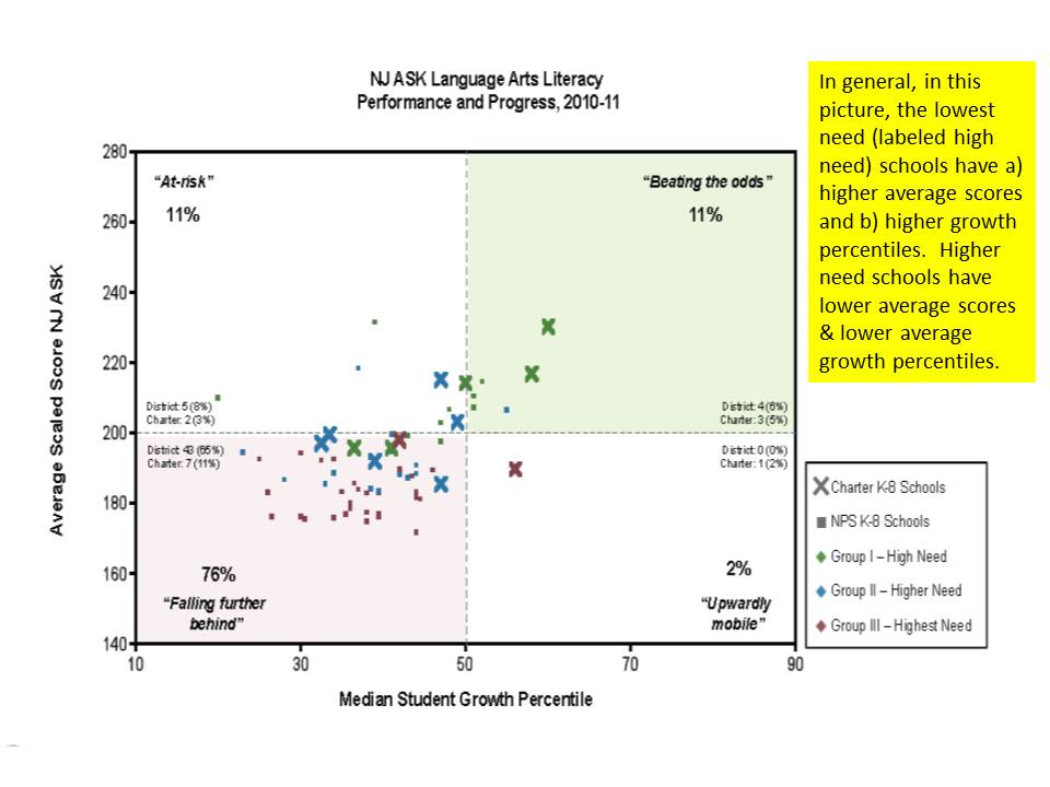
http://www.njspotlight.com/assets/12/1212/2110

Interestingly, what this graph shows is that the average score level in schools is somewhat positively associated with the median growth percentile, even within Newark where variation is relatively limited. In other words, schools with higher average scores appear to achieve higher gains. Peer group effect? Maybe. Underlying test scaling effect? Maybe. Don’t know. Can’t know.

The graph provides another dimension that is also helpful. It identifies lower and higher need schools – where “high need” are the lowest need in the mix. They have the highest average scores, and highest growth percentiles. And this is on the English/language arts assessment, where Math assessments tend to reveal stronger such correlations.

Now, state officials might counter that this pattern actually occurs because of the distribution of teaching talent… and has nothing to do with model failure to capture differences in student backgrounds. All of the great teachers are in those lower need, higher average performing schools! Thus, fire the others, and they’ll be awesome too! There is no basis for such a claim given that the model makes no attempt beyond prior score to capture student background.

Then there’s New York State, where similar rhetoric has been pervasive in the state’s push to get local public school districts to adopt state compliant teacher evaluation provisions in contracts, and to base those evaluations largely on state provided growth percentile measures. Notably, New York State unlike New Jersey actually realized that the growth percentile data required adjustment for student characteristics. So they tried to produce adjusted measures. It just didn’t work.

In a New York Post op-ed, the Chancellor of the Board of Regents opined:

The student-growth scores provided by the state for teacher evaluations are adjusted for factors such as students who are English Language Learners, students with disabilities and students living in poverty. When used right, growth data from student assessments provide an objective measurement of student achievement and, by extension, teacher performance. http://www.nypost.com/p/news/opinion/opedcolumnists/for_nyc_students_move_on_evaluations_EZVY4h9ddpxQSGz3oBWf0M

So, what’s wrong with that? Well… mainly… that it’s… WRONG!

First, as I elaborate below, the state’s own technical report on their measures found that they were in fact not an unbiased measure of teacher or principal performance:

Despite the model conditioning on prior year test scores, schools and teachers with students who had higher prior year test scores, on average, had higher MGPs. Teachers of classes with higher percentages of economically disadvantaged students had lower MGPs. (p. 1) https://schoolfinance101.com/wp-content/uploads/2012/11/growth-model-11-12-air-technical-report.pdf

That said, the Chancellor has cleverly chosen her words. Yes, it’s adjusted… but the adjustment doesn’t work. Yes, they are an objective measure. But they are still wrong. They are a measure of student achievement. But not a very good one.

But they are not by any stretch of the imagination, by extension, a measure of teacher performance. You can call them that. You can declare them that in regulations. But they are not.

To ice this reformy cake in New York, the Commissioner of Education has declared in letters to individual school districts regarding their evaluation plans, that any other measure they choose to add along side the state growth percentiles must be acceptably correlated with the growth percentiles:

The department will be analyzing data supplied by districts, BOCES and/or schools and may order a corrective action plan if there are unacceptably low correlation results between the student growth subcomponent and any other measure of teacher and principal effectiveness… https://schoolfinance101.wordpress.com/2012/12/05/its-time-to-just-say-no-more-thoughts-on-the-ny-state-tchr-eval-system/

Because, of course, the growth percentile data are plainly and obviously a fair, balanced objective measure of teacher effectiveness.

WRONG!

But it’s better than the Status Quo!

The standard retort is that marginally flawed or not, these measures are much better than the status quo. ‘Cuz of course, we all know our schools suck. Teachers really suck. Principals enable their suckiness.  And pretty much anything we might do… must suck less.

WRONG – it is absolutely not better than the status quo to take a knowingly flawed measure, or a measure that does not even attempt to isolate teacher effectiveness, and use it to label teachers as good or bad at their jobs. It is even worse to then mandate that the measure be used to take employment action against the employee.

It’s not good for teachers AND It’s not good for kids. (noting the stupidity of the reformy argument that anything that’s bad for teachers must be good for kids, and vice versa)

On the one hand, these ridiculous rigid, ill-conceived, statistically and legally inept and morally bankrupt policies will most certainly lead to increased, not decreased litigation over teacher dismissal.

On the other hand… The anything is better than the status quo argument is getting a bit stale and was pretty ridiculous to begin with.  Jay Matthews of the Washington Post acknowledged his preference for a return toward the status quo (suggesting different improvements) in a recent blog post, explaining:

We would be better off rating teachers the old-fashioned way. Let principals do it in the normal course of watching and working with their staff. But be much more careful than we have been in the past about who gets to be principal, and provide much more training.

In closing, the ham-fisted argument of the anti-status quo argument, as applied to teacher evaluation, is easily summarized as follows:

Anything > Status Quo

Where the “greater than” symbol implies “really freakin’ better than… if not totally awesome… wicked awesome in fact,” but since it’s all relative, it would have be “wicked awesomer.”

Because student growth measures exists and purport to measure student achievement growth which is supposed to be a teacher’s primary responsibility, it therefore counts as “something,” which is a subclass of “anything” and therefore it is better than the “status quo.” That is:

Student Growth Measures = “something”

Something ⊆ Anything (something is a subset of anything)

Something > Status Quo

Student Growth Measures > Current Teacher Evaluation

Again, where “>”  means “awesomer” even though we know that current teacher evaluation is anything but awesome.

It’s just that simple!

And this is the basis for modern education policymaking?

The disturbing language and shallow logic of Ed Reform: Comments on “Relinquishment” & “Sector Agnosticism”

Two buzz phrases have been somewhat quietly floating around reformyland of late, for at least a year or so. I suspect that many have not even picked up on these buzz phrases/words.  They are somewhat inner circle concepts in reformyland. The first is the notion of the great relinquisher (a seemingly bizarre contradiction indeed… to be great at surrendering… but I believe that’s the point). The second is the idea that we all must learn to be sector agnostics. That is, we all must stand behind the provision of a system of great schools as logical replacement for existing school systems and that this system of great schools might be provided by any sector – public/government, charter, private non-profit, private for profit. After all, it doesn’t matter how we provide them, as long as they are great schools. Who can argue with that?

Linking these two conceptions, the great relinquishers – primarily public officials perceived as otherwise self-interested bureaucrats – must learn to relinquish their self-interested stronghold on publicly financed schooling to alternative providers.  Among inner circle reformers, these ideas are treated as somehow ground breaking, deep intellectual thoughts about re-envisioning schooling. But in reality, they are anything but.

On Relinquishers & Sector Agnosticism

Some abbreviated backdrop on the relinquisher notion.  I converse (constructively) on occasion via e-mail with Neerav Kingsland who promotes this particular notion. For those who don’t know Neerav, he’s a Yale Law grad who completed a Broad Residency, and is currently CEO for New Schools for New Orleans. Thus, as I interpret it, he derives his core arguments largely on his perception of the (highly debatable) successes of post-Katrina New Orleans.  That in mind, and with all due respect to Neerav, I have grave concerns about what he refers to as the movement toward “relinquishment” or creating a culture of “relinquishers” among current public officials regarding the provision of the public good of schooling (differing substantively from public schooling.)

Neerav introduced the concept of Relinquishers in a letter he wrote to urban (not all, just “urban”) superintendents in Education Week:

Before I begin in full, let me say this: Superintendents, over the years I’ve begun to believe that your identities–how each of you perceives your professional charge–are often misguided. In my experience, most of you view yourselves as system reformers–leaders who can make the current educational system much better. For the sake of the letter, let’s call you, well, Reformers. With great diligence, you fight to make our government-operated system better.

But let me suggest another identity–one whose charge is to return power, in a thoughtful manner, back to parents and educators. Let’s call these types of superintendents Relinquishers. With great diligence, these superintendents attempt to transfer power away from a centralized bureaucracy.

Both Reformers and Relinquishers possess noble aims, but only one group, I think, possesses a sound strategy.

Superintendents, in the rest of this letter I hope to convince you to become Relinquishers. Specifically, I will advocate that you return power to parents and educators through the creation of charter school districts, which are the most politically acceptable mechanisms for empowering educators. (my emphasis)

Let’s start by taking the word “relinquish” literally for a moment. A quick synonym search in Microsoft Word yields: Surrender, Abandon, Renounce, Resign

The implication here is that public officials must “surrender” or “abandon” or “renounce” their schools, handing them over largely to private managers of charter schools (note that Neerav Kingsland has suggested that charter operators are the “politically acceptable” choice, leaving for others including Smarick to consider conventional private schooling and voucher models). Yeah… I get that this is an interesting notion – to suggest that there is some nobility is declaring defeat and handing control over to those who might be able to play a positive role. I get that. But I find this use, and this framing rather disturbing.

This is not to suggest that I don’t believe that many local public school districts, large or small, need work (some, a hell of a lot of work) on how they interact with their local communities and how they balance stakeholder interests (responsiveness to parents/students, etc.). That’s an ongoing concern in any public or private sector business, with differing structural/governance issues involved in public governance. This is also not to suggest that public officials should never look to other sectors for appropriately contracted, sufficiently regulated support. But “relinquishment” is an extreme perversion of this notion, especially when we start considering relinquishment of the system as a whole – Surrendering, abandoning, renouncing any and all role for public governance and centralized public policy.

Now for this notion of “sector agnosticism” – In his book The Urban School System of the Future and in several tweets and blog posts, former deputy commissioner of Education of New Jersey, Andrew Smarick promotes the reformy religion of what he refers to as Sector Agnosticism. A brief explanation is provided in a recent education week post:

Smarick: “Second, we need to have a three-sector accountability system that treats similarly district public schools, charter public schools, and private schools; we must focus on school results, not school operator. I call this “sector agnosticism;” in other words, we shouldn’t care who runs a school as long as it is superb.”

In the 1990s, when this idea arguably first gained some momentum (summarized in Paul Hill’s book Reinventing Public Education), I was actually a pretty big fan of the idea – which consisted primarily of finding ways to employ private contractors through performance contracting to improve urban schools. Heck, my own first conference paper ever was on the issue of private management of public schools, at a time when I thought there might be great hope for such strategies. Unfortunately, the self-interest of the (publicly traded, for profit) private manager (who eventually fell into financial collapse) to extract as much revenue as possible from the urban district (Baltimore) coupled with their outright disinterest in, and obstruction of having their outcomes measured, started giving me doubts. How could they possible show an efficiency advantage (doing more with less) if they managed to game their budget allocations to their advantage and then wouldn’t provide evidence of results?

Unfortunately, I wrongly assumed things would get better as the industry evolved. Further, over time, as I completed graduate work studying education finance and policy and became reasonably well versed in school law and education governance (teaching it at the graduate level for over a decade & writing/publishing numerous co-authored articles in law review journals) I became more acutely aware of the potential pitfalls of taking an uniformed leap into sector agnosticism.

Defining superbitude?

First, let’s take Smarick’s sound bite notion that it should matter as long as the school is “superb.” Even with a narrow, test score or graduation & post-secondary matriculation-based measure of “superbitude,” neither charter nor private schools are revealing any decisive edge, holding student characteristics or access to resources constant. Rather, as one might logically expect, these less regulated sectors merely produce greater variation around largely the same mean (if comparing similar students). Across sectors, the drivers of outcome variation continue to be the substantive differences in student populations served and oft correlated variations in access to schooling and non-schooling resources (in public schools, charter schools or private schools).[1]

Why do those KIPP charter middle schools appear to perform so well? What about New York City or Newark charter schools more broadly? And what about years of findings on private schools, or students participating in the New York City private school voucher experiment? It’s not about sectors, but rather about strategies and resources. And if it’s about strategies and resources, then if we can identify what works and the resources needed to legitimately serve all children, we can provide those opportunities within a publicly governed, publicly accountable system of common schools. Indeed, if these measured outcomes were in fact the only issue of concern, we might leverage an appropriately mixed set of schooling providers to get the job done. In fact, the lack of decisive advantage by sector alone is equal justification for agnosticism as it is against it.

But, that’s only if we ignore entirely that there might actually be other tradeoffs involved, beyond whatever test score, graduation, matriculation or employment outcome might be achieved.

Trading Off Legal Rights for Test Scores?

It’s not just about figuring out how to achieve crudely measured “superberific” schooling.  Our children’s schooling exists in a broader social, political and legal context. Kids have legal rights, and under most state constitutions kids a right to access/participate in/gain the benefits of a system of schooling (sometimes, quite explicitly, a system of public schooling). In many states, they not only have a right to access schooling (at times, of some measured degree of quality), but a legal obligation to attend up to a specified age (compulsory schooling laws).

As I’ve discussed on a few previous blog posts, privately governed and/or managed charter schools, more like traditional private than like public schools, may not be (are likely not) subject to the full protection of students’ constitutional or statutory rights (summary table from previous post included below). When attending a private school, it’s clear that kids have no right to continued attendance. They can be expelled, excluded outright for any number of reasons (including admissions testing). They may be compelled to recite school oaths and may be obligated to participate in religious activities and may be restricted in their ability to freely express themselves and subject to disciplinary action including expulsion for failure to comply. Parents may also be obligated to participate in certain activities as a condition of continued enrollment.

While charter advocates love to declare their schools as necessarily “public,” with regard to at least some of these same issues/questions, Charter school legal defense attorneys are quick to argue that they are in fact, private. That, for example, children’s rights under disciplinary codes should be treated as private contracts entered into by parents, just as in private schools – and substantively different from “public” schools – or those formally governed and operated by agents of the state (local elected school boards and public district administrators).

Further, the public-private delineation and murky middle ground of charter schooling raises numerous additional substantive legal questions regarding public employment law and employee rights, taxpayer and citizen rights to open public meetings and public records, and rights, responsibilities, liabilities and protections of “public officials” such as school board members and public employees as opposed to governing boards of private citizens, and employees of private contractors.

Sector agnosticism, as dreadfully simplified by Andrew Smarick requires completely ignoring these substantive tradeoffs.  Trading off constitutional rights to reduce supply of some and increase access to other sectors is not benign, if those sectors could/might possibly yield other advantages.

The Distribution of Lost Rights

Nor do I suspect that the tradeoff of rights will ever be randomly distributed across children by the wealth and income of their families. No-one is asking the superintendent of Scarsdale (great guy, by the way) to Relinquish his schools and adopt a policy of Sector Agnosticism. This is a policy for the children of New Orleans, New York City, Chicago, Philadelphia and Newark.

In the extreme case – a case favored by Smarick and seemingly endorsed (through relinquishment) by Kingsland – a district – or now merely a geographic space – where children have only access to privately governed/managed charter schools may require that any/all that wish to actually exercise their state constitutional right to attend school, have to choose which rights to forgo in the process? Will 100% of parents in that zone be required to enter into contractual agreements (forgoing constitutional & statutory protections) with schools regarding disciplinary policies for their children?

In fact, Kingsland’s logic is that district superintendents should simply succumb or surrender to the forces that wish to forcibly close and takeover their schools, and relinquish those schools or at least the children who would have attended them, to other sectors. Following Smarick’s logic, parents and citizens at large should completely ignore tradeoffs of constitutional protections, or humiliating treatment of children, in lieu of Smarickian measures of “superbification.”

Creating a scenario where only low income minority children in America’s cities must tradeoff their constitutional and statutory protections to gain access to schooling (which they may be compelled to attend) is clearly unacceptable, inequitable treatment.  Before you go there… no… I’m not saying that the responsible policy solution is to make sure that suburban kids and their parents are equally deprived of protections.  What’s not good for some is not good for all.

One logical retort to my arguments here is that if parents want these choices, if they are backed up on waiting lists for existing charters, then we should provide to them. If the demand is there, let the supply meet the demand!? It would be one thing if it was made clear, up front, to potential choosers these hidden tradeoffs, but that’s not the case. If anything, charter advocates are doing their best to conceal that any such tradeoffs exist.

Indeed, appropriate cross-sector regulation might negate some of my concerns raised here, but these issues are too frequently ignored.

Market Manipulation & The Forcible Reduction of the “Public Option”

Worse, in the current policy context, we are not witnessing the emergence of a true, fair and equitable, demand driven and fully open and accessible (driven by open information) system of choice. Policies of relinquishment and sector agnosticism are being pursued in practice as policies of forced relinquishment (read mass closings) of traditional public schooling and sector favoring transfer of assets (public to privately governed charters), coupled with gross misrepresentations of information on sector quality.

In selected cases, we are also witnessing a coordinated effort to provide competitive advantage for non-district alternatives. Where sectors are set up to compete with one another to prove their worth, the likelihood that charter or voucher advocates will lobby for increased resources for district schools is about as likely as the New York Yankee ownership arguing for revenue sharing to help the Kansas City Royals, or Walmart to lobby for tax breaks for Target. Similarly, the likelihood that well endowed charters will share their philanthropy with others less fortunate is slim to none where the emphasis remains on flaunting one’s competitive advantage.

A veneer of demand (as measured by duplicative waiting lists) for private and charter sectors has been induced by forcible reduction of supply of urban schooling, and gross misrepresentations & mismeasures (New Jersey/ New York) of neighborhood schooling quality and manipulation of the playing field.

Closing Thoughts

Before we jump on these reformy bandwagons, and start waiving the white flag of relinquishment and promoting the virtues of sector agnosticism, we need to take a hard look at how this is playing out in our cities. Numerous New Orleans schools were wiped out by a natural disaster, displacing large shares of the lowest income residents to Houston (and elsewhere), many of whom have not been able to return in part because the market based model of New Orleans has chosen not to serve their former, blighted neighborhoods.  This was tragic, and the initial occurrence largely beyond policymakers’ control.  The choice to leave children and their families unserved or underserved was a conscious policy decision (or a least a predictable result of the policy response).

Proposed Chicago (and Philadelphia) school closings would appear comparably poised to induce increased demand for charters, which will likely be used as rationale for expanding charters even further and advancing the cycle toward its ultimate end (as if Katrina by design, and more surgically targeted at schools with low test scores and poor minority children). In most U.S. cities, however charter market shares remain modest, and publicly subsidized private school enrollment even smaller, providing an opportunity to pause and rethink current strategies.

So then, what do we do about all of this? First, reformers and non-reformers alike (and anti-reformers too!) need to step back from these oversimplified talking points and buzz phrases which so illustrate the worst of intellectually lazy, undisciplined, under-informed policy development. I don’t mean to be a hypercritical, ivory tower (actually, public university 1960s era building basement) academic … okay… yeah… that is what I mean to be here. Why? Because it matters! Exploring and understanding these tradeoffs matters. Ignoring them is reckless.


[1] Elite charter schools commonly spend 30 to 50% more than district schools in the same city while often serving much less needy students, and independent private day schools spend nearly double the average of public districts (1.96x) in their same labor market while serving far more advantaged populations.

Supplementary Tables

Governance Issues in LEA and Charter Schooling

Slide1

Governance issues in Voucher and Tuition Tax Credit Programs

Slide2

When Real Life Exceeds Satire: Comments on ShankerBlog’s April Fools Post

Yesterday, Matt Di          Carlo over at Shankerblog put out his April fools post. The genius of the post is in its subtlety.  Matt put together a few graphs of longitudinal NAEP data showing that Maryland had made greater than average national gains on NAEP and then asserted that these gains must therefore be a function of some policy conditions that exist in Maryland. In the Post-RTTT era, Maryland has been the scorn of “reformers” because it just won’t get on board with large scale vouchers and charter expansion and has resisted follow through on test-score based teacher evaluation. Taking a poke a reformy logic, Matt asserted that perhaps the low charter share and lack of emphasis on test score based teacher evaluation… along with a dose of decent funding might be the cause of Maryland’s miracle!

Of course, these assertions are no more a stretch than commonly touted miracles in Texas in the 1990s, Florida or Washington DC, most of which are derived from making loose connections between NAEP trend data and selective discussion of preferred policies that may have concurrently existed.  The difference is that Matt was poking fun at the idea of making bold, decisive, causal inferences from such data. Such data raise interesting questions.

What I found so fun and at the same time deeply disturbing about Matt’s post is that the assertions he made in satire… were nowhere near as absurd as many of the assertions made in studies/reports, etc. I discussed here on my blog over the years. Here are but a few examples of “stuff” presented as serious/legit policy evidence, that make Matt’s satirical assertions seem completely reasonable.

The Many Variations of Money Doesn’t Matter Graphs:

I start with this one, because there are so many versions of it floating around out there, that come and go over time, and are often used to advance the “money doesn’t matter”… we’ve spent ourselves into bankruptcy and gotten nothing for it… graph. Every good reformer has a laminated copy of one version or another of this graph which they carry in wallet-size.

I blogged about this graph when Bill Gates used it in a HuffPo article.

Slide1

Gates asserted:

 Over the last four decades, the per-student cost of running our K-12 schools has more than doubled, while our student achievement has remained flat, and other countries have raced ahead. The same pattern holds for higher education. Spending has climbed, but our percentage of college graduates has dropped compared to other countries… For more than 30 years, spending has risen while performance stayed flat. Now we need to raise performance without spending a lot more.

Among other things, the chart includes no international comparison, which becomes the centerpiece of the policy argument. Beyond that, the chart provides no real evidence of a lack of connection between spending and outcomes across districts within U.S. States.  Instead, the chart juxtaposes completely different measures on completely different scales to make it look like one number is rising dramatically while  the others are staying flat. This tells us NOTHING. It’s just embarrassing. Simply from a graphing standpoint, a blogger at Junk Charts noted:

Using double axes earns justified heckles but using two gridlines is a scandal!  A scatter plot is the default for this type of data. (See next section for why this particular set of data is not informative anyway.)

Not much else to say about that one. Again, had I used an example this absurd to represent reformy research and thinking, I’ d have likely faced stern criticism for mis-characterizing the rigor of reformy research!

This alternate version comes to us from none other than Andrew Coulson of Cato Institute. Coulson has a stellar record of this kind of stuff. So, what would you do to the Gates graph above if you really wanted to make your case that spending has risen dramatically and we’ve gotten no outcome improvement? First, use total rather than per pupil spending (and call it “cost”) and then stretch the scale on the vertical axis for the spending data to make it look even steeper. And then express the achievement data in percent change terms because NAEP scale scores are in the 215 to 220 range for 4th grade reading, for example, but are scaled such that even small point gains may be important/relevant but won’t even show as a blip if expressed as a percent over the base year.

Slide2

Chris Cerf’s Poverty Doesn’t Matter Graph!

Now, it’s one thing when and under-informed tech CEO goes all TED-style on us with big screens, gadgets, bells and whistles and info-graphics that just don’t mean crap anyway. But, it’s yet another when a State Commissioner of Education presents something not only equally ridiculous… but arguably far more ridiculous, disingenuous, unethical and downright WRONG.

This is a graph for the ages, and it comes from a presentation by the New Jersey Commissioner of Education given at the NJASA Commissioner’s Convocation in Jackson, NJ on Feb 29. State of NJ Schools presentation 2-29-2012

Slide4

The title conveys the intended point of the graph – that if you look hard enough across New Jersey – you can find not only some, but MANY higher poverty schools that perform better than lower poverty schools.

This is a bizarre graph to say the least. It’s set up as a scatter plot of proficiency rates with respect to free/reduced lunch rates, but then it only includes those schools/dots that fall in these otherwise unlikely positions. At least put the others there faintly in the background, so we can see where these fit into the overall pattern. The suggestion here is that there is not pattern.

Note: this graph may not even be the worst one in the presentation. You decide!

The apparent inference here? Either poverty itself really isn’t that important a factor in determining student success rates on state assessments, or, alternatively, free and reduced lunch simply isn’t a very good measure of poverty even if poverty is a good predictor. Either way, something’s clearly amiss if we have so many higher poverty schools outperforming lower poverty ones. In fact, the only dots included in the graph are high poverty districts outperforming lower poverty ones. There can’t be much of a pattern between these two variables at all, can there? If anything, the trendline must be sloped uphill? (that is, higher poverty leads to higher outcomes!)

Note that the graph doesn’t even tell us which or how many dots/schools are in each group and/or what percent of all schools these represent. Are they the norm? or the outliers?

Well, here’s what the pattern really looks like with all schools included:

Slide5

Hmmm… looks a little different when you put it that way. Yeah, it’s a scatter, not a perfectly straight line of dots. And yes, there are some dots to the right hand side that land above the 65 line and some dots to the left that land below it.

Note: New Jersey’s Chris Cerf is not alone among state commissioners in promoting completely bogus analysis posing as empirical validation. In fact, New York’s John King presented a completely fabricated graph provided to him by a consultant to the state and has used that graph to frame his state’s policy initiatives.

Rishawn Biddle’s Graph of, well, something? What?

Not to be outdone, Rishawn Biddle who on occasion fashions himself a “researcher” on education policy issues, provides a graph that comes close to the degrees of intentional deception presented by Commissioner Cerf above.  I blogged about this graph here!

In response to arguments I had made on my blog regarding the role of substantive and sustained school finance reforms in improving school quality, Biddle argued:

Despite the arguments (and the pretty charts) of such defenders as Rutgers’ Bruce Baker, there is no evidence that spending more on American public education will lead to better results for children.

My claims are substantiated in this peer reviewed article and this separate more comprehensive report:

  • Baker, B. D., & Welner, K. G. (2011). School Finance and Courts: Does Reform Matter, and How Can We Tell?. Teachers College Record, 113(11), 2374-2414.
  • Baker, B. D. (2012). Revisiting the Age-Old Question: Does Money Matter in Education?. Albert Shanker Institute. http://www.shankerinstitute.org/images/doesmoneymatter_final.pdf

And what does Biddle provide as counter evidence to this – apparent lack of evidence I summarize above (I’ve sent the article link to Biddle on more than one occasion, but he apparently doesn’t read this kind of academic stuff)?

Biddle counters with a link to this graph – a true gem (I’ve added some annotation, not in his original)!

Slide6

Yes, Biddle’s counter to the body of research he has not and likely will never read, is to use this graph of “promoting power” by student race group for Jersey City, NJ in 2004 and 2009. Note that the infusion of additional funds in NJ occurred mainly from 1998 to 2003, leveling off thereafter. But that’s a tangential point (not really).  So, Biddle’s absolute verification that more money doesn’t matter is to simply assert without verification that Jersey City got a whole lot more money and then to use this graph to argue that nothing improved!

First of all, that analysis wouldn’t pass muster in as a master’s degree level assignment (I teach a class on this stuff at that level), no less major research conclusions. From a graphing standpoint, I often criticize my students’ work for what I refer to as gratuitous use of 3d – especially where the use of 3d bars actually obscures the comparisons by making it hard to see where they align on the axis.

But, the really funny if not warped part of this graph is that there appear to be significant gains for black males between 2004 and 2009, but those gains are obscured by hiding the 2009 black male score behind the 2004 black female score.

Note that the graph also contains no information regarding the actual shares of the student population that fall into each group? Not very useful. Pretty damn amateur. Certainly fails to make any particular point, and certainly doesn’t refute the various citations above – all of which employ more rigorous analytic methods, apply to more than a single district, and most of which appear in rigorous peer reviewed journals.

Reason Foundation’s Today’s Policies Affected Yesterday’s Outcomes Study!

Finally, in my years as a reviewer for the National Education Policy Center’s Think Tank Review Project I’ve reviewed a lot of sketchy stuff. Some of it stands out, and has even won Bunkum awards from NEPC.

For example, a recent report from ConnCAN repeatedly footnoted a claim as being substantiated to earlier reports…only to result in a dead end where the claim was never substantiated… and in fact, when checking the data turned out to be patently false!  So, this one isn’t even a subtle data interpretation issue. It’s just a lie.

Then there was a report by the organization Third Way, which gathered numerous sources of incompatible data, across incompatible time frames (along with many other bizarre claims) in order to make the argument that America’s middle class schools are failing miserably.

Either of these reports make Matt’s assertions in his post on the Maryland Miracle look totally reasonable!

But for me, the winner among all of the think tank reports I’ve read comes from the Reason Foundation in their 2009 Weighted Student Funding Yearbook! Here’s the abstract of my review:

The new Weighted Student Formula Yearbook 2009 from the Reason Foundation provides a simple framework for touting the successes of states and urban school districts that grant greater fiscal autonomy to schools. The report defines the Weighted Student Formula (WSF) reform extremely broadly, presenting a variety of reforms under the WSF umbrella. Accordingly, when the report concludes that WSF is successful and should be widely replicated, it is difficult to sort through the claims and recommendations. Moreover, the approach and recommendations lack critical inquiry, thought, or empirical analysis. Perhaps most disturbing is the fact that in a third of the specific districts presented in the report, the evidence of success provided predates the implementation of the reforms, and the Reason press release makes the outright claim that past improvements are somehow a function of yet-to-be-implemented reforms. While the report does provide some reasonable recommendations, they are overshadowed by others. Overall, the policy guidance provided by the Reason report is reckless and irresponsible.

Yes… you read it correctly…. If you go through the smashing successes claimed by Reason in this report, in 1/3 of the cases, the reforms in question were implemented after the window of test scores discussed! Hence, the Bunkum time machine award!

Matt’s satirical example didn’t go anywhere near this far.

In Closing….

In my view, there are at least two lessons from Matt’s post, for either side of the reformy aisle.

First, as I so often point out in my classes on applied data analysis, we need to always take  time to carefully evaluate what our data – whatever data and whatever measures – can and cannot tell us. The latter is key here. Descriptive data can be very useful… as long as we understand what they can and cannot tell us. For that matter, various types of inferential statistical analyses (regression models) can also be useful (and in policy research are often primarily descriptive), but often don’t tell us what we think or would like them to tell us. I’ll likely write more about this topic in the future.

Second, we all should take time to carefully scrutinize the link between empirical evidence and policy assertions (and many should take time to take some legit graduate level research methods and statistics and measurement courses on these topics if they wish to continue to opine so boldly about policy inferences!). Perhaps most importantly we should actually take more time and put more effort into scrutinizing those reports and claims that appear most agreeable to our own predisposed beliefs/opinions.  Everyone has predisposed beliefs (especially those who pretend not to). I would argue that experienced researchers likely have stronger beliefs and opinions… and we should… precisely as a result of years of experience researching specific topics.

Oh… and a third lesson… Don’t make completely BS, false/fabricated/absurd graphs like those above. That’s just ridiculous. Are you kidding me? Hiding 3d bars? (Rishawn?) Deleting most of the cases that define the trend? (Cerf?) That’s just ridiculous! Infuriating! Sickening!

In Connecticut, Where There’s a Reformy Con, There’s a CAN!

I was intrigued a few days ago when I saw this headline in my news alerts regarding school funding.

Headline: Report: Funding helps low-performing school districts

I was particularly intrigued because the headline comes from a Connecticut newspaper where I am fully aware that the state really hasn’t done crap to substantively increase resources for low performing, or more specifically high need schools and districts.

Disclaimer: I am fully aware of this because I have been providing technical/expert assistance to local public school districts that have been persistently shortchanged by the state school finance formula (Education Cost Sharing Formula). That, and even prior to my involvement supporting these districts (and more importantly, the kids they serve) in Connecticut, I had already blogged on their plight.

So then, how can it possibly be that that a CT newspaper would print such a ridiculous headline? And where could one possibly find a “Report” that somehow validates that the state has provided funding to help low performing districts?

Well, in Connecticut, where there’s data-free drivel on education policy spewing from the headlines, there’s usually one single source for that drivel – our old friends at ConnCAN!

Yep, they’ve produced a new report! And it’s about as technically solid as many of their previous reports!

An important caveat here is that the ConnCAN report itself (the linked report) doesn’t really seem to address directly the point that is highlighted in this article – that the reforms being implemented by the Malloy administration have improved the financial conditions of districts serving high need populations.

So then where does this strange assertion come from? Did the author of the “news” (used as loosely as possible) article simply make this up – or were they fed this line by ConnCAN? I’m not sure… but the author of the article in the Middletown newspaper begins with this bold statement:

Funding made available by last year’s Public Act 12-116 has helped some of the states lowest-performing school districts, including Middletown, according to the Connecticut Coalition for Achievement Now, an education advocacy organization based in New Haven.

Then, the author of the article summarizes what are characterized as “Highlights from ConnCAN’s March 2013 Progress Report.”

I find it hard to believe the author of the article crafted these summaries on his/her own. So, let’s take these fact-challenged reformy highlights one at a time (again, on the assumption that these highlights are somehow intended to support the article’s thesis – that the reforms have somehow mitigated funding problems/disparities?):
ConnCAN Con:

School Finance: P.A. 12-116 created a Common Chart of Accounts to be implemented in 2014-15, creating across the board standards aimed at enhancing transparency in education spending. To date, the Office of Policy and Management has selected the accounting firm Blum Shapiro to develop a framework for Common Chart of Accounts development and execution.

MY REPLY

Let’s start here with simple acknowledgement that creating a common chart of accounts does little or nothing – okay, NOTHING – to enhance the equity or adequacy of educational funding across districts. So, what did the state actually do to enhance that funding? Not so much really.

Figure 1 shows the effect of the $50 million dollar increase in ECS Aid for 2012-13, when added to Net Current Expenditures (NCEP) for 2011-12. The 2011-12 NCEP distribution is shown in green dots. The changes to NCEP that would result from the additional state aid are shown in orange dots. In green dots, we see that districts like Bridgeport, New Britain, Waterbury and Meriden are significantly disadvantaged by the ECS formula in 2011-12, in terms of their resultant NCEP.

AND, perhaps more importantly, we see that “increases” to funding for 12-13 really didn’t change much!

Figure 1.

Slide1

Table 1 includes NCEP for 2011-12 and the actual aid increases for 2012-13 (divided by ADM for 11-12) for Alliance Districts which include several high need districts.  I have also expressed the ECS aid increase as a percent increase over NCEP 2011-12. Most increases were less than $200 per pupil and well less than 2%.

Table 1.

Alliance District Spending & Aid Increases 12-13

Malloy_arky
ConnCAN Con:

School Choice: P.A. 12-116 increased per-pupil funding for public charter students ($10,500/FY13, $11,000/FY14, and $11,500/FY15) and allowed for the creation of 4 new state approved charters. Since then, per-pupil charter funds were cut by $300 for the FY13, and 27 letters-of-interest were submitted to the State Department of Education for launching new charters.

MY REPLY:

It is indeed true that recent adjustments to the funding formula provided more significant increases in aid to charter schools.  At best, these increases fail to alter the distribution of opportunities to Connecticut schoolchildren.  More likely, they in fact exacerbate disparities. Charters serve a relatively small share of the total student population. Most children in high need districts remain in district schools that saw negligible increase in funding. In that sense, charter funding increases have limited effect.

But, as it turns out, many of the charter schools in high need districts that received the greater increases in funding actually serve much lower need student populations (See Table 2).

Table 2. Selected Characteristics of Charter Schools in Cities where Mean % Free Lunch Exceeds 50%

Slide2

Further, after removing district expenditures on transportation and special education (expenses for which host districts are primarily responsible), many charters already substantially outspent district averages (see Table 3).[1]

In short, increasing funding to charters which already outspent host districts while cream-skimming lower need students, exacerbates rather than moderating disparities in opportunity.

Table 3. Total & Comparable per Pupil Spending for Charters & Districts with Free/Reduced Lunch >50%, 2009-10, Prior to Funding Boost for Charter Schools

Slide4

[1] Per Pupil Expenditures by Type: http://sdeportal.ct.gov/Cedar/WEB/ct_report/FinanceDTViewer.aspx

[2] Spending on Special Education: http://sdeportal.ct.gov/Cedar/WEB/ct_report/SpecialEducationResourcesDTViewer.aspx

[3] Percent Free or Reduced Lunch: http://sdeportal.ct.gov/Cedar/WEB/ct_report/StudentNeedDTViewer.aspx

ConnCAN Cons (lumping these last two together):

Commissioner’s Network: P.A. 12-116 gave the Commissioner of Education and the State Board of Education authority to select up to 25 of the lowest performing schools into the Commissioner’s Network school turnaround effort. Currently, 4 schools are in the Commissioner’s Network (located in Bridgeport, Hartford, New Haven, and Norwich). The state recently invited six additional schools to submit plans for inclusion in 2013-14 (located in Bridgeport, New Britain, Norwalk, Waterbury (2), and Windham).

Alliance Districts: P.A. 12-116 earmarked $39.5 million in conditional aid for the state’s 30 lowest performing school districts. So far, all 30 district plans have been approved and $39.5 million allocated.

MY REPLY

Now, in the charts above, you’ve seen the rather dramatic (cough/gag) effect that adding $50 million has on Connecticut’s high need districts through the aid formula. Well, here what we have is an even smaller amount of additional aid, to be handed out at the discretion of a single bureaucrat. Nothing systematic. Nothing substantial. Entirely discretionary, and meager.

As noted by ConnCAN, the legislation provides for 25 schools to enter the Commissioner’s network and maybe have access to some additional financial assistance.  There are far more than 25 schools in total in high need districts.  Further, each school can remain in the network for a maximum of three years, and it is unclear whether any supports would exist beyond those three years.

Let’s be absolutely clear here: Educational adequacy and equal educational opportunity a) should not be reserved for a tiny minority of schools, b) should not sunset and c) should not be at the discretion of a single political appointee.

Equally if not more likely, the various proposed structural and governance changes, coupled with new unfunded mandates, will exacerbate existing inequities across Connecticut schools and districts.   For example, many of the policy changes addressed by ConnCAN are little more than labeling schemes that merely highlight existing disparities.

Worse, the most negative and consequential labels fall disproportionately on schools in those districts already disadvantaged financially.

A substantial body of existing literature links school rating systems with local residential property values, including state accountability system assigned school grades.[2]  In short, negative labels may lead to further erosion of housing values and tax base. Further, it is likely that increased threat of state intervention and reduction of local control over schools may adversely affect local property values. The proposed reforms, lacking any substantive provision of additional resources, threaten to accelerate a downward spiral of districts already in long-run economic and educational decline.

Already, a large share of schools classified as “review” schools are not only high need schools, but high need schools concentrated in very high need, and underfunded districts (Bridgeport, Meriden, New Britain, New London & Waterbury).[5]  By contrast, the main distinction of many of the “distinction” schools identified in urban Connecticut contexts is that they serve very few of the lowest income children, few or no children with disabilities and few or no children with limited English language proficiency (See Table 4).

Meanwhile, other schools of distinction are those in the state’s most affluent suburbs.  In other words, the state has adopted a rating scheme driven primarily by student demographics to mislabel the “quality” or “effectiveness” of local public schools. Further, the rating scheme is designed to grant the state greater authority to disrupt local governance of schools, which, while the state may perceive this alternative only in positive light, local property owners and potential property owners may view it quite differently.

Table 4. Selected Characteristics of “Distinction Schools” in Cities where Mean % Free Lunch Exceeds 50%

Slide3ConnCAN Con:

Educator Evaluations: P.A. 12-116 mandated that the educator evaluation program be piloted in 8-10 sites across Connecticut. The Performance Evaluation Advisory Council (PEAC) came to an agreement that the new educator evaluation system would be implemented in all districts with flexibility in 2013-14, and the system would launch statewide with full implementation in 2014-15.

MY REPLY:

Even if one chose to accept that improved teacher evaluation systems and teacher effectiveness measures could be leveraged to better select among teachers on the labor market or in a particular district workforce, our ability to apply that leverage to improve the workforce as a whole, or achieve more equitable distribution of teaching quality would be constrained by a) the overall landscape of teacher compensation relative to other career alternatives and b)  the persistent inequities in financial resources across districts and resulting inequities teacher compensation across advantaged and disadvantaged schools and districts.

The suggestion that mandated changes to teacher evaluation alone will improve the equity and adequacy of the teacher workforce – regardless of resources – ignores that the proposed evaluation models have the potential to significantly increase job uncertainty for teachers without providing increased wages or benefits to counterbalance the risk. Increased job/career and wage expectation uncertainty, while holding wages on average, constant, is likely to lead to reduced, not increased quality of entrants to the profession.

Further, given the emerging body of evidence on the types of metrics proposed for teacher evaluation, career uncertainty is likely to be inequitably distributed, disadvantaging children in already disadvantaged districts and schools.[6]

NOTES


[1] Not accounted for here are potential differences in facilities operation & lease costs. It is often argued that the costs of facilities are particularly high for charter schools, consuming large shares of their budgets, while facilities are “free” for public districts. In reality, one can expect facilities leases for Connecticut charter schools to range from $1,500 per pupil to around $2,000 per pupil (which is indeed significant) and one can expect annual maintenance and operations (not including long term debt expense) for districts to be around $1,400 per pupil (in 2010 based on CTDOE Data).  The state’s choice to provide substantially increased funding for charter schools and not to host district schools was not based on any thorough analysis of actual differences in costs or needs.

[2] Figlio, D. N., & Lucas, M. E. (2004). Whats in a Grade? School Report Cards and the Housing Market. The American Economic Review, 94(3), 591-604.

[6] Baker, B.D., Oluwole, J., Green, P.C. III (2013) The legal consequences of mandating high stakes decisions based on low quality information: Teacher evaluation in the race-to-the-top era. Education Policy Analysis Archives, 21(5). This article is part of EPAA/AAPE’s Special Issue on Value-Added: What America’s Policymakers Need to Know and Understand, Guest Edited by Dr. Audrey Amrein-Beardsley and Assistant Editors Dr. Clarin Collins, Dr. Sarah Polasky, and Ed Sloat. Retrieved [date], from http://epaa.asu.edu/ojs/article/view/1298

School Finance Illiteracy Reaches New Low! (But it was the NY Post?)

Okay, it’s not entirely surprising to find mind-boggling ignorance conveyed in the editorial pages of the New York Post. Today’s example comes to us in an Op-Ed written in response to a report released by the Alliance for Quality Education.

Usually, I’d just let it pass. It’s the Post after all. But, for two important reasons I just had to address this one.  First, the editorial was written by a member of the Governor’s Education Reform Commission.  Second, the editorial made use of our School Funding Fairness report to make its most absurd claim. And here is that claim:

Despite all of AQE’s complaints, there is no need to change the way we allocate this money, since the state already directs almost 70 percent of education funding to high-need districts. In fact, School Funding Fairness’s National Report Card gave New York a grade of “A” in its Effort category, putting us among the top five states in that category.

http://www.nypost.com/p/news/opinion/opedcolumnists/ny_schools_money_not_the_problem_qHXdkNNBLssY1Swqj8LfQK

Apparently the authors of this quote have a little difficulty reading and perhaps some problems interpreting relatively simple numbers and letter grades.

Let’s take a look at the graded indicators in our school funding fairness report:

  • Effort – This measures differences in state spending for education relative to state fiscal capacity. “Effort” is defined as the ratio of state spending to state per capita gross domestic product (GDP).
  • Funding Distribution – This measures the distribution of funding across local districts within a state, relative to student poverty. The measure shows whether a state provides more or less funding to schools based on their poverty concentration, using simulations ranging from 0% to 30% child poverty.

 http://www.schoolfundingfairness.org/National_Report_Card_2012.pdf

The authors use the state’s high grade on “effort” as basis for asserting that New York State has no allocation problem. Hmmm… perhaps the distribution indicator would be a better indicator for whether the state has an allocation problem. After all, even a quick synonym check in MS Word lists distribution as the first synonym for allocation (followed by provision, apportionment, sharing).

New York Received a D on this measure!

And a D is actually rather generous for New York’s distribution/allocation issues. Figure 1 provides the profile for mid-Atlantic states from our funding fairness report.

Figure 1

Slide1In other words, in New York State, higher poverty districts have systematically less per pupil state and local revenue than do lower poverty ones. And despite all of the other completely ridiculous a-contextual and otherwise wrong and misleading claims in the Op-ed, high need New York State school districts face significant financial disadvantages relative to their competitive surroundings.

Despite the Op-Ed authors claims, their Governor has done little or nothing to help these districts, and much to harm them (including misguided reforms).

Sean Corcoran of NYU and I dug deeper into New York State’s distribution issues and sources of inequity in a recent report for the Center for American Progress.

First, with updated analysis following the funding fairness methods, we identify New York State as among the least equitable states in the Nation. Here are the numbers:

Slide2

And here’s a nice colored map (which may resonate with the editorial authors who’s grasp of numbers appears severely limited):

Slide3

http://www.americanprogress.org/wp-content/uploads/2012/09/StealthInequities.pdf

We explain that a hypothetical, rational, equitable school funding system should look something like this:

Slide4But that New York’s system actually looks like this – when not correcting for costs/needs (it’s much, much worse when you do!).

Slide5

We also then identify and explain the various sources of inequity in New York State’s school finance system, including the allocation of Tax Relief aid disproportionately to wealthier districts, and other adjustments to foundation aid that favor wealthier districts to the detriment of poorer ones. Here are some figures, and descriptions from our report:

Figure 13 puts New York’s School Tax Relief program aid allocations into context. Federal aid to schools is largely designed to improve equity by targeting resources to higher-need, especially higher-poverty, districts. The School Tax Relief pro­gram aid to New York schools tends on average to be slightly less than federal aid. But to the extent that federal aid creates any improvement to the distribu­tion of resources across New York school districts, the state’s School Tax Relief program aid wipes out that improvement entirely. Aid under the program, which is indicated by the darkest blue in Figure 13, is allocated in nearly perfectly inverse proportion to federal aid, such that when the two are stacked on the other, the cumulative effect is that districts receive about the same regardless of their wealth.

Slide6

 New York’s foundation-aid formula includes a series of “if/then” steps to deter­mine whether a district should receive state aid based on its initial calculation of local fair share or based on an alternative calculation, one of which is the provision of minimum aid of $500 per pupil. Figure 17 shows the pattern of state and local sharing that would occur if foundation aid were based solely on the income-wealth index estimated by the state. Under that index, the lowest-wealth districts would receive about $12,000 to $14,000 in aid per pupil, and districts with an income-wealth index greater than 1 would receive no aid. After including the various alter­native calculations, districts with an income-wealth index above about 2.5 would receive the minimum of $500 per pupil, while districts with index rates from 1 to 2.5 would receive a sliding scale toward the minimum rather than either the mini­mum or $0. The adjusted version is shown in red. Note however, that neither was fully funded in recent years. (Recent reality is achieved by taking the red squares and shifting them downward but preserving the minimum aid.)

Slide7

If fully funded, the cost of retaining the minimum aid provision tops $1.2 billion, and the cost of preserving the diagonal, sliding-scale adjustment between the income-wealth index of 1 and 2.5 is $2.47 billion (if we exclude the disproportion­ate effects of New York City). That’s real money—money that could be perhaps targeted toward higher-need districts to reduce the overall regressive nature of New York’s finance system.

Slide8

The cumulative effects of these adjustments and the School Tax Relief program on the distribution of resources across New York school districts is shown above. The left hand portion of Figure 18 shows local revenue with formula aid prior to the adjustments in Figure 17. Even this isn’t a very pretty picture because state aid remains insufficient to provide even nominal funding equity from lower- to higher-poverty districts. But the right hand side of Figure 18 shows the effect of the adjustments in Figure 17, with the icing of school tax relief aid on top.

Prior to foundation-sharing adjustments and the School Tax Relief program aid, the per-pupil difference in state and local revenue per pupil between the lowest- and highest-poverty quintile is about $1,100. After the adjustments, the per-pupil difference is more than $2,300. New York makes adjustments to its aid formula and throws on tax relief funding in a pattern that more than doubles the nominal inequity between the state’s lowest- and highest-poverty districts.

In other words – YES – NEW YORK DOES NEED TO CHANGE THE WAY IT ALLOCATES MONEY. Any suggestion to the contrary displays a mind-boggling degree of ignorance!

Civics 101: School Finance Formulas & the Limits of Executive Authority

This post addresses a peculiar ongoing power grab in New Jersey involving the state school finance formula. The balance of power between state legislatures and the executive branch varies widely across states, but this New Jersey example may prove illustrative for others as well.  This post may make more sense if you take the time to browse these other two posts from the past few years.

  1. Student Enrollment Counts and State School Finance Formulas
  2. Twisted Truths and Dubious Policies: Comments on the Cerf School Funding Report

[yeah… I know… prerequisite readings don’t always go over well on a blog – but please check them out!]

In New Jersey, as in many other states the State School Finance Formula is a state statute. That is, an act of the legislature. State school finance formula statutes may vary in the degree of detail that they actually lay out in statutory language, including varying the precision of which specific numbers must be used in the calculations and in some cases specifically how the calculations are carried out. It is my impression that until recently, many state school finance statutes have been articulated in law with greater and greater precision – meaning also less latitude for the formula to be altered in its implementation (often through a state board of education).

The New Jersey school finance formula is articulated with relatively high precision in the language of the statute itself, like many other similar state school finance formulas. Again, it’s an act of the legislature – specifically, this act of the legislature of 20008:

AN ACT providing for the maintenance and support of a thorough and efficient system of free public schools and revising parts of the statutory law.

BE IT ENACTED by the Senate and General Assembly of the State of New Jersey:

(New section) This act shall be known and may be cited as the “School Funding Reform Act of 2008.”

Among other things, the statute spells out clearly the equations for calculating each district’s state aid, which involve first calculating the enrolled students to be funded through the formula.  In short, most modern school finance formulas apply the following basic approach:

  • STEP 1: Target Funding = [Base Funding x Enrollment + (Student Needs Weight x Base Funding x Student Needs Enrollment)] x Geographic Cost Adjustment
  • STEP 2: State Aid = Target Funding – Local Revenue Requirement

Using this general approach above, how students are counted necessarily has a substantive effect on how much aid is calculated, and ultimately delivered. And in most such formulas, how the basic  enrollments are counted has a multiplicative, ripple effect throughout the entire formula. So, it matters greatly how kids are counted for funding purposes. This is likely why state statutes often articulate quite clearly exactly how kids are to be counted for funding purposes.

The School Funding Reform Act of 2008 articulates precisely the definitions of fundable student enrollment counts. The following calculations and definitions are copied and pasted directly from the legislation.

Weighted Enrollment Definition

(New section) The weighted enrollment for each school district and county vocational school district shall be calculated as follows:

 WENR = (PW x PENR) + (EW x EENR) + (MW x MENR) + (HWx HENR)

Where:

PW is the applicable weight for kindergarten enrollment;

EW is the weight for elementary enrollment;

MW is the weight for middle school enrollment;

HW is the weight for high school enrollment;

PENR is the resident enrollment for kindergarten;

EENR is the resident enrollment for grades 1 – 5;

MENR is the resident enrollment for grades 6 – 8; and

HENR is the resident enrollment for grades 9 – 12.

http://www.njleg.state.nj.us/2006/Bills/A0500/500_I2.PDF

Legal Definition of Resident Enrollment

http://njlaw.rutgers.edu/collections/njstats/showsect.php?section=18A%3A7f-45&actn=getsect

“Resident enrollment” means the number of pupils other than preschool pupils, post-graduate pupils, and post-secondary vocational pupils who, on the last school day prior to October 16 of the current school year, are residents of the district and are enrolled in: (1) the public schools of the district, excluding evening schools, (2) another school district, other than a county vocational school district in the same county on a full-time basis, or a State college demonstration school or private school to which the district of residence pays tuition, or (3) a State facility in which they are placed by the district; or are residents of the district and are: (1) receiving home instruction, or (2) in a shared-time vocational program and are regularly attending a school in the district and a county vocational school district. In addition, resident enrollment shall include the number of pupils who, on the last school day prior to October 16 of the prebudget year, are residents of the district and in a State facility in which they were placed by the State. Pupils in a shared-time vocational program shall be counted on an equated full-time basis in accordance with procedures to be established by the commissioner. Resident enrollment shall include regardless of nonresidence, the enrolled children of teaching staff members of the school district or county vocational school district who are permitted, by contract or local district policy, to enroll their children in the educational program of the school district or county vocational school district without payment of tuition. Disabled children between three and five years of age and receiving programs and services pursuant to N.J.S.18A:46-6 shall be included in the resident enrollment of the district;

Not much there left to the imagination and certainly not a great deal of flexibility on implementation. It’s in the statute. It’s in the act adopted by the legislature. It is, quite literally, the law.

Executive Budget Language (2012-13 budget)

Civics 101 tells us that the executive branch of federal or state government doesn’t write the laws. Rather, it upholds them and its executive departments in some cases may be charged with implementing the laws, including adoption of implementing regulations – that is, adding the missing precision needed to actually implement the law. Of course, regulations on how a law is to be implemented can’t actually change the law itself.

Now, in some states like New Jersey, the Governor’s office has significant budgetary authority, including a line item veto option. Of course, that doesn’t however mean that the Governor’s office has the authority to actually rewrite the equations for school funding that were adopted by the legislature. It may mean that the Governor can underfund, or defund the formula as a whole, but that raises an entirely different set of constitutional questions, which I previously addressed here.

Specifically, what we have here are two separate bills/laws. First, there is the the statute enacting the formula, which sets forth substantive standards that must be applied from year to year, unless amended through usual Legislative process of proposing amendment in bill, committee review, and vote on the bill.  Then, there is the budget bill, which appropriates state school aid for each fiscal year and only is in effect for that year.  At their intersection, the appropriations in the budget bill are to be based on the ongoing formula requirements in the formula statute. Increasingly, it would appear that governors are attempting to affect changes to their state school funding formulas through their annual budget bills. Strategically, it can be hard for legislatures to successfully amend these budget bills and re-implement their formula as adopted, because the annual budget bills include everything under the sun (all components of the state budget) and not just school funding.

Last year, the Governor’s office, through the executive budget, did actually change the equation – which is the law. And, by first glance of this year’s district by district aid runs it would appear that they have again done the same. It would appear, though I’ve yet to receive the data to validate, that the governor’s office in producing its estimates of how much each district should receive, relied on the same method as for the current year – a method which proposes to reduced specific weighting factors in the formula, and perhaps most disturbingly, exerts executive authority to change the basic way in which kids are counted for funding purposes.

Here’s the language from last year’s executive budget book:

pg D-83 http://www.state.nj.us/treasury/omb/publications/13budget/pdf/FY13BudgetBook.pdf

Notwithstanding the provisions of any law or regulation to the contrary, the projected resident enrollment used to determine district allocations of the amounts hereinabove appropriated for Equalization Aid, Special Education Categorical Aid, and Security Aid shall include an attendance rate adjustment, which is defined as the amount the state attendance rate threshold exceeds the district’s three–year average attendance rate, as set forth in the February 23, 2012 State aid notice issued by the Commissioner of Education.

Did you catch that? It says that resident enrollment, throughout the formula will be adjusted in accordance with an attendance rate factor. A facto that is not, in fact, in the legislation itself. It is not part of the equation that is the law.

Here’s a mathematical expression of the change:

Legal Funding Formula

AB = (BC + AR Cost + LEP Cost + COMB Cost + SE Census) x GCA

BC = BPA x WENR

AR Cost = BPA x ARWENR x AR Weight

LEP Cost = BPA x LWENR x LEP Weight

COMB Cost = BPA x CWENR x (AR Weight + COMB Weight)

Executive Funding Formula

AB = (BC + AR Cost + LEP Cost + COMB Cost + SE Census) x GCA

BC = BPA x WENR x CRAP*

AR Cost = BPA x ARWENR x CRAP* x AR Weight

LEP Cost = BPA x LWENR x CRAP* x LEP Weight

COMB Cost = BPA x CWENR x CRAP* x (AR Weight + COMB Weight)

*Cerf Reduction for Attending Pupils [attributed to Cerf here because this adjustment was originally proposed in his report to the Governor on the school finance formula]

This change is unquestionably a change to the law itself. This is a substantive change with ripple effects throughout the formula. And as I understand Civics 101, such a change is well beyond the authority of the executive branch.

Permitting such authority to go unchecked is a dangerous precedent!

Then again, it’s a precedent already endorsed by the President and U.S. Secretary of ed in their choice to grant waivers to states and local districts to ignore No Child Left Behind, which was/is an act of Congress.  But who cares about that pesky old checks and balances stuff anyway? That’s so… old school… so… constitutional…

Why it Matters

What I find most offensive about this power play is that the change imposed through abuse of executive power is a change to enrollment count that is well understood to be the oldest trick in the book for reducing aid to high poverty, high minority concentration districts.

In New Jersey, as elsewhere, attendance rates are lower – for reasons well beyond school & district control – in districts serving larger shares of low income and minority children. Using attendance rates to adjust funding necessarily, systematically reduces funding from higher poverty districts. Here are the attendance rates by grade level and by district factor group (where A districts are low wealth/income districts and IJ are high wealth/income).

CRAP Adjustment

And here are a handful of related articles which address this issue, and related issues in other settings:

  • Baker, B. D., & Green III, P. C. (2005). Tricks of the Trade: State Legislative Actions in School Finance Policy That Perpetuate Racial Disparities in the Post‐Brown Era. American Journal of Education, 111(3), 372-413.
  • Baker, B. D., & Corcoran, S. P. (2012). The Stealth Inequities of School Funding: How State and Local School Finance Systems Perpetuate Inequitable Student Spending. Center for American Progress.
  • Green III, P. C., & Baker, B. D. (2006). Urban Legends, Desegregation and School Finance: Did Kansas City Really Prove That Money Doesn’t Matter. Mich. J. Race & L., 12, 57.

The Non-reformy Lessons of KIPP

We’ve all now had a few days to digest the findings of the most recent KIPP middle school mega-study. I actually do have some quibbles with the analyses themselves and the presentation of them, one of which I’ll address below, but others I’ll set aside for now.  It is the big picture lessons that are perhaps most interesting.

I begin this post with a general acceptance that this study, like previous KIPP studies, and like studies of charter effectiveness in markets generally characterized by modest charter market share and dominance of high flying charter chains, typically find that the kids attending these charters achieve marginal gains in math, and sometimes reading as well (as in the new KIPP study). These findings hold whether applying a student matching analysis or lottery based analysis (though neither accounts for differences in peer group).

In the past few years, we’ve heard lots of talk about no excusesness and its (supposed) costless (revenue neutral) effectiveness and potential to replace entire urban school systems as we know them (all the while reducing dramatically the public expense).  But the reality is that what underlies the KIPP model, and that of many other “high flying” no excuses charter organizations, are a mix of substantial resources, leveraged in higher salaries, additional time – lots of additional time (and time is money) and reasonable class sizes, coupled with a dose of old-fashioned sit-down-and-shut up classroom/behavior management and a truckload of standardized testing. Nothin’ too sexy there. Nothin’ that reformy. Nothin’ particularly creative.

The brilliant Matt Di     Carlo of Shanker Blog shared with me this quote in e-mail exchanges about the study yesterday:

In other words, the teacher-focused, market-based philosophy that dominates our public debate is not very well represented in the “no excuses” model, even though the latter is frequently held up as evidence supporting the former. Now, it’s certainly true that policies are most effective when you have good people implementing them, and that the impact of teachers and administrators permeates every facet of schools’ operation and culture. Nonetheless, most of the components that comprise the “no excuses” model in its actual policy manifestation are less focused on “doing things better” than on doing them more. They’re about more time in school, more instructional staff, more money and more testing. I’ve called this a “blunt force” approach to education, and that’s really what it is. It’s not particularly innovative, and it’s certainly not cheap.

Expanding on Matt’s final comment here, our report last summer on charter schools found specifically that the costs of scaling up the KIPP model, for example, across all New York City or Houston middle schools would be quite substantial:

Extrapolating our findings, to apply KIPP middle school marginal expenses across all New York City middle school students would require an additional $688 million ($4,300 per pupil x 160,000 pupils). In Houston, where the middle school margin is closer to $2,000 per pupil and where there are 36,000 middle schoolers, the additional expense would be $72 million. It makes sense, for example, that if one expects to find comparable quality teachers and other school staff to a) take on additional responsibilities and b) work additional hours (more school weeks per year), then higher wages might be required. We provide some evidence that this is the case in Houston in Appendix D. Further, even if we were able to recruit an energetic group of inexperienced teachers to pilot these strategies in one or a handful of schools, with only small compensating differentials, scaling up the model, recruiting and retaining sufficient numbers of high quality teachers might require more substantial and sustained salary increases.

But, it’s also quite possible that $688 million in New York or $72 million in Houston might prove equally or even more effective at improving middle school outcomes if used in other ways (for example, to reduce class size). Thus far, we simply don’t know.

Baker, B.D., Libby, K., & Wiley, K. (2012). Spending by the Major Charter Management Organizations: Comparing charter school and local public district financial resources in New York, Ohio, and Texas. Boulder, CO: National Education Policy Center. Retrieved [date] from http://nepc.colorado.edu/publication/spending-major-charter.

Here’s a link to my rebuttal to the rather disturbing KIPP response to our report.

In a recent paper, I continue my explorations of the resource (and demographic) differences of charter schools and their urban contexts. In particular, I’ve been trying to get beyond just looking at aggregate per pupil spending and instead, digging into differences in tangible classroom resources. Here are some related findings of my current paper co-authored with Ken Libby and Katy Wiley.

Baker.Libby.Wiley.Charters&WSF.FEB2013

Finances

Table 5 shows the regression results comparing the site based spending per pupil of charters by affiliation, with New York City district schools serving similar populations, the same grade levels and in the same borough. When comparing by % free or reduced lunch, where KIPP schools are more similar to their surroundings, KIPP schools spent about $4,800 more per pupil. When comparing by % free lunch alone, where KIPPs have lower rates than many surrounding schools, KIPP schools spent more than $5,000 more per pupil.

Slide10

Table 6 shows similar analysis for the Houston Texas area, including schools in surrounding districts which overlap Houston City limits. Splitting KIPPs by those that serve elementary grades (Iower) versus those serving middle (and some upper) grades, This table shows that KIPPs serving lower grades spent marginally less than district schools. KIPPs serving middle/upper grades spent over $3,000 per pupil more.

Slide11

Specific Resource Inputs

This figure shows the relative salaries of teachers, both on an annual basis and equated for months on contract in New York City. KIPP teachers at same degree and experience level were paid about $4,000 more than district teachers. Equating contract months KIPP teachers were paid about the same as district teachers. But the central point here is that KIPP teachers were paid more for the additional time. That said, it would appear that teachers in some other NYC charters were paid even more than KIPPs at same degree and experience level.

Figure 1. Relative Salaries in New York City

Slide12

Here’s a plot of teacher salaries by experience level in Houston Texas. KIPP teachers across the range of experience receive a substantial salary premium for their time and effort.

Slide13

Figure 2. Relative Salaries in Houston

As I’ve said before. This simply makes sense. This is not a critique. These graphs are constructed with publicly available data – the New York State Personnel Master File and the Texas equivalent. I would argue that what KIPP schools are doing here is simple and logical. They are providing more time to get kids further along and they are acknowledging through their compensation systems that if you want to get sufficient quality teachers to provide that additional time, you’re going to have to pay a decent wage.

Finally, here’s a plot of the relative class sizes in New York City, also constructed by regression analysis accounting for location and grade range.

Figure 3. Relative Class Sizes in New York City

Slide14

An “are you kidding me?” moment

There was one point in reading the KIPP report that my head almost exploded. This was where the authors of the report included a ridiculously shoddy analysis in order to brush off claims of cream-skimming. In figure ES.1 of the report, the authors make the argument that it is clear that KIPP schools are not cream-skimming more desirable students by comparing KIPP student characteristics to those of all students in the schools from whence the KIPP students came.  

Figure ES.1. The Non-Proof of Non-Creamskimming

Slide4

The authors are drawing this bold conclusion while relying on but a handful of extremely crude dichotomous characteristics of students.  They are assuming that any student who falls below the 185% income threshold for poverty is equally poor (whether in Arkansas or New York). But many of my prior analyses have shown that even if we take this dichotomous variable and make it, say, trichotomous, we may find that poorer kids (<130% income threshold) are less likely to sort into charter schools (more below).  It is equally if not even more problematic to use a single dummy variable for disability status – thus equating the charter enrolled child with speech impairment to the district enrolled child with traumatic brain injury. The same is likely true of gradients of language proficiency.

The problems of the crudeness of classification are exacerbated when you then average them across vastly disparate contexts.   IT WOULD BE ONE THING if the authors actually threw some caveats about data quality and available and moderated their conclusions on this basis. But the authors here choose to use this ridiculous graph as the basis for asserting boldly that the graph provides PROOF that cream-skimming is not an issue.

Look, we are all often stuck with these less than ideal measures and must make the best of them. This example does not, by any stretch make the best of these inadequate measures. In fact, it makes them even worse (largely through their aggregation across disparate contexts)!

An Alternative look at Houston and New York

I don’t have the data access that Mathematica had for conducting their study. But I have, over time, compiled a pretty rich data set on finances of charter schools in New York and Texas from 2008 to 2010 and additional information on teacher compensation and other school characteristics. Notably, I’ve not compiled data on all of the KIPP charters in California, or all of the KIPP charters in Arkansas, Oklahoma, Tennessee or elsewhere. I’ve focused my efforts on specific policy contexts.  I’ve done that, well, because… context matters. Further, I’ve taken the approaches I have in order to gain insights into basic resource differences across schools, within specific contexts.

The following two tables are intended to make a different comparison than the KIPP creamskimming analysis. They are intended to compare KIPP, and other charter schools in these city contexts with the other schools serving same grade level students. That is, they are intended to compare the resulting peer context, not the sending/receiving pattern. It’s a substantively different question, but one that is equally if not far more relevant. I use regression models to tease out differences by grade range and within New York City, by location.

Table 3 shows that KIPP schools have relatively similar combined free/reduced lunch shares to other same grade schools in New York City (in the same borough). But, Table 3 also shows that KIPP schools have substantively lower % free lunch share (13% lower on average, but with individual schools varying widely). Table 3 also shows that KIPP schools have substantively lower ELL (11% fewer) and special education (3% fewer) populations in New York City.

Slide8

Table 4 shows the results for the Houston area, and this is why context is important to consider. While I would argue that New York City KIPPs do show substantial evidence of income related cream-skimming as well as ELL and special education, I can’t say the same across the board in Houston. Then again, I don’t have the free/reduced breakout in Houston. In Houston, the KIPPs do have lower total special education (and I’m unable to parse by disability type – which is likely important). KIPP middle schools in Houston appear to have higher free/reduced lunch share than middle schools in/around Houston.

Slide9

Differences between Houston and New York and for that matter every other KIPP context are masked by aggregation across all contexts, yet these differences may be relevant predictors of differences in KIPP success that may exist across these contexts.

Note that Houston and New York are non-trivial shares of the total KIPP sample. Here’s my run of KIPPs by state and by major city, using the NCES Common Core of Data 2010-11.

Slide6

Slide7

Revisiting the Foolish Endeavor of Rating Ed Schools by Graduates’ Value-Added

Knowing that I’ve been writing a fair amount about various methods for attributing student achievement to their teachers, several colleagues forwarded to me the recently released standards of the Council For the Accreditation of Educator Preparation, or CAEP. Specifically, several colleagues pointed me toward Standard 4.1 Impact on Student Learning:

4.1.The provider documents, using value-added measures where available, other state-supported P-12 impact measures, and any other measures constructed by the provider, that program completers contribute to an expected level of P-12 student growth.

http://caepnet.org/commission/standards/standard4/

Now, it’s one thing when relatively under-informed pundits, think tankers, politicians and their policy advisors pitch a misguided use of statistical information for immediate policy adoption. It’s yet another when professional organizations are complicit in this misguided use. There’s just no excuse for that! (political pressure, public polling data, or otherwise)

The problems associated with attempting to derive any reasonable conclusions about teacher preparation program quality based on value-added or student growth data (of the students they teach in their first assignments) are insurmountable from a research perspective.

Worse, the perverse incentives likely induced by such a policy are far more likely to do real harm than any good, when it comes to the distribution of teacher and teaching quality across school settings within states.

First and foremost, the idea that we can draw this simple line below between preparation and practice contradicts nearly every reality of modern day teacher credentialing and progress into and through the profession:

one teacher prep institution –> one teacher –> one job in one school –> one representative group of students

The modern day teacher collects multiple credentials from multiple institutions, may switch jobs a handful of times early in his/her career and may serve a very specific type of student, unlike those taught by either peers from the same credentialing program or those from other credentialing programs. This model also relies heavily on minimal to no migration of teachers across state borders (well, either little or none, or a ton of it, so that a state would have a large enough share of teachers from specific out of state institutions to compare). I discuss these issues in earlier posts.

Setting aside that none of the oversimplified assumptions of the linear diagram above hold (a lot to ignore!), let’s probe the more geeky technical issues of trying to use VAM to evaluate ed school effectiveness.

There exist a handful of recent studies which attempt to tease out certification program effects on graduate’s student’s outcomes, most of which encounter the same problems. Here’s a look at one of the better studies on this topic.

  • Mihaly, K., McCaffrey, D. F., Sass, T. R., & Lockwood, J. R. (2012). Where You Come From or Where You Go?

Specifically, this study tries to tease out the problem that arises when graduates of credentialing programs don’t sort evenly across a state. In other words, a problem that ALWAYS occurs in reality!

Researchy language tends to downplay these problems by phrasing them only in technical terms and always assuming there is some way to overcome them with statistical tweak or two. Sometimes there just isn’t and this is one of those times!

Let’s dig in. Here’s a breakdown of the abstract:

In this paper we consider the challenges and implications of controlling for school contextual bias when modeling teacher preparation program effects. Because teachers from any one preparation program are hired in more than one school and teachers are not randomly distributed across schools, failing to account for contextual factors in achievement models could bias preparation program estimates.

Okay, that’s a significant problem! Teachers from specific prep institutions are certainly not likely to end up randomly distributed across a state, are they? And if they don’t, the estimates of program effectiveness could be “biased.” That is, the estimates are wrong! Too high, or to low, due to where their grads went as opposed to how “good” they were. Okay, so what’s the best way to fix that, assuming you can’t randomly assign all of the teacher grads to similar schools/jobs?

Including school fixed effects controls for school environment by relying on differences among student outcomes within the same schools to identify the program effects.  However, the fixed effect specification may be unidentified, imprecise or biased if certain data requirements are not met.

That means, that the most legit way to compare teachers across programs is if you can compare teachers whose first placements are in the same schools, and ideally where they serve similar groups of kids. And, you’d have to have a large enough sample size at the lowest level of analysis – comparable classrooms within school – to accomplish this goal. So, the best way to compare teachers across prep programs is to have enough of them, from each and every program, in each school, teaching similar kids similar subjects at the same grade level, across grade levels. Hmmmm…. How often are we really likely to meet this data requirement?

Using statewide data from Florida, we examine whether the inclusion of school fixed effects is feasible in this setting, the sensitivity of the estimates to assumptions underlying for fixed effects, and what their inclusion implies about the precision of the preparation program estimates. We also examine whether restricting the estimation sample to inexperienced teachers and whether shortening the data window impacts the magnitude and precision of preparation program effects. Finally, we compare the ranking of preparation programs based on models with no school controls, school covariates and school fixed effects. We find that some preparation program rankings are significantly affected by the model specification. We discuss the implications of these results for policymakers.

With “no school” controls means not accounting at all for differences in the schools where grads teach. With “covariates” means correcting in the model for the measured characteristics of the kids in the schools – so – trying to compare teachers who teach in similar – by measured characteristics – schools. But, measured characteristics often fail to catch all the substantive differences between schools/classrooms.  And where “school fixed” effects means comparing graduates from different institutions who teach in the same school (though not necessarily the same types of kids!).

Okay, so the authors tested their “best” methodological alternative (comparing teachers within schools, by school “fixed” effect) with other approaches, including making no adjustment for where teachers went, or making adjustments based on the characteristics of the schools, even if not matched exactly.

The authors found that the less good alternatives were, to no surprise, less good- potentially biased. The assumption being that the fixed effect models are most correct (which doesn’t, however, guarantee that they are right!).

So, if one can only legitimately (though really not in this case either) compare teacher prep programs in cases where grads across programs are concentrated in the same schools for their first jobs, that’s a pretty severe limitation. How many job openings are there in a specific grade range in a specific school in a given year – or even over a five year period? And how likely is it that those openings can be filled with one teacher each from each teacher prep institution. But wait, really we need more than one from each to do any legit statistical comparison – and ideally we need for this pattern to be replicated over and over across several schools. In other words, the constraint imposed to achieve the “best case” model in this study is a constraint that is unlikely to ever be met for more than a handful of large teacher prep institutions concentrated in a single metropolitan area (or very large state like Florida).

Other recent studies have not found VAM particularly useful in parsing program effects:

We compare teacher preparation programs in Missouri based on the effectiveness of their graduates in the classroom. The differences in effectiveness between teachers from different preparation programs are very small. In fact, virtually all of the variation in teacher effectiveness comes from within-program differences between teachers. Prior research has overstated differences in teacher performance across preparation programs for several reasons, most notably because some sampling variability in the data has been incorrectly attributed to the preparation programs.

Koedel, C., Parsons, E., Podgursky, M., & Ehle, M. (2012). Teacher Preparation Programs and Teacher Quality: Are There Real Differences Across Programs? (No. 1204).

http://econ.missouri.edu/working-papers/2012/WP1204_koedel_et_al.pdf

Example from Kansas

Let’s use the state of Kansas and graduates over a five year period from the state’s major teacher producing institutions to see just how problematic it is to assume that teacher preparation institutions in a given state will produce sufficient numbers of teachers who teach in the same schools as graduates of other programs.

All programs

Slide3

Specific programs

Slide4

Slide5

Slide6

Slide7

Slide8

Slide9

Indeed, the overlap in more population dense states is somewhat more significant, but still unlikely sufficient to meet the high demands of the fixed effects specification (where you can only essentially compare when you have graduates of different programs working in the same school together, in similar assignments… presumably similar number of years out of their prep programs).

Strategically Gaming Crappy, Biased Measures of “Student Growth”

In practice, I doubt most schools of ed, or state education agencies will actually consider how to best model program effectiveness with these measures. They likely won’t even bother with this technically geeky question of the fixed effects model, and data demands to apply that model. Rather, they’ll be taking existing state provided growth scores or value-added estimates and aggregating them across their graduates.

Given the varied, often poor quality of state adopted metrics, the potential for CAEP Standard 4.1 to decay into absurd gaming is quite high. In fact, I’ve got a gaming recommendation right here for teacher preparation institutions in New York State.

We know from the state’s own consultant analyzing the growth percentile data that:

Despite the model conditioning on prior year test scores, schools and teachers with students who had higher prior year test scores, on average, had higher MGPs. Teachers of classes with higher percentages of economically disadvantaged students had lower MGPs. (p. 1) https://schoolfinance101.com/wp-content/uploads/2012/11/growth-model-11-12-air-technical-report.pdf

We also know from this same technical report that the bias appears to strengthen with aggregation to the school level. It may also strengthen with aggregation across similar schools. And this is after conditioning the model on income status and disability status.

As such, it is in the accreditation interest of any New York State teacher prep institution to place as many grads as possible into lower poverty schools, especially those with fewer children with disabilities. By extension, it is therefore also in the accreditation interest of NY State teacher prep institutions to reduce the numbers of teachers they prepare in the field of special education. As it turns out, the New York State growth percentiles are also highly associated with initial scores – higher initial average scores are positively associated with higher growth. So, getting grads into relatively higher performing schools might be advantageous.

With a little statistical savvy, a few good scatteplots, one can easily mine the biases of any state’s student growth metrics to determine how to best game them in support of CAEP standard 4.1.

Further, because it is nearly if not entirely impossible to use these data to legitimately compare program effects, the best one can do is to find the most advantageous illegitimate approach.

Are these really the incentives we’re looking for?

What does the New York City Charter School Study from CREDO really tell us?

With the usual fanfare, we were all blessed last week with yet another study seeking to inform us all that charteryness in-and-of-itself is preferential over traditional public schooling – especially in NYC! In yet another template-based pissing match (charter vs. district) design study, the Stanford Center for Research on Educational Outcomes provided us with aggregate comparisons of the estimated academic growth of a two groups of students – one that attended NYC charter schools and one that attended NYC district schools. The students were “matched” on the basis of a relatively crude set of available data.

As I’ve explained previously in discussing the CREDO New Jersey report, the CREDO authors essentially make do with the available data. It’s what they’ve got. They are trying to do the most reasonable quick-and-dirty comparison, and the data available aren’t always as precise as we might wish them to be. But, this is also not to say that supposed Gold Standard “lottery-based” studies are all that. The point is that doing policy research in context is tricky, and requires numerous important caveats about the extent to which stuff is, or even can be truly randomized, or truly matched.

The new CREDO charter study found that children attending charters outpaced their peers in district schools in math (significantly) and somewhat less so in reading (relatively small difference). Their analysis included six years of data through 2010-11 (meaning that the last growth period included would be 2009-10 to 2010-11).

How does a CREDO study work?

Students are matched with a virtual peer, where one attends a district school and another attends a charter school. The NYC CREDO study matches students on the following bases:

  • Grade-level
  • Gender
  • Race/Ethnicity
  • Free or Reduced Price Lunch Status
  • English Language Learner Status
  • Special Education Status
  • Prior test score on state achievement tests

The CREDO study does not match students by:

  • Their level of free vs. reduced priced lunch, which may be consequential to the validity of the match if the students in the district school sample are more likely to be free lunch than reduced lunch and the charter school sample the opposite.
  • The type or severity of disability, which may be similarly consequential if it turns out that the charter students are less likely to have more severe disabilities.

Prior score should partially compensate for these shortcomings. But, I discussed some of the problems that arise from assuming these matches to be adequate in a previous post. Nonetheless, this is still a secondary issue.

Perhaps the biggest issue here is that the CREDO method makes no attempt to separate the composition of the peer group from the features of the school. That is, it may be the case that some portion – even a large portion – of the effectiveness being attributed to charter schools is merely a function of putting together a group of less needy students.

CREDO School Effect = Peer Effect + School Effect

So who cares? Why is this important? As I’ve explained a number of times in this blog, from a policy perspective the “scalable” portion is the “school effect” or the stuff – educational programs/services/teacher characteristics, etc. that lead to differences in student achievement even if all of the kids were the same (not just the observed/matched child). If the effect is largely driven by achieving a selective peer group, that may be equally valuable for children who have access to this school, but one can only stretch the selective peer group model so far in the context of a high poverty city. It’s not scalable. It’s a policy that necessarily requires advantage a few (in terms of peer group) while disadvantaging others.

What about those peer groups?

Here’s a look at the “relative demographics” of New York City charter schools compared to schools serving the same grade ranges in the same borough.  This figure is derived from data used in a previous report, and being used in a forthcoming study, where we go to great lengths to determine a) the comparability of students, b) the characteristics of teachers, programs and services and c) the comparable spending levels of New York City charter schools and district schools serving similar students of similar grade ranges. Our studies have employed data from 2008-2010, significantly overlapping the CREDO study years.

Figure 1. Relative Demographics of Selected Management Organizations 2008-10

Slide3

Here, we see that compared to same grade level schools in the same borough, NYC charters have in many groups, 10% to 20% fewer children qualifying for free lunch (<130% income level for  poverty), even if they appear to have comparable shares qualifying for free or reduced price lunch (<185% income level for poverty). These groups are substantively different in terms of their educational outcomes.

Further, charters serve a much lower share of children with limited English language proficiency, a finding validated by other authors. And charter schools generally serve much lower shares of children with disabilities (a finding we explored in greater detail here!).

So, while CREDO matched individual students by the crude characteristics above, they did not attempt to separate in their analysis, whether actual school quality factors, or these substantive peer group differences, were the cause of differences in student achievement growth.

Now, we have no idea what share of the growth, if any, is explained by peer effect, but we do know from a relatively large body of research that selective peer effects work both to advantage those selected into the desirable peer group and disadvantage those selected out. That aside, it is conceivable that New York City charter schools are doing some things that may lead to differential achievement growth. In fact, given what we now know from our various studies of New York City charter schools (including peer sorting), I’d be quite shocked and perhaps even disappointed if NYC charters were not able to leverage their various advantages to achieve some gain for students!

In New York City, what are those strategies? [School Effects?]

Let’s start with class size variation. We used data from 2008 to 2010 to determine the average difference in class size between NYC charter school sand district schools serving similar grade ranges and similar student populations. Here’s what we found for 8th grade as an example.

Figure 2. Charter Class Size Difference from Similar District School

Slide4

Now, on to teacher salaries. First, we used individual teacher level data to estimate the salary curve by experience for teachers in NYC charter schools and similar assignments in district schools. Here’s what we found. Charter teachers, who already have smaller class sizes on average, are getting paid substantively more in many cases (in particularly elite/recognized charter management chains).

Figure 3. Projected Teacher Salaries (based on regression model of individual teacher data)

Slide8

But, that pay does come with additional responsibilities, which for students translates to a) longer school years and b) greater individual attention. Here are the contract month differences for NYC charter and district school teachers.

Figure 4. Contract Months

Slide9

Figure 5. Salary Controlling for Months

Slide10

Others have noted that “no excuses” models often provide substantial additional time in terms of length of school year and length of school day (+20% to 30% more time), but most have failed to provide reasonable cost analysis of this additional time.  Here are a few pictures of the comparable spending levels of district and charter schools, for elementary and middle schools by special education share (the strongest predictor of differences in site budgets per pupil in NYC.

Figure 6. Spending per Pupil and Special Education for Elementary Schools.

Slide7

Figure 7. Spending per Pupil and Special Education for Middle Schools.

Slide6

In our more comprehensive report on the topic and in a related forthcoming article, we have found that leading charter management organizations often spend from $3,000 to $5,000 more per pupil in NYC than do district schools serving similar populations.

To Summarize

Okay, so we know that:

CREDO School Effect = Peer Effect + School Effect

And we know that the peer groups into which the “matched” kids were sorted are substantively different from one another and that various school resources are substantively different (despite what some very poorly constructed, very selective analyses might suggest).  It’s certainly possible that BOTH MATTER – and that BOTH MATTER quite a lot. Or at least they should.

Figure 8. The Real Question behind the NYC CREDO Study?

NYC CREDO

Actually, it’s rather depressing that all that additional time, paid for in additional salaries and applied to smaller classes of more advantaged kids couldn’t accomplish an even better gain on reading assessments. That would undermine a lot of what we currently understand about schooling and peer effects.

And the Policy Implications Are?

What’s most important here is how we interpret the policy implications. Certainly, given the wide variation in both district and charter schooling in NYC and substantial differences between them, it would be foolish to assert that any differences found in the CREDO study provide endorsement of charter expansion. That is, provide endorsement of simply adding more schools called charter schools. The study is a study of charter schools that serve largely selective populations and have lots of additional resources for doing so. This by no means provides endorsement that we could just add any old charter schools in any neighborhood and achieve similar results.

It also may be the case that even if we try our hardest to replicate only the good charters, that as charter market share increases in NYC, both the more advantaged students and the access to big money philanthropy starts to run thin. Note that the NYC share of children in charter schools remained under/around 4% during the period studied – a sharp contrast from other states/cities where charter performance has been much less stellar.

An alternative assertion that might be drawn from combining the NYC charter study with our previous studies, is that more students might benefit from being provided additional resources. But scaling up these charter alternatives would not be cheap. Here’s what we found in our comparisons of New York City and Houston:

These findings, coupled with evidence from other sources discussed earlier in this report, paint a compelling picture that “no excuses” charter school models like those used in KIPP, Achievement First and Uncommon Schools, including elements such as substantially increased time and small group tutoring, may come at a significant marginal cost. Extrapolating our findings, to apply KIPP middle school marginal expenses across all New York City middle school students would require an additional $688 million ($4,300 per pupil x 160,000 pupils). In Houston, where the middle school margin is closer to $2,000 per pupil and where there are 36,000 middle schoolers, the additional expense would be $72 million. It makes sense, for example, that if one expects to find comparable quality teachers and other school staff to a) take on additional responsibilities and b) work additional hours (more school weeks per year), then higher wages might be required. We provide some evidence that this is the case in Houston in Appendix D. Further, even if we were able to recruit an energetic group of inexperienced teachers to pilot these strategies in one or a handful of schools, with only small compensating differentials, scaling up the model, recruiting and retaining sufficient numbers of high quality teachers might require more substantial and sustained salary increases.

But, it’s also quite possible that $688 million in New York or $72 million in Houston might prove equally or even more effective at improving middle school outcomes if used in other ways (for example, to reduce class size). Thus far, we simply don’t know.

As I noted in a previous post, it’s time to get beyond these charter vs. district school pissing match studies and seek greater precision in our comparisons and deeper understanding of “what works” and what is and isn’t “scalable.”

A drop in a half empty bucket? In defense of deprivation in NY

First, here’s a primer and reading list on the Empire State of School Finance:

  1. New York State maintains one of the least equitable state school finance systems in the nation
  2. New York State actually allocates a ton of state aid to districts that need it least, exacerbating the disparities
  3. Reformy types in New York State thought, under these circumstances, it would be really cool to make any additional state aid a district receives contingent on adopting a teacher evaluation scheme based on their documented deeply flawed metrics!
  4. To ice that reformy cake, the legislature saw fit to – after slashing state aid year after year – impose a local property tax limit on districts so that they are unable to even raise the funds they would need to provide a sound basic education, if they could raise those funds locally.

ohhh… but I’m just getting started here.  Then came the lawsuits. That’s what makes this so fun and interesting to watch.

Now, there is already a pending lawsuit challenging the overall adequacy of state funding in New York specifically for high need cities (brought by the state’s small city school districts).

More recently however, we’ve been hearing of two separate cases.

First, we have the state teacher’s union (as reported) suing the state over the imposition of the property tax cap, which, in effect prohibits many districts from making up the difference from the aid they’ve been screwed out of for the past several years – the aid that in theory – by the state’s own definition of its foundation formula – would provide for a sound basic education. That formula was implemented specifically to comply with a previous court order in Campaign for Fiscal Equity. 

Next, we have the lawsuit brought on behalf of children in New York City schools challenging the state’s authority to reduce the city’s funding by $250 million for non-compliance with adopting a teacher evaluation policy.

So far, it would appear that this argument has achieved a positive, immediate response from the judge, who a this stage has blocked the state funding reduction.
As laid out in full here: http://schoolfunding.info/wp-content/uploads/2013/02/Memorandum-of-Law-in-Opp-to-App-for-Prelim-Inj1.pdfAnd as characterized here: http://schoolfunding.info/2013/02/miriam-aristy-v-state-of-new-york/

Assistant Attorney General Steven Schulman described the $250 million that the state will cut from NYC schools as a “drop in the bucket” and argued that it was not great enough to have any effect on schools’ ability to provide a sound basic education.

The state’s defense of its actions is essentially that $250 million really isn’t that much money for New York City and certainly doesn’t deprive NYC schoolchildren of receiving their constitutionally mandated sound, basic education. And that forcing the state to provide the $250 million would undermine their authority. That is, their authority to deprive kids of their constitutionally mandated sound basic education! ? ! ? huh? Now, this is all part of legal maneuvering. Yeah… it would be difficult for NYC to show that holding back this additional 3.3% state funding tips the scales on whether the city can provide a sound basic education. As such, how can the court reason intervening and forcing the state to give this money back?
But that’s only if we set aside that the state of New York is already depriving New York City schoolchildren of 38% of the aid that should be allocated to the city based on the state’s own formula for what the city needs to provide a sound basic education. And that was a bogus, low-balled estimate to begin with. Here’s my quick run down on state aid shortfalls in 2012-13 – with respect to the state’s own estimates – for small city districts and for New York City:

Foundation Aid, Foundation after GEA expressed in Thousands (‘000s)Slide1New York City is being shorted about 3.4 billion in aid to achieve what the state has defined as “sound basic” funding. That’s about 38% of their total foundation aid.  That share is even larger for some small city districts. This next table shows that this amounts to thousands per pupil. Slide2 Sure, the loss from the teacher evaluation debacle amounts to a few hundred per pupil. But hey, what’s the harm? NYC is already being shorted over $3,000 per pupil.By the state’s logic, we, and the sitting judge are asked to ignore that the bucket into which that drop is to fall (or not) is nearly half empty (no, not half full… well… actually… about 62% full) to begin with.  That the murder who stabs to death a victim one day, and comes back to stab the already dead body one more time the next, is not guilty of any marginal crime for his actions on the second day.Perhaps not in the final legal analysis. I’ll leave that for the judge to figure out. But in my view, it’s still pretty damned offensive.