Ed Trust Getting Loopy Again

Education Trust has released another BIG statement about an issue that I would argue is a minor distraction – at best. At worst, this issue becomes a major policy distraction, diverting attention from far more significant equity concerns.

http://www.edtrust.org/sites/edtrust.org/files/publications/files/Hidden%20Funding%20Gaps_0.pdf

Education Trust’s summary bullet points for their new report are as follows:

  • Federal law permits hidden funding gaps to persist between high-poverty schools and more affluent counterparts within the same district.
  • These gaps occur partly because teachers in wealthier schools tend to earn more than their peers in high-poverty schools and because of pressure to “equalize” other resources across schools.
  • By closing loopholes in the comparability provisions of Title I of the Elementary and Secondary Education Act, Congress could promote funding equity within school district budgets.
  • The report is grounded in this premise:

    Many states have made progress in closing the funding gaps between affluent school districts and those serving the highest concentrations of low-income children. But a hidden funding gap between high-poverty and low-poverty schools persists between schools within the same district. District budgeting policies frequently favor schools with the fewest low-income students. This undercuts the aim of Title I and robs poor children of funds intended to help them.

    The layers of problems with this premise and Education Trust’s major conclusions are downright baffling. I am not suggesting that we should not be concerned with inequities that might occur between schools within districts, inappropriately as a function of district budgeting practices or teacher assignment practices. These are a concern. They are just not the major equity concern du jour. And further, while Title I funding might be leveraged better to correct this concern, the role of Title I funding in improving equity overall across states is minimal.

    Issue 1 – Ed Trust’s misguided perception that states have solved between-district inequities, leaving within-district inequities as the primary policy concern

    On this particular point, here is an abstract of a forthcoming peer-reviewed article and analysis which I have written (with Kevin Welner) on this topic:

    Two interlocking claims are being increasingly made around school finance: that states have largely met their obligations to resolve disparities between local public school districts and that the bulk of remaining disparities are those that persist within school districts. These local decisions are described as irrational and unfair school district practices in the allocation of resources between individual district schools. In this article, we accept the basic contention of within-district inequities. But we offer a critique of the empirical basis for the claims that within-district gaps are the dominant form of persistent disparities in school finance, finding that claims to this effect are largely based on one or a handful of deeply flawed analyses. Next, we present an empirical analysis, using national data, of 16-year trends (1990 to 2005) and recent patterns (2005 to 2007) of between-district disparities, finding that state efforts to resolve between-district disparities are generally incomplete and inadequate and that in some states, between-district disparities have actually increased over time.

    Education Trust chooses anecdotal comparisons between New York City schools in order to make their case that within-district funding disparities are the problem du jour.  Without a doubt, within district disparities persist in New York City schools, some unexplainable and many that should be remedied. I’m all for fixing illogical disparities.

    The use of New York City anecdotes to illustrate supposed major national policy concerns, in this case by authors Daria Hall and Natasha Ushomirsky piggy-backs on similar “shock” comparisons used in op-eds by Marguerite Roza – an author cited by the Hall/Ushomirsky brief. We are led to believe that this is an example of one of the greatest equity problems facing schoolchildren in the entire NY metropolitan area – if not the nation as  a whole. After all, the state of NY has done its job to fix between district disparities. Right? It’s the city that’s not pulling its weight?

    Here’s one fun example, from our forthcoming article:

    Following a state high court decision in New York mandating increased funding to New York City schools, Roza and Hill (2005) opined: “So, the real problem is not that New York City spends some $4,000 less per pupil than Westchester County, but that some schools in New York [City] spend $10,000 more per pupil than others in the same city.” That is, the state has fixed its end of the system enough.

    This statement by Roza and Hill is even more problematic when one dissects it more carefully. What they are saying is that the average of per pupil spending in suburban districts is only $4,000 greater than spending per pupil in New York City but that the difference between maximum and minimum spending across schools in New York City is about $10,000 per pupil. Note the rather misleading apples-and-oranges issue. They are comparing the average in one case to the extremes in another.

    In fact, among downstate suburban[1] New York State districts, the range of between-district differences in 2005 was an astounding $50,000 per pupil (between the small, wealthy Bridgehampton district at $69,772 and Franklin Square at $13,979). In that same year, New York City as a district spent $16,616 per pupil, while nine downstate suburban districts spent more than $26,616 (that is, more than $10,000 beyond the average for New York City). Pocantico Hills and Greenburgh, both in Westchester County (the comparison County used by Roza and Hill), spent over $30,000 per pupil in 2005.[2] These numbers dwarf even the purported $10,000 range within New York City (a range that we agree is presumptively problematic); our conclusion based on this cursory analysis is that the bigger problem likely remains the between-district disparity in funding.

    The bottom line regarding this first claim is that much of the “research” to which the new Ed Trust brief points as validating within-district disparities being the greatest problem of our day, and states largely fulfilling their objectives to improve equity, is misguided, shoddy or both. Between district disparities remain a major concern and vary widely across states.

    Issue 2: Ed Trust’s strange misperception that rich and poor kids actually attend the same school districts, such that between district inequity even could be the major equity concern du jour

    Yes, there are cases where lower poverty schools exist in generally higher poverty school districts. But as I have pointed out in other posts, for the most part, low poverty schools exist in some districts and high poverty schools in other districts. The same is true of minority student concentrations. When we start talking about leveraging Title  I aid to FIX equity problems within districts we are largely talking about redistributing resources across schools which have from 60% to 80% or higher low income children, while ignoring all of the surrounding school districts which have 0% to 60% low income kids. Here are just a few examples of the clustering of high poverty schools within districts.

    First, Chicago Public Schools. Here’s a map of the higher and lower poverty and higher and lower minority concentration schools in Chicago Public Schools and surroundings. Yes, there are some lower poverty schools in Chicago and perhaps a few (very few) with fewer minority children. But, on average reshuffling Chicago public schools resources means reshuffling them from poor to really poor schools or black to Hispanic schools, or back.

    Here are the school enrollments – weighted by number enrolled – expressed as a frequency distribution by low income student concentrations:

    You see, the vast majority of CPS kids are in high poverty schools and the majority of kids in schools outside of CPS but in the same metro area, are in low poverty schools. It’s really that simple. Yeah… there’s variation in CPS. But the greater variation is between CPS and surroundings.

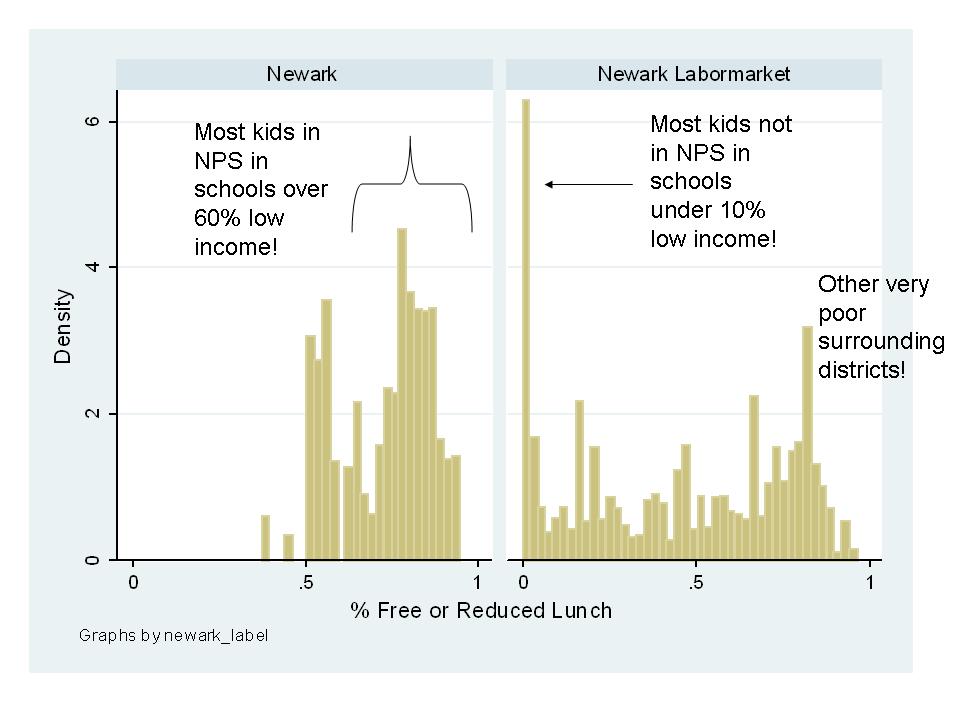
    Here’s Newark, NJ:
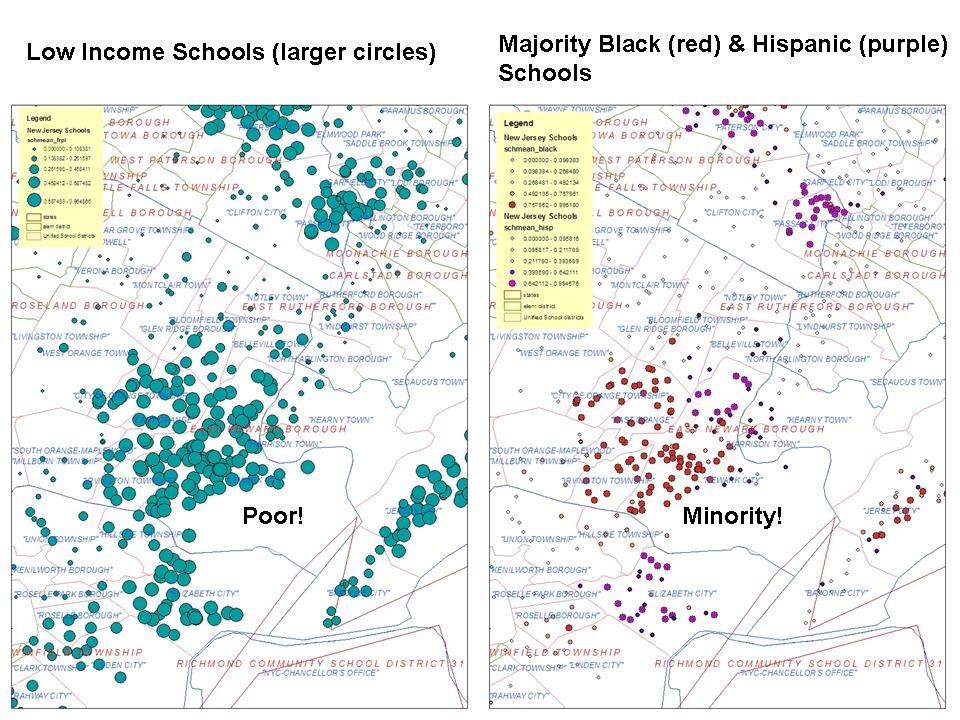
    And here’s the frequency distribution:

    The assumption implicit in the Education Trust reports, including this brief, that higher and lower poverty schools are distributed (evenly?) across districts, that states have solved the between-district equity problem, and now districts are the ones that need to step up, seems a bit off base. No. Actually, it’s just WRONG.  On average, high poverty schools exist in high poverty districts and low poverty schools in low poverty districts. In some very large districts like NYC or CPS you can find examples of lower poverty schools in the presence of higher poverty ones. But this is not the norm.

    Issue 3: Education Trust’s untested and misguided assumption that Title I funding provides major leverage for improving school funding equity

    I don’t want to totally downplay the role of Title I funding here. It is important and quite significant for some school districts. But, the effects of Title I funding on equity – especially cross-district equity within states, are relatively small. In a forthcoming report, we lay out a methodology we use for estimating the extent to which states drive more funding (cumulative state and local revenues) to higher poverty school districts. Kevin Welner and I use a similar method in the paper cited above. I will provide a link to that paper when it is posted.

    In these graphs, I estimate a model of the relationship between state and local revenue and school district poverty rates, controlling for a variety of other cost factors (see Baker/Welner article). In a second version of the models I include Title I funding. As you can see, if a state is already providing an upward tilt (progressive with respect to poverty) to their funding, Title I modestly bumps up that tilt. But, for states with a downward tilt (regressive with respect to poverty) Title I aid doesn’t even bring it back to flat.

    Quite honestly, if there’s a loophole associated with Title I funding, it’s that states like New York, Illinois and Pennsylvania (and Arizona) have been able to use Title I aid to provide a small slice of support to poor urban and small city districts that the states themselves have chosen to neglect entirely. Now, Pennsylvania has started to make some progress on this front. But, Illinois has actually slid backwards over time, and New York made little progress following the court ruling noted above.

    In closing, I do concur with Education Trust that we should be concerned with inequities that arise for a variety of reasons across schools within large school districts.  But, overemphasizing this point creates a major distraction from the more significant disparities that persist. Actually prefacing the argument with the claim that these disparities are less important or unimportant – as this Education Trust report does – is very problematic and unfounded.

    Suggesting that Title I funding and the “comparabiltiy loophole” are the panacea for the most significant persistent disparities is just…well… LOOPY!
    And the (RttT) winners are…

    In a previous post, I bemoaned the list of Race to the Top Nominees:

    https://schoolfinance101.wordpress.com/2010/03/04/and-the-rttt-nominees-are/

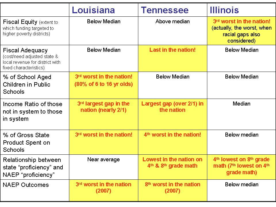
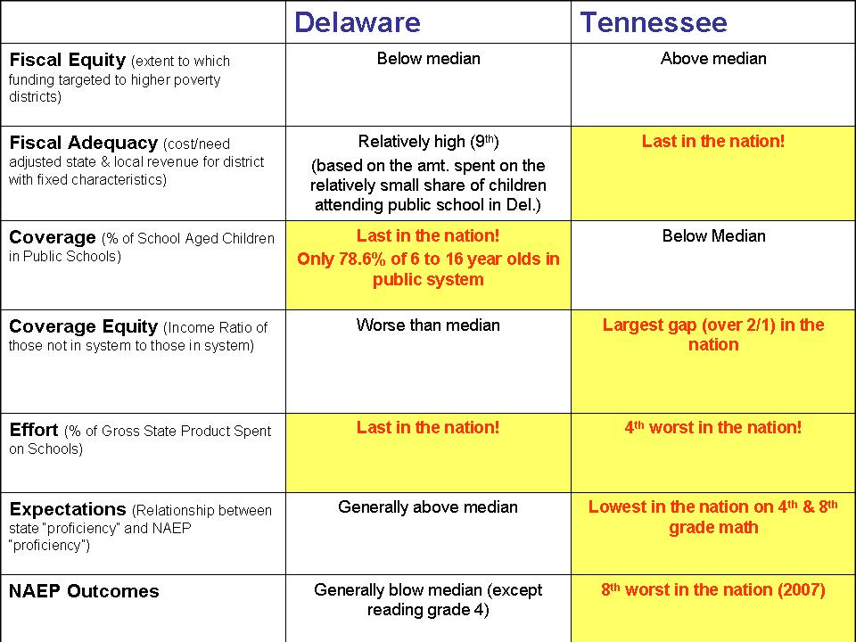
    Today, we have our winners – Delaware and Tennessee. Here’s my own summary of where these states stand on a number of key indicators. See previous post for discussion.

    A helpful colleague offered the following summary bullet points for the above table (which I just didn’t have time to do myself when I first posted this). It’s a little hard to quote a table, so here’s the bottom line:

    • Delaware is dead last in the nation in terms of its effort to fund public education, despite that state having the nation’s greatest fiscal capacity (largest per capita GDP).
    • Delaware is also dead last in the nation in terms of its public schools serving school-aged kids:  21% of its school-aged kids do not attend the public schools.
    • Tennessee is ranked 4th from last in states’ efforts to fund public education.  Tennessee is also among the lowest scoring states on the NAEP assessments.
      • (“Effort” is here defined as state and local spending relative to state fiscal capacity, with “fiscal capacity” measured as per capita GDP.)

    So then, who cares? or why should we? Many have criticized me for raising these issues, arguing “that’s not the point of RttT.  It’s (RttT)not about equity or adequacy of funding, or how many kids get that funding. That’s old school – stuff of the past – get over it! This…  This is about INNOVATION! And RttT is based on the ‘best’ measures of states’ effort to innovate… to make change… to reach the top!”

    My response is that the above indicators measure Essential Pre-Conditions! One cannot expect successful innovation without first meeting these essential preconditions.  If you want to buy the “business-minded” rhetoric of innovation, which I wrote about here , you also need to buy into the reality that the way in which businesses achieve innovation also involves investment in both R&D and production (coupled with monitoring production quality). You can have all of the R&D and quality monitoring systems in the world, but if you go cheap on production and make a crappy product – you haven’t gotten very far.  On average, it does cost more to produce higher quality products.

    This also relates to my post on common standards and the capacity to achieve them. It’s great to set high standards, but if don’t allocate the resources to achieve those standards, you haven’t gotten very far! It costs more to achieve high standards than low ones. Tennessee provides a striking example in the maps from this post! (their low spending seems generally sufficient to achieve their even lower outcome standards!)

    That in mind, should states automatically be disqualified from RttT for doing so poorly on these Essential Preconditions? Perhaps not. After all, these are states which may need to race to the top more than others (assuming the proposed RttT strategies actually have anything to do with improving schools). But, for states doing so poorly on key indicators like effort and overall resources, or even the share of kids using the public school system, those states should at least have to explain themselves – and show how they will do their part to rectify these concerns.

    Would $8,000 Scholarships help Sustain NJ Private Schools?

    Note: This was written prior to the announcement that the scholarship amounts would be $6000 for elementary and $9000 for secondary schools. The same logic and findings apply, though to an even greater extreme in light of these numbers.

    Part of the argument being made for providing $8,000 scholarships for students to attend private schools in New Jersey is that those scholarships would help financially sustain struggling New Jersey private schools. I published an extensive report on private school costs last summer, here: http://epicpolicy.org/publication/private-schooling-US

    In this report, one issue I address is the fiscal problems of urban Catholic schools which have struggled to survive on shoestring budgets. The reality is that most operate with a very large differential between tuition charged and actual operating costs. In 2007-08, average tuition charged by Catholic Parochial and Catholic Diocesan schools in New Jersey was about $4,000 and $5,000 respectively at the elementary level, and about $9,000 at the secondary level (based on the very limited sample in the Schools and Staffing Survey of 2007-08, National Center for Education Statistics). Private non-religious school tuition was about $11,000 at the elementary level and $18,000 at the secondary level. the weighted average tuition across all school types for New Jersey private schools was $10,206. So, even keeping this figure in mind… if tuition held constant from 2007-08 to 2010-11, the $8,000 scholarship would fall $2,000 short of average tuition… not even average cost.  Clearly, private schools on average would be taking a loss to accept these scholarships, unless only the lowest spending private schools accepted the scholarships or unless the scholarships were to stimulate massive additional philanthropy outside of the tax credit program.

    But again, these above tuition estimates are based on relatively small numbers of schools and the schools from these national surveys cannot be listed individually because of confidentiality issues.

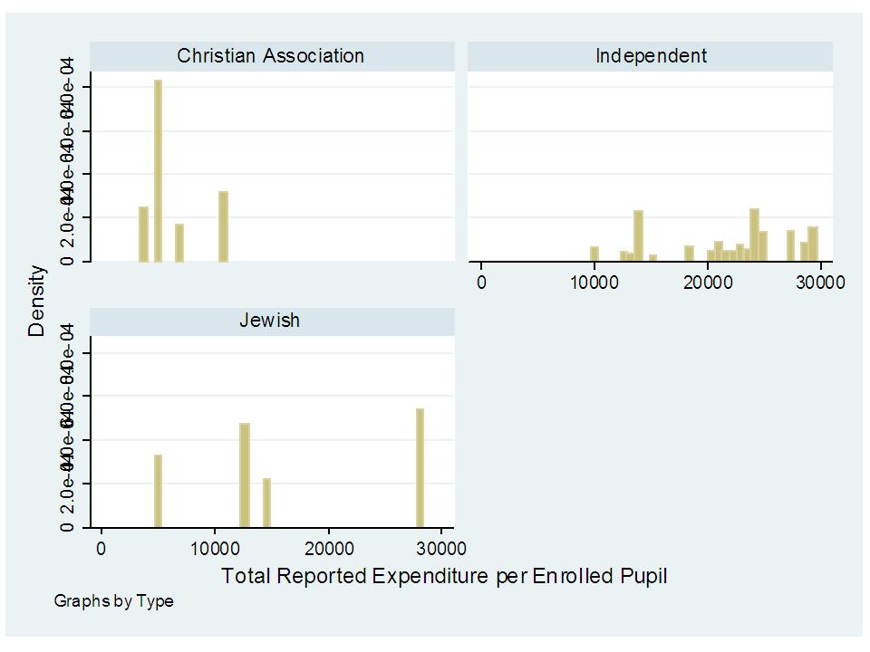
    Most importantly those tuition figures don’t represent actual total costs of operating and maintaining these schools. All rely on some form of philanthropy and/or church subsidy to cover full costs. Below is a summary graph of IRS Tax Filing data on New Jersey private schools (2007 tax year).  Schools that most consistently report their financial data (by obligation) are those which are not officially religiously affiliated (specific church), but some religious schools do. The graph below includes  Total Expenditures per enrolled pupil, where Total Expenditures are from the IRS 990 (and include all expenditures including those for capital in the given tax year and other contracted services) and enrollment data are from the National Center for Education Statistics Private School Universe Survey.

    Notably absent in the graph below, but included in the tuition averages above are Catholic schools, which represent approximately 67% (seems to vary by year of data) of students in private schools in New Jersey.

    Most schools represented by the averages below would need to take a substantial loss for each child accepted on the $8,000 scholarship (in 2007).  There are no doubt interesting quirks (large capital expenditures for some?) and omissions (suspiciously low expenditures for others) in these individual school reported data, but they are illustrative nonetheless. Boarding schools are excluded.

    An important feature here is that the only schools that would not operate at a loss on the proposed voucher level are religious schools. That is, we should expect that at this voucher level, the vast majority if not all students using the voucher would have to use it at private religious schools unless private non-religious schools were able to find substantial additional resources to offset large per pupil losses (cost – voucher differences).

    In general, an $8,000 voucher would likely do little to help sustain fiscally stressed private schools in New Jersey because the voucher does not cover operating costs.

    Providing these vouchers might (would likely) increase private school enrollment, making certain private schools more accessible to low-income families. And, some students may benefit from this (while others may not). But, such a program will likely do little to cure the fiscal woes of cash strapped private schools. In fact, some have argued specifically in reference to Catholic schools that parishioner philanthropy to the schools may decline as those schools take on more non-Catholic students through vouchers, causing the school’s mission to drift.

    In a related recent post, I point out that in general, when it comes to these large differences in spending by private school sector, you get what you pay for: https://schoolfinance101.wordpress.com/2010/02/20/stossel-coulson-misinformation-on-private-vs-public-school-costs/

    From previous post:

    • Private independent day schools which provide small class sizes with highly academically qualified teachers spend well above nearby public schools.
    • Catholic schools, where they report their finances (not the crude survey summary data of tuition and expense compiled annually by the National Catholic Education Association) spend marginally less than nearby public schools (but charge much lower tuition than cost), perform about the same if given the same kids and have comparably qualified teachers in terms of academic preparation. Note that Catholic schools in trying to operate on a shoestring have been financially failing at an alarming rate. That is how markets work when you try to hard to price your product below the cost of maintaining quality (a more friendly spin being that the social service mission of urban Catholic schools has outpaced church philanthropy). I discuss this extensively in the report.
    • Conservative Christian schools (to the extent they can be lumped together) operate at much less per pupil than traditional public schools and have lower outcomes given the same students and have disturbingly academically weak teaching staff based on national survey data.

    Note: According to: http://www.njsendems.com/release.asp?rid=3254

    The proposed voucher amount is to be $6,000 (elem) to $9,000 (secondary). The link above claims:

    The $6,000 to $9,000 amount is the current average cost per student at non-public schools…

    This statement is completely absurd… and quite simply FLAT OUT WRONG! According to what source? Does actual data matter at all here? Wow! Even Cato, which grossly underestimates private school costs estimates the NYC metro average at $10,500 for 2009 (see first section of this post, Cato link).

    Mean per Pupil Spending by Private School Type

    Distribution of Private School Students in New Jersey

    Distribution of per Pupil Expenditures by Private School Type

    New Jersey: Cert. Staffing Costs & State & Local Spending

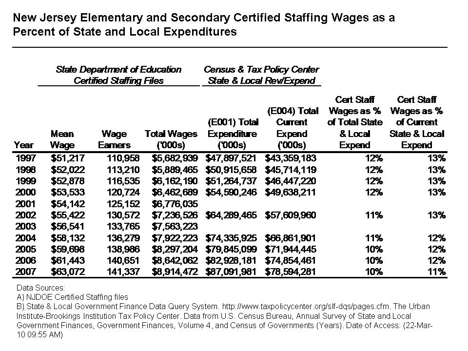
    Only one table today, as I continue to try to figure out how elementary and secondary education staffing costs and teacher wages fit into state and local budget concerns in New Jersey. Are certified employee staffing salaries really escalating? Are they outstripping state and local budgets? I really am just trying to find the best measures of this apparent concern. Because state aid to schools is an intergovernmental transfer to local public school districts, certified employees are not a direct state expense and therefore not reported as such. Certified education employees are hired by local public school districts and paid for with a combination of the state aid and local property taxes. As such, it is a bit of a data struggle to figure out how best to tally the total cost of certified public school employees with respect to total state and local expenditures.

    Here’s one shot at it. For this table, I use the NJDOE Certified Staffing files to tally the total costs of wages (not benefits) for certified education employees. I then divide the certified staffing wages by a) the total state and local expenditures for the same years and b) the current state and local expenditures for the same years as reported in the Census fiscal surveys (accessed through: http://slfdqs.taxpolicycenter.org/pages.cfm) . The findings are rather interesting – Elementary and Secondary Public School Certified Staffing Salaries have DECLINED as a percent of Total State and Local Expenditures from 1997 to 2007.

    Let me be absolutely clear here – It does not always work well to combine such different data sources (individual staffing files on teacher salaries and reported aggregate budget figures). It should, logically – but data realities often thwart logic. One data source should be useful for characterizing the total salary expense on teachers, if, in fact, the data are truly comprehensive and the other should provide a reasonable estimate of total state and local expenditures.

    Also, be assured that I understand fully that an alternative issue is whether teacher wages are increasing pressure on local school district budgets, which I do not address here. That is, what is the percent and change in percent of local public school budgets that are going to teacher wages (and benefits)? While an important and relevant question that is not what I am endeavoring to explore here (I address that question here – at the end of the post: https://schoolfinance101.wordpress.com/2010/03/17/just-the-facts-nj-taxes-teacher-salaries-and-spending-fluff/). Rather, I am exploring whether there is an empirical basis for arguing that salaries of certified public educators are a primary cause of stress to state and local budgets as a whole, in New Jersey. Please read previous posts(and comments sections) for a discussion of benefits.

    Proposed NJ State Aid Cuts 2010-11

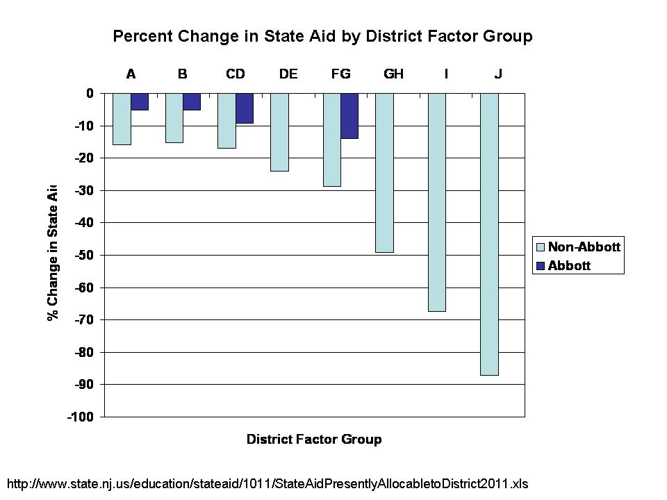
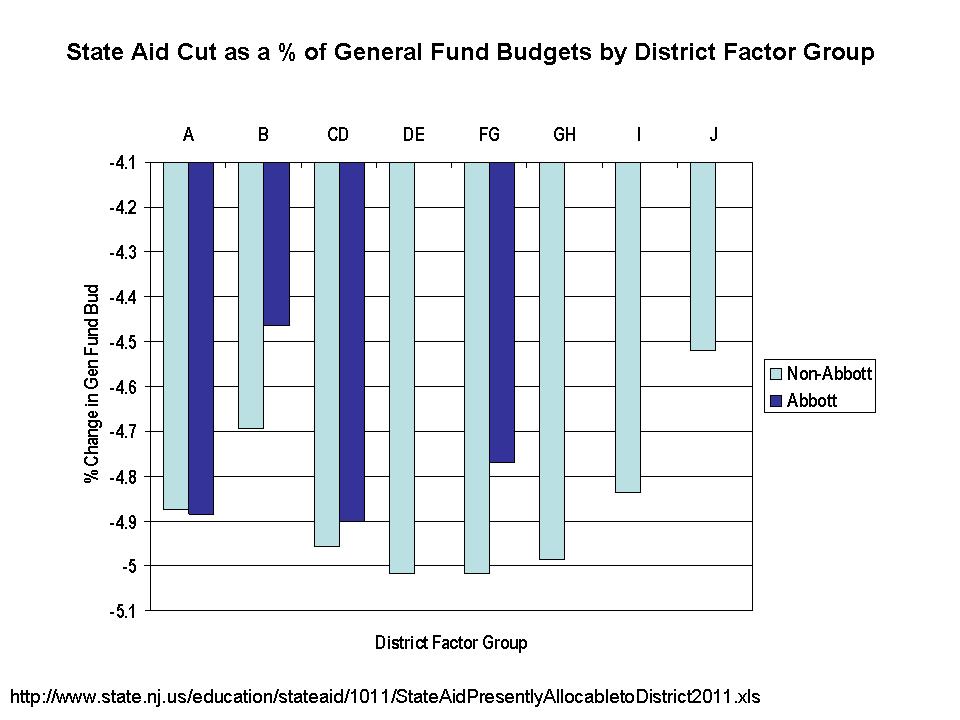
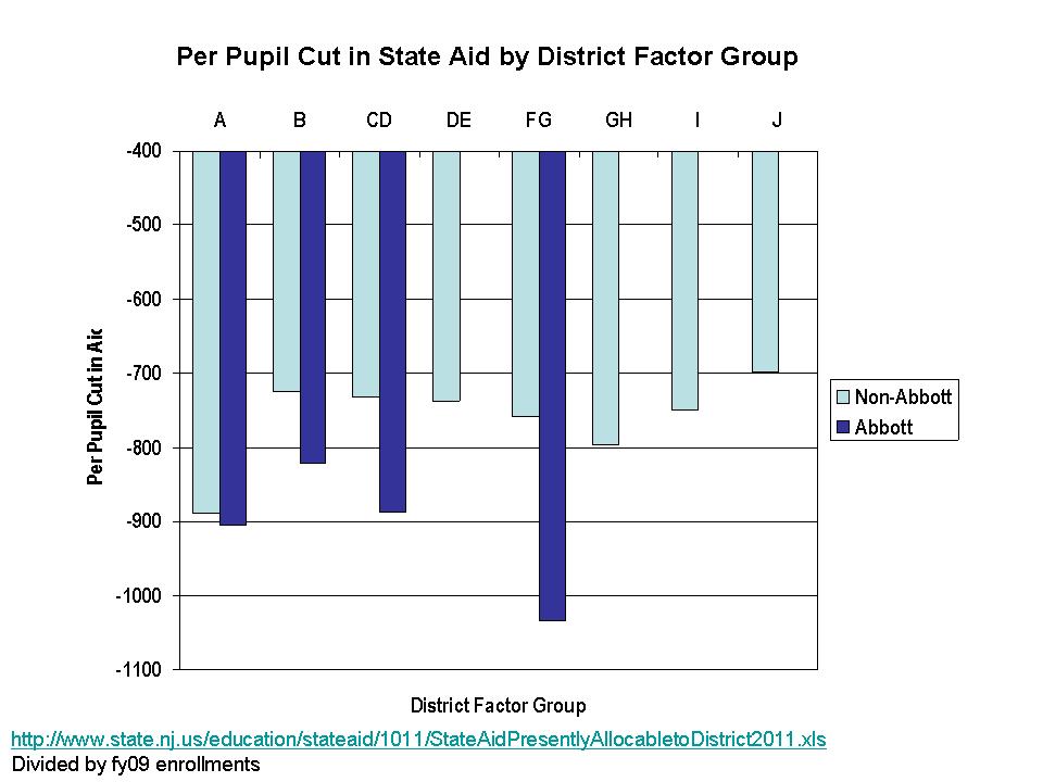
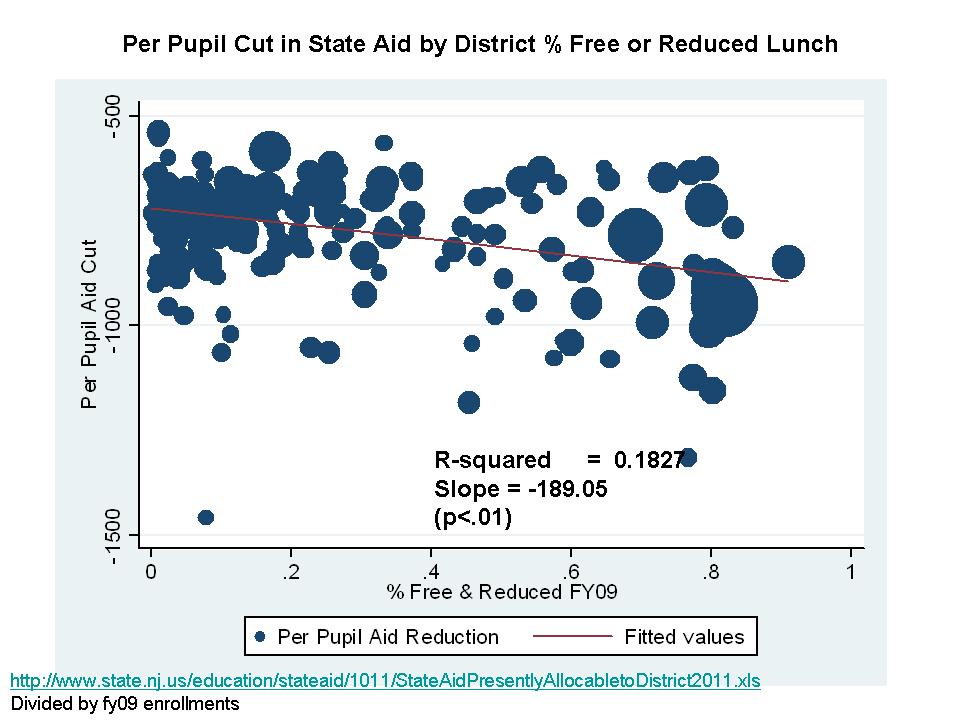
    Here’s a quick run down on the distribution of cuts to state aid for New Jersey school districts for 2010-2011. Much has been made in the media about how the cuts are most severe for wealthy communities. The graphs below show that that depends much on what you’re looking at. Yes, these communities lose a much larger share of their state aid, but their general fund budgets are much less dependent on state aid. When viewing the cuts in terms of per pupil aid cuts, the cuts are actually higher in higher poverty districts.

    As a refresher – District Factor Groups are essential wealth/income classifications, where I and J are relatively wealthy generally suburban districts and A and B represent poorer, often (though not entirely) urban core districts.

    Just the Facts: NJ Taxes, Teacher Salaries and Spending “Fluff”

    Download PPT Slides (UPDATED): jersey-taxes-and-teacher-wages_r6

    I’ll do my best not to editorialize too much here. Just the facts. Just a few slides in order to clarify where New Jersey stands in terms of taxes, long run economic position and growth, teacher salaries and the allocation of resources in school districts. These slides are in response to claims that;

    1. New Jersey is the most taxed state in the nation,
    2. our taxes are driving our economy into the ground and we’re falling way behind all other states,
    3. our teacher salaries which are completely out of control are the reason why our taxes are out of control,
    4. school districts don’t have to cut teachers to get their budgets in line because school districts waste most of their money on administration anyway.

    Of course, these last two claims are entirely inconsistent, but often spouted by the same pundits (primarily talk radio).  If escalating teacher salaries were the cause of escalating costs, then teacher salaries – or teachers themselves – would need to be cut.

    A few take home points from the slides below are:

    Taxes

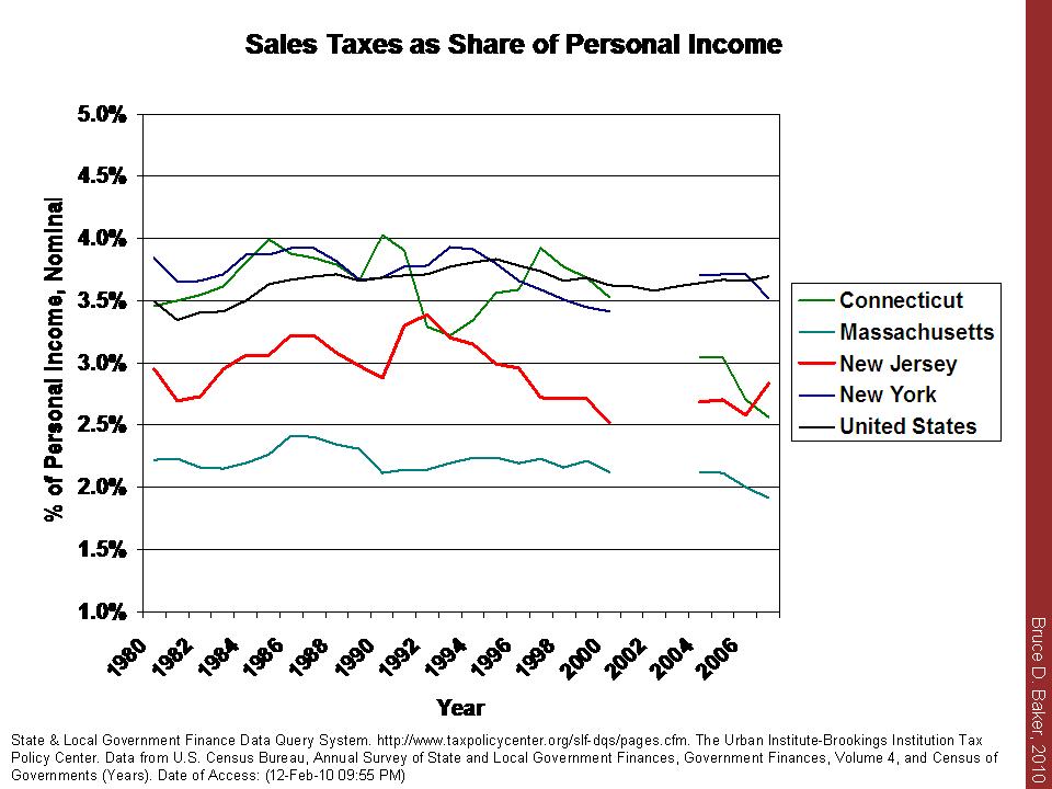
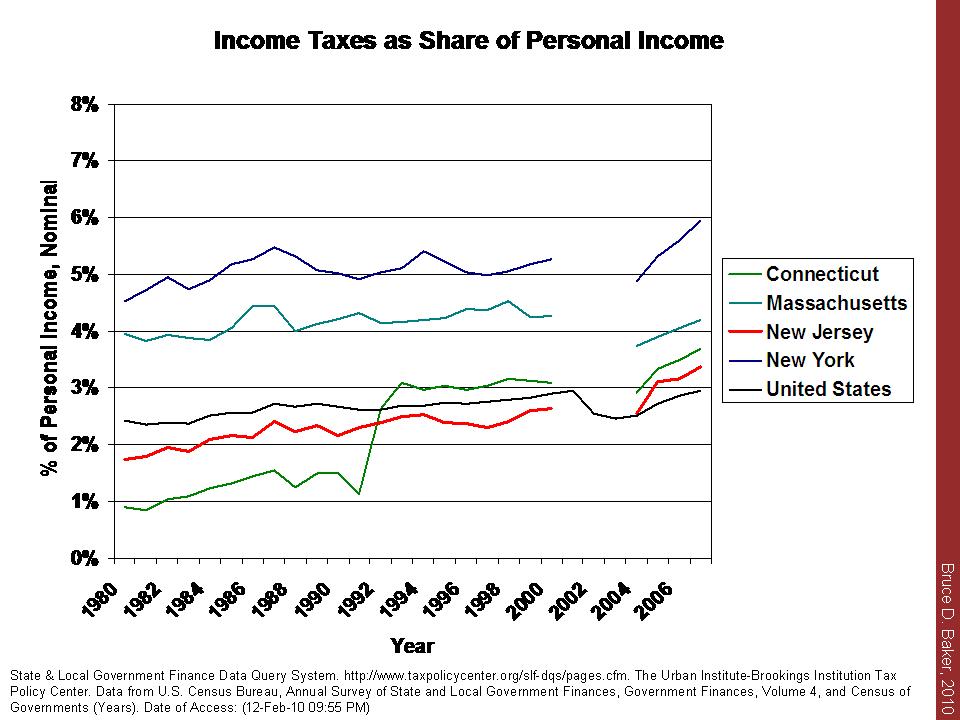
    a) New Jersey is not, in fact, the highest taxed state in the nation. Our property taxes are high, but our income and sales taxes are modest by comparison. We’re also not number one in property taxes when all states are considered and when property taxes are measured as a percent of income.

    • Note: There has been much media buzz this week about this report: http://www.taxfoundation.org/files/f&f_booklet_20100325.pdf which identifies New Jersey as #1 on this supposed same measure for 2008 (See Table 2). The cited source for their information is their own report, footnoted as: Tax Foundation Special Report, No. 163 (from August 2008: http://www.taxfoundation.org/files/sr163.pdf.) Table 1 of this report cites advance estimates of 2008 data which would appear to be from the same sources I have used. BUT… I have chosen a simple straightforward – directly cited comparison of final data and over multiple years. I have also disaggregated debt burdens from other taxes. Here is a PDF of the actual extract of the supposed same data. State & Local Finance Data .. By these data, which you can download yourself, NJ is NOT #1. That said, I have little reason to believe that taxfoundation.org would necessarily hold a NJ bias that would cause it to want to alter the stats to put NJ at #1.  The numbers just don’t match up.

    Productivity

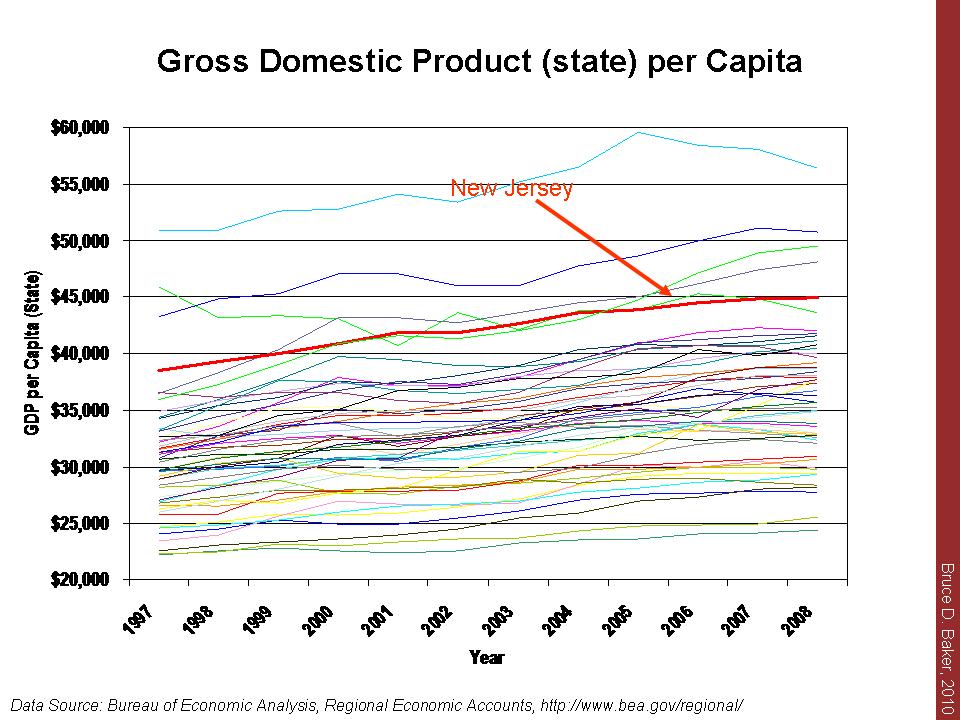
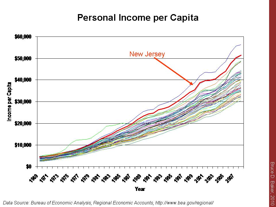
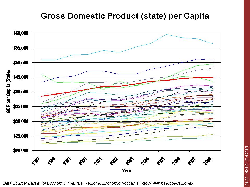
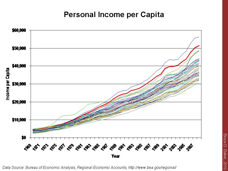
    b) New Jersey remains high in gross state product (gross domestic product – state) per capita. Our growth has been only modest, but some of those states in our region that have outpaced us in recent years are actually states with higher tax burdens (NY). This is obviously not causal – ONE WAY OR THE OTHER! New Jersey also remains high in per capita income and has held pace over time despite apocalyptic claims that all of the state’s high income residents are exiting the state in droves.

    Teacher Salaries

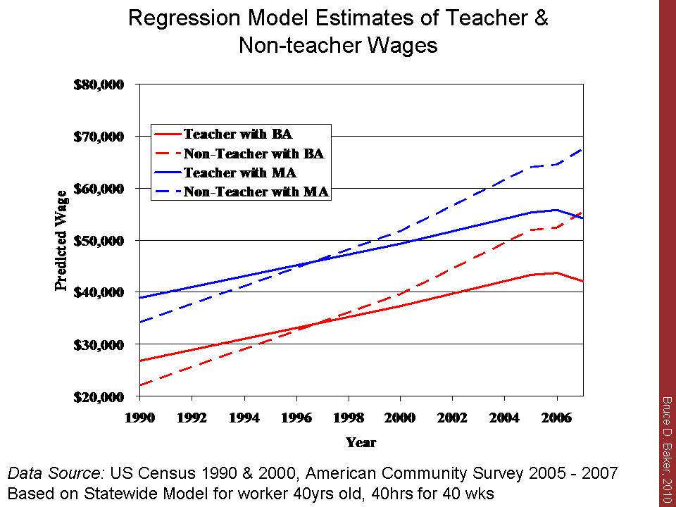
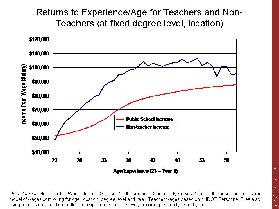
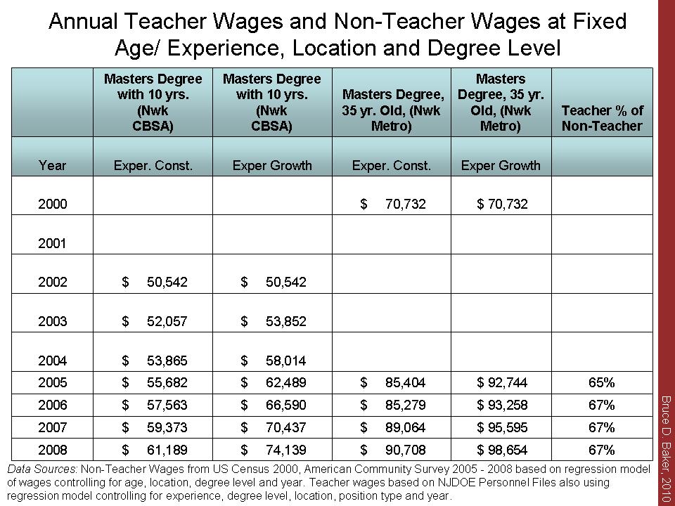
    c) Teacher salaries have actually declined with respect to non-teacher wages over time in NJ, even when comparing wages for the same number of hours and weeks worked, and at same degree level and age.

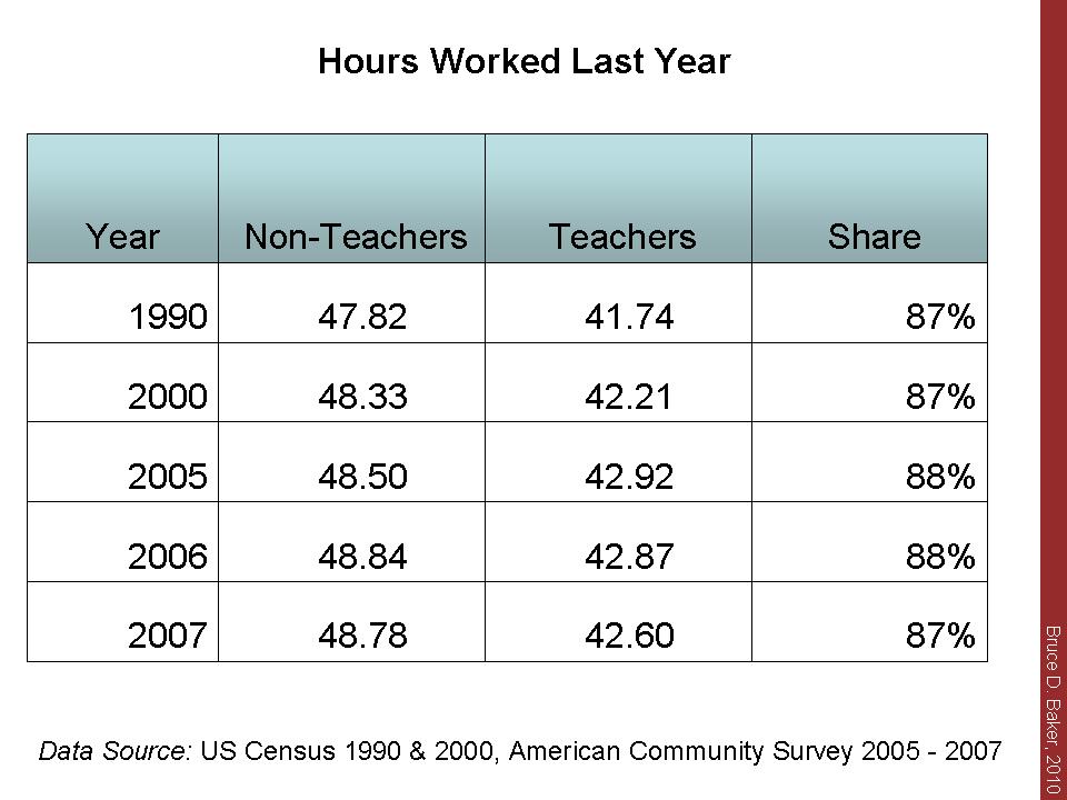
    d) Despite a mythology that all non-teachers work every day of every week of the year and that teachers work about half the year, non-teachers actually report working about 48 weeks per year compared to teachers 42 weeks. Teachers worked about 87% of the weeks worked by other non-teacher workers in NJ.

    e) Comparing different data sources (something I prefer not to do), teachers at specific experience and degree levels appear to earn an annual wage about 67% of that of their non-teaching peers – annually. Okay, but they don’t work as many weeks. So, they earned 67% of the wage for working 87% of the time. Still a significant disparity.

    f) Teachers’ annual income return to experience (or age)  is well less than that of non-teachers over much of their careers. Assuming teachers and non-teachers start at a similar wage at age 23 with a masters degree (around $50k), by age 40, the average non-teacher will be earning over $100k, while the average teacher will be approaching $80k .

    Note regarding benefits & bias: Corcoran and Mishel point out here: http://epi.3cdn.net/05447667bb274f359e_zam6br3st.pdf

    …overall K-12 teacher compensation was 27.5% greater than teacher wages alone, while overall professional compensation was 23.5% greater than professional wages. These differences in benefit shares translate into a benefits “bias”of 2.8 percentage points in 2006.

    That is, benefits would close little of the overall gap in wages. Costrell and Podgursky show about a 5% (slightly less) differential (10% non-teachers, 15% teachers) in the value of pensions, a portion of benefits. This too would close only part of the teacher to non-teacher wage gap in New Jersey, even if we assume New Jersey benefits for teachers to be much greater than other employee benefits.

    Growing Waste in School Budgets and The “Blob”

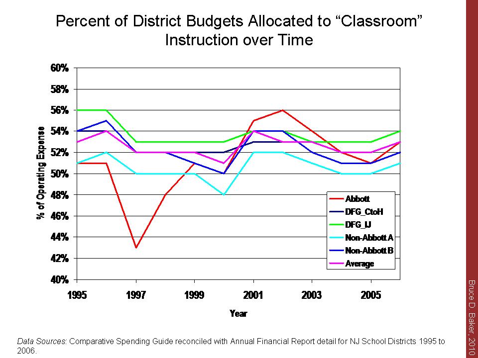
    g) Classroom instructional spending as a share of budgets has remained relatively constant over time, and poor urban districts are in line with other NJ districts in this regard.

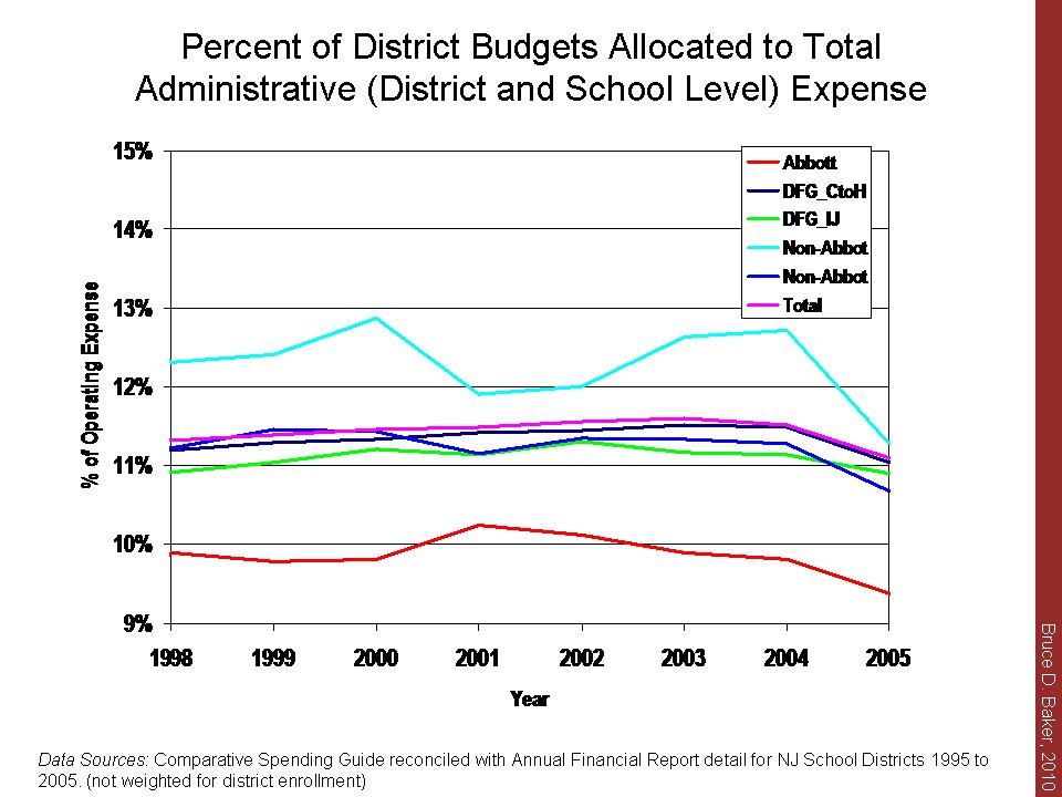
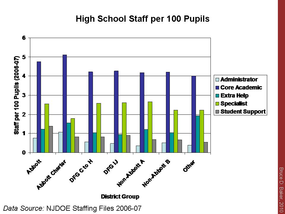
    h) Total administrative expenses as a share of school district budgets have remained relatively constant for nearly 15 years and large poor urban and Abbott district administrative expenses are in line with (and lower than) other districts.

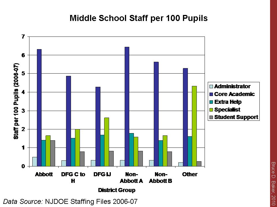
    i) School level administrators are a relatively small share of school personnel. Not shown here, but also relevant is the fact that school level administrative salaries are only marginally higher than senior teacher salaries. As such, it is highly unlikely that one can cut substantially close budget gaps by cutting “administrative fat” alone.


    Swatting Flies: Kansas City, NJ Tax Limits, NCLB Blueprint & Private School “Costs”

    There’s just not enough time in the day to deal with all of the absurdity out there right now and to do so in any thorough way. So, here are a couple of quick replies to what I’ve seen in the past week.

    1. Cato released They Spent What? http://www.cato.org/pubs/pas/pa662.pdf in an attempt to show how much more public school districts in any one location spend than “private schools.” So, Cato took total expenditure data (all capital outlay, etc.) for urban public school systems for 2009 and divided it by enrolled students to get a maximized total expenditure figure for public school districts. Then, they compared this maximized public expenditure figure to a “median” (not mean, or mean weighted by actual # of students served, but a deflated, school level median) tuition level from a national sample of private schools (about 2,300) from 2003-04 and rather arbitrarily assumed that tuition from 2003-04 represents 80% of total expenditures and that private school tuition rose by $347 per year between 2003-04 and 2009.  Note that even at the region level (not the city level used by Cato) the Schools and Staffing Survey includes relatively small samples of private schools. Further, Cato provides little justification for either the 80% or $347 figure – except to refer to their own “expert” on the topic (and some location specific reports). For a better analysis of actual private school spending with detail on samples and data sources, see: http://epicpolicy.org/publication/private-schooling-US (note that I make one similar inappropriate comparison in this report where I used operating expenditures for Wash DC in the discussion section. Other than that, this report compares totals to totals and based on actual financial documents of private schools).

    2. Much has been made in recent days of the closure of about half of the Kansas City Missouri Public Schools. Some have compared this event to Central Falls firings – Taking a hard line on “failing urban schools in need of reform.” Wow… that’s a stretch. Others have casually thrown around rhetoric of $2 billion dollars wasted on social engineering in Kansas City, in reference to desegregation litigation that extended from the 1970s through 2003. For a more precise history of what actually went on during the desegregation litigation, see: http://law.bepress.com/expresso/eps/1213/

    Also, note that in 2006 (2007?), the Missouri legislature passed a law which allowed the remaining predominantly white residential corner of Kansas City Missouri School District to vote itself out of KCMSD and into a neighboring predominantly white district (since the deseg case was over, apparently this was okay). This resulted in the transfer of a large share of children and a handful of school facilities to Independence, MO. As a result of this and other factors (including increased charter school enrollment), KCMSD now serves about half the number of children it did when I first lived there about 12 years ago.  While I’m unaware of the specific reorganization plan to be implemented, it would seem that some reorganization might be warranted. But, it should also be acknowledged that the State of Missouri has, since 1995, continuously pulled back financial support for KCMSD while advancing policies that leave KCMSD with a more needy, albeit smaller, student population to serve. More on this at a later point.

    3. New Jersey’s Governor has proposed a constitutional amendment placing a cap on both local property tax growth and on state expenditure growth. It would appear that the proposal would allow for local referendum to override the cap, but it is a cap nonetheless and one based on an arbitrary constraint of 2.5%. What do we know about such “Tax and Expenditure Limitations,” or TELs? In short, they are generally bad policy which do not lead to “economic growth” (“private” sector growth) and which often lead to decreases in a) the quality of public school teachers and b) student outcomes.  That is, hard caps on state expenditures and/or local property taxes tend to harm public service quality – specifically public education – and really don’t provide other economic growth benefit. Colorado’s TABOR is a particularly striking example. The local override option would result in significant inequities across municipalities and school districts which have widely varied capacity to achieve an override. Link to analysis of Massachusetts’ Prop 2 1/2.

    4. Finally, the NCLB Blueprint (http://www2.ed.gov/policy/elsec/leg/blueprint/blueprint.pdf) was released by the Dept. of Ed. The Blueprint contains only this short reference to “equity,” and seems to emphasize the district responsibility over the state responsibility – in part by the sequence of their reference, but also by reference to “comparability” which is terminology specifically related to within district allocations and Title I aid.

    Greater equity. To give every student a fair chance to succeed, and give principals and teachers the resources to support student success, we will call on school districts and states to take steps to ensure equity, by such means as moving toward comparability in resources between high- and low-poverty schools.

    As I’ve noted many times before, the greatest disparities between higher and lower poverty schools are those that exist between, not within districts, largely because few districts have both high and low poverty schools. Rather, there are higher and lower poverty districts. I will post more on this topic when my forthcoming article on within versus between district disparities comes out in the near future.

    And the (RTTT) Nominees are…

    Not much time today to analyze, but I can’t pass up the opportunity for some quick comments on the Race to the Top Finalists announced today. The list is indeed a mixed bag (DC, CO, DE, DC, FL, GA, IL, KY, LA, MA, NY, NC, OH, PA, RI, SC, TN).

    And yes, the list does include three of the most talked about early heavy favorites – and my favorites, of course – Louisiana, Tennessee and Illinois. (and there are many more comments on these states and their RTTT prospects throughout my earlier blog posts).

    Here’s my rap sheet on these states in particular, and why I find it so completely absurd that simply a) removing caps on numbers of charter schools coupled with b) removing firewalls between teacher and student data are the primary criteria (or at least seem to be) for the big race.

    It’s not just that some of these states have mildly problematic policies from a critical academic perspective. Rather, these three states in particular have compiled a record of education policies – both on the fiscal input end and on the outcome, standards and accountability end which are outright disgraceful.

    The only thing going for Tennessee’s education system – beyond its data quality – is the fact that funding is relatively equitable within the state (compared to many states). But, that’s only because everyone has next to nothing! Tennessee currently maintains the least well-funded, overall, education system in the nation after correcting for costs associated with a) poverty, b) economies of scale and sparsity and c) regional competitive wage variation.

    And not only is Tennessee dead last in overall funding, but it is also dead last in the rigor of its testing standards, when compared against NAEP proficiency standards. So, can the data really be that good if the standards are so low? if the proficiency rates on state assessments are so high even though the state ranks near the bottom on NAEP proficiency?

    So, Tennessee spends little and expects little, but measures it well! In addition, Tennessee’s low spending appears to be largely a function of lack of effort, not lack of wealth. Tennessee is 4th lowest in the nation on the percent of gross state product spent on schools. Further Tennessee has the largest income gap between children not in the public schools and children in the public schools.

    I’ve written more about Louisiana’s prospects in the past. Louisiana, like Tennessee, has mainly itself to blame for its low spending. Louisiana is 3rd lowest in the nation on the percent of GSP allocated to public schools. Coupled with that, Louisiana has the 3rd smallest share of 6 to 16 year olds in the public school system and the 3rd largest income gap between those in and not in the system. Louisiana’s own state testing standards are relatively average, but its NAEP outcomes are right there at the bottom (okay… 3rd from bottom across math and reading, grades 4 and 8 in 2007).

    So, these two standout RTTT finalists are states that have pretty much chosen to throw their public education systems under the bus. Yet, they are somehow racing to the top!??

    So, how does Illinois fit into this mess? Instead of throwing its entire system under the bus, Illinois has merely chosen to sacrifice the education of poor and minority children. Illinois maintains among the least equitable state school funding systems in the nation with among the largest funding gaps between wealthy and poor, minority and non-minority districts.  And, as it turns out, Illinois also has very low testing standards when mapped to NAEP standards.

    Slides from recent presentation to National Urban League.

    National Urban League Presentation

    Who’s next? And who is really to blame?

    Apparently, we now have a national initiative underway to replicate the Central Falls, Rhode Island drama across poor urban and inner urban fringe schools and districts. This national initiative places blame for school failure directly on school principals (who, by necessity must be replaced if reform is to happen) and on at least 50% of each failing school’s teachers. Once again, there is no attention paid to whether or not the STATE has, in fact, fulfilled its obligation to provide (or ensure) equitable and adequate financial resources for the district or schools under fire. None – no mention of it whatsoever. Clearly, it must be the principal’s and teachers’ fault if a school fails, regardless of the resources available to that school or host district???

    Few locations nationwide provide more stark examples than Duncan’s home state of Illinois for why this “blame the school,” “blame the teachers,” “blame the central district office” perspective is so deeply problematic.

    To date (assuming Pennsylvania continues to follow through on its finance reforms), Illinois maintains the most regressive state school finance system in the nation. What I mean by this is that Illinois maintains a system whereby higher poverty school districts – and higher minority concentration school districts – receive systematically less state and local revenue per pupil than lower poverty ones. And the disparities in Illinois are far greater than almost anywhere else in the country.

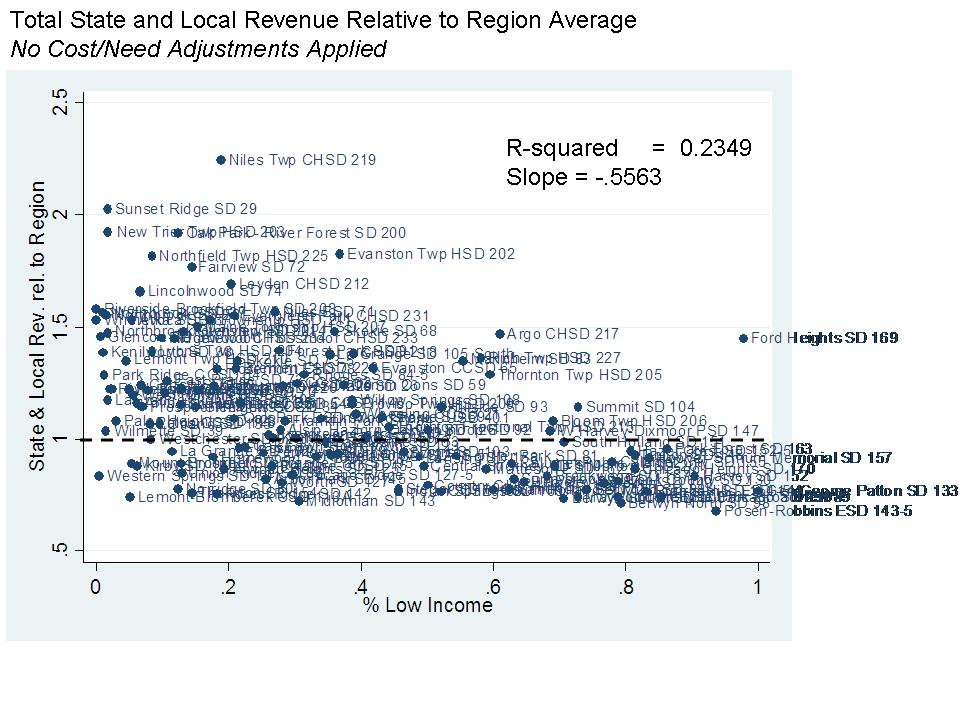
    Here, for example, is the relationship between the relative level of state and local revenue per pupil (2007-08) and district shares of low-income children for school districts in the immediate Chicago region. 1.0 on the vertical axis represents the average state and local revenue. A value of less than 1.0 indicates less than average state and local revenue in the region. As poverty increases, relative state and local revenue decreases. There are no fancy cost adjustments applied here. This is just straight up, state and local revenue – the bulk of school funding.

    So – why does this matter? The reality is that these much higher need districts require more, not fewer resources if we expect them to approach comparable outcomes. On the one hand, they need more resources in order to provide greater staffing intensity (staffing quantities) to provide the level of services needed to overcome background differences of the children they serve. In addition, it is increasingly well understood that to recruit and retain comparably qualified teachers into higher poverty, higher minority concentration settings requires a higher wage than in surrounding districts which happen to have more desirable working conditions. In short, higher need districts require a greater number of comparable teachers, who come at a higher price per teacher. That gets expensive.  So, even if these higher poverty districts had comparable state and local revenue, they’d be in a bind.

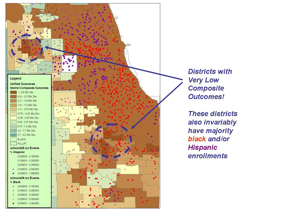
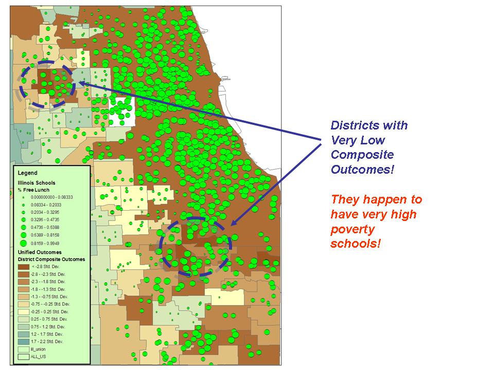
    Here’s a map of district composite test scores expressed as standard deviations from the mean of districts serving comparable grade levels (because proficient rates tend to shift by grade level). Deeper brown colors are the “low performers” and darker blue colors are the “high performers.” We can quickly identify a few good candidates for whipping out the Central Falls playbook! There they are – in Deep Brown… the failures… who must be reformed… replaced…!!! And of course, it’s their own darn fault! Mismanagement. An abomination. Our kids deserve better!!!!! How dare these adults treat them so poorly!!!! (in this map, purple dots indicate majority Hispanic schools and red dots, majority black schools).

    Okay, enough of that. Note above that most of these low performing districts are also districts with majority black or Hispanic schools. Here’s the same map but with school poverty represented as circle size. Notably, these low performing districts also have very high poverty schools.

    Now let’s go back to the scatterplot of relative state and local revenues, but focus on the highest poverty school districts:

    Our very low performing, high poverty districts are also very low in state and local revenue per pupil relative to their surrounding districts! Again, this graph includes no fancy attempt to adjust the value of state and local revenues for the different costs and needs faced by these districts.

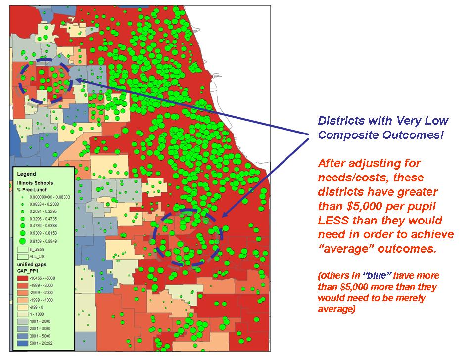
    But, this map does!!! Here, I have estimated a statistical model to determine the relative costs in each district of achieving state average composite scores, and from that model I have calculated just how much more (or less) each district would need to spend per pupil in order to be able to achieve state average outcomes (if it did so at average efficiency).Districts in the deepest red color would need over $5,000 more in per pupil current operating spending in order to have a shot at achieving average outcomes. Districts in blue have well more than what they need in order to achieve averageness.

    Each of our Central Falls candidates is in deep red here. Each has well less than it would need in order to achieve average outcomes. And that deficit is a function of inequitable and selectively inadequate state funding for local public school districts.

    Should we really be blaming, exclusively, the teachers and principals in these schools and districts for their failures? Does adequate and equitable state and local funding of these schools and districts have absolutely no place in the current policy discourse? How can two guys from Illinois take such a stand and do so with a straight face?

    Isn’t the state at least partly to blame for which schools and districts are failing under the STATE’s accountability system and under the STATE’s approach to financing schools? Do we really think that we can fix these schools and districts by dumping half the teachers, firing the principal and giving them a one time infusion of federal funding without ever addressing the systemic failures of the state’s education policies?

    I’m not trying to argue that these schools and districts actually do have great teachers who should be considered untouchable. They may not. They may have among the least qualified teachers available on the local labor market. It might even actually be a good idea to replace some or many of them. But, replacing these teachers with “better” teachers will require appropriate sustained resource levels – not a one shot infusion of federal bailout, or a constant churning of cadres of eager, well-educated and well-meaning volunteers.

    Some statistical context for Central Falls

    Pundits have been tweeting and blogging the Central Falls Rhode Island High School story this week, with many cheering the bold “turnaround” strategy of firing all of the school’s teachers. Essentially, the district Superintendent has dismissed all teachers in the school with the option for them to re-apply. The reason for the dismissal is that the school has performed very poorly in recent years on state assessments and when teachers were asked to work extra time, their union resisted – or so the reports go.

    Pundits seem to think this is a great idea: http://www.usatoday.com/news/education/2010-02-24-all-educators-fired_N.htm

    But Joe Williams of Democrats for Education Reform, a political action group, says: “This is what real political cover can do for public education. You see very clear signals coming from Washington that the Obama administration is serious about turning around our worst schools.”

    Central Falls has long been one of the worst-performing in Rhode Island. Just 7% of 11th-graders tested last fall were proficient in math and 55% were proficient in reading. In 2008, 52% of students graduated within four years.

    And: http://www.southcoasttoday.com/apps/pbcs.dll/article?AID=/20100224/NEWS/100229948

    U.S. Secretary of Education Arne Duncan applauded the plan, saying students only have one chance for an education.

    “When schools continue to struggle we have a collective obligation to take action,” he said in a written statement.

    The U.S. Department of Education does not play a role in deciding which model schools choose and did not know Wednesday whether Central Falls was the first to opt to get rid of its teachers, said Sandra Abrevaya, a department spokeswoman.

    The decision won praise from Republican Gov. Don Carcieri, a former math teacher who supports Gist.

    “We can no longer stand by as our schools underperform,” Carcieri said in a written statement. “While we have some excellent individual teachers, our students continue to be held back by a lack of a quality education and by union leadership that puts their self-interests above the interests of the students.”

    So, according to the above cast of characters, the way to fix low performing schools is simply to shake them up, get rid of the status quo current crop of teachers and others will be anxiously waiting in line to fill their shoes and fix these schools with the same or fewer resources and the same kids who’ve been there for years. I often point out that getting rid of your current teachers can really only lead to improvement if you are able to replace them with better ones. Are there 74 better teachers waiting in line outside Central Falls HS?

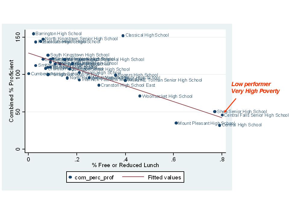
    That issue aside, let’s take a look at where Central Falls fits in among Rhode Island High Schools in terms of a) student characteristics, b) spending per pupil and c) outcomes (based on 2006 data – which hasn’t shifted much over time). First, let’s look at the relationship between school level free/reduced lunch rates and combined (summed) proficiency rates across RI HS:

    Yes, Central Falls is in tough shape – very high poverty and relatively low performing. But, not really off the trendline (above it, if anything) for performance given its poverty level and better than other high schools of similar poverty.

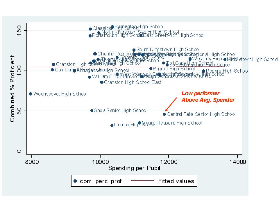
    Now lets look at Central Falls performance with respect to school site spending from Rhode Island’s IN$ITE database:

    Central Falls spending is somewhat above average. But again, its student needs are far greater than average – in fact, they are on the outer edge of the entire distribution. So, it is unlikely that “somewhat above average” per pupil spending is going to fully compensate for their high needs.

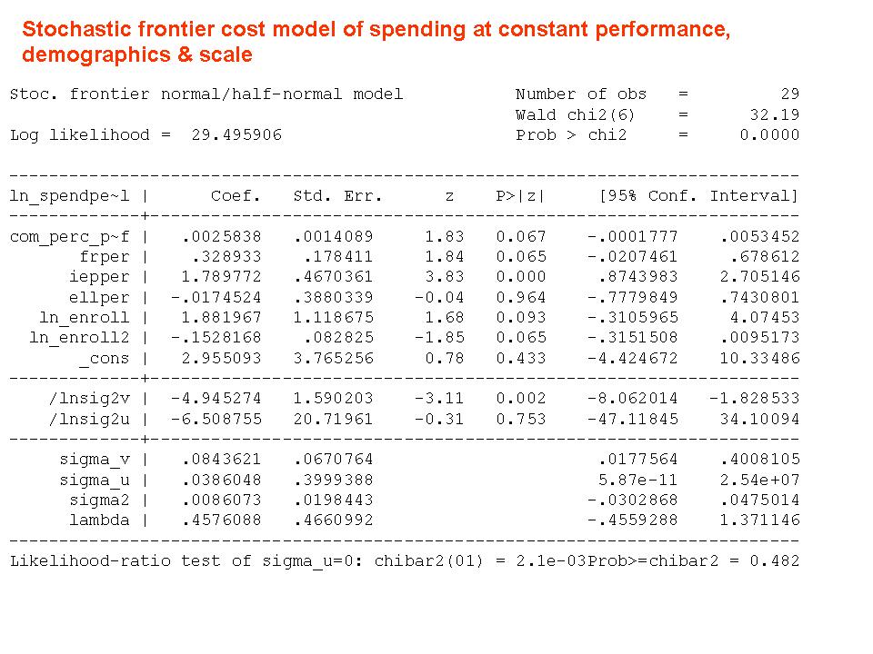
    Here is an oversimplified, but still ugly enough statistical model of the relative costs, given student populations, economies of scale and current outcomes, of Rhode Island High Schools in 2006 (I had run this previously with 2003 to 2005 with similar results):

    Admittedly this is no way to do “real” rigorous research. This is a single year of data on 30 high schools and too many covariates for the data. But, these data do reconcile with the model of the previous 3 years. I should also note that such analysis – those that try to pin down the relative efficiency of school district performance and/or cost – are generally unstable/unreliable. All that fun stuff aside, we have this crude model that tells us that at constant outcomes, per pupil costs are higher in higher poverty high schools and high schools with more special education children. And the model can produce for us an indicator of the extent to which each high school spends more or less than expected for the outcomes it receives – that is, the relative efficiency of the school. For the other stat geeks who might be reading, in this particular case, the estimates from the Stochastic Frontier Model and from the OLS regression model were identical.

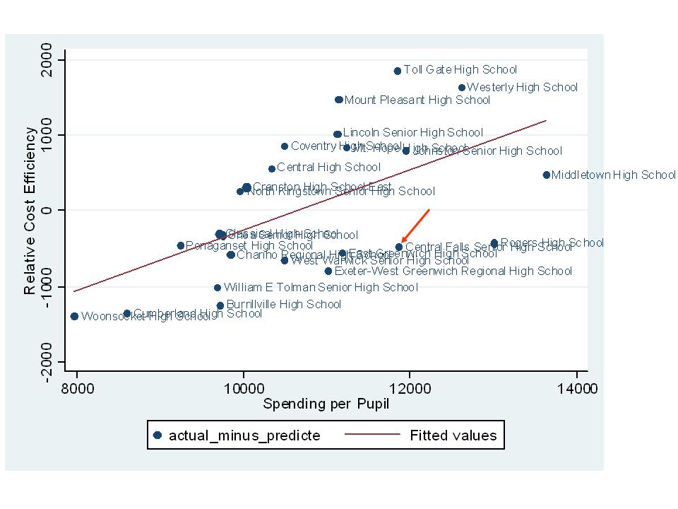
    Here’s the “relative efficiency” of Rhode Island High Schools with respect to cost, from lower to higher poverty high schools.

    As it turns out, the relative efficiency of Central Falls HS stacks up pretty well with other Rhode Island High Schools. That is, the actual spending per pupil in Central Falls is not far off from the predicted amount to achieve their current outcomes, with their current population.

    Here’s the above data, rescaled (from the OLS version of the model), and with the relative efficiency measures sorted from lowest to highest per pupil spending. The “0” line is the line where the district spends what it is predicted to spend to achieve its current outcome levels given its current students. Central Falls actually spends less than it is predicted to spend given its students and current outcome levels.  Many other high schools spend far more than expected, given their students and current outcomes.

    This seems like a fairer comparison than simply casting stones at Central Falls teachers for their miserable test scores.

    This is not to excuse low performance or to simply set a lower bar for this school because it serves a very high need population. But it is to point out that given their resources and their kids, they are doing as well as can be expected and better than many other Rhode Island high schools.

    This analysis is far from definitive, but is illustrative. If it turns out, through more rigorous multi-year analyses, that Central Falls is efficiently producing its current (miserably low) level of outcomes at its current (relatively inadequate) spending level (at least by comparison with all other Rhode Island High Schools), then one answer here might actually be that Central Falls needs more resources to achieve better outcomes. Why is there no talk of this possibility?

    The figures above suggest that Central Falls is doing as well with what it has as any other Rhode Island High School, after accounting for student needs. Where is the outcry over the amount Westerly High is spending to achieve its current outcomes (far less efficient that even Central Falls, in this quick analysis)? Yes, Westerly gets better outcomes, but with a much less needy student population (under 20% free or reduced compared to over 80%) and nearly $1,000 per pupil more in spending.

    =====

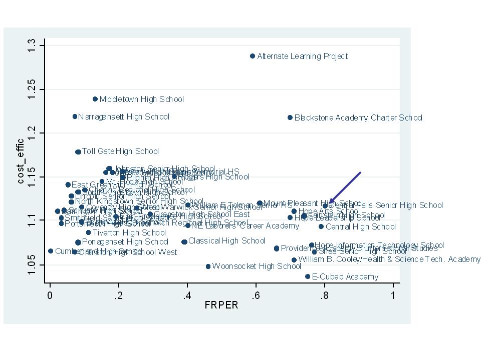
    Here’s the position of Central Falls based on my previous 2004-05 analysis. The overall cost inefficiencies are higher because the high schools were included in a model with middle and elementary schools (but with a dummy variable identifying them as high schools). This model included math outcomes only (language arts outcomes were non-significant). Again, Central Falls is not the standout inefficient school (Higher up in the graph is less efficient).