What does the education level of 25 to 34 year olds really mean?

About a week ago, The College Board released their latest status report in their college completion series.

http://completionagenda.collegeboard.org/sites/default/files/reports_pdf/Progress_Executive_Summary.pdf

The parts of the report that seemed to grab the most media attention were those related to a) comparing the US to other countries on the percent of 25 to 34 year olds who hold an associates degree or higher and b) comparing US states to one another on the same measure.

Newspapers across the country ran with this stuff and Twitter was buzzing with punditry on what these indicators meant about the quality of K-12 public schools in each state. Our public schools must be failing us if we’re only 24th on the education level of our younger adults – one Missouri pundit tweeted (related news story here).

The first thing that caught my eye was that Washington, DC was first in the rankings of percent of 25 to 34 year olds with an associates degree or higher.  Of course it is. Washington DC is a magnet for recent college graduates. Clearly, this particular indicator says as much about the employment options for a young, college educated workforce as it does about a state’s own education system. This indicator also tells us something about the education level and expectations of the previous generation – parents of these 25 to 34 year olds, whether in the same state or elsewhere. And, this indicator may also tell us something about the extent to which a state imports or exports college students.

So, I decided to play with some data…’cuz that’s what I like to do… just to see how these rankings might change if I tweaked them a bit.

I decided it might be fun to look at the differences in the rates of college educated adults – % of 25 to 34 year olds with a bachelors degree or higher – across states in three different ways:

  1. percent of 25 to 34 year old current adult residents who hold a BA or higher
  2. percent of 25 to 34 year old adult current residents who were born in the state who hold a BA or higher
  3. percent of 25 to 34 year old adults who were born in the state, whether they continue to reside there or not, who hold a BA or higher

It would seem to me that the second of these measures is most on target – the percent of the native population that holds a certain level of education. Needless to say, when I focus on the second measure, the rankings change somewhat. Here it is:

Table 1

Education Level (% BA or Higher) of the 25 to 34 Year Old Population by State

U.S. Census – American Community Survey 2006 to 2008

Data Source: Steven Ruggles, J. Trent Alexander, Katie Genadek, Ronald Goeken, Matthew B. Schroeder, and Matthew Sobek. Integrated Public Use Microdata Series: Version 5.0 [Machine-readable database]. Minneapolis: University of Minnesota, 2010.

Washington DC which ranks 1st on resident college graduates drops to 24th on native college graduates. MA, NY and NJ which were 2, 5 & 4, are now 1, 2, 3. Virginia goes from 9th to 26th and Maryland goes from 6th to 15th when only natives are considered. This is likely a DC effect as well. NH also drops quite a bit. Wisconsin rises quite a bit. Overall, there are some pretty big changes here.

Here are a few scatterplots – ‘cuz nothin’ is more fun than a good scatterplot.

This one shows on the horizontal axis, the share of 25 to 34 year old residents who are natives (born there).  On the vertical axis is the % BA or higher for all current residents. There’s DC, way above the rest on the vertical axis and pretty far to the left on the horizontal – that is, not too many 25 to 34 year olds who live there, were born there. The native share is only lower in Nevada. But Nevada doesn’t seem to be importing college grads!

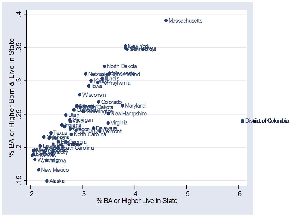
This one shows the relationship between the % BA or higher among all current residents (horizontal axis) and % BA or higher among native residents (born and live there). Clearly there’s a pretty strong relationship between the two. But, there is enough variation to really change some rankings. Mass is high either way.  The big movers are those identified above, like Maryland, Virginia and New Hampshire, which have much more educated resident young adult populations than native resident young adult populations.
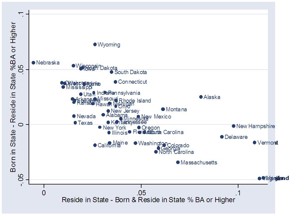
This one puts the “native share” again on the horizontal axis. On the vertical axis is a measure of the difference in the education level of all current residents (25 to 34) and native current residents. It’s somewhat of a net “import” effect measure. How much more educated is the current resident population than the born and raised population? Now, this is net difference, including the fact that some individuals who were born and raised in a state might have left and become more educated. Big net importers here appear to be Maryland, Virginia and Vermont and New Hampshire (Vermont surprised me a bit here… since there isn’t a whole lot of industry to attract college grads, but Burlington does always make those “great places to live” lists). It might also be a small sample size issue with the Vermont data. At the other end of the picture are Nebraska and Nevada, which don’t appear to importing a more educated adult population. Strangely, all but Nebraska are in the positive zone on this measure (note that this measure does not have to be net-zero across states because between state migration is not the only type of migration occurring. International migration may also affect these differences. This may also reflect the fact that more educated individuals tend to be more mobile. Just pondering).

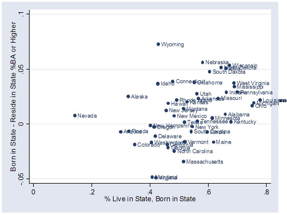
In this one, we have the “native share” again on the horizontal axis, and the difference between the education level of those born in the state – whether they stayed or not – and those who reside in the state. This is somewhat of a net “export” measure. In this case, it would appear that Wyoming is the big loser. So too are Nebraska and Wisconsin. This is the one interesting piece about Wyoming. In the rankings above, Wyoming doesn’t move much. It’s 47th in % BA for current residents and 48th for native residents. But, Wyoming does much better on the education level of those born in the state, whether they stay or not – which apparently they don’t if they have a BA or higher.
So what does all of this mean? Probably not much. These figures and additional analyses certainly tell a more nuanced story than the media buzz of last week. But, it’s hard to really link much of this back to the quality of states’ underlying elementary and secondary education systems. Far too many factors are in play here, and even tweaking this one factor – whether residents are native residents or not- has significant consequences for state rankings.

So much for attaching any simple, bold statement about [YOUR STATE HERE] to that huge, pull-out multi-color map in the College Board Report!

Rolling Dice: If I roll a “6” you’re fired!

Okay… Picture this…I’m rolling dice… and each time I roll a “6” some loud-mouthed, tweet happy pundit who just loves value-added assessment for teachers gets fired. Sound fair? It might happen to  someone who sucks at their job…or might just be someone who is rather average. Doesn’t matter. They lost on the roll of the dice.  A 1 in 6 chance. Not that bad. A 5 in 6 chance of keeping their job. Can’t you live with that?

This report was just released the other day from the National Center for Education Statistics:

http://ies.ed.gov/ncee/pubs/20104004/pdf/20104004.pdf

The report carries out a series of statistical tests to determine the identification “error” rates for “bad teachers” when using typical value added statistical methods. Here’s a synopsis of the findings from the report itself:

Type I and II error rates for comparing a teacher’s performance to the average are likely to be about 25 percent with three years of data and 35 percent with one year of data. Corresponding error rates for overall false positive and negative errors are 10 and 20 percent, respectively.

Where:

Type I error rate (α) is the probability that based on c years of data, the hypothesis test will find that a truly average teacher (such as Teacher 4) performed significantly worse than average. (p. 12)

So, that means that there is about a 25% chance, if using three years of data or 35% chance if using 1 year of data that a teacher who is “average” would be identified as “significantly worse than average” and potentially be fired. So, what I really need are some 4 sided dice. I gave the pundits odds that are too good! Admittedly, this is the likelihood of identifying an “average” teacher as well below average. The likelihood of identifying an above average teacher as below average would be lower. Here’s the relevant definition of a “false positive” error rate from the study”

the false positive error rate, ()FPRq, is the probability that a teacher (such as Teacher 5) whose true performance level is q SDs above average is falsely identified for special assistance. (p. 12)

From the first quote above, even this occurs 1 in 10 times (given three years of data and 2 in 10 given only one year). And here’s the definition of a “false negative error:”

false negative error rate is the probability that the hypothesis test will fail to identify teachers (such as Teachers 1 and 2 in Figure 2.1) whose true performance is at least T SDs below average.

…which also occurs 1 in 10 times (given three years of data and 2 in 10 given only one year).

These concerns are not new. In a previous post, I discuss various problems with using value added measures for identifying good and bad teachers, such as temporal instability: http://www.urban.org/UploadedPDF/1001266_stabilityofvalue.pdf.

The introduction of this new report notes:

Existing research has consistently found that teacher- and school-level averages of student test score gains can be unstable over time. Studies have found only moderate year-to-year correlations—ranging from 0.2 to 0.6—in the value-added estimates of individual teachers (McCaffrey et al. 2009; Goldhaber and Hansen 2008) or small to medium-sized school grade-level teams (Kane and Staiger 2002b). As a result, there are significant annual changes in teacher rankings based on value-added estimates.

In my first post on this topic (and subsequent ones), I point out that the National Academies have already cautioned that:

“A student’s scores may be affected by many factors other than a teacher — his or her motivation, for example, or the amount of parental support — and value-added techniques have not yet found a good way to account for these other elements.”

http://www8.nationalacademies.org/onpinews/newsitem.aspx?RecordID=1278

And again, this new report provides a laundry list of factors that affect value-added assessment beyond the scope of the analysis itself:

However, several other features of value-added estimators that have been analyzed in the literature also have important implications for the appropriate use of value-added modeling in performance measurement. These features include the extent of estimator bias (Kane and Staiger 2008; Rothstein 2010; Koedel and Betts 2009), the scaling of test scores used in the estimates (Ballou 2009; Briggs and Weeks 2009), the degree to which the estimates reflect students’ future benefits from their current teachers’ instruction (Jacob et al. 2008), the appropriate reference point from which to compare the magnitude of estimation errors (Rogosa 2005), the association between value-added estimates and other measures of teacher quality (Rockoff et al. 2008; Jacob and Lefgren 2008), and the presence of spillover effects between teachers (Jackson and Bruegmann 2009).

In my opinion, the most significant problem here is the non-random assignment problem. The noise problem is significant and important, but much less significant than the non-random assignment problem. It just happens to be the topic of the day.

But alas, we continue to move forward… full steam ahead.

As I see it there are two groups of characters pitching fast-track adoption of value-added teacher evaluation policies.

Statistically Inept Pundits (who really don’t care anyway): The statistically inept pundits are those we see on Twitter every day, applauding the mass firing of DC teachers, praising the Colorado teacher evaluation bill and thinking that RttT is just AWESOME, regardless of the mixed (at best) evidence behind the reforms promoted by RttT (like value-added teacher assessment). My take is that they have no idea what any of this means… have little capacity to understand it anyway… and probably don’t much care. To them, I’m just a curmudgeonly academic throwing a wet blanket on their teacher bashing party. After all, who… but a wet blanket could really be against making sure all kids have good teachers… making sure that we fire and/or lay off the bad teachers, not just the inexperienced ones. These teachers are dangerous after all. They are hurting kids. We must stop them! Can’t argue that.  Or can we? The problem is, we just don’t have ideal, or even reasonably good methods for distinguishing between those good and bad teachers. And school districts that are all-of-the-sudden facing huge budget deficits and laying off hundreds of teachers, don’t retroactively have in place an evaluation system with sufficient precision to weed out the bad – nor could they.  Implementing “quality-based layoffs” here and now is among the most problematic suggestions currently out there.  The value-added assessment systems yet-to-be-implemented aren’t even up to the task. I’m really confused why these pundits who have so little knowledge about this stuff are so convinced that it is just so AWESOME.

Reform Engineers: Reform engineers view this issue in purely statistical and probabilistic terms – setting legal, moral and ethical concerns aside. I can empathize with that somewhat, until I try to make it actually work in schools and until I let those moral, ethical and legal concerns creep into my head. Perhaps I’ve gone soft. I’d have been all for this no more than 5 years ago. The reform engineer assumes first that it is the test scores that we want to improve  as our central objective – and only the test scores. Test scores are the be-all and end-all measure.  The reform engineer is okay with the odds above because more than 50% of the time they will fire the right person. That may be good enough – statistically. And, as long as they have decent odds of replacing the low performing teacher with at least an average teacher – each time – then the system should move gradually in a positive direction.  All that matters is that we have the potential for a net positive quality effect on replacing the 3/4 of fired teachers who were correctly identified and at least breaking even on the 1/4 who were falsely fired. That’s a pretty loaded set of assumptions though. Are we really going to get the best applicants to a school district where they know they might be fired for no reason on a 25% chance (if using 3 years of data) or 35% chance (on one year?). Of course, I didn’t even factor into this the number of bad teachers identified as good.

I guess that one could try to dismiss those moral, ethical and legal concerns regarding wrongly dismissing teachers by arguing that if it’s better for the kids in the end, then wrongly firing 1 in 4 average teachers along the way is the price we have to pay. I suspect that’s what the pundits would argue – since it’s about fairness to the kids, not fairness to the teachers, right? Still, this seems like a heavy toll to pay, an unnecessary toll, and quite honestly, one that’s not even that likely to work even in the best of engineered circumstances.

========

Follow up notes: A few comments I have received have argued from a reform engineering perspective that if we a) use the maximum number of years of data possible, and b) focus on identifying the bottom 10% or fewer of teachers, based on the analysis in the NCES/Mathematica report, we might significantly reduce our error rate – down to say 10% of teachers being incorrectly fired. Further, it is more likely that those incorrectly identified as failing are closer to failing anyway. That is not, however, true in all cases. This raises the interesting ethical question of – what is the tolerable threshold for randomly firing the wrong  teacher? or keeping the wrong teacher?

Further, I’d like to emphasize again that there are many problems that seriously undermine the application of value-added assessment for teacher hiring/firing decisions. This issue probably ranks about 3rd among the major problem categories. And this issue has many dimensions. First there is the statistical and measurement issue of having statistical noise result in wrongful teacher dismissal. There are also the litigation consequences that follow. There are also the questions over how the use of such methods will influence individuals thinking about pursuing teaching as a career, if pay is not substantially increased to counterbalance these new job risks. It’s not just about tweaking the statistical model and cut-points to bring the false positives into a tolerable zone. This type of shortsightedness is all too common in the types of technocratic solutions I, myself, used to favor.

Here’s a quick synopsis of the two other  major issues undermining the usefulness of value-added assessment for teacher evaluation & dismissal (on the assumption that majority weight is placed on value-added assessment):

1) That students are not randomly assigned across teachers and that this non-random assignment may severely bias estimates of teacher quality. The fact that non-random assignment of students may bias estimates of teacher quality will also likely have adverse labor market effects, making it harder to get the teachers we need in the classrooms where we need them most – at least without a substantial increase to their salaries to offset the risk.

2) That only a fraction of teachers can even be evaluated this way in the best of possible cases (generally less than 20%), and even their “teacher effects” are tainted – or enhanced – by one another. As I discussed previously, this means establishing different contracts for those who will versus those who will not be evaluated by test scores, creating at least two classes of teachers in schools and likely leading to even greater tensions between them. Further, there will likely be labor market effects with certain types of teachers either jockeying for position as a VAM evaluated teacher, or avoiding those positions.

More can be found on my entire blog thread on this topic: https://schoolfinance101.wordpress.com/category/race-to-the-top/value-added-teacher-evaluation/

Private Schools & Public Education Policy in New Jersey

The commission on private schools established by former Governor Corzine has just released its report:

http://nj.gov/governor/news/reports/pdf/20100720_np_schools.pdf

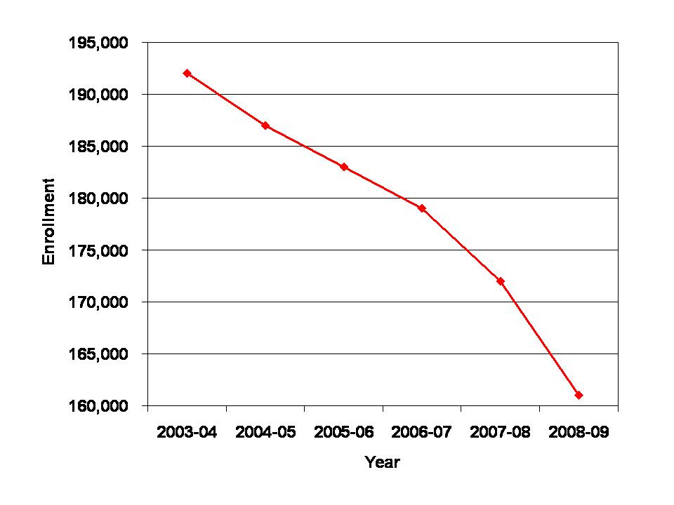
This report is more fun than many recent reports in New Jersey because it actually has some data and citations. Nonetheless, I have at least a few concerns regarding the presentation of the data and implications drawn from it. I was particularly intrigued by the graph on page 7 – which I replicate below:


This graph shows an apparent catastrophic collapse of the private schooling sector in New Jersey… or does it? Look at that the Y (vertical) axis. The range is from 160,000 to 192,000.  Yeah… that makes for a really steep apparent drop off. Note also that this data is from a state department of education source and is not reconciled against any other source. So, a stretched Y axis to make it look really, really, really dramatic. No second look – second opinion. And, only a single aggregate count of private school kids to show a major across-the-board collapse.

Here’s a more detailed exploration, using two data sources: 1) The National Center for Education Statistics Private School Universe Survey and 2) the U.S. Census Bureau American Community Survey, via the Integrated Public Use Microdata System.

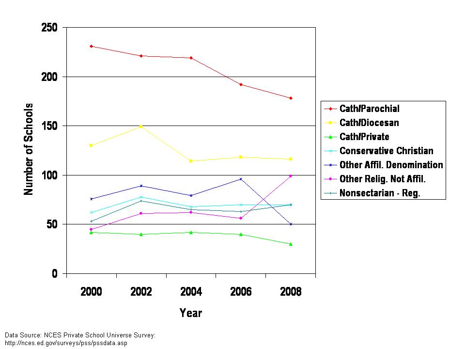
First, here are the number of private schools by type in New Jersey over time:

This graph shows that the only significant decline in numbers of schools occurs for Catholic Parochial schools. Other private school types hold their ground in total numbers of schools.

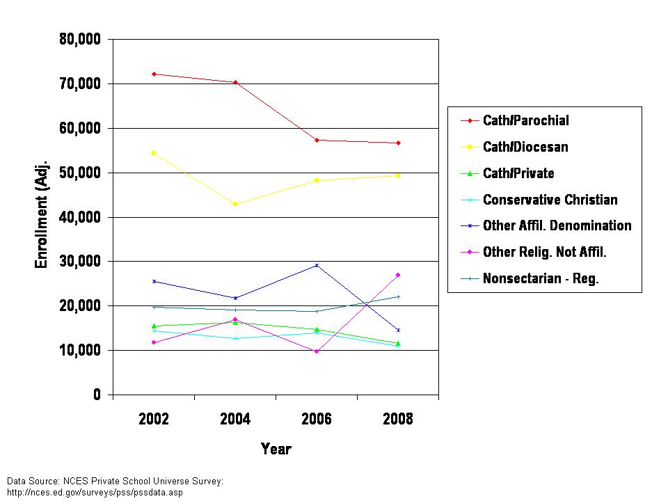
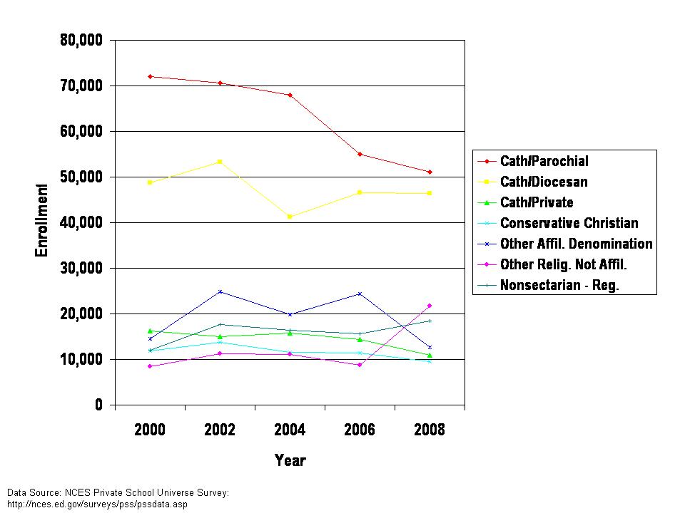
Next, here are the enrollment and in the second graph, enrollment adjusted for missing data.

As with numbers of schools, the most substantive decline is for Catholic Parochial schools. There is a smaller drop for Catholic Diocesan schools. Other schools stay relatively constant, with some reclassification occurring between Other Religious – Not Affiliated and Other Affiliated. Note that the corrected, weighted version in the second graph above shows a somewhat smaller decline in Catholic Parochial enrollment than the un-adjusted version.

Next, I address private school enrollment by grade level and as a share of the total population of students in public and private school. A drop in private school enrollment would only be significant if it occurred in a context of stable or growing overall student population.

Here’s the total school population by grade level:

And the private school population by grade level:

What we see in this second graph is that the Grades 1 to 4 population appears to be declining most.

Here’s the private school enrollment by grade level as a percent of total enrollment. Kindergarten private school enrollment as a share of kindergarten students has declined. But, other grade level private school populations have declined only very slightly as a share of all children statewide in the same grade level.

This much more refined picture, across two additional data sets casts some doubt on the significance of the first graph above. Is there really a massive collapse of private schooling in New Jersey? It doesn’t look that way to me.

Explanations and Policy Implications for Catholic Schooling in New Jersey

Indeed, there may be some cause for concern for Catholic Parochial schools which appear to be closing and losing enrollment. But this phenomenon is not unique to New Jersey. Others have attempted to shed light on why Catholic schools are struggling in many urban centers.  Catholic schools have tried to remain accessible to the middle class by holding tuition down. At the same time, costs have risen. Decades ago, Catholic schools relied heavily on unpaid, church affiliated staff. Now, nearly all staff are salaried. My own recent analysis suggest that the cost of operating many Catholic schools are quite similar to those for traditional public school districts. The gap between tuition and cost has grown substantially over time for these schools. That’s not sustainable.

Two recent reports provide additional insights regarding public policy forces that may be compromising the stability of Catholic schooling in particular:

1) This Pew Trust report on parental choices in Philadelphia suggests that the expansion of Charter schools has potentially cut into the non-Catholic enrollment in urban Catholic schools.

http://www.pewtrusts.org/uploadedFiles/wwwpewtrustsorg/Reports/Philadelphia_Research_Initiative/PRI_education_report.pdf

Notably, New Jersey has not expanded charter schools as quickly as other states. But, it remains possible that existing New Jersey charter schools have drawn some students away from urban Catholic schools. As such, if the state is truly concerned with the sustainability of Catholic schools, the state should evaluate the effect of charter expansion on Catholic school enrollment (and on teacher recruitment/retention).

2) This Thomas B. Fordham Institute report suggests that vouchers in other locations such as Milwaukee have been a double-edged sword for Catholic schools. Vouchers do not provide full cost subsidy and restrict charging tuition above the subsidy to cover the gap. As such, schools are required to take a loss for each voucher student accepted. Further, as Catholic schools take on more non-Catholic vouchered students, parishioner contributions tend to decline – because it is perceived that the Catholic mission of the school has been compromised.

http://www.edexcellence.net/doc/catholic_schools_08.pdf

This situation does not apply in New Jersey, but findings from other cities raise concern that an under-subsidized voucher or tuition tax credit like the proposed Opportunity Scholarship Act (NJOSA) could actually do more harm than good for many private schools.

Vouchers differ from other subsidies (like the transportation and textbook subsidies) because of the restriction on charging tuition to cover the margin between the subsidy level and actual cost.  Some schools may subvert this requirement with strongly implied requirements for “tithing” as a substitute for tuition – including voucher receiving families. In fact, families could be obligated to tithe sufficient income to the private schools (or the religious institution that governs those schools) such that the family then qualifies for the tax credit program. The state should attempt to guard against this possibility in the design of any related policy.

Follow-up information:

A reader was kind enough to send me this link: http://www.avi-chai.org/census.pdf

Page 23 of this census report on Jewish school enrollment explains:

The other side of the geographic distribution picture is the concentration of schools in New York and New Jersey, as well as the overwhelming Orthodox domination in these two states. New York has 132,500 students, up from 104,000 ten years ago, while New Jersey has nearly 29,000 students, up from 18,000 in 1998. New Jersey’s gain is nearly all attributable to Lakewood, although there has been meaningful growth in Bergen County and the Passaic area. At the same time, Solomon Schechter enrollment in New Jersey has declined precipitously.

Clearly, the Orthodox schools in New Jersey are not in a free fall, as implied by the aggregation of all private schools in the private school commission report.

Another reader sent me this link:  http://www.njpsa.org/userfiles/File/EO161.pdf

This link explains the charge of the commission. It would seem to me that the final report has strayed somewhat from this charge.


Another “You Cannot be Serious!” The demise of private sector preschool in New Jersey?

There is little I find more enjoyable than boldly stated claims where the claims are entirely unsubstantiated… but where data are relatively accessible for testing those claims.

This week, the Governor’s Task Force on Privatization in New Jersey released their final report on the virtues of privatization for specific services. I took particular interest in the claims made about preschool in New Jersey. Preschool programs were expanded significantly with public support for both public and private programs for 3 and 4 year olds following the 1998 NJ Supreme Court ruling in Abbott v. Burke. For more information on the rulings and Abbott pre-school programs, see: http://www.edlawcenter.org/ELCPublic/AbbottPreschool/AbbottPreschoolProgram.htm

Here are the claims made in the privatization report:

•At the program’s inception, nearly 100 percent of students were served by providers in the private sector, many of which are women‐and minority‐owned businesses. Now, approximately 60 percent are served by private providers, as traditional districts have built preschools at great public expense and unfairly regulated their private‐sector competitors out of business.

•There are currently two sets of state regulations governing pre‐k. The majority of private pre‐k providers are subject to Dept. of Children and Families (DCF) regulations, but private pre‐k providers working in the former Abbott districts and serving low‐income children in some other districts are subject to the regulation of the DOE and the respective districts themselves, effectively crowding out the private sector and driving up costs to the taxpayer without any documented benefit to the children they serve.

To summarize, the over-subsidized public option of Abbott preschool has decimated the private preschool market in New Jersey, adding numerous women and minority business owners to the unemployment roles since the program was implemented (okay… a bit extreme… but I suspect you’ll hear it spun this way… since the above language isn’t far off from this).
The last time I read something this silly was in a research report from The Reason Foundation regarding “weighted student funding.” Not surprisingly, the Reason Foundation is among the only sources cited for… anything… in this report on the virtues of privatization (see page 4).

In this post, I’ll address two issues:

First, I address whether the claim that private preschool enrollment has dropped is true. Has private preschool in New Jersey actually been decimated since the 1998 Abbott decision? Are there that many fewer slots in private versus public preschools than before that time? Have public programs continued to grow while private programs have been eliminated? Has private preschool enrollment declined at any greater rate than private school enrollment generally? if at all?

Second, I revisit some of my previous findings about private versus public school markets, cost and quality. The recommendation that follows from the above claims is that the state, instead of continuing to subsidize expensive Abbott preschool programs, should allow any private provider to participate without Abbott regulation. This, it is assumed, would dramatically reduce costs. Rather, this might reduce expenditures… and the quality of service along with it. Lower spending (not cost) private providers simply don’t and can’t offer what higher spending providers do. Cost assumes specific quality, and lower “cost” assumes that less can be spent for the same quality. In this case, quality is being ignored entirely (or assumed entirely unimportant). That is, the proposed plan of allowing any private provider to house “preschool” students would likely be the equivalent of subsidized “daycare” (minimally compliant with Dept. of Children and Families (DCF) regulations) and not actual “pre-school.”

Issue 1

For these first four figures, I use data from the U.S.Census Bureau’s Integrated Public Use Microdata System. One of my favorites. Specifically, I evaluate the school enrollment patterns of 3 and 4 year olds in New Jersey from 1990 to 2008, by school type. Note that Census IPUMS data are actually not great for evaluating parent responses to the “school” enrollment question for 3 and 4 year olds, because in many cases a parent will identify their child as being in “school” even if the child is merely in daycare… home based, non-instructional, or any type of daycare. This is not hugely problematic here, because the report on privatization assumes that home based daycare or anything registered with DCF to supervise children during the day qualifies as a pre-school.  If anything, there may be under-reporting of private enrollment in these data by parents who actually don’t consider their private daycare to be “school.”

For 3 year olds, from 1990 to 2000, both public and private enrollment increase, while non-enrollment decreases. Public and private enrollment then stay relatively steady, except for an apparent increase in private enrollment in 2008 (I’m not confident in this bump, having seen other odd jumps between 2007 and 2008 IPUMS data). In any case, it would not appear that public enrollment has continued to severely squeeze out the private market place, unless we were to assume that the private market would have absorbed the entirety of the reduction in non-enrollment.  The lack of substantive shift from 2000 to 2008, with privates if anything, increasing their share, suggests that public subsidized have not led to the collapse of the private preschool market.

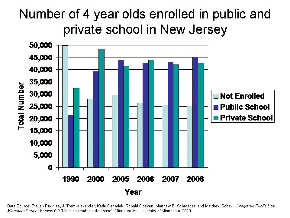
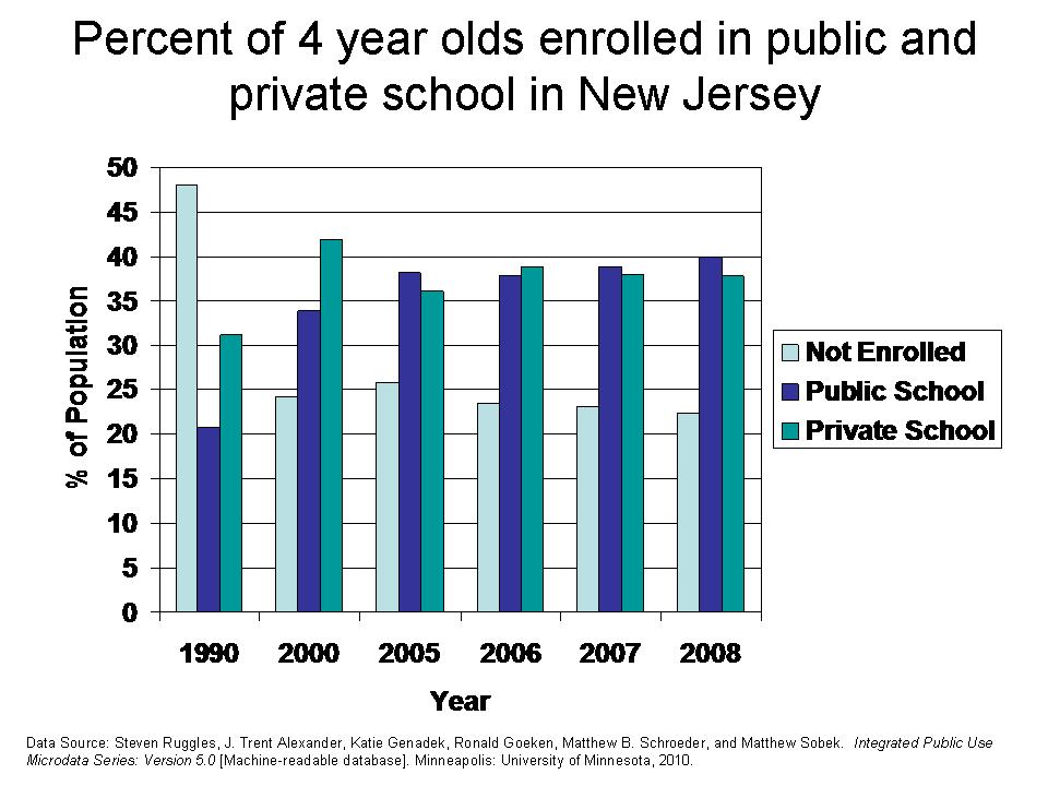
The next two figures show the enrollment patterns for 4 year olds. In general, 4 year olds are more likely to be enrolled in school, public or private, and less likely to be non-enrolled. As with 3 year olds, there really aren’t any substantive changes to the relative enrollment of 4 year olds in public and private settings between 2000 and 2008. No collapse of the private market here.


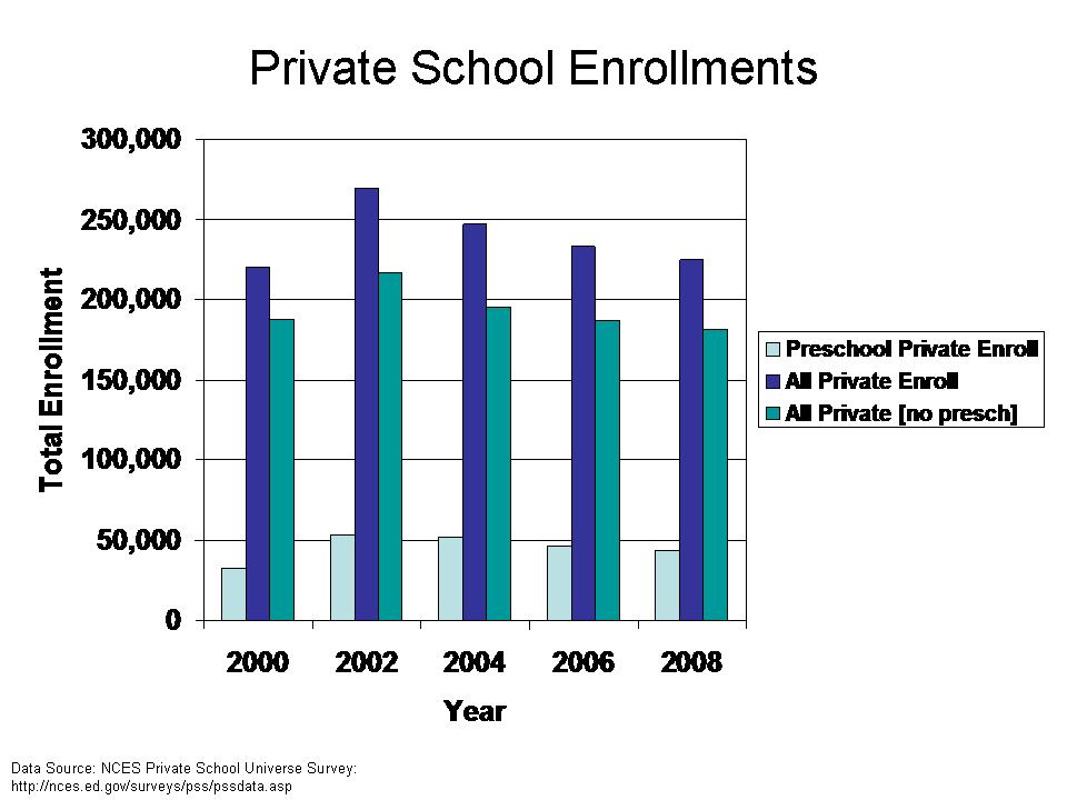
As an alternative, I explore the enrollment of private schools which provide pre-kindergarten programs statewide, using the National Center for Education Statistics Private School Universe Survey. Using this data set, we can determine whether the number of enrollment slots at the preschool level among private providers has declined, and whether the decline in private preschool enrollment has been greater than the decline in private school enrollment more generally.  Note that much has been made of the “collapse” of private schooling in New Jersey in the context of the New Jersey Opportunity Scholarship Act.

This figure shows that private school enrollment generally has declined more than private preschool enrollment since 2000. Private preschool enrollment has remained relatively stagnant statewide from 2002 to 2008. No real collapse of private preschools evident here.

Issue 2

As I noted above, preschool might be defined in many different ways. On the one hand, we might wish to consider preschool to be any place that meets minimum health and safety guidelines for caring for children between the ages of 3 and 4. To me, that sounds more like daycare. Alternatively, preschool might actually involve specific curriculum and activities as well as training for personnel, etc. Obviously, these differences in definition can and likely do significantly influence the cost per child of offering the service. If I can hire high school graduates and rely heavily in parent volunteers, and use only minimally compliant physical space to supervise children at play – mix in story time – I can likely do things relatively cheaply. On the other hand, if I actually have to hire teachers who hold college degrees and provide a specific curriculum and have appropriate physical spaces in which to do those things, it’s likely going to get more expensive – publicly or privately provided. It’s not so much about whether it’s publicly or privately provided, but whether there are minimum expectations for what defines “preschool.”

The elementary and secondary private school market is highly stratified by price and quality, as I have discussed on many previous occasions. YOU GET WHAT YOU PAY FOR. Yeah… I know that clashes with the appealing logic that private providers always do more with less…. thwarting the “you get what you pay for” assumption… or even reversing it… ‘cuz private provides do so much more with so much less. But let’s look again at one of my favorite summaries – with a new presentation – of the private school market. Here’s the earlier version.

This figure lines up the national average (regionally cost adjusted for each regional cluster) a) per pupil spending, b) pupil to teacher ratios and c) percentage of teachers who attended competitive undergraduate colleges, for private schools by private school type. Public school expenditures sit right near the middle. The small group of Catholic schools in the national sample sit right along side public schools (the system of Catholic schools has evolved to look much like their public school counterparts over time).  Independent schools spend nearly twice what public schools spend, have much smaller class sizes and have very high percentages of teachers who attended competitive undergraduate colleges. Hebrew and Jewish day schools lie about half way between the elite privates and public and Catholic schools. At the other end of the private school market are conservative christian schools, which spend much less per pupil than public or Catholic schools. They do have somewhat smaller class sizes, but have very poorly paid teachers, and have few if any teachers who attended competitive colleges. For more on these comparisons, see: https://schoolfinance101.wordpress.com/2010/02/20/stossel-coulson-misinformation-on-private-vs-public-school-costs/. In short, this figure shows that even in the k-12 marketplace, private providers are very diverse, some offering small class sizes and highly qualified teachers for a much higher price than public schools, and others offering much less.

We can certainly expect at least as much variation in the private preschool marketplace, if not one-heck-of-a-lot more, since many private daycare facilities require little or no formal training and no college degree for their employees.

As an aside, I was driving down Route 202 the other day west of Somerville Circle and noticed that they are putting in a Creme-de-la-Creme “daycare/preschool.”  We had one around the corner from our house in Leawood, KS.  I suspect that few of the Abbott preschool facilities built at such great expense compare favorably to a “Creme” facility – with waterpark (we’re talking slides, fountains), mini tennis court, indoor fish pond, tv studio, etc. (at least that’s what the one in Leawood had. I expect nothing less here?).  I expect that many parents, having toured many other “less desirable” daycare and preschools, will decide that their child deserves the “Creme” lifestyle (I suspect that there are actually other options with better curriculum and perhaps better teachers in the area, but I have not had the occasion to research it). It’s just an extreme example of the diversity of the private preschool marketplace. I suspect the cost per pupil will far exceed that of the Abbott preschools (heck… it already exceeded $12k per year in Kansas several years ago).

To summarize, the Task Force report on privatization makes bold claims about Abbott preschool programs crowding out, and decimating private preschool programs, many run by women and minority business owners. But the Task Force report does not bother to substantiate a) that private preschools have actually suffered, or b) that any, if they had suffered, were actually owned and operated by women or minorities. The only “evidence” the report has to offer is the undocumented claim that 100% of kids were in private programs and now only 60% are. Where does that come from? What the heck is that? 100% of who? 60% of what?

Further, the Task Force report is willing to assume that warehousing 3 and 4 year olds under the supervision of high school graduates in physical spaces and with supervision ratios compliant with DCF regulations is sufficient for low-income and minority children… or rather… that it is the lower cost option with equivalent quality to Abbott pre-school programs (public or publicly regulated private). It is critically important that we acknowledge the difference in the quality or even type of service received at different price points. Like the private K-12 market, the private preschool market varies widely, and spending much less generally means getting much less.

=====

See also, the Abbott 5th year report: http://edlawcenter.org/ELCPublic/Publications/PDF/PreschoolFifthYearReport.pdf

Manual for Child Care Centers from DCF in NJ: http://www.nj.gov/dcf/divisions/licensing/CCCmanual.pdf

Can’t forget this:

The Gist Twist(s) & Rhode Island School Finance

So, I’ve tried not to… but I’ve been following the relatively uninformed debate over Rhode Island’s nifty new Foundation Aid formula on the National Journal “Experts” Blog.

http://education.nationaljournal.com/2010/06/a-funding-formula-for-success.php#comments

Yep, Rhode Island has invented the… wheel… or perhaps bread… one or the other. Pretty much a run-of-the-mill foundation aid formula here. And that’s not necessarily a bad thing. But there are a number of “wait and see” issues here… like how well the crafty state-local matching aid formula will work and to what extent the single relatively small and completely arbitrary poverty weight will actually drive additional funding to higher poverty districts.

One thing really caught my eye in Deborah Gist’s response to David Sciarra. Mr. Sciarra criticized the inclusion of New Hampshire in the calculation of the foundation aid level for the 2010-11 incarnation – adoption year incarnation of the nifty new bread/wheel. Here’s how Gist responds:

1. Our core instructional amount was based on national research, using data from the NCES, is sufficient to fund the requirements of the Rhode Island Basic Education Program, and it in no way focused on states with low per-pupil expenditures. In fact, we looked particularly carefully at our neighboring states, which have some of the highest per-pupil expenditures in the nation, and we included only those states that have an organizational structure and staffing patterns similar to ours.

First, I must say that it is a strange use of the term “national research” to refer to simply taking averages of spending data from states collected from a national survey, jointly from the National Center for Education Statistics and Census Bureau. It’s an annual survey. Collection of data. Not national research. It could be used for research. Heck, I love those data and know them oh too well. Which brings me to the Gist Twist here. And, it’s a three part twist.

You see, the goal is to identify an underlying “foundation” level of funding for school districts in Rhode Island.

Twist Part I: The first part of the twist, which I will not dig through here in great detail, is the pruning back of core instructional expenditures, a definition in the NCES data intended to be reported uniformly across states, albeit imperfect. The choice of core versus all current operating expense clearly drops the foundation value, and quite significantly. What remains unknown is the extent to which other aid beyond the foundation formula will actually address those other cost areas. In 2007-08, Rhode Island instructional spending per pupil was about $8,500 and current operating expenditures per pupil over $14,000. That’s a big difference to cover with other aid. Let’s hope they do.

Twist Part II: I was also quite intrigued by Gist’s explanation of how national data were used, and her defense to the accusation that they picked low spending states and took the average of the low spending states. Gist responds by saying they took “neighbors” of Rhode Island, which are, of course high spending states.

Here’s how the actual legislation describes the process:

(1) The core instruction amount shall be an amount equal to a statewide per pupil core instruction amount as established by the department of elementary and secondary education, derived from the average of northeast regional expenditure data for the states of Rhode Island, Massachusetts, Connecticut, and New Hampshire from the National Center for Education Statistics (NCES) that will adequately fund the student instructional needs as described in the basic education program and multiplied by the district average daily membership as defined in section 16-7-22.

http://www.ride.ri.gov/Finance/Funding/FundingFormula/Docs/H8094Aaa_FINAL_6_10_10.pdf

Even though I love maps, I won’t post one here. Maybe it’s because I used to teach in New Hampshire, and once lived in eastern Connecticut that I realize that one of these two is actually a neighbor of Rhode Island and one is not. Okay… for those of you pulling out your maps to figure out how all of those tiny New England states line up… yeah… New Hampshire does not neighbor Rhode Island. So then, why include New Hampshire in the calculation of the average instructional expenditures to set the Rhode Island foundation. Okay… let’s set aside the fact that this whole approach is actually not a reasonable way to identify the costs of meeting Rhode Island’s education standards, in Rhode Island districts and charter schools. But if you’re going to go down this road, the decisions should be somewhat justifiable.

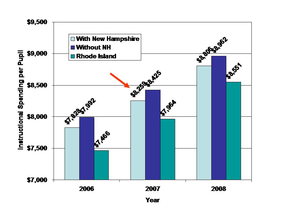
Here’s the average core instructional spending per pupil for the states used:

Hmmmm… which one of these is not like the others? Yeah… New Hampshire’s per pupil spending is somewhat lower. But, it is a smaller state than the other two, and thus has lessened effect on the averages.  Oh… by the way… “similar organizational structure” as noted by Gist above, was her/their way of cutting out Vermont from the averages – because Vermont has too many non-unified districts – or actually – because Vermont is the highest spending of these states.

Here’s the effect on the averages. Including New Hampshire brings the average down by just under $200 per pupil. While this doesn’t seem like a lot, it’s about 1/3 of the difference between Rhode Island’s current spending per pupil and the target spending. That is, including New Hampshire cuts the aggregate increases in funding (difference between RI current and Target) required by about 1/3 … but that’s before we get to Part III of the twist.

Twist Part III: As far as I can tell, the proposed foundation level for fy2010-11 or even fy2011-2012? is to be set at $8,295.  Please correct me if this is not true.  That’s the amount cited here on slide #8:

http://www.ride.ri.gov/Finance/Funding/FundingFormula/Docs/Formula_PPT.pdf

And in any other documentation in which a foundation number is cited. These documents are generally from this past winter/spring leading up to passage of the legislation. So what’s wrong with that?  Well, the average spending of CT, MA and NH which comes out to about $8,295 (actually, mine comes out to $8,259) is from data from fiscal year 2006-07. Are they really basing the 2010-11 or 2011-12 foundation level on 2006-07 data?  Take a look at my second graph above. The 2007-08 data came out the other day. And, as it turns out, the 2007-08 Rhode Island average core instructional spending per pupil was over $8,500. That’s actually more than the new foundation level.

That’s not to say that it can’t be reasonable to have a foundation level that’s less than current average spending. After all, the average spending is the average of all districts, including their varied needs. It is conceivable that the current average is more than sufficient… to achieve current average performance in districts with less than average needs. But that’s not how this is being spun at all. Rather, it’s being spun as a breakthrough based on thorough and thoughtful empirical analysis.  That’s hardly the case.

Quite honestly, Ms. Gist and the RI legislature may have been better off saying that the foundation level will be set at $8,295 because that’s how much we are willing to pay for – not this silly back of the napkin justification of the amount they were willing to pay for. That in mind, this foundation formula and its arbitrary weights – excuse me – weight – actually bring us backwards, not forwards in the school finance debate, making a mockery of “research” and its potential use for informing state school finance policy.

Sorry… got a little edgy at the end there.

And here’s a little extra credit reading which actually covers national research on estimating the cost of achieving state standards. It’s from the National Research Council of all places: http://www7.nationalacademies.org/CFE/Taylor%20Paper.pdf

Follow up note:

As the statute reads, RI itself would also be included in the average calculation, lowering the value further. It makes little sense to include current average (or even 3 year old average) spending of the state you are trying to “fix” in the average spending to inform the foundation level if the assumption is that the state has, for lack of any real formula, fallen behind in regional competitiveness. Of course, it hasn’t fallen behind New Hampshire. So… my above averages do not include Rhode Island itself and are intended only to be illustrative of the arbitrary (well… not really arbitrary… intentional) choice of including New Hampshire in the calculation.

By the way… I wonder if Deborah Gist can see New Hampshire from her window, or does Massachusetts actually get in the way?

An Alternative Look at the Census Financial Data

The spin is on. As soon as the annual school district level U.S. Census fiscal survey data are released, news outlets across the country take their shot a spinning the data to show just where their state stands. New York #1! Utah… dead last! Hawaii “above average.” Spending just really high (totally out of context)! Typically, news outlets point out spending is high when they wish to argue that it’s too high… and we should do something to curb it. No mention is made of outcomes achieved with that spending, or which districts in the state are responsible for the high average. When spending is reported as low, the spin is generally that it is too low, and that state policymakers should do something about it.

Allow me to briefly present a slightly more nuanced picture. For the past few years, and in a number of publications, I have used a statistical model of the national school finance data to correct for such issues as a) economies of scale and population density, b) regional variation in competitive wages, and c) variations in student needs. I use this model to project what a school district, with comparable characteristics, would have in state and local revenue per pupil in each state. The methods of this madness were used in this study: http://epaa.asu.edu/ojs/article/viewFile/718/831

Here are some of the results with the 2007-08 Census Fiscal Survey data (with the model built on data from 2005-06, 2006-07  & 2007-08).

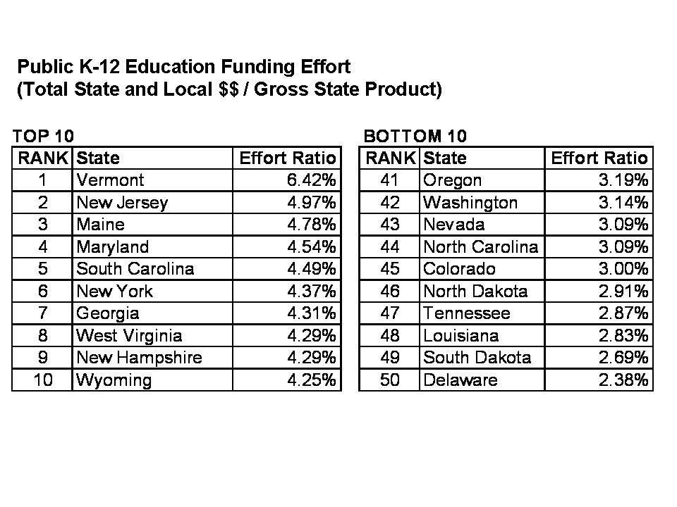
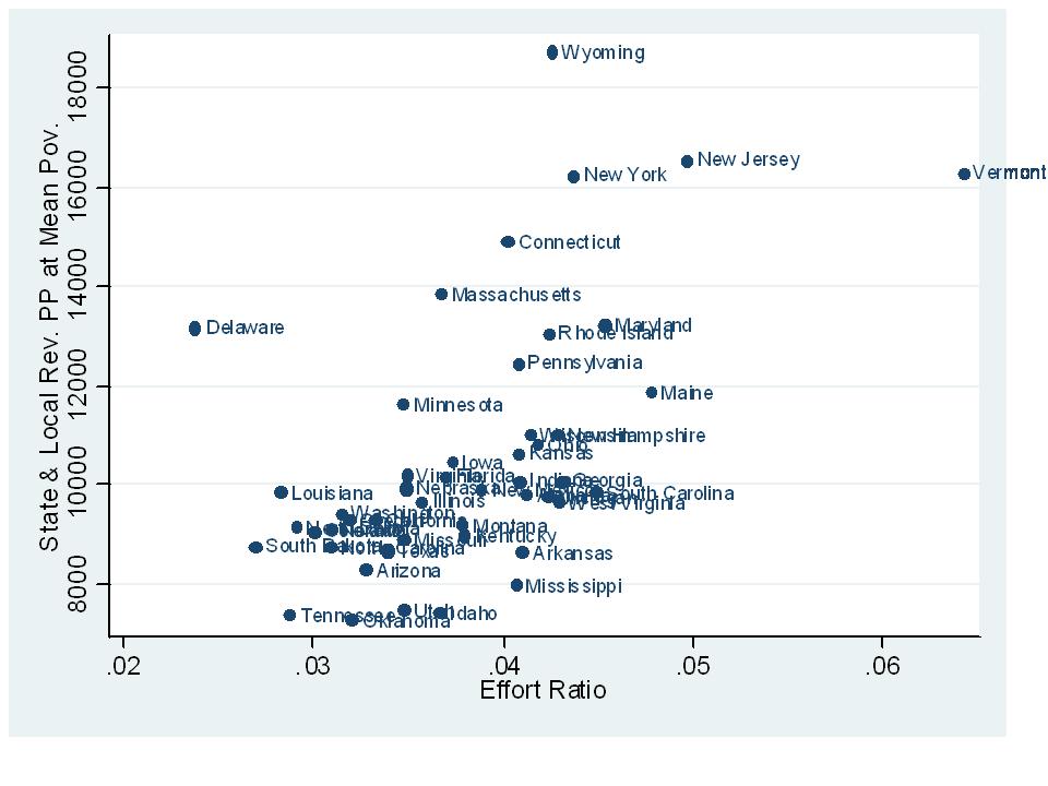
Before getting to the modeled estimates of comparable state and local revenue, lets take a quick look at the relative educational effort of each state, or the combined State and Local Revenues for K-12 education as a share of Gross State Product. Vermont and New Jersey lead the pack on this on, with other states including Maryland and New York in the mix. Note, however, that this effort can be quite unevenly distributed. In fact, it may be the case that a significant amount of effort is going into local property tax revenues being raised by the richest communities in a state. Yeah… it’s still a lot of effort, but selectively distributed among those who can put up that effort and choose to as long as it benefits (or is perceived to benefit) their own children. Total effort provides a limited window, but important one nonetheless.

Fun Fact about this first table – TAKE A LOOK AT OUR RACE TO THE TOP, ROUND 1 WINNERS! (47TH & 50TH ON EFFORT!!!!)

Now to the model based estimates of who’s really in the top and bottom ten on state and local revenue per pupil for elementary and secondary education. Let’s begin by looking at those states where the lowest poverty districts have the highest and lowest resources.

Yep, New York is #1 in per pupil state and local revenues for very low poverty districts! Indeed, very affluent Long Island and Westchester County school districts in New York State spend about as much as any districts in the nation, largely because they have the financial capacity to do so (and partly because the state has enabled them to!)

Next in line in funding for very low poverty districts are Wyoming and Vermont, which really don’t have many children attending incredibly high poverty districts. Notably, New Jersey falls well behind New York state for low poverty districts, and many of New Jersey’s affluent suburbs lie in the same labor market with the higher spending affluent New York suburbs. And then there’s Tennessee – one of our great RttT winners.  Of course, as I have shown on a previous post, this works fine for TN, which as the lowest state assessment cut scores – so most of the kids pass the tests anyway (low standards & low funding – a winning combination indeed)!  

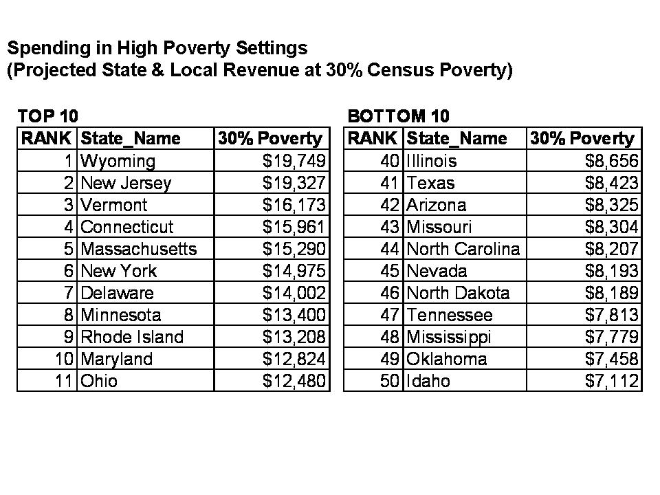
The next table ranks per pupil funding for high poverty districts.  Notably, New York is NOT in first place on this one. New York drops to 6th, but the situation is somewhat more complicated. While this might appear okay, it can be particularly difficult for high poverty New York state school districts to recruit and retain high quality teachers when they are surrounded by so many affluent districts which already hold the recruitment and retention advantage, and have substantially more resources. For high poverty districts, New Jersey and Wyoming come in first. Wyoming is simply high across the board. And yep… there’s Tennessee again – our RttT winner in 47th place!

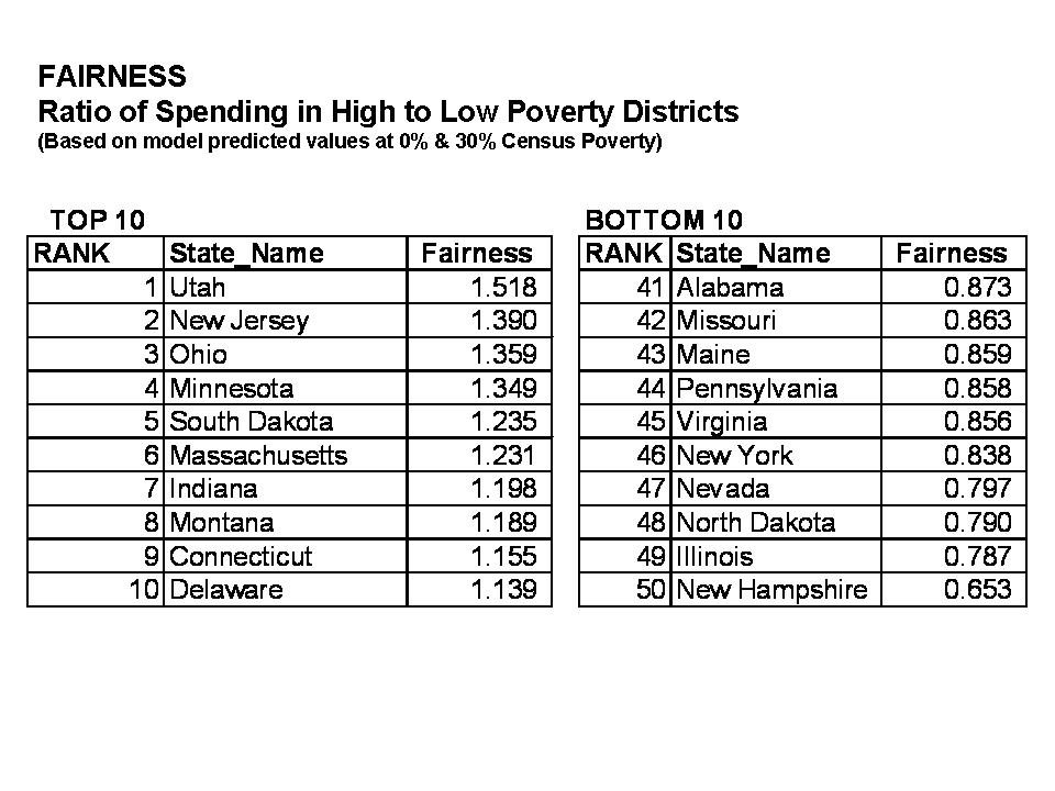
This next table ranks the within-state FAIRNESS of the state school funding distribution – where fairness is determined by taking the ratio of high poverty funding to low poverty funding – with the implicit assumption that state school finance systems should provide for additional support in districts serving children with greater needs. Now, this table must be taken in the context of the previous two. For example, Utah comes in first on “fairness.” But, in this case, this merely means that low poverty districts in Utah get nothing, and high poverty districts in Utah get next to nothing! In a twisted sense, that’s “fair?????”

Among states not at the bottom in overall resources, New Jersey, Ohio, Minnesota and Massachusetts seem to be driving additional resources into higher need, higher poverty districts.

States  at the other end of the spectrum include New York, Pennsylvania and Illinois. These are among the historically least equitable large, diverse states in the country. Now, to Pennsylvania’s credit, these calculations precede the phase-in of their new funding formula which the governor has continued to support even during the recession. New York and Illinois are another story. Yeah… New York also implemented – okay – kind of planned to implement a new formula. That didn’t get very far, and it is highly unlikely (okay, almost entirely unlikely based on other analysis I’ve conducted on more recent NY data) that NY has actually improved since 2007-08.  Illinois hasn’t even tried – in fact, Illinois just keeps getting worse and worse!

Now for an obligatory point – Many argue that the overall funding level in states is simply a function of their wealth. Wealthier states, like wealthier school districts within states simply have the ability to spend more. That is indeed partly true. But effort also matters – remember that first slide above?  This scatterplot shows the relationship between state effort and funding levels in a hypothetical average poverty school district. There’s actually a reasonably strong relationship here, but for a few quirky outliers. In fact, based on additional analyses, a state’s effort explains about as much of the funding level as does a state’s wealth.

So, Mississippi is a very poor state that puts up relatively average effort, but simply can’t get very far with that effort. By contrast, Tennessee and Louisiana both have much higher fiscal capacity (measured by gross state product per capita) than Mississippi, but they simply don’t use it. Tennessee has little excuse for its spending level! Nor does Louisiana!

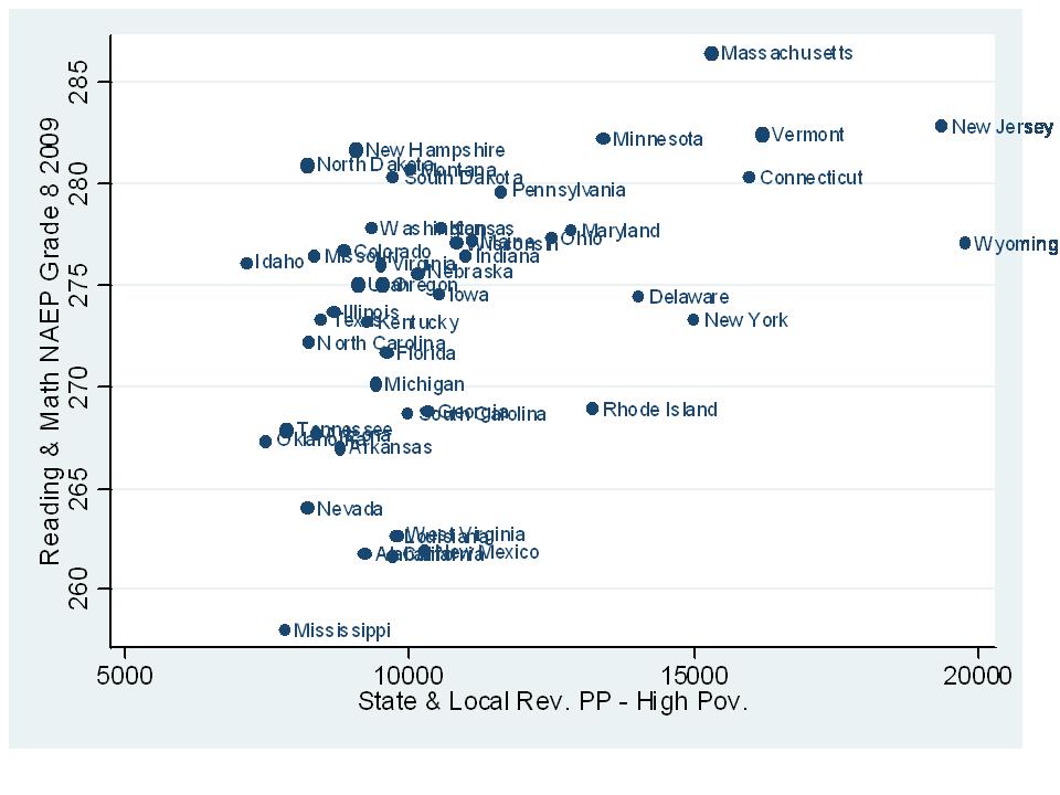
Finally, here’s a snapshot of the association between 8th grade reading and math NAEP performance and funding levels across states. As it turns out, funding levels for high poverty settings were most strongly associated with NAEP performance for all students. As one can see, there exists a reasonable correlation between funding levels and NAEP mean scale scores. That said, as I have noted in previous posts regarding such relationships, there’s a lot of circular stuff all tangled up in here. Wealthier states with more educated adult populations supporting higher education spending – and supporting and encouraging their children to do well in school, etc.  But, it is difficult to conceive how a state in the bottom left corner of this picture (very low funding in high poverty districts – and most likely, low funding across the board) can begin to lift itself out of that corner – or Race to the Top. Financial resources are a necessary underlying condition, albeit easier to achieve in some states than in others.

Note: Difficulties arise when trying to make simple comparisons of funding levels and funding gaps with achievement gaps between poor and non-poor children in each state a) because income thresholds used for subsidized lunch status characterize very different populations from one region of the country to another and from rural to urban settings within states, and b) because gaps between non-poor and poor children in states depend significantly on how wealthy are the non-poor and how poor are the poor. Sadly, these complexities make it very difficult if not impossible to use NAEP data to untangle the relationship between funding differences between lower and higher poverty districts, and outcome differences between children attending those districts in different states:

I discuss the poverty measurement problems here:

https://schoolfinance101.wordpress.com/2009/11/27/title-i-does-not-make-rich-states-richer/

Kevin Welner and I discuss evaluating the relationship between state school funding distribution and student outcomes here:

https://schoolfinance101.com/wp-content/uploads/2010/05/doreformsmatter_formatted.pdf

New Jersey Opportunity Scholarship (NJOSA) Study Notes & Review

It’s kind of like an end of semester blogging time here – a good time to review various posts on specific topics related to New Jersey education policy. My apologies to those of you looking for issues of national/broader interest. I’ll get back to those issues after this post.

In this post, I provide a brief summary of my previous posts related to the New Jersey Opportunity Scholarship Act. I have a handful of posts specifically related to this proposed legislation. But I have many others related to the private school marketplace, private school costs and quality.

In short, NJOSA is a “neo-voucher” policy which provides tax breaks to corporations that contribute to a scholarship pool, which then provides vouchers to children to attend private or other schools. Currently (NJOSA is being reworked as I write this), those vouchers would be made available to a combination of children attending “failing” schools and other income qualified children across New Jersey. In my series of posts on NJOSA, I point out that:

Finding #1) One of if not the biggest beneficiary of NJOSA is not a) the children trapped in poor urban (Newark, Camden, Jersey City) schools, or b) cash-strapped urban Catholic Schools (which lack sufficient other private contribution support to keep afloat), but rather, the highly racially and religiously segregated Lakewood Orthodox Jewish community and its schools. They constitute the largest number – by far – of “income qualified” current private school enrolled children in the state.

NJOSA & THE LAKEWOOD EFFECT

This finding was reported a few days ago in the Asbury Park Press

Finding #2) The premise that children will be saved from failing public schools with these paltry payoffs to low-end private schools is a stretch at best. Good private schools are expensive, and often more expensive than even the highest spending nearby public schools. The Milwaukee studies provide useful insights as well, showing little or no effect after much more than a trial period.

Would Scholarships Help Sustain NJ Private Schools?

NJOSA Must Read Items

Finding #3) Providing these vouchers might (would likely) increase private school enrollment, making certain private schools more accessible to low-income families. And, some students may benefit from this (while others may not). But, such a program will likely do little to cure the fiscal woes of cash strapped private schools. In fact, some have argued specifically in reference to Catholic schools that parishioner philanthropy to the schools may decline as those schools take on more non-Catholic students through vouchers, causing the school’s mission to drift.

This finding was covered by AP and reported in a handful of NJ outlets

Would Scholarships Help Sustain NJ Private Schools?
For more information on private school markets, costs and quality, see:

Major National/Regional Study on the Costs of Private Schooling by Type and Location, and Relationship to Quality Measures
http://www.epicpolicy.org/files/PB-Baker-PvtFinance.pdf

See also:

Washington Post Coverage of National Study
http://www.washingtonpost.com/wp-dyn/content/article/2009/08/30/AR2009083002335.html

Education Week Op-Ed on National Study:
http://www.edweek.org/login.html?source=http://www.edweek.org/ew/articles/2009/08/19/01baker.h29.html&destination=http://www.edweek.org/ew/articles/2009/08/19/01baker.h29.html&levelId=2100

Cap 2.5 Study Notes & Review

In this post, I review my various previous posts related to the proposal for a constitutional 2.5% property tax limit in New Jersey. Below are some summary points from previous posts, with links to those posts.

Flawed Argument #1) The need for Cap 2.5 is premised on the argument that New Jersey is by far the highest taxed state in the nation, therefore warranting not only a cap on growth rates of property taxes but also a cap on future state spending. I tackle the assumption that New Jersey taxes are out of control, highest in the nation, and that teacher and school administrator salaries are the cause here:  https://schoolfinance101.wordpress.com/2010/03/17/just-the-facts-nj-taxes-teacher-salaries-and-spending-fluff/

I point out that:

  • New Jersey is not, in fact, the highest taxed state in the nation. Our property taxes are high, but our income and sales taxes are modest by comparison. We’re also not number one in property taxes when all states are considered and when property taxes are measured as a percent of income.
  • The Tax Foundation report which is often used to support these claims is flawed at multiple levels, and that their estimates cannot be replicated with the supposed data from whence they came.

Flawed Argument #2) The argument has been made in many ways and on many occasions that property tax limits bring spending into line, make governments more efficient, and have no downside in terms of the quality of local public services. This argument is often based on comparisons to Massachusetts three decades following its implementation of a similar tax limit. This particular argument is often tied to the Manhattan Institute report which attempted to argue that Proposition 2.5, passed in 1980, had no adverse effect on Massachusetts public schools. Rather, it helped lead to Mass. schools being more productive than NJ schools, at much lower per pupil expense.

This topic has required several posts over time. First, the good empirical research, in good peer-reviewed economics journals (not the Manhattan Institute schlock) finds consistently that tax and expenditure limits harm public sector service quality – specifically public school quality.  I post relevant information here: https://schoolfinance101.wordpress.com/2010/05/26/manhattan-institute-study-provides-bogus-interpretation-of-massachusetts-prop-2-%C2%BD/ and here: https://schoolfinance101.wordpress.com/2010/04/22/a-few-quick-notes-on-tax-and-expenditure-limits-tels/

Here’s a sampling of the related research:

  • Author David Figlio in a study of Oregon’s Measure 5 (National Tax Journal  Vol 51 no. 1 (March 1998) pp. 55-70) finds that: Oregon student-teacher ratios have increased significantly as a result of the state’s tax limitation.
  • David Figlio and Kim Rueben in the Journal of Public Economics (April 2001, Pages 49-71) find: Using data from the National Center for Education Statistics we find that tax limits systematically reduce the average quality of education majors, as well as new public school teachers in states that have passed these limits.
  • In a non-peer reviewed, but high quality working paper, Thomas Downes and David Figlio “find compelling evidence that the imposition of tax or expenditure limits on local governments in a state results in a significant reduction in mean student performance on standardized tests of mathematics skills.” (http://ase.tufts.edu/econ/papers/9805.pdf)
  • Context also matters. The effects of tax and expenditure limits may differ if implemented during bad rather than good economic times. Andy Reschovsky, in a 2004 article in State and Local Government Review (volume 36, pp. 86-102) suggests that the existence of fiscal constraints created by tax limitations could serve to exacerbate the impact of downturns on education spending, both by limiting the ability of localities to respond to state aid cuts and by shifting local revenue away from a stable source, the property tax, to less stable sources.
  • Of particular interest in New Jersey are the effects of Massachusetts Proposition 2 ½ implemented in 1980. A handful of studies have explored various aspects of that particular property tax limit which included an option for local communities to override the cap. Katherine Bradbury and colleagues, in a 1998 article in the New England Economic Review (July/August Issue 3-20) point out several interesting direct and indirect effects of Proposition 2 ½ in Massachusetts. First, they find that the share of the potential student population served by the public schools is lower in districts in which more initial cuts were necessary when the limits were first imposed. This result suggests that the limits could increase dropout rates or could result in students switching from the public to the private sector. Second, they find that Proposition 21⁄2 made constrained communities relatively less attractive to families with children, both in the early 1980s and the early 1990s.  Bradbury and colleague note that the distortion effects of the property tax limits on mobility of families into and out of different municipalities and school districts were “troubling.”

Regarding the bogus Manhattan Institute assertions that Prop 2.5 did not harm, and may have helped promote the rise of Massachusetts public schools…

Flawed Argument #3) Finally, there was the argument that implementing property tax limits would also increase the likelihood that municipalities and school districts would consolidate, to save money and live within their caps. But, as I point out here https://schoolfinance101.wordpress.com/2010/06/17/comment-on-property-tax-limits-and-consolidation/, the caps would lead to greater awareness of the differences in tax capacity among communities and of differences in the ability of communities to override caps.  The end result:

  • The cap would make these differences far more apparent and, as a result, would decrease the likelihood that a municipality that has room under its cap and/or the ability to override if necessary would ever consider merging with a town that would reduce its cap flexibility and/or dilute its pool of “yes” votes on an override.

Negotiating Points for Teachers on Value-Added Evaluations

A short time back I posted an explanation of how using value-added student testing data could lead to a series of legal problems for school districts and states.  That post can be found here:

https://schoolfinance101.wordpress.com/2010/06/02/pondering-legal-implications-of-value-added-teacher-evaluation/

We had some interesting follow-up discussion over on www.edjurist.com.

My concerns regarding legal issues arose from statistical problems and some practical problems associated with using value-added assessment to reliably and validly measure teacher effectiveness. The main issue is to protect against wrongly firing teachers on the basis of statistical noise, or on the basis of factors that influenced the value-added scores that were not related to teacher effectiveness.

Among other things, I pointed out problems associated with the non-random assignment of students, and how non-random assignment of students across classrooms of teachers can influence significantly – bias that is – value-added estimates of teacher effectiveness. Non-random assignment could, under certain state policies or district contracts, lead to the “de-tenuring” and/or dismissal of a teacher simply on the basis of students assigned to that teacher. Links to research and more detailed explanation of the non-random assignment problem are provided on the previous post above.

Of course, this also means that school principals or superintendents – anyone with sufficient authority to influence teacher and student assignment – could intentionally stack classes against the interest  of specific teachers. A principal could assign students to a teacher with the intent of harming that teacher’s value-added estimates.

To protect against this possibility, I suggest that teachers unions or individual teachers argue for language in their contracts which requires that students be randomly assigned and that class sizes be precisely the same – along with the time of day when courses are taught, lighting, room temperature , nutrition and any other possible factors that could compromise a teacher’s value added score and could be manipulated against a teacher.

The language in the class size/random assignment clause will have to be pretty precise to guarantee that each teacher is treated fairly – in a purely statistical sense. Teachers should negotiate for a system that guarantees “comparable class size across teachers – not to deviate more than X” and that year to year student assignment to classes should be managed through a “stratified randomized lottery system with independent auditors to oversee that system.” Stratified by disability classification, poverty status, language proficiency, neighborhood context, number of books in each child’s home setting, etc. That is, each class must be equally balanced with a randomly (lottery) selected set of children by each relevant classification.  This gets out of hand really fast.

KEEP IN MIND THAT THIS SPECIAL CONTRACT STILL APPLIES TO ONLY SOMEWHAT FEWER THAN 20% OF TEACHERS – THOSE WHO COULD EVEN REASONABLY BE LINKED TO SPECIFIC STUDENTS’ READING AND MATH ACHIEVEMENT.

I welcome suggestions for other clauses that should be included.

Just pondering the possibilities.
A recent summary of state statutes regarding teacher evaluation can be found here: http://www.ecs.org/clearinghouse/86/21/8621.pdf

See also: http://www.caldercenter.org/upload/CALDER-Research-and-Policy-Brief-9.pdf

This is a thoughtful read from a general supporter of using VA assessments to create better incentives to improve teacher quality. Read the “Policy Uses” section on pages 3-4.

Comment on Property Tax Limits and Consolidation

One of the new arguments in favor of implementing the 2.5% constitutional limit on property taxes for New Jersey municipalities and school districts is that it would not only force these municipalities and school districts to operate within their means and much more efficiently (an unfounded argument I address here), but that the caps would also encourage consolidation because of the fiscal constraints. This logic is wrongheaded for a variety of reasons, a few of which I will touch on here.

For starters, I have written on the topic of consolidation and potential cost savings on several previous posts and have spoken on this issue around the state. There are certainly savings to be found by consolidating very small school districts – especially those with fewer than 300 students. My slides on this topic, and its relation to racial isolation of towns in NJ can be found here: https://schoolfinance101.com/wp-content/uploads/2009/08/race-cost-in-nj1.ppt

What we know about property tax limits with an override option from states like Massachusetts is that those property tax limits tend to highlight the differences in property taxing capacity of towns and of the ability of local voters to override caps if they wish to maintain high quality schooling or other public services. Some towns hit the cap sooner than others, having little ability to improve services within the cap and other towns have much more latitude to raise revenues before hitting their cap. Some towns have little difficulty overriding the cap, while others find it near impossible.  In New Jersey, even without these caps differences in tax base and voter behavior (preferences for public service quality) are relatively obvious to local voters in adjacent municipalities that fall into different categories. As it is, these differences create substantial barriers, insurmountable barriers to consolidation when left to votes among each municipality.

The cap would make these differences far more apparent and, as a result, would decrease the likelihood that a municipality that has room under its cap and/or the ability to override if necessary would ever consider merging with a town that would reduce its cap flexibility and/or dilute its pool of “yes” votes on an override.

Even if towns did consider merging while caps are in place, it would only be in the interest of affluent towns to merge with other similarly affluent towns (or towns in similar position with respect to the caps and public service preferences), reinforcing the already striking patterns of inter-district racial and socio-economic segregation.