Friday Finance 101: Equitable and Adequate Funding and Teacher Quality is Not an Either-Or choice!

In recent years, the casual observer of debates over public education policy might be led to believe that improving teacher quality and ensuring that low income and minority school children have access to high quality teachers has little or nothing to do with the equity or adequacy of financing of schools. The casual observer might be led to believe that there actually exists a sizable body of empirical research that confirms a) that high quality teaches matter, b) that money doesn’t matter and c) by extension money has nothing to do with recruiting, retaining or redistributing teacher quality. These arguments, while politically convenient for those hoping to avoid thorny questions of tax policy and state aid formulas, are not actually grounded in any body of decisive, empirical research. Rather, to the contrary, it is reasonably well understood that while teacher quality does indeed matter, teacher wages also matter and teacher working conditions matter, both in terms of the level of quality of the overall teacher workforce and in the distribution of quality teachers.

The modern debate over the role of teachers and teaching quality for improving student outcomes dates back to findings within the Coleman report in the 1960s. The Coleman report looked at a variety of specific schooling resource measures, most notably teacher characteristics, finding positive relationships between these traits and student outcomes. A multitude of studies on the relationship between teacher characteristics and student outcomes have followed, producing mixed messages as to which matter most and by how much.[1] Inconsistent findings on the relationship between teacher “effectiveness” and how teachers get paid – by experience and education – added fuel to “money doesn’t matter” fire. Since a large proportion of school spending necessarily goes to teacher compensation, and (according to this argument) since we’re not paying teachers in a manner that reflects or incentivizes their productivity, then spending more money won’t help.[2] In other words, the assertion is that money spent on the current system doesn’t matter, but it could if the system was to change.

Of course, in a sense, this is an argument that money does matter. But it also misses the important point about the role of experience and education in determining teachers’ salaries, and what that means for student outcomes.

While teacher salary schedules may determine pay differentials across teachers within districts, the simple fact is that where one teaches is also very important in determining how much he or she makes.[3] Arguing over attributes that drive the raises in salary schedules also ignores the bigger question of whether paying teachers more in general might improve the quality of the workforce and, ultimately, student outcomes. Teacher pay is increasingly uncompetitive with that offered by other professions, and the “penalty” teachers pay increases the longer they stay on the job.[4]

A substantial body of literature has accumulated to validate the conclusion that both teachers’ overall wages and relative wages affect the quality of those who choose to enter the teaching profession, and whether they stay once they get in. For example, Murnane and Olson (1989) found that salaries affect the decision to enter teaching and the duration of the teaching career,[5] while Figlio (1997, 2002) and Ferguson (1991) concluded that higher salaries are associated with more qualified teachers.[6] In addition, more recent studies have tackled the specific issues of relative pay noted above. Loeb and Page showed that:

“Once we adjust for labor market factors, we estimate that raising teacher wages by 10 percent reduces high school dropout rates by 3 percent to 4 percent. Our findings suggest that previous studies have failed to produce robust estimates because they lack adequate controls for non-wage aspects of teaching and market differences in alternative occupational opportunities.”[7]

In short, while salaries are not the only factor involved, they do affect the quality of the teaching workforce, which in turn affects student outcomes.

Research on the flip side of this issue – evaluating spending constraints or reductions – reveals the potential harm to teaching quality that flows from leveling down or reducing spending. For example, David Figlio and Kim Rueben (2001) note that, “Using data from the National Center for Education Statistics we find that tax limits systematically reduce the average quality of education majors, as well as new public school teachers in states that have passed these limits.”[8]

Salaries also play a potentially important role in improving the equity of student outcomes. While several studies show that higher salaries relative to labor market norms can draw higher quality candidates into teaching, the evidence also indicates that relative teacher salaries across schools and districts may influence the distribution of teaching quality. For example, Ondrich, Pas and Yinger (2008) “find that teachers in districts with higher salaries relative to non-teaching salaries in the same county are less likely to leave teaching and that a teacher is less likely to change districts when he or she teaches in a district near the top of the teacher salary distribution in that county.”[9]

With regard to teacher quality and school racial composition, Hanushek, Kain, and Rivkin (2004) note: “A school with 10 percent more black students would require about 10 percent higher salaries in order to neutralize the increased probability of leaving.”[10] Others, however, point to the limited capacity of salary differentials to counteract attrition by compensating for working conditions.[11]

Finally, it bears noting that those who criticize the use of experience and education in determining teachers’ salaries must of course produce a better alternative, and there is even less evidence behind increasingly popular ways to do so than there is to support the policies they intend to replace. In a perfect world, we could tie teacher pay directly to productivity, but contemporary efforts to do so, including performance bonuses based on student test results,[12] have thus far failed to produce concrete results in the U.S. More promising efforts to measure productivity, such as new teacher evaluations that incorporate heavily-weighted teacher productivity measures based on their students’ test scores, are still a work in progress, and there is not yet evidence that they will be any more effective (or cost-effective) in attracting, developing or retaining high-quality teachers.

To summarize, despite all the uproar about paying teachers based on experience and education, and its misinterpretations in the context of the “Does money matter?” debate, this line of argument misses the point. To whatever degree teacher pay matters in attracting good people into the profession and keeping them around, it’s less about how they are paid than how much. Furthermore, the average salaries of the teaching profession, with respect to other labor market opportunities, can substantively affect the quality of entrants to the teaching profession, applicants to preparation programs, and student outcomes. Diminishing resources for schools can constrain salaries and reduce the quality of the labor supply. Further, salary differentials between schools and districts might help to recruit or retain teachers in high need settings. In other words, resources used for teacher quality matter.


[1] Hanushek, E.A. (1971) Teacher Characteristics and Gains in Student Achievement: Estimation Using MicroData. Econometrica 61 (2) 280-288, Clotfelter, C.T., Ladd, H.F., Vigdor, J.L. (2007) Teacher credentials and student achievement: Longitudinal analysis with student fixed effects. Economics of Education Review 26 (2007) 673–682, Goldhaber, D., Brewer, D. (1997) Why Don’t Schools and Teachers Seem to Matter? Assessing the Impact of Unobservables on Educational Productivity. The Journal of Human Resources, 332 (3) 505-523, Ehrenberg, R. G., & Brewer, D. J. (1994). Do school and teacher characteristics matter? Evidence from High School and Beyond. Economics of Education Review, 13(1), 1-17, Ehrenberg, R. G., & Brewer, D. J. (1995). Did teachers’ verbal ability and race matter in the 1960s? Economics of Education Review, 14(1), 1-21, Jepsen, C. (2005). Teacher characteristics and student achievement: Evidence from teacher surveys. Journal of Urban Economics, 57(2), 302-319, Jacob, B. A., & Lefgren, L. (2004). The impact of teacher training on student achievement: Quasi-experimental evidence from school reform. Journal of Human Resources, 39(1),50-79, Rivkin, S. G., Hanushek, E. A., & Kain, J. F. (2005). Teachers, schools, and academic achievement. Econometrica, 73(2), 471, Wayne, A. J., & Youngs, P. (2003). Teacher characteristics and student achievement gains. Review of Educational Research, 73(1), 89-122, For a recent review of studies on the returns to teacher experience, see: Rice, J.K. (2010) The Impact of Teacher Experience: Examining the Evidence and Policy Implications. National Center for Analysis of Longitudinal Data in Educational Research.

[2] Some go so far as to argue that half or more of teacher pay is allocated to “non-productive” teacher attributes, and so it follows that that entire amount of funding could be reallocated toward making schools more productive. See, for example, a recent presentation to the NY State Board of Regents from September 13, 2011 (page 32), slides by Stephen Frank of Education Resource Strategies: http://www.p12.nysed.gov/mgtserv/docs/SchoolFinanceForHighAchievement.pdf

[3] Lankford, H., Loeb., S., Wyckoff, J. (2002) Teacher Sorting and the Plight of Urban Schools. Educational Evaluation and Policy Analysis 24 (1) 37-62

[4] Allegretto, S.A., Corcoran, S.P., Mishel, L.R. (2008) The teaching penalty : teacher pay losing ground. Washington, D.C. : Economic Policy Institute, ©2008.

[5] Richard J. Murnane and Randall Olsen (1989) The effects of salaries and opportunity costs on length of state in teaching. Evidence from Michigan. Review of Economics and Statistics 71 (2) 347-352

[6] David N. Figlio (2002) Can Public Schools Buy Better-Qualified Teachers?” Industrial and Labor Relations Review 55, 686-699. David N. Figlio (1997) Teacher Salaries and Teacher Quality. Economics Letters 55 267-271. Ronald Ferguson (1991) Paying for Public Education: New Evidence on How and Why Money Matters. Harvard Journal on Legislation. 28 (2) 465-498.

[7] Loeb, S., Page, M. (2000) Examining the Link Between Teacher Wages and Student Outcomes: The Importance of Alternative Labor Market Opportunities and Non-Pecuniary Variation. Review of Economics and Statistics 82 (3) 393-408

[8] Figlio, D.N., Rueben, K. (2001) Tax Limits and the Qualifications of New Teachers. Journal of Public Economics. April, 49-71. See also: Downes, T. A. Figlio, D. N. (1999) Do Tax and Expenditure Limits Provide a Free Lunch? Evidence on the Link Between Limits and Public Sector Service Quality52 (1) 113-128

[9] Ondrich, J., Pas, E., Yinger, J. (2008) The Determinants of Teacher Attrition in Upstate New York. Public Finance Review 36 (1) 112-144

[10] Hanushek, Kain, Rivkin, “Why Public Schools Lose Teachers,” Journal of Human Resources 39 (2) p. 350

[11] Clotfelter, C., Ladd, H.F., Vigdor, J. (2011) Teacher Mobility, School Segregation and Pay Based Policies to Level the Playing Field. Education Finance and Policy , Vol.6, No.3, Pages 399–438, Clotfelter, Charles T., Elizabeth Glennie, Helen F. Ladd, and Jacob L. Vigdor. 2008. Would higher salaries keep teachers in high-poverty schools? Evidence from a policy intervention in North Carolina. Journal of Public Economics 92: 1352–70.

[12] For recent studies specifically on the topic of “merit pay,” each of which generally finds no positive effects of merit pay on student outcomes, see: Glazerman, S., Seifullah, A. (2010) An Evaluation of the Teacher Advancement Program in Chicago: Year Two Impact Report. Mathematica Policy Research Institute. 6319-520, Springer, M.G., Ballou, D., Hamilton, L., Le, V., Lockwood, J.R., McCaffrey, D., Pepper, M., and Stecher, B. (2010). Teacher Pay for Performance: Experimental Evidence from the Project on Incentives in Teaching. Nashville, TN: National Center on Performance Incentives at Vanderbilt University, Marsh, J. A., Springer, M. G., McCaffrey, D. F., Yuan, K., Epstein, S., Koppich, J., Kalra, N., DiMartino, C., & Peng, A. (2011). A Big Apple for Educators: New York City’s Experiment with Schoolwide Performance Bonuses. Final Evaluation Report. RAND Corporation & Vanderbilt University.
Which states screw the largest share of low income children? Another look at funding fairness

Here’s a little Friday afternoon fun with the updated Census Fiscal Survey data through 2009-2010. I’ve written recently about the national school funding fairness report card, which I work on with colleagues from the Education Law Center. The report card can be found here:

http://www.schoolfundingfairness.org/

I also recently wrote a blog post about America’s Most Screwed City School Districts. It was clear to some readers that the most screwed city school districts happen to be concentrated in certain states like Illinois and Pennsylvania, and also in Connecticut which is often perceived as a reasonably well funded and fairer state (than the other two).

Par for the course, as soon as we release the School Funding Fairness report card using data from 06-07 to 08-09 (most recent available at the time we put it together), the Census Bureau releases their 2009-10 district level finance figures… leading to the usual flurry of misinterpretations of data (which I’ll get to another day). Not being able to resist the temptation, despite a heavy backlog of other work to do, I decided I had to play with the updated fiscal data. I also decided for fun to take an alternative look at the data, bridging the idea I presented on my blog about screwed city schools with the general idea of state school funding systems. I decided to ask which states screw the most low income kids.

Here’s my operational definition of screwed for this post. A district is identified as screwed (new technical term in school finance… as of a few posts ago) if a) the district has more than 50% higher census poverty than other districts in the same labor market and b) lower per pupil state and local revenues than other districts in the same labor market. As I’ve explained on numerous previous occasions, it is well understood that districts with higher poverty rates (among other factors) have higher costs of providing equal educational opportunity to their students.

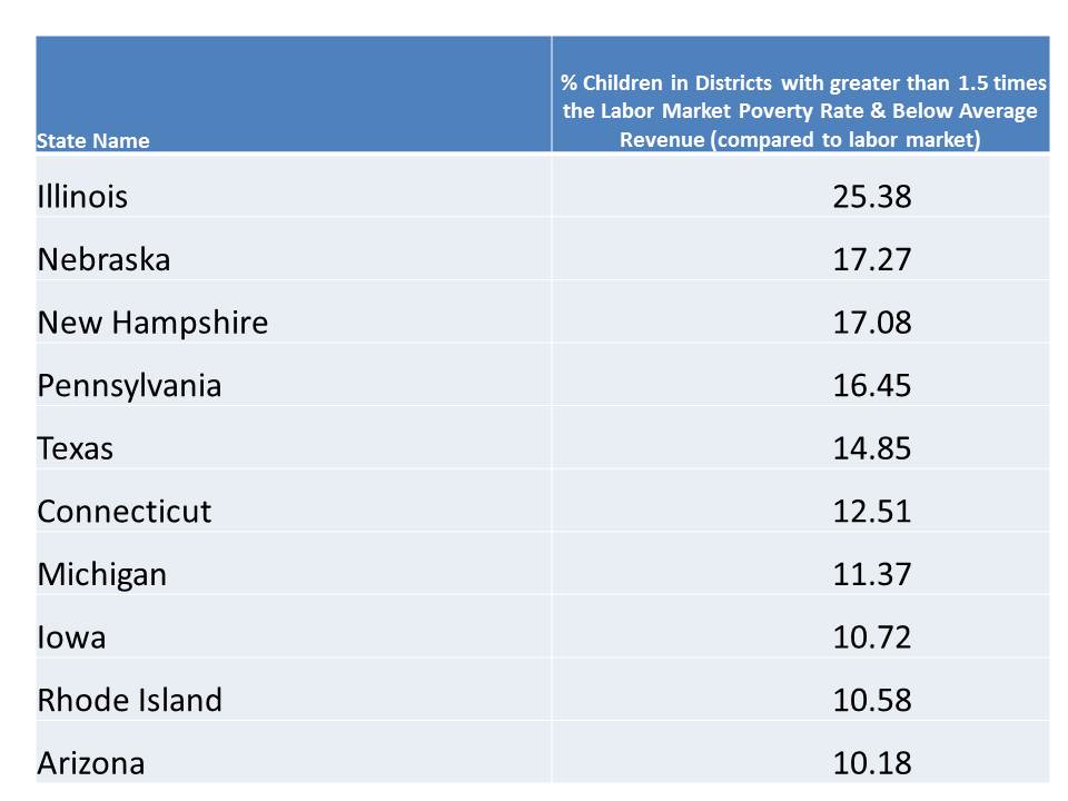
I then tally the percent of statewide enrollments that are concentrated in these screwed districts to determine the share of kids screwed by their state. And here are the rankings… or at least the short list of states that screw the largest share of low income students:

Not much new here. The same culprits make up the list. Nebraska is elevated to its position of disgrace by its systematic underfunding of Omaha Public Schools, which seemed to improve for a fleeting few years, but recent data don’t look so good. Woonsocket and Pawtucket bring Rhode Island into the mix… but raising additional fun questions regarding placement of blame (another post, another day… but should the city managers/local officials have the authority to deprive children in their jurisdiction of state constitutional rights? under what circumstances and by what mechanism should the state step in? Can they?).

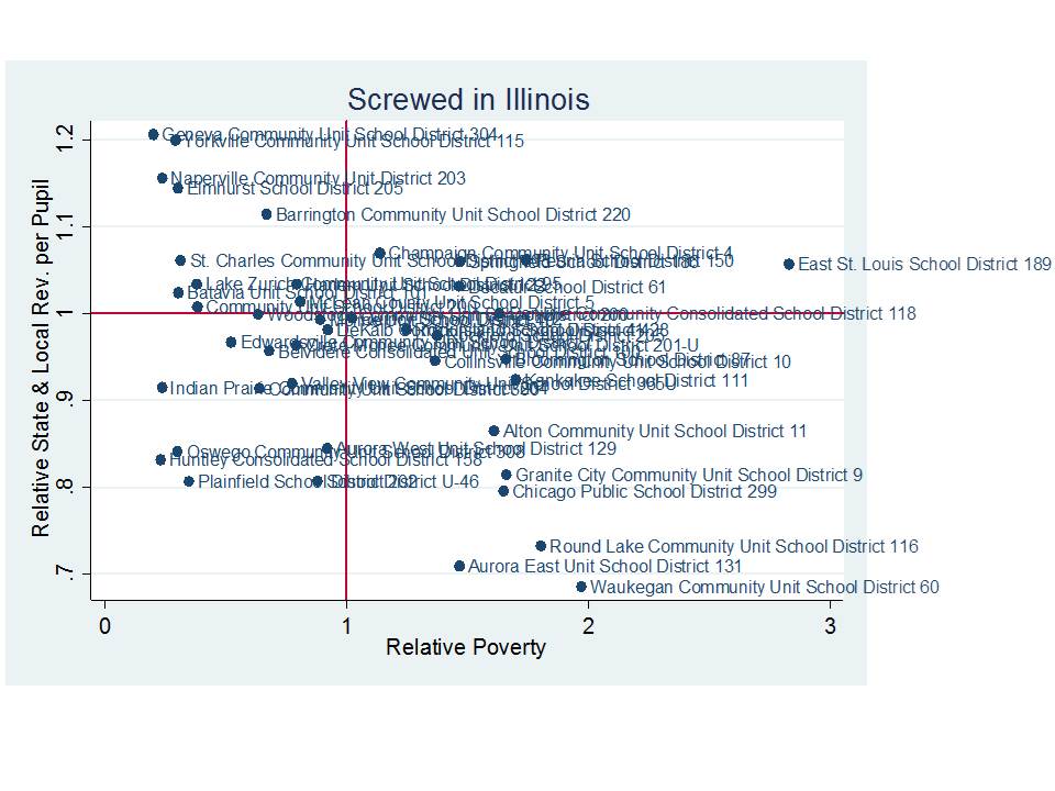
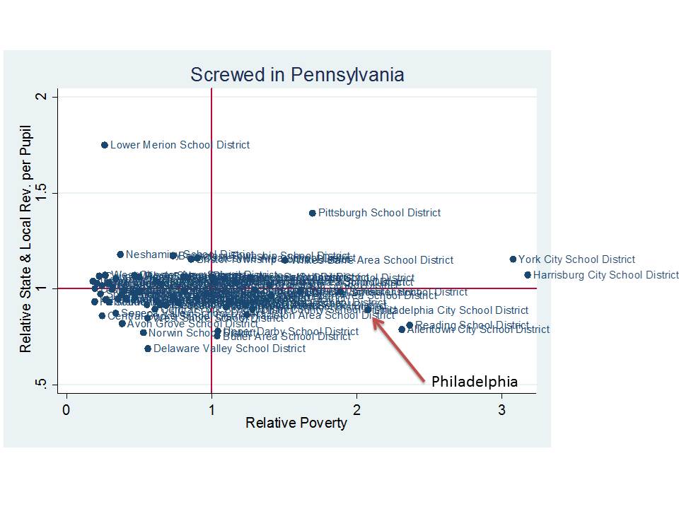
Here are a few graphs showing the distributions of individual districts in Illinois, Pennsylvania and Connecticut. On the horizontal axis is the relative poverty rate of districts compared to all other districts in the same core based statistical area. On the vertical axis is the state and local revenue per pupil relative to the average for all other districts in the core based statistical area.

Again, Allentown, Reading and Philadelphia are massively screwed (yep… a new school finance classification). Meanwhile… Lower Merion… in the Philly ‘burbs is not screwed at all. An intriguing contrast in Pennsylvania school finance is that Pittsburgh has long had far more adequate funding than Philadelphia for a variety of reasons. It is important to understand here that the highest poverty districts – those with 3x the average for their labor market – likely need FAR MORE revenue per pupil than their neighbors to get by – not just the same. So, while York and Harrisburg are decidedly less screwed than Allentown or Reading, they too are not in particularly good shape. They have about the same revenue per pupil as surrounding districts, and 3x the poverty rate.

Here’s Illinois:

Waukegan and Aurora East, along with Round Lake hold the coveted spots of “most screwed” but Chicago Public Schools isn’t far behind (with over 400k students). A multitude of smaller high poverty districts in the Chicago metro not shown here also have very low relative revenue per pupil.

Finally, here’s Connecticut once again:

Again, Bridgeport and New Britain, along with Waterbury (among others) remain substantially screwed. Recall from my previous post that Hartford and New Haven funding is somewhat distorted by magnet school aid.

So why does any of this matter anyway. Well, at face value it’s patently unfair to systematically deprive these districts of resources comparable to their less needy neighbors.  If money doesn’t matter to New Britain or Bridgeport, then why does it matter to Greenwich or Westport? Really, if money is so damn trivial for improving schooling quality, they why don’t all those districts in the upper right hand corner of these graphs just give all that useless money to those in the lower right hand corner. Oh, wait… perhaps money does matter…???…!!!

One thing about school finance that’s really important to understand is that the relative position of districts matters a great deal. It matters a great deal because education is a labor intensive industry. It is about getting a sufficient quantity of sufficient quality teachers in front of kids who need them. The spending behavior and negotiated agreements, and working conditions in districts like Westport and Greenwich matter for the teacher recruitment potential for Bridgeport.  The distribution of quality teachers across districts in a labor market depends on numerous factors, many of which tie back to available resources. And in these states, large numbers of children attend high need districts that simply lack resources to compete.

Notably, those districts sitting pretty in the upper left hand corner of these figures also have had traditional teacher contracts, tenure, seniority preferences and likely other policies that would make “reformers” cringe for years.  But most are doin’ just fine.  So too do the even higher spending and lower poverty elite private schools in the same labor markets! Most don’t use test scores as the basis for providing merit pay and I’m quite sure that few if any of them use test scores as the basis for firing the bottom 5% of their teachers every year. They haven’t been and aren’t being subjected to manipulative heavy handed takeovers, school closures and massive charter school expansion.

None of that reformy junk would likely do much good for the Westports, Greenwiches or Lower Merions of the US school system.  And none of that reformy junk is likely to be much good for the Bridgeports, New Britains, Allentowns, Readings, Philadelphias or Chicagos!

I find it particularly infuriating when I hear news of these “most screwed” districts being blamed for their own failure by the state officials who have deprived them systematically of resources for decades.

What these districts need as a baseline – a fair starting point – is equitable & adequate funding. Once that has been accomplished, then, and only then can we start having a reasonable conversation about how to best leverage that funding to improve student outcomes. But without the funding, there are no options for leveraging it.


Deconstructing Funding Fairness: Comments on the release of our latest report

Today, I, along with colleagues at the Education Law Center released the second round report on school funding fairness which can be found here:

http://www.schoolfundingfairness.org

We cover much ground in this report and develop what we believe are a useful set of indicators for comparing state school finance systems. In this new version of the report, we also include interactive tables and graphs thanks to the efforts and expertise of Danielle Farrie.

http://www.schoolfundingfairness.org/ia_reports.htm

But there’s always more to the story. There’s always more to be discussed/addressed that can’t be fully captured in a short policy report. Specifically, I would like to address a handful of potential misconceptions regarding funding fairness.

First, it is important to understand that unfair conditions may occur even in states that would appear in our updated report to be generally fair.

Second, it is really important to understand that the percent of money that comes from the state – from state tax revenue sources – does not seem to predict/influence the overall level of fairness. Fairness is not achieved by pushing all funding away from property tax revenues and onto state source revenues. In fact, such a move might do little to improve fairness while substantially increasing revenue volatility (income tax revenues which fuel state general funds are typically far more volatile – elastic to economic conditions – than are property tax revenues.   The real key to a good school finance formula is to figure out how to integrate the revenue sources into a system that is overall fair, and stable.

Third, federal revenues make things only marginally fairer. Their effect is minor. Yes, they are targeted to higher poverty districts generally. And yes, for those districts the resources are needed and may seem substantial. But, in the big picture of funding fairness, it comes down to providing that right mix of state and local funds to achieve a system that is overall fair.

Let’s take a closer look at each of these issues.

There are unfair conditions even in states that appear fairer!

Let’s begin with a look at Connecticut, a state that appears to a) spend a fair amount on its schools and b) spend marginally more on higher poverty districts. Or at least so the federal data on state and local revenues which we use in the funding fairness report indicate.

Connecticut is a particularly interesting case. As it turns out the fairness we find in our report is selective in two ways. First, the progressive tilt to the formula overall is significantly influenced by special aid provided primarily to Hartford and New Haven. Other high poverty districts lack this benefit. It is selectively applied. Second, the aid to which I refer is aid targeted for magnet schools which partly serve children from other districts in an effort to integrate minority and non-minority, low income and non-low income students. That this aid shows up in the expenditures of Hartford and New Haven also creates some distortion to the calculation of per pupil spending.

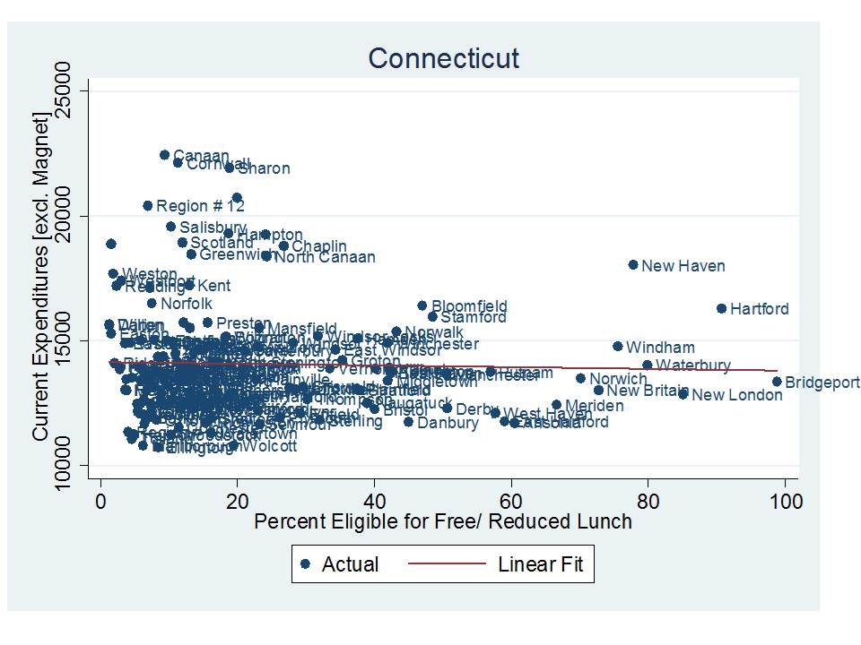
Here is an arguably more accurate portrayal of the selective fairness of funding in Connecticut. To clarify – selective fairness is… well… unfair.

This graph relates current spending per pupil (Net current expenditures per ADM 2011) after removing magnet aid from district expenditures. Overall, Hartford and New Haven remain better funded than other high poverty districts, but lower than with magnet aid included. Further, several very high poverty Connecticut districts have very low funding compared to their surroundings, precisely what landed them on my previous list of most screwed school districts.

Figure 1

Allocating more state aid doesn’t make it fairer if aid is allocated unfairly!

There exists a common assertion that disparities in school funding across districts are largely caused by disparities in property tax base – local property wealth – and the failure of states to allocate enough aid to offset those disparities. At times, I even hear advocates suggesting that if we could just do away with property tax funding of schools, and move all of the funding to state taxes and make the system completely state controlled, all of these equity concerns would be resolved. Wrong. Wrong… and double Wrong.

First, as a tangent which I mentioned above, allow me to point out that property tax revenues actually play a really important role in stabilizing school revenues over time and acting as a counterbalancing force to state aid fluctuations. State school finance systems require a balanced portfolio of revenue sources!  State income tax revenues are much more volatile to economic cycles.

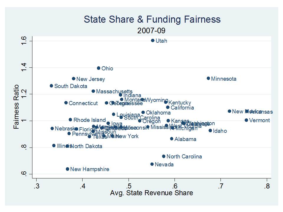
That aside, the figure below shows as we did in our first edition of the report, that states where districts on average receive a higher share of funding from the state (either as actual state disbursements, or in some cases as cleverly reclassified local property tax revenues raised by state mandated minimum tax rates, perhaps with revenue sharing), do not necessarily have fairer- more progressive – distributions of state aid.

Figure 2

So, how can this be? The implication of this is that state aid itself is being allocated unfairly? Is that possible? How might a state allocate aid in ways that fails to improve the fairness of the overall distribution of state and local revenue?

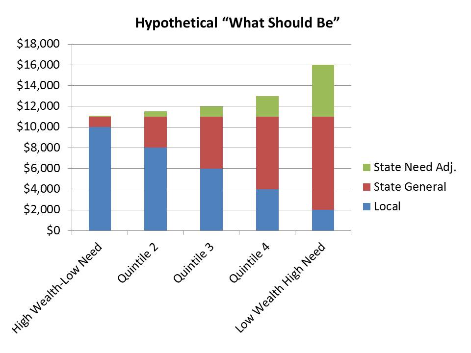
Well, let’s start with a hypothetical of what should be, or the distribution of aid as it might appear in a progressively funded state like New Jersey or Ohio. The figure below shows that state aid must counter two forces of local economics. First, state aid must be allocated in higher amounts to districts with less local capacity to raise that aid on their own. Second, to achieve progressiveness, aid must be allocated in higher supplemental amounts – or weighted amounts – to districts with greater student needs. If we totally oversimplify these issues and assume that low capacity districts also tend to have higher needs, it might look something like this:

Figure 3

And, as it turns out, states like New Jersey actually do look something like that:

Figure 4

But even New Jersey isn’t “perfect” in this regard. Note that middle wealth districts actually drop below the highest wealth districts. The pattern “dips” when it should perhaps climb more consistently from left to right.

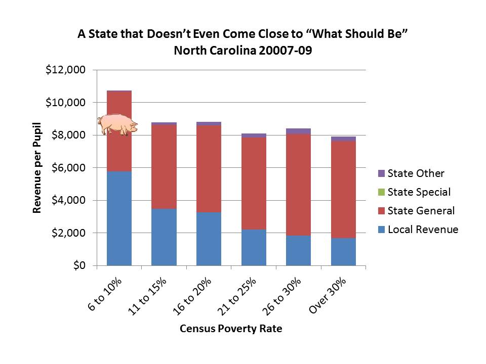
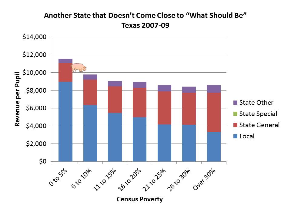
So then, what the heck is going on in other states? Well, here are a few examples of the state aid distributions in states that scrape the bottom of the fairness barrel in our updated report. I will have a new report out this fall supported by the Center for American Progress in which I dissect how states actually use their aid formula to make things worse! Unbelievable, but true. Some states actually allocate state aid so inequitably as to make funding gaps bigger! (see this post for an explanation of the pig!)

Figure 5. North Carolina

Figure 6. Texas

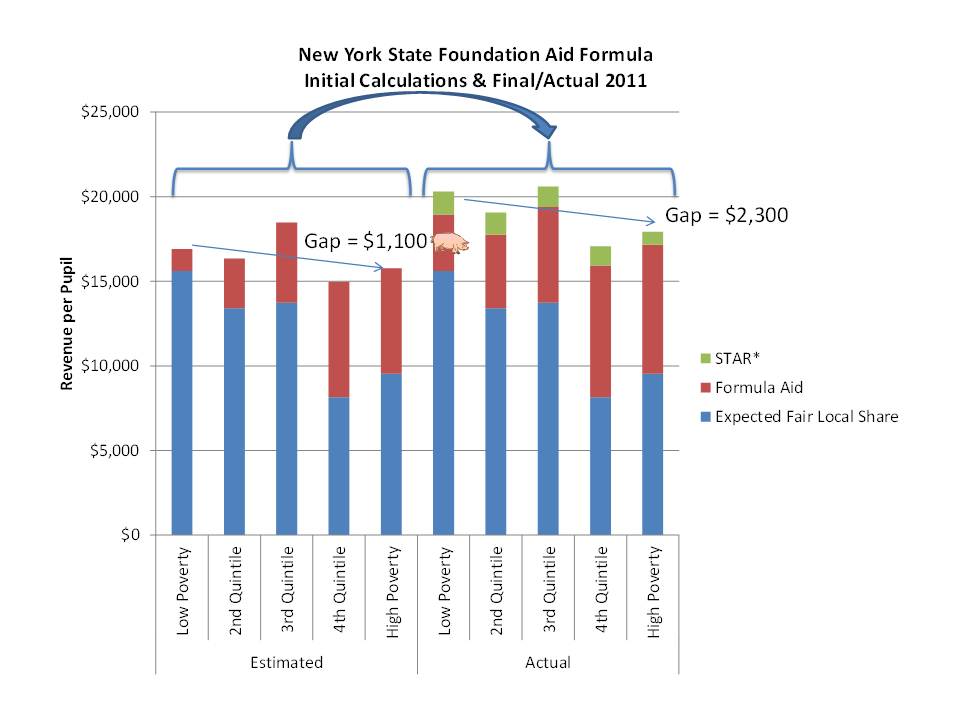
In this final figure, I show how New York State “tweaks” their aid formula from its initial calculations to its final calculations in ways that actually increase the funding gap from lower to higher poverty districts. The first cut (left hand side of the figure) calculations of state aid in New York would have many districts getting little or no state general foundation aid. But, the state aid formula then tweaks that amount by guaranteeing a minimum aid of $500 per pupil and an upward adjustment to the aid share for districts that are middle to upper middle wealth. Then, as I’ve discussed in previous posts, the state allocates disproportionate property tax relief aid to the wealthiest districts. Overall, these adjustments have the effect of increase the low poverty to high poverty funding gap from $1,100 per pupil to $2,300 per pupil. Yep… using state aid to double the funding gap! The politics of state school finance systems at work!

Figure 7. New York

Federal aid is no substitute for a sound, well designed, progressive state school finance system!

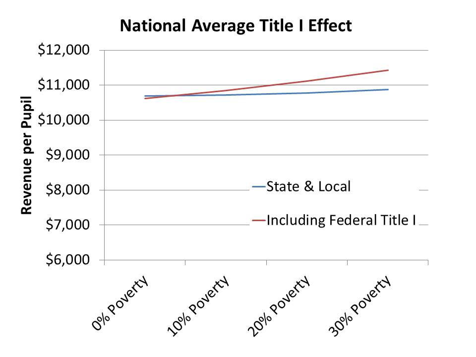
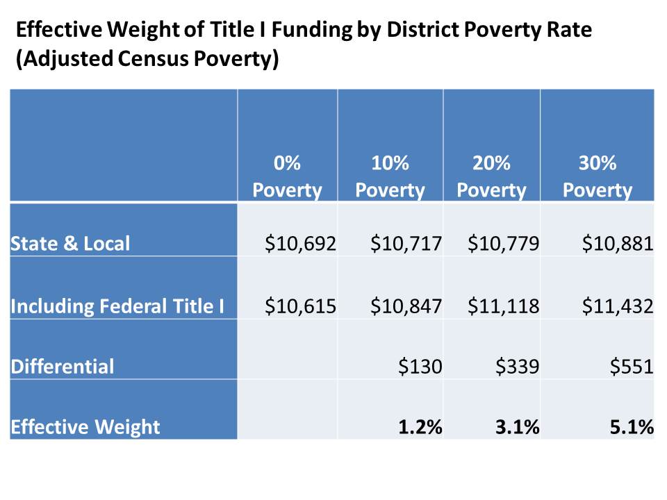
Finally, what about that federal aid and specifically what about that biggest chunk federal aid allocated to local districts primarily on the basis of poverty? Doesn’t that do the trick? Doesn’t the federal aid create the necessary upward tilt? Well… uh… no… it doesn’t. It helps, indeed. But Federal Title I aid creates only marginal improvements.

Consider that according to the most rigorous empirical research on the topic that it generally costs double to achieve comparable outcomes in a district that is 100% low income versus one that is 0% low income. That is, each low income child would warrant a “weight” of about 1.0 if counting low income as qualifying for free/reduced lunch (185% income level). When using the more stringent 100% poverty threshold, the required weight is about 1.5.

The following figure and table show that on average nationally federal title I funding adjusts upward the tilt of revenues per pupil by about 5% for a district that is 30% in poverty (100% poverty level). This would be comparable to about a 5% adjustment for a district that is 70% or more “low income” (qualified for free or reduced lunch, see page 31). That’s a relatively modest and far from sufficient adjustment!

Figure 8

Figure 9

So, while Federal Title I Aid is not entirely irrelevant, it is far from sufficient for achieving the extent of need-based targeting required for high poverty settings.

A sound, well-designed, progressive state school finance system is required.

Sadly, far too few of such systems presently exist.

Equitable and adequate financing of public school systems in the U.S. remains largely a state responsibility, and some states continue to either throw their entire education systems under the bus (Arizona, Tennessee), or selectively disregard children living in high poverty settings. Put simply, money matters. School funding equity and school finance reforms matter.

It’s not sexy and it’s not reformy. In fact, it’s quite possibly anti-reformy, but the reality is that equitable and adequate financing of state education systems remains the necessary underlying condition for providing quality schooling and achieving equal educational opportunity for all children.

Five Ridiculously Reformy “Copy & Paste” Policies & Why They’re Misguided

65 Cent Solution (now defunct?)

What is it? It was (thankfully this one is pretty much dead!) a policy proposal being pitched in the mid-2000s which would require, through state mandate/legislation or regulation, that local public school districts show on paper that they spend 65% of their total budgets on “instruction.”

The argument was that the average district nationally allocates somewhat less than 65% to instruction. Instruction is good. Private sector businesses use benchmarks, therefore education should use benchmarks. 65% is a benchmark. Therefore it should be used! Viola… freakin’ brilliant?

Backers of this proposal argued that the policy allowed state legislators to claim they were increasing classroom spending without actually allocating more money.

But, the backers were caught with their pants down in a memo leaked to the Austin Statesmen newspaper in Texas. In an article in Educational Policy (full citation below), Doug Elmer & I summarize the whole memo debacle:

In addition to these criticisms of what qualified as instructional spending, many opponents of the bill questioned the motives behind FCE (First Class Education) and the 65% solution proposal. These suspicions were in part confirmed by a memo written by Mooney to Republican legislators and obtained by the Austin American-Statesman in 2005 (Embry, 2005). In the memo, Mooney (2003) listed several political benefits of the 65% Solution, including the following:

  • Splitting of the Education Union. The 1st Class Education proposal pits administrators and teachers at odds with one another. . . .
  • Direct Fix for Public Education. While voucher and charter school proposals have great merit, large segments of the voting public—especially suburban, affluent women voters—view these ideas as an abandonment of public education . . . targeted segments of voters may be more greatly predisposed to supporting voucher and charter school proposals, as Republicans address the voting public with greater credibility on public education issues. . . .
  • Allows the Use of Unlimited Non-Personal Money for Political Position Advantages. The aforementioned benefits can be achieved with funding in any amount and from any source.
  • It Wins! As with initiatives proposing tax limits, term limits, and the definition of marriage, ballot successes for the 1st class is exceedingly likely.

Of course, one thing that never seemed to get discussed in this process was that empirical research on the issue of instructional spending shares of budgets, student outcomes and other school quality measures suggests little if any relationship – especially with respect to the 65% threshold.

Thankfully, this particular bit of copy and paste education policy foolishness seems to have come and gone!

Research

Taylor, L, Grosskopf, S. (2007) Is a Low Instructional Share an Indicator of School Inefficiency?

Exploring the 65-Percent Solution http://bush.tamu.edu/research/workingpapers/ltaylor/The_65_Percent_Solution.pdf

Baker, B.D., Elmer, D.R. (2009) The Politics of Off-the-Shelf School Finance Reform. Educational Policy 23 (1) 66-105

Parent Trigger

The Parent Trigger is perhaps even more obnoxious and deceptive than the 65 cent debacle. What is it? Well, the Parent Trigger is a policy that allows the majority of parents of students in any failing (generally meaning high poverty/minority concentration) school to vote, by simple majority to have the school taken over by a private company, charter operator, or to simply fire all of the teachers and the principal and start fresh (options may vary). The assertion is that this mechanism gives low income and minority parents “rights” that they are simply unable to assert through bloated and non-responsive urban district bureaucracies. While it may be true that some urban district bureaucracies are less than responsive, the parent trigger sure as hell isn’t the solution.

The parent trigger basically permits a simple majority of parents of children who happen to attend a given school for a period of time to stage a takeover of that school, and this could be done for a variety of motives in a variety of ways with a plethora of possible distorted, negative consequences. A group of middle school parents (during their 3 to 4 year window) might, for example, take a year to take-over their school and turn it over to a private charter management company.  The parent majority might, for example, have a gripe against LGBT students, or students of a particular race, culture or religion. Charter takeover would allow the simple majority to makeover the school into a themed school – like a school for traditional family values, or a English only academy. The simple majority could easily use this tool to oppress any minority population (and don’t give me that crap about this being better than the tyranny of the district oppressing everyone).

Further, if the simple majority of parents do forcibly convert the school to a privately managed charter, it may turn out that all parents and children lose important statutory and constitutional rights, as I have discussed in previous posts regarding parental/student/teacher rights in privately managed charter schools.

Notably, this hostile takeover could have occurred under the majority rule of parents on one cohort of students and have lasting adverse effects on subsequent cohorts of children whose parents had little input.

Further, this mechanism removes from the process any/all other residents of the community surrounding the school (who contribute tax dollars to the school), placing all control in the hands of the simple majority of parents with children attending the school at any one point in time.

It’s a ridiculous approach granting disproportionate, ill-defined power to an ill-defined majority constituency seemingly intended to do little more than stimulate infighting among low income and minority populations as a distraction from the larger policy issues.

Blog Posts

Potential abuses of the Parent Trigger

https://schoolfinance101.wordpress.com/2010/12/07/potential-abuses-of-the-parent-trigger/

Public/Private Status of Charter Schools

https://schoolfinance101.wordpress.com/2012/05/02/charter-schools-are-public-private-neither-both/

Why Public/Private Status Matters: Legal Issues

https://schoolfinance101.wordpress.com/2012/05/04/follow-up-on-why-publicnessprivateness-of-charter-schools-matters/

Weighted Student Funding Reformy edition

This one is an example of a totally reasonable policy concept that has been dreadfully abused and over-emphasized as a panacea for urban district budgeting and management, and conflated with many other management policies strategies.

Weighted student funding itself is simply an approach to calculating the need and cost based funding to be delivered to schools or districts. Several states used weighted student formulas to drive money to districts. Several districts use weighted student formulas to allocate budgets out to schools.

But, in the reformy world, weighted student funding has taken on the meaning of a Money Follows the Child coupled with Decentralized School Site Control model. Put simply, there really isn’t much evidence that decentralized governance across schools within districts is particularly effective policy for improving productivity and efficiency, or equity for that matter! (see Baker & Elmer article below).

But, the most frustrating part of the WSF discussion for me has been that it has encouraged many to argue that the big problem with school funding today is the disparities in budgets across schools within large city districts. Yeah… there are some significant problems there. But those are not the biggest problems. Between district disparities and state school finance systems continue to severely constrain district’s ability to target funds to their highest need schools.

Sadly, despite there being some virtues of WSF as a funding approach, the reformy takeover and complete mis-representation of the issue has led to some truly baffling think tanky reporting on WSFs. Take for example 2010 Bunkum Award Winner The Reason Foundation:

http://nepc.colorado.edu/bunkum/2010/time-machine-award

This Reason Foundation report has multiple features that make it an award winner. It engages in definitional acrobatics, pouring a kitchen sink’s worth of assorted reforms into a vessel it calls Weighted Student Formula (WSF) reforms. And, in a truly breathtaking innovation, the report enters its time machine and attributes positive reform outcomes to policy changes that had not yet been implemented. In broad terms, WSF reforms involve linking funding to each student, with that funding calculated as the student’s base allocation and any additional funds for special needs, economic deprivation or other reasons. The Reason report somehow manages to squeeze into this WSF concept three additional reforms: (a) site-based management; (b) site-based budgeting; and (c) school choice. The expert third party reviewer said this about the Reason “umbrella labeled as WSF:” “[it] deceptively suggests that all related policies are necessarily good—even going so far as to credit those policies for improvements that took place before the policies were implemented.”

“The report then irresponsibly recommends untested, cherry picked policy elements, some of which may substantially undermine equity for children in the highest-need schools within major urban districts.” For example, the plan suggests that extra funds for economically deprived students be eliminated but that added money should be given to gifted and talented students. The report also ignores a large body of relevant literature on within-district equity and school site management in its uncritical effort to find support for the foundation’s ideological policy preferences.

Look… a good weighted student formula is not a bad idea at all. Pretending that district weighted student formulas and decentralized governance will solve the most pressing equity issues in education today, however, is totally ridiculous!

Research on WSF

Baker, B. D., & Welner, K. G. (2010). “Premature celebrations: The persistence of interdistrict funding disparities” Educational Policy Analysis Archives, 18(9). Retrieved [date] from http://epaa.asu.edu/ojs/article/view/718

Baker, B. (2009). Review of “Weighted Student Formula Yearbook 2009.” Boulder and Tempe: Education and the Public Interest Center & Education Policy Research Unit. Retrieved [date] from http://epicpolicy.org/thinktank/review-Weighted-Student-Formula-Yearbook

Baker, B.D., Elmer, D.R. (2009) The Politics of Off-the-Shelf School Finance Reform. Educational Policy 23 (1) 66-105

Baker, B.D. (2009) Evaluating Marginal Costs with School Level Data: Implications for the Design of Weighted Student Allocation Formulas. Education Policy Analysis Archives 17 (3)

Baker, B.D. (2012) Re-arranging deck chairs in Dallas: Contextual constraints on within district resource allocation in large urban Texas school districts. Journal of Education Finance 37 (3) 287-315

Toxic Trifecta Teacher Evaluation Policies

Another type of cut-and paste policy that’s been driving me up the wall lately is what I refer to as the Toxic Trifecta Teacher Evaluation Framework. I have explained in previous posts the issues associated with Value Added Models for determining teacher effects on student outcomes. I have also explained how Student Growth Percentiles are not appropriate for the task at all. But, I have also explained how this information might be responsibly used, for example, for exploring patters across teacher within a school or district, while retaining the option to decide that the data were simply wrong.

Toxic trifecta policies, in very simple terms, MANDATE THE MISUSE OF STATISTICAL INFORMATION FOR MAKING TENURE AND DISMISSAL DECISIONS.

They negate responsible human judgment altogether and replace it with rigid, ill-conceived frameworks reflecting a baffling degree of statistical ignorance (and educational and management ignorance).  

Here are the elements to look out for in Toxic Trifecta Teacher Evaluation Policies:

  1. Mandating potentially invalid VAM or necessarily invalid SGP scores to be used as a fixed share in determining personnel decisions.  Necessarily becomes an overriding factor!
  2. Forcing precise cut-point determinations through data with absurdly wide error ranges (creating categories of performance with defined cut points for VAM or SGP estimates).
  3. Forcing that personnel decisions be made on the basis of this information, on strict timelines, without consideration of any other contextual factors (or the possibility that the estimates are simply WRONG)

Really, any one of these elements alone is bad enough. But in combination, they are a complete disaster (except for the legal profession)!

As I’ve explained on many occasions, simply saying that the VAM or SGP measure of teacher effect on student test score change is “only 20%” or “only 40%” of the evaluation is unhelpful. It is still assumed to be valid and important and it may be neither.

Further, that element which varies most in the overall scheme is likely to tip the scales on most decisions. And the variance in VAM or SGP estimates is a mix of a) real effect, b) noise and c) bias (likely heavy bias in SGPs). Further, noise and bias are quite likely to dominate any “real effect” (and the real effect may not be an important effect). And we simply can’t know what share is real, bias or nose.

On the second element, it is utterly foolish to try to set up cut-scores for defined performance categories (with a point or two difference changing the category) given the extent of noise and bias in the measures. How can say that a 25 is unacceptable and a 26 is okay, when both have error ranges of 50 points on each end?  It then stands to reason that it is even more foolish to tie high stakes decisions to falling just above or below these cut scores from year to year.

Now,  I don’t know what the current TEACHNJ (Ruiz) bill includes from the toxic trifecta, but on my last read, it included all three components, the worst of which was the absolute requirement that teachers lose tenure after 2 bad evaluations, stated rigidly as follows:

Notwithstanding any provision of law to the contrary, the principal, in consultation with the panel, shall revoke the tenure granted to an employee in the position of teacher, assistant principal, or vice-principal if the employee is evaluated as ineffective in two consecutive annual evaluations. (p. 10)

Further, in an effort to rub salt in the wound following this mandated misuse of statistical information, the versions of the bill which I had reviewed indicated that teachers could only appeal these decisions on procedural grounds. Several other states have already adopted trifecta elements in part or entirely.

As I’ve mentioned in a few recent blog posts, there might (though I’m increasingly pessimistic) exist some reasonable uses of VAM estimates or SGPs for informing management decision making in schools.  Those reasonable uses invariable acknowledge that these measures are not only noisy but may also simply be wrong, and permit human judgment to make that call. Toxic trifecta policies prohibit those reasonable uses, and will ultimately mandate that bad decisions be made based on inadequate information.

Related Articles

Green, P.C., Baker, B.D., Oluwole, J. (2012) Legal implications of dismissing teachers on the basis of value-added measures based on student test scores. BYU Education and Law Journal 2012 (1)

Blog Posts

Toxic Trifecta: https://schoolfinance101.wordpress.com/2012/04/19/the-toxic-trifecta-bad-measurement-evolving-teacher-evaluation-policies/

If it’s not Valid, Reliability Doesn’t Matter: https://schoolfinance101.wordpress.com/2012/04/28/if-its-not-valid-reliability-doesnt-matter-so-much-more-on-vam-ing-sgp-ing-teacher-dismissal/

Video Post: https://schoolfinance101.wordpress.com/2012/05/23/video-thoughts-on-test-scores-vam-sgp-teacher-evaluation/

Mutual Consent Hiring/Assignment/Dismissal

This is one of those policies that had seemed relatively pointless and innocuous. Originally it was mostly about district human resource management policies, not about state requirements. But, as a state mandate and in conjunction with other teacher evaluation policies (the toxic trifecta), mutual consent policies take on new meaning.

Mutual consent policies – when adopted as state legislation or regulation – require that principals have the “last  word” on which teachers are assigned to or hired to work within their buildings. These policies have been driven by two ideas/purposes. On the one hand, there were the outrage-invoking news stories of principals being forced to draw from pools of excess teachers (implied [without validation] to be awful teachers and completely unqualified) in large city districts, when they supposedly knew they could get someone better from the outside. Second… and originally… these policies were intended to improve the distribution of teacher qualifications across more and less advantaged schools within districts.  Both are virtuous to the extent that a) the problem is real and b) the solution works.

But, there are many problems of both basic logic and of operational reality when it comes to mutual consent policies. Here’s a short list:

  1. Mutual consent assumes only good decisions are made at building level and bad ones at district level;
  2. Mutual consent ignores that district officials hire/fire and assign principals;
  3. Mutual consent sets up scenario where central office may wish to assign ‘good teachers’ to weak school but principal could reject (district might even be trying to groom new leaders for the school);
  4. Research suggests that it doesn’t actually accomplish much if anything!

In really simple terms, mutual consent causes administrative chaos, by mandating that the subordinate has final word, when the subordinate never really has the final word. What kind of silly crap is that? At least as a state policy mechanism?

It’s one thing if a district decides to have a collaborative process, or even a policy of collaboration regarding personnel decision between building leaders and central office. But having the state mandate that building leaders have authority over central office, when central office ultimate has authority over building leaders is ludicrous. Suggesting that this is based on how big business in the private sector works is even more ludicrous!

Further… what’s particularly warped is when a mutual consent policy is proposed in the same legislation as the toxic trifecta elements above. The toxic trifecta mandates who the principal must fire or at least de-tenure and under what specific circumstances and based on measures over which the principal has no control and may have limited statistical understanding????  And then the mutual consent policy “empowers” the principal? Are you kidding me?

Look, districts should design personnel policies such that school leaders can build good teams. I’m all for that, and have conducted and published research on that very topic. I favor building level involvement in personnel policy toward the goal of building effective teams. State mandated “mutual consent” does little or nothing to advance this goal.

As for the research on mutual consent, the one study done on a large district that used the policy found that it did not achieve its goal of improving the distribution of teacher quality:

We conduct an interrupted time-series analysis of data from 1998-2005 and find that the shift from a seniority-based hiring system to a “mutual consent” hiring system leads to an initial increase in both teacher turnover and share of inexperienced teachers, especially in the district’s most disadvantaged schools. For the most part, however, these initial shocks are corrected within four years leaving little change in the distribution of inexperienced teachers or levels of turnover across schools of different advantage. http://www.nctq.org/docs/Mutual_Concent_8049.pdf

Blog Posts

Regarding research on mutual consent: https://schoolfinance101.wordpress.com/2010/10/08/nctq-were-sure-it-will-work-even-if-research-says-it-doesnt/

New Jersey Charter Data Roundup: A look at the 2010-11 Report Cards

Here’s a quick run-down on the 2010-11 New Jersey School Report Card data on charter schools. No-one else is putting out decent summaries of this stuff, so I feel obligated to revisit these data periodically. They don’t change much over time. But those older blog posts get buried over time. So, here we go.

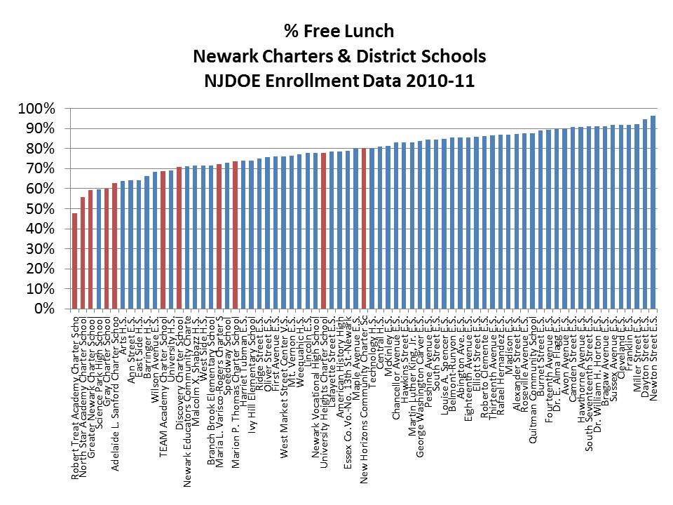
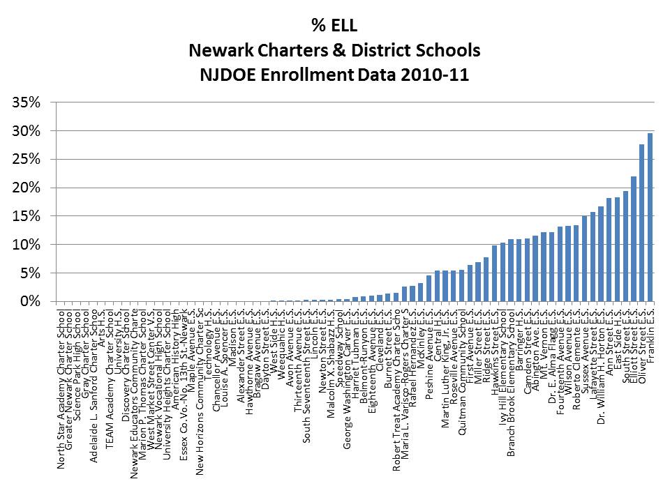
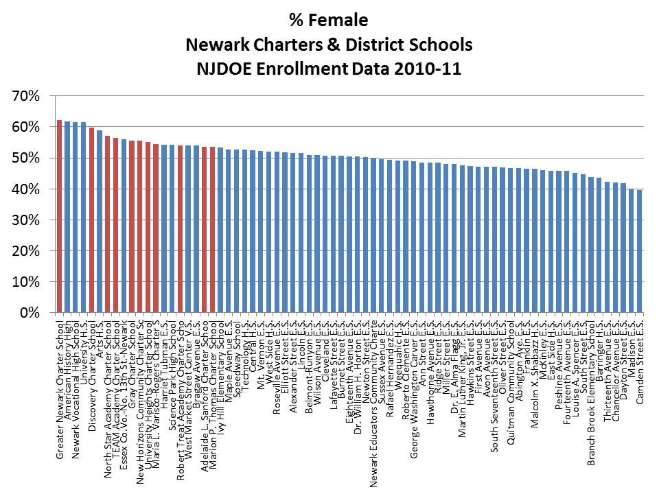
Let’s take a specific look at Newark because that’s where most of our attention has been paid regarding high flying charter performance.

Data sources:

1. NJDOE Report Card

2. NJDOE Enrollment File

3. NJDOE Directory File (for City location)

Percent Free Lunch

Percent ELL

Percent Female

Regression Model of Charter Performance

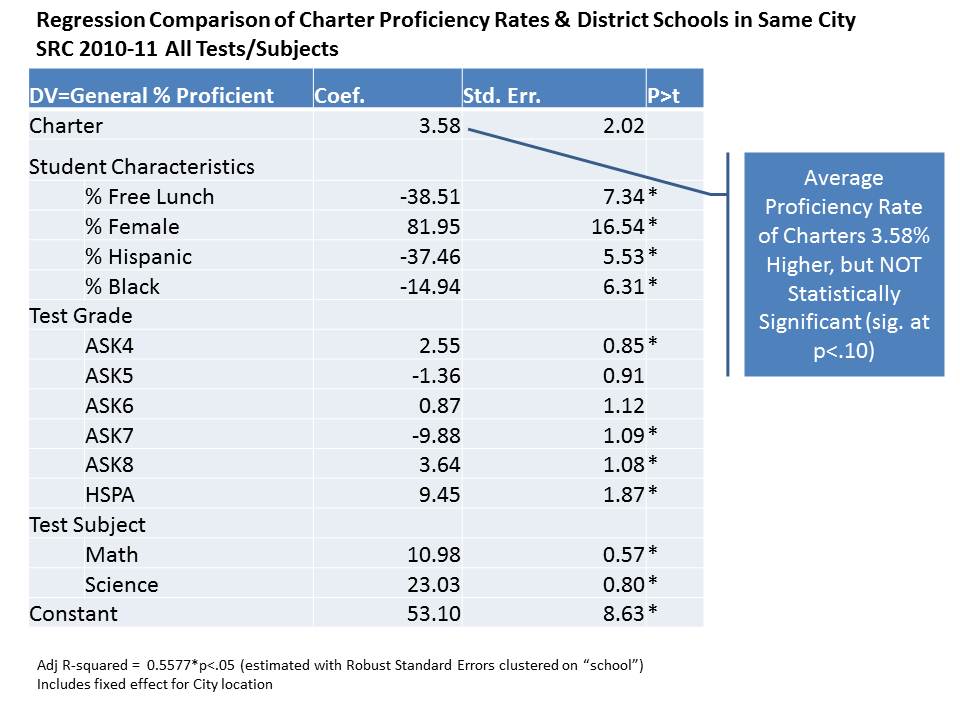
More explanation is provided below. But this regression model (raw output on link below) is simply intended to compare the average proficiency rates across all tests and grades of charter schools to other schools in the same city and with similar characteristics. The bottom line is that as in previous similar regressions, there remains a small statistically non-significant margin of difference in average overall proficiency. But, the graphs that follow are perhaps more fun/interesting to explore.

CharterRegression

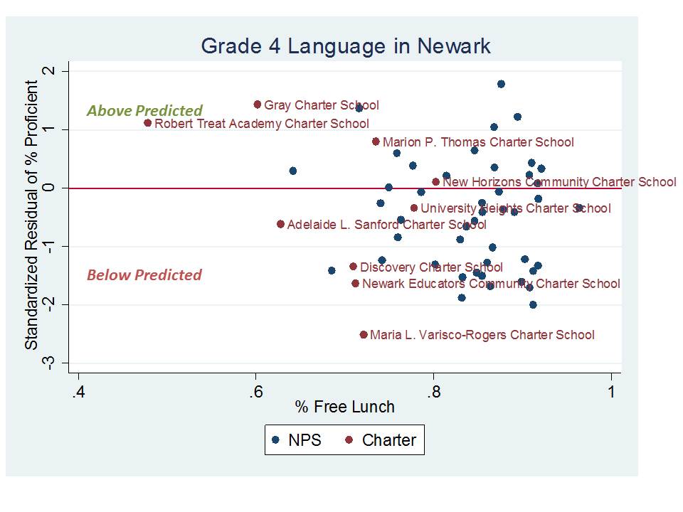
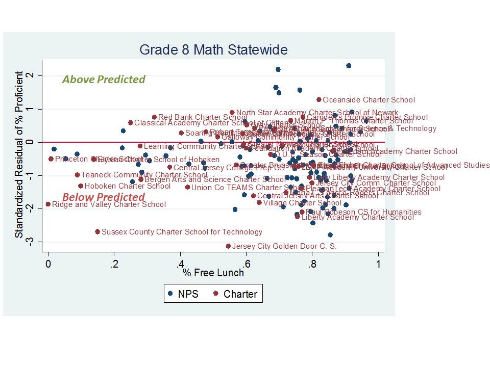
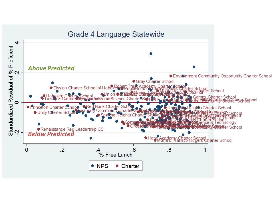
Now, for the following figures, the overall charter effect variable is removed, so that we can see how individual charter schools lie with respect to expected proficiency levels. The following figures compare schools to their predicted performance given each of the characteristics in the regression model. On the vertical axis is the standardized residual or the standard deviations above or below predicted performance. Along the horizontal axis is the percent free lunch of the schools, just so that we can see how they sort out by poverty concentration. Note that poverty concentration is already controlled for in the models. I begin with a few figures for select tests in Newark, and then present some statewide figures.

Newark Schools over and under predicted performance

Statewide schools over and under predicted performance

On average, this statewide picture is actually pretty ugly. It would certainly be very hard to argue that charter school expansion across New Jersey has led to any substantive overall improvement of educational opportunities. Numerous charter schools are substantial underperformers. And overall, as the regression model indicates, the net performance is bread even.

Take home points

This analysis merely compares the average proficiency rates of schools with similar characteristics in the same city. It does not measure whether charters “add value” per se.  This isn’t really ideal from a research perspective, because it doesn’t attempt to sort out whether these schools are actually doing something that leads to higher performance.

To address this question we might try either of two strategies – estimating achievement gains across matched schools – or hypothetically matched schools/children, or by a lottery based analysis comparing kids lotteried in to those lotteried out and staying in neighborhood schools.

But, I would argue that we still might not learn much of policy relevance for Newark from either of these approaches. Why?

Well, let’s consider the first approach – a matched school analysis (or virtual match based on individual students).  Let’s say we specifically wanted to determine the effectiveness of schools like North Star, Robert Treat or Gray charter.  The problem is that there really aren’t any “matched” schools or match-able kids – except perhaps those in magnet schools.  Note on matching-based-analyses… given that nearly all kids in a city like Newark qualify for Free OR REDUCED lunch, matching would have to be done on the basis of Free Lunch! If not, substantial precision/accuracy is lost and the comparisons invalid.

We might look outside of Newark for matched schools or students, but then other contextual factors might compromise the analysis quite substantially, and this might cut either for or against the charters.

Further, it appears that gender balance matters – not just a little – but a lot. Gordon McInnis tipped me off to this.  I hadn’t realized how big a deal it was in these schools.

Note that I’ve also left out attrition here, so that even if the schools were matched by poverty rates, gender and ELL concentration, there might be substantive differences in which students leave over time, altering the peer group composition over time (as weaker students leave).  Again, it may be most relevant to compare Newark Charters to Newark Magnets and/or children who attend them, which are most similar to these Newark Charters.

We could try to construct hypothetical or virtual matches based on similar individual children (to those in the charters) across the district who may or may not actually attend school together. But therein lies the problem, most other similar kids left in district schools would be attending school in substantively different peer groups than those in charters like North Star, Gray or Treat.

AND if we did find an “effect” on student achievement growth what the heck would it mean? And how would it inform our policy decisions?

Well, if we did, we would still have significant difficulty sorting out as to whether that effect has anything to do with school quality, or with student peer group  – quite possibly the largest in school factor affecting achievement.

Alternatively, one could attempt a lottery based analysis in which we look at the gains of kids lotteried in and lotteried out of the charters – left in their neighborhood schools. But in this case we would certainly have kids whose peer groups differ dramatically.  Again, we could try to “correct” for that uneven distribution, but the fact is that we simply can’t fully correct for the substantial contextual differences across these schools.  Too many Newark charters (and those in Jersey City and Hoboken) simply don’t even come close to resembling the student composition of traditional public schools in the same area.

So who cares? Well, it matters a great deal for policy implications whether the effect is created by concentrating less poor, English speaking females in a given school or by actually providing substantively better curriculum/instruction.  The latter might be scalable but the FORMER IS NOT! There just aren’t enough non-poor girls in Newark to create (or expand) a whole bunch of these schools!

The Commonwealth Triple-Screw: Special Education Funding & Charter School Payments in Pennsylvania

This post is the second in a series (of unknown number) focusing on how states harm local public school districts through illogical, ill-conceived state school finance systems and components of those systems. One goal of this post is to illustrate the types of problems/manipulations that exist in state school finance systems, how they work, and the severity of the problems they can cause.  I have written previously, for example, how states find ways to actually use state aid to make their finance systems less equitable (school finance pork). I have also written about policies like census based financing of special education and it’s adverse effects on high need districts. The Commonwealth Triple-Screw takes it to another level.

The Commonwealth of Pennsylvania has among the least equitable state school finance systems in the country. Pennsylvania operates a school funding system that on average provides systematically less state and local revenue per pupil to the state’s highest need large and mid-size city districts. Among the nation’s most “screwed” city districts are Philadelphia, Reading and Allentown.

But amazingly, in Pennsylvania, the pain doesn’t end there. Pennsylvania also has one of the least fair, least logical approaches to special education funding, both in terms of the way in which special education aid is distributed to local public school districts and in the calculations for determining how much should be paid by local public school districts to charter schools for serving special education students.

Apparently, this issue is of current interest in PA: http://www.mcall.com/news/local/parkland/mc-lehigh-valley-cyber-charter-schools-20120604,0,2970776.story

The hit comes in three parts and I call it the Commonwealth Triple-Screw. Here’s a run-down.

Screw 1: Census based financing of special education, assuming a uniform share of students in need on its face provides less support to districts with greater shares of students in need.

First, Pennsylvania is among a handful of states which continue to use an approach called Census Based financing of special education. In brief, what PA does is provide to each school district, in general regardless of their local wealth and regardless of their actual number of special education students, a flat, base allocation of special education funding per 16% of total enrollment (the assumed flat % special ed across districts).

The argument is that funding special ed in flat amounts avoids the incentive to over-classify students. This argument ignores the possibility – the simple reality – that populations of all types vary in their geographic distribution for a variety of reasons and that includes families of children with disabilities. Funding on this basis necessarily deprives districts that through no fault of their own have far more than 16% special education. Further, and more illogically, for districts having only about 7% special education, this approach arbitrarily over-funds their needs (at least relative to higher need districts). I have written extensively about the research and realities of Census Based funding in this recent article:

  • Baker, B.D., Ramsey, M.J. (2010) What we don’t know can’t hurt us? Evaluating the equity consequences of the assumption of uniform distribution of needs in Census Based special education funding. Journal of Education Finance 35 (3) 245-275

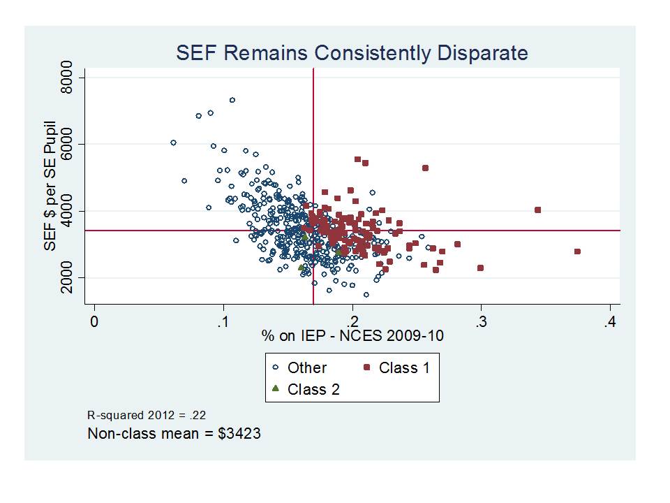
Here are a few quick snapshots of how this works out globally (Statewide) then locally (Chester Upland School District). The following figure is drawn from my Summer 2011 final update to my testimony in the case of C.G. v. Commonwealth (a Federal Court challenge to PA special education funding). The figure shows that districts with higher special education population shares and higher Market Value/Personal Income ratios (hence low wealth/income) generally receive less special education aid per special education pupil as a function of the underlying census based formula.

Figure 1. Special Education State Aid per Special Education Pupil

In the rest of this post, I will show in particular how this formula along with other calculations dramatically undercut the financial viability of Chester Upland School District, a high need district facing dire financial circumstances in recent years.

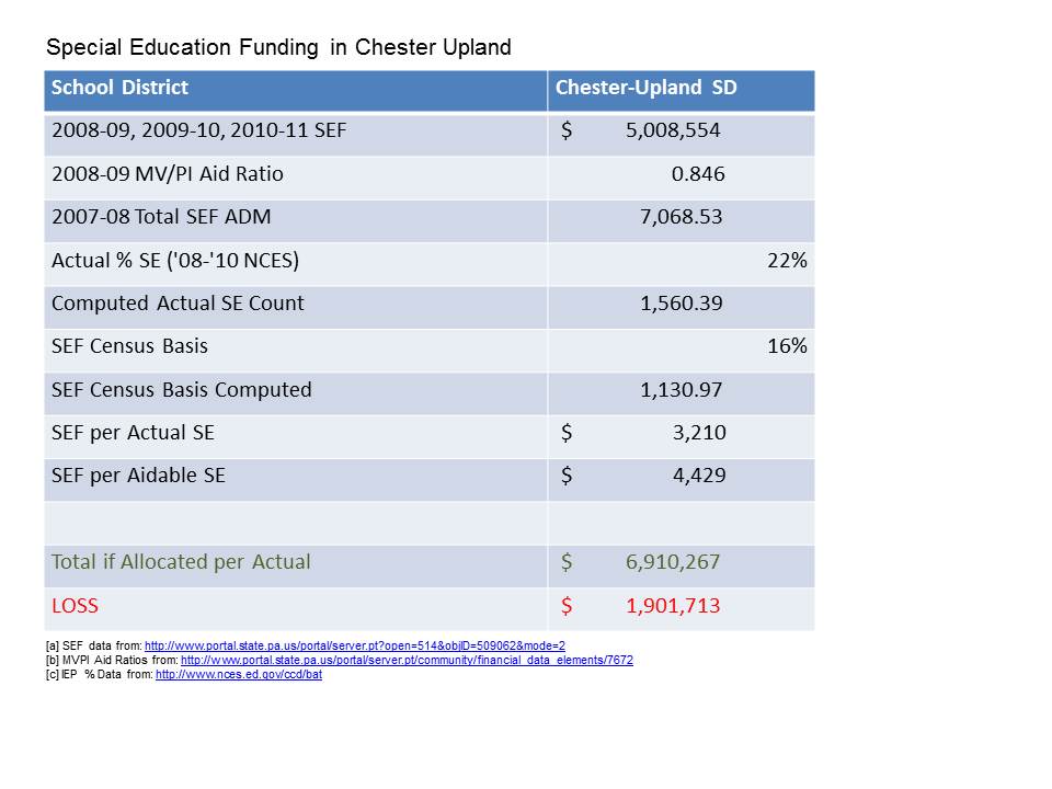
Table 1 provides a walk-through of Chester Upland’s position with respect to special education state funding. CUSD was reported to have been allocated just over $5 million in SEF funding for 2010-11, with that funding having been frozen for the past several years. CUSD’s actual percent of enrollment in special education programs has typically been about 22% over time (based on several sources, including the NCES common core of data). That would amount to over 1,500 special education students, consistent with counts reported later. This yields special education funding per actual special education pupil of about $3,200 (placing CUSD among the red squares in Figure 1 which lie at approximately 22% special education and have low wealth [high MVPI]).

Table 1 walks through the hypothetical difference in funding that would occur if CUSD was allocated SEF per actual pupil rather than per 16% ADM. CUSD’s SEF allocation per 16% ADM is $4,429, or $1,200 per pupil higher than it is per actual pupil in need. If CUSD received $4,429 per actual child in need, then CUSD would receive nearly $2 million more in special education funding, or a 38% increase. For a district with minimal local capacity to offset this loss, that’s a significant hit. But, it’s also the smallest hit of the triple-screw!

Table 1. Special Education Funding in Chester Upland

[a] SEF data from: http://www.portal.state.pa.us/portal/server.pt?open=514&objID=509062&mode=2

[b] MVPI Aid Ratios from: http://www.portal.state.pa.us/portal/server.pt/community/financial_data_elements/7672

[c] IEP % Data from: http://www.nces.ed.gov/ccd/bat

Screws 2 & 3: The charter school funding formula for special education students exacerbates these problems by requiring high need, under-resourced districts to pay special education tuition to charter schools at the rate of the average special education expenditure per special education child of the host district.

Pennsylvania’s formula for determining the amount of money that must be transferred from sending districts to charter schools for serving students with disabilities is poorly conceived, creates perverse incentives for charter school operators, and inappropriately drains disproportionate resources from sending districts. CUSD is perhaps more harmed by this ill-conceived mechanism than any other district in the state both because of the characteristics of CUSD and because of the enrollment practices of Chester Community Charter School.

Note that the following analyses present the hypothetical adverse effects of the Pennsylvania charter school funding formula on CUSD, using enrollments of Chester Community Charter School to illustrate those effects. CUSD may also be sending children with disabilities to other charter schools, where the effects would play out similarly to the extent that other charters also siphon off children having lower cost disabilities. Further, the hypotheticals are based on enrollment-by-classification data from 2008-09 and conditions may have become even more severe in recent years.

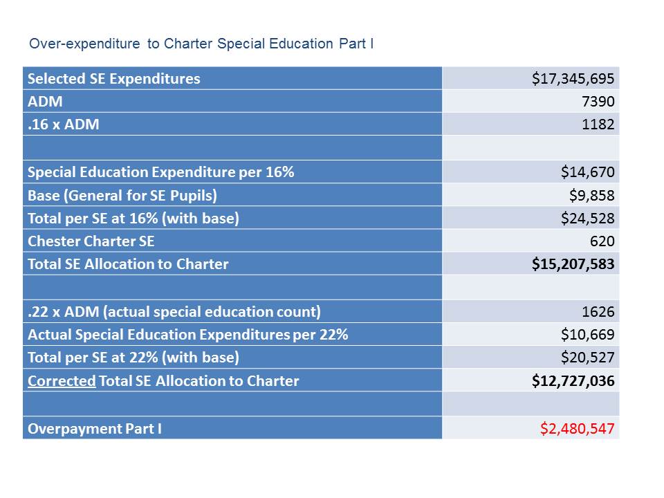
The funding hit comes in two parts. First, Table 2 shows how the spending special education tuition rate is set. CUSD spent in 2011-12 about $17.3 million in “selected” special education spending. Even though this spending was used for approximately 22% of the district population, the tuition sending rate is calculated per only 16%, incorrectly inflating the special education spending per special education pupil.  16% of CUSD ADM is just under 1,200 students. Thus, the special education expenditure divided by that figure is $14,670. This is the “additional expenditure” per special education child. Each special education child also has associated with him/her a “base” (regular education) expenditure. That figure for CUSD is $9,858. Therefore, the total including BASE + SE is $24,528. If we take the $24,528 and multiply it times the total number of special education students sent to Chester Community Charter School, that amounts to over $15 million.

Okay… so let’s stop for a minute. The district receives in SEF funding about $3,200 per special education student, and must send out over $24,000. That’s difficult enough… but… the $24,000 is miscalculated substantially in two ways!

If we consider that CUSD actually served about 22% special education (or about 1,620 students), the special education spending per pupil, with the base added in, would be $20,527. If we use this figure instead to determine the payment to the charter school, CUSD would send only $12.7 million to the charter.

This arbitrary use of the 16% figure to determine sending tuition rates costs CUSD nearly $2.5 million (or about 50% of its state special education funding)!!!!!!!

Table 2: Over-expenditure to Charter Special Education Part I

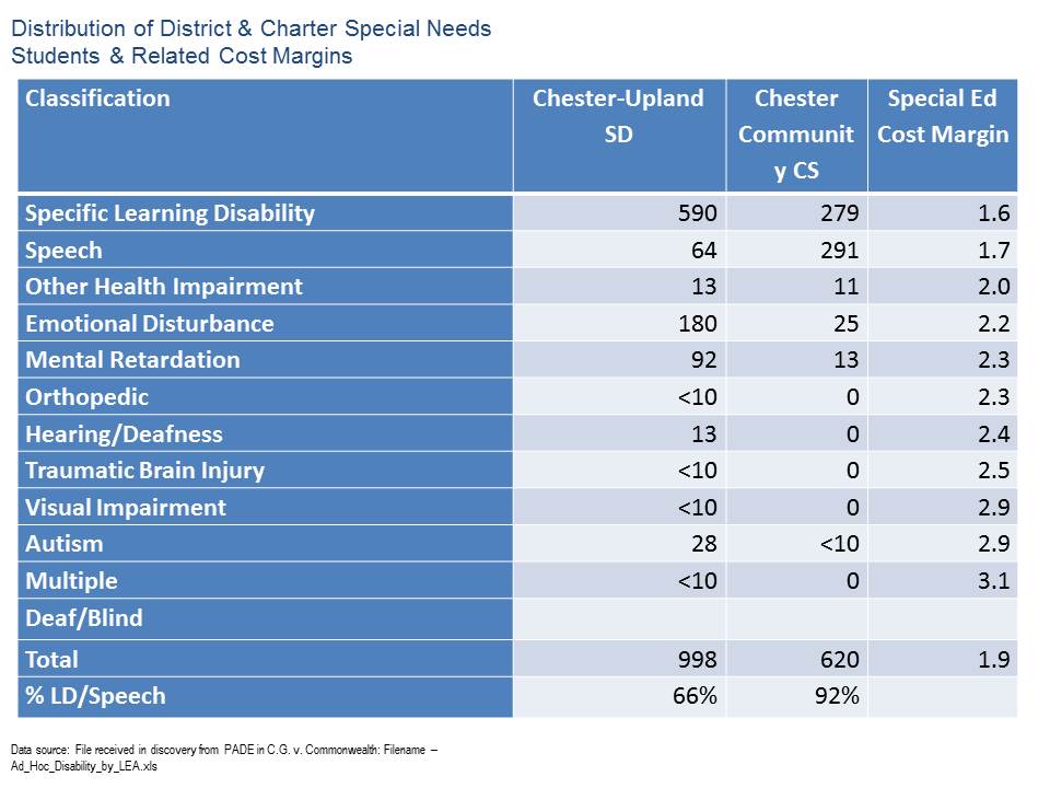
But this is only the first and smaller portion of the miscalculation of sending tuition rates for special education students. Table 3 shows distribution of counts of students by disability type for CUSD and for Chester Community Charter School. Also in Table 3 are the average additional expenditures per special education student based on analyses from the Special Education Expenditures Project (SEEP). I’ve chosen to use these average additional expenditure margins so that I can simulate the effects on host districts of charter schools choosing to serve only the least needy (and least costly) special education students. 92% of the children with disabilities in the charter school are those with the lowest cost disabilities, compared to only 66% in CUSD. Yet, CUSD must pay out to the charter on the basis of an already inflated average special education cost per special education pupil.

Table 3: Distribution of District & Charter Special Needs Students & Related Cost Margins

Table 4 provides a walkthrough of the estimated impact of this financial hit. First, if we take the actual special education spending per actual special education pupil in CUSD ($10,699) and express it with respect to the spending per average non-special education child in the district we get a ratio consistent with research literature over time. On average, in CUSD, the special education child is allocated just over 2.0 times the average non-special education child (where the base non-SE child is just under $10k and the special education spending margin is just over $10k, see Table 2). I have performed this check simply to see that average special education spending margins in CUSD are in line with prior research findings.

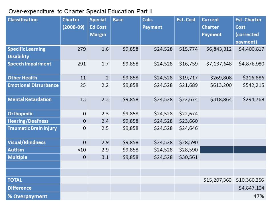
In Table 4, I estimate the additional expenditure of an SLD child by taking the research based additional expenditure ratio of 1.6 and multiplying it times the average additional expenditure of a non-special education child in CUSD (1.6 x $9,858).  That gives me an estimated additional expenditure per SLD child of $15,774. I do the same for children with speech impairment, yielding an estimated additional expenditure of $16,759. Indeed, even the charter serves some children with disabilities estimated to have higher than average additional expenditure, but very few of them.

Calculating the charter payment based on the inflated district average (based on the error mentioned in Table 3 above), CUSD must allocate over $15 million for children with disabilities in Chester Community Charter School.

But, if we re-calculate the charter allocation using the additional expenditure ratios from research, where some children will have higher than average cost and some lower than average cost, we find that CUSD would need to allocate just over $10 million.

In short, the district is overcharged by nearly 50%. The district is overcharged by an amount equal to nearly all of the district’s state special education funding, even though the district is left with more than half of the total special education children to serve and nearly all of those with more severe disabilities.

Table 4: Over-expenditure to Charter Special Education Part II

Arguably, this mechanism actually provides incentive for Pennsylvania charter schools to seek out, recruit and serve children with mild disabilities, creating similar budget pressures for other districts across the state.

Cumulative effects of the Commonwealth Triple Screw

Chester Upland School District’s expenditure budget for its own students is now approximately $54 million (after transfers to charters).  Note that if Chester Upland had received special education revenue from the state based on actual percent special education, the district would have received about $2 million more in revenue to spend, some of which would have been transferred to charters for serving special education kids. But let’s assume that about half should have stayed with the district. So, there’s a $1 million hit to start. Then there’s the big double hit, which amounts to $4.8 million!

So, we’re talking about a cumulative hit of, oh… hypothetically… about $5.8 million, or over 10% of the district’s budgeted expenditures (in other words, they should have received and kept roughly an additional million in state special education funding and should pay out a simulated/estimated $4.8 million less to charters for special education students).

And that, my friends, colleagues, co-bloggers, tweeters and avid readers is the Commonwealth Triple-Screw!

America’s Most Screwed City Schools: Where are the least fairly funded city districts?

Contrary to reformy wisdom regarding spending bubbles… the harmlessness …. oh wait… the benefits of spending cuts… and the fact that we all know as a reformy fact that we’ve already dumped plenty of money into our high need districts nationwide – it turns out that there actually are still some school districts out there that appear somewhat disadvantaged when it comes to funding.

Soon, we will be releasing our annual update of our report on school funding fairness. In that report, we emphasize that school funding fairness is an issue primarily governed by and primarily a responsibility of the states. And school funding fairness varies widely across states.  First, the overall level of funding varies significantly from state to state. Second, the extent to which states provide additional resources to districts with higher concentrations of children in poverty varies widely across states. In fact, several large, diverse states still maintain state school finance systems where the highest need districts receive substantially less state and local revenue per pupil than the lowest need districts. These states include Illinois, New York, Pennsylvania and Texas among others.

It’s important to understand that the value of any given level of education funding, in any given location, is relative. That is, it doesn’t simply matter that a district has or spends $10,000 per pupil, or $20,000 per pupil. What matters is how that funding compares to other districts operating in the same labor market, and for that matter, how that money relates to other conditions in the region/labor market. Why? Well, schooling is labor intensive.  And the quality of schooling depends largely on the ability of schools or districts to recruit and retain quality employees. And yes… despite reformy arguments to the contrary – competitive wages for teachers matter!  The largest share of school district annual operating budgets is tied up in the salaries and wages of teachers and other school workers. The ability to recruit and retain teachers in a school district in any given labor market depends on the wage a district can pay to teachers a) relative to other surrounding schools/districts and b) relative to non-teaching alternatives in the same labor market.

In our funding fairness report, we present statewide profiles of disparities in funding with respect to poverty. But, I thought it would be fun (albeit rather depressing) here to try to identify some of the least well-funded districts in the country. Now, keep in mind that there are still over 15,000 districts nationwide. I’m focusing here on large and mid-sized cities using a Census Bureau Locale classification.

Following are two lists. In each case, I have selected districts where:

  • The combined state and local revenue per pupil is less than the average for districts in the same labor market (core based statistical area);
  • The U.S. Census Poverty rate for the district is more than 50% higher than the average for districts in the same labor market.

Put very simply, districts with higher student needs than surrounding districts in the same labor market don’t just require the same total revenue per pupil to get the job done. They require more. Higher need districts require more money simply to recruit and retain similar quantities (per pupil) of similar quality teachers. That is, they need to be able to pay a wage premium. In addition, higher need districts need to be able to both provide the additional program/service supports necessary for helping kids from disadvantaged backgrounds (including smaller classes in early grades) while still maintaining advanced and enriched course options.

The districts in these tables not only don’t have the “same” total state and local revenue per pupil than surrounding districts. They have less and in some cases they have a lot less! In many cases their child poverty rate is more than twice that of the surrounding districts that continue to have more resources.

Among the least well funded cities are Chicago, Philadelphia and Bridgeport, CT. All have much higher poverty than their surroundings.

Table 1. Least fairly funded large, midsize and small cities [Preliminary single year analysis]

District State State & Local Revenue Ratio  Poverty Ratio
West Fresno Elementary School District California 71%          1.97
Roosevelt Elementary District Arizona 74%          1.87
Alhambra Elementary District Arizona 75%          1.85
Reading School District Pennsylvania 78%          2.50
Allentown City School District Pennsylvania 78%          2.48
Franklin-McKinley Elementary School District California 79%          1.92
Chicago Public School District 299 Illinois 80%          1.67
Alum Rock Union Elementary School District California 82%          1.52
Isaac Elementary District Arizona 83%          1.91
Sunnyside Unified District Arizona 85%          1.70
Creighton Elementary District Arizona 87%          1.96
North Forest Independent School District Texas 87%          2.13
Manchester School District New Hampshire 87%          1.77
East Hartford School District Connecticut 87%          1.60
Murphy Elementary District Arizona 87%          2.88
Schenectady City School District New York 88%          2.53
Lansingburgh Central School District New York 89%          1.94
Pontiac City School District Michigan 90%          3.04
Kankakee School District 111 Illinois 91%          1.69
Utica City School District New York 91%          1.98
National Elementary School District California 91%          1.74
San Antonio Independent School District Texas 91%          1.66
Bloomington School District 87 Illinois 91%          1.73
Godfrey-Lee Public Schools Michigan 92%          1.81
Hueneme Elementary School District California 92%          1.72
Dallas Independent School District Texas 92%          1.83
Balsz Elementary District Arizona 92%          1.66
Adams-Arapahoe School District 28J Colorado 93%          1.77
Binghamton City School District New York 93%          1.91
Fort Worth Independent School District Texas 93%          1.70
Norfolk City Public Schools Virginia 93%          1.77
Magnolia Elementary School District California 93%          1.65
Parkrose School District 3 Oregon 93%          1.69
Godwin Heights Public Schools Michigan 94%          1.57
Philadelphia City School District Pennsylvania 94%          2.12
Alief Independent School District Texas 94%          1.69
David Douglas School District 40 Oregon 96%          2.00
South San Antonio Independent School District Texas 96%          1.61
Lansing Public School District Michigan 96%          2.00
Clarenceville School District Michigan 96%          1.65
Harrison School District 2 Colorado 96%          1.81
Holland City School District Michigan 96%          1.71
Lebanon School District Pennsylvania 96%          2.08
Bridgeport School District Connecticut 98%          2.63
Edgewood Independent School District Texas 98%          1.71
Turner Unified School District 202 Kansas 98%          1.62
Biddeford Maine 98%          1.84
Saginaw City School District Michigan 98%          1.73
North Little Rock School District Arkansas 98%          1.63
Burlington School District Vermont 98%          1.90
Milwaukee School District Wisconsin 98%          2.09
Omaha Public Schools Nebraska 98%          1.72
Santa Ana Unified School District California 99%          1.63
Birmingham City School District Alabama 99%          1.77
Erie City School District Pennsylvania 99%          1.70
Crooked Oak Public Schools Oklahoma 99%          1.73
Lancaster School District Pennsylvania 99%          2.11
Lima City School District Ohio 99%          2.24
Gainesville City School District Georgia 99%          1.78
Oakland Unified School District California 99%          1.84

Data Sources: Based on Census Fiscal Survey (f33) 2008-09 [http://www.census.gov/govs/school/] and Census Small Area Income and Poverty Estimates

Table 2. Least fairly funded fringe districts of large, midsize and small cities [Preliminary single year analysis]

District State State & Local Revenue Ratio  Poverty Ratio
Clearview Local School District Ohio 67%          1.57
Cicero School District 99 Illinois 67%          1.60
Waukegan Community Unit School District 60 Illinois 68%          1.97
Posen-Robbins Elementary School District 143-5 Illinois 69%          1.74
Lincoln Elementary School District 156 Illinois 71%          1.76
Maywood-Melrose Park-Broadview School District 89 Illinois 72%          1.52
Kannapolis City Schools North Carolina 72%          1.53
Round Lake Community Unit School District 116 Illinois 72%          1.72
Ravenswood City Elementary School District California 73%          1.82
Zion Elementary School District 6 Illinois 73%          1.99
Community Consolidated School District 168 Illinois 75%          1.79
Inkster City School District Michigan 75%          1.55
Woonsocket School District Rhode Island 76%          1.78
Dayton Independent School District Kentucky 76%          1.82
Port Huron Area School District Michigan 77%          1.93
Highland Park City Schools Michigan 78%          2.03
Harvey School District 152 Illinois 79%          1.76
Pawtucket School District Rhode Island 80%          1.56
Clintondale Community Schools Michigan 80%          1.68
Bessemer City School District Alabama 80%          1.86
New Miami Local School District Ohio 80%          1.78
Hamtramck Public Schools Michigan 80%          2.13
Chicago Heights School District 170 Illinois 80%          1.84
Kenosha School District Wisconsin 81%          1.63
Blackstone-Millville School District Massachusetts 81%          1.63
North Chicago School District 187 Illinois 82%          2.06
Waterbury School District Connecticut 82%          1.94
Ludlow Independent School District Kentucky 82%          1.52
Revere School District Massachusetts 83%          1.82
Chicago Ridge School District 127-5 Illinois 83%          1.67
Laurel Highlands School District Pennsylvania 83%          1.62
Brentwood Union Free School District New York 84%          2.17
Glendale Elementary District Arizona 84%          1.57
Pleasant Hill School District 69 Illinois 84%          2.08
Lennox Elementary School District California 85%          1.53
Rochester School District New Hampshire 86%          1.65
Spalding County School District Georgia 86%          1.64
Campbell City School District Ohio 86%          1.61
Castleberry Independent School District Texas 86%          1.55
Connellsville Area School District Pennsylvania 86%          1.65
Fredericksburg City Public Schools Virginia 87%          2.81
Alta Vista Elementary School District California 87%          1.58
Paulsboro Borough School District New Jersey 87%          2.58
Chelsea School District Massachusetts 87%          2.17
Uniontown Area School District Pennsylvania 87%          1.86
Pleasant Valley School District 62 Illinois 88%          2.07
Everett School District Massachusetts 88%          2.52
Carbon Cliff-Barstow School District 36 Illinois 89%          2.14
Madison Public Schools Michigan 89%          2.02
Freehold Borough School District New Jersey 90%          2.44
Caldwell School District 132 Idaho 90%          1.85
Twin Lakes No. 4 School District Wisconsin 90%          1.67
Edinburgh Community School Corporation Indiana 90%          1.70
Riverview Gardens School District Missouri 90%          1.79
Independence Public Schools Missouri 91%          1.61
Hazel Park City School District Michigan 91%          1.88
Winooski Incorporated School District Vermont 91%          2.19
Carteret Borough School District New Jersey 91%          1.79
Penns Grove-Carneys Point Regional School District New Jersey 92%          1.51
Speedway School Town Indiana 92%          1.54
Hopewell City Public Schools Virginia 92%          2.00
Bound Brook Borough School District New Jersey 92%          1.73
New Britain School District Connecticut 92%          2.46
Somersworth School District New Hampshire 92%          1.62
Watervliet City School District New York 92%          1.57
Centennial School District 28J Oregon 92%          1.59
William Floyd Union Free School District New York 93%          1.92
Fountain School District 8 Colorado 93%          1.65
Lowell School District Massachusetts 93%          2.55
Lorain City School District Ohio 93%          1.95
St. Bernard Parish School District Louisiana 93%          1.64
Cahokia Community Unit School District 187 Illinois 93%          2.79
Northridge Local School District Ohio 93%          2.20
Hudson Falls Central School District New York 94%          1.62
Reynolds School District 7 Oregon 94%          1.84
Woodbury City School District New Jersey 94%          2.00
Aldine Independent School District Texas 94%          1.63
Bartonville School District 66 Illinois 94%          1.65
Westwood Heights Schools Michigan 95%          1.81
Hazel Crest School District 152-5 Illinois 95%          1.81
New Kensington-Arnold School District Pennsylvania 95%          1.59
Cascade Union Elementary School District California 95%          1.63
Malden School District Massachusetts 95%          2.29
Seabrook School District New Hampshire 96%          1.64
Lynn School District Massachusetts 96%          1.87
Newport Independent School District Kentucky 96%          1.91
River Forest Community School Corporation Indiana 96%          1.60
Willow Run Community Schools Michigan 96%          2.19
Big Beaver Falls Area School District Pennsylvania 96%          1.70
Norwood City School District Ohio 97%          1.69
Beecher Community School District Michigan 97%          2.31
Jennings School District Missouri 97%          2.06
Hammond School City Indiana 97%          1.55
Freeport Union Free School District New York 97%          2.17
Monessen City School District Pennsylvania 97%          1.83
Copiague Union Free School District New York 97%          1.87
McKeesport Area School District Pennsylvania 98%          2.07
Lawrence School District Massachusetts 98%          2.41
Covington Independent School District Kentucky 98%          2.37
Clinton School District Massachusetts 98%          2.26
Adams County School District 14 Colorado 98%          1.82
Beloit School District Wisconsin 99%          1.71
Brooklawn Borough School District New Jersey 99%          1.51
Oak Park City School District Michigan 99%          2.21
Lindenwold Borough School District New Jersey 99%          2.08
Bay Shore Union Free School District New York 99%          1.88

Data Sources: Based on Census Fiscal Survey (f33) 2008-09 [http://www.census.gov/govs/school/] and Census Small Area Income and Poverty Estimates

Now, it’s one thing for reformy pundits to be making the absurd arguments I laid out in the introduction above. They simply don’t know crap about any of this stuff. I’m convinced of that. They simply don’t know what districts spend, how it compares to other districts – or even that school finance is primarily a state by state issue. Invariably, when speaking on issues of school funding, they make statements that are patently false – and most often passed down through the reformy bad graph archive.

What concerns me more is when local representatives of children attending these districts, including the superintendents of many of these school districts simply don’t stand up for their own constituents. Somehow, the solution for Philadelphia public schools is to close more of them? To shift more control to additional private managers? But to ignore entirely that Pennsylvania continues to maintain one of the least equitable state school finance systems in the country? The same applies to Chicago? Do we hear the City of Chicago’s leaders condemning the fact that Illinois also maintains one of the nation’s least fair funding systems? One of the nation’s most racially disparate state school finance systems?

I also don’t expect to see Governors of these states continue to point the finger of shame at these districts – and state departments of education continue to set up ill-conceived and unfair accountability systems and unfunded intervention strategies through new powers awarded to them under NCLB waivers.  When they do – if, for example, NY’s Governor Cuomo chooses to point the finger of shame at Utica (purely hypothetical), I sure as hell hope that Utica points right back! And I hope others including Schenectedy and Binghamton stand by their side. Likewise for Reading and Allentown, PA! These districts have been persistently slammed by their state school funding system. We are talking about districts that a) have 2.5 times the poverty rate of their surroundings and b) less than 80% of the state and local revenue.

And likewise for Bridgeport, CT along with New Britain and Waterbury! And what about Waukegan, IL… which by these measures has only about 68% of the average state and local revenue of their surroundings and nearly double the poverty rate!

Leaders in these cities should be outraged by their treatment under state school finance systems. We should be hearing it, and hearing it loudly. We shouldn’t just be hearing about how their incompetent and greedy teachers and administrators are to blame and how we need to simply shut down more of their schools and turn them over to someone else. Fairness in funding is a critical first step. It is a prerequisite condition. And without it, we can expect continued difficulties in these districts – difficulties that will certainly not be remedied by current slash/burn & blame policies.

Note: The analysis presented here is a preliminary run using a single year of national school finance data (but built on a 3-year panel). In several of these cases however, especially those that I call out individually, I have conducted numerous additional analyses which are consistent with those above. I can say with confidence that the Illinois, Pennsylvania, Connecticut and New York State disparities represented above are entirely consistent with analyses of multiple years of state data and federal data. Cities like Utica, NY, Bridgeport, Waterbury and New Britain CT, Allentown and Reading, PA are consistently among the worst funded districts relative to their state as a whole and their specific labor market surroundings. Riverview Gardens and other poor inner urban fringe St. Louis districts are also among the most disadvantaged, similar to low income, high-minority concentration Chicago suburbs. Texas and Colorado findings are also consistent. Others may be as well, but I’ve not yet had the chance to reconcile the findings for each city/state with state data systems.

Two Persistent Reformy Misrepresentations regarding VAM Estimates

I have written much on this blog about problems with the use of Value-added Estimates of teacher effect (used loosely) on student test score gains on this blog. I have addressed problems with both the reliability and validity of VAM estimates, and I have pointed out how SGP based estimates of student growth are invalid on their face for determining teacher effectiveness.

But, I keep hearing two common refrains from the uber-reformy (those completely oblivious to the statistics and research of VAM while also lacking any depth of understanding of the complexities of the social systems [schools] into which they propose to implement VAM as a de-selection tool) crowd. Sadly, these are the people who seem to be drafting policies these days.

Here are the persistent misrepresentations:

Misrepresentation #1: That this reliability and error stuff only makes it hard for us to distinguish among all those teachers clustered in the middle of the distribution. BUT… we can certainly be confident about those at the extremes of the distribution.  We know who the really good and really bad teachers are based on their VAM estimates.

WRONG!

This would possibly be a reasonable assertion if reliability and error rates were the only problem. But this statement ignores entirely the issue of omitted variables bias (other stuff that affects teacher effect estimates that may have been missed in the model), and just how much those observations in the tails jump around when we tweak the VAM by adding or removing variables, or rescaling measures.

A recent paper by Dale Ballou & colleagues illustrates this problem:

“In this paper, we consider the impact of omitted variables on teachers’ value-added estimates, and whether commonly used single-equation or two-stage estimates are preferable when possibly important covariates are not available for inclusion in the value-added model. The findings indicate that these modeling choices can significantly influence outcomes for individual teachers, particularly those in the tails of the performance distribution who are most likely to be targeted by high-stakes policies.” (Ballou et al., 2012) [emphasis added]

The problem is that we can never know when we’ve got that model specification just right. Further, while we might be able to run checks as to whether the model estimates display bias with respect to measurable external factors, we can’t know if there is bias with respect to stuff we can’t measure, nor can we always tell if there are clusters of teachers in our model whose effectiveness estimates are biased in one direction and other clusters in another direction (also in relation to stuff unmeasured).  That is, we can only test this omitted variables bias stuff when we can add in and take out measures that we have. We simply don’t know how much bias remains due to all sorts of other unmeasured stuff, nor do we know just how much that bias may affect many of those distributions in the tails!

Misrepresentation #2: We may be having difficulty in these early stages of estimating and using VAM models to determine teacher effectiveness, but these are just early development problems that will be cleared up with better models, better data and better tests.

WRONG AGAIN!

Quite possibly, what we are seeing now is as good as it gets.  Keep in mind that many of the often cited papers applying the value-added methodology date back to the mid-1990s. Yeah…. we’ve been at this for a while and we’ve got what we’ve got!

Consider the sources of the problems with the reliability and validity of VAM estimates, or in other words:

The sources of random error and/or noise in VAM estimates

Random error in testing data can be a function of undetected and uncorrected poorly designed test items, such as items with no correct response or more than one correct response, testing conditions/disruptions, and kids being kids – making goofy errors such as filling in the wrong bubble (or toggling the wrong box in computerized testing) or simply having a brain fart on stuff they probably otherwise knew quite well. We’re talking about large groups of 8 and 9 year old kids in some cases, in physically uncomfortable settings, under stress, with numerous potential distractions.

Do we really think all of these sources of noise are going to go away? Substantively improve over time? Testing technology gains only have a small chance at marginally improving some of these. I hope to see those improvements. But it’s a drop in the bucket when it comes to the usefulness, reliability and validity of VAM estimates.

The factors other than the teacher which may influence the average test score gain of students linked to that teacher

First and foremost, kids simply aren’t randomly sorted across teachers and the various ways in which kids aren’t randomly sorted (by socioeconomic status, by disability status, by parental and/or child motivation level) substantively influence VAM estimates. As mentioned above, we can never know how much the unmeasured stuff influences the VAM estimates.  Why? It’s unmeasured!

Second, teachers aren’t randomly sorted among teaching peers and VAM studies have shown what appear to be spillover effects – where teachers seem to get higher VAM estimates when other teachers serving the same students get higher VAM estimates.  Teacher aides, class sizes, lighting/heating/cooling aren’t randomly distributed and all of this stuff may matter.

And you know what?  This stuff isn’t going to change in the near future.  In fact, the more time we waste obsessing on the future of VAM-based de-selection policies instead of equitably and adequately financing our school systems, the more that equity of schooling conditions is going to erode across children, teachers, schools and districts – in ways that are very much non-random [uh… that means certain kids will get more screwed than others].  So perhaps our time would be much better spent trying to improve the equity of those conditions across children. Provide more parity in teacher compensation and working conditions, and better integrating/distributing student populations.

Look – if we were trying to set up an experiment or a program evaluation in which we wanted our VAM estimates to be most useful – least likely to be biased by unmeasured stuff – we would take whatever steps we could to achieve the “all else equal” requirement.  Translated to the non-experimental setting – applied in the real world – this all else equal requirement means that we actually have to concern ourselves with equality of teaching conditions – equality of the distribution of students by race, SES and other factors.  Yeah… that actually means equitable access to financial resources – equitable access to all sorts of stuff (including peer group).

In other words, we’d be required to exercise more care in establishing equality of conditions or explaining why we couldn’t if we were simply comparing program effectiveness for academic publication than the current reformy crowd is willing to exercise when deciding which teachers to fire. [then again, the problem is that they don’t seem to know the difference. Heck, some of them are still hanging their hopes on measures that aren’t even designed for the purpose !]

But this conversation is completely out-of-sight, out-of-mind for the uber-reformy crowd. That’s perhaps the most ludicrous part of all of this reformy VAM-pocrisy !  Ignoring the substantive changes to the education system that could actually improve the validity of VAM estimates by asserting that VAM estimates alone will do the job, which they couldn’t possibly do if we continue to ignore all this stuff!

Finally, one more reason why VAM estimates are unlikely to become more valid or more useful over time? Once we start using these models with high stakes attached, the tendency for the data to become more corrupted and less valid escalates exponentially!

By the way, VAM estimates don’t seem to be very useful for evaluating a) the effectiveness of teacher preparation programs [due to the non-random geographic distributions of graduates] or b) principals either! More on this at another point.

Note on VAM-based de-selection: Yeah… the uber-reformy types will argue that no-one is saying that VAM should be used 100% for teacher de-selection, and further that no-one is really even arguing for de-selection.  WRONG! AGAIN! As I discussed in a previous post, the standard reformy legislation template includes three basic features which essentially amount to using VAM (or even worse SGPs) as the primary basis for teacher de-selection – yes, de-selection. First, use of VAM estimates in a parallel weighting system with other components requires that VAM be considered even in the presence of a likely false positive. NY legislation prohibits a teacher from being rated highly if their test-based effectiveness estimate is low. Further, where VAM estimates vary more than other components, they will quite often be the tipping point – nearly 100% of the decision even if only 20% of the weight – and even where most of that variation is NOISE or BIAS… not even “real” effect (effect on test score growth). Second, the reformy template often requires (as does the TEACHNJ bill in NJ) that teachers be de-selected (or at least have their tenure revoked) after any two years in a row of falling on the wrong side of an arbitrary cut point rammed through these noisy data.

Finally, don’t give me the anything is better than the status quo crap!

Video Thoughts on Test Scores, VAM, SGP & Teacher Evaluation

Recent Bank Street College of Education Symposium on teacher evaluation

Additional video clips from legislative forum at the New Jersey Principals and Supervisors Association

General Issues in Teacher Evaluation: Where to Start in New Jersey

http://www.youtube.com/watch?v=5B7gAkB5-QU&feature=player_detailpage#t=1208s

Pilots versus Expedited Legislated Evaluation Models (Rigidity of Legislation)

http://www.youtube.com/watch?v=5B7gAkB5-QU&feature=player_detailpage#t=1878s

Complete Forum Video:

No Excuses! Really? Another look at our NEPC Charter Spending Figures

UPDATED MAY 11, 2012

Not surprisingly, KIPPs first response to our recent NEPC study was to declare it outright flawed. KIPP then proceeded to make up every possible explanation they could – every possible “excuse” – conjure every possible out of context – or different context estimate or “fact” to make their case that they in fact spend equal or less than schools in New York City and Houston.

I guess what continues to perplex me most is the stance that KIPP takes whenever anyone writes anything about them, in a report not sponsored by them or by one of their major funders (some of which are quite good).  Whether a descriptive analysis of attrition rates or our analysis of spending per pupil, KIPPs standard response is to deny, deny, deny.

We have not said anywhere in our report that there’s anything wrong with spending more to do a good job – run a good school. It would be preposterous for us to make such an assertion. We have simply tried to lay out a reasonable comparison of what schools are spending, compared to otherwise similar schools. These comparisons are appropriate, and are necessary for making judgments about any marginal benefits that might be achieved by students attending different schools.

We show that part of the KIPP puzzle in Houston is explained by their attempts to provide more competitive front end teacher wages. Nothin’ wrong with that! It’s certainly a logical recruitment/retention strategy. Notably, it would become difficult to maintain these margins as school staff matures. These are issues worth monitoring over time – to see if CMOs entering their second and third decades of operation can continue to hold expenses down by holding staff experience down, while still recruiting and retaining energetic, high quality teachers. I will likely be conducting more extensive analyses of these salary structures across KIPP and other schools in NYC and Texas in the future, and hope to have a more productive discussion on the topic when that time comes.

KIPP argues that we counted all of their centralized expenses against them, and counted NONE against the NYC public schools. This is not true. We actually didn’t count KIPP regional and national expenses that exist beyond what the locals pay in management fees accounted for on their budgets.

Second, as I will show below, even if we count all of the system-wide expenses (& other obligations) of NYC BOE schools, KIPP schools continue to substantially outspend them.

Further, KIPP complains that we include expenses on their KIPP to College program. It’s a program. It’s a support service. It’s an expenditure. Further, even the KIPP schools budgets that don’t include KIPP to college exceed NYC BOE spending. And KIPP plays the usual card, in reference to Houston, not NYC, that they must incur the full costs (from their operating expenses) of facilities, implying that public districts have absolutely no costs of facilities.

Clearly, such comparisons are complicated and we acknowledge as much throughout our paper. Further, we provide substantial detail as to the types of data being compared and potential issues with the comparisons.

New York City

Let’s look first at our New York City comparisons. The data in NYC are pretty good, but because the charter financial reports are not part of the same system as the district school site budgeting data, they are not necessarily designed to be directly comparable. We had removed system-wide costs from the NYC BOE schools, in addition to removing costs for facilities (because BOE also pays for charter facilities), food and transportation, and we removed payments to charters. KIPPs assertion is that clearly if we add back in all system-wide costs NYC BOE schools would be spending at least the same if not more than KIPP schools.  This is especially the case if, as KIPP asserts, that pension costs alone should add $2,200 per pupil to the BOE schools (this is a perfect example of a wrong context number extracted from a different comparison [a good one by IBO]).

Of course, this assertion doesn’t pass a basic smell test even given the information that already existed prior to our report. In the Independent Budget Office report which we cite, the IBO evaluated the comparability of the public subsidy rate of co-located (as with KIPP) charters and BOE schools, finding that the co-located charters had the equivalent subsidy of slightly higher than BOE schools on average district-wide. Note that subsidy rates aren’t expenditures. It’s a different comparison. But subsidy rates provide a starting point for what could be spent. And KIPP was ahead at the starting line, albeit only slightly.

Add to that, the fact that KIPP schools do not serve average special education populations, the major driver of differences in spending across BOE schools (as we validate). Thus, compared to these schools rather than average district-wide, KIPP moves further ahead. Then, I think we all understand by this point that KIPP raises and spends at least some private funding.  Fair enough? We’ve got two reports out on this:

  1. Baker, B.D. & Ferris, R. (2011). Adding Up the Spending: Fiscal Disparities and Philanthropy among New York City Charter Schools. Boulder, CO: National Education Policy Center. Retrieved [date] from http://nepc.colorado.edu/publication/NYC-charter-disparities.
  2. Baker, B.D., Libby, K., & Wiley, K. (2012). Spending by the Major Charter Management Organizations: Comparing charter school and local public district financial resources in New York, Ohio, and Texas. Boulder, CO: National Education Policy Center. Retrieved [date] from http://nepc.colorado.edu/publication/spending-major-charter.

Add their private spending to the already growing margin, and you’ve got a bigger margin of difference in per pupil spending between KIPP schools and otherwise similar NYC BOE schools. On its face, it’s highly suspect for KIPP to argue that they do not spend more than NYC BOE schools.

But, just for fun, let’s rerun the regressions from our report with all system-wide costs added back to BOE schools and see if that puts them ahead of KIPP spending.

Here’s the overall comparison:

Even after adding system-wide costs back into BOE schools, KIPP schools spend more than $3,000 per pupil more than BOE schools.

Now here are the breakout scatterplots, starting with our original:

And then with all system-wide costs added back in to BOE school:

Hmmm… seems that KIPP schools are still significantly outspending otherwise similar BOE schools – about 25% more.

Another really important point here is that none of these adjustments alter KIPP charter spending relative to the other charters. KIPP continues to outspend the other charters by as much as they did in our original analyses.

What we don’t include for KIPP

We don’t include regional (KIPP NY) or national expenditures above and beyond what is covered by the school management fees. We write extensively in Appendix C of our report about these additional expenditures and difficulty in parsing precisely how much was spent by KIPP regional and national organizations and what services were provided as in-kind services to schools. This is a potentially significant break that we give to KIPP, setting aside entirely their centralized costs of the organization (those above and beyond what is covered by management fees).

Texas

It was problematic enough for KIPP to assert that they spend similarly to NYC BOE schools, but it was surely a stretch to assert that they spend similarly to Houston ISD schools which have been significantly constrained under state school finance policies in recent years. KIPP first pulls the facilities cost card to make their case, as usual, implicitly assuming public district facilities to be free. We discuss this issue on Page 49 of our report (and in numerous other locations):

Charter advocates often argue that charters are most disadvantaged in financial comparisons because charters must often incur from their annual operating expenses, the expenses associated with leasing facilities space. Indeed it is true that charters are not afforded the ability to levy taxes to carry public debt to finance construction of facilities. But it is incorrect to assume when comparing expenditures that for traditional public schools, facilities are already paid for and have no associated costs, while charter schools must bear the burden of leasing at market rates – essentially and “all versus nothing” comparison. First, public districts do have ongoing maintenance and operations costs of facilities as well as payments on debt incurred for capital investment, including new construction and renovation. Second, charter schools finance their facilities by a variety of mechanisms, with many in New York City operating in space provided by the city, many charters nationwide operating in space fully financed with private philanthropy, and many holding lease agreements for privately or publicly owned facilities.

KIPP also argues that their per pupil spending figures are inflated due to spending for growth. Hey. That’s an expenditure. By the way, typically, per pupil expenditures rise with declining enrollment (as the denominator goes down). Yes, there might be scaling up expenditures, but they tend not to have dramatic effect on per pupil expenditures. If KIPP has chosen to pay for redundant administration, etc. in order to support scaling up, then so be it. That’s an expenditure. We would hope to see these expenses level off down the line with additional analyses. We’ll wait and see on that.

But, back to our actual comparisons in Houston. We used two different approaches in Texas. First of all, in Houston, KIPP spending per pupil was much closer than in other Texas cities, where KIPP spending totally blew away district schools spending. But back to Houston. Using current operating expenditures per pupil data for KIPP and Houston schools, we show that KIPP middle schools outspend not only otherwise similar schools in HISD, but the district-wide average operating expenditure per pupil.

Further, we show that KIPP total district (IRS 990) expenditures significantly exceed Houston ISD’s TOTAL REVENUE PER PUPIL, including revenue for retiring debt and maintenance of HISD’s large capital stock.

Here are additional figures not included in the report, comparable to the figure above for other cities in Texas where KIPP  operates. In each and every case, KIPP IRS 990 total expenditures per pupil EXCEED district TOTAL REVENUES PER PUPIL.

What we don’t include for KIPP

Again, we don’t attempt to figure out the additional expenses of KIPP national allocated to schools, above and beyond what is paid for from the local/regional KIPPs through management fees to the national organization.

Closing Thoughts

I encourage those interested in these topics to not only browse the abstract of our report, but to also dig deep into the appendices and end notes – which are as long as the report itself. Heck, follow the hyperlinks to the data sources and take your own stab at this stuff. That’s what we need out here – not more excuses and unfounded anecdotal arguments.

I actually hesitate to write about KIPP and perhaps that’s just what they want. Apparently no one should write about them that hasn’t been paid by them to write about the. Those who do should be forewarned that you’ll have to waste inordinate time responding to their complaints – excuses – about what you wrote. As of this post, I hope to be done with this topic.