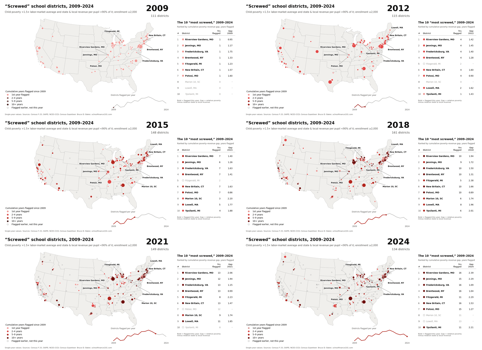
A decade after I last published these lists, 47 districts with at least 2,000 students still have more than 1.5 times the child poverty rate of their labor market and spend less than 90% of what their neighbors spend. Half of them were on my lists 10 to 13 years ago.
Where this started
For years I produced lists of what I called America’s “most screwed” school districts. The idea is simple: a district is financially disadvantaged when it serves far needier children than the districts around it, with less money.
- 2013 blog update (2009–2011 data). I flagged city and suburban districts with more than 1.5 times their labor market’s poverty rate and less than 95% of its average state and local revenue per pupil. The list included Chicago, Philadelphia, Reading, Allentown, Bridgeport, Waukegan, Utica and dozens of others.
- 2014 Center for American Progress report. America’s Most Financially Disadvantaged School Districts and How They Got That Way used a somewhat looser screen: poverty above 125% and revenue below 90% of the labor-market average. It grouped the causes into five types: savage inequalities in property wealth (Illinois, Pennsylvania); “stealth” inequalities in illogical state aid formulas (Michigan, Arizona); local budgeting that undercuts state aid (Bridgeport); tiny segregated enclaves (south suburban Cook County and Phoenix elementary districts); and demographic shifts in smaller, increasingly Hispanic cities (Waukegan, Reading, Allentown). It also found that the odds of being fiscally disadvantaged rose with a district’s Black and Hispanic enrollment shares, even among districts equally dependent on state aid.
- 2015 blog update (2011–2013 data). Same logic, tighter screen: poverty above 150% and state and local revenue below 90% of the labor-market average, limited to K–12 unified districts of 2,000 or more in non-rural labor markets.
The core point hasn’t changed. The value of a school dollar is relative. Schools compete for teachers against the districts next door, and graduates compete for college seats and jobs in the same regional pool. A district that spends $15,000 per pupil can still be badly shortchanged if its neighbors spend $18,000 on far less needy kids.
Data and methods
This update uses a district-by-year panel built from the Census Fiscal Survey of school district finances (F-33), Census Small Area Income and Poverty Estimates (SAIPE), and the NCES Common Core of Data. The panel runs through fiscal year 2024.
- Relative poverty. Each district’s SAIPE poverty rate for children ages 5–17, divided by the average for all districts in its labor market.
- Relative spending. Each district’s current operating spending per pupil, divided by its labor-market average.
- Labor markets. Core-based statistical areas, following the NCES Education Comparable Wage Index, as in the earlier lists.
- Screen. Relative poverty above 1.5 and relative spending below 0.9, using 2022–2024 averages of both ratios. Districts must average at least 2,000 students.
- Ranking. Within each state, districts are ordered by the gap between relative poverty and relative spending, the same “gap” measure used in the CAP report.
- Race and ethnicity. 2024 Black and Hispanic enrollment shares from the Common Core, compared with each state’s share of all students.
Two differences from the earlier lists matter. First, this screen uses current spending rather than state and local revenue. Current spending includes federal money, and 2022–2024 were the peak years of federal pandemic relief (ESSER), which flowed disproportionately to high-poverty districts. That temporarily lifted spending in many of the districts that have always topped these lists. Second, this version includes elementary-only districts, which the 2015 list excluded, so several south suburban Chicago elementary districts appear.
The 2022–2024 list
Forty-seven districts in 16 states make the cut. Illinois leads with 8, followed by Missouri and New York with 5 each. Missouri’s Riverview Gardens and Jennings are the most extreme in the country: each has nearly three times its labor market’s child poverty rate and spends 81–85% of the regional average.
These are overwhelmingly districts that serve Black and Hispanic children. In 38 of the 47, the combined Black and Hispanic share of enrollment is higher than the state’s. The exceptions are mostly small, largely white towns and small cities: Potosi, MO; Rochester, NH; Macon County, TN; Jamestown and Watertown, NY. Union County, TN reports a 14.9% Black share, which looks implausible for that county and may be a data error.
| St. | # | District | Enroll. | Pov. ratio | Spend ratio | Gap | % Black (state) | % Hisp. (state) |
|---|---|---|---|---|---|---|---|---|
| AL | 1 | Chickasaw City | 2,634 | 2.32 | 0.88 | 1.44 | 52.7 (31.6) | 5.0 (11.2) |
| AZ | 1 | Sunnyside Unified | 14,418 | 1.71 | 0.90 | 0.81 | 2.7 (5.8) | 89.4 (47.8) |
| AZ | 2 | Nogales Unified | 5,634 | 1.55 | 0.87 | 0.68 | 0.1 (5.8) | 99.4 (47.8) |
| CA | 1 | San Rafael City Elementary | 4,308 | 2.20 | 0.86 | 1.34 | 0.9 (4.9) | 71.3 (56.1) |
| CA | 2 | Barstow Unified | 6,372 | 2.12 | 0.83 | 1.29 | 18.7 (4.9) | 56.8 (56.1) |
| CA | 3 | Hollister | 5,720 | 1.52 | 0.75 | 0.77 | 1.0 (4.9) | 81.0 (56.1) |
| CA | 4 | San Rafael City High | 2,650 | 1.59 | 0.83 | 0.76 | 1.3 (4.9) | 64.1 (56.1) |
| CT | 1 | Bridgeport | 19,338 | 2.42 | 0.85 | 1.57 | 27.8 (12.5) | 59.3 (31.1) |
| CT | 2 | Waterbury | 18,756 | 1.78 | 0.88 | 0.91 | 21.1 (12.5) | 62.5 (31.1) |
| CT | 3 | Danbury | 12,020 | 1.60 | 0.79 | 0.81 | 6.4 (12.5) | 64.1 (31.1) |
| GA | 1 | Carrollton City | 5,620 | 1.54 | 0.82 | 0.72 | 32.1 (36.2) | 24.7 (18.7) |
| IL | 1 | Prairie-Hills ESD 144 | 2,558 | 2.20 | 0.80 | 1.40 | 79.0 (16.4) | 17.2 (28.1) |
| IL | 2 | Lansing SD 158 | 2,559 | 1.71 | 0.70 | 1.01 | 54.9 (16.4) | 31.6 (28.1) |
| IL | 3 | Indian Springs SD 109 | 2,454 | 1.84 | 0.88 | 0.96 | 15.6 (16.4) | 31.4 (28.1) |
| IL | 4 | Ridgeland SD 122 | 2,339 | 1.72 | 0.83 | 0.90 | 5.5 (16.4) | 36.5 (28.1) |
| IL | 5 | Burbank SD 111 | 3,251 | 1.56 | 0.71 | 0.85 | 1.5 (16.4) | 61.7 (28.1) |
| IL | 6 | Granite City CUSD 9 | 5,811 | 1.66 | 0.87 | 0.79 | 19.7 (16.4) | 15.0 (28.1) |
| IL | 7 | North Palos SD 117 | 3,374 | 1.60 | 0.83 | 0.78 | 4.2 (16.4) | 17.3 (28.1) |
| IL | 8 | Matteson ESD 162 | 2,393 | 1.61 | 0.90 | 0.72 | 88.1 (16.4) | 7.2 (28.1) |
| MA | 1 | Everett | 7,178 | 2.36 | 0.87 | 1.50 | 12.7 (9.6) | 67.5 (25.1) |
| MA | 2 | Chelsea | 6,178 | 2.11 | 0.83 | 1.28 | 4.3 (9.6) | 88.6 (25.1) |
| MA | 3 | Malden | 6,251 | 2.06 | 0.83 | 1.23 | 18.8 (9.6) | 30.9 (25.1) |
| MA | 4 | Revere | 7,310 | 1.58 | 0.81 | 0.77 | 3.4 (9.6) | 64.2 (25.1) |
| MI | 1 | River Rouge | 2,665 | 1.81 | 0.87 | 0.94 | 73.7 (18.2) | 7.7 (9.2) |
| MO | 1 | Riverview Gardens | 5,254 | 2.95 | 0.85 | 2.10 | 96.7 (15.3) | 2.3 (8.4) |
| MO | 2 | Jennings | 2,385 | 2.85 | 0.81 | 2.04 | 97.0 (15.3) | 1.0 (8.4) |
| MO | 3 | Potosi R-III | 2,028 | 1.91 | 0.72 | 1.19 | 0.6 (15.3) | 1.1 (8.4) |
| MO | 4 | Ritenour | 6,119 | 1.78 | 0.85 | 0.93 | 42.4 (15.3) | 28.5 (8.4) |
| MO | 5 | Independence 30 | 14,323 | 1.80 | 0.89 | 0.91 | 15.0 (15.3) | 25.6 (8.4) |
| NH | 1 | Rochester | 3,924 | 2.04 | 0.82 | 1.22 | 1.0 (2.2) | 3.5 (7.7) |
| NJ | 1 | Plainfield | 10,141 | 1.73 | 0.85 | 0.89 | 16.3 (14.5) | 81.4 (34.1) |
| NJ | 2 | Dover | 3,547 | 1.58 | 0.90 | 0.69 | 3.4 (14.5) | 90.7 (34.1) |
| NY | 1 | William Floyd UFSD | 9,192 | 2.05 | 0.88 | 1.16 | 15.6 (15.5) | 47.0 (30.2) |
| NY | 2 | Brentwood UFSD | 18,256 | 1.92 | 0.83 | 1.09 | 7.1 (15.5) | 86.9 (30.2) |
| NY | 3 | Riverhead CSD | 5,623 | 1.85 | 0.87 | 0.98 | 7.9 (15.5) | 64.1 (30.2) |
| NY | 4 | Jamestown City SD | 4,541 | 1.56 | 0.84 | 0.72 | 3.5 (15.5) | 26.2 (30.2) |
| NY | 5 | Watertown City SD | 3,956 | 1.51 | 0.89 | 0.62 | 6.6 (15.5) | 11.4 (30.2) |
| OH | 1 | Steubenville City | 2,783 | 1.65 | 0.84 | 0.81 | 23.8 (17.0) | 3.1 (7.8) |
| OH | 2 | Painesville City Local | 2,694 | 1.68 | 0.90 | 0.79 | 15.8 (17.0) | 56.6 (7.8) |
| PA | 1 | Reading SD | 17,332 | 2.18 | 0.87 | 1.31 | 6.3 (14.4) | 87.1 (14.9) |
| PA | 2 | Southeast Delco SD | 4,089 | 1.73 | 0.90 | 0.83 | 78.4 (14.4) | 5.3 (14.9) |
| PA | 3 | Upper Darby SD | 12,458 | 1.58 | 0.79 | 0.79 | 48.0 (14.4) | 16.3 (14.9) |
| PA | 4 | Wilkes-Barre Area SD | 7,783 | 1.55 | 0.84 | 0.72 | 15.3 (14.4) | 51.5 (14.9) |
| TN | 1 | Union County | 5,849 | 1.58 | 0.71 | 0.86 | 14.9 (20.5) | 4.9 (14.8) |
| TN | 2 | Macon County | 4,182 | 1.61 | 0.78 | 0.83 | 0.7 (20.5) | 15.5 (14.8) |
| VA | 1 | Fredericksburg City | 3,654 | 2.08 | 0.89 | 1.19 | 32.1 (21.5) | 24.4 (19.4) |
| VA | 2 | Manassas City | 7,305 | 1.67 | 0.89 | 0.78 | 9.0 (21.5) | 69.9 (19.4) |
Relative poverty and spending are 2022–2024 averages of each district’s ratio to its labor-market average. Gap = relative poverty minus relative spending. Racial shares are 2024; state figures are the share of all students statewide.
Then and now
Twenty-four of the 47 districts appeared on at least one of the earlier lists, and 12 appeared on all three. These are the chronic cases: districts that have served far needier children with less money for well over a decade.
| District | 2013 blog | 2014 CAP | 2015 blog |
|---|---|---|---|
| Riverview Gardens, MO | ✓ | ✓ | ✓ |
| Jennings, MO | ✓ | ✓ | ✓ |
| Bridgeport, CT | ✓ | ✓ | ✓ |
| Everett, MA | ✓ | ✓ | ✓ |
| Reading, PA | ✓ | ✓ | ✓ |
| Rochester, NH | ✓ | ✓ | ✓ |
| Fredericksburg City, VA | ✓ | ✓ | ✓ |
| Brentwood UFSD, NY | ✓ | ✓ | ✓ |
| Waterbury, CT | ✓ | ✓ | ✓ |
| Sunnyside Unified, AZ | ✓ | ✓ | ✓ |
| Revere, MA | ✓ | ✓ | ✓ |
| Painesville City, OH | ✓ | ✓ | ✓ |
| Potosi R-III, MO | ✓ | ✓ | |
| Dover, NJ | ✓ | ✓ | |
| Ritenour, MO | ✓ | ✓ | |
| Manassas City, VA | ✓ | ✓ | |
| Granite City, IL | ✓ | ✓ | |
| William Floyd UFSD, NY | ✓ | ||
| Independence, MO | ✓ | ||
| Danbury, CT | ✓ | ||
| Plainfield, NJ | ✓ | ||
| Jamestown City, NY | ✓ | ||
| Chelsea, MA | ✓ | ||
| Carrollton City, GA | ✓ |
The 23 newcomers fall into three groups:
- South suburban Cook County elementary districts. Prairie-Hills, Lansing, Indian Springs, Ridgeland, Burbank, North Palos and Matteson. The CAP report flagged this area’s fragmented elementary districts (Posen-Robbins, Lincoln) as the “not-so-blurred lines” problem. They show up in force now partly because this version includes elementary districts.
- Older inner-ring suburbs. Upper Darby and Southeast Delco outside Philadelphia, Malden outside Boston, River Rouge outside Detroit, and Riverhead on Long Island. Most serve predominantly Black or Hispanic students.
- Smaller cities and towns. Chickasaw, AL; Barstow, Hollister and San Rafael, CA; Nogales, AZ; Steubenville, OH; Wilkes-Barre, PA; Watertown, NY; and Union and Macon Counties, TN.
Who dropped off, and why that isn’t good news
The biggest names from the old lists are gone: Chicago, Philadelphia, Allentown, Waukegan, Lowell, New Britain, Hamtramck, Eastpointe (formerly East Detroit), Woonsocket and Manchester. Each still has between 1.6 and 2.7 times its labor market’s child poverty rate. They drop off because their current spending ratios now sit at or above 0.9.
For most of them, that reflects federal money, not a fix. On state and local revenue, the measure used in the earlier lists, most remain well below their neighbors:
| District | Pov. ratio | Spend ratio | Revenue ratio |
|---|---|---|---|
| Hamtramck, MI | 1.97 | 1.02 | 0.75 |
| Eastpointe, MI | 2.59 | 1.09 | 0.77 |
| Glendale Elem., AZ | 1.88 | 0.96 | 0.78 |
| New Britain, CT | 2.29 | 0.99 | 0.81 |
| East Hartford, CT | 1.61 | 0.97 | 0.82 |
| Lowell, MA | 2.65 | 0.92 | 0.85 |
| Waukegan, IL | 2.16 | 1.02 | 0.86 |
| Woonsocket, RI | 2.04 | 0.93 | 0.86 |
| Manchester, NH | 1.94 | 0.91 | 0.86 |
| Allentown, PA | 2.05 | 0.92 | 0.91 |
| Chicago, IL | 1.61 | 1.06 | 0.94 |
| Philadelphia, PA | 2.13 | 0.94 | 1.11 |
Swap in the revenue screen (relative revenue below 0.9) and the national count jumps from 47 to 139 districts. As pandemic relief runs out, many of these districts will likely fall back below the spending line. Philadelphia is the notable exception. Its state and local revenue is now above its labor-market average, but its poverty rate is still more than double that of its neighbors, so equal funding is still far from adequate funding.
The bottom line is the one I wrote in 2015. There is no excuse for public school districts with twice the poverty of their surroundings to have less to spend on those children. Ten years later, many of the same districts are still in that position, and many more have joined them.
Sources
- Baker, B.D. (2013, May 24). Most Screwed Local Public School Districts Update 2009–2011. School Finance 101.
- Baker, B.D. (2014, July). America’s Most Financially Disadvantaged School Districts and How They Got That Way. Center for American Progress.
- Baker, B.D. (2015, June 24). America’s Most “Financially Disadvantaged” (e.g. Screwed) School Districts 2013 and Table 1. School Finance 101.
- Current data: U.S. Census Bureau Annual Survey of School System Finances (F-33) and Small Area Income and Poverty Estimates; NCES Common Core of Data; fiscal years 2022–2024.


