NJ Education Spending & the Collapse of Equity [Update]

A while back, I wrote this post on the collapse of educational equity in New Jersey.

A few years back, I wrote this post to try to clear up the multitude of falsehoods I kept hearing about New Jersey taxes and spending.

Well… not much time to write a great deal of explanatory text today… but here are a few updated figures. Tax figures are from the state and local tax query system of Taxpolicycenter.org.  Note that these figures only go through FY 2011, as do Census data on local public school district spending used in the retreat from equity post above.

But before I go to my updated slides, note that the Center on Budget and Policy Priorities also recently produced a report on education spending since 2008, finding that New Jersey was among those states that either in percentage terms or on a per pupil basis, had seen reductions in inflation adjusted elementary and secondary education spending.

Slide5

So, here’s New Jersey spending on education since 1990, beginning with STATE DIRECT EXPENDITURES on k-12 and higher education. Note that the peak of state direct spending on k-12 was in 2006, following the largest scale up of “Abbott” funding (from 1998 to 2005ish). Since that time, first with the adoption of the School Funding Reform Act (for comments on problems with SFRA, see this post)  and then with recession era cuts, state support has declined.

Slide1Here’s combined state and local direct spending on education PER CAPITA (NOT per pupil, but per population) – which is the lions share of spending on education (federal being relatively small… but for a temporary “stabilization” boost).

Slide2Now, one argument for the per capita drop is/was that earnings/incomes, etc were dropping and thus the burden on the taxpayer was simply too high and climbing. But here’s what the direct spending – state and local – on education looks like as a share of personal income.

Slide3Yes, even as a share of income, education spending declined.

And this decline comes largely as a function of state aid decline. And, when state aid declines, the natural tendency is to use local property taxes to the extent possible to offset that decline.

So, as we can see, property taxes spiked.

Slide4

And, of course, some local public districts have far more capacity to offset their losses with property tax increases than do others. See this post

And for more information on persistent property tax disparities by wealth in NJ see this post!

So… during this period, as the post mentioned at the outset of this post explains – the progressiveness of New Jersey’s state school finance system begins to decline.

Slide6

progressivenessThat previously progressive system had actually made some substantial strides for low income children.

Friday Story Time: Deconstructing the Cycle of Reformy Awesomeness

Once upon a time, there was this totally awesome charter school in Newark, NJ. It was a charter school so awesome that its leaders and founders and all of their close friends decided they must share their miracle with the world in books on the reasons for their awesomeness, including being driven by data and teaching like a champion!

The school’s break-the-mold – beating the odds – disruptively innovative awesomeness was particularly important during this critical time of utter collapse of the American education system which had undoubtedly been caused by corrupt self-interested public school teachers (& their unions) who had been uniformly ill-trained by antiquated colleges and universities that themselves were corrupt and self-interested and generally in the business of selling worthless graduate degrees.

In fact, the undisputed awesomeness of this North Star Academy could, in theory, provide the foundation for a whole new approach to turning around the dreadful state of American education.

And thus came the Cycle of Reformy Awesomeness, which looks something like this:

Slide1

Built on the foundation of awesomeness established by THE North Star Academy, since teachers are the undisputed most important in school factor determining student outcomes, the awesomeness of North Star could be attributed primarily to the quality of the teachers and innovative practices they used in their data driven classrooms!

Thus, by extension, we must establish new institutions of teacher preparation whereby these truly exceptional teachers (of 3 to 5 years experience) not only are provided the opportunity to share their expertise on a personal collaborative level with their own colleagues, but rather, we should let these teachers be the instructors in a new graduate school of education (regardless of academic qualifications) and we should actually let them grant graduate degrees in education to their own colleagues.

This new approach of letting teachers in a school grant graduate degrees to their own work colleagues (and those in other network schools) could lead to rapid diffusion of excellence and would most certainly negate the corrupt perverse incentives pervasive throughout the current, adult oriented self-interested American higher education system! Disruptive innovation indeed!

And so their founders and disciples took their show on the road. They took their show to state departments of education to urge fast-tracked uncritical promotion of their cycle of awesomeness. They gained leverage on local boards of education in nearby school districts to promote diffusion of their awesomeness. And they set out to other state departments of education to share their insights on how to achieve awesomeness with drive by data… excuse me… being driven by data!

And driven by data they were… for example… absolutely all of the kids in their school passed that test in high school.

And there was much rejoicing.

Slide2And that one too:

Slide3


And there was much rejoicing.

And they were only getting better, and better and better:

Slide4

And there was much rejoicing.

And better:

Slide5The more they looked at their own data – well, really only one measure of their data – the more they patted themselves on the back, congratulated their own reformy awesomeness and shared it with the world. And the state!

Slide6

And there was much rejoicing.

Yup… 100% graduation rate… which is totally unheard of for a high poverty, urban high school in dreadful Newark, NJ! [or at least for a school that happens to be located in the high poverty city of Newark].

A true miracle it was… is… and shall be. One that must be proliferated and shared widely.

But alas, the more they shared, the more they touted their awesomeness, the more it started to become apparent that all might not be quite so rosy in North Star land.

As it turned out, those kids in North Star really didn’t look so much like those others they were apparently so handily blowing out on state tests….

Slide11

And there was complete freakin’ silence!

Somehow, this rapidly growing miracle school was managing to serve far fewer poor children than others (except a few other charter schools also claiming miracle status) around them.

And, they were serving hardly any children with disabilities and few or none with more severe disabilities.

Slide12

And again there was complete freakin’ silence!

And if that was the case, was it really reasonable to attribute their awesomeness to the awesomeness of their own teachers – their innovative strategies… and the nuanced, deep understanding of being driven by data?

Actually, it is perhaps most befuddling if not outright damning that such non-trivial data could be so persistently ignored in a school that is so driven by data?

And there was complete freakin’ silence!

But alas, these were mere minor signals that all might not be as awesome as originally assumed.

It also turned out that of all the 5th graders who entered the halls of awesomeness, only about half ever made it to senior year – year after year after year after year… after year.

Slide14

And for black boys in the school, far fewer than that:

Slide15

And there was complete freakin’ silence!

And in any given year, children were being suspended from the school at an alarming rate.

Slide13

Again… raising the question of how a school driven by data could rely so heavily on a single metric – test scores and pass rates derived from them – to proclaim their awesomeness, when in fact, things were looking somewhat less than awesome.

Could a school really be awesome  if only the fewer than half who remain (or 20% of black boys who remain) pass the test? Might it matter at least equally as much what happened to the the other half who left?

Was it perhaps possible that the “no excuses” strategies endorsed as best practices both in their school and in their training of each other really weren’t working so well…and weren’t the strategies of true teaching champions… but rather created a hostile and oppressive environment causing their high attrition rate? Well… one really can say this one way or the other…

Regardless of the cause, what possibly could such a school share with those traditional supposedly failing public schools who lacked similar ability to send the majority of their children packing? Further, what possibly could the rather novice teachers in this school charged with granting their own co-workers graduate credentials share with experienced researchers and university faculty training the larger public school teacher workforce?

Alas the miracle was (is) crumbling.

But that miracle wasn’t just any ol’ miracle. Rather, it was the entire foundation for the reformy cycle of awesomeness! And without that foundation, the entire cycle comes crumbling down.

Slide16

No miraculously awesome charter school [in fact, one might argue that any school with such attrition is an unqualified failure].

Thus no valid claim of miraculous teachers and teaching.

Thus no new secret sauce for teacher preparation.

All perpetrated with deceptive and in some cases downright fraudulent (100% graduation rate?) presentation of data.

And thus the search continues… for the next miracle… and the next great disruptive innovation to base on that miracle… whatever… wherever it may be.


The “Ed Schools are the Problem” Fallacy

I had the displeasure of waking up to this drivel in my in-box this morning:

“Those who can, do. Those who can’t, teach. And those who can’t teach, teach teaching.”

http://www.nytimes.com/2013/10/21/opinion/keller-an-industry-of-mediocrity.html?_r=0

yeah… and those completely lacking in critical thinking, basic research and data interpretation skills write op-eds for the Times.

I don’t really teach teachers myself, so I guess I shouldn’t take offense. But I do mainly because the core argument advanced here is so ill-informed and poorly conceived.

Allow me to start by pointing out that I have actually written detailed, quantitative research in peer reviewed journals on the very topic of who’s teaching the teachers. In fact, the article we wrote was done partly in response to the Arthur Levine report cited in the Times op-ed piece. And it’s not as if the article title really conceals its contents:

  • Wolf‐Wendel, L., Baker, B. D., Twombly, S., Tollefson, N., & Mahlios, M. (2006). Who’s teaching the teachers? Evidence from the National Survey of Postsecondary Faculty and the Survey of Earned Doctorates. American Journal of Education, 112(2), 273-300.

My apologies for the fact that this article is fire-walled. I really don’t expect all of my blog readers to go through the trouble of paying for it or finding an academic library that carries it. But any responsible journalist, pundit or author proclaiming a strong policy position on this issue ought to at least do some reading on the topic first. The above article is certainly not uncritical of teacher preparation. [UPDATE: Full version here, courtesy of the kind folks at AJE Baker2006]

And the issues of complexity and variation in teacher preparation I explore in the above research article are not the only massive omission or conflation put forth in the New York Times piece, which operates on the overly crude assumption of a uniform system of content-free instruction across any and all ed schools.

Let’s tackle the bigger and much simpler issue here – the broad notion advanced in this op-ed that Ed Schools are the problem!  Ed Schools are the primary threat to the quality of our public schooling system as a whole and by extension Ed Schools are a threat to our national security. [yeah… he didn’t really say that… but somehow it often goes there] And further, that if we can just replace ed schools – with some other unknown thing – we’ll all be better off.

A kinder, gentler variant on this argument is that it’s just the bad ed schools that are a threat and that we can weed out those bad ed schools by looking at how the students of their graduates perform. I’ve addressed this issue in a few previous blog posts. First, I’ve addressed the question of whether “ed school” is really some static, monolithic entity. Second, I’ve addressed the feasibility of rating ed schools by twice removed outcome measures.

But there’s actually a simpler logical fallacy at play here which lies at the root of many reformy arguments regarding causes and consequences – failure to acknowledge that  the U.S. has a wide range of elementary and secondary of schools that are both high performing and low performing and that the defining features differentiating higher and lower performing schools are not found primarily in their teachers or the preparation programs they attended – or whether they attended any at all – but rather in the communities they serve, the resources available to them and the backgrounds, health and economic well-being of the children and families they serve.

This is not about the poverty as excuse argument. This is about the simple point that our highest performing public schools also employ teachers from traditional public college and university preparation programs and in many cases, teachers from the same – or substantively overlapping – college and university preparation programs as teachers in our lowest performing schools in the same region.

If that’s the case, then how is it possible that teacher preparation programs are the problem?

I know… the good reformer at this point is thinking – but there are no good U.S. public schools or districts. They all suck and that’s precisely why teacher preparation is the problem. Of course, if that was the case – that all K-12 public schools suck – it would hard to, by research design – with a dependent variable that doesn’t vary – attribute that sucky-ness to a single cause.  But the dependent variable does vary… even when we rely on reformy resources like the Global Report Card I wrote about here.

First, here’s a location where you, yourself can actually download the reformy report card, which in large part was designed to shake the confidence of America’s suburban parents by taking a few statistical leaps to show them their leafy suburban schools wouldn’t stack up so well if we transported them to Finland or Singapore.

http://globalreportcard.org/docs/Global-Report-Card-Data-11.14.12.xlsx

I’ll save that argument for another day, and just select two sets of districts from this report card, from Illinois and Kansas, because I have the data readily available. Let’s look at local public school districts that are

1) Better than the Average Fin and those that are…

2) Worse than 80% of beer-swillin’ Hockey Lovin’ Canadians.

That’s quite a contrast (even though both are high performing countries – on average – setting aside demographics, etc.).

Here are the lists:

Slide1

Slide2

So, we’ve got some school districts in each state that are better than the average Finnish school and some that get trampled by the those syrup swillin’ hosers from the Great White North.

The only plausible explanation is that the teachers in the Better than Finland category are either from completely non-traditional ed schools or not ed schools at all while  the teachers in the not-so-great schools all come from your typical state ed school.

Certainly, we know from large bodies of teacher labor market research that graduates of various preparation programs, colleges and universities and alternative route programs more broadly,  sort themselves on the labor market, with those who possess stronger academic credentials often sorting into the “more desirable” jobs.

But that’s somewhat of an aside here. For the basic reformy premise of massive uniform ed school failure to be true – we would have to see little or no commonality in the ed school preparation of teachers across these settings – across totally awesome U.S. schools and totally sucky ones.

So, here’s the recent distribution of graduates of Kansas teacher preparation programs in the Kansas City metropolitan area which includes the Blue Valley School district – better than the average  Fin and Kansas City Kansas, which, well, gets its butt kicked by Canada!

Slide3

Hmmm… you can’t possibly be telling me that both KCK and BVSD have teachers who graduated from the major state teacher preparation colleges can you? If that’s the case, then their relative international rankings might not be determined by teacher preparation?

[ignore the poverty shading in the background…’cuz payin attention to poverty… well… just isn’t cool with the reformy crowd!]

There are some notable features to this map. One is that BVSD and and Olathe to its west were still significantly growing districts during this period. So it makes sense that they hired a lot of new teachers during that time. It makes less sense that KCK, more stagnant (and declining) in population hired so many new teachers – but for the relatively high turnover rate more common in such high poverty settings! There are also some distributional differences in the dots – which universities produce more teachers for which districts (or provide more credentials). Pittsburg state (blue dots) more prevalent in KCK provides a local program that feeds to KCK. I’d be hard pressed, however, to lay blame on Pitt state for KCK’s Canadian butt-whoopin’ and I’d be equally hard pressed to credit K-state in producing more teachers for Blue Valley as the cause of Blue Valley’s competitive match up with Finland! The fact is that all of these Kansas districts draw heavily on teachers produced by the public teachers colleges of that state – and some do as well as Finland while others struggle.

As such, it’s pretty darn hard to lay blame on traditional teacher preparation in Kansas for these differences in outcomes.

Now, let’s take a look at a few high performing and lower performing districts in Illinois.

First, here are the top 15 undergraduate degree producers for Chicago and Aurora East and for Naperville and Lake Forest. Rather than from the degree producers perspective, these data simply include all instructional staff in these districts, downloadable here: http://www.isbe.state.il.us/research/xls/2012-tsr-public-dataset-instr.xlsx

The data include where teachers got their undergraduate and advanced degrees.

Slide5

Wow… there’s actually quite a bit of overlap in the institutions. Sure, there are differences. Where a state name is listed, the teacher received his/her undergraduate degree from an un-named institution in that state (such are the shortcomings of state administrative data). The City of Chicago does have larger shares from some Chicago based programs. But there’s also overlap and there’s significant overlap for the state’s major public teacher preparation institutions, like Illinois State University, Northern Illinois University and the University of Illinois main campus (Champaign). How can that be? How can there possibly be school districts that compete favorably with Finland while employing graduates of traditional teachers colleges?

While the percentages of teachers in these districts who attended any one preparation institution tend to be small, the shares who attended major public preparation institutions for their bachelors degrees appears marginally larger in the high performers (Over 10% for both IL State and Northern).

That’s impossible! But… But… But… graduates of those same colleges are teaching in districts that got whooped by the Canadians? So how can we possibly place blame for systemic failure of American schools on teacher prep programs? I’m struggling with the logic here.

One more look… here are the advanced degree granting institutions for teachers in higher versus lower performing Chicago area districts. Note that “NULL” refers to those not holding (or reporting) advanced degrees and that the share holding only a bachelors degree is higher in the lower performing districts (poorer, minority districts).

Slide6

Again, these degrees – which in include both initial and additional certifications – are dominated by traditional credential granting institutions with substantial overlap across teachers between higher and lower performing schools.

This is a separable but related issue to the evaluation of ed schools by student outcome measures. I’ll continue digging more into that issue in future posts.

It is certainly hard to make a compelling case that traditional teacher preparation institutions are the primary cause of our supposed lagging national education system when our highest performing schools – those that compete favorably with Finland – also employ in large number, graduates of those preparation programs and in many cases employ significant numbers of graduates of the same programs that provide teachers for our supposed failing schools.

$500 million? No! $3 BILLION! That’s $3BILLION! Comments New York State’s Underfunding of NYC Schools

New York’s Governor Cuomo has been big on words promising NOT TO FUND New York State schools and squeeze them to the maximum extent possible with layers of cuts and caps. After all – NOT FUNDING SCHOOLS is the most noble of endeavors – that along with declaring death penalties for those underfunded, high need schools that post low average test scores.

The Governor’s most recent anti-school-funding attack comes in response to NYC Mayoral Candidate Bill de Blasio’s campaign promise to push for universal preschool for city school children. At least as characterized in a New York Daily News editorial, the noble Governor is again set to dig in his heals against any additional spending on schools:

Laying claim to big ideas, Bill de Blasio has promised to deliver universal all-day pre-kindergarten, paid for by raising taxes on wealthy New Yorkers.

The attractive concept helped boost de Blasio to a commanding lead over Republican Joe Lhota, and is key to his education program. He calls universal pre-k “how we will start to close the achievement gap” between minority and white children.

Now is the time for voters to consider whether de Blasio has a prayer of fulfilling his pledge to provide services to 70,000 4-year-olds, along with after-school programs for middle-schoolers.

He’d need a half-billion dollars a year and has staked all on convincing Albany to okay a city income tax hike on high earners.

Bill, meet Andrew:

Gov. Cuomo says no.

In an interview with the Daily News Editorial Board, Cuomo made clear that he has no intention of pressing the Legislature to give de Blasio the $500 million in tax money he’s counting on.

Read more: http://www.nydailynews.com/opinion/bill-rude-awakening-article-1.1487839#ixzz2i5NJcOJT

So, as the Daily News would characterize, the Governor is incensed that de Blasio would even consider the absurd possibility of needing an additional half a billion – that’s HALF A BILLION DOLLARS! to finance the frivolity of universal preschool.

Yeah… HALF A BILLION DOLLARS sure sounds like an obscene number. But let’s reflect for a moment on just how much money the state of New York, under the leadership of Governor Cuomo continues to come up short in financing the state school finance formula that was adopted back in 2007 in order to comply with a NY State High Court ruling that funding levels at that time for New York City were inadequate.

In 2012-13 and again in 2013-14 – New York State continues to short NYC on general state aid for schools to the tune of around 3 BILLION DOLLARS! Yeah… that’s 6 times the seemingly obscenely huge funding request for de Blasio’s pre-k proposal.

Let’s take a look. First, here’s a graph of the relationship between state aid shortfalls per pupil and the state’s own pupil need index. Larger circles represent larger (enrollment) districts. As can be seen here, in 2013-14, based on March/April 2013 adopted budget figures (state aid run worksheets), New York City – the bowling ball in the picture – is shorted by just under $3,000 per pupil in State Aid! That’s $3,000 PER PUPIL IN STATE AID!

Slide1Now, here’s how the funding formula that got the state out from under litigation is supposed to work.

A district’s target funding level per pupil is supposed to be a function of a) the foundation level of funding per pupil [appropriately inflated to represent current year costs], times b) the pupil need index for each district times c) the regional cost index for each district times d) the number of “aidable foundation pupil units” (which is an enrollment count including some adjustments for special education and other factors).

The adjusted foundation amount per pupil in NYC is $16,562 in 2013-14.

Bear in mind that even this figure is based on rigged analyses that severely underestimate actual needs and costs.

Then, the state determines the share of that figure to be covered by the district and balance to be covered by the state. The state share for NYC is supposed to be $7,006.

Take that figure times the total aidable foundation pupil units (TAFPU) and you’ve got….. $8.8 BILLION DOLLARS!

THAT’S $8.8 BILLION DOLLARS!!!!!

Slide2But alas, that’s far more than the state actually allocates to the City of New York through the foundation aid program it adopted to get out from under litigation brought by the city of New York – because funding was (and still is) inadequate!

I’m not even going to quibble (here and now) over the broader conception of “adequacy” involved, or the fact that the state concocted ways to reduce their estimated targets. The fact is that even though they set a low bar and further lowballed their funding targets, they’ve (meaning the Governor and Legislature) chosen to not even come close to funding those targets!

Instead, the state begins by freezing the underlying foundation aid level to past levels, setting NYC’s foundation aid level to just under $6.4 billion.

Yeah… sounds like a lot… but that’s already well short of what the city is supposed to get. And that’s just the first CUT.

Next, the state applies what it calls the Gap Elimination Adjustment (and then partially restores that cut, to make it seem like a gift), further reducing state aid to NYC down to just under $5.9 billion.

That’s a total state aid shortfall of nearly $3 billion! THAT’S $3 BILLION!!!!!!!!!!!  [with the figure fluctuating around $3 billion from year to year – the figure was higher for 2012-13]

So before the good Governor Cuomo decries the obscene half a billion dollar request presented by future mayor(?) de Blasio, it might be wise for him to reflect on the state’s own past and still relevant promises to New York City… promises that would rightfully (constitutionally… as per the high court decision in Campaign for Fiscal Equity v. State) drive an additional $3 Billion to NYC.

THAT’S $3 BILLION!!!!!!!!!!!!!!!!!!!!!!!!!!!!!!!!!!!!!!!!!!!!!!!!!!!!!!!!!!!!!!!!!


More Thoughts on Interpreting Educational/Economic Research: DC Impact Study

Today brings us yet another opportunity to apply common sense interpretation to an otherwise seemingly complex research study – this time on the “effectiveness” of the DC Impact teacher evaluation system on improving teaching quality in the district. The study, by some of my favorite researchers (no sarcasm here, these are good, thoughtful individuals who do high quality work) is nicely described in the New York Times Economix Blog section:

To study the program’s effect, the researchers compared teachers whose evaluation scores were very close to the threshold for being considered a high performer or a low performer. This general method is common in social science. It assumes that little actual difference exists between a teacher at, say, the 16th percentile and the 15.9th percentile, even if they fall on either side of the threshold. Holding all else equal, the researchers can then assume that differences between teachers on either side of the threshold stem from the threshold itself.

The results suggest that the program had perhaps its largest effect on the rate at which low-performing teachers left the school system. About 20 percent of teachers just above the threshold for low performance left the school system at the end of a year; the probability that a teacher just below the threshold would quit was instead above 30 percent.

In addition, low-performing teachers who remained lifted their performance, according to the system’s criteria. To give a sense of scale, the researchers noted that the effect was about half as large as the substantial gains that teachers typically make in their first years of teaching combined.

http://economix.blogs.nytimes.com/2013/10/17/a-new-look-at-teacher-evaluations-and-learning/?_r=1&

The study: http://cepa.stanford.edu/sites/default/files/w19529.pdf

So, for research and stats geeks this description speaks to a design referred to as regression discontinuity analysis. It sounds complicated but it’s really not.  The idea is that whenever we stick cut-points through some distribution of ratings or scores – through messy/noisy data – some people fall just below those cut-points and others just above. But the cut-points are really arbitrary and those who fall just above the line really aren’t substantively, or even statistically significantly different from those who fall just below the line. It’s almost equivalent (assumed equivalent for research purposes) to taking a group of otherwise similar individuals and randomly assigning to some, one score (below the line) and others another score (above the line).

In one application of this approach, researchers from Harvard studied the effect of high stakes high school exit exams on student in Massachusetts. Students who barely passed the test were compared with those who barely failed the test on the first try. In reality, missing or making one or two additional questions does not validly indicate that one child knows their math better than the other. The kids were otherwise comparable, but some were labeled failures and others successes. Those labeled failures were more likely to drop out of high school and less likely to attend college.

The conclusion – that these arbitrary, non-meaningful distinctions adopted in policy are harmful.

This brings us to the present study on the DC Impact teacher evaluation system. Here, the researchers identified teachers who were really no different from one another statistically on their DC Impact ratings, but some were just a few fractions of a point low enough to be labeled as Ineffective and face threat of dismissal, and others just high enough to be out of the woods for now. That is, there really aren’t any substantive observed quality differences between these two groups. Note that the researchers studied this at the high end of the ratings distribution as well, but didn’t really find as much going on there.

Put simply, what this study says is that if we take a group of otherwise similar teachers, and randomly label some as “ok” and tell others they suck and their jobs are on the line, the latter group is more likely to seek employment elsewhere. No big revelation there and certainly no evidence that DC Impact “works.”

Rather, arbitrary, non-meaningful distinctions are still consequential. This is largely what was found in the Massachusetts high stakes testing studies.

Actually, one implication for supervisors is that if you want to get a teacher you don’t like to leave your school, find a way to give them a bad rating. But I think most supervisors and principals could already figure that one out.

Here’s an alternative experiment to try – take a group of otherwise similar teachers and randomly assign them to group 1 and group 2. We’ll treat Group 1 okay… just okay… no real pats on the back or accolades. Group 2 on the other hand will be berated and treated like crap by the principal on a daily basis and each day in passing, the principal will scowl at them and say… “your job’s on the line!.”

My thinking is that group 2 teachers will be more likely to seek employment elsewhere. Not hugely different from the DC Impact research framework and nor are the policy implications. Does this mean that teacher evaluation works – has appropriate labor market consequences. No… not at all. It means that arbitrary differential treatment matters.

Of course, this would be an unethical experiment unlikely to make through IRB approval. But heck, screwing with people’s lives via actual arbitrary and capricious employee rating schemes, adopted as policy is totally okay.

As for the second conclusion… that those who do stay appear to improve their game…it certainly makes sense that individuals would try not to continue being the whipping boy… even if they perceive their prior selection as whipping boy to be arbitrary and capricious. Notably, the bulk of the evaluations in this study were based on observed behaviors not test-based metrics, and with observations, teachers have more direct control over what their supervisors observe and can therefore respond accordingly. Whether these behavior changes have anything to do with better actual on-the-job performance – “good teaching” – is at least questionable.


Notes on the Seniority Smokescreen

Seniority, in the modern reformy lexicon, is among the dirtiest words. Senior teachers are not only ineffective and greedy and never put interests of the children over their own, but they are in fact downright evil, a persistent drain on state and local economies and a threat to our national security! By contrast, “effectiveness” is good and since seniority and effectiveness are presumed entirely unassociated, the simple solution is to replace any reference to seniority in current education policies with measures of “effectiveness.”

If only it was so simple. This modern reformy mantra grossly misinterprets the relationship between seniority and effectiveness, presumes currently available measures of effectiveness to be more useful than they really are at sorting “good” from “bad” teachers, ignores that the proposed solutions have in many cases been found NOT to solve the supposed problem, and is oblivious to the broader literature on teacher labor markets, compensation and the quality of the teaching workforce.

Seniority and Effectiveness

Numerous studies over time have shown that as teachers reach somewhere around their 5th year, student achievement gains under those teachers begin to grow more slowly and to an extent level off.[1]  These findings, to the extent we believe that these metrics of test score gain adequately represent teaching effectiveness, do not by any stretch of the imagination mean that more experienced teachers are less effective. Rather, their effectiveness increases from year to year level off. If they have indeed reached their optimal performance then it makes sense to continue to compensate senior teachers in order to retain them. A constant cycle of replacement costs money and costs in terms of lost effectiveness during the start-up years.[2]

Seniority and Fairness to Children

One argument is that seniority preferences in teaching assignments permit senior teachers to hold on to jobs in schools against their principals preferences and that these seniority privileges often lead to the neediest children having the least experienced teachers – as the more experienced teachers get the cushiest jobs in the district. On the one hand, this assertion acknowledges that new teachers, not senior ones, may in fact be the least effective. On the other hand, it’s simply not supported by research. Two separate studies, one on Seattle schools after implementing “mutual consent” hiring, and the other exploring Florida seniority contractual provisions have found that a) implementation of mutual consent initially exacerbated inequities across schools and ultimately led to no change[3] and b) that seniority provisions in contracts had no statistical relationship to inequitable distributions of teachers across schools and children.[4] Further, mutual consent hiring policies a) assume that central office decisions are necessarily bad and principals’ decisions necessarily good, b) they ignore that principal quality itself may be inequitably distributed and c) they ignore that central office is responsible for assigning principals.

Seniority and Layoffs

Another argument is that removing seniority preferences in cases of reduction in force (RIF) will necessarily lead to an improved teaching workforce as measured by student achievement outcomes. The argument is that seniority preferences must be replaced by “effectiveness” metrics that are predictably related to future effectiveness. First, such “effectiveness” measures are typically only available for core content classroom teachers between grades 3 and 8. In those relatively rare cases where Reduction in Force is actually implemented, the 20% of teachers for whom such metrics are available are least likely to be reduced and there typically exists significant latitude in deciding which programs and positions might be reduced first. Most reductions in force, which happen infrequently to begin with, chip away at other programs and services before ever approaching core subject area teachers.  Second, these effectiveness measures are wildly erratic and often substantially biased by who the teacher is teaching.[5]  In reality, these policies propose to replace seniority with a roll of the dice, or even a roll of rigged dice. Third, when implementing a 5% across the board cut, for example, effectively eliminating teachers at random by experience rather than eliminating only the newest teachers results only in nickels and dimes savings – certainly not enough to make even the smallest dent in the degree of persistent underfunding of Philadelphia schools, where debate on these policies is ongoing.[6]

While seniority is a seemingly arbitrary and imperfect measure for retaining teachers, replacing it with a roll of the dice is likely to have serious negative consequences for retaining high quality senior teachers and recruiting teachers into high need districts.

Bigger Picture Wage Issues

Most important to recruiting and retaining a quality teacher workforce in any given school district are a) the relative compensation and working conditions a teacher can expect throughout their career when compared with other career options in the same labor market and b) the relative compensation and working conditions a teacher can expect in one school or district versus another in the same labor market.[7]

Paying teachers competitively, offering good working conditions, including smaller class sizes and other resources, and providing job security are far more likely to produce the teaching workforce our children need.


[1] Rice, J. K. (2010). The Impact of Teacher Experience: Examining the Evidence and Policy Implications. Brief No. 11. National center for analysis of longitudinal data in education research.

[2] Ronfeldt, M., Loeb, S., & Wyckoff, J. (2013). How teacher turnover harms student achievement. American Educational Research Journal, 50(1), 4-36.

[4] Cohen-Vogel, L., & Feng, L. (2013). Seniority Provisions in Collective Bargaining Agreements and the “Teacher Quality Gap”. Educational Evaluation and Policy Analysis.

[5] see for example, Haertel, E. H. (2013). Reliability and Validity of Inferences about Teachers Based on Student Test Scores.  http://atlanticresearchpartners.org/wp-content/uploads/2013/07/PICANG14.pdf

[7] Richard J. Murnane and Randall Olsen (1989) The effects of salaries and opportunity costs on length of state in teaching. Evidence from Michigan. Review of Economics and Statistics 71 (2) 347-352

David N. Figlio (1997) Teacher Salaries and Teacher Quality. Economics Letters 55 267-271. David N. Figlio (2002) Can Public Schools Buy Better-Qualified Teachers?” Industrial and Labor Relations Review 55, 686-699.

Ronald Ferguson (1991) Paying for Public Education: New Evidence on How and Why Money Matters. Harvard Journal on Legislation.  28 (2) 465-498.

Susanna Loeb and Marianne Page (2000) Examining the link between teacher wages and student outcomes: the importance of alternative labor market opportunities and non-pecuniary variation. Review of Economics and Statistics  82, 393-408.

Susanna Loeb and Marianne Page (19980 Examining the link between wages and quality in the teacher workforce. Department of Economics, University of California, Davis.

Figlio, D.N., Rueben, K. (2001) Tax Limits and the Qualifications of New Teachers. Journal of Public Economics. April, 49-71

Ondrich, J., Pas, E., Yinger, J. (2008) The Determinants of Teacher Attrition in Upstate New York. Public Finance Review 36 (1) 112-144

Paying Economists by Hair Color? Thoughts on Masters Degrees & Teacher Compensation

In previous posts, I’ve conveyed my distaste for the oft obsessively narrow thinking of the traditional labor economist when engaged in education policy research. I’ve picked on the assumption that greed and personal interest are necessarily the sole driving force of all human rational decision making. And I’ve picked on the obsession with narrow and circular validity tests. Yet still, sometimes, I see quotes from researchers I otherwise generally respect, that completely blow my mind.

I gotta say, this quote from Tom Kane of Harvard regarding compensation for teachers holding masters degrees is right up there with the worst of them – most notably because it conveys such an obscenely narrow perspective of compensation policies (public or private sector) and broader complexities of labor market dynamics.

The quote comes to us from the Wall Street Journal the other day:

“Paying teachers on the basis of master’s degrees is equivalent to paying them based on hair color,” said Thomas J. Kane, an economist at the Harvard Graduate School of Education and director for the Center for Education Policy Research. Mr. Kane said decades of research has shown that teachers holding master’s degrees are no more effective at raising student achievement than those with only bachelor’s, except in math. Researchers have also shown that teachers with advanced degrees in science benefit students. (Wall St. Journal)

http://online.wsj.com/article/SB10001424052702304795804579101723505111670.html

The broad implication of the quote by Kane is that immediate, measurable differentials  in teacher compensation should only ever be directly associated with characteristics, indicators, behaviors of teachers that can be directly associated with differences in measured student test score differences from time 1 to time 2. Here… and NOW! That’s it. Any and all pay differentials MUST be associated with estimated test score gains on reading and math! The extension of this logic is that if there exists no statistically estimated relationship between a teacher having a masters degree in X, Y or Z and their students test score gains in that or the next year (perhaps), then no compensation should exist for this characteristic. Apparently, the same would apply for the teacher with the additional year of experience if they could not show a marginal gain to their students test scores over what they had previously achieved with less experience.

There are two gaping holes in this logic (setting aside the huge questions of the validity of the test score outcome metric as most important in defining student success and attributing that success to the teacher).

First, the research on “masters” degrees in education has pretty much addressed questions related to whether holding something ambiguously classified as a masters degree is positively associated with test score gains. In fact, these studies have found that holding content area masters degrees in math is associated with gains in math achievement.[1]

BUT, that research has not to my knowledge asked the broader labor market question regarding whether school districts offering additional pay for holding or pursuing masters degrees achieve a recruitment advantage on the labor market for teachers, or any other benefits to their workforce and children they serve. That’s a totally different question and one that requires being able to think beyond the laughably narrow mindset that the ONLY benefit that can ever matter and should ever warrant additional public expenditure is that which contributes directly and immediately to test score gains (of the students with the specific teacher being compensated for their masters degree).

Quite honestly, it’s this same utterly ridiculous thinking that plagues Kane’s Measures of Effective Teaching studies for the Gates Foundation – the assumption pervasive at every step of the project that the one and only valid indicator of teacher quality is value-added itself and all other measures should be evaluated by their ability to predict value added. Because a teacher’s prior year value added is the best predictor of current year value added, and a better predictor than observations, student surveys, etc., therefore value-added is the best measure of teacher effectiveness!

Second, both from a practical perspective and with potential broader labor market implications, there are many, many reasons why a local public school district or private school… or other business entity for that matter might wish to provide additional compensation for their employees who chose to advance their education, either related specifically to their current job title and responsibilities, or not!

It may be entirely reasonable for local public school districts to provide additional compensation for teachers seeking graduate credentials that expand their possible involvement in district or school activities, such as achieving additional training to work with special needs populations, or additional content certifications, or for that matter additional training to engage in all of the new teacher observations Kane and others now seem to think are necessary for getting rid of bad teachers (even though his own work on MET did not support his own conclusion in this regard). That is, you might want to have the salary differential available for the utility player.

It may also be an entirely reasonable approach for school districts to view providing additional compensation for furthering one’s education as a useful tool for retaining teachers – especially those who themselves show interest in expanding their own knowledge/learning.

In both this, and the previous case, the additional degrees or credentials obtained may actually have no direct relationship to the current primary responsibilities of the teacher. Does that mean they are entirely useless? That they should not be in any way associated with differentiated compensation not only until they are used, but until they are used in such a way that we can estimate that the additional credential has led to test score gains?

That’s just freakin’ asinine.

And this reductionist thinking really needs to stop.

A few other points are in order here. As I’ve shown in previous posts, the pursuit of the education masters degree takes many forms and has drifted over years. See the following figures.

Slide4

Slide5

Indeed, more creative thinking about how and when we choose to compensate graduate degrees through salary differentials is important to consider. But it would be utterly foolish to consider only immediate contribution to student test score gain as the single valid metric for making this decision.

Also, there already exists some variation in the ways in which masters degrees tend to be compensated across local public school districts. On average, I have found in studying teacher wage data in large diverse metropolitan areas that it is in fact the more affluent suburban districts that a) tend to have larger shares of teachers holding masters degrees and b) tend to provide a bigger bump in salary associated with masters degrees. Here are the New Jersey figures from a few years back.

Slide2

Slide1

And in the Chicago metro area, based on prior work, a teacher in a majority minority (student population) district is only 69% as likely as a teacher in a non-majority minority district (in the same labor market and holding other teacher characteristics constant) to hold a master’s degree and a teacher in a district that is 100% minority is only 60% as likely to hold a master’s degree as a teacher in a district that is 0% minority.

This figure displays the salary differentials by degree level and experience:

Slide3Teachers in majority minority districts are much less likely to hold a master’s degree than teachers in other districts in the same labor market. On average, a teacher in a majority minority district – at the same degree level and experience as a teacher in a non-majority minority district – is making about $2,000 less in annual salary. Because a master’s degree “bump” in salary is worth an average of about $8,500 ($8,481) in annual salary, large shares of teachers in majority minority schools are earning over $10,000 less than teachers at comparable experience levels in non-majority minority districts in the same labor market.

So, in other words, if masters degrees are such an obscene inefficiency in our public education system, they are an inefficiency most among the affluent suburban districts and less so in major urban districts (it is actually common to find that financially less constrained districts spend less efficiently – at least in terms of direct relationship to measured outcomes).

Meanwhile, the policies endorsed by Kane (via the MET project) are at least implicitly far more focused on fixing the supposed inefficiencies of our major urban education systems.

Perhaps, just perhaps, if those suburban districts next door did not pay such large differentials for and recruit so aggressively the teachers with masters degrees, their urban neighbors might have a chance to recruit some of those same teachers. But in the current environment, pushing urban districts to remove any and all compensating differentials related to anything not tied directly and immediately to test score gains will undoubtedly do far more harm than good.


[1] Goldhaber, D. D., & Brewer, D. J. (1998). When should we reward degrees for teachers?. The Phi Delta Kappan, 80(2), 134-138.


Other articles related to teacher wages and quality

Richard J. Murnane and Randall Olsen (1989) The effects of salaries and opportunity costs on length of state in teaching. Evidence from Michigan. Review of Economics and Statistics 71 (2) 347-352

David N. Figlio (1997) Teacher Salaries and Teacher Quality. Economics Letters 55 267-271. David N. Figlio (2002) Can Public Schools Buy Better-Qualified Teachers?” Industrial and Labor Relations Review 55, 686-699.  Ronald Ferguson (1991) Paying for Public Education: New Evidence on How and Why Money Matters. Harvard Journal on Legislation.  28 (2) 465-498.

Susanna Loeb and Marianne Page (2000) Examining the link between teacher wages and student outcomes: the importance of alternative labor market opportunities and non-pecuniary variation. Review of Economics and Statistics  82, 393-408. Susanna Loeb and Marianne Page (19980 Examining the link between wages and quality in the teacher workforce. Department of Economics, University of California, Davis.

Figlio, D.N., Rueben, K. (2001) Tax Limits and the Qualifications of New Teachers. Journal of Public Economics. April, 49-71

Ondrich, J., Pas, E., Yinger, J. (2008) The Determinants of Teacher Attrition in Upstate New York. Public Finance Review 36 (1) 112-144

Philadelphia Graph of the Day

I just can’t drop the Philly issue, because of the complete absurdity of the reformy rhetoric about Philly schools and persistent willful ignorance regarding the role of equitable and adequate funding for Philly schools and the Commonwealth’s failure to provide any reasonable level of support.

For what it’s worth – and I’ve spent a great deal of time critiquing this and similar studies – the Commonwealth in the mid-2000s took on the task of determining the “costs” per pupil of what Pennsylvania school districts needed to get the job done. This cost analysis was then used to guide development of a new formula intended to drive appropriate levels of state aid to districts facing substantive gaps between current spending (2006-07) at the time, and cost estimates developed under state supervision, by independent consultants.

 [critique of these & related methods can be found here]

At the time, state officials found that districts including Philadelphia, Allentown and Reading faced funding (relative to cost) gaps between $4,000 and $6,000+ per pupil.  So, in rather bold style, they adopted a new school finance formula with the intent to phase districts toward their adequacy targets.  Then the economy tanked, and a new era of political attacks on state school finance formulas followed (as much a Cuomo/NY issue as a Corbett one!).

So, where are Pennsylvania school districts now, with 2013-14 (July estimates) funding (holding local effort constant), when compared to the 2006-07 funding gaps? That is, have Pennsylvania districts come any closer in the (7) following years to the targets that were estimated for them before it all came crumbling down?

Simple answer? No!

Philly Adequacy GapThat is, Philly remains more than $4,000 per pupil (by this quick&dirty analysis) below the funding target that was estimated for it nearly a decade ago. [BEF = Basic Education Funding]

BEF 2013-14: http://www.portal.state.pa.us/portal/server.pt/community/education_budget/8699/SAEBG/539259

Endangering Intelligent Conversation: Comments on the Latest Hanushekian Crisis Manifesto

I had the displeasure of coming across this completely ridiculous and deceitful video the other day:

http://www.youtube.com/watch?v=e8aeEr2qk9s

Which was created to promote Eric Hanushek’s latest U.S. education crisis manifesto.  Around the 4:12 minute mark, the video jumps from crisis mode to policy solution mode,  telling us how among U.S. States, Florida is a model for the way forward, and states like Wyoming and New York provide proof positive that money really has nothing to do with helping schools. That money doesn’t matter is a critical underpinning of nearly every reformy rant.

Here’s the complete story to the contrary.

Now, most of what’s here has been summarized previously by Hanushek, and I have discussed this stuff previously on this blog.

This bizarre video got me thinking about a series of previous posts where I’ve looked across numerous indicators to try to tease out the relationships among them, across states.  I’ve selectively scoured scatterplots of relationships between various state level indicators and outcome measures, but have not for a while now, simply stepped back and evaluated the correlations across all of them, and then tried to tease out what states, if any really do stand out.

Let’s start with the indicators and their sources.

School Funding Fairness: First up in my state level data set are a series of indicators from http://schoolfundingfairness.org/

These indicators characterize the level of funding and effort in state school finance systems.

  • Funding Level (predicted at 10% Poverty)
  • Funding Effort (state and local revenue as a share of gross state product)
  • Coverage (% of 6 to 16 year olds in public school system)
  • Early Childhood Enrollment (% of 3 & 4yr olds enrolled in some form of school)

Union Strength: Second are the Thomas B. Fordham Institute rankings of state level union strength. Here, a rank of 1 means a state with strong unions, and a rank of 50 would be a state with a weak union role.  Thus, from a measurement standpoint, one might describe it as “union weakness” – that is, the higher the assigned value (thus lower ranking) the weaker the unions in that state. http://www.edexcellencemedia.net/publications/2012/20121029-How-Strong-Are-US-Teacher-Unions/20121029-Union-Strength-Full-Report.pdf

 Policy Context Reformyness:  Third, I have the grade point averages assigned to states by Students First in their state report cards. I use their overall GPA, their GPA for teacher policies and their GPA for parent power. http://reportcard.studentsfirst.org/ In brief, Students First supports removal of seniority privileges, test-based teacher evaluation, mutual consent teacher assignment policies, folding their preferences for these policies into their teacher GPA. Regarding parent power, they support such cockamamie schemes as parent trigger, and more common school choice alternatives such as charter school expansion and tuition tax credits.

Teacher Wage Competitiveness: Here, I rely on the Economic Policy Institute’s measure of the Teaching Penalty, which is the average weekly wage of teachers compared to non-teachers for each state. http://www.epi.org/publication/the_teaching_penalty_an_update_through_2010/

Harvard PEPG/Hanushek Catching Up Outcome Measures: Finally, along with mean scale scores of the National Assessment of Educational Progress, I also use some of Eric Hanushek’s own measures of student outcomes – and corrected versions of those measures – in order to track which of the above policies seem most correlated with various outcome measures – in the appropriate direction that is! http://www.hks.harvard.edu/pepg/PDF/Papers/PEPG12-03_CatchingUp.pdf

Now, in the book of “reformy”, there are some well understood truths.

First, that school choice programs, no matter what, no matter how structured, necessarily lead to an improved system for all. Choice lifts all boats. It necessarily induces innovation, thus quality, and the pressures of innovative quality force the stagnant public system to step up or collapse (that is, unless political leaders have already crafted a scheme to forcibly close traditional public schools, creating a false demand for alternatives, and then publicize that false demand as real… and well… you know).

Second, teacher wages are completely unimportant, largely because teachers are already paid way to freakin much and as a result they are all just complacent, lazy and greedy, waiting on those fat pensions they stand to collect after they ride out their time. In fact, pure reformy ideology declares that the best way to improve teacher quality is to cut those wage for most teachers, and perhaps, based on the luck of the roll of the test score dice, grant a few bonuses here and there to the truly “great” teachers.

Spending more money on stuff like expanding early childhood education is just wasteful expansion of the existing bureaucracy, having no persistent positive gains for children down the line.

States that spend a lot on schools are really just wasting their money, and getting nothing for it (see the above video… which pretty much says this straight up! Re: Wyoming and New York).

Thus… we must look to the models… like Florida… or Louisiana… or perhaps even Arizona?

So I was wondering….

So, I was wondering, if I took all of the above indicators, and first evaluated the correlations among all of them, and then evaluated a few scatterplots of what appear to be among the more consistent correlations, what would I conclude? Clearly, by my snark above, along with a lot of the other content you’ve probably read on this blog, I already have an opinion in this regard… but let’s start with a look at the correlations.  Do they really tell us how totally freakin awesome reformyness is? And how totally freakin pointless it is to consider silly stuff…. Like money… and paying teachers well? And how completely freakin’ destructive unions are to quality education systems?

Here’s the correlation matrix… highlighted using a standard Excel conditional formatting feature.

Table 1. Correlations Across Indicators

Slide1

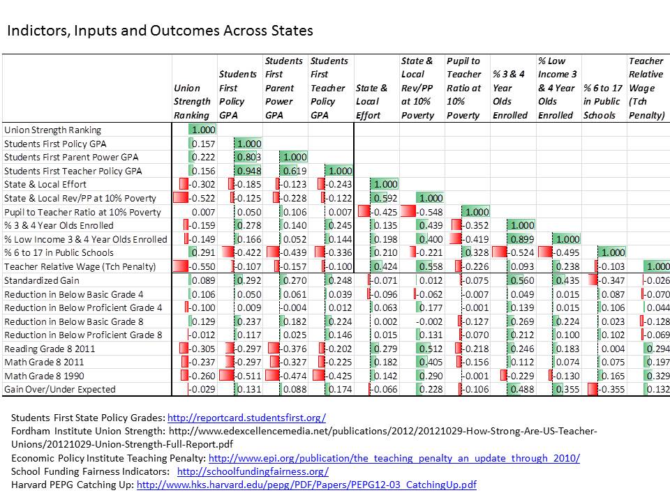
And here’s a bullet point summary of the correlations.

  • States with weaker unions (higher number in ranking, meaning lower union strength ranking), have systematically lower state and local revenue per pupil and less competitive teacher wages.
  • States with weaker unions have systematically lower average NAEP scores.
  • States with higher reformy grade point averages according to Students First, have lower shares of children in the public school system, and have lower average NAEP scores.
  • Average NAEP scores are most positively associated with state and local revenue and teacher wage competitiveness.
  • Standardized NAEP gains over time are most positively associated with shares of 3 and 4 year olds enrolled in school programs/pre-school.
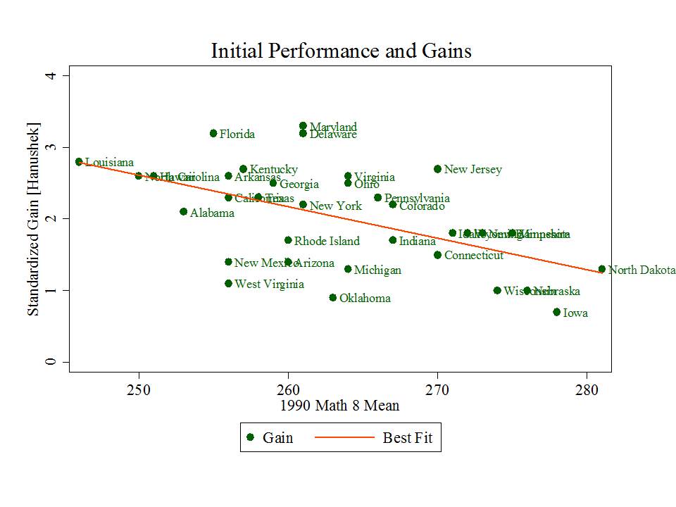
  • Standardized NAEP gains are also positively associated with Students First grade point averages.  But, standardized NAEP gains are pretty strongly related to starting point. That is, states showing greater gains are generally those who started lower.

Figure 1. Gains Depend on Starting Point

 Slide2

  • Standardized NAEP gains, adjusted for starting point, are positively associated with enrollment of 3 and 4 year olds and with state and local revenue per pupil.
  • Adjusted standardized NAEP gains are only very weakly associated with Students First grade point averages.

So, who are the real standouts?

Okay… okay… but those correlations just suggest that states with higher spending and more kids in early childhood education seem to be doing better and gaining more over time.  The correlations also, in the most generous case, suggest that the most reformy policies have been adopted in states that do and have historically done very poorly on outcome measures and that states with reformier policies aren’t necessarily outpacing those without (when the performance measures are adjusted for starting point).

Now… one might say… we must give these policies time… we’ve only just begun. To which I say many of the underlying policy conditions in these states, but for more recent changes to teacher evaluation policies under Race to the Top, have actually been in place now for a decade or so. Reforminess IS THE STATUS QUO in many of these low performing and gain-lagging states!

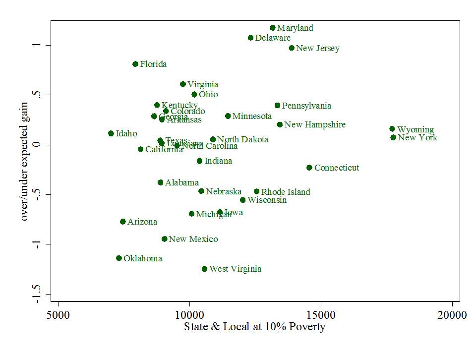
Figure 2. State & Local Revenue and NAEP Mean Scale Score

Slide3

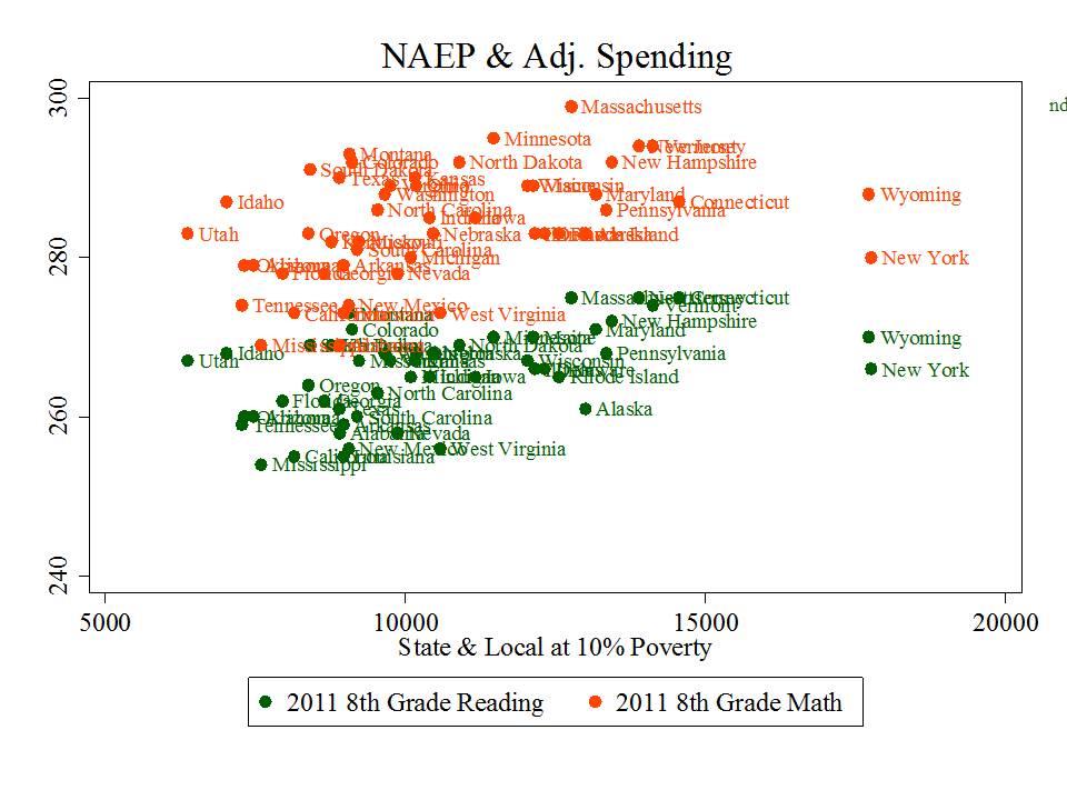
State and local revenues remain positively associated with NAEP mean scale scores, but this is indeed a case, in part, of those who have versus those who don’t. Here, Massachusetts is lookin’ pretty good, with New Jersey squashed below it, just above New Hampshire.  Minnesota’s not lookin’ too bad. Florida is squashed in the middle of the pack among the low spenders.

Figure 3. State and Local Revenue and Adjusted Gains

Slide4Interestingly state and local revenues are also loosely (r=.228) associated with adjusted (by starting point) standardized gains on NAEP from 1990 to present (whereas reformier policy preferences were less correlated or not at all with adjusted standardized gains).

Now, a point not to be overlooked here is that New Jersey is actually further above the “expected” value, given its starting point, than Florida. But reformy types HATE New Jersey because it doesn’t conform to their preferences, just like they hate Maryland and tolerate, at best, Massachusetts.  New Jersey spends a lot, has very low percent of kids in charter schools and has relatively strong unions.

Thus, the emphasis on Florida as the obvious (really?) standout – the model for all! Some pretty massive freakin deceptive, cherry picking there if you ask me. Missing from this graph is Massachusetts.  Amazingly, no mention of New Jersey or Massachusetts in the goofy video above.

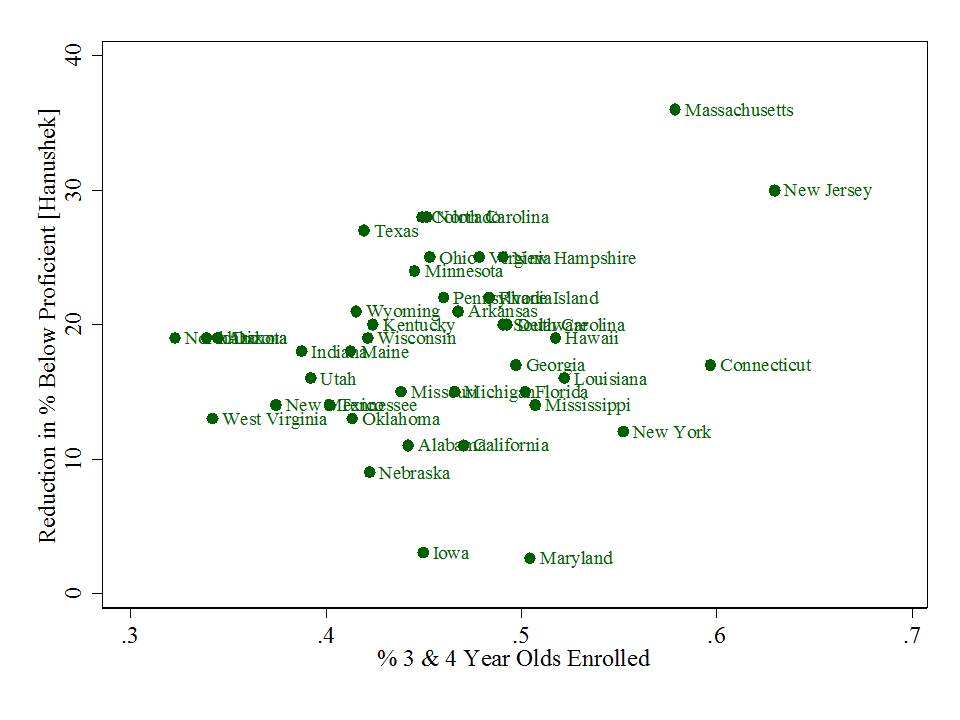
What I found most intriguing in this whole exercise was the relative strength of early childhood enrollments both with respect to NAEP mean scale score levels and with respect to the change in the percent of children scoring below basic.

Indeed, the first graph below also reflects some of the have/have not relationship. States like New Jersey and Massachusetts have higher income, more educated families that even without publicly financed pre-k programs would likely enroll their youngsters at a higher rate than parents in much lower income states.  These are the strongest relationships in the matrix above… and early childhood enrollments are also most positively correlated with changes in shares of children scoring low on NAEP and most positively correlated with corrected standardized gains on NAEP.

Figure 4. 3 & 4 Year Old Enrollment and NAEP Mean Scale Score

Slide5

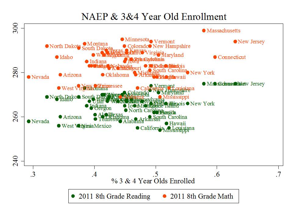
Figure 5. 3 & 4 Year Old Enrollment and Reduction in % Below Basic

Slide6So, maybe it’s just me, but if anything, the correlation matrix above suggests that states that are spending on schools seem to both be doing okay, and to be improving over time.  Standouts on gains include Maryland and New Jersey (and Delaware). Florida doesn’t strike me as the big standout here, though they do have high NAEP change over time. But, others including New Jersey have higher adjusted NAEP gain and have much higher reduction in the percent below proficient.  And while New York and Wyoming raise some questions… some of these are easily disposed, with Wyoming being among the most sparsely populated states in the nation, for example, and New York being home to the largest city in the nation, embedded in the highest cost labor market in the nation.

As I’ve explained on previous posts… there’s a whole lot going on behind any simple scatterplot like these. They don’t tell of complex underlying causal relationships. They don’t really point us to those perfect models to follow.  But they sure can be illustrative, and raise some important questions about the BS constantly hurled at us, increasingly in cleverly produced youtube format.

=====

Addendum: This paper was recently tweeted as providing proof that the presence of strong teachers unions in states creates a substantial drag on student performance gains.  I’m actually quite shocked that such a methodologically goofy paper was actually published in this journal, which tends to be quite reasonable. First and foremost, the outcome measure – achievement growth over time – is created using states’ own assessments and looking at the difference in proficiency rates between 8th and 4th graders [with an unsatisfying “correction” for differences in test difficulty], in the same year [not even real cohort change]. This is problematic on two levels – first that differencing proficiency rates is a junk analysis to begin with, given policy shifts and other changes in state assessments and cut-scores over time, not to mention the massive information loss that occurs when we look only at numbers of kids shifting over  a particular bar (yes… one of my graphs above suffers this same problem – # 5).  No, these differences cannot be corrected by the simple regression used in the study.  Second, state assessments, rigor of items and cut scores differ so vastly that the idea of comparing proficiency rate changes across states is utterly ridiculous.  No, these differences cannot be corrected by the simple regression used in the study.  Finally, explanatory variables/covariates in the models are a relatively simple collection of measures for which entirely unsatisfying justification is provided. But that doesn’t matter so much when the dependent measure is complete crap.