I had the displeasure of coming across this completely ridiculous and deceitful video the other day:
http://www.youtube.com/watch?v=e8aeEr2qk9s
Which was created to promote Eric Hanushek’s latest U.S. education crisis manifesto. Around the 4:12 minute mark, the video jumps from crisis mode to policy solution mode, telling us how among U.S. States, Florida is a model for the way forward, and states like Wyoming and New York provide proof positive that money really has nothing to do with helping schools. That money doesn’t matter is a critical underpinning of nearly every reformy rant.
Here’s the complete story to the contrary.
Now, most of what’s here has been summarized previously by Hanushek, and I have discussed this stuff previously on this blog.
This bizarre video got me thinking about a series of previous posts where I’ve looked across numerous indicators to try to tease out the relationships among them, across states. I’ve selectively scoured scatterplots of relationships between various state level indicators and outcome measures, but have not for a while now, simply stepped back and evaluated the correlations across all of them, and then tried to tease out what states, if any really do stand out.
Let’s start with the indicators and their sources.
School Funding Fairness: First up in my state level data set are a series of indicators from http://schoolfundingfairness.org/
These indicators characterize the level of funding and effort in state school finance systems.
- Funding Level (predicted at 10% Poverty)
- Funding Effort (state and local revenue as a share of gross state product)
- Coverage (% of 6 to 16 year olds in public school system)
- Early Childhood Enrollment (% of 3 & 4yr olds enrolled in some form of school)
Union Strength: Second are the Thomas B. Fordham Institute rankings of state level union strength. Here, a rank of 1 means a state with strong unions, and a rank of 50 would be a state with a weak union role. Thus, from a measurement standpoint, one might describe it as “union weakness” – that is, the higher the assigned value (thus lower ranking) the weaker the unions in that state. http://www.edexcellencemedia.net/publications/2012/20121029-How-Strong-Are-US-Teacher-Unions/20121029-Union-Strength-Full-Report.pdf
Policy Context Reformyness: Third, I have the grade point averages assigned to states by Students First in their state report cards. I use their overall GPA, their GPA for teacher policies and their GPA for parent power. http://reportcard.studentsfirst.org/ In brief, Students First supports removal of seniority privileges, test-based teacher evaluation, mutual consent teacher assignment policies, folding their preferences for these policies into their teacher GPA. Regarding parent power, they support such cockamamie schemes as parent trigger, and more common school choice alternatives such as charter school expansion and tuition tax credits.
Teacher Wage Competitiveness: Here, I rely on the Economic Policy Institute’s measure of the Teaching Penalty, which is the average weekly wage of teachers compared to non-teachers for each state. http://www.epi.org/publication/the_teaching_penalty_an_update_through_2010/
Harvard PEPG/Hanushek Catching Up Outcome Measures: Finally, along with mean scale scores of the National Assessment of Educational Progress, I also use some of Eric Hanushek’s own measures of student outcomes – and corrected versions of those measures – in order to track which of the above policies seem most correlated with various outcome measures – in the appropriate direction that is! http://www.hks.harvard.edu/pepg/PDF/Papers/PEPG12-03_CatchingUp.pdf
Now, in the book of “reformy”, there are some well understood truths.
First, that school choice programs, no matter what, no matter how structured, necessarily lead to an improved system for all. Choice lifts all boats. It necessarily induces innovation, thus quality, and the pressures of innovative quality force the stagnant public system to step up or collapse (that is, unless political leaders have already crafted a scheme to forcibly close traditional public schools, creating a false demand for alternatives, and then publicize that false demand as real… and well… you know).
Second, teacher wages are completely unimportant, largely because teachers are already paid way to freakin much and as a result they are all just complacent, lazy and greedy, waiting on those fat pensions they stand to collect after they ride out their time. In fact, pure reformy ideology declares that the best way to improve teacher quality is to cut those wage for most teachers, and perhaps, based on the luck of the roll of the test score dice, grant a few bonuses here and there to the truly “great” teachers.
Spending more money on stuff like expanding early childhood education is just wasteful expansion of the existing bureaucracy, having no persistent positive gains for children down the line.
States that spend a lot on schools are really just wasting their money, and getting nothing for it (see the above video… which pretty much says this straight up! Re: Wyoming and New York).
Thus… we must look to the models… like Florida… or Louisiana… or perhaps even Arizona?
So I was wondering….
So, I was wondering, if I took all of the above indicators, and first evaluated the correlations among all of them, and then evaluated a few scatterplots of what appear to be among the more consistent correlations, what would I conclude? Clearly, by my snark above, along with a lot of the other content you’ve probably read on this blog, I already have an opinion in this regard… but let’s start with a look at the correlations. Do they really tell us how totally freakin awesome reformyness is? And how totally freakin pointless it is to consider silly stuff…. Like money… and paying teachers well? And how completely freakin’ destructive unions are to quality education systems?
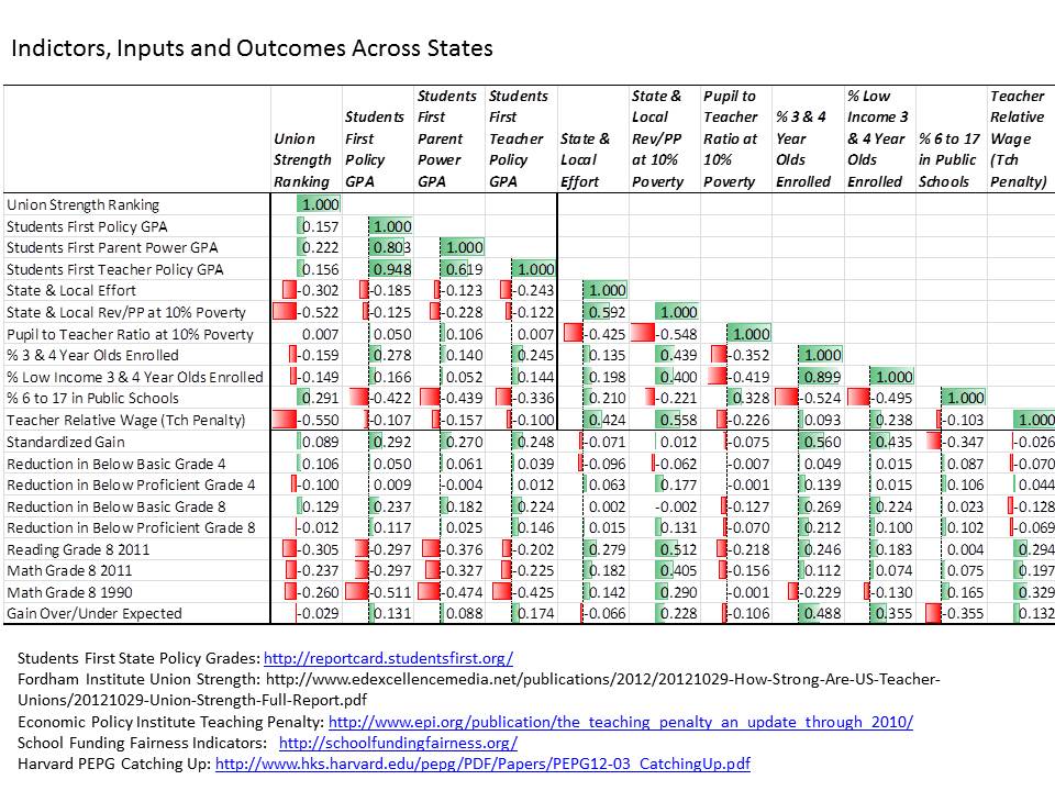
Here’s the correlation matrix… highlighted using a standard Excel conditional formatting feature.
Table 1. Correlations Across Indicators
And here’s a bullet point summary of the correlations.
- States with weaker unions (higher number in ranking, meaning lower union strength ranking), have systematically lower state and local revenue per pupil and less competitive teacher wages.
- States with weaker unions have systematically lower average NAEP scores.
- States with higher reformy grade point averages according to Students First, have lower shares of children in the public school system, and have lower average NAEP scores.
- Average NAEP scores are most positively associated with state and local revenue and teacher wage competitiveness.
- Standardized NAEP gains over time are most positively associated with shares of 3 and 4 year olds enrolled in school programs/pre-school.
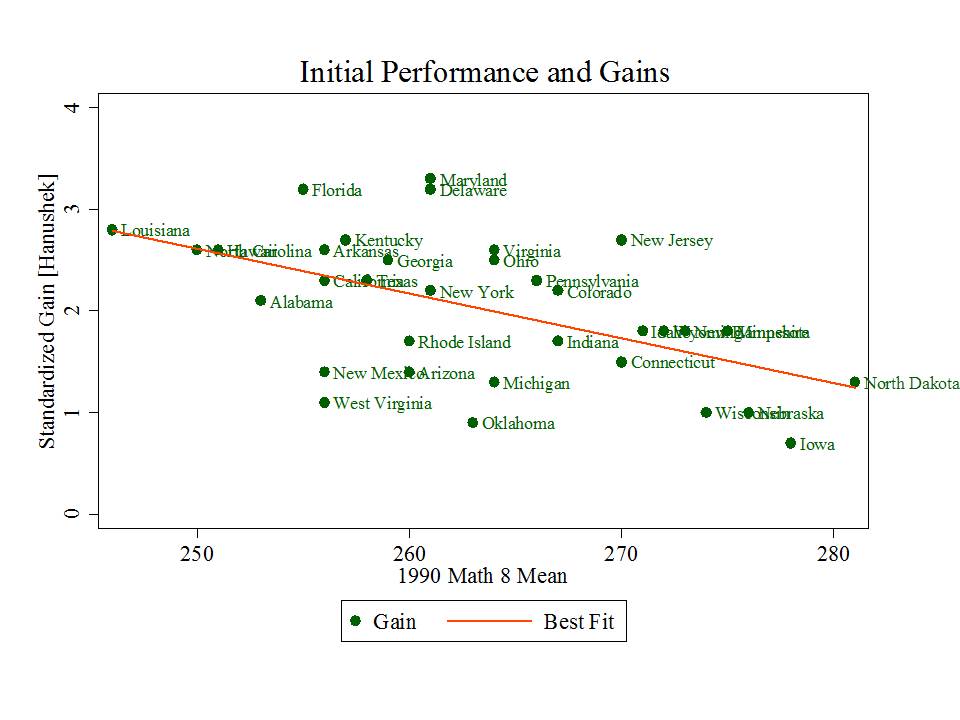
- Standardized NAEP gains are also positively associated with Students First grade point averages. But, standardized NAEP gains are pretty strongly related to starting point. That is, states showing greater gains are generally those who started lower.
Figure 1. Gains Depend on Starting Point
- Standardized NAEP gains, adjusted for starting point, are positively associated with enrollment of 3 and 4 year olds and with state and local revenue per pupil.
- Adjusted standardized NAEP gains are only very weakly associated with Students First grade point averages.
So, who are the real standouts?
Okay… okay… but those correlations just suggest that states with higher spending and more kids in early childhood education seem to be doing better and gaining more over time. The correlations also, in the most generous case, suggest that the most reformy policies have been adopted in states that do and have historically done very poorly on outcome measures and that states with reformier policies aren’t necessarily outpacing those without (when the performance measures are adjusted for starting point).
Now… one might say… we must give these policies time… we’ve only just begun. To which I say many of the underlying policy conditions in these states, but for more recent changes to teacher evaluation policies under Race to the Top, have actually been in place now for a decade or so. Reforminess IS THE STATUS QUO in many of these low performing and gain-lagging states!
Figure 2. State & Local Revenue and NAEP Mean Scale Score
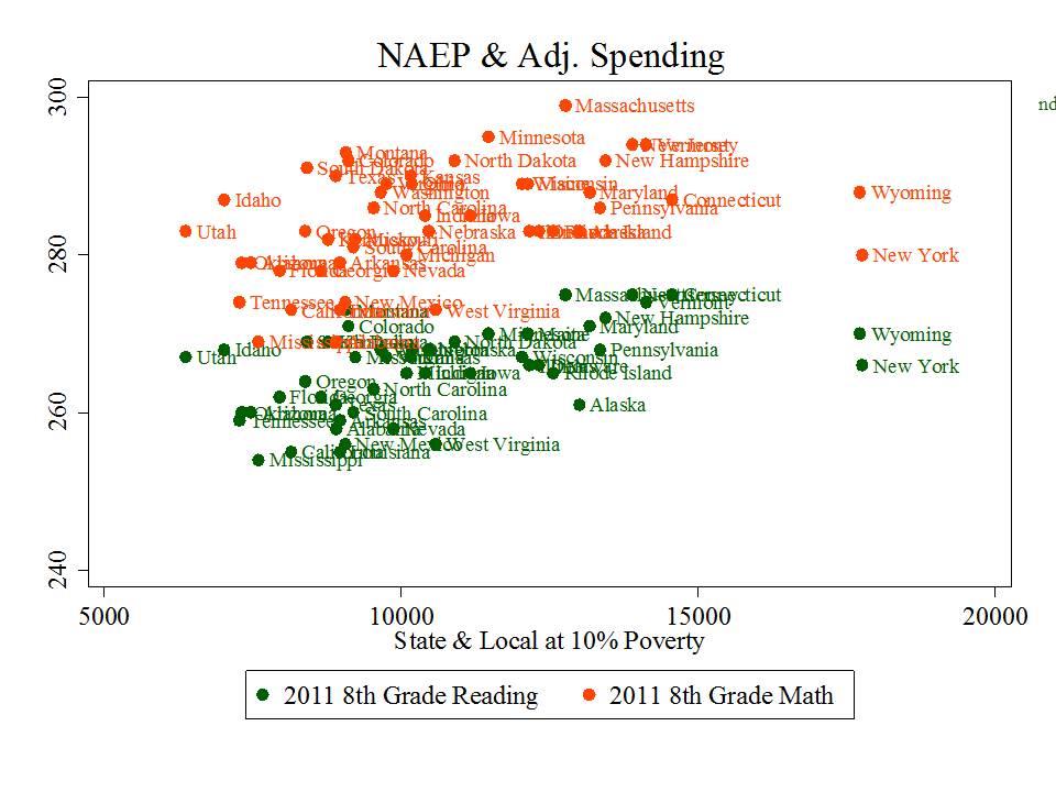
State and local revenues remain positively associated with NAEP mean scale scores, but this is indeed a case, in part, of those who have versus those who don’t. Here, Massachusetts is lookin’ pretty good, with New Jersey squashed below it, just above New Hampshire. Minnesota’s not lookin’ too bad. Florida is squashed in the middle of the pack among the low spenders.
Figure 3. State and Local Revenue and Adjusted Gains
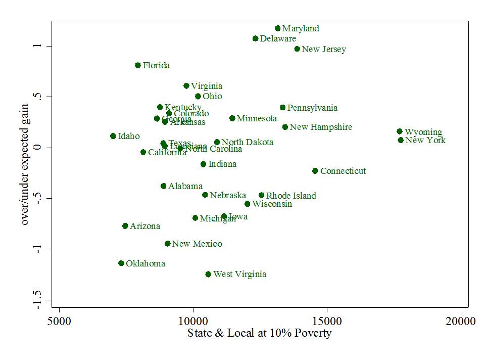 Interestingly state and local revenues are also loosely (r=.228) associated with adjusted (by starting point) standardized gains on NAEP from 1990 to present (whereas reformier policy preferences were less correlated or not at all with adjusted standardized gains).
Now, a point not to be overlooked here is that New Jersey is actually further above the “expected” value, given its starting point, than Florida. But reformy types HATE New Jersey because it doesn’t conform to their preferences, just like they hate Maryland and tolerate, at best, Massachusetts. New Jersey spends a lot, has very low percent of kids in charter schools and has relatively strong unions.
Thus, the emphasis on Florida as the obvious (really?) standout – the model for all! Some pretty massive freakin deceptive, cherry picking there if you ask me. Missing from this graph is Massachusetts. Amazingly, no mention of New Jersey or Massachusetts in the goofy video above.
What I found most intriguing in this whole exercise was the relative strength of early childhood enrollments both with respect to NAEP mean scale score levels and with respect to the change in the percent of children scoring below basic.
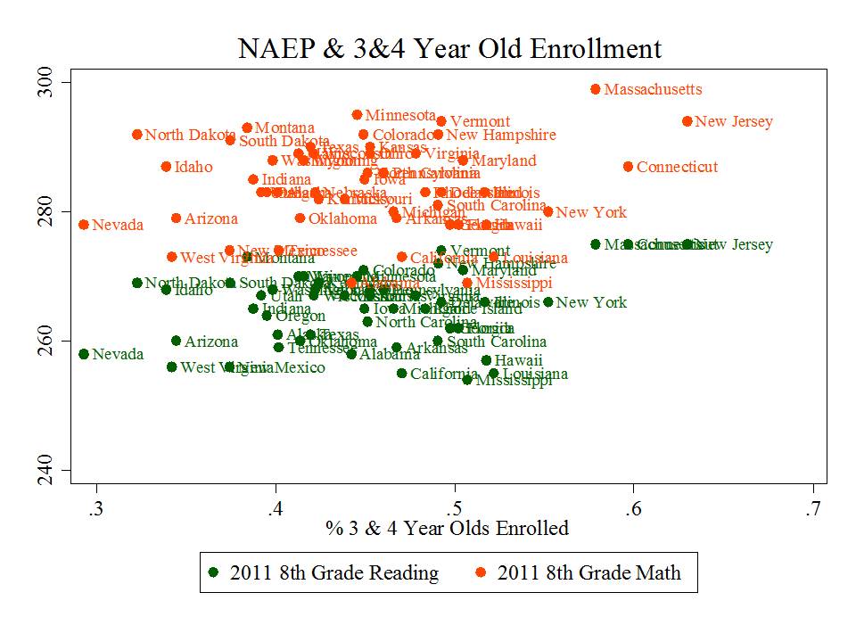
Indeed, the first graph below also reflects some of the have/have not relationship. States like New Jersey and Massachusetts have higher income, more educated families that even without publicly financed pre-k programs would likely enroll their youngsters at a higher rate than parents in much lower income states. These are the strongest relationships in the matrix above… and early childhood enrollments are also most positively correlated with changes in shares of children scoring low on NAEP and most positively correlated with corrected standardized gains on NAEP.
Figure 4. 3 & 4 Year Old Enrollment and NAEP Mean Scale Score
Figure 5. 3 & 4 Year Old Enrollment and Reduction in % Below Basic
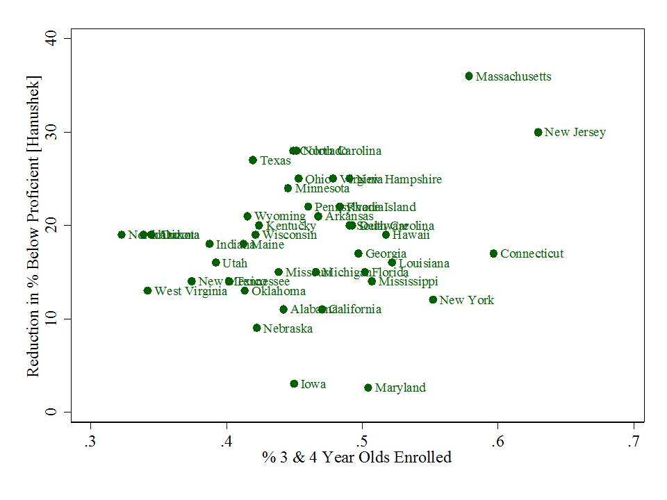 So, maybe it’s just me, but if anything, the correlation matrix above suggests that states that are spending on schools seem to both be doing okay, and to be improving over time. Standouts on gains include Maryland and New Jersey (and Delaware). Florida doesn’t strike me as the big standout here, though they do have high NAEP change over time. But, others including New Jersey have higher adjusted NAEP gain and have much higher reduction in the percent below proficient. And while New York and Wyoming raise some questions… some of these are easily disposed, with Wyoming being among the most sparsely populated states in the nation, for example, and New York being home to the largest city in the nation, embedded in the highest cost labor market in the nation.
As I’ve explained on previous posts… there’s a whole lot going on behind any simple scatterplot like these. They don’t tell of complex underlying causal relationships. They don’t really point us to those perfect models to follow. But they sure can be illustrative, and raise some important questions about the BS constantly hurled at us, increasingly in cleverly produced youtube format.
=====
Addendum: This paper was recently tweeted as providing proof that the presence of strong teachers unions in states creates a substantial drag on student performance gains. I’m actually quite shocked that such a methodologically goofy paper was actually published in this journal, which tends to be quite reasonable. First and foremost, the outcome measure – achievement growth over time – is created using states’ own assessments and looking at the difference in proficiency rates between 8th and 4th graders [with an unsatisfying “correction” for differences in test difficulty], in the same year [not even real cohort change]. This is problematic on two levels – first that differencing proficiency rates is a junk analysis to begin with, given policy shifts and other changes in state assessments and cut-scores over time, not to mention the massive information loss that occurs when we look only at numbers of kids shifting over a particular bar (yes… one of my graphs above suffers this same problem – # 5). No, these differences cannot be corrected by the simple regression used in the study. Second, state assessments, rigor of items and cut scores differ so vastly that the idea of comparing proficiency rate changes across states is utterly ridiculous. No, these differences cannot be corrected by the simple regression used in the study. Finally, explanatory variables/covariates in the models are a relatively simple collection of measures for which entirely unsatisfying justification is provided. But that doesn’t matter so much when the dependent measure is complete crap.
Many thanks for this. Curious to know if you have seen, or maybe even created, a map or chart to illustrate school funding, district performance and socio-economic status of students. Would be interesting and suspect I could guess what it would look like.
Where would you get reliable school performance, funding data?
Thanks for all you do.
susan S sawyers
Adding that only about a third of Floridians were born there. Most new Florida residents come from New York and New Jersey (and also Texas and California). So a lot of Florida’s gains could be attributable to school systems elsewhere, especially NY and NJ.