Zip it! Charters and Economic Status by Zip Code in NY and NJ

There’s no mystery or proprietary secret among academics or statisticians and data geeks as to how to construct simple comparisons of school demographics using available data.  It’s really not that hard. It doesn’t require bold assumptions, nor does it require complex statistical models. Sometimes, all that’s needed to shed light on a situation is a simple descriptive summary of the relevant data.  Below is a “how to” (albeit sketchy) with links to data for doing your own exploring of charter and traditional public school demographics, by grade level and location.

Despite the value of a simple, direct and relevant comparison using accessible data providing for easy replication, many continue to obscure charter-non-charter comparisons with convoluted presentations of less pertinent information.  Matt DiCarlo recently published a very useful post (at Shanker Blog) explaining the various convoluted descriptions from Caroline Hoxby’s research on charter schools that make it difficult to discern whether the charter schools in her comparisons really had comparable student populations to nearby, same grade level traditional public schools.

 As I’ve discussed in the past, charter advocate researchers tend to avoid these basic comparisons, instead showing that students selected through the lottery were comparable to those not selected but who still entered the lottery (excluding all those who didn’t enter the lottery). While this information is relevant to the research question at hand (comparing effectiveness among lottery winners and losers), it skips over entirely another potentially relevant tidbit – whether, on average, the charter students are comparable to students in surrounding schools.

Alternatively, charter advocate researchers will compare charter characteristics to district wide averages, or whatever comparison sheds the most favorable light.  For example, Matt DiCarlo explains of Caroline Hoxby’s NYC charter research that:

“The authors compare the racial composition of charter students to that of students throughout the whole city – not to that of students in the neighborhoods where the charters are located, which is the appropriate comparison (one that is made in neither the summary nor the body of the report). For example, NYC charter schools are largely concentrated in Harlem, central Brooklyn and the South Bronx, where regular public schools are predominantly non-white and non-Asian (just like the charters).”

The better approach is, of course, to compare against the, well, most comparable schools – or those serving similar grade levels in the same general proximity – or even to be able to identify each individual school (such that one can determine comparable grade levels) among districts in similar locations.

Here’s my general guide to making your own comparisons using a readily available data source.

Go to: www.nces.ed.gov/ccd

Use the Build a Table function: http://nces.ed.gov/ccd/bat/

  1. Select as many years of data you want/need (first screen toggle)
  2. Select the “school” as your unit of analysis for your data (first screen, drop down)
  3. Select “contact information” from the drop down menu on next screen
    1. Select location zip code
    2. Select location city
  4. Select “classification information” from the drop down menu
    1. Select the “charter” indicator
    2. Select the “magnet” indicator (in case you want to include/exclude these)
  5. Select “total enrollment” from the drop down menu
    1. Select total enrollment
  6. Select “students in special programs” from the drop down menu
    1. Select students qualifying for free lunch
    2. Select students qualifying for reduced price lunch
  7. Select “Grade Span Information” from the drop down menu
    1. Select “school level” identifier
    2. Select “High Grade” and “Low Grade” indicators if you want more flexibility in comparing “like” schools
  8. Pick the state or states you want (you can’t use this tool to pull all schools nationally because the data set will be too large for this tool. Complete data are downloadable at: http://nces.ed.gov/ccd/pubschuniv.asp )

Calculate Percent Free Lunch and Percent Free & Reduced Lunch (divide groups by total enrollment)!

Play…

Here are some examples…

First, here are a handful of New Jersey Charter Schools compared to other schools (comparable and not) in their same zip code.

In this first figure, from a Newark, NJ zip code, we can see quite plainly and obviously that the shares of children qualifying for free lunch in Robert Treat Academy are much lower than all other surrounding schools, including the high school in the zip code (Barringer), where high schools typically have lower rates of students qualifying (or filing relevant forms) for free lunch.

Here are a few more.

Other “high flying” charters in Newark including North Star Academy, Gray Charter School and Greater Newark Academy, in a zip code with fewer traditional public schools, tend to have poverty concentrations more similar to specialized/magnet schools than to neighborhood schools in Newark. Other charter schools like Maria Varisco Rogers and Adelaide Sanford have populations more comparable to traditional neighborhood schools.  But, we don’t tend to hear as much about these schools – or their great academic successes.

Things aren’t too different over in Jersey City.  In the area (zip code) around Learning Community Charter School, other charters and neighborhood schools have much higher rates of children qualifying for free lunch than LCCS. Only the special Explore 2000 school has a lower rate.

Ethical Community Charter also stands out like a sore thumb when compared to all other schools in the same zip code, including those serving upper grades which typically have lower rates.

But what about those NYC KIPP schools? How about some KIPP BY ZIP?

So much has been made of the successes of KIPP middle schools, coupled with much contentious debate over whether KIPP schools really serve representative populations and/or whether they are advantaged by selective attrition. I included some links to relevant studies on those points here. But even those studies, which make many relevant and interesting comparisons, don’t give the simple demographic comparison to other middle schools in the same neighborhood. So here it is:

Does New Jersey really need more small, segregated schools?

Political pundits and the media frequently point out two major concerns regarding the organization of public school districts in New Jersey.

  • First, that New Jersey, being the most population dense state in the nation, simply has far too many small schools and school districts (largely an artifact of municipal reorganization and alignment that occurred in the late 1890s and first decade of the 1900s).
  • Second, that New Jersey is among the most racially and socioeconomically segregated states in the nation, or more specifically, that many urban communities in New Jersey suffer extreme racial isolation (high concentration of a single race/ethnicity).

I blogged about this topic way back when I first started this blog!

Here’s a snapshot:

So then, one should ask how expansion of charter schools intersects with these two major policy concerns. It would be one thing if New Jersey Charter Schools simply had a track record of a) serving similar student populations and b) consistently outperforming traditional public schools in the same location. That is, one might argue that we can deal with a marginal increase in segregation and additional segmentation of our school system if it’s producing better results (therefore not compromising efficiency). But that’s not the case. New Jersey charter schools, on average, are average.  In particular, there are few if any high performing, high poverty charters. The figure below is from a recent post.

In fact, the NJ charters frequently cited as high flyers also tend to a) serve far lower shares of children qualifying for free lunch, b) serve far fewer LEP/ELL children, and c) some in particular have disproportionately high attrition rates in the middle grades.

I’ve shown on many occasions on this blog, that NJ Charters serve far fewer children with greater educational needs.

But do NJ Charter schools contribute to racial and ethnic segregation in New Jersey? Given the break-even performance of NJ charters, it would make little sense to advance a policy agenda that has the tendency to increase segregation and racial isolation in a state already segregated and racially isolated.

Here are the figures, based on the 2009-10 NCES Common Core of Data, Public School Universe Survey, based on the zip code of school location (LZIP).

I’ve included only elementary and middle schools in the following graphs.

First, here are the charter and non-charter averages for % Free Lunch by zip code:

While statewide averages are relatively comparable, as I’ve discussed numerous times, there are big differences in specific locations. Note the number of zip codes where charters serve far fewer children qualifying for free lunch (light blue bars way below dark blue bars). In a few cases, charters serve higher rates.

Second, here are the charter and non-charter % black populations by zip code:

In many cases, charters serve far higher concentrations of black students than surrounding schools.  This figure provides an intriguing contrast with the previous, suggesting that in fact, in many neighborhoods, Charters are serving the less poor among black populations specifically and are serving black populations almost exclusively in some otherwise mixed race neighborhoods.

Third, here is the distribution of Hispanic enrollments by zip code:

Charter schools seem to be largely underserving Hispanic populations. This may be consistent with their underserving of LEP/ELL children to the extent that there is overlap between LEP/ELL concentrations and Hispanic enrollments within Zip Codes. A few zip codes have higher concentrations of Hispanic children in charter schools but most have far fewer.

Finally, here is the concentration of Asian students by zip code:

A handful of NJ charter schools have highly disproportionate shares of Asian students.

These figures raise important questions about the contribution of charter schools in the broader education policy and public policy context in a state already grappling with significant segregation and racial isolation (and consolidation, or lack thereof). These concerns may be particularly relevant as increased numbers of culture (ethnicity) specific charter schools are proposed, dispersed throughout the state.

Raw Stata output of tabulations: Charter Segregation Raw Output

Unspinning Data on New Jersey Charter Schools

Today’s (okay…yesterday… I got caught up in a few other things) New Jersey headlines once again touted the supposed successes of New Jersey Charter Schools:

http://www.nj.com/news/index.ssf/2011/01/gov_christie_releases_study_sh.html

The Star Ledger reporters, among others, were essentially reiterating the information provided them by the New Jersey Department of Education. Here’s their story.

http://www.state.nj.us/education/news/2011/0118chart.htm

And here’s a choice quote from the press release:

“These charter schools are living proof that a firm dedication to students and a commitment to best education practices will result in high student achievement in some of New Jersey’s lowest-income areas,” said Carlos Perez, chief executive officer of the New Jersey Charter School Association. He pointed to NJASK data for third grade Language Arts, where more than half the charters outperformed the schools in their home districts, and of those, more than 75 percent were located in former Abbott districts.

No spin there. Right? Just a balanced summary of achievement data, with thoughtful interpretation of what they might actually mean. Not really.

There are many, many reasons why the comparisons released yesterday are deeply problematic, and well, quite honestly, pretty darn meaningless. I could not have said it better than Matt DiCarlo of Shanker Blog did here:

“Unfortunately, however, the analysis could barely pass muster if submitted by a student in one of the state’s high school math classes (charter or regular public).”

Here are some guidelines I have posted in the past, regarding appropriate ways to compare New Jersey Charter Schools to their host districts on various measures including outcome measures:

  1. When comparing across schools within poor urban setting, compare on basis of free lunch, not free or reduced, so as to pick up variation across schools. Reduced lunch income threshold too high to pick up variation.
  2. When comparing free lunch rates across schools either a) compare against individual schools and nearest schools, OR compare against district averages by GRADE LEVEL. Subsidized lunch rates decline in higher grade levels (for many reasons, to be discussed later). Most charter schools serve elementary and/or middle grades. As such they should be compared to traditional public schools of the same grade level. High school students bring district averages down.
  3. When comparing test score outcomes using NJ report card data, be sure to compare General Test Takers, not Total Test Takes. Total Test Takers include scores/pass rates for children with disabilities. But, as we have seen time and time again, in charts above, Charters tend not to serve these students. Therefore, it is best to exclude scores of these students from both the Charter Schools and Traditional Public Schools.

Today’s (okay, yesterday – publication lag) primary violation involves #3 above, but also relates to the first two basic rules. Let’s do a quick walk through, using the 2009 data, because the 2010 school level school reports data are not yet posted on the NJDOE web site. The bottom line is that it is relatively meaningless to simply compare raw scores or proficiency rates of charter schools to host district schools – as done by NJDOE and the Star Ledger. That is, it is meaningless unless they actually serve similar student populations, which they do not.

Below, I walk through a few quick examples of student population differences in Newark, home to the state’s high-flying charter schools (North Star Academy and Robert Treat Academy). Next, I construct a statistical model of school performance including New Jersey Charter schools and traditional public schools in their host district, controlling for student demographics and location. I first used this same model here: Searching for Superguy in New Jersey. I use that model to show adjusted performance comparisons on a few of the tests, and then I use a variation of that model to test the proficiency rate difference – on average statewide – between charter schools and schools in the host district. Finally, I address one additional factor which I am unable to fully control for in the model – the fact that some New Jersey Charter Schools – high performing ones – seem to have unusually high rates of cohort attrition between grade 6 and 8, concurrent with rising test scores. I raise this point because pushing out of students is not an option available to traditional public schools. In fact, it is the traditional public schools that must take back those students pushed out.

Demographic Examples from Newark

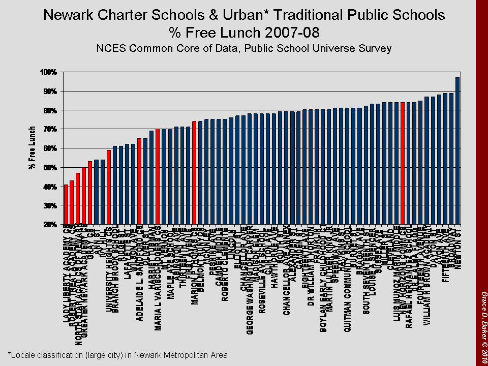
Here are a few slides from previous posts on the demography of Newark Charter Schools in particular, compared to other Newark Public Schools. Here are the shares of kids who qualify for free lunch by school in Newark (city boundaries). Clearly, most of the charters fall toward the left hand side of the graph with far fewer of the lowest low-income children.

The shares of English Language Learners look similar if not more dramatic. Many NPS schools have very high rates of English Language Learners while few charters have even a modest share.

Finally, here’s a 4 year run of the most recent available special education classification rate data (More recent years of data have a dead link on the classification rates). This graph compares Essex County charter schools with Essex County public school districts. Charter Schools have invariably low special education rates, but for those focused on children with disabilities.


One cannot reasonably ignore these differences when comparing performance outcomes of kids across schools. It’s just silly and not particularly useful.

The Outcomes Corrected for the Demographics

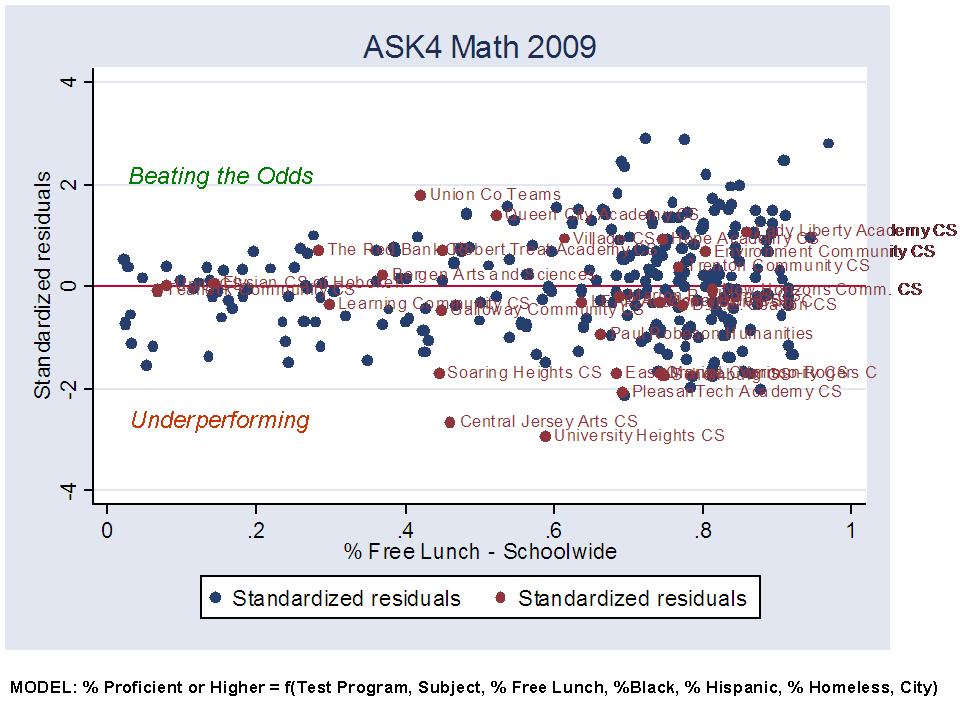
So then, what happens if we actually use some statistical adjustments to evaluate whether the charter schools outperform (on average proficiency rate) other schools in the same city on the same test. Well, I’ve done this for charter data from 2009 and previous years and will do it again for the 2010 data when available. I use variables available in the Fall Enrollment Files and from the School Report Card and information on school location from the NCES Common Core of Data in order to create a model of the expected scores for each charter school and each other school in the same city. In the model, I use only the performance of GENERAL TEST TAKERS, so as to exclude those scores of special education students (who, for the most part don’t attend the charter schools). The model:

Outcome = f(Poverty, Race, Homelessness, City, Tested Grade, Subject)

Is use the model to create a predicted performance level (proficiency rate) for each school, considering which grade level test we are looking at, in which subject, the race/ethnicity of the students (where Hispanic concentration is highly correlated with available ELL data, and Hispanic concentration data are more consistently reported), the share of students qualifying for free lunch, the percent identified as homeless and the city of location for the school. That is, each charter school is effectively compared against only other schools in the same geographic context (city).

This is a CRUDE model, which can’t really account for other factors, such as the possibility that some charter schools actually shed, or push out, lower performing students over time.  More on that below. So, for each school, I get a predicted performance level – what that school is expected to achieve given the children it serves and the location. I can then compare the actual performance to the predicted performance to determine whether the school beats expectations or falls below expectations.

The next two graphs provide a visual representation of schools beating the odds and schools under-performing with respect to expectations. Charters are identified in red and named. Blue circles are traditional public schools in the same district. Note that there are about the same number of charters beating expectations as there are falling short. The same is true for non-charters. On average, both groups appear to be about average.

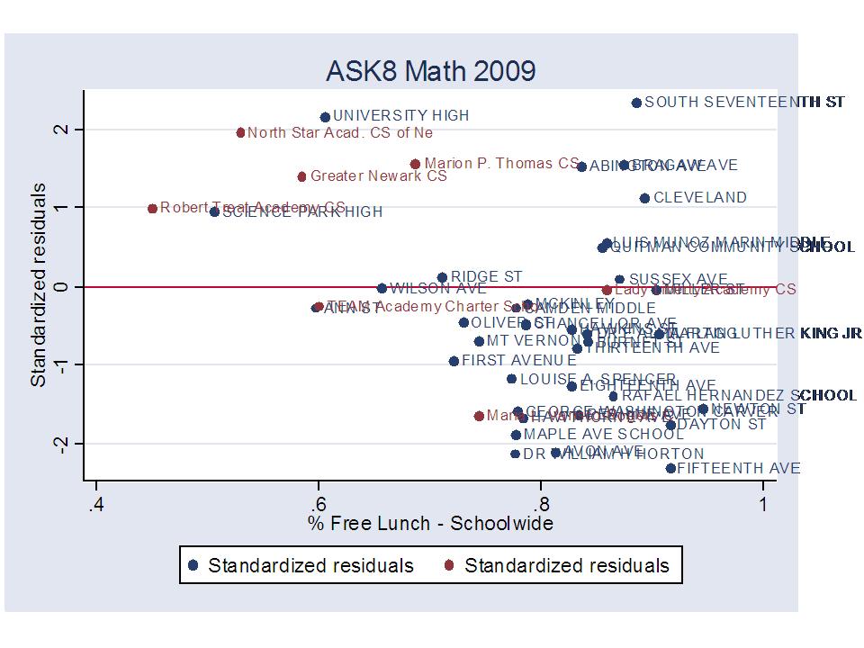
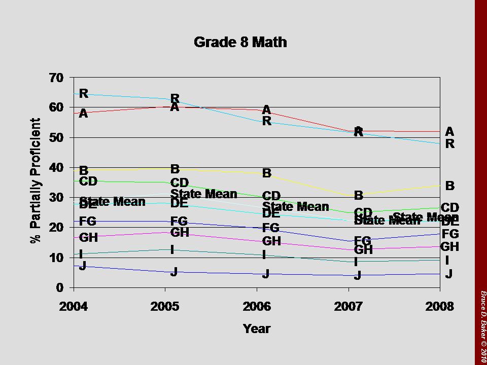
8th Grade Math performance looks much like 4th grade. Charters are evenly split between “good” and “bad,” as are the traditional public schools in their host districts.

The Overall Charter Difference (Or Not?)

Now, the above graphs don’t directly test whether the average charter performance is better or worse than the average non-charter performance on the same test, same grade and in the same location. But, conducting that test (for these purposes) is as simple as adding into the statistical model an indicator of whether a school is a charter school. Doing so creates a simple (oversimplified, in fact) comparison of the average performance of charters to the average performance of non-charters in the same city (on the same test, in the same grade level), while “correcting” statistically for differences in the student population. I SHOULD POINT OUT THAT ONE CAN NEVER REALLY FULLY CORRECT FOR THOSE DIFFERENCES!

Using this oversimplified method, the analysis (statistical output) below shows that the charter average proficiency rate is about 3% higher than the non-charter average – BUT THAT DIFFERENCE IS NOT STATISTICALLY SIGNIFICANT. That is, there really isn’t any difference. THAT IS, THERE REALLY ISN’T ANY DIFFERENCE.


Some Other Intervening Factors: Cohort Attrition, or Pushing Out

As I mentioned above, even the “tricky statistics” I used cannot sort out such things as a school that systematically dumps, or pushes out lower performing students, where those lower performing students end up back in the host district. Such an effect would simultaneously boost the charter performance and depress the host district performance (if enough kids were pushed back). I’ve written on this topic previously. So, I’ll reuse some of the older stuff – which isn’t really that old (last Fall).

In this figure, we can see that for the 2009 8th graders, North Star began with 122 5th graders and ended with 101 in 8th. The subsequent cohort also began with 122, and ended with 104. These are sizable attrition rates. Robert Treat, on the other hand, maintains cohorts of about 50 students – non-representative cohorts indeed – but without the same degree of attrition as North Star. Now, a school could maintain cohort size even with attrition if that school were to fill vacant slots with newly lotteried-in students. This, however, is risky to the performance status of the school, if performance status is the main selling point.

Here, I take two 8th grade cohorts and trace them backwards. I focus on General Test Takers only, and use the ASK Math assessment data in this case. Quick note about those data – Scores across all schools tend to drop in 7th grade due to cut-score placement (not because kids get dumber in 7th grade and wise up again in 8th). The top section of the table looks at the failure rates and number of test takers for the 6th grade in 2005-06, 7th in 2006-07 and 8th in 2007-08. Over this time period, North Star drops 38% of its general test takers. And, cuts the already low failure rate from nearly 12% to 0%. Greater Newark also drops over 30% of test takers in the cohort, and reaps significant reductions in failures (partially proficient) in the process.

The bottom half of the table shows the next cohort in sequence. For this cohort, North Star sheds 21% of test takers between grade 6 and 8, and cuts failure rates nearly in half  – starting low to begin with (starting low in the previous grade level, 5th grade, the entry year for the school). Gray and Greater Newark also shed significant numbers of students and Greater Newark in particular sees significant reductions in share of non(uh… partially)proficient students.

My point here is not that these are bad schools, or that they are necessarily engaging in any particular immoral or unethical activity. But rather, that a significant portion of the apparent success of schools like North Star is a) attributable to the demographically different population they serve to begin with and b) attributable to the patterns of student attrition that occur within cohorts over time.

Understanding Differing Perspectives

Some will say, why should I care if charters are producing higher outcomes with similar kids? What matters to me is that they are producing higher outcomes! Anyone who produces higher outcomes in Newark or Trenton should be applauded, no matter how they do it. It’s one more high performing school where there wasn’t one previously.

It is important to understand that comparisons of student outcomes that ignore differences in student populations reward – in the public eye – those schools that manage to find a way to serve more advantaged populations, either by achieving non-representative initial lottery pool or by selective attrition. As a result, there is a disincentive for charter operators to actually make greater effort to serve higher need populations – the ones who really need it! And there are many out there who see this as their real mission.  Those charter operators who do try to serve more ELL children, more children in severe multi-generational poverty, and children with disabilities often find themselves answering tough questions from their boards of directors and the media regarding why they can’t produce the same test scores as the high-flying charter on the other side of town. These are not good incentives from a public policy perspective. They are good for the few, not the whole.

Further, one’s perspective on this point varies whether one is a parent looking for options for his/her own child, or a policymaker looking for “scalable” policy options for improving educational opportunities for children statewide. From a parent (or child) perspective, one is relatively unconcerned whether the positive school effect is function of selectivity of peer group and attrition, so long as there is a positive effect. But, from a public policy perspective, the “charter model” is only useful if the majority of positive effects are not due to peer group selectivity and attrition, but rather to the efficacy and transferability of the educational models, programs and strategies. Given the uncommon student populations served by many Newark charters and even more uncommon attrition patterns among some… not to mention the grossly insufficient data… we simply have no way of knowing whether these schools can provide insights for scalable reforms.

As they presently operate, however, many of the standout schools do not represent scalable reforms. And on average, New Jersey charters are still… just… average.

Truly Uncommon in Newark…

A while back I wrote a post explaining why I felt that while Robert Treat Academy Charter School in Newark is a fine school, it’s hardly a replicable model for large scale reform in Newark, or elsewhere.  I have continued over time to write about the extent to which Newark Charter schools in particular have engaged in a relatively extreme pattern of cream skimming.  The same is true in Jersey City and Hoboken, but not so in Trenton. But, Trenton also offers us fewer examples of those high-flying charters that we are supposed to view as models for the future of NJ education. When I wrote my earlier post on Treat, I somehow completely bypassed North Star Academy, which I would now argue is even that much less scalable than Robert Treat. That’s not to say that North Star Academy is not a highly successful school for the students that it serves… or at least for those who actually stay there over time.  But rather that Star of the North is yet another example of why the “best” New Jersey charter schools provide a very limited path forward for New Jersey urban school reform. Let’s take a look:

So, here’s where North Star fits in my 8th grade performance comparisons of beating the odds, based on the statistical model I explain in previous posts:

In this figure (ab0ve), we see that North Star certainly beats the odds at 8th grade. Now, we can also already see that North Star has a much lower % free lunch than nearly any other school in Newark, limiting scalability right off the bat. There just aren’t enough non-poor kids in Newark to create many more schools with demography like North Star. Not to mention the complete lack of children with disabilities or limited English language proficiency.

Here’s North Star on the map, in context. Smaller lighter circles are lower % free lunch schools. Most of the charters in this map are… well.. smaller lighter circles (with charters identified with a red asterisk). Not all, however, are as non-representative as North Star.

Now, here’s the part that sets North Star and a few others apart – at first in a seemingly good way…

If we take the 2009 assessments for each grade level, one interesting finding is that the charter schools serving lower grade levels in Newark are generally doing less well than the NPS average (red line). But, those schools that start at grade 5 seem to be picking up a population that right away is doing comparable or better than the NPS average. See, for example, TEAM and Greater Newark (comparable to NPS in their first grade – 5th – served) and, of course, North Star whose students perform well above NPS in their first year – likely not fully a North Star effect, but rather at least partly a selection effect (Lottery or not, it’s a different population than those served in the district).  More strikingly, with each increase in grade level, proficiency rates climb dramatically toward 100% by 8th grade. Either they are simply doing an amazing job of bringing these kids to standards over a 3 year period… or … well… something else.

The figure above looks at 6th, 7th, and 8th graders in the same year. That is, they aren’t the same kids over time doing  better and better. But, even if we looked at 6th graders in one year, 7th graders the next year and 8th graders the following year, we wouldn’t necessarily be looking at the same kids. In fact, one really easy way to make cohort test scores rise is to systematically shed – push out – those students who perform less well each year. Sadly, NJDOE does not provide the individual student data necessary for such tracking. But there are a few other ways to explore this possibility.

First, here are the cohort “attrition rates” based on 3 sequential cohorts for Newark Charter schools:

In this figure, we can see that for the 2009 8th graders, North Star began with 122 5th graders and ended with 101 in 8th. The subsequent cohort also began with 122, and ended with 104. These are sizable attrition rates. Robert Treat, on the other hand, maintains cohorts of about 50 students – non-representative cohorts indeed – but without the same degree of attrition as North Star. Now, a school could maintain cohort size even with attrition if that school were to fill vacant slots with newly lotteried-in students. This, however, is risky to the performance status of the school, if performance status is the main selling point.

Here’s what the cohort attrition looks like when tracked with the state assessment data.

Here, I take two 8th grade cohorts and trace them backwards. I focus on General Test Takers only, and use the ASK Math assessment data in this case. Quick note about those data – Scores across all schools tend to drop in 7th grade due to cut-score placement (not because kids get dumber in 7th grade and wise up again in 8th). The top section of the table looks at the failure rates and number of test takers for the 6th grade in 2005-06, 7th in 2006-07 and 8th in 2007-08. Over this time period, North Star drops 38% of its general test takers. And, cuts the already low failure rate from nearly 12% to 0%. Greater Newark also drops over 30% of test takers in the cohort, and reaps significant reductions in failures (partially proficient) in the process.

The bottom half of the table shows the next cohort in sequence. For this cohort, North Star sheds 21% of test takers between grade 6 and 8, and cuts failure rates nearly in half  – starting low to begin with (starting low in the previous grade level, 5th grade, the entry year for the school). Gray and Greater Newark also shed significant numbers of students and Greater Newark in particular sees significant reductions in share of non(uh… partially)proficient students.

My point here is not that these are bad schools, or that they are necessarily engaging in any particular immoral or unethical activity. But rather, that a significant portion of the apparent success of schools like North Star is a) attributable to the demographically different population they serve to begin with and b) attributable to the patterns of student attrition that occur within cohorts over time.

Again, the parent perspective and public policy perspective are entirely different. From a parent (or child) perspective, one is relatively unconcerned whether the positive school effect is function of selectivity of peer group and attrition, so long as there is a positive effect. But, from a public policy perspective, the model is only useful if the majority of positive effects are not due to peer group selectivity and attrition, but rather to the efficacy and transferability of the educational models, programs and strategies. Given the uncommon student populations served by many Newark charters and even more uncommon attrition patterns among some… not to mention the grossly insufficient data… we simply have no way of knowing whether these schools can provide insights for scalable reforms.

As they presently operate, however, many of the standout schools – with North Star as a shining example – do not represent scalable reforms.


Searching for Superguy in Jersey…

A short while back I did a post called Searching for Superguy in Gotham.  In that post, I tackled the assumption that Superguy was easily identifiable as a hero leader of charter schools – or at least that was one distorted portrayal of Superguy in Waiting for Superman. Now, I should point out here that I really don’t know of anyone actually out there running charter schools who wishes to portray him/herself in this way. So, to be absolutely clear, this post is in no way an attack on those who are out there just trying to do the best job they can for kids in need.

This post IS a criticism of the punditry around charter schools- the notion that charter schools are easy to pick out from the crowd of urban (or other) schools- because they are necessarily, plainly and obviously better. That classic argument that the upper half is better than average!

This was the basis of my Searching for Superguy in Gotham activity. In that activity, I estimated a relatively simple statistical model to determine which schools performed better than expected, given their students and location and which schools performed less well than expected, given their students and location. I had been planning all along to do something similar with New Jersey Charter Schools. Now is that time!!!!!

As I did with New York City charter schools, I have estimated a statistical model of the proficiency rates of each charter school and each other school in the same New Jersey city. In the model, I correct for a) free lunch rates, b) homelessness rates, c) student racial composition (Hispanic and black). AND, I compare each test – grade level and subject – to the same test across all schools. AND, I compare each school to other schools in the same city (by using a “city” dummy variable). I obtained all necessary variables from a) NJ school report cards (outcome measures) and b) NJ enrollment data file (free lunch, race, homelessness) and c) NCES Common Core of data for “city” location of school.

So now, the search for Jersey Superguy begins! Let’s start with 4th Grade Math performance in 2009. This scatterplot includes all schools with ASK4 Math scores in cities where charters existed in 2009. Schools above the red horizontal line are schools that “beat the odds.” That is, they are schools that had proficiency rates that were above the expected proficiency rates for that school, given its students, the test, and the location (city). Schools below the red line are schools that did not meet expectations. So, is superman (mythical super charter school leader) hiding in one of those dots way at the top of the scatter? Is he in a high-flying, high poverty school? Is he in a high-flying low poverty school? Certainly, he could not be down in the lower half of the graph.


CLICK HERE TO SEE WHICH SCHOOLS ARE CHARTERS AND WHICH ARE DISTRICT SCHOOLS

CLICK HERE FOR A CLOSE UP ON NEWARK SCHOOLS OVER AND UNDER THE LINE

NOTE: I’m in the process of fixing a data error that occurs on a few charter schools (affecting merging of data).  These figures still include the merge error, but the overall distributions are not affected. Schools affected include: Environment Community School, Liberty Academy, Hope Academy, International CS of Trenton, Jersey City Community CS and Jersey City Golden Door. I HAVE  NOW EXCLUDED MISMATCHED SCHOOLS.

The source of the error is the NJDOE enrollment file, which, for example identifies Environment Community School as both 80_6232_920 (county, district, school) and as 80_6235_900.  The first of these codes is correct. The second is for Liberty Academy CS (according to the School Report Card and according to NCES data).

Now, let’s take a look at the 8th Grade Math outcomes. Here’s the statewide scatterplot:


Surely superguy must be hangin’ out in one of those high flyin’ dots way at the top of the scatter?

CLICK HERE TO SEE WHICH SCHOOLS ARE CHARTERS AND WHICH ARE DISTRICT SCHOOLS

CLICK HERE FOR A CLOSE UP ON NEWARK SCHOOLS OVER AND UNDER THE LINE

As you can see, there are plenty of charters and traditional public schools above the line, and below the line. The point here is by no means to bash charters. Rather, this is about being realistic about charters and more importantly realistic about the difficulty of truly overcoming the odds. It’s not easy and any respectable charter school leader or teacher and any respectable traditional public school leader or teacher will likely confirm that. It’s not about superguy. It’s about hard work and sustained support – be it for charters or for traditional public schools.

As I noted in my previous searching for superguy post:

Yeah… I’d like to be a believer. I don’t mean to be that much of a curmudgeon. I’d like to sit and wait for Superguy – perhaps watch a movie while waiting (gee… what to watch?). But I think it would be a really long wait and we might be better off spending this time, effort and our resources investing in the improvement of the quality of the system as a whole. Yeah, we can still give Superguy a chance to show himself (or herself), but let’s not hold our breath, and let’s do our part on behalf of the masses (not just the few) in the meantime.

TECHNICAL APPENDIX

Here is a link to the model used for generating the over/under performing graphs above

And here is a separate model  in which I test whether Charter schools on average outperform traditional public  schools in the same city. This model shows that they don’t, or at least that their 1 to 3 percentage point edge on proficiency is not statistically significant. But whether charters on average outperform – or don’t – traditional public schools is not the point. The point is that like traditional public schools – they vary – and it’s important for us to get a handle on how and why all schools vary in their successes and failures – charter or not.

Complete slide set here: New Charter Figures Nov 12

BONUS MAPS

Here are some updated maps of the demographics and adjusted performance measures of charter and district schools in Newark.

First, % Free Lunch 2009-10:

Next, a new one, % LEP/ELL – note that the % LEP/ELL for NWK charters is so low, therefore their dots are so small that the star indicating “charter” covers them entirely:

Finally, here are the Beating the Odds figures converted into color coded circles – with large purple circles being high performers – better than expectations – medium size pale dots being relatively average performers – and large yellow dots performing below expectations:

Jersey City % LEP/ELL

Jersey City % Free Lunch

Jersey City Performance Index

A few updated NJ charter figures

New, updated slides in PPT format (for clarity on labels): CHARTER SCHOOLS_NOV2010

I expect people will be asking why some of my figures previously posted don’t match up exactly with figures presented by others on New Jersey Charter Schools – including those produced by ACNJ in a new report.  In short, the answer is that at least with regard to “poverty” measurement and comparisons across charters and Newark Public Schools, they are different measures. In my previous slides I show a bar graph of Free Lunch rates and later show scatterplots of performance by Free or Reduced Price Lunch rates. ACNJ and many others use only Free or Reduced lunch rates, never exploring the distinction between the two. Seems like a subtle difference for the lay reader and one that might not sink in right away. But, it can actually be an important distinction in this type of comparison.

Here’s a link to the differences in eligibility guidelines: http://www.fns.usda.gov/cnd/governance/notices/iegs/iegs.htm

For children to qualify for Free Lunch, their family income levels must be below the 130% income level with respect to the Poverty Income Level (30% above poverty line). That is, kids in families who qualify for free lunch are in families up to that level.

The income threshold for Reduced Price Lunch is the 185% income level with respect to the poverty income level.

The fact is that most school aged children in Newark fall under the 185% income level with respect to the poverty income level. As such, most schools in Newark have over 80% children in this category. Therefore, it is hard to use this relatively “generous” income threshold in order to distinguish differences in populations across Newark Schools- NPS or charter. The lower income threshold serves as a better way to distinguish the differences.

Here is the % Free Lunch using NJDOE 2009-10 data: http://www.state.nj.us/education/data/enr/enr10/

These data are highly consistent (except for Lady Liberty) with my 2008-09 data from the National Center for Education Statistics Common Core of Data. Most Newark Charter Schools, especially the frequently touted high performers, have very low relative rates of children below the 130% poverty threshold.

Here is the % Free or Reduced Lunch using NJDOE 2009-10 data:

Here, the charter schools scatter themselves more widely among the NPS schools. They appear more comparable and their average is only marginally different by some accounts. BUT, the reality is that most kids in Newark fall under this threshold and nearly every school in the above figure exceeds 70% free or  reduced lunch and the vast majority exceed 80%. This higher income threshold limits our ability to distinguish real differences in student populations across Newark schools.

Another angle would be to say that the difference in the position of charter schools in the second graph versus the first is an indication that CHARTERS ARE SERVING THE LESS POOR AMONG THE POOR.  Not all, but many are doing this. Most surprising perhaps is that Robert Treat in particular remains a standout even with regard to the less poor.

Additional Figures:

Here are the special education classification rate data for 2004 through 2007:

NJDOE has not posted the more recent classification rate data by the same format. Enrollment files used in the first part of this post have disaggregated classification data, but report mostly “0” values for charters because counts were too small to report. NJDOE does report placement data, but again, these data are spotty at best for NJ Charter schools.

Here are the frequency distributions by school, for Newark Schools, by Free Lunch and by Free or Reduced Lunch. As you can see, the distribution for Free or Reduced Lunch is all crunched in the range above 80% making it more difficult to distinguish true poverty differences among schools serving Newark children.

GUIDELINES FOR USING/COMPARING NJ CHARTER DATA

  1. When comparing across schools within poor urban setting, compare on basis of free lunch, not free or reduced, so as to pick up variation across schools. Reduced lunch income threshold too high to pick up variation.
  2. When comparing free lunch rates across schools either a) compare against individual schools and nearest schools, OR compare against district averages by GRADE LEVEL. Subsidized lunch rates decline in higher grade levels (for many reasons, to be discussed later). Most charter schools serve elementary and/or middle grades. As such they should be compared to traditional public schools of the same grade level. High school students bring district averages down.
  3. When comparing test score outcomes using NJ report card data, be sure to compare General Test Takers, not Total Test Takes. Total Test Takers include scores/pass rates for children with disabilities. But, as we have seen time and time again, in charts above, Charters tend not to serve these students. Therefore, it is best to exclude scores of these students from both the Charter Schools and Traditional Public Schools.

ACNJ’s Newark Kids Count 2010 report appears to fail on all 3 guidelines above.

ACNJ’s Newark Kids Count: http://acnj.org/admin.asp?uri=2081&action=15&di=1841&ext=pdf&view=yes

ADDITIONAL STUFF

One question raised by the ACNJ Kids Count yearbook is why the NPS schools hold ground with Newark Charters through 4th grade, but appear to lose ground in 8th grade. The charter advocate explanation is that charters are simply doing better, cumulatively, with students through 8th grade and preparing them for college. However, there are two other equally if not more likely explanations.

First, the mix of schools that are charter schools serving 8th grade students is different from the mix serving 4th grade students. Heavy “cream-skimmers” like North Star Academy start at 5th grade. And some lower performing charters, actually serving more representative populations end at 4th grade. The different mix of charters having students taking the 8th grade test versus those taking the 4th grade test may explain a substantial portion of the difference. It’s also important to understand that at this break – where low performers end – and where high performers start up – that many low performing students may be pushed back into NPS schools and meanwhile, higher performing ones creamed off.  Here are the charter school proficiency rates (general test takers only) from 2009 state report cards, along side NPS proficiency rates (averaged across tests).

Second, charter schools have the ability to use cohort attrition to their advantage, over time, shedding the students who perform less well on assessments, perhaps due to the extent of parental obligation involved in keeping students in the school or even due to the message that the child “just can’t cut it here.” NJDOE data don’t allow for precise student level tracking to see whether individual students stay on in particular charter schools or which students do. But, one can do a relatively simple back of the napkin approach using the grade level enrollment files to determine whether or not cohort attrition may be an issue. Note from the performance graph above, North Star in particular shows incrementally higher proficiency rates at each higher grade level. While this is not a cohort comparison, it is possible that this pattern arises due to attrition of weaker students in higher grades.

Here’s a quick look at 3 cohorts of 5th graders across these schools:

This tabulation shows significant cohort attrition for North Star in particular.

Now, there is nothing particularly conclusive about the above slides, but they do raise questions as to whether the difference in 8th grade scores between NPS and Newark Charters is at least partly if not substantially a function of a) the different mix of schools serving 8th grade and b) the significant cohort attrition of at least one of the larger schools. Note that these attrition patters, if shedding lower performing students have the effect of both raising the charter 8th grade average and depressing the NPS 8th grade average.

New Jersey Charter Schools Association gets angry over… data?

For some time now, I’ve been pulling together data from the National Center for Education Statistics and from the New Jersey Department of Education on New Jersey Charter Schools. Why do I do it? Mainly out of frustration that no-one else seems to be playing a monitoring role. I’ve not seen any good compilations or presentations of the various types of data that exist on New Jersey Charter Schools. That said, the data aren’t great. They aren’t worthy of high level academic research. But they are what we’ve got, and they are from the primary government sources charged with collecting these data. So, here are a series of my slides compiled from the data:

Link to PDF slides: CHARTER SCHOOLS_OCT2010

CHARTER SCHOOLS_NOV2010 (Includes updated slides)

Updated Figures: https://schoolfinance101.wordpress.com/2010/11/10/a-few-updated-nj-charter-figures/


CHARTER SCHOOL DEMOGRAPHICS

Data: LINK TO UPDATED SPREADSHEET OF FREE LUNCH AND SPECIAL ED DATA

On second look, it appears that this first graph matches the 2008-09 data from the spreadsheet linked above (not the 2007-08 as originally labeled).


CHARTER SCHOOL PERFORMANCE WITH RESPECT TO DEMOGRAPHICS (NEWARK)


CHARTER SCHOOLS IN SPATIAL CONTEXT (CLICK FOR READABILITY)

Previous posts and additional figures on NJ charters can be found throughout my blog at:

1. Math Trends over Time by District Factor Group: https://schoolfinance101.wordpress.com/2009/12/14/nj-charter-update-math-trends-over-time/

2. Playing with Charter Numbers: https://schoolfinance101.wordpress.com/2009/11/13/playing-with-charter-numbers-in-nj/

3. Replicating Robert Treat Academy: https://schoolfinance101.wordpress.com/2009/11/05/replicating-robert-treat-academy/

My general conclusions from these previous posts and the above graphs?

  1. New Jersey Charter Schools generally serve smaller shares of children qualifying for free lunch than schools in their host district and schools in their immediate surroundings.
  2. New Jersey Charter Schools serve very few children with disabilities.
  3. New Jersey Charter School performance, like charter school performance elsewhere is  a mixed bag. Some of the highest performers are simply not comparable to traditional public schools in their districts because they serve such different student populations (far fewer low income children and few or no special education students). So, even if we found that these schools produced greater gains for their students than similar students would have achieved in the traditional public schools, we could not sort out whether that effect came from school quality differences or from peer group differences (which doesn’t matter from the parent perspective, but does from the policy perspective).

A colleague of mine shared these data with an interested reporter. I spoke with the reporter. And the reporter requested a response from a representative of the New Jersey Charter Schools Association.

The New Jersey Charter Schools Association responded:

The New Jersey Charter Schools Association seriously questions the credibility of this biased data. Rutgers University Professor Bruce Baker is closely aligned with teachers unions, which have been vocal opponents of charter schools and have a vested financial interest in their ultimate failure.

Baker is a member of the Think Tank Review Panel, which is bankrolled by the Great Lakes Center for Education Research and Practice. Great Lakes Center members include the National Education Association and the State Education Affiliate Associations in Illinois, Indiana, Michigan, Minnesota, Ohio and Wisconsin. Its chairman is: Lu Battaglieri, the executive director of the Michigan Education Association.

There are now thousands of children on waiting lists for charters schools in New Jersey. This demand shows parents want the option of sending their children to these innovative schools and are satisfied with the results.

Wow. That’s quite interesting. These data can’t be credible simply because I sit on the Think Tank Review Panel and I am – ACCORDING TO THEM (news to me) – closely aligned with teachers’ unions. According to this statement, these data are necessarily “biased,” even though the statement provides no evidence whatsoever to that effect. Heck, I’ve merely graphed and mapped NCES and NJDOE data. Did my mapping software introduce some devious union bias? Damn that ArcView!

By the way, I don’t get any kind of ongoing pay for doing this Think Tank Review stuff. I do get contracted to write a policy brief or critique on occasion, and it’s a relatively small sum of money for each brief or critique.  I consult for a lot of groups around the country and a long list can be found on my vitae, here: B.Baker.Vitae.October5_2010

I don’t take any money for this blog or reprints/re-posts of it, and quite honestly, when I do take contract money to write a policy brief or report – whoever it’s for – I go to extra lengths to make sure that the data and analysis are defensible, typically opting for the most conservative representation of the data, knowing full well that the instinct of any opposing critic will be to pounce.

Hey… these data are what they are. I’m just making graphs of them. This official statement of the New Jersey Charter Schools Association is a childish personal attack from an organization that apparently has little else to stand on.

SOURCE LINKS:

For free lunch data and enrollments: http://nces.ed.gov/ccd/

Use the “build a table” function (under CCD Data tools)

For special education count data:

General NJDOE site: http://www.state.nj.us/education/specialed/data/

For 2007 classification rates: http://www.state.nj.us/education/specialed/data/2007.htm

First link: http://www.state.nj.us/education/specialed/data/ADR/2007/classification/distclassification.xls

Note that same link is dead for 2008 and 2009: http://www.state.nj.us/education/specialed/data/2008.htm

For test score data: http://education.state.nj.us/rc/rc09/database.htm


If money doesn’t matter…

A) Then why do private independent schools, like those attended by our President’s children (Sidwell Friends in DC), or by Davis Guggenheim’s children (?), spend so much more than nearby traditional public schools?

Davis Guggenheim, producer of Waiting for Superman, frequently explains to the media these days that he feels uneasy that he has made a personal choice drive by his neighborhood school each day to bring his children to a private school. Now, I don’t know which private school his children attend, but I would suspect (though I may be wrong) that it is more likely to be an academically elite, private independent school than to be a conservative Christian or urban Catholic school. As I discuss in this previous report, the spending differences and resulting programmatic resources and teacher characteristics by type of private school are striking: http://epicpolicy.org/publication/private-schooling-US

I would see little problem with Guggenheim’s personal anecdote were it not for one of the central arguments of Superman being that money plays little or no role in fixing public education systems. Instead, tough-minded superintendents like Michelle Rhee, or charter schools are the solution – money or not.

Again, I’ll fess up to the fact that I am a former teacher at and big supporter of Private Independent Schools. Here’s the school in New York City where I used to teach www.ecfs.org, and here’s its page on tuition: http://www.ecfs.org/admission/tuition.aspx. It was then, and I suspect still is an outstanding example of what a school can be! But that outstanding-ness comes at a price!

(approximately $36,000 per year for middle school and up)

The problem with the assertion that “money wouldn’t help public schools anyway” is that many of those pitching the argument seem themselves to favor private schools that spend more – A LOT MORE – per child than the public schools they are criticizing as failing (speak nothing of the fact that the public schools are serving a much more diverse student population).

Here are some comparisons pulled from my 2009 study on private school expenditures.

First, here’s the per pupil spending in 2005-06 for a handful of major labor markets that had sufficient numbers of Private Independent Day Schools for calculating the averages. My original sample of IRS Tax filings covered about 75% of all Private Independent Day Schools (NAIS or NIPSA member schools), so these are not “outlier” schools.

FIGURE 1 (This figure is now the figure from my original report: http://epicpolicy.org/publication/private-schooling-US)

And here are the regional averages, adjusted for regional differences in competitive wages, using the NCES Education Comparable Wage Index.

FIGURE 2 (This figure is now the figure from my original report: http://epicpolicy.org/publication/private-schooling-US)

If money doesn’t matter when it comes to school quality, then why not pick one of those private schools that charges only $6,000 in tuition, and spends $8,000 per pupil? Clearly there is some basis for the decision to send a child to a more expensive private school? There is some “utility” placed on the differences in what those schools have to offer? In the complete report above, I discuss (in painful detail) those differences across private schools, but here, I quickly summarize some of the differences between private independent schools and traditional public school districts.

FIGURE 3 (This figure is now the figure from my original report: http://epicpolicy.org/publication/private-schooling-US)

Private independent schools a) spend a lot more per pupil, b) have much lower pupil to teacher ratios and c) have much higher shares of teachers who attended more competitive colleges. These seem like potentially substantive differences to me. And they are differences that come at a cost.

I am by no means criticizing the choice to provide your own child with a more expensive education. That is a rational choice, when more expensive is coupled with substantive, observable differences in what a school offers. I am criticizing the outright hypocritical argument that money wouldn’t/couldn’t possibly help public schools provide opportunities (breadth of high school course offerings, smaller class sizes) more similar to those of elite private independent day schools, when this argument is made by individuals who prefer private schools that spend double what nearby public schools spend.

Sidebar: I suspect there are few if any private independent day schools out there which currently evaluate their teachers based on student test score gains alone. Please let me know if you know of one? And, I should note that the private independent school where I worked in New York City was actually unionized and had a tenure system in place with a probationary period similar to that of public schools and a salary schedule tied to experience.

B) Then why do venture philanthropists continue to throw money at charter schools while throwing stones at traditional public schools?

Charter school backers like Whitney Tilson love to throw stones at public schools while throwing money at charter schools. Here’s one of his presentations:

http://www.tilsonfunds.com/Personal/TheCriticalNeedforGenuineSchoolReform.pptx

On Slide 13, Whitney Tilson opines that increased spending on public education has yielded no return to outcomes over time, and therefore, by extension, increased spending would not and could not help public schools in the future. Tilson is featured prominently in this New York Times article on affluent fund managers in NYC rallying for charter schools: http://www.nytimes.com/2010/05/10/nyregion/10charter.html?pagewanted=all

So, here we have one of many prominent New York City charter school supporters on the one hand arguing that throwing more money at the public school system could not possibly help that system, but on the other hand, providing substantial financial assistance to charter schools (or at least participating in and promoting groups that engage in such activity)?

A New York City Independent Budget Office report suggested that charter schools housed in public school facilities have comparable public subsidy to traditional NYC public schools, but charter schools not housed in public school facilities have to make up about $2,500 (per pupil) in difference. I will show in a future post, however, that student population differences (charters serving lower need populations) largely erase this differential.

Kim Gittleson points out here, that in 2008-08, NYC Charter schools raised an average of $1,654 per pupil through philanthropy. But, some raised as much as $8,000 per pupil. As a result, some charters – those most favored by venture philanthropists – spend on a per pupil basis much more than traditional NYC public schools (including KIPP schools). I will provide much more detail in this point in a future post.

One might argue that the Venture Philanthropists are trying to spend their way to success – To outspend the public schools in order to beat them! After all, it’s the New York Yankee, George Steinbrenner way? (spoken from the perspective of a Red Sox fan, who spent the last several years in Kansas City, supporting the underdog – low payroll – Royals).

But here’s the disconnect – These same Venture Philanthropists – like Tilson, who are committed to spending whatever it takes on charters in order to prove they can succeed, are arguing that public schools a) don’t need and b) could never use effectively any more money. They are trying to argue that charters are doing more with less, when some are doing more with more, others less with less, and some may be doing more with less, and others are actually doing less with more. Shouldn’t traditional public schools be given similar opportunity to do more with more? And don’t give me that … “we’ve already tried that and it didn’t work” claim. I’ll gladly provide the evidence to refute that one, much of which is in the article at the bottom of this post!

C) Then why do affluent – and/or low poverty – suburban school districts continue in many parts of the country to dramatically outspend their poorer urban neighbors?

Last but not least, why do affluent suburban school districts in many states continue to far outspend poor urban ones? If there is no utility to the additional dollar spent and/or no effect produced by that additional dollar then why spend it?

Here is the overall trend, over time in the relationship between community income and state and local revenues per pupil.

When the red line is above the green horizontal line, there exists a positive relationship between district income and state and local revenue. That is, higher income districts have more state and local revenue per pupil. The red line never drops below the green line. This graph, drawn from this article (http://epaa.asu.edu/ojs/article/view/718) shows that state and local revenues per pupil remain positively associated with income across school districts nationally, after controlling for a variety of factors (see article for full detail). Things improved somewhat in the 1990s, but then leveled off.

FIGURE 4 (from: http://epaa.asu.edu/ojs/article/view/718)

Here are the trends for mid-Atlantic states, where some including New York State improved, but remain strongly associated with income. New Jersey is the only state among these where the relationship between income and revenue is disrupted and ultimately reversed.

FIGURE 5 (from: http://epaa.asu.edu/ojs/article/view/718)

Here are the trends for the New England trend, where New Hampshire school district state and local revenues remain strongly tied to income.

FIGURE 6 (from: http://epaa.asu.edu/ojs/article/view/718)

Here are the trends for the Great Lakes are trend, where Illinois remains among the most regressively funded systems in the nation (along with New York).

FIGURE 7 (from: http://epaa.asu.edu/ojs/article/view/718)

Here’s a specific look at state and local revenues per pupil in New York State districts in the NY metropolitan area, with districts organized by U.S. Census Poverty rates.

FIGURE 8

Is there a reason why Westchester County and Long Island school districts choose to spend so much more than New York City on a per pupil basis? What about those North Shore Chicago area districts?

These communities demand higher expenditures per pupil for their schools on a presumption that the marginal dollar does not go entirely to waste – that there is some value, some return for that dollar, perhaps in the richness of supplemental programs offered or the smaller class sizes – much like the differences in private schools seen above.

Finally, I point you to this recently published article in Teachers College Record, where Kevin Welner and I try to set the record straight on the effectiveness of “reforms” involving state school finance systems. They’re not the “reformy” reforms, but school finance reforms are reforms nonetheless.

Baker, B.D., Welner, K. School Finance and Courts: Does Reform Matter, and How Can We Tell? Teachers College Record

http://www.tcrecord.org/content.asp?contentid=16106

DoReformsMatter.Baker.Welner

More Fun with New Jersey Charter Schools

LINK TO UPDATED SPREADSHEET OF FREE LUNCH AND SPECIAL ED DATA

I love maps. I love GIS software. This is a particularly interesting one related to the shares of children who qualify for free (not free or reduced, but free only, a poorer population) lunch in traditional public schools and in charter schools in Newark. One reason why mapping is useful here is that it is important to compare school demographics with other nearby schools, rather than district average. This map of a portion of Newark pretty much speaks for itself. Click to enlarge the map (to read the free lunch ranges on the key). Clearly, two of the “high performers” among charters – North Star and Robert Treat, have noticeably lower free lunch rates than other schools around them (except for other special schools).(CS indicates Charter School)

Data for this map were acquired from the National Center for Education Statistics Common Core of Data – Public School Universe Survey for 2007-08. These data include latitude and longitude for schools, which may not be perfectly precise. But, they are pretty good overall.

While I’m at it – here are the Jersey City Charters – even more striking differences:

Stepping back a bit to see more charters and taking off the names for clarity, here’s what all of Newark looks like, including some other neighboring towns. Charters have a pink asterisk. Again, smaller circles in lighter shades are lower free lunch schools. There are a few charters that are moderate to higher poverty – similar to many Newark schools (bright green, medium size bubble). However, many charters are the lowest poverty schools to be found. The same is true in the second map below for Jersey City.

Recall from previous posts that Charters are even more different from their neighbors in terms of the numbers of special education and limited English proficient students they serve. Their one saving grace was that they did seem to have relatively high shares of students qualifying for free or reduced price lunch. But, as I have noted in previous posts, they seem, on average to be taking in the less poor among the poor – at least the “model charters” do.  That’s simply not scalable reform. Claims by NJ Charter advocates that these schools are serving the same, high poverty, needy student populations as other schools in their neighborhood are simply wrong – and not supported by any legitimate, fine-grained analysis (and it doesn’t even have to be that fine grained).

Note: One error in other analyses that compare charter school free or reduced lunch rates to district average rates is that those analyses fail to compare by grade level. Few charters in New Jersey are High Schools. High schools on average have lower rates of children qualifying for free/reduced lunch for a variety of reasons – primarily reporting issues. So, if you compare a bunch of elementary schools to a district average which includes high schools, you are likely to show that the elementary schools have higher average free/reduced lunch rate. But it’s not a correct comparison. Charter schools should be compared by grade level to their nearest neighboring and/or sending schools. I’ve not yet run the relevant spatial statistics above.

So, here are a few basic guidelines for future comparisons:

1) compare by relevant grade level because of the way in which subsidized lunch rates shift from elementary to secondary school;

2) while it’s okay to evaluate free and reduced shares, it is also important to slice those shares because children in these categories differ by family background. Looking only at the sum of free and reduced conceals substantial differences in student populations across charters and traditional public schools;

3) compare by location.

========

Here’s some follow-up data on New Jersey Charter School demographics. Here are the comparisons of disability rates and free lunch shares for Newark and Jersey City Public (Traditional Public) schools by grade level and the disability rates and free lunch shares for Charter schools often cited as outperforming the host district. Note that most claims that these schools outperform the host district use all kids’ test scores, not just general student test scores. So, differences in shares of children with disabilities make a huge difference in proficiency rates. I show this in previous posts on this thread (New Jersey Charter Schools).

Special Education

Note: A knowledgeable reader has informed me that the “0” value for Greater Newark Charter is actually “missing data,” for that year and has assured me that Greater Newark Charter does indeed enroll children with disabilities. At some point, I may get around to updating these analyses.

% Free Lunch

Note that the highest flyin’ charters (Treat and North Star) have substantially lower free lunch shares than the host district in addition to having very low special education rates. Only Marion P. Thomas has a relative high free lunch share, but has very few special education students.