Measuring poverty in education policy research

My goal in this post is to explain why it is vitally important in the current policy debate that we pay careful attention to how child poverty is measured and what is gained and lost by choosing different versions of poverty measures as we evaluate education systems, schools and policy alternatives.

This post is inspired by a recent exceptional column on a similar topic by Gordon MacInnis, on NJ Spotlight. See: http://www.njspotlight.com/stories/11/0323/1843/

There is a great deal of ignorance and in some cases belligerent denial about persistent problems with using excessively crude measures to characterize the family backgrounds of children, specifically measuring degrees of economic disadvantage.

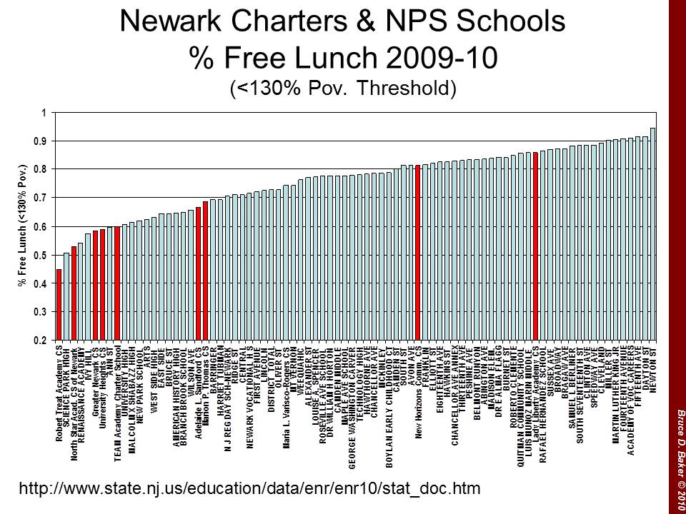
As an example of the belligerent denial side of the conversation, the following statements come from a recent slide show from officials at the New Jersey Department of Education, regarding their comparisons of charter school performance, and in response to my frequently expressed concern that New Jersey Charter schools tend to serve larger shares of the “less poor among the poor” children. Here’s the graph for Newark schools.

That is, New Jersey Charter Schools which operate generally in high poverty settings, tend to serve somewhat comparable shares of children qualifying for free AND REDUCED price lunch, when compared to neighborhood schools, but serve far fewer children who qualify for FREE LUNCH ONLY.

NJDOE official’s recent response to this claim is as follows:

  • The state aid formula does not distinguish between “free” and “reduced”-price lunch count.
  • New Jersey combines free and reduced for federal AYP determination purposes
  • All students in both these categories are generally used by researchers throughout the country as a good enough proxy for “economically disadvantaged”
  • And most important, research shows that concentration of poverty in schools creates unique challenges, and most charters in NJ cross a threshold of concentrated poverty that makes these distinctions meaningless

Whether New Jersey uses this crude indicator in other areas of policy does not make it a good measure. In some cases, it may be the only available measure. But that also doesn’t make it a good one. And whether researchers use the measure when it’s one of the only measures available also does not make it a good measure.

Any thoughtful and reasonably informed researcher should readily recognize and acknowledge the substantial shortcomings of such crude income classification, and the potential detrimental effects of using such a measure within an analysis or statistical model.

The final bullet point is just silly. The final statement claims that since charters and non-charters in New Jersey cities are all “poor enough” there’s really no difference. This claim relies on selecting a threshold for identifying poverty that is simply too high to capture the true differences in poorness – real, legitimate and important differences – with significant consequences for student outcomes.

To put it quite simply, the distinction between various levels of poverty and measures for capturing those distinctions are not trivial and not meaningless. Rather, they are quite meaningful and important, especially in the current policy context.

Here’s a run-down on why these differences are not trivial:

What are the “official” differences in those who qualify for free versus reduced priced lunch?

Figure 1 provides the income definitions for families to qualify for free versus reduced price lunch. This information is relatively self-explanatory. Families qualifying for reduced price lunch have income at 185% of the poverty level. Families qualifying for free lunch fall below income of 130% of the poverty level.

Figure 1: Income cut-offs for families qualifying for the National School Lunch Program


Unfortunately, a secondary problem with these cut-offs for discussion another day, is that these thresholds do not vary appropriately across regions and between rural and urban areas. The same income might go further in providing a reasonable lifestyle in Texas than in the New York metropolitan area. Trudi Renwick has done some preliminary work providing state level adjusted poverty estimates to correct for this problem: http://www.census.gov/hhes/povmeas/methodology/supplemental/research.html

If these distinctions are trivial and meaningless, why are there such large differences in NAEP performance?

Now the fact that the income levels which qualify a family for free or reduced lunch are different does not necessarily mean that these differences are important to education policy analysis. In fact, one thing that we do know is that because the income thresholds fit differently in different settings and different regions, different measures work better in different settings (lower-income thresholds in southern and southwestern states, for example).

But why do we consider these measures in education policy research to begin with? The main reason we consider poverty measures in education policy research is because it is generally well understood that children’s economic well-being is strongly associated with their educational outcomes, and with our ability to improve those outcomes and the costs of improving those outcomes. In most thorough, social science analysis of these relationships, extensive measures of family educational background, actual income (rather than simple categories), numbers of books in the household, and other measures are used. But such measures aren’t always readily available. It is more common to find, in a state data system, a simple indicator of whether a child qualifies for free or reduced price lunch. That doesn’t make it good though. It’s just there.

But if, for example, we could look at achievement outcomes of kids who qualified for free lunch only, and for kids who qualified for reduced price lunch, and if we saw significant differences in their achievement, then it would be important to consider both… or consider specifically the indicator more strongly associated with lower student outcomes. The goal is to identify the measure, or version of the measure that is sensitive to the variations in family backgrounds in the setting under investigation and is associated with outcomes.

Figure 2 piggy backs on Gordon MacInnis examples comparing NAEP achievement gaps between non-low income students (anything but a homogeneous group) and students who qualify for free or for reduced price lunch. In figure 2 I graph NAEP 8th grade math outcomes for 2003 to 2009. What we see is that the average outcomes for students who qualify for free lunch are much lower than those who qualify for reduced price lunch. In fact, the gap between free and reduced is nearly as big in some cases as the gap between reduced and not qualified!

Figure 2: Differences in 8th grade Math Achievement by Income Status 2003-2009


Can every school in Cleveland be equally poor?

Another issue is that when we use the free or reduced price lunch indicator, and apply that indicator as a blunt, dummy variable to kids in high poverty settings – like poor urban core areas – we are likely to find that 100% of children qualify. Just because 100% of children receive the “qualified for free or reduced lunch” label does not by any stretch of the imagination mean that they are all on equal “economic disadvantage” footing. That they are all “poor enough” to be equally disadvantaged.

Let’s take a look at Cleveland Municipal School District and the distribution of schools by their rate of free and reduced lunch. There it is in Figure 3 – Nearly every school in Cleveland is 100% free or reduced price lunch. So, I guess they are all about the same. All equally poor. No need to consider any differential treatment, funding, policies or programs? Right?

Figure 3: Distribution of Cleveland Municipal School District % Free or Reduced Price Lunch Rates


Well, not really! That would be a truly stupid assertion, and I expect anyone working within Cleveland Municipal School District can readily point to those neighborhoods and schools that serve far more substantively economically disadvantaged students than others. The data I have for this analysis are not quite that fine-grained – to go to the neighborhood level – but in Figure 4 I can break the city into 4 areas, and show the average poverty index level for families with public school enrolled children between the ages of 6 and 16.  The poverty index is income relative to the poverty level where 100 is 100% level, and 185 would be roughly the level that qualifies for reduced price lunch, for example. Figure 4 shows the average differences across 4 areas of the city – classified in the American Community Survey as Public Use Microdata Areas, or PUMAs.

Figure 4: Average “Poverty Index” by Public Use Microdata Area within Cleveland


Figure 5 shows the distributions for each area, and they are different. Clearly, not all Cleveland neighborhoods are comparably economically disadvantaged, even in 100% of the schools are 100% free or reduced price lunch!

Figure 5: Poverty Index distribution by Public Use Microdata Area within Cleveland


Why is this so important in the current policy context?

So then, who really cares? Why does any of this matter? And why now? Well, it has always mattered, and responsible researchers have typically sought more fine-grained indicators of economic status, where available. But we are now in an era where policy researchers are engaged in fast-paced, fast-tracked use of available state administrative data in order to immediately inform policy decision-making. This is a dangerous data environment, and crude poverty measurement has potentially dire consequences.  Here are a few reasons why:

  • Many if not most models rating teacher or school effectiveness rely on a single dummy variable indicating that a child does or does not come from a family that falls below the 185% income level for poverty.

I’ve actually been shocked by this. Reviewing numerous pretty good and even very high quality studies estimating teacher effects on student outcomes, I’ve found an incredible degree of laziness in the specification of student characteristics – specifically student poverty.

Figure 6 shows the poverty components of the New York City Teacher Effectiveness Model. Yep – there it is, a simple dichotomous indicator of qualifying for free or reduced price lunch. No way at all to differentiate between teachers of marginally poor, and very poor children.

Figure 6: Measures included in New York City Teacher Effectiveness Model


In a value-added model of teacher effects, if we use only a crude Yes or No indicator for whether a child is in a family that falls below the 185% income level for poverty, that child who is marginally below that income level is considered no different from the child who is well below that income level – homeless, destitute, multi-generational poverty. Further, in many large urban centers, nearly all children fall below the 185% income level (imagine doing this in Cleveland?). But they are not all the same! The variations in economic circumstances faced by children across schools and classrooms is huge. But the crude measurement ignores that variation entirely. And the lack of sensitivity of these measures to real differences in economic disadvantage likely adversely affects teachers of much poorer children – a model bias that goes unchecked for lack of a more precise indicator to check for the bias!

  • This problem is multiplied by the fact that when these models evaluate the influence of peers on individual student performance, the peer group is also characterized in terms of whether the peers fall below this single income threshold.

In a teacher effectiveness model, the poverty measurement problem operates at two levels. First, at the individual student level mentioned above, where one cannot delineate between the student from a low-income family and the student from a very low income family. Second, “better” value-added teacher effectiveness models also attempt to account for the characteristics of the classroom peer group. But, we are stuck with the same crude measure, which prohibits us from evaluating the effect on any one student’s achievement gains of being in a class of marginally low-income peers versus being in a class of very low-income peers.

Okay, you say, the “best” value added models – especially those used in high stakes teacher evaluation would not be so foolish as to use such a crude indicator. BUT THEY DO, JUST LIKE THE NYC MODEL ABOVE. AND THEY DO SO QUITE CALLOUSLY AND IGNORANTLY.  Why? Because it’s the data they have. The LA Times model uses a single dummy variable for poverty, and does not even include a classroom peer effect aggregation of that variable.

  • Many comparisons of charter and traditional public schools that seek to evaluate whether charters are serving representative populations only compare the total of children qualifying for free or reduced price lunch, or similarly apply simple indicators of free or reduced price lunch status to individual students.

Yet, charter schools seem invariably to serve much more similar rates of children qualifying for free or reduced price lunch when compared to nearby traditional public schools, but serve far fewer children in the lower-income group which qualify for free lunch. Charters seem to be serving the less poor among the poor, in poor neighborhoods, in Newark, NJ or in New York City. Given that the performance differences among these subgroups tend to be quite large, using only the broader classification masks these substantial differences.

In conclusion

Yes, in some cases, we continue to be stuck with these less than precise indicators of child poverty. In some cases, it’s all we’ve got in the data system. But it is our responsibility to seek out better measures where we can, and use the better measures when we have them. We should, whenever possible:

  1. Use the measure that picks up the variation across children and educational settings
  2. Use the measure that serves as the strongest predictor of educational outcomes – the strongest indicator of potential educational disadvantage.
  3. And most importantly, when you don’t have a better measure, and when the stakes are particularly high, and when the crude measure might significantly influence (bias) the results, JUST DON’T DO IT!

Don’t attempt to draw major conclusions about whether charter schools (or any schools or programs for that matter) can do “as well” with low-income children when the indicator for “low income” encompasses equally every child (or nearly every child) in the city in both traditional public and charter schools.

Don’t attempt to label a teacher as effective or ineffective at teaching low-income kids, relative to his or her peers, when your measure of low-income is telling you that nearly all kids in all classrooms are equally low-income, when they clearly are not.

And most importantly, don’t make ridiculous excuses for using inadequate measures!

Student Test Score Based Measures of Teacher Effectiveness Won’t Improve NJ Schools

Op-Ed from: http://www.northjersey.com

The recent Teacher Effectiveness Task Force report recommended basing teacher evaluation significantly on student test scores. A few weeks earlier, Education Commissioner Cerf recommended that teacher tenure and dismissal, as well as compensation decisions be based largely on student assessment data.

Implicit in these recommendations is that the state and local districts would design a system for linking student assessment data to teachers for purposes of estimating teacher effectiveness. The goal of statistical “teacher effectiveness” measurement systems, including the most common approach called value-added modeling (VAM), is to estimate the extent to which a specific teacher contributes to the learning gains of a group (or groups) of students assigned to that teacher in a given year.

Unfortunately, while this all sounds good, it just doesn’t work, at least not well enough to even begin considering using it for making high stakes decisions about teacher tenure, dismissal or compensation. Here’s a short list (my full list is much longer) of reasons why:

  1. It is not possible to equate the difficulty of moving a group of children 5 points (or rank and percentile positions) at one end of a test scale to moving children 5 points at the other end. Yet that is precisely what the proposed evaluations endeavor to accomplish. In such a system, the only fair way to compare one teacher to another would be to ensure that each has a randomly assigned group of children whose initial achievement is spread similarly across the testing scale. Real schools and districts don’t work that way.  It is also not possible to compare a 5 point gain in reading to a 5 point gain in math. These limitations undermine the entire proposed system.
  2. Even with the best models and data, teacher ratings are highly inconsistent from year to year, and have very high rates of misclassification. According to one recent major study, there is a 35% chance of identifying an average teacher as poor, given one year of data, and 25% chance given three years. Getting a good rating is a statistical crap shoot.
  3. If we rate the same teacher with the same students, but with two different tests in the same subject, we get very different results. Cal. Berkeley Economist Jesse Rothstein, re-evaluating the findings of the much touted Gates Foundation Measuring Effective Teaching (MET) study noted that more than 40% of teachers who placed in the bottom quarter on one test (state test) were in the top half when using the other test (alternative). That is, teacher ratings based on the state assessment were only slightly better than a coin toss for identifying which teachers did well using the alternative assessment.
  4. No-matter how hard statisticians try, and no matter how good the data and statistical model, it is very difficult to separate a teacher’s effect on student learning gains from other classroom effects, like peer effect (race and poverty of peer group).  New Jersey schools are highly segregated, hampering our ability to make valid comparisons across teachers who work in vastly different settings. Statistical models attempt to adjust away these differences, but usually come up short.
  5. Kids learn over the summer too and higher income kids learn more than their lower income peers over the summer. As a result, annual testing data aren’t very useful for measuring teacher effectiveness. Annual (rather than fall-spring) testing data significantly disadvantage teachers serving children whose summer learning lags. Setting aside all of the un-resolvable problems above, this one can be fixed with fall-spring assessments. But it cannot be resolved in any fast-tracked plan involving current New Jersey assessments, which are annual. The task force report irresponsibly ignores this HUGE AND OBVIOUS concern, recommending fast-tracked use of current assessment data.
  6. As noted by the task force, only those teachers responsible for reading and math in grades 3 to 8 could readily be assigned ratings (less than 20% of teachers). Testing everything else is a foolish and expensive endeavor. This means school districts will need separate contracts for separate classes of teachers and will have limited ability to move teachers from one contract type to another (from second to fourth grade). Further, pundits have been arguing that a) we should be using effectiveness measures instead of experience to implement layoffs due to budget cuts, and b) we shouldn’t be laying off core, classroom teachers in grades 3 to 8. But those are the only teachers for whom “effectiveness” measures would be available?
  7. Basing teacher evaluations, tenure decisions and dismissal decisions on scores that may be influenced by which students a teacher serves provides a substantial disincentive for teachers to serve kids with the greatest needs, disruptive kids, or kids with disruptive family lives. Many of these factors are not, and can not be captured by variables in the best models. Some have argued that including value-added metrics in teacher evaluation reduces the ability of school administrators to arbitrarily dismiss a teacher. Rather, use of these metrics provides new opportunities to sabotage a teacher’s career through creative student assignment practices.

In short, we may be able to estimate a statistical model that suggests that teacher effects vary widely across the education system – that teachers matter. But we would be hard pressed to use that model to identify with any degree of certainty which individual teachers are good teachers and which are bad.

Contrary to education reform wisdom, adopting such problematic measures will not make the teaching profession a more desirable career option for America’s best and brightest college graduates. In fact, it will likely make things much worse. Establishing a system where achieving tenure or getting a raise becomes a roll of the dice and where a teacher’s career can be ended by a roll of the dice is no way to improve the teacher work force.

Contrary to education reform wisdom, using these metrics as a basis for dismissing teachers will NOT reduce the legal hassles associated with removal of tenured teachers.  As the first rounds of teachers are dismissed by random error of statistical models alone, by manipulation of student assignments, or when larger shares of minority teachers are dismissed largely as a function of the students they serve, there will likely be a new flood of lawsuits like none ever previously experienced. Employment lawyers, sharpen your pencils and round up your statistics experts.

Authors of the task force report might argue that they are putting only 45% of the weight of evaluations on these measures. The rest will include a mix of other objective and subjective measures. The reality of an evaluation that includes a single large, or even significant weight, placed on a single quantified factor is that that specific factor necessarily becomes the tipping point, or trigger mechanism. It may be 45% of the evaluation weight, but it becomes 100% of the decision, because it’s a fixed, clearly defined (though poorly estimated) metric.

Self-proclaimed “reformers” make the argument that the present system of teacher evaluation is so bad as to be non-existent. Reformers argue that the current system has 100% error rate (assuming current evaluations label all teachers as good, when all are actually bad)!

From the “reformer” viewpoint, something is always better than nothing.

Value added is something.

We must do something.

Therefore, we must do value-added.

Reformers also point to studies showing that teacher’s value-added scores are the best predictor (albeit a weak and error prone predictor) of teacher’s future value added scores – a self-fulfilling prophecy. These arguments are incredibly flimsy.

In response, I often explain that if we lived in a society that walked everywhere, and a new automotive invention came along, but had the tendency to burst into a ball of flames on every third start, I think I’d walk. Now is a time to walk! Some innovations just aren’t ready for broad public adoption – and some may never be. Some, like this one, may not be a very good idea to begin with. That said, improving teacher evaluation is not a simple either/or and now may be a good time to step back from this false dichotomy and discuss more productive alternatives.

New Jersey Superintendent Salaries in Context

These two figures provide some updated context to an earlier post  on Arbitrary Pay Limits for NJ Administrators. The bombastic rhetoric on this topic refuses to die down. So, here are a few more figures to put NJ public school district administrator salaries into context. Note that these two figures compare THE TOP 20 SUPERINTENDENT SALARIES to salaries of a) the majority of private independent school headmasters statewide, and b) the average of a large number of NJ Hospital administrators (non-physician chief executives).  Just a little more fodder for the conversation.


Figure 1

Mean and Median Compensation by Group

Figure 2

Top 20 Public School  Superintendents (2009-10) Compared with Private School Headmasters (2008)


Enough said.

Arbitrary pay limits for New Jersey public school administrators?

RE-POSTING MY JULY 16 ENTRY, WHICH HAS RENEWED RELEVANCE:

Public school administrators are an easy target. Almost any public employee making a “whopping” six figure salary these days is an easy target. Indeed most of the general public does not earn as much as a school superintendent. But, as I’ve pointed out in the past, it’s not necessarily appropriate to compare the general public average wage with that of school teachers or school administrators. It is obviously more appropriate to compare wages among similarly educated individuals and to compare them with others in the same labor market. This is much easier done with teacher salaries, because there are enough of them to calculate averages using census data which samples only a small portion of the population. It is more difficult with administrators 1) because there aren’t as many of them, so census data are less useful, and 2) because administrators may migrate further to take leadership positions – for example, from New York State to New Jersey, or even across the country for a large district superintendency.

I read today on NJ.COM that the Governor has proposed fixing New Jersey school district administrator pay according to the following scale, which adjust maximum salaries by school district size.

Proposed pay limits for school administrators
School enrollment / maximum pay

up to 250 / $120,000
251 – 750 / $135,000
751 – 1,500 / $150,000
1,501 – 3,000 / $165,000
3,001 – 10,000 / $175,000
More than 10,000 / to be determined by the Department of Education

As far as I can tell, these maximum salaries are completely arbitrary, but for pegging the highest to the Governor’s salary. Note that the Governor’s salary like the President’s salary is not based on any competitive labor market for Governors (e.g. the wage required to recruit/retain a high quality governor) or based on any negotiation. Governors’ salaries are pretty much arbitrary and the price in lost wages that one pays for being governor for a brief period in his/her career. So pegging salaries to the Governor’s salary on the basis that it somehow represents the competitive wage for the public executive with greatest level of responsibility is just absurd.

So, let’s take a look at New Jersey administrative salaries from a few different perspectives. Most of the analysis I present below come from previous posts, reports and analysis. Not much time for new content here today.

First – are New Jersey administrative salaries a major cost driver of school district budgets? Are they eating away at the edges of other spending categories? Here’s a chart from some analysis I did on New Jersey while still working at the University of Kansas (getting ready for my move). This chart shows us two things. First, between 1998 and 2005 (and similar in more recent years – not in chart), administrative expenses as a share of expenses have not climbed. Further, administrative expenses as a share of total expenses in the former Abbott districts were relatively low compared to other groups.

Second – relative to growth in regional non-teacher (non-administrator) wages, based on average wage growth in the National Center for Education Statistics Comparable Wage Index,  have district and school level administrator wages in New Jersey grown out of control?

This first graph shows adjusted wages for district level administrators. Hmmm… pretty flat. Some lag, followed by some growth for superintendents.

Okay then, how about those elite superintendents at the top of the New Jersey food chain? From 1997 to 2008, their wages grew to an average that exceeded $200,000. But again, adjusted for average regional wage growth, those wages were relatively flat over time.

Then what about New Jersey building level administrators? Well, actually, their wages seem to have declined slightly over time, but are also relatively flat.

Third – These figures don’t speak to the competitiveness of district or school administrator wages on the regional labor market, except to say that their wages have not become more competitive over time. How might we compare the competitiveness? One interesting comparison is to compare the wages of private independent school headmasters in New Jersey to superintendents in the districts that are home to those private independent schools. This chart is from my 2009 study on private school costs which I have discussed on many occasions in this blog. This graph shows that in most cases, the private independent school headmasters’ salaries far exceed those of local public school superintendents. Note that most of these private schools have between 500 and 1200 students, which on the pay scale above would put them at a maximum salary of $135,000 to $150,000. It seems that the private school marketplace has identified a somewhat higher wage than this for recruiting top leadership talent. And these salaries are now quite dated.

Migration between private independent school leadership positions and public school superintendency is not all that common, but not unheard of. It is more likely that New Jersey districts would be in a position to compete for top regional school leaders with nearby New York State school districts. Here’s an article from the New York Times from 2006 on administrator salaries in New York, which already far exceeded the proposed pay scale above: http://www.nytimes.com/2006/04/23/nyregion/nyregionspecial2/23weadmi.html?fta=y&pagewanted=all

And here’s a list of New York State superintendent salaries over $250,000 and between $225,000 and $250,000, from: http://www.emsc.nysed.gov/mgtserv/admincom. Most are in southern New York State.

And a quote from an earlier post of mine:

In Illinois, primarily in the Chicago metro area, 10 administrators exceeded the 300,000 mark – most working in affluent suburban districts. http://www.championnews.net/salaries.php. In Texas, the top 4 superintendents in 2007-08 were compensated over 300,000 in base salary.

So, let’s review:

  • New Jersey administrative salaries do not seem to be the major driver of school district budgets over time. They have not crept out of control and consumed larger shares of school district budgets.
  • New Jersey administrative salaries have not grown with respect to regional wage growth over time. Adjusted for regional wage growth, district and school level administrative salaries have been relatively flat.
  • New Jersey public school district superintendents tend to be paid much lower salaries than those of private independent school headmasters for private independent schools geographically located in their district. Further the private independent schools tend to be much smaller in enrollment than a typical public school district.
  • Relatively large numbers of nearby superintendents in New York State earn salaries in excess of the highest New Jersey superintendent salaries, and far in excess of the maximum on the proposed salary scales above.

These findings raise significant concerns about the proposed salary schedule above specifically and about the broader concept of “fixing” or capping school district administrative salaries. Districts must be able to adapt to the competitive labor market context.

The concerns raised herein don’t address the additional issue that the competitive wage for a school administrator might also vary widely within the state of New Jersey, from the New York metropolitan area to the Philadelphia or Atlantic City areas.

Declaring a wage to be “appropriate” does not make it so. Mandating non-competitive wages for school administrators may lead to significant recruitment and/or retention problems for New Jersey school districts. More likely, such mandates will lead to a plethora of new games to skirt the mandated caps.

Per Pupil Spending “Factiness:” Newark in Context!

Anyone who’s been reading popular media or who watched any of NBC’s Education Nation now knows as a simple fact that Newark Public Schools spend $22,000 per pupil and that’s simply a disgracefully high amount! Just check out this Google search for “Newark” & “22,000” & “per-pupil.”

Along with this number come claims of the sort – Newark is one of if not the most expensive public school system in the nation! It’s simply fact – truthiness – proofiness – or perhaps even factiness. Recent Newark claims are about as facty as these two other great claims from school finance lore:

  1. that Kansas City Missouri spent more than any other district in the nation for 10 years running (but of course still failed miserably); and
  2. that the average private per pupil cost is about $3,500 per year.

Coauthor Preston C. Green and I tear down the first of these “urban legends” of school finance in this article.  I tear down the myth of the $3,500 private school in this report from 2009.

This post is about putting numbers into context. In the urban legends article above, Preston Green and I simply fact check national data on per pupil spending and find that Kansas City came close in one year in the early 1990s, but fell precipitously after that, as desegregation funding tapered off. The mythical private school number is one of those numbers that relies on a single report of a very incomplete sample of “tuition” not spending data (where tuition does not cover full costs or spending), from around 1999 – yet references to that same number still persist. Time is part of the context of money!

So, where do these Newark spending figures come from and why is important to contextualize these numbers? First of all, the $22,000 number is a rounded figure based on the total current spending per pupil reported in the 2006-07 U.S. Census Fiscal Survey – elementary and secondary finances. The updated 2007-08 figure rises to $23,500. Wow… holy crap… that’s a lot right?

So, we’re kind of starting with a “fact” (a number that can be linked to some reasonable source). That said, even this fact varies by source. Note that in a per pupil spending figure we’ve got a numerator – spending and a denominator – pupils. Both matter to how this number is calculated. The New Jersey Department of Education reports Newark Public Schools Spending per Pupil around $16,000 to $17,000 during those same years. NJDOE also reports NPS enrollment well over 45,000. The implicit enrollment of NPS in the Census Fiscal Survey figures (backed out from total current spending and per pupil estimate) is around 43,000. Census reports NPS enrollment at about 40,000 (but uses the 43,000 figure to generate the per pupil figure).  So, this unexplained discrepancy is responsible for some of the difference. But this is all rather trivial quibbling to some extent. A much simpler, transparent issue is the issue of context.

Let’s walk through some examples. Here is how the media has been pitching Newark Public Schools spending:


One big bar on a graph, sitting out in space. The general public doesn’t have a particularly good idea of what that $23,500 means. So, they are simply told – Damn… that’ s a lot- maybe even the most in the country! Either way, it’s ton of money… which is unquestionably being wasted.

The other comparison we’ve been seeing and hearing in New Jersey is that Newark spends twice what Texas spends per pupil – and they get great outcomes and Newark… well… stinks… because they’re wasting it all. Here’s my stylized graph of that example (which you can find here: http://www.nje3.org/?p=4588)


Wow, that’s some really brilliant stuff there. For fun, I’ve used one of those fine visual tricks of cutting off the first $10,000 to emphasize the fact that Newark spends a ton, and Texas not much at all… Texas great… Newark stinky – expensive and stinky.

Setting aside this foolishness, how does Newark actually compare – in various contexts?

Is Newark the highest spending district in the nation? one of them?

Is Newark the highest spending district in the metropolitan area? (NYC Core based statistical area)

Is Newark even the highest spending in New Jersey?

Here, I use the Census Fiscal Survey data from 2007-08 and walk through for NPS, the same comparisons I did in the previous state ranking post.

This table shows the alternative comparisons. First out of 13,500 or so districts nationally with sufficient data for the comparison, NPS ranked 220 without any cost or need adjustment. Not #1, but 220. That’s still pretty high – 220 out of 13,500 puts NPS at about the top 2%. However, simply adjust for regional differences in competitive wages, and NPS drops to 732, about the top 5%. Next, adjust for the additional needs of children in poverty (using a conservative adjustment as I did in the previous post) and Newark slides back to rank of 1158 – still in the top 10%, but not top overall by any stretch.

Now, as I noted in my previous post, cross state – national comparisons are tough because it’s particularly hard to equate the costs of hiring teachers and other school staff across regions and it’s also hard to equate poverty rates from one location to another.

So then, let’s focus on the NY metro area. For starters, NPS comes in 56th with no adjustments, and 53rd when we adjust for wage variation (because the NCES wage index does carve the NY metro area into a handful of labor markets). Either way, NPS is not at the top of even the NY labor market in spending. Among the 546 or so districts in the NY metro, NPS hovers around the top 10% – on the edge of it. If we take the additional step of adjusting for children in poverty, NPS drops to a rank of 144 out of 546 – below the 25%ile.

NPS ranks somewhat higher within the state of NJ than in the broader metro area, mainly because the highest spending districts in the NY metro area tend to be in New York State – Westchester and Rockland Counties and on Long Island. Yeah… NY districts spend much more than New Jersey districts in the NY metro area, and as I’ve shown previously, have much higher salaries as well.

So there you have it. Newark per pupil spending in context. Newark Public Schools are a relatively high spending district, which provides the district with more opportunities to assist its high need population than other urban, high poverty, high minority concentration districts around the country. But Newark is not some massive outlier – most expensive in the nation district.

Note that these analyses do not question the Census per pupil spending figure. I simply accept that number – because I’ve accepted the Census data for all others in the sample. It would be inappropriate for me to “audit” NPS spending without looking for similar issues in other cities and states. The number may be screwed up, which is why I tend to stay away from the Census data for individual district analysis, without reconciling across other sources. But, it is what it is, and these data are generally pretty good (but for some specific states).

Finally, while I have shown here that NPS is still a relatively high spender, even after adjustments, I’ve not tackled the outcome question. What do we get for this funding? I would argue that pundits have grossly misrepresented this side of the equation as well. Pundits argue that NPS has a low graduation rate and that graduation rate is even inflated because more kids graduate than actually pass the high school assessments (using the alternative assessment to get around the supposed gate). Those same pundits are quick to point out the very high graduation rates of the few secondary charter schools in NJ – as a good thing. I show  in this much older post that these same charters which graduate 97% of their students actually had lower high school math assessment scores than poor urban districts (which had lower grad rates). Pot? Kettle? ???? Perhaps more on the outcome issue at a later point in time.

In the meantime, for a thorough discussion of the relationship between school funding reforms and student outcomes, see this article (which includes some discussion of New Jersey):

Baker, B.D., Welner, K. School Finance and Courts: Does Reform Matter, and How Can We Tell? Teachers College Record

http://www.tcrecord.org/content.asp?contentid=16106

DoReformsMatter.Baker.Welner

UPDATE: Here’s one additional really important comparison for NPS. The following graph compares NPS to the 216 K-12 NJ districts for whom sufficient data were available for this analysis.  This graph starts by comparing NPS to the other districts in the state and in Essex County using each of the above methods for adjusting spending figures – ECWI and then the ECWI and a poverty weight. But, clearly even the latter of these two approaches doesn’t catch all of the cost differences faced by Newark Public Schools. The final comparison in this graph includes a “comprehensive” cost adjustment based on a statistical model of New Jersey School districts – a “cost function” model, an approach which has been used extensively in economic research on education costs (Google Scholar Search on Cost Function Research of William Duncombe and John Yinger).

Here we see that if we account for the various costs faced by NPS, NPS actually has less per pupil than either the state average or other districts in Essex County.

Here is a link to the cost models. Note: for this analysis I actually adopted a very conservative assumption to generate the cost index for NPS. The statewide average cost index is 1.0 and NPS receives a cost index around 1.7 indicating 70% higher than state average costs, largely as a function of student population served, but also being in a higher wage labor market. The conservative assumption was that any variation in spending picked up by the model that was associated only with being an Abbott district (and not accounted for by differences in outcomes) was treated as “inefficiency,” and therefore not counted toward Abbott district cost index values (a significant portion of  the Abbott bump in funding was effectively removed as if “waste” even though this is a suspect assumption).

A few thoughts on the unlikely alliance…

Today was the day of the big Oprah-Christie-Booker-Zuckerberg event, which I guess we can all watch around 4pm if we really want to. I’ve been trying to dig up any information I can, without wasting too much time on this, because there are certainly more important things to get to. That said, I do have a few brief comments in response to specific points and issues raised.

In an effort to get a good soundbite, Mayor Booker commented on Oprah that “You can not have a superior democracy with an inferior system of education” a comment that has now been re-tweeted over a hundred times. Here’s the thing. This whole situation is about a philanthropic contribution from a single wealthy individual, which has been described in the media as a contribution that carries with it a stipulation that the Governor grant unprecedented power to the Mayor to control Newark Public Schools. Anyone else seeing the contradiction here? My basic summary points are:

  • We should be concerned and skeptical any time a single individual uses their wealth to buy substantive changes to public policy.
  • Setting aside Booker’s loose use of the term democracy, I have to ask: Is it really democratic to have a single individual pay to alter the very structure of state and local government?

Would that be “democracy hypocrisy?”

Next on my list – the nature of the preferred reforms. We have little specific information on the types of school reforms that Mark Zuckerberg would like to see implemented in Newark or whether he has any specific interest in promoting certain education reforms. Zuckerberg provides some insights in this interview: http://techcrunch.com/2010/09/24/techcrunch-interview-with-mark-zuckerberg-on-100-million-education-donation/. Perhaps the most striking part of the interview is here:

So that – that way Cory is really aligned towards one – like this is his top priority. He just got re-elected by a pretty big margin and it’s his biggest priority. Then, so now – so that’s kind of what we’re doing, I mean, the idea is fund him and basically support him in doing a really comprehensive program to get all these things in place that they need to get done. [DELETE: So we should close down schools that are failing, get a lot of good charter schools and figure out new contracts for teachers so that better teachers can get paid more money, that more for performance as opposed to just based on how long you’ve been there. Have a lot of programs that are after schools that to keep kids healthy and safe and I mean, Newark, isn’t the safest city. So that’s the basic thing. And I mean for…]

I was particularly intrigued by that part in brackets, after DELETE – where Zuckerberg or the interviewer interpreting Zuckerberg seems to be suggesting a strong preference for massive charter expansion, closing public schools, and pushing for teacher contracts tied to student achievement data. The implication across media sources yesterday and today has been that the preference for these specific types of reforms across this seemingly diverse set of individuals – Zuckerberg, Oprah, Christie and Booker – validates the public interest in moving quickly toward accomplishing these public policy objectives. Setting aside the issue that fast-tracking these reforms under these circumstances is built on buying – with a big $$ gift – a change in state and local governance, I offer the following comments regarding this new unlikely alliance and these specific reform strategies:

  • It’s interesting to see such an eclectic cast of characters unify around a set of unproven and ill-conceived school reform strategies to hoist upon the children of Newark.
  • The fact is that major research organizations including the National Research Council, American Education Research Association, National Council on Measurement in Education, American Psychological Association and others have advised strongly against misusing student testing data to evaluate teacher effectiveness and there are many technical and statistical as well as practical reasons for their conclusions. With all due respect, a consensus vote in favor of these flawed policies from our Governor, the Newark Mayor, Oprah and Mark Zuckerberg doesn’t change that.

More Information:https://schoolfinance101.wordpress.com/category/race-to-the-top/value-added-teacher-evaluation/

  • The reality is that two of Newark’s most acclaimed charter schools – Robert Treat and North Star both serve far fewer of the lowest income children than nearby Newark Public Schools (43% to 47% compared to over 70% NPS) and very few children with disabilities (3.8 to 7.8% compared to 18.1% NPS) or limited English skills. It may be ‘working’ for them, but that’s not scalable reform. Eventually someone has to serve all of those other kids.

Data link: https://sites.google.com/site/schoolfinancepolicy/Home/NJCharters.xls?attredirects=0&d=1

Update from the Star Ledger: http://www.nj.com/news/index.ssf/2010/09/facebook_ceo_mark_zuckerberg_s.html

Apparently the “deleted” section has been removed from the interview, but I’m not the only one who saw it!

A few pictures related to my comment on charter school demographics:


And here are the 2009 assessment results for NPS and Newark Charter schools. As you can see, the very low poverty charters do very well. But they just aren’t comparable to NPS schools. Other higher poverty charters, which are still actually much lower poverty (and low or no special ed) than NPS schools, are actually distributed among the NPS schools, regardless of test subject or grade.


Private Schools & Public Education Policy in New Jersey

The commission on private schools established by former Governor Corzine has just released its report:

http://nj.gov/governor/news/reports/pdf/20100720_np_schools.pdf

This report is more fun than many recent reports in New Jersey because it actually has some data and citations. Nonetheless, I have at least a few concerns regarding the presentation of the data and implications drawn from it. I was particularly intrigued by the graph on page 7 – which I replicate below:


This graph shows an apparent catastrophic collapse of the private schooling sector in New Jersey… or does it? Look at that the Y (vertical) axis. The range is from 160,000 to 192,000.  Yeah… that makes for a really steep apparent drop off. Note also that this data is from a state department of education source and is not reconciled against any other source. So, a stretched Y axis to make it look really, really, really dramatic. No second look – second opinion. And, only a single aggregate count of private school kids to show a major across-the-board collapse.

Here’s a more detailed exploration, using two data sources: 1) The National Center for Education Statistics Private School Universe Survey and 2) the U.S. Census Bureau American Community Survey, via the Integrated Public Use Microdata System.

First, here are the number of private schools by type in New Jersey over time:

This graph shows that the only significant decline in numbers of schools occurs for Catholic Parochial schools. Other private school types hold their ground in total numbers of schools.

Next, here are the enrollment and in the second graph, enrollment adjusted for missing data.

As with numbers of schools, the most substantive decline is for Catholic Parochial schools. There is a smaller drop for Catholic Diocesan schools. Other schools stay relatively constant, with some reclassification occurring between Other Religious – Not Affiliated and Other Affiliated. Note that the corrected, weighted version in the second graph above shows a somewhat smaller decline in Catholic Parochial enrollment than the un-adjusted version.

Next, I address private school enrollment by grade level and as a share of the total population of students in public and private school. A drop in private school enrollment would only be significant if it occurred in a context of stable or growing overall student population.

Here’s the total school population by grade level:

And the private school population by grade level:

What we see in this second graph is that the Grades 1 to 4 population appears to be declining most.

Here’s the private school enrollment by grade level as a percent of total enrollment. Kindergarten private school enrollment as a share of kindergarten students has declined. But, other grade level private school populations have declined only very slightly as a share of all children statewide in the same grade level.

This much more refined picture, across two additional data sets casts some doubt on the significance of the first graph above. Is there really a massive collapse of private schooling in New Jersey? It doesn’t look that way to me.

Explanations and Policy Implications for Catholic Schooling in New Jersey

Indeed, there may be some cause for concern for Catholic Parochial schools which appear to be closing and losing enrollment. But this phenomenon is not unique to New Jersey. Others have attempted to shed light on why Catholic schools are struggling in many urban centers.  Catholic schools have tried to remain accessible to the middle class by holding tuition down. At the same time, costs have risen. Decades ago, Catholic schools relied heavily on unpaid, church affiliated staff. Now, nearly all staff are salaried. My own recent analysis suggest that the cost of operating many Catholic schools are quite similar to those for traditional public school districts. The gap between tuition and cost has grown substantially over time for these schools. That’s not sustainable.

Two recent reports provide additional insights regarding public policy forces that may be compromising the stability of Catholic schooling in particular:

1) This Pew Trust report on parental choices in Philadelphia suggests that the expansion of Charter schools has potentially cut into the non-Catholic enrollment in urban Catholic schools.

http://www.pewtrusts.org/uploadedFiles/wwwpewtrustsorg/Reports/Philadelphia_Research_Initiative/PRI_education_report.pdf

Notably, New Jersey has not expanded charter schools as quickly as other states. But, it remains possible that existing New Jersey charter schools have drawn some students away from urban Catholic schools. As such, if the state is truly concerned with the sustainability of Catholic schools, the state should evaluate the effect of charter expansion on Catholic school enrollment (and on teacher recruitment/retention).

2) This Thomas B. Fordham Institute report suggests that vouchers in other locations such as Milwaukee have been a double-edged sword for Catholic schools. Vouchers do not provide full cost subsidy and restrict charging tuition above the subsidy to cover the gap. As such, schools are required to take a loss for each voucher student accepted. Further, as Catholic schools take on more non-Catholic vouchered students, parishioner contributions tend to decline – because it is perceived that the Catholic mission of the school has been compromised.

http://www.edexcellence.net/doc/catholic_schools_08.pdf

This situation does not apply in New Jersey, but findings from other cities raise concern that an under-subsidized voucher or tuition tax credit like the proposed Opportunity Scholarship Act (NJOSA) could actually do more harm than good for many private schools.

Vouchers differ from other subsidies (like the transportation and textbook subsidies) because of the restriction on charging tuition to cover the margin between the subsidy level and actual cost.  Some schools may subvert this requirement with strongly implied requirements for “tithing” as a substitute for tuition – including voucher receiving families. In fact, families could be obligated to tithe sufficient income to the private schools (or the religious institution that governs those schools) such that the family then qualifies for the tax credit program. The state should attempt to guard against this possibility in the design of any related policy.

Follow-up information:

A reader was kind enough to send me this link: http://www.avi-chai.org/census.pdf

Page 23 of this census report on Jewish school enrollment explains:

The other side of the geographic distribution picture is the concentration of schools in New York and New Jersey, as well as the overwhelming Orthodox domination in these two states. New York has 132,500 students, up from 104,000 ten years ago, while New Jersey has nearly 29,000 students, up from 18,000 in 1998. New Jersey’s gain is nearly all attributable to Lakewood, although there has been meaningful growth in Bergen County and the Passaic area. At the same time, Solomon Schechter enrollment in New Jersey has declined precipitously.

Clearly, the Orthodox schools in New Jersey are not in a free fall, as implied by the aggregation of all private schools in the private school commission report.

Another reader sent me this link:  http://www.njpsa.org/userfiles/File/EO161.pdf

This link explains the charge of the commission. It would seem to me that the final report has strayed somewhat from this charge.


Another “You Cannot be Serious!” The demise of private sector preschool in New Jersey?

There is little I find more enjoyable than boldly stated claims where the claims are entirely unsubstantiated… but where data are relatively accessible for testing those claims.

This week, the Governor’s Task Force on Privatization in New Jersey released their final report on the virtues of privatization for specific services. I took particular interest in the claims made about preschool in New Jersey. Preschool programs were expanded significantly with public support for both public and private programs for 3 and 4 year olds following the 1998 NJ Supreme Court ruling in Abbott v. Burke. For more information on the rulings and Abbott pre-school programs, see: http://www.edlawcenter.org/ELCPublic/AbbottPreschool/AbbottPreschoolProgram.htm

Here are the claims made in the privatization report:

•At the program’s inception, nearly 100 percent of students were served by providers in the private sector, many of which are women‐and minority‐owned businesses. Now, approximately 60 percent are served by private providers, as traditional districts have built preschools at great public expense and unfairly regulated their private‐sector competitors out of business.

•There are currently two sets of state regulations governing pre‐k. The majority of private pre‐k providers are subject to Dept. of Children and Families (DCF) regulations, but private pre‐k providers working in the former Abbott districts and serving low‐income children in some other districts are subject to the regulation of the DOE and the respective districts themselves, effectively crowding out the private sector and driving up costs to the taxpayer without any documented benefit to the children they serve.

To summarize, the over-subsidized public option of Abbott preschool has decimated the private preschool market in New Jersey, adding numerous women and minority business owners to the unemployment roles since the program was implemented (okay… a bit extreme… but I suspect you’ll hear it spun this way… since the above language isn’t far off from this).
The last time I read something this silly was in a research report from The Reason Foundation regarding “weighted student funding.” Not surprisingly, the Reason Foundation is among the only sources cited for… anything… in this report on the virtues of privatization (see page 4).

In this post, I’ll address two issues:

First, I address whether the claim that private preschool enrollment has dropped is true. Has private preschool in New Jersey actually been decimated since the 1998 Abbott decision? Are there that many fewer slots in private versus public preschools than before that time? Have public programs continued to grow while private programs have been eliminated? Has private preschool enrollment declined at any greater rate than private school enrollment generally? if at all?

Second, I revisit some of my previous findings about private versus public school markets, cost and quality. The recommendation that follows from the above claims is that the state, instead of continuing to subsidize expensive Abbott preschool programs, should allow any private provider to participate without Abbott regulation. This, it is assumed, would dramatically reduce costs. Rather, this might reduce expenditures… and the quality of service along with it. Lower spending (not cost) private providers simply don’t and can’t offer what higher spending providers do. Cost assumes specific quality, and lower “cost” assumes that less can be spent for the same quality. In this case, quality is being ignored entirely (or assumed entirely unimportant). That is, the proposed plan of allowing any private provider to house “preschool” students would likely be the equivalent of subsidized “daycare” (minimally compliant with Dept. of Children and Families (DCF) regulations) and not actual “pre-school.”

Issue 1

For these first four figures, I use data from the U.S.Census Bureau’s Integrated Public Use Microdata System. One of my favorites. Specifically, I evaluate the school enrollment patterns of 3 and 4 year olds in New Jersey from 1990 to 2008, by school type. Note that Census IPUMS data are actually not great for evaluating parent responses to the “school” enrollment question for 3 and 4 year olds, because in many cases a parent will identify their child as being in “school” even if the child is merely in daycare… home based, non-instructional, or any type of daycare. This is not hugely problematic here, because the report on privatization assumes that home based daycare or anything registered with DCF to supervise children during the day qualifies as a pre-school.  If anything, there may be under-reporting of private enrollment in these data by parents who actually don’t consider their private daycare to be “school.”

For 3 year olds, from 1990 to 2000, both public and private enrollment increase, while non-enrollment decreases. Public and private enrollment then stay relatively steady, except for an apparent increase in private enrollment in 2008 (I’m not confident in this bump, having seen other odd jumps between 2007 and 2008 IPUMS data). In any case, it would not appear that public enrollment has continued to severely squeeze out the private market place, unless we were to assume that the private market would have absorbed the entirety of the reduction in non-enrollment.  The lack of substantive shift from 2000 to 2008, with privates if anything, increasing their share, suggests that public subsidized have not led to the collapse of the private preschool market.

The next two figures show the enrollment patterns for 4 year olds. In general, 4 year olds are more likely to be enrolled in school, public or private, and less likely to be non-enrolled. As with 3 year olds, there really aren’t any substantive changes to the relative enrollment of 4 year olds in public and private settings between 2000 and 2008. No collapse of the private market here.


As an alternative, I explore the enrollment of private schools which provide pre-kindergarten programs statewide, using the National Center for Education Statistics Private School Universe Survey. Using this data set, we can determine whether the number of enrollment slots at the preschool level among private providers has declined, and whether the decline in private preschool enrollment has been greater than the decline in private school enrollment more generally.  Note that much has been made of the “collapse” of private schooling in New Jersey in the context of the New Jersey Opportunity Scholarship Act.

This figure shows that private school enrollment generally has declined more than private preschool enrollment since 2000. Private preschool enrollment has remained relatively stagnant statewide from 2002 to 2008. No real collapse of private preschools evident here.

Issue 2

As I noted above, preschool might be defined in many different ways. On the one hand, we might wish to consider preschool to be any place that meets minimum health and safety guidelines for caring for children between the ages of 3 and 4. To me, that sounds more like daycare. Alternatively, preschool might actually involve specific curriculum and activities as well as training for personnel, etc. Obviously, these differences in definition can and likely do significantly influence the cost per child of offering the service. If I can hire high school graduates and rely heavily in parent volunteers, and use only minimally compliant physical space to supervise children at play – mix in story time – I can likely do things relatively cheaply. On the other hand, if I actually have to hire teachers who hold college degrees and provide a specific curriculum and have appropriate physical spaces in which to do those things, it’s likely going to get more expensive – publicly or privately provided. It’s not so much about whether it’s publicly or privately provided, but whether there are minimum expectations for what defines “preschool.”

The elementary and secondary private school market is highly stratified by price and quality, as I have discussed on many previous occasions. YOU GET WHAT YOU PAY FOR. Yeah… I know that clashes with the appealing logic that private providers always do more with less…. thwarting the “you get what you pay for” assumption… or even reversing it… ‘cuz private provides do so much more with so much less. But let’s look again at one of my favorite summaries – with a new presentation – of the private school market. Here’s the earlier version.

This figure lines up the national average (regionally cost adjusted for each regional cluster) a) per pupil spending, b) pupil to teacher ratios and c) percentage of teachers who attended competitive undergraduate colleges, for private schools by private school type. Public school expenditures sit right near the middle. The small group of Catholic schools in the national sample sit right along side public schools (the system of Catholic schools has evolved to look much like their public school counterparts over time).  Independent schools spend nearly twice what public schools spend, have much smaller class sizes and have very high percentages of teachers who attended competitive undergraduate colleges. Hebrew and Jewish day schools lie about half way between the elite privates and public and Catholic schools. At the other end of the private school market are conservative christian schools, which spend much less per pupil than public or Catholic schools. They do have somewhat smaller class sizes, but have very poorly paid teachers, and have few if any teachers who attended competitive colleges. For more on these comparisons, see: https://schoolfinance101.wordpress.com/2010/02/20/stossel-coulson-misinformation-on-private-vs-public-school-costs/. In short, this figure shows that even in the k-12 marketplace, private providers are very diverse, some offering small class sizes and highly qualified teachers for a much higher price than public schools, and others offering much less.

We can certainly expect at least as much variation in the private preschool marketplace, if not one-heck-of-a-lot more, since many private daycare facilities require little or no formal training and no college degree for their employees.

As an aside, I was driving down Route 202 the other day west of Somerville Circle and noticed that they are putting in a Creme-de-la-Creme “daycare/preschool.”  We had one around the corner from our house in Leawood, KS.  I suspect that few of the Abbott preschool facilities built at such great expense compare favorably to a “Creme” facility – with waterpark (we’re talking slides, fountains), mini tennis court, indoor fish pond, tv studio, etc. (at least that’s what the one in Leawood had. I expect nothing less here?).  I expect that many parents, having toured many other “less desirable” daycare and preschools, will decide that their child deserves the “Creme” lifestyle (I suspect that there are actually other options with better curriculum and perhaps better teachers in the area, but I have not had the occasion to research it). It’s just an extreme example of the diversity of the private preschool marketplace. I suspect the cost per pupil will far exceed that of the Abbott preschools (heck… it already exceeded $12k per year in Kansas several years ago).

To summarize, the Task Force report on privatization makes bold claims about Abbott preschool programs crowding out, and decimating private preschool programs, many run by women and minority business owners. But the Task Force report does not bother to substantiate a) that private preschools have actually suffered, or b) that any, if they had suffered, were actually owned and operated by women or minorities. The only “evidence” the report has to offer is the undocumented claim that 100% of kids were in private programs and now only 60% are. Where does that come from? What the heck is that? 100% of who? 60% of what?

Further, the Task Force report is willing to assume that warehousing 3 and 4 year olds under the supervision of high school graduates in physical spaces and with supervision ratios compliant with DCF regulations is sufficient for low-income and minority children… or rather… that it is the lower cost option with equivalent quality to Abbott pre-school programs (public or publicly regulated private). It is critically important that we acknowledge the difference in the quality or even type of service received at different price points. Like the private K-12 market, the private preschool market varies widely, and spending much less generally means getting much less.

=====

See also, the Abbott 5th year report: http://edlawcenter.org/ELCPublic/Publications/PDF/PreschoolFifthYearReport.pdf

Manual for Child Care Centers from DCF in NJ: http://www.nj.gov/dcf/divisions/licensing/CCCmanual.pdf

Can’t forget this:

New Jersey Opportunity Scholarship (NJOSA) Study Notes & Review

It’s kind of like an end of semester blogging time here – a good time to review various posts on specific topics related to New Jersey education policy. My apologies to those of you looking for issues of national/broader interest. I’ll get back to those issues after this post.

In this post, I provide a brief summary of my previous posts related to the New Jersey Opportunity Scholarship Act. I have a handful of posts specifically related to this proposed legislation. But I have many others related to the private school marketplace, private school costs and quality.

In short, NJOSA is a “neo-voucher” policy which provides tax breaks to corporations that contribute to a scholarship pool, which then provides vouchers to children to attend private or other schools. Currently (NJOSA is being reworked as I write this), those vouchers would be made available to a combination of children attending “failing” schools and other income qualified children across New Jersey. In my series of posts on NJOSA, I point out that:

Finding #1) One of if not the biggest beneficiary of NJOSA is not a) the children trapped in poor urban (Newark, Camden, Jersey City) schools, or b) cash-strapped urban Catholic Schools (which lack sufficient other private contribution support to keep afloat), but rather, the highly racially and religiously segregated Lakewood Orthodox Jewish community and its schools. They constitute the largest number – by far – of “income qualified” current private school enrolled children in the state.

NJOSA & THE LAKEWOOD EFFECT

This finding was reported a few days ago in the Asbury Park Press

Finding #2) The premise that children will be saved from failing public schools with these paltry payoffs to low-end private schools is a stretch at best. Good private schools are expensive, and often more expensive than even the highest spending nearby public schools. The Milwaukee studies provide useful insights as well, showing little or no effect after much more than a trial period.

Would Scholarships Help Sustain NJ Private Schools?

NJOSA Must Read Items

Finding #3) Providing these vouchers might (would likely) increase private school enrollment, making certain private schools more accessible to low-income families. And, some students may benefit from this (while others may not). But, such a program will likely do little to cure the fiscal woes of cash strapped private schools. In fact, some have argued specifically in reference to Catholic schools that parishioner philanthropy to the schools may decline as those schools take on more non-Catholic students through vouchers, causing the school’s mission to drift.

This finding was covered by AP and reported in a handful of NJ outlets

Would Scholarships Help Sustain NJ Private Schools?
For more information on private school markets, costs and quality, see:

Major National/Regional Study on the Costs of Private Schooling by Type and Location, and Relationship to Quality Measures
http://www.epicpolicy.org/files/PB-Baker-PvtFinance.pdf

See also:

Washington Post Coverage of National Study
http://www.washingtonpost.com/wp-dyn/content/article/2009/08/30/AR2009083002335.html

Education Week Op-Ed on National Study:
http://www.edweek.org/login.html?source=http://www.edweek.org/ew/articles/2009/08/19/01baker.h29.html&destination=http://www.edweek.org/ew/articles/2009/08/19/01baker.h29.html&levelId=2100

Cap 2.5 Study Notes & Review

In this post, I review my various previous posts related to the proposal for a constitutional 2.5% property tax limit in New Jersey. Below are some summary points from previous posts, with links to those posts.

Flawed Argument #1) The need for Cap 2.5 is premised on the argument that New Jersey is by far the highest taxed state in the nation, therefore warranting not only a cap on growth rates of property taxes but also a cap on future state spending. I tackle the assumption that New Jersey taxes are out of control, highest in the nation, and that teacher and school administrator salaries are the cause here:  https://schoolfinance101.wordpress.com/2010/03/17/just-the-facts-nj-taxes-teacher-salaries-and-spending-fluff/

I point out that:

  • New Jersey is not, in fact, the highest taxed state in the nation. Our property taxes are high, but our income and sales taxes are modest by comparison. We’re also not number one in property taxes when all states are considered and when property taxes are measured as a percent of income.
  • The Tax Foundation report which is often used to support these claims is flawed at multiple levels, and that their estimates cannot be replicated with the supposed data from whence they came.

Flawed Argument #2) The argument has been made in many ways and on many occasions that property tax limits bring spending into line, make governments more efficient, and have no downside in terms of the quality of local public services. This argument is often based on comparisons to Massachusetts three decades following its implementation of a similar tax limit. This particular argument is often tied to the Manhattan Institute report which attempted to argue that Proposition 2.5, passed in 1980, had no adverse effect on Massachusetts public schools. Rather, it helped lead to Mass. schools being more productive than NJ schools, at much lower per pupil expense.

This topic has required several posts over time. First, the good empirical research, in good peer-reviewed economics journals (not the Manhattan Institute schlock) finds consistently that tax and expenditure limits harm public sector service quality – specifically public school quality.  I post relevant information here: https://schoolfinance101.wordpress.com/2010/05/26/manhattan-institute-study-provides-bogus-interpretation-of-massachusetts-prop-2-%C2%BD/ and here: https://schoolfinance101.wordpress.com/2010/04/22/a-few-quick-notes-on-tax-and-expenditure-limits-tels/

Here’s a sampling of the related research:

  • Author David Figlio in a study of Oregon’s Measure 5 (National Tax Journal  Vol 51 no. 1 (March 1998) pp. 55-70) finds that: Oregon student-teacher ratios have increased significantly as a result of the state’s tax limitation.
  • David Figlio and Kim Rueben in the Journal of Public Economics (April 2001, Pages 49-71) find: Using data from the National Center for Education Statistics we find that tax limits systematically reduce the average quality of education majors, as well as new public school teachers in states that have passed these limits.
  • In a non-peer reviewed, but high quality working paper, Thomas Downes and David Figlio “find compelling evidence that the imposition of tax or expenditure limits on local governments in a state results in a significant reduction in mean student performance on standardized tests of mathematics skills.” (http://ase.tufts.edu/econ/papers/9805.pdf)
  • Context also matters. The effects of tax and expenditure limits may differ if implemented during bad rather than good economic times. Andy Reschovsky, in a 2004 article in State and Local Government Review (volume 36, pp. 86-102) suggests that the existence of fiscal constraints created by tax limitations could serve to exacerbate the impact of downturns on education spending, both by limiting the ability of localities to respond to state aid cuts and by shifting local revenue away from a stable source, the property tax, to less stable sources.
  • Of particular interest in New Jersey are the effects of Massachusetts Proposition 2 ½ implemented in 1980. A handful of studies have explored various aspects of that particular property tax limit which included an option for local communities to override the cap. Katherine Bradbury and colleagues, in a 1998 article in the New England Economic Review (July/August Issue 3-20) point out several interesting direct and indirect effects of Proposition 2 ½ in Massachusetts. First, they find that the share of the potential student population served by the public schools is lower in districts in which more initial cuts were necessary when the limits were first imposed. This result suggests that the limits could increase dropout rates or could result in students switching from the public to the private sector. Second, they find that Proposition 21⁄2 made constrained communities relatively less attractive to families with children, both in the early 1980s and the early 1990s.  Bradbury and colleague note that the distortion effects of the property tax limits on mobility of families into and out of different municipalities and school districts were “troubling.”

Regarding the bogus Manhattan Institute assertions that Prop 2.5 did not harm, and may have helped promote the rise of Massachusetts public schools…

Flawed Argument #3) Finally, there was the argument that implementing property tax limits would also increase the likelihood that municipalities and school districts would consolidate, to save money and live within their caps. But, as I point out here https://schoolfinance101.wordpress.com/2010/06/17/comment-on-property-tax-limits-and-consolidation/, the caps would lead to greater awareness of the differences in tax capacity among communities and of differences in the ability of communities to override caps.  The end result:

  • The cap would make these differences far more apparent and, as a result, would decrease the likelihood that a municipality that has room under its cap and/or the ability to override if necessary would ever consider merging with a town that would reduce its cap flexibility and/or dilute its pool of “yes” votes on an override.