When Dummy Variables aren’t Smart Enough: More Comments on the NJ CREDO Study

This is  a brief follow up on the NJ CREDO study, which I wrote about last week when it was released. The major issues with that study were addressed in my previous post, but here, I raise an additional non-trivial issue that plagues much of our education policy research. The problems I raise today not only plague the CREDO study (largely through no real fault of their own…but they need to recognize the problem), but also plague many/most state and/or city level models of teacher and school effectiveness.

We’re all likely guilty at some point in time or another – guilty of using dummy variables that just aren’t precise enough to capture what is that we are really trying to measure. We use these variables because, well, they are available, and often, greater precision is not. But the stakes can be high if using these variables leads to misclassification/misidentification of schools for closure, teachers to be dismissed, or misidentification of supposed policy solutions deserving greater investment/expansion.

So… what is a dummy variable? Well, a dummy variable is when we classify students as Poor or Non-poor by using a simple, single income cut-off and assigning, for example, the non-poor a value 0f “0” and poor a value of “1.” Clearly, we’re losing much information when we take the entire range of income variation and lump it into two categories. And this can be consequential as I’ve discussed on numerous previous occasions. For example, we might be estimating a teacher effectiveness model and comparing teachers who each have a class loaded with 1s and  few 0s.  But, there’s likely a whole lot of variation across those classes full of 1s – variation between classrooms with large numbers of very low income, single parent & homeless families versus the classroom where those 1s are marginally below the income threshold.

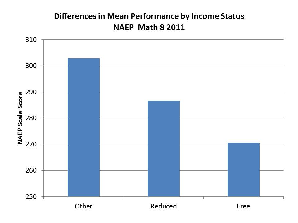
For those who’ve not really pondered this, consider that for 2011 NAEP 8th grade math performance in New Jersey, the gap between non-low income and reduced lunch kids (185% income threshold for poverty) is about the same as the gap between free (130% income level) & reduced!

Slide4

The NJ CREDO charter school comparison study is just one example. CREDO’s method involves identifying matched students who attend charter schools and districts schools based on a set of dummy variables. In their NJ study, the indicators included an indicator for special education status and an indicator for children qualified for free or reduced priced lunch (as far as one can tell from the rather sketchy explanation provided). If their dummy variable matches, they are considered to be matched – empirically THE SAME. Or, as stated in the CREDO study:

…all candidates are identical to the individual charter school student on all observable characteristics, including prior academic achievement.

Technically correct – Identical on the measures used – but identical? Not likley!

The study also matched on prior test score, which does help substantially in providing additional differentiation within these ill-defined categories. But, it is important to understand that annual learning gains  – as well as initial scores/starting point – are affected by a child’s family income status. Lower income, among low income, is associated with increased mobility (induced by housing instability). Quality of life during all those hours kids spend outside of school (including nutrition/health/sleep, etc.) affect childrens’ ability to fully engage in their homework and also likely affect summer learning/learning loss (access to summer opportunities varies by income/parental involvement, etc.). So – NO – it’s not enough to only control for prior scores. Continued deprivation influences continued performance and performance growth. As such, this statement in the CREDO report is quite a stretch (but is typical, boilerplate language for such a study):

The use of prior academic achievement as a match factor encompasses all the unobservable characteristics of the student, such as true socioeconomic status, family background, motivation, and prior schooling.

Prior scores DO NOT capture persistent differences in unobservables that affect the ongoing conditions under which children live, which clearly affect their learning growth!

Now, one problem with the CREDO study is that we really don’t know which schools are involved in the study, so I’m unable here to compare the demographics of the schools actually included among charters with district schools. But, for illustrative purposes, here are a few figures that raise significant questions about the usefulness of matching charter students and district students on the basis  of “special education” as a single indicator, and “free AND reduced” lunch qualification as a single indicator.

First, here are the characteristics of special education populations in Newark district and charter schools.
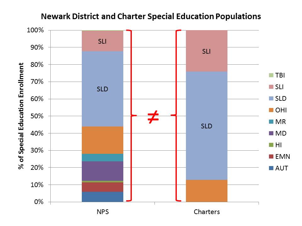
Slide1As I noted in my previous post, nearly all special education students in Newark Charter schools have mild specific learning disabilities and the bulk of the rest have speech impairment.  Yet, students in districts schools who may have received the same dummy variable coding are far more likely to have multiple disabilities, mental retardation, emotional disturbance, etc. It seems rather insufficient to code these groups with a single dummy variable… even if the classifications of the test-taker population were more similar than those of the total enrolled population (assuming many of the most severely disabled children were not in that test-taker sample?).

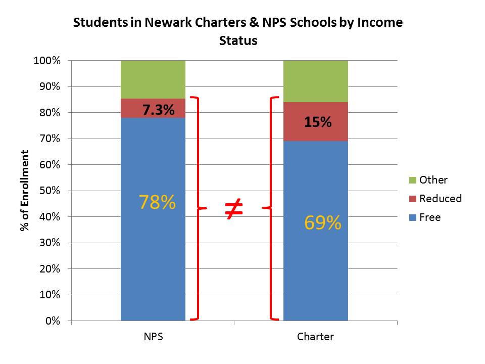
Now, here are the variations by income status – first for district and charter schools in the aggregate:

Slide2

Here, charters in Newark as I’ve noted previously, generally have fewer low income students, but they have far fewer students below the 130% income threshold than they do between the 130% and 185% thresholds. It would be particularly interesting to be able to parse the blue regions even further as I suspect that charters serve an even smaller share of those below the 100% threshold.  Using a single dummy variable, any child in either the red or blue region was assigned a 1 and assumed to be the same (excuse me… “IDENTICAL?”). But, as it turns out, there is about twice the likelihood that the child with a 1 in a charter school was in a family between the 130% and 185% income thresholds. And that may matter quite a bit, as would additional differences within the blue region.

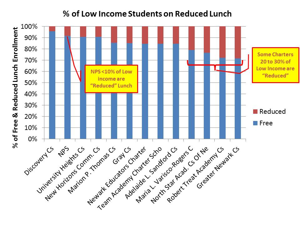
Here’s the distribution of free vs. reduced price lunch across NJ charter schools – among their free/reduced populations.

Slide3

While less than 10% of the free/reduced population in NPS is in the upper income bracket, a handful of Newark Charter schools – including high flyers like Greater Newark, Robert Treat and North Star, have 20% to 30% of their (relatively small) low income populations in the upper bracket of low income. That is, for the “matched child” who attended Treat, North Star or Greater Newark there was a 2 to 3 times greater chance than for the their “peer” in NPS that they were from the higher (low) income group.

Again… CREDO likely worked with the data they have. However, I do find inexcusable the repeated sloppy use of the term “poverty” to refer to children qualified for free or reduced price lunch, and the failure of the CREDO report to a) address any caveats regarding their use of these measures or b) provide any useful comparisons of the differences in overall demographic context between charter schools and district schools.
School Labels & Housing Values: Potential consequences of NJDOE’s new arbitrary & capricious school ratings

There exists relatively broad agreement in the empirical literature that perceived quality of local public goods and services – including local public schools – influences significantly the value – as represented in demand/sales prices – of residential property. In other words – perceived school quality affects housing prices and housing values. All else equal, one pays a premium to live in a school district or attendance zone within a district that is associated with a “good” school.

Indeed this “capitalization” of school quality (perceived or real) in home values is at the root of much of the disparity underlying highly residentially segregated state education systems. It’s a long run, complex chicken-egg cycle sort of thing. Some communities have more which allows them to spend more… to improve perceived quality… and capitalize that value into their homes/property values, increasing the town’s ability to raise revenue further, and increasing barriers to entry for families with lower income.

Realtors, the real estate industry and state and local publications like New Jersey monthly and national publications like Newsweek and U.S. News drool over oversimplified characterizations of good and bad schools. As trivial as this stuff may seem to many of us, it is consequential, or at least can be.

Beyond magazine ratings, state school rating schemes have been shown be consequential for home values. The key is that summary type ratings, broad classifications or grades – ACCURATELY REFLECTING QUALITY OR NOT – seem to have the most significant impact. For example, in one recent study specifically evaluating post-NCLB classification schemes & other metrics, authors found that “Results show that while all school quality measures tested have some explanatory power, school district ratings and performance index, which are comprehensive measures of school quality, are the most appropriate measures and are readily capitalized into housing prices.”[1] In one of the better known studies on this topic, David Figlio evaluated the influence of Florida’s letter grading system on home values, finding:

This paper provides the first evidence of the effects of school grade assignment on the housing market. Our results suggest that the housing market responds significantly to the new information about schools provided by these “school report cards,” even when taking into consideration the test scores or other variables used to construct these same grades. These results suggest that innocuous-seeming school classifications may have large distributional implications, and that policy-makers should exercise caution when classifying schools.

http://bear.warrington.ufl.edu/figlio/house0502.pdf

Now, the caveat to Figlio’s findings is the initial shock on housing prices of revealed grades may fade with time.

These findings raise significant questions about the potential impact on housing values located in attendance boundaries of schools granted these new labels by state agencies, in accordance with their NCLB waiver applications.  In their waiver applications state agencies were (seemingly) under the gun to find ways to classify as problem schools and/or failing schools, not exclusively poor minority schools in the inner city. Indeed, many set out to make poor, minority schools their primary target.  As I’ve shown in recent posts on New York and New Jersey, states did indeed classify as failing schools largely those schools that are predominantly poor, predominantly minority and in the inner city.

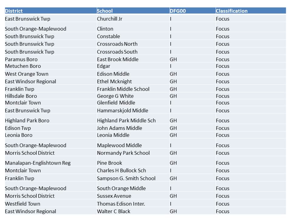
But, in their effort to marginally diversify their “bad” schools list, states also proposed achievement gap metrics and subgroup metrics to be used for identifying “other” more diverse and less poor schools for disruptive state intervention.  Most of these schools New Jersey ended up being classified as “focus” schools, or “we’re watching you!” schools and we’re going to push interventions on you through our regional achievement centers.  Here’s the list of “focus” schools in generally non-low-income communities (middle and upper income) in New Jersey:

Table 1. Focus Schools in Non-Low-Income Districts

http://www.state.nj.us/education/reform/PFRschools/Priority-Focus-RewardSchools.pdf

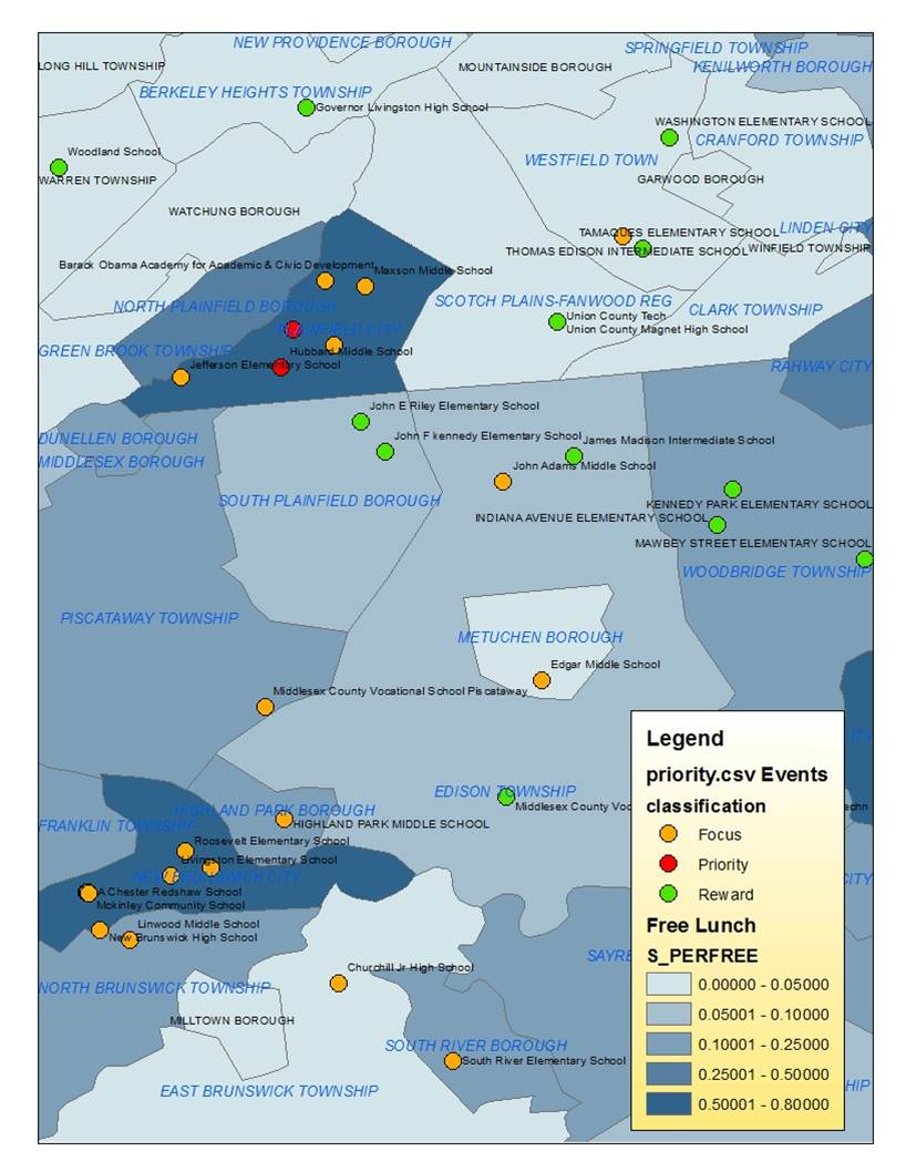
A number of “focus” schools occur along the Northeast Corridor around Middlesex County. This is particularly true of “focus” schools in non-low-income (lighter blue) districts.

Figure 1. Locations of Focus, Priority and Reward Schools

All of these schools achieved their “focus” status by having large achievement gaps between two groups either by race, language proficiency or poverty (or disability?… no detail is provided!), rather than by low average or overall performance. Many are middle schools, in part because middle schools serve as a funneling point within mid-sized suburban districts, where children from neighborhood schools first come together in a single location (or perhaps two locations), creating sufficient subgroup sample sizes for calculating gaps.

Notably, a school can only have a measurable achievement gap between ethnic groups if it has at least 30 tested students in each group!  So really, most of the “focus” schools in middle and upper middle class New Jersey districts are middle schools in more diverse districts.

Far fewer of the more affluent schools in the state even have at least 30 members of disadvantaged minority groups taking state assessments in a given year! As such, racial achievement gaps cannot even be calculated for these districts.

Yes, gaps are a problem… but these measures… and resultant classifications are a twisted combination of ignorant and arbitrary.

Ignorant, arbitrary or otherwise, these classifications may have significant consequences for home values. And homeowners in these districts (and those in poor urban “priority” school zones) should be rightfully outraged at this potentially highly consequential abuse of data. [and of course those in “reward” school zones can quietly basque in the glory of their unearned accolades]

After all, it is the broad labeling that matters more than precise and nuanced characterizations of actual schooling quality!

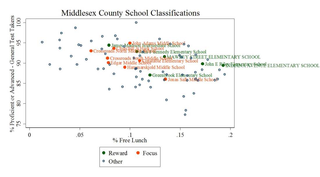
Figure 3 shows the average proficiency rates of the “reward” schools and “focus” schools in Middlesex County – focusing only on those schools with fewer than 20% of children qualified for free lunch. That is, lower poverty schools.  In terms of overall proficiency, the “focus” schools fit reasonably into the broader mix of schools in Middlesex County.

My intent here is certainly not to downplay the gaps that may persist in these schools, though it’s really important to acknowledge that you can only even measure that gap if diversity exists to begin with. My point in this graph and post in general is that the state has created a labeling system misuses measures that weren’t very good to begin with to create arbitrary and capricious school labels that may have real and substantial consequence for home values. In many cases here, districts that are home to a focus school are immediately adjacent to districts that are home to ‘reward’ schools (an equally unearned label!).

Figure 3.

The kicker here is that even if the public were to become wise to the questionable veracity of these labels, that state has used this labeling system in the context of granting itself near unilateral authority to exercise substantial control over the operations of these schools [an authority which may not actually exist!].

So, it’s not just about the labels – which may be entirely meaningless – but it’s also about – much more about – a substantial threat to local governance of those schools. Now, I’ll admit that I have mixed feelings about “local governance,” because it is often local governance that reinforces disparities across children and schools.

But, that said, the state’s choice to use these labels quite explicitly as a threat to local governance – rather than merely as a “label” to increase awareness and encourage increased local accountability – may increase the consequences for local home values. That is, prospective home buyers may be more likely to avoid purchasing homes in neighborhoods or districts where they perceive that they may lose control to the state of their schools and this effect may be much greater than the effect of a negative label alone. Further, it’s entirely possible that in these middle class communities otherwise perceived as having pretty good schools, that public perception would be that proposed state interventions are more likely to make the schools worse than better (in addition to the threat of intervention itself).

Indeed, these are empirical questions and ones I hope to explore over the next few years as annual housing sales data are released.

Gap measurement in NJ: Largest Within-School Gaps: schools with the largest in-school proficiency gap between the highest-performing subgroup and the combined proficiency of the two lowest-performing subgroups. Schools in this category have a proficiency gap between these subgroups of 43.5 percentage points or higher. see: http://www.state.nj.us/education/reform/PFRschools/TechnicalGuidance.pdf


Data, Data, Data? Dissecting & Debunking NJDOE’s State of the Schools Message

Time again for an NJ State of the Schools Address, as reported HERE in NJ Spotlight (with absolutely no critical question/reporting whatsoever! More or less spoon fed regurgitation).

As I’ve written a number of times on this blog, state officials in New Jersey have decided on specific marketing/messaging plan in order to support current policy initiatives. Those policy initiatives involve:

  1. expanding NJDOE authority to impose desired “reforms” (charter/management takeover, staff replacement, etc.) on specific schools otherwise not under their direct authority.
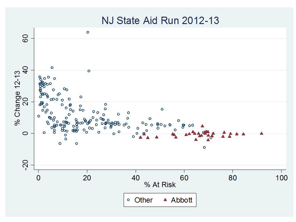
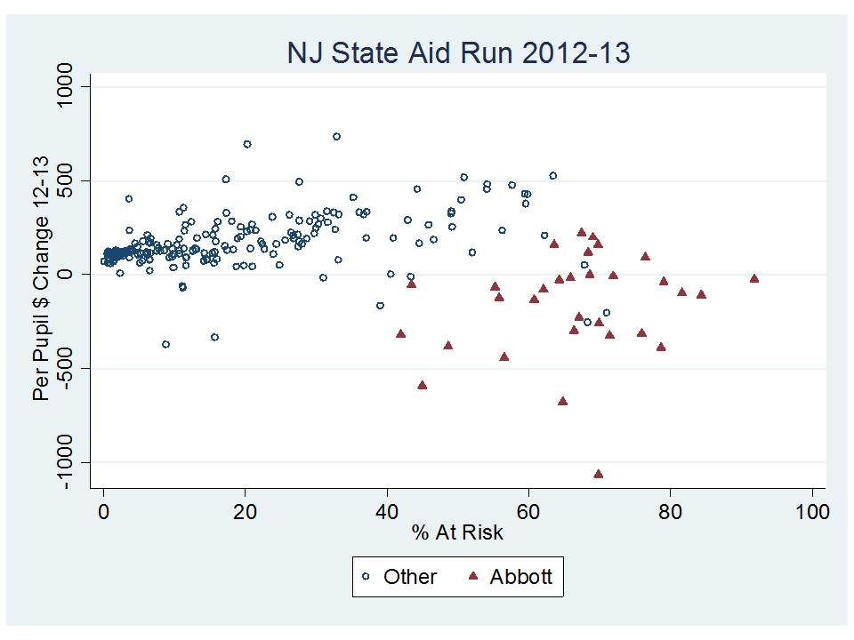
  2. cutting funding from higher poverty, higher need districts and shifting it toward lower poverty, lower need ones.
  3. expanding charter schooling and promoting other  “innovations” in high poverty concentration schools.

The supposed impetus for these reforms is that New Jersey faces a very large achievement gap between low income and non-low income children (one that is largely mis-measured). While it would seem inconsistent to suggest reducing funding in low income districts and shifting it to others, the creative messaging has been that the additional resources are quite possibly the source of the harm… or at the very least those resources are doing no good. Thus, the path to improvement for low income kids is to transfer their resources to others.  What I have found most disturbing about this messaging – other than the ridiculous message itself! – is the flimsy logic and disingenuous presentations of DATA that have been used to advance the argument.

Look if the message is going to be about Data, Data, Data – then now is the time to take a more thorough, context-sensitive look at the data, and try to better understand what’s really going on.

Let’s do a walk through of some of the information presented in the most recent state of the schools presentation.

Here’s a link to the slides from the recent presentation:

http://www.state.nj.us/education/news/2012/0919con.pdf

NJDOE Message

The most recent state of the schools presentation is now in the post-NCLB waiver era, where we are now presented with those template classifications of schools as Priority, Focus and Reward schools.
The state of the schools presentation revolves to a large extent around these categories, because it is those Priority schools that are the target of the most immediate and disruptive interventions.

Below are the slides that were presented to characterize schools by their performance category. The message to be conveyed by these slides was:

  1. Priority Schools are overspenders (or at least very well resourced)
  2. Priority Schools have very well paid teachers who have slightly higher than average experience
  3. Yet still, priority schools have really crummy outcomes!

Therefore, we must have wide latitude to intervene!

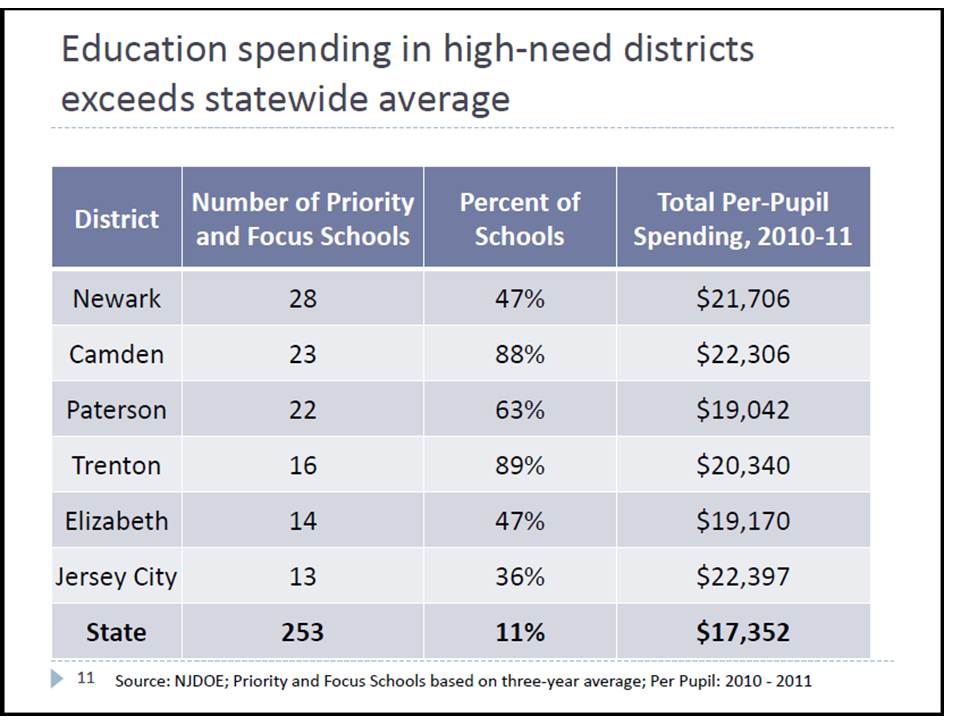
EXHIBIT A – PRIORITY SCHOOLS SPEND MORE(?)

EXHIBIT B – PRIORITY SCHOOLS HAVE HIGH PAID TEACHERS & LOW OUTCOMES!

EXHIBIT C- GAPS REMAIN LARGE

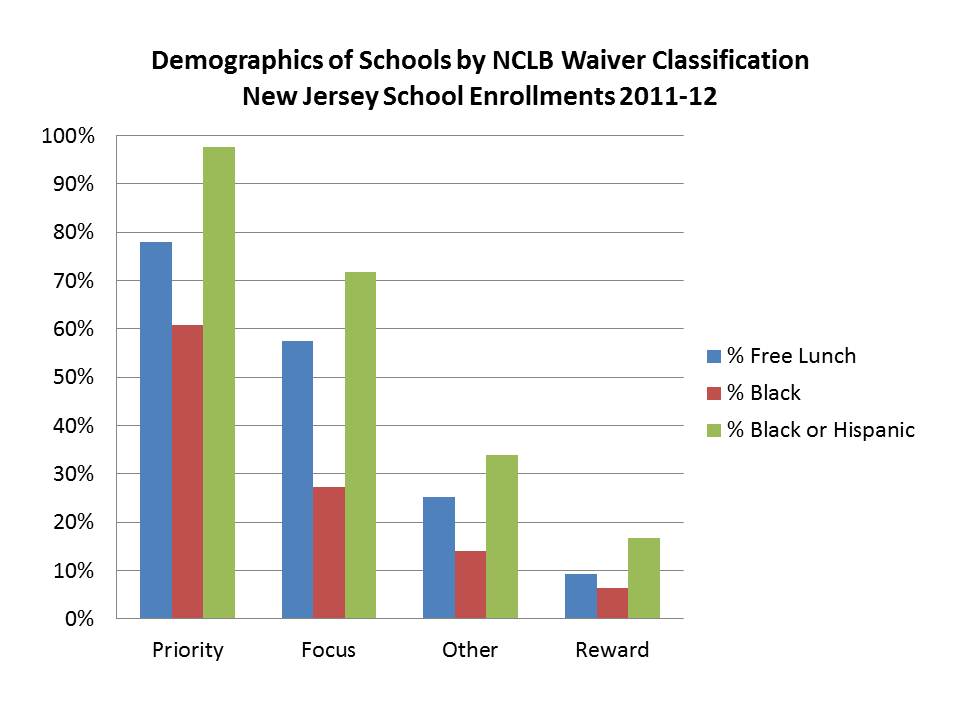
Omitted Information What about demographic differences?

Clearly, a few things are being overlooked in the first two slides which claim characterize Priority schools as schools with plenty of resources that simply don’t get the job done. Now, there’s a little more to the story than that!

Most notable, as I show below, priority schools have about 80% of children qualified for free lunch and reward schools less than 10%! Yet as the NJDOE slide above shows, at the high end these school districts spend slightly under 30% more than state average. Notably, this shoddy comparison does not compare these districts to others in their own labor market.

Indeed, New Jersey more than other states has put some money into these districts. See “Is school funding fair?” But, let’s be clear, these margins of funding difference, while helpful, hardly make these districts – given their needs – flush with excess resources!

In fact, the strongest empirical research on this topic suggests that it would take an additional 100% or so per pupil funding for a district that is 100% low income versus a district that is 0% low income. Here, we are looking at nearly that extreme of low income differential, and not nearly that extreme of funding support! So while these districts are better off than similar districts in other states, implying that they’ve got more than enough to close achievement gaps is a huge stretch.

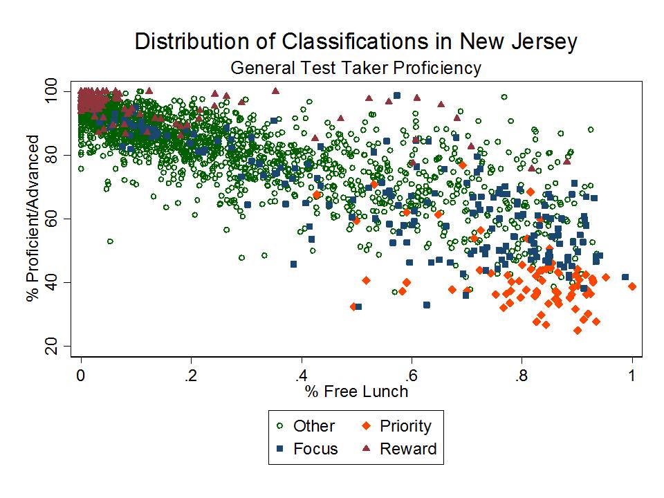
But do those demographic differences matter?

This figure shows just how much the demographic differences represented above matter with respect to student achievement, and specifically how much school demography continues to dictate the performance classification of schools under the NJDOE waiver plan.

As I pointed out on a recent post, NJDOE has basically flagged schools in low income neighborhoods for experimentation and substantial disruption (closure, etc.) with an option to override any/all local input.

Notably, this pattern is likely better than it would otherwise be because of New Jersey’s past efforts to target additional resources to high need settings, including pre-kindergarten programs, smaller class sizes and more competitive teacher salaries than might otherwise exist in these settings.

What about the teacher pay and teacher characteristics claim?

But what about those salaries? The NJDOE slides present a picture of teachers who – by their argument – are certainly paid enough. And, in fact, setting aside (ignoring entirely the demography of the schools), the implication of the NJDOE slides is that hey… we’re paying these teachers a few thousand more than the average teacher in the state, but clearly they just aren’t very good, or at least there are a bunch of them that aren’t and need to be fired! Further, they have slightly more experience than teachers in other schools… yet they still stink… indicating that experience clearly doesn’t matter. Notice that they didn’t present degree levels.

Okay… now let’s do a legitimate walkthrough of the most recent available data on NJ teachers with respect to the performance categories of schools. I use the 2011-12 Fall Staffing Reports and I fit a regression model of teacher salaries for all elementary and middle level classroom teachers (secondary later if I get a chance). In that model, my goal is to compare the salary a teacher would make:

  • at the same experience level
  • with the same degree level
  • having the same job code
  • working full time
  • in the same labor market (and type of district in that market)
  • in the same year

That is, I’m comparing apples with apples. This first graph shows the average difference in salary on the above comparison bases, statewide. Statewide, teachers in priority schools are earning a lower salary and teachers in reward schools a higher salary than teachers in “all other schools.” But these averages do mask some important differences across labor markets.

Here are the North Jersey/NY projected teacher salaries by experience level, where Newark carries significant weight in the model. Priority school salaries by experience are in blue, reward in red. On average, the differences are rather subtle. Reward schools salaries jump ahead in the mid-range, and priority rise again later, but fall behind in the mid range. But, it’s really important to understand, that simply having roughly the same salary does not mean that salary is actually competitive for recruiting and retaining teachers of comparable qualifications! In fact, to get teachers to work in a high need setting is likely to require a substantively higher wage!

As I explain in a recent review of the literature on this topic: With regard to teacher quality and school racial composition, Hanushek, Kain, and Rivkin (2004) note: “A school with 10 percent more black students would require about 10 percent higher salaries in order to neutralize the increased probability of leaving.”33 Others,however, point to the limited capacity of salary differentials to counteract attrition by compensating for working conditions.34 see: http://www.shankerinstitute.org/images/doesmoneymatter_final.pdf

  • Hanushek, Kain, Rivkin, “Why Public Schools Lose Teachers,” Journal of Human Resources 39 (2) p. 350
  • Clotfelter, C., Ladd, H.F., Vigdor, J. (2011) Teacher Mobility, School Segregation and Pay Based Policies to Level the Playing Field. Education Finance and Policy , Vol.6, No.3, Pages 399–438
  • Clotfelter, Charles T., Elizabeth Glennie, Helen F. Ladd, and Jacob L. Vigdor. 2008. Would higher salaries keep teachers in high-poverty schools? Evidence from a policy intervention in North Carolina. Journal of Public Economics 92: 1352–70.

Now let’s look at south jersey, which appears to be the source of most of the deficit that shows up statewide. In South Jersey/Philly metro, teachers in priority schools are making a much lower wage especially in the mid-range. Non-classified and reward schools lead the way on salaries across most of the experience range. Hey… is this chicken or egg? Do salaries matter – or are more advantaged schools simply able to pay higher salaries.

One issue that NJDOE appears to be ignoring entirely is that the classification of these schools may actually lead to additional teacher sorting – making it even harder to staff priority schools with high quality teachers down the line.

Here are the degree levels of classroom teachers in these schools – something notably absent in the NJDOE presentation. The differences between priority and reward schools are quite striking.

PRIORITY SCHOOLS HAVE FAR MORE TEACHERS WITH ONLY A BA AND FEWER WITH AN MA THAN REWARD SCHOOLS!

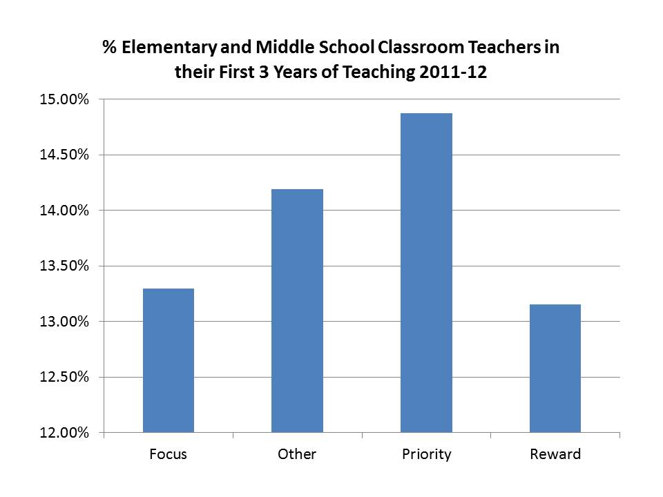
Finally, here are the concentrations of novice teachers, where a sizable body of research literature points to the problem of teacher churn in high need schools and the relationship between high novice teacher concentrations and lower student outcomes.

What about the performance of low income children in New Jersey?

Again, part of the message being presented in the state of the schools address is that New Jersey in particular has failed its low income children – as indicated by the suspect, over time proficiency rate graphs presented above. These graphs are presented as coupled with the funding/resource graphs to imply that funding is clearly unhelpful at best and harmful at worst when it comes to fixing the achievement gap.

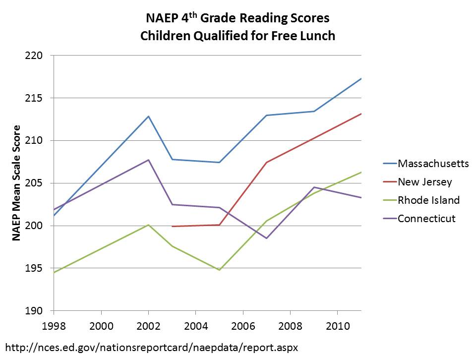
As I’ve written on this blog before, New Jersey has made substantive gains in recent decades for low income children. Further, to make comparisons of achievement gaps, one must focus on the most comparable measures and most comparable settings. In one recent blog post, I compared Massachusetts, Connecticut and New Jersey – which in terms of income distributions and the characteristics of those above and below the Free/Reduced Income thresholds are most similar. The following graphs show that children of HS dropouts and low income children in NJ and MA have both higher levels of performance and have outpaced the gains in performance of similar children in Connecticut and Rhode Island (but especially CT!)

What has New Jersey done to improve performance of low income children?

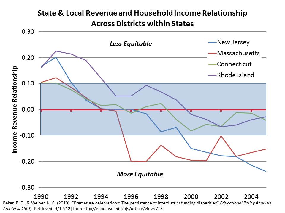
I also elaborated in that previous that one key difference between these states is that NJ and MA, more than the others have shifted resources toward higher need districts. The first graph shows the disruption over time in the relationship between district income and district resources. MA and NJ have most significantly disrupted this relationship, providing systematically more resources per pupil in lower income districts.

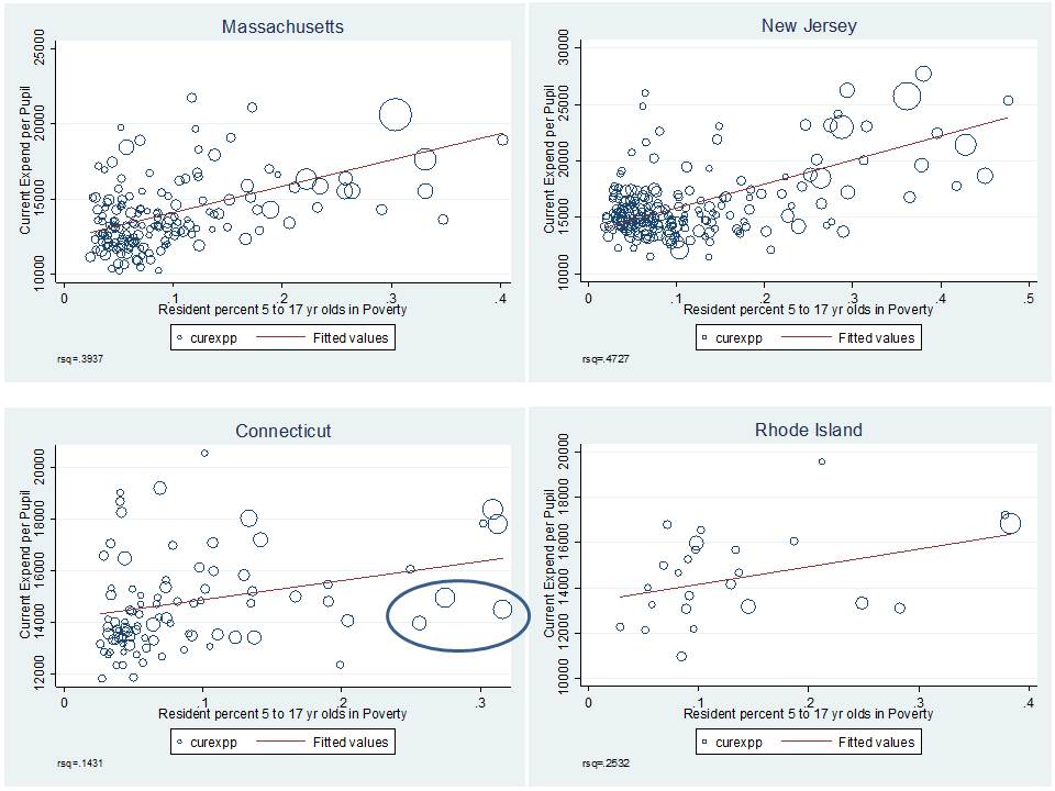
This second graph shows the pattern across districts by poverty in each state. Note that in CT, while a few high poverty districts (Hartford and New Haven) have higher current spending, the CT pattern is less systematic. Further, in those few districts, much of the additional spending is granted through magnet school aid, and thus may have limited positive impact on the districts’ neediest students.

To the best of my understanding, teacher tenure laws are/were strong in each of these states. Few if any districts in these states base teacher evaluation heavily on student test scores – especially during the periods represented in the graphs above – which predate Race to the Top. That is, clearly the differences in low income achievement growth between these states have little/nothing to do with state teacher evaluation policy. To go even further, NJ and CT have relatively small charter school market share, so charter school market share likely is not a major factor either.

Further, as explained in this report, and in this article, substantive and sustained school finance reforms do matter! And the evidence on the effectiveness of these reforms far outweighs the more speculative reforms being suggested as replacements for funding in New Jersey.

What does NJDOE & the current administration propose to do about future funding?

Finally, as I noted previously, the current direction of policy initiatives is to attempt to reshuffle funding away from higher poverty/need districts and toward lower poverty/need ones. Here’s the graph from the previous post.

The Strange Logic of it All?

Coupling this DOOHNIBOR (uh… reverse robinhood) strategy with arguments for disruptive reforms in high poverty settings is illogical at best and reckless and irresponsible at worst.

Children in high poverty settings in New Jersey have made substantive gains over time.

It is quite likely that New Jersey’s investments in the schools and communities of these children have played a significant role in those gains.

Yet, even in New Jersey, where the state has made those efforts, poverty-related disparities do persist and require attention.

There is little or no evidence that expanded charter schooling is substantively improving the outcomes of our lowest income children, largely because those “successful charter schools” of which we most often speak are not serving our lowest income children in any significant numbers, and in some cases are increasing concentrations of disadvantaged children left behind in district schools.

And there’s little evidence that either New Jersey’s failures or gains are a function of an oversimplified good teacher/bad teacher dichotomy, suggesting a need for oversimplified reformy solutions like teacher deselection and/or pay-for-test scores.

Despite the state’s efforts to provide support to high poverty settings/schools, teacher wages still are not where they necessarily need to be in those districts to recruit and retain a high quality applicant pool year after year. There remain disparities in teacher qualifications, including novice teacher concentrations. Teacher quality disparities may be/are an issue – but not in the way they are presently being framed!

These are the basic issues that need to be addressed. They aren’t sexy. They aren’t reformy. They aren’t consistent with the current marketing/messaging of NJDOE.

But they are based on data, data, data, DATA, DATA and more freakin’ Data!

And there’s a lot more where that came from!


New Jersey Charter Data Roundup: A look at the 2010-11 Report Cards

Here’s a quick run-down on the 2010-11 New Jersey School Report Card data on charter schools. No-one else is putting out decent summaries of this stuff, so I feel obligated to revisit these data periodically. They don’t change much over time. But those older blog posts get buried over time. So, here we go.

Let’s take a specific look at Newark because that’s where most of our attention has been paid regarding high flying charter performance.

Data sources:

1. NJDOE Report Card

2. NJDOE Enrollment File

3. NJDOE Directory File (for City location)

Percent Free Lunch

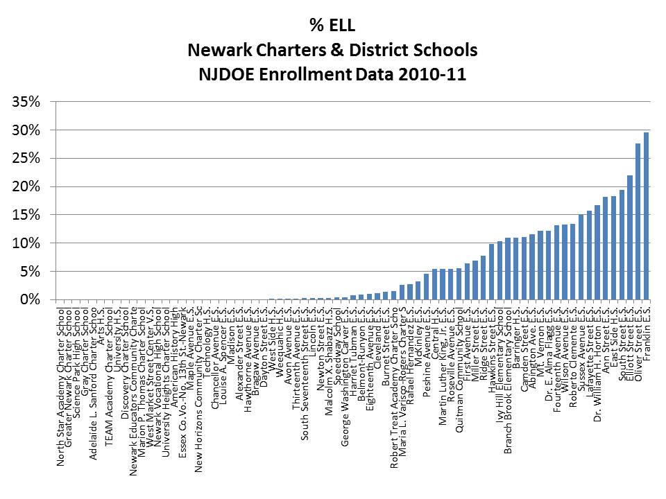
Percent ELL

Percent Female

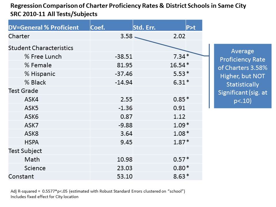
Regression Model of Charter Performance

More explanation is provided below. But this regression model (raw output on link below) is simply intended to compare the average proficiency rates across all tests and grades of charter schools to other schools in the same city and with similar characteristics. The bottom line is that as in previous similar regressions, there remains a small statistically non-significant margin of difference in average overall proficiency. But, the graphs that follow are perhaps more fun/interesting to explore.

CharterRegression

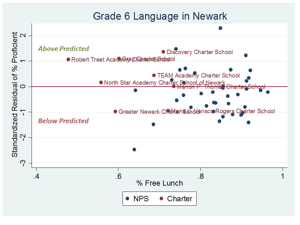
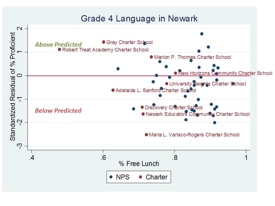
Now, for the following figures, the overall charter effect variable is removed, so that we can see how individual charter schools lie with respect to expected proficiency levels. The following figures compare schools to their predicted performance given each of the characteristics in the regression model. On the vertical axis is the standardized residual or the standard deviations above or below predicted performance. Along the horizontal axis is the percent free lunch of the schools, just so that we can see how they sort out by poverty concentration. Note that poverty concentration is already controlled for in the models. I begin with a few figures for select tests in Newark, and then present some statewide figures.

Newark Schools over and under predicted performance

Statewide schools over and under predicted performance

On average, this statewide picture is actually pretty ugly. It would certainly be very hard to argue that charter school expansion across New Jersey has led to any substantive overall improvement of educational opportunities. Numerous charter schools are substantial underperformers. And overall, as the regression model indicates, the net performance is bread even.

Take home points

This analysis merely compares the average proficiency rates of schools with similar characteristics in the same city. It does not measure whether charters “add value” per se.  This isn’t really ideal from a research perspective, because it doesn’t attempt to sort out whether these schools are actually doing something that leads to higher performance.

To address this question we might try either of two strategies – estimating achievement gains across matched schools – or hypothetically matched schools/children, or by a lottery based analysis comparing kids lotteried in to those lotteried out and staying in neighborhood schools.

But, I would argue that we still might not learn much of policy relevance for Newark from either of these approaches. Why?

Well, let’s consider the first approach – a matched school analysis (or virtual match based on individual students).  Let’s say we specifically wanted to determine the effectiveness of schools like North Star, Robert Treat or Gray charter.  The problem is that there really aren’t any “matched” schools or match-able kids – except perhaps those in magnet schools.  Note on matching-based-analyses… given that nearly all kids in a city like Newark qualify for Free OR REDUCED lunch, matching would have to be done on the basis of Free Lunch! If not, substantial precision/accuracy is lost and the comparisons invalid.

We might look outside of Newark for matched schools or students, but then other contextual factors might compromise the analysis quite substantially, and this might cut either for or against the charters.

Further, it appears that gender balance matters – not just a little – but a lot. Gordon McInnis tipped me off to this.  I hadn’t realized how big a deal it was in these schools.

Note that I’ve also left out attrition here, so that even if the schools were matched by poverty rates, gender and ELL concentration, there might be substantive differences in which students leave over time, altering the peer group composition over time (as weaker students leave).  Again, it may be most relevant to compare Newark Charters to Newark Magnets and/or children who attend them, which are most similar to these Newark Charters.

We could try to construct hypothetical or virtual matches based on similar individual children (to those in the charters) across the district who may or may not actually attend school together. But therein lies the problem, most other similar kids left in district schools would be attending school in substantively different peer groups than those in charters like North Star, Gray or Treat.

AND if we did find an “effect” on student achievement growth what the heck would it mean? And how would it inform our policy decisions?

Well, if we did, we would still have significant difficulty sorting out as to whether that effect has anything to do with school quality, or with student peer group  – quite possibly the largest in school factor affecting achievement.

Alternatively, one could attempt a lottery based analysis in which we look at the gains of kids lotteried in and lotteried out of the charters – left in their neighborhood schools. But in this case we would certainly have kids whose peer groups differ dramatically.  Again, we could try to “correct” for that uneven distribution, but the fact is that we simply can’t fully correct for the substantial contextual differences across these schools.  Too many Newark charters (and those in Jersey City and Hoboken) simply don’t even come close to resembling the student composition of traditional public schools in the same area.

So who cares? Well, it matters a great deal for policy implications whether the effect is created by concentrating less poor, English speaking females in a given school or by actually providing substantively better curriculum/instruction.  The latter might be scalable but the FORMER IS NOT! There just aren’t enough non-poor girls in Newark to create (or expand) a whole bunch of these schools!

Revisiting NJOSA & the Lakewood Effect

The current version of the New Jersey Opportunity Scholarship Act would pilot the tuition tax credits for private schooling in the following locations:

  • Asbury Park City School District
  • Camden City School District
  • Elizabeth City School District
  • Lakewood City School District
  • Newark City School District
  • City of Orange School District
  • Passaic City School District, and
  • City of Perth Amboy School District

http://www.njleg.state.nj.us/2012/Bills/S2000/1779_I1.PDF

http://www.njspotlight.com/stories/12/0316/0145/

NJOSA is often pitched publicly as a scholarship program that would allow students trapped in failing urban districts to exercise the choice to select a better alternative – implicit in this argument is that any private school option a student might choose would necessarily be a better alternative. Also suggestive in the rhetoric around NJOSA is that this program is mainly focused on kids in places like Camden and Newark – the stereotypical New Jersey urban centers.

NJOSA would provide scholarships to children in families below the 250% income threshold for poverty. The text of the bill indicates that eligible children are those either attending a chronically failing school in one of the districts above or eligible to enroll in such school in the following year (which would seem to include any child within the attendance boundaries of these districts even if presently already enrolled in private schools).

“children either attending a chronically failing school or eligible to enroll in a chronically failing school in the next school year.”

I have discussed NJOSA numerous times on this blog, specifically focusing on the Lakewood effect here & here.

Many in New Jersey probably already understand that the above list contains some intriguing outliers, but I suspect few understand just how big these outlier effects are. One would naturally assume that Newark, for example, would be the major target of NJOSA scholarship recipients? Right? That’s our stereotypical urban core with failing schools from which kids need to escape.

Here’s what the Newark private school market looks like.

This map uses data on individual private schools, their locations, and enrollments from the 2007-08 National Center for Education Statistics, Private School Universe Survey, which also includes classifications of religious affiliation/status. Purple circles are religious private schools and green circles are those who’s primary affiliation is listed as non-religious (independent of a specific church/religion). Circle size indicates enrollment size. Bigger circles are the bigger schools.

I also use U.S. Census Bureau American Community Survey data to identify the number of total children and children in families below the 250% income threshold attending private school within each Public Use Micro Data Area (PUMA). Blue numbers indicate total private enrollments, and red numbers indicate low income private school enrollments.

Currently, there are about 3400 private schooled students residing in Newark, and there are about 2,000 who actually fall below the 250% poverty-income threshold. So, that’s a sizeble number of Newark children who might quality for NJOSA scholarships, in addition to others who might apply who are presently enrolled in public schools.

It would seem by the language in the bill that a current privately schooled student would merely have to be eligible to attend their local public school, but not actually do so.

Here’s what the Passaic/Clifton private school market looks like (neither one is big enough to be its own PUMA):

The Passaic/Clifton PUMA has nearly as many low income private school enrolled children as Newark – 1,619, despite much smaller total population. And by far the largest private school in the area is Yeshiva Ktana.

But the most striking example is that of Lakewood, as I have discussed in the past. Since Lakewood remains in this bill, even though there’s nothing really new I’m presenting here, I felt the need to reiterate just how big a deal this is.

Here’s the Lakewood private school marketplace & current enrollments:

Based on the Census ACS data from a few years back, there were over 17,000 privately schooled students in Lakewood, and OVER 10,400 OF THOSE STUDENTS WERE IN FAMILIES THAT REPORTED THEMSELVES AS BEING BELOW THE 250% POVERTY-INCOME THRESHOLD!

Recall that Newark had about 2,000 low income private school enrolled children.

Orange/East Orange combined have under 900.

All of the cities around Asbury Park combined about 400 (meaning that Asbury Park alone is likely much less).

Camden about 1,300

Elizabeth about 1,000

The entire area (several towns/districts) around Perth Amboy about 1,000 (meaning that Perth Amboy is likely only a fraction of that amount)

And again, Lakewood, over 10,000! (and Passaic, another significant amount)

In other words, all of the other locations combined do not have the sum total of low income private school enrolled children that Lakewood has. Lakewood would likely be the epicenter of NJOSA scholarship distribution. I noted in my first post on this topic that if the average scholarship amounts were as proposed, the Lakewood Yeshiva schools would stand to take in as much as $67 million per year in these indirect taxpayer subsidies.

The clever subversion of taxpayer rights

I have a secondary, related concern when it comes to Tuition Tax Credits, these days, often framed as “Opportunity Scholarship Acts.”

Tuition Tax Credit programs create an indirect subsidy of private schooling, whereas Vouchers provide a direct subsidy.  The latter is a more honest approach and one that at least allows for legal recourse by concerned taxpayers – even if they eventually lose. It is currently the case that voucher programs which provide direct subsidies to families, even where the majority of those families choose to use their subsidy for religious schooling, are constitutional under the U.S. Constitution (but not under some state constitutions which expressly prohibit use of public funding for religious education). Specifically, the U.S. Supreme Court has determine that these subsidies do not violate the establishment clause of the U.S. Constitution, because the distribution of the subsidy is mediated through individual/family choices and the subsidy/voucher program (at least by Cleveland design) is neutral to religion (see: http://www.oyez.org/cases/2000-2009/2001/2001_00_1751  – the dissent is worth listening to)

This is not to say, however that a state might not be vulnerable to legal challenge over a voucher system if it could be shown that the state had actually made policy decisions with the intent of guiding students and resources toward specific religious schools/institutions, but rather that the Cleveland model did pass muster. One might certainly scrutinize the NJ legislature’s choice to include Lakewood in NJOSA, with the Lakewood Yeshiva schools essentially as the primary beneficiary of the program. This would seem somewhat analogous to a 1990s scenario where NY State redrew one district’s boundaries so as to encompass a single homogeneous religious community (see: http://www.oyez.org/cases/1990-1999/1993/1993_93_517) Could NY State now go back and pilot a voucher program in Kiryas Joel instead? Would the choice of a homogeneous religious community to pilot a voucher program violate the establishment clause? Would it be substantively different from the more “neutral” Cleveland Voucher program? Maybe.

But, here’s the kicker with Tuition Tax Credit programs.  They are indirect subsidies, generated by providing full tax credits to corporations to gift money to a state approved (independently governed) entity (voucher governing body). Thus, a hole of “X” is created in the state budget. That hole is paid for by the fact that the state no-longer has to allocate state aid (>or= X) to local public districts where students accept the scholarship to attend private schools instead. It’s the mathematical equivalent of simply allocating the same sum in state revenue directly to private schools, but it’s achieved indirectly through a third party entity.

Who cares? Why is that important? If the state has gamed this system to favor and disproportionately subsidize a specific religion, can’t we still do something about it? The answer to that question is probably not, at least via legal action!  The U.S. Supreme Court has recently determined that taxpayers do not have legal standing to challenge the distribution of these indirect subsidies. As far as we can tell no one really seems to have a right to challenge these policies for potentially violating the establishment clause. If if was a voucher program- direct subsidy – there would most likely at least exist the right of taxpayers to challenge the policy in court, even if it was eventually determined that the policy was constitutional (sufficiently similar to the Cleveland model). But the indirect tuition tax credit approach cleverly permits diversion of tax revenues while negating entirely taxpayer rights to challenge that diversion. See: http://www.oyez.org/cases/2010-2019/2010/2010_09_987

In other words, the court never even gets to address the substantive question of whether the legislature has intentionally gone out of its way to favor and subsidize a specific religion.

(Real) Graph vs (Fake) Graph Friday

This post provides a quick follow up to yesterday’s post (late last night) when I critiqued a questionable graph from an NJDOE presentation here: State of NJ Schools presentation 2-29-2012

It turns out that the slide presentation had many comparable graphs that deserve at least some attention. First, there’s this graph which attempts to argue that early reading proficiency is a statewide issue, and not just a problem of low income urban neighborhoods:

Rather impressive eh? Certainly gives the impression that early reading deficits are concentrated not in the poorest districts but in the least poor ones.

Why would someone make such an argument? Well, one reason would be if this argument was being coupled with arguments to redistribute funding to those less poor district to help them out – to argue that educational “risk” is not concentrated in poor districts, but rather distributed across all districts.

The problem here is that it’s completely absurd to compare total counts of students who are non-proficient across groups without any regard for the total counts of all students. That is, what percent of kids are proficient in each poverty group. Well, here’s what that picture ends up looking like:

Pretty much as we might expect. Lack of reading proficiency in 3rd grade as measured on state assessments is a much bigger problem in higher poverty districts, with poverty here measured as % Free Lunch and with reading proficiency tabulated for general test takers

Here’s the next graph, which compares charter school reading and math proficiency rates in Newark to Newark Public Schools:

In this case, the title is somewhat appropriate in that charter school performance does indeed vary in Newark. But the graph is pretty much meaningless and deceptive.

The graph relates average Language Arts and Math proficiency across schools showing basically that schools which are higher on one are also higher on the other. That’s really no big surprise. But the graph ignores entirely the substantive student population differences that explain a large portion of the difference in these proficiency rates. The graph appears to be not-so-subtly constructed to reinforce the central point of this section of the presentation slides – that charters outperform district schools.  That point continues to be built on analyses that were already thoroughly debunked many times over. This graph goes a step further by then cherry picking a few charters to name – all of which appear superior to the “District.”

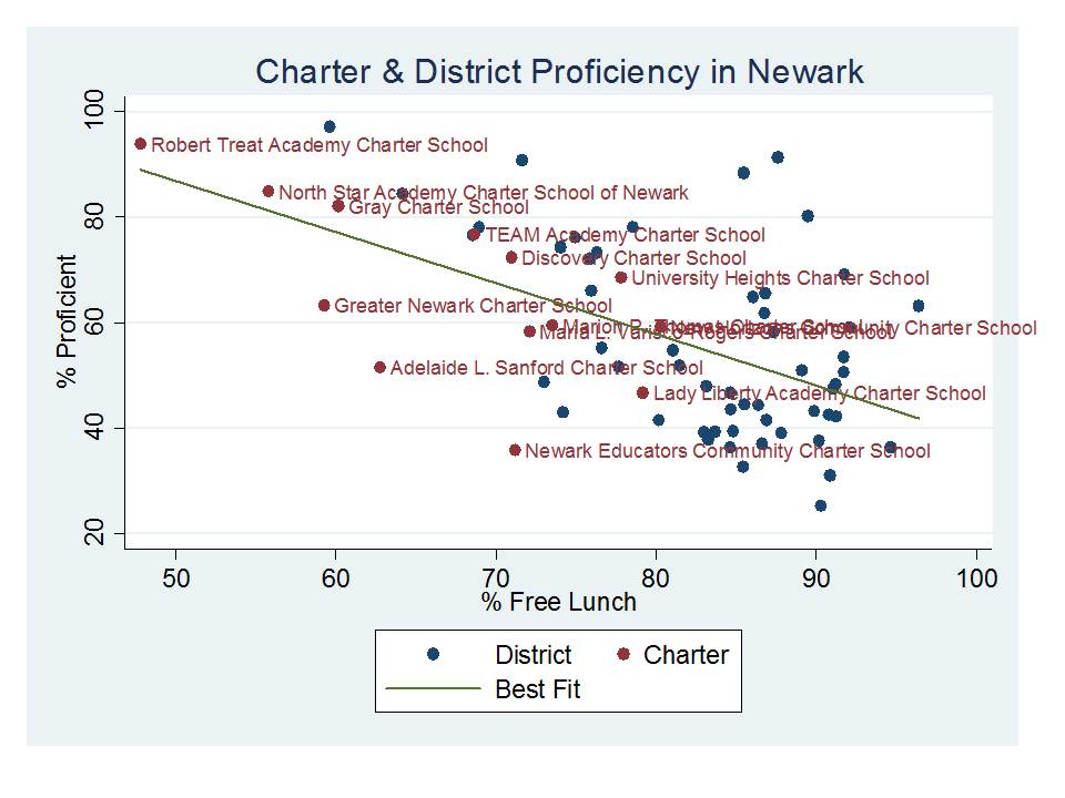
So, what does it look like if we take all of these schools, and separate the district into it’s schools, and plot the combined proficiency rates with respect to % Free Lunch? Well, here it is:INCLUDES NJASK3 TO NJASK8 (no HSPA)

Yes, this graph reinforces the title of the NJDOE graph, but in a much more reasonable light. That said, there are a number of other student population factors that would need to be accounted for in a more thorough analysis. 

Among other things, while the first graph appears to suggest that TEAM Academy is a relative laggard compared to schools like North Star or Robert Treat, my representation here shows that TEAM is actually further above it’s expected performance than either of the other two. TEAM simply serves a lower income population than the other two. Further, district schools serving similar populations do similarly well. And several charter schools do as poorly (and worse) than comparable district schools.
 

Amazing Graph Proves Poverty Doesn’t Matter!(?)

I just couldn’t pass this one up. This is a graph for the ages, and it comes from a presentation by the New Jersey Commissioner of Education given at the NJASA Commissioner’s Convocation in Jackson, NJ on Feb 29. State of NJ Schools presentation 2-29-2012

Please turn to Slide #24:

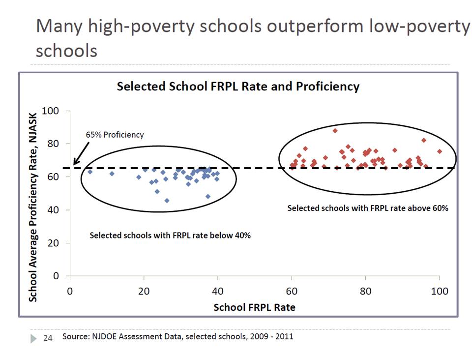
The title conveys the intended point of the graph – that if you look hard enough across New Jersey – you can find not only some, but MANY higher poverty schools that perform better than lower poverty schools.

This is a bizarre graph to say the least. It’s set up as a scatter plot of proficiency rates with respect to free/reduced lunch rates, but then it only includes those schools/dots that fall in these otherwise unlikely positions. At least put the others there faintly in the background, so we can see where these fit into the overall pattern. The suggestion here is that there is not pattern.

The apparent inference here? Either poverty itself really isn’t that important a factor in determining student success rates on state assessments, or, alternatively, free and reduced lunch simply isn’t a very good measure of poverty even if poverty is a good predictor. Either way, something’s clearly amiss if we have so many higher poverty schools outperforming lower poverty ones. In fact, the only dots included in the graph are high poverty districts outperforming lower poverty ones. There can’t be much of a pattern between these two variables at all, can there? If anything, the trendline must be sloped up hill? (that is, higher poverty leads to higher outcomes!)

Note that the graph doesn’t even tell us which or how many dots/schools are in each group and/or what percent of all schools these represent. Are they the norm? or the outliers?

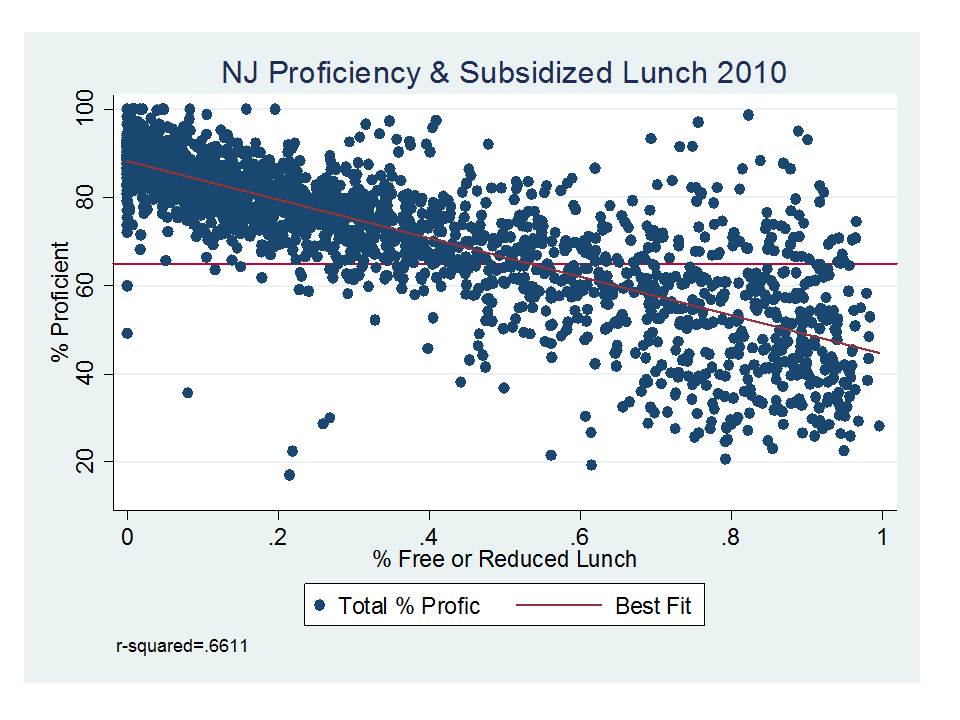
So, here’s the actual pattern:

Hmmm… looks a little different when you put it that way. Yeah, it’s a scatter, not a perfectly straight line of dots. And yes, there are some dots to the right hand side that land above the 65 line and some dots to the left that land below it.

BUT THE REALITY IS THAT FREE/REDUCED LUNCH ALONE EXPLAINS ABOUT 2/3 OF THE VARIATION IN PROFICIENCY RATES ACROSS SCHOOLS!

Do free/reduced lunch rates explain all of the variance? Of course not. Nothing really does, in part because the testing data themselves include noise, and reducing the testing data to percentages of kids over and above arbitrary thresholds introduces other noise. So all of the variance can’t be explained no-matter how many variables we throw at it. We can, however, take some additional easily accessible variables from the school report cards and explain a little more of the variation:

But, % free lunch remains the dominant factor, along with % black and % female. Combining free/reduced produces a somewhat weaker effect than using % free alone.

Lengthy, somewhat related tangent

Back in 2007-2008, while I was still at the University of Kansas, I was involved in a study of factors associated with production of outcomes and relative efficiency of New Jersey schools. Most of the data were generally insufficient for academic publication, but we did have some fun playing and figuring out what was there.

The study was designed to figure out a) which background factors really accounted for differences in NJ school performance, and b) what were the differences in characteristics of schools that appeared to do better or worse than expected.

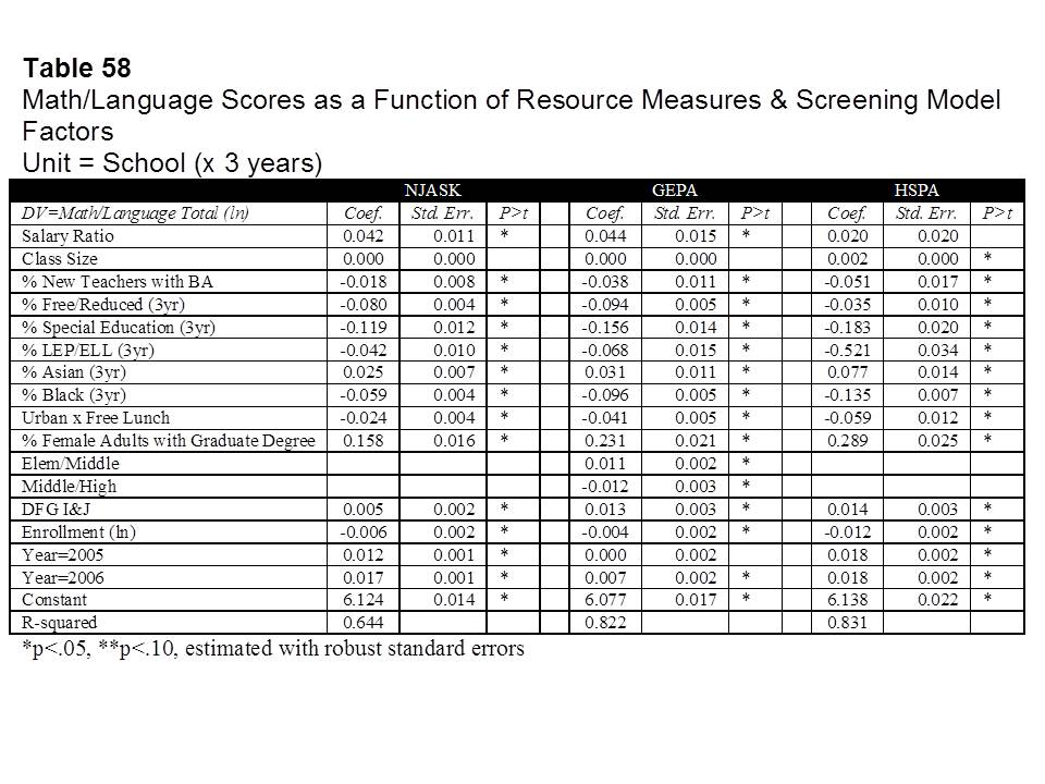
Here are a few snapshots of what I found back then, constructing models of school level outcomes for New Jersey schools using data from 2004 to 2006 (all publicly accessible data).

First, using a combination of background demographic factors, school characteristics and other school resource measures we were able to explain as much as 82% of the variation in 8th grade (then GEPA) outcomes. Still, % free and reduced lunch played a (the) dominant role, along with other related factors including special education shares, racial composition, % of female adults living in the surrounding area holding a Graduate degree, and an indicator that the school was in an affluent suburban district (DFG I or J).

We played around with multiple options and this is where we ended up. One of the more interesting revelations was that poverty seemed to have stronger effects on outcomes in population dense urban centers (our Urban x Free Lunch interaction term). This finding is common and can be explained in multiple ways (I’ll have to get to that another time).

We also found that certain resource measures were associated with higher (or lower) outcome schools. Schools where teachers had higher salaries than other similar teachers (by degree and experience) in the surrounding labor market tended to have higher outcomes. And schools with larger shares of teachers in their first three years with only a BA had lower outcomes.

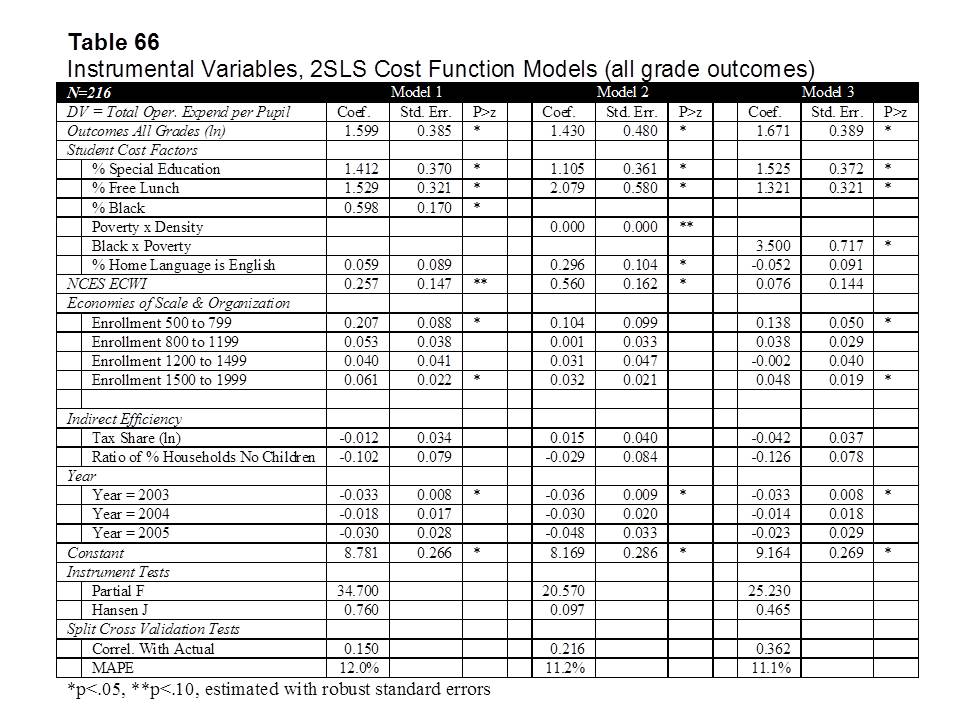
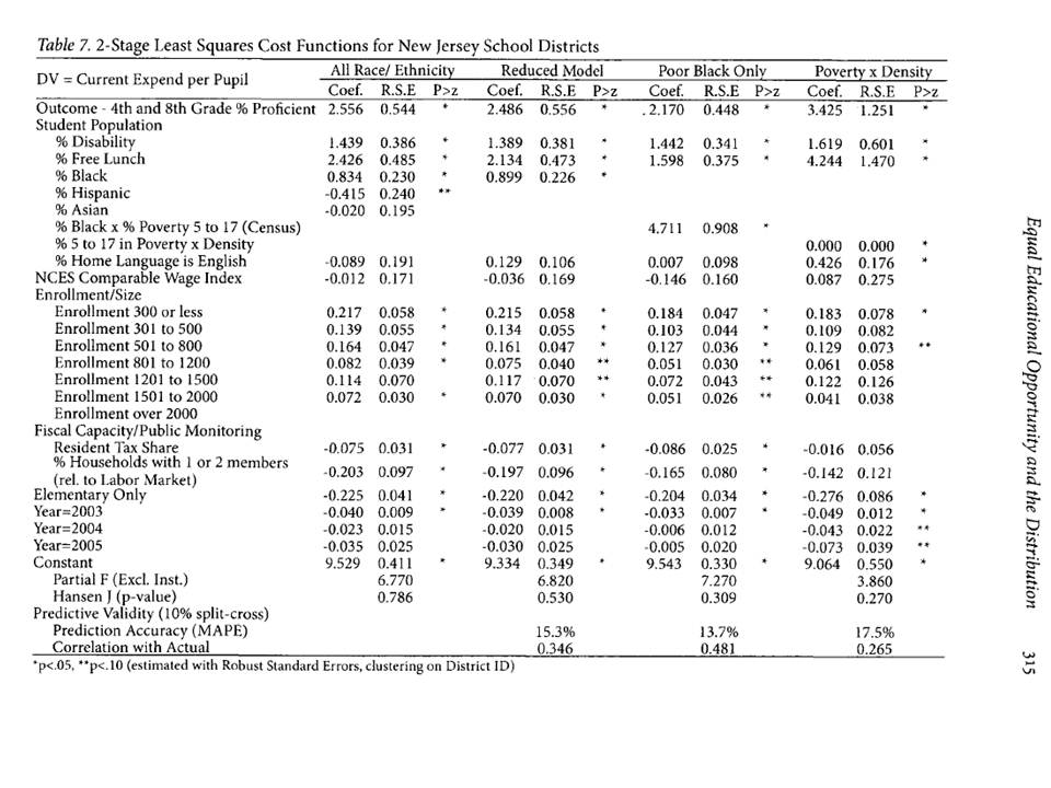
We (I) actually took the analyses a step further and estimated preliminary models of the costs of producing desired outcome targets (models which I subsequently improved upon). The key element of these models was to figure out if there were, in fact, alternative or additional demographic measures for districts that might help to better capture which districts have legitimately higher costs of achieving desired student outcomes. That is, what kind of stuff should be weighted, and/or weighted more heavily in the state school finance formula.  Specifically, what alternatives do we have for addressing poverty?

This was the first attempt:

And this was the second attempt (in a published article):

  • Baker, B.D., Green, P.C. (2009) Equal Educational Opportunity and the Distribution to State Aid to Schools: Can or should racial composition be a factor? Journal of Education Finance 34 (3) 289-323

What we found was that poverty (measured by % free lunch) indeed strongly affects the costs of improving student outcomes, specifically applied to New Jersey districts, in one case focusing only on K-12 unified districts and in the second case all NJ districts. This finding is not a revelation.

We also found that one might capture additional “costs” by including measures of school district racial composition, and we discuss the legal implications of this finding in several related articles (here, here & here). But, we also point out that there are alternatives for capturing some of the same effect, including the Urban x Poverty interaction.

So yes, we can make our statistical models and analyses ever more nuanced to more thoroughly explain the links between student backgrounds and student outcomes, and the costs of improving those outcomes. And, to the extent we can, we should.  But the fact is that poverty still matters, and it seems to matter statistically even when we measure it with the imperfect, crude proxy of children qualified for free or reduced price lunch.

In summary, despite the apparent brilliant wisdom conveyed in the graph at the outset of this post:

  1. Poverty as measured by free and reduced lunch status remains a very strong predictor of variations in proficiency rates across New Jersey schools; and
  2. Various measures of poverty, including free lunch status, and census poverty rates interacted with urban population density strongly influence the costs of improving outcomes across New Jersey school districts (and to an extent that far exceeds the weights in the current school finance formula).

But it’s still a really fun graph!

Here’s a link to a related article on schools supposedly “beating the odds” (like those in the above graph)

And here’s a link to my preliminary analyses which never saw the light of day (rough and unedited, in its original draft form): BAKER.DRAFT.JUNE_08

Student Enrollments & State School Finance Policies

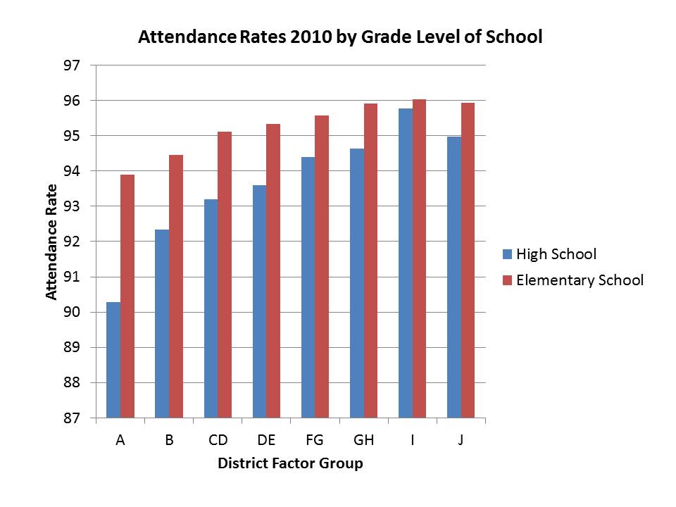
Most readers of the NJDOE report on reforming the state’s school finance formula likely glided right past the seemingly innocuous recommendation to shift the enrollment count method for funding from a fall enrollment count to an average daily attendance figure. After all, on its face, the argument provided seems to make sense. Let’s fund on this basis so that we can incentivize increased attendance in our most impoverished and low performing districts. (Another argument I’ve heard in other states is “why would we fund kids who aren’t there?”). The data were even presented to validate that attendance rates are lower in these districts (Figure 3.1).

I, however, could not let this pass, because Average Daily Attendance as a basis for funding is actually a well understood trick of the trade for reducing aid to districts and schools with higher poverty and minority concentrations.  I have both blogged about this topic in the past, and written published research directly and indirectly related to the topic.[1]

The intent of this blog post is to provide a (very limited, oversimplified) primer on the common methods of counting general student populations for purposes of determining state aid to schools (charter and district) and to provide some commentary on the pros and cons of each.

This blog post doesn’t touch upon the layers of additional factors associated with counting all of the various special student categories that may drive additional aid to local public school districts and charter schools.  I have, however, written numerous articles and reports on that topic as well. I’m writing about the underlying, basic count methods in this post because they are so often overlooked. But, they tend to have multiplicative effects throughout state school finance formulas.

So, here’s the primer (in somewhat oversimplified terms since there are multiple permutations on each):

Definitions

Fall Enrollment Count

A fall enrollment or fall attendance count is often based on the count of students either enrolled or specifically in attendance on a single date early in the fall of the school year (Oct 1, Oct 15, etc.). That figure may be based on students who have enrolled in a district or on students who actually attended on the given day. These single day counts in the fall are sometimes reconciled with a spring/January re-calculation leading to either upward or downward adjustments in remaining aid payments.

Average Daily Attendance

Average daily attendance counts are based on the numbers of children actually in attendance in a school or district each day, then, typically averaged on a bimonthly or quarterly basis in order to determine mid-year adjustments to state aid.

Average Daily Membership

Average Daily Membership or Average Daily Enrollment measures the numbers of children enrolled to attend a specific district throughout the year, and may also be periodically reconciled, as students enter and leave the district or school mid-year.

Comments on Each

Fall Enrollment Count

Fall enrollment counts allow for rational annual budget planning.  Note that there is a difference between enrollment and attendance.  Conceptually, attendance can’t exceed enrollment, if enrollment represents all those eligible to attend and enrolled to attend a particular school or district.   To some degree, it makes sense to base funding on the students enrolled rather than those that can be tracked down to attend on a single day in the fall.

Single point in time enrollment counts do not allow for mid-term adjustments to aid when students come or go during the school year. One might argue that this means that districts with significant mid-year attrition will be overpaid throughout the year. But these districts have had to plan their budgets and staffing based on the numbers they expected at the beginning of the year (though usually state aid estimates for budgeting purposes are based on prior year fall enrollments), and cannot easily make mid-year adjustments to accommodate losses in aid resulting from losses in students.

Average Daily Attendance (ADA)

One major problem with ADA is that districts must plan their budgets and staffing on an annual basis, and mid-year adjustments based on attendance counts, result in reductions in aid that are difficult to absorb mid-stream in the school year.  The bottom line is that districts and charter schools are obligated to have services available for all who might attend, not just all who do on a given day.

In addition, districts with higher poverty concentrations and high minority concentrations tend to have lower attendance rates for a variety of reasons beyond their control.  Students from disrupted, low income households are more likely, for example to have illnesses that go untreated, be malnourished or be exposed to other factors (second hand smoke & other environmental hazards) that compromise their health.  They have less access to transportation, and often come from single parent households, limiting parental supports to get them out the door to school.  One cannot fix these factors by reducing aid to school districts facing these dilemmas.

It is well understood that financing schools on the basis of average daily attendance systematically reduces aid to higher poverty districts.  The NJDOE report acknowledges that funding on this basis would lead to a reduction in aid of over 3% for districts in DFG A versus average districts (see figure 3.1).  Further, there is no substantive evidence that funding formulas based on ADA have ever improved or better balanced student attendance rates by district poverty and race over time.

Using ADA as the basis for determining funding can have other unintended consequences, such as increased numbers of school closure days in order to reduce the risk of low attendance.[2] School districts might, for example, choose to close for increased numbers of days during flu season, as attendance drops off. Closures typically do not reduce average daily attendance. In fact, closures are used by schools/districts operating under this model as a way to avoid low attendance days.  And some districts may be more significantly affected than others in this regard. Weather related decisions may also be affected.

Average Daily Membership (ADM)

ADM requires the State in collaboration with school districts to accurately manage their enrollment information.  It is unclear if NJDOE has the present ability to implement ADM in New Jersey

As with average daily attendance, districts plan their budgets and staffing on an annual basis, and mid-year adjustments to enrollment, leading to reductions in aid, may not easily be absorbed mid-stream.

Within year moves tend to more often affect higher poverty, urban districts,[3] potentially causing greater fluctuations in the budgets of these districts and complicating their financial planning.

A Few Examples from States

States in the Northeast do not tend to use Average Daily Attendance as their method for determining school aid. Rather, New York State had been using attendance as a factor in a prior school funding formula.[4]  Presently among Northeastern states, Connecticut uses Resident Pupils within its Education Cost Sharing Formula,[5] New York uses ADM toward the estimation of Total Aidable Foundation Pupil Units*,[6] Pennsylvania uses ADM,[7] Massachusetts uses a Fall Enrollment figure,[8] and Rhode Island uses ADM.[9] Other states around the country, including Kansas[10] and Colorado[11] use a fall enrollment count date.  Many others around the country use variations on either ADM or FTE, including Florda and Tennessee.  A few states — e.g., Missouri,[12] Texas and Illinois — still use ADA.  But published literature and legal analyses have, in fact, criticized the racially disparate effects of Missouri’s school funding formula (prior to recent reforms).[13]

Application to New Jersey Data

So, just how disparate are attendance rates across New Jersey school districts, by race and low income status, as well as by district factor grouping? Here are a few quick graphs based on the 2010-11 school level data on enrollments (enr file from NJDOE) and attendance rates (school report card d-base).

In short, what these graphs show is that if aid were allocated by average daily attendance as opposed to by enrollment or membership, districts with higher percent black population or higher percent low income, would receive systematic reductions to their state aid. These reductions would be non-trivial.  High school attendance in a school that is 100% black is, on average, nearly 7% lower than in a school that is 0% black. In elementary schools, the differential is between 2% and 3%.   These differentials would translate directly to percent reductions in aid.

Enrollment Data: http://www.nj.gov/education/data/enr/

Attendance Data: http://education.state.nj.us/rc/rc10/index.html

*Note: In some parts of the NY Aid formulas, the local wealth measure for taxable assessed value per pupil uses a variant of ADA in the denominator.  This use is generally much less significant to the overall calculation of aid than using ADA directly in the calculation of the foundation allotment.


[1] Green, P.C., Baker, B.D. (2006) Urban Legends, Desegregation and School Finance: Did Kansas City Really Prove that Money Doesn’t Matter? Michigan Journal of Race and Law. 12 (1)

Baker, B.D., Green, P.C. (2005) Tricks of the Trade: Legislative Actions in School Finance that Disadvantage Minorities in the Post-Brown Era American Journal of Education 111 (May) 372-413

[3] Killeen, K., Baker, B.D. Addressing the Moving Target: Should measures of student mobility be included in education cost studies? (Available on request)

[5]http://www.sde.ct.gov/sde/lib/sde/PDF/dgm/report1/merecsgd.pdf  “Resident Students are those regular education and special education pupils enrolled at the expense of the town on October 1 of each school year.”

[6]https://stateaid.nysed.gov/budget/combaidsa_0910.htm  For calculating Foundation Aid, which has been frozen since this point in time

[8]http://finance1.doe.mass.edu/chapter70/enrollment_desc.pdf. “In order to be included, a student must be officially enrolled on October 1st. Those who leave inSeptember or arrive after October 1st are not counted. A student who happens to be absent onOctober 1st is included nonetheless; this is a measure of enrollment, not attendance.”

[13]Green, P.C., Baker, B.D. (2006) Urban Legends, Desegregation and School Finance: Did Kansas City Really Prove that Money Doesn’t Matter? Michigan Journal of Race and Law. 12 (1)   Baker and Green (2006) explain: “Missouri is among a handful of states that continues to provide aid to local public school districts on the basis of their average daily attendance (ADA) rather than enrolled pupil count or membership. From 2000 to 2004, poverty rates and black student population share alone explain 59% of variations in attendance rates across Missouri school districts enrolling over 2,000 students. Both black population share and poverty rate are strongly associated with lower attendance rates, leading to systematically lower funding per eligible or enrolled pupil in districts with higher shares of either population.”

How NOT to fix the New Jersey Achievement Gap

Late yesterday, the New Jersey Department of Education Released its long awaited report on the state school finance formula. For a little context, the formula was adopted in 2008 and upheld by the court as meeting the state constitutional standard for providing a thorough and efficient system of public schooling. But, court acceptance of the plan came with a requirement of a review of the formula after three years of implementation. After a change in administration, with additional legal battles over cuts in aid in the interim, we now have that report.  The idea was that the report would suggest any adjustments that may need to be made to the formula to make the distributions of aid across districts more appropriate/more adequate (more constitutional?). I laid out my series of proposed minor adjustments in a previous post.

Reduced to its simplest form, the current report argues that New Jersey’s biggest problem in public education is its achievement gap – the gap between poor and minority students and between non-poor and non-minority students.  And the obvious proposed fix? To reduce funding to high poverty, predominantly minority school districts and increase funding to less poor districts with fewer minorities.

Why? Because money and class size simply don’t matter. Instead, teacher quality and strategies like those  used in Harlem Childrens’ Zone do!

Here’s my quick, day-after, critique:

The Obvious Problem? New Jersey’s Huge & Unchanging Achievement Gap

The front end of the report provides lots of nifty graphs based on cohort proficiency rates on tests which change substantially in some years. The graphs are neatly laid out to validate the argument that New Jersey’s achievement gap is large and hasn’t changed much.  First, on the point of the largeness of the gap, in national context. I’ve explained here how the NJ poor-non-poor gap is actually relatively average nationally. That’s not to say that it’s acceptable, we ought to work on this, by whatever reasonable means we can.

Thankfully (so I don’t have to revisit all of the problems here), the remainder of the achievement gap analysis presented by NJDOE is thoroughly critiqued in a recent post by Matt Di   Carlo at Shanker Blog. DiCarlo summarizes some of the NJ achievement gap and trend data to point out:

The results for eighth grade math and fourth grade reading are more noteworthy – on both tests, eligible students in NJ scored 12 points higher in 2011 than in 2005, while the 2011 cohorts of non-eligible students were higher by roughly similar margins.

In other words, achievement gaps in NJ didn’t narrow during these years because both the eligible and non-eligible cohorts scored higher in 2011 versus 2005. Viewed in isolation, the persistence of the resulting gaps might seem like a policy failure. But, while nobody can be satisfied with these differences and addressing them must be a focus going forward, the stability of the gaps actually masks notable success among both groups of students (at least to the degree that these changes reflect “real” progress rather than compositional changes).

http://shankerblog.org/?p=5102

Revelation? Gaps are a function of the height of the highs as much as the depth of the lows. If both get better, gaps don’t close as much. Gaps are still a problem, and must be addressed even if the highs get higher, because opportunity for access to college and on the labor market is relative. But, the framing of the NJ achievement gap by NJDOE is unhelpful in this regard, and the proposed solutions harmful. How does it make sense then, to provide greater increases in state aid to those students in districts at the highs and less to the lows?

Supporting Claims for Solutions?

Of course, to support the eventual pre-determined (utterly absurd) conclusion that the way to close this achievement gap is to cut aid to the poor and give it to the less poor requires that the report validate that money really has nothing to do with it. That, arguably, all of that money and increased staffing actually made things worse. Further, that cutting money from poor districts is what will make them better. I guess it also then stands to reason that giving larger aid increases to less poor districts might also make them worse, and viola – the achievement gap shrinks!

  • Claim 1: Money Has Nothing to do with It

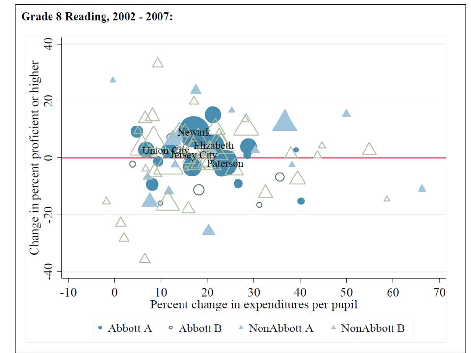
The claims that money doesn’t matter are built on some graphs which could easily make my list of dumbest graphs (or at least most pointless, deceptive, meaningless ones). Here’s one which is intended to convince the reader that all of that money sent to Abbott districts was for naught:

The report uses the graph to conclude:

While the above analysis is not sufficient to say whether new spending has had a positive impact on student achievement, it makes clear that financial resources are not the only – and perhaps not even the most important – driver of achievement.

If the graph isn’t sufficient to make this point, then why use the graph to try to make this point? Clearly, looking only at two variables – percent change in revenue and percent change in proficiency rates – is not even sufficient to make the softened claim “perhaps not even the most important” factor in improving student achievement.  These assertions can’t be supported in any way by this graph.

But even more suspect is the assertion embedded in the policy recommendations  that therefore, cutting aid from high poverty districts will cause no harm.

Better research on whether and to what extent school finance reforms improve student outcomes &/or equity of outcomes shows that in fact, school finance reforms can and do improve both the level and distribution of student outcomes: http://www.tcrecord.org/content.asp?contentid=16106

Higher quality research, in contrast, shows that states that implemented significant reforms to the level and/or distribution of funding tend to have significant gains in student outcomes.

Further, research on the broader question (based on real analysis) of whether and how class size and money matter indicates that, in simple terms, money does matter, and that things that cost money, like class size reduction and improving teacher quality (which does cost money) matter:  http://www.shankerinstitute.org/images/doesmoneymatter_final.pdf

Perhaps most importantly, even the research that has cast doubt on the strength of the positive influence of money on student outcomes has never validated that cuts to funding are not harmful and may be helpful. This is an absurd and unfounded claim.

Richard Murnane of Harvard said it well enough back in the early 1990s:

“In my view, it is simply indefensible to use the results of quantitative studies of the relationship between school resources and student achievement as a basis for concluding that additional funds cannot help public school districts. Equally disturbing is the claim that the removal of funds… typically does no harm.” (p. 457)

Murnane, R. (1991) Interpreting the Evidence on Does Money Matter? Harvard Journal of Legislation. 28 p. 457-464

Though not directly stated in the NJDOE report, it is implicit in the recommendations.

  • Claim 2: Teacher Quality & Harlem Childrens’ Zone-Style Strategies Can Close the Gap

Deeply embedded in the NJDOE report, making the transition from claims of dire achievement gaps toward how to fix them, is a discussion of how the obvious solutions based on current research must have to do with improving teacher quality and doing stuff like Harlem Childrens’ Zone does.  The NJDOE report includes two particularly bold statements that these two strategies alone – but certainly not money – can close the black-white achievement gap:

Having a highly effective teacher for three to five years can erase the deficits that the typical disadvantaged student brings to school.xxiii

Evidence from the Harlem Children’s Zone provides a similar demonstration of the power of schools to close the black-white achievement gap existing in New York.xxiv

Needless to say, these interpretations of the existing research are a massive unwarranted stretch. Matt Di    Carlo addresses the issue of  how many teachers does it take to close the achievement gap?

Even then, the implicit assertion of the report in general, that money has nothing to do with teacher quality or the distribution of teacher quality, is ridiculous. As I explain here:

A substantial body of literature has accumulated to validate the conclusion that both
teachers’ overall wages and relative wages affect the quality of those who choose to enter the teaching profession, and whether they stay once they get in. For example, Murnane and Olson (1989) found that salaries affect the decision to enter teaching and the duration of the teaching career, while Figlio (1997, 2002) and Ferguson (1991) concluded that higher salaries are associated with more qualified teachers.

http://www.shankerinstitute.org/images/doesmoneymatter_final.pdf

And further, on the flip side, cuts to funding and severe constraints on spending growth can reduce teacher quality:

Research on the flip side of this issue – evaluating spending constraints or reductions – reveals the potential harm to teaching quality that flows from leveling down or reducing spending. For example, David Figlio and Kim Rueben (2001) note that, “Using data from the National Center for Education Statistics we find that tax limits systematically reduce the average quality of education majors, as well as new public school teachers in states that have passed these limits.”

And, if we are interested in achievement gaps, and better distributing the quality of teachers across richer and poorer districts and children:

Salaries also play a potentially important role in improving the equity of student outcomes. While several studies show that higher salaries relative to labor market norms can draw higher quality candidates into teaching, the evidence also indicates that relative teacher salaries across schools and districts may influence the distribution of teaching quality. For example, Ondrich, Pas and Yinger (2008) “find that teachers in districts with higher salaries relative to non-teaching salaries in the same county are less likely to leave teaching and that a teacher is less likely to change districts when he or she teaches in a district near the top of the teacher salary distribution in that county.”

But even more strikingly, these interpretations ignore entirely that what Harlem Childrens Zone does, above and beyond anything else is to spend a ton of money (raising as much as $60,000 per pupil in private giving in some years, for additional information, see this post) and spend much of that money on providing smaller class sizes than surrounding NYC district schools.  So, in effect, what Harlem Childrens Zone shows us (in its best light) is that we can make modest progress toward closing achievement  gaps by leveraging substantial additional financial resources to provide comprehensive wrap-around community resources coupled with small class sizes.

The Proposal: Cut Aid to the Poor and Give More to the Non-Poor (& Less Poor)

After the rather predictable preamble about New Jersey’s achievement gap, coupled with classic claims that money clearly isn’t the answer, and things that actually cost money, but we’ll pretend don’t really cost money are the answer, the obvious recommendations for changes to the school finance formula are to reduce aid to the poor and give it to the less poor.

Here are the distributions of the percent change in state aid for 2012-13 across K-12 districts and the per pupil (preliminary estimates in need of updated enrollment figures) by districts arranged from lower to higher concentrations of low income children:

K-12 Unified Districts Only

K-12 Unified Districts Only

The report argues specifically that the adjustments in the aid formula for low income children should be reduced. That they should be reduced because they were increased without basis, over original recommendations provided to the state board back in 2003 (but hidden until 2006). In short, that those low income kids really don’t need that much and will be better off without it.

I critique those original recommendations in this report. Essentially, the argument is that there is simply no basis for providing as much as an additional 57% per low income child in high poverty concentration districts, therefore we should reduce it. The icing in the cake in this argument is a table in which the report points out that Texas, Vermont and Maine provide less than this. How in the heck they chose Texas, Vermont and Maine is beyond me. These states are at least a little different from NJ… and… from each other.

Beyond that, it should go without saying that the decisions of policymakers in three completely different states that aren’t New Jersey really have little or nothing to do with the cost of providing equal educational opportunity to low income kids in New Jersey.  Are we going to base all of our policies on Vermont… and Texas simultaneously? That would be a real trick? Consider the possibilities?

As my reported linked above points out, the weights in the original analysis were too low, and were thus adjusted upwards, though not necessarily far enough? On what basis? Well, the actual research on the costs of providing equal educational opportunities for low income children points to weights nearer to double, not 40% or 50% higher than average.  Here’s the most directly relevant article, from the Economics of Education Review, and here’s a link to a National Research Council report on the subject.

In a further effort to reduce aid to poorer districts (in a way that will have multiplicative effects throughout the formula) NJDOE proposes to base the allocation of aid on Average Daily Attendance. This is actually a classic, well understood Trick of the Trade for shifting aid away from poorer districts which for a variety of reasons outside their control have lower attendance rates. Way back when I started this blog, one of the topics I wrote about was these seemingly innocuous tricks (a subject of my research).  While other states do continue to use these policies, since their effects are well understood, to recommend such a change is shameless.

But even setting aside the empirical evidence on “costs,” how can it possibly make sense that achievement gaps between richer and poorer districts will be moderated by taking money from poorer districts and redistributing it back to less poor ones?

That’s the report in its essence.

We’ve got big achievement gaps.

Money doesn’t matter – in fact – it must be making things worse not better.

Therefore, to close the gaps, we need to give less of that harmful money to the poor, and more to the non-poor.

Go figure?

Newark Public Schools: Let’s Just Close the Poor Schools and Replace them with Less Poor Ones?

This week started with several individuals from the Washington DC area asking if I would address a school closure/turnaround report produced by an outside consulting firm on contract with the DC Public Schools (as I understand it). That consulting firm basically made a map of the locations of the schools around the city, identified which schools had higher and lower proficiency rates, and where proficiency rates had changed over time, and then basically listed the lowest performing schools by these deeply flawed metrics suggesting their closure and alternatives for “turnaround,” essentially focusing on conversion and expansion of charter schools. Thankfully, before I even got a chance to dig into the report, two other bloggers took it to task. As Steve Glazerman explains here:
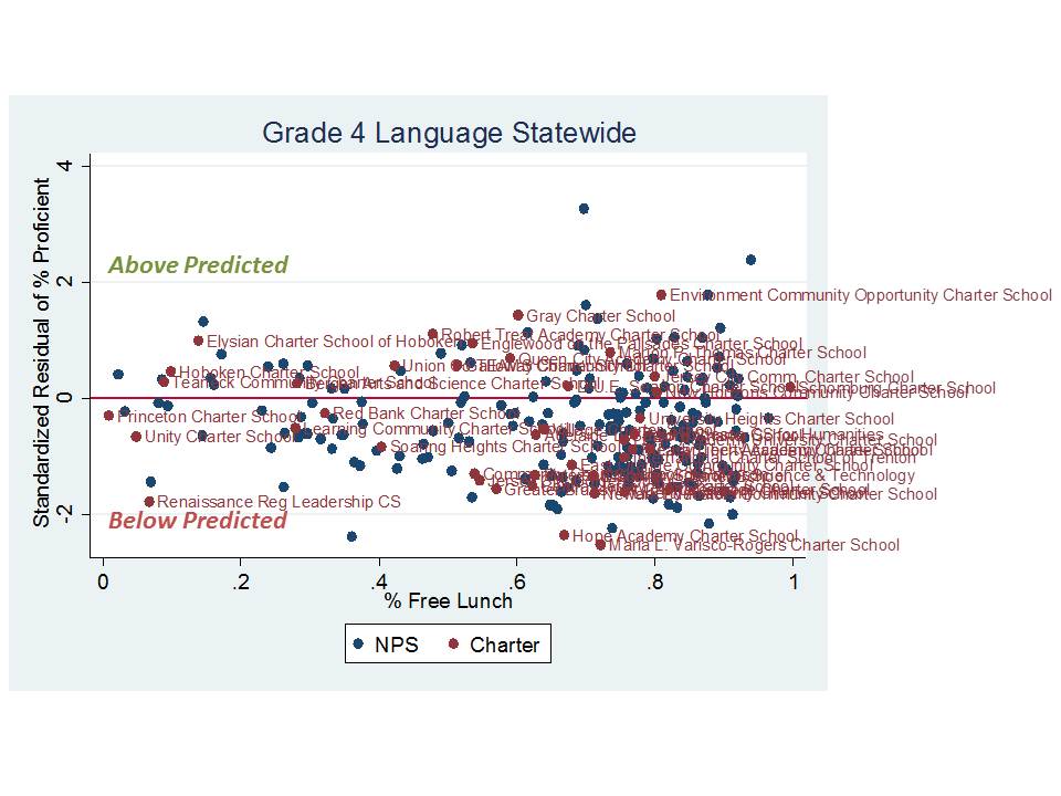
Student proficiency rates have long been discredited as a school performance measure because proficiency rates capture student achievement at a point in time, but say little about how much the school or its teachers contributed to its current students’ performance.

For example, a middle school could have declining proficiency rates if a feeder school begins sending more at-risk students to it, even if the teachers are especially skilled at working with a challenging population.

At a bare minimum, a sensible measure accounts for what a student knew before enrolling in the school (for example, using the student’s score from the prior year). This is why more and more states, including DC, have adopted student achievement growth measures instead of proficiency rates for their teacher and school performance indicators.

Using a trend in proficiency rates doesn’t help, and only creates a false sense of “gains” which is more likely to measure demographic change and other differences between successive cohorts of students cycling through a school than the performance of the schools’ educators. That’s because it compares students in one year to different students, instead of students in one year to the same students in the prior year.

By relying on flawed measures of school performance, policymakers risk closing down schools that are best equipped to work with challenging populations and replacing them with ones that would fail miserably if they started working with a different student body.

http://greatergreaterwashington.org/post/13512/flawed-study-mis-rates-potential-dc-school-closings/

Matt Di        Carlo also addressed the issue of conflating student and school performance here.

This early-in-the-week flap brought back to mind an even more crude, sloppy and egregiously flawed report that was produced last spring for Newark Public Schools by a group calling itself Global Education Advisors. Here’s a story about the report. http://www.njspotlight.com/stories/11/0607/2319/. And here’s a link to what they produced: http://www.njspotlight.com/assets/11/0306/2157

Let’s be really blunt/honest here. This stuff is hack junk, and whoever is responsible for producing it really has no business providing recommendations on anything relating to schools/education, or for that matter the basic use/presentation of data.

Because I didn’t take this report seriously at all at the time, I totally blew it off. After all, who would really make decisions affecting large numbers of low income urban schoolchildren based on such ill-conceived schlock. At least the shoddy analyses produced by the Pittsburgh based group working for Washington DC kind of looked serious.

Note that on Page 6 of the Newark report, the authors suggest that charter schools be moved into several NPS school locations including MLK, Burnet and Eighteenth Avenue. This recommendation appears in part based on the authors’ identification of “low performing schools” shown in appendices at the end of the document. The third slide from the end simply sorts schools from highest to lowest proficiency rates to identify the lowest performing quintile from 2009: http://www.njspotlight.com/assets/11/0306/2157

And perhaps none of this schlock really does enter into the current discussions on Newark school closures. One can only hope.

In any case, yesterday’s Star Ledger included a story on proposed school closures and reorganization in Newark. http://www.nj.com/news/index.ssf/2012/02/newark_superintendent_to_annou.html

Let me start by saying that I do like some of the language/explanations being used by the Superintendent in explaining her desire to look at the system as a whole – including charter, magnet and traditional public schools – and how they each affect one another in terms of how children are distributed across those schools.

Let me also be clear that I’m all for within district school reorganization especially to optimize the efficiency of school district operations and achieve more balanced student populations across schools. Very small schools operating within population dense urban districts are a resource drain. By very small, I mean elementary schools of less than 300 students, or high schools of less than 600 students. Subsidizing very small schools’ operations necessarily takes away from other things. Also, concentrated poverty – high concentrations of children from very low income families – is very hard to overcome, as is racial isolation in schools. To the extent that school districts can better distribute/balance/integrate populations, improving outcomes can be easier. This stuff should be considered/on the table. Just to be clear, I’m all for appropriate re-organization.
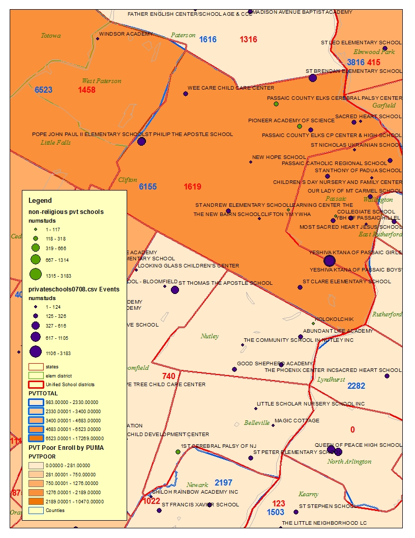
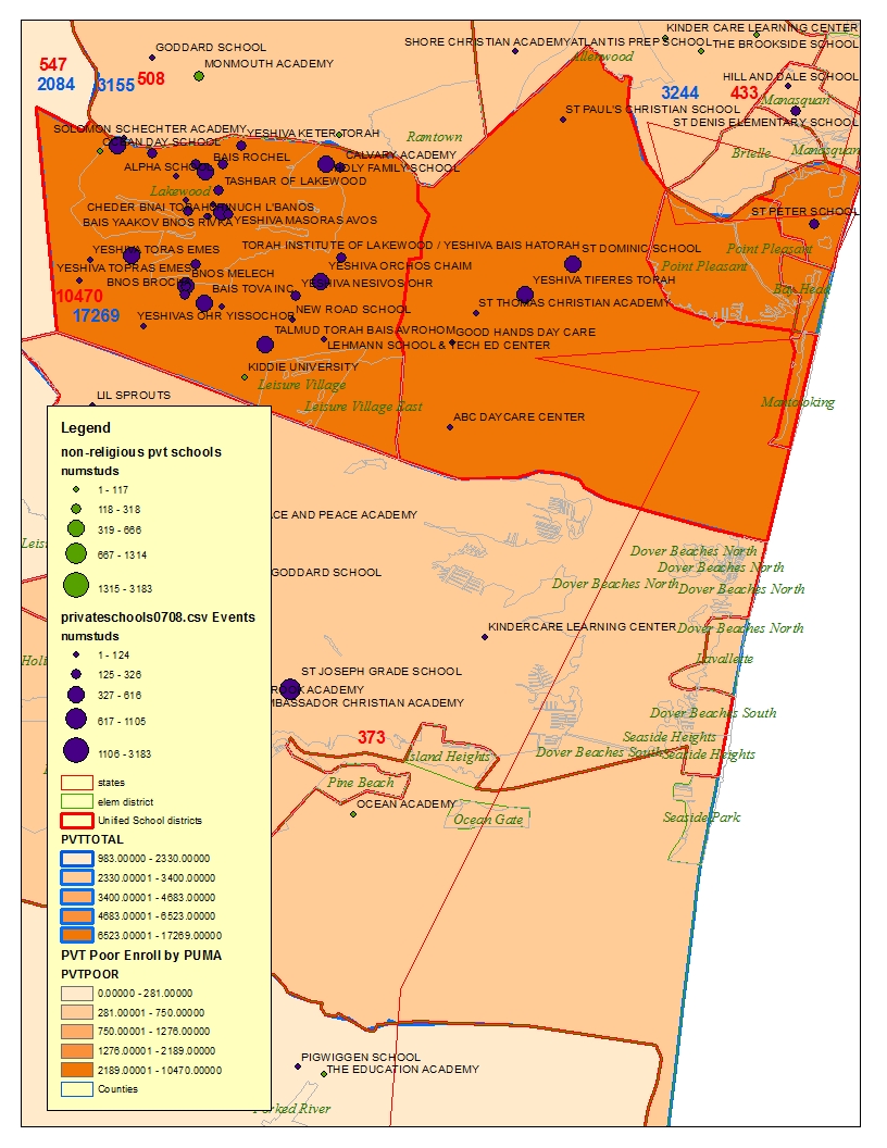
What I’m not for… and I’m not yet sure what’s going on here… is pretending that we can simply shut down schools in high poverty neighborhoods, blaming teachers and principals for their failure, and then either a) replacing the school management and staff with individuals likely to be even less qualified and less well equipped to handle the circumstances,  or b) initiating an inevitably continuous pattern of displacement from school to school to school for children already disadvantaged.

Again, I don’t yet see this kind of language being used in Newark, as it has been in New York City, for example (regarding the 33 “low performers” there).

But, let’s take a quick look at the schools which the Ledger reports as being on the closure hit list: “Dayton Street, Martin Luther King, 18th Avenue, Miller Street and Burnet Street elementary schools”

Some of these schools also made the Global Education Advisors hit list, including Burnett, MLK and Eighteenth Ave.

First, here’s where the schools fit in a districtwide/citywide sort of % Free Lunch (2011):

Closure elementary schools are indicated in Red, and charter schools in Green. District average (labeled Total – sorry) is in Black. In short, these are high poverty schools, with two of them – Dayton and Miller St having among the highest concentrations of low income children.

Now, here’s how they perform on a few select tests, with the schools sorted by low income concentration and proficiency based on 2010 assessment data (General Test Takers):

In brief, they perform pretty much where you’d expect them to, with Burnett and Miller outperforming similarly low income schools in Math, with Dayton well below the trendline, and with Burnet falling down with Dayton on Language. But again these schools still fall near other similar schools.
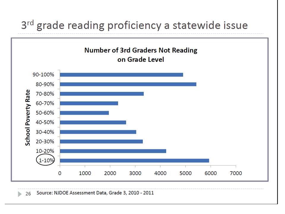
Low income concentration alone isn’t the only reasonable predictor of performance differences across theses schools, and it’s useful to be able to bring in  – aggregate – results across all of the tests and grade levels. So, I ran a quick & dirty descriptive regression model in which I predicted general test taker proficiency rates accounting for a) % Free lunch b) % by racial composition (Black/Hispanic) c) % LEP/ELL, d) % Female (strong predictor w/NJ scores in urban contexts). And, I control for which test/grade level. Here’s a link to the output.

Then, for visual fun, I plotted the differences (standard deviations) between expected and actual performance for 2010 assessments… here:

So, what we have here is a mix of Newark schools much like other Newark schools which are very high in poverty. They have a mix of student outcomes, some beating expectations and others falling short, and they have a mix in terms of specific grade levels and assessments.

And notice the green dots in the picture – those charter schools. All of those charter schools serve substantively less poor populations than the NPS schools identified by the Ledger for closure. And some of those charter schools actually fall further below their “expected” performance levels than the worst of the NPS schools slated for closure.
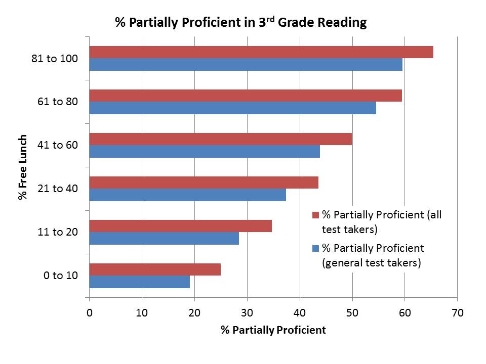
Let’s be absolutely clear here – these high poverty schools slated for closure (if the Ledger is correct) – cannot simply be converted into lower poverty schools and made “more successful.”

Indeed redistributing those students among less poor students – altering the peer composition by disrupting concentrated poverty might help. But there aren’t a whole lot of options available for accomplishing that. Further, with each disruptive relocation for each child comes another potential marginal loss.

Let’s just hope those involved are being somewhat more thoughtful about these decisions and using more reasonable information to guide their decision making that what was produced for the district last spring, or that which stirred up such controversy in DC earlier this week.

UPDATE:

Here are some maps of the above data. First, here are the schools in Newark, with the regression based relative performance estimates from the last figure above. Schools in blue perform above expectations (based on proficiency rates) and schools in red below expectations. Schools with a push-pin in them are charter schools and schools with a red X are elementary schools slated for closure.  As in the above pictures (because it’s the same data), those slated for closure include a mix of higher and lower performing schools. Similarly, charter schools are a mixed bag. Note that the locations of the schools are determined using the latitude and longitude data from the NCES Common Core, which by my experience, may include some errors (school locations may be incorrectly or imprecisely reported).
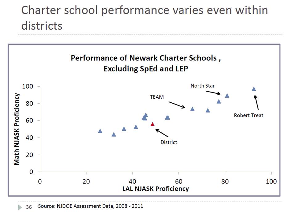
Here’s what it looks like with the schools shaded according to % free lunch. Schools slated for closure are invariably among the highest poverty schools. The difficulty here is that other NPS schools around them also tend to be very high poverty, while nearby charter schools have much… much… much lower poverty concentrations.