Reformy Platitudes & Fact-Challenged Placards won’t Get Connecticut Schools what they Really Need!

For a short while yesterday – more than I would have liked to – I followed the circus of testimony and tweets about proposed education reform legislation in Connecticut. The reform legislation – SB 24 – includes the usual reformy elements of teacher tenure reform, ending seniority preferences, expanding and promoting charter schooling, etc. etc. etc. And the reformy circus had twitpics of of eager undergrads (SFER) & charter school students (as young as Kindergarten?) shipped in and carrying signs saying CHARTER=PUBLIC (despite a body of case law to the contrary, and repeated arguments, some lost in state courts [oh], by charter operators that they need not comply with open records/meetings laws or disclose employee contracts), and tweeting reformy platitudes and links to stuff they called research supporting the reformy platform (Much of it tweeted as “fact checking” by the ever-so-credible ConnCAN).

Ignored in all of this theatre-of-the-absurd was any actual substantive, knowledgeable conversation about the state of public education in Connecticut, the nature of the CT achievement gap and the more likely causes of it, and other problems/failures of Connecticut education policy.

First, that achievement gap:

Yes, Connecticut has a large achievement gap… among the largest. But, I encourage you to read my previous post in which I explain that poverty achievement gaps in states tend to be mostly a function of income disparity in states. The bigger the income difference between rich and poor, the bigger the achievement gaps between them. But, even then, the CT achievement gap is a problem. CT’s income gaps between poor and  non-poor are most similar to those of MA and NJ, but both MA and NJ do better than CT on achievement gap measures. Here’s a graph relating income gap and achievement gap:

Connecticut has a higher than otherwise expected gap and MA, NJ and RI have lower.

But, is this because of teacher tenure? Is it because teachers aren’t regularly fired because of bad student test scores? Is it because there aren’t enough charter or magnet schools in CT? That’s highly unlikely for several reasons.

First, teachers have tenure status in both higher and lower performing, higher and lower income districts in CT. As I show below, teacher salaries are lower and class sizes larger in disadvantaged districts. SB24 does NOTHING to fix that.

As for highly recognized charter and magnet schools in CT, these schools are actually serving far fewer of the lower income kids within the lower income neighborhoods. So, while they might be doing okay, on average, for the kids they are serving, it is equally likely that they are contributing to the achievement gap as much if not more than helping it. That’s not to say they aren’t helping the students they are serving. But rather that the segregated nature of their services is capitalizing on a peer effect of concentrating more advantaged children. Either way, these schools are unlikely to serve as a broad based solution for CT education quality in general or for resolving achievement gaps.

During this same time period, teachers in NJ and MA also had similar tenure protections and weren’t being tenured or fired based on student test scores. Still somehow, those states had smaller gaps. Further, while both other states do have charter schools, New Jersey which has a much smaller achievement gap than CT has thus far maintained a relatively small charter sector. What Massachusetts and New Jersey have done is to more thoroughly and systematically address school funding disparities.

The Real Disparities:

In a previous series of posts, I discussed what I called Inexcusable Inequalities. I actually used CT as the main example, not because CT is among the worst states on funding inequality, but because I happened to have good data on CT. CT is not among the worst. That special space is reserved for NY, IL, PA and a few others. But CT has its problems. Let’s do a quick walk through. In my previous analysis

I started my previous post by comparing per pupil spending adjusted for needs and costs across all CT school districts with actual outcomes of those districts in order to categorize CT districts into more and less advantaged groups. The differences, starting with the figure below were pretty darn striking. Districts like New Canaan, Westport and Weston have rather high need and cost adjusted spending, certainly by comparison with Bridgeport, New London or New Britain.

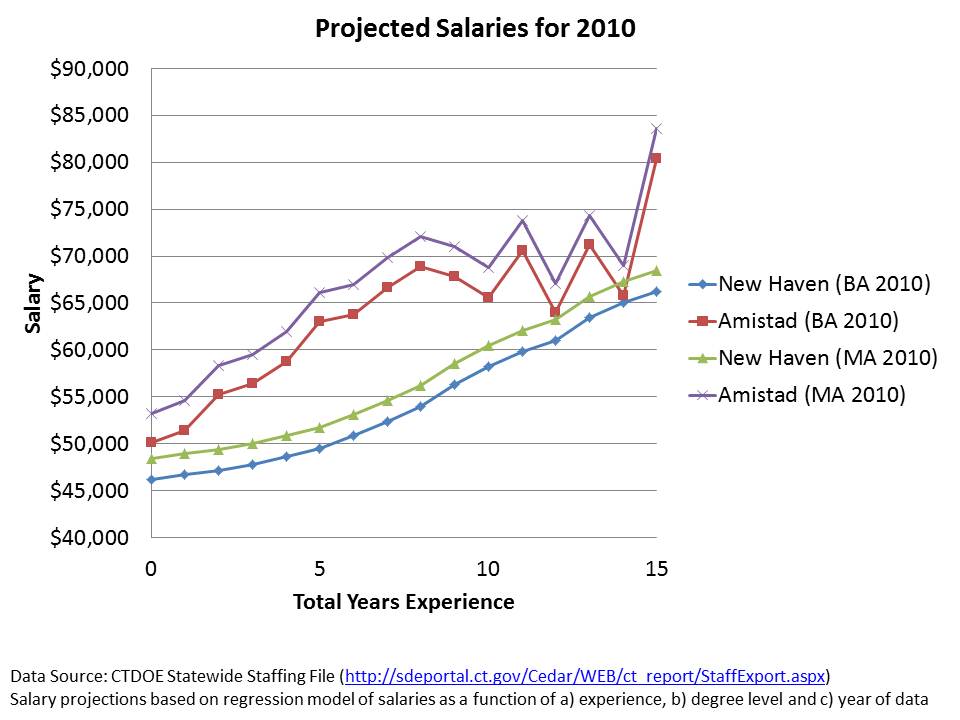
For Illustrative purposes, I then picked a few of the most disadvantaged CT districts and compared them to the most advantaged on a handful of measures – shown below. In this table, I report their nominal spending per pupil – not adjusted for the various needs and additional costs. Even without those adjustments, districts like Bridgeport and New Britain start well behind their more advantaged peers. And among other differences, they pay their teachers less a) on average and b) at any given level of experience or education. Pretty darn hard to recruit and retain quality teachers into these settings given the combination of working conditions and lower pay.

AND MAKING TENURE CONTINGENT ON STUDENT TEST SCORES, OR FIRING TEACHERS BASED ON STUDENT TEST SCORES WON’T FIX THAT! IT WILL FAR MORE LIKELY MAKE IT MUCH, MUCH WORSE!

Salary disparity patterns hold when comparing a) all districts in the upper right of the first figure with b) all districts in the lower left, and c) districts furthers in the lower left (severe disparity):

On top of that, class sizes are also larger in the higher need districts, despite the need for smaller class sizes to aid in closing the achievement gaps for these children (more here).

Further, as I showed in my previous post, the funding disparities have significant consequences for the depth and breadth of curricular offerings available to high students in these districts:

For this analysis, I used individual teacher level data on individual course assignments to determine the distribution of teacher assignments per child, thus characterizing each district’s and group of districts’ offerings (for related research, see: https://schoolfinance101.com/wp-content/uploads/2010/01/b-baker-mo_il-resourcealloc-aera2011.pdf)

Disadvantaged districts have far fewer total positions per child, and if we click and blow up the graph, we can see some striking discrepancies! Those high need districts have far more special education and bilingual education teachers (squeezing out other options, from their smaller pot!). Those high need districts have only about half the access to teachers in physical education assignments or art, much less access to Band (little or none to Orchestra), and significantly less access to math teachers!

IN REALLY SIMPLE TERMS, UNDER CT POLICIES, HIGH NEED DISTRICTS SUCH AS BRIDGEPORT AND NEW BRITAIN HAVE FAR FEWER RESOURCES AND FAR GREATER NEEDS. THEIR TEACHERS HAVE LOWER SALARIES AND, ON AVERAGE, LARGER CLASSES.

Messing with teacher evaluation, especially in ways as likely to do harm as to do good, is an unfortunate distraction at best. Doing so on the basis that those are the policy changes needed to close Connecticut’s achievement gap reflects an astounding degree of utter obliviousness!

What about those amazing CT charter and magnet schools? Aren’t they the ultimate scalable solution?

I’ve written much more detail here, about the issue of whether renowned CT charter schools actually “do more, with less while serving the same students.” Here are a few quick graphs. First, Amistad Academy of New Haven in context, by % free lunch:

Next, Capital Prep in Hartford in context. Now, I typically wouldn’t (shouldn’t) have to point out that a small selective magnet program drawing students across district lines is simply NOT REPRESENTATIVE and not likely a scalable solution for all kids.  It’s a potentially good option for those with access, and much of the benefit of the option likely rests in selective peer group effect (as noted above). I feel compelled, however, to point out how Capital Prep is (obviously) not a typical  school only because the head of the school seems to be trying to argue that it is a model scalable reform Really? Really? I mean…. REALLY?):

But what about Governor Malloy’s funding plan? That’ll fix it! Won’t it?

Amidst all of the reformy platitudes, misguided and fact-challenged placards and the like, there were occasional references to Governor Malloy’s changes to the state school finance formula – seemingly implying that the Governor has taken major steps toward making the (supposedly already overfunded) system fairer. There was certainly no outrage expressed at the types of disparities I note above, and all the warm fuzzy feeling anyone could possibly conjure that any finance package tied to the vast batch of reformyness on steriods would be sufficient to get the job done.

After all, new aid would be progressively distributed. Those poor districts would get, on average, about… oh… a whopping new $250 per pupil while richer districts would get only about $50 per pupil. And with this astounding outlay of fiscal effort, the most important thing is to make sure it doesn’t just go straight into the pockets of those union-lacky-lazy-self-interested-teachers, of course – or at least certainly not the “ineffective” ones.

Here are the effects of the Malloy funding increases, on a per pupil basis, if added on to Net Current Expenditures per Pupil (pulling out magnet school aid which creates a distorted representation for New Haven and Hartford):

What we have in this picture is each district as a dot (circle or triangle). Districts are sorted from low to high percent free/reduced lunch along the horizontal axis. Net Current Expenditures are on the vertical axis. Blue Circles represent current (okay, last year) levels of current expenditures per pupil. RED TRIANGLES REPRESENT THE ADDITION OF MALLOY AID. Wow… that’s one heck of a difference. That should certainly fix the disparities I laid out above! NOT!

Here it is with district names added, so you can see where some of our more disadvantaged districts start and end up:

Not that helpful for Bridgeport or New Britain, is it?

To summarize:

The fact is that EQUITABLE AND ADEQUATE FUNDING IS THE NECESSARY UNDERLYING CONDITION FOR IMPROVING EDUCATION QUALITY IN CONNECTICUT AND REDUCING ACHIEVEMENT GAPS!!!!!! (related research: http://www.tcrecord.org/library/content.asp?contentid=16106)

Equitable and adequate funding is a necessary underlying condition for running any quality school, be it a traditional public school, charter school or private school. Money matters and it matters regardless of the type of school we’re talking about.

Equitable and adequate funding is required for recruiting and retaining teachers in Connecticut’s high need, currently under-resourced schools (something charter operators realize). Recruiting and retaining teachers to work in these communities will take more, not less money.

Reformy platitudes (and fact-challenged placards) about tenure reform won’t change that.  And altering the job security landscape to move toward ill-conceived evaluation frameworks and flawed metrics will likely hurt far more than it will help.

It’s time to pack up the reformy circus, load up the buses and shred the placards and have some real, substantive conversations about improving the quality and equality of public schooling in Connecticut.

Beneath the Veil of Inadequate Cost Analyses: What do Roland Fryer’s School Reform Studies Really Tell Us? (if anything)

Here’s a short section from one of my papers currently in progress (part of the summary of existing literature on alternative models/strategies, and marginal expenditures).

A series of studies from Roland Fryer and colleagues have explored the effectiveness of specific charter school models and strategies, including Harlem Childrens’ Zone (Dobbie & Fryer, 2009), “no excuses” charter schools in New York City (Dobbie & Fryer, 2011), schools within the Houston public school district (Apollo 20) mimicking no excuses charter strategies (Fryer, 2011, Fryer, 2012), and an intensive urban residential schooling model in Baltimore, MD (Curto & Fryer, 2011).  In each case, the models in question involve resource intensive strategies, including substantially lengthening school days and years, providing small group (2 or 3 on 1) intensive tutoring, providing extensive community based wrap around services (Harlem Childrens’ Zone) or providing student housing and residential support services (Baltimore).

The broad conclusion across these studies is that charter schools or traditional public schools can produce dramatic improvements to student outcomes by implementing no excuses strategies and perhaps wrap around services, and that these strategies come at relatively modest marginal cost. Regarding the benefits of the most expensive alternative explored – residential schooling in Baltimore (at a reported $39,000 per pupil) – the authors conclude that no excuses strategies of extended day and year, and intensive tutoring are likely more cost effective.

But, each of these studies suffers from poorly documented and often ill-conceived comparisons of costs and/or marginal expenditures.

In their study on the effectiveness of no excuses New York City charter schools, Dobbie and Fryer (2011) use data on 35 [those responding to their survey] charter schools to generate an aggregate index based on five policies including teacher feedback, use of data to guide instruction, high-dosage tutoring, increased instructional time and high expectations. [i] They then correlate this index with their measures of school effectiveness across the 35 schools, finding a significant relationship. Separately, the authors report weak or no correlations between “traditional” measures of school resources including per pupil spending and class size and their effectiveness measures, concluding that these measures are not correlated with effectiveness. In short, Dobbie and Fryer argue that potentially costly strategies matter, but money doesn’t. [or so the headlines went]

First, if potentially costly strategies matter (even if those costs are never measured), then so too does money itself. Second, the authors’ analysis and documentation of the financial data is woefully inadequate.[ii] The authors fail entirely to consider that the majority (55 to 60%) of per pupil spending differences across New York City charter schools are explained by grade ranges served and total enrollments (and/or enrollment per grade level, economies of scale), where enrollment is to some extent a function of institutional maturation (scaling up) (Baker and Ferris, 2011, p. 33).[iii]  Given the extent that expenditure variation is largely a function of uncontrollable structural differences across these schools, it is unlikely that one will find a simple correlation between spending variation and student outcomes (without finding some way to control for the structural differences). The authors also fail to report the source or descriptive statistics on their expenditure measure.

In earlier work on Harlem Childrens’ Zone, Dobbie and Fryer[iv] similarly argued that the substantial benefits they found for children participating in HCZ charter schools could be obtained at what they [feebly attempt to] characterize as negligible marginal expense. They arrive at this conclusion via the following [hap-hazard] cost calculation and [bogus] comparison:

The total per-pupil costs of the HCZ public charter schools can be calculated with relative ease. The New York Department of Education provided every charter school, including the Promise Academy, $12,443 per pupil in 2008-2009. HCZ estimates that they added an additional $4,657 per-pupil for in school costs and approximately $2,172 per pupil for after-school and “wrap-around” programs. This implies that HCZ spends $19,272 per pupil. To put this in perspective, the median school district in New York State spent $16,171 per pupil in 2006, and the district at the 95th percentile cutpoint spent $33,521 per pupil (Zhou and Johnson, 2008).[v]

Accepting the additional costs of Harlem Childrens’ Zone as adding up to $19,000 per pupil and accepting as a relevant comparison basis that this figure lies somewhere between the New York statewide median and statewide 95%ile of district spending, then the marginal expense for Harlem Childrens’ Zone might just be trivial. But the marginal expense calculation for HCZ is not clearly documented and highly suspect and the comparison basis misleading.

Baker and Ferris (2011) discuss the difficulties of deriving comparable spending per pupil figures for Harlem Childrens’ Zone schools, pointing out that reported total revenues based on IRS filings vary from $6,000 to $60,000 per pupil (p. 13) depending on the year of data and which children are counted in the denominator (charter students or all school aged residents in the zone).

Further it makes little sense to contextualize the HCZ total figure by placing it between the statewide median and 95%ile district, where affluent suburban Westchester County and Long Island districts far outpace per pupil spending in New York City (Baker and Welner, 2010, p.  10).[vi] Rather, more meaningful comparisons might use relevant budget components for all schools in New York City, or schools serving similar student populations in the same area of the city. Using the city Independent Budget Office (2010b) figure for 2008-09 of $15,672, and accepting the authors total cost figure of $19,000 per pupil, the marginal expense for HCZ would be 21%. Comparing against nearby school site budgets for select schools (see Baker and Ferris, p. 24), the marginal expense is 36 to 60%.

Similar imprecision plagues Fryer’s analysis of transfer of “no excuses” strategies from the charter school context to traditional public schools in Houston, Texas. Fryer explains in his study of Apollo 20 schools in Texas:

The marginal costs are $1,837 per student, which is similar to the marginal costs of other high-performing charter schools. While this may seem to be an important barrier, a back of the envelope cost-benefit exercise reveals that the rate of return on this investment is roughly 20 percent 30 – if one takes the point estimates at face value. Moreover, there are likely lower cost ways to conduct our experiment. For instance, tutoring cost over $2,500 per student. Future experiments can inform whether three-on-one (reducing costs by a third) or even online tutoring may yield similar effects.

Among other things, it is important to understand that this $1,837 figure is derived in a Houston, TX context (as opposed to an NYC context) where the average middle school operating expenditure per pupil is $7,911, for an average marginal expense of 1837/7911 = 23.2%.  While no documentation is provided for the $1,837 figure in Fryer’s paper, that figure is quite close to the average difference in current operating expenditure for the 5 Apollo 20 middle schools in Houston compared to all schools in Houston. But, when comparing only to other Houston Middle Schools that figure rises to $2,392, or 30%. In our view, a 23% to 30% increase in cost is substantial, but further exploration of the true costs of scaling the various reform strategies presented is warranted. [data available here: http://ritter.tea.state.tx.us/perfreport/aeis/2010/DownloadData.html]

In short, across Fryer’s various studies, we find a range of marginal expenses for preferred models and strategies from 21% to 60% above average expenditures of other schools not using the preferred models and strategies. So, what are these studies really saying?

Setting aside the exceptionally poor documentation behind any of the marginal expenditure or cost estimates provided in each and every one of these studies, throughout his various attempts to downplay the importance of financial resources for improving student outcomes, Roland Fryer and colleagues have made a compelling case for spending between 20 and 60% more on public schooling in poor urban contexts including New York City and Houston, TX.

I suspect there are more than a few urban superintendents and principals out there who would appreciate seeing and infusion of resources of this magnitude. And many might even be happy to allocate the bulk of those resources to adopt such strategies as increasing teacher compensation in order to extend school days and years and implement intensive tutoring supports (surprisingly non-reformy strategies).

I should also point out that 20% to 60% more funding, while marginally improving student outcomes in these districts, likely still falls well short of providing children attending poor urban districts equal opportunity to achieve outcomes commonly achieved by their more affluent suburban counterparts, and may fall well short of providing adequate resources for these children to gain access to and succeed in higher education and the labor market beyond. Estimating the true costs of these more lofty outcome objectives is a topic for another day.

NOTE: I would caution however, that we have little basis for asserting that a 20 to 60% increase in per pupil spending would be more efficiently spent on these strategies than on such alternatives as class size reduction and/or expansion of early childhood programs. These comparisons simply haven’t been made, and Fryer’s attempt at such a comparison (NYC “no excuses” study) is woefully inadequate.  Pundits who argue that class size reduction is an especially expensive and inefficient alternative seem willing to ignore outright the substantial additional costs of the strategies promoted in Fryer’s work, arriving at the erroneous conclusion (with Fryer’s full support) that class size reduction is ineffective and costly, and extended school time and intensive tutoring are costless and highly effective.


[ii] For a discussion of methods used for evaluating the relationship between fiscal inputs and student outcomes, see Baker, B.D. (2012) Revisiting the Age-Old Question: Does Money Matter in Education. Shanker Institute. http://www.shankerinstitute.org/images/doesmoneymatter_final.pdf

[iii] Baker, B.D. & Ferris, R. (2011). Adding Up the Spending: Fiscal Disparities and Philanthropy among New York City Charter Schools. Boulder, CO: National Education Policy Center. Retrieved [date] from http://nepc.colorado.edu/publication/NYC-charter-disparities.

[iv] Dobbie, W. & Fryer, R. G. (2009). Are High-Quality Schools Enough to Close the Achievement Gap? Evidence from a Bold Social Experiment in Harlem. Unpublished manuscript, Harvard University, 5.

[v] Dobbie, W. & Fryer, R. G. (2009). Are High-Quality Schools Enough to Close the Achievement Gap? Evidence from a Bold Social Experiment in Harlem. Unpublished manuscript, Harvard University, 5. http://www.economics.harvard.edu/files/faculty/21_HCZ_Nov2009_NBERwkgpaper.pdf

[vi] Baker, B. D., & Welner, K. G. (2010). “Premature celebrations: The persistence of interdistrict funding disparities” Educational Policy Analysis Archives, 18(9). Retrieved [date] from http://epaa.asu.edu/ojs/article/view/741

Jay Greene (Inadvertently?) Argues for a 23% Funding Increase for Texas Schools

I was intrigued by this post from Jay Greene today, in which he points out that public schools can learn from charter schools and perhaps can implement some of their successes. Specifically, Greene is referring to KIPP-like “no excuses” charter schools as a model, and their strategies for improving outcomes including much extended school time (longer day/year).  As the basis for his argument, Greene refers specifically to Roland Fryer’s updated analysis of Houston’s Apollo 20 schools – which are – in effect, models of no excuses charters applied in the traditional public district.  Greene opines:

Traditional public schools can get results like a KIPP school without having to actually become KIPP schools.  They just have to imitate a few of the key features employed by KIPP and other successful charter schools.  This is incredibly encouraging news.

Greene does acknowledge that pesky little issue of potentially higher costs, but seems to go along with Fryer’s downplaying of the additional costs, given the amazing benefits.

Cost is another barrier to bringing this reform strategy to scale, but he notes that the marginal cost is only $1,837 per student and the rate of return on that investment would be roughly 20%. (emphasis added)

Those of you who read Jay’s work regularly probably realize that he’s not generally one to argue that more money matters, at all, for improving public schools.  After all, here’s the intro to a synopsis of his book on Education Myths:

How can we fix our floundering public schools? The conventional wisdom says that schools need a lot more money, that poor and immigrant children can’t do as well as most other American kids, that high-stakes tests just produce “teaching to the test,” and that vouchers do little to help students while undermining our democracy. But what if the conventional wisdom is wrong?

Alternatively, what if Jay Greene is wrong and he just realized it – without even realizing it?  Perhaps he’s turning over a new leaf here. Perhaps he’s accepting that a little extra funding, if used on simple things like small group tutoring and additional time can help. Heck, if it’s such a small amount of money – ONLY $1,837 per pupil – we can likely find that somewhere already squandered in school budgets.

Really, what’s an additional $1,837 per Houston middle school student anyway? Let’s wrap some context around that number. Well, it’s about 23% higher than the average 2010 current operating expenditure per middle school pupil in Houston Independent School District (based on school site current operating expenditure data for Houston ISD, which can be downloaded here: http://ritter.tea.state.tx.us/perfreport/aeis/2010/DownloadData.html)

Now, in Houston ISD alone, there are about 36,000 middle schoolers, with somewhat under 4,000 (3,657) in 5 Apollo 20 Middle Schools (applying this list of middle schools – Attucks, Dowling, Fondren, Key, and Ryan – to the TEA school site data on enrollments). So let’s say we want to add about $2,000 per pupil to the budgets of the other middle schools serving about 32,000 pupils. Oh, that’s about $64 million.

Of course, it’s quite likely that the an additional 23% funding could also do some good toward expanding school time, providing intensive tutoring and other no excuses strategies in elementary and secondary schools as well. Houston Elementary schools serve over 100,000 kids and high schools nearly 50,000 kids. Rounding it off at an additional $2k per 150,000 kids, and well, we’re talking about a substantial increase in expenditure for Houston ISD.

Even if one can hypothetically re-allocate about 3 to 5% of existing funding toward these strategies, we’re still looking at approximately 18 to 20% increase in funding required to round out the programs/services.

Personally, I’m glad to see Jay Greene come around to this realization that a substantial infusion of additional funding, used wisely might lead to substantial improvement in traditional public schools.

Jay also points out that he has some concern that when scaling up these strategies, that sufficient supply of high quality teachers will be readily available. Fryer’s analysis doesn’t provide much insight into the competitive wages for the “no excuses” charter school teacher. Actually, Fryer’s analysis doesn’t even provide any real documentation of the $1,837 figure[1], but I’ll set that aside for now, since I’ve complained about Fryer’s hap-hazard, back of the napkin cost analyses in nearly every one of his other papers on a previous blog post.

Here’s a brief preview from ongoing research of the competitive wage structure of KIPP and other charter school teachers in Houston, and teachers in Houston ISD. These comparisons are based on a wage model using teacher level data in which I estimate the base salary of full time teachers as a function of degree levels and experience levels for teachers in each type charter school listed and in Houston ISD. I then project teacher salaries holding other factors constant.

Not surprisingly, KIPP in particular pays a significant premium for their teachers (with Harmony schools as a stark contrast, but see this story for additional context). Perhaps wages matter here, and that certainly needs to figure into the future scalability of these strategies, if we truly expect to hold teacher quality at least constant (if not improve it over time).

Here’s how Houston KIPP middle school operating expenditures per pupil stack up against Houston ISD middle schools (by special ed population share – which happens to be the most consistent predictor of school site spending differences, along with grade level served).

Paying teachers more to recruit and retain high quality candidates, and to find candidates willing to work more hours and days? Offering more time by extending school days and school years? Providing small group tutoring? This kind of stuff appears to make sense. And, it costs money. And if this stuff matters, then money matters. Sometimes it really is that simple.

Welcome aboard Jay. Perhaps money really does (or at least can) matter after all!

[1] The average difference in current operating expenditure per pupil between the five Apollo middle schools and all other Houston ISD schools (all grades) in 2010 appears to be about $1,839, surprisingly close to Fryer’s undocumented estimate.  But, the average difference between Apollo middle schools and Houston ISD middle schools was $2,392.

Taxpayer rights under New Jersey’s current Education Policy Agenda

In light of recent controversy over the role of state appointed “emergency” managers in Michigan,   I’ve been pondering the state of taxpayer rights under the current education policy agenda(s) in New Jersey. For example:

  • The state of New Jersey seems determined to maintain its control over Newark Public Schools, which, in effect, at least partially (if not almost entirely) negates the voice of local taxpayers in decisions over the operations of their schools.  http://www.nytimes.com/2011/12/12/education/newark-school-district-in-debate-over-state-control.html
  • The State of New Jersey continues to maintain a charter authorization law which permits the state department of education to grant a charter to a school to operate in any district, and draw resources from that district, including those resources derived from local property taxes. But, local taxpayers have no authority in the distribution of local tax dollars to charter schools, authorized by the state.

By contrast, in Georgia, the state constitution grants authority to establish and maintain public schools within their limits exclusively to county and area boards of education (http://www.sos.ga.gov/elections/GAConstitution.pdf, page 60).  So, when the Georgia legislature approved a charter law granting authority to a state entity to approve charters (and draw on local resources), county boards of education challenged that provision in court and won.

One reasonable summary can be found here: http://www.accessnorthga.com/detail.php?n=238715, see also: http://www.earlycountynews.com/news/2011-05-18/Front_Page/Court_ruling_leaves_charter_schools_in_limbo.html

  • The legislature continues to debate the adoption of a Tuition Tax Credit act, known as the Opportunity Scholarship Act. Tuition Tax Credits (or quasi-vouchers) create an indirect tax subsidy of private schooling, primarily religious private schooling in practice and in likelihood in New Jersey, by providing full tax credits to corporations to gift money to a state approved entity (voucher governing body). Thus, a hole of “X” is created in the state budget. That hole is paid for by the fact that the state no-longer has to allocate state aid (>or= X) to local public districts where students accept the scholarship to attend private schools instead. Here’s the taxpayer twist. If the state was to adopt a direct subsidy program (voucher), providing state tax dollars to religious institutions, citizen taxpayers might be able to bring a legal challenge to the use of their tax dollars on religious institutions. They might lose that challenge, as in the Cleveland voucher model which the US Supreme Court determined to be religion neutral because vouchers were provided to parents who were then able to choose religious or non-religious options, as well as to choose to take a voucher or not. So, even though nearly all private school alternatives in Cleveland were religious, the system, by its design was determined neutral. NJ taxpayers might, for example, challenge the legislative choice to include an exclusively religious community among the locations for eligibility was not religion neutral (different from Cleveland). BUT THE KICKER WITH A TUITION TAX CREDIT PROGRAM – even if it would pass constitutional muster regarding the establishment clause – IS THAT TAXPAYERS DON’T EVEN HAVE STANDING TO CHALLENGE THE CONSTITUTIONALITY IN COURT. NO TAXPAYER RIGHT AT ALL! (and we’ve been yet to figure out a party that would have standing to challenge such a model)  That’s right, under this indirect subsidy approach NJ taxpayers likely would not have the right – the legal standing – to challenge NJOSA even if the legislature decided to operate the program exclusively for Lakewood? (we’d have to see how that would play out).

Do we see a theme emerging here?

I tend to be somewhat ambivalent about deference to local control arguments.  The more local we allow our education systems to be operated and financed, the greater the likelihood of substantial inequities, especially given the economically and racially segregated structure of housing stock & neighborhoods (which did not occur by chance!).  Clearly, there’s a time and place for state intervention, including state intervention in local tax policy.  After all, as I’ve explained previously on this blog, local tax authority often only exists as a function of state policy (often in state constitutions). Unfortunately, what I’ve realized over the years is that state governments have refined their own art of taking policies intended to improve equity (greater state financing) and have often used those policies to reinforce inequities as great as those which might exist without state intervention.

In fact, in our school funding fairness report we found absolutely no relationship between the share of revenues coming from state as opposed to local sources, and increased equity (figure 15). This is somewhat disheartening, and has me really questioning the optimal governance for achieving the appropriate balance between liberty and equity (to concepts often in tension with one another in policy design).

For now, I’m stumped, but stick by my basic assumption that an equitable distribution of sufficient levels of financial resources are necessary underlying conditions for achieving an education system that is both equitable and excellent (regardless of the balance of public-charter-private schooling in the mix). Further, I still believe that state courts (elected or appointed) have (and should use where necessary) the authority interpret equity and adequacy requirements of state constitutions pertaining specifically to education (and financing of schools), but I struggle with the best methods for managing the aftermath of those decisions. Either representative majority rule, or direct tyranny of the majority can, and does lead to policies that can only be rectified by a (quasi)independent judiciary. But I digress.

I am, at the very least, concerned at the apparent disregard for citizen/voter/taxpayer interests that seems to be emerging under New Jersey education policy.

Dobbie & Fryer’s NYC charter study provides no meaningful evidence about class size & per pupil spending

So, I’ve seen on more than a few occasions these last few weeks references to the recent Dobbie and Fryer article on NYC charter schools as the latest evidence that money doesn’t matter in schools. That costly stuff like class size, or  overall measures of total per pupil expenditures are simply unimportant, and can easily be replaced/substituted with no-cost alternatives like those employed in no excuses charter schools (like high expectations, tutoring, additional time, and wrap-around services). I’ll set aside the issue that many of these supposedly more effective alternatives do, in fact, have cost implications. Instead, I’ll focus my critique on whether this Dobbie/Fryer study provides any substantive evidence that money doesn’t matter – either broadly, or in the narrower context of looking specifically at NYC charter schools.

Now, in many cases, it’s really just the media spin from a study that gets out of hand. It’s just the media and politically motivated tweeters who dig for the lede otherwise buried by the overly cautious researcher. Not so much in this case. Dobbie and Fryer actually make this bold statement… and make it several times and in several forms throughout their paper – as if they’re really on to something.

We find that traditionally collected input measures — class size, per pupil expenditure, the fraction of teachers with no certification, and the fraction of teachers with an advanced degree — are not correlated with school effectiveness.

http://www.nber.org/tmp/65800-w17632.pdf

Now, I would generally treat the work of such respected researchers with great caution here on my blog. Yes, my readers know well that I do go after shoddy think tank work with little reservation. But, when the work is from a respected source, like here, or here, I do tend to be more reserved and more cautious, often second guessing whether my critique is legit.

But I’ll be honest here. I find this Dobbie/Fryer piece infuriating on many levels, some of which are simply entirely inexcusable (and, as noted below, this is the 3rd in a row, so my patience is running thin).  The basic structure of their study, as far as I can tell from the disturbingly sparse documentation in their working paper,  is that they conducted a survey of NYC charter schools to gather information on practices (the no excuses stuff) and on expenditures and class size. Then, they evaluated the correlations between individual factors (and an aggregate index of them) among traditional and no excuses measures, and alternative forms of their charter effect estimates.

Let’s be really clear here – simply testing the correlation between spending and an outcome measure – comparing higher and lower spending schools and their outcomes to see if the higher spending schools have higher effectiveness measures – WOULD TELL US LITTLE OR NOTHING, EVEN IF THE DATA WERE ACCURATE, PRECISE AND WELL DOCUMENTED. Which, by the way, they are not.

Here’s what Dobbie and Fryer give us for descriptive information on their resource measures:

FIGURE 1: D/F Descriptives

And here’s the evidence regarding the correlation between traditional resources and outcomes:

FIGURE 2: D/F Correlations (they include another table, #6 w/Lottery estimates)

So, why would it be problematic to look for a simple correlation between charter spending (“per pupil expenditure”) levels and school effectiveness measures?

First, NYC charter schools are an eclectic mix of very small to small (nothing medium or large, really) schools at various stages of development, adding grade levels from year to year, adding schools and growing to scale over time. Some are there, others working their way there. And economies of scale has a substantial effect on per pupil spending. So too might other start-up costs which may not translate to same year effectiveness measures.

Here’s a link to my detailed analysis of NYC charter school spending and the complexities of even figuring out what they spend, comparing audited annual financial report data and IRS filings: http://nepc.colorado.edu/files/NEPC-NYCharter-Baker-Ferris.pdf (as opposed to saying, hey, what do you spend anyway?)

As it turns out, school size and grade range were the only two factors I (along with Richard Ferris) found to be reasonable predictors of NYC charter school per pupil spending (note that the caption on this chart in the original report is wrong – this chart relates to predictors of total per pupil spending, not facilities spending alone). At the very least, any respectable analysis of the relationship between spending and effectiveness must account for grade range/level and economies of scale. It should probably also account for student population characteristics (which may bias effectiveness estimates). But, the sample sizes are also pretty darn small when trying to evaluate resource effects across similar grade level/range NYC charter schools. That alone will find you nothing.

FIGURE 3:  B/F Regression of factors influencing NYC charter spending

Further, NYC charter schools have different access to facilities. Some are provided NYC public school facilities (through colocation), while others are not. Having a facility provided can save a NYC charter school over $2500 per pupil per year (to be put toward other things). Dobbie and Fryer provide no documentation regarding whether these differences are accounted for in their mythical per pupil expenditure figure.

It turns out that because of the various structures, grade ranges and developmental stage of NYC charters, it’s hard to even discern a relationship between per pupil spending and class size, even after trying to account for the facilities cost differentials (typically, you’d get a pattern in this type of graph, with declining class size as per pupil spending increases).

FIGURE 4: B/F $ and Class Size

Some more detail in NYC KIPP spending here: https://schoolfinance101.com/wp-content/uploads/2011/10/slide81.jpg

The reality is that the wacky and large expenditure variations that exist across NYC charter schools don’t seem to be correlated with much of anything, individually, but are  correlated with school size and grade range (r-squared between .5 and .6 for those).

Capturing an accurate and precise representation of NYC charter school spending is messy. Not even trying is embarrassing and inexcusable. 

Even worse and most frustrating about this particular paper by Dobbie and Fryer is the absurd lack of documentation, or any real descriptives on the measures they used. Instead, Dobbie and Fryer present a very limited information form of descriptive on per pupil spending (above). We have no idea what Dobbie and Fryer believe are the actual ranges of per pupil spending across their sample of schools? Rather, we have only a measure of the amount above the mean, the high expenditure charters are (I don’t mind standardizing measures, but like to see what I’m dealing with first!) This information is presumably drawn from their survey  – with no definition whatsoever of what is even meant by “per pupil expenditures?” [which is not always a simple question] Did the costs of wrap-around services in Harlem Children’s Zone count?  Dobbie and Fyer’s earlier back of the napkin estimates of HCZ wrap around costs (see below) fall well short of the revenue we identified for HCZ in our report by actually looking at their financial statements.

Even if Dobbie and Fryer did find, in appropriately documented analyses, using more accurate/precise and appropriate spending measures, that spending was not correlated with charter effectiveness estimates in NYC, this would be a very limited finding.

The finding is more limited in light of the fact that the supposedly resource neutral strategies used in their “no excuses” schools aren’t resource neutral at all. Rather, the cost implications of these resource intensive strategies are not carefully explored (similar to the unsatisfying lack of real cost analysis in Fryer’s recent Houston Apollo program study – again, no documentation at all!).

Dobbie and Fryer’s NYC charter study adds nothing to the larger debate on the importance of class size, or financial resources toward improving school quality and/or student outcomes. A much richer, more rigorous literature on this topic already exists, and I will provide a thorough review of that literature at a future point in time.

Tip – surveys of interested parties are not how to get information on finances. Audited financial statements are probably a better starting point, and two forms of such data are available for nearly all NYC charter schools. Further, where specific programs/services are involved, a thorough resource cost analysis (ingredients method) is warranted. This is School Finance (or Econ of Ed) 101.

Other examples of sloppy, poorly documented cost/benefit inferences from recent Dobbie and Fryer papers:

Here’s a segment identified as cost-benefit analysis from Dobbie and Fryer’s paper on Harlem Children’s Zone:

 The total per-pupil costs of the HCZ public charter schools can be calculated with relative ease. The New York Department of Education provided every charter school, including the Promise Academy, $12,443 per pupil in 2008-2009. HCZ estimates that they added an additional $4,657 per-pupil for in school costs and approximately $2,172 per pupil for after-school and “wrap-around” programs. This implies that HCZ spends $19,272 per pupil. To put this in perspective, the median school district in New York State spent $16,171 per pupil in 2006, and the district at the 95th percentile cutpoint spent $33,521 per pupil (Zhou and Johnson, 2008).

http://www.economics.harvard.edu/files/faculty/21_HCZ_Nov2009_NBERwkgpaper.pdf

This paper on Harlem Childrens Zone provides no attempt to validate the $4,657 figure, and no documentation from financial reports to reconcile it. We discuss in our NEPC report, the range of likely expenditures  for HCZ, where $4,657 would be below our low estimates (though 2 years earlier), based on mining actual IRS filings and audited financial reports. Further, it is absurd to compare HCZ spending to NY State mean spending without any consideration for variations in regional costs. It is far more reasonable to compare the relevant spending components to similar schools within NYC serving similar student populations.  Their statement about perspective puts absolutely nothing into perspective, or at least not into any relevant perspective.

Here’s all of the information provided in the Apollo 20 no excuses Houston public schools study:

The experiment’s cost of roughly $2,042 per student – 22 percent of the average per pupil expenditure and similar to the costs of “No Excuses” charters – could seem daunting to a cash strapped district, but taking the treatment effects at face value, this implies a return on that investment of over 20 percent.

http://www.hisd.org/HISDConnectEnglish/Images/Apollo/apollo20whitepaper.pdf

The $2,042 figure is not documented at all. This is where a resource cost analysis would be appropriate (identifying the various resources that go into providing these services, the input prices of those resources, and determining the total costs). Further, it is not cited/documented anywhere in this paper any source that shows that no excuses charters spend about the same. Where? When? Actually, $2,000 per pupil in Texas is one thing and something entirely different in NY? This stuff isn’t trivial and such omissions are shameful and inexcusable.

MPR’s Unfortunate Sidestepping around Money Questions in the Charter CMO Report

Let me start by pointing out that Mathematica Policy Research, in my view, is an exceptional research organization. They have good people. They do good work and have done much to inform public policy in what I believe are positive ways. That’s why I found it so depressing when I started digging through the recent report on Charter CMOs – a report which as framed, was intended to explore the differences in effectiveness, practices and resources of charter schools operated by various Charter Management Organizations.

First, allow me to point out that I believe that the “relative effectiveness of CMOs” is not necessarily the right question – though it does have particular policy relevance when framed that way. Rather, I believe that the right questions at this point are not about charter versus non-charter, KIPP versus Imagine or White Hat, but rather about what these schools are doing, and whether we have evidence that it works (across a broad array of students and outcome measures). Then, once we get a better picture of what is working… and for that matter … what is not, we also need to consider very carefully… and in detail… the cost structure of the alternatives – that is, if what they are doing is really alternative to (different from) what others are doing. Of course, it is relevant from a measured expansion strategy to know which management organizations have particularly effective strategies. But we only develop useful information on how to transfer successes beyond the charter network by understanding the costs and effects of the strategies themselves.

So, as I read through the Mathematica CMO study, I was curious to see how they addressed resource issues.  What I found in terms of “money issues” were three graphs… each of which were pretty damn meaningless, and arguably well below Mathematica’s high quality research standards.

Here’s the first graph. It shows what I believe to be the average per pupil spending of charter schools by the CMO network and shows a very wide range. Now, This one bugs me on a really basic level, because as far as I can tell, the authors didn’t even try to correct their spending measures for differences in regional costs. So, any CMO which operates more schools in lower cost labor markets will appear lower and any CMO in higher cost labor markets will likely appear higher. In short, this graph really means absolutely nothing. It tells us nothing at all.

Figure 1

Source: http://www.mathematica-mpr.com/publications/PDFs/Education/cmo_final.pdf

Rule #1: Money always needs to be evaluated in context.  Actually, the easiest way to deal with regional or local corrections is to simply compare the expenditures to average expenditures of other school types in the same labor market.  That is, what percent above or below traditional public schools and/or private schools is charter spending among schools in the same labor market (can use Core Based Statistical Areas as a proxy for labor market). Notably, the tricky part here is figuring out the relevant spending components, such as equating traditional public school facilities, special education and transportation costs with cost responsibilities of charters. Alternatively, one can use something like the NCES Education Comparable Wage Index (though dated now) to adjust spending figures across labor markets.

In their second figure, Mathematica compares reported IRS filing expenditures to public subsidy figures. But rather than bothering to dig up the public subsidy figures themselves, Mathematic relies on figures from a dated and highly suspect report – the Public Impact/Ball State report on charter school finances. I’ve written previously about the many problems with the data in this report. There’s really no reason Mathematica should have been relying on secondary reported data like these when it’s pretty damn easy to go to the primary source.  Further, this graph doesn’t really tell us anything either.

Figure 2

Source: http://www.mathematica-mpr.com/publications/PDFs/Education/cmo_final.pdf

What do we really need and want to know? We need to know:

  1. Does it cost more and how much more to do the kinds of things the report identifies as practices of successful charter schools, such as running marginally smaller schools with smaller class sizes?
  2. What kind of wages are being paid to recruit and retain teachers who are working the extra hours and delivering the supposedly more successful models?
  3. How does the aggregate of these spending practices stack up against other types of schools in given local/regional economic contexts?

The financial analyses provided by Mathematica may as well not even be there. Actually, it would be a much better report if those graphs were just dropped. Because they are meaningless. They are also simply bad analyses. Analyses that are certainly well below the technical quality of research commonly produced by Mathematica.

Here are a few examples of what I’ve been finding on these questions, from recent blog posts, but part of a larger exploration of what we can learn from extant data on charter school resource allocation.

First, here’s some data on KIPP schools expenditures compared in context in NYC. That is, comparing the relevant school site expenditures (with footnote on the odd additional spending embedded in KIPP Academy financial reports) within NYC.  Here, it would appear that KIPP schools in certain zip codes in NYC may be significantly outspending traditional public schools serving the same grade ranges in the same zip codes (perhaps more consistently if we spread the KIPP Academy spending across the network, as I discuss in my report below [end of post]). The next step here is to compare the underlying salary structures, class sizes and other factors which explain (or are a result of) these spending differences. I’m not there yet with this analysis. More to come.

Figure 3

Second, Here’s how KIPP (and other charter) school spending per pupil compares in Houston Texas, based only on the school site spending reports from the Texas Education Agency, and not necessary including additional CMO level allocations (in the works).  Clearly, there’s some screwy stuff to be sorted out here as well. My point with these figures is merely to show how one can put spending in context and use more relevant numbers. Again, there are similar next steps to explore.

Figure 4

From a related recent post, here again are the class sizes and salary structure of Amistad Academy, a successful Achievement First school in New Haven Connecticut.  If there are two things that really drive the cost of operating any particular educational model it’s a) the quantity of staff needed to deliver the model – as can be measured in terms of class sizes (number of teachers), b) the price that must be paid for each staff member in order to recruit and retain the kind of staff you want to be delivering that model.

Figure 5

Figure 6

These figures show that two strategies employed by Amistad are a) lower early grades class sizes and b) much higher teacher salaries across the entire range of experience (among the experience range held by Amistad teachers) but especially in the early –mid-career stages.  These are potentially expensive strategies to replicate and/or maintain. But, they may just be good strategies… and may actually be the most cost –effective approach. We’ll never know if we don’t actually take the time to study it. We may also find that these approaches become more expensive as we attempt to scale them up and put greater strain on local teacher labor markets (supply).

Notably, I’ve been finding similar approaches to teacher compensation in the more recognized New Jersey Charter schools. I have shown previously, and here it is again, that schools like TEAM Academy seem to be shooting for higher salaries than neighboring/host public districts.  So too are schools like North Star Academy. But others (often less stellar [pun intended] charters) are not.

Figure 7


Now’s the time to get more serious about digging into the resource issues and providing useful information on the underlying cost structure of the educational models and strategies being used in successful charter networks, individual schools or anywhere for that matter.

Mathematica is far from alone in paying short shrift to these questions.  Roland Fryer’s Houston Apollo 20 study provided only marginally less flimsy analysis of the costs associated with the “no excuses” model (and made unsupported assertions regarding the relationship of Apollo 20 costs to “no excuses” charter school costs see http://www.houstonisd.org/HISDConnectEnglish/Images/Apollo/ApolloResults.pdf, full paper provides only marginally more information re: costs)

So, why do I care so much about this… and more importantly… why should anyone else? Well, as I explained in a previous post there’s a lot of mythology out there about education policy solutions – like no excuses charter schools – that can do more with less. That can get better outcomes for less money.  Most of the reports that pitch this angle simply never add up the money. And they fail to do any analysis of what it might cost to implement similar strategies at greater scale or in different contexts.  Is it perhaps possible that most improvements will simply come at greater overall cost?

Here’s the other part that’s been bugging me. It has often been asserted that the way to fix public schools is to either A) replace them with more charter schools and B) stop bothering with small class size and get rid of additional pay for things like increased experience.

As far as I can tell from the available data Option A and Option B above may just involve diametrically opposed strategies. As far as I’ve seen in many large data sets, charter schools that we generally acknowledge as “successful” are trying to pay teachers well and their teacher salaries are generally highly predictable as a function of experience (based on regression models of individual teacher data). That said, the shape of their salary schedules is often different from their hosts and surroundings – different in a way I find quite logical. Further, Charters with additional resources seem to be leveraging those resources at least partly to keep class sizes down (certainly not in the 35 to 40 student range of many NYC public schools, or CA schools).  Total staffing costs may still be lower mainly because charter teachers and other staff still remain “newer.” But sustaining current wage premiums may be tricky as charter teachers stay on for longer periods.

Again, in my preliminary analyses, I’m seeing some emphasis in some cases on early grades which makes sense. What I’m not seeing is dramatically lower spending, with very large class sizes, flat (w/respect to experience) but high teacher salaries (maximized w/in the budget constraint) – at least among high flying charters.  That is, I’m not seeing a complete disregard for class size reduction in order to achieve the wage premium. I’m seeing both/and, not either or (and both/and is more expensive than either/or).

So, on the one hand, pundits are arguing to expand “successful” charter schools which are pursuing rather traditional resource allocation strategies, while arguing that public school resource allocation strategies are fatally flawed and entirely inefficient. They only get away with this argument because they fail to explore in any depth how successful charter schools allocate resources and the cost implications of those strategies. It’s time to start taking this next step!

See also:

From: Baker, B.D. & Ferris, R. (2011). Adding Up the Spending: Fiscal Disparities and Philanthropy among New York City Charter Schools. Boulder, CO: National Education Policy Center. Retrieved [date] from http://nepc.colorado.edu/publication/NYC-charter-disparities.

Zip it! Charters and Economic Status by Zip Code in NY and NJ

There’s no mystery or proprietary secret among academics or statisticians and data geeks as to how to construct simple comparisons of school demographics using available data.  It’s really not that hard. It doesn’t require bold assumptions, nor does it require complex statistical models. Sometimes, all that’s needed to shed light on a situation is a simple descriptive summary of the relevant data.  Below is a “how to” (albeit sketchy) with links to data for doing your own exploring of charter and traditional public school demographics, by grade level and location.

Despite the value of a simple, direct and relevant comparison using accessible data providing for easy replication, many continue to obscure charter-non-charter comparisons with convoluted presentations of less pertinent information.  Matt DiCarlo recently published a very useful post (at Shanker Blog) explaining the various convoluted descriptions from Caroline Hoxby’s research on charter schools that make it difficult to discern whether the charter schools in her comparisons really had comparable student populations to nearby, same grade level traditional public schools.

 As I’ve discussed in the past, charter advocate researchers tend to avoid these basic comparisons, instead showing that students selected through the lottery were comparable to those not selected but who still entered the lottery (excluding all those who didn’t enter the lottery). While this information is relevant to the research question at hand (comparing effectiveness among lottery winners and losers), it skips over entirely another potentially relevant tidbit – whether, on average, the charter students are comparable to students in surrounding schools.

Alternatively, charter advocate researchers will compare charter characteristics to district wide averages, or whatever comparison sheds the most favorable light.  For example, Matt DiCarlo explains of Caroline Hoxby’s NYC charter research that:

“The authors compare the racial composition of charter students to that of students throughout the whole city – not to that of students in the neighborhoods where the charters are located, which is the appropriate comparison (one that is made in neither the summary nor the body of the report). For example, NYC charter schools are largely concentrated in Harlem, central Brooklyn and the South Bronx, where regular public schools are predominantly non-white and non-Asian (just like the charters).”

The better approach is, of course, to compare against the, well, most comparable schools – or those serving similar grade levels in the same general proximity – or even to be able to identify each individual school (such that one can determine comparable grade levels) among districts in similar locations.

Here’s my general guide to making your own comparisons using a readily available data source.

Go to: www.nces.ed.gov/ccd

Use the Build a Table function: http://nces.ed.gov/ccd/bat/

  1. Select as many years of data you want/need (first screen toggle)
  2. Select the “school” as your unit of analysis for your data (first screen, drop down)
  3. Select “contact information” from the drop down menu on next screen
    1. Select location zip code
    2. Select location city
  4. Select “classification information” from the drop down menu
    1. Select the “charter” indicator
    2. Select the “magnet” indicator (in case you want to include/exclude these)
  5. Select “total enrollment” from the drop down menu
    1. Select total enrollment
  6. Select “students in special programs” from the drop down menu
    1. Select students qualifying for free lunch
    2. Select students qualifying for reduced price lunch
  7. Select “Grade Span Information” from the drop down menu
    1. Select “school level” identifier
    2. Select “High Grade” and “Low Grade” indicators if you want more flexibility in comparing “like” schools
  8. Pick the state or states you want (you can’t use this tool to pull all schools nationally because the data set will be too large for this tool. Complete data are downloadable at: http://nces.ed.gov/ccd/pubschuniv.asp )

Calculate Percent Free Lunch and Percent Free & Reduced Lunch (divide groups by total enrollment)!

Play…

Here are some examples…

First, here are a handful of New Jersey Charter Schools compared to other schools (comparable and not) in their same zip code.

In this first figure, from a Newark, NJ zip code, we can see quite plainly and obviously that the shares of children qualifying for free lunch in Robert Treat Academy are much lower than all other surrounding schools, including the high school in the zip code (Barringer), where high schools typically have lower rates of students qualifying (or filing relevant forms) for free lunch.

Here are a few more.

Other “high flying” charters in Newark including North Star Academy, Gray Charter School and Greater Newark Academy, in a zip code with fewer traditional public schools, tend to have poverty concentrations more similar to specialized/magnet schools than to neighborhood schools in Newark. Other charter schools like Maria Varisco Rogers and Adelaide Sanford have populations more comparable to traditional neighborhood schools.  But, we don’t tend to hear as much about these schools – or their great academic successes.

Things aren’t too different over in Jersey City.  In the area (zip code) around Learning Community Charter School, other charters and neighborhood schools have much higher rates of children qualifying for free lunch than LCCS. Only the special Explore 2000 school has a lower rate.

Ethical Community Charter also stands out like a sore thumb when compared to all other schools in the same zip code, including those serving upper grades which typically have lower rates.

But what about those NYC KIPP schools? How about some KIPP BY ZIP?

So much has been made of the successes of KIPP middle schools, coupled with much contentious debate over whether KIPP schools really serve representative populations and/or whether they are advantaged by selective attrition. I included some links to relevant studies on those points here. But even those studies, which make many relevant and interesting comparisons, don’t give the simple demographic comparison to other middle schools in the same neighborhood. So here it is:

The Offensively Defensive Ideology of Charter Schooling

There now exists a fair amount of evidence that Charter schools in many locations, especially high performing charter schools in New Jersey and New York tend to serve much smaller shares of low income, special education and limited English proficient students (see various links that follow). And in some cases, high performing charter schools, especially charter middle schools, experience dramatic attrition between 6th and 8th grade, often the same grades over which student achievement climbs, suggesting that a “pushing out” form of attrition is partly accounting for charter achievement levels.

As I’ve stated many times on this blog, the extent to which we are concerned about these issues is a matter of perspective. It is entirely possible that a school – charter, private or otherwise – can achieve not only high performance levels but also greater achievement growth by serving a selective student population, including selection of students on the front end and attrition of students along the way. After all, one of the largest “within school effects on student performance” is the composition of the peer group.

From a parent (or child) perspective, one is relatively unconcerned whether the positive school effect is function of selectivity of peer group and attrition, so long as there is a positive effect.

But, from a public policy perspective, the model is only useful if the majority of positive effects are not due to peer group selectivity and attrition, but rather to the efficacy and transferability of the educational models, programs and strategies. To put it very bluntly, charters (or magnet schools) cannot dramatically improve overall performance in low income communities by this approach, because there simply aren’t enough less poor, fluent English speaking, non-disabled children to go around. They are not a replacement for the current public system, because their successes are in many cases based on doing things they couldn’t if they actually tried to serve everyone.

Again, this is not to say that some high performing charters aren’t essentially effective magnet school programs that do provide improved opportunities for select few. But that’s what they are.

But rather than acknowledging these issues and recognizing charters and their successes for what they are (or aren’t), charter pundits have developed a series of very intriguing (albeit largely unfounded) defensive responses (read excuses) to the available data.  These include the arguments that:

  1. Lotteries don’t discriminate and charters have to use lotteries, therefore they couldn’t possibly discriminate!
  2. Charters only appear to have fewer children with disabilities because they actually just provide better, more inclusive programming and choose not to label kids who would get labeled in the public system! In particular, charters do so much better at early grades interventions that they keep kids out of special education in later grades!
  3. While one might think charters are advantaged by having fewer low income children, in reality, Charters suffer significantly from “negative selection.” That is, the parents who choose charters are invariably the parents of kids who are having the most trouble in the public system.
  4. While it appears that Charter middle schools have high rates of attrition between 6th and 8th grade, all schools really do. Charters are no different.
  5. The data are always biased against charters and never in their favor on these issues.

The foundation for these arguments is flimsy in some cases, and manipulative in others.


1. Lotteries don’t discriminate

True, lotteries alone don’t, really can’t discriminate. They are random draws. Among those students whose parents enter them into a lottery for a specific school, those who get picked should be comparable to those who don’t picked.  But that does not by any stretch of the imagination – or by much of the available data – mean that those who end up in charter schools through the lottery system are in any way representative of students who live in the surrounding neighborhoods or attend traditional public schools in the local district.

In other words:

 Lotteried In = Lotteried Out

 Not the same as:

 Charter School Enrollment = Nearby Public School Enrollment

Why aren’t these the same? Well, those who enter the lottery to begin with are only a subset of those who might otherwise attend the local public schools. That subset can be influenced by a number of things, including quite simply, the motivation of a parent to sign up for the lottery, or parental impression regarding the “fit” of the school to the child. So, if the lottery pool is selective, then those lotteried into charters are merely a random group of the selective group.

Pundits frequently point to lottery based studies of charter school effects to make their case that lotteries don’t discriminate and that therefore charter schools serve the same students as traditional public schools.

Richard Ferris and I, in our recent study of New York City Charters note:

As one would expect, Hoxby found no differences between those who were randomly selected and those who entered the lottery but were not selected. This is not the same, however, as saying that the overall population in the charter schools is demographically similar to comparison groups or non-charter public school students. While they do compare the demographics of the charter “applicant pool” to those of the city schools as a whole (see Hoxby‟s Table IIA, page II-2),30 they never compare charter enrollment demographics with those the nearest similar schools or even schools citywide serving the same grade ranges.

http://nepc.colorado.edu/publication/NYC-charter-disparities

2. Charters are just better at dealing with children with disabilities in their regular programs and therefore don’t classify them

This story takes two different forms:

Version 1: Charters simply don’t identify kids because they provide better inclusive programming

This is perhaps conceivable when addressing children with mild specific learning disabilities and/or mild behavioral problems, but much less likely to be the case where more severe disabilities are concerned. In New Jersey and in New York City, many charter schools serve few or no children with disabilities (see: https://schoolfinance101.com/wp-content/uploads/2011/01/charter-special-ed-2007.jpg ).  This can only be accomplished if the only children with disabilities who were present to begin with were those with only the mildest disabilities – making declassification reasonable. Perhaps more importantly, while charter advocates make this claim, I am aware of no rigorous large scale or even individual case study research that provides any validation of this claim.

Version 2: Charters provide better early intervention programs such that by third grade, children don’t need to be classified when they reach the grades where they typically would be classified.

I’ve only heard this argument on a few occasions and it is simply a variation on the first argument. But this argument has important additional holes in it that make it even more suspect than the first argument. Most notably, very large shares of charter schools including charter schools with disproportionately low shares of children with disabilities are charter schools that don’t have lower grades – and serve upper elementary to middle grades. In fact, nationally, 44% of charters start after 3rd grade, and in New Jersey, for example, these are the schools with very low rates of children classified for special education services.

Perhaps more importantly, while charter advocates make this claim, I am aware of no rigorous large scale or individual case study research that provides any validation of this claim.

3. Not only do charters not cream skim, they actually are disadvantaged by negative selection!

That is, among poor children or among non-poor children, some statistical models show a small effect of the average entry performance of those choosing charters to be lower. Actually, the only potential validation I can find of this is from a study of high school charter schools in Florida (and a similar study of high school voucher recipients in Florida), though some other studies speculate the existence of a small negative selection effect without strong empirical validation.

But even if we see negative selection, as typically reported in these studies, we have to consider what it is that is being reported. Typically, what is being reported is:

Initial Performance of Non-Disadvantaged Students in Charters <= Initial Performance of Non-Disadvantaged Students in Traditional Publics

&

 Initial Performance of Disadvantaged Students in Charters <= Initial Performance of Disadvantaged Students in Traditional Publics

And across other categories of student needs (to the extent the attend charters). This could be problematic for making statistical comparisons where one is only able to control for various disadvantages but not to capture the fact that there may be some “negative selection” within these groups (lower initial performance). That would create model bias that works to the disadvantage of charters.

But that’s not what the pundits are claiming. This punditry is rather like the punditry about lotteries not discriminating. The above comparisons do not address the simpler issue of:

% Disadvantaged in Charters < % Disadvantaged in Traditional Public Schools

Rather, they compare initial achievement only among subgroups.

If the traditional public school 90% low income and 10% non-low income and the charter school is only 50% low income and 50% non-low income, the populations are still different – significantly and substantially. The entry performance of the 50% low income is being compared to the entry performance of the 90% low income in the traditional public school. But this does not address the fact that the schools are, overall, very different and the average entry performance of the groups overall are very different. That is, cream-skimming is indeed occurring on the basis of income and of other factors and as a result on the basis of entry performance in across all groups, but charters aren’t necessarily getting the strongest students within those groups.


4. Traditional public schools have attrition too

This is largely true, but with a few qualifiers attached. In general, children residing in lower income communities tend to make more unplanned moves from school year to school year and even during school years. So, mobility is a problem in high poverty settings and it is perhaps reasonable to assume that these poverty induced – housing disruption induced – mobility patterns affect both traditional public school and charter students in some settings.  But, this is only one component of mobility and attrition in the urban schooling setting.

This has been a hot topic lately to some extent because a report released by Gary Miron which used national school enrollment data to look at attrition patterns in KIPP middle schools.  Many who immediately shot back at Miron cited the KIPP study done by Mathematica which was able to more precisely address which students were “retained” versus which actually left. Of course, Gary Miron also cited this study and explained that it had greater precision in some respects, but further explained how in his own calculations it was simply infeasible that all of the attrition could be explained by retention. That is, that the entire difference between the size of the 8th grade cohorts and 6th grade cohorts could be attributed to holding kids back in 6th grade. Unfortunately, while the original Mathematica KIPP study provided some additional insights, it did not provide sufficient disaggregation or precision in explaining the different types of mobility and attrition occurring across KIPP and nearby public schools.

Mathematica subsequently released a more detailed descriptive analysis of student mobility and attrition, which did largely confirm similar aggregate rates of attrition between KIPP and matched public schools. But, while this study does allay some of the concerns regarding perceptions of attrition in KIPP schools, further untangling of inter-school within district mobility is warranted, and the findings that pertain to KIPP middle schools in the Mathematica analysis do not necessarily pertain to any and all charter schools or host districts showing comparable attrition rates.

5. The Data are Always/Only Biased against Charters (never in their favor)

This is one of my favorites because I love data, but recognize their fallibility. The data are what they are. There may be explanations for why one set of schools is more or less likely to have accurate data than another, and why these differences may compromise comparisons. But the data are what they are, with all relevant caveats attached.  What is NOT reasonable is to use the existing data to make a comparison, find that the result isn’t what you wanted it to be, and then explain why the data aren’t what they are… but do so without alternative data.

For example, it is unreasonable to compare host district rates of special education classification and charter special education classification, find that charters have far fewer classified students, and then only provide reasons why the charter classification rates must be wrong… implying that despite what the data say… there really aren’t differences in classification rates… or in ELL/LEP concentrations… or in low income student concentrations. Yes, there may be problems with the data, but data proof speculation about those problems with corrections applying only to the favor of charters is unhelpful and dishonest.

Hoxby & Murarka spend two pages here making arguments for why the dramatically lower reported rates of special education and ELL students in New York charter schools simply must be wrong – systematically under-reported. While some of their arguments may be true and seem reasonable, there is no clear evidence to support their implied argument that in spite of the data, we should assume that charters are actually comparable to traditional public schools. Rather, the data they use shows a finding they don’t like – a finding that NYC charters appear to under-serve ELL children and children with disabilities.

One example of a common data bias that does cut the other way, as I’ve shown on multiple occasions, occurs when comparing rates of low income students in charters and traditional public schools if only comparing those who qualify for “free or reduced price lunch.” When this measure is used alone, charters often do look the same as nearby traditional public schools (at least in NY and NJ). But, when a lower income threshold is used, we see that charters actually serve far fewer of the poorer students.  The “free or reduced lunch” data are insufficient for the comparison, and the bias makes charters look more comparable than they really are.

Oh, and finally: Charter schools are public schools!  Or are they?

Charter pundits get particularly irked when anyone expresses as a dichotomy “charter schools vs. public schools,” referring to charter schools versus “traditional” district schools. Charter pundits will often immediately interrupt to correct the speaker’s supposed error, proclaiming ever so decisively – “let’s get this straight first – CHARTER SCHOOLS ARE PUBLIC SCHOOLS!”

Well, at least in terms of liability under Section 1983 of the U.S. Code, in cases involving employee dismissal (and deprivation of liberty interests w/o due process), the 9th Circuit Court of Appeals has decided that charter schools are not state actors. That is, at least in some regards, they are not public entities, even if they provide a “public” service.  Or at least the companies responsible for managing them and their boards of directors are not held to the same standards as would official state actors – public officials and/or employees.

 Horizon is a private entity that contracted with the state to provide students with educational services that are funded by the state. The Arizona statute, like the Massachusetts statute in Rendell-Baker, provides that the sponsor “may contract with a public body, private person or private organization for establishing a charter school,” Ariz. Rev. Stat. § 15- 183(B), to “provide additional academic choices for parents and pupils . . . [and] serve as alternatives to traditional public schools,” id. § 15-181(A). The Arizona legislature chose to provide alternative learning environments at public expense, but, as in Rendell-Baker, that “legislative policy choice in no way makes these services the exclusive province of the State.”

Merely because Horizon is “a private entity perform[ing] a function which serves the public does not make its acts state action.”

http://www.ca9.uscourts.gov/datastore/opinions/2010/01/04/08-15245.pdf

Does New Jersey really need more small, segregated schools?

Political pundits and the media frequently point out two major concerns regarding the organization of public school districts in New Jersey.

  • First, that New Jersey, being the most population dense state in the nation, simply has far too many small schools and school districts (largely an artifact of municipal reorganization and alignment that occurred in the late 1890s and first decade of the 1900s).
  • Second, that New Jersey is among the most racially and socioeconomically segregated states in the nation, or more specifically, that many urban communities in New Jersey suffer extreme racial isolation (high concentration of a single race/ethnicity).

I blogged about this topic way back when I first started this blog!

Here’s a snapshot:

So then, one should ask how expansion of charter schools intersects with these two major policy concerns. It would be one thing if New Jersey Charter Schools simply had a track record of a) serving similar student populations and b) consistently outperforming traditional public schools in the same location. That is, one might argue that we can deal with a marginal increase in segregation and additional segmentation of our school system if it’s producing better results (therefore not compromising efficiency). But that’s not the case. New Jersey charter schools, on average, are average.  In particular, there are few if any high performing, high poverty charters. The figure below is from a recent post.

In fact, the NJ charters frequently cited as high flyers also tend to a) serve far lower shares of children qualifying for free lunch, b) serve far fewer LEP/ELL children, and c) some in particular have disproportionately high attrition rates in the middle grades.

I’ve shown on many occasions on this blog, that NJ Charters serve far fewer children with greater educational needs.

But do NJ Charter schools contribute to racial and ethnic segregation in New Jersey? Given the break-even performance of NJ charters, it would make little sense to advance a policy agenda that has the tendency to increase segregation and racial isolation in a state already segregated and racially isolated.

Here are the figures, based on the 2009-10 NCES Common Core of Data, Public School Universe Survey, based on the zip code of school location (LZIP).

I’ve included only elementary and middle schools in the following graphs.

First, here are the charter and non-charter averages for % Free Lunch by zip code:

While statewide averages are relatively comparable, as I’ve discussed numerous times, there are big differences in specific locations. Note the number of zip codes where charters serve far fewer children qualifying for free lunch (light blue bars way below dark blue bars). In a few cases, charters serve higher rates.

Second, here are the charter and non-charter % black populations by zip code:

In many cases, charters serve far higher concentrations of black students than surrounding schools.  This figure provides an intriguing contrast with the previous, suggesting that in fact, in many neighborhoods, Charters are serving the less poor among black populations specifically and are serving black populations almost exclusively in some otherwise mixed race neighborhoods.

Third, here is the distribution of Hispanic enrollments by zip code:

Charter schools seem to be largely underserving Hispanic populations. This may be consistent with their underserving of LEP/ELL children to the extent that there is overlap between LEP/ELL concentrations and Hispanic enrollments within Zip Codes. A few zip codes have higher concentrations of Hispanic children in charter schools but most have far fewer.

Finally, here is the concentration of Asian students by zip code:

A handful of NJ charter schools have highly disproportionate shares of Asian students.

These figures raise important questions about the contribution of charter schools in the broader education policy and public policy context in a state already grappling with significant segregation and racial isolation (and consolidation, or lack thereof). These concerns may be particularly relevant as increased numbers of culture (ethnicity) specific charter schools are proposed, dispersed throughout the state.

Raw Stata output of tabulations: Charter Segregation Raw Output

Unspinning Data on New Jersey Charter Schools

Today’s (okay…yesterday… I got caught up in a few other things) New Jersey headlines once again touted the supposed successes of New Jersey Charter Schools:

http://www.nj.com/news/index.ssf/2011/01/gov_christie_releases_study_sh.html

The Star Ledger reporters, among others, were essentially reiterating the information provided them by the New Jersey Department of Education. Here’s their story.

http://www.state.nj.us/education/news/2011/0118chart.htm

And here’s a choice quote from the press release:

“These charter schools are living proof that a firm dedication to students and a commitment to best education practices will result in high student achievement in some of New Jersey’s lowest-income areas,” said Carlos Perez, chief executive officer of the New Jersey Charter School Association. He pointed to NJASK data for third grade Language Arts, where more than half the charters outperformed the schools in their home districts, and of those, more than 75 percent were located in former Abbott districts.

No spin there. Right? Just a balanced summary of achievement data, with thoughtful interpretation of what they might actually mean. Not really.

There are many, many reasons why the comparisons released yesterday are deeply problematic, and well, quite honestly, pretty darn meaningless. I could not have said it better than Matt DiCarlo of Shanker Blog did here:

“Unfortunately, however, the analysis could barely pass muster if submitted by a student in one of the state’s high school math classes (charter or regular public).”

Here are some guidelines I have posted in the past, regarding appropriate ways to compare New Jersey Charter Schools to their host districts on various measures including outcome measures:

  1. When comparing across schools within poor urban setting, compare on basis of free lunch, not free or reduced, so as to pick up variation across schools. Reduced lunch income threshold too high to pick up variation.
  2. When comparing free lunch rates across schools either a) compare against individual schools and nearest schools, OR compare against district averages by GRADE LEVEL. Subsidized lunch rates decline in higher grade levels (for many reasons, to be discussed later). Most charter schools serve elementary and/or middle grades. As such they should be compared to traditional public schools of the same grade level. High school students bring district averages down.
  3. When comparing test score outcomes using NJ report card data, be sure to compare General Test Takers, not Total Test Takes. Total Test Takers include scores/pass rates for children with disabilities. But, as we have seen time and time again, in charts above, Charters tend not to serve these students. Therefore, it is best to exclude scores of these students from both the Charter Schools and Traditional Public Schools.

Today’s (okay, yesterday – publication lag) primary violation involves #3 above, but also relates to the first two basic rules. Let’s do a quick walk through, using the 2009 data, because the 2010 school level school reports data are not yet posted on the NJDOE web site. The bottom line is that it is relatively meaningless to simply compare raw scores or proficiency rates of charter schools to host district schools – as done by NJDOE and the Star Ledger. That is, it is meaningless unless they actually serve similar student populations, which they do not.

Below, I walk through a few quick examples of student population differences in Newark, home to the state’s high-flying charter schools (North Star Academy and Robert Treat Academy). Next, I construct a statistical model of school performance including New Jersey Charter schools and traditional public schools in their host district, controlling for student demographics and location. I first used this same model here: Searching for Superguy in New Jersey. I use that model to show adjusted performance comparisons on a few of the tests, and then I use a variation of that model to test the proficiency rate difference – on average statewide – between charter schools and schools in the host district. Finally, I address one additional factor which I am unable to fully control for in the model – the fact that some New Jersey Charter Schools – high performing ones – seem to have unusually high rates of cohort attrition between grade 6 and 8, concurrent with rising test scores. I raise this point because pushing out of students is not an option available to traditional public schools. In fact, it is the traditional public schools that must take back those students pushed out.

Demographic Examples from Newark

Here are a few slides from previous posts on the demography of Newark Charter Schools in particular, compared to other Newark Public Schools. Here are the shares of kids who qualify for free lunch by school in Newark (city boundaries). Clearly, most of the charters fall toward the left hand side of the graph with far fewer of the lowest low-income children.

The shares of English Language Learners look similar if not more dramatic. Many NPS schools have very high rates of English Language Learners while few charters have even a modest share.

Finally, here’s a 4 year run of the most recent available special education classification rate data (More recent years of data have a dead link on the classification rates). This graph compares Essex County charter schools with Essex County public school districts. Charter Schools have invariably low special education rates, but for those focused on children with disabilities.


One cannot reasonably ignore these differences when comparing performance outcomes of kids across schools. It’s just silly and not particularly useful.

The Outcomes Corrected for the Demographics

So then, what happens if we actually use some statistical adjustments to evaluate whether the charter schools outperform (on average proficiency rate) other schools in the same city on the same test. Well, I’ve done this for charter data from 2009 and previous years and will do it again for the 2010 data when available. I use variables available in the Fall Enrollment Files and from the School Report Card and information on school location from the NCES Common Core of Data in order to create a model of the expected scores for each charter school and each other school in the same city. In the model, I use only the performance of GENERAL TEST TAKERS, so as to exclude those scores of special education students (who, for the most part don’t attend the charter schools). The model:

Outcome = f(Poverty, Race, Homelessness, City, Tested Grade, Subject)

Is use the model to create a predicted performance level (proficiency rate) for each school, considering which grade level test we are looking at, in which subject, the race/ethnicity of the students (where Hispanic concentration is highly correlated with available ELL data, and Hispanic concentration data are more consistently reported), the share of students qualifying for free lunch, the percent identified as homeless and the city of location for the school. That is, each charter school is effectively compared against only other schools in the same geographic context (city).

This is a CRUDE model, which can’t really account for other factors, such as the possibility that some charter schools actually shed, or push out, lower performing students over time.  More on that below. So, for each school, I get a predicted performance level – what that school is expected to achieve given the children it serves and the location. I can then compare the actual performance to the predicted performance to determine whether the school beats expectations or falls below expectations.

The next two graphs provide a visual representation of schools beating the odds and schools under-performing with respect to expectations. Charters are identified in red and named. Blue circles are traditional public schools in the same district. Note that there are about the same number of charters beating expectations as there are falling short. The same is true for non-charters. On average, both groups appear to be about average.

8th Grade Math performance looks much like 4th grade. Charters are evenly split between “good” and “bad,” as are the traditional public schools in their host districts.

The Overall Charter Difference (Or Not?)

Now, the above graphs don’t directly test whether the average charter performance is better or worse than the average non-charter performance on the same test, same grade and in the same location. But, conducting that test (for these purposes) is as simple as adding into the statistical model an indicator of whether a school is a charter school. Doing so creates a simple (oversimplified, in fact) comparison of the average performance of charters to the average performance of non-charters in the same city (on the same test, in the same grade level), while “correcting” statistically for differences in the student population. I SHOULD POINT OUT THAT ONE CAN NEVER REALLY FULLY CORRECT FOR THOSE DIFFERENCES!

Using this oversimplified method, the analysis (statistical output) below shows that the charter average proficiency rate is about 3% higher than the non-charter average – BUT THAT DIFFERENCE IS NOT STATISTICALLY SIGNIFICANT. That is, there really isn’t any difference. THAT IS, THERE REALLY ISN’T ANY DIFFERENCE.


Some Other Intervening Factors: Cohort Attrition, or Pushing Out

As I mentioned above, even the “tricky statistics” I used cannot sort out such things as a school that systematically dumps, or pushes out lower performing students, where those lower performing students end up back in the host district. Such an effect would simultaneously boost the charter performance and depress the host district performance (if enough kids were pushed back). I’ve written on this topic previously. So, I’ll reuse some of the older stuff – which isn’t really that old (last Fall).

In this figure, we can see that for the 2009 8th graders, North Star began with 122 5th graders and ended with 101 in 8th. The subsequent cohort also began with 122, and ended with 104. These are sizable attrition rates. Robert Treat, on the other hand, maintains cohorts of about 50 students – non-representative cohorts indeed – but without the same degree of attrition as North Star. Now, a school could maintain cohort size even with attrition if that school were to fill vacant slots with newly lotteried-in students. This, however, is risky to the performance status of the school, if performance status is the main selling point.

Here, I take two 8th grade cohorts and trace them backwards. I focus on General Test Takers only, and use the ASK Math assessment data in this case. Quick note about those data – Scores across all schools tend to drop in 7th grade due to cut-score placement (not because kids get dumber in 7th grade and wise up again in 8th). The top section of the table looks at the failure rates and number of test takers for the 6th grade in 2005-06, 7th in 2006-07 and 8th in 2007-08. Over this time period, North Star drops 38% of its general test takers. And, cuts the already low failure rate from nearly 12% to 0%. Greater Newark also drops over 30% of test takers in the cohort, and reaps significant reductions in failures (partially proficient) in the process.

The bottom half of the table shows the next cohort in sequence. For this cohort, North Star sheds 21% of test takers between grade 6 and 8, and cuts failure rates nearly in half  – starting low to begin with (starting low in the previous grade level, 5th grade, the entry year for the school). Gray and Greater Newark also shed significant numbers of students and Greater Newark in particular sees significant reductions in share of non(uh… partially)proficient students.

My point here is not that these are bad schools, or that they are necessarily engaging in any particular immoral or unethical activity. But rather, that a significant portion of the apparent success of schools like North Star is a) attributable to the demographically different population they serve to begin with and b) attributable to the patterns of student attrition that occur within cohorts over time.

Understanding Differing Perspectives

Some will say, why should I care if charters are producing higher outcomes with similar kids? What matters to me is that they are producing higher outcomes! Anyone who produces higher outcomes in Newark or Trenton should be applauded, no matter how they do it. It’s one more high performing school where there wasn’t one previously.

It is important to understand that comparisons of student outcomes that ignore differences in student populations reward – in the public eye – those schools that manage to find a way to serve more advantaged populations, either by achieving non-representative initial lottery pool or by selective attrition. As a result, there is a disincentive for charter operators to actually make greater effort to serve higher need populations – the ones who really need it! And there are many out there who see this as their real mission.  Those charter operators who do try to serve more ELL children, more children in severe multi-generational poverty, and children with disabilities often find themselves answering tough questions from their boards of directors and the media regarding why they can’t produce the same test scores as the high-flying charter on the other side of town. These are not good incentives from a public policy perspective. They are good for the few, not the whole.

Further, one’s perspective on this point varies whether one is a parent looking for options for his/her own child, or a policymaker looking for “scalable” policy options for improving educational opportunities for children statewide. From a parent (or child) perspective, one is relatively unconcerned whether the positive school effect is function of selectivity of peer group and attrition, so long as there is a positive effect. But, from a public policy perspective, the “charter model” is only useful if the majority of positive effects are not due to peer group selectivity and attrition, but rather to the efficacy and transferability of the educational models, programs and strategies. Given the uncommon student populations served by many Newark charters and even more uncommon attrition patterns among some… not to mention the grossly insufficient data… we simply have no way of knowing whether these schools can provide insights for scalable reforms.

As they presently operate, however, many of the standout schools do not represent scalable reforms. And on average, New Jersey charters are still… just… average.