Market Induced Innovations in Charter & Private Schools?
A frequent critique of traditional public schools is that as bureaucratic public institutions, operating under collective bargaining agreements with politically powerful labor unions, public schools are beholden to those unions and inefficiently allocate resources into increasing numbers of unionized staff and into salaries and benefits for those staff (typically favoring quantity over quality/wage). Lacking any market competition, there is no need to seek more efficient alternatives.
Charter schools by contrast are not beholden to all of the same bureaucratic structures and obligations, and are subject to market competition. As such, if there are innovations out there which really can change the way schooling gets done, we might find those innovations emerging in the charter sector. To an even greater extent, private schooling is also not subject to the same bureaucratic controls and labor agreements of public systems and private schools which drive the majority of their revenue from tuition paying parent-consumers must be particularly responsive to local and regional competitive market pressures.
While modern charter schooling was conceived by some as a way to spur innovation – try new things – evaluate them – and inform the larger system, studies of the structure and practices of charter schooling find the sector as a whole not to be particularly “innovative.”[i] Analyses by charter advocates at the American Enterprise Institute find that the dominant form of specialized charter school is the “no excuses” model – a model which combines traditional curriculum and direct instruction with strict disciplinary policies and school uniforms, in some cases providing extended school days and years.[ii] Further, charter schools raising substantial additional revenue through private giving tend to use that funding to a) provide smaller classes, and b) pay teachers higher salaries for working longer days and years.[iii] For those spending less, total costs are held down, when necessary, through employing relatively inexperienced, low wage staff and maintaining high staff turnover rates.[iv] In other words, the most common innovations are not especially innovative or informative for systemic, structural reform.
Lessons from High Profile Charter Operators in NYC
Studies of charter school effectiveness show vast differences across charter school operators (management companies) and across cities and regions. Studies of charter school efficiency will be discussed in a later post. Studies of charter schools in New York City have often shown strong positive effects, as have studies of major, established charter school operators like the Knowledge is Power Program (KIPP).[v]
Here, I provide an illustrative walk through of the characteristics of students, resources and teachers for major operators of charter schools in New York City, based on data from my prior research.[vi] The data are from the years 2008 to 2010. I begin with Figure 20 which compares the demographics of major charter school operators in New York City to those of district schools serving the same grade ranges in the same borough of the city. For each of these major operators, including the oft cited KIPP schools, the share of low income (those qualified for free lunch, or <130% income threshold for poverty status), English language learners (ELL), and children with disabilities is lower than for district schools, in some cases quite substantially. That is, on average, these schools are serving far less needy and thus less costly student populations than district schools.
Figure 20
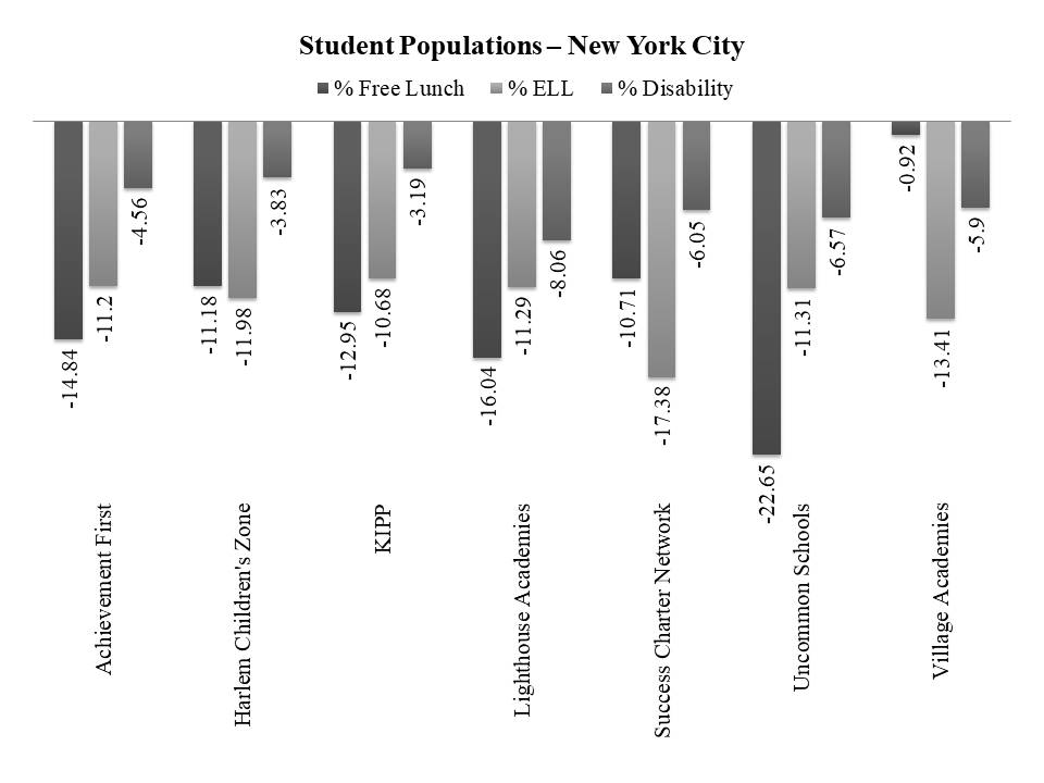
Figure 21 shows the relative spending of these schools when compared with district schools in the same borough of New York City, serving the same grade levels and similar students. In the lighter gray bars, schools are also compared with schools of similar size. Charter schools tend to be smaller and operate at higher expense as a result of lacking economies of scale. Harlem Children’s Zone, KIPP and Uncommon Schools significantly outspend similar district schools. Success charter network does as well, when setting aside scale related spending differences, which might be considered inefficient. That is, in a population dense urban center, why operate schools which are so small that they incur additional expenses? That they lack economies of scale?
Figure 21
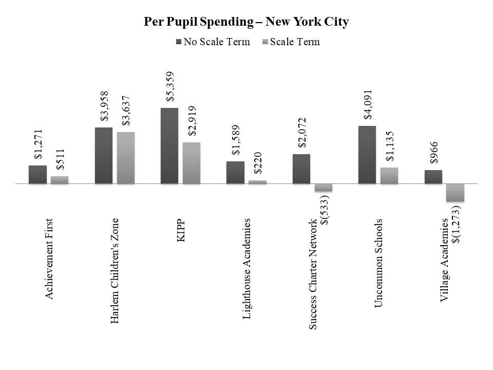
Figure 22 shows that the additional spending relative to district schools, at least in Harlem Children’s Zone, KIPP and Uncommon Schools translates into consistently smaller class sizes than in comparable district schools. Achievement First has leveraged their dollars (a smaller available margin) specifically toward 8th grade math class sizes. That is, these schools are using their additional spending to provide smaller classes, in some cases, within a context of much smaller schools.
Figure 22
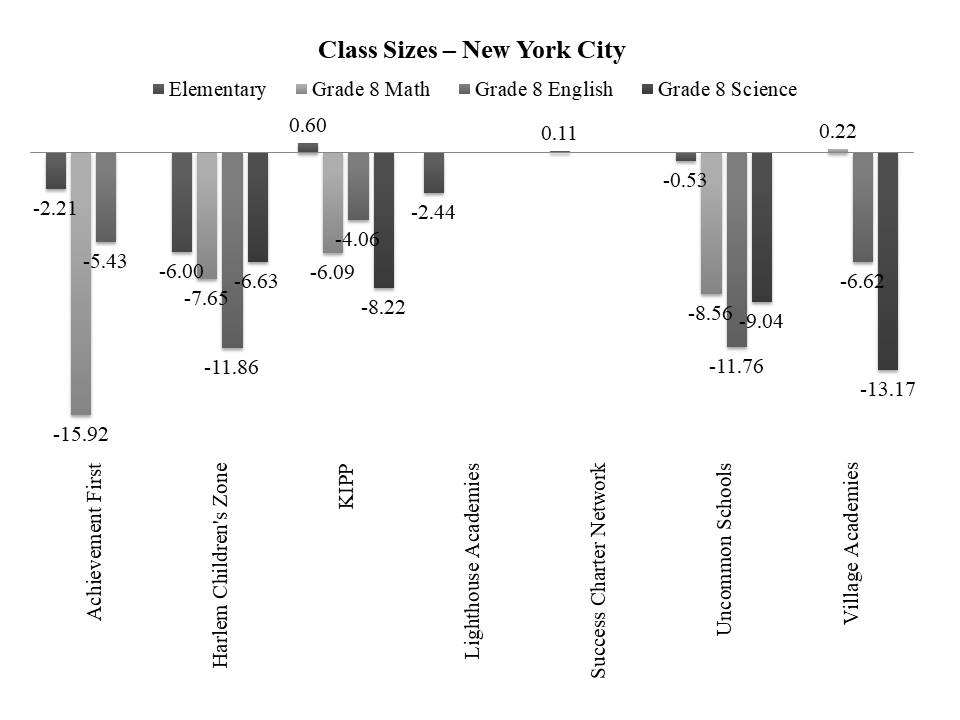
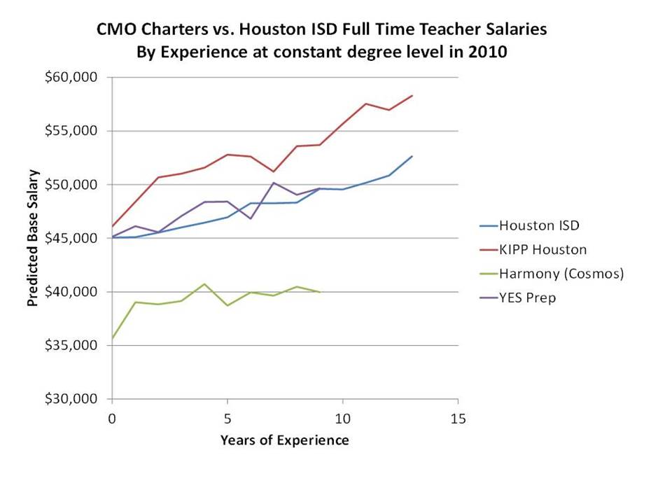
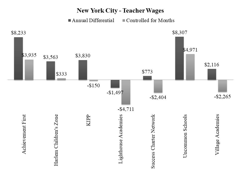
Figure 23 shows the relative wages of teachers in these schools, compared to teachers with similar degree levels and experience in district schools. Teachers in the charter schools tend to have far fewer average years of experience and thus lower average salaries. This occurs both because of higher turnover rates among young teachers in the charter schools and because many of the schools themselves, at the time were only 5 to 10 years old. The dark bars show the relative annual salary difference, and the lighter bars show the salary difference adjusted for contract months. Teachers in Achievement First and Uncommon Schools are paid substantially higher annual salaries than similar teachers in district schools. But, a share of that difference is due to the longer years they are assigned to work. While the margins of difference are smaller for Harlem Children’s Zone and KIPP schools, the patterns are similar. There exists a substantial annual salary differential, but nearly all of that salary differential is attributed to additional contracted months.
Figure 23
Collectively, these figures tell a story of high profile, well-funded charter operators in New York City leveraging their additional resources in three, logical and rather traditional ways: 1) hiring more staff per pupil in order to provide smaller class sizes, 2) paying their teachers more at any given level of experience and degree, and 3) specifically paying those teachers more to work more hours, days and months. That is, more people for more time.
Studies of Charter School Resource Allocation
The New York City examples above are somewhat unique. Not every city and state has the same well-endowed high flying charter operators and local philanthropy to support them. Our study which first illustrated these differences in New York, found that Ohio charter schools were much less well-off and Texas charter operators a mixed bag.[vii] Further, the examples above are by no means meant to imply that charter schools allocate dollars to human resources in exactly the same way as district schools. Rather, the point is that charter schools that have the resources to do so – the flexibility to make trade-off decisions – often choose to spend on logical things – like competitive wages, more money for more time and smaller classes.
Studies of resource allocation in charter schools have indeed found some systematic differences between charter school and traditional district schools spending. But those differences are hardly what one would consider a result of technological innovation or substitution. In most cases, observed resource allocation differences result from structural constraints like operating at inefficient scale, with inadequate access to capital for acquisition and renovation of facilities, or simply being new and having larger numbers of new, young and lower paid employees.
Two studies of Michigan charter schools, which operate fiscally independently of local public districts, have found them to have particularly high administrative expenses and low direct instructional expenses. Arsen and Ni (2012) found that “Controlling for factors that could affect resource allocation patterns between school types, we find that charter schools on average spend $774 more per pupil per year on administration and $1141 less on instruction than traditional public schools.”[viii] (p. 1) Further, they found “charter schools managed by EMOs spend significantly more on administration than self-managed charters (about $312 per pupil). This higher spending occurs in administrative functions traditionally performed at both the district central office and school building levels.” (p. 13)
Izraeli and Murphy (2012) found that district schools in Michigan tended to spend more on instruction per student than did charter schools, and the gap grew by about 5 percent to nearly 35% percent over the period studied (1995-96 to 2005-06) (p. 265).[ix] Further they found the spending gap for instructional spending to be greater than that for general spending. The overall funding gap between district and charter schools was approximately $230. The spending gap for basic programs was $562 and for total instruction $910. The authors note “much like a profit-maximizing firm, charter schools generate a surplus of revenue over expenditure.” (Izraeli & Murphy, 2012, p. 265)
Bifulco and Reback (2014) explore the complex relationship between fiscally dependent charter schools and their host districts in upstate New York cities. Particularly relevant to our investigation is Bifulco and Reback’s finding that having fiscally dependent charter schools separately affiliated with outside management companies and governance structures can create excess, redundant costs (p. 86).[x]
Others have explored teacher compensation in relation to instructional expense in charter schools. In a recent comprehensive review of charter school research, Epple, Romano and Zimmer (2015) summarize that “On the whole, teachers in charter schools are less experienced, are less credentialed, are less white, and have fewer advanced degrees.[xi] They are paid less, their jobs are less secure, and they turnover with higher frequency.” (Epple, 2015) Similarly, in a report on spending behavior of Texas charter schools Taylor and colleagues (2011)[xii] explain that much of the difference between instructional and non-instructional expense across differing types of charter and district schools is tied to differences in teacher compensation. The authors explain that “open-enrollment charter schools paid lower salaries, on average, than did traditional public school districts. Average teacher pay was 12% lower for teachers in open-enrollment charter schools than for teachers in traditional public school districts of comparable size, and adjusted for differences in local wage levels, average teacher pay was 24% lower. Average teacher salaries were lower not only because open-enrollment charter schools hired less experienced teachers, on average, but also because open-enrollment charter schools paid a smaller premium for additional years of teacher experience.” (p. ix)
Lessons from Texas
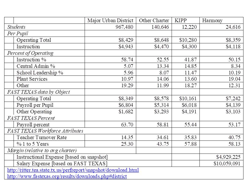
Variations across Texas operators provide additional insights. Table 3 provides an example, using two sources of Texas school expenditure data, of the very different approaches of two nonprofit education management organizations—KIPP and Harmony.[xiii] Specifically, Table 3 contrasts the revenues and expenditures of charter schools relying primarily on revenue enhancement versus those relying on expenditure cutting to free up resources for “other” uses, presumably including innovation. KIPP’s primary approach to supporting its various additional costs is one of revenue enhancement,[xiv] whereas Harmony’s is one of salary expense reduction.
Publicly subsidized revenues in Texas charter schools and in urban districts are relatively consistent. Nonetheless, KIPP schools in Texas in 2013, on average, increased their operating expenses by nearly 20%. While major urban district schools, other charter schools, and Harmony schools spent around $8,500 per pupil, KIPP schools reported spending $10,280—a conservative figure that likely misses some additional spending by KIPPs regional and national organizations on Texas KIPP schools. Despite the higher revenue, Table 3 indicates that KIPP’s instructional spending was second lowest. Harmony’s was lowest: even though in comparison to urban district and other charter school its total operating expense was lower, Harmony still spent a smaller percentage on instruction. KIPP’s total payroll per pupil remained higher than that of Harmony.
Despite having the highest total operating expense, KIPP schools diverted the largest shares to both central and school leadership activities. And, while Harmony’s central administrative expenses were lower than “other” charter schools as a share of operating expense, its “plant services” expenses were noticeably higher, approaching 20% of operating expense. Again, while these operating expenses are notably different both among charter operators and between charter operators and district schools, it is difficult to attribute these differences to disruptive innovation or technological substitution. In particular, the more researched of the two operators, KIPP, has maintained expenditure on personnel, but shifted emphasis toward administrative personnel (school leadership).
Table 2
Private Schools
Private schools have the greatest flexibility to operate differently than traditional public district schools and arguably the greatest competitive market pressure to do so. There exists much less evidence on private school spending, resource allocation or teacher compensation. One difficulty in making private to public school comparisons is that private schools, by nature of their reduced regulation, vary widely and vary regionally, and financial reporting of charter schools is sparse, inconsistent and decentralized. Like charter schools, private schools vary by their operator type. While many private school studies view schools only in terms of Catholic Schools, other religious schools and “other” non-religious schools, these distinctions are not sufficiently fine grained. In a 2009 study, I collected IRS financial filings of 1,500 private schools nationally, combining those data with national surveys of private school teachers, school enrollments and pupil to teacher ratios (for nearly all private schools).[xv]
Table 3 summarizes the comparisons with public schools of major private schools by their primary affiliation. Catholic schools (parish elementary and middle schools and diocesan secondary schools) for example, had very low nominal tuition prices, but per pupil spending much higher than their tuition, at $10,135, comparable to nearby district schools (metro area). Catholic schools had lower teacher salaries for similar teachers, but comparable staffing ratios. At the bottom end were low tuition and relatively low spending schools belonging to dominant Christian schools associations. These lower spending schools managed to maintain reasonable staffing ratios, but with low salaries.
At the other end of the spectrum are those schools belonging to the major independent schools associations (National Association of Independent Schools and regional affiliates, National Independent Private Schools Association), which includes the most elite (and high priced) private independent day schools (boarding schools were excluded from the analysis). These were also the schools for which the most comprehensive fiscal data were available. Tuition rates for these schools were nearly 50% higher than nearby district per pupil spending and per pupil spending nearly double nearby district per pupil spending. These institutions in particular, have the opportunity to leverage resources creatively.
Table 3
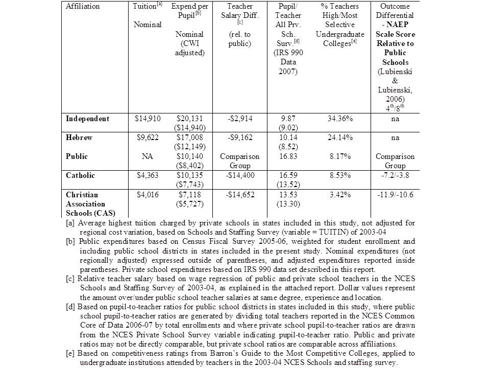
As Table 3 shows, more elite private independent schools tend to leverage their resource advantage primarily in dramatically reduced pupil to teacher ratios of <10:1 compared to nearly 17:1 for nearby districts. While annual salaries for otherwise comparable teachers are somewhat lower for private independent school teachers, they are higher than for other private school teachers. Further, elite private independent schools tend to operate shorter school years (by 10 or more days) compared to district schools, and independent school teachers serve much lower total student loads (total students taught per day, week or year) than their public district counterparts. Again, the financial resources translate to human resources, with some insightful differences in the trade-offs between staffing quantities and salaries and intertwined factors like numbers of students and courses taught.
One notable disruptive innovation of elite private schooling which continues to drive the human resource intensive model at the secondary level was the introduction in 1930 of large oval wooden tables (akin to corporate boardroom tables) which typically seat a maximum of 14 (some up to 18) to encourage student and faculty interaction. Harkness Tables and the accompanying philosophy were introduced as a gift by wealthy philanthropist Edward Harkness to the elite New Hampshire boarding school Phillips Exeter Academy, which continues to promote Harkness learning in its marketing.[xvi] Harkness tables persist to this day as central to the teaching and learning philosophy of many elite private independent schools. But they are also a testament to the preference for a human resource intensive model of schooling involving small interactive classes staffed with highly qualified academic instructors. To the extent that these schools also have the flexibility to introduce what modern edupreneurs might consider disruptive technologies (tablets & hand held devices, cloud-based computing, interactive video, white-boards, etc.), these schools are more likely to take a both-and rather than either-or path. That is, i-pads around the Harkness Table rather than in place of it.
Take Home Points
The central take home point of this post is that on average, the financial resources available to schools, whether public district (previous posts), charter or private schools generally translate to human resources. Financial resources translate to the quantities of staff which can be hired or retained and they translate to the wages that can be paid. And both of these matter.
To summarize:
- Schooling is human resource intensive, whether traditional public, charter or private;
- When schools have more money, they invest it in more staff and better paid staff and when they don’t, they can’t;
- Public systems enjoy the scale efficiencies which mitigate administrative and other overhead expenses, including construction, maintenance and operations of capital;
- Compensation for staffing across sectors remains largely a function of years of experience, credentials earned and contractual hours worked.
The third and fourth points were less fully elaborated in this post, but are equally important. As noted in this post, charter schools often divert resources from direct instruction and personnel NOT to achieve greater flexibility and adopt disruptive technologies, but rather because they lack economies of scale and they also often lack access to capital needed to access necessary land and buildings.[i] My work on private schools also revealed significantly higher administrative expenses than for public schools partly due to scale differences, but also due to the choice to pay top administrators much higher salaries than superintendents of much larger public districts.[ii] Finally, despite much talk of creative, alternative, performance based compensation for teachers, my related work on charter and private schools finds that the primary determinants of differences in pay across teachers are their years of experience, the degrees and credentials they hold, and the amount of time they are expected to work and students they are expected to serve.[iii]
This is not to suggest that this is the way it should be or will always be. Rather, this is how schools currently work in the United States (and around the world for that matter). This is how schools use money, whether large public bureaucracies, publicly subsidized private operators, or fully independent private operators. As of yet, researchers, policymakers, pundits, pontificators and even self-proclaimed “thought leaders” have yet to conjure some new secret sauce or technological innovation which can greatly improve equity, adequacy and efficiency. Human resources matter and equitable and adequate financial resources are necessary for hiring and retaining the teachers and other school staff necessary to achieve equal educational opportunity across all children. Understanding these baseline conditions and relationships is prerequisite for moving forward.
NOTES
[i] Preston, C., Goldring, E., Berends, M., & Cannata, M. (2012). School innovation in district context: Comparing traditional public schools and charter schools. Economics of Education Review, 31(2), 318-330.
[ii] Michael Q. McShane and Jenn Hatfield (2015) Measuring Diversity in Charter School Offerings. Washington, DC: American Enterprise Institute. http://www.aei.org/wp-content/uploads/2015/07/Measuring-Diversity-in-Charter-School-Offerings.pdf
[iii] Baker, B. D., Libby, K., & Wiley, K. (2012). Spending by the Major Charter Management Organizations: Comparing Charter School and Local Public District Financial Resources in New York, Ohio, and Texas. National Education Policy Center.
[iv] Epple, D., Romano, R., & Zimmer, R. (2015). Charter schools: a survey of research on their characteristics and effectiveness (No. w21256). National Bureau of Economic Research.
Toma, E., & Zimmer, R. (2012). Two decades of charter schools: Expectations, reality, and the future. Economics of Education Review, 31(2), 209-212.
[v] Gleason, P. M., Tuttle, C. C., Gill, B., Nichols-Barrer, I., & Teh, B. R. (2014). Do KIPP schools boost student achievement?. Education Finance & Policy, 9(1), 36-58.
Angrist, J. D., Dynarski, S. M., Kane, T. J., Pathak, P. A., & Walters, C. R. (2012). Who benefits from KIPP?. Journal of policy Analysis and Management, 31(4), 837-860.
Dobbie, W., Fryer, R. G., & Fryer Jr, G. (2011). Are high-quality schools enough to increase achievement among the poor? Evidence from the Harlem Children’s Zone. American Economic Journal: Applied Economics, 3(3), 158-187.
Dobbie, W., & Fryer Jr, R. G. (2013). Getting beneath the veil of effective schools: Evidence from New York City. American Economic Journal: Applied Economics, 5(4), 28-60.
[vi] Baker, B. D., Libby, K., & Wiley, K. (2012). Spending by the Major Charter Management Organizations: Comparing Charter School and Local Public District Financial Resources in New York, Ohio, and Texas. National Education Policy Center.
Baker, B. D., Libby, K., & Wiley, K. (2015). Charter School Expansion and Within-District Equity: Confluence or Conflict?. Education Finance and Policy.
[vii] Baker, B. D., Libby, K., & Wiley, K. (2012). Spending by the Major Charter Management Organizations: Comparing Charter School and Local Public District Financial Resources in New York, Ohio, and Texas. National Education Policy Center.
[viii] Arsen, D. D., & Ni, Y. (2012). Is administration leaner in charter schools? Resource allocation in charter and traditional public schools. education policy analysis archives, 20, 31.
[ix] Izraeli, O., & Murphy, K. (2012). An Analysis of Michigan Charter Schools: Enrollment, Revenues, and Expenditures. Journal of Education Finance, 37(3), 234-266.
[x] Bifulco, R., & Reback, R. (2014). Fiscal Impacts of Charter Schools: Lessons from New York. Education Finance & Policy, 9(1), 86-107.
[xi] Epple, D., Romano, R., & Zimmer, R. (2015). Charter Schools: A Survey of Research on Their Characteristics and Effectiveness (No. w21256). National Bureau of Economic Research.
[xii] Taylor, L.L. Alford, B.L., Rollins, K.G., Brown, D.B., Stillisano. J.R., Waxman, H.C. (2011) Evaluation of Texas Charter Schools 2009-2010 (Revised Draft). Texas Education Research Center. Texas A&M University, College Station.
[xiii] Harmony Schools are actually subsumed under the Cosmos Foundation Inc. and Harmony and Cosmos under the umbrella of the national network of Gulen charter schools. http://gulencharterschools.weebly.com/
[xiv] Gronberg, T. J., Jansen, D. W., & Taylor, L. L. (2012). The relative efficiency of charter schools: A cost frontier approach. Economics of Education Review, 31(2), 302-317.
[xv] Baker, B. D. (2009). Private Schooling in the US: Expenditures, Supply, and Policy Implications. Education Policy Research Unit.
[xvi] https://exeter.edu/exeter-difference/how-youll-learn
Additional Notes
[i] Baker, B., & Miron, G. (2015). The business of charter schooling: Understanding the policies that charter operators use for financial benefit. Boulder, CO: National Education Policy Center. Retrieved January, 27, 2016.
[ii] Baker, Bruce D. “Private Schooling in the US: Expenditures, Supply, and Policy Implications.” Education Policy Research Unit (2009).
[iii] http://www.bostonglobe.com/metro/2017/09/03/most-boston-charter-schools-reject-performance-based-pay-for-teachers/i64tLVRwL9WqsRxzJ6Z7XJ/story.html?platform=hootsuite