Blog

Newark Charter Update: A few new graphs & musings

It’s been a while since I’ve written anything about New Jersey Charter schools, so I figured I throw a few new graphs and tables out there. In the not too distant past, I’ve explained:

  1. That Newark charter schools in particular, persist in having an overall cream-skimming effect in Newark, creating demographic advantage for themselves and ultimately to the detriment of the district.
  2. That while the NJ CREDO charter school effect study showed positive effects of charter enrollment on student outcomes specifically (and only) in Newark, the unique features of student sorting (read skimming) in Newark make it difficult to draw any reasonable conclusions about the effectiveness of actual practices of Newark Charters. Note that in  my most recent post, I re-explain the problem with asserting school effects, when a sizable component of the school effect may be a function of the children (peer group) served.
  3. In many earlier posts, I evaluated the extent to which average performance levels of Newark (and other NJ) charter schools were higher or lower than those of demographically similar schools, finding that charters were/are pretty much scattered.
  4. And I’ve raised questions about other data – including attrition rates – for some high flying NJ charters.

As an update, since past posts have only looked at NJ charter performance in terms of “levels” (shares of kids proficient, or not), let’s take a look at how Newark district and charter schools compare on the state’s new school level growth percentile measures. In theory, these measures should provide us a more reasonable measure of how much the schools contribute to year over year changes in student test scores. Of course, remember, that school effect is conflated with peer effect and with every other attribute of the yearly in and out of school lives of the kids attending each school.

And bear in mind that I’ve critiqued in great detail previously that New Jersey’s growth percentile scores appear to do a particularly crappy job at removing biases associated with student demographics, or with average performance levels of kids in a cohort.  To summarize prior findings:

  1. school average growth percentiles tend to be lower in schools with higher average rates of proficiency to begin with.
  2. school average growth percentiles tend to be lower in schools with higher shares of low income children.
  3. school average growth percentiles tend to be lower in schools with more non-proficient scoring special education students.

And each of these relationships was disturbingly strong. So, any analysis of the growth percentile data must be taken with a grain of salt.

So, pretending for a moment that the growth percentile data aren’t complete garbage, let’s take a look at the growth percentile data for Newark Charter Schools, along side district schools.

Let’s start with a statewide look at charter school growth percentiles compared to district schools. In this figure, I’ve graphed the 7th grade ELA growth percentiles with respect to average school level proficiency rates, since the growth percentile data seem so heavily biased in this regard. As such, it seems most reasonable to try to account for this bias by comparing schools against those with the most similar current average proficiency rates.

Figure 1. Statewide Language Arts Growth with Respect to Average Proficiency (Grade 7)

Slide1

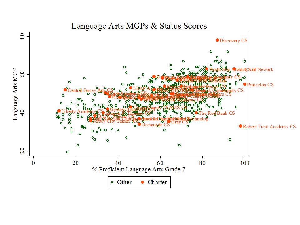
Now, if we buy these growth percentiles as reasonable, then one of our conclusions might be that Robert Treat Academy is one of, if not the worst school in the state – at least in terms of its ability to contribute to test score gains. By contrast, Discovery Charter school totally rocks.

Other charters to be explored in greater depth below, like TEAM Academy in Newark fall in the “somewhat better than average” category (marginally above the trendline) and frequently cited standouts like North Star Academy somewhat higher (though in the cloud, statewide).

So, let’s focus on Newark in particular.

Figure 2. Newark Language Arts Growth with Respect to Average Proficiency (Grade 5)

Slide2

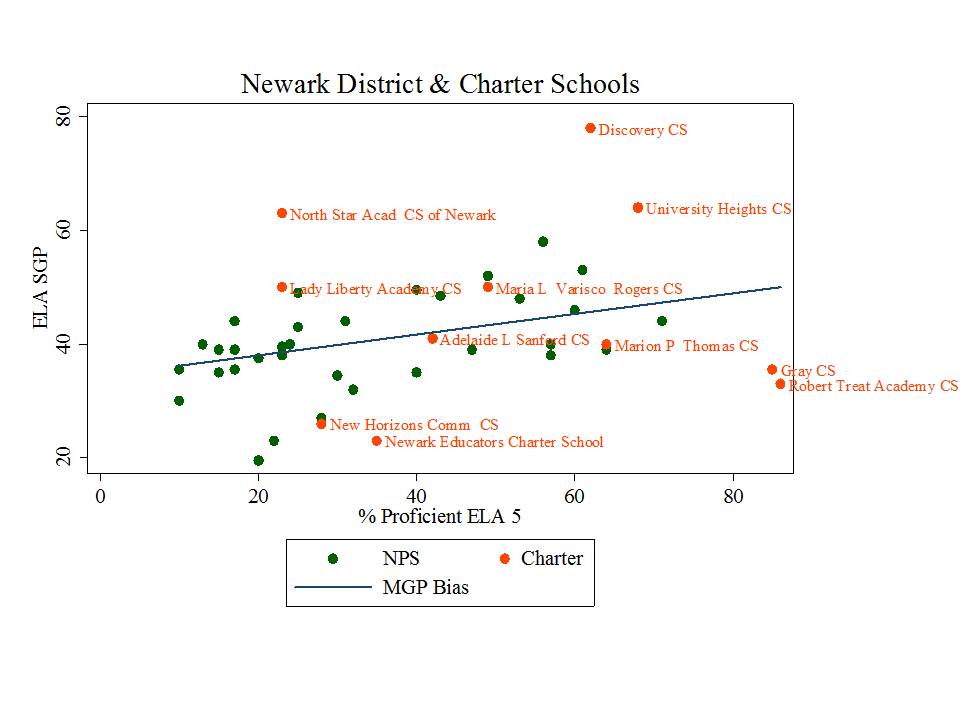
Figure 3. Newark Language Arts Growth with Respect to Average Proficiency (Grade 6)

Slide3

Figure 4. Newark Language Arts Growth with Respect to Average Proficiency (Grade 7)

Slide4

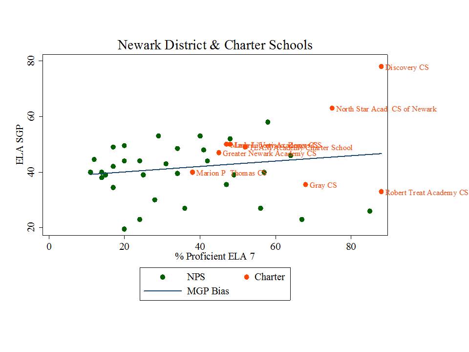
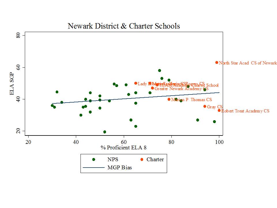
Figure 5. Newark Language Arts Growth with Respect to Average Proficiency (Grade 8)

Slide5In my earlier posts, it was typically schools like Treat, North Star, Gray and Greater Newark that rose to the top, with TEAM posting more average results, but all of these results heavily mediated by demographic differences, with Treat and North Star hardly resembling district schools at all, and TEAM coming closer but still holding a demographic edge over district schools.

In these updated graphs, using the growth measures, one must begin to question the Robert Treat miracle especially. Yeah… they start high… and stay high on proficiency… but they appear to contributed little to achievement gains. Again, that is, if these measures really have any value at all. Gray is also hardly a standout… or actually it is a standout… but not in a good way.

TEAM continues to post solidly above average, but still in the non-superman (mere mortal) mix of district & charter schooling in Newark.

Remember, school gains are a function of all that goes on in the lives of kids assigned to each school, including in school and out of school stuff, including peer effect.

Let’s focus in on the contrast between TEAM and North Star for a bit. These are the two big ones in Newark now, and they’ve evolved over time toward providing K-12 programs. Here’s the most recent demographic data comparing income status and special education populations by classification, for NPS, TEAM and North Star.

Figure 6. Demographic data for NPS, TEAM and North Star (2012-13 enrollments & 2011-12 special education)

Slide6

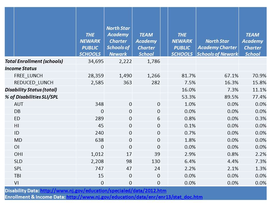
North Star especially continues to serve far fewer of the lowest income children. And, North Star continues to serve very few children with disabilities, and next to none with more severe disabilities. Similarly, in TEAM, most children with disabilities have only mild specific learning disabilities or speech/language impairment.

But this next piece remains the most interesting to me. I’ve not revisited attrition rates for some time, and now these schools are bigger and have a longer track record, so it’s hard to argue that the patterns we see over several cohorts, including the most recent several years, for schools serving over 1,000 children, are anomalies.  At this point, these data are becoming sufficiently stable and predictable to represent patterns of practice.

The next two tables map the changes in cohort size over time for cohorts of students attending TEAM and North Star. The major caveat of these tables is that if there are 80 5th graders one year and 80 6th graders the next, we don’t necessarily know that they are the same 80 kids. 5 may have left and been replaced by 5 new students. But, taking on new students does pose some “risk” in terms of expected test scores, so some charters engage in less “backfilling” than others, and fewer backfill enrollments in upper grades.

Since tests that influence SGPs are given in grades 5 – 8 (well, 3 – 8, but 5-8 is most relevant here), the extent to which kids drop off between grade 5 & 6, 6 & 7, and who drops off between those grades can, of course, affect the median measured gain (if kids who were more likely to show low gains leave, and thus aren’t around for the next year of testing, and those more likely to show high gains stay, then median gains will shift upward from what they might have otherwise been).

First, lets look at TEAM.

Figure 7. TEAM Cohort Attrition Rates

Slide8Among tested grade ranges, with the exception of the most recent cohort, TEAM keeps from the upper 80s to low 90s – percentages of 5th graders who make it to 8th grade (with potential replacement involved).  Any annual attrition may bias growth percentiles, as noted above, if potentially lower  gain students are more likely to leave. But without student level data, that’s a bit hard to tell.

TEAMs’ grade 5 to 12 attrition is greater, dropping over 25% of kids per cohort. From 9 to 12, about 20% disappear.

But these figures are far more striking for North Star.

Figure 8. North Star Cohort Attrition Rates

Slide7Within tested grades, North Star matches TEAM in the most recent year, but for previous years, North Star loses marginally more kids from grades 5 to 8, hanging mainly in the lower to mid 80s.  So, if there is bias in who is leaving – if weaker – slower gain students are more likely to leave, that may partially explain North Star’s greater gains seen above. Further, as weaker students leave, the peer group composition changes, also having potential positive effects on growth for those who remain.

Now… the other portion of attrition here doesn’t presently affect the growth percentile scores, but it is indeed striking, and raises serious policy concerns about the larger role of a school like North Star in the Newark community.

From grade 5 to 12, North Star persistently finishes less than half the number who started! As noted above, this is no anomaly at this point. It’s a pattern and a persistent one, over the four cohorts that have gone this far. I may choose to track this back further, but going back further brings us to smaller starting cohorts, increasing volatility.

Even from Grade 9 to 12, only about 65% persist.

Parsing these data a step further, let’s look specifically at attrition for Black boys at North Star.

Figure 9. Cohort Decline for Black Boys

Slide1I’ve flipped the direction of the years here…to be moving forward in the logical left to right direction. So, reorient yourself!  For grade 5 to 12, North Star had only one cohort that approached retaining 50% (well… actually, 42%). In other years, grade 5 to 12 attrition was around 75% or greater for black boys. Grade 9 to 12 attrition was about 40% in the most recent two years, and much more than that previously for black boys. Of the 50 or so annual entrants at 5th grade to North Star prior to recent doubling, only a handful would ever make it to 12th grade.

The concern here, of course, is what is happening to the rest of those students who leave, and what is the effect of this churn on surrounding schools – perhaps both charter and district schools who are absorbing these students who are so rapidly shed. [to the extent, if any, that exceptional middle school preparation at a school like North Star leads students to scholarship opportunities at elite private schools, or acceptance to highly selective magnet schools, this attrition may be less ugly than it looks]

Of course, this does lead one to question how North Star is able to report to the state a 100% graduation rate and a .3% dropout rate? Seems a bit suspect, eh?

Figure 9. What North Star reports as its dropout and graduation rates

Slide9

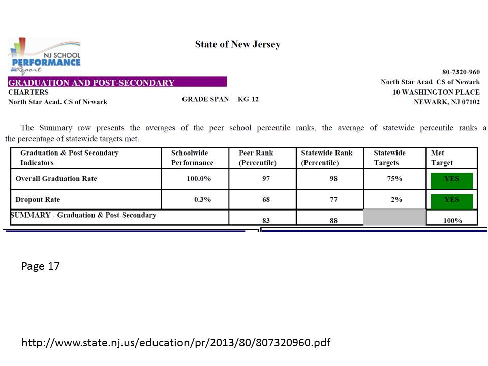
Notably absent HERE, as well, is any mention of the fact that only a handful of kids actually stick around through grade 12?

So, is this data driven leadership, or little more than drive by data? Seems that they’ve missed a really, really critical issue. [if you lose more than half of your kids btw grades 5 and 8, and even more than that for one of your target populations – black boys – that kind of diminishes the value of the outcomes created for the handful who stay, doesn’t it? Not for the stayers individually, but certainly for the school as a whole.]

A few closing thoughts…

As I’ve mentioned on many previous occasions, it is issues such as this as well as the demographic effects of charters, magnets and other schools that induce student sorting in the district, that must be carefully tracked and appropriately managed.  Neither an actual public school, nor a school chartered to serve the public interest (with public resources) should be shielded from scrutiny.

If we are really serious about promoting a system of great schools (as opposed to a school system) which productively integrates charter and district schools, then we can nolonger sit by and permit behavior by some that is more likely than not, damaging to others (in that same system).  That’s simply not how a “system of great schools” works, or how any well-functioning system, biological, ecological, economic, social or otherwise works.

But sadly, those who most vociferously favor charter expansion as a key element of supposed “portfolio” models of schooling appear entirely uninterested mitigating parasitic activity (that which achieves the parasites goal at the expense of the host. e.g. parasitic rather than symbiotic). Rather, they fallaciously argue that an organism consisting entirely of potential parasites is itself, the optimal form. That the good host is one that relinquishes? (WTF?) As if somehow, the damaging effects of skimming and selective attrition might be lessened or cease to exist if the entirety of cities such as Newark were served only by charter schools.  Such an assertion is not merely suspect, it’s absurd.

So then, imagine if you will, an entire district of North Stars? Or an entire district of those who strive to achieve the same public accolades of North Star? That would sure work well from a public policy standpoint. They’d be in constant bitter battle over who could get by with the fewest of the lowest income kids. Anyone who couldn’t “cut it” in 5th or 6th grade, along with each and every child with a disability other than speech impairment would dumped out on the streets of Newark. Even after the rather significant front end sorting, we’d be looking at 45% citywide graduation rates – actually – likely much lower than that because some of the aspiring North Star’s would have to take students even less likely to complete under their preferred model.

Yes, there would probably eventually be some “market segmentation” (a hearty mix of segregation, tracking & warehousing of kids with disabilities) – special schools for the kids brushed off to begin with – and special schools for those shed later on. But, under current accountability policies, those “special schools” would be closed and reconstituted every few years or so since they won’t be able to post the requisite gains. Sounds like one hell of a “system of great schools,” doesn’t it.

To the extent we avoid changing the incentive structure & accountability system, the tendency to act parasitic rather than in a more beneficial relationship will dominate. The current system is driven by the need to post good numbers – good “reported” numbers. NJ has created a reporting system that allows North Star to post a 100% grad rate and .3% dropout rate despite completing less than 50% of their 5th graders.

What do they get for this? Broad awards, accolades from NJDOE… & the opportunity to run their own graduate school to train teachers in their stellar methods (that result in nearly every black boy leaving before graduation).

A major problem here is that the incentive structure, the accountability measures, and system as it stands favor taking the parasitic path to results.

That said, in my view, it takes morally compromised leadership to rationalize taking this to the extent that North Star has. TEAM, for example, exists under the very same accountability structures. And while TEAM does its own share of skimming and shedding, it’s no North Star.

But I digress.

More to come – perhaps.

Suspension Rates for Schools in Newark

Thinking (& Writing) About Education Research & Policy Implications

Education reporters out there… here are a few thoughts for you as you embark on whatever may be your next article pertaining to an education research study.

FIRST, do a Google Scholar (easiest lit search around!) search on the topic in question to see what other peer reviewed an non-peer reviewed stuff has been written on the same topic? And more specifically, if you are reporting on a “work in progress,” or non-peer reviewed recent release, compare the a) methods used and b) phrasing of major conclusions, to those used in the peer reviewed stuff. While peer review isn’t a be all and end all for research quality, methods do tend to get refined in the process, and junky methods often (though not always) get filtered out or substantively improved (it’s all relative)! More complicated methods aren’t always better. Good authors can explain more complicated methods in reasonable terms.

These next two are perhaps even more important… and require somewhat less technical background…

SECOND, stop, take a breath and revisit your basic knowledge of how schools work – how they are set up – etc. How classrooms are organized – how kids and teachers are sorted across classrooms, schools, neighborhoods, etc.  Ponder how classrooms are organized and how those classrooms may differ from one school to the next, one town or city to the next. Scribble out pictures of “how schools work,” how a child’s day, week, year – inside and outside of school is organized…AND THEN, ONLY THEN, start pondering the possible implications of the study.

THIRD, while pondering the implications of the study, make yourself a list of major current policy agendas and ask yourself – what the heck might any of this mean, when it comes to, say, studies of the effectiveness of charter schools? The effect of charter expansion? Or the usefulness of test-score based measures for evaluating teacher effectiveness?

One recent example that comes to mind is the reporting on a report (well, actually a series of them) from the Hamilton Institute.  Specifically, The Boston Globe covered the portion of the report where one of the report author’s Michael Greenstone indicated that:

High-income families have always invested more in education, but they now spend seven times more a year on average than a low-income family, up from four times in the 1970s, according to the report, coauthored by MIT economics professor Michael Greenstone. These families now spend as much as $9,000 annually on private tutoring, SAT prep courses, computers, and other activities, compared with about $1,300 for low-income families. (cited from the Boston Globe)

The (rather unfulfilling) policy implications punchline(s) from the Boston Globe article were:

For example, said Greenstone, simplifying financial aid applications and providing low-income families help in filling them out could increase college enrollment by about 8 percentage points at a cost of less than $100 a student.

Another recent study found that mailing high-achieving, low-income students personalized information on their college options nudged students to apply to better schools.

Surely, a seven fold difference in private contributions to children’s learning between richer and poorer families has broader implications than this? Right?

Actually, this kind of disparity, and knowing how richer and poorer kids and their schools are organized, has potential ripple effect implications across nearly everything we study in education policy research.   Think about this – just a little bit – from a very basic and practical standpoint.

Wealthier families are adding up to $9k annually to the educational expenditures on their children, compared to $1.3k for less wealthy families.  So, even if these two groups lived in similar towns and attended “equally” funded schools, we’d have a substantial disparity in the financial inputs to their education. Now, if all of this additional spending is pointless, and, for example, doesn’t in any way contribute to improved test scores, then perhaps it’s a non-issue when we consider other implications for popular policy research. But, to the extent that this personal expenditure matters at all, then it has important ripple effects across numerous types of studies, pertaining to current favored policy topics.

For example, if teachers are going to be evaluated on the basis of student test score gains, and those tests are to be given annually, wouldn’t it be better to be the teacher of kids whose parents are spending more (assuming they are choosing wisely) on after school, weekend… and especially SUMMER academic opportunities? Seriously – first consider (jot it down/back of the napkin) how many hours per day for a 185 day school year a kid has contact with her algebra teacher.  Then add up the hours for a typical KUMON program after school or on weekends. Add in all of those summer days, and potential access to a plethora of interesting summer academic & enrichment programs. 45 minutes a day for 185 days is a relatively small portion of a child’s life over the course of a year. Doesn’t take any heavy statistical lifting to figure that out. Just stepping back and think about how kids’ lives and schools are organized.

And is that 45 minutes a day in a class of 35 (dividing the teacher’s attention by 35) really equivalent to 45 minutes in a class of 16? And which kid is more likely in which class? (depends somewhat on state context).

There’s already a substantial body of literature validating substantial summer achievement growth differences by income status. Quite honestly, if our best value-added measures and growth percentile measures aren’t picking up such large, non-random, non-school investments in student learning – if these investments don’t affect the model results – it may just be because the models and measures on which they are based are crap.

It turns out that this differential investment by parents in out of school opportunities not only compromises how we think about per pupil spending differences across children, but it also may blow a pretty big hole in how we interpret a whole lot of other policy research & policy recommendations.

A second example, which I have discussed previously, is reporting on the much discussed CREDO studies of charter school “effects” on student achievement gains.   These studies really require that we ponder how school systems work and how kids sort (as well as how we measure who is similar to one another). Otherwise, we miss some really, really, important points.

First, I’ve explained previously through pictures that studies characterized as “randomized” lottery studies of charter schools really aren’t randomized, which can easily be seen by sketching out where, in the process randomization occurs (lottery).  A true randomized study would take a representative population, and randomly put half in a charter school, and half in a control (whatever that may be) school. Like this:

Randomized

But a lottery study starts with a sample of those who entered the lottery, which may or may not be representative of the total population – but in theory they were/are all similarly motivated to enter a lottery.  But it’s only the lottery that’s randomized. Not the peer group into which the kids fall when they finally end up at their assigned school. Like this:

pseudo-randomized

So who cares, if they are supposed otherwise similar kids (of course, as I’ve noted, the measures are often insufficient for defining them as such)?  Well, let’s ponder again how schools work and how we evaluate the “effects” of a school on a kid. What’s in a school, after all?

Bricks & mortar, materials, supplies and equipment, yes.

Teachers, yes.

Other school staff, check.

And other kids! Check!

The “effect” of a school as measured in most studies of this type are the “effect” on measured test score changes during a given time period, of all of this stuff – and for that matter – any and all outside of school stuff that goes on during this same time period. And that includes the peer group. And a substantial body of research supports that peer groups matter for student outcomes.

The average current achievement level of the peers affects individual student’s outcomes.[1]

In other words, cream-skimming and/or selective attribution, to the extent it exists and to the extent it affects peer groups, matters (on both the up, and down side)[2] – in this type of study, which considers any and all school conflated factors to contribute to measured school effects.

This is not a condemnation of the CREDO method, but rather a limitation (I might condemn the extent that they ignore and obfuscate this point). It’s really hard to sort out the peer, from teacher or school effect. They’re all conflated. And guess what… all of this stuff then relates back to those huge differences in which kids’ families spend more on their outside of school education! It would certainly be a huge stretch to suggest that positive effects found for a charter school, or charter schooling, using this method tell us anything about the relative effectiveness of charter versus “other” school teachers.

Then there’s the issue  of how these CREDO type studies frequently address (read: brush off) the issue of cream-skimming. First, many use measures insufficient to actually capture cream-skimming (calling all special ed kids, or all “low income” kids equal, when they’re not, and when they may not be randomly sorted as either individuals or peers).

Second, they often set up a deceptive comparison… say… for example… showing that kids who entered charter middle schools from district elementary schools are representative of the total population of their cohort from the district elementary schools. The casual reader then assumes that this means that if the charter applicant and matriculated kids were representative of the populations of the sending schools, then so too must be the kids in the “control” group – district middle schools.

But wait a second, those aren’t the only two pipelines, or options out of feeder schools. Rather, a more complete picture might look like this…

feeder

Among kids in those feeder, urban (perhaps) neighborhood elementary schools, when middle school comes along, some may go to district magnet schools that have selective admissions (and thus selective peer groups), some may go to private schools and some may in fact move out to the suburbs. And then there are those who go to the district, “regular” schools – the likely “control” group in CREDO like studies. Do we really think that the kids who sort through each of these various pipelines are similar to one another? Or might comparing against a “feeder” group that sorts in many directions be a little deceptive, at least if it’s done without any acknowledgement of the various directions into which kids sort, and the uneven distribution that may (likely) result from that sorting?

To tie this altogether, it’s also certainly likely that the family contributions to outside of schooling education across these pathways also varies.

So… draw some pictures. Ponder how the system works. Think broadly. Step back & revisit to see if anything might be missing.  Step outside the immediate implications provided by study authors and ask the bigger questions. And with each new study that comes along, don’t forget entirely all those that came before it!


[1] Hanushek, E. A., Kain, J. F., Markman, J. M., & Rivkin, S. G. (2003). Does peer ability affect student achievement?. Journal of Applied Econometrics, 18(5), 527-544.

The results indicate that peer achievement has a positive effect on achievement growth. Moreover, students throughout the school test score distribution appear to benefit from higher achieving schoolmates.

Hoxby, C. M., & Weingarth, G. (2005). Taking race out of the equation: School reassignment and the structure of peer effects. Working paper.

We find support for the Boutique and Focus models of peer effects, as well as for a generic monotonicity property by which a higher achieving peer is better for a student’s own achievement all else equal.

Burke, M. A., & Sass, T. R. (2013). Classroom peer effects and student achievement. Journal of Labor Economics, 31(1), 51-82.

…we find that peer effects depend on an individual student’s own ability and on the ability level of the peers under consideration, results that suggest Pareto‐improving redistributions of students across classrooms and/or schools. Estimated peer effects tend to be smaller when teacher fixed effects are included than when they are omitted, a result that suggests co‐movement of peer and teacher quality effects within a student over time. We also find that peer effects tend to be stronger at the classroom level than at the grade level.

[2] Dills, A. K. (2005). Does cream-skimming curdle the milk? A study of peer effects. Economics of Education Review, 24(1), 19-28.

The determinants of education quality remain a puzzle in much of the literature. In particular, no one has been able to isolate the effect of the quality of a student’s peers on achievement. I identify this by considering the introduction of a magnet school into a school district. The magnet school selects high quality students from throughout the school district, generating plausibly exogenous variation in the quality of classmates remaining to those students in the regular schools. I find that the loss of high ability peers lowers the performance of low-scoring students remaining in regular schools.

Stop School Funding Ignorance Now! A Philadelphia Story

On a daily basis, I continue to be befuddled by the ignorant bluster, intellectual laziness and mathematical and financial ineptitude of those who most loudly opine on how to fix America’s supposed dreadful public education system.  Common examples that irk me include taking numbers out context to make them seem shocking, like this Newark example (some additional context), or the repeated misrepresentation of per pupil spending in New York State.

And then there are those times, when a loudmouthed pundit simply chooses to ignore reality altogether – and frame the problem as it exists only in their own cloistered world or own head. That brings me to this tweet:

Perhaps I’m misinterpreting, but it appears that Andy Smarick in this tweet is placing blame for the financial distress of Philadephia schools squarely if not entirely on the city school district itself. In fact, he suggests that someone has been “propping up” the district. And that because the district – like all “urban” districts do – fails – it must be replaced by an assortment of private providers. See this post for more insights into Smarick’s “solution” to this “problem” that Philly Schools has clearly created on its own.

To callously assert that the problems faced by Philly schools are primarily if not entirely a  function of local mismanagement – and that someone somewhere has actually been trying to “prop” the district up – displays a baffling degree of willful ignorance.  Save for another day a discussion of the fact that over the past 10 years, the city has in fact adopted many of the strategies that Smarick himself endorses (privatized management, charter expansion, etc.).

One might argue that to a significant extent, through the state’s dysfunctional and inequitable approach to providing financial support for local public districts, Pennsylvania has for some time (but for a brief period of temporary reforms) actually been trying to put an end to Philly schools. And it appears that they may be achieving their goals. To summarize:

  1. Pennsylvania has among the least equitable state school finance systems in the country, and Philly bears the brunt of that system.
  2. Pennsylvania’s school finance system is actually designed in ways that divert needed funding away from higher need districts like Philadelphia.
  3. And Pennsylvania’s school finance system has created numerous perverse incentives regarding charter school funding, also to Philly’s disadvantage. (see here also)

I would be remiss if I didn’t actually include data or a graph in this post, beyond the citations to sources above that include plenty.  So here it is – the distribution of state and local revenues for districts in the Philly metro area from 2005 to 2011, with respect to child poverty.

Slide1A district with average state and local revenue for the metro area would fall on the 1.0 line. The sizes of the shapes represent the size of the districts in terms of enrollment. Circles are for 2005, triangles for 2007 and so on (see key). The vertical position of larger shapes is measured from their center. Notably, Philly hangs at marginally above 80% of metro average funding.  Yes… following the Rendell formula reforms Philly’s position started to improve slightly but has since fallen back, and never really made sufficient progress. Way up in that upper left hand corner, is Lower Merion School District, perhaps the most affluent suburb of Philly. They’re doin’ just fine!

What we also notice here is that Philly’s indicator is, year after year, moving to the right in our picture. Some of this is a poverty measurement issue, but some of it is real (to be parsed more carefully at a later point). Philly school aged children are getting poorer. They were never compensated with sufficient additional resources to begin with and those resources are now in decline.

I’ve explained previously that Cost pressures in education are primarily local/regional. Education is a labor intensive industry. Salaries must be competitive on the local/regional labor market to recruit and retain quality teachers. And for children to have access to higher education, they must be able to compete with peers in their region.

And within any region, children with greater needs and schools serving higher concentrations of children with greater needs require more resources – more resources to recruit and retain even comparable numbers of comparable teachers – and more resources to provide smaller class sizes and more individual attention.

Put simply – Philly needs far more than its surrounding districts but has, year after year, had far less.

More information on how and why money matters can be found here:

http://www.shankerinstitute.org/images/doesmoneymatter_final.pdf

As far back as I’ve been running the numbers with both national and state data sources, Philly has been among the most screwed urban public districts in the nation. Philly has never been “propped up.”

End the district? Because it’s clearly the right thing to do for these kids? Because we’ve propped them up year after year… and they just keep blowing it – acting inefficiently – in the interest of adults not kids – as all “urban” districts do? Are you freakin’ kidding me? Wake the hell up. Look at some damned data and evaluate the problem a little more carefully before you make such absurd declarations.

For those who wish to levy similar accusations against Chicago….

Slide2Those BIG shapes there… which like Philly, fall below the “average” line and have much higher child poverty than other districts in their metro? yeah… that’s Chicago. As I’ve noted on numerous previous posts in this blog (just search for “Chicago” or Illinois) Chicago and Philly are consistently among the most screwed major urban districts – operating in states with the least equitable state school finance systems. The links above to reports slamming PA (first two bullets) provide similar tales of inequity in Illinois.

UPDATE:

Clearly, Andy Smarick cares little that he lacks even the most basic understanding of the financial plight of Philadelphia public schools.  The tweets keep coming… and remain as wrong as ever… simply … factually… wrong! There is just no excuse for this kind of BS.

As for the presumptive solution here… that the “failed urban” district should/can be replaced with portfolio of charter operators that will necessarily be more effective, consider again that Philly has been dabbling for over a decade with resource free attempts at porfolio-izing the district. Consider also that even where charters – at small market share (http://shankerblog.org/?p=8609) do appear relatively effective – there remain substantive differences in their student populations, and in many cases substantive differences in their access to resources.

There are no miracles, regardless of the type of provider. Here’s one particularly relevant post on the non-reformy lessons of KIPP: https://schoolfinance101.wordpress.com/2013/03/01/the-non-reformy-lessons-of-kipp/ & here’s a more cynical post regarding NJ charters, and Uncommon schools in particular:

https://schoolfinance101.wordpress.com/2013/07/14/newark-charter-update-a-few-new-graphs-musings/

In other words, if the urban school district has proven, with unlimited resources, that it cannot succeed, and if charters have largely proven a break even endeavor in their urban contexts, then they too are equal failures. Only in Smarick’s wild imagination is the solution so simple and clear, yet so potentially dangerous if blindly accepted as public policy.

https://schoolfinance101.wordpress.com/2013/04/08/the-disturbing-language-and-shallow-logic-of-ed-reform-comments-on-relinquishment-sector-agnosticism/

This level of fact-free schlock and feeble minded policy advocacy must stop. Civil discourse? Sorry. I just can’t. This stuff is just too dumb for words! It’s irresponsible, ill-informed, reckless and more.

The Glaring Hypocrisy of the NCTQ Teacher Prep Institution Ratings

I’ve already written about this topic in the past.

But, given that NCTQ has just come out with their really, really big new ratings of teacher preparation institutions… with their primary objective of declaring teacher prep by traditional colleges and universities in the U.S. a massive failure, I figured I should once again revisit why the NCTQ ratings are, in general, methodologically inept & vacuous and more specifically wholly inconsistent with NCTQ’s own primary emphasis that teacher quality and qualifications matter perhaps more than anything else in schools and classrooms.

The debate among scholars and practitioners in education as to whether a good teacher is more important than a good curriculum, or vice versa, is never-ending. Most of us who are engaged in this debate lean one way or the other. Disclosure – I lean in favor of the “good teacher” perspective.  Those with labor economics background or interests tend to lean toward the good teacher importance, and perhaps those with more traditional “education” training lean toward the importance of curriculum.  I’m grossly oversimplifying here (perhaps opening a can of worms that need not be opened). Clearly, both matter.

I would argue that NCTQ has historically leaned toward the idea that the “good teacher” trumps all – but for their apparent newly acquired love of the Common Core Standards.

Now here’s the thing – if the content area expertise of elementary and secondary classroom teachers and the selectivity and rigor of their preparation matters most of all – how is it that at the college and university level, faculty substantive expertise (including involvement in rigorous research pertaining to the learning sciences, and specifically pertaining to content areas) is completely irrelevant to the quality of institutions that prepare teachers? That just doesn’t make sense.

Here’s a snapshot of the data collection framework used by NCTQ to rate teacher preparation institutions:

NCTQ

Seemingly most important of all is whether the teacher preparation institution teaches teachers how to teach/adopt the Common Core Standards.  The vast majority of this information seems to be derived from documents such as syllabi and course catalogs.  In fact, the majority of items in this framework are about curriculum as represented in whatever documents they decided to/were able to collect and how they then chose to interpret those documents.

ABSOLUTELY NOWHERE IN THE DATA FRAMEWORK ABOVE, OR IN THEIR ENTIRE METHODOLOGY DOCUMENT, IS THERE ANY REFERENCE TO FACULTY TRAINING OR EXPERTISE (INCLUDING RESEARCH CONTRIBUTIONS TO THE SCIENCE OF TEACHING AND LEARNING).

Culling key words in syllabi and catalogs is no way to determine the quality of teacher preparation institutions any more than one can evaluate the quality of a high school by looking at the list of graduation requirements and courses offered (theoretically offered by their existence in a course catalog).

Heads up for future NCTQ reports – nor is it particularly useful to try to rank teacher preparation institutions by the test scores of students of their graduates.

Yeah… it’s relatively convenient. Yeah… it allows NCTQ to subjectively tweak their ratings for their own political purposes.  It’s not only a largely pointless endeavor, but one that runs in complete contrast with what NCTQ claims is of central importance to improving the quality of our supposedly dreadful teacher preparation pipeline. It’s certainly easy enough to game this goofy methodology if we wanted to bother inserting common core “here” everywhere that NCTQ’s minimally trained minions might search.

There are numerous issues regarding teacher preparation that legitimately require our attention. I’ve pointed out previously that credential production for teachers is adrift.

I’ve pointed out in research a number of years back that ed schools are actually in an awkward position when it comes to recruiting faculty and building a team of faculty that bring to the table the diverse set of skills and expertise needed to provide teachers with balanced, rigorous preparation.  The faculty pipeline for teacher preparation is bifurcated between research and practice orientations and many preparation programs are imbalanced in one direction or the other, with the standards of their institutions shaping their preferences and practices in ways that don’t always support better teacher preparation.

These are complex issues that my colleagues and I at the University of Kansas (back in 2005) and many others have addressed and continue to address. They need real attention.

The new NCTQ report offers minimal guidance and a whole lot of misguided hype.

Related Articles

Wolf-Wendel, L, Baker, B.D., Twombly, S., Tollefson, N., & Mahlios, M.  (2006) Who’s Teaching the Teachers? Evidence from the National Survey of Postsecondary Faculty and Survey of Earned Doctorates.  American Journal of Education 112 (2) 273-300

Baker, B.D., Wolf-Wendel, L.E., Twombly, S.B. (2007) Exploring the Faculty Pipeline in Educational
Administration: Evidence from the Survey of Earned Doctorates 1990 to 2000. Educational
Administration Quarterly 43 (2) 189-220

Revisiting the Chetty, Rockoff & Friedman Molehill

My kids and I don’t watch enough Phineas and Ferb anymore. Awesome show. I was reminded just yesterday of this great device!

320px-Mountain_out_of_molehill-inatorThis… is the Mountain-Out-Of-A-Molehill-INATOR!  The name is rather self-explanatory – but here’s the official explanation anyway:

The Mountain-out-of-a-molehill-inator turns molehills into big mountains. It uses energy pellets to do so. It was created because all his life he was told “Don’t make mountains out of molehills”.

Now, I don’t mean to belittle the famed Chetty, Rockoff and Friedman study from a while back, which was quite the hit among policy wonks. As I explained in both my first, and second posts on this study, it’s a heck of a study, with lots of interesting stuff… and one hell of a data set!

What irked me then, and has all along is the spin that was put on the study, and that the spin was not just a matter of interpretation by politicos and the media, but that the spin was being fed by the study’s authors.

I figured that would eventually die down. I figured eventually cooler heads would prevail. But alas, I was wrong.  Worst of all, we still have at least some of the study’s authors prancing around like Doofenschmirtz (pictured above) with their very own Mountain-out-of-a-molehill-inator!

So what the heck am I talking about? This! is what I’m talking about. This graph provides the basis for the oft-repeated claim that having a good teacher generates $266k in additional income for a classroom full of kids over their lifetime. $266k – that’s a heck of a lot of money! We must get all kids in classrooms with these amazing teachers!

Rockoffs_Mole_Hill

This graph comes from a presentation given the other day to the New Jersey State Board of Education, in an effort to urge them to continue moving forward using Student Growth Percentiles as a substantial share of high stakes teacher evaluation (yes… to be used in part for dismissing the “bad” teachers, and retaining the “good” ones).

This graph shows us that the $266k figure actually comes from a figure of about $250! CHECK OUT THE VERTICAL AXIS ON THIS GRAPH! First of all, the authors chose to graph only one age (28) at which there even was a statistically significant difference in the earnings of children with super awesome versus only average teachers!  The full range on the vertical axis GOES ONLY FROM $20,400 TO $21,200! And the trendline goes from $20,600 to $21,200 – for a total vertical range of about $600! Yeah… that’s a molehill… about 2.9%.  The difference from the top to the average (albeit amidst a rather uncertain scatter) is only about $250. Now, the authors wouldn’t have generated quite the same buzz by pointing out that they found a wage differential of this magnitude – statistically significant or not- in a data set of this magnitude.

Here’s further explanation of their Mountain-out-of-a-molehill-inator calculation:

Rockoffs_Mole_Hill_2

That’s right… just point the Mountain-Out-Of-A-Molehill-Inator at the graph above, and all of the sudden that rather small differential that occurs at one age (displayed as a huge effect by spreading the heck out of the Y axis) all of the sudden becomes $266k.

Heck, why not multiply times a whole freakin’ village! Or why not the entire enrollment of NYC schools (context for the study). What if every kid in NYC for 10 straight years had awesome rather than sucky teachers? How much more would they earn over a lifetime?

I was somewhat forgiving of this playful spin the first time around, when they first released the paper. These are the kind of things authors do to playfully explain the magnitude of their results.  It’s one thing when this occurs as playful explanation in an academic context. It’s yet another when this is presented as a serious policy consideration to naive state policymakers – a result that somehow might plausibly occur if those policymakers move boldly forward in adopting a substantively different measure of teacher effectiveness to be used for firing all of the bad teachers.

What really are the implications of this study for practice – for human resource policy in local public (or private schools)? Well, not much! A study like this can be used to guide simulations of what might theoretically happen if we had 10,000 teachers, and were able to identify, with slightly better than even odds, the “really good” teachers – keep them, and fire the rest (knowing that we have high odds that we are wrongly firing many good teachers… but accepting this fact on the basis that we are at least slightly more likely to be right than wrong in identifying future higher vs. lower value added producers). As I noted on my previous post, this type of big data – this type of small margin-of-difference finding in big data – really  isn’t helpful for making determinations about individual teachers in the real world. Yeah… works great in big-data simulations based on big-data findings, but that’s about it.

Indeed it’s an interesting study, but to suggest that this study has important immediate implications for school and district level human resource management is not only naive, but reckless and irresponsible and must stop.

Rebutting (again) the Persistent Flow of Disinformation on VAM, SGP and Teacher Evaluation

This post is in response to testimony overheard from recent presentations to the New Jersey State Board of Education. For background and more thorough explanations of issues pertaining to the use of Value-added Models and Student Growth Percentiles please see the following two sources:

  • Baker, B.D., Oluwole, J., Green, P.C. III (2013) The legal consequences of mandating high stakes decisions based on low quality information: Teacher evaluation in the race-to-the-top era. Education Policy Analysis Archives, 21(5). This article is part of EPAA/AAPE’s Special Issue on Value-Added: What America’s Policymakers Need to Know and Understand, Guest Edited by Dr. Audrey Amrein-Beardsley and Assistant Editors Dr. Clarin Collins, Dr. Sarah Polasky, and Ed Sloat. Retrieved [date], from http://epaa.asu.edu/ojs/article/view/1298
  • Baker, B.D., Oluwole, J. (2013) Deconstructing Disinformation on Student Growth Percentiles & Teacher Evaluation in New Jersey. New Jersey Education Policy Forum 1(1) http://njedpolicy.files.wordpress.com/2013/05/sgp_disinformation_bakeroluwole1.pdf

Here, I address a handful of key points.

First, different choices of statistical model or method for estimating teacher “effect” on test score growth matter. Indeed, one might find that adding new variables, controlling for this, that and the other thing, doesn’t always shift the entire pattern significantly, but a substantial body of literature indicates that even subtle changes to included variables or modeling approach can significantly change individual teacher’s ratings and significantly reshuffle teachers across rating categories. Further, these changes may be most substantial for those teachers in the tails of the distribution – or those for whom the rating might be most consequential.

Second, I reiterate that Value-added models in their best, most thorough form, are not the same as student growth percentile estimates. Specifically, those who have made direct comparisons of VAMs versus SGPs for rating teachers have found that SGPs – by omission of additional variables – are less appropriate. That is, they don’t to a very good job of sorting out the teacher’s influence on test score growth!

Third, I point out that the argument that VAM as a teacher effect indicator is as good as batting average for hitters or earned run average for pitchers simply means that VAM is a pretty crappy indicator of teacher quality.

Fourth, I reiterate a point I’ve made on numerous occasions, that just because we see a murky pattern of relationship and significant variation across thousands of points in scatterplot doesn’t mean that we can make any reasonable judgment about the position of any one point in that mess. Using VAM or SGP to make high stakes personnel decisions about individual teachers violates this very simple rule. Sticking specific, certain, cut scores through these uncertain estimates in order to categorize teachers as effective or not violates this very simple understanding rule.

Two Examples of How Models & Variables Matter

States are moving full steam ahead on adopting variants of value added and growth percentile models for rating their teachers and one thing that’s becoming rather obvious is that these models and the data on which they rely vary widely. Some states and districts have chosen to adopt value added or growth percentile models that include only a single year of student prior scores to address differences in student backgrounds, and others are adopting more thorough value added models which also include additional student demographic characteristics, classroom characteristics including class size, and other classroom and school characteristics that might influence – outside the teacher’s control – the growth in student outcomes. Some researchers have argued that in the aggregate – across the patterns as a whole – this stuff doesn’t always seem to matter that much. But we also have a substantial body of evidence that when it comes to the individual rating teachers it does.

For example, a few years back, the Los Angeles times contracted Richard Buddin to estimate a relatively simple value-added model of teacher effect on test scores in Los Angeles. Buddin included prior scores and student demographic variables. However, in a critique of Buddin’s report, Briggs and Domingue ran the following re-analysis to determine the sensitivity of individual teacher ratings to model changes, including additional prior scores and additional demographic and classroom level variables:

The second stage of the sensitivity analysis was designed to illustrate the magnitude of this bias. To do this, we specified an alternate value-added model that, in addition to the variables Buddin used in his approach, controlled for (1) a longer history of a student’s test performance, (2) peer influence, and (3) school-level factors. We then compared the results—the inferences about teacher effectiveness—from this arguably stronger alternate model to those derived from the one specified by Buddin that was subsequently used by the L.A. Times to rate teachers. Since the Times model had five different levels of teacher effectiveness, we also placed teachers into these levels on the basis of effect estimates from the alternate model. If the Times model were perfectly accurate, there would be no difference in results between the two models. Our sensitivity analysis indicates that the effects estimated for LAUSD teachers can be quite sensitive to choices concerning the underlying statistical model. For reading outcomes, our findings included the following:

Only 46.4% of teachers would retain the same effectiveness rating under both models, 8.1% of those teachers identified as effective under our alternative model are identified as “more” or “most” effective in the L.A. Times specification, and 12.6% of those identified as “less” or “least” effective under the alternative model are identified as relatively effective by the L.A. Times model.

For math outcomes, our findings included the following:

Only 60.8% of teachers would retain the same effectiveness rating, 1.4% of those teachers identified as effective under the alternative model are identified as ineffective in the L.A. Times model, and 2.7% would go from a rating of ineffective under the alternative model to effective under the L.A. Times model.

The impact of using a different model is considerably stronger for reading outcomes, which indicates that elementary school age students in Los Angeles are more distinctively sorted into classrooms with regard to reading (as opposed to math) skills. But depending on how the measures are being used, even the lesser level of different outcomes for math could be of concern.

  • Briggs, D. & Domingue, B. (2011). Due diligence and the evaluation of teachers: A review of the value-added analysis underlying the effectiveness rankings of Los Angeles Unified School District Teachers by the Los Angeles Times. Boulder, CO: National Education Policy Center. Retrieved June 4, 2012 from http://nepc.colorado.edu/publication/due-diligence.

Similarly, Ballou and colleagues ran sensitivity tests of teacher ratings applying variants of VAM models:

As the availability of longitudinal data systems has grown, so has interest in developing tools that use these systems to improve student learning. Value-added models (VAM) are one such tool. VAMs provide estimates of gains in student achievement that can be ascribed to specific teachers or schools. Most researchers examining VAMs are confident that information derived from these models can be used to draw attention to teachers or schools that may be underperforming and could benefit from additional assistance. They also, however, caution educators about the use of such models as the only consideration for high-stakes outcomes such as compensation, tenure, or employment decisions. In this paper, we consider the impact of omitted variables on teachers’ value-added estimates, and whether commonly used single-equation or two-stage estimates are preferable when possibly important covariates are not available for inclusion in the value-added model. The findings indicate that these modeling choices can significantly influence outcomes for individual teachers, particularly those in the tails of the performance distribution who are most likely to be targeted by high-stakes policies.

In short, the conclusions here are that model specification and variables included matter. And they can matter a lot. It is reckless and irresponsible to assert otherwise and even more so to never bother to run comparable sensitivity analyses to those above prior to requiring the use of measures for high stakes decisions.

SGP & a comprehensive VAM are NOT THE SAME!

This point is really just an extension of the previous. Most SGP models, which are a subset of VAM, take the simplest form of accounting only for a single prior year of test score. Proponents of SPGs like to make a big deal about how the approach re-scales the data from its original artificial test scaling to a scale-free (and thus somehow problem free?) percentile rank measure. The argument is that we can’t really ever know, for example, whether it’s easier or harder to increase your SAT (or any test) score from 600 to 650, or from 700 to 750, even though they are both 50 pt increases. Test-score distances simply aren’t like running distances. You know what? Neither are ranks/percentiles that are based on those test score scales! Rescaling is merely recasting the same ol’ stuff, though it can at times be helpful for interpreting results.  If the original scores don’t show legitimate variation – for example, if they have a  strong ceiling or floor effect, or simply have a lot of meaningless (noise) variation – then so too will any rescaled form of them.

Setting aside the re-scaling smokescreen, two recent working papers compare SGP and VAM estimates for teacher and school evaluation and both raise concerns about the face validity and statistical properties of SGPs.  And here’s what they find.

Goldhaber and Walch (2012) conclude “For the purpose of starting conversations about student achievement, SGPs might be a useful tool, but one might wish to use a different methodology for rewarding teacher performance or making high-stakes teacher selection decisions” (p. 30).

  •  Goldhaber, D., & Walch, J. (2012). Does the model matter? Exploring the relationship between different student achievement-based teacher assessments. University of Washington at Bothell, Center for Education Data & Research. CEDR Working Paper 2012-6.

Ehlert and colleagues (2012) note “Although SGPs are currently employed for this purpose by several states, we argue that they (a) cannot be used for causal inference (nor were they designed to be used as such) and (b) are the least successful of the three models [Student Growth Percentiles, One-Step & Two-Step VAM] in leveling the playing field across schools”(p. 23).

  •  Ehlert, M., Koedel, C., &Parsons, E., & Podgursky, M. (2012). Selecting growth measures for school and teacher evaluations. National Center for Analysis of Longitudinal Data in Education Research (CALDER). Working Paper #80. http://ideas.repec.org/p/umc/wpaper/1210.html

If VAM is as reliable as Batting Averages or ERA, that simply makes it a BAD INDICATOR of FUTURE PERFORMANCE!

I’m increasingly mind-blown by those who return, time after time, to really bad baseball analogies to make their point that these value-added or SGP estimates are really good indicators of teacher effectiveness.  I’m not that much of a baseball statistics geek, though I’m becoming more and more intrigued as time passes.  The standard pro-VAM argument goes that VAM estimates for individual teachers have a correlation of about .35 from one year to the next. Casual readers of statistics often see this as “low” working from a relatively naïve perspective that a high correlation is about .8.  The idea is that a good indicator of teacher effect would have to be an indicator which reveals the true, persistent effectiveness of that teacher from year to year. Even better, a good indicator would be one that allows us to tell if that teacher is likely to be a good teacher in future years. A correlation of only about .35 doesn’t give us much confidence.

That said, let’s be clear that all we’re even talking about here is the likelihood that a teacher having students who showed test score gains in one year, is likely to have a new batch of students who show similar test score gains the following year (or at least in relative terms, the teacher who is above the average of teachers for their student test score gains remains similarly above the average of teachers for their students’ test score gains the following year). That is, the measure itself may be of very limited use, thus the extent to which it is consistent or not may not really be that important. But I digress.

In order to try to make a .35 correlation sound good, VAM proponents will often argue that the year over year correlation between baseball batting averages, or earned run averages is really only about the same. And since we all know that batting average and earned run average are really, really important baseball indicators of player quality, then VAM must be a really, really important indicator of teacher quality. Uh… not so much!

If there’s one thing Baseball statistics geeks really seem to agree on, it’s that Batting Averages and Earned Run Averages for pitchers are crappy predictors of future performance precisely because of their low year over year correlation.

This piece from beyondtheboxscore.com provides some explanation:

Not surprisingly, Batting Average comes in at about the same consistency for hitters as ERA for pitchers. One reason why BA is so inconsistent is that it is highly correlated to Batting Average on Balls in Play (BABIP)–.79–and BABIP only has a year-to-year correlation of .35.

Descriptive statistics like OBP and SLG fare much better, both coming in at .62 and .63 respectively. When many argue that OBP is a better statistic than BA it is for a number of reasons, but one is that it’s more reliable in terms of identifying a hitter’s true skill since it correlates more year-to-year.

And this piece provides additional explanation of descriptive versus predictive metrics.

An additional really important point here, however, is that these baseball indicators are relatively simple, mathematical calculations – like taking the number of hits (relatively easily measured term) divided by at bats (also easily measured). These aren’t noisy regression estimates based on the test bubble-filling behaviors of groups of 8 and 9 year old kids.  And most baseball metrics are arguably more clearly related to the job responsibilities of the player – though the fun stuff enters in when we start talking about modeling personnel decisions in terms of their influence on wins above replacement.

Just because you have a loose/weak pattern across thousands of points doesn’t add to the credibility of judging any one point!

One of the biggest fallacies in the application of VAM (or SGP) is that having a weak or modest relationship between year over year estimates for the same teachers, produced across thousands of teachers serving thousands of students, provides us with good enough (certainly better than anything else!) information to inform school or district level personnel policy.

Wrong! Knowing that there exists a modest pattern in a scatterplot of thousands of teachers from year one to year two, PROVIDES US WITH LITTLE USEFUL INFORMATION ABOUT ANY ONE POINT IN THAT SCATTERPLOT!

In other words, given the degrees of noise in these best case (least biased) estimates, there exists very limited real signal about the influence of any one teacher on his/her student’s test scores.  What we have here is limited real signal on a measure – measured test score gains from last year to this – which captures a very limited scope of outcomes. And, if we’re lucky, we can generate this noisy estimate of a measure of limited value on about 1/5 of our teachers.

Asserting that useful information can be garnered about the position of a single point in a massive scatterplot, based on such a loose pattern violates the most basic understandings of statistics. And this is exactly what using Value Added estimates to evaluate individual teachers, and put them into categories based on specific cut scores applied these noisy measures does!

The idea that we can apply strict cut scores  to noisy statistical regression model estimates to characterize an individual teacher as “highly effective” versus merely “very effective” is statistically ridiculous, and validated as such by the resulting statistics themselves.

Can useful information be garnered from the pattern as whole? Perhaps. Statistics aren’t entirely worthless, nor is this variation of statistical application. I’d be in trouble if this was all entirely pointless.  These models and their resulting estimates describe patterns – patterns of test score growth across lots and lots of kids across lots and lots of teachers – and groups and subgroups of kids and teachers. And these models may provide interesting insights into groups and subgroups if the original sample size is large enough. We might find that teachers applying one algebra teaching approach in several schools appear to be advancing students’ measured grasp of key concepts better than teachers in other schools (assuming equal students and settings) applying a different teaching method?

But we would be hard pressed to say with any certainty, which of these teachers are “good teachers” and which are “bad.”

The Disturbing Inequities of the New Normal

I wrote a post a while back, providing an overview of the basics of state school finance formulas, reforms and why they matter. I revisit this post having how conducted more extensive analysis of the retreat from school funding equity over the period from 2005 through 2011 (most recent available federal school finance data). Let’s begin with a review of my previous post.

School Funding Formula Basics

Modern state school finance formulas – aid distribution formulas – typically strive (but fail) to achieve two simultaneous objectives: 1) accounting for differences in the costs of achieving equal educational opportunity across schools and districts, and 2) accounting for differences in the ability of local public school districts to cover those costs. Local district ability to raise revenues might be a function of either or both local taxable property wealth and the incomes of local property owners, thus their ability to pay taxes on their properties.

Figure 1 presents a hypothetical example of the distribution of state and local revenue per pupil across school districts, sorted by poverty concentration. The hypothetical relies on the simplified assumption that districts with weaker local revenue raising capacity also tend to be higher in poverty concentration. While that’s not uniformly true, there is often at least some correlation between the two [it serves to make this hypothetical a bit more straightforward]. Accepting this oversimplified characterization, Figure 1 shows that the typical low poverty and high local fiscal capacity district would likely raise the vast majority of the cost of providing its children with equal educational opportunity through local tax dollars. There may be some small share of state general aid assuming that the total cost of providing equal educational opportunity exceeds the local resources raised with a fair tax rate.

Figure 1


This pattern is usually arrived at (if it is arrived at) through some overly complicated formula requiring multiple inefficiently and illogically laid out spreadsheets of calculations and based on measures for which each state chooses its own, completely distinct and unrecognizable nomenclature. A short version might go as follows:

Step 1 – determine target funding level (need & cost adjusted foundation level) per pupil for each district

Target Funding per Pupil = Foundation Level x Student Need Adjustments x Geographic Cost Adjustments

Where the foundation level is some specified per pupil dollar amount. Where student need adjustments include adjustments for individual student educational needs, as for children with limited English language proficiency and children with one or more disabilities, and collective characteristics of the student population such as poverty, homelessness and/or mobility/transiency rates. Where geographic costs refer to geographic variations in competitive wages, and factors such as economies of scale and population sparsity.

Step 2 – determine the share of target funding to be raised by local communities

State Aid per Pupil = Target Funding per Pupil – Local Fair Share

Yep. That’s it. Student needs and costs are accommodated in Step 1, and differences in local wealth and/or capacity to pay are accommodated in Step 2! Now convert that into about 2,000+ separate calculations and create incomprehensible names for each measure (like calling a weight on “low income students” a “student success factor”) and you’ve got a state school finance formula.

But I digress.

Implicit in the design of state school finance systems is that money may be leveraged for improving both the measured and unmeasured outcomes of children.  That is, that money matters to the quality of schooling that can be provided in general and that money matters toward the provision of special services for children with greater educational needs. That is, money can be an equalizer of educational opportunity.

In a typical foundation aid formula, it is implied that a foundation level of “X” should be sufficient for producing a given level of student outcomes in an average school district. It is then assumed that if one wishes to produce a higher level of outcomes, the foundation level should be increased. In short, it costs more to achieve higher outcomes[1] and the foundation level in a state school finance formula is the tool used for determining the overall level of support to be provided.

Further, it is assumed that resource levels may be adjusted in order to permit districts in different parts of the state to recruit and retain teachers of comparable quality. That is, the wages paid to teachers affect who will be willing to work in any given school. In other words, teacher wages affect teacher quality and in turn they affect school quality and student outcomes. This is plain common sense, and this teacher wage effect operates at two levels. First, in general, teacher wages must be sufficiently competitive with other career opportunities for similarly educated individuals. The overall competitiveness of teacher wages affects the overall academic quality of those who choose to enter teaching.[2] Second, the relative wages for teachers across local public school districts determine the distribution of teaching quality.[3] Districts with more favorable working conditions (more desirable facilities, fewer low income and minority students) can pay a lower wage and attract the same teacher. Wages matter, therefore, money matters.

Finally, those student need adjustments in state school finance formulas assume that the additional resources can be leveraged to improve outcomes for low income students, or students with limited English language proficiency. First, note that some share of the additional resources is needed in higher poverty settings simply to provide for “real resource” equity – or to pay the wage premium for doing the more complicated job. Second, resource intensive strategies such as reduced class sizes in the early grades, high quality (using qualified teaching staff)[4] early childhood programs, intensive tutoring and extended learning time programs may significantly improve outcomes of low income students. And these strategies all come with significant additional costs (even when adopted under the veil of “no excuses charterdom“).

But, because providing more money to support public schools often means raising more tax dollars and because providing supplemental resources to children whose own communities may lack local revenue raising capacity often means more aggressive redistribution of state tax revenues, whether and how money  matters in education is often hotly politically contested.

School finance is a political minefield, which is arguably why so many pundits have tried to distract from school finance issues by advancing ludicrous arguments that education equity and overall quality can be improved by altering teacher labor markets via statistical deselection without ever addressing funding deficiencies and wage disparities or by expanding charter schooling and ignoring the role of philanthropic contributions (while counting on them).  Unfortunately for those political pundits, school finance is a minefield they must eventually walk through if they ever expect to make real progress in resolving quality or equity concerns.

How and Why Money Matters

In a recent report titled Revisiting the Age Old Question: Does Money Matter in Education?[5] I review the controversy over whether, how and why money matters in education, evaluating the current political rhetoric in light of decades of empirical research.  I ask three questions, and summarize the response to those questions as follows:

Does money matter? Yes. On average, aggregate measures of per pupil spending are positively associated with improved or higher student outcomes. In some studies, the size of this effect is larger than in others and, in some cases, additional funding appears to matter more for some students than others. Clearly, there are other factors that may moderate the influence of funding on student outcomes, such as how that money is spent – in other words, money must be spent wisely to yield benefits. But, on balance, in direct tests of the relationship between financial resources and student outcomes, money matters.

Do schooling resources that cost money matter? Yes. Schooling resources which cost money, including class size reduction or higher teacher salaries, are positively associated with student outcomes. Again, in some cases, those effects are larger than others and there is also variation by student population and other contextual variables. On the whole, however, the things that cost money benefit students, and there is scarce evidence that there are more cost-effective alternatives.

Do state school finance reforms matter? Yes. Sustained improvements to the level and distribution of funding across local public school districts can lead to improvements in the level and distribution of student outcomes. While money alone may not be the answer, more equitable and adequate allocation of financial inputs to schooling provide a necessary underlying condition for improving the equity and adequacy of outcomes. The available evidence suggests that appropriate combinations of more adequate funding with more accountability for its use may be most promising.

While there may in fact be better and more efficient ways to leverage the education dollar toward improved student outcomes, we do know the following:

  • Many of the ways in which schools currently spend money do improve student outcomes.
  • When schools have more money, they have greater opportunity to spend productively. When they don’t, they can’t.
  • Arguments that across-the-board budget cuts will not hurt outcomes are completely unfounded.

In short, money matters, resources that cost money matter and more equitable distribution of school funding can improve outcomes. Policymakers would be well-advised to rely on high-quality research to guide the critical choices they make regarding school finance.

Regarding the politicized rhetoric around money and schools, which has become only more bombastic and less accurate in recent years, I explain the following:

Given the preponderance of evidence that resources do matter and that state school finance reforms can effect changes in student outcomes, it seems somewhat surprising that not only has doubt persisted, but the rhetoric of doubt seems to have escalated. In many cases, there is no longer just doubt, but rather direct assertions that: schools can do more than they are currently doing with less than they presently spend; the suggestion that money is not a necessary underlying condition for school improvement; and, in the most extreme cases, that cuts to funding might actually stimulate improvements that past funding increases have failed to accomplish.

To be blunt, money does matter. Schools and districts with more money clearly have greater ability to provide higher-quality, broader, and deeper educational opportunities to the children they serve. Furthermore, in the absence of money, or in the aftermath of deep cuts to existing funding, schools are unable to do many of the things they need to do in order to maintain quality educational opportunities. Without funding, efficiency tradeoffs and innovations being broadly endorsed are suspect. One cannot tradeoff spending money on class size reductions against increasing teacher salaries to improve teacher quality if funding is not there for either – if class sizes are already large and teacher salaries non-competitive. While these are not the conditions faced by all districts, they are faced by many.

It is certainly reasonable to acknowledge that money, by itself, is not a comprehensive solution for improving school quality. Clearly, money can be spent poorly and have limited influence on school quality. Or, money can be spent well and have substantive positive influence. But money that’s not there can’t do either. The available evidence leaves little doubt: Sufficient financial resources are a necessary underlying condition for providing quality education.

There certainly exists no evidence that equitable and adequate outcomes are more easily attainable where funding is neither equitable nor adequate. There exists no evidence that more adequate outcomes will be attained with less adequate funding. Both of these contentions are unfounded and quite honestly, completely absurd.

 Evaluating the Retreat from Equity

Now let’s take a look at what has happened in several states in recent years. Let’s start with a quick look at the framework I use for characterizing state school finance systems, as developed for the report Is School Funding Fair?

Slide1In Is School Funding Fair, we estimate a regression model to identify the slope of the relationship between poverty concentrations and state and local revenue, controlling for population density, district size and variation in competitive wages. We then characterize states as higher and/or lower spending and progressive or regressive. As explained above, the rationale for a progressive system is that progressively distributed revenues/expenditures provide the opportunity to leverage the additional resources to provide smaller class sizes, supplemental services and/or compensation differentials to recruit and retain teachers, aiding in the closing of achievement gaps between higher and lower poverty settings.

In my most recent post, I showed the rather dramatic retreat from equity in New Jersey over a fairly short period of time, in both state and local revenues and expenditures. Here it is again.

Slide2Slide3Here are the effects in a handful of other states. These graphs, like the New Jersey graphs, use state and local revenues per pupil from the Census Fiscal Survey of Local Governments (F-33). Unlike the School Funding Fairness Report, these are simply best fit lines of the relationship between Census Poverty rates and state and local spending, for all districts enrolling over 2,000 pupils. No inflation adjustment is used, nor is there adjustment for within state competitive wage variation. That will come in a future post when we’ve completed our annual funding fairness analysis.

Slide4

Slide6

Slide8

Slide10

Slide12

Slide16


Slide18


[1] Duncombe, W. and Yinger, J.M. (1999). Performance Standards and Education Cost Indexes: You Can’t Have One Without the Other. In H.F. Ladd, R. Chalk, and J.S. Hansen (Eds.), Equity and Adequacy in Education Finance: Issues and Perspectives (pp.260-97). Washington, DC: National Academy Press.

[2] Allegretto, S.A., Corcoran, S.P., Mishel, L.R. (2008) The teaching penalty : teacher pay losing ground. Washington, D.C. : Economic Policy Institute, ©2008.  Richard J. Murnane and Randall Olsen (1989) The effects of salaries and opportunity costs on length of state in teaching. Evidence from Michigan. Review of Economics and Statistics 71 (2) 347-352. David N. Figlio (2002) Can Public Schools Buy Better-Qualified Teachers?” Industrial and Labor Relations Review 55, 686-699. David N. Figlio (1997) Teacher Salaries and Teacher Quality. Economics Letters 55 267-271. Ronald Ferguson (1991) Paying for Public Education: New Evidence on How and Why Money Matters. Harvard Journal on Legislation. 28 (2) 465-498. Loeb, S., Page, M. (2000) Examining the Link Between Teacher Wages and Student Outcomes: The Importance of Alternative Labor Market Opportunities and Non-Pecuniary Variation. Review of Economics and Statistics 82 (3) 393-408. Figlio, D.N., Rueben, K. (2001) Tax Limits and the Qualifications of New Teachers. Journal of Public Economics. April, 49-71

[3] Ondrich, J., Pas, E., Yinger, J. (2008) The Determinants of Teacher Attrition in Upstate New York. Public Finance Review 36 (1) 112-144. Lankford, H., Loeb., S., Wyckoff, J. (2002) Teacher Sorting and the Plight of Urban Schools. Educational Evaluation and Policy Analysis 24 (1) 37-62. Clotfelter, C., Ladd, H.F., Vigdor, J. (2011) Teacher Mobility, School Segregation and Pay Based Policies to Level the Playing Field. Education Finance and Policy , Vol.6, No.3, Pages 399–438. Clotfelter, Charles T., Elizabeth Glennie, Helen F. Ladd, and Jacob L. Vigdor. 2008. Would higher salaries keep teachers in high-poverty schools? Evidence from a policy intervention in North Carolina. Journal of Public Economics 92: 1352–70.

[5] Baker, B.D. (2012) Revisiting the Age Old Question: Does Money Matter in Education. Shanker Institute. http://www.shankerinstitute.org/images/doesmoneymatter_final.pdf

The Dramatic Retreat from Funding Equity in New Jersey: Evidence from the Census Fiscal Survey

I have explained in numerous previous posts how New Jersey is among those states that operates a reasonably progressive state school finance system, that New Jersey, throughout the 1990s and early 2000s put the effort into disrupting the relationship between local community income and school spending. And, during that period, New Jersey’s low income students appear to have experienced some gains, at least when compared with other demographically similar states. Massachusetts, like New Jersey, also improved the progressiveness of its state school funding system over the same period, but Connecticut not so much.  Here are some figures from a previous post:

Figure 1. Disrupting the relationship between income and school spending 1990 to 2004

Slide1

Figure 2.  NAEP Gains of Children qualified for Free Lunch (Math)

Slide2

Figure 3. NAEP Gains of Children qualified for Free Lunch (Reading)

Slide3

New Jersey has maintained strong position relative to other states both in terms of NAEP achievement gains, especially for lower income students and in terms of school funding fairness in our annual report.  I have often used New Jersey as a model of a sound, progressive state school funding system and one that has produced some reasonable initial results. In fact, I was about to start writing a post on that very point. Way too many of my posts on school funding equity/inequity have been negative. Heck, I just posted the “most screwed” districts in the nation. I was looking for an upside. A model. Some positives. A state that has maintained a solid progressive funding system even through bad times. So, I went back to the New Jersey data, and included the recently released 2010-11 Census Bureau data. What I found was really sad.

The following figures reveal the damage to funding progressiveness accomplished in New Jersey over a relatively short period of time. A system that was among the nation’s most progressive in terms of school funding as recently as 2009 appears – based on the most recent census bureau data on current expenditures per pupil – to have slipped not only slightly… but dramatically.  Here are the year to year snapshots, first as graphs of the actual district positions (for districts enrolling 2,000 or more pupils, with circle/triangle size indicating enrollment size) and then as the lines of best fit for each distribution, which indicates the “progressiveness” of the funding system with respect to poverty.

Figure 4. New Jersey Districts 2005 to 2007

Slide5

Figure 5. New Jersey Progressiveness 2005 t0 2007

Slide6Note – Funding level increases and progressiveness (tilt from low to high poverty) stays stable)

Figure 6. New Jersey Districts 2007 to 2009

Slide7

Figure 7. New Jersey Progressiveness 2007 to 2009

Slide8

Figure 8. New Jersey Districts 2009 to 2011

Slide9

Figure 9. New Jersey Progressiveness 2009 to 2011

Slide10

The damage done is rather striking and far beyond what I ever would have expected to see in these data. It may be that there are problems in the data themselves, but separate analyses of the revenue and expenditure data and use of alternative enrollment figures thus far have produced consistent results. In fact, analyses using state and local revenue data look even worse for New Jersey. And these charts do not adjust for various cost factors. They are what they are (variable ppcstot, or per pupil current spending, with respect to census poverty rates).

Meanwhile, efforts continue to cause even more damage to funding equity in New Jersey, amazingly using the argument that reducing the funding targeted to higher need districts and shifting it to others will somehow help New Jersey reduce its (misrepresented) achievement gap between high and low income children.

We may or may not begin to see the fallout – the real damages – of these shifts this year, or even next. But there will undoubtedly be consequences. Current policy changes, such as the use of bogus metrics to rate and remove mythically bad teachers will not make it less costly for high poverty districts to recruit and retain quality staff.  In fact, it may make it more expensive, given the increased disincentive for teachers to seek employment in higher poverty settings, all else equal. Nor will newly adopted half-baked school performance rating schemes. Nor will the state’s NCLB waiver which hoists new uncertainties and instabilities onto districts serving the neediest students with annually less competitive revenues and expenditures.

As I’ve said numerous times on this blog – equitable and adequate funding are prerequisite conditions for all else. Money matters.  And the apparent dramatic retreat from equity in New Jersey over a relatively short period of time raises serious concerns.


Additional Figures

Below is the retreat from equity in state and local revenues per pupil with respect to poverty. In this case, I’ve expressed state and local revenues relative to the average state and local revenues of districts sharing the same labor market and I’ve expressed poverty similarly.

Slide11

Slide12


Follow-up: Title I Funding DOES NOT Make Rich States Richer!

In one of my earliest posts, I took on a myth created and shared by many DC Think Tanks that the Title I funding formula inappropriately favors “rich states” and school districts in urban areas.

This myth has its origins in a handful of policy papers and poorly constructed analyses, some of which eventually made into print – albeit in law review journals that tend to be light on reviewing quantitative evidence.

Today, after many conversations over the years, Lori Taylor of Texas A&M, Jay Chambers, Jesse Levin and Charles Blankenship of the American Institutes for Research and I finally published our article in the journal Education Finance and Policy in which we critique the arguments that Title I is making rich states richer. In short, much of confusion boils down to the mis-measurement of income and poverty, an issue I’ve discussed extensively on this blog.

The assertion from prior reports is that the Title I aid formula includes a number of critical flaws that ultimately lead to providing disproportionate funding to states that are relatively high income and can spend more than other states to begin with, and to school districts in urban and suburban areas, shorting the rural districts which on their face may appear to have comparable or even higher poverty in some cases. We summarize this literature as follows:

Because Title I provides the largest share of direct federal education funding to states and local districts, Title I funds are a likely target for political tug-of-war during re-authorization. In recent years questions have been raised about whether Title I funding in particular is appropriately targeted to those districts, schools, and children that need it most. Deliberations have focused on perceived flaws in the design of the Title I funding formulas (Carey & Roza, 2008; Liu, 2007, 2008; Miller, 2009; Miller & Brown, 2010a,2010b). Critics argue that Title I funding favors wealthy states and larger urban districts, to the detriment of very poor states and rural areas, in part because parts of the formula described above are driven by state’s own spending levels and because rich states are able to spend more, thus gain more Title I funding (Liu, 2008, 2007; Miller, 2009; Miller & Brown, 2010a, 2010b).[1] Specifically, Liu (2007, 2008) provided analyses that suggest that lower poverty states and urban districts receive disproportionate share of Title I funding per poor child and asserted that (1) “By allocating aid to states in proportion to state per-pupil expenditures, Title I reinforces vast spending inequalities between states to the detriment of poor children in high-poverty jurisdictions,” and (2) “small or mid-sized districts that serve half or more of all poor children in areas of high poverty receive less aid than larger districts with comparable poverty” (Liu, 2008, p. 973).

But, as I’ve discussed previously on this blog, there are two issues that need to be considered when comparing the distribution of Title I dollars across local public school districts. In this previous post, I was able to crudely tackle those issues. That is, first, one must consider how the Title I dollar varies in value from one state to another, one region to another, across rural and urban settings, and so on. Education being a labor intensive industry, accounting for variation in school labor costs is critical for determining the fairness of the distribution of funding. In this previous post, I used the Education Comparable Wage Index developed by Lori Taylor for the National Center for Education Statistics.  Lori has been kind enough to update this index on her own through 2011 and post it on the Texas A&M web site. The second step I took in my earlier post was to adjust poverty rates for each state by an index created by Trudi Renwick of the Census Bureau. After adjusting for both the value of the Title I dollar and for Renwick’s state level poverty adjustments, I found that the Title I distributions really weren’t that awful – and certainly didn’t systematically reward rich states.

Thanks to the brilliance of Lori, Jay, Jesse and Charles (and some others providing supporting roles) we are now able to take this analysis a step (or more) further and re-evaluate Title I distributions down to the school district level to determine not only at large scale whether rich states are rewarded over poor ones, but whether the formula also advantages urban versus rural areas, and so on. Let’s take a quick walk through the two adjustments.  First, we have Lori’s updated Education Comparable Wage Index, which uses Census Data to estimate how much the wages for non-educators vary across labor markets nationally. That variation looks something like this:

Figure 1. National ECWI

Slide3

This index can be used to adjust the value of the Title I dollar.

Next, we have our poverty adjustment factor, which is arrived at through a few steps, also using Census Data. This process starts with a similar wage index (details in the full article) which is intended to capture differences in wages across locales and regions which are largely driven by differences in underlying costs of living…but in many cases tend to be less extreme than cost of living differences (because, in many cases, high costs are accompanied by desirable amenities).  We use this index to create an adjusted income threshold for poverty for each labor market nationwide. Then, we re-calculate the number of children in families below and above this adjusted income threshold, and compare our new poverty rate to the original poverty rate. This gives us a poverty adjustment factor- or a multiplier that lets us adjust the poverty rate in a given area from its original level to the poverty rate that would exist at the adjusted income threshold. Here’s what that poverty adjustment factor looks like nationally.

Figure 2. Poverty Adjustment Factor

Slide4

So, taking into account regional wage/cost variation, poverty rates in urban and northeastern areas require an upward adjustment on the order of 25 to 55% in some cases, where in areas such as northwest Kansas, poverty rates actually require substantial downward adjustment.

We can probably see where this is headed at this point. But let’s go there anyway… since that is the main point here. Let’s start with this graph of Title I allocations per child in poverty by locale and by region, applying only the first adjustment for the value of the Title I dollar (updated ECWI). Metropolitan areas are areas around a core with population of at least 50k and micropolitan areas are areas around a core of 10k to 50k.

Figure 3. Applying the Dollar Value Adjustment Only (ECWI)

Slide5

In the left half of the figure we have “unadjusted” allocations and in the right we have adjusted allocations. Northeastern metropolitan districts have, in unadjusted dollars, over $1,800 per poverty pupil. This would appear to be the highest of any group. But even after applying only the first adjustment, this figure drops to $1,500 and is lower than most micropolitan and rural districts. Even this first step sheds significant doubt on the original assertion (which in some cases, did use a regional cost adjustment).

Figure 4 takes the next step of applying adjustments to poverty rates, in order to better capture just how many children live in families below a more locally [labor market] reasonable income level. Here, we see that once we have made both adjustments, metropolitan districts generally are being significantly shortchanged relative to their micropolitan and rural peers. In fact, rural and micropolitan districts in central (plains) states are receiving in some cases twice as much (or more) per poverty pupil in Title I aid as are metropolitan residents.

Figure 4. Applying the Dollar Value and Poverty Adjustment

Slide7

In short, Title I funding DOES NOT ADVANTAGE WEALTHY, NORTHEASTERN, METROPOLITAN AREAS!  That is, not when one more accurately measures both the value of the education dollar and the expected numbers of children in need.

Now, back to the Title I formula. We discuss in our article that the Title I formula does indeed include factors that are, on their face illogical and seemingly unfair. Why, after all, would policy drive more need-based funding to those who can and choose to spend more on their own (the Spending factor)? The formula also includes political giveaways like the small state minimum. But these political giveaways don’t amount to much (because small states, are, well, small…).  It would certainly make sense to replace the illogical factors that currently drive Title I funding with our more logical factors addressed herein. But, it is important to understand that doing so will drive MORE, not less funding to metropolitan areas and states with higher average income. Empirically, it’s the right thing to do.

A few closing points are in order. First, it’s also important to understand that Title I alone cannot resolve the persistent disparities in state school finance systems. The Title I effect on funding fairness remains relatively small. Here it is in 2010.

Figure 5. Title I Effect on Funding Fairness

Slide1

So, no matter what we do, Title I will not solve our biggest funding equity issues. That remains largely a state problem.

Finally, it’s also worth considering how similar adjustments might apply across federal benefit programs.  Consider, for example, this interactive map of the current geographic distribution of federal benefits.

Selected References

Carey, K., & Roza, M. (2008). School funding’s tragic flaw. Seattle, WA: Center on Reinventing Public Education.

Liu, G. (2008). Improving Title I funding equity across states, districts and schools. Iowa Law Review, 93, 973-1014.

Miller, R. (2009). Secret recipes revealed: Demystifying the Title I, Part A funding formulas. Washington, DC: Center for American Progress.

Miller, R. T., & Brown, C. G. (2010a). Bitter pill, better formula: Toward a single, fair, and equitable formula for ESEA Title I, Part A. Washington, DC: Center for American Progress.

Miller, R. T., & Brown, C. G. (2010b). Spoonful of sugar: An equity fund to facilitate a single, fair, and equitable formula for ESEA Title I, Part A. Washington, DC: Center for American Progress.

Renwick, T. (2009). Alternative geographic adjustments of U.S. poverty thresholds: Impact on state poverty rates. Washington, DC: U.S. Census Bureau.

Renwick, T. (2011, January). Geographic adjustments of supplemental poverty measure thresholds: Using the American Community Survey five-year data on housing costs. Washington, DC: U.S. Census Bureau.


[1] Additional criticisms of Title I funding point to the fact that three of the four formulas used to allocate dollars do not take into account state fiscal effort (the level of state and local revenue dedicated to providing public education) and state-minimum provisions guarantee relatively large allocations to states with small populations (see Miller, 2009).

I don’t know anything about them, but they suck! Reformy thoughts on Ed Schools

It all started here, when Ben Riley of NSVF suggested that comments from Finnish Ed Guru Pasi Sahlberg (hero of the anti-reformers) regarding teacher preparation in Finland (and elsewhere) meant that the U.S. really needed to start shutting down teacher preparation programs.

Ben Riley’s main takeaway from Sahlberg’s post was that the U.S. should have about the same number of ed schools as Finland…. ? (or at least he lacked clarity on the point… So Sherman Dorn set him straight on the basic math):

A point on which Riley capitulated. So, now we’ve got that straight. The U.S. could indeed reduce the number of teacher preparation programs. But Finland’s total number of 8 really doesn’t match the U.S. Population. Rather, we might use about 500 relatively highly regulated programs, largely housed in research universities and/or professional teaching colleges.

A bit of a sidebar here… Sherman Dorn is also pointing out that the Sahlberg article actually speaks of a system which maintains a strong role for the country’s research universities.

That is, not increased reliance on for-profit institutions, or quasi-academic non-research based startups like Relay GSE (which emphasize sit-down-and-shut-up classroom management) which rely almost exclusively on relatively inexperienced current teachers who themselves hold only a master’s degree (many from non-competitive programs – Relay Faculty/Relay NCATE App 9-2012) to deliver their certification programs.

Then the conversation enters new territory. So, what’s been going in in teacher preparation in the U.S. Where have many of the emerging graduate degrees and credentials been coming from in education?

To which Ben Riley issues the incoherent response:

So, rather confidently as purveyors of decisive reformy thought tend to do, Ben Riley submits that he knows for sure that the system as a whole and invariably is still crappy… and uses the term “ecosystem” to sound informed/thoughtful.

But this is actually really funny, because the whole point of analogizing such systems to natural ecosystems is to understand their diversity and interconnectedness. Yet all that follows here conveys that Ben Riley has limited or no understanding of that nor does he believe that it is important.

So, I figure I’ll jump in (after standing by for a while) and post a link to my slides on changes in the pattern of production of education credentials over the past 20 years:

And why not throw in some citations to published research while I’m at it.

Skipping ahead here… because we somehow went on another tangent about Finland…I ask Ben Riley if he believes this system that he knows for sure is crappy… is crappier than it was 20 years ago?

I dare suggest that history matters. Context matters… and to know where we are headed, we might want to look first at where we’ve been. After all crappiness requires context- either in terms of time, or in terms of some relevant peer group – or both. To know crappy, one must have some idea of what’s not crappy.

And here’s where the conversation just gets stupid and offensive, and so absurdly anti-intellectual that it is perhaps revealing of deeper problems with education in America.

Amazingly, Riley’s response is that it’s just crappy. Damn… that’s just brilliant!  I push to clarify… Doesn’t history matter? Shouldn’t we understand where we’ve been to figure out where we’re headed? The trends are rather striking. Yes, we’ve criticized teacher preparation in the U.S. for decades… but it certainly seems to be coming to a head of late. But what’s changed so dramatically? This post tells an interesting story!

So, asking again about whether history matters… (and yeah… putting it bluntly & chastising Ben Riley… who I feel at this point deserves a jab or two…)

[Note – My original post erred in attributing a Ben Riley response to this statement as denying this statement – a “nope, it does not.” However, the message here still stands. Ben Riley, throughout this conversation displayed complete disregard for the history or context of “ed schools,” or their “ecosystem” responding instead with grossly misinformed, fact-challenged generalizations.]

Apparently, this was not worthy of a response? Does history and context matter? or can we just call the current system crappy without any regard for either?

Perhaps this complete and utter disregard for intellectual inquiry into how/why or even if there are problems, disregard for history and misunderstanding of complexity and “ecosystems” is indicative of the failures of Yale Law School? After all, Yale Law has recently give us this (John King) and this (Neerav Kingsland [who I like and respect, but…]) (and much more to be discussed later).  Is there some funky mind-numbing (anti-critical-thinking) Koolaid being passed around in New Haven?

And perhaps it is indicative of the core problem of the modern education reform movement- be it the emphasis on misuse of measures in teacher evaluation (or rating ed schools) – the desire to rapidly expand and deregulate charter schooling – or the crusade against ed schools as if they are some stagnant monolithic entity.  Our willful ignorance of context and complete disregard for history is leading down a questionable path – well, actually several at once.

We concluded the conversation after one last side trip to Finland. I pointed out that there are various systemic complexities that make it difficult to assume that focusing solely or even primarily on teacher preparation institutions (w/o consideration for earnings competitiveness, etc.) is wrongheaded.

And I’m met with the classic “all of the good countries out there” that obviously beat us into the ground on international assessments do it differently… from us… and of course… the same as each other… you know… like they all have only 8 prep institutions regardless of total population, and only take the top 2% of HS graduates into teaching… and that top 2% goes into teaching regardless of expected earnings. And the programs all get accredited and rated and/or shut down based on whether they contribute positively to the country’s PISA ranking.  And while their institutions are called universities… and have instructors called professors… who appear to be engaged in research… really, they’re  more like entrepreneurial start-ups that are totally different from university based Ed Schools in the U.S.? Yeah… okay… whatever. What a load of crap!

My final response:

I’m sick of data-free, research void conversations with those who claim so belligerently to know all of the problems and have all of the answers. In other words, I know a crappy argument when I see one, and this was surely a crappy argument!

Related Research

Baker, B.D, Orr, M.T., Young, M.D. (2007) Academic Drift, Institutional Production and Professional Distribution of Graduate Degrees in Educational Administration. Educational Administration Quarterly  43 (3)  279-318

Baker, B.D., Fuller, E. The Declining Academic Quality of School Principals and Why it May Matter. Baker.Fuller.PrincipalQuality.Mo.Wi_Jan7

Baker, B.D., Wolf-Wendel, L.E., Twombly, S.B. (2007) Exploring the Faculty Pipeline in Educational Administration: Evidence from the Survey of Earned Doctorates 1990 to 2000. Educational Administration Quarterly 43 (2) 189-220

Wolf-Wendel, L, Baker, B.D., Twombly, S., Tollefson, N., & Mahlios, M.  (2006) Who’s Teaching the Teachers? Evidence from the National Survey of Postsecondary Faculty and Survey of Earned Doctorates.  American Journal of Education 112 (2) 273-300