Blog

Stop School Funding Ignorance Now! A Philadelphia Story

On a daily basis, I continue to be befuddled by the ignorant bluster, intellectual laziness and mathematical and financial ineptitude of those who most loudly opine on how to fix America’s supposed dreadful public education system.  Common examples that irk me include taking numbers out context to make them seem shocking, like this Newark example (some additional context), or the repeated misrepresentation of per pupil spending in New York State.

And then there are those times, when a loudmouthed pundit simply chooses to ignore reality altogether – and frame the problem as it exists only in their own cloistered world or own head. That brings me to this tweet:

Perhaps I’m misinterpreting, but it appears that Andy Smarick in this tweet is placing blame for the financial distress of Philadephia schools squarely if not entirely on the city school district itself. In fact, he suggests that someone has been “propping up” the district. And that because the district – like all “urban” districts do – fails – it must be replaced by an assortment of private providers. See this post for more insights into Smarick’s “solution” to this “problem” that Philly Schools has clearly created on its own.

To callously assert that the problems faced by Philly schools are primarily if not entirely a  function of local mismanagement – and that someone somewhere has actually been trying to “prop” the district up – displays a baffling degree of willful ignorance.  Save for another day a discussion of the fact that over the past 10 years, the city has in fact adopted many of the strategies that Smarick himself endorses (privatized management, charter expansion, etc.).

One might argue that to a significant extent, through the state’s dysfunctional and inequitable approach to providing financial support for local public districts, Pennsylvania has for some time (but for a brief period of temporary reforms) actually been trying to put an end to Philly schools. And it appears that they may be achieving their goals. To summarize:

  1. Pennsylvania has among the least equitable state school finance systems in the country, and Philly bears the brunt of that system.
  2. Pennsylvania’s school finance system is actually designed in ways that divert needed funding away from higher need districts like Philadelphia.
  3. And Pennsylvania’s school finance system has created numerous perverse incentives regarding charter school funding, also to Philly’s disadvantage. (see here also)

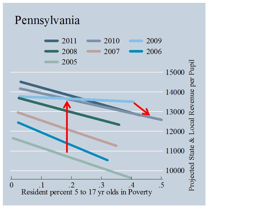
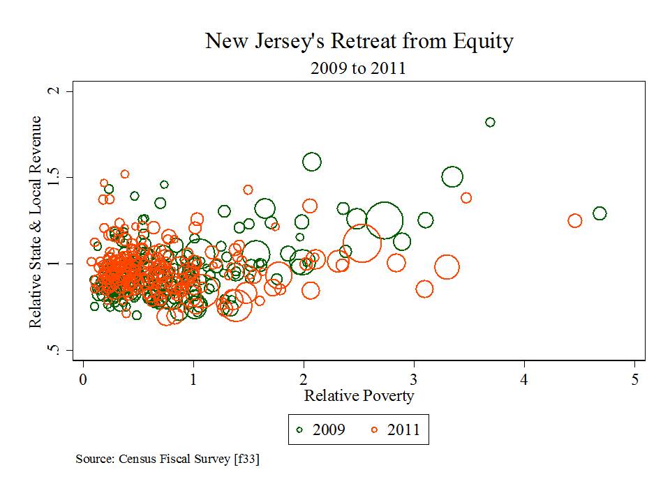
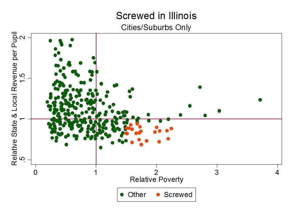
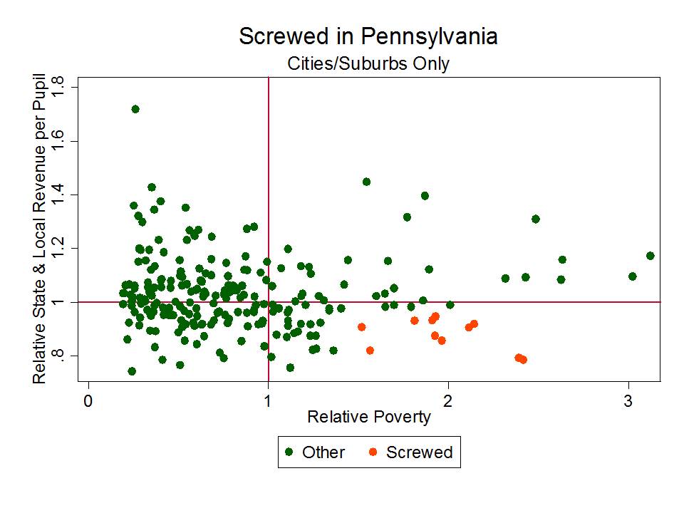
I would be remiss if I didn’t actually include data or a graph in this post, beyond the citations to sources above that include plenty.  So here it is – the distribution of state and local revenues for districts in the Philly metro area from 2005 to 2011, with respect to child poverty.

Slide1
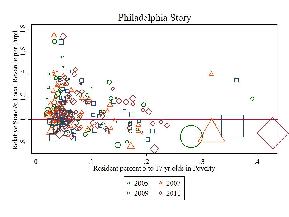
A district with average state and local revenue for the metro area would fall on the 1.0 line. The sizes of the shapes represent the size of the districts in terms of enrollment. Circles are for 2005, triangles for 2007 and so on (see key). The vertical position of larger shapes is measured from their center. Notably, Philly hangs at marginally above 80% of metro average funding.  Yes… following the Rendell formula reforms Philly’s position started to improve slightly but has since fallen back, and never really made sufficient progress. Way up in that upper left hand corner, is Lower Merion School District, perhaps the most affluent suburb of Philly. They’re doin’ just fine!

What we also notice here is that Philly’s indicator is, year after year, moving to the right in our picture. Some of this is a poverty measurement issue, but some of it is real (to be parsed more carefully at a later point). Philly school aged children are getting poorer. They were never compensated with sufficient additional resources to begin with and those resources are now in decline.

I’ve explained previously that Cost pressures in education are primarily local/regional. Education is a labor intensive industry. Salaries must be competitive on the local/regional labor market to recruit and retain quality teachers. And for children to have access to higher education, they must be able to compete with peers in their region.

And within any region, children with greater needs and schools serving higher concentrations of children with greater needs require more resources – more resources to recruit and retain even comparable numbers of comparable teachers – and more resources to provide smaller class sizes and more individual attention.

Put simply – Philly needs far more than its surrounding districts but has, year after year, had far less.

More information on how and why money matters can be found here:

http://www.shankerinstitute.org/images/doesmoneymatter_final.pdf

As far back as I’ve been running the numbers with both national and state data sources, Philly has been among the most screwed urban public districts in the nation. Philly has never been “propped up.”

End the district? Because it’s clearly the right thing to do for these kids? Because we’ve propped them up year after year… and they just keep blowing it – acting inefficiently – in the interest of adults not kids – as all “urban” districts do? Are you freakin’ kidding me? Wake the hell up. Look at some damned data and evaluate the problem a little more carefully before you make such absurd declarations.

For those who wish to levy similar accusations against Chicago….

Slide2
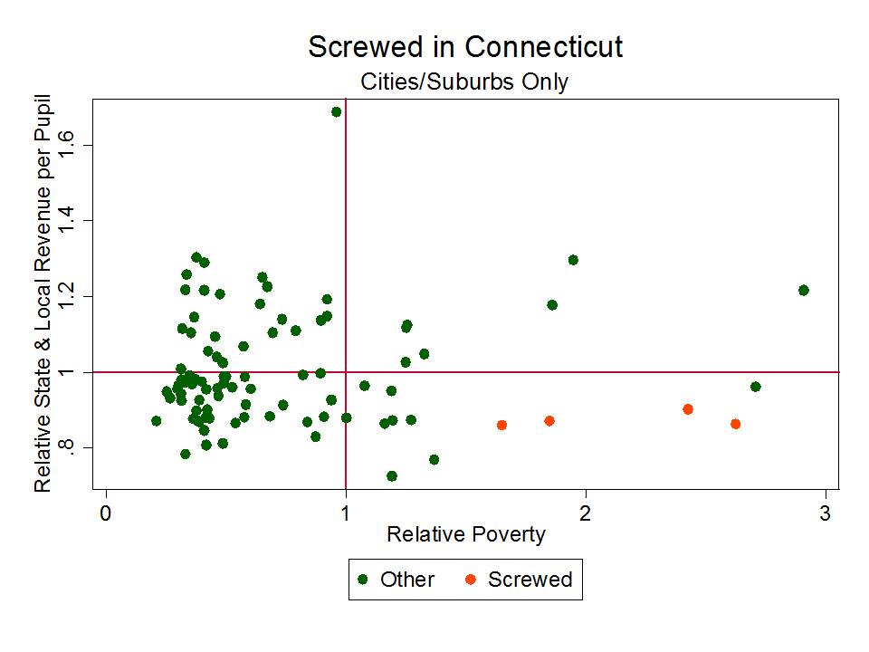
Those BIG shapes there… which like Philly, fall below the “average” line and have much higher child poverty than other districts in their metro? yeah… that’s Chicago. As I’ve noted on numerous previous posts in this blog (just search for “Chicago” or Illinois) Chicago and Philly are consistently among the most screwed major urban districts – operating in states with the least equitable state school finance systems. The links above to reports slamming PA (first two bullets) provide similar tales of inequity in Illinois.

UPDATE:

Clearly, Andy Smarick cares little that he lacks even the most basic understanding of the financial plight of Philadelphia public schools.  The tweets keep coming… and remain as wrong as ever… simply … factually… wrong! There is just no excuse for this kind of BS.

As for the presumptive solution here… that the “failed urban” district should/can be replaced with portfolio of charter operators that will necessarily be more effective, consider again that Philly has been dabbling for over a decade with resource free attempts at porfolio-izing the district. Consider also that even where charters – at small market share (http://shankerblog.org/?p=8609) do appear relatively effective – there remain substantive differences in their student populations, and in many cases substantive differences in their access to resources.

There are no miracles, regardless of the type of provider. Here’s one particularly relevant post on the non-reformy lessons of KIPP: https://schoolfinance101.wordpress.com/2013/03/01/the-non-reformy-lessons-of-kipp/ & here’s a more cynical post regarding NJ charters, and Uncommon schools in particular:

https://schoolfinance101.wordpress.com/2013/07/14/newark-charter-update-a-few-new-graphs-musings/

In other words, if the urban school district has proven, with unlimited resources, that it cannot succeed, and if charters have largely proven a break even endeavor in their urban contexts, then they too are equal failures. Only in Smarick’s wild imagination is the solution so simple and clear, yet so potentially dangerous if blindly accepted as public policy.

https://schoolfinance101.wordpress.com/2013/04/08/the-disturbing-language-and-shallow-logic-of-ed-reform-comments-on-relinquishment-sector-agnosticism/

This level of fact-free schlock and feeble minded policy advocacy must stop. Civil discourse? Sorry. I just can’t. This stuff is just too dumb for words! It’s irresponsible, ill-informed, reckless and more.

The Glaring Hypocrisy of the NCTQ Teacher Prep Institution Ratings

I’ve already written about this topic in the past.

But, given that NCTQ has just come out with their really, really big new ratings of teacher preparation institutions… with their primary objective of declaring teacher prep by traditional colleges and universities in the U.S. a massive failure, I figured I should once again revisit why the NCTQ ratings are, in general, methodologically inept & vacuous and more specifically wholly inconsistent with NCTQ’s own primary emphasis that teacher quality and qualifications matter perhaps more than anything else in schools and classrooms.

The debate among scholars and practitioners in education as to whether a good teacher is more important than a good curriculum, or vice versa, is never-ending. Most of us who are engaged in this debate lean one way or the other. Disclosure – I lean in favor of the “good teacher” perspective.  Those with labor economics background or interests tend to lean toward the good teacher importance, and perhaps those with more traditional “education” training lean toward the importance of curriculum.  I’m grossly oversimplifying here (perhaps opening a can of worms that need not be opened). Clearly, both matter.

I would argue that NCTQ has historically leaned toward the idea that the “good teacher” trumps all – but for their apparent newly acquired love of the Common Core Standards.

Now here’s the thing – if the content area expertise of elementary and secondary classroom teachers and the selectivity and rigor of their preparation matters most of all – how is it that at the college and university level, faculty substantive expertise (including involvement in rigorous research pertaining to the learning sciences, and specifically pertaining to content areas) is completely irrelevant to the quality of institutions that prepare teachers? That just doesn’t make sense.

Here’s a snapshot of the data collection framework used by NCTQ to rate teacher preparation institutions:

NCTQ

Seemingly most important of all is whether the teacher preparation institution teaches teachers how to teach/adopt the Common Core Standards.  The vast majority of this information seems to be derived from documents such as syllabi and course catalogs.  In fact, the majority of items in this framework are about curriculum as represented in whatever documents they decided to/were able to collect and how they then chose to interpret those documents.

ABSOLUTELY NOWHERE IN THE DATA FRAMEWORK ABOVE, OR IN THEIR ENTIRE METHODOLOGY DOCUMENT, IS THERE ANY REFERENCE TO FACULTY TRAINING OR EXPERTISE (INCLUDING RESEARCH CONTRIBUTIONS TO THE SCIENCE OF TEACHING AND LEARNING).

Culling key words in syllabi and catalogs is no way to determine the quality of teacher preparation institutions any more than one can evaluate the quality of a high school by looking at the list of graduation requirements and courses offered (theoretically offered by their existence in a course catalog).

Heads up for future NCTQ reports – nor is it particularly useful to try to rank teacher preparation institutions by the test scores of students of their graduates.

Yeah… it’s relatively convenient. Yeah… it allows NCTQ to subjectively tweak their ratings for their own political purposes.  It’s not only a largely pointless endeavor, but one that runs in complete contrast with what NCTQ claims is of central importance to improving the quality of our supposedly dreadful teacher preparation pipeline. It’s certainly easy enough to game this goofy methodology if we wanted to bother inserting common core “here” everywhere that NCTQ’s minimally trained minions might search.

There are numerous issues regarding teacher preparation that legitimately require our attention. I’ve pointed out previously that credential production for teachers is adrift.

I’ve pointed out in research a number of years back that ed schools are actually in an awkward position when it comes to recruiting faculty and building a team of faculty that bring to the table the diverse set of skills and expertise needed to provide teachers with balanced, rigorous preparation.  The faculty pipeline for teacher preparation is bifurcated between research and practice orientations and many preparation programs are imbalanced in one direction or the other, with the standards of their institutions shaping their preferences and practices in ways that don’t always support better teacher preparation.

These are complex issues that my colleagues and I at the University of Kansas (back in 2005) and many others have addressed and continue to address. They need real attention.

The new NCTQ report offers minimal guidance and a whole lot of misguided hype.

Related Articles

Wolf-Wendel, L, Baker, B.D., Twombly, S., Tollefson, N., & Mahlios, M.  (2006) Who’s Teaching the Teachers? Evidence from the National Survey of Postsecondary Faculty and Survey of Earned Doctorates.  American Journal of Education 112 (2) 273-300

Baker, B.D., Wolf-Wendel, L.E., Twombly, S.B. (2007) Exploring the Faculty Pipeline in Educational
Administration: Evidence from the Survey of Earned Doctorates 1990 to 2000. Educational
Administration Quarterly 43 (2) 189-220

Revisiting the Chetty, Rockoff & Friedman Molehill

My kids and I don’t watch enough Phineas and Ferb anymore. Awesome show. I was reminded just yesterday of this great device!

320px-Mountain_out_of_molehill-inatorThis… is the Mountain-Out-Of-A-Molehill-INATOR!  The name is rather self-explanatory – but here’s the official explanation anyway:

The Mountain-out-of-a-molehill-inator turns molehills into big mountains. It uses energy pellets to do so. It was created because all his life he was told “Don’t make mountains out of molehills”.

Now, I don’t mean to belittle the famed Chetty, Rockoff and Friedman study from a while back, which was quite the hit among policy wonks. As I explained in both my first, and second posts on this study, it’s a heck of a study, with lots of interesting stuff… and one hell of a data set!

What irked me then, and has all along is the spin that was put on the study, and that the spin was not just a matter of interpretation by politicos and the media, but that the spin was being fed by the study’s authors.

I figured that would eventually die down. I figured eventually cooler heads would prevail. But alas, I was wrong.  Worst of all, we still have at least some of the study’s authors prancing around like Doofenschmirtz (pictured above) with their very own Mountain-out-of-a-molehill-inator!

So what the heck am I talking about? This! is what I’m talking about. This graph provides the basis for the oft-repeated claim that having a good teacher generates $266k in additional income for a classroom full of kids over their lifetime. $266k – that’s a heck of a lot of money! We must get all kids in classrooms with these amazing teachers!

Rockoffs_Mole_Hill

This graph comes from a presentation given the other day to the New Jersey State Board of Education, in an effort to urge them to continue moving forward using Student Growth Percentiles as a substantial share of high stakes teacher evaluation (yes… to be used in part for dismissing the “bad” teachers, and retaining the “good” ones).

This graph shows us that the $266k figure actually comes from a figure of about $250! CHECK OUT THE VERTICAL AXIS ON THIS GRAPH! First of all, the authors chose to graph only one age (28) at which there even was a statistically significant difference in the earnings of children with super awesome versus only average teachers!  The full range on the vertical axis GOES ONLY FROM $20,400 TO $21,200! And the trendline goes from $20,600 to $21,200 – for a total vertical range of about $600! Yeah… that’s a molehill… about 2.9%.  The difference from the top to the average (albeit amidst a rather uncertain scatter) is only about $250. Now, the authors wouldn’t have generated quite the same buzz by pointing out that they found a wage differential of this magnitude – statistically significant or not- in a data set of this magnitude.

Here’s further explanation of their Mountain-out-of-a-molehill-inator calculation:

Rockoffs_Mole_Hill_2

That’s right… just point the Mountain-Out-Of-A-Molehill-Inator at the graph above, and all of the sudden that rather small differential that occurs at one age (displayed as a huge effect by spreading the heck out of the Y axis) all of the sudden becomes $266k.

Heck, why not multiply times a whole freakin’ village! Or why not the entire enrollment of NYC schools (context for the study). What if every kid in NYC for 10 straight years had awesome rather than sucky teachers? How much more would they earn over a lifetime?

I was somewhat forgiving of this playful spin the first time around, when they first released the paper. These are the kind of things authors do to playfully explain the magnitude of their results.  It’s one thing when this occurs as playful explanation in an academic context. It’s yet another when this is presented as a serious policy consideration to naive state policymakers – a result that somehow might plausibly occur if those policymakers move boldly forward in adopting a substantively different measure of teacher effectiveness to be used for firing all of the bad teachers.

What really are the implications of this study for practice – for human resource policy in local public (or private schools)? Well, not much! A study like this can be used to guide simulations of what might theoretically happen if we had 10,000 teachers, and were able to identify, with slightly better than even odds, the “really good” teachers – keep them, and fire the rest (knowing that we have high odds that we are wrongly firing many good teachers… but accepting this fact on the basis that we are at least slightly more likely to be right than wrong in identifying future higher vs. lower value added producers). As I noted on my previous post, this type of big data – this type of small margin-of-difference finding in big data – really  isn’t helpful for making determinations about individual teachers in the real world. Yeah… works great in big-data simulations based on big-data findings, but that’s about it.

Indeed it’s an interesting study, but to suggest that this study has important immediate implications for school and district level human resource management is not only naive, but reckless and irresponsible and must stop.

Rebutting (again) the Persistent Flow of Disinformation on VAM, SGP and Teacher Evaluation

This post is in response to testimony overheard from recent presentations to the New Jersey State Board of Education. For background and more thorough explanations of issues pertaining to the use of Value-added Models and Student Growth Percentiles please see the following two sources:

  • Baker, B.D., Oluwole, J., Green, P.C. III (2013) The legal consequences of mandating high stakes decisions based on low quality information: Teacher evaluation in the race-to-the-top era. Education Policy Analysis Archives, 21(5). This article is part of EPAA/AAPE’s Special Issue on Value-Added: What America’s Policymakers Need to Know and Understand, Guest Edited by Dr. Audrey Amrein-Beardsley and Assistant Editors Dr. Clarin Collins, Dr. Sarah Polasky, and Ed Sloat. Retrieved [date], from http://epaa.asu.edu/ojs/article/view/1298
  • Baker, B.D., Oluwole, J. (2013) Deconstructing Disinformation on Student Growth Percentiles & Teacher Evaluation in New Jersey. New Jersey Education Policy Forum 1(1) http://njedpolicy.files.wordpress.com/2013/05/sgp_disinformation_bakeroluwole1.pdf

Here, I address a handful of key points.

First, different choices of statistical model or method for estimating teacher “effect” on test score growth matter. Indeed, one might find that adding new variables, controlling for this, that and the other thing, doesn’t always shift the entire pattern significantly, but a substantial body of literature indicates that even subtle changes to included variables or modeling approach can significantly change individual teacher’s ratings and significantly reshuffle teachers across rating categories. Further, these changes may be most substantial for those teachers in the tails of the distribution – or those for whom the rating might be most consequential.

Second, I reiterate that Value-added models in their best, most thorough form, are not the same as student growth percentile estimates. Specifically, those who have made direct comparisons of VAMs versus SGPs for rating teachers have found that SGPs – by omission of additional variables – are less appropriate. That is, they don’t to a very good job of sorting out the teacher’s influence on test score growth!

Third, I point out that the argument that VAM as a teacher effect indicator is as good as batting average for hitters or earned run average for pitchers simply means that VAM is a pretty crappy indicator of teacher quality.

Fourth, I reiterate a point I’ve made on numerous occasions, that just because we see a murky pattern of relationship and significant variation across thousands of points in scatterplot doesn’t mean that we can make any reasonable judgment about the position of any one point in that mess. Using VAM or SGP to make high stakes personnel decisions about individual teachers violates this very simple rule. Sticking specific, certain, cut scores through these uncertain estimates in order to categorize teachers as effective or not violates this very simple understanding rule.

Two Examples of How Models & Variables Matter

States are moving full steam ahead on adopting variants of value added and growth percentile models for rating their teachers and one thing that’s becoming rather obvious is that these models and the data on which they rely vary widely. Some states and districts have chosen to adopt value added or growth percentile models that include only a single year of student prior scores to address differences in student backgrounds, and others are adopting more thorough value added models which also include additional student demographic characteristics, classroom characteristics including class size, and other classroom and school characteristics that might influence – outside the teacher’s control – the growth in student outcomes. Some researchers have argued that in the aggregate – across the patterns as a whole – this stuff doesn’t always seem to matter that much. But we also have a substantial body of evidence that when it comes to the individual rating teachers it does.

For example, a few years back, the Los Angeles times contracted Richard Buddin to estimate a relatively simple value-added model of teacher effect on test scores in Los Angeles. Buddin included prior scores and student demographic variables. However, in a critique of Buddin’s report, Briggs and Domingue ran the following re-analysis to determine the sensitivity of individual teacher ratings to model changes, including additional prior scores and additional demographic and classroom level variables:

The second stage of the sensitivity analysis was designed to illustrate the magnitude of this bias. To do this, we specified an alternate value-added model that, in addition to the variables Buddin used in his approach, controlled for (1) a longer history of a student’s test performance, (2) peer influence, and (3) school-level factors. We then compared the results—the inferences about teacher effectiveness—from this arguably stronger alternate model to those derived from the one specified by Buddin that was subsequently used by the L.A. Times to rate teachers. Since the Times model had five different levels of teacher effectiveness, we also placed teachers into these levels on the basis of effect estimates from the alternate model. If the Times model were perfectly accurate, there would be no difference in results between the two models. Our sensitivity analysis indicates that the effects estimated for LAUSD teachers can be quite sensitive to choices concerning the underlying statistical model. For reading outcomes, our findings included the following:

Only 46.4% of teachers would retain the same effectiveness rating under both models, 8.1% of those teachers identified as effective under our alternative model are identified as “more” or “most” effective in the L.A. Times specification, and 12.6% of those identified as “less” or “least” effective under the alternative model are identified as relatively effective by the L.A. Times model.

For math outcomes, our findings included the following:

Only 60.8% of teachers would retain the same effectiveness rating, 1.4% of those teachers identified as effective under the alternative model are identified as ineffective in the L.A. Times model, and 2.7% would go from a rating of ineffective under the alternative model to effective under the L.A. Times model.

The impact of using a different model is considerably stronger for reading outcomes, which indicates that elementary school age students in Los Angeles are more distinctively sorted into classrooms with regard to reading (as opposed to math) skills. But depending on how the measures are being used, even the lesser level of different outcomes for math could be of concern.

  • Briggs, D. & Domingue, B. (2011). Due diligence and the evaluation of teachers: A review of the value-added analysis underlying the effectiveness rankings of Los Angeles Unified School District Teachers by the Los Angeles Times. Boulder, CO: National Education Policy Center. Retrieved June 4, 2012 from http://nepc.colorado.edu/publication/due-diligence.

Similarly, Ballou and colleagues ran sensitivity tests of teacher ratings applying variants of VAM models:

As the availability of longitudinal data systems has grown, so has interest in developing tools that use these systems to improve student learning. Value-added models (VAM) are one such tool. VAMs provide estimates of gains in student achievement that can be ascribed to specific teachers or schools. Most researchers examining VAMs are confident that information derived from these models can be used to draw attention to teachers or schools that may be underperforming and could benefit from additional assistance. They also, however, caution educators about the use of such models as the only consideration for high-stakes outcomes such as compensation, tenure, or employment decisions. In this paper, we consider the impact of omitted variables on teachers’ value-added estimates, and whether commonly used single-equation or two-stage estimates are preferable when possibly important covariates are not available for inclusion in the value-added model. The findings indicate that these modeling choices can significantly influence outcomes for individual teachers, particularly those in the tails of the performance distribution who are most likely to be targeted by high-stakes policies.

In short, the conclusions here are that model specification and variables included matter. And they can matter a lot. It is reckless and irresponsible to assert otherwise and even more so to never bother to run comparable sensitivity analyses to those above prior to requiring the use of measures for high stakes decisions.

SGP & a comprehensive VAM are NOT THE SAME!

This point is really just an extension of the previous. Most SGP models, which are a subset of VAM, take the simplest form of accounting only for a single prior year of test score. Proponents of SPGs like to make a big deal about how the approach re-scales the data from its original artificial test scaling to a scale-free (and thus somehow problem free?) percentile rank measure. The argument is that we can’t really ever know, for example, whether it’s easier or harder to increase your SAT (or any test) score from 600 to 650, or from 700 to 750, even though they are both 50 pt increases. Test-score distances simply aren’t like running distances. You know what? Neither are ranks/percentiles that are based on those test score scales! Rescaling is merely recasting the same ol’ stuff, though it can at times be helpful for interpreting results.  If the original scores don’t show legitimate variation – for example, if they have a  strong ceiling or floor effect, or simply have a lot of meaningless (noise) variation – then so too will any rescaled form of them.

Setting aside the re-scaling smokescreen, two recent working papers compare SGP and VAM estimates for teacher and school evaluation and both raise concerns about the face validity and statistical properties of SGPs.  And here’s what they find.

Goldhaber and Walch (2012) conclude “For the purpose of starting conversations about student achievement, SGPs might be a useful tool, but one might wish to use a different methodology for rewarding teacher performance or making high-stakes teacher selection decisions” (p. 30).

  •  Goldhaber, D., & Walch, J. (2012). Does the model matter? Exploring the relationship between different student achievement-based teacher assessments. University of Washington at Bothell, Center for Education Data & Research. CEDR Working Paper 2012-6.

Ehlert and colleagues (2012) note “Although SGPs are currently employed for this purpose by several states, we argue that they (a) cannot be used for causal inference (nor were they designed to be used as such) and (b) are the least successful of the three models [Student Growth Percentiles, One-Step & Two-Step VAM] in leveling the playing field across schools”(p. 23).

  •  Ehlert, M., Koedel, C., &Parsons, E., & Podgursky, M. (2012). Selecting growth measures for school and teacher evaluations. National Center for Analysis of Longitudinal Data in Education Research (CALDER). Working Paper #80. http://ideas.repec.org/p/umc/wpaper/1210.html

If VAM is as reliable as Batting Averages or ERA, that simply makes it a BAD INDICATOR of FUTURE PERFORMANCE!

I’m increasingly mind-blown by those who return, time after time, to really bad baseball analogies to make their point that these value-added or SGP estimates are really good indicators of teacher effectiveness.  I’m not that much of a baseball statistics geek, though I’m becoming more and more intrigued as time passes.  The standard pro-VAM argument goes that VAM estimates for individual teachers have a correlation of about .35 from one year to the next. Casual readers of statistics often see this as “low” working from a relatively naïve perspective that a high correlation is about .8.  The idea is that a good indicator of teacher effect would have to be an indicator which reveals the true, persistent effectiveness of that teacher from year to year. Even better, a good indicator would be one that allows us to tell if that teacher is likely to be a good teacher in future years. A correlation of only about .35 doesn’t give us much confidence.

That said, let’s be clear that all we’re even talking about here is the likelihood that a teacher having students who showed test score gains in one year, is likely to have a new batch of students who show similar test score gains the following year (or at least in relative terms, the teacher who is above the average of teachers for their student test score gains remains similarly above the average of teachers for their students’ test score gains the following year). That is, the measure itself may be of very limited use, thus the extent to which it is consistent or not may not really be that important. But I digress.

In order to try to make a .35 correlation sound good, VAM proponents will often argue that the year over year correlation between baseball batting averages, or earned run averages is really only about the same. And since we all know that batting average and earned run average are really, really important baseball indicators of player quality, then VAM must be a really, really important indicator of teacher quality. Uh… not so much!

If there’s one thing Baseball statistics geeks really seem to agree on, it’s that Batting Averages and Earned Run Averages for pitchers are crappy predictors of future performance precisely because of their low year over year correlation.

This piece from beyondtheboxscore.com provides some explanation:

Not surprisingly, Batting Average comes in at about the same consistency for hitters as ERA for pitchers. One reason why BA is so inconsistent is that it is highly correlated to Batting Average on Balls in Play (BABIP)–.79–and BABIP only has a year-to-year correlation of .35.

Descriptive statistics like OBP and SLG fare much better, both coming in at .62 and .63 respectively. When many argue that OBP is a better statistic than BA it is for a number of reasons, but one is that it’s more reliable in terms of identifying a hitter’s true skill since it correlates more year-to-year.

And this piece provides additional explanation of descriptive versus predictive metrics.

An additional really important point here, however, is that these baseball indicators are relatively simple, mathematical calculations – like taking the number of hits (relatively easily measured term) divided by at bats (also easily measured). These aren’t noisy regression estimates based on the test bubble-filling behaviors of groups of 8 and 9 year old kids.  And most baseball metrics are arguably more clearly related to the job responsibilities of the player – though the fun stuff enters in when we start talking about modeling personnel decisions in terms of their influence on wins above replacement.

Just because you have a loose/weak pattern across thousands of points doesn’t add to the credibility of judging any one point!

One of the biggest fallacies in the application of VAM (or SGP) is that having a weak or modest relationship between year over year estimates for the same teachers, produced across thousands of teachers serving thousands of students, provides us with good enough (certainly better than anything else!) information to inform school or district level personnel policy.

Wrong! Knowing that there exists a modest pattern in a scatterplot of thousands of teachers from year one to year two, PROVIDES US WITH LITTLE USEFUL INFORMATION ABOUT ANY ONE POINT IN THAT SCATTERPLOT!

In other words, given the degrees of noise in these best case (least biased) estimates, there exists very limited real signal about the influence of any one teacher on his/her student’s test scores.  What we have here is limited real signal on a measure – measured test score gains from last year to this – which captures a very limited scope of outcomes. And, if we’re lucky, we can generate this noisy estimate of a measure of limited value on about 1/5 of our teachers.

Asserting that useful information can be garnered about the position of a single point in a massive scatterplot, based on such a loose pattern violates the most basic understandings of statistics. And this is exactly what using Value Added estimates to evaluate individual teachers, and put them into categories based on specific cut scores applied these noisy measures does!

The idea that we can apply strict cut scores  to noisy statistical regression model estimates to characterize an individual teacher as “highly effective” versus merely “very effective” is statistically ridiculous, and validated as such by the resulting statistics themselves.

Can useful information be garnered from the pattern as whole? Perhaps. Statistics aren’t entirely worthless, nor is this variation of statistical application. I’d be in trouble if this was all entirely pointless.  These models and their resulting estimates describe patterns – patterns of test score growth across lots and lots of kids across lots and lots of teachers – and groups and subgroups of kids and teachers. And these models may provide interesting insights into groups and subgroups if the original sample size is large enough. We might find that teachers applying one algebra teaching approach in several schools appear to be advancing students’ measured grasp of key concepts better than teachers in other schools (assuming equal students and settings) applying a different teaching method?

But we would be hard pressed to say with any certainty, which of these teachers are “good teachers” and which are “bad.”

The Disturbing Inequities of the New Normal

I wrote a post a while back, providing an overview of the basics of state school finance formulas, reforms and why they matter. I revisit this post having how conducted more extensive analysis of the retreat from school funding equity over the period from 2005 through 2011 (most recent available federal school finance data). Let’s begin with a review of my previous post.

School Funding Formula Basics

Modern state school finance formulas – aid distribution formulas – typically strive (but fail) to achieve two simultaneous objectives: 1) accounting for differences in the costs of achieving equal educational opportunity across schools and districts, and 2) accounting for differences in the ability of local public school districts to cover those costs. Local district ability to raise revenues might be a function of either or both local taxable property wealth and the incomes of local property owners, thus their ability to pay taxes on their properties.

Figure 1 presents a hypothetical example of the distribution of state and local revenue per pupil across school districts, sorted by poverty concentration. The hypothetical relies on the simplified assumption that districts with weaker local revenue raising capacity also tend to be higher in poverty concentration. While that’s not uniformly true, there is often at least some correlation between the two [it serves to make this hypothetical a bit more straightforward]. Accepting this oversimplified characterization, Figure 1 shows that the typical low poverty and high local fiscal capacity district would likely raise the vast majority of the cost of providing its children with equal educational opportunity through local tax dollars. There may be some small share of state general aid assuming that the total cost of providing equal educational opportunity exceeds the local resources raised with a fair tax rate.

Figure 1


This pattern is usually arrived at (if it is arrived at) through some overly complicated formula requiring multiple inefficiently and illogically laid out spreadsheets of calculations and based on measures for which each state chooses its own, completely distinct and unrecognizable nomenclature. A short version might go as follows:

Step 1 – determine target funding level (need & cost adjusted foundation level) per pupil for each district

Target Funding per Pupil = Foundation Level x Student Need Adjustments x Geographic Cost Adjustments

Where the foundation level is some specified per pupil dollar amount. Where student need adjustments include adjustments for individual student educational needs, as for children with limited English language proficiency and children with one or more disabilities, and collective characteristics of the student population such as poverty, homelessness and/or mobility/transiency rates. Where geographic costs refer to geographic variations in competitive wages, and factors such as economies of scale and population sparsity.

Step 2 – determine the share of target funding to be raised by local communities

State Aid per Pupil = Target Funding per Pupil – Local Fair Share

Yep. That’s it. Student needs and costs are accommodated in Step 1, and differences in local wealth and/or capacity to pay are accommodated in Step 2! Now convert that into about 2,000+ separate calculations and create incomprehensible names for each measure (like calling a weight on “low income students” a “student success factor”) and you’ve got a state school finance formula.

But I digress.

Implicit in the design of state school finance systems is that money may be leveraged for improving both the measured and unmeasured outcomes of children.  That is, that money matters to the quality of schooling that can be provided in general and that money matters toward the provision of special services for children with greater educational needs. That is, money can be an equalizer of educational opportunity.

In a typical foundation aid formula, it is implied that a foundation level of “X” should be sufficient for producing a given level of student outcomes in an average school district. It is then assumed that if one wishes to produce a higher level of outcomes, the foundation level should be increased. In short, it costs more to achieve higher outcomes[1] and the foundation level in a state school finance formula is the tool used for determining the overall level of support to be provided.

Further, it is assumed that resource levels may be adjusted in order to permit districts in different parts of the state to recruit and retain teachers of comparable quality. That is, the wages paid to teachers affect who will be willing to work in any given school. In other words, teacher wages affect teacher quality and in turn they affect school quality and student outcomes. This is plain common sense, and this teacher wage effect operates at two levels. First, in general, teacher wages must be sufficiently competitive with other career opportunities for similarly educated individuals. The overall competitiveness of teacher wages affects the overall academic quality of those who choose to enter teaching.[2] Second, the relative wages for teachers across local public school districts determine the distribution of teaching quality.[3] Districts with more favorable working conditions (more desirable facilities, fewer low income and minority students) can pay a lower wage and attract the same teacher. Wages matter, therefore, money matters.

Finally, those student need adjustments in state school finance formulas assume that the additional resources can be leveraged to improve outcomes for low income students, or students with limited English language proficiency. First, note that some share of the additional resources is needed in higher poverty settings simply to provide for “real resource” equity – or to pay the wage premium for doing the more complicated job. Second, resource intensive strategies such as reduced class sizes in the early grades, high quality (using qualified teaching staff)[4] early childhood programs, intensive tutoring and extended learning time programs may significantly improve outcomes of low income students. And these strategies all come with significant additional costs (even when adopted under the veil of “no excuses charterdom“).

But, because providing more money to support public schools often means raising more tax dollars and because providing supplemental resources to children whose own communities may lack local revenue raising capacity often means more aggressive redistribution of state tax revenues, whether and how money  matters in education is often hotly politically contested.

School finance is a political minefield, which is arguably why so many pundits have tried to distract from school finance issues by advancing ludicrous arguments that education equity and overall quality can be improved by altering teacher labor markets via statistical deselection without ever addressing funding deficiencies and wage disparities or by expanding charter schooling and ignoring the role of philanthropic contributions (while counting on them).  Unfortunately for those political pundits, school finance is a minefield they must eventually walk through if they ever expect to make real progress in resolving quality or equity concerns.

How and Why Money Matters

In a recent report titled Revisiting the Age Old Question: Does Money Matter in Education?[5] I review the controversy over whether, how and why money matters in education, evaluating the current political rhetoric in light of decades of empirical research.  I ask three questions, and summarize the response to those questions as follows:

Does money matter? Yes. On average, aggregate measures of per pupil spending are positively associated with improved or higher student outcomes. In some studies, the size of this effect is larger than in others and, in some cases, additional funding appears to matter more for some students than others. Clearly, there are other factors that may moderate the influence of funding on student outcomes, such as how that money is spent – in other words, money must be spent wisely to yield benefits. But, on balance, in direct tests of the relationship between financial resources and student outcomes, money matters.

Do schooling resources that cost money matter? Yes. Schooling resources which cost money, including class size reduction or higher teacher salaries, are positively associated with student outcomes. Again, in some cases, those effects are larger than others and there is also variation by student population and other contextual variables. On the whole, however, the things that cost money benefit students, and there is scarce evidence that there are more cost-effective alternatives.

Do state school finance reforms matter? Yes. Sustained improvements to the level and distribution of funding across local public school districts can lead to improvements in the level and distribution of student outcomes. While money alone may not be the answer, more equitable and adequate allocation of financial inputs to schooling provide a necessary underlying condition for improving the equity and adequacy of outcomes. The available evidence suggests that appropriate combinations of more adequate funding with more accountability for its use may be most promising.

While there may in fact be better and more efficient ways to leverage the education dollar toward improved student outcomes, we do know the following:

  • Many of the ways in which schools currently spend money do improve student outcomes.
  • When schools have more money, they have greater opportunity to spend productively. When they don’t, they can’t.
  • Arguments that across-the-board budget cuts will not hurt outcomes are completely unfounded.

In short, money matters, resources that cost money matter and more equitable distribution of school funding can improve outcomes. Policymakers would be well-advised to rely on high-quality research to guide the critical choices they make regarding school finance.

Regarding the politicized rhetoric around money and schools, which has become only more bombastic and less accurate in recent years, I explain the following:

Given the preponderance of evidence that resources do matter and that state school finance reforms can effect changes in student outcomes, it seems somewhat surprising that not only has doubt persisted, but the rhetoric of doubt seems to have escalated. In many cases, there is no longer just doubt, but rather direct assertions that: schools can do more than they are currently doing with less than they presently spend; the suggestion that money is not a necessary underlying condition for school improvement; and, in the most extreme cases, that cuts to funding might actually stimulate improvements that past funding increases have failed to accomplish.

To be blunt, money does matter. Schools and districts with more money clearly have greater ability to provide higher-quality, broader, and deeper educational opportunities to the children they serve. Furthermore, in the absence of money, or in the aftermath of deep cuts to existing funding, schools are unable to do many of the things they need to do in order to maintain quality educational opportunities. Without funding, efficiency tradeoffs and innovations being broadly endorsed are suspect. One cannot tradeoff spending money on class size reductions against increasing teacher salaries to improve teacher quality if funding is not there for either – if class sizes are already large and teacher salaries non-competitive. While these are not the conditions faced by all districts, they are faced by many.

It is certainly reasonable to acknowledge that money, by itself, is not a comprehensive solution for improving school quality. Clearly, money can be spent poorly and have limited influence on school quality. Or, money can be spent well and have substantive positive influence. But money that’s not there can’t do either. The available evidence leaves little doubt: Sufficient financial resources are a necessary underlying condition for providing quality education.

There certainly exists no evidence that equitable and adequate outcomes are more easily attainable where funding is neither equitable nor adequate. There exists no evidence that more adequate outcomes will be attained with less adequate funding. Both of these contentions are unfounded and quite honestly, completely absurd.

 Evaluating the Retreat from Equity

Now let’s take a look at what has happened in several states in recent years. Let’s start with a quick look at the framework I use for characterizing state school finance systems, as developed for the report Is School Funding Fair?

Slide1In Is School Funding Fair, we estimate a regression model to identify the slope of the relationship between poverty concentrations and state and local revenue, controlling for population density, district size and variation in competitive wages. We then characterize states as higher and/or lower spending and progressive or regressive. As explained above, the rationale for a progressive system is that progressively distributed revenues/expenditures provide the opportunity to leverage the additional resources to provide smaller class sizes, supplemental services and/or compensation differentials to recruit and retain teachers, aiding in the closing of achievement gaps between higher and lower poverty settings.

In my most recent post, I showed the rather dramatic retreat from equity in New Jersey over a fairly short period of time, in both state and local revenues and expenditures. Here it is again.

Slide2Slide3Here are the effects in a handful of other states. These graphs, like the New Jersey graphs, use state and local revenues per pupil from the Census Fiscal Survey of Local Governments (F-33). Unlike the School Funding Fairness Report, these are simply best fit lines of the relationship between Census Poverty rates and state and local spending, for all districts enrolling over 2,000 pupils. No inflation adjustment is used, nor is there adjustment for within state competitive wage variation. That will come in a future post when we’ve completed our annual funding fairness analysis.

Slide4

Slide6

Slide8

Slide10

Slide12

Slide16


Slide18


[1] Duncombe, W. and Yinger, J.M. (1999). Performance Standards and Education Cost Indexes: You Can’t Have One Without the Other. In H.F. Ladd, R. Chalk, and J.S. Hansen (Eds.), Equity and Adequacy in Education Finance: Issues and Perspectives (pp.260-97). Washington, DC: National Academy Press.

[2] Allegretto, S.A., Corcoran, S.P., Mishel, L.R. (2008) The teaching penalty : teacher pay losing ground. Washington, D.C. : Economic Policy Institute, ©2008.  Richard J. Murnane and Randall Olsen (1989) The effects of salaries and opportunity costs on length of state in teaching. Evidence from Michigan. Review of Economics and Statistics 71 (2) 347-352. David N. Figlio (2002) Can Public Schools Buy Better-Qualified Teachers?” Industrial and Labor Relations Review 55, 686-699. David N. Figlio (1997) Teacher Salaries and Teacher Quality. Economics Letters 55 267-271. Ronald Ferguson (1991) Paying for Public Education: New Evidence on How and Why Money Matters. Harvard Journal on Legislation. 28 (2) 465-498. Loeb, S., Page, M. (2000) Examining the Link Between Teacher Wages and Student Outcomes: The Importance of Alternative Labor Market Opportunities and Non-Pecuniary Variation. Review of Economics and Statistics 82 (3) 393-408. Figlio, D.N., Rueben, K. (2001) Tax Limits and the Qualifications of New Teachers. Journal of Public Economics. April, 49-71

[3] Ondrich, J., Pas, E., Yinger, J. (2008) The Determinants of Teacher Attrition in Upstate New York. Public Finance Review 36 (1) 112-144. Lankford, H., Loeb., S., Wyckoff, J. (2002) Teacher Sorting and the Plight of Urban Schools. Educational Evaluation and Policy Analysis 24 (1) 37-62. Clotfelter, C., Ladd, H.F., Vigdor, J. (2011) Teacher Mobility, School Segregation and Pay Based Policies to Level the Playing Field. Education Finance and Policy , Vol.6, No.3, Pages 399–438. Clotfelter, Charles T., Elizabeth Glennie, Helen F. Ladd, and Jacob L. Vigdor. 2008. Would higher salaries keep teachers in high-poverty schools? Evidence from a policy intervention in North Carolina. Journal of Public Economics 92: 1352–70.

[5] Baker, B.D. (2012) Revisiting the Age Old Question: Does Money Matter in Education. Shanker Institute. http://www.shankerinstitute.org/images/doesmoneymatter_final.pdf

The Dramatic Retreat from Funding Equity in New Jersey: Evidence from the Census Fiscal Survey

I have explained in numerous previous posts how New Jersey is among those states that operates a reasonably progressive state school finance system, that New Jersey, throughout the 1990s and early 2000s put the effort into disrupting the relationship between local community income and school spending. And, during that period, New Jersey’s low income students appear to have experienced some gains, at least when compared with other demographically similar states. Massachusetts, like New Jersey, also improved the progressiveness of its state school funding system over the same period, but Connecticut not so much.  Here are some figures from a previous post:

Figure 1. Disrupting the relationship between income and school spending 1990 to 2004

Slide1

Figure 2.  NAEP Gains of Children qualified for Free Lunch (Math)

Slide2

Figure 3. NAEP Gains of Children qualified for Free Lunch (Reading)

Slide3

New Jersey has maintained strong position relative to other states both in terms of NAEP achievement gains, especially for lower income students and in terms of school funding fairness in our annual report.  I have often used New Jersey as a model of a sound, progressive state school funding system and one that has produced some reasonable initial results. In fact, I was about to start writing a post on that very point. Way too many of my posts on school funding equity/inequity have been negative. Heck, I just posted the “most screwed” districts in the nation. I was looking for an upside. A model. Some positives. A state that has maintained a solid progressive funding system even through bad times. So, I went back to the New Jersey data, and included the recently released 2010-11 Census Bureau data. What I found was really sad.

The following figures reveal the damage to funding progressiveness accomplished in New Jersey over a relatively short period of time. A system that was among the nation’s most progressive in terms of school funding as recently as 2009 appears – based on the most recent census bureau data on current expenditures per pupil – to have slipped not only slightly… but dramatically.  Here are the year to year snapshots, first as graphs of the actual district positions (for districts enrolling 2,000 or more pupils, with circle/triangle size indicating enrollment size) and then as the lines of best fit for each distribution, which indicates the “progressiveness” of the funding system with respect to poverty.

Figure 4. New Jersey Districts 2005 to 2007

Slide5

Figure 5. New Jersey Progressiveness 2005 t0 2007

Slide6Note – Funding level increases and progressiveness (tilt from low to high poverty) stays stable)

Figure 6. New Jersey Districts 2007 to 2009

Slide7

Figure 7. New Jersey Progressiveness 2007 to 2009

Slide8

Figure 8. New Jersey Districts 2009 to 2011

Slide9

Figure 9. New Jersey Progressiveness 2009 to 2011

Slide10

The damage done is rather striking and far beyond what I ever would have expected to see in these data. It may be that there are problems in the data themselves, but separate analyses of the revenue and expenditure data and use of alternative enrollment figures thus far have produced consistent results. In fact, analyses using state and local revenue data look even worse for New Jersey. And these charts do not adjust for various cost factors. They are what they are (variable ppcstot, or per pupil current spending, with respect to census poverty rates).

Meanwhile, efforts continue to cause even more damage to funding equity in New Jersey, amazingly using the argument that reducing the funding targeted to higher need districts and shifting it to others will somehow help New Jersey reduce its (misrepresented) achievement gap between high and low income children.

We may or may not begin to see the fallout – the real damages – of these shifts this year, or even next. But there will undoubtedly be consequences. Current policy changes, such as the use of bogus metrics to rate and remove mythically bad teachers will not make it less costly for high poverty districts to recruit and retain quality staff.  In fact, it may make it more expensive, given the increased disincentive for teachers to seek employment in higher poverty settings, all else equal. Nor will newly adopted half-baked school performance rating schemes. Nor will the state’s NCLB waiver which hoists new uncertainties and instabilities onto districts serving the neediest students with annually less competitive revenues and expenditures.

As I’ve said numerous times on this blog – equitable and adequate funding are prerequisite conditions for all else. Money matters.  And the apparent dramatic retreat from equity in New Jersey over a relatively short period of time raises serious concerns.


Additional Figures

Below is the retreat from equity in state and local revenues per pupil with respect to poverty. In this case, I’ve expressed state and local revenues relative to the average state and local revenues of districts sharing the same labor market and I’ve expressed poverty similarly.

Slide11

Slide12


Follow-up: Title I Funding DOES NOT Make Rich States Richer!

In one of my earliest posts, I took on a myth created and shared by many DC Think Tanks that the Title I funding formula inappropriately favors “rich states” and school districts in urban areas.

This myth has its origins in a handful of policy papers and poorly constructed analyses, some of which eventually made into print – albeit in law review journals that tend to be light on reviewing quantitative evidence.

Today, after many conversations over the years, Lori Taylor of Texas A&M, Jay Chambers, Jesse Levin and Charles Blankenship of the American Institutes for Research and I finally published our article in the journal Education Finance and Policy in which we critique the arguments that Title I is making rich states richer. In short, much of confusion boils down to the mis-measurement of income and poverty, an issue I’ve discussed extensively on this blog.

The assertion from prior reports is that the Title I aid formula includes a number of critical flaws that ultimately lead to providing disproportionate funding to states that are relatively high income and can spend more than other states to begin with, and to school districts in urban and suburban areas, shorting the rural districts which on their face may appear to have comparable or even higher poverty in some cases. We summarize this literature as follows:

Because Title I provides the largest share of direct federal education funding to states and local districts, Title I funds are a likely target for political tug-of-war during re-authorization. In recent years questions have been raised about whether Title I funding in particular is appropriately targeted to those districts, schools, and children that need it most. Deliberations have focused on perceived flaws in the design of the Title I funding formulas (Carey & Roza, 2008; Liu, 2007, 2008; Miller, 2009; Miller & Brown, 2010a,2010b). Critics argue that Title I funding favors wealthy states and larger urban districts, to the detriment of very poor states and rural areas, in part because parts of the formula described above are driven by state’s own spending levels and because rich states are able to spend more, thus gain more Title I funding (Liu, 2008, 2007; Miller, 2009; Miller & Brown, 2010a, 2010b).[1] Specifically, Liu (2007, 2008) provided analyses that suggest that lower poverty states and urban districts receive disproportionate share of Title I funding per poor child and asserted that (1) “By allocating aid to states in proportion to state per-pupil expenditures, Title I reinforces vast spending inequalities between states to the detriment of poor children in high-poverty jurisdictions,” and (2) “small or mid-sized districts that serve half or more of all poor children in areas of high poverty receive less aid than larger districts with comparable poverty” (Liu, 2008, p. 973).

But, as I’ve discussed previously on this blog, there are two issues that need to be considered when comparing the distribution of Title I dollars across local public school districts. In this previous post, I was able to crudely tackle those issues. That is, first, one must consider how the Title I dollar varies in value from one state to another, one region to another, across rural and urban settings, and so on. Education being a labor intensive industry, accounting for variation in school labor costs is critical for determining the fairness of the distribution of funding. In this previous post, I used the Education Comparable Wage Index developed by Lori Taylor for the National Center for Education Statistics.  Lori has been kind enough to update this index on her own through 2011 and post it on the Texas A&M web site. The second step I took in my earlier post was to adjust poverty rates for each state by an index created by Trudi Renwick of the Census Bureau. After adjusting for both the value of the Title I dollar and for Renwick’s state level poverty adjustments, I found that the Title I distributions really weren’t that awful – and certainly didn’t systematically reward rich states.

Thanks to the brilliance of Lori, Jay, Jesse and Charles (and some others providing supporting roles) we are now able to take this analysis a step (or more) further and re-evaluate Title I distributions down to the school district level to determine not only at large scale whether rich states are rewarded over poor ones, but whether the formula also advantages urban versus rural areas, and so on. Let’s take a quick walk through the two adjustments.  First, we have Lori’s updated Education Comparable Wage Index, which uses Census Data to estimate how much the wages for non-educators vary across labor markets nationally. That variation looks something like this:

Figure 1. National ECWI

Slide3

This index can be used to adjust the value of the Title I dollar.

Next, we have our poverty adjustment factor, which is arrived at through a few steps, also using Census Data. This process starts with a similar wage index (details in the full article) which is intended to capture differences in wages across locales and regions which are largely driven by differences in underlying costs of living…but in many cases tend to be less extreme than cost of living differences (because, in many cases, high costs are accompanied by desirable amenities).  We use this index to create an adjusted income threshold for poverty for each labor market nationwide. Then, we re-calculate the number of children in families below and above this adjusted income threshold, and compare our new poverty rate to the original poverty rate. This gives us a poverty adjustment factor- or a multiplier that lets us adjust the poverty rate in a given area from its original level to the poverty rate that would exist at the adjusted income threshold. Here’s what that poverty adjustment factor looks like nationally.

Figure 2. Poverty Adjustment Factor

Slide4

So, taking into account regional wage/cost variation, poverty rates in urban and northeastern areas require an upward adjustment on the order of 25 to 55% in some cases, where in areas such as northwest Kansas, poverty rates actually require substantial downward adjustment.

We can probably see where this is headed at this point. But let’s go there anyway… since that is the main point here. Let’s start with this graph of Title I allocations per child in poverty by locale and by region, applying only the first adjustment for the value of the Title I dollar (updated ECWI). Metropolitan areas are areas around a core with population of at least 50k and micropolitan areas are areas around a core of 10k to 50k.

Figure 3. Applying the Dollar Value Adjustment Only (ECWI)

Slide5

In the left half of the figure we have “unadjusted” allocations and in the right we have adjusted allocations. Northeastern metropolitan districts have, in unadjusted dollars, over $1,800 per poverty pupil. This would appear to be the highest of any group. But even after applying only the first adjustment, this figure drops to $1,500 and is lower than most micropolitan and rural districts. Even this first step sheds significant doubt on the original assertion (which in some cases, did use a regional cost adjustment).

Figure 4 takes the next step of applying adjustments to poverty rates, in order to better capture just how many children live in families below a more locally [labor market] reasonable income level. Here, we see that once we have made both adjustments, metropolitan districts generally are being significantly shortchanged relative to their micropolitan and rural peers. In fact, rural and micropolitan districts in central (plains) states are receiving in some cases twice as much (or more) per poverty pupil in Title I aid as are metropolitan residents.

Figure 4. Applying the Dollar Value and Poverty Adjustment

Slide7

In short, Title I funding DOES NOT ADVANTAGE WEALTHY, NORTHEASTERN, METROPOLITAN AREAS!  That is, not when one more accurately measures both the value of the education dollar and the expected numbers of children in need.

Now, back to the Title I formula. We discuss in our article that the Title I formula does indeed include factors that are, on their face illogical and seemingly unfair. Why, after all, would policy drive more need-based funding to those who can and choose to spend more on their own (the Spending factor)? The formula also includes political giveaways like the small state minimum. But these political giveaways don’t amount to much (because small states, are, well, small…).  It would certainly make sense to replace the illogical factors that currently drive Title I funding with our more logical factors addressed herein. But, it is important to understand that doing so will drive MORE, not less funding to metropolitan areas and states with higher average income. Empirically, it’s the right thing to do.

A few closing points are in order. First, it’s also important to understand that Title I alone cannot resolve the persistent disparities in state school finance systems. The Title I effect on funding fairness remains relatively small. Here it is in 2010.

Figure 5. Title I Effect on Funding Fairness

Slide1

So, no matter what we do, Title I will not solve our biggest funding equity issues. That remains largely a state problem.

Finally, it’s also worth considering how similar adjustments might apply across federal benefit programs.  Consider, for example, this interactive map of the current geographic distribution of federal benefits.

Selected References

Carey, K., & Roza, M. (2008). School funding’s tragic flaw. Seattle, WA: Center on Reinventing Public Education.

Liu, G. (2008). Improving Title I funding equity across states, districts and schools. Iowa Law Review, 93, 973-1014.

Miller, R. (2009). Secret recipes revealed: Demystifying the Title I, Part A funding formulas. Washington, DC: Center for American Progress.

Miller, R. T., & Brown, C. G. (2010a). Bitter pill, better formula: Toward a single, fair, and equitable formula for ESEA Title I, Part A. Washington, DC: Center for American Progress.

Miller, R. T., & Brown, C. G. (2010b). Spoonful of sugar: An equity fund to facilitate a single, fair, and equitable formula for ESEA Title I, Part A. Washington, DC: Center for American Progress.

Renwick, T. (2009). Alternative geographic adjustments of U.S. poverty thresholds: Impact on state poverty rates. Washington, DC: U.S. Census Bureau.

Renwick, T. (2011, January). Geographic adjustments of supplemental poverty measure thresholds: Using the American Community Survey five-year data on housing costs. Washington, DC: U.S. Census Bureau.


[1] Additional criticisms of Title I funding point to the fact that three of the four formulas used to allocate dollars do not take into account state fiscal effort (the level of state and local revenue dedicated to providing public education) and state-minimum provisions guarantee relatively large allocations to states with small populations (see Miller, 2009).

I don’t know anything about them, but they suck! Reformy thoughts on Ed Schools

It all started here, when Ben Riley of NSVF suggested that comments from Finnish Ed Guru Pasi Sahlberg (hero of the anti-reformers) regarding teacher preparation in Finland (and elsewhere) meant that the U.S. really needed to start shutting down teacher preparation programs.

Ben Riley’s main takeaway from Sahlberg’s post was that the U.S. should have about the same number of ed schools as Finland…. ? (or at least he lacked clarity on the point… So Sherman Dorn set him straight on the basic math):

A point on which Riley capitulated. So, now we’ve got that straight. The U.S. could indeed reduce the number of teacher preparation programs. But Finland’s total number of 8 really doesn’t match the U.S. Population. Rather, we might use about 500 relatively highly regulated programs, largely housed in research universities and/or professional teaching colleges.

A bit of a sidebar here… Sherman Dorn is also pointing out that the Sahlberg article actually speaks of a system which maintains a strong role for the country’s research universities.

That is, not increased reliance on for-profit institutions, or quasi-academic non-research based startups like Relay GSE (which emphasize sit-down-and-shut-up classroom management) which rely almost exclusively on relatively inexperienced current teachers who themselves hold only a master’s degree (many from non-competitive programs – Relay Faculty/Relay NCATE App 9-2012) to deliver their certification programs.

Then the conversation enters new territory. So, what’s been going in in teacher preparation in the U.S. Where have many of the emerging graduate degrees and credentials been coming from in education?

To which Ben Riley issues the incoherent response:

So, rather confidently as purveyors of decisive reformy thought tend to do, Ben Riley submits that he knows for sure that the system as a whole and invariably is still crappy… and uses the term “ecosystem” to sound informed/thoughtful.

But this is actually really funny, because the whole point of analogizing such systems to natural ecosystems is to understand their diversity and interconnectedness. Yet all that follows here conveys that Ben Riley has limited or no understanding of that nor does he believe that it is important.

So, I figure I’ll jump in (after standing by for a while) and post a link to my slides on changes in the pattern of production of education credentials over the past 20 years:

And why not throw in some citations to published research while I’m at it.

Skipping ahead here… because we somehow went on another tangent about Finland…I ask Ben Riley if he believes this system that he knows for sure is crappy… is crappier than it was 20 years ago?

I dare suggest that history matters. Context matters… and to know where we are headed, we might want to look first at where we’ve been. After all crappiness requires context- either in terms of time, or in terms of some relevant peer group – or both. To know crappy, one must have some idea of what’s not crappy.

And here’s where the conversation just gets stupid and offensive, and so absurdly anti-intellectual that it is perhaps revealing of deeper problems with education in America.

Amazingly, Riley’s response is that it’s just crappy. Damn… that’s just brilliant!  I push to clarify… Doesn’t history matter? Shouldn’t we understand where we’ve been to figure out where we’re headed? The trends are rather striking. Yes, we’ve criticized teacher preparation in the U.S. for decades… but it certainly seems to be coming to a head of late. But what’s changed so dramatically? This post tells an interesting story!

So, asking again about whether history matters… (and yeah… putting it bluntly & chastising Ben Riley… who I feel at this point deserves a jab or two…)

[Note – My original post erred in attributing a Ben Riley response to this statement as denying this statement – a “nope, it does not.” However, the message here still stands. Ben Riley, throughout this conversation displayed complete disregard for the history or context of “ed schools,” or their “ecosystem” responding instead with grossly misinformed, fact-challenged generalizations.]

Apparently, this was not worthy of a response? Does history and context matter? or can we just call the current system crappy without any regard for either?

Perhaps this complete and utter disregard for intellectual inquiry into how/why or even if there are problems, disregard for history and misunderstanding of complexity and “ecosystems” is indicative of the failures of Yale Law School? After all, Yale Law has recently give us this (John King) and this (Neerav Kingsland [who I like and respect, but…]) (and much more to be discussed later).  Is there some funky mind-numbing (anti-critical-thinking) Koolaid being passed around in New Haven?

And perhaps it is indicative of the core problem of the modern education reform movement- be it the emphasis on misuse of measures in teacher evaluation (or rating ed schools) – the desire to rapidly expand and deregulate charter schooling – or the crusade against ed schools as if they are some stagnant monolithic entity.  Our willful ignorance of context and complete disregard for history is leading down a questionable path – well, actually several at once.

We concluded the conversation after one last side trip to Finland. I pointed out that there are various systemic complexities that make it difficult to assume that focusing solely or even primarily on teacher preparation institutions (w/o consideration for earnings competitiveness, etc.) is wrongheaded.

And I’m met with the classic “all of the good countries out there” that obviously beat us into the ground on international assessments do it differently… from us… and of course… the same as each other… you know… like they all have only 8 prep institutions regardless of total population, and only take the top 2% of HS graduates into teaching… and that top 2% goes into teaching regardless of expected earnings. And the programs all get accredited and rated and/or shut down based on whether they contribute positively to the country’s PISA ranking.  And while their institutions are called universities… and have instructors called professors… who appear to be engaged in research… really, they’re  more like entrepreneurial start-ups that are totally different from university based Ed Schools in the U.S.? Yeah… okay… whatever. What a load of crap!

My final response:

I’m sick of data-free, research void conversations with those who claim so belligerently to know all of the problems and have all of the answers. In other words, I know a crappy argument when I see one, and this was surely a crappy argument!

Related Research

Baker, B.D, Orr, M.T., Young, M.D. (2007) Academic Drift, Institutional Production and Professional Distribution of Graduate Degrees in Educational Administration. Educational Administration Quarterly  43 (3)  279-318

Baker, B.D., Fuller, E. The Declining Academic Quality of School Principals and Why it May Matter. Baker.Fuller.PrincipalQuality.Mo.Wi_Jan7

Baker, B.D., Wolf-Wendel, L.E., Twombly, S.B. (2007) Exploring the Faculty Pipeline in Educational Administration: Evidence from the Survey of Earned Doctorates 1990 to 2000. Educational Administration Quarterly 43 (2) 189-220

Wolf-Wendel, L, Baker, B.D., Twombly, S., Tollefson, N., & Mahlios, M.  (2006) Who’s Teaching the Teachers? Evidence from the National Survey of Postsecondary Faculty and Survey of Earned Doctorates.  American Journal of Education 112 (2) 273-300

Most Screwed Local Public School Districts Update 2009-2011

Here it is – my annual update of America’s most screwed school districts. This time, for stability purposes, I’ve used a 3-year average based on 2009-2011 data (2011 data being released earlier this week).

As I’ve explained in my previous posts on this topic (from last year’s post on screwed districts)…

It’s important to understand that the value of any given level of education funding, in any given location, is relative. That is, it doesn’t simply matter that a district has or spends $10,000 per pupil, or $20,000 per pupil. What matters is how that funding compares to other districts operating in the same labor market, and for that matter, how that money relates to other conditions in the region/labor market. Why? Well, schooling is labor intensive.  And the quality of schooling depends largely on the ability of schools or districts to recruit and retain quality employees. And yes… despite reformy arguments to the contrary – competitive wages for teachers matter!  The largest share of school district annual operating budgets is tied up in the salaries and wages of teachers and other school workers. The ability to recruit and retain teachers in a school district in any given labor market depends on the wage a district can pay to teachers a) relative to other surrounding schools/districts and b) relative to non-teaching alternatives in the same labor market.

In our funding fairness report, we present statewide profiles of disparities in funding with respect to poverty. But, I thought it would be fun (albeit rather depressing) here to try to identify some of the least well-funded districts in the country. Now, keep in mind that there are still around 15,000 districts nationwide.

Here is this year’s empirical definition of “screwed” in school finance terms:

  1. State and Local Revenue per Pupil (Census Fiscal Survey, 3-year Average) less than 95% of average for districts in the same labor market*
  2. Adjusted Census Poverty Rate for 5 to 17 year olds (Census Small Area Income and Poverty Estimates, 3-year average) greater than 50% above average for districts in the same labor market.

*where “labor market” is defined as it is defined in the NCES Education Comparable Wage Index (essentially by core based statistical area for all districts in metropolitan or micropolitan areas).

Put very simply, districts with higher student needs than surrounding districts in the same labor market don’t just require the same total revenue per pupil to get the job done. They require more. Higher need districts require more money simply to recruit and retain similar quantities (per pupil) of similar quality teachers. That is, they need to be able to pay a wage premium. In addition, higher need districts need to be able to both provide the additional program/service supports necessary for helping kids from disadvantaged backgrounds (including smaller classes in early grades) while still maintaining advanced and enriched course options.

The districts in this table not only don’t have the “same” total state and local revenue per pupil than surrounding districts. They have less and in some cases they have a lot less! In many cases their child poverty rate is more than twice that of the surrounding districts that continue to have more resources.

State, District Relative Poverty Relative State & Local Revenue
Alabama,Bessemer City School District 2.046 0.837
Alabama,Fairfield City School District 1.562 0.803
Arizona,Sunnyside Unified District 1.681 0.816
California,Bayshore Elementary School D 1.579 0.718
California,Ravenswood City Elementary S 1.715 0.749
California,West Fresno Elementary Schoo 1.793 0.739
Colorado,Adams-Arapahoe School District 1.758 0.915
Connecticut,Bridgeport School District 2.626 0.863
Connecticut,East Hartford School Distri 1.651 0.86
Connecticut,New Britain School District 2.427 0.903
Connecticut,Waterbury School District 1.849 0.871
Delaware,Colonial School District 1.573 0.94
Georgia,Spalding County School District 1.578 0.876
Idaho,Caldwell School District 132 1.925 0.875
Illinois,Chicago Public School District 1.663 0.825
Illinois,Granite City Community Unit Sc 1.515 0.823
Illinois,Kankakee School District 111 1.681 0.943
Illinois,North Chicago School District 2.174 0.857
Illinois,Round Lake Community Unit Scho 1.836 0.733
Illinois,Waukegan Community Unit School 2.044 0.722
Indiana,Edinburgh Community School Corp 1.709 0.912
Indiana,Hammond School City 1.547 0.948
Indiana,River Forest Community School C 1.598 0.941
Kentucky,Dayton Independent School Dist 1.861 0.797
Massachusetts,Blackstone-Millville Scho 1.804 0.918
Massachusetts,Dennis-Yarmouth School Di 1.509 0.95
Massachusetts,Everett School District 2.295 0.833
Massachusetts,Lowell School District 2.425 0.898
Massachusetts,Revere School District 1.774 0.807
Massachusetts,Webster School District 1.697 0.909
Michigan,Clarenceville School District 1.634 0.945
Michigan,Clintondale Community Schools 1.789 0.829
Michigan,East Detroit Public Schools 1.803 0.864
Michigan,Godfrey-Lee Public Schools 1.893 0.913
Michigan,Hamtramck Public Schools 2.114 0.793
Michigan,Inkster City School District 1.519 0.837
Michigan,Kelloggsville Public Schools 1.589 0.929
Michigan,Madison Public Schools 1.914 0.908
Michigan,Port Huron Area School Distric 1.814 0.775
Michigan,Roseville Community Schools 1.638 0.924
Missouri,Independence Public Schools 1.622 0.943
Missouri,Jennings School District 2.086 0.891
Missouri,Ritenour School District 1.5 0.896
Missouri,Riverview Gardens School Distr 1.979 0.853
New Hampshire,Manchester School Distric 1.826 0.85
New Hampshire,Rochester School District 1.826 0.87
New Hampshire,Somersworth School Distri 1.615 0.899
New Jersey,Bound Brook Borough School D 1.727 0.929
New Jersey,Carteret Borough School Dist 1.781 0.873
New Jersey,Irvington Township School Di 2.023 0.906
New Jersey,Penns Grove-Carneys Point Re 1.57 0.929
New Jersey,Pennsauken Township School D 1.605 0.939
New Jersey,South Amboy City School Dist 1.705 0.895
New Jersey,Woodbury City School Distric 1.565 0.946
New York,Binghamton City School Distric 1.815 0.936
New York,Brentwood Union Free School Di 2.17 0.817
New York,Copiague Union Free School Dis 1.844 0.945
New York,Lansingburgh Central School Di 1.953 0.895
New York,Schenectady City School Distri 2.39 0.903
New York,Utica City School District 1.87 0.865
New York,Watervliet City School Distric 1.59 0.925
New York,William Floyd (Mastic Beach) U 1.727 0.919
North Carolina,Kannapolis City Schools 1.529 0.688
Ohio,Campbell City School District 1.509 0.9
Ohio,Clearview Local School District 1.628 0.66
Ohio,New Miami Local School District 1.909 0.827
Ohio,Northridge Local School District 2.173 0.915
Ohio,Painesville City Local School Dist 1.667 0.946
Oregon,Centennial School District 28J 1.621 0.9
Oregon,David Douglas School District 40 2.008 0.933
Oregon,Reynolds School District 7 1.974 0.927
Pennsylvania,Allentown City School Dist 2.417 0.784
Pennsylvania,Big Beaver Falls Area Scho 1.811 0.93
Pennsylvania,Connellsville Area School 1.926 0.874
Pennsylvania,Highlands School District 1.517 0.907
Pennsylvania,Laurel Highlands School Di 1.564 0.82
Pennsylvania,Lebanon School District 2.143 0.919
Pennsylvania,McKeesport Area School Dis 1.927 0.947
Pennsylvania,New Kensington-Arnold Scho 1.91 0.932
Pennsylvania,Philadelphia City School D 2.115 0.905
Pennsylvania,Reading School District 2.39 0.792
Pennsylvania,Uniontown Area School Dist 1.963 0.857
Rhode Island,Pawtucket School District 1.604 0.793
Rhode Island,Woonsocket School District 1.983 0.764
Tennessee,Hawkins County School Distric 1.552 0.863
Texas,Aldine Independent School Distric 1.634 0.917
Texas,Alief Independent School District 1.597 0.93
Texas,Castleberry Independent School Di 1.575 0.897
Texas,Dallas Independent School Distric 1.871 0.95
Texas,Edgewood Independent School Distr 1.772 0.944
Texas,Fort Worth Independent School Dis 1.654 0.935
Texas,North Forest Independent School D 1.942 0.904
Texas,San Antonio Independent School Di 1.698 0.891
Vermont,Winooski Incorporated School Di 2.818 0.867
Virginia,Fredericksburg City Public Sch 2.411 0.806
Virginia,Hopewell City Public Schools 1.94 0.92
Virginia,Manassas City Public Schools 1.548 0.936
Virginia,Norfolk City Public Schools 1.681 0.939

List includes only those districts with Urban Centric Locale Codes for Cities (11,12,13) or Suburbs (21,22,23).

And here’s a list of the states with the largest shares of children attending “screwed” districts:

State % Attending Screwed Districts
Illinois 24%
Pennsylvania 15%
New Hampshire 15%
Connecticut 12%
Delaware 12%
West Virginia 11%
Rhode Island 11%
Texas 9%
Arizona 9%
Vermont 6%
Oregon 5%
Colorado 5%
Missouri 5%

Here are the patterns of “screwedness” in states which seem to have relatively large numbers of screwed districts.

Slide1Slide2Slide3Slide4

In short – school funding disparities are alive and well – and certainly don’t appear to by improving substantively in recent years. More on that at a later point.

The Death of Private Schools is Greatly Exaggerated (& Misrepresented!)

As I’ve explained on previous posts, specific to New Jersey, claims of the dying private sector in education are grossly over exaggerated.

These days, such claims are often over exaggerated with the purpose of framing some broad policy interest in supporting private schools. That is, some need for immediate public policy attention to the problem – some reason to consider how to better integrate our private sector schools into the provision of the public good of elementary and secondary education.

It is argued broadly that the loss of our ever important private sector of schooling is a threat to educational excellence – or even national security. That this loss is of particular concern for our middle and lower income populations who have now lost access to private sector schooling.

In short, policymakers must act swiftly to stabilize this “too big to fail” sector of schooling that is critical to the future of low income children in America. This is not a religious issue. It’s a public interest issue. It has no religious boundaries. No specific religious identity. It is entirely neutral of religion. Or is it?

Indeed, I’m painting a caricature of recent arguments regarding private schooling and the public good. But I would argue that this caricature is reasonably representative of Checker Finn’s recent Fordham Institute editorial on “Why Private Schools are Dying Out.”

Checker begins with bold claims of a dying private schooling industry… though noting that elite schools are doing just fine.  His precision of analysis ends about there – elites okay… everyone else dying.  Checker points to “other countries” (an ambiguity that drives me nuts… and is entirely pointless in its absurd imprecision), noting:

Most other modern countries have essentially melded their private education sectors into their systems of public financing

The implication to be drawn (though not entirely clearly stated) from Checker’s rant on the decline of private schooling in America is that we too must find ways to act like “other modern countries” (which obviously trounce us on international tests) and meld our public and private systems with public funding toward the greater public good.

To believe this line of reasoning, one must be entirely ignorant of the social/cultural religious demography of the United States and the history, long past and recent of private schooling in America (some data provided here).  One would also have to ignore any and all publicly available data from which one might actually explore patterns of private school enrollment over time. I just can’t do that. It’s too easy to check.

Evidence from the NCES Private School Universe Survey

Let’s start with the national biennial survey of private schools conducted by the National Center for Education Statistics.  First, here are estimated total private school enrollments by grade level.

Slide1

As we can see, elementary enrollments do appear to be dropping.

Now, here it is by region. There appears to be some decline in the Northeast and Midwest. But, the south and West are relatively stable.

Slide2

Now, by affiliation, or in the NCES dataset, an aggregate typology they’ve created. Here what we see is that most sectors of private schooling in the U.S. are, in fact stable. One is not. Parochial Catholic schools have declined appreciably in the past decade, assuming these data to be accurate (with the decline starting well before that). Yes, it’s a big sub-sector within private schooling. Formerly the biggest. But it is one specific sub-sector.

Slide3

Evidence from Census Data and the American Community Survey

Now, let’s take a look at Census Bureau data from 2000 to 2011, including a breakout of children from lower income families (those below 250% of the income level for poverty). Here, I look at 6 to 16 year olds because, in states where kindergarten is half-day, larger shares attend private schools, and where full day kindergarten increases by policy change, private school shares decline. Here I’m trying to capture the core of the school aged population.

Slide5What we see is some drop among the total population, but the lower income population is relatively stable.

Clarifying the Policy Inferences

First and foremost, the graphs here are still far too highly aggregated. This issue requires much more parsing by state, metro area, by affiliation and grade ranges, and so on. National averages of anything in the U.S. tend not to be very useful.

That aside, what we see here is that lower income families are enrolled at roughly a constant rate over time. They are not declining. Not losing substantial access. That said, they have much less access than their higher income peers to begin with. 

Further, most types of private schools have remained stable over time – nationally.  There is an apparent small shock between 2008 and 2010. Catholic Church affiliated schools have indeed declined in enrollment over the long haul, and significantly. This includes especially parochial, largely elementary schools, and recently, church affiliated Diocesan upper schools.  

Overall, high school enrollments are up. Middle school enrollments are stable. Elementary school enrollments are down, and largely due to the decline in Catholic parochial elementary schools.

So, let’s be sure to see the public policy question for what it is. And to see it for what it is, we must start with a reasonable look at the available data.

Private schooling isn’t generally in decline. Church affiliated Catholic schooling is.  There may be a variety of reasons for this. Middle class Catholic families have migrated out of the cities for decades.  Urban catholic school enrollments have become increasingly non-Catholic (in many regions/cities), arguably altering (if not compromising) the Catholic mission of those schools. Non-Catholic low income families in cities have been provided more non-religious choices, through expanded charter schooling (perhaps the primary reason?).  While attempting to uphold their service mission, holding down tuition and providing breaks for low income families, Catholic schools have become increasingly cash strapped. Notably, Catholic schools today operate with a much smaller share of in-kind, Church staff than they used to. Staffing costs have risen dramatically.

So then, if we accept these trends among one subset of private schools as being a substantial national policy concern (which some may), then the question is not broadly how to better integrate private entities of all stripes into the provision of elementary and secondary education as a public good, but rather about whether we should be using public funding to stabilize a subset of private schools of a single religion – in other words, should we use public dollars to bail out Catholic schools in decline?  

When viewed as a taxpayer subsidized bailout of Catholic Church affiliated schooling, these policy proposals are no longer religion neutral – are they? (nor are they particularly good for Catholic education)