Updated: It seems that Mike Petrilli on Twitter takes issue with my reference to these schools below as “segregated.” In his view, if a city includes some charter schools that have more of a 50/50 balance of low income and non-low income kids, those are the integrated schools, even if they achieve their balance by creaming off the non-low income kids in a district that is 80% low income. Petrilli seems to suggest that it is necessarily a good thing if charters can can create a balanced population for themselves, even if they create imbalanced population (even more intense concentration of poverty) for the system as a whole. Notably, an unanswered question by the data below is the extent to which the creation of economically non-representative charters in a city can help to retain some middle class families that might not have otherwise sent their children to the district schools. Certainly, there exists at least some evidence that Catholic school enrollments have suffered from charter expansion. It seems far less likely that these charters are recruiting into the city, higher income children from neighboring districts. To suggest that a majority, or even large share of non-low-income students in charters are retained (but would have otherwise left the public system), brought in from lower poverty neighboring suburbs, or siphoned from private schools and would not have otherwise attended the public system is a huge stretch – a smokescreen. It remains most likely that the vast majority of sorting displayed herein is internal to the public-charter system and unlikely to be crossing school district or city boundaries. [more below]
In this first of several posts, I explore economic variation in charter enrollments in the states of Massachusetts, New Jersey and Connecticut.
I’m taking a fairly simple, easily replicable approach here and encourage any data savvy readers to take their own shot at it. For this analysis I’m using the most recent three years of non-preliminary school level enrollment data from the National Center for Education Statistics Common Core of Data, Public School Universe Survey.
http://nces.ed.gov/ccd/pubschuniv.asp
I’m only using a handful of variables here. I’m using:
- City of location (lcity)
- Total school enrollment (member)
- Total number of free lunch qualified children (frelch)
- Charter school indicator (chartr)
For each year of the data, I sum the enrollment of all schools in the city of location, including charters and district schools and magnets or other special schools. That gives me the total number of all kids enrolled in a city (yeah… it’s a little messy in that some cities include schools that also enroll kids from outside the city – I limit the final lists to large enough enrollment areas where such cases should not substantively distort final numbers). I do the same for kids qualified for free lunch. So, I have:
- City Total Enrollment
- City Free Lunch Enrollment
Note that this is by city, not host district, but city is a relevant geographic unit for many reasons, including the fact that many US cities are actually carved into multiple segregated public school districts. Part of the point here is to run a quick-and-dirty summary with the publicly available, readily useable data.
Next, I determine each charter school’s market share:
- School market share = school enrollment/city enrollment
And then each school’s share of low income kids served:
- School free lunch share = school free lunch / city free lunch
If a school was serving a representative population by low income status, then the free lunch share for the school would equal the market share for the school. That is, the school would be serving both X% of total enrollment and X% of low income kids. I use a simple disparity ratio here:
- School free lunch share / school market share
If the disparity ratio is say, .50, then the charter school is serving only half as many low income kids as would be proportional for that school.
To make the final data set manageable… I focus on charter schools in cities where the aggregate enrollment is greater than 10,000. And to have more stable numbers 1) I use only those charters with at least a 1% market share and I use a three year average (2009 to 2011).
So, let’s have at it. Here are the ratios for Connecticut schools:
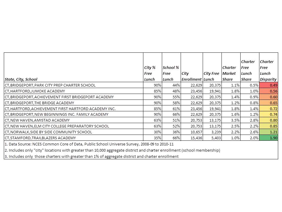 All but two CT charters underserve low income students in these data. Four are under 70%. Park City, Jumoke and AF Bridgeport are particularly egregious examples!
Here’s Massachusetts:

Many Boston area schools are excluded from the above table on the basis that what outsiders generally think of as “Boston” is actually carved into many smaller city areas, many of which fell under my 10,000 aggregate enrollment threshold. I will report additional data on these areas at a later date.
And finally, New Jersey:

Unfortunately, in this last figure, we actually lose some of New Jersey’s most economically disproportionate charter schools which are in Hoboken, which fell under the aggregate enrollment threshold.
Why does this matter?
There exist at least two reasons why it matters to pay close attention to just how different charter schools are from their surroundings – that is, if and when they are. First, better understanding demographic differences of charter schools – or any school for that matter – provides useful backdrop for claims of chartery miracles. Second, the demography of charters in their local contexts, and demographic shifts induced by choice programs, or attendance boundary reconfiguration for that matter, have implications for schools on both ends – sending and receiving.
1. Claims of reformy miracles
I don’t know how many times I’ve come across tweets and blog posts, for example, talking about how BASIS charter schools in Arizona are better than Singapore or Shanghai, or even Finland. And that, since we all know Arizona is a high poverty state, BASIS must be serving low income kids, and thus achieving some transferable miracle.
If we put BASIS into a scatterplot, including its % free or reduced lunch share, among Arizona schools, expressed in national percentile ranking for math, we get this picture:
 Here, BASIS looks rather not-so-miraculous. In fact, it’s right about where one would expect given the students it serves.
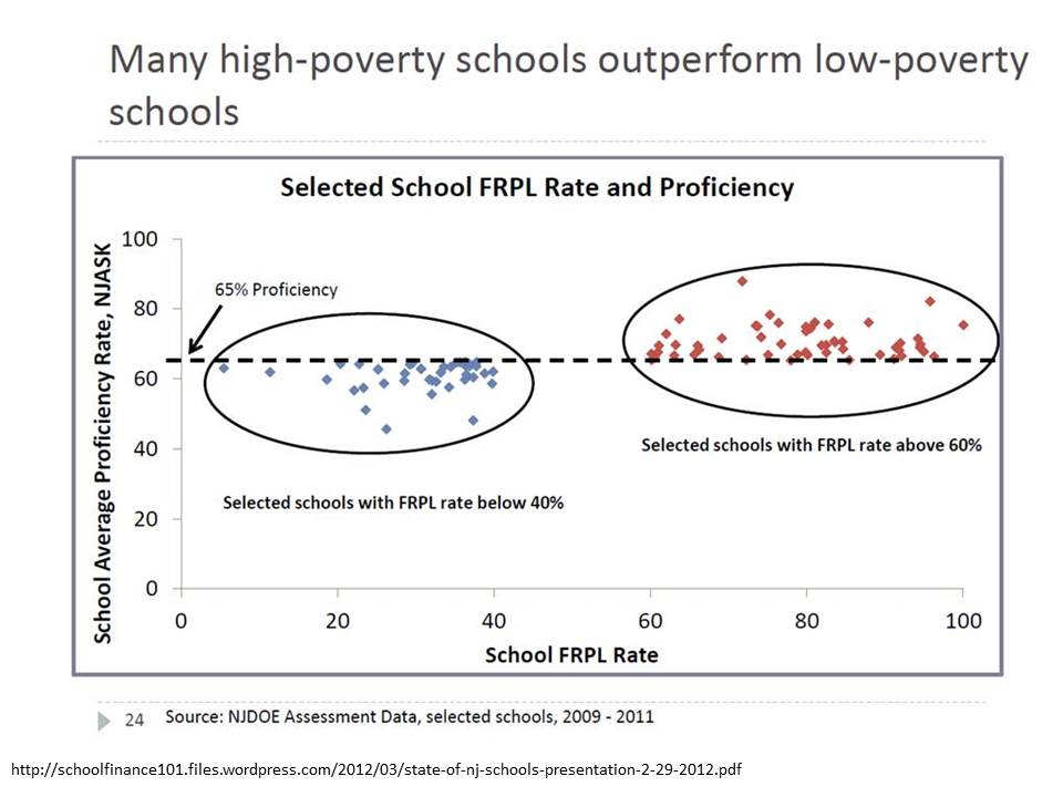
Likewise, schools like Robert Treat Academy and North Star Academy often receive praise for their outcomes in New Jersey. Here’s where they lie when we take into account free lunch shares alone (and use general test taker outcomes to reduced special ed and ELL effects).
 Both are near where one would expect them to be given their students. In fact, many more Newark Public Schools district schools deviate positively – and more positively – from expectations than either of these “miracle” schools.
2. Effects on the system as a whole
As I’ve shown in several previous posts (like this one), when charter schools (or district’s own magnet schools) siphon off lower need students they leave behind higher need students. Just as the concentration of lower need students in charter or magnet schools may provide advantageous peer group influence on those involved, the concentration of higher need students left behind in district or other charter schools has adverse peer group effects. Similar concerns arise with neighborhood level sorting of children and families. The policy goal is to figure out how to best manage student sorting so as not to exacerbate these problems via under-regulated choice programs (with incentives to cream-skim).
Regulation need not take the form of requiring all charter (or district magnet) schools to serve proportionate shares of specific populations (by race, economic status or disability). The reality is that some charter schools, like districts’ own magnet schools may work better with some populations than others and thus forcing them to serve a population they are ill equipped to serve is neither productive for the school nor the child.
However, where charter (or magnet) success depends on ability to serve a select population, alternative policy constraints like growth caps may be in order, to restrain otherwise parasitic tendencies.
Thus far, however, unfettered, largely parasitic charter growth continues to have the potential to do much more harm than good in the long run.
UPDATE
Some have pointed out that the charter sector in these states appears relatively “balanced” overall. Thus, what’s the harm? They merely introduce heterogeneity based on the preferences of individual parents on behalf of their children. The problem is that charter enrollment behaviors seems to vary substantially by city. So, statewide averages, or statewide distributions can mask real local level problems. For example, in New Jersey, most of the charter schools in Trenton over enroll low income kids, while on average in Newark, they under enroll. That charters in Trenton over enroll low income kids does not help the Newark situation, though it does raise different questions for Trenton. Notably, when CREDO conducted its study of charter school effects in New Jersey, the identified positive effect came entirely from Newark, whereas charters elsewhere in the state underperformed.
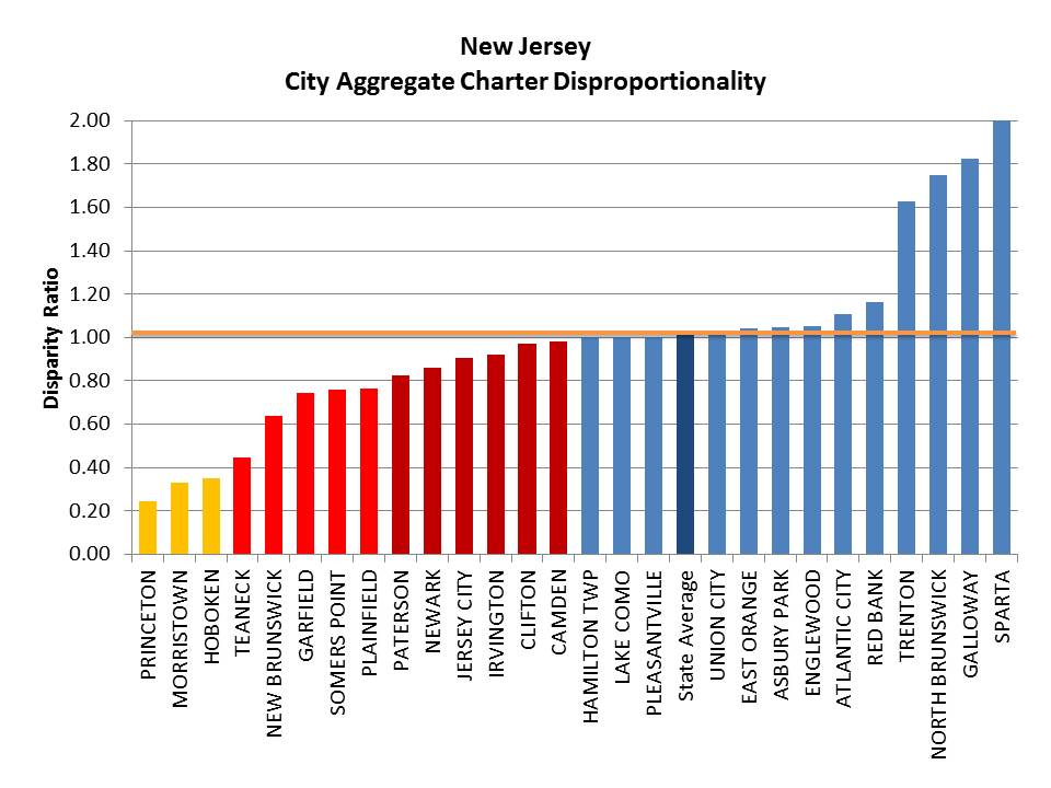
Here are a few additional slides showing the city level aggregate disproportionality for the states above. Note that there may be a few cases where charter operators submitted the WRONG information about their “city of location” to their state, for the national data. In which case, a charter may show up in a city where it keeps its management office rather than where it runs its school. Don’t blame me for wrong addresses in the data. Blame those who submitted their information WRONG!
Here’s NJ, where the greatest aggregate disproportionality is in Princeton. And to those arguing that charters are merely creating more balance than can the district – that is NOT the case in Princeton NJ. Note that the net disproportionality in Newark is about 84%. Thus, while there is heterogeneity, with some schools overservign low income kids, there are enough schools underserving low income kids and by a large enough margin that the net effect is that charters in Newark are underserving. Some other smaller towns with single charters standout… Camden is approximately balanced between charter and district schools and Trenton has higher concentration of low income kids in charters. On average in NJ, the state average is relatively balanced.
 Here’s Massachusetts, which on average is imbalanced, with significant disproportionality in locations like Dorchester which is home to many charters. Charters within the cit of Boston itself are more balanced.
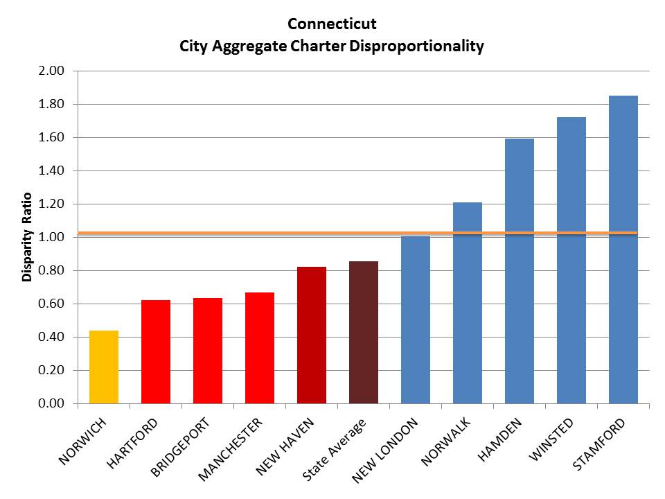
 Here’s Connecticut, which on average is also imbalanced.
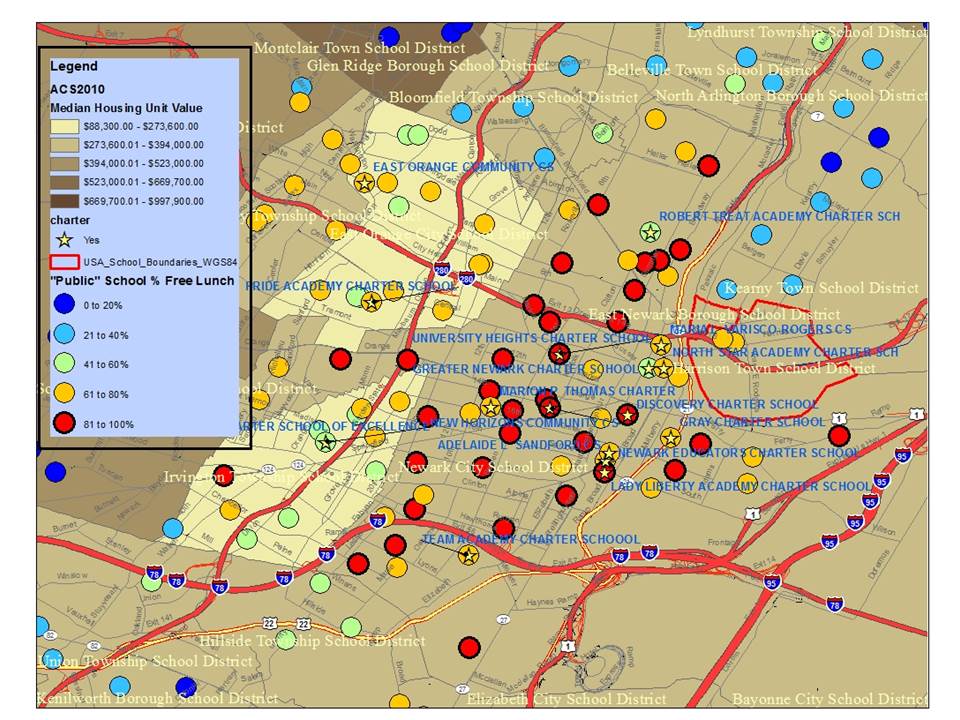
 Another point that has been raised, related to the issue of charters attracting suburbanites and retaining “wealthier” families than might otherwise stay in the cities and send their kids to the schools, is the argument that these most disproportionate charters likely represent their neighborhoods within the cities, and the schools around them. First, as I explain in the comments below, this apparent skimming pattern isn’t so much a function of some charters serving wealthy populations (not so much a Princeton problem), but rather a function of charters in otherwise poor neighborhoods skimming off the less poor from surrounding neighborhoods and schools. Indeed, the other scenario likely exists in a few select cases. But having reviewed numerous maps of charter locations and demography, I don’t suspect that’s the norm. Here are a few maps for illustrations.
Here are Newark charters:
 Note for example, that Robert Treat Academy stands out like a sore thumb. And even TEAM, which is more representative than other Newark Charters, sticks out in its context (a yellow circle surrounded by red ones). So too does Greater Newark which is surrounded both by higher poverty district schools and higher poverty other charters.
Here’s Hartford, CT, where nearly every other district school – except for the magnet schools – is a red circle – serving very high poverty concentrations.
 But, Hartford is wonderfully illustrative of the fact that some districts also impose on themselves a significant degree of economic segregation. Hartford’s Capital Prep is as disproportionate in low income enrollment as Jumoke and Achievement First. But none – none of the districts’ regular public schools, including those right next door, serve such low shares of kids qualified for free lunch.
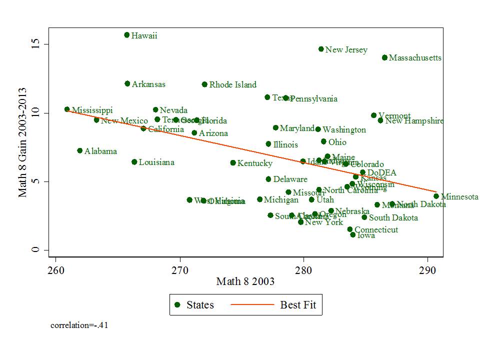
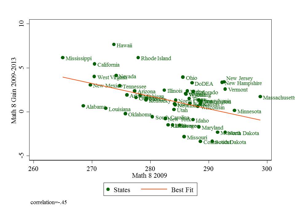
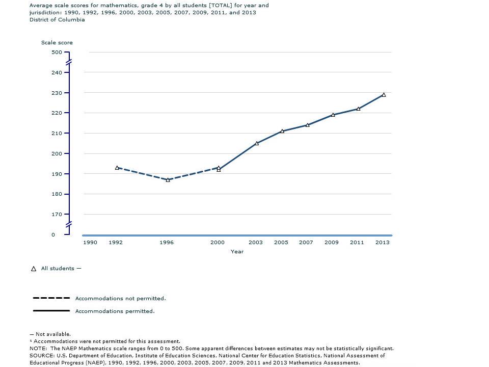
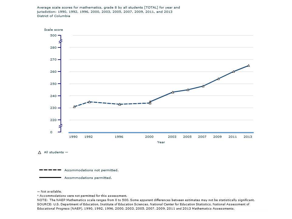
 The relationship between 10 year gains on 8th grade math and initial average score is relatively strong. DC and LA which appear to be getting the early applause for their reformy amazingness pretty much fall right in line with expectations. Boston is a standout here… and Cleveland? well… that’s a bit perplexing, but Cleveland reveals perplexing data on many levels in ed policy (including some of the consistently highest school level low income concentrations in the nation).
 LA is lookin’ pretty good here, but starting pretty darn low – lower than DC… which, by the way, really isn’t a standout here on 10 year gains. Cleveland? well… not a pretty sight… Other cities fall pretty much in line with expectations given their initial 2003 mean scores.
 DC looks a little better here… but as previously, cities fall among the states in roughly their expected locations- but for Cleveland and Detroit, which seem to lag. San Diego, a relative standout on 10 year gains, lags on 4 year gains, but that’s hardly a condemnation of a city that a) has made longer term gains and b) as of 2009 sits among the higher performing jurisdictions.
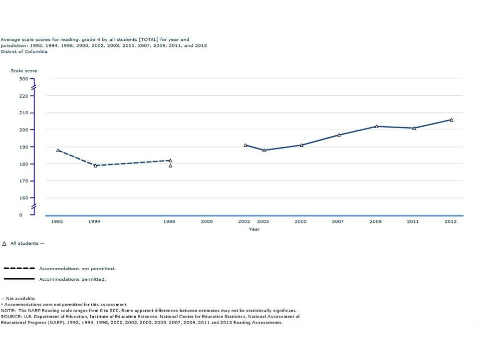
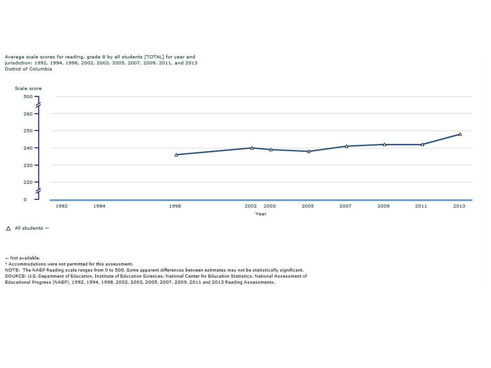
 This relationship is certainly less consistent. DC falls more or less in line. Cleveland and Milwaukee aren’t lookin’ so good. San Diego is back above the line, but having started and remaining lower in the pack than they were on math.
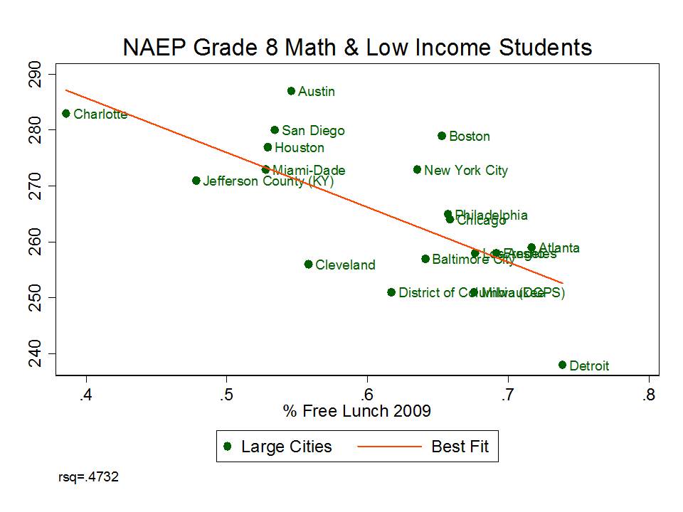 Given that many of these cities are high poverty settings, the relationship is actually tighter when I use the more stringent census poverty threshold (rather than free lunch, which is 130% of poverty level), even though these city level poverty data are not necessarily completely overlapping with school district enrollments. What these data do show is that Cleveland and Detroit are simply much higher poverty settings than the other cities in the sample (for 5 to 17 year old children). And that is certainly relevant to both score levels and potential changes in cohort level scores over time.