Blog

Petrilli’s Hammer & the poverty has nothing to do with PISA argument

Mike Petrilli over at TB Fordham has made his case for why differences in national economic context do little to substantively explain variations in PISA scores.

He frames his argument in terms of Occam’s Razor, as if to sound well informed, deeply intellectual and setting the stage to share profound logical argument, summarized as follows:

“among competing hypotheses, the hypothesis with the fewest assumptions should be selected.”

Petrilli asserts that while some might perceive a modest association (actually, it’s pretty strong) between national economic context and average tested outcomes in math, for example… like this…

Slide1

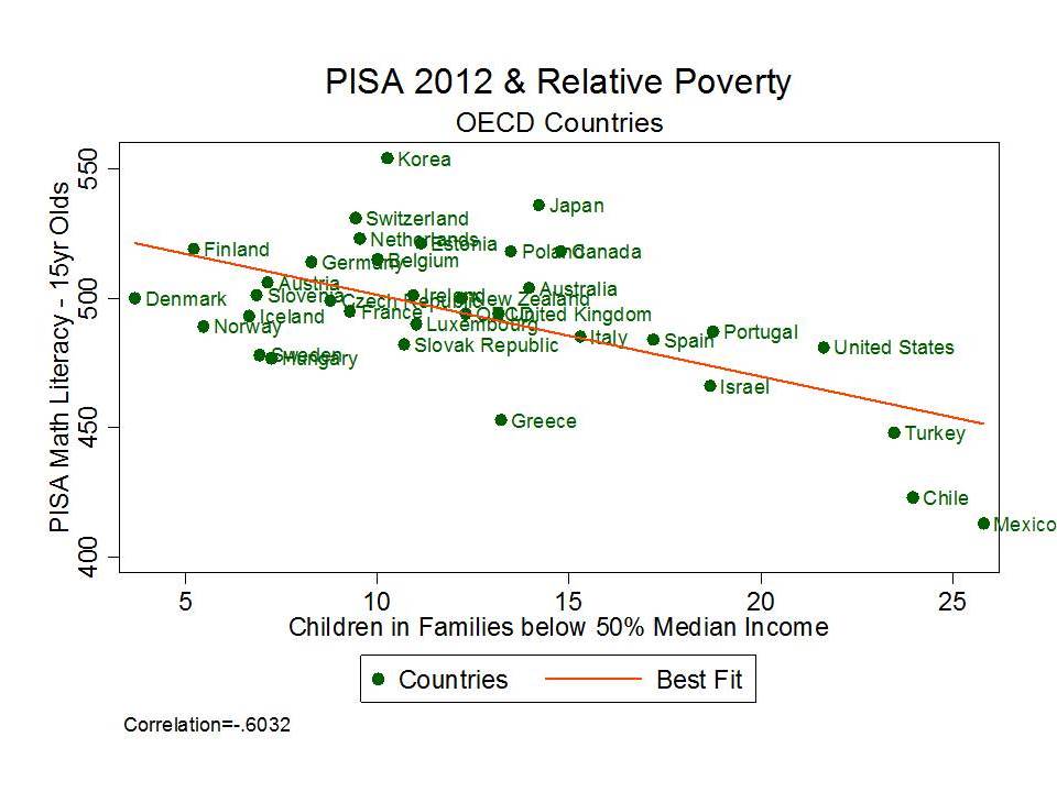
…that it is entirely illogical to assert that child poverty has anything to do with national aggregate differences in math performance at age 15.

That is, the various assumptions that must be made to accept this crazy assertion – that economic context matters in math performance – simply don’t hold water in Petrilli’s mind. Rather, the answer must be much simpler and lie in the classroom, with our good ol’ American ineptitude at teaching math.

As Petrilli concludes in his post:

So what’s an alternative hypothesis for the lackluster math performance of our fifteen-year-olds? One in line with Occam’s Razor?

Maybe we’re just not very good at teaching math, especially in high school.

Accepting the bad math teaching conclusion simply requires fewer tricky assumptions than asserting any role for economic context in determining national aggregate outcomes.

Let’s call this Petrilli’s Hammer! as an illogical, blunt & necessarily under-informed alternative to Occam’s Razor. When in doubt – when too lazy to develop disciplined understanding of the field on which you choose to opine and when data are just too hard to handle, get that hammer and everything can look like a nail! (e.g. the bad teacher conclusion)

These two quotes frame Petrilli’s argument:

First, one must assume that math is somehow more related to students’ family backgrounds than are reading and science, since we do worse in the former. That’s quite a stretch, especially because of much other evidence showing that reading is more strongly linked to socioeconomic class. It’s well known that affluent toddlers hear millions more words from their parents than do their low-income peers. Initial reading gaps in Kindergarten are enormous. And in the absence of a coherent, content-rich curriculum, schools have struggled to boost reading scores for kids coming from low-income families.

AND

So the second assumption must be that “poverty” has a bigger impact on math performance for fifteen-year-olds than for younger students. But I can’t imagine why. If anything, it should have less of an impact, because our school system has had more time to erase the initial disadvantages that students bring with them into Kindergarten.

The problem is that both of these statements are a) conceptually foolish and b) statistically ignorant.

Let’s tackle the second issue conceptually first. These scores for 15 year olds are performance level – or status scores. Status scores reflect the cumulative effects of schooling and family background. Most notably in this case, status scores – math performance at age 15, reflect the cumulative influences of poverty – living in poverty – growing up in poverty – lacking resources over long periods of ones’ early life.

Here’s some more reading on poverty timing and cumulative effects.

And then there’s this report which I prepared last summer with ETS.

So… setting measurement issues aside here, we can logically expect gaps between lower and higher income kids to grow between earlier grade assessments and later grade assessments – if we choose to do little or nothing in policy terms about the circumstances under which these children live. Yes, we can and should leverage resources in schools to offset these gaps. But we’re not necessarily applying those resources either.

Accepting Petrilli’s second point above requires that we ignore entirely that our school system remains vastly disparate in many states and locations between rich and poor communities and reinforces (rather than erasing) the initial disadvantages that students bring with them to Kindergarten.

Now, backing up to his first point, where Petrilli argues that if higher poverty settings/contexts do worse relative to lower poverty settings on math than on reading assessments, there must be a simple answer for the math problem/disparity – like bad math teaching of course.  There can be no logical explanation for why math scores might be more sensitive than reading scores to poverty variation.  Assuming bad math teaching to be the reason for greater disparity in math than in reading is much simpler than exploring why it might appear that math test scores are more sensitive to context/poverty, etc. than reading scores. This is true because we all know that poverty affects reading more than math – or so Mike says without citation to any legitimate source validating his point.

This one is pretty simple. First, it may simply be the case that Mike Petrilli is wrong on all levels here. That conceptually and statistically, economic deprivation seems to have stronger affect on numeracy than on literacy. But even accepting the idea that poverty affects literacy more – in a substantive way – doesn’t mean that we’d find a stronger statistical relationship between a) variations in poverty across settings and b) variations in measured outcomes across settings. The fact is that variations in math assessments are often simply more predictable. They may be both more stable/consistent and may actually have more variation to predict.

Empirical Illustrations

I’m going to use state level NAEP data within the US here to provide statistical illustrations for the rather simple flat-out-wrongness of Mike Petrilli’s Hammer.

The following illustrations simply reveal how data of this type tend to play out, something anyone reasonably well versed in using assessment data along side economic data, at various levels of aggregation, would understand. Some of these patterns reveal conceptually sound underlying hypotheses, and some may simply be an artifact of typical issues occurring in the measurement of student outcomes at different ages and in different subjects.

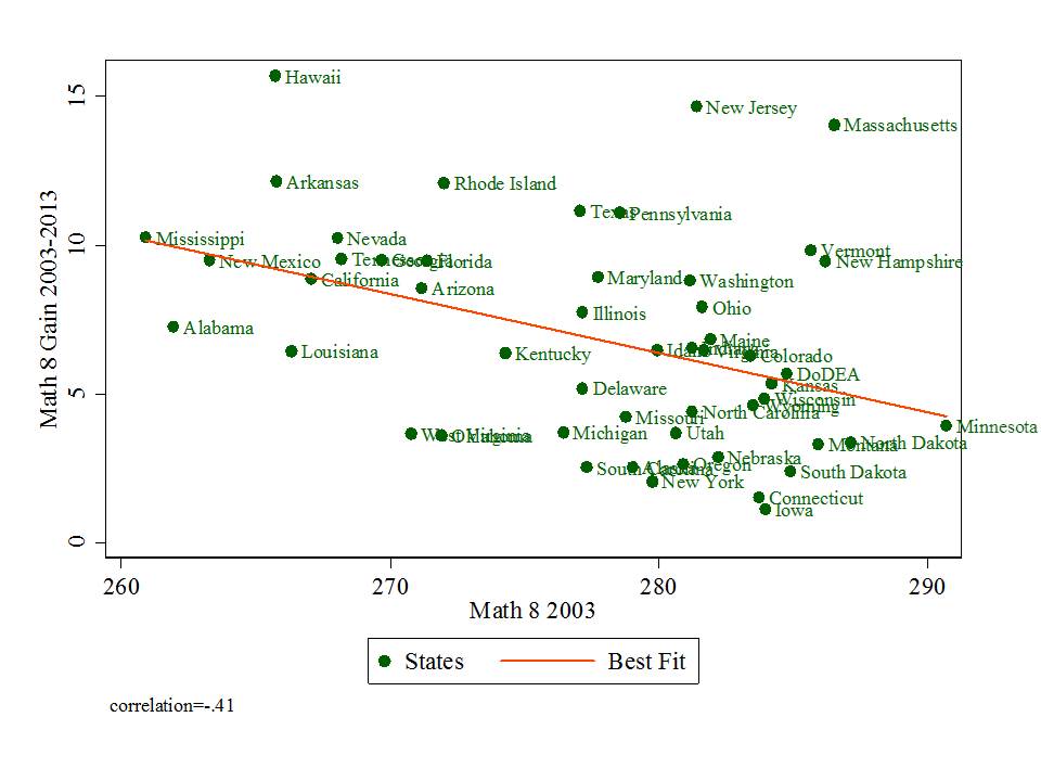
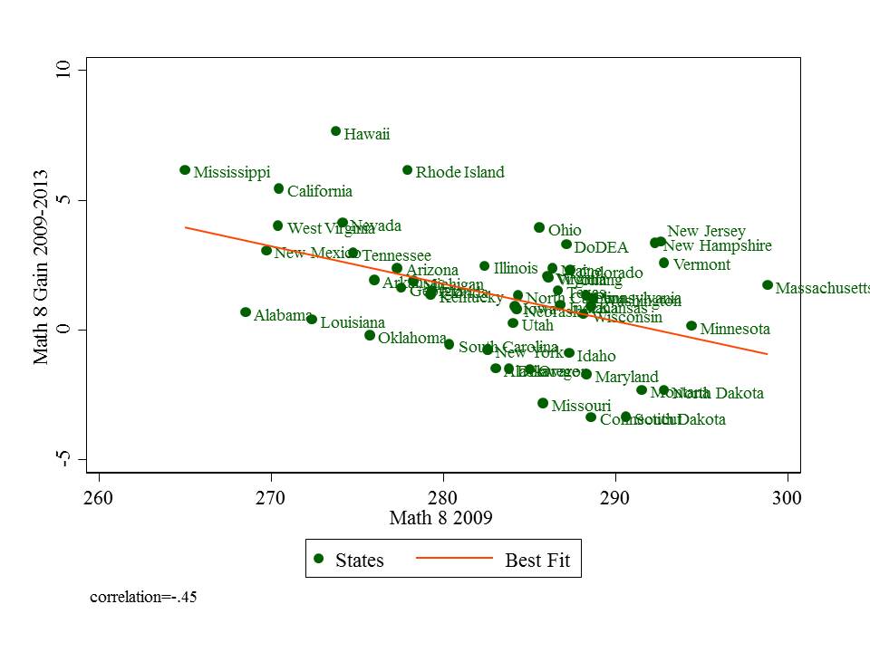
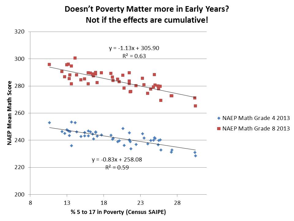
So, for our first question we ask whether it can possibly be the case that there exists greater disparity in math outcomes in 8th grade than in 4th grade across US states of varying degrees of poverty (setting aside the substantive explanations for why such gaps increase).

Now, careful here, this one requires using a little algebra – slope/intercept analysis. The first figure here shows the variation in NAEP math outcomes for 8th graders and for 4th graders, both in 2013.

This figure shows us first of all, that 8th grade math scores are more predictably disparate as a function of poverty than are 4th grade math scores. For 8th grade, poverty alone explains 63% of the cross state variation in math scores, but marginally less (59%) for 4th grade.

The figure also shows us that by 8th grade, an additional 1% poverty is associated with 1.13 point lower state average scale score, whereas in 4th grade, 1% higher poverty rate is associated only with .83 points lower in state average scale score. That is, the negative slope is greater for 8th than for fourth grade.

There can be many, many reasons for this. Among these reasons might be that as time goes on, cumulative poverty related deficits do increase. Persistent disadvantage makes gaps grow. It may also be a measurement issue, pertaining to the precision of measurement of mathematics knowledge and skill, or it may even be an issue of the stability and predictability of tests on early grade math content given to 9 year olds versus tests on stuff like algebra and pre-algebra given to older, hopefully more mature kids (who’ve also taken far more tests by that time).

But, instead of gettin’ all thoughtful about these possibilities and arming ourselves with well-conceived arguments grounded in data and knowledge of the literature, we could simply use Petrilli’s Hammer to assert that the one and only logical answer is that math teachers in high poverty states like Alabama and Mississippi suck and math teachers in low poverty states like New Jersey and Massachusetts rock!  It’s bad math teaching that is making this negative slope get worse between grade 4 and grade 8 – bad math teaching exclusively in high poverty states!

Is there greater disparity in Grade 8 Math than in Grade 4 Math by Contextual Poverty?

Slide2

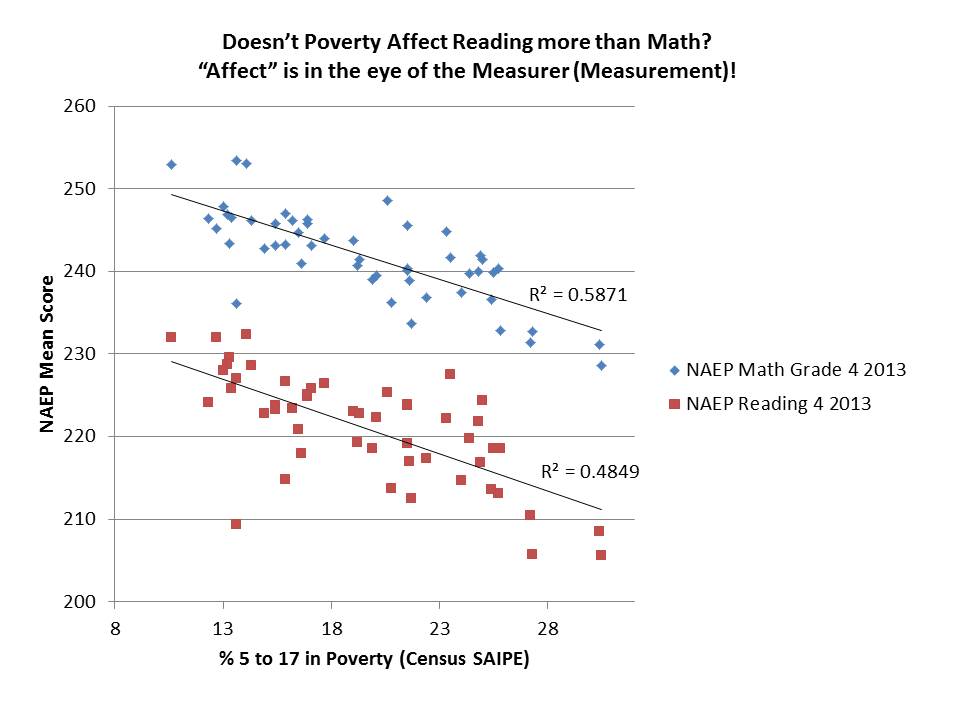
The next question then is how can it ever be that math scores might be more disparate as a function of poverty when we all know that poverty affects reading more?

The next figure shows the relationship between poverty by state, and math and reading scores in grade 4. Rather amazingly, math scores are more predictable as a function of poverty than are reading scores – note the difference in variance explained (r-squared). Now, (almost) anyone who has ever  plotted reading and math “level” (status) scores, or even estimated value added scores for reading and math in relation to poverty or nearly any other covariate knows that this is common. Variation in math scores – level or value added – is often much more predictable than is variation in reading scores. As above, this may be for many, many reasons. Maybe we’re just not as good on the measurement side at teasing out differences in underlying skill on reading, with either 9 or 14 year olds?

That math scores are more predictably a function of poverty than reading scores – across states – doesn’t mean that our math teaching is better or worse than our reading teaching. Even though the math scores at 4th grade are more predictable than the reading scores, the reading slope appears slightly more disparate (steeper negative). And that doesn’t mean either that our reading teaching is more disparate, or that the 4th grade scores are picking up some differential on the baggage kids bring to school with them. It’s a statistical artifact of the data – based on how math and reading are being measured. It may mean something, but who knows what? It may mean absolutely nothing.

Are Grade 4 Math Scores more predictably a function of poverty than Grade 4 Reading Scores across contexts?

Slide3

Finally, here’s the 8th grade math and reading. Here, math is marginally more predictable as a function of poverty and math outcomes are more disparate as a function of poverty.

At least by these measures – NAEP math and reading scores – aggregated to the state level – which is similar to making national comparisons – reading is NOT as Petrilli so confidently argues above “more strongly linked to socioeconomic class” than math.

International comparisons work much the same.

What about Grade 8 Math and Reading?

Slide4

Indeed, Petrilli is attempting to assert that there exists an incongruity between the data and the underlying reality – that yes, reading scores are affected by poverty, but math not so much.  Thus, if the data show that math scores are more affected by poverty than are reading scores, then something much more nefarious must be going on – Yes – the bad teacher/teaching problem!

It couldn’t possibly have anything to do with measurement issues or the significant possibility that the full range of student outcomes measured are similarly affected by economic deprivation.  That would just be way too much to swallow.

But, if we want to go there… if we want to accept Petrilli’s argument that there’s simply no excuse for U.S. students to fall where they do on international math comparisons, because poverty doesn’t affect 15 year olds or math, only younger kids and reading, then we must apply Petrilli’s hammer to state-by-state comparisons as well.

And thus we logically conclude that math teaching in DC, MS, AL, LA stink and math teaching in NJ, MA VT and NH is great! And that poverty really has nothing to do with it?

Ignoratis Paradox

Graph of the Day: My contribution to PISA Palooza

With today’s release of PISA data it is once again time for wild punditry, mass condemnation of U.S. public schools and a renewed sense of urgency to ram through ill-conceived, destructive policies that will make our school system even more different from those breaking the curve on PISA.

With that out of the way, here’s my little graphic contribution to what has become affectionately known to edu-pundit class as PISA-Palooza.  Yep… it’s the ol’ poverty as an excuse graph – well, really it’s just the ol’ poverty in the aggregate just so happens to be pretty strongly associated with test scores in the aggregate – graph… but that’s nowhere near as catchy.

pisa_palooza

PISA Data: http://nces.ed.gov/pubs2014/2014024_tables.pdf

(table M4)

OECD Relative Poverty: Source: Provisional data from OECD Income distribution and poverty database (www.oecd.org/els/social/inequality).

Yep – that’s right… relative poverty – or the share of children in families below 50% of median income – is reasonably strongly associated with Math Literacy PISA scores. And this isn’t even a particularly good measure of actual economic deprivation. Rather, it’s the measure commonly used by OECD and readily available. Nonetheless, at the national aggregate, it serves as a pretty strong correlate of national average performance on PISA.

What our little graph tells us – albeit not really that meaningful – is that if we account (albeit poorly) for child poverty, the U.S. is actually beating the odds. Way to go? (but for that really high poverty rate).

Bottom line – economic conditions matter and simple rankings of countries by their PISA scores aren’t particularly insightful (and the above graph only marginally more insightful). Further, comparisons of cities in China to entire nations is a particularly silly approach.

Additional Readings:

Coley, R., Baker, B.D. (2013) Poverty and Education: Finding the Way Forward. ETS Center for
Research on Human Capital and Education. Princeton, NJ: Educational Testing Service

http://www.ets.org/s/research/pdf/poverty_and_education_report.pdf

Baker, B.D., Welner, K.G. (2011) Productivity Research, the U.S. Department of Education, and High‐Quality Evidence. Boulder, CO: National Education Policy Center. Retrieved [date] from
http://nepc.colorado.edu/publication/productivity‐research


Where are the most economically disproportionate charter schools? (& why does it matter?) UPDATED

UpdatedIt seems that Mike Petrilli on Twitter takes issue with my reference to these schools below as “segregated.” In his view, if a city includes some charter schools that have more of a 50/50 balance of low income and non-low income kids, those are the integrated schools, even if they achieve their balance by creaming off the non-low income kids in a district that is 80% low income.  Petrilli seems to suggest that it is necessarily a good thing if charters can can create a balanced population for themselves, even if they create imbalanced population (even more intense concentration of poverty) for the system as a whole.  Notably, an unanswered question by the data below is the extent to which the creation of economically non-representative charters in a city can help to retain some middle class families that might not have otherwise sent their children to the district schools. Certainly, there exists at least some evidence that Catholic school enrollments have suffered from charter expansion.  It seems far less likely that these charters are recruiting into the city, higher income children from neighboring districts. To suggest that a majority, or even large share of non-low-income students in charters are retained (but would have otherwise left the public system), brought in from lower poverty neighboring suburbs, or siphoned from private schools and would not have otherwise attended the public system is a huge stretch – a smokescreen.  It remains most likely that the vast majority of sorting displayed herein is internal to the public-charter system and unlikely to be crossing school district or city boundaries. [more below]

In this first of several posts, I explore economic variation in charter enrollments in the states of Massachusetts, New Jersey and Connecticut.

I’m taking a fairly simple, easily replicable approach here and encourage any data savvy readers to take their own shot at it. For this analysis I’m using the most recent three years of non-preliminary school level enrollment data from the National Center for Education Statistics Common Core of Data, Public School Universe Survey.

http://nces.ed.gov/ccd/pubschuniv.asp

I’m only using a handful of variables here. I’m using:

  • City of location (lcity)
  • Total school enrollment (member)
  • Total number of free lunch qualified children (frelch)
  • Charter school indicator (chartr)

For each year of the data, I sum the enrollment of all schools in the city of location, including charters and district schools and magnets or other special schools. That gives me the total number of all kids enrolled in a city (yeah… it’s a little messy in that some cities include schools that also enroll kids from outside the city – I limit the final lists to large enough enrollment areas where such cases should not substantively distort final numbers). I do the same for kids qualified for free lunch. So, I have:

  • City Total Enrollment
  • City Free Lunch Enrollment

Note that this is by city, not host district, but city is a relevant geographic unit for many reasons, including the fact that many US cities are actually carved into multiple segregated public school districts. Part of the point here is to run a quick-and-dirty summary with the publicly available, readily useable data.

Next, I determine each charter school’s market share:

  • School market share = school enrollment/city enrollment

And then each school’s share of low income kids served:

  • School free lunch share = school free lunch / city free lunch

If a school was serving a representative population by low income status, then the free lunch share for the school would equal the market share for the school. That is, the school would be serving both X% of total enrollment and X% of low income kids. I use a simple disparity ratio here:

  • School free lunch share / school market share

If the disparity ratio is say, .50, then the charter school is serving only half as many low income kids as would be proportional for that school.

To make the final data set manageable… I focus on charter schools in cities where the aggregate enrollment is greater than 10,000. And to have more stable numbers 1) I use only those charters with at least a 1% market share and I use a three year average (2009 to 2011).

So, let’s have at it. Here are the ratios for Connecticut schools:

Slide4All but two CT charters underserve low income students in these data.  Four are under 70%.  Park City, Jumoke and AF Bridgeport are particularly egregious examples!

Here’s Massachusetts:

Slide5

Many Boston area schools are excluded from the above table on the basis that what outsiders generally think of as “Boston” is actually carved into many smaller city areas, many of which fell under my 10,000 aggregate enrollment threshold. I will report additional data on these areas at a later date.

And finally, New Jersey:

Slide6

Unfortunately, in this last figure, we actually lose some of New Jersey’s most economically disproportionate charter schools which are in Hoboken, which fell under the aggregate enrollment threshold.

Why does this matter?

There exist at least two reasons why it matters to pay close attention to just how different charter schools are from their surroundings – that is, if and when they are. First, better understanding demographic differences of charter schools – or any school for that matter – provides useful backdrop for claims of chartery miracles. Second, the demography of charters in their local contexts, and demographic shifts induced by choice programs, or attendance boundary reconfiguration for that matter, have implications for schools on both ends – sending and receiving.

1. Claims of reformy miracles

I don’t know how many times I’ve come across tweets and blog posts, for example, talking about how BASIS charter schools in Arizona are better than Singapore or Shanghai, or even Finland. And that, since we all know Arizona is a high poverty state, BASIS must be serving low income kids, and thus achieving some transferable miracle.

If we put BASIS into a scatterplot, including its % free or reduced lunch share, among Arizona schools, expressed in national percentile ranking for math, we get this picture:

Slide2Here, BASIS looks rather not-so-miraculous. In fact, it’s right about where one would expect given the students it serves.

Likewise, schools like Robert Treat Academy and North Star Academy often receive praise for their outcomes in New Jersey. Here’s where they lie when we take into account free lunch shares alone (and use general test taker outcomes to reduced special ed and ELL effects).

Slide1Both are near where one would expect them to be given their students. In fact, many more Newark Public Schools district schools deviate positively – and more positively – from expectations than either of these “miracle” schools.

2. Effects on the system as a whole

As I’ve shown in several previous posts (like this one), when charter schools (or district’s own magnet schools) siphon off lower need students they leave behind higher need students. Just as the concentration of lower need students in charter or magnet schools may provide advantageous peer group influence on those involved, the concentration of higher need students left behind in district or other charter schools has adverse peer group effects. Similar concerns arise with neighborhood level sorting of children and families. The policy goal is to figure out how to best manage student sorting so as not to exacerbate these problems via under-regulated choice programs (with incentives to cream-skim).

Regulation need not take the form of requiring all charter (or district magnet) schools to serve proportionate shares of specific populations (by race, economic status or disability). The reality is that some charter schools, like districts’ own magnet schools may work better with some populations than others and thus forcing them to serve a population they are ill equipped to serve is neither productive for the school nor the child.

However, where charter (or magnet) success depends on ability to serve a select population, alternative policy constraints like growth caps may be in order, to restrain otherwise parasitic tendencies.

Thus far, however, unfettered, largely parasitic charter growth continues to have the potential to do much more harm than good in the long run.

UPDATE

Some have pointed out that the charter sector in these states appears relatively “balanced” overall. Thus, what’s the harm? They merely introduce heterogeneity based on the preferences of individual parents on behalf of their children.  The problem is that charter enrollment behaviors seems to vary substantially by city. So, statewide averages, or statewide distributions can mask real local level problems. For example, in New Jersey, most of the charter schools in Trenton over enroll low income kids, while on average in Newark, they under enroll. That charters in Trenton over enroll low income kids does not help the Newark situation, though it does raise different questions for Trenton. Notably, when CREDO conducted its study of charter school effects in New Jersey, the identified positive effect came entirely from Newark, whereas charters elsewhere in the state underperformed.

Here are a few additional slides showing the city level aggregate disproportionality for the states above. Note that there may be a few cases where charter operators submitted the WRONG information about their “city of location” to their state, for the national data. In which case, a charter may show up in a city where it keeps its management office rather than where it runs its school. Don’t blame me for wrong addresses in the data. Blame those who submitted their information WRONG!

Here’s NJ, where the greatest aggregate disproportionality is in Princeton. And to those arguing that charters are merely creating more balance than can the district – that is NOT the case in Princeton NJ. Note that the net disproportionality in Newark is about 84%. Thus, while there is heterogeneity, with some schools overservign low income kids, there are enough schools underserving low income kids and by a large enough margin that the net effect is that charters in Newark are underserving. Some other smaller towns with single charters standout… Camden is approximately balanced between charter and district schools and Trenton has higher concentration of low income kids in charters. On average in NJ, the state average is relatively balanced.

Slide7Here’s Massachusetts, which on average is imbalanced, with significant disproportionality in locations like Dorchester which is home to many charters. Charters within the cit of Boston itself are more balanced.

Slide8Here’s Connecticut, which on average is also imbalanced.

Slide9Another point that has been raised, related to the issue of charters attracting suburbanites and retaining “wealthier” families than might otherwise stay in the cities and send their kids to the schools, is the argument that these most disproportionate charters likely represent their neighborhoods within the cities, and the schools around them. First, as I explain in the comments below, this apparent skimming pattern isn’t so much a function of some charters serving wealthy populations (not so much a Princeton problem), but rather a function of charters in otherwise poor neighborhoods skimming off the less poor from surrounding neighborhoods and schools. Indeed, the other scenario likely exists in a few select cases. But having reviewed numerous maps of charter locations and demography, I don’t suspect that’s the norm.  Here are a few maps for illustrations.

Here are Newark charters:

Slide11Note for example, that Robert Treat Academy stands out like a sore thumb. And even TEAM, which is more representative than other Newark Charters, sticks out in its context (a yellow circle surrounded by red ones). So too does Greater Newark which is surrounded both by higher poverty district schools and higher poverty other charters.

Here’s Hartford, CT, where nearly every other district school – except for the magnet  schools – is a red circle – serving very high poverty concentrations.

Hartford ChartersBut, Hartford is wonderfully illustrative of the fact that some districts also impose on themselves a significant degree of economic segregation. Hartford’s Capital Prep is as disproportionate in low income enrollment as Jumoke and Achievement First.  But none – none of the districts’ regular public schools, including those right next door, serve such low shares of kids qualified for free lunch.

Comments on NJ’s Teacher Evaluation Report & Gross Statistical Malfeasance

A while back, in a report from the NJDOE, we learned that outliers are all that matters. They are where life’s important lessons lie! Outliers can provide proof that poverty doesn’t matter. Proof that high poverty schools – with a little grit and determination – can kick the butts of low poverty schools. We were presented with what I, until just the other day might have considered the most disingenuous, dishonest, outright corrupt graphic representation I’ve seen… (with this possible exception)!

Yes, this one:Slide5This graph was originally presented by NJ Commissioner Cerf in 2012 as part of his state of the schools address. I blogged about this graph and several other absurd misrepresentations of data in the same presentation here & here.

Specifically, I showed before that the absurd selective presentation of data in this graph completely misrepresents that actual underlying relationship, which looks like this:

Slide6Yep, that’s right, % free or reduced priced lunch alone explains 68% of the variation in proficiency rates between 2009 and 2012 (okay, that’s one more year than in the misleading graph above, but the pattern is relatively consistent over time).

But hey, it’s those outliers that matter right? It’s those points that buck the trend that really define where we want to look…what we want to emulate? right?

Actually, the supposed outliers above are predictably different, as a function of various additional measures that aren’t included here. But that’s a post for another day. [and discussed previously here]

THEN came the recent report on progress being made on teacher evaluation pilot programs, and with it, this gem of a scatterplot:

Slide1

This scatterplot is intended to represent a validation test of the teacher practice ratings generated by observations.  As reformy logic tells us, an observed rating of a teacher’s actual classroom practice is only ever valid of those ratings are correlated with some measure of test score gains.

In this case, the scatterplot is pretty darn messy looking. Amazingly, the report doesn’t actually present either the correlation coefficient (r) or coefficient of determination (r-squared) for this graph, but I gotta figure in the best case it’s less than a .2 correlation.

Now, state officials could just use that weak correlation to argue that “observations BAD, SGP good!” which they do, to an extent. But before they even go there, they make one of the most ridiculous statistical arguments I’ve seen, well… since I last wrote about one of their statistical arguments.

They argue – in picture and in words above – that if we cut off points from opposite corners – lower right and upper left – of a nearly random distribution – there otherwise exists a pattern. They explain that “the bulk of the ratings show a positive correlation” but that some pesky outliers buck the trend.

Here’s a fun illustration. I generated 100 random numbers and another  100 random numbers, normally distributed and then graphed the relationship between the two:

Slide2And this is what I got! The overall correlation between the first set of random numbers and second set was .03.

Now, applying NJDOE Cerfian outlier exclusion, I exclude those points where X (first set of numbers) >.5 & Y (second set)<-.5 [lower right], and similarly for the upper left. Ya’ know what happens when I cut of those pesky supposed outliers in the upper left and lower right. The remaining “random” numbers now have a positive correlation of .414! Yeah… when we chisel a pattern out of randomness, it creates… well… sort of… a pattern.

Mind you, if we cut off the upper right and lower left, the bulk of the remaining points show a negative correlation. [in my random graph, or in theirs!]

But alas, the absurdity really doesn’t even end there… because the report goes on to explain how school leaders should interpret this lack of a pattern that after reshaping is really kind of a pattern, that isn’t.

Based on these data, the district may want to look more closely at its evaluation findings in general. Administrators might examine who performed the observations and whether the observation scores were consistently high or low for a particular observer or teacher. They might look for patterns in particular schools, noting the ones where many points fell outside the general pattern of data. These data can be used for future professional development or extra training for certain administrators. (page 32)

That is, it seems that state officials would really like local administrators to get those outliers in line – to create a pattern where there previously was none – to presume that the reason outliers exist is because the observers were wrong, or at least inconsistent in some way.  Put simply, that the SGPs are necessarily right and the observations wrong, and that the way to fix the whole thing is to make sure that the observations in the future better correlate with the necessarily valid SGP measures.

Which would be all fine and dandy… perhaps… if those SGP measures weren’t so severely biased as to be meaningless junk. 

Slide4Yep, that’s right – SGP’s at least at the school level, and thus by extension at the underlying teacher level are:

  1. higher in schools with higher average performance to begin with in both reading and math
  2. lower in schools with higher concentrations of low income children
  3. lower in schools with higher concentrations of non-proficient special education children
  4. lower in schools with higher concentrations of black and Hispanic children

So then, what would it take to bring observation ratings in line with SGPs? It would take extra care to ensure that ratings based on observations of classroom practice, regardless of actual quality of classroom practice, were similarly lower in higher poverty, higher minority schools, and higher in higher performing schools. That is, let’s just make sure our observation ratings are similarly biased – similarly wrong – to make sure that they correlate.  Then all of the wrong measures can be treated as if they are consistently right???????

Actually, I take some comfort in the fact that the observation ratings weren’t correlated with the SGPs. The observation ratings may be meaningless and unreliable… but at least they’re not highly correlated with the SGPs which are otherwise correlated with a lot of things they shouldn’t be.

When will this madness end?


A few quick thoughts and graphs on Mis-NAEP-ery

Update: Here are a bunch of additional graphs relating Students First Report Card grades with unadjusted and adjusted NAEP Gains (hint – it’s the adjusted gains that matter since low performing states are able to post bigger gains, and also generally received higher grades from Students First). Mis_naep_ery9

Yesterday gave us the release of the 2013 NAEP results, which of course brings with it a bunch of ridiculous attempts to cast those results as supporting the reform-du-jour. Most specifically yesterday, the big media buzz was around the gains from 2011 to 2013 which were argued to show that Tennessee and Washington DC are huge outliers – modern miracles – and that because these two settings have placed significant emphasis on teacher evaluation policy – that current trends in teacher evaluation policy are working – that tougher evaluations are the answer to improving student outcomes – not money… not class size… none of that other stuff.

I won’t even get into all of the different things that might be picked up in a supposed swing of test scores at the state level over a 2 year period. Whether 2 year swings are substantive and important or not can certainly be debated (not really), but whether policy implementation can yield a shift in state average test scores in a two  year period is perhaps even more suspect.

Setting all that aside, let’s just take a step back and look at the NAEP data, changes in scores from 03-13, 09-13 and 11-13 for 4th grade reading and 8th grade math. BUT, as I’ve shown before, since gains on NAEP appear correlated with starting point – lower performing states show higher gains, let’s condition those gains on starting point by representing them in scatterplots against starting points.

Here are the figures. In some of the figures below, I’ve cut out Washington, DC because it is such a low performing outlier. It does creep into the picture as its scores rise. But this is a rise over the longer haul, much prior to teacher evaluation reforms.

If teacher evaluation reform (or expanded choice, etc.) has caused great NAEP gains, then the graphs below should show that especially from pre-RTTT baseline year 2009 to 2013, states adopting RTTT-style teacher eval policies should be rising above the trendline – but not those curmudgeonly states that have lagged in such reform efforts.

Grade 4 Reading 2003-2013Slide1

Over the 10 year period, Maryland is the miracle state in 4th grade reading. Matt Di Carlo has pointed this out in the past. Florida does okay, and Alabama is also a standout. New Jersey and Massachusetts – both initial high performers also exceed expectations given starting point. Louisiana falls right on the line.

Grade 4 Reading 2009-2013Slide2

From 2009-2013, Maryland remains the standout. Georgia, Washington, Utah and Minnesota also do pretty darn well, and yes… Tennessee is in that next batch, but even Wyoming and New Hampshire beat expectations by more, having started higher. Louisiana beats expectations. In any case, it’s hard to make a case that from 2009 to 2013, states that moved most aggressively on teacher evaluation are those that showed greatest gains.

Grade 4 Reading 2011-2013Slide3

On the recent 2-year bump, Tennessee and DC do quite well, but so too does Minnesota. Colorado (another teacher eval state) does pretty well on this one. This graph may provide the “best” (albeit painfully weak, suspect and short term) “evidence” for teacher eval states – well – except for Minnesota, which I don’t believe was leading the reformy pack on that issue. Of course there are also those who wish to point to choice policies as the driver – noting Indiana’s presence in the mix – but similar inconsistencies undermine this argument (with larger and smaller charter and voucher share states falling, well, all over the place in this figure – but that does warrant some additional figures at a later point.)

Let’s move to 8th grade math.

Grade 8 Math 2003-2013Slide4 New Jersey and Massachusetts lead the way on 10 year gains – even though they started high – with Vermont and New Hampshire doing okay as well. Hawaii also isn’t looking bad here. But Louisiana, despite starting low, posted lack-luster gains. Tennessee is right below Nevada – falling pretty much in line with expectations.

Grade 8 Math 2009-2013Slide5From 2009 to 2013, New Jersey and Massachusetts along with Rhode Island, Hawaii, Ohio, California and Mississippi do pretty well. Not your most reformy mix of states – regarding teacher evaluation or choice programs (but for Ohio’s charter expansion). Louisiana is still sucking it up, and Tennessee falling more or less in line with expectations.

Grade 8 Math 2011-2013Slide6Finally, in the much noisier two year bump on math from 2011 to 2013, we get a little more spreading out – because a two year bump is noisier – less certain – less decisive in any way, and also less related to initial level. Here, New Jersey and Massachusetts are still about as far above expected growth as is Tennessee, which for the first time jumps above expectations for grade 8 math growth. DC does creep into the picture here, and posts some pretty nice gains. BUT… the issue with DC is that its average starting point is so low that it’s hard to predict accurately what its gain would likely be.

Is Tennessee’s 2-year growth an anomaly? we’ll have to wait at least another two years to figure that out. Was it caused by teacher evaluation policies? That’s really unlikely, given that those states that are equally and even further above their expectations have approached teacher evaluation in very mixed ways and other states that had taken the reformy lead on teacher policies – Louisiana and Colorado – fall well below expectations.

UPDATE: Classic example of Mis-NAEP-ery

Here are some additional versions of the figures above, in which I have identified the states that received passing grades from Students First for “teaching” related policies.

Clarification: The graphs below separate states that received above/below a “teaching” grade point average of 2.0 from Students First.

Slide1Slide2Slide3Slide4Another UPDATE: Here are the trends on DC score improvements… So, in other words, are you really telling me that teacher contractual changes adopted in the last few years affected student gains starting back in 1996?

Slide1Slide2Slide3Slide4

Failure is in the Eye of the Political Hack: Thoughts & Data on NJ Failure Factories & NOLA Miracles

We all know… by the persistent blather emanating from reformy-land that some common truths exist in education policy.

Among those truths are that New Jersey’s urban public school districts are absolute, undeniable Failure Factories, while New Orleans’ Post-Katrina charter invasion is the future of greatness in public (well, not really public) education – the ultimate example of how reformyness taken to its logical extreme saves children from failure factories.

Thus, we must take New Jersey down that New Orleans path toward greatness. It’s really that simple. Dump this union-protectionist favor-my-failure-factory mindset… throw all caution (and public tax dollars) to the wind – jump on that sector agnostic train and relinquish all adult self interest.

But like most reformy truths, this one is a bit fact challenged, even when mining reformy preferred data sources.

Now – as I’ve explained previously, I do have my concerns with the Global Report Card method for bridging state – NAEP and international assessments. But why should a little statistical validity concern keep us from having some fun with it.

Wouldn’t it be fun, for example, if we could make some direct comparisons between NOLA’s miracle relinquished, sector agnostic charter schools and New Jersey’s union-protectin’ public bureaucracy failure factories? Wouldn’t it just?

And of course, if we can compare our individual school districts with Finland and Singapore using the Global Report Card than why the heck can’t we compare NJ Failure Factories and NOLA Miracle Charters? I guess we can.

Let’s start with a global look at NJ’s massively failing public schooling system when compared with Finland, and all other U.S. Public School Districts. In this graph we have NJ districts in Orange, compared against the Finnish average (50% on the vertical axis) and in the context of all other U.S. districts, from lower to higher percent free/reduced lunch.

Slide4

In fact, a whole bunch of NJ districts look like they’re doin’ pretty darn well-Above that Finnish median (the Finnish line?). But hey… there are those high poverty NJ districts over to the right… those failure factors… those where children are being dreadfully failed by their unionized teachers (yeah… you!)… they do indeed fall well below the Finnish median… and that’s just not acceptable!

Certainly, Louisiana as a state must look at least as good as NJ when compared to Finland… especially given the massive gains of NOLA children after that wonderfully beneficial weather event some years back (or so it’s been characterized by many a reformy public official in the past 5 years or so).

Slide5

Well that’s not a very good start is it? But hey, Louisiana is a very high poverty state with many issues to overcome. And it is well understood that the best way to overcome poverty is to put very little fiscal effort into public education, to rate teachers by their students test scores, and to evaluate teacher preparation similarly.

NOLA Miracles and NJ Failure Factories

Let’s dig deeper into that lower right hand corner for a bit. Let’s specifically isolate those NJ public districts and those NOLA Recovery School District charters with over 80% children qualified for free or reduced priced lunch and let’s see how they stack up against each other, by their percentile rank among U.S. Districts in 2009 Reading and Math.

Slide1

Here, it certainly appears that NJ failure factories are actually doing about as well as NOLA miracle schools. Heck, Union City, West New York and East Newark beat them all, including NOLA KIPP. Newark – one of the most failure-factory of all is ahead of most NOLA charter organizations and not far behind KIPP.

The picture is pretty similar for reading, but with two NOLA charter operators rising higher in the picture. The others, not-so-much!

Slide2

Now – you say.. but the NOLA charters are much higher in poverty.  This isn’t really a fair comparison, even though I’ve isolated only the highest poverty districts and schools. But to say that, you’d have to be ignorant of a key problem with poverty measurement – about which I’ve written on numerous occasions in recent years both in my blog, in peer reviewed articles and in recent reports.

Put simply, because the same income thresholds are used across the whole country for determining those free/reduced lunch rates above, poverty in NOLA schools is significantly  overstated and in the NJ schools is significantly understated.

So, I can use adjustments that we generated for our research on poverty measures to correct the free/reduced lunch rates for our NOLA charters and NJ districts. For the most part, the NJ districts, by comparison move up to 100%, but here, I allow them to go above 100% just to spread them out. By contrast and as expected the NOLA Charters go down in poverty.

And the pictures look like this:

Slide3Slide4

And what do we see?

We see that ON AVERAGE, NJ PUBLIC SCHOOL DISTRICT FAILURE FACTORS ARE BOTH HIGHER IN POVERTY AND HIGHER IN AVERAGE PERFORMANCE OUTCOMES THAN THE VAST MAJORITY OF NOLA MIRACLE CHARTERS.

Heck, even Camden City Schools, slated to be dismantled NOLA-style… already performs about as well (middle of the pack) as most post-Katrina NOLA miracle charters.  On Reading, Union City, West New York, East Newark, Elizabeth, East Orange, New Brunswick and Newark all beat NOLA KIPP and all have higher adjusted low income rates!

Yes… the statistical bridging method here from state assessments to national percentiles is, well, imperfect at best.

But that never stopped reformy-pundits from arguing that all U.S. schools suck when compared to Finland or Singapore.

Thus by empirical and logical extension, the NOLA reformy miracle is a cesspool when compared to New Jersey’s failure factories.

Either that, or New Jersey’s failure factories really aren’t as bad as we’ve been led to believe (except maybe this one).

Well that doesn’t fit the reformy narrative very well does it?

Charter Schools & the Public Good: Jersey City Version

As I’ve discussed in several recent posts, I’m increasingly concerned with how charter school expansion has played out both in our cities and in our suburbs.

My one post that perhaps best captures my overarching concerns is here.

It seems that increasingly, no matter where I look, my worst fears are realized. As I’ve explained numerous times – I began my work on charter school policy with positive expectations. Not so much anymore. Here’s how it’s all playing in Jersey City, NJ.

First… the map…where we have our two highly skimmed schools – Soaring Heights and Learning Community Charter. Slide1And yes, we do have some charters for the commoners at least in terms of income status.

NOTE: While LCCS has not updated its latitude/longitude data for its new location – the enrollment data characterizing their actual student enrollments are from 2012-13.

Slide2The skimming behavior of the elite charters not only disadvantages other district schools, but also those charters for the commoners.

Perhaps more problematic than the number of lower income children left behind in district and non-elite charters is the number and share and type of children with disabilities. Here are the aggregate shares, which are disparate enough.

Slide3

More problematic however is the fact that the big red bar representing district schools includes much larger shares of children with far more severe and more costly disabilities. Charters are serving only those children with the least severe a) mild specific learning disabilities, b) speech/language needs and c) in some cases “other” health impairments.

Slide4And under New Jersey’s persistently biased growth measures, these strong patterns of student sorting not only have consequences for the average level of student performance, but also for the average gains. Clustering more disadvantaged peers together – which necessarily happens when you cluster more advantaged peers together – has consequences.

Higher poverty settings have lower gains and vice versa. Does this mean, as NJDOE would have us believe [by arguing that their growth measures fully account for student background and that teachers are the most important in school determinant of growth], that teachers in Liberty Academy and Jersey City Comm Charter suck and teachers in Learning Community and Soaring Heights are awesome? This is a highly suspect (read totally ridiculous, offensive and asinine) conclusion to draw.

Slide5And lower performing settings have lower gains, though this picture is somewhat less clear, because Soaring Heights fails to soar to its expected heights.

Slide6The sorting induced by some though not all charter schools in Jersey City raises concerns about how New Jersey charter policy should move forward in the future. This is not to suggest that any and all sorting is bad and should never occur – or be immediately stopped. But, we cannot ignore it… nor should we let the system run wild on its current path.

NJ Education Spending & the Collapse of Equity [Update]

A while back, I wrote this post on the collapse of educational equity in New Jersey.

A few years back, I wrote this post to try to clear up the multitude of falsehoods I kept hearing about New Jersey taxes and spending.

Well… not much time to write a great deal of explanatory text today… but here are a few updated figures. Tax figures are from the state and local tax query system of Taxpolicycenter.org.  Note that these figures only go through FY 2011, as do Census data on local public school district spending used in the retreat from equity post above.

But before I go to my updated slides, note that the Center on Budget and Policy Priorities also recently produced a report on education spending since 2008, finding that New Jersey was among those states that either in percentage terms or on a per pupil basis, had seen reductions in inflation adjusted elementary and secondary education spending.

Slide5

So, here’s New Jersey spending on education since 1990, beginning with STATE DIRECT EXPENDITURES on k-12 and higher education. Note that the peak of state direct spending on k-12 was in 2006, following the largest scale up of “Abbott” funding (from 1998 to 2005ish). Since that time, first with the adoption of the School Funding Reform Act (for comments on problems with SFRA, see this post)  and then with recession era cuts, state support has declined.

Slide1Here’s combined state and local direct spending on education PER CAPITA (NOT per pupil, but per population) – which is the lions share of spending on education (federal being relatively small… but for a temporary “stabilization” boost).

Slide2Now, one argument for the per capita drop is/was that earnings/incomes, etc were dropping and thus the burden on the taxpayer was simply too high and climbing. But here’s what the direct spending – state and local – on education looks like as a share of personal income.

Slide3Yes, even as a share of income, education spending declined.

And this decline comes largely as a function of state aid decline. And, when state aid declines, the natural tendency is to use local property taxes to the extent possible to offset that decline.

So, as we can see, property taxes spiked.

Slide4

And, of course, some local public districts have far more capacity to offset their losses with property tax increases than do others. See this post

And for more information on persistent property tax disparities by wealth in NJ see this post!

So… during this period, as the post mentioned at the outset of this post explains – the progressiveness of New Jersey’s state school finance system begins to decline.

Slide6

progressivenessThat previously progressive system had actually made some substantial strides for low income children.

Segregating Suburbia: A Princeton Story

Others around me have for some time been raising concerns about the emergence of boutique, suburban charter schools. Until now, I’ve largely blown off those concerns in part as I’ve questioned just how much sorting a charter school can achieve in a relatively homogeneous suburban area.

Suburbs have their own unique portfolio of schools.  One might find in any leafy suburb near a major metropolitan area a very fine local public school district, perhaps a private catholic school in certain regions of the country and in many areas, an elite private independent day school or two – oft named “day school” or “country day school.” These portfolios have been in existence, in some cases, for centuries.  At some future point, I may discuss more extensively the public private balance issue and the role that elite, and less so, private schools play when embedded in otherwise elite communities that also have relatively elite public school systems.

Rarely would one expect to find the charter school movement trying to infiltrate this environment, adding that other element to the portfolio. And if and when this does happen, what niche do they try to fill? On the one hand, one might try to establish a charter that handles the “difficult” cases from the local school system – those that might not fit particularly well in either the public system or have access to appropriate private schooling.

But, I’m reminded… though I can’t find the link right now… of a Palo Alto, CA charter school that had basically established itself as the equivalent of a publicly subsidized elite private school. [Found! By a commenter below] It’s a rather clever financial model. If elite private school tuition is running at about $30k per year per child…and per pupil cost of a quality private education program about $32 to $35k… one could either pay that price, or gather a group of close friends, and apply for a charter, where each child might receive an allotment of $10 to $15k from the local district and then parents could quietly agree to chip in the other $15k to achieve similar quality schooling to  the private option – at half the price.

Of course, there are many additional costs of getting that ball rolling, including finding and leasing space for start up years, and running capital fundraising campaigns for future years. By establishing a charter school in this way, these parents really couldn’t officially exclude others from their school or obligate private contributions within their “club”… but they sure could make any free-rider, or other resource drain on their schooling model feel uncomfortable enough to leave.

On the one hand, it might not be considered that problematic for a group of parents with “average children” in the local district to require (via establishing a charter school) that district to subsidize their quasi-private endeavor.  I would argue that it becomes more problematic when an above average income group in the community, with relatively low need children (by usual classifications), obligates the local public school district to subsidize their segregationist preferences. That is, asking those less well off than you to subsidize your quasi-private school alternative.

But, just how much sorting can a suburban charter school achieve anyway? And can a suburban charter school establish itself as a quasi-elite-private school in a market  where there are already several private schooling options. That is, would parents of advantaged children actually seek to establish a school that taxes those less well off than them, to subsidize their charter school, instead of paying the full price of tuition at local private schools?  Evidence from Princeton, New Jersey suggests that the answer to this question may in fact be yes!

Let’s take a look.

Here’s the lay of the land… from the broad viewpoint… with district housing values in the brown shading.

Princeton GlobalPrinceton is the dark area in the middle of the picture, with very high average housing values. Princeton also is home to numerous… and I mean numerous private independent day and boarding schools, many of which (along a single road) serve a large portion of school aged children from Princeton and surrounding communities and many of which have been around for a very long time. Princeton is also known for having and exceptionally strong local public district. To the south and west is Trenton, with high poverty schools including high poverty charter schools (yellow stars). Notably, in Princeton the lowest poverty “public” school is Princeton Charter School. Princeton Public Schools each have much higher rates of children qualified for free or reduced priced lunch.

Here’s a zoom in on Princeton:

Princeton ZoomWhile many of the triangles (private schools) in other parts of the state are preschools, etc., many in  Princeton are actually relatively large elite private day and boarding schools.  Rather amazingly, Princeton Charter School appears – at least by exclusion of low income children – to be positioning itself as a publicly subsidized alternative to the elite private schools and not as a more broadly accessible charter alternative.

Here’s a breakout of the details on the Princeton Charter population compared to the district:

Slide1

And here’s the composition of the special education populations:

Slide2

That is, PCS has only the mildest, lowest cost children with disabilities.

Put bluntly, these figures show that the parent population of Princeton Charter is obligating the parents of much less advantaged children, including parents of children with special education needs, subsidize their preference to have a school more like the private day schools along Great Road.

While I’m still not entirely sure what to make of this… it does concern me.

It also ought to raise questions for leaders of private school alternatives in these communities. On balance, I’ve never seen the charter school movement as a particular competitive threat to private independent day schools, as charters have often been primarily urban, serving minority populations and employing “no excuses” strategies that most parents in leafy suburbs would not find palatable for their own children.

Urban charter schools have arguably taken their toll on urban catholic school enrollments, but that’s another story.  But, to the extent that state charter policies permit the type of school establishment and segregation going on in Princeton, more an more parents may find ways to organize quasi-private-elite schools to serve their needs – effectively seeking taxpayer charity to support their country club preferences. This indeed may pose a threat to financially less well endowed private schools.

In a twisted sort of way, it’s rather like asking your local public parks department to pay for your membership to the local private country club – thus reducing the quality of services to others who really don’t have access to the country club (even if it proclaims it’s open to all comers).

Much more to ponder here… but the numbers on Princeton Charter School certainly raise some serious red flags.

Note: In New Jersey and elsewhere, there are numerous other taxpayer subsidies that support private schooling, ranging from property tax exemptions and exemptions on charitable gifts, to textbook subsidies (loans from local districts) and transportation reimbursements. So, to an extent, all private schools and privately schooled children are receiving some level of subsidy at taxpayer expense. But, that level increases dramatically if/when the local public district is also required to hand over the full annual operating expense per child.

Friday Story Time: Deconstructing the Cycle of Reformy Awesomeness

Once upon a time, there was this totally awesome charter school in Newark, NJ. It was a charter school so awesome that its leaders and founders and all of their close friends decided they must share their miracle with the world in books on the reasons for their awesomeness, including being driven by data and teaching like a champion!

The school’s break-the-mold – beating the odds – disruptively innovative awesomeness was particularly important during this critical time of utter collapse of the American education system which had undoubtedly been caused by corrupt self-interested public school teachers (& their unions) who had been uniformly ill-trained by antiquated colleges and universities that themselves were corrupt and self-interested and generally in the business of selling worthless graduate degrees.

In fact, the undisputed awesomeness of this North Star Academy could, in theory, provide the foundation for a whole new approach to turning around the dreadful state of American education.

And thus came the Cycle of Reformy Awesomeness, which looks something like this:

Slide1

Built on the foundation of awesomeness established by THE North Star Academy, since teachers are the undisputed most important in school factor determining student outcomes, the awesomeness of North Star could be attributed primarily to the quality of the teachers and innovative practices they used in their data driven classrooms!

Thus, by extension, we must establish new institutions of teacher preparation whereby these truly exceptional teachers (of 3 to 5 years experience) not only are provided the opportunity to share their expertise on a personal collaborative level with their own colleagues, but rather, we should let these teachers be the instructors in a new graduate school of education (regardless of academic qualifications) and we should actually let them grant graduate degrees in education to their own colleagues.

This new approach of letting teachers in a school grant graduate degrees to their own work colleagues (and those in other network schools) could lead to rapid diffusion of excellence and would most certainly negate the corrupt perverse incentives pervasive throughout the current, adult oriented self-interested American higher education system! Disruptive innovation indeed!

And so their founders and disciples took their show on the road. They took their show to state departments of education to urge fast-tracked uncritical promotion of their cycle of awesomeness. They gained leverage on local boards of education in nearby school districts to promote diffusion of their awesomeness. And they set out to other state departments of education to share their insights on how to achieve awesomeness with drive by data… excuse me… being driven by data!

And driven by data they were… for example… absolutely all of the kids in their school passed that test in high school.

And there was much rejoicing.

Slide2And that one too:

Slide3


And there was much rejoicing.

And they were only getting better, and better and better:

Slide4

And there was much rejoicing.

And better:

Slide5The more they looked at their own data – well, really only one measure of their data – the more they patted themselves on the back, congratulated their own reformy awesomeness and shared it with the world. And the state!

Slide6

And there was much rejoicing.

Yup… 100% graduation rate… which is totally unheard of for a high poverty, urban high school in dreadful Newark, NJ! [or at least for a school that happens to be located in the high poverty city of Newark].

A true miracle it was… is… and shall be. One that must be proliferated and shared widely.

But alas, the more they shared, the more they touted their awesomeness, the more it started to become apparent that all might not be quite so rosy in North Star land.

As it turned out, those kids in North Star really didn’t look so much like those others they were apparently so handily blowing out on state tests….

Slide11

And there was complete freakin’ silence!

Somehow, this rapidly growing miracle school was managing to serve far fewer poor children than others (except a few other charter schools also claiming miracle status) around them.

And, they were serving hardly any children with disabilities and few or none with more severe disabilities.

Slide12

And again there was complete freakin’ silence!

And if that was the case, was it really reasonable to attribute their awesomeness to the awesomeness of their own teachers – their innovative strategies… and the nuanced, deep understanding of being driven by data?

Actually, it is perhaps most befuddling if not outright damning that such non-trivial data could be so persistently ignored in a school that is so driven by data?

And there was complete freakin’ silence!

But alas, these were mere minor signals that all might not be as awesome as originally assumed.

It also turned out that of all the 5th graders who entered the halls of awesomeness, only about half ever made it to senior year – year after year after year after year… after year.

Slide14

And for black boys in the school, far fewer than that:

Slide15

And there was complete freakin’ silence!

And in any given year, children were being suspended from the school at an alarming rate.

Slide13

Again… raising the question of how a school driven by data could rely so heavily on a single metric – test scores and pass rates derived from them – to proclaim their awesomeness, when in fact, things were looking somewhat less than awesome.

Could a school really be awesome  if only the fewer than half who remain (or 20% of black boys who remain) pass the test? Might it matter at least equally as much what happened to the the other half who left?

Was it perhaps possible that the “no excuses” strategies endorsed as best practices both in their school and in their training of each other really weren’t working so well…and weren’t the strategies of true teaching champions… but rather created a hostile and oppressive environment causing their high attrition rate? Well… one really can say this one way or the other…

Regardless of the cause, what possibly could such a school share with those traditional supposedly failing public schools who lacked similar ability to send the majority of their children packing? Further, what possibly could the rather novice teachers in this school charged with granting their own co-workers graduate credentials share with experienced researchers and university faculty training the larger public school teacher workforce?

Alas the miracle was (is) crumbling.

But that miracle wasn’t just any ol’ miracle. Rather, it was the entire foundation for the reformy cycle of awesomeness! And without that foundation, the entire cycle comes crumbling down.

Slide16

No miraculously awesome charter school [in fact, one might argue that any school with such attrition is an unqualified failure].

Thus no valid claim of miraculous teachers and teaching.

Thus no new secret sauce for teacher preparation.

All perpetrated with deceptive and in some cases downright fraudulent (100% graduation rate?) presentation of data.

And thus the search continues… for the next miracle… and the next great disruptive innovation to base on that miracle… whatever… wherever it may be.