A Look at State Aid Cuts in New York State 2011-12

Following is another in my school finance geeky series of straight-up analyses of state school finance formulas. I wrote about New Jersey’s funding formula few days ago. This analysis focuses specifically on the cuts levied across NY school districts for 2011-12 and the underfunding of the foundation formula for select districts.

In 2007, New York State adopted the new Foundation Aid Program.

A full critique of that state aid program can be found here: NY Aid Policy Brief_Fall2011_DRAFT6

That school funding formula was argued by the state to represent the state’s constitutional obligation to provide for a sound basic education. That argument was built on the assumption that the underlying base aid for the formula would be calculated by estimating the average instructional spending per pupil of districts statewide that were performing well, or achieving 80% proficiency on state assessments.[1] By 2011-12, the foundation level was to be set to $6,535.[2] For each district, the sound basic level of funding would be determined by multiplying the foundation funding level times that district’s Pupil Need Index to account for variations in student populations to be served, and Regional Cost Index to account for variations in regional labor costs.

Target “Sound Basic” Funding per Pupil = Foundation x PNI x RCI

            Next, to determine each district’s total sound basic, or foundation formula funding target, this per pupil funding figure was to be multiplied times the Total Aidable Foundation Pupil Units, or TAFPU. TAFPU is based on district enrollments, but includes additional weightings to account for student needs, such as students with disabilities and summer school pupils.

Total Sound Basic Funding Target = Sound Basic Funding per Pupil x TAFPU

            Next, for each district, the state determines the share of the total to be raised locally and the share to be distributed in state foundation aid. A district receives the greater of aid levels based on two different calculations:

State Foundation Aid = Total Sound Basic Funding Target – Expected Minimum Local Contribution

OR

State Foundation Aid = Total Sound Basic Funding Target x State Aid Sharing Ratio

 Applying the Formula to Small Cities and New York City

We can apply these calculations to determine the aid that should have been received in 2011-12 by several of the state’s small cities and by New York City, based on data and parameters from state aid runs as provided on April 1, 2011. (again… this is how it hypothetically works).

Table 1 shows the first portion of the calculations

Note that these are all high need districts, though Tonawanda and North Tonawanda are certainly lower need than Utica or New York City. Among the districts Utica has by far the highest pupil need index. New York City and other downstate Hudson Valley districts have the highest labor market cost estimates. All but Tonawanda and North Tonawanda receive target per pupil funding levels over $10,000.

In the next step, we determine the total foundation funding and the state share of that funding target.

Table 2. Calculation of Promised State Aid

For example, for Albany, the target per pupil funding is $12,179. The expected minimum local contribution is $4,749 and the difference between the two is $7,430 per pupil. In the case of Albany, that difference becomes the state aid per pupil amount. Multiply that amount times the aidable pupils, and you’ve got a total state aid of about $93.5 million. For New York City, it turns out that the higher aid amount is allotted by using the State Aid Sharing Ratio instead of the difference between target funding and estimated local contribution. By the final calculation, New York City would receive about $8.6 billion in aid.

 Broken Promises: Aid Freezes and Gap Elimination

But, this is all hypothetical. This is all entirely based on the promised foundation aid formula. This is all based on the foundation aid formula that the state has argued is by its design the manifestation of the state’s own constitutional obligation to provide a sound basic and meaningful high school education to children across New York State.  Note that I have provided an entirely separate report which explains the insufficiency of these targets and the rationale behind them. But let’s accept these targets for the moment and explore the extent to which even these modest promises have been ignored. Because we are dealing with really big numbers here, Table 3 reports those numbers in millions.

Table 3. Foundation Freezes and Gap Reductions (or are they just aid cuts?)

For Albany, the sound basic level of aid calculated by the legislature’s own formula is about $93.5 million. But, from the start, foundation aid was frozen at prior year levels, which were actually frozen at the levels of the year prior to that. For Albany, the aid freeze brings them down to $56.7 million, or a $37 million shortfall from their sound basic aid calculation. For New York City, the freeze alone pulls out $2.4 billion in aid. For small cities, the total reduction from the freeze, the total underfunding of sound basic aid, is about $271 million.

But it doesn’t end there. The state budget for 2011-12 does not promise to fund even that frozen level of aid. Rather, an additional “Gap Elimination Adjustment” was applied to cut aid further. At the last minute of the legislative session, there was partial reduction of this adjustment, but not full reduction. The adopted Gap Elimination adjustment removes another $12.5 million from Albany, bring their actual state aid level for 2011-12 to rest at $44.2 million, or less than half of their sound basic aid target. The total funding gap for small cities is $370 million. And the total funding gap for New York City after the Gap Elimination adjustment is $3.2 billion.

In summary, even if we pretend that the current foundation formula does provide for a sound basic education, even if we ignore that the current foundation formula is set to relatively low success rates on an assessment where scores had become inflated over time, the New York State Legislature has fallen 30% to 50% or more below these funding promises for many high need, large districts. Statewide, the foundation formula shortfall before Gap Elimination adjustment is approximately $5.5 billion, and after gap elimination adjustment is $8.1 billion. While the current formula itself falls short in many ways, the New York Legislature faces a serious uphill climb simply to keep their own promises.

Spreadsheet of Calculations: Funding Gap NY Calculations

Note: Analysis above focuses on the Foundation Aid Program. Other aids outside this formula include:

F(FA0013) 00 2011-12 CHARTER SCHOOL TRANSITIONAL

G(FA0029) 00 2011-12 HIGH TAX AID

H(FA0065) 00 2011-12 SUMMER TRANSPORTATION AID

I(FA0069) 00 2011-12 TRANSPORTATION AID W/O SUMMER

J(FA0073) 00 2011-12 BUILDING AID

K(FA0077) 00 2011-12 BUILDING  REORG INCENTIVE AID

L(FA0081) 00 2011-12 OPERATING REORG INCENTIVE AID

M(FA0085) 00 2011-12 NON-CMPNT COMPUTER ADMIN AID

N(FA0089) 00 2011-12 NON-CMPNT CAREER EDN AID

O(FA0021) 00 2011-12 NON-CMPNT ACADEMIC IMPROVMT AID

P(FA0093) 00 2011-12 BOCES AID

Q(FA0097) 00 2011-12 PUBLIC EC HIGH COST AID

R(FA0101) 00 2011-12 PRIVATE EXCESS COST AID

S(FA0105) 00 2011-12 SOFTWARE AID

T(FA0109) 00 2011-12 LIBRARY MATERIALS AID

U(FA0113) 00 2011-12 TEXTBOOK AID

V(FA0117) 00 2011-12 HARDWARE & TECHNOLOGY AID

W(FA0121) 00 2011-12 FULL DAY K CONVERSION

X(FA0125) 00 2011-12 UNIV PREKINDERGARTEN AID

Y(FA0033) 00 2011-12 SUPPLEMENTAL PUB EXCESS COST

Z(FA0185) 00 2011-12 ACADEMIC ENHANCEMENT AID

More with Less or More with More & Why it Matters!

I did a piece a short while back on TEAM Academy, a Charter school which I thus far admire in Newark, NJ. I admire the school because, while the data I’ve been able to gather from official sources still indicates that TEAM is far from a statistical match with its surroundings, and appears to have greater cohort attrition than I might like to see, I am, at this point, comfortable stating that TEAM Academy is more comparable than others to its surroundings than other Newark Charters.

Allow me to restate why I care about the comparability piece of the puzzle. First, let me say that I do believe that there is (or at least may be) an important role in urban school systems or any school systems for that matter, for schools that aren’t entirely comparable. That’s the case for Magnet schools for example, which have in some rigorous studies been shown to produce positive outcomes for kids who attend. (see: http://citeseerx.ist.psu.edu/viewdoc/download?doi=10.1.1.152.385&rep=rep1&type=pdf)

But, when schools like magnet schools show positive outcomes we must recognize them for what they are and not make bold assumptions that those schools can easily be replicated districtwide or nationwide for “all kids” otherwise “trapped” in “failing schools.” Magnet or other selective schools’ success is likely significantly contingent on the student population served. The same goes for some charter schools, a key point of which is that it is foolish to ever lump all charters into one basket as if they represent a single reform strategy. They are a diverse mix of schools. Some serve more comparable populations to surrounding district schools and operate more similarly to open enrollment public schools while others are far more similar to magnet schools in terms of population served and in terms of the curriculum that can then be delivered to that population. When charters are effectively magnet schools (like North Star in Newark) scalability must be viewed differently (in part because the “success” of the school is as likely dependent on the selective student body as it is on any program/services/curriculum provided).

But the debate on scalability of “successful” charters goes beyond just the student population comparability issue. Far too often the rhetoric around successful charters involves the following three part claim:

Claim: Successful charter schools serve the same students, for less money and get better outcomes than traditional public schools.

Rarely if ever are these three components sufficiently validated.  This is especially true of the same students and less money prongs of the argument.  If policymakers accept on faith that pundits are truthful in these claims, policymakers may develop a false confidence as to how easily and how cheaply charter expansion can lead to improved outcomes.  It would behoove policymakers to take a much closer look at all three prongs of the issue, and consider each of these possibilities in Table 1.

Table 1. Framework of Possibilities

Note that this table can be expanded to include those cases of charters that serve non-comparable populations that are more needy than nearby traditional public schools (a focus of many specialized charters)

As I noted in my post regarding TEAM Academy, while the expenditure comparisons (particularly in New Jersey) are complicated they are critically important. And, perhaps my most important statement in that post is that there is no shame in spending more to provide a good education. Charter supporters (or anyone for that matter) should not understate the costs of their additional efforts. Charter supporters should not downplay the importance of class size reduction, teacher salaries, extended learning time in an effort to fit themselves into a category in Table 1 into which they don’t really belong.

Policymakers need to know what works and why it works. If a charter school is really freakin’ successful by spending more money on certain things and/or spending it differently, that’s important to know, even if their overall success is partly contingent on serving a selective population. Simply adopting the rhetoric of serving the same students, for less money and getting better outcomes than traditional public schools is unhelpful when it’s simply not true. Even worse, it’s potentially harmful to promote expansion on such a false premise.

So, here are a few more examples which come from preliminary explorations which are part of a much bigger project to get a handle on charter spending. Note that I began this project over a year ago and released a detailed report on New York City charter spending last year: http://nepc.colorado.edu/publication/NYC-charter-disparities. That report provides important supporting detail for this post regarding making sound comparisons of spending in Charters and traditional public schools in NYC.

Let’s start with a look at Amistad Academy, a well-known high performing charter school in New Haven Connecticut and part of the Achievement First network (www.achievementfirst.org). By usual accounts, Amistad is a high flying charter school. Let me be absolutely clear about this – I’m not crapping on Amistad. To the best of my data-driven understanding, it’s a very good school providing strong academic opportunities for kids in New Haven. But, from a policy standpoint, it’s worth at least cursory exploration of data on the three prongs above.

The following analyses use a mix of data from the National Center for Education Statistics Common Core of Data, from the CTDOE data system (http://sdeportal.ct.gov/Cedar/WEB/ct_report/DTHome.aspx) and from Guidestar (www.guidestar.or). In order to have all data elements lined up to a common fiscal and enrollment year, I’ve focused on school year 2008-09 here.

Figure 1. Amistad % Free Lunch compared to New Haven Schools

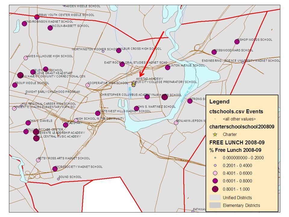
Figure 2. Map of Amistad % Free Lunch compared to Surround Schools


NOTE: I’m informed (see comment below) that the school location for Amistad is not correct. Note that the school location is based on the latitude and longitude as provided in the NCES Common Core of Data (www.nces.ed.gov/ccd/bat). As I suspected might be the case, the CCD Lat/Lon indicates the location of the Central Office of Achievement First (403 James Street). Amistad is located over in the area indicated, near many high poverty traditional public schools. (130 Edgewood Avenue New Haven, CT 06511)

So, Figure 1 and Figure 2 show quite decisively that Amistad is not serving a population which is comparable to surroundings in terms of % qualified for free lunch. Amistad also reports 0% LEP/ELL [no data] while the district reports 12.6% (http://sdeportal.ct.gov/Cedar/WEB/ct_report/EllDTViewer.aspx)

Now, let’s take a look at Amistad’s per pupil spending compared to New Haven public schools. Note that it’s generally not a great idea to try to compare against the district as a whole. If we are comparing Amistad’s performance to elementary and middle schools in New Haven, we should be comparing Amistad’s spending to elementary and middle schools. I’ll provide examples for KIPP charter schools in NYC and Houston at the end of this post.

One must also figure out what components are “in” and what components of spending are “out “ when making a host district comparison to charter spending. For example, host districts are responsible for transportation of children to charters in CT. So, that spending should be removed from host district spending. Note that Amistad logically reports no expenditures on transportation in CTDOE spending reports. http://sdeportal.ct.gov/Cedar/WEB/ct_report/FinanceDTViewer.aspx

Further, host districts are responsible for costs of all resident children with disabilities, and it is difficult to discern whether any of these costs (other than the regular education costs of those students) show up in the charter expenditures. Amistad reports no percentage of spending on special education in CTDOE reports (reporting its total general expenditure figure instead). It is most likely that a large share if not all of the district special education spending should be excluded from the district spending figure. http://sdeportal.ct.gov/Cedar/WEB/ct_report/FinanceDTViewer.aspx

Finally, Amistad is part of a national network which might be considered analogous to its “district,” and expenditures by that national organization should be included. I’ve played it very conservative by only prorating the “administrative” expenses (www.guidestar.org) of Achievement First Inc. across all students in the network, for an additional $218 per pupil. (www.achievementfirst.org)

Figure 3. Per pupil Spending in Amistad Academy and New Haven

Data Sources: New Haven City & Amistad CTDOE http://sdeportal.ct.gov/Cedar/WEB/ct_report/FinanceDTViewer.aspx Amistad Academy IRS 990 from www.guidestar.org (Total expenditures =  $9,575,340, enrollment = 641 in 2008-09)

[1] Host districts are responsible for transportation costs for in district students enrolled in charters.

[2] 18.08% of New Haven Public Schools total expense is on special education.  Amistad reported total expenditures as special educ. expenditures & 0% to special education in 2008-09. See: http://sdeportal.ct.gov/Cedar/WEB/ct_report/FinanceDTViewer.aspx

[3] Achievement First Administrative Expense in subsequent year (guidestar.org) $1.125 million with cumulative enrollment 2010-11 of approximately 5,150 (tallied from achievementfirst.org)

So, Figure 3 shows that Amistad academy at the very least spends comparable to New Haven district wide spending after excluding transportation, and spends quite a bit more than New Haven district per pupil if we exclude all of New Haven’s special education spending. Even if we excluded only a portion of New Haven’s special education spending (likely more appropriate), Amistad’s spending would be quite a bit higher than New Haven Public Schools.  Again, there should be no shame in trying to spend more to provide a good school. Rather, it’s arguably quite noble.

I’m not a big fan of relying exclusively on aggregate spending figures. Rather, I prefer to dig under the hood a bit to see how those dollars are leveraged. This is especially important if we really want to figure out how to replicate the successes of a school like Amistad, albeit with a very different population.

Figure 4 shows the class sizes by grade level in Amistad and New Haven public schools based on CTDOE data from 2008-09.  Amistad appears to have leverage money for smaller class sizes in the lower grades, a choice which arguably makes sense given the existing research on the effects of class size reduction. Overall, Amistad has lower class sizes than the district at the same grade level. And that costs money.

Figure 4. Class Size by Grade Level

Now, on to teacher salaries. In my previous post on TEAM Academy in Newark, NJ, I found that TEAM had scaled up teacher salaries on the front end of experience and paid much higher salaries than Newark Public Schools (no easy accomplishment), for new to mid-career teachers, putting TEAM in a pretty good position for local recruitment and retention. Figure 5 shows that Amistad has done much the same. To construct Figure 5 I used 6 years of data on individual classroom teachers in Connecticut and estimated a teacher salary model as a function of experience, degree level and year of the data. I estimated separate models for New Haven schools and for Amistad, and used those models to impute the implicit teacher salary schedule.

Amistad is paying more on the front end, and far outpacing the district across the first several years of the salary schedule (figures jump around for later years in Amistad due to very few teachers in those categories). And perhaps this allows Amistad to recruit and retain the teachers it wants. More exploration is warranted.

Figure 5. Modeled Teacher Salaries by Degree and Experience Level

So, in summary, what we have here is a high performing school that does not serve the same population, spends more than the local district and chooses to leverage spending toward class size reduction in the early grades and toward competitive early to mid-career teacher salaries. That’s a realistic look at a school that by many accounts is a darn good one.

[but a look I suspect some will still take offense to]

The population differences of the school create serious limitations for determining its scalability. That is, is the performance a function of the students or of the school? That’s hard to tell (even in a rigorous lottery based analysis). Further, the expense of the Amistad model of reduced class size and higher wages on the front end may cause some policymakers to balk. But that expense may be indicative of what’s actually needed, even with a more selective student population.

Perhaps more importantly, even with publicly available macro level data we can gain some insights into how the additional money is leveraged. And it would appear that Amistad is doing things I would consider quite logical, such as early grade class size reduction and paying competitive teacher wages. Those aren’t necessarily the sexy things the “cool kids” might be expecting. And those are both things that cost money. It would be hard to run a school with both reduced class sizes AND competitive wages while spending substantially less. And it is critically important that we recognize this!

Addendum: Making school level spending comparisons in New York City and Houston

Note that a major shortcoming of the Connecticut data above is that they don’t allow for comparison of New Haven schools spending by grade level or individual comparable schools. I have begun large scale analysis of school site expenditure in numerous other contexts. Below are two examples of school site comparison against same grade level schools – including comparable budget components (as well as spelling out in the fine print those aspects which aren’t directly comparable – see FN about KIPP Academy financial reporting – much more detail in my NEPC report).

A1. KIPP Schools in New York City (preliminary analysis)

Like Amistad, and KIPP middle schools in NYC appear to be spending more than NYC public middle schools in the same parts of the city. They are a) not serving comparable populations and b) spending more (even if we spread KIPP Academy spending across all schools and if we exclude KIPP to College spending).

Making the appropriate corrections for facilities access is complicated in Connecticut because facilities expenses are not broken out for the Charters. The CTDOE figures for Amistad and New Haven above contain the same reported components (when transportation & special education are excluded for New Haven), but facilities lease payments may be (are likely) embedded in operating expenses of Amistad (& tend to run around $1,500 per pupil in NJ cities, and over $2,000 per pupil in Manhattan). However, New Haven remains responsible for upkeep and renovation for its facilities as well as any payments on debt that may exist. That is, district facilities are not, as some might argue “free.” So, for example, Amistad spends about $828 per pupil on plant operations and maintenance, while New Haven spends $1,735 per pupil in 2008-09 (a difference of $907). But, on administrative & support services, New Haven spends $1,863 per pupil and Amistad spends $3,585 per pupil (a difference of $1,722). This latter figure likely includes a significant lease payment (or some other peculiar overhead expense), but is partially offset by the differences in operations and maintenance (net difference of $1,722 – $907 = $815, which is smaller than the total expenditure differences reported above, but does close some of the gap). But these back of the napkin approaches only get you so far.

I have greater capacity to correct for these differences in my more detailed NYC data used previously in my NEPC report and used above.

A2: KIPP (and all other charters) in Houston (preliminary analysis)

http://ritter.tea.state.tx.us/perfreport/aeis/2010/DownloadData.html

One can see in the figure above that many of the KIPP schools in Houston are spending well above a) most other charters b) most Houston public schools and c) the Houston district average expenditure. Yes, charters on the whole are a mixed bag. Many are quite low spending. These data likely need much more cleaning and cross-checking. But they are generally accessible through the TEA web site.

========================

NOTE: All data used in these posts come from official state, federal and IRS documents, in a few cases through respected aggregators of data (guidestar.org).  In a few cases above, I rely on total enrollment counts from the organization web site (Achievement First). Generally, I rely on official data and provide URLs to data sources so that any and all analyses can be checked, replicated, etc.  If you are a representative of a school and believe your data to be “wrong,” I will typically respond by at least checking that I have not made an error in reporting the data. But, if the data are what they are, then I suggest that you go to the source for any corrections. Most of these data are reported by the schools themselves to the state and federal agencies in question. I just report them as they are, and do certainly attempt to reconcile anything that appears out of line – and will make corrections when the correction can be validated.


Thoughts on Improving the School Funding Reform Act (SFRA) in NJ

I’ve seen a number of tweets and vague media references of late about the fact that NJ Education Commissioner Cerf will at some point in the near future be providing recommendations for how to change the School Funding Reform Act of 2008.

I also have it on good authority that NJDOE has convened a working group to discuss how to alter SFRA and are bringing in outside consultants for ideas. To no surprise, I’ve been left out of these conversations, despite my narrowly focused expertise on these very topics.

SFRA is subject to review by the department. Most of SFRA is laid out in statute, or laws passed by the legislature. But, as I understand it, the department of education does have some latitude to “tweak” parameters within SFRA. For example, adjusting/changing various weights and other factors which drive more money to some districts and less to others.

Now, I hate to stick my nose in on this process with my own preemptive recommendations, but you see, this happens to be a topic I know something about. After all, if within my broad areas of expertise on education policy/finance there is one area in which I really specialize it’s the design of state school finance formulas to meet student needs. And, I happen to have a little background on NJ’s SFRA. So, here’s my free advice. A little pro-bono technical advisement.

First, keep in mind that I have in the past testified on problems with SFRA, specifically focusing on what I consider to be technical errors made in the original design of the formula which fall under the umbrella of “tweakable” stuff.  I also happen to have done research  conference presentations and have published peer reviewed research related to some of the problematic features of SFRA – specifically the way the state chose to adjust for competitive wage variation across settings and the way the state chose to fund special education.

My apologies to all the non-Jersey and non-finance geeks out there for whom this analysis is going to quickly go technical. Can’t avoid it. Would take far too much space to provide full background on each issue. But I do have complete related documentation linked throughout. My reason for this post is simply to get this stuff out there. To make it known what the actual, technical issues are and what should be addressed when talking about “tweaking” SFRA. Some background is in order though, if for no other reason to explain how I’ve narrowed my scope here.

First, state school funding formulas like SFRA start out by calculating an “adequacy budget” target for each school district:

Adequacy Budget = (Base Funding + Student Need Funding) x Geographic Cost Variation

Typically, the student need category includes additional funding for a) low income children, b) children with limited English language proficiency, and c) children with disabilities. Under geographic cost variation, states generally adjust for geographic variation in competitive wages (how much more does it cost to pay teachers competitively in one labor market versus another) and for small, remote and sparsely populated districts (economies of scale & sparsity). The latter issue is less relevant in NJ.

Typically the second step in a state school finance formula is the parsing of state versus local responsibility to pay for the adequacy budget:

Foundation Formula State Aid = Adequacy Budget – Local Fair Share

This part is important too, especially for balancing tax equity concerns. But, in this post and in most of my analyses of SFRA, I’m focused on getting those adequacy targets correct.  And with SFRA, there is plenty to talk about.

SFRA emerged in part from an analysis prepared for the department of education on the costs of providing an adequate education. That report, by John Augenblick and Associates was produced to the department around 2003, but was not released by the department until 2006. Elements of that report were used to guide a new school funding formula adopted in 2008 – SFRA.

It’s really important to understand that the adoption of state school funding formulas is necessarily a political process. That’s just reality. One can ponder a world in which we substitute technical expertise for political deliberation as somehow being the perfect substitute, but even I understand that’s not realistic.

And quite honestly the quality of technical advisement varies widely. I would go so far as to say that some technical advisement is clearly better than other technical advisement, and some is not worth a damn. For examples of the latter, see: https://schoolfinance101.wordpress.com/2011/06/06/roza-tinted-reality/   and:  https://schoolfinance101.wordpress.com/2011/04/01/publicincompetence/

So, the reality is that legislatures adopt something, perhaps with technical advisement and state courts are available to hear any legally relevant grievances (and consider technical advisement) to evaluate whether those concerns rise to the level of constitutional violation.

I often assist in identifying what those grievances are. Here, I’m pointing mainly to technical quibbles over what came out of the legislative process in New Jersey. These are technical quibbles for which I would argue the research suggests there is a “right way” to do things and the New Jersey legislature and department of education chose the “wrong way.” These are technical quibbles which result in relatively modest, though important corrections to the setting of district “adequacy budgets.” And these are technical quibbles which the court appointed special master decided did not rise to a level of constitutional violation. That is, SFRA was “good enough” to meet constitutional muster.

So then, I suggest that the departmental (regulatory) review process is the right time to address these technical problems.

Table 1 provides my short list of relatively easy fixes.

First, when adopting SFRA someone, somewhere along the line suggested that the formula provide substantially greater money for each high school student than for each elementary student and marginally more money for each middle school student than for each elementary student. But, there is no clear evidence – no firm research basis for such differentiation. No evidence, for example, that it costs more to provide equal educational opportunity in districts that have a larger share of secondary than elementary students. Rather, differences that do exist in spending on high school versus elementary students are merely artifacts of the ways in which districts have typically spent regardless of which children would benefit more from additional expenditure. The most problematic feature of this adjustment is that higher poverty districts tend to have smaller shares of their total enrollment in high school, meaning that this adjustment drives more money to lower poverty and less to higher poverty districts. And it does so without any real justification. This pattern occurs for a variety of reasons, including dropout rates but also family migration patterns and family economic status shifts with maturation.

Second, when determining how to include an adjustment for differences in competitive wages across areas of New Jersey, department officials decided to rely conceptually on a new approach proposed by the National Center for Education Statistics – the Comparable Wage Index (see link below). But then they abandoned the actual index and the actual methods behind it to come up with their own. In their own method, NJDOE looked not at labor market level wages but at county level wages of non-teachers (controlling for age, occupation, industry and education level). By using county level data, NJDOE officials came up with a “geographic cost adjustment” that gives the biggest adjustments to the highest income counties (Bergen, Morris, Essex) rather than broadly applying the adjustment to regions of the state. Most problematically, this GCA gives a bigger funding boost to affluent Ridgewood (Bergen) than to nearby Paterson (Passaic) and to Franklin Township than to New Brunswick. That’s just wrong!

Third, and this is a big one, when adopting SFRA the choice was made to fund special education by a method called Census Based funding. That is, assuming that every district really has or should have the same share of population in need of services. They set the rate to 14.69% of students. The argument is that districts with more than that have simply been identifying more to chase additional funding and not that they actually have greater need. I address the flaws of this logic extensively in the linked research article below. Of course, the most absurd aspect of financing every district as if they have 14.69% children with disabilities is the assumption that it is somehow appropriate to fund many districts at that level who actually have far fewer children in need. Fiscal prudence this is not! But again, it does tend to reduce funding in higher poverty urban districts as well as larger, poor remote southern NJ towns (see my research article).

Fourth, in another seemingly back of the napkin exercise, someone decided that a child who is both from a low income background and with limited English language proficiency clearly doesn’t need the additional funding tied to both characteristics, and instead should be provided something in between. So, they instituted a “combination weight” which was a marginal increase over the low income weight, instead of the sum of the low income weight and LEP/ELL weight. I could probably make a stronger case that increased concentrations of both needs in districts serving very high concentrations of children who are both low income and non-English speaking leads to escalating not diminishing costs. Clearly, use of this weight instead of using the sum of the two reduces funding to the districts with the highest concentrations of students who are both poor and non-English speaking. Further, if a district is majority low income, each marginal child who is non-English speaking is more likely to be both and receive the lower combination weight.

Table 1. Summary of Current Errors and Proposed Fixes

Errors in Original SFRA 2008-09 How it Works  Why it’s Wrong Alternative
Grade Level Weight 1.0 Elementary Based on back of the napkin analysis. No real basis in true cost differential. Disadvantages higher poverty districts with lower share of children in upper grades. Eliminate (Revenue neutral, set to average)
1.04 Middle
1.17 Secondary
Geographic Cost Adjustment Based on non-teacher wages in county County is the wrong unit for this analysis. Should be labor market (clusters of counties). Current approach rewards affluent counties (Bergen, Morris, Somerset). Labor Market Based Comparable Wage Index
Census Based Funding of Special Education Special education funding is allocated in flat amount assuming each district has 14.69% children qualified for special education. This assumption is wrong and it leads to significant inequities in special education funding per child with actual needs.  Allocate on need basis
Combination Weight Children who are both ELL and Low Income do not receive weighted funding for both, but rather receive an adjustment between the two. Reduction was based on back of the napkin estimate, and signifcanlty draws funding away from most needy districts. Reinstate full weighting for both

Here is a link to my full report in which I first identify these issues:

Baker.PJP-SFRA.Report.WEB (My complete report explaining the above problems)

Figure 1 shows what happens if we run a formula simulation based on the original 2008 SFRA parameters, and if we incrementally fix each one of these errors.

First, I remove the Combination weight and replace it with an option where each child can receive the sum of the at risk weight and the LEP/ELL weight if they qualify for both.  Table 2 below shows that taking this approach raises the combo weight cost for TYPE 3 districts from $212 million to $330 million. And, looking at the second set of bars in Figure 1, it increases funding in lower income, higher need districts. Note that these are shifts in the total adequacy targets, for which costs will be shared between the state and local districts (albeit increasing targets more in districts heavily reliant on state aid).

Second, I allocate special education funding according to actual concentrations of children with disabilities. This does come at an increased total cost as well, raising total target funding for special education from $991 million to just over $1 billion. Again, total, to be funded by state and local, but again with stronger effect on districts more dependent on state aid.

Third, I get rid of that pesky grade level adjustment and replace it with the revenue neutral average foundation funding level. This does drive some more money into lower income districts.

Fourth, I replace the county level geographic cost adjustment with the National Center for Education Statistics adjustment, set to a statewide average of 1.0 (to make it more revenue neutral). This ain’t perfect. The NCES index has some “rough edges” (see my linked paper). But it’s still more justifiable in general, even if it does hurt some districts which actually need more help. This issue really requires a complete redo!

Figure 1. Simulation based on Operating Type 3 Districts

Table 2 provides some fiscal implications, as noted above, but it’s important to understand that these fiscal implications are based on a simulation of only Type 3 districts (which does include most of the kids). Table 2 is intended to show the patterns of reshuffling that would occur with these corrections.

Table 2. Simulation based on Operating Type 3 Districts

Formula Component Status Quo Remove Combo Fix Special Ed Remove Grade Level Fix GCA Fix All
Total Base Cost $9,547 $9,547 $9,547 $9,547 $9,547 $9,547
Total Cost of At Risk $1,610 $1,610 $1,610 $1,611 $1,610 $1,610
Total Cost of LEP/ELL $70 $70 $70 $70 $70 $70
Total Cost of Combo $212 $330 $212 $212 $212 $330
Total Cost of Special Ed Base $991 $991 $1,018 $991 $991 $1,018
Full State Funding
Total Cost of Special Ed Categorical $496 $496 $509 $496 $496 $509
Bottom Line Before Regional Wage Index $12,926 $13,044 $12,966 $12,927 $12,926 $13,084
Bottom Line After Regional Wage Index $13,007 $13,126 $13,043 $13,008 $13,041 $13,198

Figure 2. Distribution of Need-based Adjustments before Adjustment

(excludes special education)

Figure 3. Distribution of Need-based Adjustments after Adjustment (Fix All)

(excludes special education)

The bottom line here is that the reason each and every one of these corrections is important is that each of the original errors of logic and analysis that found their way into the SFRA formula shifts funding away from higher need and toward lower need districts. These aren’t huge shifts, but they’re not trivial either.

For those who wish to play around, here’s the simulation:

Aid Simulation (MS Excel File with Macros)

And for those wishing some additional technical reading to explain my arguments above, here are links to some of my related writing.

AERA.WageIndexPaper.March2008 (Conference Paper on Problems with NJ Wage Index)

Link to Published Article on Problems with Census Based Special Education Funding

Cheers!

Dear Mr. Mulshine – Please check your “facts”

I was reading this column by Paul Mushine yesterday in which Mr. Mulshine opines about the exorbitant property taxes being paid by our Governor. Now, personally, I’d prefer to keep our Governor out of this. This isn’t about him. It’s about an expensive house in a relatively wealthy suburban town in Morris County and the property taxes you have to pay when you live in an expensive house. Let’s keep it at that. Mulshine points to the rather eye-popping annual property taxes on the house which are over $37,000.

Mulshine attributes the high property tax bill to state policies which take suburban money and give it to poor urban cities and school districts, referring more than once to the state school finance formula.

As Mulshine argues:

Just when the heck is he going to demand we change the formula for handing out state property-tax relief?

Under the current formula, suburban taxpayers get socked to transfer wealth to the cities. And few suburbs fare quite as badly as Christie’s own home town, Mendham Township in Morris County. I like to bring that thorny fact up when I question him at press conferences.

http://blog.nj.com/njv_paul_mulshine/2011/10/youd_have_to_be_president_to_a.html

(emphasis added). Thorny fact? Really?

Mulshine seems to forget that the primary reason that a tax bill would be high is…well… because the tax is being paid on a property that has a very high taxable assessed value! In other words, the main reason someone pays a higher tax bill is because they live in a more expensive house. And, by the way, it has to be a pretty expensive house to generate a tax bill that high (over $2 million).

By Mulshine’s metric of fairness – property tax bill – the most disadvantaged people in the state must therefore be those who live in the most expensive houses – because those are the houses with the largest tax bills, even if we all paid the same tax rate on our homes.  So, owning an expensive house is the root of the greatest unfairness of New Jersey tax policy?

Let me offer up a few alternative metrics drawn from data (albeit a few years old) on municipalities and school districts from nj.com’s “jersey by the numbers.” Let’s take a look at two better measures across municipalities in Morris and Essex county. I’ve included Essex to bring some of the poorer urban communities into the picture, since Morris has few.

Let’s look first at the effective tax rate with respect to home values. That is, are towns with higher value homes paying a higher or lower percent of their home value in property taxes?

Now let’s look at whether individuals are paying a higher percent of their income in property taxes in towns with higher or lower income.

While these data are now somewhat old, there is little reason to believe that these patterns have shifted much if any, especially due to state tax and spending policies. First, these things tend to be relatively stable. Second, 2005 was around the peak of Abbott funding, the end of the major scaling up of funding from 1998 to 2005, prior to the new formula which actually spread money more widely.

Now, these are important metrics for evaluating Mulshine’s premise of the wrongs of current redistributive policies. Why? Because if current policies really do go overboard at redistributing suburban wealth to the urban core, then we should see that a) effective tax rates on properties are actually higher in the suburbs – that is the tax bill divided by the home value, and b) that property taxes paid as a share of income are higher in the suburban districts than the urban core.

Both of the above charts suggest that current NJ policies of school and municipal aid have not, in fact, over-corrected by driving too much relief into poor urban communities. In fact, effective property tax rates remain much higher in places like East Orange, Irvington and Orange than in Mendham or Essex Fells. Further taxes as a percent of income are much higher in East Orange, Nutley and Belleville than in Mendham.

But, Mendham and some other more affluent suburban communities do tend to be quite high on this measure and there are a few explanations for this. First, many of the towns high on this measure have very little commercial or industrial property to tax for public services. A tax equity oriented policy remedy to this problem is to require regional redistribution of property tax revenues from these non-residential properties (a topic of some academic literature in the past). Second, in some of these towns, we may see more individuals living beyond, or at least at the edges of their means – perhaps purchasing more house than their income can afford.

So, what is one to do if they are unhappy with a $37,000 annual property tax bill? The simplest answer is to move into a cheaper house.


On the Real Dangers of Marguerite Roza’s Fake Graph

In my last post, I ranted about this absurd graph presented by Marguerite Roza to a symposium of the New York Regents on September 13, 2011. Since that presentation (but before my post), that graph was also presented by the New York State Commissioner of Education to Superintendents of NY State School Districts (Sept. 26, slide #20). The graph and the accompanying materials are now part of a statewide push in New York to promote an apparent policy agenda, though I lack some clarity on the specifics of that agenda at this point in time.

Because this graph is now part of an ongoing agenda in New York and because critiques by other credible, leading scholars similar to my own but less ranting in style, which were submitted to state officials following the symposium have seemingly been ignored (shelved, shredded, or whatever) I feel the need to take a little more time to explain my previous rant. Why is this graph so problematic? And who cares? How could such a silly graph really cause any problems anyway? Let’s start back in with the graph itself.

How absurd is this graph?

So, here it is again, the Marguerite Roza graph explaining how if we just adopt either a) tech based learning systems or b) teacher effectiveness based policies we can get a whole lot more bang for our buck in public schools. In fact, we can get an astounding bang for our buck according to Roza.

Figure 1. Roza Graph

http://www.p12.nysed.gov/mgtserv/docs/SchoolFinanceForHighAchievement.pdf

As I explained on my previous post, along the horizontal axis is per pupil spending and on the vertical axis are measured student outcomes. It’s intended to be a graph of the rate of return to additional dollars spent. The bottom diagonal line on this graph – the lowest angled blue line – is intended to show the rate of return in student outcomes for each additional dollar spent given the current ways in which schools are run. Go from $5,000 to $25,000 in spending and you raise student achievement by, oh… about .2 standard deviations. I also pointed out that it doesn’t really make a whole lot of sense to assume that there is no return to any type of schooling at $5,000 per pupil. It might be small, but likely something. It should really have been set to $0 for the intercept. It’s also likely that for any of the curves, that they should be… well… curves. You know, with diminishing returns at some point, though perhaps the returns diminish well beyond spending $25,000. But these are just small signs of the sloppy thinking going on in this graph.

The next sign of the sloppy thinking is that the graph suggests that one can use these ill-defined tech-based solutions to get FIVE TIMES the bang for the same buck – a full standard deviation versus only .2 standard deviations – when spending $25,000 per pupil.

So, how crazy is it to assert that these reforms can create a full standard deviation of improvement up the productivity curve – for example, if we spend $25,000 per pupil on tech-based systems as opposed to $5,000 per pupil on tech-based systems? Well, here’s the “standard normal curve” which, for fun, I obtained from the NY Regents Assessment study guide. That’s right, this is from the study guide for the NY Regents test. So perhaps the members of the Board of Regents should take a look. A full standard deviation of improvement would be like moving a class of kids from the 50%ile to the 84.1%ile. That’s no simple accomplishment!

Figure 2. Standard Normal Curve

Let’s put this bang for the buck into context. I joked in my previous post that this blows away Hoxby’s study findings regarding NYC charter schools and closing the Harlem-Scarsdale achievement gap. Hoxby, for example found that students lotteried into charter schools had cumulative gains over their non-charter peers of .13 to .14 standard deviations by grade 3, and annual gains over their non-chartered peers of .06 to .09 standard deviations. Sean Reardon of Stanford explains how the selected models and methods may have inflated those claims! But that’s my point here. Let’s compare Roza’s stylized claims with previous, bold, inflated claims but ones at least based on a real study.

Let’s assume that the bottom line on Roza’s chart represents traditional public schooling in NYC and that traditional public schools in NYC spend about $20,000 per pupil. Following Roza’s graph that would put those students at about .2 standard deviations above what they would have scored if their schools spent only $5,000 per pupil.  Roza’s graph suggests however, that if the same $20,000 per pupil was spent on tech-based learning systems, those students would have scored about .7 standard deviations higher than if only $5,000 was spent, which is also .5 (a half standard deviation) greater than spending on traditional schools. That is, shifting the $20,000 per pupil from traditional schooling to tech-based learning systems would produce an achievement gain that is over FIVE TIMES the annual achievement gains from Hoxby’s NYC charter school study. Of course, it’s not entirely clear what the duration of treatment is in relation to outcome gains in Roza’s graph. Perhaps she means that one could gain this much after 110, 12 or 20 years of exposure to $20,000 per pupil invested in tech-based learning systems?

Figure 3. Roza Graph with Notes


Why is this graph (and the related information) dangerous?

So, let’s assume that many features of the graph are just innocently and ignorantly sloppy. Not a comforting assumption to have to make for a graph presented to a major state policy making body and by someone claiming to be a leading researcher on educational productivity and representing the most powerful private foundation in the country. Setting the intercept at $5,000 instead of $0… Setting such crazy effect magnitudes on the vertical axis. All innocently sloppy and merely intended to illustrate that there might be a better way if we can just think outside the box on school spending.

I have no problem with the idea of exploring outside the box for options that might shift the productivity curve. I have a big problem with assuming… no… declaring outright that we know full well what those options are and that they will necessarily shift the curve in a HUGE way.

I have significant concerns when this type of analysis is used to promote a policy agenda for which there exists little or no sound evidence that the policy agenda is worthwhile either in terms of costs or benefits.

The remainder of the Roza presentation and the presentation that followed basically assert that large shares of the money currently in the public education system are simply wasted. This assumption is also simply not supportable – certainly not by any of the ill-conceived fodder presented at the Regents Symposium by Marguerite Roza or Stephen Frank of Educational Resource Strategies.

For example, Stephen Frank presented slides to suggest that any and all money in the education system that is spent on a) teacher pay for experience above base pay or b) teacher pay for degree levels (any and all degrees) above and beyond base pay c) any compensation for teacher benefits, is essentially wasted and can and should be reallocated.  Here’s one of the slides:

Figure 4. Stephen Frank (ERS) slide:

Essentially, what is being argued is that a school where all teachers are paid only the base salary and receive no health benefits or retirement benefits would be equally productive to a school that does provide such compensation (since we know that those things don’t contribute to student results). That is, it would be equally productive for less than half the expense! Thus, all of that wasted money could be spent on something else, spent differently, to make the school more productive. This is essentially the middle diagonal line of the productivity curve (straight line) chart – spending on teacher effectiveness.  But this is all based on absurdly bold assumptions and slipshod analysis (intentionally deceptive since it’s based on a district with a senior workforce).

I have written about this topic previously, and how pundits (not researchers by any stretch of the imagination) have wrongly extrapolated this assumption from studies that show no strong correlations between student outcomes and whether teachers have or do not have advanced degrees, or studies that show diminishing returns in tested student outcomes to teacher experience beyond a certain number of years. As I explained previously, studies of the association between different levels of experience and the association between having a masters degree or not and student achievement gains have never attempted to ask about the potential labor market consequences of stopping providing additional compensation for teachers choosing to further their education – even if only for personal interest – or stopping providing any guarantee that a teacher’s compensation will grow at a predictable rate over time throughout the teacher’s career.

It is pure speculation and potentially harmful speculation to make this leap.

Who’s most likely to get hurt?

So, let’s say we were to capitulate on these overreaching if not outright absurd and irresponsible claims? What’s the harm anyway? Why not simply allow a little speculative experimentation in our schools? Can’t do worse right? Wrong! We could do worse! Simply pretending that there’s a better way out there, pretending that the productivity curve can be massively adjusted, with no foundation for this assumption means that there is comparable likelihood that revenue-neutral “innovations” could do as much harm as good. Assuming otherwise is ignorant and irresponsible.

But perhaps more disturbingly, when we start talking about where to engage in this speculative experimentation to adjust the productivity curve – excuse me – productivity straight line – we are most often talking about experimenting with the lives and educational futures of the most vulnerable children and families. I suspect that NY State policymakers buying into this rhetoric aren’t talking about forcing Scarsdale to replace small class sizes and highly educated and experienced teachers with tech-based learning systems. This despite the fact that Scarsdale, many other Westchester and Long Island affluent districts are already much further to the right on the spending axis than the state’s higher need cities, including New York City as well as locations like Utica, Poughkeepsie and Newburgh.  Further, as I have discussed previously on this blog, New York State continues to provide substantial state aid subsidies to these wealthy communities while failing to provide sufficient support to high need midsized and large cities.

But instead of providing sufficient resources to those high need cities to be able to provide the types of opportunities available in Scarsdale, the suggestion by these pundits posing as researchers is that it’s absolutely okay… not just okay… but the best way forward… to engage in revenue neutral (if not revenue negative) speculative experimentation which may cause significant harm to the state’s most needy children.

And that is why this graph is so dangerous and offensive.

Dumbest completely fabricated (but still serious?) graph ever! (so far)

Okay. You all know that I like to call out dumb graphs. And I’ve addressed a few on this blog previously.

Here are a few from the past: https://schoolfinance101.wordpress.com/2011/04/08/dumbest-real-reformy-graphs/

Now, each of the graphs in this previous post and numerous others I’ve addressed, like this one (From RiShawn Biddle) had something over the graph I’m going to address in this post. Each of the graphs I’ve addressed previously at the very least used some “real” data. They all used it badly. Some used it in ways that should be considered illegal. Others… well… just dumb.

But this new graph, sent to me from a colleague who had to suffer through this presentation, really takes the cake. This new graph comes to us from Marguerite Roza, from a presentation to the New York Board of Regents in September. And this one rises above all of these previous graphs because IT IS ENTIRELY FABRICATED. IT IS BASED ON NOTHING.

Perhaps even worse than that, the fabricated information on this illustrative graph suggests that its author does not have even the slightest grip on a) statistics, b) graphing, c) how one might measure effects of school reforms (and how large or small they might be) or d) basic economics.

Here’s the graph:

http://www.p12.nysed.gov/mgtserv/docs/SchoolFinanceForHighAchievement.pdf

Now, here’s what the graph is supposed to be saying. Along the horizontal axis is per pupil spending and on the vertical axis are measured student outcomes. It’s intended to be a graph of the rate of return to additional dollars spent. The bottom diagonal line on this graph – the lowest angled blue line – is intended to show the rate of return in student outcomes for each additional dollar spent given the current ways in which schools are run. Go from $5,000 to $25,000 in spending and you raise student achievement by, oh about .2 standard deviations.

Note, no diminishing returns (perhaps those returns diminish well outside the range of this graph?). It’s linear all the way – keep spending an you keep gaining…. to infinity and beyond. But I digress (that’s the basic economics bit above). And that doesn’t really matter – because this line isn’t based on a damn thing anyway. While I concur that there is a return to additional dollars spent, even I would be hard pressed to identify a single estimate of the rate of return for moving from $5k to $25k in per pupil spending.

Where the graph gets fun is in the addition of the other two lines. Note that the presentation linked above includes a graph with only the lower line first, then includes this graph which adds the upper two lines. And what are those lines? Those lines are what we supposedly can get as a return for additional dollars spent if we either a) spend with a focus on improving teacher effectiveness or b) spend “utilizing tech-based learning systems” (note that I hate utilizing the word utilizing when USE is sufficient!). I have it on good authority that the definitions of either provided during the presentation were, well, unsatisfactory.

But most importantly, even if there was a clear definition of either, THERE IS ABSOLUTELY NO EVIDENCE TO BACK THIS UP. IT IS ENTIRELY FABRICATED.  Now, I’ve previously picked on Marguerite Roza for here work with Mike Petrilli on the Stretching the School Dollar policy brief. Specifically, I raised significant concern that Petrilli and Roza provide all sorts of recommendations for how to stretch the school dollar but PROVIDE NO ACTUAL COST/EFFECTIVENESS ANALYSIS. 

In this graph, it would appear that Marguerite Roza has tried to make up for that by COMPLETELY FABRICATING RATE OF RETURN ANALYSIS for her preferred reforms.

Now let’s dig a little deeper into this graph. If you look closely at the graph, Roza is asserting that if we spend $5,000 per pupil either a) traditionally, b) focused on teacher effectiveness or c) on tech-based systems, we are at the same starting point. Not sure how that makes sense… since the traditional approach is necessarily least productive/efficient in the reformy world… but… yeah… okay.  Let’s assume it’s all relative to the starting point for each…which would zero out the imaginary advantages of two reformy alternatives… which really doesn’t make sense when you’re pitching the reformy alternatives.

Most interesting is the fact that Roza is asserting here that if you add another $20,000 per pupil into tech-based solutions – YOU CAN RAISE STUDENT OUTCOMES BY A FULL STANDARD DEVIATION. WOBEGON HERE WE COME!!!!! Crap, we’ll leave Wobegon in the dust at that rate. KIPP… pshaw… Harlem-Scarsdale achievement gap… been there done that! We’re talking a full standard deviation of student outcome improvement! Never seen anything like that – certainly not anything based on… say… evidence?

To be clear, even a moderately informed presenter fully intending to present fabricated but still realistic information on student achievement would likely present something a little closer to reality than this.

Indeed this graph is intended to be illustrative… not real…. but the really big problem is that it is NOT EVEN ILLUSTRATIVE OF ANYTHING REMOTELY REAL.

Now for the part that’s really not funny. As much as I’m making a big joke about this graph, it was presented to policymakers as entirely serious. How or whether they interpreted it as serious, who knows. But, it was presented to policymakers in New York State and has likely been presented to policymakers elsewhere with the serious intent of suggesting to those policymakers that if they just adopt reformy strategies for teacher compensation or buy some mythical software tools, they can actually improve their education systems at the same time as slashing school aid across the board. Put into context, this graph isn’t funny at all. It’s offensive. And it’s damned irresponsible! It’s reprehensible!

Let’s be clear. We have absolutely no evidence that the rate of return to the education dollar would be TRIPLED (or improved at all) if we spent each additional dollar on things such as test score based merit pay or other “teacher quality” initiatives such as eliminating seniority based pay or increments for advanced degrees. In fact, we’ve generally found the effect of performance pay reforms to be no different from “0.” And we have absolutely no evidence on record that the rate of return to the education dollar could be increased 5X if we moved dollars into “tech-based” learning systems.

The information in this graph is… COMPLETELY FABRICATED.

And that’s why this graph makes my whole new category of DUMBEST COMPLETELY FABRICATED GRAPHS EVER!

More Detail on the Problems of Rating Ed Schools by Teachers’ Students’ Outcomes

In my previous post, I explained that the new push to rate schools of education by the student outcome gains of teachers who graduated from certain education schools is a problematic endeavor… one unlikely to yield particularly useful information, and one that may potentially create the wrong incentives for education schools.  To reiterate, I laid out 3 reasons (and there are likely many more) why this approach is so problematic. Here, I divide them out a bit more – 4 ways.

  1. parsing out individual teacher’s academic backgrounds – that is if teachers hold credentials and degrees from may institutions, which institution is primarily responsible for their effectiveness?
  2. the teacher workforce in most states includes a mix of teachers from a multitude of within and out-of-state institutions, public and private, with many of those institutions having only a handful of teachers in some states. States will not be able to evaluate all pipelines reliably. Does this mean that states should just cut off teachers from other states, or from institutions that don’t produce enough of their teachers to generate an estimate of the effectiveness of those teachers?
  3. because of the vast differences in state testing systems, and differences in the biases in those testing systems toward either higher or lower ability student populations (floor and ceiling effects), graduates of a given teaching college who might for example flock to affluent suburban districts on each side of a state line might find themselves falling systematically at opposite ends of the effectiveness ratings. The differences may have little or nothing to do with actually being better or worse at delivering one state’s curriculum versus another, and may instead have everything to do with the ways in which the underlying scales of the tests lead to bias in teacher effectiveness ratings. We already know from research on Value Added estimates that the same teacher may receive very different ratings on different tests, even on the same basic content area (math).
  4. and to me, this is still the big one, that graduates of teaching programs are simply not distributed randomly across workplaces. This problem would be less severe perhaps if they were distributed in sufficient numbers across various labor markets in a state, where local sample sizes would be sufficient for within labor market analysis across all institutions. But teacher labor markets tend to be highly local, or regional within large states.

I showed previously how the rates of children qualifying for free or reduced price lunch varies significantly across schools of graduates of Kansas teacher preparation programs:

Racial composition varies as well:

But perhaps most importantly, the above to charts are merely indicative of the fact that the overall geographic distribution of teacher prep program graduates varies widely. Some are in low-income remote rural settings, with very small class sizes, while others are near the urban core of Kansas City, either in sprawling low poverty suburbs or in the very poor, relatively population dense inner urban fringe.  Making legitimate comparisons of the relative effectiveness of teachers across these widely varied settings is a formidable task for even the most refined value-added model and even that may be too optimistic.

Here’s the geographic distribution of teacher graduates of the major public teacher preparation institutions in Kansas:

The Kansas City suburbs in this figure are covered in Red (KU), Purple (K-State) and Orange (Emporia State) does, and a significant number of blue ones (Pitt State). Western Kansas is dominated by Green Dots (Hays State) and southeast Kansas by blue ones (Pitt State). Wichita is dominated by black dots (Wichita State). Nearly all of these clusters are local/regional, around the locations of the universities. Certainly, much of the distribution is also dependent upon demand for teachers, where the greatest growth has been in the Kansas City suburbs to the south and west (out toward Lawrence, home to KU).

Here it is peeled back. First KU:

Next K-State:

Wichita State:

Fort Hays State:

Pittsburg State:

Emporia State:

Even if we assume that value added models could be an effective tool for a) rating teacher effectiveness and b) aggregating that teacher effectiveness to their preparation institutions, it is a stretch to assume that we could find any reasonable way to reliably and validly compare the effectiveness of the graduates of these public institutions, given that they are clustered in such vastly different educational settings – with widely varied resource levels, widely varied class sizes, kids who sit on buses for widely varied amounts of time, widely varied poverty levels, immigration patterns and numerous other factors (it’s that other “unobservable” stuff that really complicates things!). The only reasonable statistical solution would be to have  graduates of Kansas teacher preparation programs randomly assigned to Kansas schools upon graduation.

As I noted on my previous post, I’m not entirely opposed to exploring our ability to generate useful information by testing statistical models of teacher effectiveness aggregated in this way (to preparation institutions or pipelines). It is certainly more reasonable to use these information in the aggregate for “program evaluation” purposes than for rating individual teachers. But, even then, I remain skeptical that these data will be of any particular use either for state agencies in determining which institutions should or should not be producing teachers, or for the institutions themselves. It is a massive leap, for example, to assume that a teacher preparation institution might be able to look at the value-added ratings based on the performance of students of their graduates, and infer anything from those ratings about the programs and courses their graduates took as they pursued their undergraduate (or graduate) degrees. Though again, I’m not opposed to seeing what, if anything, one can learn in this regard.

What would be particularly irresponsible – and what is actually being recommended – is to accept this information as necessarily valid and reliable (which it is highly unlikely to be) and to mandate the use of this information as a substantial component of high stakes decisions about institutional accreditation.

Misinformed charter punditry doesn’t help anyone (especially charters!)

Download slides of figures below: TEAM Academy Slides Oct 5 2011

Link to NCES Common Core Build a Table: http://nces.ed.gov/ccd/bat/

Link to Special Education Data (NJDOE): http://www.nj.gov/education/specialed/data/ADR/2010/classification/distclassification.xls

Link to School Report Card Download (NJDOE): http://education.state.nj.us/rc/rc10/database/RC10%20database.xls

Link to Enrollment Data 2010-11 (NJDOE):  http://www.nj.gov/education/data/enr/enr11/enr.zip


Misinformed charter punditry doesn’t help anyone. It doesn’t help the public to make more informed decisions either about choices for their own children or about policy preferences more generally. It also doesn’t help charter operators get their jobs done and it doesn’t help those working in traditional public schools focus on things that really matter.  This post is in direct response to the irresponsible and unjustified statement below from a recent editorial in the NJ Star Ledger:

The best of these schools, like the TEAM Academy in Newark, are miracles in our midst. With the same demographic mix of students as district schools, their kids are doing much better in basic skills. And they are doing it for less money, in a setting that is safe and orderly.

http://blog.nj.com/njv_editorial_page/2011/10/nj_sets_right_course_on_charte.html

Nearly every phrase in this statement is misleading or simply wrong. And that’s a shame. My apologies for being trapped in meetings yesterday and not having a chance to return calls on this topic. I might have been able to head this off.  Perhaps most disturbingly, this stuff really doesn’t help out TEAM Academy much either. Readers of my blog know that I often go after stories about the high flying Newark and Jersey City charters which, for the most part, stick out like sore thumbs when it comes to demographics and attrition. Readers also realize that it is not that I think these schools are doing a bad job. Rather, I think many are doing a great service. But, I am concerned that the media often deceives the public into believing that the “successes” of schools like North Star and Robert Treat can be scaled up to improve the entire system, which they cannot, because they simply do not serve students like those in the rest of the system.

My readers also know that I’ve generally left TEAM Academy alone here, and for a few reasons. First, TEAM’s demographics are less extreme outliers than those of the other high flyers. Second, TEAM’s outcomes are also more modest, but pretty good. Third, and perhaps this is revealing of preferential treatment on my part, but the head of TEAM, Ryan Hill has always been one for open and honest conversation on these very topics – perhaps because he understands fully that I’m not out to get him, or any other charter leaders here. Rather, I’m out to paint a realistic picture of what’s going on.

So, here I’m going to paint a realistic picture of TEAM Academy. This is not criticism. It’s realism. And again, I do appreciate Ryan Hill’s efforts and TEAM’s role in the Newark community. That’s why I think the above statement is so irresponsible. It sets an inappropriate bar and casts TEAM in an inappropriate light. It’s not a miracle. It doesn’t serve the same population. It spends quite a bit (but spending is all relative) and pays its teachers particularly well.

First, here are the percentages of children qualified for free lunch within the TEAM zip code in Newark:

Here’s an updated graph of TEAM vs. all NPS schools districtwide, using % free lunch data from 2010-11 from the NJDOE enrollment files: http://www.state.nj.us/education/data/enr/enr11/stat_doc.htm


I have previously reported on special education data, which are sorely lacking in NJ at the school level. Suffice it to say that all official reports indicate lower special education enrollments in TEAM than district averages, but unofficial and district provides school site reports for Newark Public Schools vary widely. Here’s the most recent classification data at the district level for Essex County districts and select Newark charters:

While TEAM has a much higher classification rate than other “high-flying” Newark charters, its total rate is still much lower than Newark Public Schools. Further, we have no information on the enrollment of children with severe disabilities.

Second, here are the cohort attrition rates for Newark charters. Indeed TEAM has lower attrition than some, but still shows significant attrition from year to year (old slide, so North Star is highlighted). We don’t know much about the nature of that attrition, nor can these data tell us about it.

Now on to resource issues. According to TEAM Academy’s IRS 990 form, the school spent in 2010:

Total Program Expenditures = $19,452,929

TEAM IRS 990

On 1,050 students

For a total per pupil of $18,527

It is important to understand that this figure may not be a full representation of what TEAM spends. It does not include additional expenditures on school activities by the national KIPP organization under which TEAM operates (which may include professional development, instructional materials, other gifts/stipends, etc.).

It is critically important to understand that this figure is not directly comparable to NPS total district budget per pupil for many reasons.  NJDOE data for making such comparisons are problematic in a number of ways, and newly revised data are no better than the older data.

This figure would need to be compared with an appropriate school site expenditure figure for NPS schools serving similar grade levels and populations.  For example, NPS district expenditures include the expenditures for transportation of charter students (which should be added to charter expense, not counted on host district expense). Further, one must acknowledge that since TEAM serves a far fewer children with disabilities than the district, especially those with more severe disabilities, TEAMs per pupil costs are lower. Note that spending on children with disabilities often consumes about 25%  of district budgets (to serve about 14 to 16% of children, on average).* Appropriate comparisons would include relevant facilities expenses (annualized) for both charter and host.*  I wrote extensively about the complexities of making similar comparisons in NYC last winter: http://nepc.colorado.edu/publication/NYC-charter-disparities And I continue to work on this topic, as it applies to NJ districts and charter schools.

But here is perhaps the most important point that can be made about resources…

There should be no shame in trying to spend enough money to actually provide a decent education!

It is twisted logic to assume otherwise! And the Star Ledger editorial ignorantly advances this twisted logic.

There’s no shame in doing more with more or even similar levels of resources (if that is indeed what’s happening).

Here are some insights into how TEAM spends. Many pundits these days talk about how we shouldn’t be throwing so much money at those already overpaid teachers.  Well, here’s how TEAM Academy’s salaries stack up against some nearby public districts and against some other charters. This is an unfinished analysis, based on actual individual teacher salaries from a statewide database.

TEAM has strategically, I would argue, put itself in a position to recruit top new teaching candidates on the front end and scaled up salaries to retain teachers who’ve made it past those rough first few years. Yes, TEAM is leveraging its resources to pay competitive wages (something not so hip and cool in today’s reformy rhetoric), which I would argue is a smart move. And, in the Newark context it’s not a difficult move because the NPS district salary schedule is so flat on the front end. It’s easy to beat. And relative salaries matter. Indeed, TEAM has placed more value on early-mid career than late career, but it’s not that TEAM reduces salaries for later career teachers, but rather that TEAM salaries climb earlier. As of now, TEAM doesn’t have many “senior” teachers, partly because it hasn’t been around that long.

Again, to summarize:

  • It’s not a miracle but it just may be a pretty good school.
  • It doesn’t serve the same population, but serves more similar population than many other high-flying charters.
  • It spends quite a bit and pays its teachers particularly well, but structures that pay differently.

AND THERE’S ABSOLUTELY NOTHING WRONG WITH THAT. (even if it doesn’t make good news copy!)

So, that’s my “real” TEAM story – at least in data terms. I assume Ryan Hill can provide some insights from the trenches (perhaps while humming this catchy tune: http://www.youtube.com/watch?v=gQjFHxJ9IKs)!

*For example, special education costs per pupil within a district budget that spends $20,000 per pupil might be $5,000 per pupil, or 25% (based specifically on analysis of special education expenditures in Connecticut districts). In New York City, the Independent Budget Office (see my NEPC report on charter spending above) estimated occupancy costs for facilities to be approximately $2,700 per pupil. That is to say, on balance, the differences in district special education population costs (relative to Charter special education costs) would typically more than offset differences in facilities costs per pupil, assuming district schools have $0 facilities costs (which is an extreme, incorrect assumption).

DATA UPDATE – HERE ARE TEAM ACADEMY’S 2010 OUTCOMES IN PERSPECTIVE

The following graphs do a relatively simple comparison of proficiency rates by schoolwide % of children qualifying for free lunch. Two data issues are important to recognize here:

1) I’ve used schoolwide % free lunch here instead of test taker % free or reduced lunch because, as I’ve explained numerous times before, the vast majority of Newark families fall below the 185% income threshold and qualify for at least reduced price lunch. As such, that measure captures little or no difference across schools. But there are differences, and those differences are captured by looking at the lower income threshold for reduced price lunch.

2) Because charter schools including TEAM serve so many fewer children with disabilities and few or no children with severe disabilities, one must compare the proficiency rates of GENERAL test takers only. If, for example, a host district has 10% more kids with disabilities and those kids are invariably non-proficient, that’s a 10% proficiency difference to begin with.

In these figures, I’m considering only low income concentrations with respect to outcomes. On that basis alone, TEAM is marginally above expectations a) overall, and b) on most grade level assessments. On the high school assessment, TEAM does somewhat better, but schools are pretty much scattered all over the place. It’s a solid school, but no miracles.

Rating Ed Schools by Student Outcome Data?

Tweeters and education writers the other day were  all abuzz with talk by U.S. Secretary of Education Arne Duncan of the need to crack down on those god-awful schools of education that keep churning out teachers who don’t get sufficient value-added out of their students.

see: http://www.educatedreporter.com/2011/10/teacher-training-programs-missing-link.html?utm_source=twitterfeed&utm_medium=twitter

Once again, the conversations were laced with innuendo that it is our traditional public institutions of higher education that have simply failed us in teacher preparation. They accept weak students, give them all “As” they don’t deserve and send the out to be bad teachers. They, along with the lazy greedy teacher graduates they produce simply aren’t  cutting it, even after decades of granting undergraduate degrees and certifications to elementary and secondary teachers.

This is a long post, so I’ll break it into parts. First, let’s debunk a few myths – a) regarding who is cranking out degrees and credentials in the field of education and b) regarding whether education policy should ever be guided by the actions of Louisiana or Tennessee. Second, let’s take a look at teacher production and distribution across schools in a handful of Midwest & plains states.

Who’s crankin’ out the credentials?

Allow me to begin this post by reminding readers – and POLICYMAKERS – that many initial credentials for teachers these days aren’t granted at the undergraduate level – but rather as expedited graduate credentials. Further, the mix of institutions granting those degrees has changed substantially over the decades, and perhaps that’s the real problem?

Here’s the mix of masters degree production in 1990:

And again in 2009:

Yes, by 2009, thousands of teaching credentials and advanced degrees were being churned out each year by online mass production machines. Perhaps if we really feel that there has been a precipitous decline in teaching quality, these shifts may be telling us something! What has changed? Who is now cranking out the credentials/degrees?

Now, I’m no big fan of the types of accountability systems and self-regulation that have been in place for education schools (specifically credential granting programs) in recent years.I tend to feel that these systems largely reward those who do the best job filling out the paperwork and listing that they have covered specific content standards (a syllabus matching exercise), while many simply lack qualified faculty to deliver on such promises. For more insights, see:

  • Wolf-Wendel, L, Baker, B.D., Twombly, S., Tollefson, N., & Mahlios, M. (2006)
    Who’s Teaching the Teachers? Evidence from the National Survey of Postsecondary
    Faculty and Survey of Earned Doctorates. American Journal of Education 112 (2) 273-
    300

A colleague of mine at the University of Kansas (we’ve now both moved on) used to joke that we should simply list on our accreditation forms the names of all of the already accredited institutions that are plainly and obviously worse than us (Kansas). That should be sufficient evidence, right?

But, simply because current systems of ed school accountability may not be cutting it does not mean that we should rush to adopt the toxic foolish policies being thrown out on the table in current policy conversations, including the recent punditry of Arne Duncan on the matter.

First, let’s dispose of the notion that Louisiana and Tennessee can ever be used as model states.

Specifically, we are being told that states must look to Louisiana and Tennessee as exemplars for reforming teacher preparation evaluation. Exemplars yes. Positive ones? Not so much. Allow me to point out that I don’t ever intend to consider Louisiana or Tennessee as a model for education policies until or unless either state actually digs their public education system out of the basement of American public schooling. These states are a disgrace at numerous levels, and not because they have high concentrations of low-income children. Rather, because both put little financial effort into their education systems and perform dismally. Both have large shares of children exported entirely. They are not models!  Here’s my stat sheet on the two:

Sure, not a single measure in the table above relates to the teacher evaluation proposals on the table. And true, these states have adopted novel (putting the best light on it) models for evaluating teacher preparation programs. But, when put into the context of these states, one will likely never know whether or if those models of teacher prep program evaluation are worth a damn. Further, when placed into a context of states with such a historic record of deprivation of their public education systems, one might even question the motives of the “crack down” on teacher education. Can a state really be serious about improving public education with the record presented above?

Suggesting that these states are now models because they have decided to rate teacher education programs on the basis of the test scores of students of teachers who graduated from each program does not, can not, make these states models.

Perils of evaluating teacher preparation programs by value-added scores of the students of teachers who graduated from them?

Here’s where it gets tricky and really messy and for at least three major reasons. The proposals on the table suggest that the quality of teacher preparation programs can somehow be measured indirectly by estimating the average effect on student outcomes of teachers who graduated from institution x versus institution y.  Further, somehow, evaluation of these teacher preparation programs can be controlled through state agencies, with specific emphasis on state accredited teacher producing institutions.

  • Reason #1: Teachers accumulate many credentials from many different institutions over time. Attributing student gains of a teacher (or large number of teachers) to those institutions is a complex if not implausible task. Say, for example that a teacher in St. Louis got an undergraduate degree from Washington University in St. Louis, but not a teaching degree. The teacher got the position on emergency or temporary certification (perhaps through some type of “fellows” program) with little intent to make it a career – decided he/she loved teaching – and eventually got credentialed time through William Woods University (a regional mass producer of teacher and administrator credentials). Is the credential institution, or the undergraduate institution responsible for this teacher’s success or failure?
  • Reason #2: If one looks at the data on the teacher workforce in any given state, one finds that teachers hold their various degrees from many, many institutions – institutions near and far. True, there are major producers and minor producers of teachers for any given labor market. But, in any given labor market or state, one is likely to find teachers with degrees from 10s to 100s of institutions. In some cases, there may be only a few teachers from a given institution (for example Michigan State graduates teaching in Wisconsin).  That makes it hard to generate estimates of effectiveness. Should states simply cut off these institutions? Send their graduates home? Never let them in? Further, while teachers do in many cases come from within-state public institutions, they also come from a scattering of institutions in border states, especially where metropolitan labor markets spread across borders.  Value-added estimates of teacher effectiveness will depend partly on state testing systems (ceiling effects, floor effects).  What is an institution to think/do when its graduates are rated highly in one state’s value-added model, but low in another? Does that mean they are good, for example at teaching Iowa kids but not Missouri ones? Iowa curriculum but not Missouri curriculum? Or simply whether the underlying scales of the state tests were biased in opposite directions? Can/should states start to erect walls prohibiting inter-state transfer of credentials? (after years of working toward the opposite!)
  • Reason #3: It will be difficult if not entirely statistically infeasible to generate non-biased estimates of teacher program effectiveness since graduates are NOT RANDOMLY DISTRIBUTED ACROSS SETTINGS. I would have to assume that what most states would try to do is to estimate a value-added model which attempts to sort out the average difference in student gains of teachers from institution A and from institution B, and in the best case, that model would include a plethora of measures about teaching contexts and students. But these models can only do so much in that regard. While this use of the value-added method may actually work better than attempts to rate the quality of individual teachers, it is still susceptible to significant problems, mainly those associated with non-random distribution of graduates. Here are a few examples from the middle of the country:

The first focuses on recent graduates of in-state Kansas institutions and the characteristics of schools in which they worked during their first year out. The average rate of children qualified for subsidized lunch ranges from under 20% to nearly 50%. Further, this average actually varies to this extent largely because teachers are sorted into geographic pockets around the state which differ in many regards. The most legitimate statistical comparisons that can be made across teacher prep graduates from these institutions are the comparisons across those working in similar settings. In some cases, the overlap between working conditions of graduates of one institution and another is minimal. And Kansas is a relatively homogeneous state compared to many!

Here’s Missouri, with teachers having 5 or fewer years of experience, and the percent free or reduced price lunch in schools where the teachers currently work. I’ve limited this figure to those institutions producing only very large numbers of Missouri teachers, which is less than half of the entire list. Notably, many of these institutions are from border states, including University of Northern Iowa and Arkansas State University. These universities tend to produce teachers for the nearest bordering portions of Missouri.

Again, there are substantial differences in the average low-income population in schools of graduates from various universities. Not here that graduates of the state flagship university – University of Missouri at Columbia – tend to be in relatively low poverty schools. Assuming the state testing system does not suffer ceiling effects, this may advantage Mizzou grads. Kansas grads above have a similar advantage in their state context. Graduates of Arkansas State, and of Avila College near Kansas City may not be so lucky.

Just to beat this issue into the ground… here’s a Wisconsin analysis comparable to the Missouri analysis. Graduates of Milwaukee area teacher prep institutions including UW-Milwaukee, Marquette and Cardinal Stritch may have significant overlap in the types of populations served by their graduates. But most are in higher poverty settings than graduates of the various state regional colleges. Again, only the BIG producers are even included in this graph. And the differences are striking statewide. And graduates are substantially regionally clustered further complicating effectiveness comparisons across teacher producing institutions.

These are just illustrations of the differences in one single parameter across the schools/students of graduates of teacher preparation programs. The layers difference in working conditions go much deeper, and include, for example, substantial variations in average class sizes taught, as well as significant often unmeasured neighborhood level differences in diverse metropolitan areas. Teacher labor markets remain relatively local. Teachers remain most likely to teach in schools like the ones they attended, if not the exact ones. Teacher placement is non-random. And that non-randomness presents serious problems for evaluating the quality of teacher preparation programs on the basis of student outcomes.

Is it perhaps interesting as exploratory research to attempt to study the relative “efficacy” of teacher prep programs by these and other measures to see what, if anything, we can learn? Perhaps so.

Is it at all useful to enter so blindly into using these tools immediately in making high stakes accountability decisions about institutions of higher education? Heck no! And certainly not because policymakers in Louisiana or Tennessee said so!

Ed Next’s triple-normative leap! Does the “Global Report Card” tell us anything?

Imagine trying to determine international rankings for tennis players or soccer teams entirely by a) determining how they rank relative to the average team or player in their country, then b) having only the average team or player from each country play each other in a tournament, then c) estimating how the top teams would rank when compared with each other based only on how their country’s average teams did when they played each other and how much better we think the individual teams or players are when compared to the average team or player in their country? Probably not that precise or even accurate, ya’ think?

Jay Greene and Josh McGee have produced a nifty new report and search tool that allows the average American Joe and Jane to see how their child’s local public school districts would stack up if one were to magically transport their district to Singapore or Finland.

 http://globalreportcard.org/

Even better, this nifty tool can be used by local newspapers to spread outrage throughout suburban communities everywhere across this mediocre land of ours.

To accomplish this mystical transportation, Greene and McGee rely on wizardry not often employed in credible empirical analysis: The Triple Normative Leap. Technically, it’s two leaps, across three norms. That is, the researcher-acrobat jumps from one normalized measure based on one underlying test, to another, and then to yet another (okay, actually to 50 others!). This is impressive, since the double-normative leap is tricky enough and has often resulted in severe injury.

To their credit, the authors provide pretty clear explanations of the triple-normative leap
and how it is used to compare the performance of schools in Scarsdale, NY to kids in Finland without ever making those kids sit down and take an assessment that is comparable in any
regard.

For example, the average student in Scarsdale School District in Westchester County, New York scored nearly one standard deviation above the mean for New York on the state’s math exam. The average student in New York scored six hundredths of a standard deviation above the national average of the NAEP exam given in the same year, and the average student in the United States scored about as far in the negative direction (-.055) from the international average on PISA. Our final index score for Scarsdale in 2007 is equal to the sum of the district, state, and national estimates (1+.06+ -.055 = 1.055). Since the final index score is expired in standard deviation units, it can easily be converted to a percentile for easy interpretation. In our example, Scarsdale would rank at the seventy seventh percentile internationally in math.

Note: Addition and spelling errors in Jay Greene’s original web-based materials: http://globalreportcard.org/about.html

Now, Greene and McGee do recognize the potential limitations of making this leap across non-comparable assessments, with potentially non-comparable distributions. In their technical appendix, which few other than geeky stat guys like me will ever read, they explain:

In order to construct the Global Report Card we combine testing information at three separate levels of aggregation: state, national, and international. At each level we use the available testing information to estimate the distribution of student achievement. To allow for direct comparisons across state and national borders, and thus testing instruments, we map all testing data to the standard normal curve.

We must make two assumptions for our methodology to yield valid results. First, mapping to the standard normal requires us to make the assumption that the distribution of student achievement on each of the testing instruments is approximately normal at each level of aggregation (i.e. district, state, national). Second, to compare the distribution of student achievement across testing instruments we assume that standard deviation units are relatively similar across the 2 testing instruments and across time. In other words we assume that being a certain distance from mean student performance in Arkansas is similar to being the same distance from mean student performance in Massachusetts.

http://globalreportcard.org/docs/AboutTheIndex/Global-Report-Card-Technical-Appendix-8-30-11.pdf

So, they appropriately lay out the important assumptions that to actually rate individual districts in the U.S. against international standards, based on relative position to a) other districts in their state, b) their state to the entire U.S., and then c) the entire U.S. relative to other countries, one must have a reasonable expectation that the distributions at each level are a) normal and b) have similar ranges. The range piece is key here because the spread of scores at any level dictates how many points a district can gain or lose when making each leap.  Again, they appropriately lay out these potential concerns. And then, true-to-form, they ignore them entirely. They don’t even test whether these assumptions hold.

The way I see it, if you’re going to point out a limitation and completely ignore it, you should at least point it out in the body of the report, not the appendix.

Setting aside that little concern for now, here’s how it all works. Walking backwards through their analysis each US district starts with penalty points based on the U.S. mean on PISA compared to the international mean.  That is, every district in the US is given a penalty point (-.055) partly because of the legitimately low performance of large numbers of US students in states that have thrown their public education systems under the bus, including Arizona, Colorado… but more strikingly, Louisiana and the deep south.

Now, a high performing state might then be able to offset their national penalty by outperforming U.S. norms… but only to the extent that NAEP has a wide enough distribution to allow a high performer to gain enough points back to make up that ground. If NAEP has a narrower range than the PISA distribution, even if you rock on NAEP, you can’t gain back the ground lost. In theory, this might even make some sense, but it would depend on the truth of the report’s key assumptions, which (as noted) are never tested.

The next move in the triple-normative leap is the move to the wacky collection of state assessments and their widely varied scale score distributions. High performing districts in a state like California, where the mean NAEP score of California gives everyone another layer of penalty to start, and a big one at that, are screwed. California high performers get a NAEP based penalty on top of their US average penalty and have to make up that entire deficit with standard deviations on state assessments. They’ve got a lot of ground to make up in standard deviations from their own state mean on their state assessment (if it’s even possible).

Let’s take a look at some of the actual district level distributions of standardized mean scale scores on state assessments. Remember, Green and McGee’s triple normative leap only works well to the extent that state assessments are a) normally distributed, b) have similar range and c) are not particularly skewed in one direction or the other.

Note that these graphs are of the normalized distributions of scale scores.

Here’s California

Here’s Ohio

And Here’s Indiana

Oh well, so much for that little assumption. Perhaps most importantly, these distributions show that it depends quite a bit on what state your district is in whether your district has reasonable likelihood of making up 1, 2 or 3 points in the last normative leap.

Remember, every district loses over half a point from the start based on U.S. PISA performance. California districts actually appear to have greater opportunity to make up more ground on the last leap, because the spread of California normed scores on state assessments is wider. But, they’ll need it, since their state average performance on NAEP gets all districts in the state a large penalty.

Anyway, while it may be fun to play with Green and McGee’s nifty web-based search tool, it really doesn’t give us much a picture as to how individual local public school districts in the U.S. stack up against foreign nations. It’s just too much of a stretch to assume that a district’s normative position on quirky state assessments, with non-normal distributions, can actually be translated with any precision to represent that district’s position within the performance distribution of schools in Finland or Singapore.

So, while it may be fun to play with the tool and see how different local public school districts compare, more or less to one another as they relate to other countries, it is totally inappropriate to make bold claims that any of these findings speak to the supposed “mediocrity” of the best public schools in the U.S. Many may appear mediocre when transported internationally for no reason other than the penalty points assessed to them in the first two normative leaps (national and state mean), neither of which has much to do with their own performance.

And these concerns ignore the fact that we are dealing with substantively different assessment content. See: http://nepc.colorado.edu/thinktank/review-us-math

Addendum:

McGee was kind enough to open a discussion on the topic below, and clarified… which what I was assuming already… that:

“We assume that being a certain distance from mean student performance in Arkansas is relatively similar to being the same distance from mean student performance in Massachusetts.”

My response is that the spread or variance issue is critically important here, even, and especially when making this kind of assumption. It comes down to the reasons for the differences in spread (like the differences seen in the above histograms).

The variance in each state’s assessments across districts contains some variance that truly indicates differences in performance and some that indicates differences in tests. The problem is that we can’t tell which portion of the spread is “real” variation in performance across districts (driven largely by demographic differences) and which is a function of the different assessments – especially the different assessments across states. Some of the variance is clearly constrained by the underlying testing differences, and may also be upper or lower limit constrained.