Dobbie & Fryer’s NYC charter study provides no meaningful evidence about class size & per pupil spending

So, I’ve seen on more than a few occasions these last few weeks references to the recent Dobbie and Fryer article on NYC charter schools as the latest evidence that money doesn’t matter in schools. That costly stuff like class size, or  overall measures of total per pupil expenditures are simply unimportant, and can easily be replaced/substituted with no-cost alternatives like those employed in no excuses charter schools (like high expectations, tutoring, additional time, and wrap-around services). I’ll set aside the issue that many of these supposedly more effective alternatives do, in fact, have cost implications. Instead, I’ll focus my critique on whether this Dobbie/Fryer study provides any substantive evidence that money doesn’t matter – either broadly, or in the narrower context of looking specifically at NYC charter schools.

Now, in many cases, it’s really just the media spin from a study that gets out of hand. It’s just the media and politically motivated tweeters who dig for the lede otherwise buried by the overly cautious researcher. Not so much in this case. Dobbie and Fryer actually make this bold statement… and make it several times and in several forms throughout their paper – as if they’re really on to something.

We find that traditionally collected input measures — class size, per pupil expenditure, the fraction of teachers with no certification, and the fraction of teachers with an advanced degree — are not correlated with school effectiveness.

http://www.nber.org/tmp/65800-w17632.pdf

Now, I would generally treat the work of such respected researchers with great caution here on my blog. Yes, my readers know well that I do go after shoddy think tank work with little reservation. But, when the work is from a respected source, like here, or here, I do tend to be more reserved and more cautious, often second guessing whether my critique is legit.

But I’ll be honest here. I find this Dobbie/Fryer piece infuriating on many levels, some of which are simply entirely inexcusable (and, as noted below, this is the 3rd in a row, so my patience is running thin).  The basic structure of their study, as far as I can tell from the disturbingly sparse documentation in their working paper,  is that they conducted a survey of NYC charter schools to gather information on practices (the no excuses stuff) and on expenditures and class size. Then, they evaluated the correlations between individual factors (and an aggregate index of them) among traditional and no excuses measures, and alternative forms of their charter effect estimates.

Let’s be really clear here – simply testing the correlation between spending and an outcome measure – comparing higher and lower spending schools and their outcomes to see if the higher spending schools have higher effectiveness measures – WOULD TELL US LITTLE OR NOTHING, EVEN IF THE DATA WERE ACCURATE, PRECISE AND WELL DOCUMENTED. Which, by the way, they are not.

Here’s what Dobbie and Fryer give us for descriptive information on their resource measures:

FIGURE 1: D/F Descriptives

And here’s the evidence regarding the correlation between traditional resources and outcomes:

FIGURE 2: D/F Correlations (they include another table, #6 w/Lottery estimates)

So, why would it be problematic to look for a simple correlation between charter spending (“per pupil expenditure”) levels and school effectiveness measures?

First, NYC charter schools are an eclectic mix of very small to small (nothing medium or large, really) schools at various stages of development, adding grade levels from year to year, adding schools and growing to scale over time. Some are there, others working their way there. And economies of scale has a substantial effect on per pupil spending. So too might other start-up costs which may not translate to same year effectiveness measures.

Here’s a link to my detailed analysis of NYC charter school spending and the complexities of even figuring out what they spend, comparing audited annual financial report data and IRS filings: http://nepc.colorado.edu/files/NEPC-NYCharter-Baker-Ferris.pdf (as opposed to saying, hey, what do you spend anyway?)

As it turns out, school size and grade range were the only two factors I (along with Richard Ferris) found to be reasonable predictors of NYC charter school per pupil spending (note that the caption on this chart in the original report is wrong – this chart relates to predictors of total per pupil spending, not facilities spending alone). At the very least, any respectable analysis of the relationship between spending and effectiveness must account for grade range/level and economies of scale. It should probably also account for student population characteristics (which may bias effectiveness estimates). But, the sample sizes are also pretty darn small when trying to evaluate resource effects across similar grade level/range NYC charter schools. That alone will find you nothing.

FIGURE 3:  B/F Regression of factors influencing NYC charter spending

Further, NYC charter schools have different access to facilities. Some are provided NYC public school facilities (through colocation), while others are not. Having a facility provided can save a NYC charter school over $2500 per pupil per year (to be put toward other things). Dobbie and Fryer provide no documentation regarding whether these differences are accounted for in their mythical per pupil expenditure figure.

It turns out that because of the various structures, grade ranges and developmental stage of NYC charters, it’s hard to even discern a relationship between per pupil spending and class size, even after trying to account for the facilities cost differentials (typically, you’d get a pattern in this type of graph, with declining class size as per pupil spending increases).

FIGURE 4: B/F $ and Class Size

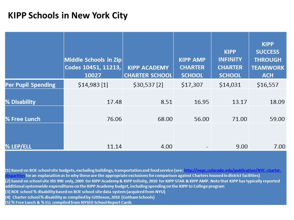
Some more detail in NYC KIPP spending here: https://schoolfinance101.com/wp-content/uploads/2011/10/slide81.jpg

The reality is that the wacky and large expenditure variations that exist across NYC charter schools don’t seem to be correlated with much of anything, individually, but are  correlated with school size and grade range (r-squared between .5 and .6 for those).

Capturing an accurate and precise representation of NYC charter school spending is messy. Not even trying is embarrassing and inexcusable. 

Even worse and most frustrating about this particular paper by Dobbie and Fryer is the absurd lack of documentation, or any real descriptives on the measures they used. Instead, Dobbie and Fryer present a very limited information form of descriptive on per pupil spending (above). We have no idea what Dobbie and Fryer believe are the actual ranges of per pupil spending across their sample of schools? Rather, we have only a measure of the amount above the mean, the high expenditure charters are (I don’t mind standardizing measures, but like to see what I’m dealing with first!) This information is presumably drawn from their survey  – with no definition whatsoever of what is even meant by “per pupil expenditures?” [which is not always a simple question] Did the costs of wrap-around services in Harlem Children’s Zone count?  Dobbie and Fyer’s earlier back of the napkin estimates of HCZ wrap around costs (see below) fall well short of the revenue we identified for HCZ in our report by actually looking at their financial statements.

Even if Dobbie and Fryer did find, in appropriately documented analyses, using more accurate/precise and appropriate spending measures, that spending was not correlated with charter effectiveness estimates in NYC, this would be a very limited finding.

The finding is more limited in light of the fact that the supposedly resource neutral strategies used in their “no excuses” schools aren’t resource neutral at all. Rather, the cost implications of these resource intensive strategies are not carefully explored (similar to the unsatisfying lack of real cost analysis in Fryer’s recent Houston Apollo program study – again, no documentation at all!).

Dobbie and Fryer’s NYC charter study adds nothing to the larger debate on the importance of class size, or financial resources toward improving school quality and/or student outcomes. A much richer, more rigorous literature on this topic already exists, and I will provide a thorough review of that literature at a future point in time.

Tip – surveys of interested parties are not how to get information on finances. Audited financial statements are probably a better starting point, and two forms of such data are available for nearly all NYC charter schools. Further, where specific programs/services are involved, a thorough resource cost analysis (ingredients method) is warranted. This is School Finance (or Econ of Ed) 101.

Other examples of sloppy, poorly documented cost/benefit inferences from recent Dobbie and Fryer papers:

Here’s a segment identified as cost-benefit analysis from Dobbie and Fryer’s paper on Harlem Children’s Zone:

 The total per-pupil costs of the HCZ public charter schools can be calculated with relative ease. The New York Department of Education provided every charter school, including the Promise Academy, $12,443 per pupil in 2008-2009. HCZ estimates that they added an additional $4,657 per-pupil for in school costs and approximately $2,172 per pupil for after-school and “wrap-around” programs. This implies that HCZ spends $19,272 per pupil. To put this in perspective, the median school district in New York State spent $16,171 per pupil in 2006, and the district at the 95th percentile cutpoint spent $33,521 per pupil (Zhou and Johnson, 2008).

http://www.economics.harvard.edu/files/faculty/21_HCZ_Nov2009_NBERwkgpaper.pdf

This paper on Harlem Childrens Zone provides no attempt to validate the $4,657 figure, and no documentation from financial reports to reconcile it. We discuss in our NEPC report, the range of likely expenditures  for HCZ, where $4,657 would be below our low estimates (though 2 years earlier), based on mining actual IRS filings and audited financial reports. Further, it is absurd to compare HCZ spending to NY State mean spending without any consideration for variations in regional costs. It is far more reasonable to compare the relevant spending components to similar schools within NYC serving similar student populations.  Their statement about perspective puts absolutely nothing into perspective, or at least not into any relevant perspective.

Here’s all of the information provided in the Apollo 20 no excuses Houston public schools study:

The experiment’s cost of roughly $2,042 per student – 22 percent of the average per pupil expenditure and similar to the costs of “No Excuses” charters – could seem daunting to a cash strapped district, but taking the treatment effects at face value, this implies a return on that investment of over 20 percent.

http://www.hisd.org/HISDConnectEnglish/Images/Apollo/apollo20whitepaper.pdf

The $2,042 figure is not documented at all. This is where a resource cost analysis would be appropriate (identifying the various resources that go into providing these services, the input prices of those resources, and determining the total costs). Further, it is not cited/documented anywhere in this paper any source that shows that no excuses charters spend about the same. Where? When? Actually, $2,000 per pupil in Texas is one thing and something entirely different in NY? This stuff isn’t trivial and such omissions are shameful and inexcusable.

The Comparability Distraction & the Real Funding Equity Issue

Yesterday, the US Department of Education released a new report addressing how districts qualified for Title I funds (higher poverty districts) often allocate resources across their schools inequitably, arguing that requirements for receiving Title I funds should be strengthened.

The report is here: http://www2.ed.gov/rschstat/eval/title-i/school-level-expenditures/school-level-expenditures.pdf

Related resources here: http://www2.ed.gov/about/offices/list/opepd/ppss/reports.html#comparability-state-local-expenditures

It is certainly problematic that many public school districts have far from predictable, far from logical and far from equitable formulas for distributing resources across their schools. This is a problem which should be addressed. And improving comparability provisions for receipt of Title I funding is an appropriate step to take in this regard.

However, it is critically important to understand that improving within district comparability of resources across schools is only a very small piece of a much larger equity puzzle. It’s a drop in the bucket. Perhaps an important drop, but not one that will even come close to resolving the major equity issues that plague public education systems today.

I have written on this topic previously both on this blog and in peer reviewed publications:

  • Baker, B. D., & Welner, K. G. (2010). “Premature celebrations: The persistence of interdistrict funding disparities” Educational Policy Analysis Archives, 18(9). Retrieved [date] from http://epaa.asu.edu/ojs/article/view/718
  • B. D. (2009). Within-district resource allocation and the marginal costs of
    providing equal educational opportunity: Evidence from Texas and Ohio. Education Policy
    Analysis Archives, 17(3). Retrieved [date] from http://epaa.asu.edu/epaa/v17n3/.
  • Baker, B.D. Re-arranging deck chairs in Dallas: Contextual constraints on within district resource allocation in large urban Texas school districts. DeckChairsinDallas.Baker (forthcoming in Journal of Education Finance)

Among other things, I have pointed out on this blog that one reason why focusing on within district disparities between “rich and poor” schools is misguided is because most of the disparities in wealth among families and children occur across district lines rather than within district boundaries. (2nd major point in post)

The new U.S. Dept. of Ed. report reinforces this overemphasis on within district disparity, ignoring entirely between district disparity. In part, it is perhaps a more politically convenient argument to point blame at local school district officials, rather than states, for not doing their part to improve equity across schools. Local school officials make good targets, but it’s harder to pick on states & state legislatures.

Here’s one way in which the USDOE report casts the disparities:

The report compares the number of Title I (higher poverty) schools that have lower per pupil spending than non-Title I schools in the same district.  This becomes fodder for the news headlines. And I would argue, fuels public distraction from the bigger inequities.

Now, there are a multitude of methodological quibbles I have with this analysis. First, it compares only the average spending of Title I and non-Title I schools within districts, without consideration for other factors which frequently serve as strong predictors of different school site spending across schools within districts (primarily, concentrations of children with disabilities, and district choices to locate specific programs in specific schools). Poverty is one factor – and a very important one at that – but it’s also important to look across the full range of poverty concentration across schools in a district, rather than just splitting schools into Title I and non-Title I. The Deck Chairs in Dallas article above provides examples of the steps one should take to evaluate equity in spending across schools within districts. So too does this article: http://epaa.asu.edu/ojs/article/view/5

But, let’s take a look at the more important issue that is missed entirely in the myopic focus on within district disparities and “blame the local districts” approach to school funding equity.

First stop, Philadelphia. This first graph shows the box plot of elementary school spending per pupil from the data set used in the USDOE report (nice new data to play with!) Philadelphia city elementary schools simply have far less than elementary schools in surrounding districts (in Pennsylvania). THIS IS THE MAJOR EQUITY CONCERN!  Here’s how these funding differences play out along a continuum of all schools in the metro (within PA) with respect to students qualified for free or reduced price lunch:

Philadelphia schools are in Red. Indeed, the pattern of spending per pupil with respect to % free or reduced price lunch is not what I would want/expect to see across schools within Philadelphia. It actually appears somewhat regressive. That is, higher poverty schools within Philadelphia having marginally lower spending per pupil than lower poverty ones. But, there may be some other factors at play (such as special education population distributions) which complicate the interpretation of this relationship. But, we also see that:

  1. the majority of Philadelphia elementary schools have near or over 80% free or reduced price lunch
  2. the majority of schools in this picture that are over 80% free or reduced price lunch are Philadelphia schools
  3. Philadelphia schools have systematically fewer per pupil resources than those of surrounding districts
  4. the majority of other schools in the metro area have fewer than 40% free or reduced price lunch
  5. these much lower poverty schools IN OTHER DISTRICTS have higher average spending.

These are the districts with which Philadelphia must compete to recruit and retain a sufficient quantity of high quality teachers. And it’s clearly a losing battle.

Focusing only on the disparities inside Philadelphia, bringing the comparability hammer down on Philadelphia does little to resolve the bigger funding equity issues that are a function of neglect by the Commonwealth of Pennsylvania, not the city of Philadelphia.

Not all metro areas look this bad. In many cases, central cities are on average or slightly above average for their metro areas. But arguably, not “enough” above average that they have wide latitude to reshuffle their resources aggressively to their higher poverty schools. Note that if Philadelphia did strive to create a strong progressive distribution of resources toward higher poverty schools, all other schools in the district would be left with next to nothing – at least relative to their surroundings. This is the very “deck chairs” issue I discuss in my paper on Dallas (well, actually on Texas as a whole).

It also turns out that many smaller cities, and very poor inner urban fringe areas (with particularly weak tax base) are often as disadvantaged or much more disadvantaged than the urban core. Places we don’t always hear about. Here’s one of my favorite small city examples, Utica, NY:

Utica City elementary schools (1 in Box Plot) have much lower average per pupil spending than elementary schools in surrounding districts.Here’s the scatterplot with respect to % free or reduced price lunch:

Like Philadelphia, there appear to be inequities in resources across Utica City elementary schools. But again, most Utica City elementary schools have over 80% free or reduced price lunch and spend less per pupil than most elementary schools in surrounding districts, many of which are not wealthy districts by any stretch of the imagination. They’re just not as poor as Utica itself. Here’s a little more backdrop on the position of Utica among NY State school districts.

While it is important, and relevant to consider ways to tighten regulations on Title I districts to require that they are allocating resources equitably across schools within their boundaries, we cannot and should not let the emphasis on Title I and Comparability distract us from the bigger equity issues – the harder equity issues to resolve.  While it’s politically convenient to blame local bureaucrats (those overpaid fat cats in large city school district central offices) we must also maintain pressure on states to do the right thing, and ensure that these districts have the resources they need in order to distribute them equitably.

see also: http://www.schoolfundingfairness.org/

Dealing with the Devil? Policy Research in a Partisan World

This note is in response to James O’Keefe’s attempt to discredit me on his Project Veritas web site (though I think his point was intended to larger than this). I was lucky (?) enough to be part of one of his investigative set ups earlier this fall. I wrote and held on to this post and all related e-mails.

His scheme was uncovered in this Huffington Post piece to which he refers in his most recent report:

http://www.huffingtonpost.com/mobileweb/2011/10/17/james-okeefe-economic-policy-institute_n_1015845.html

The story:

Back in September, I was contacted by this fictional Peter Harmon who characterized himself as working for the Ohio Education Association, but never made it absolutely clear that he was working for the state teachers’ union of Ohio. In my case, unlike the EPI case, Harmon didn’t (I don’t recall) indicate being a hedge fund guy or being backed by one, but rather that he had “funders.” He dropped me a phone message and an email which were pretty innocuous, so I agreed to talk by phone. That’s where I pick up in this string of e-mails:

===================================

EMAIL #2 – PHONE CALL SET UP

From: peter.harmon@ohioedassoc.org

Sent: Monday, September 19, 2011 10:14 PM

To: bruce.baker@gse.rutgers.edu;

gse.rutgers.edu/bruce_baker@ohioedassoc.org

Subject: Meeting

Dr. Baker,

Thank you for getting back to me.  We are eager to talk with you about this project. Would 3pm tomorrow work alright for you?

Sincerely,

Peter Harmon

614-468-3941

===================================

Then there was the strange phone call (which I’m quite sure in retrospect was recorded) where first, “Peter Harmon” wanted me to do a study showing that the collective bargaining legislation in Ohio would hurt children, to which I suggested that a) evaluating collective bargaining legislation is outside the realm of my expertise and b) that even if I agreed that it might, I’d have no clear, defensible way to analyze and argue that point.

From there I suggested things that I can and often do analyze and argue, in each case pointing out that the ability to make such an argument is contingent upon data to support that argument. For example, evaluating the competitiveness of teacher wages over time, or evaluating the distribution of state aid cuts. These are two issues on which I have already actually evaluated Ohio data. I pointed out that there are 3 basic types of products we might be talking about – a) critiques of policy reports or arguments by others (for a few thousand dollars), b) policy briefs/research brief reports (typically about ten thousand dollars) or c) full scale research report (thirty to fifty thousand dollars, with clarification that projects of this magnitude would have to go through RU and/or be done over the Summer).  I attempted repeatedly to shift his focus to answerable questions and topics within my expertise, and to topics or issues where I felt I could be helpful to him, on the assumption that he was advocating for the state teachers’ union.

It got strange when Peter Harmon laid down his requirement that if they were going to fund a study, they didn’t want it coming out finding the opposite of what they wanted. I did explain that if he had a topic he was interested in, that I would be willing to explore the data to see if the data actually support his position on the issue and that I would do so before agreeing to write a report for him. The phone call ended with no clear agreement on anything, including no agreement on even what the topic of interest was.  In fact, my main point was repeatedly that he needed to figure out what the heck he even wanted to study, though I tried to keep it friendly and supportive. No reason to argue on a first phone call.

It was a strange and disturbing conversation, but I played along until I could get off the phone with the guy. Note that the playing along in a conversation like this also involves trying to figure out what the heck is up with the caller – whether he/she has a particular axe to grind – or other issues that would make any working relationship, well, not work out.

Sadly, as twisted as this phone call was, I’ve had similarly twisted conversations with real representatives of legitimate organizations. However, with most legitimate organizations, you can later identify the less sleazy contact person. My approach has generally been to humor them while on the phone… perhaps probe as to see how twisted they really are… and when the phone conversation ends….let it pass. Move on.

Then came the follow up:

===================================

EMAIL #3 – HARMON FOLLOW-UP

From: peter.harmon@ohioedassoc.org [mailto:peter.harmon@ohioedassoc.org]

Sent: Friday, September 23, 2011 10:01 AM

To: bruce.baker@gse.rutgers.edu; gse.rutgers.edu/bruce_baker@ohioedassoc.org

Subject: Next Meeting

Dr. Baker,

I have good news, my colleagues are very interested in moving forward.

We are confident we can cover the expense of this potential study.

We have a few ideas we would like to run by you for this project.

When would be a good time to call you next?

Regards,

Peter Harmon

614-468-3941

===================================

So now, Harmon is basically suggesting that he can generate the $30 to $50k figure which I had given him for a bigger study, a figure I had basically given him to encourage him to think about doing something else – like contracting a few short policy briefs or critiques. But, he still has no idea what he supposedly wants me to write about. Quite honestly that’s really strange. So my response is simple – it’s essentially a get your act together and don’t both me again until you do. In other words, here are a few examples of the work I do and am proud of. Figure out your damn question and let me know when you do.

===================================

EMAIL #4 – BAKER REPLY

From: Bruce Baker [bruce.baker@gse.rutgers.edu]

Sent: Friday, September 23, 2011 10:06 AM

To: ‘peter.harmon@ohioedassoc.org’

Subject: RE: Next Meeting

Rather busy for next week or so. Would prefer if you could at least send an outline of potential topics & research questions of interest, so I can mull them over.

For examples of reviews/critiques of policy reports, see:

http://nepc.colorado.edu/thinktank/review-middle-class

http://nepc.colorado.edu/thinktank/review-spend-smart

For an example of a policy brief/research report, see:

http://nepc.colorado.edu/publication/NYC-charter-disparities

http://nepc.colorado.edu/publication/private-schooling-US

Thanks.

Bruce Baker

===================================

Here’s Harmon’s attempt at figuring out his question:

===================================

EMAIL #5 – HARMON REPLY

Dr. Baker,

Thanks for getting back to us.

Once of the topics we want to pursue is research regarding spending.

Specifically and increase in spending having a good effect on children. If you need to limit the scope of your research to a specific county, district or other local geographic area. that’s OK.

I will take a closer look at the examples you sent on your last email to get a better idea of what you would like from our end.  But,I hope this more specific goal better illustrates what we are looking for.

Let me know when would be good time to call, so I can clarify whatever questions you have about this.

Peter Harmon

614-468-3941

===================================

So, Peter Harmon wants me to explain, or more strangely to show that increasing spending is good for children. Okay. Anyone even modestly informed would know that’s an odd way to frame the question or issue. But clearly, given my body of work, I have argued on many occasions in writing and in court that having more funding available to schools can improve school quality, which is something I would certainly argue is good for children. Would I somehow use data on a specific district or county to do this? No…. uh… not sure? I’d probably start with an extensive review of what we already know from existing research on money and school quality.

At this point, I’m ready to drop the whole discussion, but receive an e-mail notice of a new Economic Policy Institute paper on public employee wages in Ohio. So, to save Mr. Harmon money paying for a new study on this topic, I a) send him a link to that study, and b) explain that I’m already working on a paper related to his issues of concern.

=================================== 

 EMAIL #6 – BAKER REPLY

From: Bruce Baker [bruce.baker@gse.rutgers.edu]

Sent: Thursday, October 06, 2011 10:44 AM

To: ‘peter.harmon@ohioedassoc.org’

Subject: FYI

From one of my Rutgers colleagues:

Click to access Briefing_Paper_329.pdf

Working on some related projects myself, which may be of use to you in near future. Will be back in touch as schedule frees up.

Bruce

===================================

And so it ended. And as I suspected by this point, it appears that this whole thing was a sham… and an attempt at a sting. Interestingly, this appears to be when Harmon moved on to go after EPI.

Quite honestly, O’Keefe’s concept for the investigation isn’t entirely unreasonable except that he and his colleagues didn’t seem to fully understand the fundamental difference between research projects per se, and policy analyses – between writing summaries and opinions based on data that already exist and research that’s already been done – versus exploring uncharted territory – where the data do not yet exist and where the answers cannot yet be known.

At this point, I think a few clarifications are in order about doing policy research, or more specifically writing policy briefs in a highly political context.

First, why would I ever vet the data on an issue before signing on to do work for someone? Well, this is actually common, or should be in certain cases. For example, let’s say the funder wants me to show that “teachers in Ohio are underpaid.” I don’t know that to be true. I’m not going to take his money to study an issue where he has a forgone conclusion and a political interest in that conclusion but where the data simply don’t support that conclusion. It is relatively straight forward for me to check to see if the data support the conclusion before I agree to write anything about it. This is an easy one to check. There are a standard set of databases to use, including statewide personnel data, census data and Bureau of Labor Statistics data and there are standard credible methods for comparing teacher wages. If the argument holds up applying the most conservative (most deferential analysis to the “other side” of an argument) analysis, then it’s worth discussing how to present it or whether to move forward.

A different type of example which I’ve learned by experience is that it’s always worth taking a look at the data before engaging as an expert witness on a school funding related case. I often get asked to serve as an expert witness to testify about inequities or inadequacies of funding under state school finance systems. Sometimes, attorneys have already decided what their argument is based only on the complaints of their clients. It would be utterly foolish of me to sign on to represent those clients and accept payment from them without first checking the data to see if they actually have a case.

Then there’s the issue of doing work for partisan clients to begin with. That’s a different question than doing work for sleazy clients. But sometimes, if it’s a legitimate organization, there may be a sleazy contact person, but further checking reveals that the organization as a whole is credible – and not sleazy. But back to the point…

Quite honestly, the toughest kind of policy analysis to do is for partisan clients – clients with an axe to grind or a strong interest in viewing an issue in one particular way. That is usually the case in litigation and increasingly the case when it comes to writing policy briefs on contentious topics. What this means is that the analyses have to be “bullet-proof.” There are a few key elements to making an analysis “bullet proof.”

First, the analysis must be conservative in its estimates and one must avoid at all cost overstating any claims favored by the client. In fact, the analysis needs to be deferential, perhaps even excessively, to the opposing view.

Second, the analysis must use standard, credible methods that are well known, well understood and well documented by others. Examples in my field would include comparable wage analysis, or wage models which typically include a clearly defined set of variables.

Third, the analysis must rely on publicly accessible data, with preference for “official” data sources, such as state and federal government agencies. This is because the analyses should be easy for any reader to replicate by reading through my methods and downloading or requesting the data.

So here are my final thoughts on this issue…

If this kind of stuff causes anyone to place greater scrutiny on my work of that of any others writing policy briefs on contentious topics that’s fine. It’s not only fine, but desirable. I am fully confident that my work stands on its own. Unlike some, I don’t simply take a large commission to offer my opinion without ever having looked at any data. For example, Eric Hanushek of Stanford University took $50,000 from the State of Colorado to testify that more money wouldn’t help kids and that Colorado’s school funding system is just fine, without ever having looked at any data on Colorado’s school funding system. See:

http://www.edlawcenter.org/news/archives/school-funding/what-hanushek-shows-up-again.html?searched=hanushek&advsearch=oneword&highlight=ajaxSearch_highlight+ajaxSearch_highlight1

By contrast, I did indeed accept a payment of $15,000 for writing a nearly 100 page report filled with data and detailed analyses of Colorado’s school funding system raising serious questions about the equity and adequacy of that system (available on request). In fact, I had already come to the conclusions about the problems with Colorado’s school funding system long before I was engaged by the attorneys for the plaintiff districts (as one will find in many of my blog posts referring to Colorado).

My rule #1 is always to check the data first and to base my opinions on the data. So I welcome the scrutiny on my work and I especially welcome it directly. If you have a criticism of my work, write to me. The more scrutiny on my work the better.

=========

Note #1: for an example of the types of policy briefs and/or analyses to which I am referring here, see:  NY Aid Policy Brief_Fall2011_DRAFT6

In my view, this is a solid, rigorous and very defensible analysis. It is a policy brief. It uses numerous sources of publicly available data. And, it was written on behalf of an organization which has self-interested concerns with the NY school finance formula.

Note #2: Indeed there were some poor word choices on my part in the phone conversation. “Play with data” is how I tend to refer to digging in and vetting the data to see what’s there. This blog is dedicated to what I would refer to as playing with data.  Looking stuff up. Downloading large data files (IPUMS, NCES). Running statistical models. My friends and colleagues, as well as my students know full well that I take great joy in working with data and that I consider it play.  But I’ll admit that it sure doesn’t sound too good when taken out of that context.

Note #3: A few people have asked about the portion of the conversation where I suggest that if I find results that do not support the funders’ views, I will not charge them for the work. Some have suggested that this is an example of burying an undesirable result, which would in my view be unethical. So, what’s the point of not charging them? Actually, it’s so that the result won’t get buried. If I do a bunch of preliminary data analyses only to find that the data do not support a funder’s claims/preferences, I’d rather not write up the report for the funder and charge him/her, because they then own the report and its findings, and have the control to bury it if they so choose. Now, I typically don’t permit gag-order type clauses in my consulting contracts anyway, but, it’s much easier just to avoid the eventual pissing match over the findings and any pressure to recast them, which I will not do.  If I keep the results of my preliminary work for myself, then I have complete latitude to do with them as I see fit, regardless of the funder’s preferences. It’s my out clause. My freedom to convey the findings of any/all work I do.

I’ve come to this approach having had my results buried in the past on at least two occasions, one in particular where the funder clearly did not want the results published under their name due in part to pending litigation in which they were a defendant. Much to my dismay, the project coordinators (agency that subcontracted me) capitulated to the funder. I was, and remain to this day, deeply offended by the project coordinator’s choice under pressure by the funder, to edit the report and exclude vital content. Yeah… I got paid for the work. But the work got buried, even though the work was highly relevant. I’m unwilling to go down that road again.

License to Experiment on Low Income & Minority Children?

John Mooney at NJ Spotlight provided a reasonable overview of the NJDOE waiver proposal to “reward” successful schools and sanction and/or takeover “failing” ones.

The NJDOE waiver proposal includes explanation of a new classification system for identifying which schools should be subject to state intervention, ultimately to be managed by regional offices throughout the state. This new targeted intervention system classifies districts in need of intervention as “priority” districts, with specific emphasis on “focus” districts. Mooney explains:

In all, 177 schools — known as Focus Schools — fell into this category, largely defined as the bottom 10 percent in terms of the achievement gaps between the highest- and lowest-performing student groups over three years.

http://www.njspotlight.com/stories/11/1117/0003/

The new system also has a reward program:

The same list also includes the schools that the state designates as Reward Schools, based on both their overall achievement and their progress. Reward Schools with high poverty concentrations will also be rewarded with cash: $100,000 each.

http://www.njspotlight.com/stories/11/1117/0003/

But, some significant questions persist as to whether the state is over-reaching its authority to intervene in the “focus” and priority schools. Here are a few comments from a related article:

“Consistent with state law, they can go in and direct districts to take particular actions,” said David Sciarra, director of the Education Law Center that has spearheaded the Abbott litigation. “All of that, they clearly have the authority to do.

“But nothing that I am aware of allows them to close existing schools,” he said. “And they have no power to withhold funds. That’s even outside the scope of the federal guidelines. ”

Paul Tractenberg, a Rutgers Law School professor and noted expert on education law, said he also questioned whether the application’s reform plans ran counter to the state’s current school-monitoring system, the Quality Single Accountability Continuum (QSAC).

“As a constitutional matter, it is pretty clear the commissioner has whatever power he needs to ensure a thorough and efficient education,” he said. “But that’s different than saying if there is a legislation out there, he can just ignore it.”

In terms of significant alterations such as reassigning staff or directing changes in collective bargaining, Tractenberg said, “there are all kinds of big-time issues about their legal authority to do that.”

http://www.njspotlight.com/stories/11/1117/2359/

Of course, a related twist here is just which schools are involved. NJDOE like other state agencies has adopted a set of performance metrics most likely to single out schools serving the largest shares of low income and minority students for dramatic interventions – for school closure – or for major staffing disruptions (strategies with little track record of success).

Here’s the breakdown of which schools will be subject to closure, staff replacement or other intervention, versus those who will be left alone and those eligible for a check for $100,000.


When considering racial composition, poverty and geographic location (metro area) simultaneously as predictors of school classification:

  • A school that is approaching 100% free lunch is nearly 30 times more likely to be classified as a focus school (as opposed to all other categories including priority) than a school that is 0% free lunch.
  • A school that is approaching 100% free lunch is nearly 60 times more likely to be either a priority or focus school (compared to all other options) than a school that is 0% free lunch.

While the typical FOCUS school is 26% black, 39% Hispanic and 51% free lunch, the typical reward school is 7.2% black, 11.3% Hispanic and 10.3% free lunch.

[note: several NJ schools had missing data in the 2009-10 NCES Common Core of Data which were merged with the NJDOE schools list http://www.njspotlight.com/assets/11/1116/2300. Total school enrollment data were most commonly missing, and where possible were replaced with the sum of racial subgroup data for calculating racial composition. Complete data were matched and available for 160 of the 177(9?) focus schools and 120 of the 138(?) reward schools. Thus, I am sufficiently confident that the above patterns will hold as remaining missing data are added.]

NJDOE will likely argue that they are intervening in these schools because poor and minority kids are the ones getting the worst education, which may in part be true. But causal attribution to the teachers and administrators in these schools and districts stands on really shaky ground – especially on the statistical basis provided by NJDOE.  The accountability framework chosen is merely identifying schools by the extent of the disadvantage of the students served and not by any legitimate measures of the quality of education being provided.

Further, and perhaps most disturbing, is that this policy framework, like those proposed and used elsewhere is, in effect,  (self-granted) license for NJDOE to experiment on these children with unproven “reform” strategies which are as likely to do harm as to do good (that is, likely to do more harm than even simply maintaining the status quo).  Helen Ladd’s recent presidential address at the Association for Public Policy Analysis and Management provides exceptional insights in this regard!

Why we need those 15,000+ local governments?

Neal McClusky at Cato Institute makes a good point about our casual, imprecise use of the term “democracy” in the post linked here. I did not delve into this in my previous post, and more or less allowed the imprecise terminology to slip past. Clearly there are huge differences between simple majority rule through direct democracy and our constitutional republic with separation of powers, and I certainly favor the latter.

My original point was that Bowdon completely misrepresents not just a single judicial decision in Georgia, but the notion of the “will of the people” as expressed through our form of government, especially in Georgia and especially in this case. By Bowdon’s strange logic, the will of the people in Georgia is only expressed through the legislation adopted by elected state officials – the state legislature. Local elected officials apparently don’t count – and in Bowdon’s view, the choice of these local elected officials to challenge the constitutionality of state legislative action is somehow an attack on the will of the people. Further, the judicial mediation of this dispute – by an elected judiciary – is an extension of that attack on the will of the people?

Really, the big question which goes back to Mike Petrilli’s post is determining the right balance between centralized versus local control, as carried out by our elected officials at each level. Certainly the process of electing our officials at either the local, state or federal level can become corrupted over time. Local elections can be corrupted (or at least become less expressive of the “will of the people”) by imbalanced influence (the will of some preferred more than others) on those elections and so too can state and federal elections. It would seem that Petrilli’s core argument is that local elections are necessarily most corrupt and most imbalanced because, as he sees it, local elections are entirely controlled, essentially owned by teachers’ unions, whereas state and federal elections clearly remain more pure? less influenced by imbalance of money/power? So, essentially, Mike’s argument is that we must negate the policy decision making power of the most corrupted level of the system, which in his view, are local elected officials. I find that a really hard argument to swallow.

Alternatively, on can argue in favor of centralization, as I used to (and still do on some occasions), that the higher levels of government should – by representing larger and more diverse constituencies and by having greater access to resources (including bigger budgets) – be able to accumulate better technical capacity to make more informed policy decisions. That is, to develop/design/adopt policies better grounded in technical analysis of what works. I’ve become increasingly cynical on this point of late, and quite honestly, I’m generally unwilling to see the overall power distribution shift more heavily from local to state, especially to federal policy decision making.

I still feel strongly that due to economic inequities in tax base and other measures of collective fiscal capacity of communities to provide schools – many of which were induced by policies of housing segregation and discrimination – that states must play a strong role in revenue redistribution in order to ensure that children, regardless of where they live, have access to equitable and adequate schooling.This perhaps where my perspectives begin to diverge most dramatically from McClusky’s preferred policy solutions (though we’ve not debated/discussed the particulars).

I still feel that state agencies can (in their better days), perhaps provide technical support to local schools and districts which are struggling, but I fear that state agencies (departments of education) have become increasingly politicized and instead of providing technical support, are now invariably promoting political agendas (perhaps I’m just waking up to something that’s been occurring all along?), and in many cases forcing ill-conceived politically motivated “reforms” on struggling districts and schools (rather than ensuring access to sufficient resources). See my previous post on pundits vs. practitioners.

So, at this stage in my life and career, I’m not willing to cede to the idea of eliminating entirely the role of local elected officials (or even unbalancing these roles further), as Mike Petrilli might wish. Nor do I accept that a reason for eliminating local elected officials from the mix is that local elections are most corrupted by money & uneven influence (of unions?). This seems merely an argument of convenience from the Petrillian standpoint that right now, he just happens to agree more with the policies of states – and potential to influence federal policy in order to control states – than the current push-back of locals. That’s a rather common perspective from inside the beltway (physically or mentally). It’s logistically easier for an organization like Fordham Institute (which casts itself as providing research/technical guidance?) to have disproportionate impact on policy through a single locus of control – federal gov’t – than through 15,000 local governments (that takes a lot of leg work). And that’s precisely why we need those 15,000+ local governments!

Logic and Facts, not Democracy, be Damned!

Thanks to good ol’ Mike Petrilli, much of this week’s education policy debate has centered on the relevance of local school boards and the age old tug-of-war between state and local authority over the operation and financing of local public school districts. Much of the debate has been framed in terms of “democracy,” and much of it has been rather fun and interesting to watch.  That is, until Mike and the crew at Fordham decided to let Bob Bowdon (of Cartel fame) join in the conversation, and inject his usual bizarre understanding of the world as we know it.

This time, jumping in where Petrilli had left off, Bowdon opined about how teachers unions and their advocates repeatedly cry for respecting democracy while consistently thwarting democratic efforts through legal action. The layers of absurdity in Bowdon’s  logic are truly astounding, and perhaps best illustrated by walking through one of the examples he chooses.

Here’s how Bob Bowdon explains the Georgia charter school governance and finance decision of May 2011:

When the elected legislature in Georgia authorized the state’s chartering of schools, the Georgia Association of Educators union wasn’t so happy with the voice of the people. They later filed a brief in support of a lawsuit to strike down the law — and that suit prevailed. Democracy be damned.

http://www.educationgadfly.net/flypaper/2011/11/who-has-a-problem-with-democracy/

So, according to Bob Bowdon, the way this really ambiguously referenced case played out was that the Georgia legislature acting entirely on the will of the good Georgians that elected them, passed a law establishing a statewide commission to oversee the operation and distribution of funding to charter schools. The state teachers union got pissed simply because they don’t like charter schools. The teachers union filed a brief with a sympathetic liberal activist court, which then, under no authority at all… merely being responsive the gripes of the teacher’s union, struck down the charter law. A major blow against democracy. Democracy be damned!

Okay. Let’s take a closer look at what actually happened.  One reasonable summary can be found here: http://www.accessnorthga.com/detail.php?n=238715, see also: http://www.earlycountynews.com/news/2011-05-18/Front_Page/Court_ruling_leaves_charter_schools_in_limbo.html

First, let’s acknowledge that Georgia, like other states has a) elected state officials – the legislature – who pass laws, such as the charter school law they had passed which would allow a state commission to redirect county funding (county and area district tax revenues) to charter schools established within their boundaries [by way of reducing state aid in a equal amount], b) county and area boards of education charged with establishing and maintaining public schools within their limits, and c) a State Constitution which outlines these responsibilities (http://www.sos.ga.gov/elections/GAConstitution.pdf, bottom of Page 60). That’s kind of how stuff works in U.S. States.

The County board of education in Gwinnett County, GA was not thrilled when they were informed they would be required to transfer significant funds to charter schools established under the legislatively granted authority of the state commission. The county board of Gwinnett County (joined by many others to follow) challenged in court that the legislature violated the constitution by granting authority to this state commission to redistribute county tax revenues – and more specifically – to establish and maintain schools (that would draw on such tax revenues).  So, one level of elected officials – county officials – challenged that another level of elected officials – the state legislature – had interfered with their explicitly stated constitutional authority. And the court mediated this dispute (uh… ‘cuz that’s what courts do), finding in favor of the elected officials whose authority to establish and maintain schools was clearly articulated in the constitution?

How in the hell is that a case of “democracy be damned?”  How is this a case of a union thwarting the “voice of the people.” Quite honestly, these are among the most bizarre, warped distortions of reality I’ve seen in a damn long time.

That makes about as much sense as the rest of the arguments in the Cartel movie, or in the graphs at the end of this post!


Note: Another fun twist here is that apparently, in Georgia, judges are elected (http://www.georgiaencyclopedia.org/nge/Article.jsp?id=h-2841). Democracy be damned I tell you! How can these elected officials overturn the will of the people as expressed by the elected legislature, when challenged in court by elected county officials?

The Wrong Thinking about Measuring Costs & Efficiency in Higher Education (& how to fix it!)

There is a movement afoot to reduce the measurement of the value of public institutions of higher education to a simple ratio of the revenue brought in by full time faculty members divided by the salaries and benefits of those faculty members. That is, does each faculty member “pay” for him or herself, on an annual cash flow basis?[1]

Even some of the finest major public colleges and universities have recently succumbed to reporting such information, arguably, in an effort to appease politically motivated critics.[2] This seemingly simple ratio of the “net cost” of faculty salaries and benefits is presumed representative of the relative efficiency of higher education institutions and/or entire public systems of higher education.

This is a dreadfully oversimplified if not simply wrongheaded approach to measuring the cost of providing public higher education.  It is also a simply wrong approach to characterizing the efficiency of production of higher education institutions or higher education systems, largely because the approach ignores entirely the question of what higher education institutions produce. More importantly, measuring institutional performance and efficiency in this way does little or nothing to inform policymakers or institutional leaders on how to get more bang for the buck from higher education. That is, how to generate greater economic benefit to the state or society as a whole, by achieving more efficient production of an educated citizenry.

Arguably, the greatest economic (setting aside cultural and social) value-added of public higher education systems is achieved when those systems can efficiently transform high school graduates into college graduates, with all of the economic and societal benefits bestowed on them (at least in relative terms). This is especially true for high school graduates from low-income backgrounds, including first generation college students. Accepting an economic emphasis, public higher education institutions can and should substantially improve the economic outlook and lifelong earnings of students who otherwise have the least likelihood of college degree completion. Thus, public higher education’s role in providing value added to the economy and to society as a whole.

As such, what we must begin to better understand is how colleges and universities can improve the efficiency with which they produce undergraduate (and graduate) degrees across a variety of fields, and for students of varied backgrounds. Further, we must establish metrics of cost and efficiency that promote the right incentives for faculty and institutions of higher education to improve degree production, especially for those students previously least likely to complete their undergraduate education in a timely and efficient manner. The current policy rhetoric and proposed metrics do little or nothing to advance these policy objectives.

Flawed Reasoning and Bad Incentives of the Net-Value Approach

Under the politically popular model of faculty “net value,” the basic underlying assumption is that higher education faculty are worth as much as the sum of a) the grant funding they bring to the institution and b) the number of student credit hours they produce, thus generating tuition revenue. It is then assumed that if the state subsidized portion of the faculty member’s salary is greater than the sum of the other two values, that faculty member is inefficient (or not worth it).  Therefore, the incentives for any faculty member formally evaluated or even informally characterized by this model are to either, track down enough external grant and contract funding to pay in full, his or her own salary and/or to teach enough large sections of large classes and recruit enough students into his or her classes to cover salary and benefits. The same incentives similarly apply to all faculty. But both are counterproductive incentives.

If the mission of public higher education is to produce an educated citizenry that contributes to the economy and society as a whole, as well as being a direct engine of economic development through research and scholarly productivity, then having all faculty focus their efforts on chasing external funding to cover their costs and reduce or eliminate teaching from their responsibilities is counterproductive.  Second, production of credit hours and generating tuition may also operate at odds with helping college students progress most efficiently toward degree completion. Maximizing course enrollments generates tuition and credit hours, but may actually reduce time-to-completion as more students get lost in the shuffle. It also reduces the incentive to provide lower enrollment higher level courses that may improve completion rates.

The net-value metric is at best neutral to whether institutions try to move students forward toward completion, or allow them to flounder, repeat numerous (large enrollment) courses and never quite reach the end goal. That just doesn’t make sense, on many levels.

Finally, using this net-value metric forces the same incentive structure onto all faculty members uniformly, encouraging them to act as autonomous agents choosing either one or other approach to covering their margin.

Understanding the Role of Student Behaviors

How might we better think about productivity and efficiency in higher education? Again, consider that a primary goal is the efficient production of degreed or credentialed graduates. That is, taking high school completers and moving them efficiently through their coursework to degree completion, at which point they are likely to, at the very least, be a higher wage earner than they otherwise might have been, and in an even better light might be more likely to contribute more significantly to the economy and society as a whole.

Higher education institutions consist of a maze of pathways often navigated naively (or at least irregularly) by college students trying to find their way toward that light at the end of the tunnel. Evaluating the relative efficiency of higher education institutions requires that we better understand these student behaviors – student course taking patterns – and figure out a) which behaviors seem to be more (and less) associated with successful degree completion and b) whether institutional constraints or supports make any difference. It is naïve, if not completely ignorant to try to evaluate the productivity or efficiency of higher education systems and their economic contributions (or financial drain) without considering these student behaviors and how to influence them.

On the one hand, understanding student pathways helps us understand who is more likely to complete their degree in a timely manner. Further, for those critics of higher education who believe that too many students are pursuing (or at least completing) “useless” degrees in “unproductive” fields, it is important to understand how and why students migrate across degree programs through course selection behavior.

For example, let’s say that we believe society needs more electrical engineers than economists, a reasonable assertion indeed! (note the old adage that majoring in EE [electrical engineering] refers to “eventual economics”). Evaluation of course taking behaviors may reveal that many EE majors become economics majors (without really wanting to) after performing poorly in specific lower level engineering courses, for a variety of reasons. It may be that these students would still have been great engineers and would have flourished in their higher level courses. But perhaps course delivery approaches (large lectures) lack of supports or other institutional barriers are partly at fault.  Identifying these barriers and shifting institutional policies may lead to an increased production of electrical engineering completers (and most importantly a decrease in future economists).

Linking Student Behaviors to their Cost & Efficiency Implications

Building on understanding student pathways, we should shift our focus toward the way groups of faculty members and the sequences of courses (and degree programs) they provide lead to differences in the likelihood of degree completion, differences in time to completion and differences in the total costs of degree completion.  This is another area where higher education cost research has gone awry in the past. One cannot calculate the differences in costs of producing an economics versus an engineering major by simply looking at the costs of operating those departments. Departments are top down organizational units of universities. But students pursuing a degree in any one field take courses across many units. Instead, we can estimate the cost per credit hour for any one student taking any course in the university, and can then estimate the cumulative costs of common student pathways, and identify the higher and lower average and total cost pathways toward achieving any one degree.

Taking this approach, we might find, for example, that offering smaller class sizes (thus higher unit cost) in specific lower tier courses decreases the likelihood of repeating those courses and/or increases likelihood of successful completion of subsequent courses, leading to an overall more efficient pathway to degree completion.  But under the current model of evaluating the net cash value of faculty, the incentive works in the opposite direction by encouraging filling seats over completing degrees and programs.

We might find that offering additional supports for students from disadvantaged backgrounds (who attended high schools with weaker math and physical science programs) taking their lower level courses in engineering calculus leads to greater likelihood of timely degree completion in electrical engineering. Further, that doing so significantly decreases average cost to degree completion by decreasing course repeats.  Again, the current net-value approach creates the opposite incentive, favoring course repeats to beef up credit hour production in high enrollment lower level classes.

In reality, the unit costs of any single course, or net value of the faculty member delivering that course, matter far less than how that course more broadly influences the cost of degree completion overall.

Institutional and Public Policy Implications

For progress to be made in the current policy conversations around higher education costs and efficiency, we must improve our metrics and must link new metrics to a much deeper understanding of just how higher education systems work, the role of individual student behaviors and the complexity of the delivery systems and institutional structures designed to serve those students.

We must also be cognizant of the fact that higher education systems are not uniformly, as often characterized in policy rhetoric, stagnant structures of ancient origin, assuming a single woefully inefficient, exorbitantly costly and arcane governance and program delivery structure. Arguably, many elite institutions which best fit this caricature (elite private liberal arts colleges), while sustaining themselves with very high tuition, also achieve very high degree completion rates, albeit for the most advantaged high school graduates.

By contrast, in recent decades we have seen a dramatic proliferation of alternative delivery mechanisms, including rapid expansion of online and for profit higher education institutions. Further, many of these alternative delivery institutions have begun to disproportionately serve high school graduates with the least likelihood of timely (6 year or less) degree completion and have done so at substantial public expense through access to federal student loans. If evaluated on a net-value of faculty basis, these institutions likely look quite good. They must in order to achieve their desired financial bottom line. Yet, their financial bottom line (and in some cases stock value) comes at the taxpayer expense of high rates of loan default and societal and economic expenses of dismal rates of completion of meaningful degrees or credentials.

Getting higher education cost and efficiency measures right is critically important for informing the policy debate and for informing institutional practices. Getting these measures right means the difference between incentivizing non-productive course credit and financial debt accumulation versus incentivizing timely degree completion. When one group of students completes their degrees in a timely fashion, institutions have more resources available for the next wave. Finally, getting these measures right means the difference between a) having each and every faculty member in public institutions of higher education operate autonomously and inefficiently out of self-interest, often to the disadvantage of their students, or b) having faculty working collectively with colleagues and their institutions to improve degree production for the benefit of students, and the broader economy.


Professionals 2: Pundits 0! (The shifting roles of practitioners and state education agencies)

Professionals, Pundits and Evidence Based Decision Making

In Ed Schools housed within research universities, and in programs in educational leadership which are primarily charged with the training of school and district level leaders, we are constantly confronted with deliberations over how to balance teaching the “practical stuff” and “how to” information on running a school or school district, managing personnel, managing budgets, etc. etc. etc., and the “research stuff” like understanding how to interpret rigorous research in education and related social sciences (increasingly economic research).  Finding the right balance between theory, research and practice is an ongoing struggle and often the subject of bitter debate in professional programs housed in research universities.

Over the past year, I’ve actually become more supportive of the notion that our future school and district leaders really do need to know the research, understand statistics and other methods of inquiry and be able to determine how it all intersects with their daily practice, even when it seems like it couldn’t possibly do so.

Unfortunately, a major reason that it has become so important for school leaders to know their shit is because state agencies, including departments of education, which to some extent are supposed to be playing a “technical support role,” have drifted far more substantially toward political messaging than technical support, and have in many cases drifted toward driving their policy agendas with shoddy fact sheets, manifestos and other shallow, intellectually vacuous but “easy to digest” Think Tank fodder.

In many cases, this intellectually vacuous, technically bankrupt think tank fodder is actually being trotted out by state education agencies as technical guidance to local school administrators.

Punditry in NY State

SchoolFinanceForHighAchievement

commissioner-nyscoss-presentation-092611

nyssba2011

For example, I’ve mentioned these two graphs previously on this blog, which have now been repeatedly trotted out by New York State Education Commissioner John King in presentations to local school officials.

The first graph fabricates an argument that putting more funding into current practices in schools would necessarily be less efficient than putting more funding into either a) alternative compensation schemes which pay teachers based on performance (or at least not on experience and degree level) or b) tech-based solutions. While the latter is never even defined, neither has been shown to produce

Figure 1

The second graph basically argues that most money currently in schools is simply wasted because it’s allocated to portions of compensation that aren’t directly tied to performance. More or less and extension of the first graph, by a different author.

Figure 2

The latest version of the NYSED/King presentation also includes an exaggerated representation of what some refer to as the Three Great Teachers legend. That is, based on estimates from a study in the 1990s, that having three great teachers in a row can close any/all achievement gaps. This is a seriously misguided overstatement/extrapolation from this one study.

Figure 3

To put it bluntly, these various materials compiled and presented by the New York State Education Department are, well, in most cases, not research at all, and in the one case, a gross misrepresentation of a single piece of research on a topic where there are numerous related sources available.

NY Professionals Respond (albeit not directly to the information above, but concurrent with it)

Thankfully, a very large group of Principals on Long Island have been doing their reading, and have been making more legitimate attempts to understand and interpret research as applies to their practice.

APPR_Position_Paper_10Nov11

The principals were primarily concerned with the requirement under new state policies that they begin using student assessment data as a substantial component of teacher evaluation. The principals raised their concerns as follows:

Concern #1: Educational research and researchers strongly caution against teacher evaluation approaches like New York Stateʼs APPR Legislation

A few days before the Regents approved the APPR regulations, ten prominent researchers of assessment, teaching and learning wrote an open letter that included some of the following concerns about using student test scores to evaluate educators1:

a) Value-added models (VAM) of teacher effectiveness do not produce stable ratings of teachers. For example, different statistical models (all based on reasonable assumptions) yield different effectiveness scores.2 Researchers have found that how a teacher is rated changes from class to class, from year to year, and even from test to test3.

b) There is no evidence that evaluation systems that incorporate student test scores produce gains in student achievement. In order to determine if there is a relationship, researchers recommend small-scale pilot testing of such systems. Student test scores have not been found to be a strong predictor of the quality of teaching as measured by other instruments or approaches4.

c) The Regents examinations and Grades 3-8 Assessments are designed to evaluate student learning, not teacher effectiveness, nor student learning growth5. Using them to measure the latter is akin to using a meter stick to weigh a person: you might be able to develop a formula that links height and weight, but there will be plenty of error in your calculations.

Citing:

  1. Baker, E. et al. (2011). Correspondence to the New York State Board of Regents. Retrieved October 16, 2011 from: http://www.washingtonpost.com/blogs/answer-sheet/post/the-letter-from-assessment-experts-the-ny-regentsignored/2011/05/21/AFJHIA9G_blog.html.
  2. Papay, J. (2011). Different tests, different answers: The stability of teacher value-added estimates across outcome measures. American Educational Research Journal 48 (1) pp 163-193.
  3. McCaffrey, D. et al. (2004). Evaluating value-added models of teacher accountability. Santa Monica, CA.; Rand Corporation.
  4. See Burris, C. & Welner, K. (2011). Conversations with Arne Duncan: Offering advice on educator evaluations. Phi Delta Kappan 93 (2) pp 38-41.
  5. New York State Education Department (2011). Guide to the 2011 Grades 3-8 Testing Program in English Language Arts and Mathematics. Retrieved October 18, 2011 from http://www.p12.nysed.gov/apda/ei/ela-mathguide-11.pdf .
  6. Committee on Incentives and Test-Based Accountability in Education of the National Research Council. (2011). Incentives and Test-Based Accountability in Education. Washington, D.C.: National Academies Press.
  7. Baker, E. et al (2010). Problems with the use of test scores to evaluate teachers. Washington, D.C. Economic Policy Institute. Retrieved October 16, 2011 from: http://epi.3cdn.net/b9667271ee6c154195_t9m6iij8k.pdf; Newton, X. et al. (2010). Value-added modeling of teacher effectiveness: An exploration of stability across models and contexts. Education Policy and Analysis Archives. Retrieved October 16, 2011 from http://epaa.asu.edu/ojs/article/view/810/858. ; Rothstein, J. (2009). Student sorting and bias in value-added estimation: Selection on observables and unobservables. Education Finance and Policy, 4(4), 537–571.

In short, the principals built their case against the punditry that’s been hoist upon them, on a reasonable read of existing research. Thankfully, they had the capacity to do so, and the interest in pursuing guidance from experts around the country in crafting their response. I urge you to read the remainder of their memo and compare the rigor of evidence behind their arguments to the type of content that has most recently been presented to them in recent months.

New Jersey Punditry

The New York principals backlash was relatively high profile. A similar situation occurred last winter/spring in New Jersey, but went largely unnoticed, at least nationally.  At that time, a Task Force established by the Governor released its report on how to reform teacher evaluation.  The Task Force had been charged with developing an evaluation system based at least 50% on use of student assessment data. So, of course, they did. The task force include an odd array of individuals. It was not, as does occur in some cases, a true “citizen task force” of lay persons providing their lay perspectives. Rather, it was cast as a task force of interested and knowledgeable constituents.

Here is their report: NJ Teacher Effectiveness Task Force

The task force does have a bibliography on their report listing a number of potentially useful sources. Whether they actually read any of them or understood any of the content is highly questionable, given the content of the recommendations and footnotes actually cited to validate their recommendations.

And here are the majority of the footnotes (those which actually site some supposed source of support) from the teacher evaluation section (excludes principal section) or their report, and the claims those footnotes are intended to support:

NJ Educator Effectiveness Task Force Report

Claim: And when used properly, a strong evaluation system will also help educators become more effective.2
Source: 2 For more on this subject, see the discussion in DC IMPACT: http://dc.gov/DCPS/Learn+About+Schools/School+Leadership/IMPACT+(Performance+Assessment)

Claim: The Task Force recommends that the new system have four summative categories: Highly Effective, Effective, Partially Effective, and Ineffective. The number of rating categories should be large enough to give teachers a clear picture of their performance, but small enough to allow for clear, consistent distinctions between each level and meaningful differentiation of teacher performance3
Source: 3 “Teacher Evaluation 2.0,” p. 7, The New Teacher Project, 2010.

Claim: The state review and approval of measurement tools and their protocols will assure that they are sufficiently rigorous, valid, and reliable while also providing districts flexibility to innovate and develop their own tools.4
Source: 4 The Bill and Melinda Gates Foundation in collaboration with many prominent research organizations are in the process of testing a wide array of measurement tools in the Measuring Effective Teaching project: http://metproject.org/

Claim: Studies have found that the results of student surveys can be tightly correlated with student achievement results. Persuasive evidence can be found in the Gates MET study, which uses a survey instrument called Tripod.5
Source: 5 Learning about Teaching: Initial Findings from the Measures of Effective Teaching Project, Bill and Melinda Gates Foundation, 2009

Claim: Growth scores are a fairer and more accurate means of measuring student performance and teachers’ contributions to student learning. In fact, over half of the states surveyed by the Council of Chief State School Officers (CCSSO)—24 out of 43—reported that they either already do or plan to use student growth in analyzing teacher effectiveness.7
Source: 7 State Growth Models for School Accountability: Progress on Development and Reporting Measures of Student Growth, 2010, by the Council of Chief State School Officers.

In short, most of these claims amount to either a) because The New Teacher Project said so, b) because Washington DC does it in the IMPACT evaluation model or d) because one preliminary release study from the Gates foundation included inferences to this effect.

NJ Professional Response

Like those pesky informed Long Island principals, a group of New Jersey educators responded, through an organization spearheaded by a local superintendent who has immersed himself in the relevant research on the issues and has maintained constant open communication with and attended many sessions presented by economists engaged in teacher evaluation studies.   The New Jersey group also engaged researchers from the region to assist in the development of their report.

Here’s a portion of their report, which was drafted concurrent with the Task Force Activities (and presented to the Task Force, apparently to no avail):

EQUATE REPORT: NJ EQuATE Report

Once again, the professionals have far outpaced the pundits in their intellectual rigor, use and interpretation of far more legitimate, primarily peer reviewed research.

Summing it all up…

I am so thankful these days that we have in our schools, professionals like these who a) are willing to speak out in the face of pure punditry, and b) are capable of making such a strong and well reasoned case for their own policy proposals or at the very least for why they should not be backed into the ill-conceived, poorly grounded policy proposals of their governing bodies.

I expect that many “reformy” types and the politicos they support are thinking that these necessarily dumb, high paid bureaucrat local public school administrators should just sit down and shut up (as in this case) and adopt the policies that they are being told to adopt by those (often highly educated pundits) who simply know better. How pundits “know better,” stumps me, because the quality of evidence behind their all knowing-ness is persistently weak.

I might be more inclined to accept and argument for state policy preferences and technical capacity over local resistance if the contrast in the quality of information being presented by the pundits and professionals wasn’t so damn stark.

Regardless of political disposition (which is obviously an impossible hypothetical to achieve), if each of these sources was handed to me as a paper to grade in a graduate class (even in a school of education), differentiating among them would be quite easy.

The NYSED materials include completely fabricated information, ill-defined concepts, little basis in peer reviewed (or any “real”) research, and such utterly silly things as claiming that we can quadruple outcomes by moving to some undefined strategy.  Yes, this stuff was presented to them by experts they hired. But rather than even attempt to think critically about any of it (and realize it was junk) they simply copied and pasted it into their report and took it on the road. This work fails on any level.

The NJ Task Force report which argues that NJ should adopt a multi-category effectiveness classification system (without any understanding of the information lost in aggregation or problems of aggregating around uncertain cut points), merely because TNTP said so, and suggests use of growth measures is “fair” by citation to a Council of Chief State School Officers report, and bases much of the rest of their recommendations on “what Washington DC did.” Yeah, I’ve read student papers like this. They fail too! Most of my students know full well not to hand me this kind of crap, even if they believe I’m sympathetic to their ultimate conclusion.

But the memo prepared by the NY principals and the report by the NJ professionals are pretty darn good when viewed as a paper I might have to grade. They use real research, and for the most part, use it responsibly. Their recommendations and criticisms are generally well thought out.  For that I applaud them.

That said, it is certainly discomforting that local practitioners have had to counter the pure punditry of the very agencies which arguably should be attempting to provide legitimate, well grounded technical support.

More Inexcusable Inequalities: New York State in the Post-Funding Equity Era

I did a post a short while back about the fact that there are persistent inequities in state school finance formulas and that those  persistent inequities have real consequences for students’ access to key resources in schools – specifically their access to a rich array of programs, services, courses and other opportunities.  In that post I referred to the post school funding equity era as this perceived time in which we live. Been there, done that. Funding equity? No problem. We all know funding doesn’t matter anyway. Funding can’t buy a better education. It’s all about reform. Not funding. And we all know that the really good reformy strategies can, in fact, achieve greater output with even less funding. Hey, just look at all of those high flying, no excuses charter schools. Wait… aw crap… it seems that many of them actually do spend quite a bit. But, back to my point. Alexander Russo put up a good post today about those pesky school funding gaps, asking whatever happened to them? And he nailed it when he pointed out:

 If funding didn’t matter, then rich districts wouldn’t bother taxing themselves to provide resources to local kids.  If funding didn’t matter, high-performing charter schools wouldn’t cost so much.  Until and unless funding matters again in the public debate over education, I fear that we’ll largely be left fiddling at the margins (which is what it feels like we’re doing now).

I will have much more to say in the near future about the mythology about whether, why and how money matters in education. In this post, I’d just like to illustrate some of the extremes in access to resources that persist across school districts in New York State, which along with Illinois (the topic of Russo’s post) remains among the most inequitable states in the nation. (see: http://www.schoolfundingfairness.org)

Let’s start here.

This is a snapshot if the total expenditures per pupil and the need and cost adjusted expenditures per pupil of some of the MOST and LEAST advantaged school districts in New York State (in terms of a mix of need & spending measures). Without any adjustment for needs and costs, the high poverty, high need districts in many cases are spending below $16,000 per pupil, and the Top 30 districts nearly double that. When adjusted for needs/costs, the disparities widen dramatically.

Even worse, as I’ve explained a few times on this blog, New York State actually uses state aid to help support these disparities, by giving unnecessarily large sums of aid to the top group while continuing to cut aid from the bottom. Here is the distribution of some of that aid:

And here is the distribution of the most recent per pupil cuts in aid:

This all results in a rather ugly pattern of disparities that look rather like this, when we compare current need and cost adjusted funding levels with current district outcomes, as I did in a recent post on Illinois and Connecticut schools:

Because NY has so many districts, I’ve included only the relatively large ones here. This graph shows that districts with more need and cost adjusted funding tend to have higher outcomes and those with less need and cost adjusted funding tend to have lower outcomes. But, this graph is not intended to be a causal representation of that relationship. Rather, it’s intended to display the patterns of disparity across these districts. In the Lower Left are districts that are very high need, very low resources and very low outcomes. Among the standouts in this group are Utica and Poughkeepsie (in red in the first table above).  In the upper right hand corner of the picture are the lower need, high resource and high outcome districts.

What I’ve been finding most interesting though hardly surprising in my research is just how stark the consequences of these disparities are in terms of the actual programs and services provided within these districts. Reformy logic has told us in the past (see: https://schoolfinance101.wordpress.com/2011/05/05/resource-deprivation-in-high-need-districts-caps-goofy-roi/) that really, these districts in the lower left have more than enough money but they insist on wasting it all on junk like cheerleading and ceramics when they should be putting it into basic math/reading coursework.  Alternatively, related reformy logic is that these districts are really just wasting it all on paying additional salaries for experience and degree levels when they could just pay teachers the base salary and do just as well (I’m sure Utica would have great luck in recruiting and retaining teachers with that kind of salary structure. Actually, one of the better articles on relative salaries and teacher job choices uses data on upstate NY cities: http://citeseerx.ist.psu.edu/viewdoc/download?doi=10.1.1.142.5636&rep=rep1&type=pdf)

Setting aside these, well, completely stupid and unfounded claims (which are so pervasive in today’s education policy debate, especially in NY State), these next few slides take a look at the types of disparities in access to specific courses and opportunities faced by students in New York State’s schools.

First, here are a few slides using data from the Office of Civil Rights data collection on AP participation rates and participation in other key milestone courses.These data are shown with respect to district poverty rates, and poor small city districts (and some less poor, but still not advantaged ones) are highlighted.

This first slide shows the ratio of students in 7th grade (early) algebra to those taking algebra in  high school. As poverty rates increase, rates of participation in early algebra decline.Clearly, to a large extent, this pattern occurs because fewer students in these districts are prepared for early algebra.

This slide shows overall participation in advanced placement courses. Overall, AP participation declines as poverty increases. Again, this is likely partly due to differences in readiness for these courses among higher poverty populations.

But, it’s also likely due to differences in access to/availability of resources.   For a high need district to both a) provide the advanced opportunities for kids in middle and secondary school and b) make sure kids are prepared to take advantage of those opportunities, those districts would need additional resources on the front end – to make sure kids are prepared for early algebra and on the back end to be able to provide the advanced courses once kids are prepared.

The contrast between the top 30 and bottom 30 (and small city) districts in New York State, as evidenced by the allocation of teaching assignments is striking and disturbing. Let’s start with allocation of teaching assignments to advanced and college credit courses (all are not included). I’ve tallied teaching assignments per 1,000 student (in the group of schools, excluding NYC) based on statewide staffing data from 2010-11.This is very preliminary stuff, from a large data set on all teacher assignments in NY State.

What this first tally shows is that in the high performing, high spending, affluent school districts, there are .5 teacher assignments per 1,000 pupils allocated to AP Physics B. In low performing, low spending, high poverty districts, there are only .05 teacher assignments per 1,000 pupils. That adds up to a disparity ratio of 8.61. In other words, pupils in advantaged districts have nearly 9 times the access to teachers assigned to AP Physics as do pupils in disadvantaged districts. In nearly every and any college credit or AP course, disparity ratios run from about 2 to 9 fold differences. The same is true for disparities specifically between the top districts and poor small city districts which largely fall in the lower left of the Quadrant figure above.

Now, you might be saying…well… they don’t have these programs because of all of their frivolous spending on music and arts. Not so much.

On average, most middle and secondary music and arts staffing assignments also run at about a 2 fold or greater disparity between high and low need/resource districts in New York State.  Kids in high need, low resource, low outcome districts have substantially less access to band, chorus, orchestra, private instrumental or vocal lessons…. and JAZZ BAND! This is not an exhaustive list. And a handful of arts opportunities are allocated roughly with parity (1:1), but high need, low resource districts do not have substantially greater resources allocated to any of these areas and generally have much less.

The one area where the resource balance shifts systematically is in the allocation of remedial and special education related staffing assignments. Here are some examples. Even in special education, in some cases high resources districts retain their advantage. But on average, the higher need, lower resource districts are driving additional resources into special education related teaching assignments. And just to clarify, no, these districts are not way ahead on class size reduction. A few are. Others clearly are not!

In general in NY State, high need districts are, well, screwed. And as I’ve shown in recent posts, the current leadership in New York State has done little to really help – and arguably much to hurt.

Inequity still matters.

Funding inequity has real consequences for the programs, services and educational opportunities that can be provided to kids.

Anyone who suggests otherwise – that funding is somehow irrelevant to any and all of this – is, well, full of crap. These things cost money. Providing both/and costs more than providing either/or.

To reiterate, this is not the post-funding era!

In fact, quite depressingly, we may be sitting at the edge of a new era of dramatic educational inequalities unlike any we’ve experienced in recent decades.


MPR’s Unfortunate Sidestepping around Money Questions in the Charter CMO Report

Let me start by pointing out that Mathematica Policy Research, in my view, is an exceptional research organization. They have good people. They do good work and have done much to inform public policy in what I believe are positive ways. That’s why I found it so depressing when I started digging through the recent report on Charter CMOs – a report which as framed, was intended to explore the differences in effectiveness, practices and resources of charter schools operated by various Charter Management Organizations.

First, allow me to point out that I believe that the “relative effectiveness of CMOs” is not necessarily the right question – though it does have particular policy relevance when framed that way. Rather, I believe that the right questions at this point are not about charter versus non-charter, KIPP versus Imagine or White Hat, but rather about what these schools are doing, and whether we have evidence that it works (across a broad array of students and outcome measures). Then, once we get a better picture of what is working… and for that matter … what is not, we also need to consider very carefully… and in detail… the cost structure of the alternatives – that is, if what they are doing is really alternative to (different from) what others are doing. Of course, it is relevant from a measured expansion strategy to know which management organizations have particularly effective strategies. But we only develop useful information on how to transfer successes beyond the charter network by understanding the costs and effects of the strategies themselves.

So, as I read through the Mathematica CMO study, I was curious to see how they addressed resource issues.  What I found in terms of “money issues” were three graphs… each of which were pretty damn meaningless, and arguably well below Mathematica’s high quality research standards.

Here’s the first graph. It shows what I believe to be the average per pupil spending of charter schools by the CMO network and shows a very wide range. Now, This one bugs me on a really basic level, because as far as I can tell, the authors didn’t even try to correct their spending measures for differences in regional costs. So, any CMO which operates more schools in lower cost labor markets will appear lower and any CMO in higher cost labor markets will likely appear higher. In short, this graph really means absolutely nothing. It tells us nothing at all.

Figure 1

Source: http://www.mathematica-mpr.com/publications/PDFs/Education/cmo_final.pdf

Rule #1: Money always needs to be evaluated in context.  Actually, the easiest way to deal with regional or local corrections is to simply compare the expenditures to average expenditures of other school types in the same labor market.  That is, what percent above or below traditional public schools and/or private schools is charter spending among schools in the same labor market (can use Core Based Statistical Areas as a proxy for labor market). Notably, the tricky part here is figuring out the relevant spending components, such as equating traditional public school facilities, special education and transportation costs with cost responsibilities of charters. Alternatively, one can use something like the NCES Education Comparable Wage Index (though dated now) to adjust spending figures across labor markets.

In their second figure, Mathematica compares reported IRS filing expenditures to public subsidy figures. But rather than bothering to dig up the public subsidy figures themselves, Mathematic relies on figures from a dated and highly suspect report – the Public Impact/Ball State report on charter school finances. I’ve written previously about the many problems with the data in this report. There’s really no reason Mathematica should have been relying on secondary reported data like these when it’s pretty damn easy to go to the primary source.  Further, this graph doesn’t really tell us anything either.

Figure 2

Source: http://www.mathematica-mpr.com/publications/PDFs/Education/cmo_final.pdf

What do we really need and want to know? We need to know:

  1. Does it cost more and how much more to do the kinds of things the report identifies as practices of successful charter schools, such as running marginally smaller schools with smaller class sizes?
  2. What kind of wages are being paid to recruit and retain teachers who are working the extra hours and delivering the supposedly more successful models?
  3. How does the aggregate of these spending practices stack up against other types of schools in given local/regional economic contexts?

The financial analyses provided by Mathematica may as well not even be there. Actually, it would be a much better report if those graphs were just dropped. Because they are meaningless. They are also simply bad analyses. Analyses that are certainly well below the technical quality of research commonly produced by Mathematica.

Here are a few examples of what I’ve been finding on these questions, from recent blog posts, but part of a larger exploration of what we can learn from extant data on charter school resource allocation.

First, here’s some data on KIPP schools expenditures compared in context in NYC. That is, comparing the relevant school site expenditures (with footnote on the odd additional spending embedded in KIPP Academy financial reports) within NYC.  Here, it would appear that KIPP schools in certain zip codes in NYC may be significantly outspending traditional public schools serving the same grade ranges in the same zip codes (perhaps more consistently if we spread the KIPP Academy spending across the network, as I discuss in my report below [end of post]). The next step here is to compare the underlying salary structures, class sizes and other factors which explain (or are a result of) these spending differences. I’m not there yet with this analysis. More to come.

Figure 3

Second, Here’s how KIPP (and other charter) school spending per pupil compares in Houston Texas, based only on the school site spending reports from the Texas Education Agency, and not necessary including additional CMO level allocations (in the works).  Clearly, there’s some screwy stuff to be sorted out here as well. My point with these figures is merely to show how one can put spending in context and use more relevant numbers. Again, there are similar next steps to explore.

Figure 4

From a related recent post, here again are the class sizes and salary structure of Amistad Academy, a successful Achievement First school in New Haven Connecticut.  If there are two things that really drive the cost of operating any particular educational model it’s a) the quantity of staff needed to deliver the model – as can be measured in terms of class sizes (number of teachers), b) the price that must be paid for each staff member in order to recruit and retain the kind of staff you want to be delivering that model.

Figure 5

Figure 6

These figures show that two strategies employed by Amistad are a) lower early grades class sizes and b) much higher teacher salaries across the entire range of experience (among the experience range held by Amistad teachers) but especially in the early –mid-career stages.  These are potentially expensive strategies to replicate and/or maintain. But, they may just be good strategies… and may actually be the most cost –effective approach. We’ll never know if we don’t actually take the time to study it. We may also find that these approaches become more expensive as we attempt to scale them up and put greater strain on local teacher labor markets (supply).

Notably, I’ve been finding similar approaches to teacher compensation in the more recognized New Jersey Charter schools. I have shown previously, and here it is again, that schools like TEAM Academy seem to be shooting for higher salaries than neighboring/host public districts.  So too are schools like North Star Academy. But others (often less stellar [pun intended] charters) are not.

Figure 7


Now’s the time to get more serious about digging into the resource issues and providing useful information on the underlying cost structure of the educational models and strategies being used in successful charter networks, individual schools or anywhere for that matter.

Mathematica is far from alone in paying short shrift to these questions.  Roland Fryer’s Houston Apollo 20 study provided only marginally less flimsy analysis of the costs associated with the “no excuses” model (and made unsupported assertions regarding the relationship of Apollo 20 costs to “no excuses” charter school costs see http://www.houstonisd.org/HISDConnectEnglish/Images/Apollo/ApolloResults.pdf, full paper provides only marginally more information re: costs)

So, why do I care so much about this… and more importantly… why should anyone else? Well, as I explained in a previous post there’s a lot of mythology out there about education policy solutions – like no excuses charter schools – that can do more with less. That can get better outcomes for less money.  Most of the reports that pitch this angle simply never add up the money. And they fail to do any analysis of what it might cost to implement similar strategies at greater scale or in different contexts.  Is it perhaps possible that most improvements will simply come at greater overall cost?

Here’s the other part that’s been bugging me. It has often been asserted that the way to fix public schools is to either A) replace them with more charter schools and B) stop bothering with small class size and get rid of additional pay for things like increased experience.

As far as I can tell from the available data Option A and Option B above may just involve diametrically opposed strategies. As far as I’ve seen in many large data sets, charter schools that we generally acknowledge as “successful” are trying to pay teachers well and their teacher salaries are generally highly predictable as a function of experience (based on regression models of individual teacher data). That said, the shape of their salary schedules is often different from their hosts and surroundings – different in a way I find quite logical. Further, Charters with additional resources seem to be leveraging those resources at least partly to keep class sizes down (certainly not in the 35 to 40 student range of many NYC public schools, or CA schools).  Total staffing costs may still be lower mainly because charter teachers and other staff still remain “newer.” But sustaining current wage premiums may be tricky as charter teachers stay on for longer periods.

Again, in my preliminary analyses, I’m seeing some emphasis in some cases on early grades which makes sense. What I’m not seeing is dramatically lower spending, with very large class sizes, flat (w/respect to experience) but high teacher salaries (maximized w/in the budget constraint) – at least among high flying charters.  That is, I’m not seeing a complete disregard for class size reduction in order to achieve the wage premium. I’m seeing both/and, not either or (and both/and is more expensive than either/or).

So, on the one hand, pundits are arguing to expand “successful” charter schools which are pursuing rather traditional resource allocation strategies, while arguing that public school resource allocation strategies are fatally flawed and entirely inefficient. They only get away with this argument because they fail to explore in any depth how successful charter schools allocate resources and the cost implications of those strategies. It’s time to start taking this next step!

See also:

From: Baker, B.D. & Ferris, R. (2011). Adding Up the Spending: Fiscal Disparities and Philanthropy among New York City Charter Schools. Boulder, CO: National Education Policy Center. Retrieved [date] from http://nepc.colorado.edu/publication/NYC-charter-disparities.