NCTQ: We’re sure it will work! Even if research says it doesn’t!

Last spring, I had the pleasure of presenting on teacher labor market research in the same conference session in which a very interesting paper on mutual consent teacher contract changes was also presented (by Bethany Gross). This paper is a product of an organization I’ve poked fun at in the past (Center for Reinventing Public Education) but this one is good stuff, by credible authors.  The methods are relatively tight, but it is a bit tricky to figure out the implications of the findings – discussed blow.  This study fits into the broader topic and policy concern of “how do we get a better balance of teacher quality across poorer and less poor schools in the same district?”

Now, pundits (not these researchers) like those from Center for American Progress, Education Trust, some from CRPE and those from New Teacher Project and National Council on Teacher Quality (NCTQ) all seem to argue that the biggest teacher quality/sorting problems are those that occur across rich and poor kids within school districts – all because of teacher seniority preferences, tenure and contractual issues which all favor the interests of adults over the interests of children – like letting the senior teacher keep his/her job in the cushy school in the district (or letting the senior teacher bump the junior teacher from such a position).

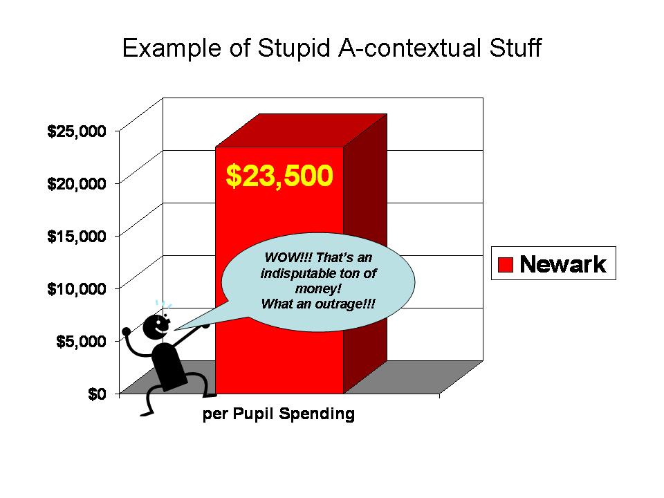
As I’ve shown in many recent posts, in general, rich kids and poor kids, black kids and white kids don’t often attend the same school districts – but for a few very large urban ones and some other sprawling countywide systems. The BIG disparities in resources and teacher characteristics are across not within districts. They are disparities that result across different bargaining units – not within bargaining units. So it’s pretty hard to argue that most disparities in teacher quality across rich and poor kids from one location to another are caused by seniority focused, adult interest, contractual provisions.

But, setting that broader issue aside, what do we actually know about within district disparities in the distribution of teacher characteristics, and whether changing contracts to remove these “offensive” protections can actually help redistribute teacher quality? Well, here’s what Gross and colleagues found:

http://www.nctq.org/docs/Mutual_Concent_8049.pdf

We conduct an interrupted time-series analysis of data from 1998-2005 and find that the shift from a seniority-based hiring system to a “mutual consent” hiring system leads to an initial increase in both teacher turnover and share of inexperienced teachers, especially in the district’s most disadvantaged schools. For the most part, however, these initial shocks are corrected within four years leaving little change in the distribution of inexperienced teachers or levels of turnover across schools of different advantage.

So, initially the policy change actually made things worse and in the end, the policy change made things no different. There may actually be some reasonable explanations for these findings. Perhaps most problematic, teachers who are really beginning to hit their stride in years 5 to 10 or so, might take advantage of their newly discovered mobility to jump more quickly from positions in higher poverty, higher need schools into more desirable positions once reserved for the most senior teachers. This could create a substantial drain of quality – non-novice but not really old – teachers from high need schools.

Notice the URL for this study. It is posted on the NCTQ website. That doesn’t mean they ever read it though. SOMEHOW, THE NEW NCTQ REPORT WHICH ARGUES THAT THESE CHANGES ARE PART OF THE SOLUTION, DOESN’T PAY ANY ATTENTION TO THIS!

Here’s a link to that report: http://www.nctq.org/tr3/docs/nctq_site_based_hiring.pdf

Here’s the list of the 3 “major barriers” to improving the distribution of teacher quality, as identified by NCTQ:

• Centralized hiring. In most districts, the human resources office controls the hiring process, determining whom to recruit and hire and where to place teachers. Principals, at most, are given the opportunity to voice their preferences.

• Inadequate evaluations. Teachers in most districts are not regularly, or sufficiently, evaluated, meaning that evaluations can only play a minor role in personnel decisions, when they should be paramount. It is seniority, not performance, that decides the movement of teachers within the district.

• Contractual obligations. Most teacher contracts stipulate that, if a teacher loses her current assignment—because of a shift in the student population, for example—the district has to find her a new assignment, regardless of whether another school wants to accept the teacher. Compounding the problem is that most state laws limit the reasons districts can dismiss a teacher, and being without a classroom assignment is not one of them. Districts are left with little choice but to either assign teachers to positions or keep them on the payroll, sometimes for years, even if they aren’t teaching.

See that third one – Yep – it’s those  contractual provisions that keep these disparities in place. Remove then and all will be fixed!

Now briefly on their first point – that centralized hiring is the other really big problem. The answer – let school site principals make decisions and teachers decide which principal they really want to work for in a district. That couldn’t backfire?   Well, I used to believe the same – that this could be a reasonable idea. The problem with this idea is that principal quality is so disparately distributed. I have recently worked on several studies of principal labor markets, the distribution of principals by their academic preparation and other factors across schools within districts and the relationship between principal attributes and the teachers they hire. Given what we are learning from these studies, it is in fact very likely to backfire! The weakest principals tend to be in the highest need schools and weak principals tend to attract and potentially even retain weaker teachers.

This line in the NCTQ press release is particularly fun, because it’s based on nothing but “gut” and “emotional appeal” – which is always the best basis for experimenting with the lives of low income and minority children, right?

“Giving principals the authority to hire who works on their staff is critical,” says Kate Walsh, NCTQ’s president. “It is the only fair way to hold schools accountable for results. But if the principal doesn’t have enough control over the quality of her staff, the school—and, of course, the students—will suffer.”

You know what – not addressing the larger resource disparities across and within districts – which lead to the disparities in leadership quality across schools and districts – and then handing greater control over teacher hiring/firing to the least qualified principals in the highest need schools – yeah… that’s when children will suffer. Even if we start by getting good principals where they are needed most, we must provide them the resources to attract and retain the “better” teachers.

To summarize:

1. Decentralizing control of teacher hiring to principals, where principal quality distribution is disparate, to the disadvantage of high need schools, is likely to lead to worse, not better distribution of teacher quality;

2. Altering contractual provisions, such as moving from seniority based to mutual consent placement, appears to disadvantage higher need schools initially and in the end, leads to little or no substantive change in the distribution of teachers across schools.

Yet, let’s go with it. What the heck. Why not – it chips away at those facially offensive protections of stubborn old selfish, lazy unproductive teachers (yes, I do know a few, but that’s not the point). We know it should work, even if we have no evidence to that effect. When organizations like NCTQ present policy recommendations against their own evidence and built on such flimsy logic, why do we even listen?

Additional resources

The NCTQ report above concludes with a rant about ESEA Comparability Regulations. For my thoughts, see: https://schoolfinance101.wordpress.com/2010/05/31/research-schmresearch-caps-misguided-analysis-again/

Regarding financial resources, “autonomy” and the distribution of teachers, see: Baker, B.D. Re-arranging deck chairs in Dallas: Contextual constraints on within district resource allocation in large urban Texas school districts. DeckChairsinDallas.Baker

Regarding the distribution of school leaders, teacher hiring and all that stuff, see:

Fuller, E., Young, M.D., Baker, B.D. Career Paths and the Influence of School Principals on Teachers. (Available on request)

Baker, B.D., Fuller, E. The Declining Academic Quality of School Principals and Why it May Matter. Baker.Fuller.PrincipalQuality.Mo.Wi_Jan7

Punswick, E., Baker, B.D., Belt, C. Principal backgrounds and school leadership stability: Evidence from Missouri. Educational Administration Quarterly Punswick.Baker.Belt.MoPrins09

Principal moves/exits: http://eaq.sagepub.com/content/46/4/523.abstract

Principals and hiring: http://eaq.sagepub.com/content/41/3/449.abstract

(the references in the above articles may provide some additional useful guidance on the role and the current distribution of principals)

Per Pupil Spending “Factiness:” Newark in Context!

Anyone who’s been reading popular media or who watched any of NBC’s Education Nation now knows as a simple fact that Newark Public Schools spend $22,000 per pupil and that’s simply a disgracefully high amount! Just check out this Google search for “Newark” & “22,000” & “per-pupil.”

Along with this number come claims of the sort – Newark is one of if not the most expensive public school system in the nation! It’s simply fact – truthiness – proofiness – or perhaps even factiness. Recent Newark claims are about as facty as these two other great claims from school finance lore:

  1. that Kansas City Missouri spent more than any other district in the nation for 10 years running (but of course still failed miserably); and
  2. that the average private per pupil cost is about $3,500 per year.

Coauthor Preston C. Green and I tear down the first of these “urban legends” of school finance in this article.  I tear down the myth of the $3,500 private school in this report from 2009.

This post is about putting numbers into context. In the urban legends article above, Preston Green and I simply fact check national data on per pupil spending and find that Kansas City came close in one year in the early 1990s, but fell precipitously after that, as desegregation funding tapered off. The mythical private school number is one of those numbers that relies on a single report of a very incomplete sample of “tuition” not spending data (where tuition does not cover full costs or spending), from around 1999 – yet references to that same number still persist. Time is part of the context of money!

So, where do these Newark spending figures come from and why is important to contextualize these numbers? First of all, the $22,000 number is a rounded figure based on the total current spending per pupil reported in the 2006-07 U.S. Census Fiscal Survey – elementary and secondary finances. The updated 2007-08 figure rises to $23,500. Wow… holy crap… that’s a lot right?

So, we’re kind of starting with a “fact” (a number that can be linked to some reasonable source). That said, even this fact varies by source. Note that in a per pupil spending figure we’ve got a numerator – spending and a denominator – pupils. Both matter to how this number is calculated. The New Jersey Department of Education reports Newark Public Schools Spending per Pupil around $16,000 to $17,000 during those same years. NJDOE also reports NPS enrollment well over 45,000. The implicit enrollment of NPS in the Census Fiscal Survey figures (backed out from total current spending and per pupil estimate) is around 43,000. Census reports NPS enrollment at about 40,000 (but uses the 43,000 figure to generate the per pupil figure).  So, this unexplained discrepancy is responsible for some of the difference. But this is all rather trivial quibbling to some extent. A much simpler, transparent issue is the issue of context.

Let’s walk through some examples. Here is how the media has been pitching Newark Public Schools spending:


One big bar on a graph, sitting out in space. The general public doesn’t have a particularly good idea of what that $23,500 means. So, they are simply told – Damn… that’ s a lot- maybe even the most in the country! Either way, it’s ton of money… which is unquestionably being wasted.

The other comparison we’ve been seeing and hearing in New Jersey is that Newark spends twice what Texas spends per pupil – and they get great outcomes and Newark… well… stinks… because they’re wasting it all. Here’s my stylized graph of that example (which you can find here: http://www.nje3.org/?p=4588)


Wow, that’s some really brilliant stuff there. For fun, I’ve used one of those fine visual tricks of cutting off the first $10,000 to emphasize the fact that Newark spends a ton, and Texas not much at all… Texas great… Newark stinky – expensive and stinky.

Setting aside this foolishness, how does Newark actually compare – in various contexts?

Is Newark the highest spending district in the nation? one of them?

Is Newark the highest spending district in the metropolitan area? (NYC Core based statistical area)

Is Newark even the highest spending in New Jersey?

Here, I use the Census Fiscal Survey data from 2007-08 and walk through for NPS, the same comparisons I did in the previous state ranking post.

This table shows the alternative comparisons. First out of 13,500 or so districts nationally with sufficient data for the comparison, NPS ranked 220 without any cost or need adjustment. Not #1, but 220. That’s still pretty high – 220 out of 13,500 puts NPS at about the top 2%. However, simply adjust for regional differences in competitive wages, and NPS drops to 732, about the top 5%. Next, adjust for the additional needs of children in poverty (using a conservative adjustment as I did in the previous post) and Newark slides back to rank of 1158 – still in the top 10%, but not top overall by any stretch.

Now, as I noted in my previous post, cross state – national comparisons are tough because it’s particularly hard to equate the costs of hiring teachers and other school staff across regions and it’s also hard to equate poverty rates from one location to another.

So then, let’s focus on the NY metro area. For starters, NPS comes in 56th with no adjustments, and 53rd when we adjust for wage variation (because the NCES wage index does carve the NY metro area into a handful of labor markets). Either way, NPS is not at the top of even the NY labor market in spending. Among the 546 or so districts in the NY metro, NPS hovers around the top 10% – on the edge of it. If we take the additional step of adjusting for children in poverty, NPS drops to a rank of 144 out of 546 – below the 25%ile.

NPS ranks somewhat higher within the state of NJ than in the broader metro area, mainly because the highest spending districts in the NY metro area tend to be in New York State – Westchester and Rockland Counties and on Long Island. Yeah… NY districts spend much more than New Jersey districts in the NY metro area, and as I’ve shown previously, have much higher salaries as well.

So there you have it. Newark per pupil spending in context. Newark Public Schools are a relatively high spending district, which provides the district with more opportunities to assist its high need population than other urban, high poverty, high minority concentration districts around the country. But Newark is not some massive outlier – most expensive in the nation district.

Note that these analyses do not question the Census per pupil spending figure. I simply accept that number – because I’ve accepted the Census data for all others in the sample. It would be inappropriate for me to “audit” NPS spending without looking for similar issues in other cities and states. The number may be screwed up, which is why I tend to stay away from the Census data for individual district analysis, without reconciling across other sources. But, it is what it is, and these data are generally pretty good (but for some specific states).

Finally, while I have shown here that NPS is still a relatively high spender, even after adjustments, I’ve not tackled the outcome question. What do we get for this funding? I would argue that pundits have grossly misrepresented this side of the equation as well. Pundits argue that NPS has a low graduation rate and that graduation rate is even inflated because more kids graduate than actually pass the high school assessments (using the alternative assessment to get around the supposed gate). Those same pundits are quick to point out the very high graduation rates of the few secondary charter schools in NJ – as a good thing. I show  in this much older post that these same charters which graduate 97% of their students actually had lower high school math assessment scores than poor urban districts (which had lower grad rates). Pot? Kettle? ???? Perhaps more on the outcome issue at a later point in time.

In the meantime, for a thorough discussion of the relationship between school funding reforms and student outcomes, see this article (which includes some discussion of New Jersey):

Baker, B.D., Welner, K. School Finance and Courts: Does Reform Matter, and How Can We Tell? Teachers College Record

http://www.tcrecord.org/content.asp?contentid=16106

DoReformsMatter.Baker.Welner

UPDATE: Here’s one additional really important comparison for NPS. The following graph compares NPS to the 216 K-12 NJ districts for whom sufficient data were available for this analysis.  This graph starts by comparing NPS to the other districts in the state and in Essex County using each of the above methods for adjusting spending figures – ECWI and then the ECWI and a poverty weight. But, clearly even the latter of these two approaches doesn’t catch all of the cost differences faced by Newark Public Schools. The final comparison in this graph includes a “comprehensive” cost adjustment based on a statistical model of New Jersey School districts – a “cost function” model, an approach which has been used extensively in economic research on education costs (Google Scholar Search on Cost Function Research of William Duncombe and John Yinger).

Here we see that if we account for the various costs faced by NPS, NPS actually has less per pupil than either the state average or other districts in Essex County.

Here is a link to the cost models. Note: for this analysis I actually adopted a very conservative assumption to generate the cost index for NPS. The statewide average cost index is 1.0 and NPS receives a cost index around 1.7 indicating 70% higher than state average costs, largely as a function of student population served, but also being in a higher wage labor market. The conservative assumption was that any variation in spending picked up by the model that was associated only with being an Abbott district (and not accounted for by differences in outcomes) was treated as “inefficiency,” and therefore not counted toward Abbott district cost index values (a significant portion of  the Abbott bump in funding was effectively removed as if “waste” even though this is a suspect assumption).

State Ranking Madness: Who spends most/least?

Ranking the states by different methods

Every year, through many different sources, state politicians and political activists make great waves over which state spends more on public education, and which spends less. Who’s in first place? Who’s in last? Those from differing perspectives have different motives. Politicians and anti-tax, anti-government activists search for their way to find that “our states spends more than everyone else and gets nothing for it,” while others hoping to increase education spending search frantically for low ratings – “We’re in last place and that’s a disgrace!” Of course, not everyone can be in first or last place and it’s pretty damn hard to tweak the numbers to move a state from near the top to near the bottom. Here, I’ll present a few alternative, reasonable rankings – the last two of which, I believe are most reasonable, though for some states still differ significantly.

First, let’s begin with the simplest version of the numbers- the straight up averages of school district state and local revenue per pupil (weighted by the number of pupils in each district). Now, I use the state and local revenue per pupil instead of current expenditures per pupil because state and local revenue gives a complete picture of state and local resources allocated to local public school systems and excludes expenditures of federal funds.

Politicians in New Jersey and New York love to make claims that their state is highest spending in the nation (and we get nothing for it!). Even at this most basic level, these claims are wrong. Close, but still wrong. Hooray for Vermont! But isn’t that really part of Canada anyway?

FIGURE 1

Of course, the cost of running a school varies quite significantly across states with a large share (though not all) of that variation being tied to regional differences in the competitive wage one must pay to teachers. Here, I use a competitive wage index developed by the National Center for Education Statistics (by Lori Taylor and Bill Fowler) which uses variation in non-teacher wages across labor markets to correct for variation in teacher wages. http://nces.ed.gov/edfin/adjustments.asp

FIGURE 2

Some reshuffling occurs. States like California, for example drop quite a bit because California is certainly a more expensive place to live and higher wage state. But, we may be assuming too strong a role for the wage adjustment here – assuming that state and local revenues per pupil should move on a 1 for 1 basis with wage variation. Nonetheless, not a totally unreasonable comparison.

We might also wish to consider the student populations that states must educate with their funding at present levels. That is, how much are these current dollars worth toward achieving common outcomes across students? Many cost factors influence the cost of achieving common outcomes across children, as discussed in this paper –http://surface.syr.edu/cgi/viewcontent.cgi?article=1102&context=cpr – by William Duncombe and John Yinger of the Maxwell School at Syracuse University. But, this particular paper focuses on the additional costs associated with children in poverty. Duncombe and Yinger determine that the additional cost per child falling below the federal poverty line is approximately 150% of the cost of achieving the same outcomes with a non-poor child. They also find that the additional costs associated with counts of children falling below the 185% poverty threshold are approximately 100% above average costs. Now, I go very conservative here, and I apply only a 100% weight of additional cost to children qualifying as being in poverty, using U.S. Census Bureau Small Area Income and Poverty Estimates.

FIGURE 3

But, we’ve been learning more of late about problems with using the same income thresholds for poverty across states with very different costs of living. Recently, the U.S. Census Bureau put out this exceptional paper which includes adjusted poverty measures for each state, based on three different adjustment methods – http://www.census.gov/hhes/www/povmeas/papers/Geo-Adj-Pov-Thld8.pdf. In general, the adjustments lead to much higher actual poverty rates in states with very high costs of living such as New York and California. If we use those poverty rates instead of the previous ones to adjust spending for poverty, we get this:

FIGURE 4

In this case, California moves into 49th place, or third from bottom with Washington DC in the analysis.

We’re still missing a pretty big piece of the puzzle here – additional costs associated with economies of scale and population sparsity (for more information on economies of scale see: http://www-cpr.maxwell.syr.edu/efap/Publications/Revisiting_Economies.pdf). Notice that Wyoming and Alaska are our big spenders here. Now, there’s probably no adjustment we can find to fully account for the many ways in which Alaska is different from the lower 48. Nor do the poverty corrections seem to fully address the difficulties of Washington DC. It’s all pretty imperfect. That said, I take one more stab at things, based on a regression model which attempts to control for a) competitive wage variation, b) economies of scale and population density and c) poverty. The idea here is to account for the fact that some states have a need for very small schools and districts because of their small populations which are spread across vast rural expanses. The model attempts to avoid giving a break to other states like New Jersey or Illinois that have many tiny racially segregated enclaves in densely populated suburbs. And here are the results:

FIGURE 5

An important difference when using a regression model to determine relationships between cost factors and revenue levels – instead of just dividing by the cost factors – is that the model determines the weight of those cost factors. On thing that happens in the figure above is that the influence of wage differentials is “softened.” The model-based projections do not assume a 1 for 1 relationship between competitive wages and revenue. As a result, California does not come out as low as in previous figures. Also, the model is projecting state and local revenues for a district with X% poor children. The projection is for an “equated” condition. But, if the state has far more children in higher poverty settings, and those settings have fewer resources, the model projection does not necessarily reflect the average actual conditions. However, for California in particular, there really isn’t a systematic relationship between poverty and revenues across districts – a finding that is as bad as it might seem good. In fact, it’s just bad!

Aren’t the differences really all about state wealth?

I would be remiss if I didn’t include at least a few ugly scatterplots in this post. So here goes. The first two scatterplots here show that state and local revenues per pupil are somewhat modestly related to state average poverty rates (not adjusted regionally) and to the household income levels of families with children in the public school system.

FIGURE 6

FIGURE 7

However, this final figure shows that state and local revenues per pupil are equally related to the effort a state puts up, where effort is measured in terms of state and local revenue per pupil as a share of gross domestic product by state, or gross state product. That is, some states that don’t raise much revenue per pupil simply don’t try that hard. Very few high spending states have low effort. Tennessee, Louisiana, Oklahoma, Arizona and South Dakota are near the bottom because they don’t put up much effort. Mississippi puts up average effort, but just can’t raise much revenue. I’m far more empathetic to Mississipi’s plight! Well, our highest spender, Vermont in some cases, is off the charts on effort. Despite having less capacity than states like New York or New Jersey, Vermont still manages to outspend them.

FIGURE 8

While it makes great rhetoric to claim “first in the nation” or “last in the nation” or “most expensive,” the best one can really do here is to delineate in terms of relatively high or relatively low. Not great headline stuff, but that’s how it goes. New Jersey – NOT THE HIGHEST IN THE NATION – rather, “relatively high.” California – NOT LAST IN THE NATION – but damn close to it by some measures, and still low by others!