About those Dice… Ready, Set, Roll! On the VAM-ification of Tenure

A while back I wrote a post (and here) in which I explained that the relatively high error rates in Value-added modeling might make it quite difficult for teachers to get tenure under some newly adopted and other proposed guidelines and much easier to lose it, even after waiting years to get lucky [& yes I do mean LUCKY] enough to obtain it.

The standard reformy template is that teachers should only be able to get tenure after 3 years of good ratings in a row and that teachers should be subject to losing tenure if they get 2 bad years in a row.  Further, it is possible that the evaluations might actually stipulate that you can only get a good rating if you achieve a certain rating on the quantitative portion of the evaluation – or the VAM score. Likewise for bad ratings (that is, the quantitative measure overrides all else in the system).

The premise of the dice rolling activity from my previous post was that it is necessarily much less likely to roll the same number (or subset of numbers) three times in a row than twice (exponentially in fact). That is, it is much harder to overcome the odds based on error rates to achieve tenure, and much easier to lose it. Again, this is much due to the noisiness of the data, and less due to the difficulty of actually being “good” year after year. The ratings simply jump around a lot. See my previous post.

So, for those of you energetic young reformy wanna be teachers out there thinkin’ – hey, I can cut it – I’ll take my chances and my “good” teaching will overcome those odds – generating year-after-year top quartile rankings? Alot of that is totally out of your control! [Look, I would have been right there with you when I graduated college]

But my first post on this topic was all in hypothetical-land. Now, with the newly released NYC teacher data we can see just how many teachers actually got three-in-a-row in the past three years [among those actually teaching the same subject and grade level in the same school], applying different ranges of “acceptableness” or not.

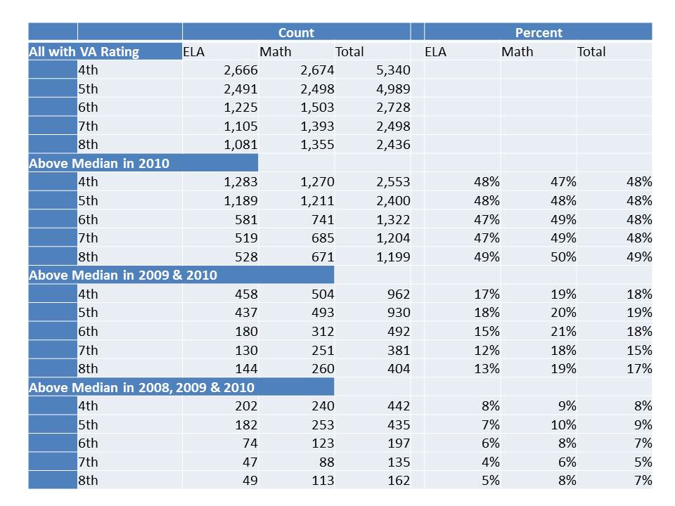
So, here, I give the benefit of the doubt, and set a reasonably low bar for getting a good rating – the median or higher [ignoring error ranges and sticking with the type of firm cut-points that current state policies and local contracts seem to be adopting]. Any teacher who gets the median or higher 3 years in a row can get tenure! otherwise, keep trying until you get your three in a row? How many teachers is that? How many overcome the odds of the randomness and noise in the data? Well, here it is:

As percentiles dictate (by definition) about half of the teachers in the data are in the upper half in the most recent year. But, only about 20% of teachers in any grade or subject are above the median two years in a row. Further, only about 6 to 7% actually were lucky enough to land in the upper half for three years running!  Assuming stability remains relatively similar over time, we could expect that in any three year period, about 7% of teachers might string together three above-the-medians in a row. At that pace, tenure will be awarded rather judiciously. (but actually, stability in the most recent year over prior is unusually high)

Let’s say I cut teachers a break and only take tenure away if they get two in a row not in the bottom half, but rather all the way down into the bottom third!  What are the odds? How many teachers actually get two years in a row in the bottom third?

Well, here it is:

That’s rather depressing isn’t it. The chances of ending up in the bottom third two years in a row are about the same as the chances of ending up in the top half three years in a row!

Now, perhaps you’re thinkin’ Big Deal. So you jump into and out of the edges of these categories. That just means you’re not really solidly in the “good” or the “bad” and it should take you longer to get tenure. That’s fair? After all, it’s not like any substantial portion of teachers are actually jumping back and forth between the top half and the bottom third?

  • In ELA,  14% of those in the top half in 2010 were in the bottom third in 2009
  • In ELA, 23.9% in the top half in 2009 were in the bottom third in 2010
  • In Math (where the scores are more stable in part because they appear to retain some biases), 9% of those in the top half in 2010 were in the bottom third in 2009
  • In Math, 26% of those in the bottom third in 2009 were in the top half in 2010 and nearly 16% of those in the top half in 2009 ended up in the bottom third in 2010.

[corrected]

Most of these shifts if not nearly all of them are not because the teacher actually became a good teacher or became a bad teacher from one year to the next.

The big issue here is the human side of this puzzle. None of the existing deselection or tightened tenure requirement simulations of the supposed positive effects of leveraging VAM estimates to improve student outcomes makes even halfhearted attempts to account for human behavioral responses to a system driven by these imprecise and potentially inaccurate metrics. All adopt the oversimplified “all else  equal” assumption of an unending supply of new teacher candidates that are equal in quality to the  current average teacher and with comparable standard deviation.

Reformy arguments ratchet these assumptions up a notch. The most reformy arguments in favor of moving toward these types of tenure and de-tenuring provisions posit that making tenure empirically performance based and de-selecting the “bad” teachers will strengthen the teaching profession. That better applicants – the top third of college graduates – will suddenly flock to teaching instead of other currently higher paying professions.

But, with so little control over one’s destiny is that really likely to be the case? It certainly stands to be a frustrating endeavor to achieve any level of job stability. And it doesn’t look like average compensation will be rising in the near future to compensate for this dramatic increase in risk. Further, if we tie compensation to these ratings either as one-time bonuses or as salary adjustments, many teachers who, by chance, get good ratings in one year will, by chance again, get bad ratings the next year.  Teachers will have a difficult time even guessing at what their compensation might look like the following year. And since the ratings are necessarily relative (based on percentiles) the distribution of additional compensation must involve winners and losers. The luckier one or a handful of teachers get in a given year, the larger the share of the merit pot they receive and the less others receive.  Once again, I do mean LUCK.

Who will really be standing in line to take these jobs? In the best case (depending on one’s point of view), perhaps a few additional energetic grads of highly selective colleges will jump into the mix for a couple of years. But as these numbers and frustrations play out over time, the pendulum is certainly likely to swing the other direction.

More risk and more uncertainty without any sign of significantly increased reward is highly unlikely to improve the teaching profession and far more likely to make things much worse, especially in already hard to staff schools and districts!

These numbers are fun to play with. I just can’t stop myself. And they have endless geeky academic potential. But I’m increasingly convinced that they have little practical value for improving school quality. And I’m increasingly disturbed by how policy makers  have adopted absurd, rigid requirements around these anything but precise and questionably accurate metrics.


Seeking Practical Uses of the NYC VAM Data???

A short while back, in a follow up post regarding the Chetty/Friedman/Rockoff study I wrote about how and when I might use VAM results, if I happened to be in a decision making role in a school or district:

I would want to be able to generate a report of the VA estimates for teachers in the district. Ideally, I’d like to be able to generate a report based on alternative model specifications (option to leave in and take out potential biases) and on alternative assessments (or mixes of them). I’d like the sensitivity analysis option in order to evaluate the robustness of the ratings, and to see how changes to model specification affect certain teachers (to gain insights, for example, regarding things like peer effect vs. teacher effect).

If I felt, when pouring through the data, that they were telling me something about some of my teachers (good or bad), I might then use these data to suggest to principals how to distribute their observation efforts through the year. Which classes should they focus on? Which teachers? It would be a noisy pre-screening tool, and would not dictate any final decision.  It might start the evaluation process, but would certainly not end it.

Further, even if I did decide that I have a systematically underperforming middle school math teacher (for example), I would only be likely to try to remove that teacher if I was pretty sure that I could replace him or her with someone better. It is utterly foolish from a human resource perspective to automatically assume that I will necessarily be able to replace this “bad” teacher with an “average” one.  Fire now, and then wait to see what the applicant pool looks like and hope for the best?

Since the most vocal VAM advocates love to make the baseball analogies… pointing out the supposed connection between VAM teacher deselection arguments and Moneyball, consider that statistical advantage in Baseball is achieved by trading for players with better statistics – trading up (based on which statistics a team prefers/needs).  You don’t just unload your bottom 5%  or 15% players in on-base-percentage and hope that players with on-base-percentage equal to your team average will show up on your doorstep. (acknowledging that the baseball statistics analogies to using VAM for teacher evaluation to begin with are completely stupid)

With the recently released NYC data in hand, I now have the opportunity to ponder the possibilities. How, for example, if I was the principal of a given, average sized school in NYC, might I use the VA data on my teachers to council them? to suggest personnel changes? assignment changes, or so on? Would these data, as they are, provide me any useful information about my staff and how to better my school?

For this exercise, I’ve decided to look at the year to year ratings of teachers in a relatively average school. Now, why would I bother looking at the year to year ratings when we know that the multi-year averages are supposed to more accurate – more representative of the teacher’s over time contributions? Well, you’ll see in the graphs below that those multi-year averages also may not be that useful. In many cases, given how much teacher ratings bounce around from year to year, it’s rather like assigning a grade of “C” to the kid who got Fs on the first two tests of the semester, and As on the next two or even a mix of Fs and As in some random sequence. Averages, or aggregations, aren’t always that insightful. So I’ve decided to peel it back a bit, as I likely would if I was the principal of this school seeking insights about how to better use my teachers and/or how to work with them to improve their art.

Here are the year to year Math VA estimates for my teachers who actually continue in my building from one year to the next:

Focusing on the upper left graph first, in 2008-09, Rachel, Elizabeth and Sabina were somewhat below average. In 2009-10 they were slightly above average. In fact, going to the prior year (07-08), Elizabeth and Sabina were slightly above average, and Rachel below. They reshuffle again, each somewhat below average in 2006-07, but only Rachel has a score for the earliest year. Needless to say, it’s little tricky figuring out how to interpret differences among these teachers from this very limited view of very noisy data. Julie is an interesting case here. She starts above average in 05-06, moves below average, then well above average, then back to below. She’s never in the same place twice. There could be any number of reasons for this that are legitimate (different class composition, different life circumstances for Julie, etc.). But, more likely it’s just the noise talkin’! Then there’s Ingrid, who held her own in the upper right quadrant for a few years, then disappears. Was she good? or lucky?  Glen also appears to be a tw0-in-a-row Math teaching superstar, but we’ll have to see how the next cycle works out for him.

Now, here are the ELA results:

If we accept these results as valid (a huge stretch), one might make the argument that Glen spent a bit too much of his time in 2008-09 trying to be a Math teaching superstar, and really shortchanged ELA. But he got it together and became a double threat in 2009-10?  Then again, I think I’d have to wait and see if Glen’s dot in the picture actually persists in any one quadrant for more than a year or two, since most of the others continue to bounce all over the place. Perhaps Julie, Rachel, Elizabeth and Sabina really are just truly average teachers in the aggregate – if we choose to reduce their teaching to little blue dots on a scatterplot. Or perhaps these data are telling me little or nothing about their teaching. Rachel and Julie were both above average in 05-06, with former? colleague (or left the VAM mix) Ingrid. Rachel drops below average and is joined by Sabina the next year. Jennifer shows up as a two-year very low performer, then disappears from the VAM mix. But Julie, Rachel, Sabina and Elizabeth persist, and good for them!

So, now that I’ve spent all of my time trying to figure out if Glen is a legitimate double-threat superstar and what, if anything I can make of the results for Julie, Rachel, Elizabeth and Sabina, It’s time to put this back into context, and take a look at my complete staffing roster for this school (based on 2009-10 NYSED Personnel Master File). Here it is by assignment code, where “frequency” refers to the total number of assigned positions in a particular area:

So, wait a second, my school has a total of 28 elementary classroom teachers. I do have a total of 11 ELA and 10 Math ratings in 2009-10, but apparently fewer than that (as indicated above) for teachers teaching the same subject and grade level in sequential years (the way in which I merged my data). Ratings start in 4th grade, so that knocks out a big chunk of even my core classroom teachers.

I’ve got a total of 108 certified positions in my school, and I’m spending my time trying to read these tea leaves which pertain to, oh… about 5% of my staff (who are actually  there, and rated, on multiple content areas, for more than a few years).

By the way, by the time I’m looking at these data, it’s 2011-12, two years after the most recent value-added estimates and not too many of my teachers are posting value-added estimates more than a few years in a row. How many more are gone now? Sabina, Rachel, Elizabeth, Julie? Are you still even there? Further, even if they are there, I probably should have been trying to make important decisions in the interim and not waiting for this stuff. I suspect the reports can/will be produced more likely on a 1 year lag, but even then I have to wait to see how year-to-year ratings stack up for specific teachers.

From a practical standpoint, as someone who would probably try to make sense of this type of data if I was in the role of school principal (‘cuz data is what I know, and real “principalling” is not!), I’m really struggling to see the usefulness of it.

See also my previous post on Inkblots and Opportunity Costs.

Note for New Jersey readers: It is important to understand that there are substantive differences between the Value-added estimates produced in NYC and the Student Growth Percentile’s being produced in NJ. The bottom line – while the value-added estimates above fail to provide me with any meaningful insights, they are conceptually far superior (for this purposes) to SGP reports.

These value-added estimates actually are intended to sort out the teacher effect on student growth. They try to correct for a number of factors, as I discuss in my previous post.

Student Growth Percentiles do not even attempt to isolate the teacher effect on student growth, and therefore it is entirely inappropriate to try to interpret SGP’s in this same way. SGPs could conceivably be used in a VAM, but by no means should ever stand alone.

They are NOT A TEACHER EFFECTIVENESS EVALUATION TOOL. THEY SHOULD NOT BE USED AS SUCH.  An extensive discussion of this point can be found here:

https://schoolfinance101.wordpress.com/2011/09/02/take-your-sgp-and-vamit-damn-it/

https://schoolfinance101.wordpress.com/2011/09/13/more-on-the-sgp-debate-a-reply/

You’ve Been VAM-IFIED! Thoughts (& Graphs) on the NYC Teacher Data

Readers of my blog know I’m both a data geek and a skeptic of the usefulness of Value-added data specifically as a human resource management tool for schools and districts. There’s been much talk this week about the release of the New York City teacher ratings to the media, and subsequent publication of those data by various news outlets. Most of the talk about the ratings has focused on the error rates in the ratings, and reporters from each news outlet have spent a great deal of time hiding behind their supposed ultra-responsibleness of being sure to inform the public that these ratings are not absolute, that they have significant error ranges, etc.  Matt Di Carlo over at Shanker Blog has already provided a very solid explanatory piece on the error ranges and how those ranges affect classification of teachers as either good or bad.

But, the imprecision – as represented by error ranges – of each teacher’s effectiveness estimate is but one small piece of this puzzle. And in my view, the various other issues involved go much further in undermining the usefulness of the value added measures which have been presented by the media as necessarily accurate albeit lacking in precision.

Remember, what we are talking about here are statistical estimates generated on tests of two different areas of student content knowledge – math and English language arts.  What is being estimated is the extent of change in score (for each student, from one year to the next) on these particular forms of these particular tests of this particular content, and only for this particular subset of teachers who work in these particular schools.

We know from other research (from Corcoran and Jennings, and form the first Gates MET report) that value added estimates might be quite different for teachers of the same subject area if a different test of that subject is used.

We know that summer learning may affect student annual value added, yet in this case, NYC is estimating teacher effectiveness on student outcomes from year to year. That is, the difference in a students’ score on one day in the spring of 2009 to another in the spring of 2010, is being attributed to a teacher who has contact, for a few hours a day with that child from September to June (but not July and August).

The NYC value-added model does indeed include a number of factors which attempt to make fairer comparisons between teachers of similar grade levels, similar class sizes, etc. But we also know that those attempts work only so well.

Focusing on error rate alone presumes that we’ve got the model and the estimates right – that we are making valid assertions about the measures and their attribution to teaching effectiveness.

That is, that we really are estimating the teacher’s influence on a legitimate measure of student learning in the given content area.

Then error rates are thrown into the discussion (and onto the estimates) to provide the relevant statistical caveats about their precision.

That is, accepting that we are measuring the right thing and rightly attributing it to the teacher, there might be some noise – some error – in our estimates.

If the estimates lack validity, or are biased, the rate of noise, or error around the invalid or biased estimate is really a moot point.

In fact, as I’ve pointed out before on this blog, it is quite likely that value added estimates that retain bias by failing to fully control for outside influences are actually likely to be more stable over time (to the extent that the outside influences remain more stable over time). And that’s not a good thing.

So, to the news reporters out there, be careful about hiding behind the disclaimer that you’ve responsibly provided the error rates to the public. There’s a lot more to it than that.

Playing with the Data

So, now for a little playing with the data, which can be found here:

http://www.ny1.com/content/top_stories/156599/now-available–nyc-teacher-performance-data-released-friday#doereports

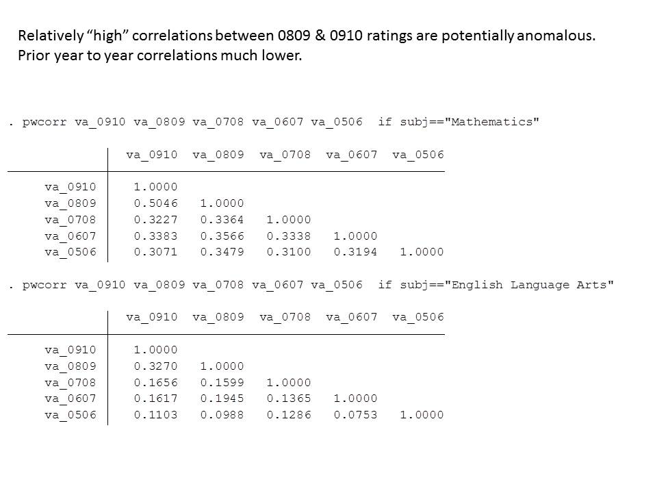
I personally wanted to check out a few things, starting with assessing the year to year stability of the ratings. So, let’s start with some year to year correlations achieved by merging the teacher data reports across years for teachers who stayed in the same school teaching the same subject area to the same grade level. Note that teacher IDs are removed from the data. But teachers can be matched within school, subject and grade level, by name over time (by concatenating the dbn [school code], teacher name, grade level and subject area [changing subject area and grade level naming to match between older and newer files]). First, here’s how the year to year correlations play out for teachers teaching the same grade, subject area and in the same school each year.

Sifting through the Noise

As with other value-added studies, the correlation across teachers in their ratings from one year to the next seem to range from about .10 to about .50. Note that between 2009-10 and 2008-09 Math value-added estimates were relatively highly correlated, compared to previous years (with little clear evidence as to why, but for possible changes to assessments, etc.). Year to year correlations for ELA are pretty darn low, especially prior to the most recent two years.

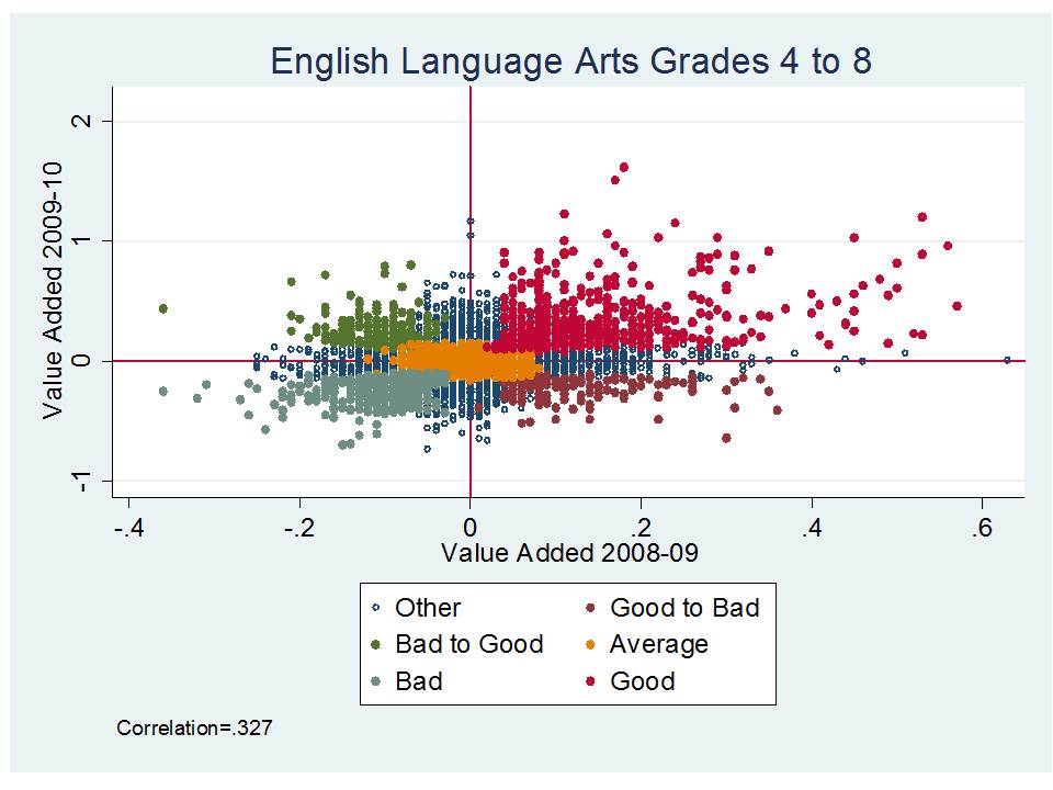
Visually, here’s what the relationship between the most recent two years of ELA VAM ratings looks like:

I’ve done a little color coding here for fun. Dots coded in orange are those that stayed in the “average” category from one year to the next. Dots in bright red are those that stayed “high” or “above average” from one year to the next and dots in pale blue were “low” or “below average” from one year to the next. But there are also significant numbers of dots that were above average or high in one year, and below average or low in the next.  9 to 15% (of those who were “good” or were “bad” in the previous year) move all the way from good to bad or bad to good. 20 to 35% who were “bad” stayed “bad” & 20 to 35% who were “good” stayed “good.” And this is between the two years that show the highest correlation for ELA.

Here’s what the math estimates look like:

There’s actually a visually identifiable positive relationship here. Again, this is the relationship between the two most recent years, which by comparison to previous years, showed a higher correlation.

For math, only about 7% of teachers jump all the way from being bad to good or good to bad (of those who were “good” or “bad” the previous year), and about 30 to 50% who were good remain good, or who were bad, remain bad.

But, that still means that even in the more consistently estimated models, half or more of teachers move into or out of the good or bad categories from year to year, between the two years that show the highest correlation in recent years.

And this finding still ignores whether other factors may be at play in keeping teachers in certain categories. For example, whether teachers stay labeled as ‘good’ because they continue to work with better students or in better environments.

Searching for Potential Sources of Bias

My next fun little exercise in playing with the VA data involved merging the data by school dbn to my data set on NYC school characteristics. I limited my sample for now to teachers in schools serving all grade levels 4 to8 and w/complete data in my NYC schools data, which include a combination of measures from the NCES Common Core and NY State School Report Cards. I did a whole lot of fishing around to determine whether there were any particular characteristics of schools that appeared associated either or both with individual teacher value added estimates or with the likelihood that a teacher ended up being rated “good” or “bad” by my aggregations used here.  I will present my preliminary findings with respect to those likelihoods here.

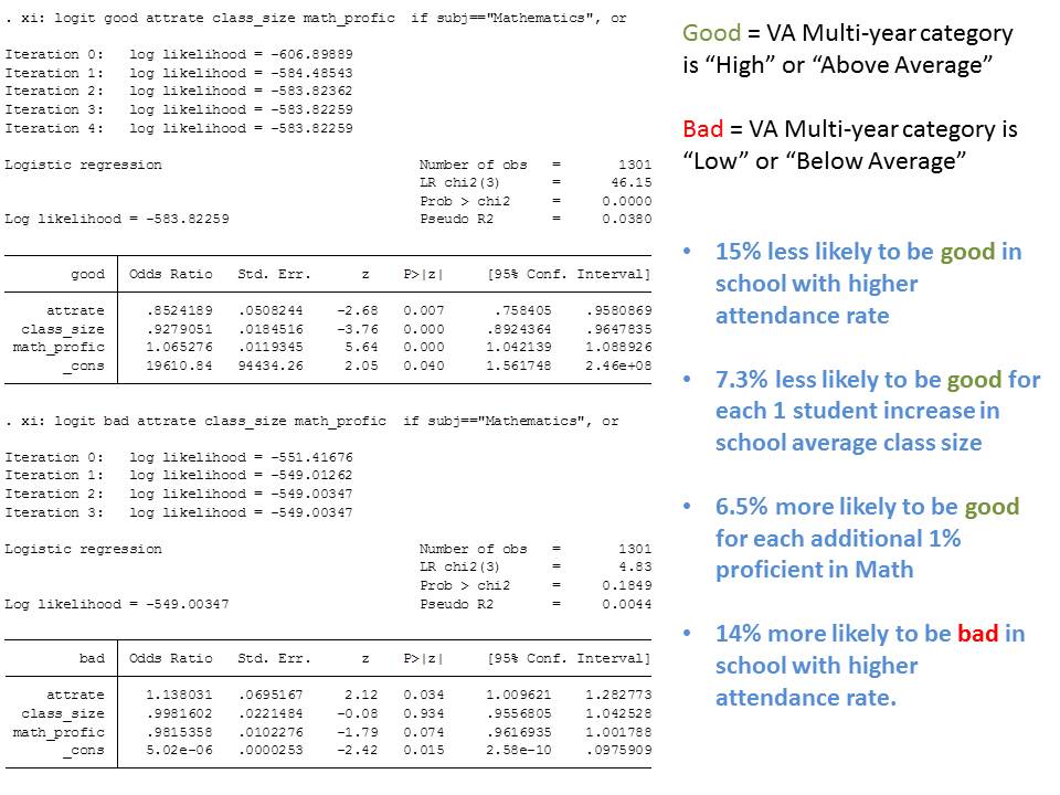
Here are a few logistic regression models of the odds that a teacher was rated “good” or rated “bad” based on a) the multi-year value-added categorical rating for the teacher and b) based on school year 2009 characteristics of their school across grades 4 to 8.

After fishing through a plethora of measures on school characteristics (because I don’t have classroom characteristics for each teacher), I found that with relative consistency, using the Math ratings, teachers in schools with higher math proficiency rates tended to get better value added estimates for math and were more likely to be rated “good.” This result was consistent across multiple attempts, models, subsamples (Note that I’ve only got 1300 of the total math teachers rated here… but it’s still a pretty good and well distributed sample). Also, teachers in schools with larger average class size tended to have lower likelihood of being classified as “above average” or “high” performers. These findings make some sense, in that peer group effect may be influencing teacher ratings and class size may effects (perhaps as spillover?) may not be fully captured in the model. The attendance rate factor is somewhat more perplexing.

Again, these models were run with the multi-year value added classification.

Next, I checked to see if there were differences in the likelihood of getting back to back good or back to back bad ratings by school characteristics. Here are the models:

As it turns out, the likelihood of achieving back to back good or back to back bad ratings is also influenced by school characteristics. Here, as class size increases by 1 student, the likelihood that a teacher in that school gets back to back bad ratings goes up by nearly 8%. The likelihood of getting back to back good ratings declines by 6%. The likelihood of getting back to back good ratings increases by nearly 8% in a school with 1% higher math proficiency rate in grades 4 to 8.

These are admittedly preliminary checks on the data, but these findings in my view do warrant further investigation into school level correlates with the math value added estimates and classifications in particular. These findings are certainly suggestive of possible estimate bias.

Who Gets VAM-ED?

Finally, while there’s been much talk about these ratings being released for such a seemingly large number of teachers – 18,000 – it’s important to put those numbers in context in order to evaluate their relevance. First of all, it’s 18,000 ratings, not teachers. Several teachers are rated for both math and ELA, bringing the total number of individuals down significantly from 18,000.  In still generous terms, the 18,000 or so are more like “positions” within schools, but even then, the elementary classroom teacher covers both areas even within the same assignment or position.

Based on the NY State Personnel Master File for 2009-10, there were about 150,000 (linkable to individual schools including those in the VA reports) certified staffing assignments in New York City in 2009-10 (where individual teachers cover more than one assignment). In that light, 18,000 is not that big a share.

But let’s look at it at the school level using two sample schools. For these comparisons I picked two schools which had among the largest numbers of VA math estimates (with many of the same teachers in those schools having VA ELA estimates).  The actual listing of teacher assignments is provided for two schools below, along with the number of teachers for whom there were Math VA estimates.  Again, these are schools with among the highest reported number (and share) of teachers who were assigned math effectiveness ratings.

In each case, we are Math VAM-ing around 30% of total teacher assignments [not teachers, but assignments] (with substantial overlap for ELA). Clearly, several of the teacher assignments in the mix for each school are completely un-VAM-able. States such as Tennessee have adopted the absurd strategy that these other staff should be evaluated on the basis of the scores for those who can be VAM-ed.

A couple of issues are important to consider here. First, these listings more than anything convey the complexity of what goes on in schools – the type of people who nee to come together and work together collectively on behalf of the interests of kids. VAM-ing some subset of those teachers and putting their faces in the NY Post is unhelpful in many regards. Certainly there exist significant incentives for teachers to migrate to un-vammed assignments to the extent possible.   And please don’t tell me that the answer to this dilemma is to VAM the Orchestra conductor or Art teacher. That’s just freakin’ stupid!

As Preston Green, Joseph Oluwole and I discuss in our forthcoming article in the BYU Education and Law Journal, coupling the complexities of staffing real schools and evaluating the diverse array of professionals that exist in those schools with VAM-based rating schemes necessarily means adopting differentiated contractual agreements, leading to numerous possible perverse incentives and illogical management decisions (as we’ve already seen in Tennessee as well as in the structure of the DC IMPACT contract).

Follow up on Fire First, Ask Questions Later

Many of us have had extensive ongoing conversation about the Big Study (CFR) that caught media attention last week. That conversation has included much thoughtful feedback from the authors of the study.  That’s how it should be. A good, ongoing discussion delving into technical details and considering alternative policy implications.  I received the following kind note from one of the study authors, John Friedman, in which he addresses three major points in my critique:

Dear Bruce,

Thank you very much for your thorough and well-reasoned comment on our paper.  You raise three major concerns with the study in your post which we’d like to address.  First, you write that “just because teacher VA scores in a massive data set show variance does not mean that we can identify with any level of precision or accuracy which individual teachers … are “good” and which are “bad.”  You are certainly correct that there is lots of noise in the measurement of quality for any individual teacher.  But I don’t think it is right that we cannot identify individual teachers’ quality with any precision.  In fact, our value-added estimates for individual teachers come with confidence intervals that exactly quantify the degree of uncertainty, as we discuss in Section 6.2 of the paper.  For instance, if after 3 average-sized classrooms a teacher had VA of -0.2, which is 2 standard deviations below the mean, would have a confidence interval of approximately [-0.41,0.01].  This range implies that there is a 80% chance that the teacher is among the worst 15% in the system, and less than a 5% chance that the teacher is better than average.  Importantly, we take account of this teacher-level uncertainty in our calculations in Figure 10.  Even taking account of this uncertainly, replacing this teacher with an average one would generate $190K in NPV future earnings for the students per classroom.  Thus, even taking into account imprecision, value-added still provides useful information about individual teachers.  The imprecision does imply that we should use other measures (such as principal ratings or student feedback) in combination with VA (more on this below).

Your second concern is about the policy implications of the study, in particular the quotations given by my co-author and I for the NYT article, which give the impression that we view dismissing low-VA teachers as the best solution.  These quotes were taken out of context and we’d like to clarify our actual position.  As we emphasize in our executive summary and paper, the policy implications of the study are not completely clear.  What we know is that great teachers have great value and that test-score based VA measures can be useful in identifying such teachers.  In the long run, the best way to improve teaching will likely require making teaching a highly prestigious and well rewarded profession that attracts top talent.  Our interpretation of the policy implications of the paper is better reflected in this article we wrote for the New York Times.

Finally, you suggest to your readers that the earnings gains from replacing a bottom-5% teacher with an average one are small — only $250 per year.  This is an arithmetic error due to not adjusting for discounting. We discount all gains back to age 12 at a 5% interest rate in order to put everything in today’s dollars, which is standard practice in economics. Your calculation requires the undiscounted gain (i.e. summing the cumulative earnings impact), which is $50,000 per student for a 1 SD better teacher (84th pctile vs 50th pctile) in one grade. Discounted back to age 12 at a 5% interest rate, $50K is equivalent to about $9K.  $50,000 over a lifetime – around $1,000 per year – is still only a moderate amount, but we think it would be implausible that a single teacher could do more than that on average. So the magnitudes strike us as reasonable yet important.  It sounds like many readers make this discounting mistake, so it might be helpful to correct your calculation so that your readers have the facts right (the paper itself also provides these calculations in Appendix Table 14).

Thank you again for your thoughtful post, we hope look forward to reading your comments on our work and others in the future.

Best,

John Friedman

I do have comments in response to each of these points, as well as a few additional thoughts. And I certainly welcome any additional response from John or the other authors.

On precision & accuracy

The first point above addresses only the confidence interval around a teacher’s VA estimate for the teacher in the bottom 15%. Even then, if we were to use the VA estimate as a blunt instrument (acknowledging that the paper does not make such a recommendation – but does simulate it as an option) for deselection, this would result in a 20% chance of dismissing teachers who are not legitimately in the bottom 15% (5% who are actually above average), given three years of data.  Yes, that’s far better than break even (after waiting three full years), and permits one to simulate a positive effect of replacing the bottom 15% (in purely hypothetical terms, holding lots of stuff constant). But acting on this information, accepting a 1/5 misfire rate to generate a small marginal benefit, might still have a chilling effect on future teacher supply (given the extent that the error is entirely out of their control).

But the confidence interval is only one piece of the puzzle. It is the collective pieces of that puzzle that have led me to believe that the VA estimates are of limited if any value as a human resource management tool, as similarly concluded by Jesse Rothstein in his review of the first round of Gates MET findings.

We also know that if we were to use a different test of the supposed same content, we are quite likely to get different effectiveness ratings for teachers (either following the Gates MET findings, or the Corcoran & Jennings findings). That is, the present analysis tells us only whether there exists a certain level of confidence in the teacher ratings on a single instrument, which may or may not be the best assessment of teaching quality for that content area. Further test-test differences in teacher ratings may be caused by any number of factors. I would expect that test scaling differences as much as subtle content and question format differences, along with differences in the stakes attached lead to the difference in ratings across the same teachers when different tests are used. Given that the tests changed at different points in the CFR study, and there are likely at least some teachers who maintained constant assignments across those changes, CFR could explore shifts in VA estimates across different tests for the same teachers.  Next paper? (the current paper is already 5 or 6 rolled into one).

Also, as the CFR paper appropriately acknowledges, the VA estimates – and any resulting assumptions that they are valid – are contingent upon the fact that they were estimated to data retrospectively, using assessments for which there were no stakes attached – most importantly, where high stakes personnel decisions were not based on the tests.

And one final technical point, just because the model across all cases does not reveal any systematic patterns of bias does not mean that significant numbers of teacher cases within the mix would not have their ratings compromised by various types of biases (associated with either observables or unobservables). Yes, the bias, on average, is either a wash or drowned out by the noise. But there may be clusters of teachers serving clusters of students and/or in certain types of settings where the bias cuts one way or the other. This may be a huge issue if school officials are required to place heavy emphasis on these measures, and where some schools are affected by biased estimates (in any direction) and others not.

On the limited usefulness of VAM estimates

I do not deny, though I’m increasingly skeptical, that these models produce any useful information at the individual level. They do indeed, as CFR explain produce a prediction – with error – of the likelihood that a teacher produces higher or lower gains across students on a specific test or set of tests (for what that test is worth). That may be useful information. But that’s a very small piece of a much larger human resource puzzle. First of all, it’s very limited piece of information on a very small subset of teachers in schools.

While pundits often opine about the potential cost effectiveness of these statistical estimates for use in teacher evaluation versus more labor intensive observation protocols, we must consider in that cost effectiveness analysis that the VA estimates are capturing only effectiveness with respect to a) the specific tests in question (since other tests may yield very different results) and b) for a small share of our staff districtwide.

I do appreciate, and did recognize that the CFR paper doesn’t make a case for deselection with heavy emphasis on VA estimates. Rather, the paper ponders the policy implications in the typical way in which we academically speculate. That doesn’t always play well in the media – and certainly didn’t this time.

The problem – and a very big one – is that states (and districts) are actually mandating rigid use of these metrics including proposing that these metrics be used in layoff protocols (quality based RIF) – essentially deselection. Yes, most states are saying “use test-score based measures for 50%” and use other stuff for the other half.  And political supporters are arguing – “no-one is saying to use test scores as the only measure.” The reality is that when you put a rigid metric (and policymakers will ignore those error bands) into an evaluation protocol and combine it with less rigid, less quantified other measures the rigid metric will invariably become the tipping factor. It may be 50% of the protocol, but will drive 100% of the decision.

Also, state policymakers and local decision makers for the most part do not know the difference between a well estimated VAM, with appropriate checks for bias, and a Student Growth Percentile score – as being pitched to many state policymakers as a viable alternative and now adopted in many states – with no covariatesno published statistical evaluation on the properties, biases, etc.

Further, I would argue that there are actually perverse incentives for state policymakers and local district officials to adopt bad and/or severely biased VAMs because those VAMS are likely to appear more stable (less noisy) over time (because they will, year after year, inappropriately disadvantage the same teachers).

State policymakers are more than willing to make that completely unjustified leap that the CFR results necessarily indicate that Student Growth Percentiles – just like a well estimated (though still insufficient) VAM – can and should be used as blunt deselection tools (or tools for denying and/or removing tenure).

In short, even the best VAMs provide us with little more than noisy estimates of teaching effectiveness, measured by a single set of assessments, for a small share of teachers.

Given the body of research, now expanded with the CFR study, while I acknowledge that these models can pick up seemingly interesting variance across teachers, I stand by my perspective that that information is of extremely limited use for characterizing individual teacher effectiveness.

On the $250 calculation (and my real point)

My main point regarding the break down to $250 from $266k was that the $266k was generated for WOW effect, from an otherwise non-startling number (be it $1,000 or $250). It’s the intentional exaggeration by extrapolation that concerns me, like stretching the Y axes in the NY Times story (theirs, not yours). True, I simplified and didn’t discount (via an arbitrary 5%) and instead did a simple back of the napkin that would then reconcile, for the readers, with the related graph – which shows about a $250 shift in earnings at age 28 (but stretches the Y axis to also exaggerate the effect).  It is perhaps more reasonable to point out that this is about a $250 shift over $20,500, or slightly greater than 1.2%?

I agree that when we see shifts even this seemingly subtle, in large data sets and in this type of analysis, they may be meaningful shifts. And I recognize that researchers try to find alternative ways to illustrate the magnitude of those shifts. But, in the context of the NY Times story, this one came off as stretching the meaningfulness of the estimate – multiplying it just enough times  (by the whole class then by lifetime) to make it seem much bigger, and therefore much more meaningful.  That was easy blog fodder. But again, I put it down in that section of my critique focused on the presentation, not the substance.

If I was a district personnel director would I want these data? Would I use them? How?

This is one that I’ve thought about quite a bit.

Yes, probably. I would want to be able to generate a report of the VA estimates for teachers in the district. Ideally, I’d like to be able to generate a report based on alternative model specifications (option to leave in and take out potential biases) and on alternative assessments (or mixes of them). I’d like the sensitivity analysis option in order to evaluate the robustness of the ratings, and to see how changes to model specification affect certain teachers (to gain insights, for example, regarding things like peer effect vs. teacher effect).

If I felt, when pouring through the data, that they were telling me something about some of my teachers (good or bad), I might then use these data to suggest to principals how to distribute their observation efforts through the year. Which classes should they focus on? Which teachers? It would be a noisy pre-screening tool, and would not dictate any final decision.  It might start the evaluation process, but would certainly not end it.

Further, even if I did decide that I have a systematically underperforming middle school math teacher (for example), I would only be likely to try to remove that teacher if I was pretty sure that I could replace him or her with someone better. It is utterly foolish from a human resource perspective to automatically assume that I will necessarily be able to replace this “bad” teacher with an “average” one.  Fire now, and then wait to see what the applicant pool looks like and hope for the best?

Since the most vocal VAM advocates love to make the baseball analogies… pointing out the supposed connection between VAM teacher deselection arguments and Moneyball, consider that statistical advantage in Baseball is achieved by trading for players with better statistics – trading up (based on which statistics a team prefers/needs).  You don’t just unload your bottom 5%  or 15% players in on-base-percentage and hope that players with on-base-percentage equal to your team average will show up on your doorstep. (acknowledging that the baseball statistics analogies to using VAM for teacher evaluation to begin with are completely stupid)

Unfortunately, state policymakers are not viewing it this way – not seeking reasonable introduction of new information into a complex human resource evaluation process. Rather, they are rapidly adopting excessively rigid mandates regarding the use of VA estimates or Student Growth Percentiles as the major component of teacher evaluation, determination of teacher tenure and dismissal. And unfortunately, they are misreading and misrepresenting (in my view) the CFR study to drive home their case.

Fire first, ask questions later? Comments on Recent Teacher Effectiveness Studies

Please also see follow-up discussion here: https://schoolfinance101.wordpress.com/2012/01/19/follow-up-on-fire-first-ask-questions-later/

Yesterday was a big day for big new studies on teacher evaluation. First, there was the New York Times report on the new study by Chetty, Friedman and Rockoff. Second, there was the release of the second part of the Gates Foundation’s Measures of Effective Teaching project.

There’s still much to digest. But here’s my first shot, based on first impressions of these two studies (with very little attention to the Gates study)

The second – Gates MET study – didn’t have a whole lot of punchline to it, but rather spent a great deal of time exploring alternative approaches to teacher evaluation and the correlates of those approaches to a) each other and b) measured student outcome gains. The headline that emerged from that study, in the Washington Post and in brief radio blurbs was that teachers ought to be evaluated by multiple methods and should certainly be evaluated more than once a year or every few years with a single observation. That’s certainly a reasonable headline and reasonable set of assertions. Though, in reality, after reading the fully study, I’m not convinced that the study validates the usefulness of the alternative evaluation methods other than that they are marginally correlated with one another and to some extent with student achievement gains, or that the study tells us much if anything about what schools should do with the evaluation information to improve instruction and teaching effectiveness. I have a few (really just one for now) nitpicky concerns regarding the presentation of this study which I will address at the end of this post.

The BIG STUDY of the day… with BIG findings … at least in terms of news headline fodder, was the Chetty, Friedman & Rockoff (CFR) study.  For this study, the authors compile a massive freakin’ data set for tech-data-statistics geeks to salivate over.  The authors used data back to the early 1990s on children in a large urban school district, including a subset of children for whom the authors could gather annual testing data on math and language arts assessments. Yes, the tests changed at different points between 1991 and 2009, and the authors attempt to deal with this by standardizing yearly scores (likely a partial fix at best). The authors use these data to retrospectively estimate value-added scores for those (limited) cases where teachers could be matched to intact classrooms of kids (this would seem to be a relatively small share of teachers in the early years of the data, increasing over time… but still limited to grades 3 to 8 math & language arts). Some available measures of student characteristics also varied over time. The authors take care to include in their value-added model, the full extent of available student characteristics (but remove some later) and also include classroom level factors to try to tease out teacher effects. Those who’ve read my previous posts understand that this is important though quite likely insufficient!

The next big step the authors take is to use IRS tax record data of various types and link it to the student data. IRS data are used to identify earnings, to identify numbers and timing of dependent children (e.g. did an individual 20 years of age claim a 4 year old dependent?) and to identify college enrollment. Let’s be clear what these measures are though. The authors use reported earnings data for individuals in years following when they would have likely completed college (excluding incomes over $100k). The authors determine college attendance from tax records (actually from records filed by colleges/universities) on whether individuals paid tuition or received scholarships. This is a proxy measure – not a direct one. The authors use data on reported dependents & the birth date of the female reporting those dependents to create a proxy for whether the female gave birth as a teenager.[1] Again, a proxy, not direct measure. More later on this one.

Tax data are also used to identify parent characteristics. All of these tax data are matched to student data by applying a thoroughly-documented algorithm based on names, birth dates, etc. to match the IRS filing records to school records (see their Appendix A).

And in the end, after 1) constructing this massive data set[2], 2) retrospectively estimating value-added scores for teachers and 3) determining the extent to which these value added scores are related to other stuff, the authors find…. well… that they are.

The authors find that teacher value added scores in their historical data set vary. No surprise. And they find that those variations are correlated to some extent with “other stuff” including income later in life and having reported dependents for females at a young age. There’s plenty more.

These are interesting findings. It’s a really cool academic study. It’s a freakin’ amazing data set! But these findings cannot be immediately translated into what the headlines have suggested – that immediate use of value-added metrics to reshape the teacher workforce can lift the economy, and increase wages across the board! The headlines and media spin have been dreadfully overstated and deceptive. Other headlines and editorial commentary has been simply ignorant and irresponsible. (No Mr. Moran, this one study did not, does not, cannot negate  the vast array of concerns that have been raised about using value-added estimates as blunt, heavily weighted instruments in personnel policy in school systems.)

My 2 Big Points

First and perhaps most importantly, just because teacher VA scores in a massive data set show variance does not mean that we can identify with any level of precision or accuracy, which individual teachers (plucking single points from a massive scatterplot) are “good” and which are “bad.” Therein exists one of the major fallacies of moving from large scale econometric analysis to micro level human resource management.

Second, much of the spin has been on the implications of this study for immediate personnel actions. Here, two of the authors of the study bear some responsibility for feeding the media misguided interpretations. As one of the study’s authors noted:

“The message is to fire people sooner rather than later,” Professor Friedman said. (NY Times)

This statement is not justified from what this study actually tested/evaluated and ultimately found. Why? Because this study did not test whether adopting a sweeping policy of statistically based “teacher deselection” would actually lead to increased likelihood of students going to college (a half of one percent increase) or increased lifelong earnings. Rather, this study showed retrospectively that students who happened to be in classrooms that gained more, seemed to have a slightly higher likelihood of going to college and slightly higher annual earnings. From that finding, the authors extrapolate that if we were to simply replace bad teachers with average ones, the lifetime earnings of a classroom full of students would increase by $266k in 2010 dollars. This extrapolation may inform policy or future research, but should not be viewed as an absolute determinant of best immediate policy action.

This statement is equally unjustified:

Professor Chetty acknowledged, “Of course there are going to be mistakes — teachers who get fired who do not deserve to get fired.” But he said that using value-added scores would lead to fewer mistakes, not more. (NY Times)

It is unjustified because the measurement of “fewer mistakes” is not compared against a legitimate, established counterfactual – an actual alternative policy. Fewer mistakes than by what method? Is Chetty arguing that if you measure teacher performance by value-added and then dismiss on the basis of low value-added that you will have selected on the basis of value-added. Really? No kidding! That is, you will have dumped more low value-added teachers than you would have (since you selected on that basis) if you had randomly dumped teachers? That’s not a particularly useful insight if the value-added measures weren’t a good indicator of true teacher effectiveness to begin with. And we don’t know, from this study, if other measures of teacher effectiveness might have been equally correlated with reduced pregnancy, college attendance or earnings.

These two quotes by authors of the study were unnecessary and inappropriate. Perhaps it’s just how NYT spun it… or simply what the reporter latched on to. I’ve been there. But these quotes in my view undermine a study that has a lot of interesting stuff and cool data embedded within.

These quotes are unfortunately illustrative of the most egregiously simpleminded, technocratic, dehumanizing and disturbing thinking about how to “fix” teacher quality.

Laundry list of other stuff…

Now on to my laundry list of what this new study adds and what it doesn’t add to what we presently know about the usefulness of value-added measures for guiding personnel policies in education systems. In other words, which, if any of my previous concerns are resolved by these new findings.

Issue #1: Isolating Teacher Effect from “other” classroom effects (removing “bias”)

The authors do provide some additional useful tests for determining the extent to which bias resulting from the non-random sorting of kids across classrooms might affect teacher ratings. In my view the most compelling additional test involves evaluating the value-added changes that result from teacher moves across classrooms and schools. The authors also take advantage of their linked economic data on parents from tax returns to check for bias. And in their data set, comparing the results of these tests with other tests which involve using lagged scores (Rothstein’s falsification test) the authors appear to find some evidence of bias but in their view, not enough to compromise the teacher ratings. I’m not yet fully convinced, but I’ve got a lot more digging to do. (I find Figure 3, p. 63 quite interesting)

But more importantly, this finding is limited to the data and underlying assessments used by these authors in this analysis in whatever school system was used for the analysis. To their credit, the authors provide not only guidance, but great detail (and share their Stata code) for others to replicate their bias checks on other value added models/results in other contexts.

All of this stuff about bias is really about isolating the teacher effect from the classroom effect and doing so by linking teachers (a classroom level variable) to student assessment data with all of the underlying issues of those data (the test scaling, equating moves from x to x+10 on one test to another, an on one region of the scale on one test to another region of the scale on the same test).

Howard Wainer explains the heroic assumptions necessary to assert a causal effect of teachers on student assessment gains here: http://www.njspotlight.com/ets_video2/

When it comes to linking the teacher value-added estimates to lifelong outcomes like student earnings, or teen pregnancy, the inability to fully isolate teacher effect from classroom effect could mean that this study shows little more than the fact that students clustered in classrooms which do well over time eventually end up less likely to have dependents while in their teens, more likely to go to college (.5%) and earn a few more dollars per week.[3]

These are (or may be) shockingly unsurprising findings.

Issue #2. Small Share of Teachers that Can Be Rated

This study does nothing to address the fact that relatively small shares of teachers can be assigned value-added scores. This study, like others merely uses what it can – those teachers in grades 3 to 8 that can be attached to student test scores in math and language arts. More here.

Issue #3: Policy implications/spin from media assume an endless supply of better teachers?

This study like others makes assertions about how great it would all turn out – how many fewer teen girls would get pregnant, how much more money everyone would earn, if we could simply replace all of those bad teachers with average ones, or average ones with really good ones. But, as I noted above, these assertions are all contingent on an endless supply of “better” teachers standing in line to take those jobs. And this assertion is contingent upon there being no adverse effect on teacher supply quality if we were to all of the sudden implement mass deselection policies. The authors did not, nor can they in this analysis, address these complexities. I discuss deselection arguments in more detail in this previous post.

A few final comments on Exaggerations/Manipulations/Clarifications

I’ll close with a few things I found particularly annoying:

  • Use of super-multiplicative-aggregation to achieve a number that seems really, really freakin’ important (like it could save the economy!).

One of the big quotes in the New York Times article is that “Replacing a poor teacher with an average one would raise a single classroom’s lifetime earnings by about $266,000, the economists estimate.” This comes straight from the research paper. BUT… let’s break that down. It’s a whole classroom of kids. Let’s say… for rounding purposes, 26.6 kids if this is a large urban district like NYC. Let’s say we’re talking about earnings careers from age 25 to 65 or about 40 years. So, 266,000/26.6 = 10,000 lifetime additional earnings per individual. Hmmm… nolonger catchy headline stuff. Now, per year? 10,000/40 = 250. Yep, about $250 per year (In constant, 2010 [I believe] dollars which does mean it’s a higher total over time, as the value of the dollar declines when adjusted for inflation). And that is about what the NYT Graph shows: http://www.nytimes.com/interactive/2012/01/06/us/benefits-of-good-teachers.html?ref=education

  • The super-elastic, super-extra-stretchy Y axis

Yeah… the NYT graph shows an increase of annual income from about $20,750 to $21,000. But, they do the usual news reporting strategy of having the Y axis go only from $20,250 to $21,250… so the $250 increase looks like a big jump upward. That said, the author’s own Figure 6 in the working paper does much the same!

  • Discussion/presentation of “proxy” measure as true measure (by way of convenient language use)

Many have pounced on the finding that having higher value added teachers reduces teen pregnancy and many have asked – okay… how did they get the data to show that? I explained above that they used a proxy measure based on the age of the female filer and the existence of dependents. It’s a proxy and likely an imperfect one. But pretty clever. That said, in my view I’d rather that the authors say throughout “reported dependents at a young age” (or specific age) rather than “teen pregnancy.” While clever, and likely useful, it seems a bit of a stretch, and more accurate language would avoid the confusion. But again, that doesn’t generate headlines.

  • Gates study gaming of stability correlations

I’ve spent my time here on the GFR paper and pretty much ignored the Gates study. It didn’t have those really catchy findings or big headlines. And that’s actually a good thing. I did find one thing in the Gates study that irked me (I may find more on further reading). In a section starting on Page 39 the report acknowledges that a common concern about using value-added models to rate teachers is the year volatility of the effectiveness ratings. That volatility is often displayed with correlations between teachers’ scores in one year and the same teachers’ scores the next year, or across different sections of classes in the same year. Typically these correlations have fallen between .15 and .5 (.2 and .48 in previous MET study). These low correlations mean that it’s hard to pin down from year to year, who really is a high or low value added teacher. The previous MET report made a big deal of identifying the “persistent effect” of teachers, an attempt to ignore the noise (something which in practical terms can’t be ignored), and they were called out by Jesse Rothstein in this critique: http://nepc.colorado.edu/thinktank/review-learning-about-teaching

The current report doesn’t focus as much on the value-added metrics, but this one section goes to yet another length to boost the correlation and argue that value-added metrics are more stable and useful than they likely are. In this case, the authors propose that instead of looking at the year to year correlations between these annually noisy measures, we should correlate any given year with the teacher’s career long average where that average is a supposed better representation of “true” effectiveness. But this is not an apples to apples comparison to the previous correlations, and is not a measure of “stability.” This is merely a statistical attempt to make one measure in the correlation more stable (not actually more “true” just less noisy by aggregating and averaging over time), and inflate the correlation to make it seem more meaningful/useful. Don’t bother! For teachers with a relatively short track record in a given school, grade level and specific assignment, and schools with many such teachers, this statistical twist has little practical application, especially in the context of annual teacher evaluation and personnel decisions.


[1] “We first identify all women who claim a dependent when filing their taxes at any point before the end of the sample in tax year 2010. We observe dates of birth and death for all dependents and tax filers until the end of 2010 as recorded by the Social Security Administration. We use this information to identify women who ever claim a dependent who was born while the mother was a teenager (between the ages of 13 and 19 as of 12/31 the year the child was born).”

[2] There are 974,686 unique students in our analysis dataset; on average, each student has 6.14 subject-school year observations.

[3] Note that the authors actually remove their student level demographic characteristics in the value-added model in which they associate teacher effect with student earnings The authors note: When estimating the impacts of teacher VA on adult outcomes using (9), we omit the student-level controls Xigt. (p. 22) Tables in appendices do suggest that these student level covariates may not have made much difference. But, this may be evidence that the student level covariates themselves were too blunt to capture real variation across students.

Rating Ed Schools by Student Outcome Data?

Tweeters and education writers the other day were  all abuzz with talk by U.S. Secretary of Education Arne Duncan of the need to crack down on those god-awful schools of education that keep churning out teachers who don’t get sufficient value-added out of their students.

see: http://www.educatedreporter.com/2011/10/teacher-training-programs-missing-link.html?utm_source=twitterfeed&utm_medium=twitter

Once again, the conversations were laced with innuendo that it is our traditional public institutions of higher education that have simply failed us in teacher preparation. They accept weak students, give them all “As” they don’t deserve and send the out to be bad teachers. They, along with the lazy greedy teacher graduates they produce simply aren’t  cutting it, even after decades of granting undergraduate degrees and certifications to elementary and secondary teachers.

This is a long post, so I’ll break it into parts. First, let’s debunk a few myths – a) regarding who is cranking out degrees and credentials in the field of education and b) regarding whether education policy should ever be guided by the actions of Louisiana or Tennessee. Second, let’s take a look at teacher production and distribution across schools in a handful of Midwest & plains states.

Who’s crankin’ out the credentials?

Allow me to begin this post by reminding readers – and POLICYMAKERS – that many initial credentials for teachers these days aren’t granted at the undergraduate level – but rather as expedited graduate credentials. Further, the mix of institutions granting those degrees has changed substantially over the decades, and perhaps that’s the real problem?

Here’s the mix of masters degree production in 1990:

And again in 2009:

Yes, by 2009, thousands of teaching credentials and advanced degrees were being churned out each year by online mass production machines. Perhaps if we really feel that there has been a precipitous decline in teaching quality, these shifts may be telling us something! What has changed? Who is now cranking out the credentials/degrees?

Now, I’m no big fan of the types of accountability systems and self-regulation that have been in place for education schools (specifically credential granting programs) in recent years.I tend to feel that these systems largely reward those who do the best job filling out the paperwork and listing that they have covered specific content standards (a syllabus matching exercise), while many simply lack qualified faculty to deliver on such promises. For more insights, see:

  • Wolf-Wendel, L, Baker, B.D., Twombly, S., Tollefson, N., & Mahlios, M. (2006)
    Who’s Teaching the Teachers? Evidence from the National Survey of Postsecondary
    Faculty and Survey of Earned Doctorates. American Journal of Education 112 (2) 273-
    300

A colleague of mine at the University of Kansas (we’ve now both moved on) used to joke that we should simply list on our accreditation forms the names of all of the already accredited institutions that are plainly and obviously worse than us (Kansas). That should be sufficient evidence, right?

But, simply because current systems of ed school accountability may not be cutting it does not mean that we should rush to adopt the toxic foolish policies being thrown out on the table in current policy conversations, including the recent punditry of Arne Duncan on the matter.

First, let’s dispose of the notion that Louisiana and Tennessee can ever be used as model states.

Specifically, we are being told that states must look to Louisiana and Tennessee as exemplars for reforming teacher preparation evaluation. Exemplars yes. Positive ones? Not so much. Allow me to point out that I don’t ever intend to consider Louisiana or Tennessee as a model for education policies until or unless either state actually digs their public education system out of the basement of American public schooling. These states are a disgrace at numerous levels, and not because they have high concentrations of low-income children. Rather, because both put little financial effort into their education systems and perform dismally. Both have large shares of children exported entirely. They are not models!  Here’s my stat sheet on the two:

Sure, not a single measure in the table above relates to the teacher evaluation proposals on the table. And true, these states have adopted novel (putting the best light on it) models for evaluating teacher preparation programs. But, when put into the context of these states, one will likely never know whether or if those models of teacher prep program evaluation are worth a damn. Further, when placed into a context of states with such a historic record of deprivation of their public education systems, one might even question the motives of the “crack down” on teacher education. Can a state really be serious about improving public education with the record presented above?

Suggesting that these states are now models because they have decided to rate teacher education programs on the basis of the test scores of students of teachers who graduated from each program does not, can not, make these states models.

Perils of evaluating teacher preparation programs by value-added scores of the students of teachers who graduated from them?

Here’s where it gets tricky and really messy and for at least three major reasons. The proposals on the table suggest that the quality of teacher preparation programs can somehow be measured indirectly by estimating the average effect on student outcomes of teachers who graduated from institution x versus institution y.  Further, somehow, evaluation of these teacher preparation programs can be controlled through state agencies, with specific emphasis on state accredited teacher producing institutions.

  • Reason #1: Teachers accumulate many credentials from many different institutions over time. Attributing student gains of a teacher (or large number of teachers) to those institutions is a complex if not implausible task. Say, for example that a teacher in St. Louis got an undergraduate degree from Washington University in St. Louis, but not a teaching degree. The teacher got the position on emergency or temporary certification (perhaps through some type of “fellows” program) with little intent to make it a career – decided he/she loved teaching – and eventually got credentialed time through William Woods University (a regional mass producer of teacher and administrator credentials). Is the credential institution, or the undergraduate institution responsible for this teacher’s success or failure?
  • Reason #2: If one looks at the data on the teacher workforce in any given state, one finds that teachers hold their various degrees from many, many institutions – institutions near and far. True, there are major producers and minor producers of teachers for any given labor market. But, in any given labor market or state, one is likely to find teachers with degrees from 10s to 100s of institutions. In some cases, there may be only a few teachers from a given institution (for example Michigan State graduates teaching in Wisconsin).  That makes it hard to generate estimates of effectiveness. Should states simply cut off these institutions? Send their graduates home? Never let them in? Further, while teachers do in many cases come from within-state public institutions, they also come from a scattering of institutions in border states, especially where metropolitan labor markets spread across borders.  Value-added estimates of teacher effectiveness will depend partly on state testing systems (ceiling effects, floor effects).  What is an institution to think/do when its graduates are rated highly in one state’s value-added model, but low in another? Does that mean they are good, for example at teaching Iowa kids but not Missouri ones? Iowa curriculum but not Missouri curriculum? Or simply whether the underlying scales of the state tests were biased in opposite directions? Can/should states start to erect walls prohibiting inter-state transfer of credentials? (after years of working toward the opposite!)
  • Reason #3: It will be difficult if not entirely statistically infeasible to generate non-biased estimates of teacher program effectiveness since graduates are NOT RANDOMLY DISTRIBUTED ACROSS SETTINGS. I would have to assume that what most states would try to do is to estimate a value-added model which attempts to sort out the average difference in student gains of teachers from institution A and from institution B, and in the best case, that model would include a plethora of measures about teaching contexts and students. But these models can only do so much in that regard. While this use of the value-added method may actually work better than attempts to rate the quality of individual teachers, it is still susceptible to significant problems, mainly those associated with non-random distribution of graduates. Here are a few examples from the middle of the country:

The first focuses on recent graduates of in-state Kansas institutions and the characteristics of schools in which they worked during their first year out. The average rate of children qualified for subsidized lunch ranges from under 20% to nearly 50%. Further, this average actually varies to this extent largely because teachers are sorted into geographic pockets around the state which differ in many regards. The most legitimate statistical comparisons that can be made across teacher prep graduates from these institutions are the comparisons across those working in similar settings. In some cases, the overlap between working conditions of graduates of one institution and another is minimal. And Kansas is a relatively homogeneous state compared to many!

Here’s Missouri, with teachers having 5 or fewer years of experience, and the percent free or reduced price lunch in schools where the teachers currently work. I’ve limited this figure to those institutions producing only very large numbers of Missouri teachers, which is less than half of the entire list. Notably, many of these institutions are from border states, including University of Northern Iowa and Arkansas State University. These universities tend to produce teachers for the nearest bordering portions of Missouri.

Again, there are substantial differences in the average low-income population in schools of graduates from various universities. Not here that graduates of the state flagship university – University of Missouri at Columbia – tend to be in relatively low poverty schools. Assuming the state testing system does not suffer ceiling effects, this may advantage Mizzou grads. Kansas grads above have a similar advantage in their state context. Graduates of Arkansas State, and of Avila College near Kansas City may not be so lucky.

Just to beat this issue into the ground… here’s a Wisconsin analysis comparable to the Missouri analysis. Graduates of Milwaukee area teacher prep institutions including UW-Milwaukee, Marquette and Cardinal Stritch may have significant overlap in the types of populations served by their graduates. But most are in higher poverty settings than graduates of the various state regional colleges. Again, only the BIG producers are even included in this graph. And the differences are striking statewide. And graduates are substantially regionally clustered further complicating effectiveness comparisons across teacher producing institutions.

These are just illustrations of the differences in one single parameter across the schools/students of graduates of teacher preparation programs. The layers difference in working conditions go much deeper, and include, for example, substantial variations in average class sizes taught, as well as significant often unmeasured neighborhood level differences in diverse metropolitan areas. Teacher labor markets remain relatively local. Teachers remain most likely to teach in schools like the ones they attended, if not the exact ones. Teacher placement is non-random. And that non-randomness presents serious problems for evaluating the quality of teacher preparation programs on the basis of student outcomes.

Is it perhaps interesting as exploratory research to attempt to study the relative “efficacy” of teacher prep programs by these and other measures to see what, if anything, we can learn? Perhaps so.

Is it at all useful to enter so blindly into using these tools immediately in making high stakes accountability decisions about institutions of higher education? Heck no! And certainly not because policymakers in Louisiana or Tennessee said so!

Piloting the Plane on Musical Instruments & using SGPs to Evaluate Teachers

I’ve posted a few blogs recently on the topic of Student Growth Percentile Scores, or SGPs and how many state policymakers have moved to adopt these measures and integrate them into new evaluation systems for teachers. In my first post, I argued that SGPs are simply not designed to make inferences about teacher effectiveness.

The designers of SGP replied to my first post, suggesting that I was conflating the measures with their use by suggesting that these measures can’t and shouldn’t be used to infer teacher effectiveness.  And in their response (more below), they explained in greater detail, what was essentially my main point – that SGPs are not designed or intended to infer teacher effectiveness from student achievement growth. They also argued that the policy makers they have advised on adopting SGPs understood that.

Well, let’s review what’s going on in New Jersey. In New Jersey, a handful of districts have signed on to the department of education’s Pilot teacher evaluation program, explained here: http://www.state.nj.us/education/EE4NJ/faq/

Specifically, here’s how NJDOE responds to the question over how standardized testing data, and SGPs based on those data would be used within the pilot evaluations:

From NJDOE

Q:  How much weight do standardized test scores get in the evaluations?

A:  Standardized test scores are not available for every subject or grade. For those that exist (Math and English Language Arts teachers of grades 4-8), Student Growth Percentages (SGPs), which require pre- and post-assessments, will be used. The SGPs should account for 35%-45% of evaluations.  The NJDOE will work with pilot districts to determine how student achievement will be measured in non-tested subjects and grades.

Now, here is a quote from Betebenner and colleagues’ response to my criticism of policymakers proposed uses of SGPs in teacher evaluation.

From Damian Betebenner & colleagues

A primary purpose in the development of the Colorado Growth Model (Student Growth Percentiles/SGPs) was to distinguish the measure from the use: To separate the description of student progress (the SGP) from the attribution of responsibility for that progress.

(emphasis added)

But, you see, using these data to “evaluate teachers” necessarily infers “attribution of responsibility for that progress.” Attribution of responsibility to the teacher!  If one cannot use these measures to attribute responsibility to the teacher, then how can one possibly use these measures to “evaluate” the teacher? One can’t. You can’t. No-one can. No-one should!

Perhaps in an effort to preserve proprietary interests, Betebenner and colleagues in their reply to my original criticism also note:

To be clear about our own opinions on the subject: The results of large-scale assessments should never be used as the sole determinant of education/educator quality.

No state or district that we work with intends them to be used in such a fashion. That, however, does not mean that these data cannot be part of a larger body of evidence collected to examine education/educator quality.

But this statement stands in direct conflict with the first above. If the tool is insufficient for – simply not even designed to – ATTRIBUTE RESPONSIBILITY FOR PROGRESS to either teachers or schools, then it simply can’t and SHOULDN’T BE USED THAT WAY! Be it for 10% or 90%.

The reality is that even though Betebenner and colleagues explain that they believe that the policymakers with whom they have consulted “get it” and would never consider misusing the measures in the ways I explained on my original post, that is precisely what is going on.

Also, I noted previously that this paragraph from their response is a complete cop out. I explained:

What the authors accomplish with this point, is permitting policymakers to still assume (pointing to this quote as their basis) that they can actually use this kind of information, for example, for a fixed 90% share of high stakes decision making, regarding school or teacher performance, and  certainly that a fixed 40% or 50% weight would be reasonable. Just not 100%. Sure, they didn’t mean that. But it’s an easy stretch for a policymaker.

If the measures aren’t meant to isolate system, school or teacher effectiveness, or if they were meant to but simply can’t, they should NOT be used for any fixed, defined, inflexible share of any high stakes decision making.  In fact, even better, more useful measures shouldn’t be used so rigidly.

[Also, as I’ve pointed out in the past, when a rigid indicator is included as a large share (even 40% or more) in a system of otherwise subjective judgments, the rigid indicator might constitute 40% of the weight but drive 100% of the decision.]

Look. It’s pretty simple. If you want to pilot an airplane effectively, the plane needs to have the right instruments – flight instruments. If you’re coming in for a landing in dense fog in mountainous terrain, you look down to where your flight instruments should be, http://www.b737.org.uk/images/fltinsts_panel_nonefis.jpg, and there sits an alto saxophone instead (albeit a fine, Selmer Mark VI w/serial # in the 180s), you’re screwed. You might have a few minutes left to blow through the changes to Foggy Day, but your chances of successfully piloting the plane to a safe landing are severely diminished.

Okay, this analogy is a bit of a stretch. But it is not a stretch to acknowledge that SGPs were simply not designed to attribute responsibility for student progress to teachers. Meanwhile, VAM models try, but are unable to effectively, accurately or precisely attribute student progress to teachers. So, we have a choice of piloting the plane with either a) the wrong instruments (SGP) or b) instruments that don’t work very well (have high error rates & comparable problems of inference).  When faced with choices this bad, it may be wise to take another course entirely. Don’t pilot the damn plane! It would be a shame to crash it with such a beautiful saxophone on board!

Inkblots and Opportunity Costs: Pondering the Usefulness of VAM and SGP Ratings

I spent some time the other day, while out running, pondering the usefulness of student growth percentile estimates and value added estimates of teacher effectiveness for the average school or district level practitioner. How would they use them? What would they see in them? How might these performance snapshots inform practice?

Let’s just say I am skeptical that either VAMs (Value Added Models) or SGPs (Student Growth Percentiles) can provide useful insights to anyone who doesn’t have a pretty good understanding of the nuances of these kinds of data/estimates & the underlying properties of the tests. If I was a principal, would I rather have the information than not? Perhaps. But I’m someone who’s primary collecting hobby is, well, collecting data. That doesn’t mean it all has meaning, or more specifically, that it has sufficient meaning to influence my thinking or actions. Some does. Some doesn’t. Keeping some of the data that doesn’t have much meaning actually helps me to delineate. But I digress.

It seems like we are spending a great deal of time and money on these things for questionable return. We are investing substantial resources in simply maximizing the links in our data systems between individual student’s records and their classroom teachers of record, hopefully increasing our coverage to, oh, somewhere between 10% and 20% of teachers (those with intact, single teacher classrooms, serving children who already have a track record of prior tests – e.g. upper elementary classroom teachers).

At the outset of this whole “statistical rating of teachers” endeavor, it was perhaps assumed by some economists that we would just ram these things through as large scale evaluation tools (statewide and in large urban districts) and use them to prune the teacher workforce and that would make the system better. We’d shoot first… ask questions later (if at all). We’d make some wrong decisions, hopefully statistically more “right’ than wrong, and we’d develop a massive model and data set for large enough numbers of teachers that the cost per unit (cost per bad teacher correctly fired, counterbalanced by the cost per good teacher wrongly fired) would be relatively low. We’d bring it all to scale, and scale would mean efficiency.

Now, I find this whole version of the story to be too offensive to really dig into here and now. I’ve written previously about “smart selection” versus “dumb selection” regarding personnel decisions in schools. And this would be what I called “dumb selection.

But, it also hasn’t necessarily played out this way… thankfully… except perhaps for some large city systems like Washington, DC, and a few more rigidly mandated state systems (though we’re mostly in wait-and-see mode there as well). Instead, we are now attempting to be more “thoughtful” about how we use this stuff and asking teachers to ponder their statistical ratings for insights into how they interact with children? How they teach? And we are asking administrators to ponder teachers’ statistical estimates for any meaning they might find.

In my current role, as a researcher of education policy, I love equations like this: http://graphics8.nytimes.com/images/2011/03/07/education/07winerip_graphic/07winerip_graphic-articleLarge-v2.jpg

I like to see the long lists of coefficients (estimates of how some measure in the model relates to the dependent variable) spit out in my Stata logs and ponder what they might mean, with full consideration of what I’ve chosen to include or exclude in the model, and whether I’m comfortable that the measures on both sides of the equation are of sufficient quality to really tell me anything… or at least something.

The other evening,  I thought back to my teaching days (considered a liability as an education policy researcher), at whether I thought it would have been useful to me to simply have some rating of my aggregate effectiveness – simply relative to other teachers. Nothing specific about the performance of my students on specific content/concepts. Just some abstract number… like the relative rarity that my students scored X at the end of my class given that they scored X-Y at the end of last years class? Or, some generalized “effectiveness” rating category based on whether my coefficient in the model surpassed a specific cut score to call me “exceptional” or merely “adequate?” Something like this.

Would that be useful to me? to the principal? if I was the principal?

Given that I typically taught 2 sections of 7th grade life science and 2 of 8th grade physical science (yeah… cushy private school job), with class sizes of about 18 students each, which rotated through different times of day, I might also find it fun to compare growth of my various classes. Did the disruptive distraction kid really cause my ratings in one life science section to crash (you know who you are!)? Was the same kid able to bring her 8th grade teacher down the next year (hopefully not me again!)?

I asked myself… would those ratings actually tell me anything about what I should do next year (accepting that the data would come on a yearly cycle)? Should I go watch teachers who got better ratings? Could I? Would they protect their turf? Would that even tell me a damn thing? Besides, knowing what I do now, I also know that large shares of the teachers who got a better rating likely got that rating either because of a) random error/noise in the data or b) some unmeasured attribute of the students they serve (bias). Of course, I didn’t know that then, so what would I think?

My gut instinct is that any of these aggregate indicators of a teacher’s relative effectiveness, generated from complex statistical models, with, or without corrections for other factors, are little more than ink blots to most teachers and administrators. And I”m not convinced they’ll ever be anything more than that. They possess many of the same attributes of randomness or fuzziness of an ink blot. And while the most staunch advocate might wish them to appear as an impressionist painting, I expect they are still most often seen as ink blots – not even a Jackson Pollock. More random than pattern. And even if/when there is a pattern, the average viewer may never pick it up.

I anxiously (though skeptically) await well crafted qualitative studies exploring stakeholders’ interpretations of these inkblots.

But these aren’t just any ink blots. They are rather expensive ink blots if and when we start trying to use them in more comprehensive and human resource intensive ways through local public schools and districts and if we weigh on them the burden that we MUST use them not merely to inform, but rather to DRIVE our decisions – and must find significant meaning in them to justify doing so.  That is, if we really expect teachers and principals to log significant hours trying to derive meaning from them, after consultants, researchers, central office administrators and state department officials have labored over data system design, linking teachers to students, and deciding on the most aesthetically pleasing representation of teacher performance classifications for the individual reporting system. Using these tools as quick screening, blunt instruments is certainly a bad idea. But is this – staring at them for endless hours in search of meaning that may not be there – much better?

It strikes me that there are a lot more useful things we could/should/might be spending our time looking at in order to inform and improve educational practice or evaluate teachers. And that the cumulative expenditure on these ink blots, including the cost of time spent musing over them, might be better applied elsewhere.

More on the SGP debate: A reply

This new post from Ed News Colorado is in response to my critique of Student Growth Percentiles here: https://schoolfinance101.wordpress.com/2011/09/02/take-your-sgp-and-vamit-damn-it/

I must say that I agree with almost everything in this response to my post, except for a few points. First, they argue:

Unfortunately Professor Baker conflates the data (i.e. the measure) with the use. A primary purpose in the development of the Colorado Growth Model (Student Growth Percentiles/SGPs) was to distinguish the measure from the use: To separate the description of student progress (the SGP) from the attribution of responsibility for that progress.

No, I do not conflate the data and measures with their proposed use. Policy makers are doing that and doing that based on ill advisement from other policymakers who don’t see the important point – the primary purpose – as Betebenner, Briggs and colleagues explain.  This is precisely why I use their work in my previous post – because it explains their intent and provides their caveats.

Policymakers, by contrast are pitching the direct use of SGPs in teacher evaluation. Whether they intended this or not, that’s what’s happening. Perhaps this is because they are not explaining as bluntly they do here, what the actual intent/design was.

Further, I should point out that while I have marginally more faith that a VAM could, in theory be used to parse out teacher effect than an SGP, which isn’t even intended to, I do not have any more faith than they do that a VAM actually can accomplish this objective. They interpret my post as follows:

Despite Professor Baker’s criticism of VAM/SGP models for teacher evaluation, he appears to hold out more hope than we do that statistical models can precisely parse the contribution of an individual teacher or school from the myriad of other factors that contribute to students’ achievement.

I’m not, as they would characterize, a VAM supporter over SGP, and any reader of this blog certainly realizes that. However, it is critically important that state policymakers be informed that SGP is not even intended to be used in this way. I’m very pleased they have chosen to make this the central point of their response!

And while SGP information might reasonably be used in another way, if used as a tool for ranking and sorting teacher or school effectiveness, SGP results would likely be more biased even than VAM results… and we may not even know or be able to figure out to what extent.

I agree entirely with their statement (but for the removal of “freakin”):

We would add that it is a similar “massive … leap” to assume a causal relationship between any VAM quantity and a causal effect for a teacher or school, not just SGPs. We concur with Rubin et al (2004) who assert that quantities derived from these models are descriptive, not causal, measures. However, just because measures are descriptive does NOT imply that the quantities cannot and should not be used as part of a larger investigation of root causes.

The authors of the response make one more point, that I find objectionable (because it’s a cop out!):

To be clear about our own opinions on the subject: The results of large-scale assessments should never be used as the sole determinant of education/educator quality.

What the authors accomplish with this point, is permitting policymakers to still assume (pointing to this quote as their basis) that they can actually use this kind of information, for example, for a fixed 90% share of high stakes decision making, regarding school or teacher performance, and  certainly that a fixed 40% or 50% weight would be reasonable. Just not 100%. Sure, they didn’t mean that. But it’s an easy stretch for a policymaker.

If the measures aren’t meant to isolate system, school or teacher effectiveness, or if they were meant to but simply can’t, they should NOT be used for any fixed, defined, inflexible share of any high stakes decision making.  In fact, even better, more useful measures shouldn’t be used so rigidly.

[Also, as I’ve pointed out in the past, when a rigid indicator is included as a large share (even 40% or more) in a system of otherwise subjective judgments, the rigid indicator might constitute 40% of the weight but drive 100% of the decision.]

So, to summarize, I’m glad we are, for the most part, on the same page. I’m frustrated that I’m the one who had to raise this issue in part because it was pretty clear to me from reading the existing work on SGP’s that many were conflating the measure with its use. I’m still concerned about the use, and especially concerned in the current policy context. I hope in the future that the designers and promoters of SGP will proclaim more loudly and clearly their own caveats – their own cautions – and their own guidelines for appropriate use.

Simply handing off the tool to the end user and then walking away in the face of misuse and abuse would be irresponsible.

Addendum: By the way, I do hope the authors will happily testify on behalf of the first teacher who is wrongfully dismissed or “de-tenured” on the basis of 3 bad SGPs in a row. That they will testify that SGPs were never intended to assume a causal relationship to teacher effectiveness, nor can they be reasonably interpreted as such.

Take your SGP and VAMit, Damn it!

In the face of all of the public criticism over the imprecision of value-added estimates of teacher effectiveness, and debates over whether newspapers or school districts should publish VAM estimates of teacher effectiveness, policymakers in several states have come up with a clever shell game. Their argument?

We don’t use VAM… ‘cuz we know it has lots of problems, we use Student Growth Percentiles instead. They don’t have those problems.

WRONG! WRONG! WRONG! Put really simply, as a tool for inferring which teacher is “better” than another, or which school outperforms another, SGP is worse, not better than VAM. This is largely because SGP is simply not designed for this purpose. And those who are now suggesting that it is are simply wrong. Further, those who actually support using tools like VAM to infer differences in teacher quality or school quality should be most nervous about the newly found popularity of SGP as an evaluation tool.

To a large extent, the confusion over these issues was created by Mike Johnston, a Colorado State Senator who went on a road tour last year pitching the Colorado teacher evaluation bill and explaining that the bill was based on the Colorado Student Growth Percentile Model, not that problematic VAM stuff. Johnston naively pitched to legislators and policymakers throughout the country that SGP is simply not like VAM (True) and that therefore, SGP is not susceptible to all of the concerns that have been raised based on rigorous statistical research on VAM (Patently FALSE!).  Since that time, Johnston’s rhetoric that SGP gets around the perils of VAM has been widely adopted by state policymakers in states including New Jersey, and these state policymakers understanding of SGP and VAM is hardly any stronger than Johnston’s.

This brings me back to my exploding car analogy. I’ve pointed out previously that if we lived in a society where pretty much everyone still walked everywhere, and then someone came along with this new automotive invention that was really fast and convenient, but had the tendency to explode on every third start, I think I’d walk. I use this analogy to explain why I’m unwilling to jump on the VAM bandwagon, given the very high likelihood of falsely classifying a good teacher as bad and putting their job on the line – a likelihood of misfire that has been validated by research.  Well, if some other slick talking salesperson (who I refer to as slick Mikey J.) then showed up at my door with something that looked a lot like that automobile and had simply never been tested for similar failures, leading the salesperson to claim that this one doesn’t explode (for lack of evidence either way), I’d still freakin’ walk! I’d probably laugh in his face first. Then I’d walk.

Origins of the misinformation aside, let’s do a quick walk through about how  and why, when it comes to estimating teacher effectiveness, SGP is NOT immune to the various concerns that plague value-added modeling. In fact, it is potentially far more susceptible to specific concerns such as the non-random assignment of students and the influence of various student, peer and school level factors that may ultimately bias ratings of teacher effectiveness.

What is a value-added estimate?

A value added estimate uses assessment data in the context of a statistical model, where the objective is quite specifically to estimate the extent to which a student having a specific teacher or attending a specific school influences that student’s difference in score from the beginning of the year to the end of the year – or period of treatment (in school or with teacher). The best of VAMs attempt to account for several prior year test scores (to account for the extent that having a certain teacher alters a child’s trajectory), classroom level mix of students, individual student background characteristics, and possibly school characteristics. The goal is to identify most accurately the share of the student’s value-added that should be attributed to the teacher as opposed to all that other stuff (a nearly impossible task)

What is a Student Growth Percentile?

To oversimplify a bit, a student growth percentile is a measure of the relative change of a student’s performance compared to that of all students and based on a given underlying test or set of tests. That is, the individual scores obtained on these underlying tests are used to construct an index of student growth, where the median student, for example, may serve as a baseline for comparison. Some students have achievement growth on the underlying tests that is greater than the median student, while others have growth from one test to the next that is less (not how much the underlying scores changed, but how much the student moved within the mix of other students taking the same assessments, using a method called quantile regression to estimate the rarity that a child falls in her current position in the distribution, given her past position in the distribution).  For more precise explanations, see: http://dirwww.colorado.edu/education/faculty/derekbriggs/Docs/Briggs_Weeks_Is%20Growth%20in%20Student%20Achievement%20Scale%20Dependent.pdf

So, on the one hand, we’ve got Value-Added Models, or VAMs, which attempt to construct a model of student achievement, and to estimate specific factors that may affect student achievement growth, including teachers, schools, and ideally controlling for prior scores of the same students, characteristics of other students in the same classroom and school characteristics. The richness of these various additional controls plays a significant role in limiting the extent to which one incorrectly assigns either positive or negative effects to teachers. Briggs and Domingue run various alternative scenarios to this effect here: http://nepc.colorado.edu/publication/due-diligence

On the other hand, we have a seemingly creative alternative for descriptively evaluating how one student’s  performance over time compares to the larger group of students taking the same assessments. These growth measures can be aggregated to the classroom or school level to provide descriptive information on how the group of students grew in performance over time, on average, as a subset of a larger group. But, these measures include no attempt at all to attribute that growth or a portion of that growth to individual teachers or schools. That is, sort out the extent to which that growth is a function of the teacher, as opposed to being a function of the mix of peers in the classroom.

What do we know about Value-added Estimates?

  • They are susceptible to non-random student sorting, even though they attempt to control for it by including a variety of measures of student level characteristics, classroom level and peer characteristics, and school characteristics. That is, teachers who persistently serve more difficult students, students who are more difficult in unmeasured ways, may be systematically disadvantaged.
  • They produce different results with different tests or different scaling of different tests. That is, a teacher’s rating based on their students performance on one test is likely to be very different from that same teacher’s rating based on her students performance on a different test, even of the same subject.
  • The resulting ratings have high rates of error for classifying teacher effectiveness, likely in large part due to error or noise in underlying assessment data and conditions under which students take those tests.
  • They are particularly problematic if based on annual assessment data, because these data fail to account for differences in summer learning, which vary widely by student backgrounds (where those students are non-randomly assigned across teachers).

What do we know and don’t we know about SGP?

  • They rely on the same underlying assessment data as VAMs, but simply re-express performance in terms of changes in relative growth rather than the underlying scores (or rescaled scores).
    • They are therefore susceptible to at least equal error of classification concern
    • Therefore, it is reasonable to assume that using different underlying tests may result in different normative comparisons of one student to another
    • Therefore, they are equally problematic if based on annual assessment data
  • They do not even attempt (because it’s not their purpose) to address non-random sorting concerns or other student and peer level factors that may affect “growth.”
    • Therefore, we don’t even know how badly these measures are biased by these omissions? Researchers have not tested this because it is presumed that these measures don’t attempt such causal inference.

Unfortunately, while SGPs are becoming quite popular across states including Massachusetts, Colorado and New Jersey, and SGPs are quickly becoming the basis for teacher effectiveness ratings, there doesn’t appear to be a whole lot of specific research addressing these potential shortcomings of SGPs. Actually, there’s little or none! This dearth of information may occur because researchers exploring these issues assume it to be a no brainer that if VAMs suffer classification problems due to random error, then so too would SGPs based on the same data. If VAMs suffer from omitted variables bias then SGP would be even more problematic, since it includes no other variables. Complete omission is certainly more problematic than partial omission, so why even bother testing it.

In fact, Derek Briggs, in a recent analysis in which he compares the attributes of VAMs and SGPs explains:

We do not refer to school-level SGPs as value-added estimates for two reasons. First, no residual has been computed (though this could be done easily enough by subtracting the 50th percentile), and second, we wish to avoid the causal inference that high or low SGPs can be explained by high or low school quality (for details, see Betebenner, 2008).

As Briggs explains and as Betebenner originally proposed, SGP is essentially a descriptive tool for evaluating and comparing student growth, including descriptively evaluating growth in the aggregate. But, it is not by any stretch of the imagination designed to estimate the effect of the school or the teacher on that growth.

Again, Briggs in his conclusion section of his analysis of relative and absolute measures of student growth explains:

However, there is an important philosophical difference between the two modeling approaches in that Betebenner (2008) has focused upon the use of SGPs as a descriptive tool to characterize growth at the student-level, while the LM (layered model) is typically the engine behind the teacher or school effects that get produced for inferential purposes in the EVAAS. (value-added assessment system) http://dirwww.colorado.edu/education/faculty/derekbriggs/Docs/Briggs_Weeks_Is%20Growth%20in%20Student%20Achievement%20Scale%20Dependent.pdf

To clarify for the non-researcher, non-statisticians, what Briggs means in his reference to “inferential purposes,” is that SGPs, unlike VAMs are not even intended to “infer” that the growth was caused by differences in teacher or school quality.  Briggs goes further to explain that overall, SGPs tend to be higher in schools with higher average achievement, based on Colorado data. Briggs explains:

These result suggest that schools that higher achieving students tend to, on average, show higher normative rates of growth than schools serving lower achieving students. Making the inferential leap that student growth is solely caused by the school and sources of influence therein, the results translate to saying that schools serving higher achieving students tend to, on average, be more effective than schools serving lower achieving students. The correlations between median SGP and current achievement are (tautologically) higher reflecting the fact that students growing faster show higher rates of achievement that is reflected in higher average rates of achievement at the school level.

Again, the whole point here is that it would be a leap, a massive freakin’ unwarrented leap to assume a causal relationship between SGP and school quality, if not building the SGP into a model that more precisely attempts to distill that causal relationship (if any).

It’s a fun and interesting paper and one of the few that addresses SGP and VAM together, but intentionally does not explore the questions and concerns I pose herein regarding how the descriptive results of SGP would compare to a complete value added model at the teacher level, where the model was intended for estimating teacher effects. Rather, Briggs compares the SGP findings only to a simple value-added model of school effects with no background covariates,[1] and finds the two to be highly correlated. Even then Briggs finds that the school level VAM is less correlated with initial performance level than is the SGP (where that correlation is discussed above).

So then, where does all of this techno-babble bring us? It brings us to three key points.

  1. First, there appears to be no analysis of whether SGP is susceptible to the various problems faced by value-added models largely because credible researchers (those not directly involved in selling SGP to state agencies or districts) consider it to be a non-issue. SGPs weren’t ever meant to nor are they designed to actually measure the causal effect of teachers or schools on student achievement growth. They are merely descriptive measures of relative growth and include no attempt to control for the plethora of factors one would need to control for when inferring causal effects.
  2. Second, and following from the first, it is certainly likely that if one did conduct these analyses, that one would find that SGPs produce results that are much more severely biased than more comprehensive VAMS and that SGPs are at least equally susceptible to problems of random error and other issues associated with test administration (summer learning, etc.).
  3. Third, and most importantly, policymakers are far too easily duped into making really bad decisions with serious consequences when it comes to complex matters of statistics and measurement.  While SGPs are, in some ways, substantively different from VAMS, they sure as heck aren’t better or more appropriate for determining teacher effectiveness. That’s just wrong!

And this is only an abbreviated list of the problems that bridge both VAM and SGP and more severely compromise SGP. Others include spillover effects (the fact that one teacher’s scores are potentially affected by other teachers on his/her team serving the same students in the same year), and the fact that only a handful of teachers (10 to 20%) could be assigned SGP scores, requiring differential contracts for those teachers and creating a disincentive to teach core content in elementary and middle grades.  Bad policy is bad policy. And this conversation shift from VAM to SGP is little more than a smokescreen intended to substitute a potentially worse, but entirely untested method with a method for which serious flaws are now well known.


Note: To those venders of SGP (selling this stuff to state agencies and districts) who might claim my above critique to be unfair, I ask you to show me the technical analyses conducted by a qualified fully independent third party that shows that SGPs are not susceptible to non-random assignment problems, that they miraculously negate bias resulting from differences in summer learning even when using annual test data, that they have much lower classification error rates when assigning teacher effectiveness ratings, that teachers receive the same ratings regardless of which underlying tests are used and that one teacher’s ratings are not influenced by the other teachers of the same students. Until you can show me a vast body of literature on these issues specifically applied to SGP (or even using SGP as a measure within a VAM), comparable to that already in existence on more complete VAM models, don’t waste my time.


[1] Noting: “while the model above can be easily extended to allow for multivariate test outcomes (typical of applications of the EVAAS by Sanders), background covariates, and a term that links school effects to specific students in the event that students attend more than one school in a given year (c.f., Lockwood et al., 2007, p. 127-128), we have chosen this simpler specification in order to focus attention on the relationship between differences in our choice of the underlying scale and the resulting schools effect estimates.”