Blog

Per Pupil Spending “Factiness:” Newark in Context!

Anyone who’s been reading popular media or who watched any of NBC’s Education Nation now knows as a simple fact that Newark Public Schools spend $22,000 per pupil and that’s simply a disgracefully high amount! Just check out this Google search for “Newark” & “22,000” & “per-pupil.”

Along with this number come claims of the sort – Newark is one of if not the most expensive public school system in the nation! It’s simply fact – truthiness – proofiness – or perhaps even factiness. Recent Newark claims are about as facty as these two other great claims from school finance lore:

  1. that Kansas City Missouri spent more than any other district in the nation for 10 years running (but of course still failed miserably); and
  2. that the average private per pupil cost is about $3,500 per year.

Coauthor Preston C. Green and I tear down the first of these “urban legends” of school finance in this article.  I tear down the myth of the $3,500 private school in this report from 2009.

This post is about putting numbers into context. In the urban legends article above, Preston Green and I simply fact check national data on per pupil spending and find that Kansas City came close in one year in the early 1990s, but fell precipitously after that, as desegregation funding tapered off. The mythical private school number is one of those numbers that relies on a single report of a very incomplete sample of “tuition” not spending data (where tuition does not cover full costs or spending), from around 1999 – yet references to that same number still persist. Time is part of the context of money!

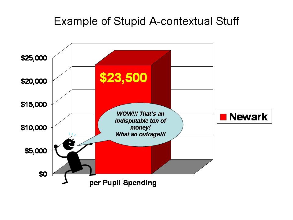
So, where do these Newark spending figures come from and why is important to contextualize these numbers? First of all, the $22,000 number is a rounded figure based on the total current spending per pupil reported in the 2006-07 U.S. Census Fiscal Survey – elementary and secondary finances. The updated 2007-08 figure rises to $23,500. Wow… holy crap… that’s a lot right?

So, we’re kind of starting with a “fact” (a number that can be linked to some reasonable source). That said, even this fact varies by source. Note that in a per pupil spending figure we’ve got a numerator – spending and a denominator – pupils. Both matter to how this number is calculated. The New Jersey Department of Education reports Newark Public Schools Spending per Pupil around $16,000 to $17,000 during those same years. NJDOE also reports NPS enrollment well over 45,000. The implicit enrollment of NPS in the Census Fiscal Survey figures (backed out from total current spending and per pupil estimate) is around 43,000. Census reports NPS enrollment at about 40,000 (but uses the 43,000 figure to generate the per pupil figure).  So, this unexplained discrepancy is responsible for some of the difference. But this is all rather trivial quibbling to some extent. A much simpler, transparent issue is the issue of context.

Let’s walk through some examples. Here is how the media has been pitching Newark Public Schools spending:


One big bar on a graph, sitting out in space. The general public doesn’t have a particularly good idea of what that $23,500 means. So, they are simply told – Damn… that’ s a lot- maybe even the most in the country! Either way, it’s ton of money… which is unquestionably being wasted.

The other comparison we’ve been seeing and hearing in New Jersey is that Newark spends twice what Texas spends per pupil – and they get great outcomes and Newark… well… stinks… because they’re wasting it all. Here’s my stylized graph of that example (which you can find here: http://www.nje3.org/?p=4588)


Wow, that’s some really brilliant stuff there. For fun, I’ve used one of those fine visual tricks of cutting off the first $10,000 to emphasize the fact that Newark spends a ton, and Texas not much at all… Texas great… Newark stinky – expensive and stinky.

Setting aside this foolishness, how does Newark actually compare – in various contexts?

Is Newark the highest spending district in the nation? one of them?

Is Newark the highest spending district in the metropolitan area? (NYC Core based statistical area)

Is Newark even the highest spending in New Jersey?

Here, I use the Census Fiscal Survey data from 2007-08 and walk through for NPS, the same comparisons I did in the previous state ranking post.

This table shows the alternative comparisons. First out of 13,500 or so districts nationally with sufficient data for the comparison, NPS ranked 220 without any cost or need adjustment. Not #1, but 220. That’s still pretty high – 220 out of 13,500 puts NPS at about the top 2%. However, simply adjust for regional differences in competitive wages, and NPS drops to 732, about the top 5%. Next, adjust for the additional needs of children in poverty (using a conservative adjustment as I did in the previous post) and Newark slides back to rank of 1158 – still in the top 10%, but not top overall by any stretch.

Now, as I noted in my previous post, cross state – national comparisons are tough because it’s particularly hard to equate the costs of hiring teachers and other school staff across regions and it’s also hard to equate poverty rates from one location to another.

So then, let’s focus on the NY metro area. For starters, NPS comes in 56th with no adjustments, and 53rd when we adjust for wage variation (because the NCES wage index does carve the NY metro area into a handful of labor markets). Either way, NPS is not at the top of even the NY labor market in spending. Among the 546 or so districts in the NY metro, NPS hovers around the top 10% – on the edge of it. If we take the additional step of adjusting for children in poverty, NPS drops to a rank of 144 out of 546 – below the 25%ile.

NPS ranks somewhat higher within the state of NJ than in the broader metro area, mainly because the highest spending districts in the NY metro area tend to be in New York State – Westchester and Rockland Counties and on Long Island. Yeah… NY districts spend much more than New Jersey districts in the NY metro area, and as I’ve shown previously, have much higher salaries as well.

So there you have it. Newark per pupil spending in context. Newark Public Schools are a relatively high spending district, which provides the district with more opportunities to assist its high need population than other urban, high poverty, high minority concentration districts around the country. But Newark is not some massive outlier – most expensive in the nation district.

Note that these analyses do not question the Census per pupil spending figure. I simply accept that number – because I’ve accepted the Census data for all others in the sample. It would be inappropriate for me to “audit” NPS spending without looking for similar issues in other cities and states. The number may be screwed up, which is why I tend to stay away from the Census data for individual district analysis, without reconciling across other sources. But, it is what it is, and these data are generally pretty good (but for some specific states).

Finally, while I have shown here that NPS is still a relatively high spender, even after adjustments, I’ve not tackled the outcome question. What do we get for this funding? I would argue that pundits have grossly misrepresented this side of the equation as well. Pundits argue that NPS has a low graduation rate and that graduation rate is even inflated because more kids graduate than actually pass the high school assessments (using the alternative assessment to get around the supposed gate). Those same pundits are quick to point out the very high graduation rates of the few secondary charter schools in NJ – as a good thing. I show  in this much older post that these same charters which graduate 97% of their students actually had lower high school math assessment scores than poor urban districts (which had lower grad rates). Pot? Kettle? ???? Perhaps more on the outcome issue at a later point in time.

In the meantime, for a thorough discussion of the relationship between school funding reforms and student outcomes, see this article (which includes some discussion of New Jersey):

Baker, B.D., Welner, K. School Finance and Courts: Does Reform Matter, and How Can We Tell? Teachers College Record

http://www.tcrecord.org/content.asp?contentid=16106

DoReformsMatter.Baker.Welner

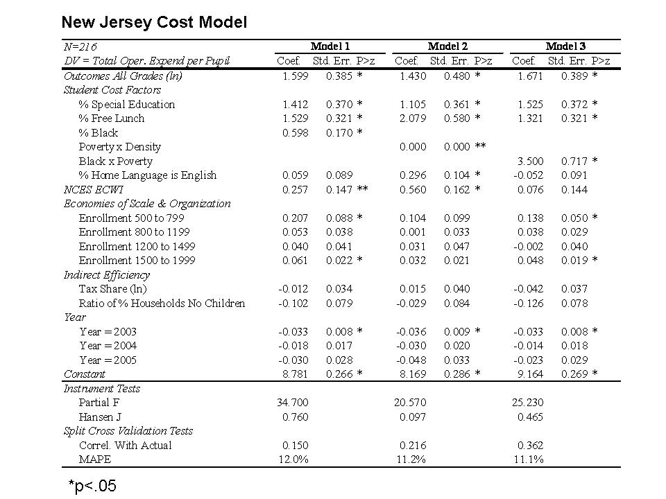
UPDATE: Here’s one additional really important comparison for NPS. The following graph compares NPS to the 216 K-12 NJ districts for whom sufficient data were available for this analysis.  This graph starts by comparing NPS to the other districts in the state and in Essex County using each of the above methods for adjusting spending figures – ECWI and then the ECWI and a poverty weight. But, clearly even the latter of these two approaches doesn’t catch all of the cost differences faced by Newark Public Schools. The final comparison in this graph includes a “comprehensive” cost adjustment based on a statistical model of New Jersey School districts – a “cost function” model, an approach which has been used extensively in economic research on education costs (Google Scholar Search on Cost Function Research of William Duncombe and John Yinger).

Here we see that if we account for the various costs faced by NPS, NPS actually has less per pupil than either the state average or other districts in Essex County.

Here is a link to the cost models. Note: for this analysis I actually adopted a very conservative assumption to generate the cost index for NPS. The statewide average cost index is 1.0 and NPS receives a cost index around 1.7 indicating 70% higher than state average costs, largely as a function of student population served, but also being in a higher wage labor market. The conservative assumption was that any variation in spending picked up by the model that was associated only with being an Abbott district (and not accounted for by differences in outcomes) was treated as “inefficiency,” and therefore not counted toward Abbott district cost index values (a significant portion of  the Abbott bump in funding was effectively removed as if “waste” even though this is a suspect assumption).

State Ranking Madness: Who spends most/least?

Ranking the states by different methods

Every year, through many different sources, state politicians and political activists make great waves over which state spends more on public education, and which spends less. Who’s in first place? Who’s in last? Those from differing perspectives have different motives. Politicians and anti-tax, anti-government activists search for their way to find that “our states spends more than everyone else and gets nothing for it,” while others hoping to increase education spending search frantically for low ratings – “We’re in last place and that’s a disgrace!” Of course, not everyone can be in first or last place and it’s pretty damn hard to tweak the numbers to move a state from near the top to near the bottom. Here, I’ll present a few alternative, reasonable rankings – the last two of which, I believe are most reasonable, though for some states still differ significantly.

First, let’s begin with the simplest version of the numbers- the straight up averages of school district state and local revenue per pupil (weighted by the number of pupils in each district). Now, I use the state and local revenue per pupil instead of current expenditures per pupil because state and local revenue gives a complete picture of state and local resources allocated to local public school systems and excludes expenditures of federal funds.

Politicians in New Jersey and New York love to make claims that their state is highest spending in the nation (and we get nothing for it!). Even at this most basic level, these claims are wrong. Close, but still wrong. Hooray for Vermont! But isn’t that really part of Canada anyway?

FIGURE 1

Of course, the cost of running a school varies quite significantly across states with a large share (though not all) of that variation being tied to regional differences in the competitive wage one must pay to teachers. Here, I use a competitive wage index developed by the National Center for Education Statistics (by Lori Taylor and Bill Fowler) which uses variation in non-teacher wages across labor markets to correct for variation in teacher wages. http://nces.ed.gov/edfin/adjustments.asp

FIGURE 2

Some reshuffling occurs. States like California, for example drop quite a bit because California is certainly a more expensive place to live and higher wage state. But, we may be assuming too strong a role for the wage adjustment here – assuming that state and local revenues per pupil should move on a 1 for 1 basis with wage variation. Nonetheless, not a totally unreasonable comparison.

We might also wish to consider the student populations that states must educate with their funding at present levels. That is, how much are these current dollars worth toward achieving common outcomes across students? Many cost factors influence the cost of achieving common outcomes across children, as discussed in this paper –http://surface.syr.edu/cgi/viewcontent.cgi?article=1102&context=cpr – by William Duncombe and John Yinger of the Maxwell School at Syracuse University. But, this particular paper focuses on the additional costs associated with children in poverty. Duncombe and Yinger determine that the additional cost per child falling below the federal poverty line is approximately 150% of the cost of achieving the same outcomes with a non-poor child. They also find that the additional costs associated with counts of children falling below the 185% poverty threshold are approximately 100% above average costs. Now, I go very conservative here, and I apply only a 100% weight of additional cost to children qualifying as being in poverty, using U.S. Census Bureau Small Area Income and Poverty Estimates.

FIGURE 3

But, we’ve been learning more of late about problems with using the same income thresholds for poverty across states with very different costs of living. Recently, the U.S. Census Bureau put out this exceptional paper which includes adjusted poverty measures for each state, based on three different adjustment methods – http://www.census.gov/hhes/www/povmeas/papers/Geo-Adj-Pov-Thld8.pdf. In general, the adjustments lead to much higher actual poverty rates in states with very high costs of living such as New York and California. If we use those poverty rates instead of the previous ones to adjust spending for poverty, we get this:

FIGURE 4

In this case, California moves into 49th place, or third from bottom with Washington DC in the analysis.

We’re still missing a pretty big piece of the puzzle here – additional costs associated with economies of scale and population sparsity (for more information on economies of scale see: http://www-cpr.maxwell.syr.edu/efap/Publications/Revisiting_Economies.pdf). Notice that Wyoming and Alaska are our big spenders here. Now, there’s probably no adjustment we can find to fully account for the many ways in which Alaska is different from the lower 48. Nor do the poverty corrections seem to fully address the difficulties of Washington DC. It’s all pretty imperfect. That said, I take one more stab at things, based on a regression model which attempts to control for a) competitive wage variation, b) economies of scale and population density and c) poverty. The idea here is to account for the fact that some states have a need for very small schools and districts because of their small populations which are spread across vast rural expanses. The model attempts to avoid giving a break to other states like New Jersey or Illinois that have many tiny racially segregated enclaves in densely populated suburbs. And here are the results:

FIGURE 5

An important difference when using a regression model to determine relationships between cost factors and revenue levels – instead of just dividing by the cost factors – is that the model determines the weight of those cost factors. On thing that happens in the figure above is that the influence of wage differentials is “softened.” The model-based projections do not assume a 1 for 1 relationship between competitive wages and revenue. As a result, California does not come out as low as in previous figures. Also, the model is projecting state and local revenues for a district with X% poor children. The projection is for an “equated” condition. But, if the state has far more children in higher poverty settings, and those settings have fewer resources, the model projection does not necessarily reflect the average actual conditions. However, for California in particular, there really isn’t a systematic relationship between poverty and revenues across districts – a finding that is as bad as it might seem good. In fact, it’s just bad!

Aren’t the differences really all about state wealth?

I would be remiss if I didn’t include at least a few ugly scatterplots in this post. So here goes. The first two scatterplots here show that state and local revenues per pupil are somewhat modestly related to state average poverty rates (not adjusted regionally) and to the household income levels of families with children in the public school system.

FIGURE 6

FIGURE 7

However, this final figure shows that state and local revenues per pupil are equally related to the effort a state puts up, where effort is measured in terms of state and local revenue per pupil as a share of gross domestic product by state, or gross state product. That is, some states that don’t raise much revenue per pupil simply don’t try that hard. Very few high spending states have low effort. Tennessee, Louisiana, Oklahoma, Arizona and South Dakota are near the bottom because they don’t put up much effort. Mississippi puts up average effort, but just can’t raise much revenue. I’m far more empathetic to Mississipi’s plight! Well, our highest spender, Vermont in some cases, is off the charts on effort. Despite having less capacity than states like New York or New Jersey, Vermont still manages to outspend them.

FIGURE 8

While it makes great rhetoric to claim “first in the nation” or “last in the nation” or “most expensive,” the best one can really do here is to delineate in terms of relatively high or relatively low. Not great headline stuff, but that’s how it goes. New Jersey – NOT THE HIGHEST IN THE NATION – rather, “relatively high.” California – NOT LAST IN THE NATION – but damn close to it by some measures, and still low by others!

On False Dichotomies and Warped Reformy Logic

Pundit Claim 1 – Value added modeling is necessarily better than the “status quo”

There exists this strange perspective that we are faced with a simple choice in teacher evaluation – a choice between using student test scores and value-added modeling, or continuing with the status quo. This is a false dichotomy, false dilemma or logical fallacy. In other words, it’s a really stupid argument in which we are forced to assume that there are only two choices that exist. This argument is usually coupled with an implicit assumption that one of the two must be superior.

“Reformers” continue to press the argument that current teacher evaluations are so bad, so unreliable, that anything is better than this “status quo.”

Expressed mathematically:

Anything > Status Quo

Bear with me while I use the “greater than” symbol to imply “really freakin’ better than… if not totally awesome… wicked awesome in fact,” but since it’s relative, it would have be “wicked awesomer.”

Because value-added modeling exists and purports to measure teacher effectiveness, it therefore counts as “something,” which is a subclass of “anything” and therefore it is better than the “status quo.” That is:

Value-added modeling = “something”

Something ⊆ Anything (something is a subset of anything)

Something > Status Quo

Value-added modeling > Current Teacher Evaluation

Again, where “>”  means “awesomer” even though we know that current teacher evaluation is anything but awesome.

It’s just that simple!

After all, you can’t even measure the error rate in current principal and supervisor evaluations of teachers can you? And if you can’t measure the error rate it must be higher than any error rate you can measure? More really basic reformy logic! That is, the unobserved error rate in one system is necessarily greater than the observed error rate of another – even if we have no way to quantify it – in fact, because we have no way to quantify it?

Unobserved error rate of ‘status quo’ > measured error rate of VAM

Let’s be really blunt here. Both are patently stupid arguments.

And both of these arguments bring to mind one of my favorite analogies related to this issue. If we were in a society that still walked pretty much everywhere, and some tech genius invented a new cool thing – called the automobile – but the automobile would burst into a superheated fireball on every fifth start, I think I’d keep walking until they worked out that little kink. If they never worked out that little kink, I’d probably still be walking. I’ve written previously about how this relates to likely error rates in teacher dismissal (misclassifying truly effective teachers as ineffective) as would occur when using typical value-added modeling approaches.

Pundit Claim 2 – If we get rid of the bad teachers, the system will necessarily be better

The assumption of many pundits is that replacing existing teachers necessarily improves the teaching workforce – that the average potential applicant for any/all available teaching jobs will be better than the average person already there, or at least better than the person we dismiss as ineffective. Now, recall that we have a pretty high chance of misclassifying truly effective teachers and dismissing them.

Now, the math here is similar to that above. The basic premise is that:

Anything > Status Quo

First of all, we know already that schools with more difficult working conditions have a much more difficult time recruiting and retaining quality teachers. Working conditions play a significant role in teacher sorting in initial job matches and in teacher moves over time.

We also know, just by looking at such information as the patterns of higher and lower “effectiveness” scores in the LA Times analysis, that if we dismiss teachers on the basis of their value added scores, we will be dismissing larger shares of teachers in higher poverty, higher minority schools. Or, we can just take the Central Falls, RI approach and declare the entire school failing based on its average performance over time (setting aside demographics and resources) and just fire everyone. Surely the replacements will be better. How could we do worse? Right?

Here’s the thing – even if we assume that some of the lower performance of teachers in poorer LA schools or the lower performance of Central Falls HS is a function of a weaker, less effective teacher workforce, we can only make things “better” by replacing that workforce with “better” teachers.

It is completely arrogant to take the reformy attitude of “how can we possibly do worse?” How could we possibly get a worse pool of teachers than the lazy slugs already in the system?

If the teacher pool in these schools is in fact less effective, and don’t just look that way statistically because of other factors, it may just be that these schools had a difficult time recruiting and retaining teachers to begin with. If we introduce our “game changing” policies – firing all of the teachers for low school performance, or firing individual teachers for bad effectiveness ratings – we will likely make things even worse.

Any teacher wishing to step in line to replace the previous cohort of “failures,” will have to not only consider the difficult working conditions but also the disproportionate likelihood that she/he will be fired a few years down the line, for factors well beyond his/her control (e.g. that pesky non-random assignment problem). That’s a significant change in working conditions – job risk. Without either changing other working conditions or substantially increasing compensation to offset this new risk, the applicant pool is not likely to get better – especially when risk is not increased similarly in other “more desirable” school districts. All else equal, the applicant pool is likely to get worse. The disparity in the quality of applicants for teaching positions is likely to increase dramatically, and the average quality of applicants to high poverty, high minority concentration districts may decline significantly.

Bonus video with thanks to Sherman Dorn:

A few thoughts on the unlikely alliance…

Today was the day of the big Oprah-Christie-Booker-Zuckerberg event, which I guess we can all watch around 4pm if we really want to. I’ve been trying to dig up any information I can, without wasting too much time on this, because there are certainly more important things to get to. That said, I do have a few brief comments in response to specific points and issues raised.

In an effort to get a good soundbite, Mayor Booker commented on Oprah that “You can not have a superior democracy with an inferior system of education” a comment that has now been re-tweeted over a hundred times. Here’s the thing. This whole situation is about a philanthropic contribution from a single wealthy individual, which has been described in the media as a contribution that carries with it a stipulation that the Governor grant unprecedented power to the Mayor to control Newark Public Schools. Anyone else seeing the contradiction here? My basic summary points are:

  • We should be concerned and skeptical any time a single individual uses their wealth to buy substantive changes to public policy.
  • Setting aside Booker’s loose use of the term democracy, I have to ask: Is it really democratic to have a single individual pay to alter the very structure of state and local government?

Would that be “democracy hypocrisy?”

Next on my list – the nature of the preferred reforms. We have little specific information on the types of school reforms that Mark Zuckerberg would like to see implemented in Newark or whether he has any specific interest in promoting certain education reforms. Zuckerberg provides some insights in this interview: http://techcrunch.com/2010/09/24/techcrunch-interview-with-mark-zuckerberg-on-100-million-education-donation/. Perhaps the most striking part of the interview is here:

So that – that way Cory is really aligned towards one – like this is his top priority. He just got re-elected by a pretty big margin and it’s his biggest priority. Then, so now – so that’s kind of what we’re doing, I mean, the idea is fund him and basically support him in doing a really comprehensive program to get all these things in place that they need to get done. [DELETE: So we should close down schools that are failing, get a lot of good charter schools and figure out new contracts for teachers so that better teachers can get paid more money, that more for performance as opposed to just based on how long you’ve been there. Have a lot of programs that are after schools that to keep kids healthy and safe and I mean, Newark, isn’t the safest city. So that’s the basic thing. And I mean for…]

I was particularly intrigued by that part in brackets, after DELETE – where Zuckerberg or the interviewer interpreting Zuckerberg seems to be suggesting a strong preference for massive charter expansion, closing public schools, and pushing for teacher contracts tied to student achievement data. The implication across media sources yesterday and today has been that the preference for these specific types of reforms across this seemingly diverse set of individuals – Zuckerberg, Oprah, Christie and Booker – validates the public interest in moving quickly toward accomplishing these public policy objectives. Setting aside the issue that fast-tracking these reforms under these circumstances is built on buying – with a big $$ gift – a change in state and local governance, I offer the following comments regarding this new unlikely alliance and these specific reform strategies:

  • It’s interesting to see such an eclectic cast of characters unify around a set of unproven and ill-conceived school reform strategies to hoist upon the children of Newark.
  • The fact is that major research organizations including the National Research Council, American Education Research Association, National Council on Measurement in Education, American Psychological Association and others have advised strongly against misusing student testing data to evaluate teacher effectiveness and there are many technical and statistical as well as practical reasons for their conclusions. With all due respect, a consensus vote in favor of these flawed policies from our Governor, the Newark Mayor, Oprah and Mark Zuckerberg doesn’t change that.

More Information:https://schoolfinance101.wordpress.com/category/race-to-the-top/value-added-teacher-evaluation/

  • The reality is that two of Newark’s most acclaimed charter schools – Robert Treat and North Star both serve far fewer of the lowest income children than nearby Newark Public Schools (43% to 47% compared to over 70% NPS) and very few children with disabilities (3.8 to 7.8% compared to 18.1% NPS) or limited English skills. It may be ‘working’ for them, but that’s not scalable reform. Eventually someone has to serve all of those other kids.

Data link: https://sites.google.com/site/schoolfinancepolicy/Home/NJCharters.xls?attredirects=0&d=1

Update from the Star Ledger: http://www.nj.com/news/index.ssf/2010/09/facebook_ceo_mark_zuckerberg_s.html

Apparently the “deleted” section has been removed from the interview, but I’m not the only one who saw it!

A few pictures related to my comment on charter school demographics:


And here are the 2009 assessment results for NPS and Newark Charter schools. As you can see, the very low poverty charters do very well. But they just aren’t comparable to NPS schools. Other higher poverty charters, which are still actually much lower poverty (and low or no special ed) than NPS schools, are actually distributed among the NPS schools, regardless of test subject or grade.


If money doesn’t matter…

A) Then why do private independent schools, like those attended by our President’s children (Sidwell Friends in DC), or by Davis Guggenheim’s children (?), spend so much more than nearby traditional public schools?

Davis Guggenheim, producer of Waiting for Superman, frequently explains to the media these days that he feels uneasy that he has made a personal choice drive by his neighborhood school each day to bring his children to a private school. Now, I don’t know which private school his children attend, but I would suspect (though I may be wrong) that it is more likely to be an academically elite, private independent school than to be a conservative Christian or urban Catholic school. As I discuss in this previous report, the spending differences and resulting programmatic resources and teacher characteristics by type of private school are striking: http://epicpolicy.org/publication/private-schooling-US

I would see little problem with Guggenheim’s personal anecdote were it not for one of the central arguments of Superman being that money plays little or no role in fixing public education systems. Instead, tough-minded superintendents like Michelle Rhee, or charter schools are the solution – money or not.

Again, I’ll fess up to the fact that I am a former teacher at and big supporter of Private Independent Schools. Here’s the school in New York City where I used to teach www.ecfs.org, and here’s its page on tuition: http://www.ecfs.org/admission/tuition.aspx. It was then, and I suspect still is an outstanding example of what a school can be! But that outstanding-ness comes at a price!

(approximately $36,000 per year for middle school and up)

The problem with the assertion that “money wouldn’t help public schools anyway” is that many of those pitching the argument seem themselves to favor private schools that spend more – A LOT MORE – per child than the public schools they are criticizing as failing (speak nothing of the fact that the public schools are serving a much more diverse student population).

Here are some comparisons pulled from my 2009 study on private school expenditures.

First, here’s the per pupil spending in 2005-06 for a handful of major labor markets that had sufficient numbers of Private Independent Day Schools for calculating the averages. My original sample of IRS Tax filings covered about 75% of all Private Independent Day Schools (NAIS or NIPSA member schools), so these are not “outlier” schools.

FIGURE 1 (This figure is now the figure from my original report: http://epicpolicy.org/publication/private-schooling-US)

And here are the regional averages, adjusted for regional differences in competitive wages, using the NCES Education Comparable Wage Index.

FIGURE 2 (This figure is now the figure from my original report: http://epicpolicy.org/publication/private-schooling-US)

If money doesn’t matter when it comes to school quality, then why not pick one of those private schools that charges only $6,000 in tuition, and spends $8,000 per pupil? Clearly there is some basis for the decision to send a child to a more expensive private school? There is some “utility” placed on the differences in what those schools have to offer? In the complete report above, I discuss (in painful detail) those differences across private schools, but here, I quickly summarize some of the differences between private independent schools and traditional public school districts.

FIGURE 3 (This figure is now the figure from my original report: http://epicpolicy.org/publication/private-schooling-US)

Private independent schools a) spend a lot more per pupil, b) have much lower pupil to teacher ratios and c) have much higher shares of teachers who attended more competitive colleges. These seem like potentially substantive differences to me. And they are differences that come at a cost.

I am by no means criticizing the choice to provide your own child with a more expensive education. That is a rational choice, when more expensive is coupled with substantive, observable differences in what a school offers. I am criticizing the outright hypocritical argument that money wouldn’t/couldn’t possibly help public schools provide opportunities (breadth of high school course offerings, smaller class sizes) more similar to those of elite private independent day schools, when this argument is made by individuals who prefer private schools that spend double what nearby public schools spend.

Sidebar: I suspect there are few if any private independent day schools out there which currently evaluate their teachers based on student test score gains alone. Please let me know if you know of one? And, I should note that the private independent school where I worked in New York City was actually unionized and had a tenure system in place with a probationary period similar to that of public schools and a salary schedule tied to experience.

B) Then why do venture philanthropists continue to throw money at charter schools while throwing stones at traditional public schools?

Charter school backers like Whitney Tilson love to throw stones at public schools while throwing money at charter schools. Here’s one of his presentations:

http://www.tilsonfunds.com/Personal/TheCriticalNeedforGenuineSchoolReform.pptx

On Slide 13, Whitney Tilson opines that increased spending on public education has yielded no return to outcomes over time, and therefore, by extension, increased spending would not and could not help public schools in the future. Tilson is featured prominently in this New York Times article on affluent fund managers in NYC rallying for charter schools: http://www.nytimes.com/2010/05/10/nyregion/10charter.html?pagewanted=all

So, here we have one of many prominent New York City charter school supporters on the one hand arguing that throwing more money at the public school system could not possibly help that system, but on the other hand, providing substantial financial assistance to charter schools (or at least participating in and promoting groups that engage in such activity)?

A New York City Independent Budget Office report suggested that charter schools housed in public school facilities have comparable public subsidy to traditional NYC public schools, but charter schools not housed in public school facilities have to make up about $2,500 (per pupil) in difference. I will show in a future post, however, that student population differences (charters serving lower need populations) largely erase this differential.

Kim Gittleson points out here, that in 2008-08, NYC Charter schools raised an average of $1,654 per pupil through philanthropy. But, some raised as much as $8,000 per pupil. As a result, some charters – those most favored by venture philanthropists – spend on a per pupil basis much more than traditional NYC public schools (including KIPP schools). I will provide much more detail in this point in a future post.

One might argue that the Venture Philanthropists are trying to spend their way to success – To outspend the public schools in order to beat them! After all, it’s the New York Yankee, George Steinbrenner way? (spoken from the perspective of a Red Sox fan, who spent the last several years in Kansas City, supporting the underdog – low payroll – Royals).

But here’s the disconnect – These same Venture Philanthropists – like Tilson, who are committed to spending whatever it takes on charters in order to prove they can succeed, are arguing that public schools a) don’t need and b) could never use effectively any more money. They are trying to argue that charters are doing more with less, when some are doing more with more, others less with less, and some may be doing more with less, and others are actually doing less with more. Shouldn’t traditional public schools be given similar opportunity to do more with more? And don’t give me that … “we’ve already tried that and it didn’t work” claim. I’ll gladly provide the evidence to refute that one, much of which is in the article at the bottom of this post!

C) Then why do affluent – and/or low poverty – suburban school districts continue in many parts of the country to dramatically outspend their poorer urban neighbors?

Last but not least, why do affluent suburban school districts in many states continue to far outspend poor urban ones? If there is no utility to the additional dollar spent and/or no effect produced by that additional dollar then why spend it?

Here is the overall trend, over time in the relationship between community income and state and local revenues per pupil.

When the red line is above the green horizontal line, there exists a positive relationship between district income and state and local revenue. That is, higher income districts have more state and local revenue per pupil. The red line never drops below the green line. This graph, drawn from this article (http://epaa.asu.edu/ojs/article/view/718) shows that state and local revenues per pupil remain positively associated with income across school districts nationally, after controlling for a variety of factors (see article for full detail). Things improved somewhat in the 1990s, but then leveled off.

FIGURE 4 (from: http://epaa.asu.edu/ojs/article/view/718)

Here are the trends for mid-Atlantic states, where some including New York State improved, but remain strongly associated with income. New Jersey is the only state among these where the relationship between income and revenue is disrupted and ultimately reversed.

FIGURE 5 (from: http://epaa.asu.edu/ojs/article/view/718)

Here are the trends for the New England trend, where New Hampshire school district state and local revenues remain strongly tied to income.

FIGURE 6 (from: http://epaa.asu.edu/ojs/article/view/718)

Here are the trends for the Great Lakes are trend, where Illinois remains among the most regressively funded systems in the nation (along with New York).

FIGURE 7 (from: http://epaa.asu.edu/ojs/article/view/718)

Here’s a specific look at state and local revenues per pupil in New York State districts in the NY metropolitan area, with districts organized by U.S. Census Poverty rates.

FIGURE 8

Is there a reason why Westchester County and Long Island school districts choose to spend so much more than New York City on a per pupil basis? What about those North Shore Chicago area districts?

These communities demand higher expenditures per pupil for their schools on a presumption that the marginal dollar does not go entirely to waste – that there is some value, some return for that dollar, perhaps in the richness of supplemental programs offered or the smaller class sizes – much like the differences in private schools seen above.

Finally, I point you to this recently published article in Teachers College Record, where Kevin Welner and I try to set the record straight on the effectiveness of “reforms” involving state school finance systems. They’re not the “reformy” reforms, but school finance reforms are reforms nonetheless.

Baker, B.D., Welner, K. School Finance and Courts: Does Reform Matter, and How Can We Tell? Teachers College Record

http://www.tcrecord.org/content.asp?contentid=16106

DoReformsMatter.Baker.Welner

Value-Added and “Favoritism”

Kevin Carey from Ed Sector has done it again. He’s come up with yet another argument that fails to pass even the most basic smell test. A few weeks ago, I picked on Kevin for making the argument that while charter schools, on average, are average, really good charter schools are better than average. Or, as he himself phrased it:

reasonable people acknowledge that the best charter schools–let’s call them “high-quality” charter schools–are really good

I myself am reasonable on occasion and fully accept this premise. Some schools are really good, and some not so good. And that applies to charter schools and non-charters alike, as I show in my recent post Searching for Superguy.

Well, last week Kevin Carey did it again – made a claim that simply doesn’t even pass the most basic smell test.  In the New York Times Room for Debate series on value-added measurement of teachers, Carey argued that Value-added measures would protect teachers from favoritism. Principals would no-longer be able to go after certain teachers based on their own personal biases. Teachers would be able to back up their “real” performance with hard data. Here’s a quote:

“Value-added analysis can protect teachers from favoritism by using hard numbers and allow those with unorthodox methods to prove their worth.” (Kevin Carey, here)

The reality is that value-added measures simply create new opportunities to manipulate teacher evaluations through favoritism. In fact, it might even be easier to get a teacher fired by making sure the teacher has a weak value-added scorecard. Because value-added estimates are sensitive to non-random assignment of students, principals can easily manipulate the distributions of disruptive students, students with special needs, students with weak prior growth and other factors, which, if not fully accounted for by the VA model will bias teacher ratings. And some factors – like disruptive students, or those who simply don’t give a $#*! won’t (and can’t) be addressed in the VA models. That is, a clever principal can use the VA non-random assignment bias to create a statistical illusion that a teacher is a bad teacher. One might argue that some principals likely already engage in a practice of assigning more “difficult” students to certain teachers – those less favored by the principal. So, even if the principal is less clever and merely spiteful, the same effect can occur.

I wrote in an earlier post about the types of contractual protections teachers should argue for, in order to protect against such practices:

The language in the class size/random assignment clause will have to be pretty precise to guarantee that each teacher is treated fairly – in a purely statistical sense. Teachers should negotiate for a system that guarantees “comparable class size across teachers – not to deviate more than X” and that year to year student assignment to classes should be managed through a “stratified randomized lottery system with independent auditors to oversee that system.” Stratified by disability classification, poverty status, language proficiency, neighborhood context, number of books in each child’s home setting, etc. That is, each class must be equally balanced with a randomly (lottery) selected set of children by each relevant classification.

This may all sound absurd, but sadly, under policies requiring high stakes decisions such as dismissal to be based on value added measures, this stuff will likely become necessary. And, it will severely constrain principals who wish to work closely with teachers on making thoughtful, individualized classroom assignments for students. I address the new incentives of teachers to avoid taking on the “tough” cases in this post: https://schoolfinance101.wordpress.com/2010/09/01/kids-who-don%E2%80%99t-give-a-sht/

Technical follow-up: I noticed that Kevin Carey claims that VA measures “level the playing field for teachers who are assigned students of different ability.” This statement, as a general conclusion, is wrong.

a) VA measures do account for the initial performance level of individual students, or they would not be VA measures. Even this becomes problematic when measures are annual rather than fall/spring, so that summer learning loss is included in the year to year gain. An even more thorough approach for reducing model bias is to have multiple years of lagged scores on each child in order to estimate the extent to which a teacher can change a child’s trajectory (growth curve). That makes it more difficult to evaluate 3rd or 4th grade teachers, where many lagged scores aren’t yet available. The LAT model may have had multiple years of data on each teacher, but didn’t have multiple lagged scores on each child. All that the LAT approach does is to generate a more stable measure for a teacher, even if it is merely a stable measure of the bias of which students that teacher typically has assigned to him/her.

b) VA measures might crudely account for socio-economic status, disability status or language proficiency status, which may also  affect learning gains. But, typical VA models, like the LA Times model by Buddin tend to use relatively crude, dichotomous proxies/indicators for these things. They don’t effectively capture the range of differences among kids. They don’t capture numerous potentially important, unmeasured differences.  Nor do they typically capture classroom composition – peer group – effect which has been shown to be significant in many studies, whether measured by racial/ethnic/socioeconomic composition of the peer group or by average performance of the peer group.

c) For students who have more than one teacher across subjects (and/or teaching aides/assistants), each teacher’s VA measures may be influenced by the other teachers serving the same students.

I could go on, but recommend revisiting my previous posts on the topic where I have already addressed most of these concerns.

Searching for Superguy in Gotham

Who is Superguy? By most popular accounts, Superguy is a figure of mythical proportion (urban legend proportion) capable of swooping down into the poorest of urban neighborhoods of America’s largest cities, gaining immediate access to schooling facilities, rounding up unthinkable private contributions from wealthy philanthropists and quite simply saving the lives of low-income urban school children trapped in bleak, adult-centered, perpetually failing traditional public schools.

Superguy could be found anywhere in the U.S where urban charter schools have proliferated in the past decade – Kansas City, Washington D.C., Chicago, Dallas, Houston, or even more likely, New York City – Gotham itself (yeah… Gotham was a Batman thing, not Superman… but hang in there with me).  I’ve chosen to focus on urban locations here, because who has ever heard of a “rural legend?”

I’ve written on a number of occasions about my general skepticism that Superguy really exists, or that he necessarily exists in the form of an urban charter school operator. My skepticism is based on my own read of the balance of research on charter schools and my own casual analysis  of New York City and New Jersey Charter Schools. New Jersey Charter Schools in particular are pretty average and those that are better than average serve very few of the lowest income children, no special needs children and few or no limited English proficient children. Personally, I’d expect Superguy to be out there fighting for these kids in particular, not just setting up shop in their neighborhood and cream-skimming the less needy among the more needy. But hey, that’s just my notion of what Superguy should be.

For an exceptional review of charter school research, I would recommend Robert Bifulco and Katrina Bulkley’s chapter on Charter Schools in the Handbook of Research on Education Finance and Policy. Neither of these scholars are charter school naysayers, yet they conclude:

Research to date provides little evidence that the benefits envisioned in the original conceptions of charter schools – organizational and educational innovation, improved student achievement, and enhanced efficiency – have materialized.

Of course, the true believers in Superguy (as charter operator) will argue vehemently that the finding that charters, on average, are average does not shake their belief… because the “upper half of charter schools is really good!, better than average, in fact!” Skeptically, I respond – isn’t the upper half of all schools better than average? If so, might Superguy actually be found in any school that’s better than average? But who am I to nitpick?

The most compelling evidence that Superguy exists was provided in Caroline Hoxby’s finding regarding NYC charter schools that:

On average, a student who attended a charter school for all of grades kindergarten through eight would close about 86 percent of the “Scarsdale-Harlem achievement gap” in math and 66 percent of the achievement gap in English.

Who other than Superguy could close the Harlem-Scarsdale gap? However, Stanford University researcher Sean Reardon explains:

Because the report relies on an inappropriate set of statistical models to analyze the data, however, the results presented appear to overstate the cumulative effect of attending a charter school.

Superguy in Gotham is also assumed to have competitive effects, lifting entire neighborhoods wherever he may be present. This evidence is often cited to Marcus Winters’ (Manhattan Institute) finding that:

The analysis reveals that students benefit academically when their public school is exposed to competition from a charter.

But thwarting this Superguy sighting is Wellesley economist Patrick McEwan’s observation that:

The statistical analysis suggests that increasing competition has no statistically significant impact on math test scores, but that it has small positive effects on language scores. The report does not conclusively demonstrate that the results are explained by increasing competitive pressure on public school administrators; they may also be explained by shifting peer quality or declining short-run class sizes in public schools.

Those pesky, curmudgeonly,  academics are at it again… denying the true believers that Superguy comes in the singular form of a New York City charter school operator!

Then there’s the claim that Superguy himself may have been outed in Harlem (is Superguy really Geoffrey Canada?) – as evidenced by Dobbie and Fryer’s studies of the amazing success of Harlem Children’s Zone. But then Russ Whitehurst of Brookings stepped in to rain on this parade, finding the HCZ Promise academy to be relatively average as far as NYC charter schools go.

For several additional curmudgeonly critiques of Superguy sightings, see: http://epicpolicy.org/search/epicpolicy/charter

It is with these contradictory findings in mind that I present the following figures, and we begin our statistical search for Superguy. Now, this is not a really deep, statistically rigorous search for Superguy. The approach here is what some refer to as a “beating the odds” approach (BTO) and is similar to the adjusted performance approach used by Whitehurst in his Brooking critique of HCZ.

It seems that the logical place to start would be New York City, home to the greatest number of Superguy sightings. Let’s begin with a simple flyover of NYC schools, including traditional public schools and charter schools just to get a feel for the demographics of those schools.

Here is the % of children qualifying for Free Lunch across Harlem (and South Bronx) schools. This map does not indicate which schools are charters, but you can click the link below the map to see which ones are.

CLICK HERE TO SEE WHICH SCHOOLS ARE CHARTER SCHOOLS (indicated with an asterisk)

Here is the % of children who are limited in their English language proficiency. Again, this map doesn’t show us which schools are charters, but you can click the link below.

CLICK HERE TO SEE WHICH SCHOOLS ARE CHARTER SCHOOLS (indicated with an asterisk)

Now, here’s our first “Beating the Odds” scatterplot. The predicted performance values expressed on the vertical axis are from a regression equation that accounts for a) limited English proficiency shares, b) free lunch shares, c) mobility shares, d) borough and e) year (includes 2008 & 2009). These graphs look at the adjusted performance levels (not value-added) of NYC traditional public and NYC charter schools (standardized difference between actual and predicted values for 2009). These are illustrative. While outcome levels do go up (are inflated) in 2009, the distributions in these scatterplots don’t change a whole lot if I use 2008 or earlier. (here are the models)

The first Beating the Odds scatterplot looks at the average performance from 2009 (yes, the really inflated test score year) for NYC public schools. Charter schools are not identified in this graph. Schools are displayed from low to high poverty along the horizontal axis. Schools above the red horizontal line are beating the odds, or scoring higher than expected given their location and student population. Schools below the line are, well, not beating the odds. We would, of course, expect our Superguy operated schools to be flying high above the rest and certainly not falling well below… at the bottom of the scatter. So, where is Superguy?

CLICK HERE TO SEE WHICH SCHOOLS ARE CHARTER SCHOOLS

Now, here’s the average of the 4th and 5th grade outcomes. Same deal. A good ol’ BTO analysis (yeah… this isn’t really rigorous stuff, but it is illustrative). Again, charters are not identified in this picture. Yes, there are some high and some low flyers in this graph too. But are all of the high flyers charter schools? Is Superguy really here?

CLICK HERE TO SEE WHICH SCHOOLS ARE CHARTER SCHOOLS

While I don’t think we’ve found Superguy here, we are left with some potential clues about the conditions surrounding Superguy sightings – A) that superguy sightings seem more common in the presence of unexplainable deficits in the shares of children who qualify for Free Lunch, B) that Superguy sightings seem more common in the presence of unexplainable deficits in the shares of children with limited English proficiency. Other than that, it seems that Superguy is equally likely to be hiding in a traditional New York public school as it is that Superguy is secretly disguised as a charter school operator somewhere in Gotham.

Alternatively, there exists the depressing but real possibility that Superguy simply doesn’t exist – at least not in the expected form. That there just isn’t a charter school operator out there who can single-handedly swoop into poor urban neighborhoods and save childrens lives – creating results never seen before with a truly representative population of children. Or, at the very least, not all or even the average charter school operator qualifies as Superguy. Yes, some are better than others. And, some are quite good. But you know what I have to say about that argument (see above).

Yeah… I’d like to be a believer. I don’t mean to be that much of a curmudgeon. I’d like to sit and wait for Superguy – perhaps watch a movie while waiting (gee… what to watch?). But I think it would be a really long wait and we might be better off spending this time, effort and our resources investing in the improvement of the quality of the system as a whole. Yeah, we can still give Superguy a chance to show himself (or herself), but let’s not hold our breath, and let’s do our part on behalf of the masses (not just the few) in the meantime.

Value-added and the non-random sorting of kids who don’t give a sh^%t

Last week, this video from The Onion (asking whether tests are biased against kids who don’t give a sh^%t) was going viral among the education social networking geeks like me. At the same time, the conversations continued on the Los Angeles Times Value-Added story, with LAT releasing the scores for individual teachers.

I’ve written many blog posts in recent weeks on this topic. Lately, it seems that the emphasis on the conversation has turned toward finding a middle ground – discussing the appropriate role for VAM (Value Added Modeling) – if any, in teacher evaluation. But also, there is renewed rhetoric defending VAM. Most of that rhetoric seems to take on most directly the concern over the error rates in VAM – and lack of strong year to year correlation between which teachers are rated high or low.

The new rhetoric points out that we’re only having this conversation about VAM error rates because we can measure the error rate in VAM, but can’t even do that for peer or supervisor evaluation – which might be much worse (argue the pundits). The new rhetoric argues that VAM is still the “best available” method for evaluating teacher “performance.” Let me point out that if the “best available” automobile burst into flames on every fifth start, I think I’d walk or stay home instead. I’d take pretty significant steps to avoid driving. Now, we’re not talking about death by VAM here, but the idea that random error alone – under an inflexible VAM based policy structure – could lead to wrongfully firing a teacher is pretty significant.

Again, this current discussion pertains only to the “error rate” issue. Other major – perhaps even bigger issues include the problem that so few teachers could even have test scores attached to them – creating a whole separate sub-class (<20%) of teachers in each school system and increasing divisions among teachers – creating significant tension, for example between teachers under the VAM (math/reading) rating system, and teachers who might want to meet with some of their students for music, art or other enrichment endeavors.

Perhaps most significantly, there still exists that pesky little problem of VAM not being able to sufficiently account for the non-random sorting of students across schools and teachers. For those who wish to use Kane and Staiger as their out on this (without reference to broader research on this topic), see my previous post on the LAT analysis. Their findings are interesting, but not the single definitive source on this issue. Note also that the LAT analysis itself reveals some bias likely associated with non-random assignment (the topic of my post).

So then, what the heck does this have to do with The Onion video about testing and kids who don’t give a sh^%t?

I would argue that the non-random assignment of kids who don’t give a sh^%t presents a significant concern for VAM. Consider any typical upper elementary school. It is quite possible that kids who don’t give a sh^%t are more likely to be assigned to one fourth grade teacher year-after-year than to another. This may occur because that fourth grade teacher really wants to try to help these kids out, and has some, though limited success in doing so. This may also occur because the principal has it in for one teacher – and really wants to make his/her life difficult. Or, it may occur because all of the parents of kids who do give a sh^%t (in part because their parents give a sh^%t) consistently request the same teacher year after year.

In all likelihood, whether the kids give a sh^%t about doing well – and specifically doing well on the tests used for generating VA estimates – matters, and may matter a lot. Teachers with disproportionate numbers of kids who don’t give a sh^%t may, as a result receive systematically lower VA scores, and if the sorting mechanisms above are in place, this may occur year after year.

What incentive does this provide for the teacher who wanted to help – to help kids give a sh^%t? Statistically, even if that teacher made some progress in overcoming the give a sh^%t factor, the teacher would get a low rating because give a sh^%t factor would not be accounted for in the model. Buddin’s LAT model includes dummy variables for kids who are low income and kids who are limited in their English language proficiency. But, there’s no readily available indicator for kids who don’t give a sh^%t. So we can’t effectively compare one teacher with 10 (of 25) kids who don’t give a sh^%t to another with 5 (of 25) who don’t give a sh^%t. We can hope that giving a sh^%t , or not, is picked up by the child’s prior year performance, and even better, by the prior multiple years of value-added estimates on that child. But, do we really know whether giving a sh^%t is a stable student characteristic over time? Many VAM models like the LAT one don’t capture multiple prior years of value-added for each student.

I noted in previous posts that peer-effect is among those factors that compromises (biases) teacher VAM ratings. Buddin’s LAT model, as far as I can tell, doesn’t try to capture differences in peer group when attempting to “isolate” teacher effect (though this is very difficult to accomplish). Unlike racial characteristics or child poverty, whether 1 or 10 kids in a class give a sh^%t might rub off on others in the class. Or, the disruptive behavior of kids who don’t give a sh^%t might significantly compromise the learning (and value-added estimates) of others. Yet, all of this goes unmeasured in even the best VAMs.

Once again, just pondering…

NEW: BONUS VIDEO

Why I’m not crying for Louisiana and Colorado

Many of the “reformers” out there are whining and fist-thumping about the surprise omission of Louisiana and Colorado as Race to the Top Winners. After all, Louisiana has been a heavy favorite from the outset of RttT, and Colorado… well Colorado took the amazingly bold leap of adopting legislation to mandate that a majority of teacher evaluation be based on value-added test scores. That’s got to count for something. Heck, these two states should have gotten the whole thing? Here’s Tom Vander Ark’s take on this huge surprise loss: http://edreformer.com/2010/08/co-la-surprise-losers/

Now here’s why I find it somewhat of a relief that these two states did not find themselves in the winners’ circle (not that I can identify a great deal of logic to support those who did… but…).

I’ve written numerous times about Louisiana’s public education system, and that state’s support or lack-thereof for providing a decent quality education for the children of Louisiana.

https://schoolfinance101.wordpress.com/2009/12/18/disg-race-to-the-top/

Here’s an excerpt from that previous post:

Let’s take a look at Louisiana’s education system. Yes, their system needs help, but the reality is that Louisiana politicians have never attempted to help their own system. In fact they’ve thrown it under the bus and now they want an award? Here’s the rundown:

  • 3rd lowest (behind Delaware & South Dakota) % of gross state product spent on elementary and secondary schools (American Community Survey of 2005, 2006, 2007)
  • 2nd lowest percent of 6 to 16 year old children attending the public system at about 80% (tied with Hawaii, behind Delaware) (American Community Survey of 2005, 2006, 2007). The national average is about 87%.
  • 2nd largest (behind Mississippi) racial gap between % white in private schools (82%) and % white in public schools (52%) (American Community Survey of 2005, 2006, 2007).  The national average is a 13% difference in whiteness, compared to 30% in Louisiana.
  • 3rd largest income gap between publicly and privately schooled children at about a 2 to 1 ratio. (American Community Survey of 2005, 2006, 2007)
  • 4th highest percent of teachers who attended non-competitive or less competitive (bottom 2 categories) undergraduate colleges based on Barrons’ ratings (NCES Schools and Staffing Survey of 2003-04). Almost half of Louisiana teachers attended less or non-competitive colleges, compared to 24% nationally.
  • Negative relationship between per pupil state and local revenues and district poverty rates, after controlling for regional wage variation, economies of scale, population density (poor get less).
  • 46th (of 52) on NAEP 8th Grade Math in 2009. 38th of 41 in 2000. http://nces.ed.gov/nationsreportcard/statecomparisons/
  • 49th (of 52) on NAEP 4th Grade Math in 2009. 35th of 42 in 2000.

So, this is a state where 20% abandon the public system and 82% of those who leave are white and have income twice that of those left in the public system, half of whom are non-white. While the racial gap is large in Mississippi, a much smaller share of Mississippi children abandon the public system and Mississippi is average on the percent of GSP allocated to public education. Mississippi simply lacks the capacity to do better. Louisiana doesn’t even try. And they deserve and award?

Quite honestly, I hadn’t really thought much about Colorado’s chances until today. I was certainly aware of their finalist status and aware of the reform crowd support for their new teacher evaluation legislation. But I hadn’t really reviewed their “indicators.” Here’s my summary of Colorado from earlier today:

Using 2007-08 data, Colorado ranks:

  • 45th in effort (% gross state product spent on schools)
  • 39th in funding level overall
  • 32nd in funding fairness (has a system whereby higher poverty districts have systematically less state and local revenue per pupil than lower poverty districts)

Yes, better than Louisiana, but nothin’ to brag about. And yes, both are marginally better than Round 1 winner Tennessee… but nearly every other state in the nation is.

So, where do these two states fit into those scatterplots I posted earlier today which identified Round 1 and Round 2 winners? Here they are – First, fiscal effort and overall spending level. Both states are very low effort states, and both are relatively low spending states.

And next, effort and funding fairness – or the extent to which funding is allocated in greater amounts to districts with greater needs.

In both cases, Louisiana and Colorado fall toward the lower left hand corner of the plot. Both are very low fiscal effort states. They have the capacity to provide more support for public education – BUT DON’T! Both states are also “regressive” – allocating systematically less funding per pupil to higher need districts, with Louisiana close to a flat distribution. And both are generally low spending despite their capacity to do better.

Improving state data systems – linking those data to teacher preparation institutions in order to impose sanctions on those institutions – banning teachers from obtaining tenure until they can achieve 3 consecutive years of positive value-added scores (error rates alone and year to year fluctuations may make this a low probability event) – and expanding charter schools are not likely to dig these states out of their current position. Doing so will require far greater investment than RttT could ever provide, especially in the case of Louisiana.  In fact, dramatically increasing job risk and career instability for individuals interested in entering teaching without also increasing the reward is likely to have significant negative effects. Unfortunately, it is about as likely that losing RttT will cause these states to reconsider their shortsighted reform agendas as it is that reading this blog post will get them to reconsider the persistent deprivation of their public education systems.

RttT Round 2 – Stuff that Doesn’t Matter!

Unlike many RttT enthusiasts, I have to say that I was pleased to see that Louisiana and Colorado were not among the winners. I’ve written extensively about Louisiana public schools in the past:

https://schoolfinance101.wordpress.com/2009/12/18/disg-race-to-the-top/

Although Colorado doesn’t look as bad as Louisiana on the indicators I often use on this blog, it ain’t pretty.

Using 2007-08 data, Colorado ranks:

  • 45th in effort (% gross state product spent on schools)
  • 39th in funding level overall
  • 32nd in funding fairness (has a system whereby higher poverty districts have systematically less state and local revenue per pupil than lower poverty districts)

Of course, these indicators – which I believe tell us a lot about state education systems – don’t really matter much when it comes to the big race, as I pointed out here:

https://schoolfinance101.wordpress.com/2010/03/29/and-the-rttt-winners-are/

Thankfully, while these indicators of actual effort to finance state school systems and participation rates in those systems didn’t matter in Round 2 either, the picks for Round 2 winners are somewhat – though not entirely – less offensive. I’ve highlighted in yellow with red type any cases where a Round 1 or 2 winner comes in 40th or lower on an indicator – Bottom 10. I’ve indicated in green with blue type, cases where states are in the Top 10. Sadly, there are far more bottom 10 cases than top 10 cases.

I would consider EFFORT and FAIRNESS to be the two key indicators here over which states have greatest control. A poor  state could put up significant effort and still not raise significant funding (Mississippi). The only Round 2 winner state with no “bad” marks and many good ones is Massachusetts. Massachusetts scores well on fairness and overall funding level. Tennessee, from Round 1 is simply a disgrace! North Carolina is perhaps the weakest link in Round 2, along with Florida which ranks poorly but avoids the bottom ten on any measure, and Hawaii which makes the bottom 10 on measures less within the control of the state – coverage. But, Hawaii has inflicted significant damage on its already struggling public schooling system in recent years.

And here are a few interesting two-dimensional views of RttT Round 1 and Round 2 states. First, here’s a two-dimensional view of educational effort and spending level – spending for high poverty districts. The two are reasonably related. Effort explains about half of the variation in spending levels. States like North Carolina and Tennessee are low on effort and low on spending. States like Massachusetts are relatively high on spending, but average on effort.  Rhode Island, Maryland, New York, and Ohio are above average on spending and effort. But spending level doesn’t guarantee that it’s spent – or distributed – fairly across wealthier and poorer districts.

Here’s a look at “fairness” and spending level. New York is high on spending level, but not so good on fairness. In New York State, wealthy districts in Westchester County and Long Island outspend much of the rest of the nation. But, poorer districts including New York City are largely left out, spending significantly less than the affluent suburbs.  Then there are those wonderful states where higher poverty districts have slightly higher revenue per pupil than lower poverty ones, but for the most part – everyone is similarly deprived. These are the “you get nothing!” (reference to Willy Wonka in previous post) states and Tennessee tops that list! Even more depressing are the states where “you get nothing” in general, and you get less if you are poor. Those states include RttT Round 2 standout North Carolina … and Florida sits on the margin of this group. Massachusetts is the “good” standout in this figure.


And here’s effort and coverage – or the share of 6 to 16 year olds attending the public school system.  New York, Maryland and Ohio (on the margin) do poorly on coverage, but have reasonable overall effort. Delaware is the real outlier here… with very low effort and very, very low coverage. Thankfully, none in Round 2 can match Delaware!

Finally, here is the state and local revenue predicted level for high poverty districts, and NAEP mean 2009, grade 4 reading and math scores (combined).  It’s always fun to throw the outcome data in there. And in this case, the RttT Round 1 and Round 2 winners are distributed across the range. Again, Tennessee from Round 1 is the biggest “bad” outlier, but one could say that Massachusetts from Round 2 is a positive counterbalance. Clearly, the demography and economy of these two states differs significantly. My complaint with Tennessee is not that it performs poorly partly because it has a large, low-income population. Rather, my problem with Tennessee, as I’ve noted many previous times is that TN puts up little effort and spends little, and barely spends even that paltry amount equitably. In addition, as I’ve discussed previously, TN has consistently had the lowest outcome standards.

For more on Rhode Island school funding, see: https://schoolfinance101.wordpress.com/2010/07/01/the-gist-twists-rhode-island-school-finance/

For more on Hawaii, see: https://schoolfinance101.wordpress.com/2009/11/06/hawaiis-funding-mess-my-thoughts-on-why/

As I noted on my previous post regarding Round 1 winners:

So then, who cares? or why should we? Many have criticized me for raising these issues, arguing “that’s not the point of RttT.  It’s (RttT)not about equity or adequacy of funding, or how many kids get that funding. That’s old school – stuff of the past – get over it! This…  This is about INNOVATION! And RttT is based on the ‘best’ measures of states’ effort to innovate… to make change… to reach the top!”

My response is that the above indicators measure Essential Pre-Conditions! One cannot expect successful innovation without first meeting these essential preconditions.  If you want to buy the “business-minded” rhetoric of innovation, which I wrote about here , you also need to buy into the reality that the way in which businesses achieve innovation also involves investment in both R&D and production (coupled with monitoring production quality). You can have all of the R&D and quality monitoring systems in the world, but if you go cheap on production and make a crappy product – you haven’t gotten very far.  On average, it does cost more to produce higher quality products.

This also relates to my post on common standards and the capacity to achieve them. It’s great to set high standards, but if don’t allocate the resources to achieve those standards, you haven’t gotten very far! It costs more to achieve high standards than low ones. Tennessee provides a striking example in the maps from this post! (their low spending seems generally sufficient to achieve their even lower outcome standards!)

That in mind, should states automatically be disqualified from RttT for doing so poorly on these Essential Preconditions? Perhaps not. After all, these are states which may need to race to the top more than others (assuming the proposed RttT strategies actually have anything to do with improving schools). But, for states doing so poorly on key indicators like effort and overall resources, or even the share of kids using the public school system, those states should at least have to explain themselves – and show how they will do their part to rectify these concerns.

For a video version of my comments on the big race, see: