Blog

On Teacher Effect vs. Other Stuff in New Jersey’s Growth Percentiles

PDF: BBaker.SGPs_and_OtherStuff

In this post, I estimate a series of models to evaluate variation in New Jersey’s school median growth percentile measures. These measures of student growth are intended by the New Jersey Department of Education to serve as measures of both school and teacher effectiveness. That is, the effect that teachers and schools have on marginal changes in their median student’s test scores in language arts and math from one year to the next, all else equal. But all else isn’t equal and that matters a lot!

Variations in student test score growth estimates, generated either by value-added models or growth percentile methods, contain three distinct parts:

  1. “Teacher” effect: Variations in changes in numbers of items answered correctly that may be fairly attributed to specific teaching approaches/ strategies/ pedagogy adopted or implemented by the child’s teacher over the course of the school year;
  2. “Other stuff” effect: Variations in changes in numbers of items answered correctly that may have been influenced by some non-random factor other than the teacher, including classroom peers, after school activities, health factors, available resources (class size, texts, technology, tutoring support), room temperature on testing days, other distractions, etc;
  3. Random noise: Variations in changes in numbers of items answered correctly that are largely random, based on poorly constructed/asked items, child error in responding to questions, etc.

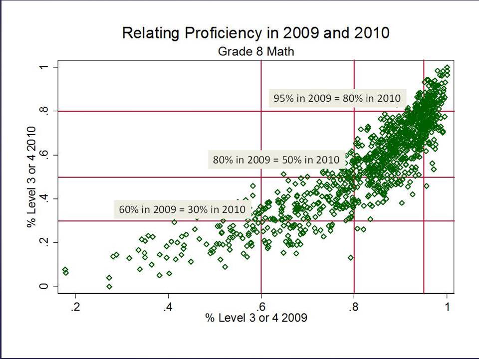
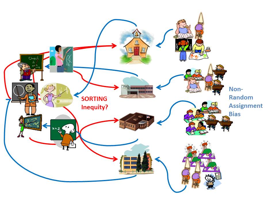
In theory, these first two types of variations are predictable. I often use a version of Figure 1 below when presenting on this topic.

We can pick up variation in growth across classrooms, which is likely partly attributable to the teacher and partly attributable to other stuff unique to that classroom or school. The problem is, since the classroom (or school) is the unit of comparison, we really can’t sort out what share is what?

Figure 1

Slide1

We can try to sort out the variance by adding more background measures to our model, including student individual characteristics, student group characteristics, class sizes, etc., or by constructing more intricate analyses involving teachers who switch settings. But we can never really get to a point where we can be confident that we have correctly parsed that share of variance attributable to the teacher versus that share attributable to other stuff. And the most accurate, intricate analyses can rarely be applied to any significant number of teachers.

Thankfully, to make our lives easier, the New Jersey Department of Education has chosen not to try to parse the extent to which variation in teacher or school median growth percentiles is influenced by other stuff. They rely instead on two completely unfounded, thoroughly refuted claims:

  1. By accounting for prior student performance (measuring “growth” rather than level) they have fully accounted for all student background characteristics (refuted here[1]); and
  2. Thus, any uneven distribution of growth percentiles, for example, lower growth percentiles in higher poverty schools, is a true reflection of the distribution of teacher quality (refuted here[2]).

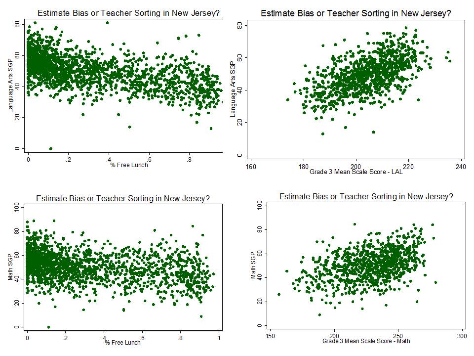
In previous analyses I have explored predictors of New Jersey growth percentiles at the school level, including the 2012 and 2013 school reports. Among other concerns, I have found that the year over year correlation (across schools) between growth percentiles is only slightly stronger than the correlation between growth percentiles and school poverty.[3] That is, NJ SGPs tend to be about as correlated with other stuff as they are with themselves year over year. One implication of this finding is that even the year-over-year consistency is merely consistently measuring the wrong effect year over year. That is, the effect of poverty.

In the following models, I take advantage of a richer data set in which I have used a) school report card measures, b) school enrollment characteristics and c) detailed statewide staffing files and have combined those data sets into one, multi-year data set which includes outcome measures (SGPs and proficiency rates), enrollment characteristics (low income shares, ELL shares) and resource measures derived from the staffing files.

Following are what I would characterize as exploratory regression models, using 3-years of measures of student populations, resources and school features, as predictors of 2012 and 2013 school median growth percentiles.

               Resource measures include:

  •  Competitiveness of wages: a measure of how much teachers’ actual wages differ from predicted wages for all teachers in the same labor market (metro area) in the same job code, with the same total experience and degree level (estimated via regression model). This measure indicates the wage premium (>1.0) or deficit (<1.0) associated with working in a given school or district. This measure is constant across all same job code teachers across schools within a district. This measure is created using teacher level data from the fall staffing reports from 2010 through 2012.
  • Total certified teaching staff per pupil (staffing intensity): This measure is created by summing the full time certified classroom teaching staff for each school and dividing by the total enrolled pupils. This measure is created using teacher level data from the fall staffing reports from 2010 through 2012.
  • % Novice teachers with only a bachelors’ degree: This measure also focuses on classroom teachers, taking the number with fewer than 3 years of experience and only a bachelors’ degree and dividing by the total number of classroom teachers. This measure is created using teacher level data from the fall staffing reports from 2010 through 2012.

I have pointed out previously that it would be inappropriate to consider a teacher or school to be failing, or successful for that matter, simply because of the children they happen to serve. Estimate bias with respect to student population characteristics is a huge validity concern regarding the intended uses of New Jersey’s growth percentile measures.

The potential influence of resource variations presents a comparable validity concern, though the implications vary by resource measure. If we find, for example that teachers receiving a more competitive wage are showing greater gains, we might assert that the wage differential offered by a given district is leading to a more effective teacher workforce. A logical policy implication would then be to provide resources to achieve wage premiums in schools and districts serving the neediest children, and otherwise lagging most on measures of student growth.

Of course, schools having more resources for use in one way – wages – also may have other advantages. If we find that overall staffing intensity is a significant predictor of student growth, it would be unfair to assert that the growth percentiles reflect teacher quality. That is, if growth in some schools is greater than in others because of more advantageous staffing ratios. Rather than firing the teachers in the schools producing low growth, the more logical policy response would be to provide those schools the additional resources to achieve similarly advantageous staffing ratios.

With these models, I also test assumptions about variations across schools within larger and smaller geographic areas – counties and cities. This geography question is important for a variety of reasons.

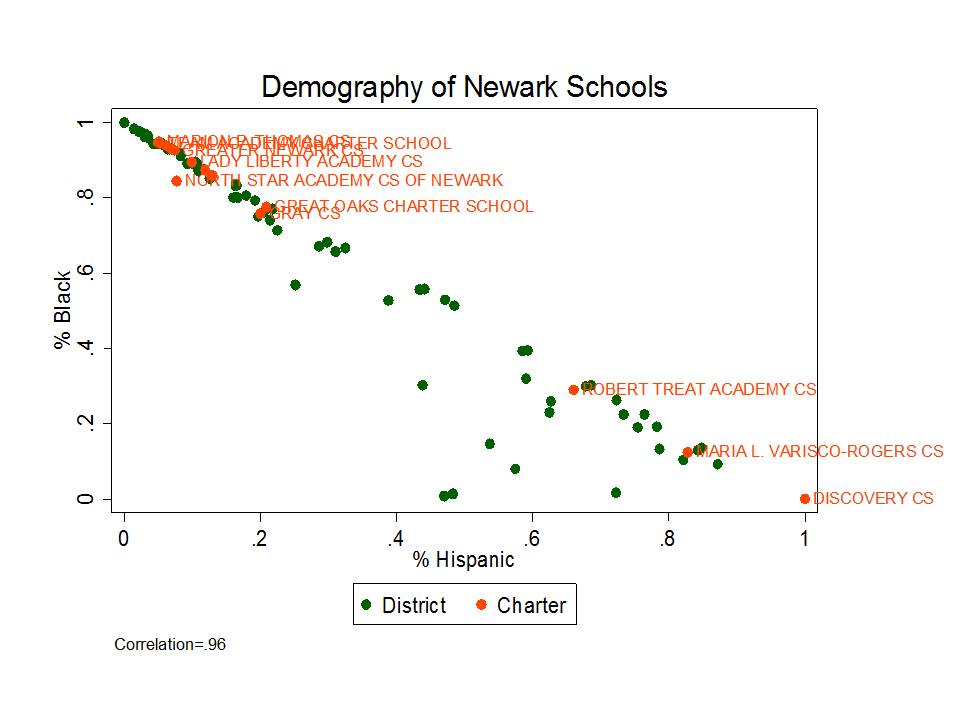
New Jersey is an intensely racially and socioeconomically segregated state. Most of that segregation occurs between municipalities far more so than within municipalities. That is, it is far more likely to encounter rich and poor neighboring school districts than rich and poor schools within districts. Yet education policy in New Jersey, like elsewhere, has taken a sharp turn toward reforms which merely reshuffle students and resources among schools (charter and district) within cities, pulling back significantly from efforts to target additional resources to high need settings.

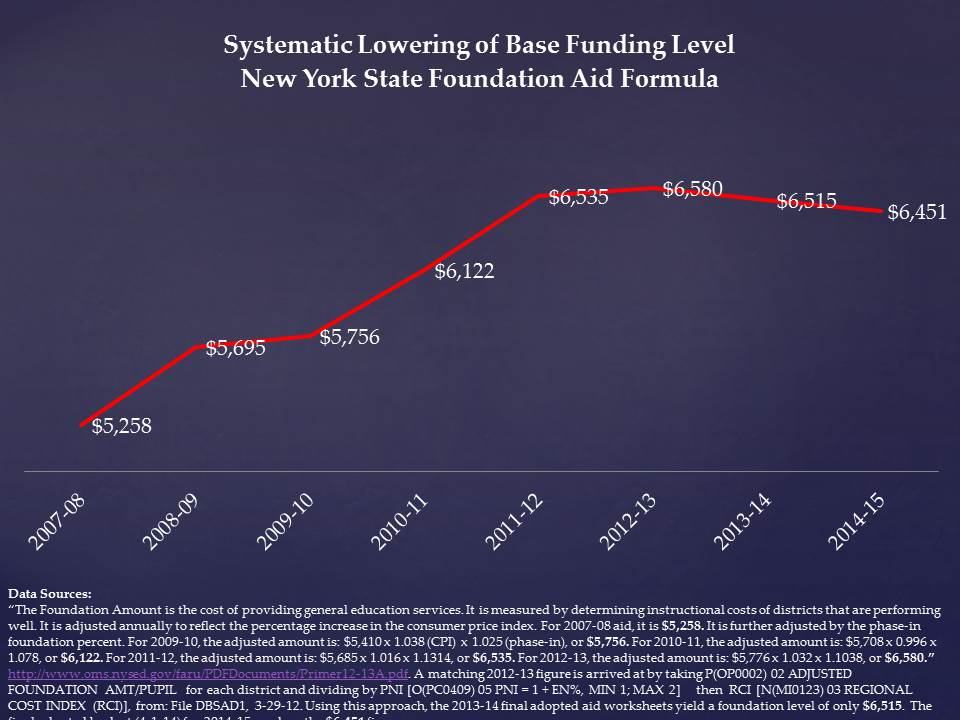
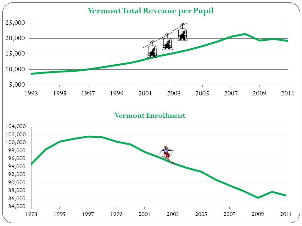
Figure 2 shows that from the early 1990s through about 2005, New Jersey placed significant emphasis on targeting additional resources to higher poverty school districts. Since that time, New Jersey’s school funding progressiveness has backslid dramatically. And these are the very resources needed for districts – especially high need districts – to provide wage differentials to recruit and retain a high quality workforce, coupled with sufficient staffing ratios to meet their students’ needs.

Figure 2

Slide2

Findings

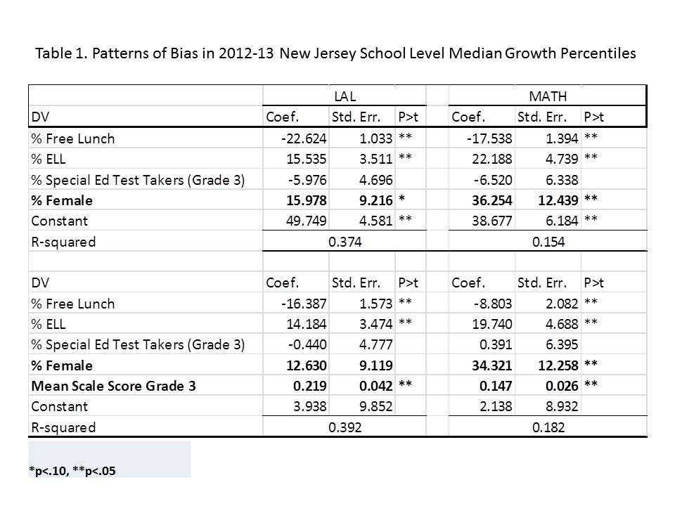
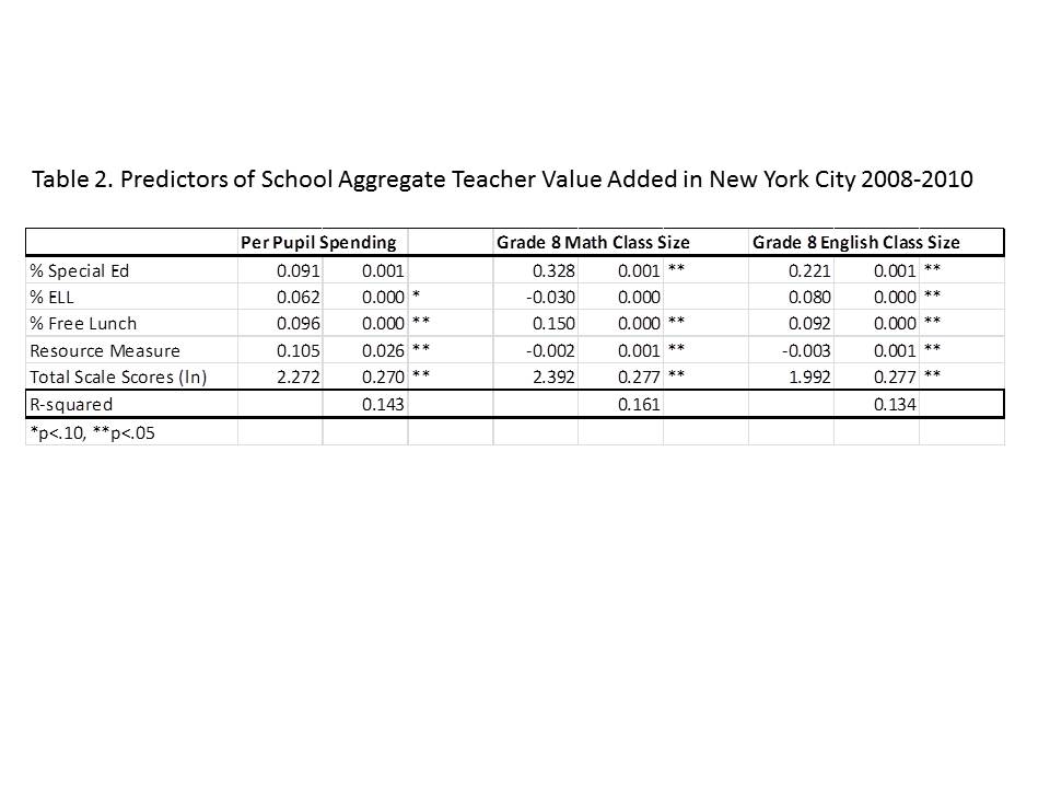
Table 1 shows the estimates from the first set of regression models which identify predictors of cross school and district, within county variation in growth percentiles. The four separate models are of language arts and math growth percentiles (school level) from the 2012 and 2013 school report cards. These models show that:

Student Population Other Stuff

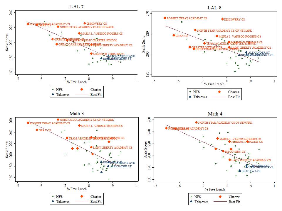
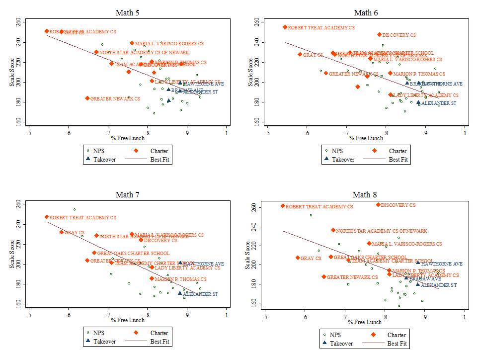
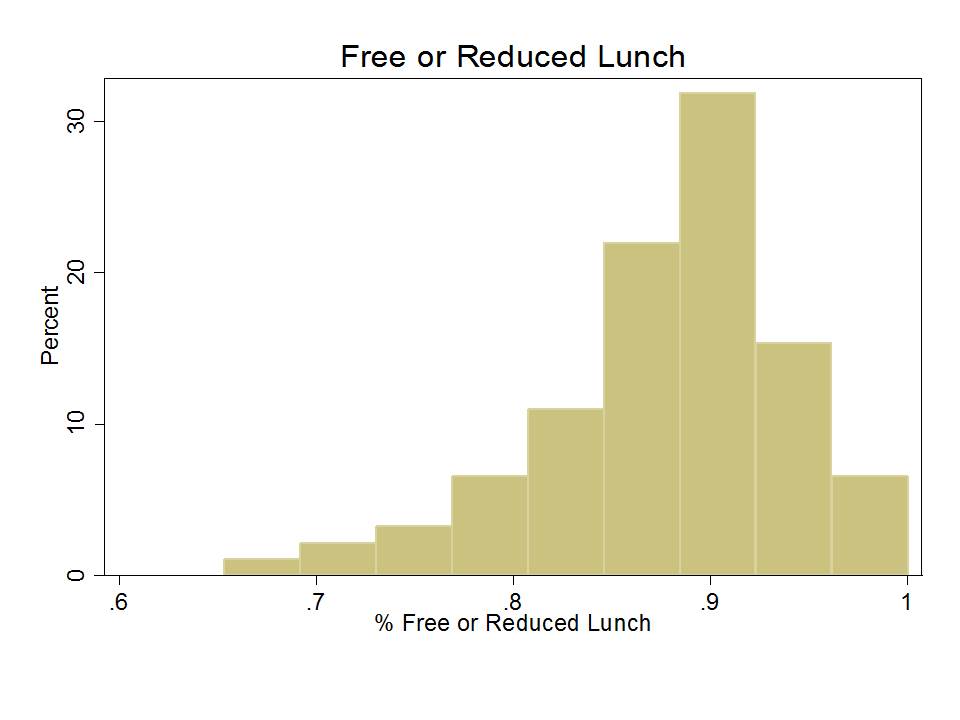
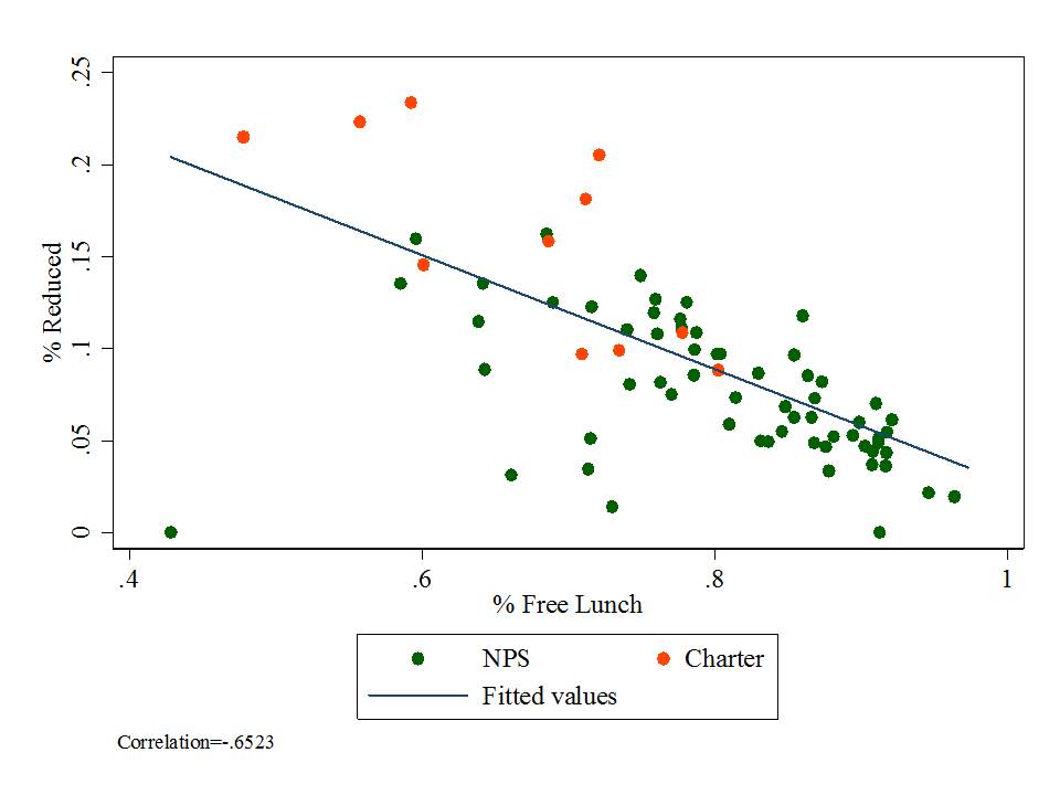
  1. % free lunch is significantly, negatively associated with growth percentiles for both subjects and both years. That is, schools with higher shares of low income children have significantly lower growth percentiles;
  2. When controlling for low income concentrations, schools with higher shares of English language learners have higher growth percentiles on both tests in both years;
  3. Schools with larger shares of children already at or above proficiency tend to show greater gains on both tests in both years;

School Resource Other Stuff

  1. Schools with more competitive teacher salaries (at constant degree and experience) have higher growth percentiles on both tests in both years.
  2. Schools with more full time classroom teachers per pupil have higher growth percentiles on both tests in both years.

Other Other Stuff

  1. Charter schools have neither higher nor lower growth percentiles than otherwise similar schools in the same county.


TABLE 1. Predicting within County, Cross School (cross district) Variation in New Jersey SGPs

Slide3

*p<.05, **p<.10

TABLE 2. Predicting within City Cross School (primarily within district) Variation in New Jersey SGPs

Slide4

*p<.05, **p<.10

Table 2 includes a fixed effect for city location. That is, Table 2 runs the same regressions as in Table 1, but compares schools only against others in the same city. In most cases, because of municipal/school district alignment in New Jersey, comparing within the same city means comparing within the same school district. But, using city as the unit of analysis permits comparisons of district schools with charter schools in the same city.

In Table 2 we see that student population characteristics remain the dominant predictor of growth percentile variation. That is, across schools within cities, student population characteristics significantly influence growth percentiles. But the influence of demography on destiny, shall we say (as measured by SGPs), is greater across cities than within them, an entirely unsurprising finding. Resource variations within cities show few significant effects. Notably, our wage index measure does not vary within districts but rather across them and was replaced in these models by a measure of average teacher experience. Again, there was no significant difference in average growth achieved by charters than by other similar schools in the same city.

Preliminary Policy Implications

The following preliminary policy implications may be drawn from the preceding regressions.

Implication 1: Because student population characteristics are significantly associated with SGPs, the SGPS are measuring differences in students served rather than, or at the very least in addition to differences in collective (school) teacher effectiveness. As such, it would simply be wrong to use these measures in any consequential way to characterize either teacher or school performance.

Implication 2: SGPs reveal positive effects of substantive differences in key resources, including staffing intensity and competitive wages. That is, resource availability matters and teachers in settings with access to more resources are collectively achieving greater student growth. SGPs cannot be fairly used to compare school or teacher effectiveness across schools and districts where resources vary.

These findings provide support for a renewed emphasis on progressive distribution of school funding. That is, providing the opportunity for schools and districts serving higher concentrations of low income children and lower current growth, to provide the wage premiums and staffing intensity required to offset these deficits.[4]

Implication 3: The presence of stronger relationships between student characteristics and SGPs across schools and districts within counties, versus across schools within individual cities highlights the reality that between district (between city) segregation of students remains a more substantive equity concerns than within city segregation of students across schools.

As such, policies which seek merely to reshuffle students across charter and district schools within cities and without attention to resources are unlikely to yield any substantive positive effect in the long run. In fact, given the influence of student sorting on the SGPs, sorting students within cities into poorer and less poor clusters will likely exacerbate within city achievement gaps.

Implication 4: The presence of significant resource effects across schools and districts within counties, but lack of resource effects across schools within cities, reveals that between district disparities in resources, coupled with sorting of students and families, remains a significant concern, and more substantive concern than within district inequities. Again, this finding supports a renewed emphasis on targeting additional resources to districts serving the neediest children.

Implication 5: Charter schools do not vary substantively on measures of student growth from other schools in the same county or city when controlling for student characteristics and resources. As such, policies assuming that “chartering” in-and-of-itself (without regard for key resources) can improve outcomes are likely misguided. This is especially true where such policies do little more than reshuffle low and lower income minority students across schools within city boundaries.

====================

[1]http://njedpolicy.wordpress.com/2013/05/02/deconstructing-disinformation-on-student-growth-percentiles-teacher-evaluation-in-new-jersey/

[2]https://schoolfinance101.wordpress.com/2014/04/18/the-endogeneity-of-the-equitable-distribution-of-teachers-or-why-do-the-girls-get-all-the-good-teachers/

[3]https://schoolfinance101.wordpress.com/2014/01/31/an-update-on-new-jerseys-sgps-year-2-still-not-valid/

[4]This finding also directly refutes the dubious assertion by NJDOE officials in their 2012 school funding report that the additional targeted funding was not only doing no good, but potentially causing harm and inducing inefficiency. https://schoolfinance101.wordpress.com/2012/12/18/twisted-truths-dubious-policies-comments-on-the-njdoecerf-school-funding-report/

The Cuomology of State Aid (or Tales from Lake Flaccid)

We’ve heard much bluster over time about school funding in New York State, and specifically how money certainly has no role in the policy debate over how to fix New York State schools, unless it has to do with providing more money to charter schools, or decrying the fact that district schools statewide are substantially over-funded.  See for example, this wonderfully absurd rant from DFER.

Here’s a recap of other posts I’ve written in recent years on NY school finance:

  1. On how New York State crafted a low-ball estimate of what districts needed to achieve adequate outcomes and then still completely failed to fund it.
  2. On how New York State maintains one of the least equitable state school finance systems in the nation.
  3. On how New York State’s systemic, persistent underfunding of high need districts has led to significant increases of numbers of children attending school with excessively large class sizes.
  4. On how New York State officials crafted a completely bogus, racially and economically disparate school classification scheme in order to justify intervening in the very schools they have most deprived over time.

I also recently wrote about this interesting trend in NY state school finance and NY state outcome standards- specifically that the state continues to raise the bar on outcomes while lowering the funding target intended to be sufficient for meeting those outcomes.

As I previously explained, regarding outcome standards:

Put simply, higher student outcome standards cost more to achieve, not less. As explained above, the New York State school finance formula is built on an underlying basic cost estimate of what it would take for a low need (no additional student needs) district to achieve adequate educational outcomes as measured on state assessments. The current formula is built on average spending estimates dating back several years now and based on prior outcome standards, tied to a goal of achieving 80% proficient or higher. More than once in the past several years, the state has substantively increased the measured outcome standards.

For 2010, the Regents adjusted the assessment cut scores to address the inflation issue, and as one might expect proficiency rates adjusted accordingly. The following figure shows the rates of children scoring at level 3 or 4 in 2009 and again in 2010. I have selected a few key, rounded, points for comparison. Districts where 95% of children were proficient or higher in 2009 had approximately 80% in 2010. Districts that had 80% in 2009 had approximately 50% in 2010. This means that the operational standard of adequacy using 2009 data was equivalent to 50% of children scoring level 3 or 4 in 2010. This also means that if we accept as reasonable, a standard of 80% at level 3 or 4 in 2010, that was equivalent to 95% – not 80% – in 2009.

Slide1This next figure shows the resulting shift of the change in assessments from 2012 to 2013, also for 8th grade math. Again, I’ve applied ballpark cutpoint comparisons.  Here, a school where 60% were proficient in 2012 was likely to have 20% proficient in 2013. A school where 90% were proficient in 2012 was likely to have 50% proficient in 2013.   If, as state policymakers argue, the 2013 assessments do more accurately represent the standard for college readiness, and thus the constitutional standard of meaningful high school education, it is quite likely that the cost of achieving that constitutional standard is much higher than previously estimated. Notably, only a handful of schools surpass the 80% threshold on math proficiency for the 2013 assessments.

Slide2

Yet, as I also explained in that previous post that while it appears that the state has been chipping away at funding gaps for districts including New York City, they have not done so by substantively increasing funding, but rather by decreasing the adequate funding target.  This figure shows that the underlying basic cost figure for the foundation aid formula climbed gradually as planned through 2012-13. Note that this climb was based on the assumed 80% success rate on the 2007-08 outcome standard, not considering the 2009-10 adjustment to that outcome standard. But inexplicably, the state has chosen to reduce the basic funding figure for each year since, despite raising the outcome standards dramatically.

Slide4

In their final adopted 2014-15 budget, state legislators did come through with some more funding for high need districts. That should not be discounted entirely. BUT… the state has played numerous games of late with the funding formula to far overstate their accomplishments- one of which is lowering the target. Of course it’s easier to slam dunk when you lower the rim. But even then, there’s no slam dunking going on here. Let’s take a look at the structure of funding and remaining gaps from fy14 to fy15.

This figure shows that for low need districts, the funding gap (to target funding) in 2014 was about $1,200 per pupil and that gap was reduced by about $200 per pupil. For high need districts, the gap was over $3,400 per pupil as was reduced to around $2,600 per pupil, a seemingly large reduction. But, first, remember that the target was lowered. And second, take a look at the green/blue numbers. State aid was indeed increased in high need districts by about $300 per pupil, but the required local contribution for these districts was increased by about $400 per pupil!

Slide3

Yeah… that’s right… you tell ’em Andy – Go pay for it yourself… uh… except that…uh… we told you that you can’t actually raise your local levy more than 2%? and if you do, we’ll penalize you! Damnit! So there!

Let’s peel this back a bit. First, here’s the effect of the lowering of the base on the funding gaps. That gap, which appears to be only about $2,639 in 2015 for high need districts would still be over $2,900 if the state hadn’t lowered the bar! In fact, the bar should have been rising if for no other reason than basic inflationary adjustment, setting aside the higher standards.

Slide5

Now it would be one thing if local contributions were generally lagging in high need districts. Indeed, some districts like Poughkeepsie have historically had lower than average local effort. But, many of these districts are so property poor and low income that raising local taxes generates little additional revenue. Here’s the average local effort by need group, from 2011-12.

Slide6

And here’s a look a the changes in required local contribution. Yeah… that’s right… if you’re a low need district, on average, your required local contribution goes down slightly. And if your a high need district, your local contribution skyrockets!

Slide7

So, should NY bureaucrats really be patting themselves on the back for their great accomplishments at closing funding gaps? Well, I’m certainly willing to give credit for the fact that the state did increase aid to a greater degree in districts with greater need.

But, let’s be clear here:

1) the state has still barely put a dent in the funding gaps that exist between actual foundation aid and funding targets defined by the state’s own (woefully inadequate) foundation aid formula.

2) the state has placed an additional burden on high need districts that many likely can’t even (or wouldn’t be allowed to) meet.

3) the state has engaged in egregious manipulation of state aid runs in their efforts to deceive local district officials and the general public regarding the adequacy of state aid.

And that’s just wrong!


Uncommon Denominators: Understanding “Per Pupil” Spending

This post is another in my series on data issues in education policy. The point of this post is to encourage readers of education policy research to pay closer attention to the fact that any measure of “per pupil spending” contains two parts – a measure of “spending” in the numerator and a measure of “pupils” in the denominator.

Put simply, both measures matter, and matching the right numerator to the right denominator matters.

Below are a few illustrations of why it’s important to pay attention to both the numerator and denominator when considering both variations across settings in education spending or variations over time in education spending.

Declining Enrollment Growth and Exploding Spending!

First it is important to understand that when the ratio of spending to pupils is growing over time, that growth may be a function of either or both, increasing expenditures in the numerator or declining pupils in the denominator. Usually, both parts are moving simultaneously, making interpretation more difficult. The State of Vermont over the past 20 years makes a fun example.

Vermont is among the highest per pupil spending states in the nation, and Vermont’s per pupil spending has continued to grow at a relatively fast pace over the past 20 years. Figure 1 shows Vermont’s per pupil spending growth (not adjusted for inflation, because choice of an inflator adds another level of complexity) in the upper half of the figure.

But, the lower half of the figure shows Vermont’s enrollment over the same period.

Figure 1. Vermont per Pupil Spending and Enrollments

Slide2

Clearly, given the dramatic enrollment statewide enrollment decline, even if total revenue and spending remained constant, or lagged significantly in its decline, per pupil spending would continue to grow.

Figure 2 breaks out the year over year growth rates of a) total revenue, b) enrollments and c) revenue per pupil. The math is pretty simple here, and the issue almost too obvious to bother with on this blog… but the point here is that if enrollment is declining by 2% annually, and total revenue (or spending) increasing by 4% to 6%, then per pupil revenue will increase by 6% to 8%.

Figure 2. Vermont % Change in Spending and Enrollment

Slide3

Yes, that’s all pretty simple and seemingly obvious. But, that doesn’t stop many from simply looking at per pupil spending growth as if it all represents spending growth. 8% annual growth likely plays differently to a political audience than 4% or 6% growth. Both parts are moving and we can’t forget that. Further, because the provision of education involves a mix of fixed, step and variable costs, we can’t expect spending changes to track perfectly with enrollment changes over time. But yes, we can and should expect appropriate adjustments down the line to accommodate the pupils that need to be served.

Equity Implications of Alternative Denominators: The ADA Game

I’ve written previously on this blog about different measures of student enrollment used in state school finance formulas, which are also used in presenting per pupil spending. A handful of states rely on “Average Daily Attendance” as a basis for providing state aid, and in turn as the method by which they report per pupil spending. As I’ve explained in previous posts, Average Daily Attendance measures vary systematically with respect to poverty, compared with enrollment measures. That is, on average, among those enrolled in a school, attendance rates tend to be lower on a daily basis in schools serving more low income and minority students. So, if one uses these measures to drive state aid to local districts, the result is systematically lower state aid in higher poverty, higher minority districts. But, if one uses these same measures to report per pupil spending, then no harm no foul… or so it seems.

As an aside, when pushed to rationalize financing schools on the basis of attendance, state policymakers often suggest that the purpose of the policy is to create an incentive for school officials to increase attendance rates.[i] The problems with this argument are many-fold. First, local public school districts remain responsible for providing the resources to educate all eligible enrolled children. While 90% may be in attendance on any given day, and while some children may be absent more than others, the same 90% are not in attendance every day. In all likelihood, 100% of eligible enrolled children attend at some point in the year. Second, depriving local public school districts of state aid lessens their capacity to provide interventions that might lead to improved attendance rates. Third, many school absences are simply beyond the control of local public school officials. This is particularly the case for poverty-induced, chronic health related absences. Finally, there exists little or no sound empirical evidence that this approach provides an effective incentive.[ii]

Figure 3 provides an illustration of how different per pupil spending figures look across Texas districts when reported by a) enrollment and b) average daily attendance with respect to shares of low income children. First, because few if any districts have perfect average daily attendance, the green dots – spending per enrolled pupil – are lower than the orange dots – spending per pupil in average daily attendance. Spending per enrolled pupil is simply lower than spending per pupil in average daily attendance. Further, while it would appear that spending per pupil in average daily attendance is higher in higher poverty districts than in lower poverty ones, that is not necessarily the case for spending per enrolled pupil (much smaller difference).

Figure 3. Per Pupil Spending and Low Income Concentrations in Texas

Slide5

Figure provides an alternative view, collapsing data into low income quintiles.

Figure 4. Per Pupil Spending by Low Income Quintile in Texas

Slide6

And it is certainly relevant that the districts in question here are obligated not merely to serve those who show up on a given day but to have resources available to all of whom for which they are held responsible. That is, those enrollment.

Matching the Numerator and Denominator: My expenditures on your pupils?

Finally, I’d like to address the somewhat more convoluted issue of matching the right numerator to the right denominator, especially when making spending comparisons across schools or districts.

I wrote extensively here, about making comparisons between brick and mortar vs. online schools.

And, I wrote extensively here about making comparisons between charter schools and district schools in New York City.

The increasing complexities of the interdependency relationships between district hosts and charter schools create significant confusion when comparing per pupil spending between host district and charter schools. In a recent report, I provide explanations of common (though likely intentional, after the 3rd or 4th iteration) mistakes. Here is one version of my critique of the Ball State study, which appears in Footnote 22, page 49 of this study: http://nepc.colorado.edu/files/rb-charterspending_0.pdf

For example, under many state charter laws, host districts or sending districts retain responsibility for providing transportation services, subsidizing food services, or providing funding for special education services. Revenues provided to host districts to provide these services may show up on host district financial reports, and if the service is financed directly by the host district, the expenditure will also be incurred by the host, not the charter, even though the services are received by charter students.

Drawing simple direct comparisons thus can result in a compounded error: Host districts are credited with an expense on children attending charter schools, but children attending charter schools are not credited to the district enrollment. In a per-pupil spending calculation for the host districts, this may lead to inflating the numerator (district expenditures) while deflating the denominator (pupils served), thus significantly inflating the district’s per pupil spending. Concurrently, the charter expenditure is deflated.

Correct budgeting would reverse those two entries, essentially subtracting the expense from the budget calculated for the district, while adding the in-kind funding to the charter school calculation. Further, in districts like New York City, the city Department of Education incurs the expense for providing facilities to several charters. That is, the City’s budget, not the charter budgets, incur another expense that serves only charter students. The Ball State/Public Impact study errs egregiously on all fronts, assuming in each and every case that the revenue reported by charter schools versus traditional public schools provides the same range of services and provides those services exclusively for the students in that sector (district or charter).

Here’s a relatively straightforward, albeit incomplete illustration. Figure 5 shows that in many states, like New York, Connecticut or New Jersey, the relationship between district host and charter spending creates significant problems in equating numerators and denominators. In many states, as we explain above, host districts retain responsibility for spending on such things as charter student transportation or special education. Districts within stats may opt for different approaches to transportation financing, and some districts may opt to provide funding for centralized enrollment management or for facilities co-locations. The costs of providing these services typically remain on the ledger of the district. That is, they are in the district’s numerator, even when the pupils are removed from the denominator. This makes the resulting per pupil spending comparisons, well, simply wrong.

Figure 5. The Conceptual Problem with Matching Numerators and Denominators – Charter Spending Comparisons

Slide8

Connecticut is one state where responsibility for transportation and special education expense is retained by the district (while many CT charters serve very few children with disabilities to begin with). Figure 6 below provides an illustration of how charter to host district spending comparisons differ when one removes special education and transportation expenses from the districts’ numerator. When these expenses are included on the district’s expense, district spending is somewhat higher than charter spending, but when they are removed, in both cases district spending is lower.

Figure 6. Matching spending responsibilities for more accurate comparisons

Slide9

Notably, this is far from a complete analysis. It is merely illustrative. Similar problems exist with reported data on charter school revenues and spending in New Jersey.

In New York City, the Independent Budget Office has produced a handful of useful reports on making relevant comparisons there.

============

Note: Charter advocates often argue that charters are most disadvantaged in financial comparisons because charters must often incur from their annual operating expenses, the expenses associated with leasing facilities space. Indeed it is true that charters are not afforded the ability to levy taxes to carry public debt to finance construction of facilities. But it is incorrect to assume when comparing expenditures that for traditional public schools, facilities are already paid for and have no associated costs, while charter schools must bear the burden of leasing at market rates–essentially an “all versus nothing” comparison. First, public districts do have ongoing maintenance and operations costs of facilities as well as payments on debt incurred for capital investment, including new construction and renovation. Second, charter schools finance their facilities by a variety of mechanisms, with many in New York City operating in space provided by the city, many charters nationwide operating in space fully financed with private philanthropy, and many holding lease agreements for privately or publicly owned facilities. (for more, see: http://nepc.colorado.edu/files/rb-charterspending_0.pdf, p49-50)

==============

[i]Recently, when New Jersey slipped the attendance factor into the determination of state aid, Education Commissioner Chris Cerf argued:

“When you look at the (difference) between the number of children on the rolls and the number of children in some of these schools, it can be very distressing,” Cerf said. “Pushing these districts to do everything in their power to get kids to attend class is good.” http://blogs.app.com/capitolquickies/2012/04/24/cerf-said-push-districts-to-get-kids-in-school/

[ii] A study published in the Spring 2013 issue of the Journal of Education Finance purports to find positive effects on attendance and graduation rates in states with “strong incentive” enrollment basis for funding, with particular emphasis on states relying on average daily attendance, but combining with them many (most) states using an average daily membership figure. Most problematically, the study draws its main conclusion from state aggregate cross sectional analyses, applying unsatisfyingly ambiguous classifications of state school finance policy count methods, and applying an approach which cannot separate finance policy effects from other contextual differences across states.

The final study is published here: Ely, Todd L., and Mark L. Fermanich. “Learning to count: school finance formula count methods and attendance-related student outcomes.” Journal of Education Finance 38.4 (2013): 343+

An earlier draft is available here: http://www.aefpweb.org/sites/default/files/webform/Fermanich_Ely_AEFP_2012.pdf

On “Dropout Factories” & (Fraudulent) Graduation Rates in NJ

This NJ Star Ledger piece the other day reminded me of an issue I’ve been wanting to check out for some time now. I’m skeptical of graduation rates as a measure of student outcomes to begin with, because, of course, graduation can be strongly influenced by local norms and practices. As such, it’s really hard to validly compare graduation rates from one place to another or even over time, as graduation standards may change. Notably, arbitrary assignment of “passing” cut scores on high stakes assessment isn’t particularly helpful and can be quite harmful. But I digress.

What piqued my interest a while back was the apparent disconnect between cohort attrition measures from 9th to 12th grade, or 10th to 12th grade, and reported graduation rates. Indeed, these are two different things. BUT, it seems strange for example that North Star Academy in Newark could report a 100% graduation rate! and .3% dropout rate! while having approximately 50% attrition rate between grades 5 and 12! How can you lose half your kids over time and still have 100% graduation and effectively no dropouts. Of course the answer is that none of these are dropouts, but rather they are voluntary transfers (with no follow up to determine where they’ve gone or what happened to them).

In any case, it seemed at best, a bit disingenuous and at worst, outright fraudulent for North Star to present itself as near perfect, when a deeper dive into the data (something North Star’s own data driven leaders fail to ever report) suggest otherwise.

Here, I quickly explore the significance of this issue across charter and district schools statewide.

First, let’s look at 2013 graduation rates and the 2012-13 fall enrollment cohorts as seniors relative to themselves as freshman.

Slide1As the key indicates, orange dots are district cohort ratios – representing the senior class of 2013 as a percent of who they were as a freshman class of 2009-10. Green dots are graduation rates for all of the same district schools. Blue circles are reported graduation rates for charters and red squares are cohort ratios. The trendline is fit to charter and district school cohort ratios. In most cases, the cohort ratios are lower than the reported grad rates. But not by a whole lot. For TEAM Academy the two are close enough to overlap. For Central Jersey College Prep and University Academy, there is what appears to be a differential of about 5 to 7% or so.

But for North Star, the gap is huge. If we evaluate North Star on its reported graduation rate, the school looks great. Nearly perfect! But even compared to other schools statewide, on the same measure of cohort loss, North Star is no leader. Rather, it’s a laggard. (not a Paterson Sci/Tech or Hoboken laggard, but a laggard nonetheless).

Let’s take a look now at the 2012 and 2013 graduation rates, averaged, and the last 3 cohorts of sophomores to seniors, averaged just to see if the above single year estimates are anomalous.

Slide2Taking the two years of grad rates and three cohorts actually reveals that North Star a) falls even further below the trendline (worse than the average district school) AND b) still has a massive gap between reported grad rate and cohort loss. TEAM now also has a gap, but that gap is smaller than for North Star. Indeed, it is possible that TEAM is back filling enrollments (adding kids in high school to fill empty seats), but I’ll leave Ryan Hill, chief exec of TEAM to let me know if that’s the case.

Now, it’s certainly also possible that district schools in Newark are adding kids in upper grades, as they exit from North Star, or other charter or magnet schools. It is far less likely that many of these students are shifting to selective private schools (and upward, outward transfer) after the 10th grade.

Finally, let’s take a look at the gaps between reported graduation rates and cohort ratios, again using the last three sophomore to senior cohorts and last two years of graduation rates.

Slide3Consider this a test of the legitimacy of using the graduation rate to characterize the extent to which schools actually help students persist toward high school completion. The above graph suggests that North Star’s graduation rate is overstated by 10 to 15% averaged over time and that their graduation rate is far more inflated than nearly anyone else except American History High. TEAM is actually quite low in average difference between cohort attrition and reported graduation rate. The other high outlier here is Central Jersey College Prep.

Again, there can be a number of enrollment flow/transfer reasons for the gaps between cohort attrition and reported graduation rate. But, at the very least these figures should be regularly reported and used as a basis for evaluating the validity of reported graduation rates.


Welcome to Relay Medical College & North Star Community Hospital

Arne Duncan has one whopper of an interview available here: http://www.msnbc.com/andrea-mitchell-reports/watch/better-preparing-our-nations-educators-237066307522

Related to his new push to evaluate teacher preparation programs using student outcome data: https://schoolfinance101.wordpress.com/2014/04/25/arne-ology-the-bad-incentives-of-evaluating-teacher-prep-with-student-outcome-data/

And his Whitehouse press release can be found here: http://www.whitehouse.gov/the-press-office/2014/04/25/fact-sheet-taking-action-improve-teacher-preparation

Now, there’s a whole lot to chew on here, but let me focus on one of the more absurd hypocrisies in all of this.

First, Duncan seems to think the world of medical education without apparently having the first clue about how any of it actually works. In his view, it’s really just a matter of intensive clinical training (no academic prerequisites required) and competitive wages (a reasonable, though shallowly articulated argument).

Second, Duncan also seems to think that a major part of the solution for Ed Schools can be found in entrepreneurial startups like Relay Graduate School of Education. The Whitehouse press release proclaims:

Relay Graduate School of Education, founded by three charter management organizations, measures and holds itself accountable for both program graduate and employer satisfaction, and requires that teachers meet high goals for student learning growth before they can complete their degrees. There is promise that this approach translates into classroom results as K-12 students of Relay teachers grew 1.3 years in reading performance in one year.

Now, I’ll set aside for the moment that the student outcome metrics proposed for use in evaluating ed schools create the same bad incentives (and unproven benefits) that the feds have imposed for evaluating physicians and hospitals.

Let’s instead consider the model of the future – one which blends Arne Duncan’s otherwise entirely inconsistent models of training. I give you:

The Relay Medical College and North Star Community Hospital

Here’s how it all works. Deep in the heart of some depressed urban core where families and their children suffer disproportionate obesity, asthma and other chronic health conditions, where few healthy neighborhood groceries exist, but plenty of fast food joints are available, sits the newly minted North Star Community Hospital.

It all starts here. NSCH is a new kind of hospital that does not require any of its staff to actually hold medical degrees, any form of board certification or nursing credential, or even special technician degrees to operate medical equipment or handle medications. Rather, NSCH recruits bright young undergrads from top liberal arts colleges, with liberal arts majors, and puts them through an intense 5 week training program where they learn to berate and belittle minority families and children and shame them into eating more greens and fiber. Where they learn to demean them into working out – walking the treadmill, etc. It’s rather like an episode of the Biggest Loser. And the Hospital is modeled on the premise that if it can simply engage enough of the community members in its bootcamp style wellness program, delivered by these fresh young faces, they can substantively alter the quality of life in the urban core.

There is indeed some truth to the argument. Getting more community members to eat healthier and exercise will improve their health stats, including morbidity and mortality measures commonly used in Hospital rating systems. In fact, over time, this Hospital, which provides no actual medical diagnosis and treatment does produce annual reports that show astoundingly good outcome measures for community members who complete their program.

These great outcome measures generate headlines from the local news writers who fail to explore more deeply what they mean (Yes Star Ledger editorial board, that’s you!). NCSH becomes such a darling of the media and politicians that they are granted authority to start their own medical school to replicate their “successes.” And they are granted the authority to run a medical school where medical training need not even be provided by individuals with medical training!

Rather, they will grant medical degrees to their own incoming staff based on their own experiences with healthcare awesomeness. That’s right, individuals who themselves had little or no basic science or actual supervised clinical training in actual medicine, but have 3 to 5 years of experience in medical awesomeness in this start-up (pseudo) Hospital will grant medical degrees – to their own incoming peers!

Acknowledging the brilliance of this new model, US Dept of Health officials established a new rating system for all medical colleges whereby they must show that graduates of their programs reduce patient morbidity and mortality. RMC and NCSH continue to lead the nation, despite providing no actual medical interventions, but sticking to their plan of tough love, no excuses wellness training.

But, one day, it comes to light that while approximately 50 community members per year who succeeded in NCSH program and did in fact experience improved quality of life, there had been over 150 entrants to the program each year (like this). In fact, most failed. Some simply weren’t up for the daily berating inflicted on them by NCSH staff. Some had other chronic health ailments and were told by NCSH staff to suck it up, get in line (literally, in line, step left only when told) or leave.

It became clear that patients with diabetes and heart conditions need not apply. None of the staff employed at NCSH had training in cardiology or for that matter any CPR or basic life support skills. That stuff really didn’t matter to them and they sure as heck weren’t going to stand for someone keeling over on the treadmill, and lowering the NCSH mortality stats.

Sadly, by this point in time RMC and NCSH had become such a touted model that the real urban hospitals had all been closed. Further, there were few if any incentives for real medical colleges to train physicians to work in the urban core, where the traditional medical model had now been fully replaced by the RMC/NCSH model. They certainly couldn’t match the stats that NCSH was posting if they chose to serve patients who actually had chronic health conditions, or were non-compliant patients.

And those 100 dropouts of the NCSH program from each cohort, those with diabetes, heart disease and other health conditions not so easily mediated with a good shout down, were simply out luck. Actual community morbidity and mortality stats skyrocketed. But alas, no one was left to care.

Note:

Indeed, wellness is key to the provision of high quality healthcare in the urban core and elsewhere. But it is not a replacement. And yes, one can make an argument that the bootcamp program described above as NCSH legitimately helped to improve the health outcomes and perhaps even the overall quality of life for the 50 program completers, as does the reality TV show Biggest Loser.

One can certainly make the comparison to the benefits obtained by the 50% or so actual completers of the most no excusiness charter schools like North Star Academy in Newark, NJ. Those few students who do succeed and complete are likely better off academically than they might have otherwise been. But this by no means indicates that North Star Academy and Relay Graduate School of Education, or my hypothetical North Star Community Hospital and Relay Medical College are model programs for serving the public good. In fact, as pointed out here, assuming so, applying bogus easily manipulated and simply wrongheaded metrics to proclaim success, may in the end cause far more harm than good.


Arne-Ology & the Bad Incentives of Evaluating Teacher Prep with Student Outcome Data

As I understand it, USDOE is going to go ahead with the push to have teacher preparation programs rated in part based on the student growth outcomes of children taught by individuals receiving credentials from those programs. Now, the layers of problems associated with this method are many and I’ve addressed them previously here and in professional presentations.

  1. This post summarizes my earlier concerns about how the concept fails both statistically and practically.
  2. This post explains what happens at the ridiculous extremes of this approach (a warped, endogenous cycle of reformy awesomeness)
  3. These slides present a more research based, and somewhat less snarky critique

Now, back to the snark.

This post builds on my most recent post in which I challenged the naive assertion that current teacher ratings really tell us where the good teachers are. Specifically, I pointed out that in Massachusetts, if we accept the teacher ratings at face value, then we must accept that good teachers are a) less likely to teach in middle schools, b) less likely to teach in high poverty schools and c) more likely to teach in schools that have more girls than boys.

Slide4

Extending these findings to the policy of rating teacher preparation programs by the ratings their teachers receive… working on the assumption that these ratings are quite strongly biased by school context, it would make sense for Massachusetts teacher preparation institutions to try to get their teachers placed in low poverty elementary schools that have fewer boys.

Given that New Jersey growth percentile data reveal even more egregious patterns of bias, I now offer insights for New Jersey colleges of education as to where they should try to place their graduates – that is, if they want to win at the median growth percentile game.

Slide2

It’s pretty simple – New Jersey colleges of education would be wise to get their graduates placements in schools that are:

  • 20% of fewer free lunch (to achieve good math gains)
  • 5% or lower black (to achieve good math gains)
  • 11% or lower free lunch (to achieve good LAL gains)
  • 2% or lower black ( to achieve good LAL gains)

Now, the schools NJ colleges of ed should avoid (for placing their grads) are those that are:

  • over 50% free lunch
  • over 30% black

That is, if colleges of education want to play this absurd game of chasing invalid metrics.

Let’s take a look at some of the specific districts that might be of interest.

Here are the districts with the highest and lowest growth producing teachers (uh… assuming this measure has any attribution to teacher quality).

Slide3

Now, my New Jersey readers can readily identify the differences between these groups, with a few exceptions. Ed schools in NJ would be wisest to maximize their placements in locations like Bernards Twp, Essex Fells, Princeton, Mendham and Ridgewood. After all, what young grads wouldn’t want to work in these districts? And of course, Ed schools would be advised to avoid placing any grads in districts like East Orange, Irvington or Newark.

Let me be absolutely clear here. I AM NOT ACTUALLY ADVOCATING SUCH DETRIMENTAL UNETHICAL BEHAVIOR.

Rather, I am pointing out that newly adopted USDOE regulations in fact endorse this model by requiring that this type of data actually be used to consequentially evaluate teacher preparation programs.

It’s simply wrong. It’s bad policy. And it must stop!

And yes… quite simply… this is WORSE THAN THE STATUS QUO!

For further discussion on this point, I refer you to this post!


The Endogeneity of the Equitable Distribution of Teachers: Or, why do the girls get all the good teachers?

Recently, the Center for American Progress (disclosure: I have a report coming out through them soon) released a report in which they boldly concluded, based on data on teacher ratings from Massachusetts and Louisiana, that teacher quality is woefully inequitably distributed across children by the income status of those children. As evidence of these inequities, the report’s authors included a few simple graphs, like this one, showing the distribution of teachers by their performance categories:

Figure 1. CAP evidence of teacher quality inequity in Massachusetts

Slide1

Based on this graph, the authors conclude:

In Massachusetts, the percentage of teachers rated Unsatisfactory is small overall, but students in high-poverty schools are three times more likely to be taught by one of them. The distribution of Exemplary teachers favors students in high-poverty schools, who are about 30 percent more likely to be taught by an exemplary teacher than are students in low-poverty schools. However, students in high-poverty schools are less likely to be taught by a Proficient teacher and more likely to be taught by a teacher who has received a Needs Improvement rating. (p. 4)

But, there exists (at least) one huge problem of making the assertion that teacher ratings, built significantly on measures such as Student Growth Percentiles, provide evidence of inequitable distribution of teaching quality. It is very well understood that many value added estimates in state policy and practice, and most if not all student growth percentile measures used in state policy and practice are substantially influenced by student population characteristics including income status, prior performance and even gender balance of classrooms.

Let me make this absolutely clear one more time – simply because student growth percentile measures are built on expected current scores of individual students based on prior scores does not mean, by any stretch of the statistical imagination, that SGPs “fully account for student background” and even more so, for the classroom context factors including other students and the student group in the aggregate. Further, Value Added Models (VAMs) which may take additional steps to account for these potential sources of bias are typically not successful at removing all such bias.

Figure 2 here shows the problem. As I’ve explained numerous previous times, growth percentile and value added measures contain 3 basic types of variation:

  1. Variation that might actually be linked to practices of the teacher in the classroom;
  2. Variation that is caused by other factors not fully accounted for among the students, classroom setting, school and beyond;
  3. Variation that is, well, complete freakin statistical noise (in many cases, generated by the persistent rescaling and stretching, cutting and compressing, then stretching again, changes in test scores over time which may be built on underlying shifts in 1 to 3 additional items answered right or wrong by 9 year olds filling in bubbles with #2 pencils).

Our interest in #1 above, but to the extent that there is predictable variation, which combines #1 and #2, we are generally unable to determine what share of the variation is #1 and what share is #2.

Figure 2. The Endogeneity of Teacher Quality Sorting and Ratings Bias

Slide2

A really important point here is that many if not most models I’ve seen actually adopted by states for evaluating teachers do a particularly poor job at parsing 1 & 2. This is partly due to the prevalence of growth percentile measures in state policy.

This issue becomes particularly thorny when we try to make assertions about the equitable distribution of teaching quality. Yes, as per the figure above, teachers do sort across schools and we have much reason to believe that they sort inequitably. We have reason to believe they sort inequitably with respect to student population characteristics. The problem is that those same student population characteristics in many cases also strongly influence teacher ratings.

As such, those teacher ratings themselves aren’t very useful for evaluating the equitable distribution of teaching. In fact, in most cases it’s a pretty darn useless exercise, ESPECIALLY with the measures commonly adopted across states to characterize teacher quality.Being able to determine the inequity of teacher quality sorting requires that we can separate #1 and #2 above. That we know the extent to which the uneven distribution of students affected the teacher rating versus the extent to which teachers with higher ratings sorted into more advantaged school settings.

Now, let’s take a stroll through just how difficult it is to sort out whether the inequity CAP sees in Massachusetts teacher ratings is real, or more likely just a bad, biased ratings system.

Figure 3 relates the % of teachers in the bottom two ratings categories to the share of children qualified for free lunch, by grade level, across Massachusetts schools. As we can see, low poverty schools tend to have very few of those least effective teachers, whereas many, though not all higher poverty schools do have larger shares, consistent with the CAP findings.

Figure 3. Relating Shares of Low Rated Teachers and School Low Income Share in Massachusetts

Slide3

Figure 4 presents the cross school correlations between student demographic indicators and teacher ratings. Again, we see that there are more low rated teachers in higher poverty, higher minority concentration schools.

But, as a little smell-test here, I’ve also included % female students, which is often a predictor of not just student test score levels but also rates of gain. What we see here is that at the middle and secondary level, there are fewer “bad” teachers in schools that have higher proportions of female students.

Does that make sense? Is it really the case that the “good” teachers are taking the jobs in the schools with more girls?

Figure 4. Relating Shares of Low Rated Teachers and School Demographics in Massachusetts

 Slide4


Okay, let’s do this as a multiple regression model, and for visual clarity, graph the coefficients in Figure 5. Here, I’ve regressed the % low performing teachers on each of the demographic measures. In find a negative (though only sig. at p<.10) effect on the % female measure. That is, schools with more girls have fewer “bad” teachers. Yes, schools with more low income kids seem to have more “bad” teachers, but in my view, the whole darn thing is suspect.

Figure 5. Regression Based Estimates of Teacher Rating Variation by Demography in Massachusetts

Slide5

So, the Massachusetts ratings seem hardly useful for sorting out bias versus actual quality and thus determining which kids are being subjected to better or worse teachers.

But what about other states? Well, I’ve written much about the ridiculous levels of bias in the New Jersey Growth Percentile measures. But, here they are again.

Figure 6. New Jersey School Growth Percentiles by Low Income Concentration and Grade 3 Mean Scale Scores

 Slide6

Figure 6 shows that New Jersey school median growth percentiles are associated with both low income concentration and average scale scores of the first tested grade level. The official mantra of the state department of education is that these patterns obviously reflect that low income, low performing children are simply getting the bad teachers. But that, like the CAP finding above, is an absurd stretch given the complete lack of evidence as to what share of these measures, if any, can actually be associated with teacher effect and what share is driven by context and students.

So, let’s throw in that percent female effect just for fun. Table 1 provides estimates from a few alternative regression models of the school level SGP data. As with the Massachusetts ratings, the regressions show that the share of student population that is female is positively associated with school level median growth percentile, and quite consistently and strongly so.

Now, extending CAP’s logic to these findings, we must now assume that the girls get the best teachers! Or at least that schools with more girls are getting the better teachers. It could not possibly have anything to do with classrooms and schools having more girls being, for whatever reason, more likely to generate test score gains, even with the same teachers? But then again, this is all circular.

Table 1. Regressions of New Jersey School Level Growth Percentiles on Student Characteristics

Slide7

Note here that these models are explaining in the case of LAL, nearly 40% of the variation in growth percentiles. That’s one heck of a lot of potential bias. Well, either that, or teacher sorting in NJ is particularly inequitable. But knowing what’s what here is impossible. My bet is on some pretty severe bias.

Now for one final shot, with a slightly different twist. New York City uses a much richer value-added model which accounts much more fully for student characteristics. The model also accounts for some classroom and school characteristics. But the New York City model, which also produces much noisier estimates as a result (the more you parse the bias, the more you’re left with noise), doesn’t seem to fully capture some other potential contributors to value added gains. The regressions in Table 2 below summarize resource measures that predict variation in school aggregated teacher value added estimates for NYC middle schools.

Table 2. How resource variation across MIDDLE schools influences aggregate teacher value-added in NYC

Slide8

Schools with smaller classes or higher per pupil budgets have higher average teacher value added! It’s also the case that schools with higher average scale scores have higher average teacher value added. That poses a potential bias problem. Student characteristics must be evaluated in light of the inclusion of the average scale score measure.

Indeed, more rigorous analyses can be done to sort the extent that “better” (higher test score gain producing) teachers migrate to more advantaged schools, but with very limited samples of data on teachers having prior ratings in one setting who then sort to another (and maintain some stable component of their prior rating). Evaluating in large scale, without tracking individual moves, even when trying to include a richer set of background variables is likely to mislead.

Another alternative is to reconcile teacher sorting by outcome measures with teacher sorting by other characteristics that are exogenous (not trapped in this cycle of cause and effect). Dan Goldhaber and colleagues provide one recent example applied to data on teachers in Washington State. Goldhaber and colleagues compared the distribution of a) novice teachers, b) teachers with low VAM estimates and c) teachers by their own test scores on a certification exam, across classrooms, schools and districts by 1) minority concentration, 2) low income concentration and 3) prior performance. That is, the reconciled the distribution of their potentially endogenous measure (VAM) with two exogenous measures (teacher attributes). And they did find disparities.

Notably, in contrast with much of the bluster about teacher quality distribution being primarily a function of corrupt, rigid contract driving within district and within school assignment of teachers, Goldhaber and colleagues found the between district distribution of teacher measures to be most consistently disparate:

For example, the teacher quality gap for FRL students appears to be driven equally by teacher sorting across districts and teacher sorting across schools within a district. On the other hand, the teacher quality gap for URM (underrepresented minority) students appears to be driven primarily by teacher sorting across districts; i.e., URM students are much more likely to attend a district with a high percentage of novice teachers than non-URM students. In none of the three cases do we see evidence that student sorting across classrooms within schools contributes significantly to the teacher quality gap.

These findings, of course, raise issues regarding the logic that district contractual policies are the primary driver of teacher quality inequity (the BIG equity problem, that is). Separately, while the FRL results are not entirely consistent with the URM (Underrepresented Minority) findings, this may be due to the use of a constant income threshold for comparing districts in rural Eastern Washington to districts in the Seattle metro. Perhaps more on this at a later point.

Policy implications of misinformed conclusions from bad measures

The implications of ratings bias vary substantially by the policy preferences supported to resolve the supposed inequitable distribution of teaching. One policy preference is the “fire the bad teachers” preference, assuming that a whole bunch of better teachers will line up to take their jobs. If we impose this policy alternative using such severely biased measures as the Massachusetts or New Jersey measures, we will likely find ourselves disproportionately firing and detenuring, year after year, teachers in the same high need schools, having little or nothing to do with the quality of the teachers themselves. As each new batch of teachers enters these schools, and subsequently faces the same fate due to the bogus, biased measures it seems highly unlikely that high quality candidates will continue to line up. This is a disaster in the making. Further, applying the “fire the bad teachers” approach in the presence of such systematically biased measures is likely a very costly option – both in terms of the district costs of recruiting and training new batches of teachers year after year, and the costs of litigation associated with dismissing their predecessors based on junk measures of their effectiveness.

Alternatively, if one provides compensation incentives to draw teachers into “lower performing” schools, and perhaps take efforts to improve working conditions (facilities, class size, total instructional load), fewer negative consequences – even in the presence of bad, biased measurement, are likely to occur. One can hope, based on recent studies of transfer incentive policies, that some truly “better” teachers would be more likely to opt to work in schools serving high need populations, even where their own rating might be at greater risk (assuming policy does not assign high stakes to that rating). This latter approach certainly seems more reasonable, more likely to do good, and at the very least far less likely to do serious harm.

Why you can’t compare simple achievement gaps across states! So don’t!

Consider this post the second in my series of basic data issues in education policy analysis.

This is a topic on which I’ve written numerous previous posts. In most previous posts I’ve focused specifically on the issue of problems with poverty measurement across contexts and how those problems lead to common misinterpretations of achievement gaps. For example, if we simply determine achievement gaps by taking the average test scores of children above and below some arbitrary income threshold, like those qualifying or not for the federally subsidized school lunch program, any comparisons we make across states will be severely compromised by the fact that a) the income threshold we use may provide very different quality of life from Texas to New Jersey and b) the average incomes and quality of life of those above that threshold versus those below it may be totally different in New Jersey than in Texas.

For example, the histogram below presents the New Jersey and Texas poverty income distributions for families of children between the ages of 5 and 17. The Poverty Index is the ratio of family income to the poverty income level (which is fixed national). The histograms are generated using 2011 American Community Survey data extracted from http://www.ipums.org (one of my favorite sites!). The vertical line is set at 185% poverty, or the federal “reduced price lunch” threshold, a common threshold used in comparing low income to non-low income student achievement gaps.

As we can see, the income distribution in New Jersey is simply higher than that of Texas. It’s also more dispersed. And, as it turns out the ratio of income for those above, versus those below the 185% threshold is much greater in New Jersey.

In New Jersey, the income ratio is about 6:1 for those above versus those below the 185% threshold. In Texas, the ratio is about 4.5:1. And that matters when comparing achievement gaps!

Figure 1. Poverty Income Distributions for Texas and New Jersey

Slide1

Figure 2 illustrates the relationship between the income ratios for non-low income to low–income children’s families and outcome gaps for NAEP grade 4 Math in 2011. Put simply, states with larger income gaps also have larger outcome gaps. States with the largest income gaps, like Connecticut, have particularly large outcome gaps. Clearly, it would be inappropriate to compare directly, the income achievement gap of Idaho, for example to New Jersey. New Jersey does have a larger outcome gap. But New Jersey also has a larger income gap. Both states fall below the trendline, indicating (that if we assume the relationship to be linear) that their outcome gaps are both smaller than expected, and in fact, quite comparable.

Figure 2: Relating Income Gaps to Outcome Gaps (NAEP Grade 4 Math)

Slide2


Table 1 summarizes the correlations between income and outcome gaps for each NAEP math and reading assessment, over several years.

Table 1. Correlations between Income and Outcome GapsSlide3

It stands to reason that if the income differences between low income and non-low income families affect the income achievement gaps, then so too would the income differences between racial groups affect the outcome differences between racial groups. Therefore, it is equally illogical to compare directly racial achievement gaps across states.

Figure 3a shows the black and white family income distributions in Texas and 3b shows the income distributions in Connecticut.

In Texas, the ratio of family income for white families to black families is about 1.5 to 1.

In Connecticut, that ratio is over 2.3:1.

Figure 3a. Black and White Income Distributions in Texas

Slide5

Figure 3b. Black and White Income Distributions in Connecticut

 Slide4

Thus, as expected, Figure 4 shows that the income gaps between black and white families are quite strongly correlated with the outcome gaps of their children in Math (Grade 4).

Figure 4. Income Gaps between Black and White Students and Outcome Gaps

Slide6

Table 2 shows the correlations between black-white family income gaps and black-white child outcome gaps for NAEP assessments since 2000.

Table 2. Correlations between Black-White Income Gaps and Black-White Test Score GapsSlide7

Why is this important? Well, it’s important because state officials and data naïve education reporters love to make a big deal about which states have the biggest achievement gaps and by extension assert that the primary reason for these gaps is state lack of attention to the gaps in policy.

Connecticut reporters and politicos love to point to that state’s “biggest in the nation” achievement gap, with absolutely no cognizance of the fact that their achievement gaps, both income and race related, are driven substantially by the vast income disparity of the state. That said, Connecticut consistently shows larger gaps than would even be expected for its level of income disparity.

Black-white achievement gaps are similarly a hot topic in Wisconsin, but will little acknowledgement that Wisconsin also has the largest income gap (other than DC) between the families of black and white children.

New Jersey officials love to downplay the state’s high average performance by lambasting defenders of public schools with evidence of largest in the nation achievement gaps.

“The dissonance in that is if you get beneath the numbers, beneath the aggregates, you’ll see that we have one of the largest achievement gaps in the nation.” (former Commissioner Christopher Cerf)

Years ago, politicos and education writers might have argued that these gaps persist because of funding and related resource gaps. Nowadays, the same groups might argue that these gaps persist because employment protections for “bad teachers” in high poverty, high minority concentration schools, and that where the gaps are bigger, those protections must be somehow most responsible.

But these assertions – both the old and the new – presume that comparisons of achievement gaps, either by race or income, between states are valid. That is, they validly reflect policy/practice differences across states and not some other factor.

Quite simply, as most commonly measured, they do not. They largely reflect differences in income distributions across states, a nuance I suspect will continue to be overlooked in public discourse and the media. But one can hope.


Understand your data & use it wisely! Tips for avoiding stupid mistakes with publicly available NJ data

My next few blog posts will return to a common theme on this blog – appropriate use of publicly available data sources. I figure it’s time to put some positive, instructive stuff out there. Some guidance for more casual users (and more reckless ones) of public data sources and for those must making their way into the game. In this post, I provide a few tips on using publicly available New Jersey schools data. The guidance provided herein is largely in response to repeated errors I’ve seen over time in using and reporting New Jersey school data, where some of those errors are simple oversight and lack of deep understanding of the data, and others of those errors seem a bit more suspect. Most of these recommendations apply to using other states’ data as well. Notably, most of these are tips that a thoughtful data analyst would arrive at on his/her own, by engaging in the appropriate preliminary evaluations of the data. But sadly these days, it doesn’t seem to work that way.

So, here are a few NJ state data tips.

NJ ASK scale score data vary by grade level, so aggregating across grade levels produces biased comparisons if schools have different numbers of kids in different grade levels

NJ, like other states has adopted math and reading assessments from grades 3 to 8 and like other states has made numerous rather arbitrary decisions over time as to how to establish cut scores determining proficiency on the assessments, and methods for converting raw scores (numbers of items on a 50 point test) into scale scores (with proficiency cut-score of 200 and max score of 300). [1] The presumption behind this method is that “proficiency” has some common meaning across grade levels. That a child who is proficient in grade 3 math for example, if he or she learns what they are supposed to in 4th grade (and only what they are supposed to), they will again be proficient at the end of the year. But that doesn’t mean that the distributions of testing data actually support this assumption. Alternatively, the state could have scaled the scores year-over-year such that the average student remained the average student, a purely normative approach rather than the pseudo-standards-based (mostly normative) approach currently in use.

A few fun artifacts of the current approach are that a) proficiency rates vary from one grade to the next, giving a false impression that, for example, 5th graders simply aren’t doing as well as 4th graders in language arts, and that b) scale score averages vary similarly. Many a 5 or 6th grade teacher or grade level coordinator across the state has come under fire from district officials for their apparent NJASK underperformance compared to lower grades. But this underperformance is merely an artifact of arbitrary decisions in the design of the tests, difficulty of the items, conversion to scale scores and arbitrary assignment of cut points.

Here’s a picture of the average scale scores drawn from school level data weighted by relevant test takers for NASK math and NJASK language arts. Of course, the simplest implication here is that “kids get dumber at LAL as they progress through grades” and or their teachers simply suck more, and that “kids get smarter in math as they progress through grades.” Alternatively – as stated above, this is really just an artifact of those layers of arbitrary decisions.

Figure 1. Scale Scores by Grade Level Statewide

Slide1

Why then, do we care? How does this affect our common uses of the data? Well, on several occasions I’ve encountered presentations of schoolwide average scale scores as somehow representing school average test performance. The problem is that if you aggregate across grades, but have more kids in some grades than others, your average will be biased by the imbalance of kids. If you are seeking to play this bias to your advantage:

  1. If your school has more kids in grades 6 to 8 than in 3 to 5, you’d want to look at LAL scores. That’s because kids statewide simply score higher on LAL in grades 6 to 8. It would be completely unfair to compare schoolwide LAL scores for a school with mostly grades 6 to 8 students to schoolwide LAL scores for a school with mostly grades 3 to 5 students. Yet it is done far too often!
  2. Interestingly, the revers appears true for math.

So, consumers of reports of school performance data in New Jersey should certainly be suspicious any time someone chooses to make comparisons solely on the basis of schoolwide LAL scores, or math scores for that matter. While it makes for many more graphs and tables, grade level disaggregation is the only way to go with these data.

Let’s take a look.

Here are Newark Charter and District schools by schoolwide LAL, and by low income concentration. Here, we see that Robert Treat Academy, North Star Academy and TEAM academy fall above the line. That is, relative to their low income concentrations (setting aside very low rates of children with disabilities or ELL children, and 50+% attrition at North Star) have average schoolwide scale scores that appear to exceed expectations.

Figure 2. Newark Charter vs. District School Schoolwide LAL by Low Income Concentration

Slide3


But, as Figure 3 shows, it may not be a good idea (unless of course you are gaming the data) to use LAL school aggregate scale scores to represent the comparative performance of these schools with NPS schools. As Figure 3 shows, both North Star and TEAM academy – especially TEAM academy have larger shares of kids in the grades where average scores tend to be higher as a function of the tests and their rescaling.

Figure 3. Charter and District Grade Level DistributionsSlide2

http://www.nj.gov/education/data/enr/enr13/enr.zip

Figure’s 4a and 4b break out the comparisons by grade level and provide both the math and LAL assessments for a more complete and more accurate picture, though still ignoring many other variables that may influence these scores (attrition, special education, ELL and gender balance). These figures also identify schools slated for takeover by charters. Whereas TEAM academy appeared on schoolwide aggregate to “beat the odds” on LAL, TEAM falls roughly on the trendline for LAL 6, 7 and 8 and falls below it for LAL 5. That is, disaggregation paints a different picture of TEAM academy in particular – one of a school that by grade level more or less meets the average expectation.  Similarly for North Star, while their small groups of 3rd and 4th graders appear to substantially beat the odds, differences are much smaller for their 5 through 8th grade students when compared to only students in those same grades in other schools. Some similar patterns appear for math, except that TEAM in particular falls more consistently below the line.

Figure 4a. Charter and District Scale Scores vs. Low Income by Grade

Slide4

Figure 4b. Charter and District Scale Scores vs. Low Income by Grade

Slide5

Figure 4c. Charter and District Scale Scores vs. Low Income by Grade

Slide6

A few related notes are in order:

  • Math assessments in grades 5-7 have very strong ceiling effects which are particularly noticeable in more affluent districts and schools where significant shares of children score 300.
  • As a result of the scale score fluctuations, there are also by grade proficiency rate fluctuations.

Not all measures are created equal: Measures, thresholds and cutpoints matter!

I’ve pointed this one out on a number of occasions – that finding the measure that best captures the variations in needs across schools is really important when you are trying to tease out how those variations relate to test scores. I’ve also explained over and over again how measures of low income concentration commonly used in education policy conversations are crude and often fail to capture variation across settings. But, among the not-so-great options for characterizing differences in student needs across schools, there are better and worse methods and measures. Two simple and highly related rules of thumb apply when evaluating factors that may affect or be strongly associated with student outcomes:

  1. The measure that picks up more variation across settings is usually the better measure, assuming that variation is not noise (simply a greater amount of random error in reporting of the measure).
  2. Typically, the measure that picks up more “real” variation across settings will also be more strongly correlated with the measure of interest – in many cases variations in student outcome levels.

A classic case of how different thresholds or cutpoints affect the meaningful variation captured across school settings is the choice of shares of free lunch (below the 130% threshold for poverty) versus free or reduced priced lunch (below the much higher 185% threshold) when comparing schools in a relatively high poverty setting. In many relatively high poverty settings, the share of children in families below the 185% threshold exceeds 80 to 90% across all schools. Yes, there may appear to be variation across those schools, but that variation within such a narrow, truncated range may be particularly noisy, and thus not very helpful in determining the extent to which low income shares compromise student outcomes. It is really important to understand that two schools with 80% of children below the 185% income threshold for poverty can be hugely different in terms of actual income and poverty distribution.

Here, for example, is the distribution of schools by concentration of children in families below the 185% income threshold in Newark, NJ. The mean is around 90%!

Figure 5.

Slide8

Now here is the distribution of schools by concentration of children in families below the 130% threshold. The bell curve looks similar in shape, but now the mean is around 80% and the spread is much greater. But even this is really the test of proof of the meaningfulness of this variation.

Figure 6.

Slide9


But first a little aside. If, in figure 5, nearly all kids are below the free/reduced threshold and fewer below the free lunch threshold, we basically have a city where “if not free lunch, then reduced lunch.” Plotted, it looks like this:

Figure 7.

Slide10

The correlation here is -.65 across Newark schools. What this actually means, is that the percent reduced lunch children is, in fact a measure of the percent of lower need children in any school – because there are so few children who don’t qualify for either. Children qualifying for reduced price lunch in Newark are among the upper income children in Newark schools. If a school has fewer reduced lunch children, it typically means they have more free lunch children and vice versa.

As such comparing charter schools to district schools on the basis of % free or reduced is completely bogus, because charters serve very low shares of the lower income children but do serve the rest.

Second, it is statistically very problematic to put both of these measures – the inverse of one another because they account for nearly the entire population – in a single regression model!

Further validation of the importance of using the measures of actual lower income children is provided in the table below, which shows the correlations between outcome measures across schools and student population characteristics.

Figure 8. Correlations between low income concentrations and outcome measures

Slide11 With respect to every outcome measure, % free lunch is more strongly negatively associated with the outcome measure. Of course, one striking problem here is that the growth percentile scores, while displaying weaker relationships to low income than level scores, do show a modest relationship, indicating their persistent bias, even across schools within a relatively narrow range of poverty (Newark). But that’s a side story for now!

To add to the assertion that % reduced lunch in a district like Newark (where % reduced means, % not free lunch), is in fact a measure of relative advantage, take a look at the final column. % reduced lunch alone is strongly positively correlated with the outcome level measures. Statistically, this is a given since it is more or less the inverse of a measure that is strongly negatively correlated with the outcome measures.

Know your data context!

Finally, and this is somewhat of an extension of a previous point, it’s really important if you intend to engage in any kind of comparisons across school settings, to get to know your context. Get to know your data and how they vary across schools. For example, know that nearly all kids in Newark fall below the 185% income threshold and that this means that if a child is not below the 130% income threshold, then they are likely still below the 185% threshold. This creates a whole different meaning from the “usual” assumptions about children qualified for reduced price lunch, how their shares vary across schools, and what it likely means.

Many urban districts have population distributions by race that are similarly in inverse proportion to one another. That is, in a city like Newark, schools that are not predominantly black tend to be predominantly Hispanic. Similar patterns exist in Chicago and Philadelphia at much larger scale. Here is the scatterplot for Newark. In Newark, the relationship between % black and % Hispanic is almost perfectly inverse!

Figure 9. % Black versus % Hispanic for Newark Schools

Slide7As Mark Weber and I pointed out in our One Newark briefs, just as it would be illogical (as well as profoundly embarrassing) to try to consider both % free and % reduced lunch in a model comparing Newark schools, it is hugely problematic to try to address both % Hispanic and % black in any model comparing Newark schools. Quite simply, for the most part, if not one then the other.

Catching these problems is a matter of familiarity with context and familiarity with data. These are common issues. And I encourage budding grad students, think tankers and data analysts to pay closer attention to these issues.

How can we catch this stuff?

Know your context.

Run descriptive analyses first to get to know your data.

Make a whole bunch of scatterplots to get to know how variables relate to one another.

Don’t assume that the relationships and meanings of the measures in one context necessarily translate to another. The best example here is the meaning of % reduced lunch. It might just be a measure of relative advantage in a very high poverty urban setting.

And think… think… think twice… and think again about just what the measures mean… and perhaps more importantly, what they don’t and cannot!


Cheers!


[1] New Jersey Assessment of Skills and Knowledge 2012 TECHNICAL REPORT Grades 3-8. February 2013. NJ Department of Education. http://www.nj.gov/education/assessment/es/njask_tech_report12.pdf

A Response to “Correcting the Facts about the One Newark Plan: A Strategic Approach To 100 Excellent Schools”

schoolfinance101's avatarNew Jersey Education Policy Forum

Full report here: Weber.Baker.OneNewarkResponseFINALREVIEW

Mark Weber & Bruce Baker

On March 11, 2014, the Newark Public Schools (NPS) released a response to our policy brief of January 24, 2014: “An Empirical Critique of One Newark.”[1] Our brief examined the One Newark plan, a proposal by NPS to close, “renew,” or turn over to charter management organizations (CMOs) many of the district’s schools. Our brief reached the following conclusions:

  •  Measures of academic performance are not significant predictors of the classifications assigned to NPS schools by the district, when controlling for student population characteristics.
  • Schools assigned the consequential classifications have substantively and statistically significantly greater shares of low income and black students.
  • Further, facilities utilization is also not a predictor of assigned classifications, though utilization rates are somewhat lower for those schools slated for charter takeover.
  • Proposed charter takeovers cannot be justified on the assumption that charters will yield better outcomes…

View original post 691 more words