Toward a Consensus Approach to Evaluating State School Finance Systems! (and dumping the others!)

Over the past decade, there has been an emerging consensus regarding state school finance systems, money and schools. That consensus is supported by a growing body of high-quality empirical research regarding the importance of equitable and adequate financing for providing quality schooling to all children. As guideposts for this new and improved annual report on state school finance systems, we offer the following five core principles:

  1. The level and distribution of school funding matters;
  2. Achieve higher outcomes and a broader array of outcomes often requires additional resources and may require substantial additional resources;
  3. Achieving competitive student outcomes depends on adequate school resources, including a competitively compensated teacher workforce;
  4. Closing achievement gaps between children from rich and poor neighborhoods requires progressive distribution of resources targeted toward children with greater educational needs;
  5. Both the adequacy of students’ outcomes and improving the equity of those outcomes are in our national interest.

But US public schooling remains primarily in the hands of states. On average, about 90 percent of funding for local public school systems and charter schools comes from state and local tax sources. How state and local revenue is raised and distributed is a function of seemingly complicated calculations usually adopted as legislation and often with the goal of achieving more equitable and adequate public schooling for the state’s children.

Core Principles of Funding Fairness

Beginning in 2010, in collaboration with the Education Law Center of New Jersey, we laid out a methodology and series of indicators for comparing state school finance systems using available national data sets. With support from the William T. Grant Foundation, we dramatically expanded our analyses and developed publicly accessible district and state level databases – The School Funding Fairness Data System. More recently, we have combined our data with those of the Stanford Education Data Archive to estimate a National Education Cost Model. Concurrently, we have begun to expand our state funding equity analyses to include public two-year colleges, applying similar methods of analysis.

We based the original method on the relatively straightforward premise that:

…all else equal, local public school districts serving higher concentrations of children from low income backgrounds should have access to higher state and local revenue per pupil than districts serving lower concentrations of children in poverty.

By “all else equal” we mean that comparisons of resources between lower- and higher-poverty school districts are contingent on differences in labor costs and other factors, such as economies of scale and population density. State school finance systems should yield progressive distributions of state and local revenue, which should translate to progressive distributions of current spending per pupil, progressive distributions of staffing ratios, and competitive teacher wages. Other organizations, including the Urban Institute, have adopted similar approaches, acknowledging the basic need for funding distributions that are progressive with respect to child poverty.[1] Of course, progressiveness alone may not be sufficient. Progressive distributions of funding must be coupled with sufficient overall levels of funding to achieve the desired outcomes. No state has a perfect school finance system, but a few states stand out as providing sufficient levels of funding and reasonable degrees of progressiveness. Massachusetts and New Jersey are among the best examples.

There is now broad agreement between scholars and organizations across the political and disciplinary spectra that school districts serving higher need student populations – those with higher poverty rates in particular – require not the same, but rather more resources per pupil than districts serving lower need student populations. In other words: state school finance systems should channel more funds toward districts with higher levels of student poverty, because that’s where those funds are needed the most. The equity measures produced in our report, those produced by the Urban Institute, and those produced by the Education Trust all acknowledge this basic goal of state school finance systems and framing of equal educational opportunity.

Consensus indicators

Drawing on our past reports and convenings with representatives of various interest groups and organizations involved in state school funding deliberations, we propose the following Consensus indicators for comparing and evaluating state school finance systems.

  • Educational Effort: The share of a state’s economic capacity which is spent on elementary and secondary education (and/or postsecondary education) in combined state and local resources.
    • State economic capacity can and should be measured by both a) gross domestic product, state and b) aggregate personal income.

This indicator provides a policy relevant representation of the effort a state is putting forth to fund its public education systems. It makes less sense, for example, to evaluate the share of state total revenue (state budget) allotted to schools, because some states simply choose not to levy sufficient taxes to support any quality public services. Effort is a policy choice, representing both the choice to levy sufficient taxes and the priority placed on public education. Combined with the adequacy of spending levels, the effort indicator allows us to determine which states lag behind in spending because they simply lack capacity, versus those that lag behind because they don’t put up the effort.

Adequacy (Spending Levels):

  • Equated spending levels: Per pupil spending (or revenue) levels for districts a) of efficient scale (>2,000 pupils), comparable population density, national average competitive wages and at specific rates of student need (child poverty).
  • Equated spending to common outcome goals (NECM): Per pupil spending levels adjusted fully for the costs of achieving common outcome goals, wherein cost adjustment involves consideration of a) regional variation of competitive wages, b) economies of scale and population density, c) student needs (child poverty, adjusted for regional income variation), and d) assuming districts produce outcomes at current national average efficiency.

The first of these indicators merely compares equated spending or revenue levels for otherwise similar school districts. That is, what does a school district of efficient scale and average density, national average wages, with 10% children in poverty spend in New Mexico versus New York?  Such adjustment is more complete than merely dividing current spending by a regional wage adjustment factor, as it also accounts for the higher average spending in states with larger shares of children in small, sparsely populated districts. This approach also compares spending for districts at similar rates of child poverty.

The second of these indicators compares spending based on the costs of achieving existing (prior year) national average outcomes, given the same contextual cost factors, and modeling the relationship between spending and district level outcomes over several years. This approach allows us to more completely characterize the “relative” adequacy of existing spending toward achieving common outcome goals, from one state or district to another, across the nation.

  • Progressiveness: The relationship between available resource quantities (per pupil spending, revenue, teachers per 100 pupils, etc.) and child poverty across schools or districts. A progressive system is one in which schools or districts serving higher shares of children from low income family backgrounds (all else equal) have greater quantities of resources available to them. Progressiveness should be both substantial and systematic:
    • Substantial: That the ratio or slope of the relationship between resource quantities in high poverty to low poverty schools or districts is large (e.g. high poverty districts have 50% or more resources per pupil than low poverty districts). This can be measured by either the high/low poverty ratio or slope of the relationship between poverty and resources across schools or districts.
    • Systematic: That the relationship between schools’ or districts’ student population needs is systematic across districts, falling in a predictable pattern whereby districts serving higher need student populations have more resources per pupil. This can be evaluated by the amount of variation in resources explained by variation in student needs (r-squared or partial correlation).
  • Competitive teacher compensation: In order to recruit and retain a high-quality teacher workforce, the wages paid to teachers must be comparable to those of non-teachers holding similar levels of education, at similar ages (or experience levels) and for a certain amount of time worked.

It is not necessarily the case that teacher wages should be at 100% parity with those of non-teachers, or higher or lower than that. Rather, if we expect to maintain a teacher workforce of constant quality, the teacher to non-teacher wage should stay constant, not fall further behind. Similarly, the gap, if any, should be similar across settings to achieve comparable recruitment and retention. So, we compare teacher wage competitiveness in relative terms, across states and over time. We refer in our reports to a Salary Parity Ratio, which compares teacher to non-teacher wags, based on Census data, at constant degree level, age, hours per week and weeks per year. The Economic Policy Institute takes a similar approach with Bureau of Labor Statistics data to compare weekly wages of teachers and non-teachers at constant degree levels.

[1] Matthew M. Chingos and Kristin Blagg, Do Poor Kids Get Their Fair Share of School Funding? (Washington, DC: Urban Institute, 2017).

Comparison to Other Indicators

In this brief, we compare our indicators with those of other organizations which seek to characterize and evaluate state public school finance systems and teacher wages.  It was our original intent in designing and producing our indicators that they would be more comprehensive, more precise and more meaningful than other measures of state school finance systems. At the time of our first report, two other reports dominated the public discourse on state school funding inequity – Education Week’s Quality Counts and the Education Trust Funding Gap report.  Education Week has continued to rely on largely the same indicators we critiqued in our original technical report in 2010.[1] We revisit problems with those indicators here.

The Education Trust has sporadically revisited their funding gap report, measuring differences in per pupil revenue between higher and low poverty, higher and lower racial minority concentration districts. Their initial report prompted our efforts to pursue greater precision and accuracy in characterizing state school finance systems along similar conceptual lines. In the mid-2000s, Education Trust produced Funding Gap reports which seemed to suggest that Kansas was among those states where districts higher in child poverty spent, on average more than lower poverty districts. Two complicating factors led to this mischaracterization, both related to the fact that Kansas has large shares of children in very small, rural districts. First, poverty rates tend to be overstated in rural areas, compared to urban areas.[2] Second, Kansas’ state school finance formula provides substantially greater funding to very small districts to compensate for their lacking economies of scale. In fact, the state over-subsidizes (or did at the time) scale related costs.[3] So, in Kansas, very small rural districts with overstated poverty do spend more than lower poverty districts. But after accounting for differences in poverty measurement and in district size, this difference is muted or negated if not reversed (in most data years).

At issue in any evaluation of per pupil resource variation is the sorting out of resource variation that is intended and based on differences in costs and needs versus resource variation that is random, inequitable or otherwise purposefully inducing inequities.  Major factors influencing the cost of providing equitable and adequate educational programs and services are well understood but overlooked in most existing reports on school funding equity.[4] Major factors include the following:

  • Input prices:
    • Competitive Wage Variation
  • Geographic Factors:
    • Economies of scale
    • Population Sparsity
  • Student Needs:
    • Child Poverty
    • Disability (by Severity)
    • Language proficiency

Most recent reports on school funding do make use of Lori Taylor’s Education Comparable Wage Index as a basis for calculated regionally cost adjusted per pupil revenue or spending. But all others (other than ours) ignore entirely differences in economies of scale and population sparsity, and the intersection between the two. Some reports will also assign “pupil weights” as cost adjustments for student needs, such as assuming it costs an additional 50% for each low income child. However, where states allocate more than 50% additional funding for low income children, those variations are assumed to be inequitable variations even if they come closer to addressing the actual costs of achieving common outcomes for low income children. Unfortunately, no single common weighting scheme suffices for adjusting student need related costs.

Table 1 summarizes the measures, their intended purposes and cost factors which are accounted for in their estimation.  Education Week’s Quality Counts (EWQC) report remains the lone holdout in applying especially dated methods and measures. First, the EWQC report relies on arbitrary pupil need weights to adjust for “costs” associated with specific student populations. EWQC also uses the Education Comparable Wage Index to adjust for regional variation in competitive wages for teachers. Then, EWQC estimates a series of measures of variation in per pupil spending after adjusting that spending for student needs and regional wage variation.

The first is the coefficient of variation, which is simply the standard deviation of per pupil spending expressed as a percent of the mean spending. Assuming a normal distribution, a CV of .10 would indicate that about 2/3 of children (assuming the analysis to be student weighted) attend districts within 10% of average per pupil spending. The “restricted range” is the difference in per pupil spending between the district attended by the 95%ile pupil and the district attended by the 5%ile pupil (ranked from highest to lowest per pupil spending).  A significant shortcoming of both of these measures, when using arbitrary weights to adjust for student need costs, is that some variation in spending reflected in the CV might actually be a function of the state targeting resources according to need more aggressively than the weight chosen by Ed Week. Additional variation in spending might occur due to other legitimate cost factors like scale and sparsity which aren’t accounted for at all in the EWQC report.

The McLoone Index is a measure which relates the average spending on students in the lower half of the school spending distribution, as a percent of spending on the median pupil. That, it’s a measure of the extent to which the bottom half is leveled up toward the median. The meaningfulness of this measure is contingent on the adequacy of that median. In very low spending states, the median child may attend a woefully inadequately funded district. A state can achieve a relatively high McLoone Index, for example, if half or nearly half of the children in a state attend one or a few very large districts whose per pupil spending is near the median. And again, this measure like the others does not fully sort out “good (equitable) variation” from inequitable variation. The McLoone Index, while perhaps useful in its day, provides relatively limited information for understanding modern state school finance policies.

EWQC also includes two measures of spending levels intended to imply “adequacy” of funding. The first is a measure of the share of children in each state attending districts at or above the national average per pupil spending. The second is a “spending index” which is kind of like a national McLoone Index, but measured against the national mean rather than median. The spending index evaluates “the degree to which lower-spending districts fall short of that national benchmark. In states that scored 100 percent, all districts met or cleared that bar.”

Most recently the Urban Institute (UI) developed a school funding “progressiveness” index, which parallels the conceptual framing of our own index. The Urban Institute Index adjusts per pupil revenue for regional variation in competitive wages. Then, the Urban Institute calculates for each state, and average revenue per pupil figure for children in poverty (average weighted by U.S. Census poverty count) and an average revenue per pupil for children NOT in poverty. The gap between the two is the progressiveness measure (which could as easily be expressed as a ratio rather than dollar gap). States where the poverty weighted per pupil revenue figure is higher (gap>0) are progressive and vice versa. This approach has a few key differences from ours.

  • First, Urban Institute simply divides per pupil revenues by the regional wage index, rather than regressing revenues against the index (reducing the influence of the regional cost adjustment).
  • Second, Urban Institute does not adjust Census Poverty Rates for regional variation in income, as we do.[5]
  • Third, Urban Institute makes no attempt to account for economies of scale, population sparsity or the interaction between the two.

But, the UI conceptual approach is consistent with ours and should reflect similar patterns across states, differing most among states with large shares of children attending, small, sparsely populated and remote rural districts.

Table 1

Comparison of Indicators

Source Measure Intended Accounting for Equitable Variation
Education Week/ Quality Counts Coefficient of Variation Equity Arbitrary “weights” to adjust for student needs

ECWI to adjust for regional wage variation

  Restricted Range Equity
  McLoone Index Equity of lower half (“adequacy”)
  % Students in Districts above National Average PPE adequacy
  Per-pupil spending levels weighted by the degree to which districts meet or approach the national average for expenditures (cost and student need adjusted) adequacy
Urban Institute Progressiveness Equity Child poverty

ECWI to adjust for regional wage variation

ECWI adjusted mean for children in poverty (poverty weighted) vs. those not in poverty

Funding Fairness Progressiveness Equity Modeled “predicted values” accounting for:

Child poverty (adjusted for regional wage variation)

Wage variation (ECWI)

Economies of scale

Population density

  Level Adequacy
NECM Level (by poverty quintile) Adequacy (and equity) Modeled “predicted values” accounting for:

Child poverty (adjusted for regional wage variation)

Wage variation (ECWI)

Economies of scale

Population density

Grades served

Efficiency factors

Constant outcomes

Most recently, we have added to our catalog of indicators, measures of relative “adequacy” from our National Education Cost Model. These model-based estimates not only account for all of the “cost factors” included in our Funding Fairness Models, but also attempt to fully equate spending with respect to common outcome goals. That is, how much does it cost, from one location to another, one child to another, to achieve common outcome goals? And how far above or below those cost predictions are current spending levels? In the process, we assign common efficiency expectations for all districts. That is, costs of achieving the outcome goal in question are based on an assumption that each district achieves those outcomes at the efficiency level of the average district.

Table 2 compares our approach to constructing an index of the competitiveness of teacher wages to the approach used by Sylvia Allegretto with the Economic Policy Institute. Both indices compare the average wages of teachers, at constant degree levels, to wages of non-teachers. The EPI index compares weekly wages of teachers to non-teachers holding a bachelors or master’s degree using data from the Bureau of Labor Statistics, Current Population Survey.[6] Our approach uses data from the American Community Survey of the U.S. Census Bureau and estimates a model of wages for teachers and non-teachers, controlling for their age, degree level (including masters and bachelors recipients only), hours worked per week and weeks worked per year.

Table 2

Comparison of Wage Competitiveness Measures

Source Measure Data Source Controls
EPI (Allegretto) Teaching Penalty = teacher weekly wage / non-teacher weekly wage (by degree level) Bureau of Labor Statistics Current Population Survey Time at work (unit=week)

Degree level

Funding Fairness Wage Parity = teacher wage  / comparable non-teacher wage American Community Survey Age

Degree level

Hours per week

Weeks per year

Equity Measures

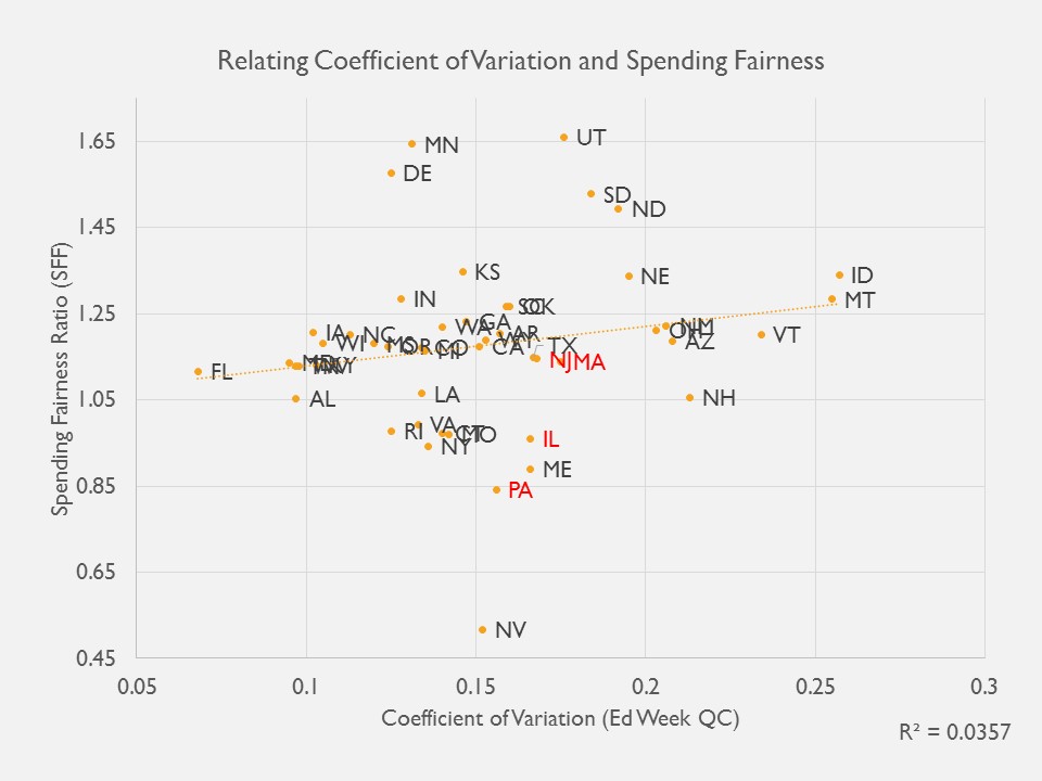
Here, we take a look at the relationships between our indicators and those of others, first focusing on indicators intended to represent equity. Figure 1 shows the relationship between the EWQC coefficient of variation an our measure of spending progressiveness – that is, to what extent is spending variation positively associated with child poverty? How much higher (or lower) is spending per pupil in higher poverty versus lower poverty districts.

EWQC finds similar degrees of variation (similar CV) for Pennsylvania, Illinois, New Jersey and Massachusetts. If anything, EWQC’s CV suggests that Massachusetts and New Jersey are slightly less equitable than Pennsylvania or Illinois (further to the right, higher CV, more variation). But, vertically, PA and IL sit nearer the bottom around or below 1.0, indicating that both of these states have regressive distributions of spending with respect to poverty whereas MA and NJ have progressive distributions of spending. In fact, it is the progessiveness itself that is handicapping MA and NJ on the EWQC measure, yielding the erroneous conclusion. In part, the “variation” reflected in the CV in an enrollment-weighted average is reduced in PA and IL by the presence of very large urban districts (Chicago and Philadelphia) because the calculation assumes all children within those districts receive precisely the same per pupil resources.

Figure 1

EWQC does separately relate property wealth to district spending to determine the “neutrality” of spending from wealth, wherein the preferred condition is one where there exists little or not relationship between district taxable property wealth and revenue or spending per pupil. But Figure 2 shows that even this measure has little or no relationship to our more meaningful, more accurate and precise progressiveness measure. The neutrality measure does pick up the inequities of the Illinois system, but continues to place Massachusetts between Illinois and Pennsylvania despite Massachusetts having a decisively more progressively funded system. Indeed, these measures are designed to show different things, and thus they do. But in an era of information overload, it would be wise for us to select and emphasize that subset of measures which most accurately convey what we really need to know about state school finance systems.

That is, is the overall level of funding sufficient to achieve desired outcomes? And do children and setting with greater needs and costs have sufficiently more resources to have equal opportunity to achieve those outcomes? (are the systems sufficiently progressive?) Whether there remains some relationship to taxable property may be unimportant, or a mere artifact of the distribution of taxable wealth (including high value undesirable properties like utilities, refineries or oil fields).

Figure 2

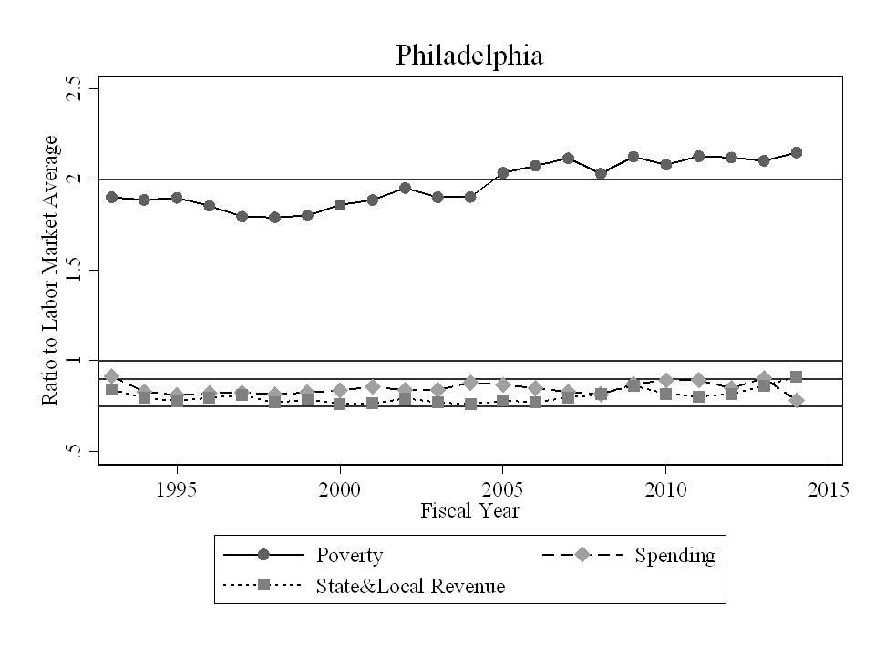
Figure 3 provides a clearer view of per pupil spending (centered around labor market means) and child poverty rates (centered around labor market means) for Massachusetts, New Jersey, Illinois and Pennsylvania. Figure 3 shows specifically that New Jersey per pupil spending tilts upward as poverty increases. That is, it’s progressive. Massachusetts is relatively flat, but Boston (the large circle) is higher in the distribution, creating an average upward tilt, but less systematic than New Jersey. Pennsylvania, by contrast is systematically regressive, with the largest district Philadelphia having very high poverty and low spending. In Illinois, Chicago sits marginally below the average for its labor market on spending, and also with high poverty. Among these states, New Jersey is clearly most equitable, with Massachusetts second, Illinois a distant third and Pennsylvania at rock bottom. But the EWQC equity indicators convey and entirely different – incorrect – conclusion.

Figure 3

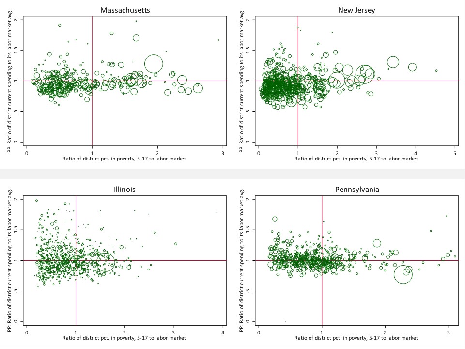
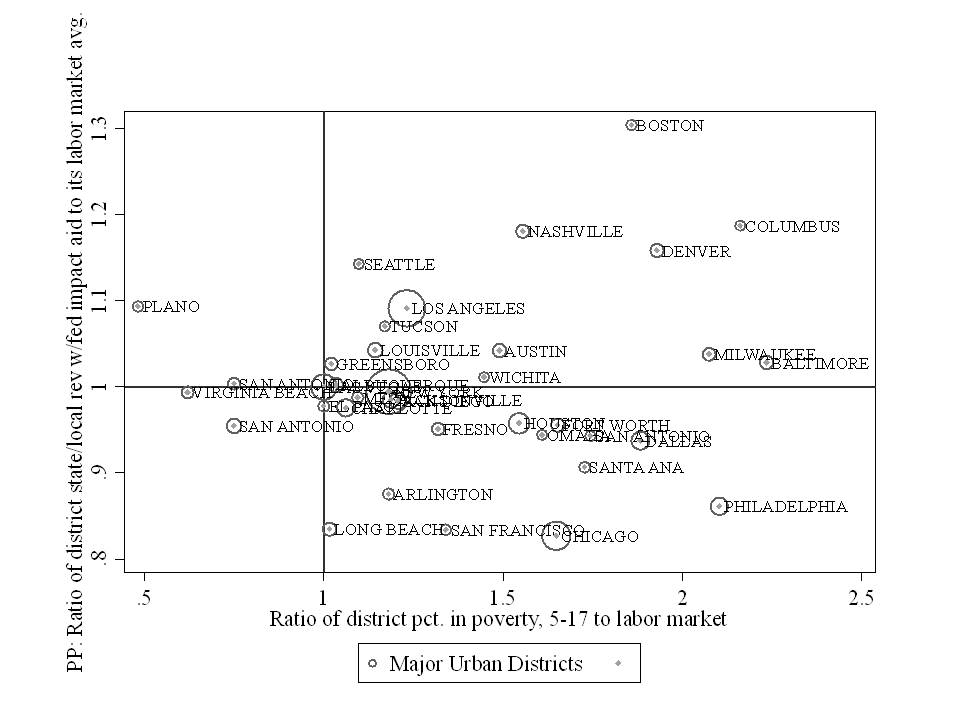
Figure 4 displays the relationship between the Urban Institute progressiveness measure and our progressiveness measure for state and local revenue per pupil. The relationship is weaker than we might expect, but mainly because so many states are clustered together near the center of the distribution. Figure 4 shows that New Jersey is in fact progressive by both measures and Illinois is regressive by both measures, in contrast with the EWQC equity indicators which suggested little difference in equity between New Jersey and Illinois. Massachusetts is also identified as progressive by both indicators.

Figure 4

Adequacy Measures

Figure 5 compares the McLoone Index to our measure from our National Education Cost Model in which we compare current spending to the spending predicted to be needed to achieve national average outcomes in reading and math. There exists little relationship between the two, and the relationship that does exist tilts in the wrong direction. A higher McLoone index is intended to indicate more adequate funding. That is, that the bottom half is closer to the median. But, states with a higher McLoone index seem to have, on average, lower spending relative to spending needed for average outcomes. This finding might be intuitive if states with especially low spending effectively “bottom out” on spending. That is, the bottom half lies at a bare minimum threshold which is also very close to the median – which is very low. This is the case, for example in Arizona and Mississippi. Because this is the case, the McLoone Index is an especially poor indicator for evaluating adequacy (or equity) of spending.  Notably, Vermont and New Hampshire, which have very low McLoone indices also have among the most adequate average spending, largely because they hare relatively low need student populations coupled with relatively high average per pupil spending. 

Figure 5

Figure 6 relates the proportion of children attending districts with above national average spending to our measure of the relative adequacy of current per pupil spending (toward achieving national average outcomes). Here at least we see a modest positive relationship. States with more children attending districts with above average spending do, on average tend to have more adequate spending by our more precise and accurate measure. But if we choose to focus on adequacy for high poverty districts with our measure, as we have done here, we can see that children in high poverty districts in states like Pennsylvania actually only spend 60% of what they would need to spend to achieve average outcomes, even though the state share of children attending districts at or above national average spending is near 100%. By contrast, using our measure, spending in Kansas and Iowa is near the level needed for national average outcomes, even though only 20% of children attend districts at or above national average spending.

Figure 6

Figure 7

Figure 7 relates our measure of spending relative adequacy – spending relative to the cost of achieving national average outcomes in reading and math – to the EWQC spending index. There exists a modes relationship between the two, which makes sense in that weighted average spending relative to national averages should be at least somewhat associated with the relative adequacy of funding toward achieving national average outcomes. But even then there are some significant disconnects.  The EWQC spending index rates Utah as similar to Arizona and Vermont as similar to Pennsylvania.  But our measure of relative adequacy for high poverty schools differs significantly between these pairings, primarily because we account more fully for costs associated with the student populations served.

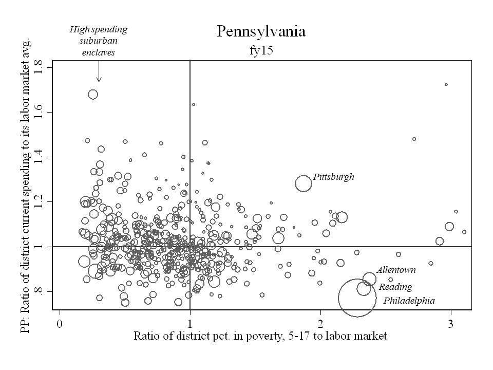
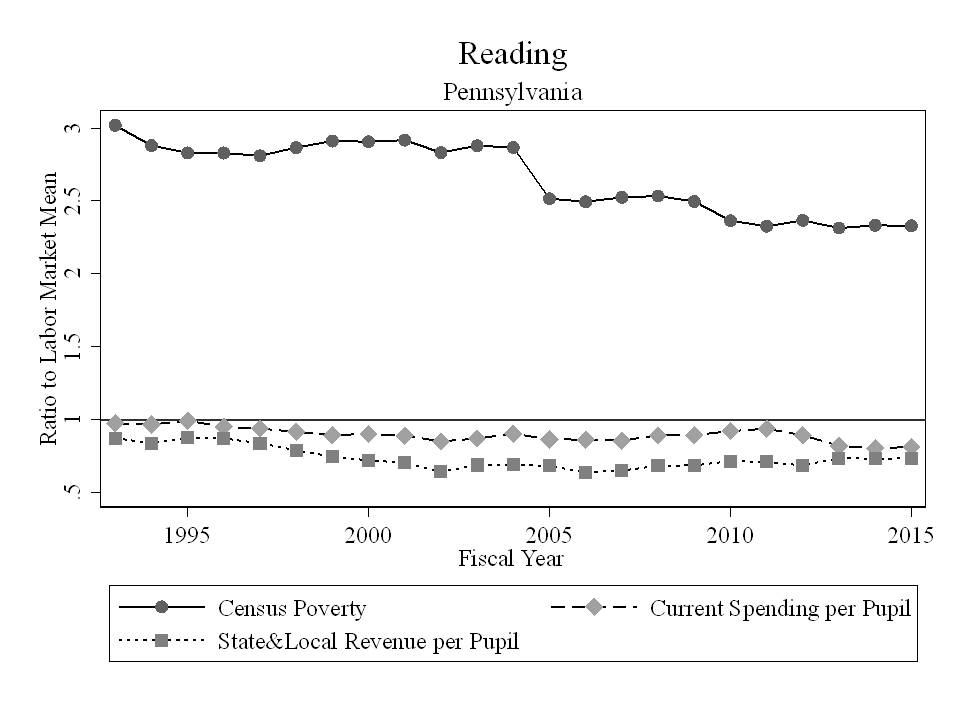
Figure 8 shows the position of Vermont and Pennsylvania school districts, by their poverty rate, on our measure of relative adequacy. The figure includes only unified K12 districts with greater than 500 enrolled students. All districts nationally are in the beige background. The horizontal red line indicates the “cost” of achieving national average outcomes (or $0 gap). In Pennsylvania, several districts, many of them very large districts including Allentown, Reading and Philadelphia fall well below the parity line. Poverty rates in Vermont districts are much lower and spending higher. As such, none of these Vermont districts fall below “adequacy” (defined modestly as the cost of achieving national average outcomes). Clearly, there exist substantive differences in the relatively adequacy of funding for Vermont and Pennsylvania school districts. Differences which are not picked up by the EWQC spending index.

Figure 8

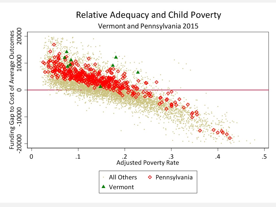
Figure 9 compares two very low spending states rated similarly on EWQC spending index. In fact, Arizona was rated somewhat higher than Utah. But, as Figure 9 shows, while both are relatively low spending states, Utah districts fall much nearer the adequacy bar.

Figure 9

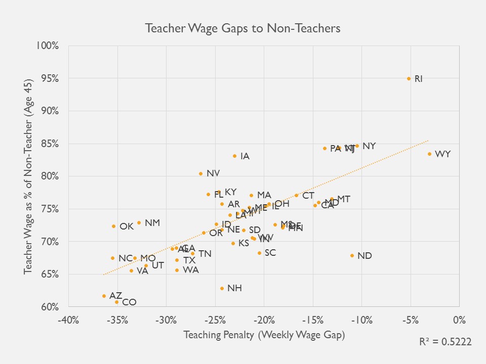
Finally, we relate the two alternative measures of teacher competitive wages – ours which applies a regression based approach to estimate the difference between teacher and non-teacher wages at constant age, degree level, hours per week and weeks per year, and the Economic Policy Institute “Teaching Penalty” which compares weekly wage data by degree level. Figure 10 shows that the two indicators are reasonably related and identity the same sets of states as having particularly competitive versus non-competitive teacher compensation.

Figure 10

Summary

To summarize:

  • Our indicators of resource equity across districts within states remain the only indicators to comprehensively account for differences in spending associated with student needs, regional competitive wage variation or economies of scale and population sparsity.
  • Our approach is conceptually similar to the Urban Institute approach to measuring “progressiveness” and thus we find that state ratings and rankings show some similarities.
  • Education Week’s Quality Counts equity indicators are especially poor measures of state school funding equity, failing to sort out variations in funding that are legitimately associated with costs, largely unrelated to more accurate and precise measures, and often yielding erroneous findings and conclusions.
  • Our indicators of resource adequacy derived from the National Education Cost Model are similarly more comprehensive, estimating specifically the costs associated with achieving existing national average outcomes in reading and math, and comparing current spending to those estimates.
  • Education Week’s Quality Counts spending level indicators are modestly associated with our adequacy measure, but lacking any connection to student outcomes or sufficient consideration of student needs, EWQC’s measures fail to pick up substantive differences in spending adequacy between states, including differences between Pennsylvania and Vermont, and differences between Utah and Arizona.

It is increasingly important in debates over state school finance systems that we achieve a greater degree of consensus around what a good school finance system looks like and how to measure it. Scholars have begun to converge on the importance of systematic progressiveness, and sufficient levels of funding as two key features of a good state school finance system.  Urban Institute and Education Trust, along with our School Funding Fairness system adopt progressiveness with respect to child poverty as a central feature of a good and fair school finance system. Education Week does not and relies on measures which often conflict outright with this guiding principle.

Persistent use of inappropriate and misleading measures of equity and adequacy introduces unnecessary confusion and encourages obfuscation in the context of legislative and judicial deliberations with the potential for profound, adverse influence on the quality of education for our nation’s children. Undoubtedly, Pennsylvania lawmakers will continue hold up their “B” grade from EWQC both in the context of legislative deliberations and while defending their school finance system in court, as a basis for claiming that they are doing a good job on school funding. I and other experts will then have to waste precious time of the judicial system in Pennsylvania explaining just why that “B” grade from Education Week really doesn’t mean anything, and is especially unhelpful for children subjected to year after year substantive deprivation and egregious inequalities in Allentown, Reading and Philadelphia. The consequences of this misinformation are not benign.

We first levied these same concerns regarding the Education Week indicators in 2009 in blog form[7] and in 2010 in our original technical report for Is School Funding Fair? Nearly a decade later, the misinformation persists and it remains as consequential as ever.  It’s time for this to end, and time for consensus on core principles and measurement of state school finance system fairness, equity and adequacy.

Notes

[1] https://drive.google.com/file/d/0BxtYmwryVI00Wmstai1qZXhlWmM/view

[2] Baker, B. D., Taylor, L., Levin, J., Chambers, J., & Blankenship, C. (2013). Adjusted Poverty Measures and the Distribution of Title I Aid: Does Title I Really Make the Rich States Richer?. Education Finance and Policy, 8(3), 394-417.

[3] Baker, B. D., & Imber, M. (1999). ” Rational Educational Explanation” or Politics as Usual? Evaluating the Outcome of Educational Finance Litigation in Kansas. Journal of Education Finance, 25(1), 121-139.

[4] Duncombe, W., & Yinger, J. (2008). Measurement of cost differentials. Handbook of research in education finance and policy, 238-256.

[5] Baker, B. D., Taylor, L., Levin, J., Chambers, J., & Blankenship, C. (2013). Adjusted Poverty Measures and the Distribution of Title I Aid: Does Title I Really Make the Rich States Richer?. Education Finance and Policy, 8(3), 394-417.

[6] https://www.epi.org/publication/teacher-pay-gap-2018/

[7] https://schoolfinance101.wordpress.com/2009/01/08/education-week-quality-lacks/

WHAT SHOULD WE REALLY LEARN FROM NEW ORLEANS AFTER THE STORM?

Full Review: https://networkforpubliceducation.org/wp-content/uploads/2018/08/BBaker.NPE_.NOLA_.pdf

SUMMARY

In July of 2018, the Education Research Alliance for New Orleans released a comprehensive, summative longitudinal report on the effects on student outcomes of the package of reforms implemented in New Orleans following hurricane Katrina in the fall of 2005. The following policy brief reviews the findings of this recent report by Douglas Harris and Matthew Larsen, offers critique of their methods and interpretation of findings and attempts to provide broader policy context for those findings.

In summary, Harris and Larsen find significant positive effects of Post-Katrina New Orleans school reforms on short-term student achievement measures, and longer term college attendance, persistence and completion. They attribute these results to the “market-based” reforms adopted following Katrina, and go to great lengths to dismiss or downplay threats to the validity of this conclusion. But for many reasons, that attribution may be misguided.

  1. First, the authors downplay the potential influence of significant changes in the concentration of poverty across neighborhoods and schools—specifically the reductions in extreme poverty which may contribute significantly to the improved student outcomes in the years following Katrina;
  2. Second, the authors understate the importance of the substantial increases to funding which occurred concurrently with organizational and governance changes in the district, specifically disclaiming the importance of increased funding by suggesting that the funding increases would not have existed but for the reforms;
  3. Third, the authors argue, without evidence, that similar funding increases provided to the old, New Orleans school system would not likely have had similar impact, claiming they would have been inefficient or wasteful. At the same time the authors sidestep the fact that much of the funding increase in the new system was allocated toward increased and duplicative overhead expenses, as well as increased transportation costs resulting from citywide choice;
  4. Fourth, the authors define the treatment as the package of market-based reforms, which are largely changes to the governance and organization of New Orleans schools, rather than focusing on the types of schools, programs and services, and qualifications of incoming staff who entered this

Adopting similar governance and organizational changes, and citywide choice in other contexts may lead to very different results. It remains unclear whether population change and redistribution, coupled with the infusion of resources could have resulted in similar effects, even without structural reforms.

It’s just not funny anymore (and never was): Reflections on educational inequality and generations lost

I’ve been writing this blog since 2009. The initial purpose of the blog was to cut through frequently spewed media bluster about public (and private) schooling. False facts. False premises. Flimsy logic. This blog has often been sarcastic. I’ve tried to use edgy humor to make my points. Some, including my doctoral student Mark Weber, have referred to my style as classic Baker Snark.

That same snark has been pervasive in my Think Tank Reviews for the National Education Policy Center.

From my blog, here’s one example! What’s not funny about this example, is that it’s about subjecting kids in low income and minority neighborhoods to the experiment of using new, noisy, imprecise and largely inaccurate metrics to decide which of their teachers to fire – as a substitute for actually providing sufficient resources for these children and the schools they attend. Yeah. That’s right, let’s just fire their teachers, disrupt their schools, argue that they really don’t need anymore resources, and pretend this will fix everything (and turn a blind eye, or blame it on poor implementation, when it doesn’t work).

Worse, as I note sarcastically in the blog post, the presumption is that we couldn’t possibly cause them any more harm than they’ve already been subjected to for years on end. So why not give this new idea a shot? God forbid we consider remedying the harm we’ve already caused by providing equitable and adequate resources and opportunities.

I tried to make it funny. I think I did make it funny. But you know what, IT’S JUST NOT FUNNY. Not anymore. Nor was it then.

Those kids who were in 5th or 6th grade then? In September of 2010 when I wrote this post? They’ve graduated high school by now (or maybe not). And many were never even given a chance – given the opportunity to succeed in schools with sufficient resources and supports – like the vast resources and opportunities available in the wealthy suburbs (or elite private schools) that other children were lucky (yeah, lucky – myself included) enough to be born into.

I haven’t always tried to be funny here. At times I’ve gone with outrage, or some other form of edginess, usually involving lots of data and graphs.

I’ve frequently updated posts on what I refer to as America’s Most Screwed Public School Districts.

I did a series of posts where I elaborated on the Inexcusable Inequalities in resources between affluent suburban and poor urban (and other) school districts.

My first list of “Screwed Districts” was based on data which are now about 10 years old. The conditions in many if not most of those districts have changed little since then. Kids subjected to those schools are the ones who really got screwed… and most are long since gone from those schools, replaced by a new generation of kids, only to be screwed over at least as much as those who came before them.

I wrote of inexcusable inequalities in Connecticut, Illinois and New York in 2011. Since that time, courts have failed to intervene (or have backed off entirely as in the high court ruling in Connecticut), other “experts” have argued that these kids don’t need more resources anyway… it might actually harm them…to increase resources in their schools… legislatures have failed to act… and governors have blamed teachers, kids, families and anyone but themselves for persistent problems in schools and districts serving our neediest children.

I’ve just completed the final edits of my forthcoming book which addresses much of what I’ve talked about on this blog for years. The book does include some of the same edginess and snark of my past posts, because I wrote it over the past year or so. If I wrote that book now, the tone might be different, though perhaps less entertaining (if school finance can be entertaining).

Stop for a moment, and think about all of the kids, the generations of kids, who’ve passed through inadequately resourced schools during the years from when I started this blog, through today (not to mention the decades prior to that).

Unfortunately, edginess, outrage, sarcasm, data and graphs lack one key element – THE key element needed to make things better – better for more kids – more equitable for all kids – and that is empathy.

Yes, blogging has not been my only activism. I’ve worked tirelessly to advise state legislatures and governors, and I’ve engaged in legal challenges to state school finance systems – trying – trying my hardest to at the very least – make things less bad than they might otherwise be if we didn’t try –  if courts didn’t apply pressure and if legislatures had even less reason to consider doing the right thing.

Yes… some… perhaps many…. Would do the right thing on their own. I must say, that despite the now decade (plus) old critique of Kansas by author Thomas Frank, I’ve been thoroughly impressed by Kansas Legislators, Kansas Courts, and Kansans in their collective (though not always agreeable) pursuit of an education system in which they can be proud. One that, as a result, provides far greater opportunity to even its most needy children than schools in neighboring states in Colorado and Oklahoma. (more on this at a later point, under the hashtag #whatsNOTthematterwithKS?)

Even before I started blogging, I had (I think) gained somewhat of a reputation in conference presentations and scholarly articles for painting egregious behavior and offensive disparities in their most humorous and sarcastic light. Like this article, where partner in crime Preston Green and I outline how state legislators came up with clever strategies to reinforce racial disparities in the post-Brown era. It’s so not funny anymore – and wasn’t then.

I’ve spent much time reflecting this spring, coming to this realization. Reflecting on those cases we passionately pursued, early in my career, like the Kansas cases, where positive change has occurred over time though certainly not linearly by any stretch of the imagination. But also, reflecting on the losses. Not that I see them in any way as my own. My privileged life went on. They are losses for the kids. Here’s a video of Colorado schools at the time of the Lobato case:

Since that time, Colorado has only sunk lower and lower in the distribution of resources among states. A few years prior, I was involved in litigation in Arizona, which was already in worse shape than Colorado. In the years since, millions and millions of additional children in theses states, and other districts around the country have continued to be subjected to inadequate, inequitable schooling, affecting their lives in ways that those of us who were much luckier can’t possibly imagine (my entire career in my present field is built on a combination of luck and the kindness of strangers – another forthcoming post, under that very title).

This all hit me about a month ago. I had arrived to give yet another ho-hum presentation, focusing on the path forward for New Jersey school finance. It was a Friday morning. Just a local thing. I had spent much time earlier that week (and prior weeks) talking with reporters nationally and across states about the link between inadequate funding and teacher wages.

Right before my talk, the conference coordinator asked me to instead discuss the national picture regarding school funding and teacher walkouts, providing some historical context. Easy, right. I do this all the time – from a purely analytic – academic perspective. I’m nearly 20 years into this now. Throw up a few graphs – make a few jokes – express some outrage. Move on. But it hit me. This isn’t funny. Yes, it is outrageous. But not funny.

But, it’s also really, really sad! Those who were there that day can attest to the fact that I got choked up – so much so that I could barely speak at one point and had to take a pause to compose myself.

So, pardon me for a moment while I shed a tear or two (or more) for the generations of children sacrificed in the name of fiscal austerity, provided false choices in the name of efficiency, subject to experimentation without their consent and subjected to woefully inadequate public schooling in Colorado, Arizona, Philadelphia and Reading, Chicago and Waukegan, Puerto Rico and far, far too many other places in this nation and the world.

We can do better. We must do better!


Beneath the Veil of Newark Charter Productivity

Among the take-home points of our recent review of Newark school reforms are that:

  • Resources, when considering school size, are positively associated with growth;
  • The productivity of large charter operators in Newark – TEAM and North Star in particular – depends on how we treat school size in our models;
  • Jumps in student growth percentiles across the board between 2014 and 2015 are hard to explain as a function of substantive policy change – where policy and contextual changes had been happening gradually prior to and throughout the period.

From any study of the effects of changes in policy and practices on student outcomes, what we really want to know – where positive outcome effects are observed – is what can be done to distribute those positive effects across more children and settings, and/or yield even stronger positive effects.

The conclusion offered in the reports is that shifting students to higher value-added schools has yielded positive growth in language arts. And thus, the logical policy conclusion is that more students should be shifted to high value-added schools. The larger the share of students placed in these schools, the higher the overall system performance will be. This may be an oversimplification, but is certainly the message that some are taking home from the reports.[i]

Figure C1 shows the present distribution of students across district and charter schools within the city of Newark. One might characterize the system as housing 3 separate K-12 school districts with a handful of smaller operators of select grade-level schools. The three comprehensive districts in question are NPS, TEAM and North Star.  Analyses in the previous section (setting aside the scale question) suggest that TEAM and NPS perform similarly and that North Star tends to be the higher producer of student growth. Thus, the assertion would be that if we shift more students into North Star, more students should be better off and the system as a whole should produce better outcomes on average.

Thus the “between-school” treatment here is essentially defined as “North Starring” more students.  But what exactly does that mean? Here, we attempt to provide some relevant context. Our intent is to separate the treatment of “North Starring” into those actions district leaders and policymakers might take which are desirable and scalable, versus those practices and conditions that are likely to be influencing measured outcomes but may not be scalable or desirable.

Figure C1

Distribution of District and Charter School Enrollments in Newark 2017

Slide15

Source: New Jersey Department of Education, Enrollment files, 2016-17.
http://www.state.nj.us/education/data/enr/enr17/

Student Population Differences

Unfortunately, a consistent feature of North Star Academy over time has been the tendency to serve and retain less needy student populations than the broader population in the district as well as other charter operators including TEAM. Neither TEAM nor North Star serve many children with severe disabilities, but North Star serves very few with disabilities of any degree of severity.  The reports’ analysis fails to parse severity of disability – its influence on individual student growth, the potential peer effects of the presence of children with severe disabilities, or the extent to which larger shares of children with severe disabilities create resource allocation constraints and pressures in schools. This is a substantial omission, but one which could not be remedied given the lack of data precision.

North Star has also consistently served proportionally fewer of the lowest income children.  Again, the reports’ analysis fails to parse income levels across children, using only indicators of children qualified for either free or reduced priced lunch. We provide illustrations in this section demonstrating why this matters.

North Star serves effectively no children with limited English language proficiency, in part because North Star caters to a predominantly black student population from Newark’s black neighborhoods, which remain geographically segregated from the city’s Hispanic and other ethnic neighborhoods and are home to non-English speaking families.

Special education rates

We start with disability rates based on 2016 data, which are actually more similar across the three Newark districts than prior years during the period studied. Figure C2 shows the overall percent classified and percent with mild specific learning disability, other health impairment, or speech/language disability. Newark Public Schools has an overall rate higher than either of the other two and more than double that of North Star. The vast majority of children with disabilities in North Star have relatively mild and less-costly disabilities. The case is similar for TEAM. Notably, TEAM and NPS have similar rates of mild disability students, but NPS has far more severe disability students.

This finding actually serves to rebut a common argument of charter advocates regarding their lower disability classification rates.  Charter advocates frequently assert that effective early grades interventions reduce their need to classify students with disabilities.[ii] But even the most effective interventions would only be successful at reducing the number of children identified as having mild specific learning disabilities – children on the margins of classification. Interventions would be far less likely to reduce classification of children with traumatic brain injury, intellectual disability, emotional disturbance, or autism. It is those more severe and costly disabilities which are more prevalent in the NPS schools.  Whether valid in other settings or not, this argument is unlikely to hold for differences in special education classification rates between NPS and TEAM Academy.

Figure C2

Slide16

NJDOE Special Education Classification Rates: http://www.nj.gov/education/specialed/data/2016/LEA_Classificatiom.xlsx

Figure C3 provides a more detailed breakdown, revealing that a very large share of North Star’s disability population are children with Speech/Language impairment, and no particular cognitive, behavioral, or other severe impairment which would either divert more substantial shares of resources or directly influence student achievement growth.

Most analyses of Newark district and charter school performance, matching on or controlling for disability status in the aggregate, presume that these children in North Star are equivalent to children with far more severe disabilities in NPS. Some studies specifically find that children with disabilities in charter schools show greater gains than children with disabilities in district schools.[iii] In this case (and most other contexts we’ve studied), such a finding – applying a single measure of “disability” – would be spurious, in that obviously children with only speech language impairment on average would achieve greater growth on standardized assessments than children with multiple and severe learning disabilities.

Figure C3Slide17

NJDOE Special Education Classification Rates: http://www.nj.gov/education/specialed/data/2016/LEA_Classificatiom.xlsx

To summarize, these disability population differences alone, which go unmeasured when using a single “has disability” dummy variable, affect:

  • relative growth between charter and district school students,
  • the nature of peer groups (proportions of marginal vs. more severe disability students integrated into regular classrooms could affect the pace of the curriculum and disruptions in classroom time, which likely would affect growth),
  • the extent to which higher need student populations create resource pressures and drive reallocation away from “general education” students.

While on the one hand these population differences raise questions regarding assumptions about the effectiveness of North Star Academy, they also raise questions about the scalability of “North Starring” and its effects on the system as a whole, even if North Star is particularly effective with the students that it does serve and retain. The more non-disabled students a single large district in the city enrolls, the more disabled students the other districts will have to serve.

Low income concentrations

During the “reform” period under study, substantive differences in the shares of children qualified for “free” lunch existed. These gaps have been closing in recent years; however, North Star continues to serve a smaller share of children who fall below the 130% income threshold for poverty than either TEAM or NPS.

Figure C4

Slide18

The Chin et al. study compares students only on the basis of “free + reduced” priced lunch. Single dummy variables on free and reduced-price lunch are relatively meaningless in a context where nearly all children fall below the higher threshold (less than 185 percent of the income poverty level). In fact, those qualified for reduced price lunch are among the more relatively “advantaged” students in the district and schools with higher shares of those students tend to have higher average scale scores.

Table C1 shows the correlations between percent free lunch, percent reduced-price lunch, percent free and reduced-price lunch, and growth and scale score outcome measures across Newark Schools, including district and charter schools. To summarize:

  • Percent free lunch has a small negative correlation with growth percentiles and a large negative correlation with scale scores.
  • Percent reduced lunch is positively correlated with growth and strongly positively correlated with scale scores.
  • Percent free and reduced-priced lunch is only modestly negatively correlated with scale scores.

This is because those students from families between the 130% and 185% income threshold for poverty happen to be the more “advantaged” students in this high-poverty, urban setting. That is, at the school level, percent free and reduced-priced lunch tells us little about the “risk” of low performance largely because nearly all children in Newark fall below the 185% income threshold for poverty. In addition, it is likely that a substantial number of those who are not identified as qualifying for either in fact do qualify, yet are not listed as such because their families did not apply.

By extension, using a single dummy indicator as a covariate in student (or school) level analysis that assumes nearly all Newark students are socioeconomically identical to one another will lead to specious findings. Because shares of lower income children vary systematically by sector – between NPS and charters – those conclusions will be biased in favor of charters generally, and North Star specifically. While North Star has shown impressive unconditional growth, it has continued to serve fewer of the poorest children in the city. TEAM also served fewer of the poorest children throughout the period studied.

Table C1

Correlations between Growth, Achievement Level and Low Income Populations in Newark (2016)
LAL SGP Math SGP PARCC Math 8 PARCC ELA 8 % Free % Reduced
LAL SGP 1
Math SGP 0.5807* 1
PARCC Math 8 0.3758* 0.4686* 1
PARCC ELA 8 0.4836* 0.4465* 0.9043* 1
% Free -0.0984 -0.0734 -0.3890* -0.5052* 1
% Reduced 0.3440* 0.3817* 0.6602* 0.8062* -0.1233 1
% Free or Reduced 0.0444 0.0779 -0.1638 -0.223 0.9348* 0.2373

In addition to compromising validity of high versus low value-added findings, the tendency of between-school mobility to sort students by income status raises scalability concerns. Put bluntly: as one school/district in a high poverty “choice” space serves more of the less-poor (among the poor) students, others must pick up the difference. Concentrating higher-poverty populations in specific schools potentially creates negative peer effects that are not picked up when using test score histories as measures of peer characteristics.

English Language Learners

Figure C5 shows that among the three districts in Newark, only NPS serves any children with limited English language proficiency. As about 10% of the NPS population is LEP/ELL, this, again, raises questions about scalability. The more that charters in the space serve non-LEP/ELL children, the more LEP/ELL children are concentrated in the district schools. As with poverty and disability, it is also desirable to have access to more fine-grained data on the level of language proficiency.

Figure C5

There remain large differences in shares of English Language Learners Served

Slide20

New Jersey Department of Education School Enrollment Files: http://www.nj.gov/education/data/enr/

Cohort Attrition Rates

Figure C6 and Figure C7 track cohort attrition rates for three sequential cohorts attending TEAM and North Star. Figure C6 shows the total cohort enrollments and Figure C7 shows the cohort enrollments for black male students. Figure C8 shows the average ratio of the 12th grade enrollment to the 7th grade enrollment of the same cohort of students. 

Figure C6

Seventh Grade Cohorts, year after year, are reduced by 25 to 40% as they matriculate to 12th grade

Slide21

Figure C7

Seventh Grade Cohorts of Black Boys, year after year, are reduced by 28 to 65% as they matriculate to 12th grade

Slide22

New Jersey Department of Education School Enrollment Files: http://www.nj.gov/education/data/enr/

Figure C8

Cohort progression rates are much higher for Newark Public Schools than for TEAM and North Star

Slide23

New Jersey Department of Education School Enrollment Files: http://www.nj.gov/education/data/enr/

Certainly much can go on between 7th and 12th grade which affects these cohort enrollments. Students can be held back, boosting the prior grade in the subsequent cohort. Cohort reduction might be mitigated by what is called “back-filling” – admitting new students to fill the spaces of students who leave. Also, after 8th grade, some students may choose to leave for other schools, including selective magnet or private schools.

However, if a cohort by 12th grade is substantively smaller than it was in 7th grade, the most likely explanation is that students have left. This cohort attrition might include those who were pushed out and/or counseled out due to behavior or low academic performance, as well as those leaving for private and magnet schools. If the former is true (weaker and “problem” students leaving), we would expect cohort test scores to go up. If, however, the latter is true (students qualified for selective schools leaving), we might expect cohort test scores to go down. Figure C9 addresses this issue.

These figures show that both North Star and TEAM have significant cohort reduction between 7th and 12th grade for all students and even more so for black boys. Senior cohorts of black boys in North Star are half or fewer than the 7th grade cohort.

Figure C10 shows that, perhaps in part due to the attrition of black boys over time, these schools also tend to be majority female. As a result, Newark district schools are majority male.

Figure C9

Scale Scores of Cohorts through Progression/Attrition

Slide24

New Jersey Department of Education School Enrollment Files: http://www.nj.gov/education/data/enr/

Statewide Assessment Reports: http://www.state.nj.us/education/schools/achievement/index.html

Figure C10

Large charter schools continue to serve predominantly female populations, perhaps as a result of shedding black male students

Slide25

New Jersey Department of Education School Enrollment Files: http://www.nj.gov/education/data/enr/

Finally, along with very high attrition rates for black boys, North Star and TEAM Academy continue to have very high student suspension rates. As Figure C11 shows, North Star suspends 30 percent of students year after year.

Figure C11

North Star and TEAM Academy continue to have among the highest suspension rates in the city of Newark (sorted by 2015 rate)

Slide26

New Jersey Department of Education School Report Cards/ School Climate: https://rc.doe.state.nj.us/ReportsDatabase.aspx

As a matter of policy preferences for moving forward, these findings raise concerns. Again, the most prominent conclusion from the reports is that citywide gains are achieved by moving more children into high value-added schools, where the largest of those schools – a district within the district – is North Star. North Star’s value-added, however, is achieved at least in part (if not in majority) by:

  • not serving children with disabilities generally and serving no children with severe disabilities;
  • serving very few lower-income children,
  • serving no ELL children;
  • having very high attrition generally, and 50% or greater attrition of black boys between 7th and 12th grade; and
  • suspending large shares of children year after year.

Having studied these schools year-after-year for nearly a decade, we are confident that these factors taken together are a “feature” and not a bug when it comes to North Star, and remain a feature, though to a lesser extent, in TEAM Academy. These factors are not captured in the reports’ analysis. Yet they a) limit the validity of assertions that North Star in particular could be a high value-added school for the general population and b) raise serious concerns regarding policies that would attempt to shift more students to North Star, or schools like it, without first addressing these issues.

Paying teachers more to work more hours and days

Here, we address other features of North Star and TEAM as they relate to the host district. These “resource” features may provide more relevant policy insights to the extent that they contribute, in part, to student achievement gains.  Resources are legitimately manipulable and scalable features of school systems – at least more so than student sorting by disability and poverty, and selective attrition.  Isolating the extent to which these resource factors relate to achievement gains, however, is difficult in the context of these other factors.

Among other things, North Star and TEAM Academy operate longer days (over 8 hours, compared to 6 to 7 for NPS schools, according to state report cards) and longer school years. Figure C12 shows that, on average, teachers in these schools are paid higher wages at similar experience and degree level for this additional time commitment. Teachers in TEAM Academy are paid as much as 20 percent more for their time, compared to teachers with similar characteristics in similar job positions throughout Essex County. Teachers in North Star Academy are paid about 10 percent more. Meanwhile, the relative competitiveness of teacher wages for NPS teachers has slipped below the wage for comparable teachers countywide.

The relevant policy question is: to what extent is this specific investment in teacher wages, for additional time, contributing to the higher value-added at North Star? These differences – time and money – are clearly part of the “treatment” which results from shifting kids from district schools to these two charter operators in particular. Yet this feature of differential treatment between district and charter schools was not addressed in the reports.

 Figure C12

Higher pay for longer days and more days

Slide27

NJDOE Staffing files, 2009-2016.

Relying Heavily on Novice Teachers

Given the relatively higher wages at TEAM and North Star and the schools’ commitment to providing longer days and years, one must question how these schools can keep their ongoing total labor costs under control and sustainable over time. That is, can labor costs be managed in the long run, at even larger scale, while providing 10 to 20 percent compensation increases to support additional contractual time commitments?

Figure C13 provides one answer to how TEAM and North Star have kept their total labor costs in check. These schools maintain staffs with very high shares – up to half – of teachers having three or fewer years of experience. At those experience levels, they are paid more than they would be in the district or elsewhere around the county; however, their average salaries are lower because of their inexperience. TEAM’s teaching staff is substantially less novice than is North Star’s teaching staff.

One explanation for the large shares of novice teachers in these schools is that they have expanded year after year and have needed new teachers. However, the question remains whether these schools can maintain their approach of longer days and years for higher pay if these teachers stick around and become more expensive over time. If the model depends on continued turnover to keep spending under control, it may not remain sustainable, especially as it is brought to scale.

Figure C13

Heavy Reliance on Novice Teachers

Slide28

NJDOE: Staffing files, 2009-2016.

Out-Of-District Peers

According to state records, a substantial portion of Newark’s charter school students are not residents of the district. In New Jersey, charter school funding comes from the district where charter students reside. We use the state’s charter aid notices[iv] to those districts to calculate the percentages of students who reside outside of the district. In total, 8 percent of Newark’s charter school students are not residents of the city.

Figure C14 shows the percentages of non-resident students by individual charter school. Over half of the student population at two of Newark’s charters do not reside in the city. Notably, 8 percent of TEAM/KIPP’s students are not Newark residents, while North Star has the highest proportional enrollment of students living in Newark.

It is likely that students who have the ability to travel to another district have unobserved differences in their personal characteristics compared to students who cannot travel. This creates a potential bias in estimates that are derived from comparing non-resident charter students to resident NPS students.

Figure C14

Slide29

NJDOE, FY17 Charter School State Aid Notices.

Staff Certifications and Curricular Narrowing

Programs in the arts, physical education, social studies, science, and other “non-tested” subjects require teachers who are certificated in those domains. To the extent that one school has fewer teachers (proportional to student enrollment) with a particular certification than another, we would assume that school offers less extensive programming within that certifications aligned field of study. Put simply: a school with more art teachers per 100 students will likely have more offerings in the arts.

We present here several graphs that show, over a ten-year period, how the Newark charter sector differs from the NPS district in how many teachers in particular subject areas are deployed. Our measure is “student loads”: the number of students each teacher certificated in a particular subject would have to teach if the students were all divided evenly among teachers.

Figure C15, for example, shows the student load for art teachers[v] in NPS schools, the charter sector, and all publicly funded Newark schools combined. In every year, art teachers in charter schools have much greater student loads than in NPS. While not definitive proof, this deployment of staff may indicate that charters do not offer coursework in art that is as extensive as NPS schools.

Figure C15

Slide30

While this data does show significant volatility in the charter schools, the general trend across the past decade has been that Newark charter schools do not have as many staff per student in a variety of non-tested subjects.

One caution: part of the disparity in staff may be due to differences in grade enrollments. If charters, for example, enroll a smaller proportion of high school students, they may have less need for teachers with social studies certifications. We have begun a preliminary investigation into this possibility. As of now, we do not find that the percentage of Grade 9 to 12 students in a school fully explains the difference between NPS and charter schools. Further analysis, however, may yield different results.

Figure C16

Slide31

Figure C17

Slide32

Figure C18

Slide33

Figure C19

Slide34

Figure C20

Slide35

[i] See, for example: https://relinquishment.org/2017/10/23/could-newark-have-achieved-more/

[ii] Winters, M. A. (2013). Why the gap? Special education and New York City charter schools. Manhattan Institute for Policy Research and Center for Reinventing Public Education.

Winters, M. A., Carpenter, D. M., & Clayton, G. (2017). Does Attending a Charter School Reduce the Likelihood of Being Placed Into Special Education? Evidence From Denver, Colorado. Educational Evaluation and Policy Analysis, 0162373717690830.

[iii] See, for example, the CREDO Urban Charter Schools study:  http://urbancharters.stanford.edu/download/Urban%20Charter%20School%20Study%20Report%20on%2041%20Regions.pdf  This study is cited by the reports to assert that “Newark is home to one of the most effective charter sectors in the nation in terms of student growth on standardized exams” (p. 19)

[iv] We thank Dr. Julia Sass Rubin of Rutgers University, Bloustein School of Planning and Public Policy, for the data.

[v] For each of the categories given, we consolidate job codes into larger categories. For example: “art teachers” include photography, ceramics, theatre/stage, dance, etc. We use the categories provided by NJDOE for guidance.

Newark’s Schools: The Facts

Full Policy Brief: Baker.Weber.Newark.12-13-17

Executive Summary

This brief is in three sections:

In Part A, we argue that those studying school reforms must give more thorough consideration to history and context. In Newark, that context includes:

  • The importance of the Abbott rulings, which brought resource advantages to Newark and similar New Jersey school districts that have effects even in the present.
  • The proliferation of charter schools – specific to Newark, charters with significant resource advantages over the public district schools.
  • The stabilization of poverty rates in Newark, even as poverty increased in surrounding districts.

All of these factors have influenced Newark’s schools, even if they are rarely discussed.

In Part B, we argue that analyses of the relative effectiveness of Newark’s schools over time should make efforts to consider variations and changes in resources available and should also consider factors that constrain those resources. Analyses should also consider how changes to outcome measures might compromise model estimates and eventual conclusions. We undertake such an analysis and find:

  • Much of the “growth” of Newark’s test scores, relative to the state, can be explained by the transition from one form of the state test (NJASK) to another (PARCC) in 2014-15. There is no evidence Newark enacted any particular reform to get those gains, which are actually quite modest.
  • The fact that other high-poverty districts close to Newark showed similar small gains in growth also suggests those gains are not unique to Newark.
  • Newark’s high-profile charter schools are not exceptionally efficient producers of test score gains when judged by statistical models that account for resource differences.

In Part C, we explore some of the substantive differences that exist between Newark’s high “value-added” charter schools and district schools (and other charter schools) yielding less “positive” outcomes. Those differences include:

  • Newark’s high-profile charters enroll substantially fewer special needs students proportionally. The special needs students those charters do enroll tend to have less severe and lower-cost learning disabilities.
  • North Star Academy, one of Newark’s highest-profile charters, enrolls substantially fewer students in the greatest economic disadvantage. Recent studies, however, do not acknowledge this difference, leading to unwarranted conclusions about North Star’s relative productivity.
  • Newark’s charters enroll very few Limited English Proficient (LEP) students.
  • Newark’s high-profile charters show substantial cohort attrition: many students leave between grades 7 and 12 and are not replaced. As those students leave, the relative test scores of those school rise.
  • Newark’s high-profile charters have very high student suspension rates.


School Funding Myths & Misdirects

There exist a handful commonly cited bodies of evidence and deceitful smokescreens intended to undermine the importance of equitable and adequate financing for schools. Here’s my abbreviated rebuttal sheet to what I call the School Money Myths & Misdirects:

First, many including Eric Hanushek assert that school spending has climbed for decades but test scores have remained “virtually flat.”[1]  Others have countered, however, that in fact test scores have not remained flat, especially when accounting for changes to the student population.[2] Still others have pointed out the fallacious logic of this argument noting that “between 1960 and 2000 the rate of cigarette smoking for females decreased by more than 30 percent while the rate of deaths by lung cancer increased by more than 50 percent over the same time period” seemingly implying that smoking cessation increases lung cancer, if one applies the same flawed reasoning.[3] I rebut the overall trends for student outcomes and spending in a recent blog post.

Second, many point to (supposed) high spending of the United States and relatively low scores on international assessments as evidence that spending in the U.S. in particular seems unrelated to school quality. Like the long term trend argument, this argument mischaracterizes U.S. students’ performance.[4] It also relies on very poor, not cross-nationally comparable school spending figures, while failing to consider a host of intervening factors.[5] The most thorough rebuttal of this claim can be found in a recent report I wrote with Mark Weber.

Third, in 1986, Eric Hanushek produced the first in a series of “vote count” meta-analyses wherein he tallied the cases in which research studies found positive, negative or non-significant correlations between school resource measures and student outcomes. Finding mixed results, Hanushek concluded “There appears to be no strong or systematic relationship between school expenditures and student performance.”(p. 1162)[6] This claim became a mantra for those denying the connection between spending and school quality. Soon thereafter other researchers applied quality standards to filter existing studies, finding that the preponderance of higher quality studies in fact did find positive correlations. [7] But these studies pale in comparison in both methodological rigor and relevance to more recent longitudinal studies which consistently find positive effects of school finance reforms on student outcomes.[8]  A thorough review of this literature is available in my Shanker Institute report – Does Money Matter in Education.

Fourth, Hanushek and others also continue to rely on anecdotal claims of massive spending increases in Kansas City, Missouri and in the state of New Jersey which failed to lead to any substantive improvement in student outcomes.[9] The Kansas City claims most often mischaracterize the amount, duration and context (desegregation order) of the funding.[10]  The New Jersey claims are most conveniently rebutted by Hanushek himself. While in the context of several recent school funding legal challenges Hanushek has asserted “Compared to the rest of the nation, performance in New Jersey has not increased across most grades and racial groups,” [11] his own more recent work has found:  “The other seven states that rank among the top-10 improvers, all of which outpaced the United States as a whole, are Massachusetts, Louisiana, South Carolina, New Jersey, Kentucky, Arkansas, and Virginia.”[12]

Fifth and finally, two arguments that frequently resurface are that:

  1. a) how money is spent matters more than how much; and
  2. b) student backgrounds matter much more than schools and money.

While the assertion that “how money is spent is important” is certainly valid, one cannot reasonably make the leap to assert that how money is spent is necessarily more important than how much money is available. Yes, how money is spent matters, but if you don’t have it, you can’t spend it. Further, those who have more of it, have more latitude in determining how to use it.

The second assertion misses the point entirely. The assertion that student background is more strongly associated with student outcomes than are school resource measures is valid. That finding can either be used as a misdirect, to convince the public that there’s no sense trying to leverage  resources to mitigate these disparities or that statement can be viewed as a challenge to be overcome in part through well-crafted state school finance policy and resource allocation. In fact it is precisely because student backgrounds matter so much in determining outcomes that we must figure out how to leverage resources best to offset disadvantages created disparities in backgrounds. Because disparities in student backgrounds are so substantial, the costs of offsetting those disparities can be substantial.[13]

Notes

[1] Hanushek, E. (2015) Money Matters After All? Education Next http://educationnext.org/money-matters-after-all/

[2] Rothstein, R. (2011). Fact-Challenged Policy. Policy Memorandum# 182. Economic Policy Institute.

[3] Jackson, K., Johnson, R.C., Persico, C. (2015) Money Does Matter After All. Education Next. http://educationnext.org/money-matter

[4] Carnoy, M., & Rothstein, R. (2013). What do international tests really show about US student performance. Economic Policy Institute, 28.

[5] Baker, B. D., & Weber, M. (2016). Deconstructing the Myth of American Public Schooling Inefficiency.

[6]E. A. Hanushek, “Economics of Schooling: Production and Efficiency in Public Schools,” Journal of Economic Literature 24, no. 3 (1986): 1141-1177. A few years later, Hanushek paraphrased this conclusion in another widely cited article as “Variations in school expenditures are not systematically related to variations in student performance.” E. A. Hanushek, “The Impact of Differential Expenditures on School Performance,” Educational Researcher 18, no. 4 (1989): 45-62. Hanushek describes the collection of studies relating spending and outcomes as follows: “The studies are almost evenly divided between studies of individual student performance and aggregate performance in schools or districts. Ninety-six of the 147 studies measure output by score on some standardized test. Approximately 40 percent are based upon variations in performance within single districts while the remainder look across districts. Three-fifths look at secondary performance (grades 7-12) with the rest concentrating on elementary student performance” (fn #25).

[7]Greenwald and colleagues explain: “Studies in the universe Hanushek (1989) constructed were assessed for quality. Of the 38 studies, 9 were discarded due to weaknesses identified in the decision rules for inclusion described below. While the remaining 29 studies were retained, many equations and coefficients failed to satisfy the decision rules we employed. Thus, while more than three quarters of the studies were retained, the number of coefficients from Hanushek’s universe was reduced by two thirds” (p. 363). Greenwald and colleagues further explain that: “Hanushek’s synthesis method, vote counting, consists of categorizing, by significance and direction, the relationships between school resource inputs and student outcomes (including but not limited to achievement). Unfortunately, vote-counting is known to be a rather insensitive procedure for summarizing results. It is now rarely used in areas of empirical research where sophisticated synthesis of research is expected” (p. 362).
Hanushek (1997) provides his rebuttal to some of these arguments, and Hanushek returns to his “uncertainty” position: “The close to 400 studies of student achievement demonstrate that there is not a strong or consistent relationship between student performance and school resources, at least after variations in family inputs are taken into account” (p. 141). E. A. Hanushek, “Assessing the Effects of School Resources on Student Performance: An Update,” Educational Evaluation and Policy Analysis 19, no. 2 (1997): 141-164. See also E. A. Hanushek, “Money Might Matter Somewhere: A Response to Hedges, Laine and Greenwald,” Educational Researcher 23 (May 1994): 5-8.

[8] Jackson, C. K., Johnson, R. C., & Persico, C. (2015a). The effects of school spending on educational and economic outcomes: Evidence from school finance reforms (No. w20847). National Bureau of Economic Research.

Jackson, C.K., Johnson, R.C., & Persico, C. (2015b) Boosting Educational Attainment and Adult Earnings. Education Next. http://educationnext.org/boosting-education-attainment-adult-earnings-school-spending/

Lafortune, J., Rothstein, J., Schanzenbach, D.W. (2015) School Finance Reform and the Distribution of Student Achievement. Working Paper. University of California at Berkeley. http://eml.berkeley.edu/~jrothst/workingpapers/LRS_schoolfinance_120215.pdf

Candelaria, C., Shores, K. (2017) Court Ordered Finance Reforms in the Adequacy Era: Heterogeneous Causal Effects and Sensitivity. Working Paper

[9] Baker, B., & Welner, K. (2011). School finance and courts: Does reform matter, and how can we tell. Teachers College Record, 113(11), 2374-2414.

[10] Baker, B., & Welner, K. (2011). School finance and courts: Does reform matter, and how can we tell. Teachers College Record, 113(11), 2374-2414.

[11]http://www.robblaw.com/PDFs/1169.pdf. (Gannon v. Kansas)

[12]E. A. Hanushek, P. E. Peterson and L. Woessmann, “Is the US Catching Up: International and State Trends in Student Achievement,” Education Next 12, no. 4 (2012): 24,
http://www.hks.harvard.edu/pepg/PDF/Papers/PEPG12-03_CatchingUp.pdf.

[13] Duncombe, William, and John Yinger. “How much more does a disadvantaged student cost?.” Economics of Education Review 24, no. 5 (2005): 513-532.


Persistent Inequity & Dangerously Ignorant Denial

Another excerpt from forthcoming work:

======================

In 2011, the Obama administration formed a national equity commission[1] to explore fiscal inequities across U.S. Schools. In one meeting of that commission, participant Eric Hanushek introduced the following table (A-36-1, in Figure 44) from the National Center for Education Statistics to assert that, on average, U.S. States had already raised levels of spending in high poverty districts to the point where, on average, high poverty districts spend more than low poverty districts.  This statement is factually correct, based on Table A-36-1 of the 2010 Condition of Education Report, of the National Center for Education Statistics. The implication being that school funding equity is not the problem, but rather, the problem lies with inefficiency in high poverty districts.

Figure 1

Slide44

There are a few problems with using this table to draw these implications, setting aside that the dollar figures are not adjusted for differences in labor costs across settings.  While $10,978 (constant dollars) is in fact higher than $10,850, this difference is hardly enough to provide for the differences in programs and services needed to close achievement gaps between our highest and lowest poverty children. But perhaps most importantly, these broad, national average figures hide substantial variation both across and within states. Many states have highly inequitable school funding systems and many districts and the children they serve continue to be significantly disadvantaged by state school finance systems, ranging from imperfect to god-awful.

In 2014 I produced a report for the Center for American Progress identifying America’s Most Financially Disadvantaged School Districts.  This report came about as an extension of a series of blog posts in which I had identified what I referred to as America’s Most Screwed School Districts.  It had become increasingly clear to me that the indicators we created for the School Funding Fairness report card, while useful for describing overall patterns, were hiding important disparities within states behind the averages. For example, the disparities I pointed out in the previous section in Massachusetts and New Jersey. These are two of the best, most progressive state school finance systems in the nation, but even in these states there are districts which are high in student poverty and have far fewer resources than the other districts around them. Many districts, and thus the children they serve, were being overlooked in our indicators and subject to mischaracterization by others, without readily available rebuttal.

It is important to understand that the value of any given level of education funding, in any given location, is relative. That is, it does not matter whether a district spends $10,000 per pupil or $20,000 per pupil. It matters how that funding compares to other districts operating in the same regional labor market—and, for that matter, how that money relates to other conditions in the regional labor market. The first reason relative funding matters is that schooling is labor intensive. The quality of schooling depends largely on the ability of schools or districts to recruit and retain quality employees. The largest share of school districts’ annual operating budgets is tied up in the salaries and wages of teachers and other school workers. The ability to recruit and retain teachers in a school district in any given labor market depends on the wage a district can pay to teachers relative to other surrounding schools or districts and relative to nonteaching alternatives in the same labor market.[2] The second reason is that graduates’ access to opportunities beyond high school is largely relative and regional. The ability of graduates of one school district to gain access to higher education or the labor force depends on the regional pool in which the graduate must compete.[3]

Table 1 lists k-12 (unified) districts identified based on 2015 fiscal and poverty data, which have <90% state and local revenue of their labor market average and >150% of the poverty rate.  Many other repeat suspects like Philadelphia (w/approximately 90% revenue) continue to lie at the margins. Year after year, Philadelphia and Chicago have appeared as the two most screwed large urban districts. Along with Philadelphia, other Pennsylvania cities including Reading and Allentown face even more dire conditions, and along with Chicago, Illinois districts like Waukegan and Joliet make the list year after year.  While Hartford and New Haven in Connecticut have received additional aid in support of their magnet programs, creating an appearance of progressive funding in Connecticut, other districts including Bridgeport, Waterbury and New Britain have been entirely left out. It seems a relatively easy call to suggest that disparities of this type and magnitude are simply wrong – unfair – and should be remedied.

Table 1

America’s Most Financially Disadvantaged Districts 2015

Screwed

Baker, B.D., Srikanth, A., Weber, M.A. (2016). Rutgers Graduate School of Education/Education Law Center: School Funding Fairness Data System. Retrieved from: http://www.schoolfundingfairness.org/data-download

To put these disparities into context, we know that high poverty districts need not only equal resources but substantially more resources per pupil to achieve common outcomes for their students. One of the more rigorous studies to ask just how much more applied cost models to districts in New York state, finding that the costs associated with each additional child in poverty (U.S. Census poverty income level) were about 1.5 more (2.5 times) the costs of achieving the same outcome measures for children not in poverty.[4] Thus, a district serving 30% children below the poverty line would have costs approximately 75% higher or 1.75 times (.3 x 2.5) per pupil cost for a district with 0% census poverty.

As obviously problematic as these disparities are, they still have their detractors and deniers, which is especially disheartening. Take for example the twitter exchange below between Andy Smarick, Fellow of the American Enterprise Institute, later appointed President of the Maryland State Board of Education and Author of The Urban School System of the Future[5], and Kombiz Lavasany, a research manager at the American Federation of Teachers.  The premise of Mr. Smarick’s book is that urban school systems have failed despite receiving massive resources. According to Mr. Smarick, urban traditional public school districts don’t and can’t work, and must be replaced with a portfolio of privately managed autonomous charter schools. This premise is largely borrowed from a 1997 book by Paul Hill, Lawrence Pierce and Jim Guthrie titled Reinventing Public Education.[6]

In the exchange below, Andy Smarick opines with great confidence that Philadelphia is among those large urban districts which have received massive sums of money, repeatedly, to “prop it up.”[7] The only hint at evidence here is the claim that Philadelphia’s state aid is among the highest in the state. Of course, that’s because Philadelphia is by far the largest district in the state (several times larger than any other district).

Figure 2

Slide45

I might have taken less offense to Mr. Smarick’s proclamation had I not been under the false impression that most reasonably informed education policy wonks understood that Philadelphia was in fact one of (if not the) nation’s least well-funded large urban districts, operating in the context of one of the nation’s least equitable states. Apparently, it wasn’t so widely understood. Nonetheless, publicly available and easily fact-checkable data were and are pretty clear on this point.

Let’s take a look at Pennsylvania school finance and the position of Philadelphia within that mix. Figure 3 shows Pennsylvania school districts arranged by their poverty rates and by per pupil spending relative to districts in their surrounding labor market.  Again, the size of each circle represents the enrollment size of each district.  Philadelphia stands out as the large circle in the lower right area of the graph. That is, Philadelphia has a little more than double the poverty rate of all districts in its area, and has less than 80% of the current spending per pupil in 2015.  In other words, Philadelphia is the classic case of a “Screwed District” as I originally reported on my blog in June of 2012.[8]

Figure 3

Slide46

Baker, B.D., Srikanth, A., Weber, M.A. (2016). Rutgers Graduate School of Education/Education Law Center: School Funding Fairness Data System. Retrieved from: http://www.schoolfundingfairness.org/data-download

Figure 4 shows the plight of Philadelphia Public Schools over time, from 1993 to 2015.  During this period, child poverty rates climbed from just under double the labor market average to over double the labor market average.  Throughout the period of over two decades, Philadelphia has received substantively less in per pupil revenue and spent less per pupil on average than surrounding districts, despite having much greater need and facing much higher costs.  Despite bombastic rhetoric to the contrary, the Commonwealth of Pennsylvania has done little, if anything, for decades to “prop up” school spending in Philadelphia.  Evidence-free bluster to the contrary is reckless and irresponsible.

Figure 4

Slide47

Baker, B.D., Srikanth, A., Weber, M.A. (2016). Rutgers Graduate School of Education/Education Law Center: School Funding Fairness Data System. Retrieved from: http://www.schoolfundingfairness.org/data-download

Among the financially disadvantaged districts of the Commonwealth, are two other eastern Pennsylvania cities – Reading and Allentown.  Reading was the subject of a feature article in the Huffington Post by education writer Joy Resmovits back in 2012, in which Resmovits detailed the ground level impact of Reading’s funding plight, including substantial staffing cuts and elimination of the district’s preschool program.[9] Kansas City native Michael Q. McShane, then with the American Enterprise Institute (now with the Missouri-based Show-Me Institute) responded to the Resmovits column in a piece he titled “It’s not about the money” in which he argued: “Ms. Resmovits was right to point to Reading as an example of a property-poor district that cannot raise enough local funds to support education. However, as the 20-year changes in funding show, the state has worked to remedy this shortfall.”[10] McShane’s evidentiary basis for his claim was to show that the percent of Reading’s funding coming from the state had increased over time and was greater than that of other districts. Thus, the state was doing its part and responsibility for any failures should fall squarely on Reading school district officials. Clearly, however, as shown in Figure 5, the state’s efforts have been far from sufficient to remedy the shortfall.  The percent of revenue that comes from the state is irrelevant if the sum of state and local revenue remains insufficient. Reading is an especially flagrant case of savage school funding inequalities. Reading is a mid-size city district with nearly 250% of the poverty rate and about 73.6% of the state and local revenue per pupil of the surrounding labor market.

Figure 5

Slide48

Baker, B.D., Srikanth, A., Weber, M.A. (2016). Rutgers Graduate School of Education/Education Law Center: School Funding Fairness Data System. Retrieved from: http://www.schoolfundingfairness.org/data-download

While Philadelphia and Reading are particularly egregious examples of disparities, it is false to assume or make data-free proclamations regarding propping up large city school districts with vast sums of state aid. Figure 6 shows the relative poverty and relative state and local revenue for large city school districts with 50,000 or more students in 2013.  Again, Philadelphia and Chicago are most disadvantaged. Boston is most advantaged here, but its margin of poverty difference is still double that of its surroundings and margin of revenue difference only about 30% higher than surroundings.  Even Boston’s progressive spending differential falls well short of cost estimates for achieving common outcomes.[11] Thus it should come as no surprise that Boston students’ outcomes continue to fall short.

Figure 6

Slide49


Baker, B.D., Srikanth, A., Weber, M.A. (2016). Rutgers Graduate School of Education/Education Law Center: School Funding Fairness Data System. Retrieved from: http://www.schoolfundingfairness.org/data-download

NOTES

[1] Mercury News. A 28-member commission studing the problem of school fundign inequities, will hold a meeting in San Jose March 4. Feb 24, 2011. http://www.mercurynews.com/2011/02/24/a-28-member-commission-studying-the-problem-of-school-funding-inequities-will-hold-a-meeting-in-san-jose-march-4/

[2] Bruce, D. B. “Revisiting the Age-Old Question: Does Money Matter in Education.” The Albert Shanker Institute (2012).

& Baker, Bruce D. “Does money matter in education?.” Albert Shanker Institute (2016).

http://www.shankerinstitute.org/images/doesmoneymatter_final.pdf.

[3] Bruce D. Baker and Preston C. Green III as well as William Koski and Rob Reich explain that to a large extent, education operates as a positional good, whereby the advantages obtained by some necessarily translate to disadvantages for others. For example, Baker and Green explain that, “In a system where children are guaranteed only minimally adequate K–12 education, but where many receive far superior opportunities, those with only minimally adequate education will have limited opportunities in higher education or the workplace.”

Baker, Bruce, and Preston Green. “Conceptions of equity and adequacy in school finance.” Handbook of research in education finance and policy (2008): 203-221.;

Koski, William S., and Rob Reich. “When adequate isn’t: The retreat from equity in educational law and policy and why it matters.” Emory LJ 56 (2006): 545.

, available at http://www.law.emory.edu/fileadmin/journals/elj/56/3/Koski___Reich.pdf.

[4] Duncombe, William, and John Yinger. “How much more does a disadvantaged student cost?.” Economics of Education Review 24, no. 5 (2005): 513-532.

[5] Smarick, Andy. The urban school system of the future: Applying the principles and lessons of chartering. R&L Education, 2012.

See also: Wexler, Natalie. Should we give up on urban public school districts and replace them with something completely different? Greater Greater Washington. May 7, 2014. https://ggwash.org/view/34640/should-we-give-up-on-urban-public-school-districts-and-replace-them-with-something-completely-different

[6] Hill, Paul, Lawrence C. Pierce, and James W. Guthrie. Reinventing public education: How contracting can transform America’s schools. University of Chicago Press, 2009.

[7] Smarick mentions Baltimore, Boston, Detroit, Milwaukee and New York in an exchange here: https://edexcellence.net/articles/does-money-matter-is-school-funding-fair

[8] Baker, Bruce D. America’s Most Screwed City Schools. School Finance 101. June 2, 2012. https://schoolfinance101.wordpress.com/2012/06/02/americas-most-screwed-city-schools-where-are-the-least-fairly-funded-city-districts/

[9]Resmovitz, Joy. Reading, Pennsylvania: Poorest U.S. City Loses Pre-Kindergarten, 170 Teachers. Huffington Post. June 15, 2012.  http://www.huffingtonpost.com/2012/06/14/reading-pennsylvania-schools_n_1598398.html

[10]McShane, Michael Q. Fact Checking HuffPost: It’s not about the money. American Enterprise Institute. Oct 5, 2012.  https://www.aei.org/publication/fact-checking-huffpost-its-not-about-the-money/

[11] Duncombe, William, and John Yinger. “Why is it so hard to help central city schools?.” Journal of Policy Analysis and Management (1997): 85-113.

Duncombe, William, and John Yinger. “How much more does a disadvantaged student cost?.” Economics of Education Review 24, no. 5 (2005): 513-532.

More on Within-District “Equity” and Charter Expansion

The 1990s saw a flurry of studies which began to explore equity of resources across schools within districts. These studies revealed significant variation in spending across schools, raising the legitimate concern regarding the effectiveness of state school finance formulas alone for resolving inequitable resources to students. After all, in some states like New York, a single district might serve over 1/3 of all pupils, across over 1,000 schools.  Getting enough money to New York City to achieve equity with other districts statewide was one thing, but ensuring that the resources flowed equitably to children across schools within this very large, socially, economically and racially diverse city was another thing entirely.

Over the next decade through the late 2000s, within district inequality became a convenient scapegoat issue for federal policymakers, informed by beltway think tanks.[1]  The message that emerged was that due to years of litigation and pressure by state courts, states had largely met their obligations to resolve disparities between local public school districts and that the bulk of remaining disparities were those that persist within school districts.[2] Thus, the most useful exertion of federal pressure is on local district officials and their corrupt policies which drive more money to schools in rich neighborhoods within districts, and away from poor neighborhoods within the same districts.

The political convenience of focusing on within district equity was that federal policy and funding could be leveraged to place pressure on local bureaucrats – school superintendents and local boards of education – to fix their inequitable budget allocations, regardless of how much money was available. It was a simple, revenue neutral solution, one which avoided federal officials placing any pressure on state legislatures and governors to fund more equitable statewide formulas, which might require raising taxes. These federal policies exist today in the form of “comparability” regulations which require that local school districts can show that poor schools receive resources at least comparable to those of rich schools in order to qualify to receive federal Title I funding.[3] Title I has long required that districts supplement, not supplant state and local resources with Title I funds for high poverty schools.

Indeed, it is important that we consider not only the delivery of resources from states to local districts, but also how those resources reach schools and children. But federal attention on within district disparities without regard for between district disparities has created an unfortunate distraction from the larger issue – that many high need school districts simply lack sufficient resources to provide their students equal educational opportunity – and have limited capacity to reshuffle those resources from poor to poorer schools within their highly segregated boundaries.

To begin with, assertions that the remaining dominant disparities in school finance are those across schools within district are based on analyses that range from merely insufficient to flawed and outright deceitful.[4]  Additionally, the argument falsely presumes that there exist large numbers of school districts around the country that have both rich and poor neighborhoods within their boundaries, and many schools sorted among them. Except in southern states operating county systems, most racial and economic segregation exists across school district boundaries, not across schools within districts. Further, in many states there exist a relative few districts which actually have large numbers of schools and even fewer where there exists large variation in poverty across those schools.

In a recent article on the limits of federal comparability regulation, Mark Weber and I explain that 21 states have less than one-half of students attending districts with 10 or more schools. Vermont has none. 15 Fifteen states have more than 1/3one-third of their students attending districts with fewer than five schools (meaning likely fewer than three at any grade level, three elementary, one middle, one secondary, or single high school regional districts).

In this same article, Mark Weber and I go further to illustrate that if we look across schools statewide, variations in district spending strongly dictate statewide variations in school spending. We explain that “District spending variation explains an important, policy relevant share of school staffing expenditures in 13 states. In many states, including Illinois and New York, a nearly 1:1 relationship exists between district spending variation and school site spending variation (2).”[5] In other words, if a district has more money, so too do the schools within that district.

The right way to evaluate spending variation across schools

When evaluating within district spending we must take steps to parse “good variation” from “bad variation,” or more specifically “equity enhancing variation” from “equity eroding variation.”  The same is true for between district spending differences. Recall that in the School Funding Fairness model which evaluates between district spending disparities, we estimate the relationship between census poverty rates and district revenues (and spending), while accounting for variation in competitive wages across regions, district enrollment size (economies of scale) and population sparsity. Failure to account for relevant factors influencing spending variation can lead to erroneous conclusions.  Here are two examples of such erroneous conclusions from school level analyses:

  • Bad Example 1: A 2007 study by authors at the Buckeye Institute in Ohio counted up the districts where there existed a positive versus negative correlation between low income shares and per pupil spending across schools within those districts. They found that most of the 70 high poverty districts they studied did not have clear positive correlations between school spending and low income shares. [6] As I explained in a critique of this study, most of what they actually found was that school districts with one or a few elementary schools, a middle school, and a high school a) often had higher per pupil spending in the high school, and b) the high school often had lower shares of children reported as qualifying for free or reduced lunch. This was an important revelation to me at the time, since this is a common pattern, with a variety of explanations including lower compliance filing forms to qualify for subsidized lunch at the secondary level. But it’s not evidence that Ohio districts were shortchanging higher poverty schools to favor lower poverty ones.
  • Bad (really stupid) Example 2: A more egregious example comes from a New York based charter school advocacy organization called Families for Excellent Schools which released a report arguing that New York City’s highest funded middle schools were also its worst! The press release for their report proclaimed: “At the middle school level, the bottom 50 schools received an average $30,256 per pupil, compared with $16,277 at the top 50 middle schools.”[7]  The goal of their report was to advocate that these funds should instead be directed toward charter school expansion, since it was clear, by this finding, that the district simply didn’t know how to leverage resources to improve student achievement.  But this “study” missed the simple fact that in New York City like most large districts, the primary driver of differences in spending across schools within districts is the share of children with disabilities served in the schools. Children with disabilities significantly influence staffing ratios and thus school level spending. It also turns out, not surprisingly, that schools with more children with disabilities tend to have lower average test scores. Thus, more spending leads to lower test scores?

So then, what’s the right approach for characterizing good and bad disparities across schools within districts? Through numerous peer reviewed publications and consulting work with colleagues including Jesse Levin at the American Institutes for Research, we have arrived at a common set of factors that should typically be included in any model of within district, school level spending variation.  First we must consider the grade level issue, both because there exist differences in spending approaches across grade levels and differences in student need measures, such as free or reduced lunch. It’s not that we have any real basis for assuming that elementary school costs more than high school or vice versa, but that direct comparisons ignoring grade level are problematic and can lead to invalid conclusions (like the Buckeye report).

While we consider district size and population sparsity in our School Funding Fairness model evaluating district spending, one can make the argument that there should not exist inefficiently small (higher spending because they are small) schools in densely populated urban contexts. Having these schools for some drains resources from others. It’s inequitable variation, not equitable variation. Perhaps most importantly, we must consider the distribution of children with disabilities across schools, preferably with consideration of which schools are serving children with more severe disabilities requiring even more direct instructional and related services support personnel.

Let’s apply these guidelines to take a look at school site spending variations in New York City and Baltimore. Table 1 and Table 2 present results of regression models of school spending in New York City and New York State. It’s important to understand here that I’m just using these models to characterize the average patterns across all schools in each district. Often, statistical models like this are used for drawing inferences about relationships. These models are simply describing patterns – actual patterns, across all schools. For New York City, for example, I find that as we go from 0% to 100% children in middle grades, per pupil spending drops by $779 per pupil. As we move from 0% to 100% children in secondary grades, per pupil spending drops by $757. That is, elementary per pupil spending tends to be highest in New York City. The average regular elementary school spent about $21,229 per pupil in 2015. As we move from a school with 0% low income children to 100% low income children, spending increases by about $2,000 (about a 10% margin). If we went from a school with 0% children in special education to 100%, spending per pupil would double. Most schools fall between 0 and 30% special education, so the practical difference is about 1/3 of the $25,159. Importantly, these factors explain over 60% of the variations in spending across New York City Schools. That is, most of the variation in spending across New York City schools is rational, explainable variation. Still, a sizeable share is not, and should be vetted further.

Table 1

Model of School Site Spending in New York City 2015

By contrast, Table 2 shows a model applied to statewide, inter-district spending variation in New York in 2015. Here, I also include factors for regional wage variation and for economies of scale and population sparsity. As such, this even richer model should be able to explain even more variation if that variation is rationally related to cost and need factors. But, the state level model only yields about 45% variation explained by rational factors. More disturbingly, however, the state model reveals an overall statewide pattern of regressive inter-district disparity, wherein a district with 100% poverty would be expected to have nearly $12,000 less in per pupil spending than a district with 0% poverty.  So, at least in New York State, spending disparities within New York City are less of a problem than spending disparities statewide.  New York City intra-district funding is mildly progressive whereas statewide inter-district funding is regressive.

Table 2

Model of Statewide Current Spending per Pupil for New York State Districts in 2015

Charter Expansion and Within-District Equity

Now let’s take a look at Baltimore, where I include two different models. The New York City analysis above does not include charter schools. The Baltimore analysis does. In an equitable district/charter system, after accounting for the relevant factors, there should not be any difference in spending between charter schools and district schools. Otherwise, charter schooling in-and-of-itself is introducing inequity.  Baltimore, unlike New York City does spend more in schools serving more secondary level students. Again, the margins of difference related to special education are the greatest, but are somewhat buffered where the shares of students who have mild disabilities is greater.

In the first model, it would appear that on average, schools serving more low income children have lower per pupil spending. That is, Baltimore school funding is flat to regressive. But, when one takes account of charter schools, what we see is that charter schools, on average, spend slightly more ($249 per pupil) than otherwise similar district schools and that spending with respect to low income children is slightly progressive ($183 per pupil increase moving from 0% to 100% low income). The reason this pattern flips when accounting for charter schools is that a) Baltimore charter schools serve, on average, fewer low income students than do district schools and b) Baltimore charter schools spend slightly more per pupil than district schools. That is, they introduce an inequity to the system. This finding is common.

Table 3

Model of School Site Spending In Baltimore 2013-2015

In a 2015 article in the journal Education Finance and Policy, Ken Libby, Katy Wiley and I discuss similar findings regarding charter schools in New York City and Houston. Specifically, we found that New York City charter schools both served less needy student populations than nearby district schools and on average, after accounting for student population differences, those charter schools spent significantly more per pupil than district schools. Even more striking were the differences in spending within the charter sector, between schools having substantial private contributions versus those receiving far less outside of their public subsidies. [8] In follow up work, in an article published in 2017 in the journal Educational Policy, Mark Weber and I found that for-profit charter operators, on average divert more money from direct classroom services, leading to even greater variation across schools in jurisdictions with a mix of district schools, for-profit and non-profit charter schools. [9]

In ongoing work, Mark Weber, Ajay Srikanth and I are finding that across large school districts which have sizeable and growing charter sectors, student sorting by demographics is exacerbated and school spending variations increased. That is, expanded chartering seems to be leading to increased inequality across schools within common geographic spaces. Using data from two waves of the Civil Rights Data Collection, we again find that controlling for the factors listed previously, New York City charter schools continue to spend far more than district schools serving similar populations (Figure 1). Results are mixed for other settings, but inequities are inequities, in whichever direction they fall.

Figure 1


Focusing for the moment specifically on New York City – as I show above, New York City, across public district schools has achieved greater equity than New York State has achieved across districts. In fact, one of the most significant factors compromising equity across schools within New York City is the expansion of charter schools!

Worse, the extent to which charter expansion adversely affects equity for children within New York City is difficult to measure accurately in the absence of a common financial reporting system inclusive of all revenues and expenditures for school sites, including the value of allocated services.

Incompatible Policy Preferences: Comparability & Expanded Choice

Tightening comparability regulations governing within district equity (defined in terms of progressiveness) while pushing for expanded choice and diversification of operators and governing bodies are entirely incompatible policies. In some states, charter schools are governed by and financed through local district budgets, providing the opportunity for districts to use common formulas for funding district and charter schools. In other states, fully independent charter schools may be authorized to operate within district spaces but outside of their control or financing. Some states like Texas have both.

Expanding the mix of providers and provider types in a common space is more likely to result in increased variations in quality and spending than in convergence toward equity.  Private providers have widely varied access to outside resources, resulting in highly unequal “revenue enhancement.”  The incentive for school operators is to pursue whatever means is necessary to be the preferred school of choice (for the preferred students), not to spend only what is needed to provide equal opportunity to achieve common outcomes.

Expanding choice also means accepting the presence of inefficiently small startups, at least for a period of time.  Continued shifting of students from one sector to another within the same geographic space means accepting simultaneously inequities and inefficiencies associated with growth related costs in one sector, and stranded expenses in another.  For a system to be equitable, policymakers must figure out how to manage these inequities. Thus far, they’ve largely ignored them


Notes

[1] Hall, Daria, and Natasha Ushomirsky. “Close the Hidden Funding Gaps in Our Schools. K-12 Policy.” Education Trust (2010).

Spatig-Amerikaner, Ary. “Unequal Education: Federal Loophole Enables Lower Spending on Students of Color.” Center for American Progress (2012).

[2] Baker, Bruce D., and Kevin G. Welner. “Premature celebrations: The persistence of inter-district funding disparities.” Education Policy Analysis Archives/Archivos Analíticos de Políticas Educativas 18 (2010).

[3] Luebchow, Lindsey. “Equitable Resources in Low Income Schools: Teacher Equity and the Federal Title I Comparability Requirement.” New America Foundation (2009).

Dynarski, Mark, and Kirsten Kainz. “Requiring school districts to spend comparable amounts on Title I schools is pushing on a string.” Evidence Speaks Reports 1 (2016): 21.

[4] Baker, Bruce D., and Kevin G. Welner. “Premature celebrations: The persistence of inter-district funding disparities.” Education Policy Analysis Archives/Archivos Analíticos de Políticas Educativas 18 (2010).

See also: Dynarski, Mark, and Kirsten Kainz. “Requiring school districts to spend comparable amounts on Title I schools is pushing on a string.” Evidence Speaks Reports 1 (2016): 21.

[5] Baker, Bruce D., and Mark Weber. “State school finance inequities and the limits of pursuing teacher equity through departmental regulation.” education policy analysis archives 24 (2016): 47.

[6] Carr, M., Gray, N., and Holley, M. (2007, Sept. 20). Shortchanging Disadvantaged Students: An analysis of intra-district spending patterns in Ohio. Policy Report No. 14. Columbus: The Buckeye Institute for Public Policy Solutions. Retrieved Oct. 10, 2007, from http://www.buckeyeinstitute.org/docs/Shortchanging_Disadvantaged_Students.pdf

[7] http://www.familiesforexcellentschools.org/news/press-release-cost-failure

[8] Baker, Bruce D., Ken Libby, and Kathryn Wiley. “Charter School Expansion and Within-District Equity: Confluence or Conflict?.” Education Finance and Policy (2015).

[9] Weber, Mark, and Bruce Baker. “Do For-Profit Managers Spend Less on Schools and Instruction? A national analysis of charter school staffing expenditures.” Educational Policy (2017): 0895904816681525.

Incompatible Policy Preferences: Comparability & Expanded Choice

Another excerpt from forthcoming work:

In a 2015 article in the journal Education Finance and Policy, Ken Libby, Katy Wiley and I discuss similar findings regarding charter schools in New York City and Houston. Specifically, we found that New York City charter schools both served less needy student populations than nearby district schools and on average, after accounting for student population differences, those charter schools spent significantly more per pupil than district schools. Even more striking were the differences in spending within the charter sector, between schools having substantial private contributions versus those receiving far less outside of their public subsidies. [i] In follow up work, in an article published in 2017 in the journal Educational Policy, Mark Weber and I found that for-profit charter operators, on average divert more money from direct classroom services, leading to even greater variation across schools in jurisdictions with a mix of district schools, for-profit and non-profit charter schools. [ii]

In ongoing work, Mark Weber, Ajay Srikanth and I are finding that across large school districts which have sizeable and growing charter sectors, student sorting by demographics is exacerbated and school spending variations increased. That is, expanded chartering seems to be leading to increased inequality across schools within common geographic spaces. Using data from two waves of the Civil Rights Data Collection, we again find that controlling for student characteristics and grade ranges served, New York City charter schools continue to spend far more than district schools serving similar populations (Figure 1). Results are mixed for other settings, but inequities are inequities, in whichever direction they fall.

Figure 1Slide105

Tightening comparability regulations governing within district equity (defined in terms of progressiveness with respect to low income concentrations) while pushing for expanded choice and diversification of operators and governing bodies are entirely incompatible policies. In some states, charter schools are governed by and financed through local district budgets, providing the opportunity for districts to use common formulas for funding district and charter schools. In other states, fully independent charter schools may be authorized to operate within district spaces but outside of their control or financing. Some states like Texas have both.

Expanding the mix of providers and provider types in a common space is more likely to result in increased variations in quality and spending than in convergence toward equity.  Private providers have widely varied access to outside resources, resulting in highly unequal “revenue enhancement.”  The incentive for school operators is to pursue whatever means is necessary to be the preferred school of choice (for the preferred students), not to spend only what is needed to provide equal opportunity to achieve common outcomes.

Expanding choice also means accepting the presence of inefficiently small startups, at least for a period of time.  Continued shifting of students from one sector to another within the same geographic space means accepting simultaneously inequities and inefficiencies associated with growth related costs in one sector, and stranded expenses in another.  For a system to be equitable, policymakers must figure out how to manage these inequities. Thus far, they’ve largely ignored them.

[i] Baker, Bruce D., Ken Libby, and Kathryn Wiley. “Charter School Expansion and Within-District Equity: Confluence or Conflict?.” Education Finance and Policy (2015).

[ii] Weber, Mark, and Bruce Baker. “Do For-Profit Managers Spend Less on Schools and Instruction? A national analysis of charter school staffing expenditures.” Educational Policy (2017): 0895904816681525.

Choice as a Substitute for Adequacy?

Another excerpt from forthcoming work…

Much of the expansion of charter schooling occurred during the recession. That is, states were adding schools while reducing overall funding, adding inequitable choices on top of increasingly inequitable and inadequate systems.  Expanded charter schooling was a centerpiece of the Duncan/Obama education reform platform which coincided with the recession and “new normal” era.

Cursory descriptive analyses (as well as more complex longitudinal models) suggest that states which most expanded their charter sectors are also among those states which most reduced their overall effort toward financing public education. This is a disturbing finding in part because charter schools rely similarly on public financing. Reducing public financing affects negatively both district and charter schools. Further, increasing the number of schools, holding enrollments constant, shifting students from one sector to another creates additional costs, at least in the short run.[i]

It is conceivable that state policymakers with an ideological preference for choice and the assumption that a competitive market based system can “do more with less,” apply that ideology to state tax and spending policies. Or it just may be that states where legislators prefer choice and charter schools are also states where legislators prefer not to raise taxes or spend money on schools in general, whatever type. Whatever the cause, Figure 1 shows that states like Colorado and Arizona with very high charter market share have, in 2015, the lowest effort rates for financing public education (inclusive of charter spending).  Michigan, another high charter share state reduced its effort more than any other state from 2007 to 2014 (Figure 2, applying alternative measure of effort).  Overall, higher charter share states have lower effort.

Figure 1

Slide90

Figure 2

Slide77

Focusing on four high charter market share states – Arizona, Colorado, Michigan and Ohio – we can see in Figure 3 that beginning in 2009 as charter market shares accelerated beyond 5%, state and local effort toward financing public schools dropped precipitously. All four states have charter market shares over 5%, with Colorado and Arizona over 10%. Two of the four states started as low effort states and two as higher effort states. Michigan and Arizona saw the greatest drop in effort, but effort also declined in the other two.

Figure 3

Slide93

Whether there is causal direction between charter market share and state effort or these patterns merely exist as a function of shared ideologies of state policymakers, these patterns are problematic for both charter and district schools in these states. Equitable and adequate financing is prerequisite regardless of operator type.

[i] Bifulco, Robert, and Randall Reback. “Fiscal impacts of charter schools: lessons from New York.” Education Finance & Policy  9.1 (2014): 86-107.