Friday Finance 101: NY State’s Formula for Failure

Below is an excerpt from a recent series of policy briefs on NY State school funding

Statewide Policy Brief with NYC Supplement: BBaker.NYPolicyBrief_NYC

50 Biggest Funding Gaps Supplement: 50 Biggest Aid Gaps 2013-14_15_FINAL

Note: The above briefs received financial support from the New York State Association for Small City School Districts. All opinions are my own.

The 2007 New York State Foundation Aid formula was adopted specifically to achieve compliance with the high court’s 2006 order in the Campaign for Fiscal Equity case. The State argued that this new formula was built on sound empirical analysis of the spending behavior of efficient districts that achieved adequate outcomes on State assessments. The State argued that the Foundation Aid formula applied this evidence, coupled with additional evidence-based adjustments to address student needs and regional cost variation, in order to identify a specific target level of per pupil spending for each district statewide which would provide comparable opportunities to achieve adequate educational outcomes.  The State determined the share of that target spending to be raised through local tax revenues and estimated the amount to be paid by the state toward achieving each districts’ sound basic spending target.

Then, the State simply failed to fund the formula.

When enacted, the State committed to phasing-in the Foundation Aid formula from 2007 to 2010-2011.  The data behind the base spending calculation had been drawn from 2003-2005, and included general education instructional spending of school districts that a) achieved 80% proficiency rates on state assessments, and b) were in the lower half spending districts among those who achieved desired outcomes.  The formula for transitioning these figures to spending targets involves a combination of inflation adjustment, and phase-in percent to bring the dated estimates up to date and project the annual increases for hitting the adequate spending target in future years – four years out in the case of the original proposed remedy.

The current Foundation Aid formula may be described as follows.

District Foundation Aid per Pupil = [Foundation Amount X Pupil Need Index X Regional Cost Index] – Expected Minimum Local Contribution

Under this formula, the State determines the need and cost adjusted target spending for each district by taking the foundation funding level and multiplying it times the pupil need adjustment index (PNI) and then times the regional labor cost adjustment index (RCI). This approach is reasonable only to the extent that the target level of funding generated for each district by the formula represents what the State determines in necessary districts to provide a meaningful high school education, the constitutional standards established in the CFE rulings.

In 2012-13, the inflation adjusted foundation level of funding [for aid calculation purposes] was set to $6,580[1], a value which on its face is far lower than existing spending levels in nearly every New York State public school district or charter school.  The pupil need index combines measures of poverty (U.S. Census Poverty and Free or Reduced Lunch) shares of children with limited English language proficiency, and district population sparsity.  Finally, the Regional Cost Index is intended to recognize “regional variations in purchasing power around the State, based on wages of non-school professionals.”

Once a district’s target level of funding is calculated, the State then determines the share of that target that will be paid for by the local district and the share that will be picked up by the State through Foundation Aid. The State share of aid, or total Foundation Aid is determined as follows:

Total Foundation Aid = Selected Foundation Aid X Selected Total Aidable Foundation Pupil Units (TAFPU). Selected Foundation Aid is the district’s Foundation Aid per pupil, but no less than $500. [2]

It is important to note that, under this formula, the State provides every district a minimum of at least $500 per pupil in Foundation Aid without regard to whether the district has the ability to raise local revenue to meet or exceed their spending target on their own, without State aid.  In this calculation, total Aidable Foundation Pupil Units (TAFPU) include additional weighted adjustments for children with disabilities (not addressed in the PNI), pupils in summer school and half versus full day kindergarten.

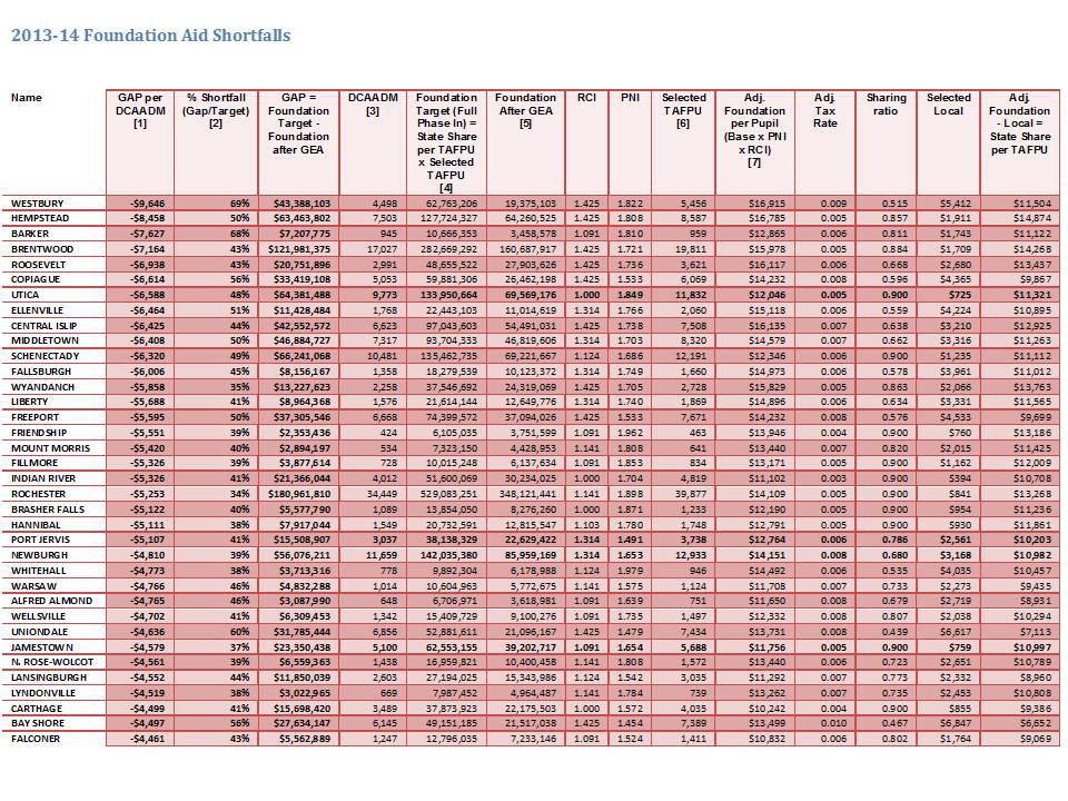
The following table lists those districts with the largest per pupil gaps in State Foundation Aid in 2013-14.. In other words, these are the districts with the largest differences between the Foundation Aid the districts should have received had the State actually funded the Foundation Aid formula compared to the actual Foundation Aid the districts receive after the State’s Aid freeze and cuts are applied.  Detailed documentation of the calculations in the table is presented in the appendix.

Top 50 2013-14 Foundation Aid Shortfalls

Slide2

[1] Shortfall per DCAADM = (Foundation Aid before Phase In – Foundation After GEA) /  DCAADM
[2] Shortfall Percent = (Foundation Aid before Phase In – Foundation After GEA) /  Foundation Aid before Phase In
[3] NYSED FARU District Fiscal Profiles (http://www.oms.nysed.gov/faru/Profiles/profiles_cover.html) 2010-11
[4] File DBSAD1 W(FA0001) 00 FOUNDATION AID BEFORE PHASE-IN   03/26/13
[5] (Foundation Aid [DBSAA1, 03/26/13, E(FA0197) 00 2013-14 FOUNDATION AID] + GEA [AA(FA0186) 00 2012-13 GAP ELIMINATION ADJUSTMENT (SA1213)] + GEA Partial Restoration [AB(FA0187) 00 2013-14 GEA RESTORATION])
[6] File DBSAD1 M(OP0088) 00 SELECTED TAFPU 03/26/13
[7] File DBSAD1 P(OP0002) 02 ADJUSTED FOUNDATION AMT/PUPIL  03/26/13


Governor’s 2014-15 Budget Shortfalls

On January 17, 2014 district by district data became available for Governor Cuomo’s budget proposal for the 2014-15 school year. As discussed in the appendix the Adequacy Target Funding per Pupil, which is the “Adjusted Foundation aid per TAFPU [Total Aidable Foundation Pupil Units] is arrived at by taking a base funding figure times the pupil needs index (PNI) times the regional cost index (RCI). That base funding figure is intended to be based on average spending of the lower half of local public school districts meeting prescribed outcome standards, as discussed in the policy brief released concurrent with these analyses. Inexplicably, the state has chosen over the past few years to lower that base funding amount, despite increasing outcome standards.

Using the state’s own spreadsheets for aid allotments, one can back these figures out of the state aid worksheets as well by taking each districts’ “Adjusted Foundation per Pupil” divided by their PNI and RCI. For 2012-13, that figure rounds to $6,580 for each district. The 2013-14 aid worksheets yield a foundation level of only $6,515, or a cut to the foundation level of $65.  Backing this figure out of the 2014-15 budget proposal yields $6,458, another cut to the base funding level. This means that the gaps in funding for the past few years are further understated in these tables. Yet, these gaps are still huge. The table below summarizes those gaps for the 50 districts with the largest per pupil funding gaps.

Comparing the Governor’s budget for 2014-15 to prior year gaps provides an appearance that the Governor’s budget helps in closing the gaps substantially for some districts like Utica. This is a false impression however, created by lowering the adequacy target to offset the increase in pupil needs.

Top 50 2014-15 Budgeted Shortfalls

[data run as of 1/17/14]

Slide3

What about New York City?

The following table shows the current year, and Governor’s budgeted shortfalls for New York City:

Slide4These shortfalls remain over $2,500 per pupil for a total approaching $3 billion.

Cutting Basic Funding while Increasing Standards

Put simply, higher student outcome standards cost more to achieve, not less. As explained above, the New York State school finance formula is built on an underlying basic cost estimate of what it would take for a low need (no additional student needs) district to achieve adequate educational outcomes as measured on state assessments. The current formula is built on average spending estimates dating back several years now and based on prior outcome standards, tied to a goal of achieving 80% proficient or higher. More than once in the past several years, the state has substantively increased the measured outcome standards.

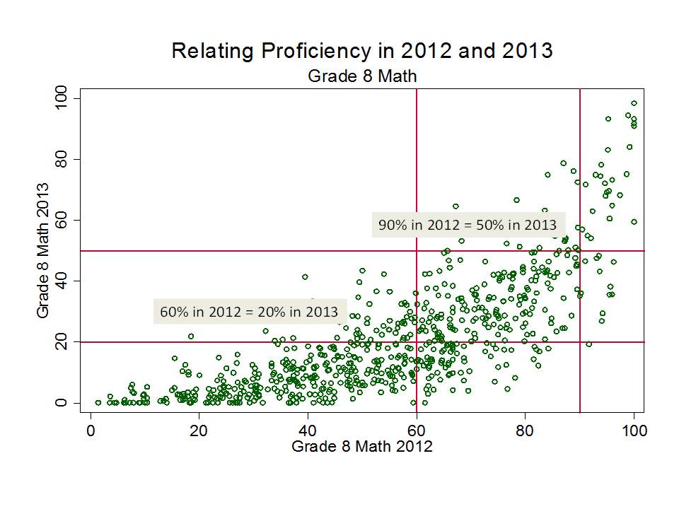
For 2010, the Regents adjusted the assessment cut scores to address the inflation issue, and as one might expect proficiency rates adjusted accordingly. The following figure shows the rates of children scoring at level 3 or 4 in 2009 and again in 2010. I have selected a few key, rounded, points for comparison. Districts where 95% of children were proficient or higher in 2009 had approximately 80% in 2010. Districts that had 80% in 2009 had approximately 50% in 2010. This means that the operational standard of adequacy using 2009 data was equivalent to 50% of children scoring level 3 or 4 in 2010. This also means that if we accept as reasonable, a standard of 80% at level 3 or 4 in 2010, that was equivalent to 95% – not 80% – in 2009.

Slide2

This next figure shows the resulting shift of the change in assessments from 2012 to 2013, also for 8th grade math. Again, I’ve applied ballpark cutpoint comparisons.  Here, a school where 60% were proficient in 2012 was likely to have 20% proficient in 2013. A school where 90% were proficient in 2012 was likely to have 50% proficient in 2013.   If, as state policymakers argue, the 2013 assessments do more accurately represent the standard for college readiness, and thus the constitutional standard of meaningful high school education, it is quite likely that the cost of achieving that constitutional standard is much higher than previously estimated. Notably, only a handful of schools surpass the 80% threshold on math proficiency for the 2013 assessments.

Slide3While it appears that the state has been chipping away at funding gaps for districts including New York City, they have not done so by substantively increasing funding, but rather by decreasing the adequate funding target.  This figure shows that the underlying basic cost figure for the foundation aid formula climbed gradually as planned through 2012-13. Note that this climb was based on the assumed 80% success rate on the 2007-08 outcome standard, not considering the 2009-10 adjustment to that outcome standard. But inexplicably, the state has chosen to reduce the basic funding figure for each year since, despite raising the outcome standards dramatically.

Slide1

Even worse, as explained above, the state continues to underfund the foundation aid formula by about 1/3. That is, even after lowering their target funding level, the state continues to fall over 30% short of that funding target.  The primary reason the extent of underfunding has declined is because the state has lowered the target.

Raising outcome standards while cutting funding is a formula for failure.

Appendix

The current “adequacy” target (according to the foundation aid formula) is the fully phased in adequacy target per (selected) aidable pupil unit, or, as laid out above:

PNI x RCI x Base = State Prescribed Adequacy Target[3]

This formula adequacy target represents what the state itself adopted as the quantification of its own constitutional obligation to provide for a sound basic education. Later in this brief, I challenge the validity of this target, but for purposes of this section, it is appropriate to consider this figure as the state’s own definition of its constitutional obligation.

The state aid per pupil (TAFPU) to reach that state prescribed adequacy target is then:

Adj. Foundation per Pupil – Local Contribution per Pupil = State Share per Pupil

And the total state aid to be received, if the formula was both fully phased in and fully funded is:

State Share per Pupil x TAFPU = Foundation Aid [before phase in]

Where “phase in” refers to the fact that the foundation formula is intended to scale toward full adequacy funding over three year periods (originally, four years reaching the target in 2011). Phase in, as referred to in this case, is a reduction to the target funding, representing the progress toward fully phased in funding to be made in the coming year. In the following analyses, and as represented above, I compare current funding against foundation aid before this reduction (phase in) is applied.

Thus, the extent of underfunding is:

State Aid to Reach Adequacy Target – Actual Foundation Formula Funding (after all adjustments) = Underfunding

The underfunding of the foundation formula results from two specific calculations. First, instead of actually basing foundation aid on the above calculations – that is, the actual formula – aid is simply frozen[4] (or proportionately marginally increased) relative to prior year total (not per pupil) aid. Then, in a two-step calculation, aid is reduced using the Gap Elimination Adjustment and then partially restored for most districts.[5]

For example, for the city of Utica:

$12,046Foundation aid per TAFPU x 11,832TAFPU = $133,950,644Foundation Aid (before phase in)

But, as shown in the following table, estimated actual (frozen) foundation aid is:

Estimate for 2013-14 = $72,413,005

So the preliminary foundation aid funding gap for Utica is:

$133,950,644Foundation Aid (before phase in) – $72,413,005Aid Based on Prior Year = $61,537,659Preliminary Aid Gap

But this is the gap before applying the Gap Elimination Adjustment. The deceptively named Gap Elimination Adjustment (or GEA) is really just a cut to state aid, which on average, falls more heavily on districts more dependent on state aid, or higher need districts.

The real gap for Utica is, therefore, as follows:

$72,413,005Aid Based on Prior Year – $2,843,829GEA = $69,569,176Actual Aid

So:

$133,950,644Foundation Aid (before phase in) – $69,569,176Actual Aid = $64,381,488Actual GAP  

In the table, we see that Utica actually receives only about half of the total state aid it should receive if the formula was funded. Other small city districts face similar shortfalls, with Utica also receiving about half of the state aid estimated as needed under the state foundation aid formula.

The table also provides a per pupil calculation of the degree of state aid underfunding across Small City districts and New York City.  I calculate the foundation aid gap per Duplicated Combined Adjusted Average Daily Membership, or DCAADM[6] which is the district enrollment figure commonly used in the state fiscal profiles files for calculating per pupil amounts.


[1] See: http://www.oms.nysed.gov/faru/PDFDocuments/Primer12-13A.pdf.

“The Foundation Amount is the cost of providing general education services. It is measured by determining instructional costs of districts that are performing well. It is adjusted annually to reflect the percentage increase in the consumer price index. For 2007-08 aid, it is $5,258. It is further adjusted by the phase-in foundation percent. For 2009-10, the adjusted amount is: $5,410 x 1.038 (CPI) x 1.025 (phase-in), or $5,756. For 2010-11, the adjusted amount is: $5,708 x 0.996 x 1.078, or $6,122. For 2011-12, the adjusted amount is: $5,685 x 1.016 x 1.1314, or $6,535. For 2012-13, the adjusted amount is: $5,776 x 1.032 x 1.1038, or $6,580.”

In this case, the matching 2012-13 figure is arrived at by taking P(OP0002) 02 ADJUSTED FOUNDATION AMT/PUPIL  for each district and dividing by PNI [O(PC0409) 05 PNI = 1 + EN%, MIN 1; MAX 2]     then  RCI [N(MI0123) 03 REGIONAL COST INDEX (RCI)], from: File DBSAD1, 3-29-12. Prior years also match. Interestingly, however the 2013-14 aid worksheets yield a foundation level of only $6,515, or a cut to the foundation level of $65.

[3] DBSAD1, 3-29-12, P(OP0002) 02 ADJUSTED FOUNDATION AMT/PUPIL

[4] DBSAA1, 3-29-12, E(FA0197) 00 2012-13 FOUNDATION AID

[5] DBSAA1, 3-29-12, GEA [AA(FL0026) 00 2012-13 GAP ELIM ADJUST ON BT1213] + GEA Partial Restoration [AB(FL0027) 00 2012-13 GAP ELIMINATION ADJMT RESTORATION])   

[6] Duplicated CAADM. This item (Duplicated Combined Adjusted Average Daily Membership or DCAADM) is the pupil count used to calculate per pupil amounts for the revenue items and expenditure categories. The pupil count is based on data from State aid worksheets and Basic Educational Data System forms. This pupil count is the best count of the number of students receiving their educational program at district expense. DCAADM includes the average daily membership (ADM) of students enrolled in district programs (including half-day kindergarten pupils weighted at 0.5); plus equivalent secondary attendance of students under 21 years of age who are not on a regular day school register plus pupils with disabilities attending Boards of Cooperative Educational Services (BOCES) full time plus pupils with disabilities in approved private school programs including State schools at Rome and Batavia plus resident students for whom the district pays tuition to another school district plus incarcerated youth. Beginning with the 1999-2000 school year, pupils resident to the district but attending a charter school are included. Beginning with the 2007-08 school year, students attending full-day Pre-K are weighted at 1.0, 1/2 day Pre-K weighted at 0.5. Since residents attending other districts were also included in the CAADM count of the receiving district, this pupil count is a duplicated count. The State total consists of the sum of the rounded pupil counts of each school district. Data Source: State Aid Suspense File. See: http://www.oms.nysed.gov/faru/Profiles/18th/revisedAppendix.html

The Average of Noise is not Signal, It’s Junk! More on NJ SGPs

I explained in my previous post that New Jersey’s school aggregate growth percentile measures are as correlated with things they shouldn’t be (average performance level and low income concentrations) as they are with themselves over time.  That is, while they seem relatively stable – correlation around .60 – it would appear that much of that correlation simply reflects the average composition and prior scores of the students in the schools.

In other words, New Jersey’s SGPs are stably baised – or consistently wrong!

But even the consistency of these measures is giving some school officials reason to pause and ask just how useful these measures are for evaluating their students’ progress or their school as a whole.

There are, for example, a good number of schools that would appear to jump a significant number of percentile points from year 1 to year 2. Here is a scatterplot of the schools moving from Over the 60th percentile to under the 40th percentile and from under the 40th to over the 60th percentile.Slide1That’s right West Cape May elementary… you rock … this year at least. Last year, well, you were less than mediocre. You are the new turnaround experts. Good thing we didn’t use last year’s SGP to shut you down!  Either that, or these data have some real issues – in addition to the fact that much of the correlation that does exist is simply a reflection of persistent conditions of these schools.

So, how is it then, that even with such persistent bias caused by external factors, that we can see schools move so far in the distribution?

I don’t have the raw data to test this particular assumption (nor will I likely ever see it), but I suspect these shifts result from a little discussed, but massive persistent problem in all such SGP and VAM models.

I call it spinning variance where there’s little or none… and more specifically… creating a ruse of “meaningful variance” from a narrow band of noise.

What the heck do I mean by that?

Well, these SGP estimates which range from the 0 to 100 percentile start with classrooms full of kids taking 50 item tests.

The raw numbers correct on those tests are then stretched into scale scores with a mean of 200, using an S-shaped conversion. At the higher and lower ends of the distribution, one or two questions can shift scale scores 20+ or so points. Stretch 1!

While individual kids’ scores might spread out quite widely, differences in classroom averages or schoolwide averages vary much less.

Differences in “growth” (really not growth… but rather estimated differences in year over year test scores) vary even less… often trivially … and quite noisily. But, these relatively trivial differences must still be spread out into 0 to 100 percentile ranks! Stretch 2!

I suspect that the differences in actual additional items answered correctly by the median student in the 60th percentile school are trivial when compared with additional items answered correctly by the median student in the 40th percentile school.

But alas, we must rank, as reformy logic and punative statistical illiteracy dictates, and fractions of individual multiple choice test items will dictate that rank under these methods.

Much of this narrow band of variance is simply noise (after sorting out the bias)… and thus the rankings based on spreading out that noise are completely freakin’ meaningless. These problems are equally bad if not worse [due to smaller sample sizes] when used for rating teachers.

Now for a few more figures. Above I show how even when we retain the bias in the SGPs, we’ve got schools that jump 20 percentile points one direction or the other over a single year! Do not cry Belleville PS10. Alas it is not your fault.

Here’s where these same schools lie, in year 1, with respect to poverty.

Slide2And here’s where they lie in year 2 with respect to poverty.

Slide3Of course, they have switched positions, merely by the way I’ve defined them. West Cape May is now awesome… and still low poverty, while the previous year they were low poverty but stunk! We’ve got some big movers at the other end too. Newark Educators Charter also made the big leap to awesomeness, while U. Heights fall from grace.

Now, the reformy statistical illiterate response to this instability is to take the mean of year 1 and year 2 and call it stable… and more representative… and by doing so we can pull this group to the middle.

Let me put this really bluntly… the average of noise is not signal.

Slide4The position of these schools at the edges of the patterned scatter is the noise.

Now averaging the patterns does give us stronger signal – signal that the growth percentiles are painfully, offensively biased with respect to poverty (the “persistent effect” is one of “persistent poverty”). But averaging the outer bands of this distribution to pull them to the center does not by any stretch make the ratings for these schools more meaningful.

As a fun additional exercise, I’ve used schoolwide proficiency rates and low income concentrations to generate predicted values of year 1 and year 2 growth percentiles and then taken the differences from those predicted values (in standard deviations) and used them as “adjusted” growth percentiles. That is, how much higher or lower is a school’s growth percentile  than predicted given only these two external factors?

In this graph, I identify those schools that jumped from over 1 full standard deviation above to 1 full standard deviation below their expected level, and vice versa.  I’ve used schools that had both 4th and 7th grade proficiency data and free lunch data, reducing my sample, I’ve also used a pretty wide range for identifying performance changes. So, I actually have fewer “outlier” schools.

Slide5

The fun part here is that these aren’t even the same schools that were identified as the big jumpers before correcting for average performance level and % free lunch. No overlap at all.

So, just how useful are the growth percentile data for even making reasonable judgments about schools’ influence on their students outcomes?

Well, as noted in my prior post, the persistent bias is so overwhelming as to call into serious question whether they have any valid use at all.

And the noise surrounding that bias appears to effectively undermine any remaining usefulness one might try to pry from these measures.

One more time on the video explanation of this stuff!

An Update on New Jersey’s SGPs: Year 2 – Still not valid!

I have spent much time criticizing New Jersey’s Student Growth Percentile measures over the past few years, both conceptually and statistically. So why stop now.

We have been told over and over again by the Commissioner and his minions that New Jersey’s SGPs take fully into account student backgrounds by accounting for each student’s initial score and comparing students against others with similar starting point.  I have explained over and over again that just because individual student’s growth percentiles are estimated relative to others with similar starting points by no means validates that classroom median growth percentiles or school median growth percentiles are by any stretch of the imagination a non-biased measure of teacher or school quality.

The assumption is conceptually wrong and it is statistically false! New Jersey’s growth percentile measures are NOT a valid indicator of school or teacher quality [or even school or teacher effect on student test score change from time 1 to time 2], plain and simple. Adding a second year of data to the mix reinforces my previous conclusions.

Now that we have a second year of publicly available school aggregate growth percentile measures, we can ask a few very simple questions. Specifically, we can ask how stable, or how well correlated those school level SGPs are from one year to the next, across all the same schools?

I’ve explained previously, however, that stability of these measures over time may actually reflect more bad than good. It may simply be that the SGPs stay relatively stable from one year of the next because they are picking up factors such as the persistent influence of child poverty, effects of being clustered with higher or lower performing classmates/schoolmates, or that the underlying test scales simply allow for either higher or lower performing students to achieve greater gains.

That is, SPGs might be stable merely because of stable bias! If that is indeed the case, it would be particularly foolish to base significant policy determinations on these measures.

Let’s clarify this using the research terms “reliability” and “validity.”

  • Validity means that a measure measures what is intended to, which in this case, is that the measure is intended to capture the influence of schools and teachers on changes in student test scores  over time. That is, the measure is not simply capturing something else. Validity is presumed good, but only to the extent those choosing what to measure are making good choices.  One might, for example, choose to, and fully accomplish measurement of something totally useless (one can debate the value of measuring differences over time in reading and math scores as representative more broadly of teacher or school quality).
  • Reliability means that a measure is consistent over time, presumed to mean that it is consistently capturing something over time. Too many casual readers of research and users of these terms assume reliability is inherently good. That a reliable measure is always a good measure. That is not the case if the measure is reliable simply because it is consistently measuring the wrong thing. A measure can quite easily be reliably invalid.

So, let’s ask ourselves a few really simple empirical questions using last year’s and this year’s SGP data, and a few other easily accessible measures like average proficiency rates and school rates of children qualified for free lunch (low income).

  • How stable are NJ’s school level SGPs from year 1 to year 2?
  • If they are stable, or reasonably correlated, might it be because they are correlated to other stuff?
    • Average prior performance levels?
    • School level student population characteristics?

If we were seeking a non-biased and stable measure of school or teacher effectiveness, we would expect to find a high correlation from one year to the next on the SGPs, coupled with low correlations between those SGPs and other measures like prior average performance or low income concentrations.

By contrast, if we find relatively high year over year correlation for our SGPS but also find that the SGPS on average over the years are correlated with other stuff (average performance levels and low income concentrations), then it becomes far more likely that the stability we are seeing is “bad” stability (false signal or bias) rather than “good” stability (true signal of teacher or school quality).

That is, we are consistently mis-classifying schools (and by extension their teachers) as good or bad, simply because of the children they serve!

Well then, here’s the correlation matrix (scatterplots below):

Slide1

The bottom line is that New Jersey’s language arts SGPs are:

  • Nearly as strongly (when averaged over two years) correlated with concentrations of low income children as they are with themselves over time!
  • As strongly (when averaged over two years) correlated with prior average performance than they are with themselves over time!

Patterns are similar for math.  Year over year correlations for math (.61) are somewhat stronger than correlations between math SGPs and performance levels (.45 to .53) or low income concentration (-.38). But, correlations with performance levels and low income concentrations remain unacceptably high – signalling substantial bias.

The alternative explanation is to buy into the party line that what we are really seeing here is the distribution of teaching talent across New Jersey schools. Lower poverty schools simply have the better teachers. And thus, those teachers must have been produced by the better colleges/universities.

Therefore, we should build all future policies around these ever-so-logical, unquestionably valid findings. That the teachers in high poverty schools whose children had initially lower performance and thus systematically lower SGPs, must be fired and a new batch brought in to replace them. Heck, if the new batch of teachers is even average (like teachers in schools of average poverty and average prior scores), then they can lift those SGPs and average scores of high poverty below average schools toward the average.

At the same time, we must track down the colleges of education responsible for producing those teachers in high poverty schools who failed their students so miserably and we must impose strict sanctions on those colleges.

That’ll work, right? No perverse incentives here? Especially since we are so confident in the validity of these measures?

Nothing can go wrong with this plan, right?

A vote of no confidence is long overdue here!

Slide2

Slide3

Slide4Slide5Slide6Slide7Slide8Slide9

On Inefficiencies and Value Added In Private Schools: A follow up on the Chubb research summit

schoolfinance101's avatarPrivate Schooling & the Public Interest

Bruce D. Baker, Rutgers

A few weeks back I posted a rather harsh critique of a summit convened by NAIS President John Chubb which he described as a gathering of leading researchers intended to generate ideas on the future of private independent schooling. Among other things, I critiqued the chosen researchers’ balance of ideology, knowledge of private independent schools and in some cases, generally lacking substance of their body of work on educational productivity.

John Chubb, as he has been known to do, graciously responded to my critique, pointing out that he would soon blog about the conversations that emerged among these researchers.

Below are two examples from Chubb’s recent blog posting, which I view as entirely consistent with my original concerns. Mainly, that the researchers gathered have weak understanding of private independent schooling, how private independent school leaders view their market and the broader perception of how private independent…

View original post 1,390 more words

Come with me… if you wanna go to Kansas City? Thoughts on BBQ, Baseball and Reformy BS

Urban school districts are easy targets – often the whipping boy – exemplars of the failures of big government bureaucracy. Kansas City Missouri is a frequent target when it comes to education policy. But as I’ve discussed in more than one peer reviewed article (one, another), and other reports, tales of Kansas City’s failures are largely urban legend.

This past week, the good citizens of Kansas City and Missouri Department of Elementary and Secondary Education were graced with one of the most vacuous manifestos on education reform I’ve read in a really long time. Yes, on my blog, I’ve pontificated about numerous other vacuous manifestos that often take the form of blog posts and op-eds which I suspect have little substantive influence over actual policies.

But this one is a little different. This report by an organization calling itself CEE, or Cities for Education Entrepreneurship Trust, in collaboration with Public Impact, is a bit more serious. No more credible, but more serious, in that it is assumed that state policymakers in Missouri might actually act on the report’s recommendations.

I’ve had the displeasure of reviewing several reports by Public Impact in the Past. Their standard fare is to establish a bold conclusion, and then cite (including self citation) materials that support – with no real validation- their forgone conclusion, cite other stuff that’s totally unrelated, and cite yet other stuff that doesn’t even exist. Thus, they are actually able to construct a report with a few graphs here and there and lots of footnotes, without ever validating a single major (albeit forgone) conclusion (see for example, this one, by the same author, under a different organizational umbrella, or this one).

This report starts with the forgone conclusion (drawn from the oft misguided and always ill-informed rhetoric of Andy Smarick), that:

“Simply put, the traditional urban school system does not work. It is not stable. It does not serve the needs of its students. It does not, nor has it ever, produced the kind of results all children, families, and taxpayers deserve. And it does not create the conditions that research shows enables great urban schools to thrive. It is time to think outside the box and have a robust community conversation about how to build a new and different school system that is structured for success.” (p. 7)

With this hypothesis – actually, forgone conclusion – firmly established the authors need merely connect the dots back to the woes of Kansas City and how to fix them. Here’s a synopsis – call it an advanced organizer – of the story line crafted in the report:

  • Urban districts don’t work (and aren’t stable)
  • Kansas City is an urban district, therefore, it doesn’t work (even though we find it has stabilized)
  • Privately operated charter schools in Newark, New Jersey, New York City, Texas and New Orleans are producing miracles – yielding incredible graduation rates and high test scores while serving comparably low income and otherwise needy children (even though they really aren’t serving similar kids, and many have far more resources)
  • Thus, the same can – no must – work in Kansas City (even though it hasn’t)
  • Somewhat tangentially, decentralized financing – driving money to schools for site based control – is necessarily good (even though reviews of the research suggest otherwise)

Therefore, the only solution is to deconstruct the entire failed urban district, turn control over to a non-government authority which shall loosely govern a confederation of private non-profit entities that shall compete with one another for students, choose which market niche and geographic space within KC they wish to serve and be evaluated on the test scores and graduation rates they ultimately produce.

Are you following? If not, let’s take a stroll through some of the “facts” provided to support their end-game, along with some of the actual facts about the Kansas City Missouri Public School District.

Justification for Intervention?

The authors’ primary justification for the bold transformation of Kansas City Public Schools is that they have low average test scores. And everyone knows that’s bad and can’t be tolerated, whatever the root causes.

Specifically, the evidence they provide is that:

  • 70 percent of KCPS students are below proficient in math and English Language Arts (ELA).
  • ELA proficiency rates have declined in some recent years, despite improved management and operations.
  • Very, very few students graduating from KCPS are ready for college based on their ACT scores.
  • While science and social studies scores have improved this past year, proficiency rates are still below 30 percent.
  • And average KCPS student achievement growth is lower than state predictions based on similar districts’ results, meaning that KCPS students could fall further behind their peers over time.

While some argue that the system has been stabilized after years of dysfunction, one must ask: what good is stability if most students still cannot read, write, or do math proficiently, or graduate from high school ready for college or careers? (p. 7)

Okay, but really, how does that stack up against expectations? Not that we should succumb to low expectations. But certainly, any credible report summarizing student outcomes in a major urban district should summarize some of the background and context for these figures.  But alas, not this one!

Well, let’s take a look. First, Kansas Citians know that their fine city and their fine school district aren’t by any stretch one and the same. Perhaps that right there is an issue to explore. KCPS, formerly KCMSD was crafted as a massive boundary gerrymandering effort in the immediate post-Brown era. Portions of the city limits were consumed by the reorganization and mergers of predominantly white neighborhoods and “suburbs” (which are really now all part of the city) at the time. In many areas, less poor, whiter (though increasingly poor and minority) sections of the city still remain in other school districts to the south and east. The poorest areas of the city, where blacks were relegated to live for decades, were included in KCMSD, along with the western edge of Independence, Missouri, which remained the most “integrated” portion of the city district until the past decade (when clever legislators passed a law allowing that section to vote itself out of KCMSD and into Independence). That’s why I bring this all up – because KCMSD itself was gerrymandered to begin with as a district for poor minority neighborhoods in the city, and because that gerrymandering persisted as recently as 2007-08!

The district really didn’t have much of a chance. Concurrent  trends led to additional pressures. Charter schools began popping up in the late 1990s and grew throughout the 2000s. Figure 1 below shows a) total enrollment for schools within city limits, non-charter enrollments, KCMSD enrollments and charter enrollments, from 1999 to 2011. A really important point here is that  KCMSD’s share of enrollment within the city limits was relatively small to begin with, because of the way in which the city was carved up in the post-brown period – exacerbated in 2008. And enrollments have been on a slow, steady decline in the past decade. Charter enrollments have climbed, and while they represent a significant share of KCMSD’s geographic space, they are a much smaller share of the city limits as a whole.

Figure 1

Slide1Source: NCES Common Core of Data, Public School Universe Survey [error in 2005 data]

Figure 2 shows the shares of low income (% qualified for free lunch, or <130% income level for poverty) children by group. Notably, KCMSD and charters within KCMSD are much higher than other schools in those carved, formerly suburban spaces in city limits (this includes Center, Hickman, a portion of Lee’s Summit, etc.).

Figure 2

Slide2Source: NCES Common Core of Data, Public School Universe Survey [error in 2005 data]

Much has been made of the desegregation litigation that, as the story goes, made Kansas City the highest spending school district in the world… for decades on end… all for naught. Figure 3 gives us a story lined walk-through of the relative state and local revenues of KCMSD compared to the average for its surrounding labor market from 1993 to 2011. Funding really started scaling up around 1988 toward a peak around 1993. But after the U.S. Supreme court in the 1990s indicated that current remedies went a bit too far (taking an approach of trying to attract suburban residents into the city’s magnet schools – because the judge really had no other way to achieve integration), the relative funding for KCMSD schools fell precipitously over time (actually what happened is that it stagnated – and other caught up).

For nearly a decade now, KCMSD state and local revenue per pupil has been only marginally above the average for the labor market.

Figure 3

Slide5Source: U.S. Census Fiscal Survey of Local Governments (F33)

But as figure 4 shows, the average poverty rate of children in the district, compared to surroundings, is anything but average. KCMSD’s student population has remained 2x to nearly 3x as poor as surrounding areas – even Wyandotte!  One certainly can’t expect to achieve stellar outcomes with a population this needy, and only relatively average resource levels to serve them (yes, money matters and even more so for needy kids!).

Figure 4

Slide6Source: U.S. Census Small Area Income and Poverty Estimates

So… to summarize… what we have here is not a simple case of inexcusable bad test scores that simply have to be “fixed” by dismantling the district and replacing it with a miraculous new structure – without changing any of the underlying causes or conditions.

What we have here is a complex, long running case, of disadvantageous housing development, boundary gerrymandering, high poverty and declining resources.

For any report on the future of KCMSD schools to miss all that is completely inexcusable. It’s downright ridiculous, amateur, sloppy and unprofessional.

Justification for Using Chartering as Replacement?

Given that the report’s authors have missed entirely most of the relevant context and history of Kansas City schools, how then do they arrive at their proposed solution – to replace the “failed urban district” with a loosely governed confederation of benevolent non-profit providers?

The answers, of course, can be found in the many miracle charter schools that grace great American cities like Newark, New Jersey (hey… Newark and KC have a lot in common), New York City and New Orleans.

Among their chosen miracles, the authors point to the Uncommon Schools network as proving that one can simply put a non-profit manager in charge and whamo…. kablam! You’ve got transformation of student outcomes! The authors explain:

Across the schools, the average student population is 98% black or Hispanic, and 78% receives free or reduced-price lunch. Uncommon Schools was awarded the 2013 Broad Prize for Public Charter Schools for demonstrating the most outstanding overall improvement in the nation for low-income students and students of color.25 Uncommon Schools closed 56% of achievement gaps between its low-income schools and the state’s non-low-income students.26

And they even provide a nifty graph showing that Uncommon Schools in Newark (uh… that’s just North Star Academy) not only beats the citywide average, but also beats the state wide average on performance measures.

Figure 5:

Slide7This is so laughable it hurts. Really.

What they totally neglect to point out is that:

To summarize, North Star’s overall performance is mediocre at best (given their attrition, lack of special needs students, etc.) and deeply disturbing at worst, when one looks beyond average test scores among those who stay. Choosing North Star as a model of beating the odds, and representing the school as in this report, is either just plain ignorant or outright reckless.

Now, on the one hand, they simply might not have ever looked at any actual numbers on North Star. But that would be equally irresponsible. The choice to use North Star as proof of the value of chartering – as applies to the current proposal for Kansas City – is bafflingly ignorant.

The report provides similarly crude information on New York City charter schools, including reference to New York City’s own Uncommon Schools. The reality is that New York City charters, like North Star in Newark, are anything but miraculous.  They are well privately subsidized schools, serving low need student populations, providing them smaller classes, well paid teachers and yielding less than astounding results.

New Orleans in particular might best be described not as some positive shining star miracle brought on by Hurricane Katrina, but rather as an unmitigated disaster of education policy. This is perhaps best documented in the work of Kristen Buras in Harvard Education Review. I have written about the spotty/questionable performance of New Orleans charter schools here.   See also this critique of attempts at selling the supposed NOLA miracle.

What about Existing Chartering in Kansas City?

What I find most interesting about the proposals in the CEE report is that they justify the shift to a 100% non-profit, loosely coupled charter confederation based on the supposed (albeit completely unfounded) great successes achieved by charters in New Jersey, New York and New Orleans. But if full scaled charterization of Kansas City is going to be the savior of the city, then why hasn’t it already? Why are Kansas City’s own charter school results so lukewarm at best? And why haven’t Kansas City charter operators stepped up to fill the void of serving those children most in need, in the city’s poorest neighborhoods?

The report uses the following deceptively simple figure of average performance?

Figure 6.

Slide8

But what does KC charter performance look like in context? Here are a few figures focused on lower grades (up to 8th) schools in Kansas City, including charter, magnet and regular district schools (though some are special emphasis). Figure 7 shows the MAP Index for schools by percent free lunch. The average for charters is slightly higher (as in the above figure) for charters, but charter performance, like district school performance varies, with the charters serving the highest poverty populations really struggling as one might expect.

Figure 7

Slide9

Figure 8 shows a similar pattern for proficiency rates.

Figure 8

Slide10

The presumption in the proposal is that the diamonds here can simply takeover the green circles and make them more like the diamonds. One problem with that is that in many cases, that change would be a downgrade. But of course, the real presumption of this report is that one can take the charters of New York City and Newark, NJ and transport them onto the circles in this graph and … WHAMO…. miracle cure for the failed urban district?????

Importantly, these graphs don’t even include the likely differences in special education populations.

The bottom line is that charters are certainly no panacea for solving the woes of KCMSD. Rather, like district schools, their performance varies, around a similar average, with those serving higher poverty populations having the most difficulty.

Does Decentralized Budgeting Lead to Better Outcomes?

Next, there’s the somewhat tangential focus in this report on making sure that as much money as possible is allocated to school sites for school site control. This argument is made with full confidence that it is entirely uncontroversial that bringing control over budgets down to individual school sites can only and has only ever yielded positive outcomes. Well, if only there was actually legitimate empirical research to support that contention? Not that it’s an awful idea. But to suggest that it’s necessarily a solution is, well, a bit of… no… a huge stretch.

These same authors  have made this claim on more than one occasion, without any particular citation to support that the share of budget allocated down to school site control meaningfully improves any form of measured outcomes. As I explain here (in a critique of a report on a similar topic):

In a comprehensive review of literature on school-site management (SSM) and budgeting, Plank and Smith (2008) in the Handbook of Education Finance and Policy present mixed findings at best, pointing out that while SSM may lead to a greater sense of involvement and efficacy, it seems to result in “little direct impact on teaching behaviors or student outcomes.”

That is, it sounds good, and can feel good, but there’s little evidence to back the approach as effective or efficient. In fact, there are many reasons to question the efficiency of fully decentralized budgeting, including the increased likelihood that building level administrators and planning teams will be required to divert more of their time and effort to budget planning issues that might better be handled centrally, the reduced rate at which efficiencies might be diffused and adopted across schools, and lost efficiencies in purchasing and contracts.

The Totally Ignored Issue of Student, Employee and Taxpayer Rights

Finally, and this is a really, really big issue that the authors of this report, and others promoting similar reform strategies completely disregard.

The shift from traditional public governance of schools to mixed public/private relationships substantively alters the rights of students, employees and taxpayers. I have a forthcoming article in Emory Law Review on this topic, with coauthors Preston Green (UCONN) and Joseph Oluwole (Montclair State).

In our forthcoming article we explain that:

Children’s rights under school discipline policies may be treated as private contractual agreements with their provider, thus potentially forgoing many constitutional protections (including due process protections related to dismissal, protections of their right to free speech and right not to be compelled to speak, among others).

Employees rights too may be limited, including their rights to organize as would public employees.

And taxpayers may find increasingly that documents and information (and meetings) they perceived as publicly accessible, are not, as organizations shift key roles responsibilities under private governance in order to shield them from public disclosure.

In a model where no true public provider exists, like the one proposed here, parents may be required to choose which rights to forgo (disclosure, discipline, etc.). This is simple bad public policy, with the worst aspect being that we are selectively reducing the rights available to our must vulnerable children and families (no-one is asking the children of Johnson County to forgo their rights in the same way).

Conclusions

While the authors of this report so confidently conclude that the obvious solution is to replace the failed urban district with an under-regulated, loosely governed confederation of benevolent non-profit actors, one might easily alternatively conclude from the evidence herein… that simply put, large scale chartering in urban centers like Kansas City simply doesn’t work. It never has and likely never will. It fails to serve the neediest children because “market forces” and accountability measures favor avoiding those children and the neighborhoods in which they live.

Further, large scale chartering leads to deprivation of important constitutional and statutory rights for children, primarily low income and minority children. Meanwhile, suburban white peers are not being asked to forgo constitutional protections in order to access elementary and secondary schooling.

Finally, large scale chartering has made far more opaque financial and governance accountability as governing institutions have created more complex private structures in order to shield their operations, records and documents from full public view.

One can only hope that this report and its aftermath have the potential to rile up Kansas City as much as Robbie Cano! (baseball)

Really miss Oklahoma Joe’s (bbq)… and Jack Stack (Martin City)

Additional Readings on Kansas City

Green III, P. C., & Baker, B. D. (2006). Urban Legends, Desegregation and School Finance: Did Kansas City Really Prove That Money Doesn’t Matter. Mich. J. Race & L., 12, 57.

Gotham, K. F. (2000). Urban space, restrictive covenants and the origins of racial residential segregation in a US city, 1900–50. International Journal of Urban and Regional Research, 24(3), 616-633.

On School Funding Myths vs Realities

Baker, B. D., & Welner, K. G. (2011). School Finance and Courts: Does Reform Matter, and How Can We Tell?. Teachers College Record, 113(11), 2374-2414.

Baker, B.D. (2012) Revisiting the Age Old Question: Does Money Matter in Education.  Shanker Institute. http://www.shankerinstitute.org/images/doesmoneymatter_final.pdf

On Charter Schooling Myths and Miracles

Baker, B.D., Libby, K., Wiley, K. Charter School Expansion & Within District Equity: Confluence or Conflict? Education Finance and Policy

Baker, B.D. (2012). Review of “New York State Special Education Enrollment Analysis.” Boulder, CO: National Education Policy Center. Retrieved [date] from http://nepc.colorado.edu/thinktank/review-ny-special-ed.

Baker, B.D., Libby, K., & Wiley, K. (2012). Spending by the Major Charter Management Organizations: Comparing charter school and local public district financial resources in New York, Ohio, and Texas. Boulder, CO: National Education Policy Center. Retrieved [date] from http://nepc.colorado.edu/publication/spending-major-charter.

On Charter Schools and Public/Private Distinctions

Green, P.C., Baker, B.C., Oluwole, J. (in press) Having it Both Ways: How Charter Schools try to Obtain Funding of Public Schools and the Autonomy of Private Schools. Emory Law Journal

Critiques of Shoddy Work by Public Impact and Public Impact Authors

Baker, B. D. (2011). Review of “Spend Smart: Fix Our Broken School Funding System.” Boulder, CO: National Education Policy Center. Retrieved [date] from http://nepc.colorado.edu/thinktank/review-spend-smart

NEPC Bernie Madoff Award Winner!

Baker, B.D. & Ferris, R. (2011). Adding Up the Spending: Fiscal Disparities and Philanthropy among New York City Charter Schools. Boulder, CO: National Education Policy Center. Retrieved [date] from http://nepc.colorado.edu/publication/NYC-charter-disparities.

See discussion of Ball State/Public Impact charter funding disparity study

Garcia, D. (2011). Review of “Going Exponential: Growing the Charter School Sector’s Best.” Boulder, CO: National Education Policy Center. Retrieved [date] from http://nepc.colorado.edu/thinktank/review-going-exponential.

Winner: the Cancer is Under-rated Award!

Litigating DC IMPACT: The real usefulness of the Dee/Wyckoff Regression Discontinuity Design

Much has been made of late regarding the erroneous classification of 44 teachers in Washington DC as ineffective, thus facing job consequences. This particular erroneous rating was based on an “error” in the calculation of the teachers’ total ratings, as acknowledged by the consulting firm applying the ratings. That is, in this case, the consultants simply did not carry out their calculations as intended. This is not to suggest by any stretch that the intended calculations are necessarily more accurate or precise than the unintended error. That is, there certainly may be far more – are likely far more than these 44 teachers whose ratings fall arbitrarily and capriciously in the zone whereby those teachers would face employment consequences.

So, how can we tell… how can we identify such teachers. Well, DC’s own evaluation study of IMPACT provides us one useful road map and even a list of individuals arbitrarily harmed by the evaluation model. As I’ve stated on many, many occasions, it is simply inappropriate to make bright line distinctions through fuzzy data. Teacher evaluation data are fuzzy. Yet teacher evaluation systems like IMPACT impose on those data many bright lines – cut points… to make important consequential decisions. Distinctions which are unwarranted. Distinctions which characterize as substantively different individuals who simply are not.

Nowhere is this more clearly acknowledged than in Tom Dee and Jim Wyckoff’s choice of regression discontinuity to evaluate the effect of being place in different performance categories. I discussed this method in a previous post. As explained in the NY Times Econ blog:

To study the program’s effect, the researchers compared teachers whose evaluation scores were very close to the threshold for being considered a high performer or a low performer. This general method is common in social science. It assumes that little actual difference exists between a teacher at, say, the 16th percentile and the 15.9th percentile, even if they fall on either side of the threshold. Holding all else equal, the researchers can then assume that differences between teachers on either side of the threshold stem from the threshold itself.

In other words, the central assumption of the method is that those who fall just above and those just below a given, blunt threshold (through noisy data) really are no different from one another. Yet, they face different consequences and behave correspondingly. I pointed out in my previous post that in many ways, this was a rather silly research design to prove that “IMPACT works.” Really what it shows is that if you arbitrarily label otherwise similar teachers as acceptable and others as bad, those labeled as bad are going to feel bad about it and be more likely to leave. That’s not much of a revelation.

But, there may be other uses for the Dee/Wyckoff RD study and its underlying data, with opportunity to call these researchers to the witness stand to explain the premise of regression discontinuity.  You see, underlying their analyses is a sufficient sample teachers in DC who have been put in the bottom performance category and may have faced job consequences as a result. By admission of the research design itself, these teachers have been arbitrarily placed in that category by the placement of a cut-score. They are, by admission of the research design, statistically no different from their peers who were lucky enough to be placed above that line and avoid consequences.

This seems at least a worthwhile due process challenge to me. To be clear, such violations are unavoidable in these teacher evaluation systems that try so hard to replace human judgment with mathematical algorithms, applying certain cut points to uncertain information.

So, to my colleagues in DC, I might suggest that now is the time to request the underlying data on the teachers included in that regression discontinuity model, and identify which ones were arbitrarily classified as ineffective and face consequences as a result.

Point of clarification: Is this the best such case to be brought on this issue? Perhaps not. I think the challenges to SGPs being bluntly used for consequential decisions – not even designed for distilling teacher effect – are much more straightforward. But what is unique here is that we now have on record an acknowledgement that the cut-points distinguishing between some teachers facing job consequences and others not facing job consequences was considered by way of research evaluation design to be arbitrary and not meaningful statistically. From a legal strategy standpoint, that’s a huge admission. It’s an admission that cut-points that forcibly (by policy design) over-ride professional judgment, are in fact arbitrary and distinguish between the non-distinguishable. And I would argue that it would be pretty damning to the district for plaintiffs counsel to simply ask Dee or Wyckoff on the stand what a regression discontinuity design does… how it works… etc.

Additional Readings

Baker, B.D., Green, P.C., Oluwole, J. (2013) The legal consequences of mandating high stakes
decisions based on low quality information: Teacher Evaluation in the Race‐to‐the‐Top Era.
Education Policy Analysis Archives

Green, P.C., Baker, B.D., Oluwole, J. (2012) Legal implications of dismissing teachers on the basis of value‐added measures based on student test scores. BYU Education and Law Journal 2012 (1)

Aggregated Ignorance…

Short one for today… on a personal pet peeve, which is apparently not only my pet peeve. Perhaps more than anything else, I hate it when pundits – who often have little clue what they are talking about to begin with, toss around big numbers with lots of zeros… or “illions” attached in order to make their ideological point. Case and point this morning on Twitter:

Bear in mind, this is nothing new for this particular individual.

Thankfully, I don’t even have to write the critique of this utter foolishness, since the Center for Economic and Policy Research preemptively wrote it the other day! Here’s a portion of their explanation:

As we mark the 50th anniversary of the War on Poverty, it would be appropriate to note one of the main causes of its limited success, using big numbers without context. The issue here is a simple one; most people think that we have committed vastly more resources than is in fact the case to fighting this war. As a result, they are reasonably (based on their understanding) reluctant to contribute more resources. (emphasis added)

Please read the rest. It’s only a few paragraphs. Of course, if the intent is to deceive and warp public opinion, then Smarick and others are right on target.


Championing Fact-Challenged Facts

The New Teacher Project and Students First have recently posted/cross-posted one of the more impressively fact-challenged manifestos I’ve encountered.

The core argument in this recent post is that the facts on education reform speak for themselves and that the facts, as they describe them, simply need a champion – someone to make the public aware of these undeniable facts. However, the dreaded and evil teachers’ union, and its stranglehold over the media and public opinion is dead set on obfuscating the undeniable facts about the effectiveness of recent education reforms. As they put it:

The reality is that while unions and their allies have the motivation, discipline and resources to get their messages out and repeat them endlessly, the facts have no champion.

So then, what are these supposed facts that the teachers’ union has so successfully obfuscated?

 The Facts According to TNTP/SF: U.S. Failure on PISA

According to TNTP and SF…

There’s no disputing that the results are pretty dismal—15-year-olds in the United States ranked 30th in math, 23rd in science and 20th in reading among participating industrialized countries. But the conversation about the PISA results was just as depressing.

Hayes argued that these results were a reflection of income inequality, not the poor quality of our schools, that we rank near the bottom because we have “so many test takers from the bottom of the social class distribution.” It’s a ridiculous assertion, and one that is easily disproved by a close look at the data, which compare the performance of students with similar socio-economic backgrounds around the globe. The wealthiest American 15-year-olds, for example—those in the top socio-economic quartile—rank 26th in math compared to their affluent peers elsewhere. In other words, poverty does not explain the poor performance of our K-12 education system. (Amanda Ripley has more on this, which you can read here.)

That’s right… no disputing. We all know it. It’s a simple fact. U.S. Schools stink when compared on simple rankings to other countries… and this stinkiness can be attributed to bad teaching, limited choice and unions, of course. Okay… they didn’t say that… but it does seem implied by the fact that their blog post blames unions and Randi Weingarten specifically for denying the facts and creating false public messages. Most importantly, Amanda Ripley, quantitative researcher extraordinaire, proves that poverty has nothing to do with our massive failure!

What do we actually know about U.S. Performance on PISA?

Here’s what I wrote back on PISA day!

With today’s release of PISA data it is once again time for wild punditry, mass condemnation of U.S. public schools and a renewed sense of urgency to ram through ill-conceived, destructive policies that will make our school system even more different from those breaking the curve on PISA.

With that out of the way, here’s my little graphic contribution to what has become affectionately known to edu-pundit class as PISA-Palooza.  Yep… it’s the ol’ poverty as an excuse graph – well, really it’s just the ol’ poverty in the aggregate just so happens to be pretty strongly associated with test scores in the aggregate – graph… but that’s nowhere near as catchy.

pisa_palooza

PISA Data: http://nces.ed.gov/pubs2014/2014024_tables.pdf (table M4)

OECD Relative Poverty: Source: Provisional data from OECD Income distribution and poverty database (www.oecd.org/els/social/inequality).

Yep – that’s right… relative poverty – or the share of children in families below 50% of median income – is reasonably strongly associated with Math Literacy PISA scores. And this isn’t even a particularly good measure of actual economic deprivation. Rather, it’s the measure commonly used by OECD and readily available. Nonetheless, at the national aggregate, it serves as a pretty strong correlate of national average performance on PISA.

What our little graph tells us – albeit not really that meaningful – is that if we account (albeit poorly) for child poverty, the U.S. is actually beating the odds. Way to go? (but for that really high poverty rate).

Bottom line – economic conditions matter and simple rankings of countries by their PISA scores aren’t particularly insightful (and the above graph only marginally more insightful). Further, comparisons of cities in China to entire nations is a particularly silly approach.

But then how does one explain away Amanda Ripley’s supposed brilliant rebuttal of the poverty concern? Note that she points to a table of how children in the top quartile within the United States according to an OECD socioeconomic index compare to children in the top quartile within other countries. This is a major math/logic fail on the part of Ripley and others interpreting these data. You see, the top quarter within a poorer country is, well, poorer than the top quarter within a richer country. So really, the above graph still applies.

But to illustrate my point, here are the countries – and Chinese Cities… and Singapore (hardly a relevant comparison) – ranked by math score, including some specific U.S. States. The top quarter of students in a “richer” U.S. state (because the top quarter among the rich are richer than the top quarter among the poor) seem to do pretty darn well… with Massachusetts being beaten only by Korea (along with select Chinese cities and Singapore – hardly relevant comparisons).  Of course, referring to these comparisons as comparing the wealthy, or affluent in one country to the wealthy, or affluent in another is offensive enough to begin with. It’s all relative.

Slide1So, NO… the scores of our top quarter falling behind those in the top quarter of other nations does NOT by any means contradict the finding that poverty matters. In fact, breaking out U.S. States of varied poverty levels and ranking them among countries in this very graph provides additional support the economic context remains the primary driver of jurisdictional aggregate test score comparisons (or maybe these scores prove that Florida’s education reforms are a dreadful failure?).

The Facts According to TNTP/SF: Test Based School Closures Improve Outcomes!

This particular quote is truly baffling, since the linked study provides no support for the actual claim made in the quote – that policies such as closing failing schools based on test-score based accountability is leading to performance gains.

And research also shows that these gains were not achieved through happenstance. They were caused, in part, by the very policies Randi decries, such as closing failing schools based on test-score-based accountability systems.

What does the linked study actually say?

The MDRC study linked above focused on the longer term outcomes of students attending small high schools in New York City. While it may be the case that some students migrated to these small high schools after having their larger neighborhood high schools closed, for any number of reasons including test-based accountability, that was not the emphasis of the study. As stated in the study summary itself, here are the findings:

  • Small high schools in New York City continue to markedly increase high school graduation rates for large numbers of disadvantaged students of color, even as graduation rates are rising at the schools with which SSCs are compared. For the full sample, students at small high schools have a graduation rate of 70.4 percent, compared with 60.9 percent for comparable students at other New York City high schools.
  • The best evidence that exists indicates that small high schools may increase graduation rates for two new subgroups for which findings were not previously available: special education students and English language learners. However, given the still-limited sample sizes for these subgroups, the evidence will not be definitive until more student cohorts can be added to the analysis.
  • Principals and teachers at the 25 small high schools with the strongest evidence of effectiveness strongly believe that academic rigor and personal relationships with students contribute to the effectiveness of their schools. They also believe that these attributes derive from their schools’ small organizational structures and from their committed, knowledgeable, hardworking, and adaptable teachers.

The Facts According to TNTP/SF: DC & Tennessee NAEP Gains!

And finally, here’s one I’ve blogged about more than once in recent months – the bold and completely unfounded claim that NAEP gains in Washington DC and Tennessee provide proof positive of the value of recent “reforms” toward improving student outcomes.

So why the cognitive dissonance? While no one should be declaring victory based on these results (a large majority of kids in New York still do NOT graduate college-ready), you might expect that the city’s results (and the most recent NAEP results, which show similarly impressive gains in Washington, D.C. and Tennessee) would give Weingarten and like-minded stakeholders some pause before they continue to issue blanket indictments of the reform agenda.

And about that claim of DC & Tennessee “impressive” gains?

As I explain in my recent post, for these latest findings to actually validate that teacher evaluation and/or other favored policies are “working” to improve student outcomes, two empirically supportable conditions would have to exist.

  • First, that the gains in NAEP scores have actually occurred – changed their trajectory substantively – SINCE implementation of these reforms.
  • Second, that the gains achieved by states implementing these policies are substantively different from the gains of states not implementing similar policies, all else equal.

And neither claim is true, as I explain more thoroughly here! But here’s a quick graphic run down.

First, major gains in DC actually started long before recent evaluation reforms, whether we are talking about common core adoption or DC IMPACT. In fact, the growth trajectory really doesn’t change much in recent years.  But hey, assertions of retro-active causation are actually more common than one might expect!

 Figure 11

Slide11

Note also that DC has experienced demographic change over time, an actual decline in cohort poverty rates over time and that these supposed score changes over time are actually simply score differences from one cohort to the next. This is not to downplay the gains, but rather to suggest that it’s rather foolish to assert that policies of the past few years have caused them.

Second, comparing cohort achievement gains (adjusted for initial scores… since lower scoring states have higher average gains on NAEP) with STUDENTS FIRST’s own measures of “reformyness” we see first that DC and TN really aren’t standouts, that other reformy states actually did quite poorly (states on the right hand side of the graphs that fall below the red line), and many non-reformy states like Maryland, New Jersey, New Hampshire and Massachusetts do quite well (states toward the middle or left that appear well above the line).

Needless to say, if we were to simply start with these graphs and ask ourselves, whose kickin’ butt on NAEP gains… and are states with higher grades on Students First policy preferences systematically more likely to be kickin’ butt, the answers might not be so obvious. But if we start with the assumption that DC and TN are kicking butt and have the preferred policies, and then just ignore all of the others, we can construct a pretty neat – but completely invalid story line.

 Figure 12

Slide12

And those, my friends, are the facts!

Thoughts on Elite Private Independent Schools and Public Education Reforms

I was informed by my brilliant and thoughtful cousin Bill the other day that on Jan 6-7 in Washington, DC., John Chubb, the new head of the National Association of Independent Schools is convening what he refers to as a Prominent Research Gathering, described here:

NAIS will convene leading economists and educational research professionals with a cross section of independent school thinkers on January 6-7 at the association’s DC offices to address the economics of independent schools. The group will identify market trends affecting independent schools, new business models that will drive growth, and methodologies to measure and articulate the benefits of an independent school education.

There are many reasons why this gathering is both interesting and somewhat disconcerting.

First, few of the “prominent researchers” invited have actually done much if any research pertaining to private schools generally, or NAIS and NAIS type schools specifically.

Really, only Peter Cookson has written anything of substance on private independent schools (specifically on elite boarding schools). Others have opined broadly about private schooling writ large, usually in the context of voucher models.  In fact, some (if not many of these researchers often falsely project issues affecting one set of private schools onto all private schools).

In one particularly egregious example, Checker Finn recently proclaimed the impending collapse of private schooling, implying strongly that private schools invariably were in trouble and unsustainable.

What Checker Finn seems to have missed is that a) overall, private school enrollment shares in the U.S. actually aren’t declining (as evidenced by the American Community Survey), and b) that declining enrollments in private schools where they do exist appear relatively isolated among Catholic parochial schools – NOT NAIS/INDEPENDENT Schools.

Figure 1.Private Schooling as a Share of Population (by Income Group)

Slide1

Figure 2.Private School Enrollments by Affiliation

Slide2

But you see, unless you can create a crisis, or at least a feeling of crisis in the air, then you can’t scare enough people into rashly adopting ill-conceived policies that serve your goals (not necessarily theirs). That’s how the crisis mentality works, and that’s certainly the message of this particular group of researchers and those posing as researchers.

Note to NAIS leaders who may be graced with this message of impending doom today and tomorrow, the death of private schools is greatly exaggerated!

I might go so far as to argue that some of those on the invited panel, through their repeated claims that public schools are wasteful and inefficient, must have their budgets slashed (the “new normal”), should reduce teacher compensation and increase class sizes, use test score based models to shed “weak teachers,” have exerted strong negative influence on public school quality. Further, that the policies endorsed by many in this crowd arguably have led to decline in support for and funding of public schooling to the point where private schooling alternatives are quite likely to benefit.

Second, the common threads and policy preferences of those invited run in stark contrast with goals and preferences of private independent schooling!

Now, it may in fact be John Chubb’s point to encourage private independent schools to get on board with the current reform preferences advocated by the members of this esteemed, generally like-minded panel.

I would counter that private independent schools would be better positioned by maintaining their differentiation, and sadly, by capitalizing on the damage many of these individuals have inflicted and continue to inflict on public school systems via their disproportionate leverage with select policymakers.

What are some of the specific policy messages from this crowd?

Many of them have written repeatedly that small class size simply doesn’t matter, it’s too expensive and wasteful.

Matt Chingos called class size the “most expensive” reform, albeit never actually providing legitimate cost comparison to anything else.  (in my view, when you say “most” you really have to compare to something).

Hanushek and Hoxby too have claimed on numerous occasions the inefficiency and ineffectiveness of class size reduction and lower pupil to teacher ratios.  In each case, claims rest only on lack of statistical relationship to tested student outcomes (and discarding strong evidence to the contrary).

The work of these individuals has been used repeatedly to justify increases to class size in major urban districts to levels unsupported, and unsupportable by any legitimate research!  (for summary of research, see: http://www.shankerinstitute.org/images/doesmoneymatter_final.pdf )

But check almost any prominent independent school web site and you’ll often see specific reference to small class size.  Notably, most Harkness Tables are made to seat about 12 students.

Accepting Hanushekian and Chingosian preferences, we might just have to start making Harkness Tables to seat 30+ students. I suspect most Independent School leaders realize how utterly foolish such a move would be.

Alternatively, we might just follow Checker Finn’s adoration of the Rocketship charter school model, which instead of those cumbersome Harkness tables that actually encourage students to face one another and engage in intellectual debate, place students in cubicles with computers or tablets!

Figure 3. From Harkness to Rocketship

 Slide10

I suspect that’s just what every parent seeking an individualized, rich, balanced education for their child is looking for, right?

What do we know about Private Independent School pupil to teacher ratios (for lack of specific, comparable class size data)? Well, back in 2009 when I did my report dissecting the private school market place by affiliation, I found that NAIS and NIPSA schools tended to provide pupil to teacher ratios slightly greater than half that of public districts.

Figure 4. Pupil to Teacher Ratios

Slide7

Now, I also suspect that independent school leaders view small class size as contributing to more than just marginal gains in measured standardized achievement scores. And that is the narrow perspective to which Chingos, Hoxby, Hanushek and others speak when they cast doubt on cost-effectiveness of class size reduction policies, based on what they characterize as weak statistical evidence and modest effects.

Small class sizes provide a unique learning environment, provide the opportunity for teachers to keep closer track of student learning, and also serve as a beneficial working condition for recruiting and retaining teachers. And small class size remains “marketable.” Prospective private school (and current public or private school) parents seem relatively unconvinced that their child would be as well off in a class of 30 with a “great” (albeit really hard to measure) teacher than in a class of 12 with an “average” teacher. Of course, private independent schools can (at least attempt to) lay claim to providing both “exceptional teachers” and small classes.

Many have argued that public school districts simply spend too much, are underproductive, inefficient and wasteful (in large part because they try to provide small class sizes).

Professor Hanushek in particular has made a fine living providing testimony that public school districts – regardless of how much money they already have or spend, simply have and spend too much. They are inefficient and wasteful and should not be provided any additional resources until we change the way the operate (Increase class size, impose merit pay, deselect bad teachers).

Such is the nature of his testimony recently provided to the Kansas courts, but thankfully the 3-judge Kansas panel wasn’t having it!  Specifically, regarding Hanushek’s premise that because money is spent so inefficiently, cuts imposed could do no harm, the 3-judge panel opined:

This is simply not only a weak and factually tenuous premise, but one that seems likely to produce, if accepted, what could not be otherwise than characterized as sanctioning an unconscionable result within the context of the education system.

Now, if public districts are so woefully inefficient in their exorbitant spending, driven largely by small class sizes, I shudder to think what Hanushek would think of NAIS school spending, were he ever to take a look at it.

Private Independent DAY Schools tend to spend per pupil nearly twice as much as per pupil as local public districts in their same labor market!

Figure 5. Per Pupil Spending(1) Nationally

 Slide3

Figure 6. Per Pupil Spending (2) Within Metro

Slide4

Many have argued that schools should rely more heavily on student assessment data to evaluate remove bad teachers (teacher deselection)

This argument is perhaps most attached to Hanushek – who crafted a nifty hypothetical simulation showing how if U.S. schools simply used value-added estimates to annually fire the bottom 5% of teachers, we could become Finland (at least in terms of test scores) in a decade! Several writers have challenged the logic of Hanushek’s assertions as well as the usefulness of this approach as an actual Human Resource Management tool. (Yes, even in private sector business)

Really, any thoughtful private school leader understands just how ill-conceived this approach is, especially when applied in the context of the typical private independent day or boarding school.

  • First, I suspect many parents would be less than thrilled at the prospect of the annual – spring/fall – standardized (weeks on end) testing in every subject, every year for every student required to estimate the optimal deselection statistical model.
  • Second, and this is true even in public districts, a good manager only seeks to shed his/her weakest link if he/she has some confidence that the weak link can be replaced with someone “better.”
  • Third, personnel decisions are complex and involve figuring out not just what a teacher might contribute to test scores in one content area, but how that teacher contributes to the community as a whole. This is especially true of private independent schools and a seemingly foreign concept to many on this esteemed panel!

And many have argued that technology can be an efficient replacement for brick and mortar classrooms and living/breathing teachers

As mentioned above, the folks at TB Fordham Institute during the reign of Checker Finn (and likely still) certainly had a love affair with models like Rocketship Education and online learning more generally. But as per the pictures above, these models are in stark contrast with current preferences for private independent schooling, and I can’t see these approaches being in high demand among the parent population current seeking out NAIS schools.  For more thorough analysis of the costs of online learning alternatives, see this report!

Of course, among the “researchers” in this mix, claims about costs and cost effectiveness of online learning range from suspect, to completely made up!  Heads up to anyone attending this event, please see this completely absurd claim by Marguerite Roza regarding the supposed efficiency gains achieved by implementing “technology” solutions.

Many have in their writing advocated the virtues of vouchers

But a) the vast majority of research to which they point on this topic involves voucher models in large urban settings where most children apply the vouchers to Catholic schools, and b) these authors have never considered vouchers awarded at the levels of tuition and expenditure that exist for most NAIS schools.  This is precisely the reason why most elite independent schools have not participated in voucher programs even where such opportunity exists (DC Scholarships). Voucher levels offered generally fall well below 50% of per pupil operating costs for independent schools, requiring the school to provide substantial financial aid to offset costs, thus limiting their capacity to serve voucher receiving students.

To extend Hanushek’s usual reasoning regarding public school spending, offering vouchers at the cost of private independent schooling would clearly be inefficient and wasteful. Why would anyone allocate a voucher at twice the average public district expense, simply to give kids access to small classes, which of course don’t matter?

Notably, at least some involved on this esteemed panel are prone to stretching their findings regarding the benefits of vouchers (see here, and here).

Many have found that peer effects matter!

Hanushek, Hoxby, Zimmer have each found that who you go to school with matters – that is, the composition of a student’s peer group affects how and how much each student learns.

I suspect that most private independent school leaders already get that!

To conclude

I suspect that heads of leading private schools will see that the proposals forwarded to them by this supposed esteemed research panel simply aren’t a good fit for the typical private independent school.  For those seeking a new marketing niche, might I suggest my fully research-based school about which I wrote some time ago. I would strongly assert, and other prominent scholars seem to agree, that these proposals aren’t a good fit for public districts either.  Nor are they representative of leading research on education, education interventions, public and private schooling productivity, cost and efficiency.

In fact, the now decades long hoisting of these strategies onto public districts may just be the best thing going for private schools. Heavy handed standardization of public schooling, over-testing, resource deprivation, and the broad political campaign to undermine the teaching profession are quickly rendering public districts both less desirable places to work, or attend, making teachers, parents and children on the margins who might not have otherwise considered private schooling give it a second look. [the one potential threat being the emergent quasi-private suburban charter school]

Additional Readings:

For a better concept of private schooling distribution, labor markets and spending behavior, I encourage reading my 2009 report (based largely on 2006-2007 data).

For a thorough discussion of how and why money, class size and other resources matter in education, see:

Finally, for a discussion of the lack of research, and weak assumptions behind many of the proposals advanced by these scholars (and pseudo-scholars), see:

Posts in which  I mention

Matt Chingos

Eric Hanushek

Marguerite Roza

Center on Reinventing Public Education (Robin Lake)

Checker Finn

Response from John Chubb:

Dear Prof. Baker,

NAIS will be posting more details of the research meeting later this week. I think you will find that the meeting has a very different aim than you suggest.

The purpose of this meeting is to help NAIS develop its own robust research agenda that will best serve the interests of its members. In surveys of the top issues facing independent schools, members have asked NAIS to research financial models, new ways to demonstrate the value that independent schools add to students’ lives, and emerging issues that will inform schools’ strategic planning.

This meeting convenes researchers and thinkers who have experience in different areas (economics, education, etc.). Our intent was to bring together people whose diverse opinions and expertise could challenge NAIS as we determine which research topics will help independent schools thrive long into the future. We have been discussing what we should research, but also how we can gather the most useful information from various research projects.

For me, day one of the meeting has confirmed that brainstorming with people outside your own industry not only helps inspire new ideas, but it also helps articulate and reinforce the core values and attributes (many of which you mentioned) that matter most to members.

Sincerely,
John E. Chubb

My Reply

I appreciate your response and look forward to what comes of this meeting.

However, I would assert that the group you’ve convened is anything but diverse in terms of its views on effective and efficient resource allocation in education. Notably, few of these individuals actually work on financial models or resource allocation to begin with, but for their frequently stated views on class size, teacher compensation and overall spending, which clearly relate to resource allocation choices. Those on this panel who do focus on resource allocation more explicitly have a tendency to promote completely unfounded approaches (see: http://edr.sagepub.com/content/41/3/98.short).

Thanks again. I look forward to hearing more about the outcomes of this meeting.

Bruce