As 2013 comes to an end, it’s time to review some of the more ridiculous claims and arguments made by pundits and politicians over the course of the past year.
A definition of “Ignorati” is important here:
Elites who, despite their power, wealth, or influence, are prone to making serious errors when discussing science and other technical matters. They resort to magical thinking and scapegoating with alarming ease and can usually be found furiously adding fuel to moral panics and information cascades. [ http://www.urbandictionary.com/define.php?term=Ignorati ]
I’m sure I’ve missed many good ones (please do send) and I’ve definitely put more weight in my selection on stuff I’ve come across recently than stuff that appeared at the beginning of the year. I’ve tried to select statements and representations of data that are so foolish that, in my view, they severely undermine the credibility of their source. At least a few of these are statements made by pundits (this post) and politicians (next post) and echoed by the media, that are so patently false and/or foolish that it’s rather surprising that anyone could swallow them whole.
So, without further ado…
Petrilli on PISA and Poverty
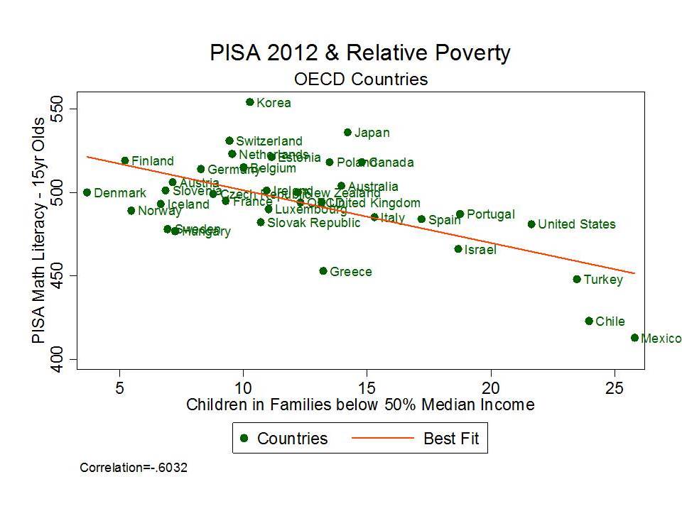
Let’s start with two claims made by Mike Petrillli in a recent post at Ed Excellence, in which he opined that bad teachers (or at least bad teaching), not poverty must be causing low PISA scores on Math for U.S. 15 year olds. Mike was perplexed that a) poverty might affect math outcomes as much as (if not more than) reading, thus something else must really be affecting math (bad teachers/teaching) and b) that poverty was affecting our 15 year olds’ outcomes, when we all know poverty affects younger kids more!? (really?). Mike’s goal was to explain that one must accept unreasonably complicated assumptions if one is to accept that poverty might comparably influence math or that poverty affects outcomes of older children as well as younger ones. Here it is in Mike’s own words (setting up the supposed “bad” assumptions used by others).
First, one must assume that math is somehow more related to students’ family backgrounds than are reading and science, since we do worse in the former. That’s quite a stretch, especially because of much other evidence showing that reading is more strongly linked to socioeconomic class. It’s well known that affluent toddlers hear millions more words from their parents than do their low-income peers. Initial reading gaps in Kindergarten are enormous. And in the absence of a coherent, content-rich curriculum, schools have struggled to boost reading scores for kids coming from low-income families.
…the second assumption must be that “poverty” has a bigger impact on math performance for fifteen-year-olds than for younger students. But I can’t imagine why. If anything, it should have less of an impact, because our school system has had more time to erase the initial disadvantages that students bring with them into Kindergarten.
Here’s a link to my post with the complete rebuttal and explanation!
Petrilli’s conclusion in the face of these inexplicable assumptions?
Maybe we’re just not very good at teaching math, especially in high school.
Here’s a shortened version of my earlier critique. First, there’s no evidence that poverty affects measured reading outcomes more than measured math outcomes, especially for highly aggregated student populations. The key word here is “measured.” Often math achievement simply seems more precisely, accurately or consistently measured (revealing more predictable variation) thus revealing clearer, more predictable gaps.
Yes, we have evidence of disparate outcomes by poverty for reading. But we have ample evidence of disparate outcomes by poverty for math. Even though we’ve been subjected lately to new reports (of old news) that higher income kids get exposed to more words earlier, that doesn’t mean that higher income kids don’t also get exposed to mathematical thinking/basic numeracy early on.
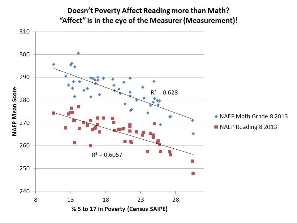
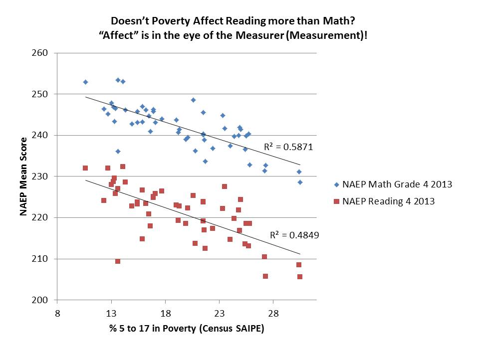
Here are the state aggregate math and reading outcomes by poverty for NAEP, and not-so-surprisingly (for anyone with an ounce of background in this stuff), the math scores are marginally more disparate than the reading scores.
Figure 1

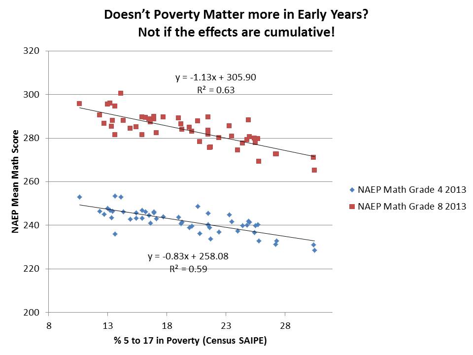
The second assertion is actually even more silly – that poverty affects early learning and thus only bad teaching affects what happens since (say, between 4th and 8th grade tests). Put simply, the effects of poverty are cumulative over time, most often leading to increasing gaps in later grades when compared with earlier grades (I should note, especially if we do not put sufficient support into resolving those gaps).
Here’s the empirical snapshot.
Figure 2

Now, this type of thinking isn’t novel for Mike. He’s made up lots of stuff before that simply doesn’t pass the most basic smell test, presenting it as some form of clever insightful revelation that makes perfect sense if you have little or no background on the issue (to his credit, it’s always done with a grin/smirk and ability to dance).
Among the most egregious examples was his policy brief a few years back with Marguerite Roza on Stretching the School Dollar which included many examples of policies and spending practices he’d like to see changed in schools, many of which actually had little or nothing to do with stretching dollars at all. For more on this topic, see this post, this policy report, and this peer reviewed article. (no, I can’t believe I wasted so much time rebutting utterly foolish schlock!)
And with the utmost class coupled with their usual depth of substance, TB Fordham responds by tweeting:
Good stuff. Deep.
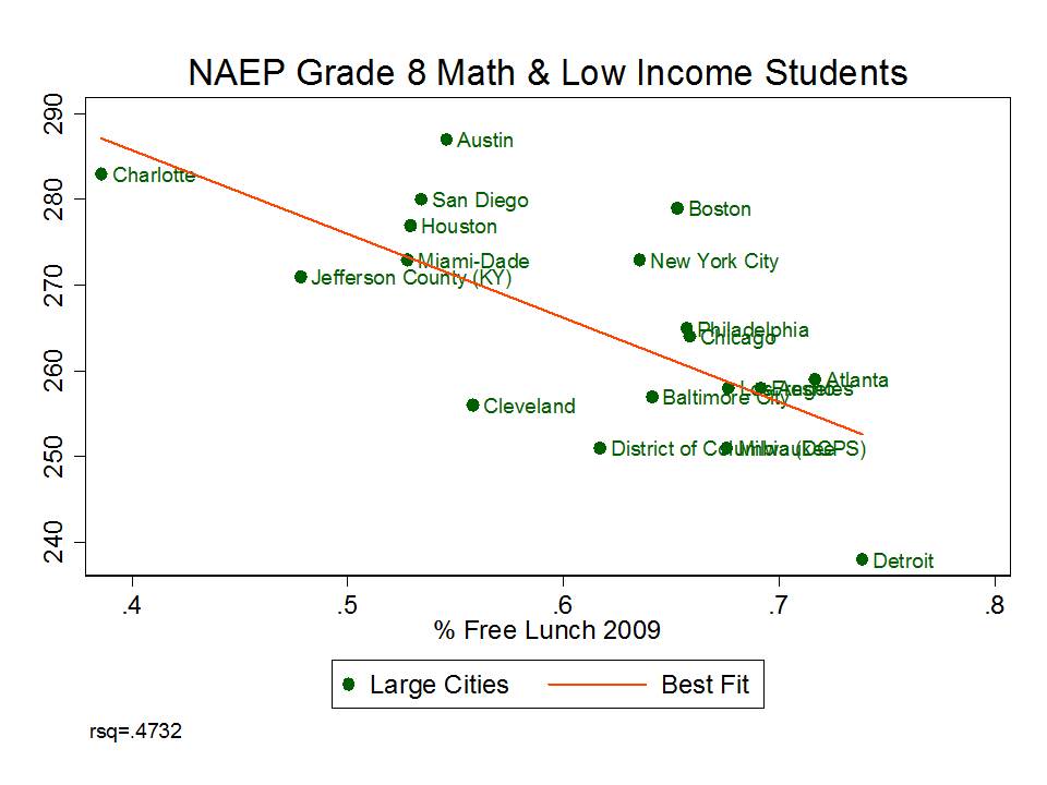
Smarick on Propping up Philadelphia
For the most compelling evidence that U.S. schools are dreadfully failing in mathematics preparation, one might point to the quantitative wizardry of Andrew Smarick. Like Petrilli, Smarick can’t be confused with really basic facts and numbers.
Over the past year, Smarick has gone on at least a few twitter rants about how the City of Philadelphia has been propped up with so much additional funding over the years and has still proven itself to be a complete failure. His twitter rants about wasted state aid, and Philly’s egregious, inefficient, under-productive overspending are in support of his agenda to simply eliminate public urban school districts and replace them with collections of charter schools (despite evidence that PA charters haven’t done a very good job).
What’s so ridiculous about Smarick’s claims here is that Philadelphia is and has been for some time, among the least well-funded major urban school districts in the nation. One can find evidence of this in many, many places and public data sources. Smarick’s angle is to simply assert that Philly receives more state aid than other PA districts. Yes… and Philly has a lot more students.
While Smarick’s entire argument for ending the urban district is suspect and full of holes (laced with historical, policy, legal and empirical ignorance) there are many other cities that might serve as better examples than Philly.
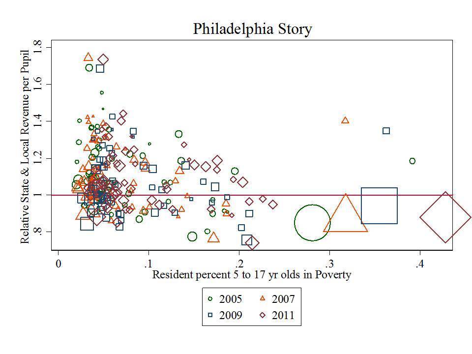
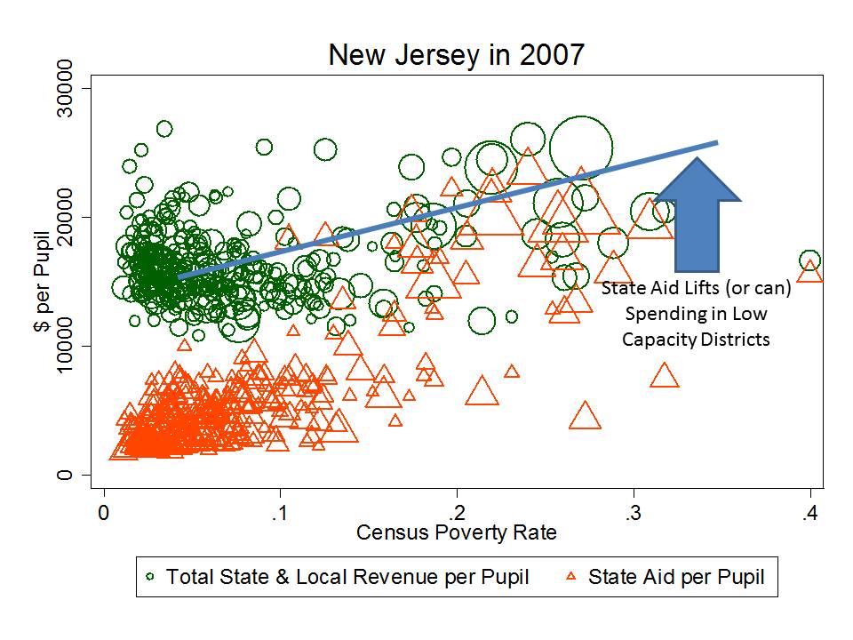
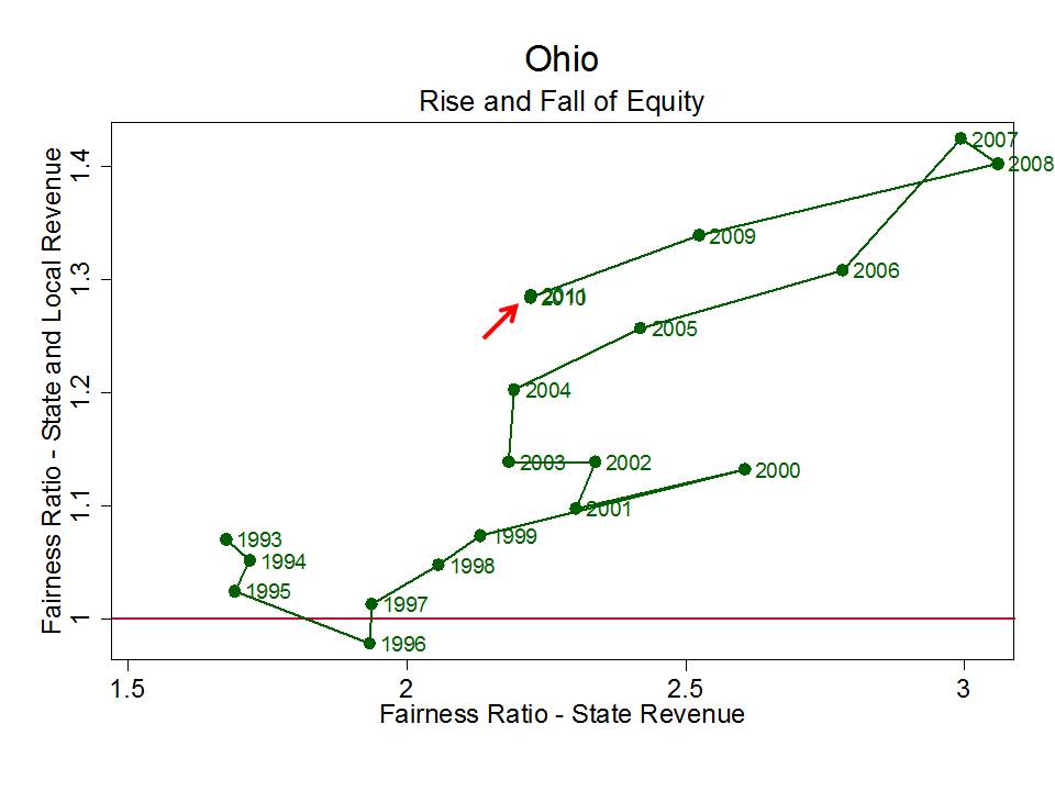
Here are two representations of Philly school funding in context. First, here’s Philly’s state and local revenue per pupil, relative to the average for its metropolitan area (PA districts only), where 1.0 is average, with districts arranged by poverty. Put simply, Philly has much greater need – higher poverty – than surrounding districts and lower than average funding. Philly is that big one… actually, those big four shapes, below the average line and with high poverty – getting higher from year to year. Way up in the upper left, is the adjacent leafy suburb – Lower Merion!
Figure 3
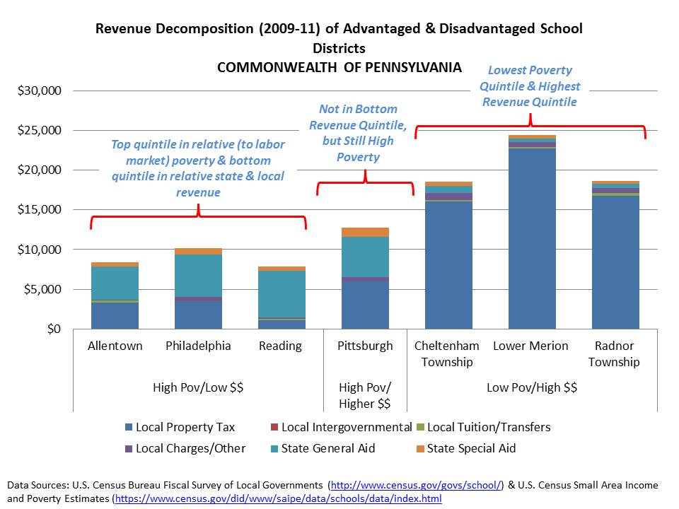
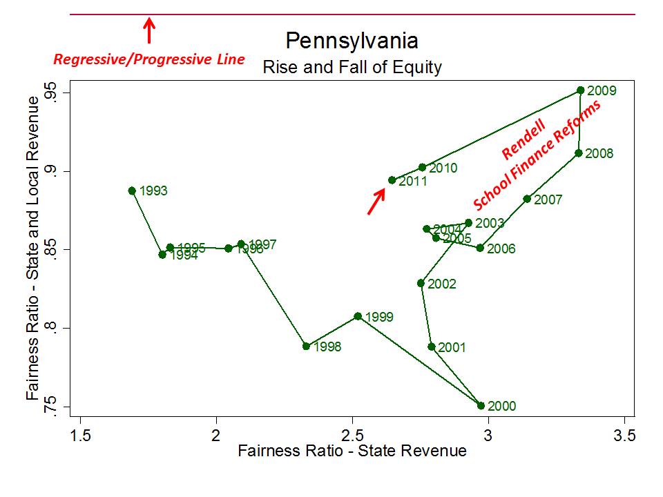
Let’s make this even simpler by comparing Philly, Allentown and Reading – three of the most fiscally screwed districts in the nation – to other more affluent Pennsylvania districts, and by breaking out their state and local revenues. Here, we can look specifically for that “propping up” with state aid effect. And guess what? It’s not there.
C’mon dude! This is ridiculous. Download some freakin’ data, either from PA dept of ed, or use the Census Fiscal Survey. It’s really not that hard. Make a graph. Philly has not been “propped up!” Okay… yeah… propped up more than if it was left entirely to raise school funds on local property taxes and propped up slightly more than Reading or Allentown. But to suggest that the state has, time and time again, bailed out Philly, given it more than would be necessary to achieve desired outcomes, is utterly ridiculous, reckless, irresponsible or downright incompetent.
Figure 4
Jeanne Allen’s Bizarre Interpretation of the U.S. & Louisiana Constitutions
This one is a bit different, but I would be remiss if I didn’t revisit it. No, it’s not one of those things that can be simply rebutted with a graph or two. Rather, this is one to be rebutted with a basic understanding of civics. If I go back further in my posts over time, I can find at least a handful of blustery reformy posts which are illustrative of our failures of civics education in the U.S.
There’s this one from the ever insightful Bob Bowdon of Choice Media, in which Bowdon decries supposed union supported legal attacks on Georgia’s charter authorizing authority (totally neglecting the actual phrasing of the Georgia constitution and the role of the courts in interpreting that constitution).
There’s this one, in which a Kansas attorney wishes to argue that there exists an individual liberty interest to impose unlimited local property taxation (e.g. that state imposed tax and expenditure limits violate that individual liberty).
But earlier this year, when the Louisiana courts struck down that state’s voucher program redirecting tax dollars to private schools, Jeanne Allen of the Center for Education Reform penned a response of unprecedented civic ignorance, her core argument being that in her view, the U.S. Constitution (as interpreted in the Cleveland voucher case of Zelman v. Simmons-Harris) protects an individual liberty to taxpayer funded private schooling.
In her own words:
“If indeed the Louisiana constitution, as suggested by the majority court opinion, prohibits parents from directing the course of the funds allocated to educate their child, then the Louisiana constitution needs to be reviewed by the nation’s highest court,” said Center for Education Reform President Jeanne Allen.
Allen added: “I urge Governor Jindal to file an appeal to the US Supreme Court, and ask for the justices’ immediate review of the decision. The Louisiana justices actions today violate the civil rights of parents and children who above all are entitled to an education that our Founders repeated time and time again is the key to a free, productive democracy.”
This is a bizarre interpretation indeed, of a ruling (Zelman) that permits the public financing of private schooling, inclusive of religious alternatives (that is, the specific model used in Cleveland was found NOT to violate the establishment clause in its use of public dollars for vouchers to private religious schools). That is not to say, by any stretch of the imagination, that this case by extension establishes a right for children everywhere to access public dollars for their private education. You see, “permit” and “require” are two very different things.
For more explanation, please see this post.
Lerum/Students First (and many others) on DC and Tennessee NAEP Miracles
I conclude with perhaps my favorite of reformy echo-chamber claims of 2013, one which we were all graced with not just once, but twice in recent months with the release of 2013 State NAEP scores and the later release of 2013 large urban district NAEP scores.
Most of the mis-NAEP-ery centered on claims of great gains in achievement (between one cohort of kids two years ago, and another cohort this year) in reformy favorites Tennessee and Washington DC. The central assertion of the reformy echo-chamber was that these great gains experienced in Tennessee and DC were proof positive that teacher evaluation reforms are working! Take, for example Eric Lerum’s Blog post on the Students First web site which starts with:
The 2013 National Assessment of Educational Progress (NAEP) results provide some of the strongest evidence yet that investment in student-centered education reforms improves student achievement.
Further down in the post, Lerum explains just what that compelling evidence is and what it means! Lerum provides us 3 “truthys”
First, that investment in teacher quality matters. Tennessee and D.C. have both implemented comprehensive teacher evaluation systems paired with targeted professional development, and (along with Florida) they were out ahead of all other states in doing so. This has established them as national leaders in policies related to teacher quality.
…
Second, we learned that rigorous academic standards make a difference. D.C. and Tennessee were early adopters of the Common Core State Standards and have been dedicated to good-faith implementation. They gave teachers and schools the resources and training necessary to put the standards in action, and students responded.
Third, it is clear that education reform isn’t about partisan politics. D.C. is one of the most liberal jurisdictions in the country; Tennessee is one of the most conservative. But when policymakers and education stakeholders withstand political pressure and make the changes needed to improve schools, kids win.
Well, that third one’s a bit of an aside, but let’s take a look at the first two. That recently adopted teacher evaluation policies and early adoption of common core standards have lifted DC and TN to new heights on NAEP!
Now, for these latest findings to actually validate that teacher evaluation and/or other favored policies are “working” to improve student outcomes, two empirically supportable conditions would have to exist.
- First, that the gains in NAEP scores have actually occurred – changed their trajectory substantively – SINCE implementation of these reforms.
- Second, that the gains achieved by states implementing these policies are substantively different from the gains of states not implementing similar policies, all else equal.
And neither claim is true, as I explain more thoroughly here! But here’s a quick graphic run down.
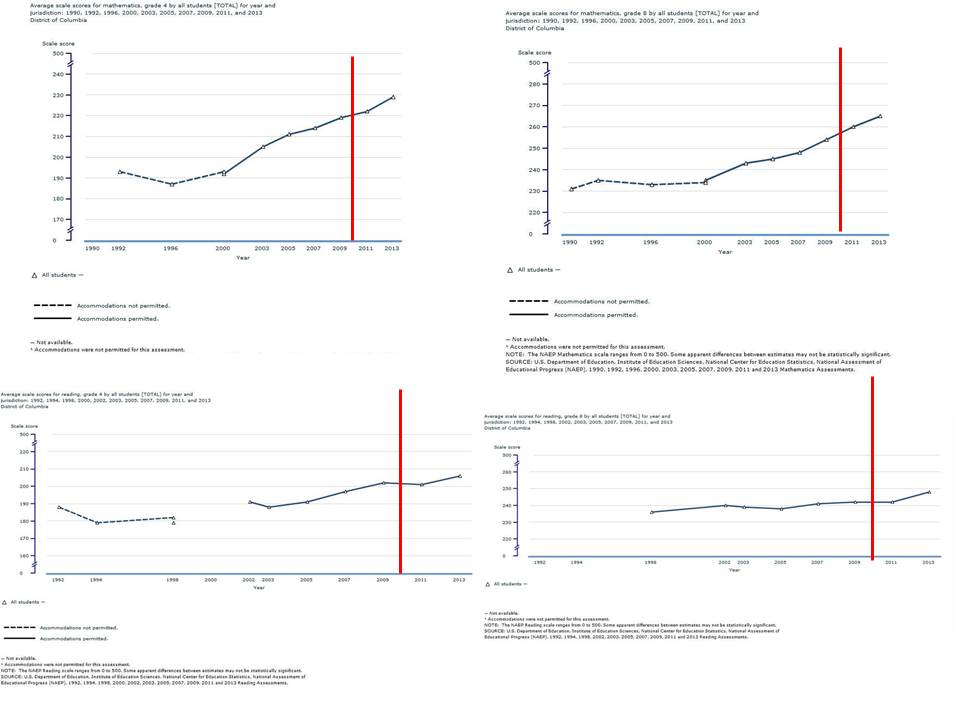
First, major gains in DC actually started long before recent evaluation reforms, whether we are talking about common core adoption or DC IMPACT. In fact, the growth trajectory really doesn’t change much in recent years. But hey, assertions of retro-active causation are actually more common than one might expect!
Figure 11

Note also that DC has experienced demographic change over time, an actual decline in cohort poverty rates over time and that these supposed score changes over time are actually simply score differences from one cohort to the next. This is not to downplay the gains, but rather to suggest that it’s rather foolish to assert that policies of the past few years have caused them.
Second, comparing cohort achievement gains (adjusted for initial scores… since lower scoring states have higher average gains on NAEP) with STUDENTS FIRST’s own measures of “reformyness” we see first that DC and TN really aren’t standouts, that other reformy states actually did quite poorly (states on the right hand side of the graphs that fall below the red line), and many non-reformy states like Maryland, New Jersey, New Hampshire and Massachusetts do quite well (states toward the middle or left that appear well above the line).
Needless to say, if we were to simply start with these graphs and ask ourselves, whose kickin’ butt on NAEP gains… and are states with higher grades on Students First policy preferences systematically more likely to be kickin’ butt, the answers might not be so obvious. But if we start with the assumption that DC and TN are kicking butt and have the preferred policies, and then just ignore all of the others, we can construct a pretty neat – but completely invalid story line.
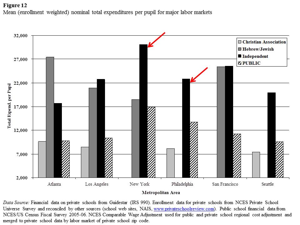
Figure 12

Closing thoughts…
I hear you say… hey… this is a bit personal isn’t it? Well, yes, I’ve called out individuals for their arguments and I too prefer sticking to the substance of those arguments. But let’s be clear here – I’m calling out the arguments – their substance – or blatant lack thereof. These ridiculous arguments happen to have emanated from these individuals.
Certainly, Lerum was far from the only one to have made the absurd DC and Tennessee claims. I could pick many others for that one… but Lerum expressed it all so eloquently wrong in his Students First post, and I had already done the comparisons with Students First own ratings of reformyness. So this was low hanging fruit. I used a ridiculous Nick Kristoff quote in my original post on this topic.
Smarick’s belligerent and repeated wrongness is simply unexcused. Smarick simply can’t be bothered with facts. He would tweet this silliness. I’d write about how wrong it was… and a week or two later… he’d be back to Philly bashing – all again with his argument that the state has already done all it can to fiscally prop up Philly.
As for Petrilli, these complete wacky, ill-conceived and under-informed arguments are his own, and to his credit, his response to my earlier post was gracious. But that doesn’t keep him off the Ignorati honor roll. It just allows him to wear that badge with honor.
And now, we sit and wait to see what the new year will bring.
Cheers.


