A short while back, the Center for American Progress posted their take-away from the Vergara decision. That takeaway was that equity of teacher quality distribution is the new major concern, or as they framed it Access to Effective Teaching. Certainly, the distribution of teaching quality is important. But let me set the record straight on a few major issues I have with this claim.
First, this is not new. It is relatively standard in the context of state constitutional litigation over equity and adequacy of educational resources to focus on the distributions of programs and services, as well as student outcomes, AND TEACHER ATTRIBUTES!
I (and many others) have regularly addressed these issues in reports and on the witness stand for years. It is important to understand that school finance equity litigation as it is often identified, actually tends these days to focus more broadly on equity and adequacy of educational programs and services, including teacher characteristics, and their relation to inequities and inadequacies of funding.
Second, modern measures of effective teaching, as I have explained in a previous post, are very problematic for evaluating “equity.” teacher effectiveness which have a tendency to be associated with demographic context and for that matter access to resources. To review, as I’ve explained numerous previous times, growth percentile and value added measures contain 3 basic types of variation:
- Variation that might actually be linked to practices of the teacher in the classroom;
- Variation that is caused by other factors not fully accounted for among the students, classroom setting, school and beyond;
- Variation that is, well, complete freakin statistical noise (in many cases, generated by the persistent rescaling and stretching, cutting and compressing, then stretching again, changes in test scores over time which may be built on underlying shifts in 1 to 3 additional items answered right or wrong by 9 year olds filling in bubbles with #2 pencils).
Our interest in #1 above, but to the extent that there is predictable variation, which combines #1 and #2, we are generally unable to determine what share of the variation is #1 and what share is #2. A really important point here is that many if not most models I’ve seen actually adopted by states for evaluating teachers do a particularly poor job at parsing 1 & 2. This is partly due to the prevalence of growth percentile measures in state policy.
This issue becomes particularly thorny when we try to make assertions about the equitable distribution of teaching quality. Yes, as per the figure above, teachers do sort across schools and we have much reason to believe that they sort inequitably. We have reason to believe they sort inequitably with respect to student population characteristics. The problem is that those same student population characteristics in many cases also strongly influence teacher ratings.
As such, those teacher ratings themselves aren’t very useful for evaluating the equitable distribution of teaching. In fact, in most cases it’s a pretty darn useless exercise, ESPECIALLY with the measures commonly adopted across states to characterize teacher quality. Being able to determine the inequity of teacher quality sorting requires that we can separate #1 and #2 above. That we know the extent to which the uneven distribution of students affected the teacher rating versus the extent to which teachers with higher ratings sorted into more advantaged school settings.
Third and finally, claims of identifying some big new equity concern seem almost always intended to divert attention from the substantive persistent inequities of state school finance systems (like this). That is, the intent seems far too often to assert that equity can be fixed without any attention to funding inequity. That in fact, the inequity of teacher quality distribution is somehow exclusively a function of state statutory job protections for teachers and/or corrupt adult-self-interested district management and teachers union arrangements.
The assertion that state policy restrictions (and no other possible major cause?) on local contractual agreements is the primary (or even a significant) cause of teaching inequity is problematic at many levels.
First, variation in access to teacher quality across schools within districts varies… across districts. Some districts (in California or elsewhere) achieve reasonably equitable distributions of teachers while others do not. If state laws were the cause, these effects would be more uniform across districts – since they all have to deal with the same state statutory constraints (perhaps those district leaders testifying at trial in Vergara and bemoaning the inequities within their own districts were, in fact, revealing their own incompetence,rather than the supposed shackles of state laws?).*
Second and most importantly, teacher quality measures and attributes tend to vary far more across than within districts, making it really hard to assert that district contractual constraints (which constrain within, not cross-district sorting) imposed by state law have any connection to the largest share of teacher quality inequity.
Setting aside the ludicrous logical fallacies on which the Vergara ruling rests, let’s take a more reasonable look at the distribution of teacher attributes with respect to resources and contexts in five states – based on prior reports I have prepared on behalf of plaintiff school children and the districts they attend, and drawn from academic papers (New York & Illinois).
Evaluating Disparities in Teacher Attributes
Ample research suggests that teacher quality is an important determinant of student achievement.[1] Although not the only policy instrument available, one way districts can try to attract higher quality teachers is by increasing salaries. Teacher salaries, however, are dependent on availability of state and local revenues. Moreover, district working conditions play a significant role in influencing the job choices of teachers. All else equal, teachers tend to avoid or exit schools with higher concentrations of children in poverty and higher concentrations of minority – specifically black – children. Some researchers have attempted to estimate the extent of salary differentials needed to offset the problem of teachers transferring from predominantly black schools. For example, Hanushek, Kain, and Rivkin (2004) note: “A school with 10% more black students would require about 10% higher salaries in order to neutralize the increased probability of leaving.”[2] Thus, to attact equal quality teachers high need districts and particularly the severe disparity districts would likely need to pay higher salaries than low need districts. The analyses presented here shows that that is not the case.
A substantial body of literature has found that concentrations of novice teachers (i.e. teachers with less than 3 or 4 years of experience) can have significant negative effects on student outcomes.[3]Rivkin, Hanushek, and Kain (2005) find that teacher experience is important in the first two years of a teaching career (but not thereafter).[4] Hanushek and Rivkin note that: “we find that identifiable school factors – the rate of student turnover, the proportion of teachers with little or no experience, and student racial composition – explain much of the growth in the achievement gap between grades 3 and 8 in Texas schools.”[5] Notably, evidence from a variety of state and local contexts, provides a consistent picture that higher concentrations of novice teachers are associated with negative effects on student outcomes.
Framework for Identifying “Disadvantaged Districts”
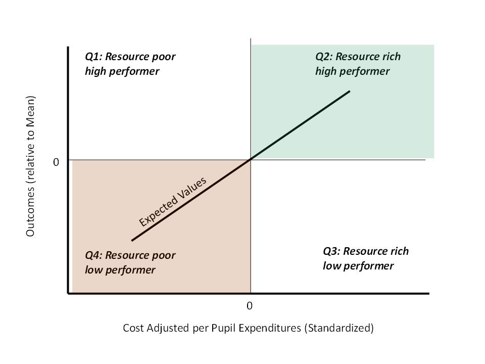
Figure 1 provides a conceptual framing of the distribution of local public school districts in terms of resource allocation and re-allocation pressures. Along the horizontal axis are “cost-adjusted” expenditures per pupil and along the vertical axis are actual measured outcomes, with both measures standardized around statewide means. Per pupil expenditure are “adjusted” for the cost of achieving specific (state average district) outcomes, where factors that influence cost include district structural characteristics, geographic location (labor costs) and various student need factors. One would assume that if expenditure measures are appropriately adjusted for costs districts would cluster around the diagonal line of expected values – where districts with more resources on average have higher outcomes. To the extent that this relationship holds with real data on real districts, one can then explore differences in resource allocation between districts falling in different regions (or quadrants) of Figure 1.
Figure 1. Hypothetical Distribution of School Districts
EVIDENCE FROM CONNECTICUT
In this section, we explore the resource and resource allocation differences across districts that fall into quadrants 2 and 4. We also examine the resources used in districts at the extremes of quadrant 4 – those with lowest outcomes and greatest needs. More specifically, we examine separately resource levels in the five districts that have
- EEO funding deficits of greater than $3,000 per pupil;
- average standardized assessment scores more than 1.5 standard deviations below the mean district; and
- LEP/ELL shares in 2007-08 greater than 10%.
We referred to these districts as severe disparity districts, and they include Meriden, Waterbury, New London, Bridgeport and New Britain.
Figure 2 – Severe Funding Disparities and Outcomes

At least two considerations limit the usefulness of simply comparing average salary levels across districts. First, competitive wages for professional occupations vary across regions in the state. Because, for instance, competitive wages in the Bridgeport-Norwalk-Stamford area are about 20 percent higher than in the Hartford area, a given nominal salary in Bridgeport has different purchasing power than the same nominal salary in Hartford. Second, teacher salaries vary substantially across different experience levels within districts. Thus, two districts that pay identical salaries for teachers with the same level of experience can have much different average salaries if one district has more experienced teachers than the other. Because differences in the experience distribution of teachers across districts are interesting in their own right, we examine them directly in the next section. In this section, we maintain focus on differences in salaries controlling for experience levels.
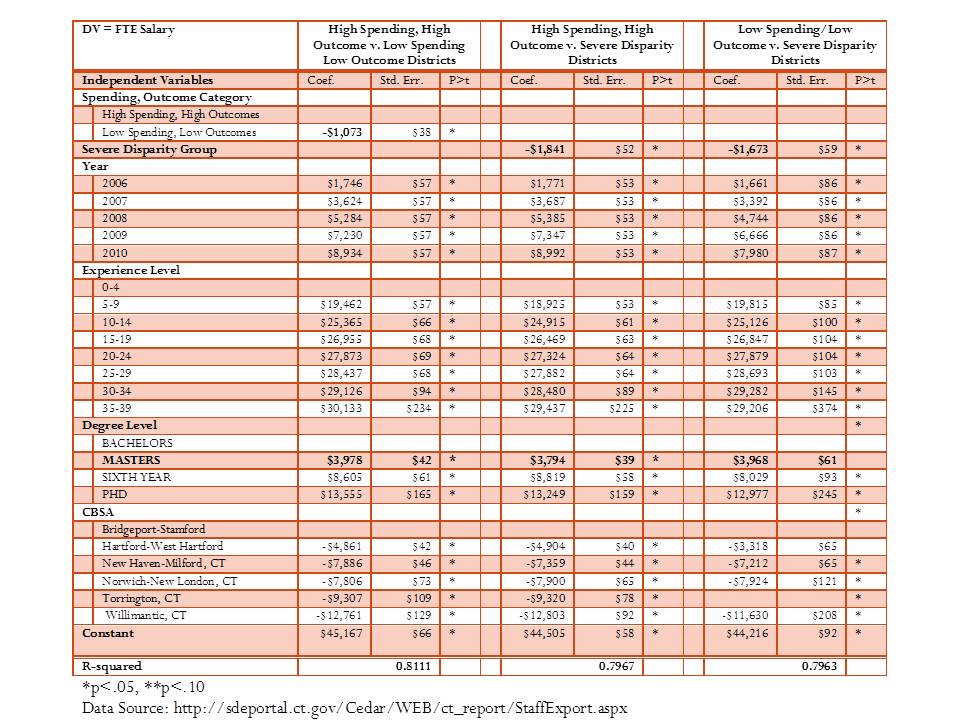
To address these issues, we estimated a salary model for Connecticut teachers using individual teacher level data on Connecticut teachers.[6] The goal of the wage model is to determine the average disparity in teacher salary between a) high spending/high outcomes districts and low spending/low outcomes districts and b) between severe disparity districts and other low spending/low outcomes districts controlling for teacher experience levels and the region of the state where the teacher works. The resulting estimates indicate, on average, how much more or less a teacher with similar qualifications, in the same labor market, is expected to be paid in FTE salary if working in a disadvantaged district.
The results of the regression analysis are presented in Table 1. The results indicate that salaries for teachers with more experience are higher, that teachers with advanced degrees, controlling for experience level are paid more, and that teachers tend to be paid less in regions other than Bridgeport-Stamford, and particularly so in the more rural parts of the state. With respect to differences across the three categories of districts, the results indicate that all else equal:
- A teacher in a low spending/low outcome district is likely to be paid about $1,000 less than a comparable teacher in a high spending/high outcome district in the same labor market;
- A teacher in a severe disparity district is likely to be paid about $1,800 less than a comparable teacher in all other districts in the same labor market;
- A teacher in a severe disparity district is likely to be paid about $1,600 less than a comparable teacher in other low spending/low outcome districts in the same labor market.
Thus, despite the expectation that severe disparity district would need to pay higher salaries to attract teachers of equal quality, we find they pay lower salaries than other districts in the same regions.
Figure 3 uses a variation on the statistical model in Table 1, including an interaction term between district group and experience category, to project the expected salaries of teachers in each experience category, holding other teacher characteristics constant. By interacting district group and experience, we are able to determine whether at some experience levels, teachers in severe disparity districts have more or less competitive salaries (whereas the model in Table 1 tells us only that, on average, across all experience levels, teachers’ salaries differ across district groups).
Table 1- Regression Estimates of Connecticut Teacher Salary Structures

At all experience levels, teachers in high spending/high outcome districts are paid more than their otherwise comparable peers in low spending/low outcome districts or in severe disparity districts. The gap appears to grow at higher levels of experience for teachers in severe disparity districts, and the gap is largest for teachers in low spending/low outcome districts across the mid-ranges of experience. For example, in the first few years of teaching, a teacher in a severe disparity district earns a wage of about $51,300 compared to a teacher in an advantaged district at $52,707, a difference of just under $1,400. But, by the 10th year of experience, that wage gap has grown to over $3,000, by the 15th year, nearly $4,000 and by the 20th year, over $4,300.
Figure 1– Teacher Salary Disparities

Data Source: http://sdeportal.ct.gov/Cedar/WEB/ct_report/StaffExport.aspx
We used another variation on the statistical model to project salaries for each group, for teachers with equated characteristics, in order to evaluate if teacher salaries in one group are falling further behind teacher salaries in another group over time. In this case, we interact the district group with the year variable in order to allow for the possibility that teacher salary disparities may be different in different years. Results from these regressions help to evaluate whether teacher salaries in severe disparity districts are catching up or falling even further behind.
Figure 4 shows that both teachers in the low spending/low outcomes group as a whole and in the severe disparity group in particular, are falling further behind teacher salaries in the high spending/high outcome group (in the same labor market). The growth in the salary gap between teachers in severe disparity districts and those in high resource districts is particularly disconcerting having grown from a difference of $1,054, or 1.7%, in 2005 to a difference of $5,517, or 8.1%, in 2010.
Figure 4 – Salary Disparities over Time

Data Source: http://sdeportal.ct.gov/Cedar/WEB/ct_report/StaffExport.aspx
Figures predicted for an individual with 5 to 9 years experience, a Master’s degree, and in CBSA 25540 (Hartford)
Figure 5 shows that, compared to high spending/high outcome districts, low spending/low outcome districts including severe disparity districts have high shares of teachers in their first four years of experience. Districts in the low spending/low outcomes group generally have smaller shares of teachers in the 5 to 9 year and 10 to 14 year categories, whereas districts facing severe disparities have shortfalls of the most experienced teachers.
Figure 5 – Teacher Experience
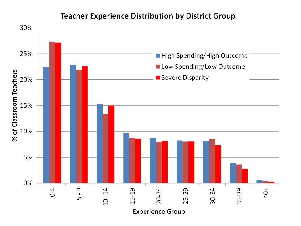
Data Source: http://sdeportal.ct.gov/Cedar/WEB/ct_report/StaffExport.aspx
Table 2 provides the estimates of a logistic regression model of the probability that a teacher is in his or her first three years of teaching, after correcting for other factors. The purpose of this analysis is to identify factors associated with, or predictors of, the likelihood that a teacher is a novice teacher. Figure 6 above indicates a greater share of novice teachers in low resource, low outcome district and in severe disparity districts than in high resource, high outcome districts. Unlike the chart above, the logistic regression models allows us to determine the relative probability that a teacher in a severe disparity district is a novice, compared a) in the same year, b) to other districts in the same labor market (metropolitan area), and c) whether those probabilities change over time. The results in Table 2 shows that on average:
- Teachers working in the severe disparity group are 20% more likely to be “novice” teachers than teachers in all other districts.
- Teachers in low spending/low outcomes districts are 19% more likely to be novice teachers than those in high spending/high outcomes districts.
Table 2 – Estimates of the Odds that a Teacher is in Her First 3 Years
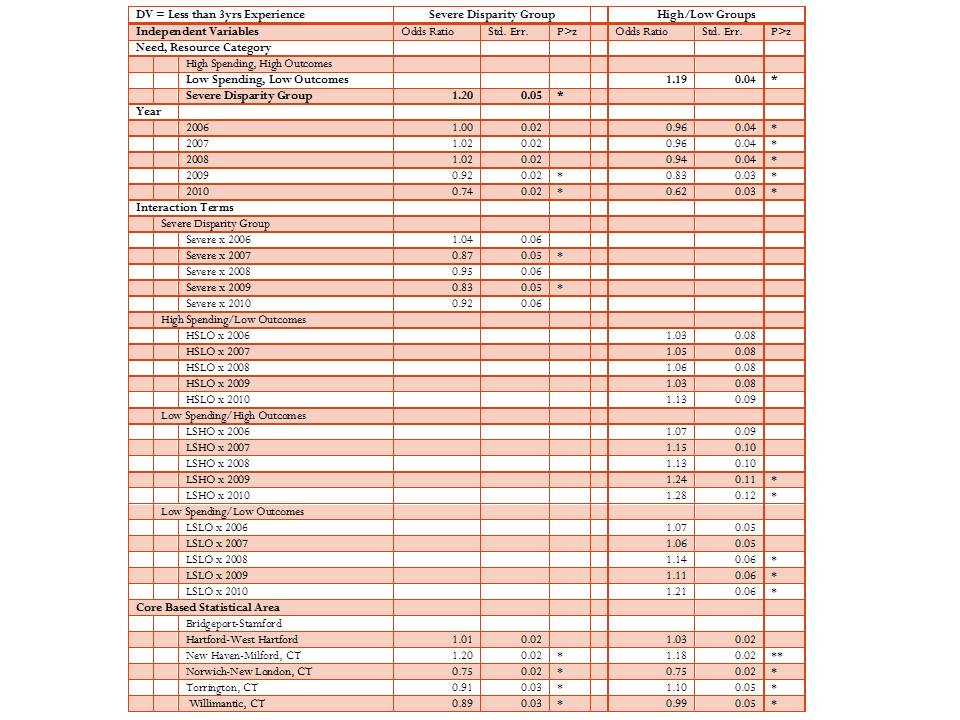
*p<.05, **p<.10
Data Source: http://sdeportal.ct.gov/Cedar/WEB/ct_report/StaffExport.aspx
EVIDENCE FROM TEXAS
Here, I explore the distribution of teachers’ salaries and concentrations of novice teachers across Texas school districts. I explore how salaries and novice teacher concentrations vary by:
- Poverty Quintile (U.S. Census poverty rate)
- District Property Value Quintile
- Resource/Outcome Group
Resource/outcome groups are determined according to Figure 6. I showed in the previous section that adjusted current operating expenditures were associated with actual outcomes. On average, higher spending districts had higher outcomes. I expressed spending and outcomes around their averages, such that there were high spending, high outcome districts where spending and outcomes were both above average, and there were low spending, low outcome districts where both were below average, as shown in Figure 6. A similar classification is constructed for both the college readiness model results and for the TAKS model results.
Figure 6
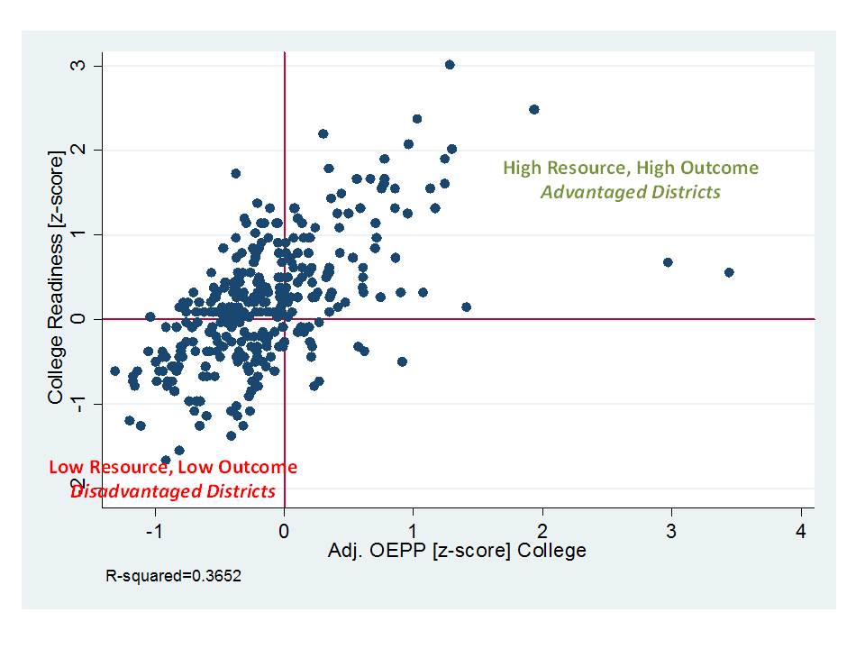
Table 3 provides the results of four wage models which attempt to discern the extent of variation in teacher wages between groups of districts, among districts in the same labor market, and for teachers with the same number of years of experience and the same degree level.
Table 3. Salary Parity for Teachers across Districts by District Group/Type (2008-09 to 2009-10)

*p<.05
Includes controls for labor market.
Table 3 provides mixed findings. First, teachers in low resource, low outcome districts earn about $271 more than teachers in high resource, high outcome districts using the TAKS based cost model for classification, and $449 more using the college readiness model for classification. These are very small salary differentials and hardly likely to be sufficient for recruiting teachers of comparable qualifications to those in the more advantaged districts.
Teachers in the highest poverty quintile of districts are paid about $1,660 more than teachers in the lowest poverty quintile. While larger than the wage premium difference between resource/outcome categories, this difference is also hardly likely to balance the distribution of teacher qualifications between the highest and lowest poverty districts. But, low property wealth districts pay, on average a lower teacher wage than high property wealth districts, by about $1,306. None of these differences is huge. Wages are relatively flat across these groups. The contrast in findings by property wealth and by poverty is intriguing, suggesting perhaps that in Texas property wealth related disparities in resources remain more persistent than even poverty related disparities.
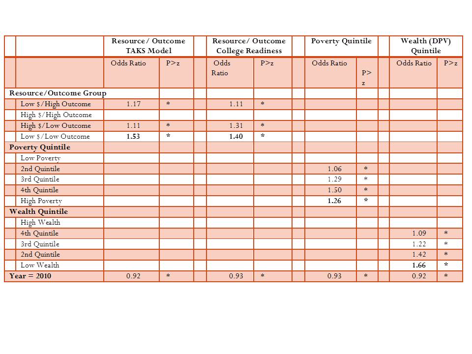
Table 4 addresses the distribution of novice teachers by the same group classifications, again comparing districts to others in the same labor market. Table 4 uses a logistic regression model to determine the odds that a teacher is in his or her first 3 years of teaching.
- Table 4 shows that a teacher in a low resource, low outcome district is 53% (TAKS model) or 40% (college readiness model) more likely to be novice than a teacher in a high resource, high outcome district.
- A teacher in a district in the highest poverty quintile is 26% more likely to be novice than a teacher in a district in the lowest poverty quintile.
- Finally, and quite strikingly, a teacher in a district in the lowest wealth quintile is 66% more likely than a teacher in a district in the highest wealth quintile to be novice. Again, property wealth disparities rule the day.
Table 4. Likelihood that a Teacher is a Novice (2008-09 to 2009-10)
 *p<.05
Includes controls for labor market.
EVIDENCE FROM KANSAS
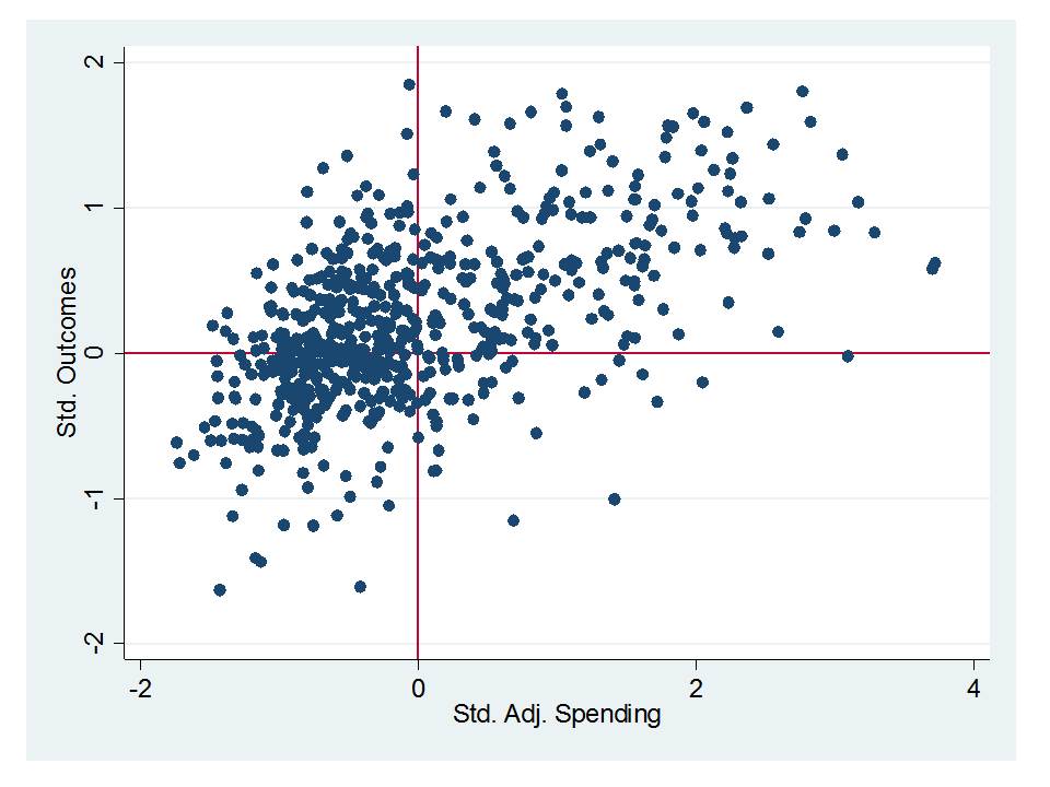
In this subsection, I explore disparities in actual staffing distributions and assignments to courses across Kansas public school districts using data on individual teachers, focusing on the most recent two years of data (2010 & 2011). For illustrative purposes, I organize Kansas school districts into quadrants, based on where each district falls in terms of a) total expenditures per pupil adjusted for the costs of achieving comparable (average) student outcomes (using the Duncombe cost index)[7], and b) actual district average proficiency rates on state reading (grades 5, 8 and 11) and math (grades 4, 7 and 10) assessments.
Figure 7 shows the distribution of districts by their quadrants. As an important starting point, Figure 7 shows that there exists a reasonably strong positive relationship between adjusted spending per pupil and outcomes (r-squared = .45, weighted for district enrollment). That is, districts with more resources have higher outcomes and districts with fewer resources have lower outcomes. Placing a horizontal line at the average actual outcomes and a vertical line at the average adjusted spending carves districts into four groups or quadrants. It is important to understand, however, that districts nearer the intersection of the horizontal and vertical lines are more similar to one another and less representative of their quadrants. That is, “average” Kansas districts are characterized by the cluster around the intersection as opposed to the few districts right at the intersection. To explore the extent of disparities between the most and least advantaged districts statewide, some analyses herein focus specifically on those districts which are deeper into their quadrants, labeled as “extreme” and colored in red in the figure.[8]
Figure 7. Distribution of Districts by Resources & Outcomes (2010)

The quadrants of the figure may be characterized as follows:
- Upper Left: Lower than average adjusted spending with higher than average outcomes
- Upper Right: Higher than average adjusted spending with higher than average outcomes
- Lower Right: Higher than average adjusted spending with lower than average outcomes
- Lower Left: Lower than average adjusted spending with lower than average outcomes
Again, some caution is warranted in interpreting these quadrants. One can be fairly confident that those districts deeper into the upper right and lower left quadrants legitimately represent high resource, high outcome, and low resource low outcome districts. But, one should avoid drawing bold “efficiency” conclusions about districts in the upper left or lower right. For example, the relationship appears somewhat curved, not straight, shifting larger numbers of districts that lie at the middle of the distribution into the upper left quadrant (rather than evenly distributed around the intercept).
The largest numbers of children in the state attend school districts that fall in the expected quadrants – those in the upper right which have high resource levels and high outcomes – and those in the lower left which have low resource levels and low outcomes. While a significant number of districts fall in the upper left – appearing to have high outcomes and low resources – most are relatively near the center of the distribution, and in total, they serve fewer students than either those in the upper right or lower left quadrants.
It is also important to understand that comparisons of staffing configurations made across these quadrants are all normative – based on evaluating what some children have access to relative to others. Most of the following comparisons are between school districts in the upper right and lower left hand quadrants. That is, what do children in low resource, low outcome schools have access to compared to children in high resource, high outcome schools? We know from the previous figures, based on the Office of Civil Rights data that participation rates in advanced courses decline precipitously as poverty increases across Kansas schools and districts. We also know that access to such opportunities is important for success in college. And, we know that such opportunities can only be provided by making available sufficient numbers of qualified teaching staff. Further, we know that districts serving higher need student populations face resource allocation pressures to allocate more staffing to basic, general and remedial courses. Research on staffing configurations in other states generally supports these assertions.
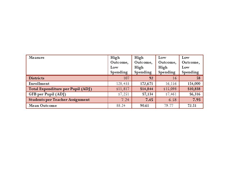
Table 9 summarizes the characteristics of districts falling into each quadrant. Of the approximately 474,000 students matched to districts for which full information was available in 2010, 172,671 attend districts with high spending and high outcomes, at least compared to averages. 154,000 attend districts with low spending and low outcomes. Smaller groups attend districts in the other two quadrants.
For adjusted total expenditures per pupil, districts in the higher spending, higher outcome quadrant have about $4,000 per pupil more than those in the lower spending, low outcomes quadrant. The difference for general fund budgets is about $800. Also related to resources, districts with high spending levels and high outcomes have fewer pupils per teacher assignment when compared to low spending, low outcome districts. That is, from the outset, low spending low outcome districts have fewer teacher assignments to spread across children. Yet, these low spending low outcome districts, which are invariably higher need districts, must find ways to both provide basic and remedial programming to bring their students up to minimum standards, and must find some way to offer the types of advanced courses required for their graduates to have meaningful access to higher education.
Table 5. Characteristics of Districts by Group (2010)

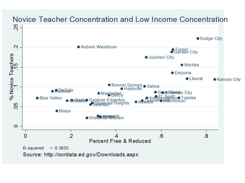
Figure 8 shows that districts with higher concentrations of low income populations have systematically higher concentrations of novice teachers (in their first or second year). In fact, low income concentration alone explains nearly 40% of the variation in novice teacher concentration. Districts like Kansas City have much higher rates of novice teachers than neighboring suburban districts, including those which are growing rapidly and have increased demand for new teachers. This finding suggests that districts like Kansas City and Turner have much higher turnover rates than districts like DeSoto, Blue Valley or Shawnee Mission. Yet, current Kansas school finance policies provide financial support for teacher retention in the districts already advantaged with systematically lower concentrations of novice teachers.
Figure 8. Shares of First and Second Year Teachers by Low Income Student Shares

Table 6 uses data from the statewide staffing files for 2010 and 2011 and compares teachers by quartile and then for the extreme groups. Based on the indicator of teacher prior year status differences appear relatively small, with marginally higher shares of teachers indicating that they are returning teachers in high resource, high outcome districts or very high resource very high outcome districts.
Table 6. Shares of Returning and Novice Teachers by District Group
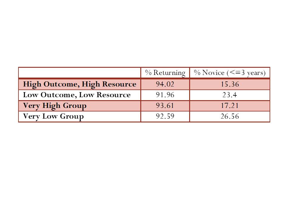
Data Source: Statewide Staffing Assignment Database, 2010-2011
But, shares of novice teachers reveal more substantive differences. Table 6 shows that in low resource, low outcome districts over 23% of teachers have 3 or fewer years of experience, compared to 15.36% in high resource high outcome districts. The share of novice teachers increases to 26.56% in very low resource very low outcome districts.
Table 7. Odds that a Teacher is Novice by District Group (Logistic Regression)
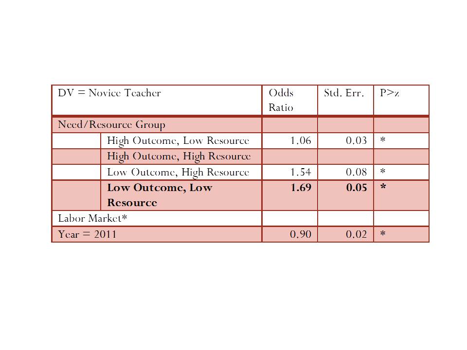
Table 7 provides more precise estimates of the odds that a teacher is novice, given the group that the district is in, and compared against districts in the same labor market. The baseline comparison group is the high resource high outcome group. Compared to teachers in the high resource high outcome districts, teachers in the low resource low outcome districts are nearly 70% more likely to be novice.
Table 8 asks whether teachers in low resource low outcome districts are receiving lower base salaries than teachers of the same experience level in high resource high outcome districts in the same labor market.
Table 8. Salary Disparities by District Group (linear regression)
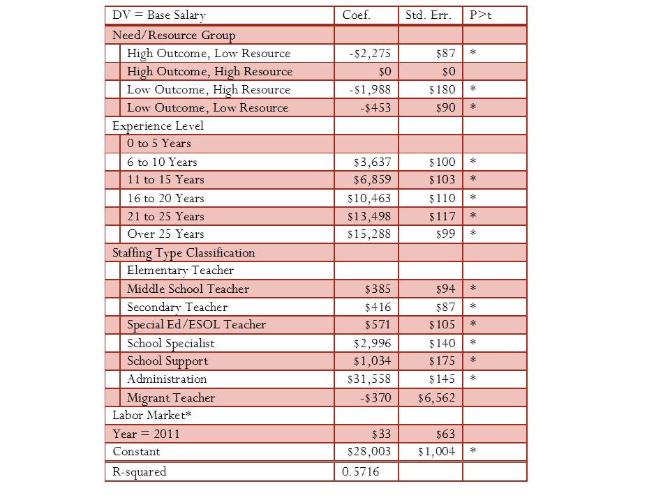
*P<.05
Table 8 shows that teachers in low resource low outcome districts at the same experience level are paid, on average, in base salary, about $450 less than teachers in high resource high outcome districts in the same labor market. Teachers in other districts are actually paid even less in base salary. That is, there exists no compensating differential to attract teachers to low resource low outcome districts. In fact, arguably, current policies which provide for additional local budget authority to affluent suburban districts work to reinforce the salary disparities shown in Table 8 and the novice teacher concentration disparities shown in Tables 6 and 7, and in Figure 8.
EVIDENCE FROM ILLINOIS
Figure 9 depicts the distribution of our Illinois school districts by outcome-resource quadrant, and by grade ranges served. Both the cost adjusted spending measure and the outcome index are standardized around a mean of “0.” On average, districts in Illinois cluster around the expected values and therefore are concentrated in the expected quadrants. Unified K-12 districts are least spread out across the quadrants. That is, there are fewer extremes among Unified K-12 districts. It should also be noted that the low resource, low outcome group of Unified K-12 districts is heavily influenced by the presence of Chicago City schools. The greatest extremes exist for secondary districts, primarily in the Chicago metropolitan area. In the case of outcome measures, districts are standardized around the mean for their grade range (district type).
Figure 9. Distribution of Illinois School Districts

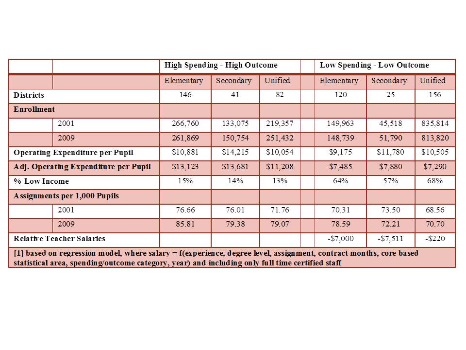
Table 9 characterizes the Illinois districts in each quadrant. There are 146 high spending high outcome elementary districts serving over 250 thousand children and 120 low spending low outcome districts serving about 150 thousand children. There are 41 high spending high outcome secondary districts serving up to 150 thousand children and 25 low spending low outcome secondary districts serving about 50 thousand children. For unified districts, there are 82 that are high spending and high outcome, serving 250 thousand children and 156 that are low spending with low outcomes, serving over 800 thousand children, with about half of those children attending Chicago Public Schools.
Even without any adjustment for costs or needs, the average per pupil operating expenditures are lower in low spending, low outcome districts. After adjustment, they are substantially lower. The percent of children who are low income is substantially higher in low spending, low outcome districts. Further, low spending, low outcome districts have fewer total staffing assignments per 1,000 students than their more affluent peers, and have lower teacher salaries at given levels of experience and degree level. Overall, lower spending low outcome districts in Illinois face substantial deficits from the outset.
Table 9. Descriptive Characteristics of Illinois School Districts
EVIDENCE FROM NEW YORK
Figure 10 depicts the distribution of New York State school districts. As with the Illinois districts, the New York district spending and outcome measures are standardized around a mean of “0.” Again, districts tend to fall clustered around expectations (correlation, weighted for district enrollment = 0.63). High spending, high outcome districts spread far into the upper right corner of Figure 3, whereas disadvantaged districts tend to be more clustered toward the center of the Figure. However, some notable exceptions fall well into the lower left quadrant, including mid-size cities of Utica and Poughkeepsie along with the larger upstate cities of Syracuse, Rochester and Buffalo.
Figure 10. Distribution of New York School Districts

Table 10 summarizes the characteristics of New York State school districts in the low spending, low outcomes and high spending, high outcomes quadrants. There are 186 districts serving nearly 580 thousand children in the high spending high outcomes quadrant and 194 districts in the low spending, low outcomes quadrant serving just over 450 thousand children. Low spending, low outcome districts have significantly higher rates of children in poverty, significantly lower nominal spending per pupil and substantially lower need and cost adjusted spending per pupil, lower teacher salaries (at similar degree and experience), but they do have slightly more total teacher assignments per 1,000 pupils.
Table 10. Descriptive Characteristics of New York School Districts

==================
*Anzia and Moe, here, find that variance of teacher attributes is greater in larger than in smaller districts in California, still asserting state policy to be the cause, but to have differential effect because large bureaucracies (large districts) are more susceptible to state policy constraints. This argument is plainly illogical because a large district has the capacity to organize/operate as if it was several small districts – whereas a small district does not have the capacity to act as a large district. In other words, small districts are more likely constrained. If large districts respond more bureaucratically, that is in fact the responsibility of district leadership, not a direct result of state policy. More likely however, the greater variance in large districts regarding the relationship between teacher characteristics and student populations is a function of greater variance, in general, on all measures, across schools in larger more heterogeneous districts.
==============
NOTES
[1] For example, see Eric A. Hanushek, John F. Kain, and Steven G. Rivkin, “Teachers, Schools, and Academic Achievement,” Econometrica 72, no. 3 (Fall 2005): 417-458; Daniel Aaronson, Lisa Barrow, and William Sander, “Teachers and Student Acheivement In Chicago Public High Schools,” Federal Reserve Bank fo Chicago Working Paper 2002-28, 2002.
[2] Hanushek, Kain, Rivkin, “Why Public Schools Lose Teachers,” p. 350
[3] See Charles T. Clotfelter, Helen F. Ladd and Jacob L. Vigdor, “Who Teaches Whom? Race and the distribution of novice teachers,” Economics of Education Review 24, no. 4 (August, 2005): 377-392; See Charles T. Clotfelter, Helen F. Ladd and Jacob L. Vigdor, “Teacher sorting, teacher shopping, and the assessment of teacher effectiveness,” Sanford Institute of Public Policy, Duke University, 2004; and Hanushek, Kain, and Rivkin, “Teachers, schools, and academic achievement.”
[4] Hanushek, Kain, and Rivkin, “Teachers, schools, and academic achievement.”
[5] http://edpro.stanford.edu/hanushek/admin/pages/files/uploads/w12651.pdf
[6] Connecticut Department of Education provides a 6 year extractable panel (2005 to 2010) of individual teacher level data, available at: http://sdeportal.ct.gov/Cedar/WEB/ct_report/StateStaffReport.aspx. This file includes just over 50,000 cases (individuals) per year, with indicators of district and school assignment, teacher position type, assignment and salaries.
[7] The Duncombe Cost Index is used to adjust expenditures for the value of those expenditures toward achieving common outcome goals (the statewide average). This is done by taking the expenditure figure (either general fund budgets or total expenditures per pupil) and dividing that figure by the cost index.
[8] having either <75% proficient & <$12,000 per pupil in total expenditures, adjusted for need and costs, or having >90% proficient & >$14,000 in need and cost adjusted spending