New Jersey: Cert. Staffing Costs & State & Local Spending

Only one table today, as I continue to try to figure out how elementary and secondary education staffing costs and teacher wages fit into state and local budget concerns in New Jersey. Are certified employee staffing salaries really escalating? Are they outstripping state and local budgets? I really am just trying to find the best measures of this apparent concern. Because state aid to schools is an intergovernmental transfer to local public school districts, certified employees are not a direct state expense and therefore not reported as such. Certified education employees are hired by local public school districts and paid for with a combination of the state aid and local property taxes. As such, it is a bit of a data struggle to figure out how best to tally the total cost of certified public school employees with respect to total state and local expenditures.

Here’s one shot at it. For this table, I use the NJDOE Certified Staffing files to tally the total costs of wages (not benefits) for certified education employees. I then divide the certified staffing wages by a) the total state and local expenditures for the same years and b) the current state and local expenditures for the same years as reported in the Census fiscal surveys (accessed through: http://slfdqs.taxpolicycenter.org/pages.cfm) . The findings are rather interesting – Elementary and Secondary Public School Certified Staffing Salaries have DECLINED as a percent of Total State and Local Expenditures from 1997 to 2007.

Let me be absolutely clear here – It does not always work well to combine such different data sources (individual staffing files on teacher salaries and reported aggregate budget figures). It should, logically – but data realities often thwart logic. One data source should be useful for characterizing the total salary expense on teachers, if, in fact, the data are truly comprehensive and the other should provide a reasonable estimate of total state and local expenditures.

Also, be assured that I understand fully that an alternative issue is whether teacher wages are increasing pressure on local school district budgets, which I do not address here. That is, what is the percent and change in percent of local public school budgets that are going to teacher wages (and benefits)? While an important and relevant question that is not what I am endeavoring to explore here (I address that question here – at the end of the post: https://schoolfinance101.wordpress.com/2010/03/17/just-the-facts-nj-taxes-teacher-salaries-and-spending-fluff/). Rather, I am exploring whether there is an empirical basis for arguing that salaries of certified public educators are a primary cause of stress to state and local budgets as a whole, in New Jersey. Please read previous posts(and comments sections) for a discussion of benefits.

Just the Facts: NJ Taxes, Teacher Salaries and Spending “Fluff”

Download PPT Slides (UPDATED): jersey-taxes-and-teacher-wages_r6

I’ll do my best not to editorialize too much here. Just the facts. Just a few slides in order to clarify where New Jersey stands in terms of taxes, long run economic position and growth, teacher salaries and the allocation of resources in school districts. These slides are in response to claims that;

  1. New Jersey is the most taxed state in the nation,
  2. our taxes are driving our economy into the ground and we’re falling way behind all other states,
  3. our teacher salaries which are completely out of control are the reason why our taxes are out of control,
  4. school districts don’t have to cut teachers to get their budgets in line because school districts waste most of their money on administration anyway.

Of course, these last two claims are entirely inconsistent, but often spouted by the same pundits (primarily talk radio).  If escalating teacher salaries were the cause of escalating costs, then teacher salaries – or teachers themselves – would need to be cut.

A few take home points from the slides below are:

Taxes

a) New Jersey is not, in fact, the highest taxed state in the nation. Our property taxes are high, but our income and sales taxes are modest by comparison. We’re also not number one in property taxes when all states are considered and when property taxes are measured as a percent of income.

  • Note: There has been much media buzz this week about this report: http://www.taxfoundation.org/files/f&f_booklet_20100325.pdf which identifies New Jersey as #1 on this supposed same measure for 2008 (See Table 2). The cited source for their information is their own report, footnoted as: Tax Foundation Special Report, No. 163 (from August 2008: http://www.taxfoundation.org/files/sr163.pdf.) Table 1 of this report cites advance estimates of 2008 data which would appear to be from the same sources I have used. BUT… I have chosen a simple straightforward – directly cited comparison of final data and over multiple years. I have also disaggregated debt burdens from other taxes. Here is a PDF of the actual extract of the supposed same data. State & Local Finance Data .. By these data, which you can download yourself, NJ is NOT #1. That said, I have little reason to believe that taxfoundation.org would necessarily hold a NJ bias that would cause it to want to alter the stats to put NJ at #1.  The numbers just don’t match up.

Productivity

b) New Jersey remains high in gross state product (gross domestic product – state) per capita. Our growth has been only modest, but some of those states in our region that have outpaced us in recent years are actually states with higher tax burdens (NY). This is obviously not causal – ONE WAY OR THE OTHER! New Jersey also remains high in per capita income and has held pace over time despite apocalyptic claims that all of the state’s high income residents are exiting the state in droves.

Teacher Salaries

c) Teacher salaries have actually declined with respect to non-teacher wages over time in NJ, even when comparing wages for the same number of hours and weeks worked, and at same degree level and age.

d) Despite a mythology that all non-teachers work every day of every week of the year and that teachers work about half the year, non-teachers actually report working about 48 weeks per year compared to teachers 42 weeks. Teachers worked about 87% of the weeks worked by other non-teacher workers in NJ.

e) Comparing different data sources (something I prefer not to do), teachers at specific experience and degree levels appear to earn an annual wage about 67% of that of their non-teaching peers – annually. Okay, but they don’t work as many weeks. So, they earned 67% of the wage for working 87% of the time. Still a significant disparity.

f) Teachers’ annual income return to experience (or age)  is well less than that of non-teachers over much of their careers. Assuming teachers and non-teachers start at a similar wage at age 23 with a masters degree (around $50k), by age 40, the average non-teacher will be earning over $100k, while the average teacher will be approaching $80k .

Note regarding benefits & bias: Corcoran and Mishel point out here: http://epi.3cdn.net/05447667bb274f359e_zam6br3st.pdf

…overall K-12 teacher compensation was 27.5% greater than teacher wages alone, while overall professional compensation was 23.5% greater than professional wages. These differences in benefit shares translate into a benefits “bias”of 2.8 percentage points in 2006.

That is, benefits would close little of the overall gap in wages. Costrell and Podgursky show about a 5% (slightly less) differential (10% non-teachers, 15% teachers) in the value of pensions, a portion of benefits. This too would close only part of the teacher to non-teacher wage gap in New Jersey, even if we assume New Jersey benefits for teachers to be much greater than other employee benefits.

Growing Waste in School Budgets and The “Blob”

g) Classroom instructional spending as a share of budgets has remained relatively constant over time, and poor urban districts are in line with other NJ districts in this regard.

h) Total administrative expenses as a share of school district budgets have remained relatively constant for nearly 15 years and large poor urban and Abbott district administrative expenses are in line with (and lower than) other districts.

i) School level administrators are a relatively small share of school personnel. Not shown here, but also relevant is the fact that school level administrative salaries are only marginally higher than senior teacher salaries. As such, it is highly unlikely that one can cut substantially close budget gaps by cutting “administrative fat” alone.


NJ Surplus Drill-down Redux

This is a quick reply to NJ Left Behind’s highly suspect if not outright bogus NJ Surplus Drill-down. The crux of my response to NJ Left Behind’s summary of NJ school district surpluses, is that his/her analysis completely distorts the distribution of school district surpluses by not taking into account district size (enrollment). Of course the larger districts on average have larger surpluses. And Abbott districts on average are larger. Now, this is not uniformly the case, but for the most part, the largest surpluses are in larger districts (indeed there are some large districts with no surplus and some smaller districts with large surpluses).

The more appropriate way to look at these numbers is in per pupil terms. First, here are the per pupil Total Surpluses by district factor group and by Abbott status:

Interestingly, relative to districts in the same factor group (wealth-income category), Abbott districts seem to be carrying somewhat smaller per pupil surpluses. Further, total surpluses per pupil in Abbott districts on average are lower than surpluses in DFG J districts.

Here is the proposed state aid withholding (in other words, proposed CUTS) by district factor group and Abbott status:

Note in this case that state aid withholding is systematically higher in poorer district factor groups, though lower in Abbott districts relative to others in their factor group.

Finally, here is the withholding as a share of total surpluses:

So, the bottom line here is that the poorest Abbott districts are in fact taking the biggest hit in terms of the share of total surpluses that will be withheld from state aid. A somewhat different story from the deceptively oversimplified NJ Left Behind post.


A closer look at New Jersey taxes

I often hear talk radio pundits ranting about New Jersey’s supposed highest in the nation taxes – that New Jersey’s taxes are driving people out of the state. I’ll tackle the migration issues in a later post, but any attempted link to tax policy as a single driver is a stretch, to say the least.  I have previously addressed the absurdity of the “Small Business Survival Index,” as a standard for measuring whether or not a business should or would locate in a particular state.

I have also pointed out that within New Jersey,  property taxes as a share of income remain lower in higher wealth suburban communities, despite claims that those communities are suffering at the hands of decades of state funding being driven disproportionately to poor urban communities. Indeed, property taxes in the wealthier communities might be lower if they received more state aid – but they are already inequitably low compared to middle and lower wealth communities.  I have pointed out before that these same communities – high wealth suburbs – remain in control of the teacher salary game.

Those issues aside, here are a few graphs I made yesterday just out of curiosity using the data tool from taxpolicycenter.org.

So, what do we learn from these graphs?

1) When it comes to total taxes, New Jersey is not at the top. While higher than average, New Jersey is relatively close to the rest of the pack, and lower than some states. Overall, as in most other states, total taxes as a share of income have increased gradually over time.

2) When it comes to either sales or income taxes, New Jersey is not as high as other states in the region. Income taxes as a percent of income are, in fact, relatively low. Sales taxes as a percent of income are relatively low and have declined over time.

3) Property taxes as  a percent of income in New Jersey are highest in the figures above. Vermont and New Hampshire, not shown on property tax as percent of income, are both higher than New Jersey on that measure. New Jersey does not, by this measure, have the highest property taxes in the nation!

It is particularly important to understand that these three major sources of tax revenue should be considered collectively. It’s a package deal – a portfolio. Different states rely on different mixes of state level sales and income tax and local property tax (to oversimplify a bit). Local property tax revenues are responsive to different levels of aid received from the state to municipalities or local school districts (intergovernmental aid). Where local homeowner voters desire or expect a certain level of public service, but state aid comes up short, property taxes are typically used to make up the difference (though state imposed limits may restrict this option). Similarly, if increased aid is received but local spending preferences remain constant, local property taxes may be reduced in response to the aid.

Yeah… yeah… that’s the professor in me talking. The point here, as we know in New Jersey, is that property tax increases are used to make up for state aid shortfalls (whether municipal aid or school aid), and state aid increases can be used to slow growth in property taxes.

As the graphs above show, New Jersey is relatively high in its reliance on local property taxes. The reality is that this reliance on high property taxes reflects the demand for high quality public schools in those communities where local public schools are most reliant on property taxes (least reliant on state aid). In other words, the relatively high property tax burden in NJ is self-inflicted, and at a local level, across a multitude of relatively small municipalities – not large bureaucracies, but small communities.

Meanwhile, our state level taxes are far from out of line with neighboring states or the nation. And even when we add the property taxes to the state level taxes to evaluate our cumulative effort, New Jersey is not out of line, and certainly is not the most taxed state in the nation.

Note:

There is actually an upside to high reliance on property taxes to fund public schools. What we saw in the last, smaller, economic downturn (2001 to 2002) was that in states where education systems were most reliant on property taxes, public schools took a smaller budget hit than in states where education systems were most reliant on state general funds – especially where those general funds were heavily dependent on income tax revenues. Over time, state income tax receipts have become much more sensitive to economic downturn because a smaller share of income is wage income and a larger share is investment income & other non-wage income which tends to fluctuate more than wage income.  These days, state income tax receipts tend to drop most sharply in economic downturn, sales tax receipts much less, and local property tax revenues not much if at all. As such, it is a good idea for states to maintain a balanced portfolio of revenues. One might argue that New Jersey’s portfolio is a bit imbalanced. Heavy on property taxes and relatively light on sales taxes in particular.

Another interesting twist is that there exists little or no relationship between the percent of funding generated through local property taxes and the overall equity of a state’s school funding system. It all depends on how  the state aid allocations are distributed with respect to local revenues.

New Jersey Teacher Salaries: Spiraling out of Control?

Not long ago, the transition teams for our new governor released their reports including an extensive report on K-12 education reform strategies. In the area of school finance, the report recommended:

(great synopsis at: http://njleftbehind.blogspot.com/2010/01/cheat-sheet-for-christies-educational.html)

  1. Identify “immediate opportunities to eliminate waste and expenditures from practices…that are making no or only limited contribution to the quality of education for children.”
  2. Review the efficacy of Corzine’s School Funding Reform Act where, famously, “the money follows the child.” Establish an “expert task force” to assess N.J.’s “overall funding system.”
  3. Freeze salaries for all public employees, including pre K-12 teachers, for FY 2011.
  4. Support and adopt A-15/S-1861, which eliminates public votes on school budgets that come in below cap.
  5. Reduce costs in the “difficult area” of special education by limiting tuition increases at private out-of-district placements (currently 8-10% per year), shifting the burden of proof from local districts to parents when disputes arise regarding placements, and providing adequate state funding under IDEA to lift the financial burden off of local districts.
  6. When school districts and local bargaining units reach an impasse, allow districts the ability to invoke a “last best offer,” a practice in effect until the McGreevey administration.
  7. “Create regional salary guides to control escalating salary increases.
  8. Figure out how to fund recurring expenditures now underwritten by ARRA money. Closely track the 327 million dollars due Jersey of Phase II ARRA money in FY 2010 budgets.

I’ll probably have something to say on each of these topics at some point in time, but for now, what caught my eye was the emphasis throughout these recommendations on the notion that New Jersey teacher salaries are “escalating” out of control: http://www.northjersey.com/news/state/012210_Teacher_staff_salaries_may_be_frozen_Christie_says.html

There seems to be much finger pointing that the budget crunch faced by local public school districts in New Jersey is driven by our supposed tops-in-the-nation teacher salaries and inappropriate increases to teacher wages in tough economic times (where these increases have occurred as a function of an imbalanced mediation process).

Let’s take a reasoned, data-driven (since that’s what we’re supposed to do) look at the question of whether New Jersey teacher salaries have, in fact, escalated out of control, and if so, where – what school districts/locations – are New Jersey teacher salaries most out of line, or in line?

I offer the following comparison bases:

1) How do New Jersey teacher salaries compare presently and over time with salaries of comparably qualified teachers in other states sharing the same labor market? That is, how do Northern New Jersey salaries compare not with all of New York State, but with teachers in the New York metropolitan area within New York State? Similarly, how do teacher salaries compare in the Camden area with those in the Philadelphia metropolitan area?

Unfortunately most available reports only compare state averages, and it’s much harder to easily access comparable teacher data across states which share a labor market. One data set that makes this possible is the National Center for Education Statistics, Schools and Staffing Survey, which has been administered in 1987-88, 1990-91, 1993-94, 1999-00, 2003-04, 2007-08. This is a data set I use frequently, but one which requires a special license and involves disclosure approvals (so I can’t just go posting fun, detailed findings here. Darn!). I urge the current NJDOE to get a license for these data and explore the question of how NJ teacher salaries compare to those of comparable teachers in the same labor market. I’ve not looked yet at the Philadelphia labor market, but I have looked at NY, NJ, CT in the past and have generally found that NEW JERSEY TEACHER SALARIES AT COMPARABLE QUALIFICATIONS, LAG BEHIND NEW YORK SUBURBAN SALARIES, AND HAVE FALLEN FURTHER BEHIND OVER TIME. Recently, NJ salaries seem to have slipped behind Southern CT salaries. This is also true of administrator salaries. Ford Fessenden has written on this topic in the past:

http://www.nytimes.com/2007/06/10/nyregion/nyregionspecial2/10mainwe.html

As I noted to Ford Fessenden in this article, between 1998 and 2005 in particular, “The data suggest that New York is outbidding its neighbors for the best teachers and administrators.” (this was also based on analysis of statewide teacher database data, but my current NY data file only goes through 2003).

UPDATE: I finally got the chance to run some appropriate comparisons of NY and NJ teacher salaries which validate Ford Fessenden’s and my own previous findings. see: https://schoolfinance101.wordpress.com/2010/04/12/teacher-salaries-in-nj-and-ny-counties/

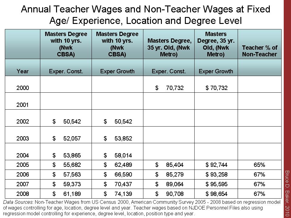
2)  How do New Jersey teacher salaries compare with salaries of non-teachers a) in the same labor market, b) at the same age, c) at the same degree level and d) for the same amount of hours worked per day and days worked per year?

I’ve blogged on this topic in the past, pointing out that in New Jersey, based on U.S. Census and American Community Survey data on income from wages, teachers in New Jersey actually used to be – at one time – compensated quite similarly to their non-teacher peers on an hourly basis. That is, back around 1990. But, over time, New Jersey teacher salaries have slid further behind their non-teacher peers  (though they have somewhat stronger average benefits packages. See my previous posts on teacher wages).

Here are my latest graphs on the topic – first, hourly wages over time by degree level and second, a modeled projection of teacher and non-teacher wages controlling for age, degree level, labormarket, hours worked and weeks worked. The first graph clearly shows that teacher salaries have slid from near 100% (near even) with non-teacher salaries back in 1990 for those with a BA only, to around 80% of the hourly wage of non-teachers with a BA. At other degree levels, teachers have fallen below 80%.

The second graph shows the projected annual wage for a 40 year old working 40 hours per week and 40 weeks per year, at the BA and MA level. This graph actually shows non-teachers with a BA surpassing teachers with an MA at the end of the period.

Note regarding benefits & bias: Corcoran and Mishel point out here: http://epi.3cdn.net/05447667bb274f359e_zam6br3st.pdf that

…overall K-12 teacher compensation was 27.5% greater than teacher wages alone, while overall professional compensation was 23.5% greater than professional wages. These differences in benefit shares translate into a benefits “bias”of 2.8 percentage points in 2006.

That is, benefits would close little of the overall gap in wages. Costrell and Podgursky show about a 5% (slightly less) differential (10% non-teachers, 15% teachers) in the value of pensions, a portion of benefits. This too would close only part of the teacher to non-teacher wage gap in New Jersey, even if we assume New Jersey benefits for teachers to be much greater than other employee benefits.

3) Where are those teacher salaries getting most out of line and what are the implications for property taxes? Is it really because the state has dumped so much funding into those Abbott districts? Or might it be because districts with high income families have chosen to adopt school district budgets which support higher salaries (essentially, canceling out the intended teacher recruitment edge produced by Abbott funding, if there ever was such a competitive edge)?

Because I love maps (see charter post), here are some maps of the school level relative competitiveness of teacher salaries – blue circles, overlaid on the median family income of school districts. The blue circles indicate the “relative competitiveness” of teacher salaries in a given school with a larger circle indicating that the actual salaries in that school are greater than the average predicted salaries for teachers with the degree and experience level of teachers in those schools. Schools are compared against others in their own labor market. So, a school identified as a large blue circle, or 1.05 value is a school where teacher salaries are 5% above the average expected salaries for those teachers in that labor market. Note that very low income, high minority urban schools would generally require higher salaries simply in order to recruit and retain comparable teachers. These maps, and competitiveness ratios include only New Jersey districts compared against other New Jersey districts. They do not include, for example, New York state districts which have much higher salaries for comparable teachers.

The first map shows the Newark area, and indeed Newark public schools do have relatively strong salaries, running at about 5% above expected. However, this margin is unlikely to yield teacher equity between Newark and its surroundings. Note that the many of the largest circles and highest competitiveness ratios – 1.12 to 1.14 – are in far more affluent suburbs like Millburn and Livingston. These self-inflicted higher salaries in districts that already provide more favorable working conditions create a competitive disadvantage for all other neighboring districts. The second map below shows the Camden area, where Camden teacher salaries are relatively non-competitive (as the district has increased quantities of staff rather than salaries over time) and where surrounding higher income suburbs have outpaced Camden city and other middle class suburbs.

This does all raise some fun questions regarding the property tax debate. One might argue that these high spenders are doing so on property taxes – high property taxes in fact. Actually, my previous analyses show that these wealthy communities with high teacher salaries actually have lower property taxes as a percent of income. If there is a squeeze going on here, that squeeze is at the juncture of the relatively lower teacher salaries and relatively higher local property tax burden (as a share of income) in middle to lower middle wealth communities who are trying to keep up with their affluent neighbors, but are less reliant on state aid than poor urban districts.

So, to conclude this rant – I’m having some trouble accepting the basic assumption that New Jersey teacher salaries are spiraling out of control, on either of the first two bases I discuss above. And further, I’m having some trouble accepting the notion that the spiraling salaries are a function of a statewide teachers’ union and strongly imbalanced mediation process. Rather, it would appear to me that very high income districts are simply choosing to spend what they can, and that it may be reasonable for these very districts to cut back, if their communities wish to do so. Actually, from a state policy perspective and especially from an equity perspective, if the current administration wishes to maintain the critical leverage provided by poverty-based funding to poor urban districts, the administration might wish to take a look at holding back the salary growth in the most affluent neighbors of the poorest urban districts. But, the notion that interventions are required to hold back all teacher salaries (with emphasis on those runaway urban districts) seems misguided.

See also: http://greatlakescenter.org/docs/Think_Twice/TT_Manhattan_Teacher%20Pay.pdf

for a discussion of technical problem’s with Jay Greene’s teacher salary analysis which is often used to argue that teachers are very well paid on an hourly basis. This is not directly relevant herein, because the analysis above deals with NJ teachers specifically, and uses more appropriate data for such analysis (the same data used by the National Center for Education Statistics for estimation of regional wage variation and for estimating teacher wages relative to other professional wages here: https://bush.tamu.edu/research/workingpapers/ltaylor/Comparing_Teacher_Salaries.pdf )

More Fun with New Jersey Charter Schools

LINK TO UPDATED SPREADSHEET OF FREE LUNCH AND SPECIAL ED DATA

I love maps. I love GIS software. This is a particularly interesting one related to the shares of children who qualify for free (not free or reduced, but free only, a poorer population) lunch in traditional public schools and in charter schools in Newark. One reason why mapping is useful here is that it is important to compare school demographics with other nearby schools, rather than district average. This map of a portion of Newark pretty much speaks for itself. Click to enlarge the map (to read the free lunch ranges on the key). Clearly, two of the “high performers” among charters – North Star and Robert Treat, have noticeably lower free lunch rates than other schools around them (except for other special schools).(CS indicates Charter School)

Data for this map were acquired from the National Center for Education Statistics Common Core of Data – Public School Universe Survey for 2007-08. These data include latitude and longitude for schools, which may not be perfectly precise. But, they are pretty good overall.

While I’m at it – here are the Jersey City Charters – even more striking differences:

Stepping back a bit to see more charters and taking off the names for clarity, here’s what all of Newark looks like, including some other neighboring towns. Charters have a pink asterisk. Again, smaller circles in lighter shades are lower free lunch schools. There are a few charters that are moderate to higher poverty – similar to many Newark schools (bright green, medium size bubble). However, many charters are the lowest poverty schools to be found. The same is true in the second map below for Jersey City.

Recall from previous posts that Charters are even more different from their neighbors in terms of the numbers of special education and limited English proficient students they serve. Their one saving grace was that they did seem to have relatively high shares of students qualifying for free or reduced price lunch. But, as I have noted in previous posts, they seem, on average to be taking in the less poor among the poor – at least the “model charters” do.  That’s simply not scalable reform. Claims by NJ Charter advocates that these schools are serving the same, high poverty, needy student populations as other schools in their neighborhood are simply wrong – and not supported by any legitimate, fine-grained analysis (and it doesn’t even have to be that fine grained).

Note: One error in other analyses that compare charter school free or reduced lunch rates to district average rates is that those analyses fail to compare by grade level. Few charters in New Jersey are High Schools. High schools on average have lower rates of children qualifying for free/reduced lunch for a variety of reasons – primarily reporting issues. So, if you compare a bunch of elementary schools to a district average which includes high schools, you are likely to show that the elementary schools have higher average free/reduced lunch rate. But it’s not a correct comparison. Charter schools should be compared by grade level to their nearest neighboring and/or sending schools. I’ve not yet run the relevant spatial statistics above.

So, here are a few basic guidelines for future comparisons:

1) compare by relevant grade level because of the way in which subsidized lunch rates shift from elementary to secondary school;

2) while it’s okay to evaluate free and reduced shares, it is also important to slice those shares because children in these categories differ by family background. Looking only at the sum of free and reduced conceals substantial differences in student populations across charters and traditional public schools;

3) compare by location.

========

Here’s some follow-up data on New Jersey Charter School demographics. Here are the comparisons of disability rates and free lunch shares for Newark and Jersey City Public (Traditional Public) schools by grade level and the disability rates and free lunch shares for Charter schools often cited as outperforming the host district. Note that most claims that these schools outperform the host district use all kids’ test scores, not just general student test scores. So, differences in shares of children with disabilities make a huge difference in proficiency rates. I show this in previous posts on this thread (New Jersey Charter Schools).

Special Education

Note: A knowledgeable reader has informed me that the “0” value for Greater Newark Charter is actually “missing data,” for that year and has assured me that Greater Newark Charter does indeed enroll children with disabilities. At some point, I may get around to updating these analyses.

% Free Lunch

Note that the highest flyin’ charters (Treat and North Star) have substantially lower free lunch shares than the host district in addition to having very low special education rates. Only Marion P. Thomas has a relative high free lunch share, but has very few special education students.

Playing with Charter Numbers in NJ

About a week ago, I commented that charter school average performance was not much, if any different from the average performance of the poorest urban public schools. This is admittedly an oversimplified comparison, but not one I would have made had I believed it to be deceptive, which it is not – given the available data on New Jersey schools.

Here, I will walk through a more complicated though still imperfect analysis of elementary school performance in host districts and in charter schools based on data from 2004 to 2006 (data I had already compiled for related work). First, let’s begin with some descriptive characteristics of the charter schools and schools of similar grade level (elementary in this case) in their host districts based largely on school reports data from those years.

The table below shows that the data set includes 28 charter schools per year and 173 host district schools of same grade level.  The charters serve about 1,000 tested students and the host district schools about 11,000 tested students.  While the free/reduced lunch share is roughly the same between the two, the free lunch share is higher in the host district schools (these are the poorer students). These differences vary by host district and charters. Newark Charters, for example, are on average (though not all) relatively high poverty.

Note that the average free lunch share in DFG A schools, used in my previous comparison, is 63% (much higher than charters or their hosts on average).

Also higher in the host district schools are the share of children who are LEP/ELL and who are classified as having disabilities. But, the host district schools do have higher total certified salaries per pupil (compiled from state database on personnel salaries).

Slide1

Three year average scale scores are also listed, for the 2004 to 2006 period.

But, the big question is what happens when you throw this all into the mix of a statistical model to evaluate whether charters outperform host district schools, controlling for the fact that they have less needy populations, but fewer resources to work with? Again, this is a simple school level model, which does not account for individual children’s relative gains in charters (treatment effect) compared to otherwise similar children not in charters but in host district schools. It would be wonderful to be able to conduct such analyses in NJ.

This school level model includes a dummy variable for each district that is a host district, such that charter performance in the model is measured against performance of the host district of that charter. The model includes only host districts and their respective charters. The overall charter effect is essentially the average of differences between charters and hosts, across hosts (and their respective charters).

What we see in this model is that charters, on average, are no different from their hosts on the combined math and language scale scores for NJASK from 2004 to 2006.  While the statewide model of the same data shows a strong effect of cumulative salaries per pupil on outcomes, the model within host districts of charters does not – an interesting point to explore. But, other factors play out quite logically – with each student need factor statistically significantly depressing scale scores.

Slide3

So, what does this more complicated, but still not complicated enough analysis tell us? It tells us that average charter school performance from 2004 to 2006 on elementary assessments is  no different from that of average performance in other poor urban schools – specifically the host districts of those charters. It just says this in a more complicated way. Sometimes simple averages – when not deceptive – can be sufficient.

One factor that could turn the findings in favor of charters (as treatment effect) would be if the average starting performance level of charter students, compared to otherwise similar host school students, is lower than that of host school students – which could occur if there is a tendency for parents to look to charters when their children are under-performing. This appears to be the case in the Missouri data in the CREDO study noted below. But, this is unlikely to create a substantial effect.

Again, this is just playing with the numbers, albeit a more rigorous play than my previous posts – leading to the same conclusions.

For more thorough discussions of charter school research, see:

http://epicpolicy.org/think-tank/reviews

Check out specifically, the original NYC Hoxby study, and critique of it, and the CREDO 16 state study and RAND 8 state study.  Exercise caution in linking any specific findings to the New Jersey context.

What do NJ Charter Schools Really Spend?

Getting back to the original point of my blog, this post is simply about introducing to the public discourse some actual data on NJ charter school spending. Back when I wrote my textbook on school finance, I found that DC charter schools were having to rely on private contributions to the tune of 14% of their annual operating expenses. One can obtain such information from IRS non-profit tax filings (IRS 990). I did a quick run of New Jersey Charter School IRS 990 filings for 2008, reflecting revenues and expenditures for 2007. I simply combined their tax filing information with their total expenditure information – which does include expenses for facilities.

What is most striking but not surprising is the degree of disparity among charter schools, driven substantially by differences in private fund raising.  Also important to note is that many of these schools spend well over the assumed $11,000 to $12,000 per pupil constantly spun by the media these days. I’ve not yet aligned the performance data with these new financial data, as I need to return to my actual research agenda (this particular analysis is  a part of ongoing research).

Remember also that these schools presently serve few or no special education children, making $16,000 per pupil worth well over $18,000 (assuming 15% special ed students typically at double average cost).

You might say, hey, if the public only has to subsidize $11k to $12k and private contributors pick up the rest, it’s still a bargain for taxpayers, right? Perhaps – but the necessity to rely on $3k to $5k of private contributions for each charter child educated then seriously limits the potential expansion of charter schools.

NJ Charter IRS 990Note from my previous posts and work on private schools, I have also shown that private independent day schools spend well above the average public expenditure. New Jersey private independent schools spent in 2007, an average of $25k to $30k per pupil (day schools only) with some exceeding $30k, also based on IRS 990 data.

My previous research on staffing in charter schools (based on undergraduate college selectivity of teachers) has shown that charters in some states attempt to staff their schools in ways similar to elite private academies – the private independent schools.

There is at least anecdotal evidence that some New Jersey Charter schools wish also to emulate elite private schools. For example, Ethical Community Charter School is founded by individuals previously associated with the Ethical Culture Schools of New York City, including the Fieldston School, a school where I taught for 5 years. An absolutely amazing school, which, by the way, spends well over $30,000 per child per year (even tuition is higher than that). I would argue that it will be quite difficult to emulate the ECFS schools of NYC on a mere $11k to $12k and that substantial private fundraising will be required. But private fundraising shouldn’t be required.

Good schools cost money! Sometimes a lot of money. Good education is expensive, which is not to say that all expensive education is good. My point here is that we are not going to solve our “urban education” problems on the cheap ($11k to $12k per kid), or necessarily any cheaper than what we’re spending currently. Any attempt to do so is likely to cause more harm than good.

[for those hanging on to anecdotal information about private religious school tuition as their basis for assuming good schooling can be done dirt cheap – about $3,500 per kid- please read http://www.epicpolicy.org/files/PB-Baker-PvtFinance.pdf]

The Real NJ Graduation Scam?

Bob Bowdon, of Cartel fame and E-3 make the claim that New Jersey’s poor urban districts are scamming the public and taxpayers by having overstated graduation rates. About half of poor district kids pass the HSPA test, but 85% graduate. Their brilliant solution to this problem, as I’ve noted previously, is to give kids the choice to attend charters – on the argument that charters are less likely to do such scamming?  So, here are some fun numbers.

First, the percent proficient or higher on HSPA MATH Assessments by district factor group for 2008:

Slide1

So, what we have here is that Charters (DFG R) actually had the lowest rate of kids proficient or higher on HSPA (matching my graph on previous posts, but lower here because only math is included). Yep, even lower than the poorest urban publics (DFG A). Yes, this is an average – among general ed test-takers – and averages conceal the highs… but they similarly conceal the lows.

Now, here are graduation rates for the schools by DFG:

Slide2

Wait one second. How can charters have a 97% graduation rate if only about half of the kids pass HSPA? Where’s the scam here? I thought you said that the differential between HSPA proficiency and graduation rates was supposed to be indicative of a scam? And that charters were the solution to the scam? But where is that differential bigger? Charters are lower on HSPA proficiency by a few points and are 12% higher on graduation rate? Now I’m really confused.

Okay – I’m not trying to pick on charter schools here. You guys are mostly working your butts off for a great cause, and quite honestly I don’t hear these completely absurd arguments coming from the charter leaders and teachers themselves. But the supposed “advocacy” out there on your behalf is deeply problematic. Quite honestly, if someone was out there advertising so poorly for my cause, I’d be a little concerned… or perhaps outraged.

Note to Non-Jersey readers about my casual use of Jersey terminology – DFG. In New Jersey, district factor groups or DFGs are a classification scheme that has been used for decades to characterize socio-economic features of public school districts. DFG A districts are generally poor urban districts, but many NJ poor urban districts are relatively small in total enrollment (a cluster of poor urban neighborhoods segregated from their more affluent neighbors). DFG I and J districts are affluent suburban districts. Charters are labeled “R.”

Replicating Robert Treat Academy

With little doubt, Robert Treat Academy in Newark is one of those charter schools that is doing well by common outcome measures and likely by even more important measures than state tests. What we know about are the tests. And even if one controls for a variety of factors about student populations, Treat’s test scores are pretty darn good.

Here’s a figure from a model I re-ran the other day (based on older work), using a variety of school, student population and community factors to control for expected differences in student outcomes. Schools above the line are those that outperformed expectations and those below the line fell below expectations. Charters are in red, and again, there are roughly equal numbers of traditional publics above and below the red line and charters above and below the red horizontal line. Treat is one of those above the line.

Treat Beat

So the argument goes, Treat is producing these test scores with much less money, and therefore we should be able to do the same, with similarly less money across poor urban settings by emulating the Treat model.

I addressed in a previous post how charter schools receive less through the state aid formula than traditional public districts. Again, this should shift somewhat over time, but charters will remain relatively disadvantaged. Using Robert Treat’s IRS 990 for 2007 expenditures (instead of their NJDOE reporting of their expenditure of public charter funding only), Treat shows expenditures per pupil in 2007 around $12,600. I’m still not sure I’ve captured the full expenditure here, because Treat’s IRS 990s show unusually low levels of private contribution for a successful charter school.

That aside, is the Treat miracle replicable across Newark? Or, is Treat different in substantive ways that can’t be spread throughout the system. Here are a few numbers that raise concern.

First, as I noted on a previous post, Robert Treat’s student body is only 3.8% special education in a district with an average of 18.1%.  This is from the special education classification data from NJDOE. In the enrollment files, Treat reports 0%. At 100% additional average expenditure per special education pupil, matching district demographics would raise Treat’s expected spending to $14,868 (1.18 x 12,600 in 2007).

Second, while Robert Treat does show about 62.4% students qualifying for free (130% poverty level) and reduced (185% poverty level) lunch, the free lunch share is about 42.9%. That is, Treat’s free or reduced share is boosted by the share of children who are more well off among the less well off. Note that the model I used above used Free & Reduced shares, not Free alone or the ratio between them.

By contrast, Newark Public Schools in total has 82% free or reduced and 71% free lunch alone.

Treat also reports less than 1% limited English proficient students while Newark City schools report 8.7%.

It’s one thing for me to try to control for these differences in estimating who does and does not “beat” odds, but yet another to take a model that has been successful under certain circumstances and apply it widely under very different circumstances, at the same cost.

It’s all well and good to cite other studies from other cities  and states that show that charter schools on average aren’t “cream-skimming,” (where most of those comparisons are based either on student’s initial performance or on free + reduced shares) but the reality in this case is that Treat Academy is producing its current level of outcomes at its current price tag with a substantively different student population – most notably the absence of children with disabilities. Again, they’re doing well, and even in models I’ve run controlling for some of these things, they still stand out and should be applauded for their efforts and results.

But, given the demography of the entire student population of Newark in particular, replicating this model may prove difficult. Adding more schools that serve fewer of the poorest children and few or no children with disabilities may be significantly problematic for those schools which then serve the larger shares of both.