What about those high income families that opted out long before the school year started?

Pro-Annual Testing of Everyone pundits are all in a tizzy about Opt-Out. In their view, parents who opt out are severely compromising accountability for our public education system. They are eroding the public interest in the most selfish possible way. What seems to irk these pundits as much as anything is the possibility that the recent pattern of opting out appears (empirical question for a later day) to be disproportionately occurring in upper middle income to upper income communities – A group, over which pundits have have little control or possible leverage [little opportunity for punitive policy – which drives them crazy].

So the pundits say, the disproportionate opting out of upper income white children from testing will severely compromise the ability of policy makers to accurately measure achievement gaps between those children and poor and minority children more compliantly sit down, shut up and fill in the bubbles (ok… point and click).

If the affluent families opt out, we really won’t know how far behind those who are less affluent really are?

Do we?

But do we anyway?

This whole line of reasoning is yet another example of the lack of demographic/contextual understanding and related number sense of those making these arguments. The edu-pundit-innumerati strike again!

These same innumerate pundits previously claimed that annual testing of everyone is absolutely necessary for accurately measuring within school and within district achievement gaps among student subgroups, totally failing to understand that few schools and districts – even when everyone is tested – actually have sufficient populations of subgroups for measuring gaps – and further that the approach most often used for measuring gaps is total BS – statistically that is. Actually, measuring within school and within district gaps and using those measures to penalize schools and districts ends up selectively penalizing only those schools for whom the gaps can be measured – integrated schools.

So then, why is this new argument equally statistically and demographically bankrupt? Certainly it would be the case that if those not taking the test were disproportionately of a certain race or of higher income, that average scores would be biased, and likely biased downward for any data aggregation that would/should include these families. So then, of course it’s a problem, right?

Well, yes… and no.

What the edu-pundit-innumerati fail to realize is that there already exist larger shares of disproportionately higher income kids in nearly every state who are already opting out of these assessments by opting into schools that generally don’t give them. Are these kids somehow not an issue of public policy concern, merely because they attend private schools (or homeschooling)?

If parents in Scarsdale, NY or Millburn, NJ opting out of state assessments matters toward our understanding of gaps in educational opportunity across children of the state by income and race, then so too do the unmeasured outcomes of children opting out of the public education system as a whole.

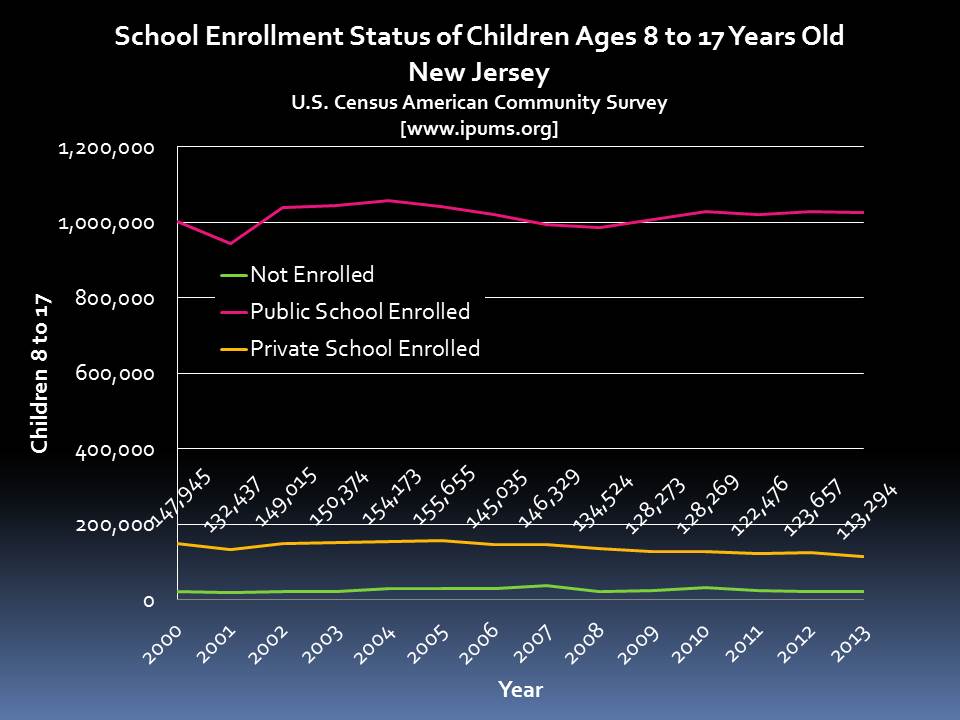
Here are the numbers for children between the ages of 8 and 17 (those who might fall in tested grades) for New Jersey and New York.

In New Jersey, over 110,000 children between the ages of 8 and 17 attend private schools (just under 150,000 when summing enrollments for k-12 private schools).

Slide1

In New York, over 300,000 children attend private schools (just under 350,000 when summing enrollments for k-12 private schools).

Slide2

In each state, over 10% of children in this age range do not attend the public schools.

Slide3

In New Jersey, the average Total Family Income of those in private schools is about $160k, compared to about $110k for those attending public schools.

Slide4

In New York, the average Total Family Income of those in private schools is about $140k, compared to $87k for those attending public schools.

Slide5

In other words, these states, among others, have relatively large shares of kids outside the system entirely, and the average income of their families is much higher than the average income of those inside the system.

That is, there already exists substantial bias – due to omitted data – in our measurement of gaps in educational outcomes!

Should we try to mitigate any additional bias? Perhaps. But can we pretend that if we do – if we reduce opt outs among affluent public school attendees, we’ve adequately measured outcome equity? Uh… no.

Here’s the breakout of those enrollments by primary affiliation of school, based on the most recent Private School Universe Survey from NCES.

Slide6

Slide7

So, is the National Catholic Education Association on board yet [w/CCSS perhaps, but the tests?]? Are they fully adopting/implementing annual testing of everyone?

How about the most (economically) elite schools in this mix, most of whom are members of the National Association of Independent Schools?

The reason why our School Funding Fairness report includes measures of “coverage” and income gaps by coverage is to make clear that even our measures of fiscal disparity across children attending public schools in any state suffer from the bias resulting from our inability to capture the resources available to the relatively large shares of children not in the public system at all, which, for 5 to 17 year olds, exceeds 20% in states like Delaware and Louisiana.

So, to those in a tizzy about opt out.

Chill.

Annual testing of everyone really isn’t annually testing everyone anyway, and as a result, really isn’t serving the public interest as well as you might think!

Innumerati: Blatantly, belligerently mathematically and statistically inept political hacks who really like to use numbers and statistical arguments to make their case. Almost always out of context and/or simply wrong.

Friday Graphs: Bad Teachers? or Bad Policy & Crappy Measures in New York?

A while back, I wrote this post explaining the problems of using measures of student achievement growth to try to sort out “where the bad teachers go.”

The gist of the post was to explain that when we have estimates of student achievement growth linked to teachers, and when those estimates show that average growth is lower in schools serving more low income children, or schools with more children with disabilities, we really can’t tell the extent to which these patterns indicate that weaker teachers are sorting into higher need settings, or that teachers are receiving lower growth ratings because they are in high need settings. The reformy line of argument is that it’s 100% the former. That bad teachers are in high poverty schools, and that it’s because of bad teachers that these schools underperform. Fire those bad teachers. Hire all of the average ones waiting in line.

Even the best measures of student growth, linked to teachers, addressing as thoroughly as possibly numerous contextual factors beyond teachers control, can’t totally get the job done – isolating only the teacher…. well… classroom level… effect. And, as I’ve noted in previous posts, many if not most state and district adopted measures are far from the best.. or even respectable attempts.

I explain in this policy brief, that in New Jersey, factors including student population characteristics, average resource levels available in schools, competitive wages of teachers (relative to surrounding districts) and other factors are significant predictors of differences in school average “growth” ratings. Schools with more resources and less needy students, and higher average scores to begin with, in New Jersey, get significantly higher growth ratings.

I also showed in this post that in either Massachusetts or New Jersey, teachers in schools with larger shares of their populations that are female, are less likely to receive bad ratings (Mass) or, conversely in schools that receiving higher growth scores (New Jersey). The implication, accepting reformy dogma about what these measures mean, is that our best teachers are teaching the girls.

So then what about those New York teacher ratings I addressed in the previous post. We saw, for example, that teachers rated “Ineffective” on the growth measure tend to be in high poverty schools:

Slide6

Tend to be in schools with larger classes:

Slide5

And those really effective teachers tend to be in schools with lower poverty and smaller classes.

So, does that mean that the “great” teachers are just getting the cushy jobs? Or is the rating system simply labeling them as such?  While there may indeed be some sorting, especially in a state with one of the least equitable funding systems in the nation, it certainly seems likely that the estimates of teacher effect on student achievement growth… well… simply suck! They don’t measure what they purport to measure.

They measure, to a large extent, the conditions into which teachers are placed, and NOT the effect of teachers on student outcomes.

Combining the above factors into a logistic regression analysis to predict how a handful of conditions affect the likelihood that a teacher is rated either “ineffective” (you really suck) or “developing” (you kinda suck, and we’ll tell you you really suck next year), we get the following:

NY Ratings Bias

So, even when considered together (holding the other “constant”), teachers in schools with larger classes (at constant low income share and funding gap) have greater likelihood of being rated “bad.” Teachers in schools with higher low income concentrations, even if class sizes and funding gaps are the same, are much more likely to be rated “bad.” But, teachers in schools in districts that have smaller state aid gaps, are less likely to be rated “bad.”

So, on the one hand, we can stick to the King’s grand plan….

  • Step 1 – Disproportionately label as “bad” those teachers in schools serving more low income kids, and doing so with fewer resources, including larger class sizes, and dump those lazy failing teachers out on the street…
  • Step 2 – Wait for that long line of “average” teachers to sign up to take their place… stepping into the very same working conditions of their predecessors, which likely led, at least in part, to those bad ratings….
  • Step 3 – Repeat

And the cycle continues, until a) those conditions are improved and b) the measures for rating teacher effect are also improved (if they even can be).

Alternatively, maybe the actual policy implication here is to a) reduce aid gaps and b) use that funding to improve class sizes?

UPDATE –

I figured I’d go check out that gender bias issue I found in NJ and MA. And wow – there it is again. I’ve rescaled the low income concentration and female concentration effects to relate odds changes (of being labeled bad) to a 10% point shift in enrollment (e.g. from 50% to 60% low income, or female). Here are the updated model results:

NY Ratings Bias

So once again – is it that all of the “bad” teachers are teaching in schools with higher percentages of boys? or is something else going on here? Are teachers really sorting this way? Are they being assigned by central office this way? Or is there something about a class with a larger share of boys that makes it harder to generate comparable gains on fill in the bubble, standardized tests? Why do the girls get all the good teachers? or do they?

Relinquishing Efficiency: NOLA Data Snapshots

There’s always plenty of bluster about the post-Katrina NOLA miracle. I’ve done a few posts on the topic, but none recently.

See:

The NOLA model of “relinquishment” continues to be pitched as a handy-dandy reformy solution for dismantling the dysfunctional urban school district and achieving miraculous gains in overall student outcomes (like those reported by CREDO), of course, at little or no increased expense. Indeed this latter piece is merely implied, by the complete and utter silence on the question of just how much money is being thrown at this alternative model in order to prove it “works.”

The purpose of this post is merely to put some of this NOLA bluster into context, using readily available data sources, including the NCES Common Core Public School Universe and NCES Fiscal Survey of Local Governments, along with CRDC/Ed Facts data released for states to conduct equity analyses to support their “teaching equity” plans.

First off, here are the pre, to post Katrina enrollment patterns for district and charter schools identified as within city boundaries of New Orleans:

Slide1City enrollments remain far lower than they were pre-Katrina, and any comparisons of the present, to that era, or even to the immediate post-Katrina era, when nearly all students remained displaced, are not useful. Most students are now in Charter schools, meaning that establishing a “counterfactual” comparison of charter students against “non-charter” students, as in the typical charter pissing match studies, is, well, rather difficult if not implausible.

As one might expect, once you’ve got most kids in charter schools, then the charters must somewhat mirror the population that had been in district schools, and remain in the few non-charters as of the final year of these data.

Slide2Really, no surprises here. Of course, we might find a different story if I had readily available data on children with disabilities, by the severity of those disabilities.

This next graph shows the per pupil current spending over time.

Slide3Now, that spike in 2006 is NOT because all of the sudden NOLA schools spent a whole lot more, but rather because the denominator – Pupils – nearly disappeared. Per pupil spending goes up when pupils decline, if spending does not decline commensurately.

It’s a simple math thing. But, even after the system stabilized at its new level, the state of Louisiana has seen fit to boost spending for the Recovery School District to 55% higher than state average spending. Prior to Katrina, NOLA schools were merely at parity with state averages. That’s a substantive boost. And one I’m certainly not complaining about, given the needs of these children. But certainly any claims of NOLA miracles, if they do exist, must include conversation about the “massive infusion of funding” in relative terms associated with this “relinquishment” experiment.

This increase (relative to surroundings) is greater than the boost received by Newark, NJ at any point during school funding litigation in NJ.

And where has some of that money gone? Well, this graph shows transportation expenditures per pupil over time.

Slide4While a bit volatile from year to year, the NOLA experiment seems to be leading to at least DOUBLE state average (non-rural) transportation spending per pupil – AND this is occurring in the most population dense part of the state, where one would expect average transportation costs to be lower. To put these figures into context, taking the margin of difference in transportation spending as about $600 per pupil in the most recent year, that figure is about 6% over the state average $10k per pupil operational expense (that is, consuming the first 6% of the 55% elevated spending on RSD, for a non-transportation RSD margin of 49%, still a healthy boost).

But what had been going on at ground level – within the “district” across schools – when there still existed district and charter schools? Here are some snapshots of total staffing expenditures per pupil by school organized first by low income concentration and then by special education.

Slide5Slide6Visually, it would certainly appear that the edge was being given to charter schools in terms of resources. In which case, any policy inferences based on assertions that charter schools yielded better outcomes, should certainly consider the influence of the additional resources. To clarify, the following table shows the output of  a regression comparing the per pupil staffing expenditure across charter, and “other” schools in New Orleans, for schools serving similar shares of low income children, children with disabilities and serving similar grade range distributions.

Slide7On average, the CRDC/Ed Facts data indicate that Charter Schools in New Orleans were spending $1,604 per pupil more than were “other” schools serving similar student populations. And that’s a hefty boost given that spending ranged from about $4,000 to $8,000 for most districts. That’s 40% of the $4,000 figure.

Again, any interpretation of differential effectiveness of charters versus other schools in New Orleans should consider the potential relevance of a 40% differential in staffing expenditure per pupil.

Setting aside the HUGE ACCOUNTABILITY concerns associated with this model (which no-one should ever set aside), and significant concerns over the legal rights of children and taxpayers (again, which should never be set aside), there are some potential lessons for pundits and policymakers here.  If there is even a success story to be told in NOLA (which I’m unconvinced), that success isn’t free, and it isn’t cheap.

So many pundits over time have ridiculed as the most inefficient experiment in social engineering of all time, the Kansas City desegregation plan of the 1990s. Now, there’s much misguided bluster – urban legend – in those characterizations, as I’ve written in the past. Perhaps one of my greatest fears about the NOLA experiment is that it will provide more fodder for the assertion that money doesn’t matter. Heck, they’ve thrown a lot of money at this so far. They’re just not talking about it. It’s being spent on exorbitant transportation costs, among other things.

Strangely, for now, all I hear is silence from the anti-spending, efficiency warriors of the ed policy world when it comes to NOLA.  Does that mean that money really matters (accepting the NOLA miracle characterization), or, alternatively, is NOLA proving (by not substantively improving outcomes with a 55% boost in funding) that the inefficiencies of a 100% charter/choice/unified enrollment system are equal to or greater than those of the urban school district of the past?

Data notes:

The original data sources for the above analysis are:

  1. enrollment data: http://nces.ed.gov/ccd/pubschuniv.asp
  2. fiscal data (PPCSTOT – or current operating expenditure per pupil) http://www.census.gov/govs/school/
  3. CRDC/Ed Facts School Site staffing expenditure data: http://www2.ed.gov/programs/titleiparta/equitable/laepd.xlsx

For current operating expenditure comparisons, the State of Louisiana reports different per pupil spending figures, combining RSD operated schools and Type 5 charters [whereas NCES reports RSD operated schools, where students shift from one – RSD operated – to the other – Charters – over time, both under RSD Governance]. Both, as far as I can tell, by relevant notations, exclude short term emergency funds. And both are current spending (excluding capital investment) figures. State data are reported below. Notably, the margin of difference is smaller than the operating expenditure figure above. But, interestingly, as more students shift to Type 5 charters, the margin of spending difference increases.

This is a trend worth watching over time. This margin, which is still substantial (and growing), might be consumed almost entirely by increased transportation expense, but may also continue to rise (or not?).

Note that these differences are unrelated to the school level CRDC/Ed Facts analyses above, which include independently reported staffing expenditure data on individual school sites where charter schools have sufficient additional resources  to substantially outspend (+40%) non-charters. These large differentials (huge for some schools) are likely a function of privately contributed resources which may not be showing up in either the State or NCES data.

Finally, there’s rarely need to speculate or make anecdotal claims about data being “wrong” or “different,” or whatever, when one can simply look up the relevant data and make the relevant comparison. Tables w/relevant URL citations can even be conveyed via twitter!

District(s) 2011-12 2012-13 2013-14
Other Parrish Schools $     10,543 $     10,368 $     10,611
Orleans Parish School Board $     14,273 $     14,601 $     13,527
Recovery School District (Operated & Type 5 Charters)* $     11,420 $     11,665 $     11,998
RSD Margin over “Other” 8.3% 12.5% 13.1%
https://www.louisianabelieves.com/resources/library/fiscal-data

NYSED Recommends “Teacher Effectiveness Gnomes” to Fix Persistent Inequities

I guess I knew that when ED released their “teacher equity” regs late fall of 2014, that we were in for a whole lot of stupid.

You see, there was some good in those regulations and the data released to accompany them. There was discussion of teacher salary and qualifications parity, and some financial measures provided that would allow states to do cursory analyses, based on 2011-12 data, of the extent to which there existed objectionable inequities in either cumulative salary expenditures per child across schools, or average salary expenditures. The idea was that states would set out plans to evaluate these disparities, using data provided and using their own data sources. And then, states would provide plans of action for mitigating the disparities. This is where I knew it could get silly.

But state officials in New York have far surpassed my wildest expectations.Here’s their first cut at this issue: http://www.regents.nysed.gov/meetings/2015Meetings/April/415p12hed2.pdf

In this memo, NYSED officials identify the following inequities:

According to the USED published equity profile, the average teacher in a highest poverty quartile school in New York earns $66,138 a year, compared to $87,161 for the average teacher in the lowest poverty quartile schools. (These numbers are adjusted to account for regional differences in the cost of living.) Information in the New York profile also suggests that students in high poverty schools are nearly three times more likely to have a first-year teacher, 22 times more likely to have an unlicensed teacher, and 11 times more likely to have a teacher who is not highly qualified.

& you know what? They’re right. Here’s the full continuum of average salaries and low income concentrations across NY state schools, first with, and then without NYC included.

Slide1

Slide2

As I’ve pointed out over, and over and over again on this blog, NY State maintains one of the least equitable educational systems in the nation. See, for example:

  1. On how New York State crafted a low-ball estimate of what districts needed to achieve adequate outcomes and then still completely failed to fund it.
  2. On how New York State maintains one of the least equitable state school finance systems in the nation.
  3. On how New York State’s systemic, persistent underfunding of high need districts has led to significant increases of numbers of children attending school with excessively large class sizes.
  4. On how New York State officials crafted a completely bogus, racially and economically disparate school classification scheme in order to justify intervening in the very schools they have most deprived over time.

Ah, but I’m just blowin’ hot air again, about that funding stuff, and the fact that NY State continues to severely underfund the highest need districts in the state, like this:

Slide2

But I digress. Who needs all of this silly talk (and actual data) about funding disparities anyway? And what do funding disparities possibly have to do with teacher equity problems, or salary disparities like those identified above by NYSED using USED data?

Well: https://www.youtube.com/watch?feature=player_detailpage&v=wfgnNI9-ImY&list=PLuzsMod17tiHrlaBvDcm2us_k68uxZcSy#t=801

Of course, NYSED official know better – much better what’s behind those ugly salary and ultimately, teacher qualification disparities plaguing NY State schools. The ED regs require that states first identify problems/disparities. Then, ROOT CAUSES, thus, leading to logical policy interventions – Strategery at it’s finest!

PROBLEM –> ROOT CAUSE –> STRATEGERY

So what then are the root causes of the disparities identified above by NYSED?

Through the collaborative sharing of lessons learned through the STLE program and research, the Department has determined that the following five common talent management struggles contribute significantly to equitable access:

  1. Preparation
  2. Hiring and recruitment
  3. Professional development and growth
  4. Selective retention
  5. Extending the reach of top talent to the most high-need students

Although the Department believes the challenges described here are reflective of broad “root causes” for the statewide equity gaps, it is still important for each LEA to examine their unique equity issues and potential root causes. In talking with superintendents, principals, and teachers involved in STLE, the Department was able to see that equity gaps that appear similar across contexts may in fact stem from different root causes in various LEAs. For example, one district struggling with inequitable access for low-performing students may find that inequities stem from a pool of low quality applicants, whereas a second district may find that they have a large pool of high quality applicants but tend to lose top talent early in their careers to neighboring districts who offer more leadership opportunities for teachers.

Ah… okay… I thought equitable funding to actually pay equitable salaries might have had something to do with it. How silly am I? It’s about bad teacher preparation programs which somehow produce bad teachers who ask for lower salaries in high poverty districts? and high poverty districts selectively retaining only their bad teachers, intentionally, by just not paying well. It’s a conspiracy that can be fixed by clever talent development strategies. No money, except some chump change in competitive grants, needed.

And thus, if we know that bad teacher prep and crappy local management of talent is the root cause, the solutions are really easy?

The Department believes the overall quality of teaching and learning can be raised through the implementation of comprehensive systems of talent management, including sound implementation of the teacher and principal evaluation system.

Key Component 1 (Educator Preparation): The Department will continue to support and monitor improvements to access and entry into the profession, such as the redesign of teacher and principal preparation programs through performance-based assessments, clinically grounded instruction, and innovative new educator certification pathways.

Key Component 2 (Educator Evaluation): With the foundation laid by Education Law §3012-c, the Department will continue to provide support and monitoring to LEAs as they implement enhanced teacher and principal evaluation systems that meaningfully differentiate the effectiveness of educators and inform employment decisions.

Key Component 3 (The TLE Continuum): The Department will provide resources and support to LEAs utilizing evaluation results in the design and implementation of robust career ladder

All that’s missing from this brilliant plan are the teacher effectiveness gnomes.

So yeah… it all comes down to the state’s brilliant model for rating, ranking and dumping “bad” teachers to open the door to all the really good teachers who are currently waiting in line to work in schools that …

serve high concentrations of low income and minority students,

Slide6

have larger class sizes,

Slide5

and still (and moving forward) have the largest state aid shortfalls!

Slide4

What’s really great about all of this, is that these teachers – all chomping at the bit to work in these schools for low pay – can have it all! Funding gaps and greater needs. Note that the majority of “ineffective” teachers (as so declared by growth rating along) are clustered in schools with high low income concentrations and big aid gaps. Interestingly, even those in districts with fewer low income children, are also in districts with big aid gaps.

CRDC Ed Facts Data – NY State 2011-12

To summarize – the framework laid out by ED, was:

PROBLEM –> ROOT CAUSE –> STRATEGERY

The brilliant application of that framework by NYSED was:

Problem=Huge salary & teacher qualification disparities by school poverty

Root Cause=Bad teachers, Teacher Prep & Administration

Strategery=Talent Development (fire bad teachers)

Are you kidding me? Really? In my wildest dreams…

To clarify – if it wasn’t already sufficiently clear – I do not at all accept that the patterns above represent the actual distribution of teacher effectiveness, but rather, that the crappy measures adopted by NYSED for rating teacher effect on growth systematically disadvantage those teachers serving needier students, in larger classes and schools with more scarce resources.

Yeah… I get it… NYSED and the Regents don’t pull the budget strings. The Gov has done that damage. But that doesn’t make the logic of the NYSED brief any less ridiculous!

Head… desk…

Angry Andy’s not so generous state aid deal: A look at the 2015-16 Aid Runs in NY

Not much time to write about this, but I finally got my hands on the state aid runs for NY state school districts which were, in an unprecedented and utterly obnoxious move by the Gov, held hostage throughout the budget “negotiations” (if we can call  it that).

Quick review – NY operates a state aid calculation formula built on the premise that each district, given its geographic location (labor costs) and pupil needs requires a certain target level of funding to achieve desired outcomes.

Target = Base x Pupil Needs x Regional Cost

The state then determines what share of that target shall be paid by local districts, the rest to be allocated in state aid.

State Aid = Target – Local Contribution

A few really important points are in order before I move forward with the updated estimates. First, those targets are supposed to be aligned with costs of achieving desired outcomes. Higher outcomes cost more to achieve, with greater marginal cost effects where student needs are higher. As I’ve explained previously, the state has continued to increase those outcome targets, but has continued to lower the funding target. This is a formula for failure!

And, in 2015-16, they’ve done it again. The “base cost” figure which drives the formula has again been decreased, thus leveling down target funding across the board, all else equal.

Slide1

So, with this in mind, any/all funding gaps I discuss below should be considered only funding gaps with respect to what the state would like to pretend is its full funding obligation. What in reality is a low-balled, manipulated figure that downplays substantially the true obligation with respect to current outcome goals. The actual full funding obligation, given increased standards over time, is likely much higher… much higher. There’s no excuse for lowering the target – and continuing year after year to push the date for hitting that target out further. None.

However, from the state perspective, this manipulative game of lowering the outcome target can make it appear that they are getting closer to hitting it. Separately, as I explained on another recent post, one can make the state aid shortfalls look less bad if one requires a higher local contribution, another game used in previous budget years.

Let’s start with the positive. Yes, the adopted state budget does, on average, increase per pupil state aid and does so in higher amounts in districts serving needier pupils:

Slide6

Not bad. We’ve got districts getting what would appear to be hundreds of dollars per pupil in increased state aid. But, remember, this is only a small dent in the funding gaps. Let’s first look at the funding gaps for 2015-16 for those districts Angry Andy called miserable failures who should be subjected to the death penalty.

Slide2

Here, we’ve got districts that in the best case, are still being shorted around $1,500 per pupil in state aid. Every one of Angry Andy’s failing districts will continue to be substantially underfunded – against the state’s own low-ball estimates – for yet another year. All in the name of Angry Andy’s Awesome Austerity Experiment. Regarding a similar “experiment” in Kansas, a 3 judge panel noted it is experimenting with our children which have no recourse from a failure of the experiment.”

And what about small city school districts, who recently had their case heard in Albany? Well, first off, some of them are among the Angry Andy failures.

Slide3

And generally, their state aid gaps remain large – really large. And again, these are gaps with respect to low-balled targets – and after jacking up the supposed local responsibility to fund those targets.

So, who’s to blame here? Well, obviously, it’s not the funding gaps – it’s those lazy teachers and the complicit administrators who give those teachers good ratings even when they can’t produce test score gains.

I close with an update of the 50 districts with the largest funding gaps going into 2015-16. And here they are:

Slide4

Slide5

  For previous reports/lists, see:

  1. Statewide Policy Brief with NYC Supplement: BBaker.NYPolicyBrief_NYC
  2. 50 Biggest Funding Gaps Supplement: 50 Biggest Aid Gaps 2013-14_15_FINAL